
4. Using Page Views
Introduction to Page Views
What you see is what you get (WYSIWYG) web design products are supposed to keep you from having to worry about HTML code, but anyone who has spent any amount of time working with a WYSIWYG tool knows that it’s not practical to ignore the code. Fortunately, Expression Web 3 provides three different views of your page so you can work with it the way you want: Design View, Code View, and Split View.
You’ll likely use Design View most often. It shows a view of your page as it will appear in a web browser. Using Design View, you can easily add text, graphics, hyperlinks, and other content and arrange it in a WYSIWYG environment.
Code View shows the underpinnings of your page—the code. Expression Web 3 offers color-coding, line numbering, IntelliSense, and other tools to make it easy and efficient to work in this view. Chances are this is where you will go to tweak code that Expression Web 3 has already added, but you can add code from scratch here as well.
Split View is a combination of Design View and Code View. Split View divides the Expression Web 3 interface into two panes, one on top of the other. One pane displays the page in Design View, and the other pane displays the page in Code View. Separating the two panes is a movable divider called the split so you can decide how much screen real estate each view should occupy.
Adding content in Design View is primarily covered in Chapter 3, “Creating Pages and Content,” but in this chapter, we go over some of the features on the View menu in Expression Web 3 and cover using Code View and Split View.
Working in Design View
As mentioned previously, Design View is where you will likely spend most of your time when using Expression Web 3. Design View is a WYSIWYG representation of your page. It provides a display of what your page will look like in a web browser.
 For more information on using SuperPreview, see Chapter 13, “Using SuperPreview.”
Note
Expression Web 3 does not use Internet Explorer’s rendering engine to display your page in Design View. Instead, Expression Web 3 uses a custom rendering engine designed to give you an accurate view of your page as it appears in any modern browser.
If you want to see how your page appears in a particular browser, use SuperPreview or the Snapshot panel.
Quite a few interface features accessible on the View menu make it easier to work in Design View.
Visual Aids
Visual Aids are user interface elements that make it easier to work with pages. Expression Web 3 offers nine Visual Aids to make it easier to position items and locate elements on your page.
Tip
The Status Bar in Expression Web 3 displays the current status of Visual Aids. You can turn Visual Aids on or off by double-clicking the Visual Aids area of the Status Bar.
To access Visual Aids, select View, Visual Aids and select the desired Visual Aid. Visual Aids are displayed by default in Expression Web 3, but you can turn them off by selecting Show in the Visual Aids menu or by pressing Ctrl+/ on your keyboard. The Show menu item toggles all Visual Aids on and off.
The following Visual Aids are available on the Visual Aids menu:
Block Selection
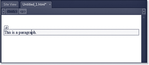
When Block Selection is enabled (it is enabled by default), Expression Web 3 will display a block selector for HTML block elements. A block selector is a small tag indicator, as shown in Figure 4.1. Block Selection will also display a shaded area indicating the padding around a particular element.
Figure 4.1 The Block Selection Visual Aid makes it easier to work with block elements such as paragraphs.
Some block elements are almost impossible to work with when block selectors aren’t visible. Expression Web 3 will not hide these block elements even when block selectors are disabled. HTML layers are an example. Layers are implemented using HTML <div> elements, and the <div> block selector is always visible regardless of whether the Block Selection Visual Aid is enabled.
For more information on using layers, see Chapter 23, “Using Layers.”
Tip
HTML block elements are elements that can appear within the <body> of the document. The W3C has more information at www.w3.org/TR/html4/struct/global.html#h-7.5.3.
Visible Borders
The Visible Borders Visual Aid displays borders around particular HTML elements, even when they are not selected. For example, when you insert a table in Expression Web 3, the Visual Borders Visual Aid will render a dotted border around each cell by default, even when the table has no border. When the Visual Borders Visual Aid is disabled, the table will be invisible in Design View unless it is selected.
For more information on using tables, see Chapter 5, “Using Tables and Layout Tables.”
Empty Containers
The Empty Containers Visual Aid displays borders around certain elements that act as containers for other elements. For example, an HTML form is visible by default in Design View, even when the form has no controls in it. If the Empty Containers Visual Aid is turned off, HTML forms are invisible in Design View until controls are added to them.
For more information on using HTML forms, see Chapter 24, “Using Form Controls.”
Margins and Padding
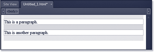
The Margins and Padding Visual Aid displays a shaded area around the page margin and around padding areas of all HTML elements, as shown in Figure 4.2.
Figure 4.2 The Margins and Padding Visual Aid makes it easy to see padding around elements and the page’s margins.
CSS Display:none
CSS elements with a Display attribute set to none or a Visibility attribute set to hidden are not visible by default. Expression Web 3 provides a Visual Aid for CSS Display:none and CSS Visibility:hidden elements.
When this Visual Aid is enabled, the elements will be visible in Design View but will not be visible in a web browser.
For more information on using CSS in Expression Web 3, see Chapter 18, “Managing CSS Styles.”
ASP.NET Non-visual Controls
Some ASP.NET controls are not visible by default. For example, the HiddenField control is an invisible control. The ASP.NET Non-visual Controls Visual Aid allows you to see invisible controls in Design View.
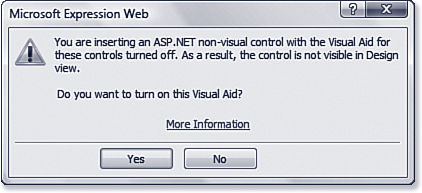
If the ASP.NET Non-visual Controls Visual Aid is not turned on and you insert a non-visual ASP.NET control, Expression Web 3 will display a dialog warning you that the element will not be visible; it will also ask whether you want to enable the ASP.NET Non-visual Controls Visual Aid, as shown in Figure 4.3.
Figure 4.3 Expression Web 3 will notify you when you insert a non-visual ASP.NET control.
For more information on using ASP.NET controls in Expression Web 3, see Chapter 25, “Using Standard ASP.NET Controls.”
ASP.NET Control Errors
By default, Expression Web 3 will display an error message when ASP.NET controls are improperly configured or if they malfunction. If you disable the ASP.NET Control Errors Visual Aid, no such error message will be displayed.
Template Region Labels
Editable regions are areas of a page that are used in conjunction with Dynamic Web Templates. By default, a label containing the name of each editable region is available only when the editable region is selected. By enabling the Template Region Labels, you can see the names of all editable regions whether they are selected or not.
For more information on using Dynamic Web Templates and editable regions, see Chapter 19, “Using Dynamic Web Templates.”
Formatting Marks
Expression Web 3 can display formatting marks for paragraphs, HTML comments, scripts, and other elements that normally are not visible.
To display formatting marks, select View, Formatting Marks, Show or press Ctrl+Alt+/ on your keyboard. After the formatting marks are visible, you can toggle individual types of formatting marks on and off as needed.
Formatting marks are useful when working with complex pages. For example, in Figure 4.4, a formatting mark is displayed indicating a right-aligned HTML element. By clicking on the formatting mark in Design View, you can easily select the element that is right-aligned.
Figure 4.4 Formatting marks can make page editing easier by allowing easy access to invisible page elements.
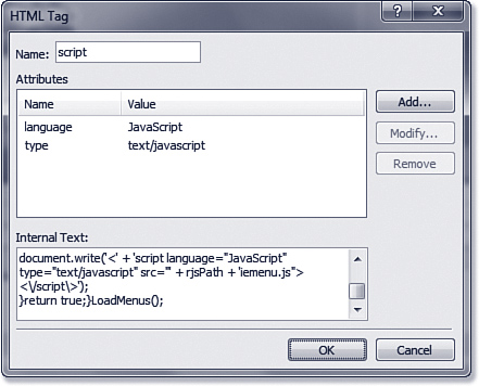
Some formatting marks offer powerful capabilities. If you double-click a script formatting mark, you can edit the script it represents, as shown in Figure 4.5.
Figure 4.5 Formatting marks make it easier to edit scripts and other non-visual elements.
Ruler and Grid
The Ruler and Grid feature of Expression Web 3 can make it much easier to position items in your page, especially if you are using absolute positioning with CSS.
For more information on CSS positioning, see Chapter 18, “Managing CSS Styles.”
Tip
When you double-click an HTML comment formatting mark, you can edit the HTML comment without switching to Code View.
The Ruler makes positioning easier by displaying horizontal and vertical indicators that originate from the upper-left corner of the page by default, as shown in Figure 4.6.
Figure 4.6 The Ruler adds convenient horizontal and vertical positioning indicators to Design View.
Tip
The Ruler uses the same coordinate system as absolute positioning. By default, the upper-left corner of Design View is at position 0, 0. This is called the origin.
As you move your mouse over the design surface, the Ruler will show the precise location of the mouse pointer by displaying position indicator marks on both the vertical and horizontal rulers. This makes positioning and resizing objects easier. For example, when you are dragging a layer to a new position, it’s helpful to have a visual representation of the mouse pointer’s exact coordinates.
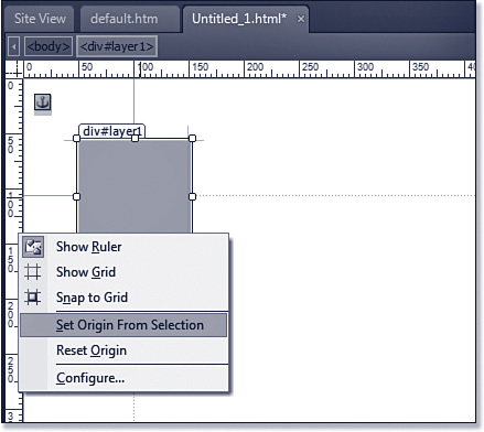
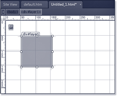
As previously mentioned, the Ruler’s origin is the upper-left corner of the design surface. You can, however, move the origin in one of two ways: You can drag the upper-left corner of the ruler to a new location or you can select something on the page, right-click the Ruler, and select Set Origin From Selection. In Figure 4.7, a layer is selected. When Set Origin From Selection is selected on the menu, the origin of the Ruler will be reset to the upper-left corner of the layer. To reset the origin to its original location, right-click the Ruler and select Reset Origin.
Figure 4.7 The Ruler’s origin can be reset to a selection on the available context menu by right-clicking the Ruler.
Although the Ruler can make it easier to position items, it’s not perfect. The layer shown in Figure 4.7 can be repositioned by clicking anywhere on the block selector and dragging. Unfortunately, the block selector itself consumes several pixels on the screen, so the position of the mouse pointer can vary when positioning the layer. Therefore, you cannot rely solely on the Ruler and position indicator marks. To make the Ruler more useful in such scenarios, the Grid can be used to make positioning more precise.
To enable the Grid, select View, Ruler and Grid, Show Grid. When the Grid is enabled, vertical and horizontal lines are drawn on the design surface. By default, these lines are drawn at 50-pixel increments, as shown in Figure 4.8.
Figure 4.8 Using the Grid in combination with the Ruler makes positioning objects on the page easy.
If you prefer, you can enable the Snap to Grid feature so that objects automatically snap to the grid when positioned. To enable Snap to Grid, select View, Ruler and Grid, Snap to Grid.
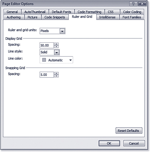
Both the Ruler and Grid are customizable by selecting View, Ruler and Grid, Configure. When you select Configure, the Page Editor Options dialog is opened and the Ruler and Grid tab is selected automatically, as shown in Figure 4.9. You can configure the units used for the Ruler as well as the units, spacing, and other settings for the Grid.
Figure 4.9 The Ruler and Grid can both be customized using the Page Editor Options dialog.
Tracing Images
Almost all sites are designed using a combination of text, graphics, and other dynamic content. In many cases, graphics are used to present interactive user interfaces. Even simple designs use graphics extensively to add user interface elements.
Note
Many graphics applications offer image slicing capabilities, and several of them are free. A web search will turn up plenty of applications to try.
When graphics are used for a site’s user interface, a large graphic is often cut up into smaller graphics in a process known as slicing. Tables or CSS styles are then used to segment the interface, add links, and so on. This whole process can be tedious and time-consuming. The Tracing Image feature in Expression Web 3 can make it considerably easier by allowing you to superimpose your user interface onto the design surface so you can build your layout around it easily.
For more information on using tables to build page layouts, see “Layout Tables and Cells,” p. 103.
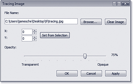
To use the Tracing Image feature, first add a new layout table to your page. Next, select View, Tracing Image, Configure to display the Tracing Image dialog shown in Figure 4.10. Click Browse and select the figure to use for the tracing image. By default, the tracing image will be positioned at the upper-left corner of the page. You can specify a different location or click Set from Selection to position the image relative to the selected element on the page.
Figure 4.10 Tracing images can be positioned and adjusted using the Tracing Image dialog.
Tracing Image Disappears
You should add your layout table before you add the tracing image. Otherwise, the tracing image will disappear when the table is added.
Tracing Image Disabled
The Tracing Image menu option is disabled on pages that use a Dynamic Web Template or an ASP.NET Master Page. To use a tracing image in this scenario, open the Dynamic Web Template or the Master Page and apply the tracing image.
Because you are building tables and other user interface elements on top of the tracing image, Expression Web 3 allows you to configure transparency for the image. This allows you to configure the image so it’s still visible while not allowing it to get in the way of your design elements.
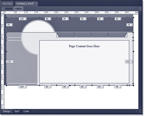
After you’ve configured the tracing image with the desired settings, click OK to add it to the page. You can then add layout cells using the tracing image as a guide. Figure 4.11 shows a tracing image being used as a guide for a layout table.
Figure 4.11 Using a tracing image as a guide for layout tables makes arranging table cells much easier.
Tip
Use the measurements displayed in your layout table as a guide when configuring your image application to slice images.
The tracing image is visible only when the page is displayed in Expression Web 3. Therefore, after you have your table arranged appropriately, you’ll still need to slice your image in a graphics editing application and then add the sliced graphic files to the table cells.
Adjusting Page Size
When designing your site, you want to make sure it looks the way you intend at all common resolutions. For example, if you design your site on a monitor set to a resolution of 1280×1024 (a common resolution for a 17” or larger LCD display) and then view it on a monitor set to a resolution of 800×600, it’s likely that part of the page will overflow the right edge of the screen. User interface elements might also shift around, making the page look unprofessional.
One solution to the screen resolution problem is to design your pages at the lowest resolution in which you expect them to be viewed. (In the example given previously, you would want to design the page at a resolution of 800×600.) There’s a problem with this approach, however. You might have spent a bunch of money on a nice monitor with plenty of screen real estate, and now you’re being asked to lower the resolution to the point where you’re no longer able to take advantage of all of that real estate! Luckily, the Page Size feature in Expression Web 3 was created so you can design for a specific resolution without actually switching to that resolution.
When you’re working in Design View, Expression Web 3 displays the current page size in the Status Bar, as shown in Figure 4.12.
Figure 4.12 The Status Bar will show you the page size so you can design for an intended resolution.
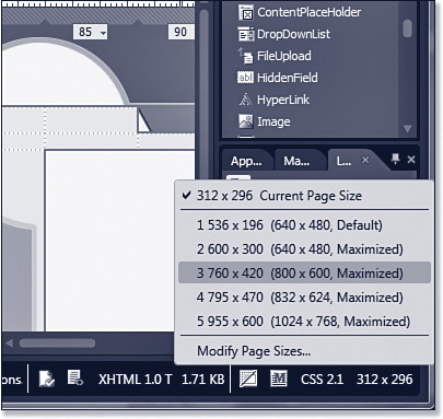
By clicking the page size displayed in the Status Bar, you can select a new page size, as shown in Figure 4.13. You can also select View, Page Size and select the desired page size from the menu.
Figure 4.13 Setting a new page size is fast and easy using the Status Bar.
choose a page size that is smaller than the current size of the design surface, Expression Web 3 will display shaded borders to indicate the size you have chosen, and you will not be able to add any content outside the selected page size. Using this method, you can take advantage of your entire screen while still ensuring that your page will display appropriately at the lowest desired resolution.
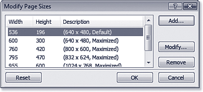
The page sizes that appear on the Page Size menu can be modified by selecting View, Page Size, Modify Page Sizes. The Modify Page Sizes dialog (shown in Figure 4.14) lets you easily add new page sizes or remove or modify existing ones.
Figure 4.14 Page sizes displayed in Expression Web 3 can be modified using the Modify Page Sizes dialog.
Working in Code View
Most users of WYSIWYG design tools aren’t too interested in digging into the code that makes up a page. In fact, the code that Expression Web 3 generates is clean and efficient enough to make digging into the code unnecessary in almost all cases. However, there are still times when you might want to add content in code or modify existing code, if for no other reason than to learn more about HTML, XHTML, CSS, and scripting.
Expression Web 3 will mark invalid code in Code View by adding a squiggly, red underline to it. It will also mark some code errors (such as missing closing tags) by highlighting them in yellow. These visual indicators are a great bonus when trying to locate code problems.
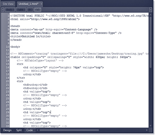
To access Code View, click the Code button at the bottom of the design surface. Expression Web 3’s Code View (shown in Figure 4.15) is a robust environment where you can work with code efficiently. Some of the tools that make working in Design View easy are also available in Code View, and code-specific tools are available that let you work with code even if you’re not an expert in HTML, CSS, and scripting.
Figure 4.15 Code View is a robust environment for working in code, but it’s also easy for those who know little about coding.
Tip
If you select something in Design View and then switch to Code View, the code representing the selection will be selected as well. The same thing happens when code is selected in Code View and you switch to Design View.
As shown in Figure 4.15, several features have been designed around making code more readable in Expression Web 3. Code is indented to make it more readable. Line breaks are also inserted automatically in tables so code is easier to understand. What you can’t see in Figure 4.15 (due to the grayscale image) is the color-coding that makes it much easier to read the code.
Several other features make working in Code View easy and intuitive.
Customizing Code Formatting
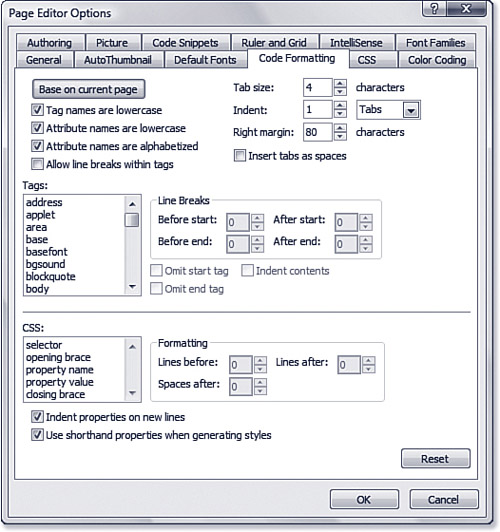
The formatting of code can be customized by selecting Tools, Page Editor Options and clicking the Code Formatting tab. As shown in Figure 4.16, there are many options to configure. By selecting a tag from the Tags list, you can customize that particular tag. CSS code can also be customized.
Figure 4.16 You don’t have to settle for how Expression Web 3 formats your code. You can change the rules any way you choose.
At the top of the Code Formatting tab are settings that apply to all code in Code View. However, these settings will not affect existing code. Only page edits and new pages are affected by changes to these settings.
Caution
If you uncheck either of these check boxes, Expression Web 3 will create all new pages with uppercase tag names and attributes. Current Web standards require that HTML tag names and attributes be lowercase. Therefore, pages created with either of these boxes unchecked will not be compatible with existing standards.
The following check boxes are available in the upper-left section of the Code Formatting tab:
• Tag Names Are Lowercase—When this box is checked, HTML tag names will be added in lowercase. This is the default setting.
• Attribute Names Are Lowercase—When this box is checked, HTML attributes are added in lowercase. This is the default setting.
• Attribute Names Are Alphabetized—When this box is checked, Expression Web 3 will alphabetize the attributes of HTML elements. This is the default setting.
• Allow Line Breaks Within Tags—By default, Expression Web 3 will not add hard line breaks within tags. If this box is unchecked, Expression Web 3 will add a hard line break between attributes within a tag if the length of the tag exceeds the number of characters specified for the right margin.
You can also configure the tab and margin settings in code view by changing the settings in the upper-right of the Code Formatting tab. By default, Expression Web 3 will use tabs as spaces. If you uncheck the Insert Tabs as Spaces check box, Expression Web 3 will use nonbreaking spaces instead.
Caution
Controlling spacing with nonbreaking spaces usually is not recommended. It can make spacing unpredictable and should be avoided.
The Tags section of the Code Formatting tab makes it easy to configure the way specific tags will be formatted in Code View. Select a tag from the Tags list and then change the appropriate settings as desired. You can configure whether to omit start tags and end tags and whether contents of the tag are indented as well.
The options available change depending on which tag you have selected. For example, if a tag doesn’t have a corresponding end tag (such as the <br> tag), the Omit End Tag check box will be checked and disabled.
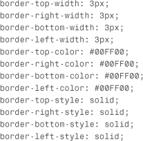
CSS elements can be formatted using the settings in the bottom section of the Code Formatting tab. You can also control how Expression Web 3 generates more complex CSS by using the Use Shorthand Properties When Generating Styles check box. When this box is checked (the default setting), Expression Web 3 will combine CSS properties in one CSS element when possible. For example, if a three-pixel green border is applied to a table cell, Expression Web 3 will create CSS code like the following by default:
border: 3px solid #00FF00;
If the Use Shorthand Properties When Generating Styles check box is unchecked, Expression Web 3 will instead create the style using the following CSS code:
Caution
Unlike the HTML formatting options in the Code Formatting tab, the CSS options will affect existing CSS code as well as new CSS code.
If you’d like Expression Web 3 to use the current page as a guide for formatting rules, click the Base on Current Page button. Expression Web 3 will attempt to match the formatting rules as closely as possible to what is on the current page.
Quick Tag Tools
The Quick Tag Tools are context-sensitive buttons that appear at the top of the Code View window. The Quick Tag Tools make it easy to select specific sections of code, edit code, and add new code. For example, when you click text inside a table cell, you’ll see a Quick Tag Tool for the <table> tag and also the <tr> and <td> tags for the selected cell. To select the code that makes up any of these tags, simply click the Quick Tag Tool for the desired tag.
For more information on using the Quick Tag Tools, see Chapter 8, “Using the Quick Tag Tools.”
Tip
The Quick Tag Tools are available in Code View, but after you make a change to the page while in Code View, Quick Tag Tools will disappear. Microsoft made that decision for performance reasons.
Quick Tag Tools Not Visible
If the Quick Tag Tools are not visible when you’re using Code View, it’s likely that the insertion point is not inside code that can be selected or manipulated with Quick Tag Tools. For the Quick Tag Tools to be visible in Code View, the insertion point must be on or inside the <body> tag.
IntelliSense
Code View supports IntelliSense for HTML code, CSS code, PHP code, and scripting code. You can use IntelliSense for adding a new tag by placing the insertion point where you want the tag and pressing <, as shown in Figure 4.17.
Figure 4.17 IntelliSense aids in adding valid code when working in Code View.
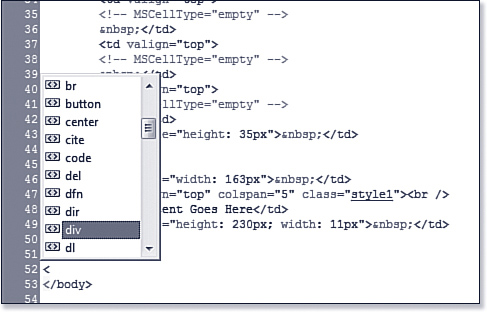
When IntelliSense pops up, scroll to the desired entry and press Enter, or double-click it to insert it.
IntelliSense is also available when editing existing tags and working with the Quick Tag Tools.
Context Menu
The context menu in Code View (see Figure 4.18) provides many useful tools for working with code.
Figure 4.18 Expression Web 3 offers many tools on the context menu in Code View to aid in adding and editing code.
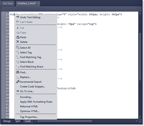
One of the most useful features of Expression Web 3’s Code View context menu is the ability to find matching curly braces in client-side script. There are also useful commands on the context menu to aid with moving pages created in other tools to Expression Web 3. However, other applications might not create XHTML-compliant code. By selecting Apply XML Formatting Rules from the context menu, you can easily make code XHTML-compliant without working through manual code edits.
Bookmarks
Another convenient feature available in Code View is the Bookmark. You can create a bookmark on a specific line of code by either selecting Edit, Code View, Toggle Bookmark or by pressing Ctrl-F2. A bookmark shows up as a blue rectangle in the code margin, as shown in Figure 4.19.
Figure 4.19 Bookmarks can make finding a specific line of code fast and easy.
To move to the next bookmark in Code View, select Edit, Code View, Next Bookmark or press F2. To move to the previous bookmark, select Edit, Code View, Previous Bookmark or press Shift+F2. To remove all bookmarks, select Edit, Code View, Clear Bookmarks.
Note
Bookmarks created in Code View are not the same as hyperlinked bookmarks. The bookmarks in Code View are simply reference points so that specific places in code can be more easily located.
Working in Split View
Some edits are better suited to Design View, and others are better suited to Code View. But what about those times when it might be convenient to use Design View and Code View both at the same time? For those cases, Split View is the solution.
As shown in Figure 4.20, Split View splits the window in Expression Web 3 into two horizontal panes. Code View is displayed on the top, and Design View is displayed on the bottom. You can drag the splitter between the two up and down to adjust the size of each view.
Figure 4.20 If you can’t decide which view to use, Split View gives you the option of using both at the same time.
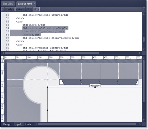
You cannot adjust the split so that the views are arranged vertically, and you cannot switch Code View to the bottom and Design View to the top. Still, Split View is a convenient method of editing when you need to see the code and design surface at the same time.
Taking Advantage of Page Views
Expression Web 3 is a valuable tool for more than just creating sites and pages. For example, Code View is a great tool for reviewing code from someone else that isn’t rendering correctly. Simply open the page in Code View and look for any highlighted code errors.
You can also use the Code and Design Views to learn more about how to create a particular layout. Simply select File, Open and enter the URL of the page you want to review. After the page is open, you can dissect it using Expression Web 3 and find out exactly how the particular design features were created.
I’m a frequent visitor to many Web design forums, and most of them include plenty of “How did they do that?” posts. By using Expression Web 3 to dismantle pages, you can answer that question easily and add some new skills to your toolset.