You’ve probably heard the mantra “tables are for tabular data,
not layout.” Originally designed to display tabular data correctly in HTML
documents, they were soon misappropriated as a way to lay out web pages.
Back then, understanding how to create complex layouts using nested tables
was a part of the standard skill set of every web designer. Yet using tables
in this way requires large amounts of markup, making a website increasingly
complex and difficult to maintain, as well as causing pages to load slowly.
This method also creates problems for users who are trying to access content
using screen readers or other text-only devices. Since then, the Web
Standards movement has pushed for the replacement of tabular layouts with
CSS, which is designed for the job and is, ultimately, far more flexible, as
we’ll discover in Chapter 9.
But, far from being evil, tables can (and should) still be used for
their true purpose—that of displaying tabular
data. This chapter will illustrate some common, correct uses of tables,
incorporating elements and attributes that, though used infrequently, help
to make your tables accessible. We’ll also look at how CSS can make these
tables more attractive and usable for those viewing them in a web
browser.
The quick answer is, you don’t! Spreadsheet data is tabular by
nature and, therefore, should be displayed in an HTML table. However, we
can still spruce up the display of that data using CSS, as we’ll see later
in this chapter. And we should still be concerned about the accessibility
of our tables, even when we’re using them to display the right kind of
content.
Tabular data is information that’s
displayed in a table, and which may be logically arranged into columns
and rows.
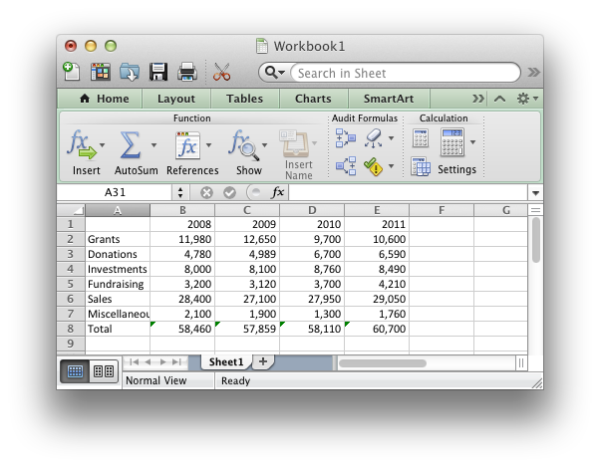
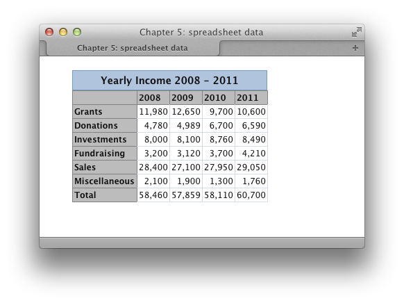
Your accounts, when stored in spreadsheet format, are a good
example of tabular data. If you needed to mark up the annual accounts of
an organization for which you were building a site, you might be given a
spreadsheet that looked like Figure 5.1.
Obviously, this is tabular data. We see column and row headings to
which the data in each cell relates. Ideally, we’d display this data in
a table, as shown in Figure 5.2, complete with
table headings to ensure that the data is structured logically.

The HTML table specification includes elements and attributes that
go beyond the basics required to achieve a certain look for tabular data.
These extra parts of the table can be used to ensure that its content is
clear when it’s read out to visually impaired users who are unable to see
the layout for themselves. They’re also easy to implement, though they’re
often omitted by web developers. Take a look at this example:
chapter_05/table.html (excerpt)
<table class="datatable">
  <caption>
    Yearly Income 2008 - 2011
  </caption>
  <tr>
    <th></th>
    <th scope="col">2008</th>
    <th scope="col">2009</th>
    <th scope="col">2010</th>
    <th scope="col">2011</th>
  </tr>
  <tr>
    <th scope="row">Grants</th>
    <td>11,980</td>
    <td>12,650</td>
    <td>9,700</td>
    <td>10,600</td>
  </tr>
  <tr>
    <th scope="row">Donations</th>
    <td>4,780</td>
    <td>4,989</td>
    <td>6,700</td>
    <td>6,590</td>
  </tr>
  <tr>
    <th scope="row">Investments</th>
    <td>8,000</td>
    <td>8,100</td>
    <td>8,760</td>
    <td>8,490</td>
  </tr>
  <tr>
    <th scope="row">Fundraising</th>
    <td>3,200</td>
    <td>3,120</td>
    <td>3,700</td>
    <td>4,210</td>
  </tr>
  <tr>
    <th scope="row">Sales</th>
    <td>28,400</td>
    <td>27,100</td>
    <td>27,950</td>
    <td>29,050</td>
  </tr>
  <tr>
    <th scope="row">Miscellaneous</th>
    <td>2,100</td>
    <td>1,900</td>
    <td>1,300</td>
    <td>1,760</td>
  </tr>
  <tr>
    <th scope="row">Total</th>
    <td>58,460</td>
    <td>57,859</td>
    <td>58,110</td>
    <td>60,700</td>
  </tr>
</table>
This markup creates a table that uses elements and attributes to
clearly explain the contents of each cell. Let’s discuss the value that
each of these elements and attributes adds.
The
caption element
adds a caption to the table. By default, browsers generally display
the caption above the table; however, you can manually set the
position of the caption in relation to the table using the
caption-side CSS property:
table {
  caption-side: bottom;
}
Why might you want to use a caption instead of just adding a
heading or paragraph text for display with the table? By using a
caption, you can ensure that the text is tied to the table, and that
it’s recognized as the table’s caption; there’s no chance that the
screen reader could interpret it as a separate element. If you want
your table captions to display as paragraph text or level-three
headings in a graphical browser, no problem! You can create CSS rules
for captions just as you would for any other element.
<th scope="col">2011</th>The
th element identifies
data that’s a row or column heading. The example markup contains both
row and column headings and, to ensure that this is clear, we use the
scope attribute of the th tag. The scope attribute shows whether a given
heading is applied to the column (col) or row (row).
Before you begin to style your tables to complement the look and
feel of the site, it is good practice to ensure the accessibility of
those tables to users of devices such as screen readers. Accessibility
is one of those concerns that many developers brush off, saying, “I’ll
check it when I’m finished.” But if you leave accessibility checks
until the end of development, you may never actually deal with them;
the problems they identify may well require time-consuming fixes,
particularly in complex applications. Once you make a habit of keeping
accessibility in mind as you design, you’ll find that it becomes
second nature and adds very little to a project’s development
time.
CSS attributes make the styling of data tables simple and quick.
For instance, when I begin a new site on which I know I’ll have to use
a lot of data tables, I create a style rule with the class selector
.datatable; this contains the basic styles that I
want to affect all data tables, and can easily be applied to the
table tag of each. I then create
style rules for .datatable th (the heading cells),
.datatable td (the regular cells), and
.datatable caption (the table captions).
From that point, adding a new table is easy. All the styles are
there—I just need to apply the datatable class. If I decide to change the
styles after I’ve created all the tables in my site, I simply edit my
stylesheet.
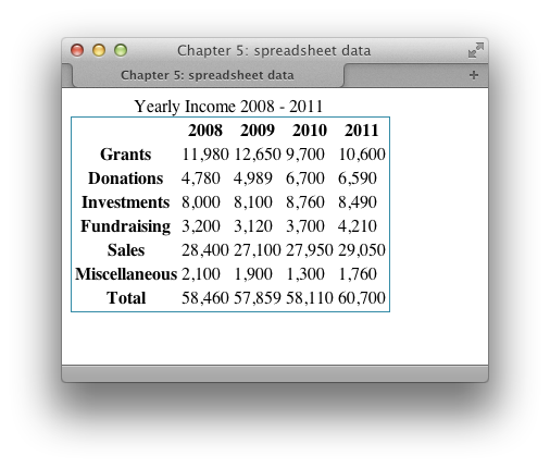
You can add borders to tables just as you can with other HTML
elements. Borders are particularly useful for tables, as they help to make
the data understandable:
This style rule will display a one-pixel, light-blue border around
your table, as in Figure 5.3.
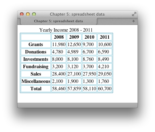
You can also add borders to individual cells:
.datatable td, .datatable th {
  border: 1px solid #73c0d4;
}
This style rule renders a slightly lighter border around td and th
table cells that have a class of datatable, as Figure 5.4
shows.
By experimenting with CSS borders on your tables, you can create
many appealing effects—even if the data contained within is dull! You
can use differently colored borders for table headings and table cells,
and apply various thicknesses and styles of border to table cells. You
might even try out such tricks as using one shade for top and left
borders, and another for bottom and right borders, to create an indented
effect.
We can apply a range of values to the CSS
border-style property. We’ve already
met solid, which displays a solid line as the border,
and this is shown along with the other available options in Figure 5.5.
Here’s the markup that will produce the preceding range of border
styles:
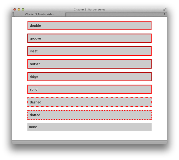
chapter_05/borderstyles.html
<!DOCTYPE html>
<html>
<head>
  <meta charset="utf-8" />
<title>Chapter 5: Border styles</title>
  <link rel="stylesheet" href="borderstyles.css" />
</head>
<body>
  <div class="wrapper">
  <div class="double">double</div>
  <div class="groove">groove</div>
  <div class="inset">inset</div>
  <div class="outset">outset</div>
  <div class="ridge">ridge</div>
  <div class="solid">solid</div>
  <div class="dashed">dashed</div>
  <div class="dotted">dotted</div>
  <div class="none">none</div>
</div>
</body>
</html>
chapter_05/borderstyles.html
body {
  background-color: #fff;
  color: #111;
  margin: 0;
  padding: 0;
  font: 1em/1.4 "Lucida Grande", "Lucida Sans Unicode",
    "Lucida Sans", Verdana, Tahoma, sans-serif;
}

.wrapper {
  width: 80%;
  margin: 20px auto 40px auto;
}

.wrapper div {
  background-color: #ccc;
  padding: 0.5em;
  margin: 0 0 1em 0;
}

.double {
  border: 4px double red
}

.groove {
  border: 4px groove red;
}

.inset {
  border: 4px inset red;
}

.outset {
  border: 4px outset red;
}

.ridge {
  border: 4px ridge red;
}

.solid {
  border: 4px solid red;
}

.dashed{
  border: 4px dashed red;
}

.dotted {
  border: 4px dotted red;
}

.none {
  border: none;
}
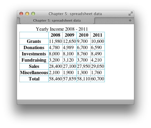
In the previous solution, after adding a border to the
th and td
elements, you can see in Figure 5.4 that there are
gaps between the borders applied to each cell. Simply setting
margin or padding to
0 won’t remove this space.
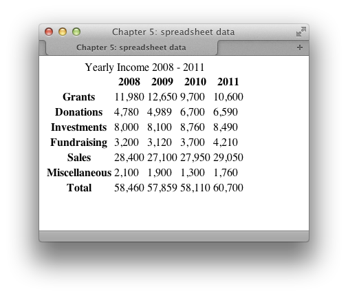
You can remove the spaces between the cells by setting the value
of the
Figure 5.6 shows the effect this has on
the example seen in Figure 5.4.
border-collapse property to
collapse:
chapter_05/table.css
.datatable {
  border: 1px solid #338ba6;
  border-collapse: collapse;
}

.datatable td, .datatable th {
  border: 1px solid #73c0d4;
}
The HTML table is the best way to structure spreadsheet data, even
though its default appearance is unattractive. Luckily, we can style the
table using CSS, which keeps markup to a minimum and allows us to control
our data table’s appearance using the stylesheet.
The data we saw displayed as an HTML table earlier in this chapter
is an example of spreadsheet data. That markup, which is shown unstyled
in Figure 5.7, forms the basis for the
following example.
Let’s apply the following stylesheet to that table:
chapter_05/spreadsheet.css
(excerpt)
body {
  background-color: #fff;
  color: #111;
  margin: 0;
  padding: 0;
  font: 0.75em/1.3 "Lucida Grande", "Lucida Sans Unicode",
    "Lucida Sans", Verdana, Tahoma, sans-serif;
}

.wrapper {
  width: 80%;
  margin: 20px auto 40px auto;
}

.datatable {
  border: 1px solid #d6dde6;
  border-collapse: collapse;
}

.datatable td {
  border: 1px solid #d6dde6;
  text-align: right;
  padding: 0.2em;
}

.datatable th {
  border: 1px solid #828282;
  background-color: #bcbcbc;
  font-weight: bold;
  text-align: left;
  padding: 0.2em;
}

.datatable caption {
  font-size: 116.7%;
  font-weight: bold;
  background-color: #b0c4de;
  color: #111;
  padding: 0.4em 0 0.3em 0;
  border: 1px solid #789ac6;
}
In this solution, I aimed to display the table in a way that’s
similar to the appearance of a desktop spreadsheet.
First I styled the table as a whole, setting the borders to
As we’ve already seen,
Here, I added a border to the table cells and used
To finish, I styled the caption to make it look visually part of
the table, as shown in Figure 5.9.
collapse:
chapter_05/spreadsheet.css
(excerpt)
.datatable {
  border: 1px solid #d6dde6;
  border-collapse: collapse;
}
border displays a border around the
outside of the table, while border-collapse removes
spaces between the table’s cells.
Next, I turned my attention to the table cells:
chapter_05/spreadsheet.css
(excerpt)
.datatable td {
  border: 1px solid #d6dde6;
  text-align: right;
  padding: 0.2em;
}
text-align to right-align their contents for that
“spreadsheety” look. If you preview the document at this point, you’ll
see a border around each cell in the table (except the header cells), as
shown in Figure 5.8.
Next, I added a border to the 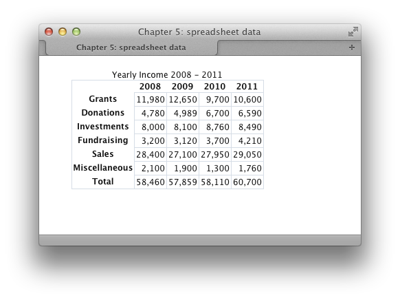
th (heading)
cells. I used a darker color for this border, because I also added a
background color to these cells to highlight that they’re headings
rather than regular cells:
chapter_05/spreadsheet.css
(excerpt)
.datatable th {
  border: 1px solid #828282;
  background-color: #bcbcbc;
  font-weight: bold;
  text-align: left;
  padding: 0.2em;
}
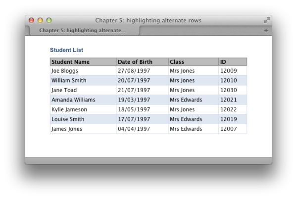
It can be difficult to stay on a particular row as your eyes work
across a large table of data. Displaying table rows in alternating colors
is a common way to help users stay focused on the row they’re on.
Using the CSS3
And here’s the CSS to style it:
The result can be seen in Figure 5.10.
nth-child selector, we can add a
different style to every other row without needing to add anything to
the markup.
Here’s the table markup for our example:
chapter_05/alternate.html
<!DOCTYPE html>
<html>
<head>
  <meta charset="utf-8" />
  <title>Chapter 5: highlighting alternate rows</title>
  <link rel="stylesheet" href="alternate.css" />
</head>
<body>
  <div class="wrapper">
    <table class="datatable">
      <caption>Student List</caption>
      <tr>
        <th scope="col">Student Name</th>
        <th scope="col">Date of Birth</th>
        <th scope="col">Class</th>
        <th scope="col">ID</th>
      </tr>
      <tr>
        <td>Joe Bloggs</td>
        <td>27/08/1997</td>
        <td>Mrs Jones</td>
        <td>12009</td>
      </tr>
      <tr>
        <td>William Smith</td>
        <td>20/07/1997</td>
        <td>Mrs Jones</td>
        <td>12010</td>
      </tr>
      <tr>
        <td>Jane Toad</td>
        <td>21/07/1997</td>
        <td>Mrs Jones</td>
        <td>12030</td>
      </tr>
      <tr>
        <td>Amanda Williams</td>
        <td>19/03/1997</td>
        <td>Mrs Edwards</td>
        <td>12021</td>
      </tr>
      <tr>
        <td>Kylie Jameson</td>
        <td>18/05/1997</td>
        <td>Mrs Jones</td>
        <td>12022</td>
      </tr>
      <tr>
        <td>Louise Smith</td>
        <td>17/07/1997</td>
        <td>Mrs Edwards</td>
        <td>12019</td>
      </tr>
      <tr>
        <td>James Jones</td>
        <td>04/04/1997</td>
        <td>Mrs Edwards</td>
        <td>12007</td>
      </tr>
    </table>
  </div>
</body>
</html>
chapter_05/alternate.css
body {
  background-color: #fff;
  color: #111;
  margin: 0;
  padding: 0;
  font: 0.75em/1.3 "Lucida Grande", "Lucida Sans Unicode",
    "Lucida Sans", Verdana, Tahoma, sans-serif;
}

.wrapper {
  width: 80%;
  margin: 20px auto 40px auto;
}

.datatable {
  width: 100%;
  border: 1px solid #d6dde6;
  border-collapse: collapse;
}

.datatable td {
  border: 1px solid #d6dde6;
  padding: 0.3em;
}

.datatable th {
  border: 1px solid #828282;
  background-color: #bcbcbc;
  font-weight: bold;
  text-align: left;
  padding-left: 0.3em;
}

.datatable caption {
  font: bold 110% Arial, Helvetica, sans-serif;
  color: #33517a;
  text-align: left;
  padding: 0.4em 0 0.8em 0;
}

.datatable tr:nth-child(odd) {
  background-color: #dfe7f2;
  color: #000000;
}
The
Prior to widespread support for this selector, we’d have to add a
class to every other row and then use the class to target the
row:
nth-child selector makes it very
easy to target the odd and even rows in your table using the keywords
odd and even:
chapter_05/alternate.css (excerpt)
.datatable tr:nth-child(odd) {
  background-color: #dfe7f2;
  color: #000;
}
.datatable tr.altrow {
  background-color: #dfe7f2;
  color: #000;
}
In Chapter 7, we will look at some
other ways to deal with the lack of support for selectors such as
nth-child in older browsers.
One way to boost the readability of tabular data is to change the
color of rows as users move the cursor over them to highlight the row
they’re reading. This can be seen in Figure 5.11.
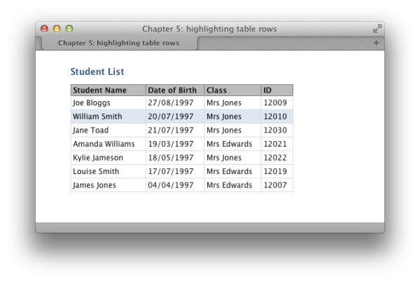
This can be a very simple solution; all you need to do is add the
following rule to your CSS:
Job done!
When we discussed
:hover on links, I mentioned
that you can also use :hover on other elements to
create attractive effects; in addition, these serve to give the user
feedback as to what they’re interacting with.
This solution will work in all modern browsers including Internet
Explorer 7—but not in Internet Explorer 6. But as long as your tables are clear,
the highlight feature could be regarded as a “nice to have,” rather than
a necessary tool.
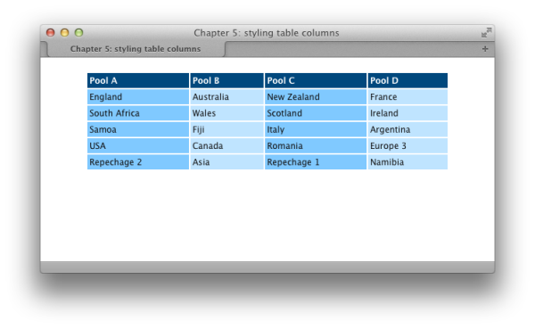
While alternate row colors are a common feature of data tables, we
see alternately colored columns less frequently. However, they can be a
helpful way to show groupings of data.
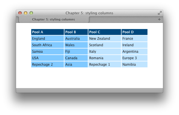
If we use the
We can add style rules for our
col element to
describe our table’s columns, we can employ CSS to add a background to
those columns. You can see the col
elements I’ve added—one for each column—in the following table
markup:
chapter_05/columns.html (excerpt)
<table class="datatable">
  <col />
  <col />
  <col />
  <col />
  <tr>
    <th>Pool A</th>
    <th>Pool B</th>
    <th>Pool C</th>
    <th>Pool D</th>
  </tr>
  <tr>
    <td>England</td>
    <td>Australia</td>
    <td>New Zealand</td>
    <td>France</td>
  </tr>
  <tr>
    <td>South Africa</td>
    <td>Wales</td>
    <td>Scotland</td>
    <td>Ireland</td>
  </tr>
  <tr>
    <td>Samoa</td>
    <td>Fiji</td>
    <td>Italy</td>
    <td>Argentina</td>
  </tr>
  <tr>
    <td>USA</td>
    <td>Canada</td>
    <td>Romania</td>
    <td>Europe 3</td>
  </tr>
  <tr>
    <td>Repechage 2</td>
    <td>Asia</td>
    <td>Repechage 1</td>
    <td>Namibia</td>
  </tr>
</table>
col elements using
nth-child as shown here; the result is depicted in
Figure 5.12:
The
Here are the styles that are applied to the
The result of this change is as shown in Figure 5.13.
col element provides us
with further flexibility for styling a table’s columns, thus making our
table attractive and easier to understand. It’s also possible to nest
col elements within a
colgroup element, which
allows us to change the column’s appearance by applying style rules to
the parent colgroup element.
Here’s an example of nested col
elements:
chapter_05/colgroups.html
(excerpt)
<table class="datatable">
  <colgroup>
    <col />
    <col />
  </colgroup>
  <colgroup>
    <col />
    <col />
  </colgroup>
  <tr>
    <th>Pool A</th>
    <th>Pool B</th>
    <th>Pool C</th>
    <th>Pool D</th>
  </tr>
colgroup element rather than col:
chapter_05/colgroups.css (excerpt)
.datatable colgroup: nth-child(odd) {
  background-color: #80c9ff;
  color: #000;
}

.datatable colgroup: nth-child(even) {
  background-color: #bfe4ff;
  color: #000;
}
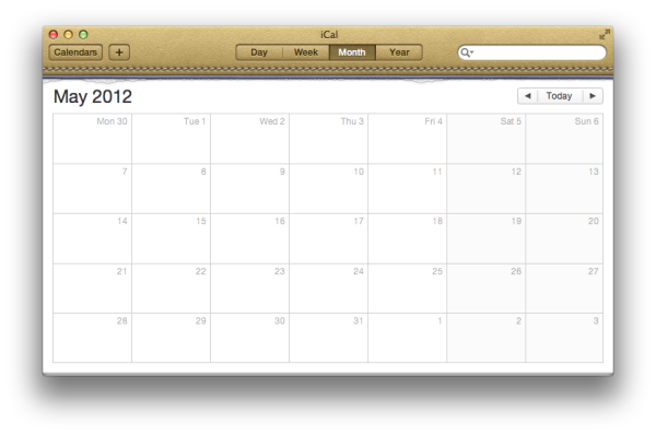
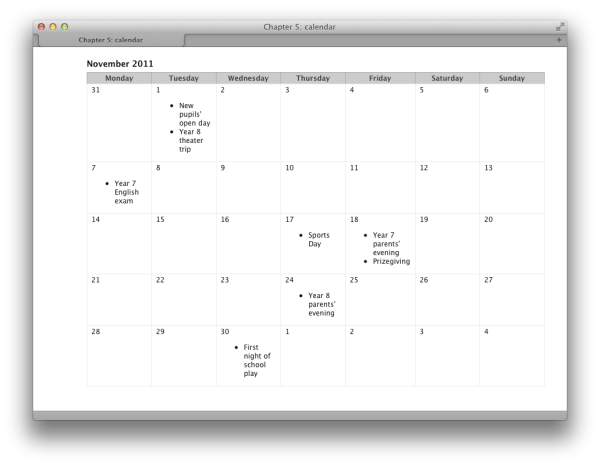
Calendars, such as the example from a desktop application in
Figure 5.14, also involve tabular data. The days of
the week along the top of the calendar represent the headings of the
columns. As such, a calendar’s display constitutes the legitimate use of a
table, but you can keep markup to a minimum by using CSS to control the
look and feel.
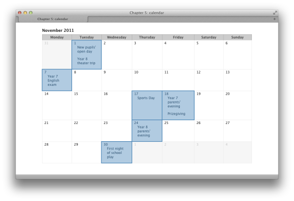
Our solution uses an accessible, simple table that
leverages CSS styles to create the attractive calendar shown in Figure 5.15. Given its basic structure, it’s ideal for
use in a database-driven application in which the table is created via
server-side code:
chapter_05/cal.html
<!DOCTYPE html>
<html>
<head>
  <meta charset="utf-8" />
  <title>Chapter 5: calendar</title>
  <link rel="stylesheet" href="cal.css" />
</head>
<body>
  <div class="wrapper">
    <table class="clmonth">
      <caption>November 2011</caption>
      <tr>
        <th scope="col">Monday</th>
        <th scope="col">Tuesday</th>
        <th scope="col">Wednesday</th>
        <th scope="col">Thursday</th>
        <th scope="col">Friday</th>
        <th scope="col">Saturday</th>
        <th scope="col">Sunday</th>
      </tr>
      <tr>
        <td class="previous">31</td>
        <td class="active">1
          <ul>
            <li>New pupils' open day</li>
            <li>Year 8 theater trip</li>
          </ul>
        </td>
        <td>2</td>
        <td>3</td>
        <td>4</td>
        <td>5</td>
        <td>6</td>
      </tr>
      <tr>
        <td class="active">7
          <ul>
            <li>Year 7 English exam</li>
          </ul>
        </td>
        <td>8</td>
        <td>9</td>
        <td>10</td>
        <td>11</td>
        <td>12</td>
        <td>13</td>
      </tr>
      <tr>
        <td>14</td>
        <td>15</td>
        <td>16</td>
        <td class="active">17
          <ul>
            <li>Sports Day</li>
          </ul>
        </td>
        <td class="active">18
          <ul>
            <li>Year 7 parents' evening</li>
            <li>Prizegiving</li>
          </ul>
        </td>
        <td>19</td>
        <td>20</td>
      </tr>
      <tr>
        <td>21</td>
        <td>22</td>
        <td>23</td>
        <td class="active">24
          <ul>
            <li>Year 8 parents' evening</li>
          </ul>
        </td>
        <td>25</td>
        <td>26</td>
        <td>27</td>
      </tr>
      <tr>
        <td>28</td>
        <td>29</td>
        <td class="active">30
          <ul>
            <li>First night of school play</li>
        </ul>
        </td>
        <td class="next">1</td>
        <td class="next">2</td>
        <td class="next">3</td>
        <td class="next">4</td>
      </tr>
    </table>
  </div>
</body>
</html>
chapter_05/cal.css
body {
  background-color: #fff;
  color: #111;
  margin: 0;
  padding: 0;
  font: 0.75em/1.3 "Lucida Grande", "Lucida Sans Unicode",
    "Lucida Sans", Verdana, Tahoma, sans-serif;
}

.wrapper {
  width: 80%;
  margin: 20px auto 40px auto;
}

.clmonth {
  border-collapse: collapse;
  width: 100%;
}

.clmonth caption {
  text-align: left;
  font-weight: bold;
  font-size: 116.7%;
  padding-bottom: 0.4em;
}

.clmonth th {
  border: 1px solid #aaa;
  border-bottom: none;
  padding: 0.2em 0.6em 0.2em 0.6em;
  background-color: #ccc;
  color: #3f3f3f;
  min-width: 8em;
}

.clmonth td {
  border: 1px solid #eaeaea;
  padding: 0.2em 0.6em 0.2em 0.6em;
  vertical-align: top;
}

.clmonth td.previous, .clmonth td.next {
  background-color: #f6f6f6;
  color: #c6c6c6;
}

.clmonth td.active {
  background-color: #b1cbe1;
  color: #2b5070;
  border: 2px solid #4682b4;
}

.clmonth ul {
  list-style-type: none;
  margin: 0;
  padding-left: 1em;
  padding-right: 0.6em;
}

.clmonth li {
  margin-bottom: 1em;
}
This example starts out as a very simple table. It has a
The table has a
The table, without CSS, displays as shown in Figure 5.16.
Now that we have the structural markup in place, we can
style the calendar. I set a standard style for the
I styled the
As you can see in Figure 5.17, our calendar is
beginning to take shape.
We can now style the list of events within each table cell,
removing the bullet and adding space between list items:
Finally, we add styles for the
caption—the month we’re working with—and I’ve
marked up the days of the week as table headers using the th element:
chapter_05/cal.html (excerpt)
<table class="clmonth">
  <caption>November 2011</caption>
  <tr>
    <th scope="col">Monday</th>
    <th scope="col">Tuesday</th>
    <th scope="col">Wednesday</th>
    <th scope="col">Thursday</th>
    <th scope="col">Friday</th>
    <th scope="col">Saturday</th>
    <th scope="col">Sunday</th>
 </tr>
class of
clmonth. I’ve used a class rather
than an ID because, in some situations, you might want to display more
than one month on the page. If you then found that you needed to give
the table an ID—perhaps to allow you to show and hide the table using
JavaScript—you could add an ID as well as the class.
The days are held within individual table cells, and the events
for each day are marked up as a list within the appropriate table
cell.
In the following markup, you can see that I’ve added classes to
two of the table cells. The class previous is applied to cells containing days
that fall within the preceding month (we’ll use next later for days in the following month),
while the class active is applied to
cells that contain event information, so that we may highlight
them:
chapter_05/cal.html (excerpt)
<tr>
  <td class="previous">31</td>
  <td class="active">1
    <ul>
      <li>New pupils' open day</li>
      <li>Year 8 theater trip</li>
    </ul>
  </td>
  <td>2</td>
  <td>3</td>
  <td>4</td>
  <td>5</td>
  <td>6</td>
</tr>
body, including a base font size. Then I set a
style for the class clmonth for the
borders to collapse, leaving no space between cells:
chapter_05/cal.css (excerpt)
body {
  background-color: #fff;
  color: #111;
  margin: 0;
  padding: 0;
  font: 0.75em/1.3 "Lucida Grande", "Lucida Sans Unicode",
    "Lucida Sans", Verdana, Tahoma, sans-serif;
}

.wrapper {
  width: 80%;
  margin: 20px auto 40px auto;
}

.clmonth {
  border-collapse: collapse;
}
caption within the
class clmonth, then created styles
for the table headers (th) and table
cells (td):
chapter_05/cal.css (excerpt)
.clmonth caption {
  text-align: left;
  font-weight: bold;
  font-size: 116.7%;
  padding-bottom: 0.4em;
}

.clmonth th {
  border: 1px solid #aaa;
  border-bottom: none;
  padding: 0.2em 0.6em 0.2em 0.6em;
  background-color: #ccc;
  color: #3f3f3f;
  min-width: 8em;
}

.clmonth td {
  border: 1px solid #eaeaea;
  padding: 0.2em 0.6em 0.2em 0.6em;
  vertical-align: top;
}
chapter_05/cal.css (excerpt)
.clmonth ul {
  list-style-type: none;
  margin: 0;
  padding-left: 1em;
  padding-right: 0.6em;
}

.clmonth li {
  margin-bottom: 1em;
}
previous and next classes, giving the effect of graying
out the days not part of the current month. We also style the active class, which highlights those days on
which events take place:
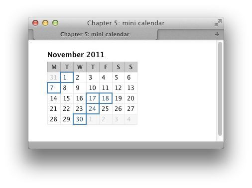
This is just one of many ways to create a calendar. Online
calendars are commonly used on blogs, where they have clickable days,
and visitors can view entries made that month. By removing the events
from our HTML markup, representing the day names with single letters—M
for Monday, and so on—and making a few simple changes to our CSS, we can
create a simple mini calendar that’s suitable for this purpose, like the
one shown in Figure 5.18.
Here’s the HTML and CSS you’ll need to create this version of the
calendar:
chapter_05/cal_mini.html
<!DOCTYPE html>
<html>
<head>
<meta charset="utf-8" />
<title>Chapter 5: mini calendar</title>
<link rel="stylesheet" href="cal_mini.css" />
</head>
<body>
<div class="wrapper">
<table class="clmonth">
<caption>November 2011</caption>
<tr>
<th scope="col">M</th>
<th scope="col">T</th>
<th scope="col">W</th>
<th scope="col">T</th>
<th scope="col">F</th>
<th scope="col">S</th>
<th scope="col">S</th>
</tr>
<tr>
<td class="previous">31</td>
<td class="active">1</td>
<td>2</td>
<td>3</td>
<td>4</td>
<td>5</td>
<td>6</td>
</tr>
<tr>
<td class="active">7</td>
<td>8</td>
<td>9</td>
<td>10</td>
<td>11</td>
<td>12</td>
<td>13</td>
</tr>
<tr>
<td>14</td>
<td>15</td>
<td>16</td>
<td class="active">17</td>
<td class="active">18</td>
<td>19</td>
<td>20</td>
</tr>
<tr>
<td>21</td>
<td>22</td>
<td>23</td>
<td class="active">24</td>
<td>25</td>
<td>26</td>
<td>27</td>
</tr>
<tr>
<td>28</td>
<td>29</td>
<td class="active">30</td>
<td class="next">1</td>
<td class="next">2</td>
<td class="next">3</td>
<td class="next">4</td>
</tr>
</table>
</div>
</body>
</html>
chapter_05/cal_mini.css
body {
background-color: #fff;
color: #111;
margin: 0;
padding: 0;
font: 0.75em/1.3 "Lucida Grande", "Lucida Sans Unicode",
"Lucida Sans", Verdana, Tahoma, sans-serif;
}
.wrapper {
width: 80%;
margin: 20px auto 40px auto;
}
.clmonth {
border-collapse: collapse;
}
.clmonth caption {
text-align: left;
font-weight: bold;
font-size: 116.7%;
padding-bottom: 0.4em;
}
.clmonth th {
border: 1px solid #aaa;
border-bottom: none;
padding: 0.2em 0.4em 0.2em 0.4em;
background-color: #ccc;
color: #3f3f3f;
}
.clmonth td {
border: 1px solid #eaeaea;
padding: 0.2em 0.4em 0.2em 0.4em;
vertical-align: top;
}
.clmonth td.previous, .clmonth td.next {
  background-color: #f6f6f6;
  color: #c6c6c6;
}

.clmonth td.active {
  background-color: #b1cbe1;
  color: #2b5070;
  border: 2px solid #4682b4;
}
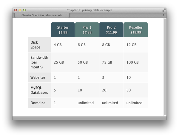
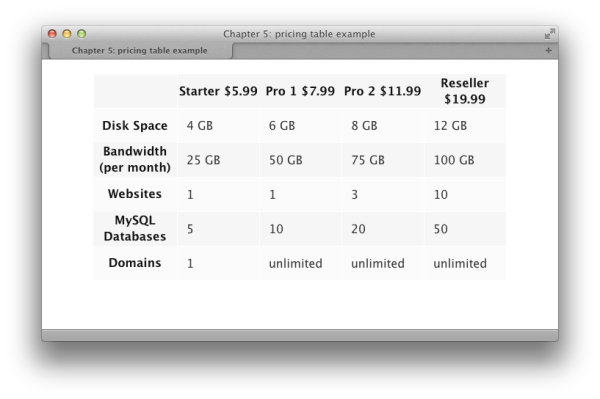
Pricing tables are a customary feature of websites offering a range
of pricing plans. We can have a look at a common example—a pricing table
for a web-hosting company—to see how we can combine some of tricks we’ve
covered in this chapter to style a more complicated table.
The table in Figure 5.19 is created using the
following markup and CSS:
chapter_05/pricing.html
<!DOCTYPE html>
<html>
<head>
  <meta charset="utf-8" />
  <title>Chapter 5: pricing table example</title>
  <link rel="stylesheet" href="pricing.css" />
</head>
<body>
  <div class="wrapper">
    <table class="pricing">
      <col />
      <col />
      <col />
      <col />
      <col />
      <tr>
        <td></td>
        <th scope="col">Starter
        <span class="price">$5.99</span></th>
        <th scope="col">Pro 1
        <span class="price">$7.99</span></th>
        <th scope="col">Pro 2
        <span class="price">$11.99</span></th>
        <th scope="col">Reseller
        <span class="price">$19.99</span></th>
      </tr>
      <tr>
        <th scope="row">Disk Space</th>
        <td>4 GB</td>
        <td>6 GB</td>
        <td>8 GB</td>
        <td>12 GB</td>
      </tr>
      <tr>
        <th scope="row">Bandwidth (per month)</th>
        <td>25 GB</td>
        <td>50 GB</td>
        <td>75 GB</td>
        <td>100 GB</td>
      </tr>
      <tr>
        <th scope="row">Websites</th>
        <td>1</td>
        <td>1</td>
        <td>3</td>
        <td>10</td>
      </tr>
      <tr>
        <th scope="row">MySQL Databases</th>
        <td>5</td>
        <td>10</td>
        <td>20</td>
        <td>50</td>
      </tr>
      <tr>
        <th scope="row">Domains</th>
        <td>1</td>
        <td>unlimited</td>
        <td>unlimited</td>
        <td>unlimited</td>
      </tr>
    </table>
  </div>
</body>
</html>
chapter_05/pricing.css
body {
  background-color: #fff;
  color: #111;
  margin: 0;
  padding: 0;
  font: 1em/1.4 "Lucida Grande", "Lucida Sans Unicode",
    "Lucida Sans", Verdana, Tahoma, sans-serif;
}

.wrapper {
  width: 80%;
  margin: 20px auto 40px auto;
}

.pricing {
  border-collapse: collapse;
}

.pricing col {
  width: 7em;
}

.pricing col:first-child {
  width: auto;
}

.pricing td {
  color: rgb(51,51,51);
  border: 1px solid rgb(255,255,255);
  padding: 0.75em;
}

.pricing tr:nth-child(odd) {
  background-color: rgb(246,246,246);
}

.pricing tr:nth-child(odd):hover td {
  background-color: rgba(59,87,98,.2);
}

.pricing tr:nth-child(even) {
  background-color: rgba(246,246,246,.5);
}

.pricing tr:nth-child(even):hover td {
  background-color: rgba(91,124,121,.2);
}

.pricing tr:first-child, .pricing tr:first-child:hover td {
  background-color: transparent;
}

.pricing th[scope="col"] {
  background-color: rgb(59,87,98);
  color: rgb(255,255,255);
  border: 1px solid rgb(255,255,255);
  font-weight: normal;
  padding: 0.75em;
  -moz-border-radius-topleft: 10px;
  -moz-border-radius-topright: 10px;
  -moz-border-radius-bottomright: 0px;
  -moz-border-radius-bottomleft: 0px;
  -webkit-border-radius: 10px 10px 0px 0px;
  border-radius: 10px 10px 0px 0px;
  text-shadow: 1px 1px 3px #111111;
}

.pricing th[scope="col"]:nth-child(odd) {
  background-color: rgb(91,124,121);
}

.pricing th span.price {
  display: block;
  padding: 0.2em 0 0 0;
  font-size: 87.5%;
  font-weight: bold;
}

.pricing th[scope="row"] {
  background-color: rgb(232,232,232);
  color: rgb(0,0,0);
  border: 1px solid rgb(255,255,255);
  padding: 0.75em;
  font-weight: normal;
  text-align: left;
}

.pricing tr:nth-child(odd) th[scope="row"] {
  background-color: rgba(232,232,232,.5);
}
This solution really pulls together much of what we’ve covered in
this chapter. I start out with my pricing information marked up as a
table. The table has headers (
I next look at the
I’ve yet to give my
If we take a look at the table now, we can see this effect:
I am now going to look at the headings for the columns. These can
be targeted separately from the
I can now take a look at the headings down the left, selecting
these with an attribute selector and adding some style information.
Again, I’m using
A final rule removes the
background color from the heading row, both on the
The nice aspect about this solution is that I’ve had no need to
add very much in the way of classes or additional markup to be able to
style it. I’ve used the correct markup for a table, and then used that
markup as a way to attach CSS to the table to make it look
appealing.
th
elements) across the top and down the left-hand side; I’ve used the
scope attribute to
explain which fields the headers are for, and this attribute becomes
useful once we start to add CSS.
In my CSS, the first task is set
border-collapse to collapse, and
then use the col element to give my
columns a width. After setting all the columns to 7em, I then use
first-child to target the very first
column and set the width back to
auto, allowing the longer headers to take up more
space:
chapter_05/pricing.css (excerpt)
.pricing {
  border-collapse: collapse;
}

.pricing col {
  width: 7em;
}

.pricing col:first-child {
  width: auto;
}
td elements
within my table—adding a color,
border, and padding:
chapter_05/pricing.css (excerpt)
.pricing td {
  color: rgb(51,51,51);
  border: 1px solid rgb(255,255,255);
  padding: 0.75em;
}
td elements
a background color as I’m going to set this on the rows using
nth-child to create a striped table effect:
chapter_05/pricing.css (excerpt)
.pricing tr:nth-child(odd) {
  background-color: rgb(246,246,246);
}

.pricing tr:nth-child(even) {
  background-color: rgba(246,246,246,.5);
}
th
elements down the left-hand side by using an attribute selector and
looking for scope="col". I’m styling my headings to
look a bit like tabs by using border-radius to
round the top corners, and adding a text shadow to the text. Then I use
nth-child to select every other heading
for a different background-color. Finally, I style
the span element within each heading
that contains the pricing information:
chapter_05/pricing.css (excerpt)
.pricing th[scope="col"] {
  background-color: rgb(59,87,98);
  color: rgb(255,255,255);
  border: 1px solid rgb(255,255,255);
  font-weight: normal;
  padding: 0.75em;
  -moz-border-radius-topleft: 10px;
  -moz-border-radius-topright: 10px;
  -moz-border-radius-bottomright: 0px;
  -moz-border-radius-bottomleft: 0px;
  -webkit-border-radius: 10px 10px 0px 0px;
  border-radius: 10px 10px 0px 0px;
  text-shadow: 1px 1px 3px #111111;
}

.pricing th[scope="col"]:nth-child(odd) {
  background-color: rgb(91,124,121);
}

.pricing th span.price {
  display: block;
  padding: 0.2em 0 0 0;
  font-size: 87.5%;
  font-weight: bold;
}
nth-child to stripe these heading
rows:
Now for some final touches. On :hover of a
table row, I change the rgba alpha value of the
td to give a visual indication of the
rollover:
chapter_05/pricing.css (excerpt)
.pricing tr:nth-child(odd):hover td {
  background-color: rgba(59,87,98,.2);
}

.pricing tr:nth-child(even):hover td {
  background-color: rgba(91,124,121,.2);
}
tr and on the td when hovered, so that no background color
displays behind the tabs:
chapter_05/pricing.css (excerpt)
.pricing tr:first-child, .pricing tr:first-child:hover td {
  background-color: transparent;
}
In this chapter, we’ve discovered that tables are alive and
well—when used for their original purpose of displaying tabular data, that
is! CSS gives you the ability to turn data tables into really attractive
interface items, without negatively impacting their accessibility. So,
please, embrace tables and use them to display tabular data—that’s their
job!
..................Content has been hidden....................
You can't read the all page of ebook, please click here login for view all page.