While writing the fourth edition of this book, it’s apparent how
practical and usable CSS has become since the previous edition. In just
under two years, we’ve gone from CSS3 being an attractive but
hard-to-implement concept, to being able to put much of what it offers into
practice. We now have improved ways to create many design effects, from
shadows to rounded corners. We’re able to precisely target elements in our
pages with CSS3 selectors, and can eliminate clutter to our markup when
styling page elements.
When using CSS for layout purposes, however, there’s been less
progress. Our basic tools are those we discussed in Chapter 8: floating, positioning, and clearing elements
to create layout. This chapter will show you how to use those building
blocks in practical ways.
One area that has rapidly evolved recently is in providing support for
smartphones, tablets, and other mobile devices—in a myriad of screen
sizes—to access the Web. We’ll spend much of this chapter exploring the area
of responsive design, and how we can use traditional layout techniques to
create designs that display neatly across a range of devices. Modern web
design simply must heed the rising popularity of mobile browsing.
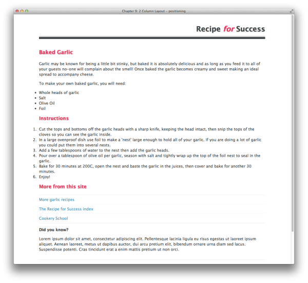
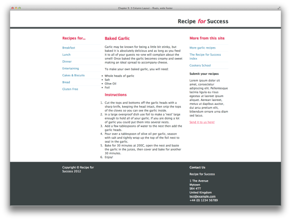
If you’re new to using CSS for layout purposes, the first trick you
might want to know is how to organize your content into two columns, as in
Figure 9.1.
The markup and CSS that follows will create a simple fixed-width
layout using positioning to control how the columns display in a
browser:
chapter_09/2col-positioning.html
<!DOCTYPE html>
<html>
<head>
  <meta charset="utf-8" />
  <title>Chapter 9: 2 Column Layout - positioning</title>
  <link rel="stylesheet" href="2col-positioning.css" />
</head>
<body>
  <div class="wrapper">
    <div class="header">
      <h1>Recipe <span>for</span> Success</h1>
    </div>
    <div class="main">
      <div class="article">
        <h1>Baked Garlic</h1>

        <p>Garlic may be known for being a little bit stinky, but
          baked it is absolutely delicious and as long as you feed
          it to all of your guests no-one will complain about the
          smell! Once baked the garlic becomes creamy and sweet
          making an ideal spread to accompany cheese.</p>
        <p>To make your own baked garlic, you will need:</p>

        <ul class="ingredients">
          <li>Whole heads of garlic</li>
          <li>Salt</li>
          <li>Olive Oil</li>
          <li>Foil</li>
        </ul>

        <h2>Instructions</h2>

        <ol>
          <li>Cut the tops and bottoms off the garlic heads with a
            sharp knife, keeping the head intact, then snip the
            tops of the cloves so you can see the garlic inside.
            </li>
          <li>In a large ovenproof dish use foil to make a 'nest'
            large enough to hold all of your garlic. If you are
            doing a lot of garlic you could put them into several
            nests.</li>
          <li>Add a few tablespoons of water to the nest then add
            the garlic heads.</li>
          <li>Pour over a tablespoon of olive oil per garlic,
            season with salt and tightly wrap up the top of the
            foil nest to seal in the garlic.</li>
          <li>Bake for 30 minutes at 200C, open the nest and baste
            the garlic in the juices, then cover and bake for
            another 30 minutes.</li>
          <li>Enjoy!</li>
        </ol>
      </div>

      <div class="aside">
        <h2>More from this site</h2>
        <ul class="nav">
          <li><a href="">More garlic recipes</a></li>
          <li><a href="">The Recipe for Success index</a></li>
          <li><a href="">Cookery School</a></li>
        </ul>

        <div class="box">
          <h3>Did you know?</h3>
          <p>Lorem ipsum dolor sit amet, consectetur adipiscing
            elit. Pellentesque lacinia ligula eu risus egestas ut
            laoreet ipsum aliquet. Aenean laoreet, metus ut dapibus
            auctor, dui arcu pretium elit, bibendum ornare urna diam
            sed lacus. Suspendisse potenti. Cras tincidunt erat a
            enim mattis pretium ut non orci.</p>
        </div>

        <div class="box">
          <h3>Submit your recipes</h3>
          <p>Lorem ipsum dolor sit amet, consectetur adipiscing
            elit. Pellentesque lacinia ligula eu risus egestas ut
            laoreet ipsum aliquet. Aenean laoreet, metus ut dapibus
            auctor, dui arcu pretium elit, bibendum ornare urna diam
            sed lacus. </p>
          <p><a href="">Send it to us here!</a></p>
        </div>
      </div>
    </div>
  </div>
</body>
</html>
chapter_09/2col-positioning.css
body {
  background-color: rgb(255,255,255);
  color: rgb(59,67,68);
  margin: 0;
  padding: 0;
  font: 1em/1.4 "Lucida Grande", "Lucida Sans Unicode",
    "Lucida Sans", Verdana, Tahoma, sans-serif;
}

h1, h2, h3 {
  margin: 0;
  padding: 0 0 1em 0;
  text-shadow: 1px 1px 2px rgba(0,0,0,0.3);
}

ul, ol, p {
  margin:0;
  padding: 0 0 1em 0;
}


h1 {
  font-size: 137.5%;
  color: rgb(241,47,93);
}

h2 {
  font-size: 125%;
  color: rgb(241,47,93);
}

h3 {
  font-size: 100%;
}

a:link, a:visited {
  color: rgba(241,47,93,0.8);
}

a:hover {
  color: rgb(241,47,93);
  text-decoration: none;
}

.nav {
  list-style-type: none;
  padding: 0;
}

.nav a:link, .nav a:visited {
  text-decoration: none;
  display: block;
  border-top: 1px solid rgb(232,243,248);
  padding: 0.5em 0 0.5em 0;
  color: rgb(66,148,182);
}

.nav a:hover {
  background-color: rgba(232,243,248,0.3);
}

.box {
  border-top: 1px solid rgb(219,230,236);
  padding: 1em 0 1em 0;
}

.wrapper {
  width: 940px;
  margin: 0 auto 0 auto;
}

.header {
  text-align: right;
  padding: 40px 0 0 0;
  border-bottom: 8px solid rgb(59,67,68);
  margin-bottom: 40px;
}

.header h1 {
  font-size: 187.5%;
  border-bottom: 1px solid rgb(59,67,68);
  margin-bottom: 2px;
  padding-bottom: 10px;
  color: rgb(59,67,68);
}

.header h1 span {
  font-style: italic;
  color: rgb(241,47,93);
}

.main {
  position: relative;
}

.article {
  position: absolute;
  top: 0;
  left: 0;
  width: 540px;
}

.aside {
  width: 300px;
  position: absolute;
  top: 0;
  right: 0;
}
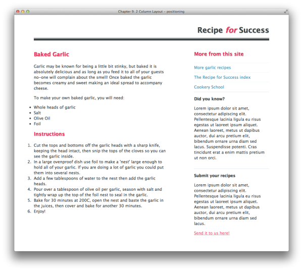
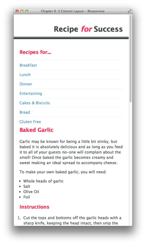
Our design starts out, as always, as a marked-up HTML document. We
then add some CSS to style the text in the document. After doing so, the
page displays in a linear fashion as in Figure 9.2.
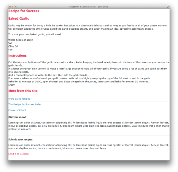
Our first task is to fix the width of the layout area and
center it within the browser viewport:
The layout is now centered, as seen in Figure 9.3.
We can now have a look at the header, where the CSS is very
simple. We just align the text
To arrange the two columns using absolute positioning, I first
need to create a positioning context for them. If I use
Our simple two-column layout is complete. This technique can be
used anywhere in a layout—from major columns of content to small
elements within a container. We’ll discover some weaknesses with
positioning in the next section, but you should still find it useful in
some contexts.
right and then add
padding to the header and the h1 within it, along
with some simple rules to style the text. The CSS follows, and you can
see the result in Figure 9.4:
chapter_09/2col-positioning.css
(excerpt)
.header {
  text-align: right;
  padding: 40px 0 0 0;
  border-bottom: 8px solid rgb(59,67,68);
  margin-bottom: 40px;
}

.header h1 {
  font-size: 187.5%;
  border-bottom: 1px solid rgb(59,67,68);
  margin-bottom: 2px;
  padding-bottom: 10px;
  color: rgb(59,67,68);
}
position: absolute, they’ll position themselves
against the viewport; I actually want to place them within the main area
of my document, below the header.
My markup has a div that wraps
both columns; it has a class of
main. I set position:
relative on the div so that
it creates a positioning context—the container for my two
columns:
Now I simply position my two columns within this container. I set
article and aside to position:
absolute. Then I position article
top and
left within this container, and aside
top and
right:
chapter_09/2col-positioning.css
(excerpt)
.article {
position: absolute;
top: 0;
left: 0;
width: 540px;
}
.aside {
width: 300px;
position: absolute;
top: 0;
right: 0;
}
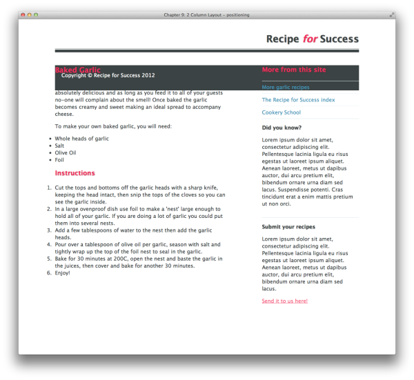
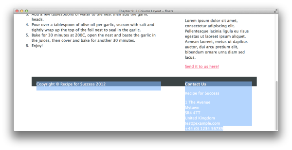
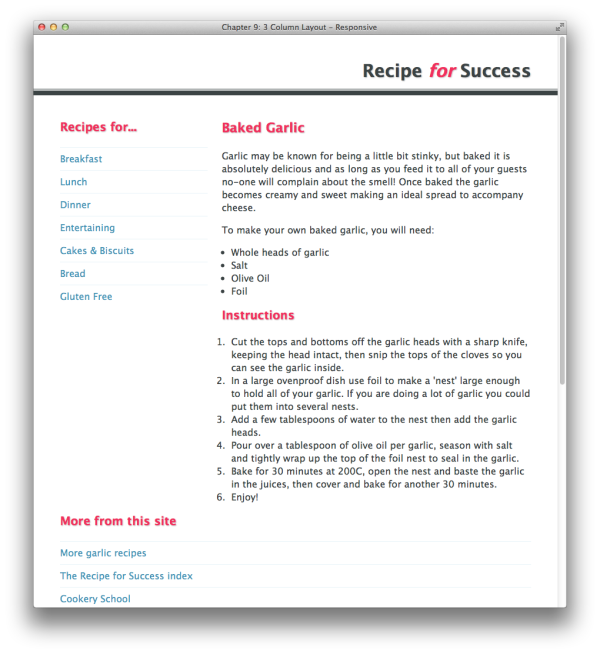
Our simple positioned layout has a weakness, and we can discover
what it is by adding a footer to the layout. As our items are positioned,
they’re removed from the document flow, so the footer acts as if they’re
not there at all, displaying across the content rather than below the two
columns. You can see this rather unpleasant effect in Figure 9.5.
To allow for a footer that will sit below the columns, we need a
different approach to our layout. One of the more popular and
cross-browser-friendly approaches is to use floats. Figure 9.6 shows how floats can be used to position two
columns.
The markup we’ll use is more or less the same as in the section called “How do I create a two-column layout?
” The containing div
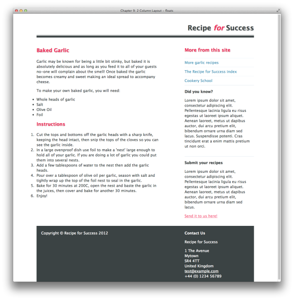
main is unnecessary, so there’s no need to
create a new positioning context when using floats, and we’ve added the
footer
div within the wrapper:
chapter_09/2col-float.html
<!DOCTYPE html>
<html>
<head>
<meta charset="utf-8" />
<title>Chapter 9: 2 Column Layout - floats</title>
<link rel="stylesheet" href="2col-float.css" />
</head>
<body>
<div class="wrapper">
<div class="header">
<h1>Recipe <span>for</span> Success</h1>
</div>
<div class="article">
<h1>Baked Garlic</h1>
<p>Garlic may be known for being a little bit stinky, but
baked it is absolutely delicious and as long as you feed
it to all of your guests no-one will complain about the
smell! Once baked the garlic becomes creamy and sweet
making an ideal spread to accompany cheese.</p>
<p>To make your own baked garlic, you will need:</p>
<ul class="ingredients">
<li>Whole heads of garlic</li>
<li>Salt</li>
<li>Olive Oil</li>
<li>Foil</li>
</ul>
<h2>Instructions</h2>
<ol>
<li>Cut the tops and bottoms off the garlic heads with a
sharp knife, keeping the head intact, then snip the tops
of the cloves so you can see the garlic inside.</li>
<li>In a large ovenproof dish use foil to make a 'nest'
large enough to hold all of your garlic. If you are doing
a lot of garlic you could put them into several nests.
</li>
<li>Add a few tablespoons of water to the nest then add the
garlic heads.</li>
<li>Pour over a tablespoon of olive oil per garlic, season
with salt and tightly wrap up the top of the foil nest to
seal in the garlic.</li>
<li>Bake for 30 minutes at 200C, open the nest and baste the
garlic in the juices, then cover and bake for another
30 minutes.</li>
<li>Enjoy!</li>
</ol>
</div>
<div class="aside">
<h2>More from this site</h2>
<ul class="nav">
<li><a href="">More garlic recipes</a></li>
<li><a href="">The Recipe for Success index</a></li>
<li><a href="">Cookery School</a></li>
</ul>
<div class="box">
<h3>Did you know?</h3>
<p>Lorem ipsum dolor sit amet, consectetur adipiscing
elit. Pellentesque lacinia ligula eu risus egestas ut
laoreet ipsum aliquet. Aenean laoreet, metus ut dapibus
auctor, dui arcu pretium elit, bibendum ornare urna diam
sed lacus. Suspendisse potenti. Cras tincidunt erat a
enim mattis pretium ut non orci.</p>
</div>
<div class="box">
<h3>Submit your recipes</h3>
<p>Lorem ipsum dolor sit amet, consectetur adipiscing
elit. Pellentesque lacinia ligula eu risus egestas ut
laoreet ipsum aliquet. Aenean laoreet, metus ut dapibus
auctor, dui arcu pretium elit, bibendum ornare urna diam
sed lacus. </p>
<p><a href="">Send it to us here!</a></p>
</div>
</div>
<div class="footer cf">
<p class="copy">Copyright © Recipe for Success 2012</p>
<div class="vcard">
<h3>Contact Us</h3>
<p class="fn org">Recipe for Success</p>
<div class="adr">
<div class="street-address">1 The Avenue</div>
<div class="Locality">Mytown</div>
<div class="postal-code">SR4 4TT</div>
<div class="country-name">United Kingdom</div>
<div><a class="email" href="mailto:[email protected]">
[email protected]</a></div>
<div class="tel value">+44 (0) 1234 56789</div>
</div>
</div>
</div>
</div>
</body>
</html>
chapter_09/2col-float.css
(excerpt)
.article {
float: left;
width: 540px;
}
.aside {
width: 300px;
float: right;
}
.footer {
clear: both;
background-color: rgb(59,67,68);
color: rgb(255,255,255);
padding: 20px;
overflow:auto;
}
.footer .copy {
float: left;
width: 520px;
}
.footer .vcard {
float: right;
width: 280px;
}
.footer a:link, .footer a:visited {
color: rgb(255,255,255);
}
While the
We can then set the
We’re going to use
Now try refreshing the browser: most of the footer has
disappeared! What on earth has happened?
If you highlight the text as in Figure 9.8,
you can see that the footer element is still there. What’s happened is
that the background color of the footer has collapsed to the same height
as the padding on the top and bottom of the
float property takes elements out
of the normal document flow and changes the way they relate to other
elements, it also enables them to be cleared. So an element—the footer
in this instance—can be set to clear: both and then
display below the floated elements.
To display our columns using float rather
than position simply involves removing the
position, top,
left, and right properties;
instead, we use float set to
left and right,
respectively:
chapter_09/2col-float.css
(excerpt)
.article {
float: left;
width: 540px;
}
.aside {
width: 300px;
float: right;
}
clear property on our
footer:
chapter_09/2col-float.css
(excerpt)
.footer {
clear: both;
background-color: rgb(59,67,68);
color: rgb(255,255,255);
padding: 20px;
}
float again on elements
within our footer, and this will give us a chance to look at some of the
potential issues you might encounter when using
float and clear.
I’ve set a background color and some padding on my footer, which
now displays as in Figure 9.7.
I want my copyright content to display in the left column,
matching the 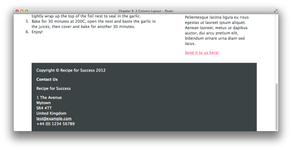
article
div above it, and the contact information to
display in the right column, lining up underneath the aside
div.
Once again, we float these left and right—the width of each being 10
pixels narrower than the columns above to account for the padding on the
footer:
chapter_09/2col-float.css
(excerpt)
.footer .copy {
float: left;
width: 520px;
}
.footer .vcard {
float: right;
width: 280px;
}
footer
div: ten pixels. The copyright statement and
contact text have their color set to
white, so they disappear against the white page
background.
The reason why the footer background has disappeared is that the
two columns of content have been taken out of the normal flow using
float. The solution is to set a
clear below these two columns—just as the footer
itself clears the main two columns on the page.
You are now encountering one of the most-discussed and troubling
issues of layout using floats: how to self-clear a page
element.
There’s no markup below our two footer columns to which we can
add a
clear property. A very basic solution would
be to add a bit of redundant markup in the form of a div with a class of clear:
<div class="footer">
<p class="copy">Copyright © Recipe for Success 2012</p>
<div class="vcard">
<h3>Contact Us</h3>
<p class="fn org">Recipe for Success</p>
<div class="adr">
<div class="street-address">1 The Avenue</div>
<div class="Locality">Mytown</div>
<div class="postal-code">SR4 4TT</div>
<div class="country-name">United Kingdom</div>
<div><a class="email" href="mailto:[email protected]">
[email protected]</a></div>
<div class="tel value">+44 (0) 1234 56789</div>
</div>
</div>
<div class="clear"></div>
</div>
Now set the class .clear to clear:
both:
.clear {
clear: both;
}
This will clear the footer; however, it’s a relatively inelegant
approach! I’m going to show you some other solutions, all of which are
valid ways to clear floats. Knowing a few methods is handy, as floats
can trigger odd layout bugs (especially in older versions of Internet
Explorer). Having a few tricks up your sleeve means if one technique
is giving you problems, you can try another.
If you float an element or elements within a wrapping element
that is itself floated, that wrapping element will then safely
contain the inner floated elements, and all your floated elements
will display according to plan. So, in our example, if we float
.footer left, it will contain our inner, floated
elements, and the footer will display in full:
.footer {
clear: both;
background-color: rgb(59,67,68);
color: rgb(255,255,255);
padding: 20px;
float: left;
width: 900px;
}
The main problem with floating a containing element in this
manner is that, when floating an element, you need to give it an
explicit width, and this may not always be preferable or possible.
Even in situations where it is, declaring widths on internal
elements of your pages makes them less flexible if they’re used
elsewhere across your site (for instance, the width may be incorrect
for the dimensions of another page). You also need to calculate
margins and padding carefully. In our example, we’d need to set a
width of 900 pixels, taking into account the 20 pixels on each side
of the footer.
Another trick that will cause a wrapper to neatly contain
floated elements is to set
overflow: auto or
overflow: hidden on the container. Watch out for
any content that might extend beyond the container (for example, a
long URL that does not wrap), as it will either generate a scrollbar
if the overflow is set to
auto, or will fail to show if the
overflow is set to
hidden:
.footer {
clear: both;
background-color: rgb(59,67,68);
color: rgb(255,255,255);
padding: 20px;
overflow: auto;
}
Those warnings aside, this is a very simple technique that you
can use in many situations.
Another technique you may come across is known as the clearfix
hack. I tend to avoid using it in my work, though, as the previous
two methods suffice in most situations. There are a few versions of
the clearfix hack, but they use generated content to add markup that
clears the container. The example we’ve used in this case is
explained on
Nicolas
Gallagher’s site:
In our layout, we’d add the class
chapter_09/2col-float.css
(excerpt)
/* For modern browsers */
.cf:before,
.cf:after {
content:"";
display: table;
}
.cf:after {
clear: both;
}
/* For IE 6/7 (trigger hasLayout) */
.cf {
zoom:1;
}
cf to the footer, like this:
The float would then self-clear.
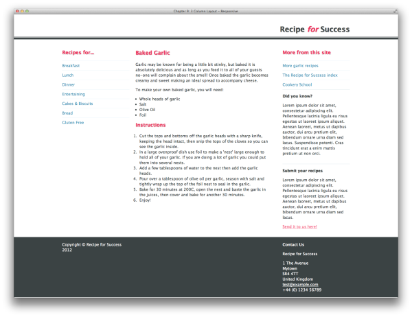
We’ve explored a basic two-column page set-up, but how easy is it to
add a third column to our fixed-width layout, perhaps to add some
subnavigation?
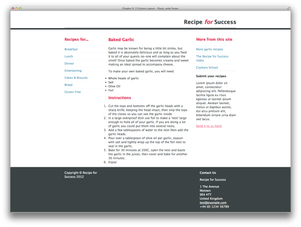
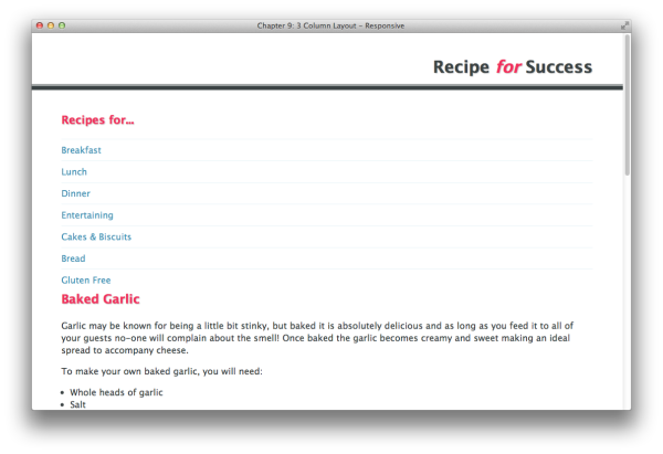
Adding a third column to take care of subnavigation is actually
quite simple. We can just add our subnavigation element structure to the
existing markup, float it left, and then adjust our other columns to
give it some space. The markup and CSS follow, and the result can be
seen in Figure 9.9:
chapter_09/3col-float.html
(excerpt)
<!DOCTYPE html>
<html>
<head>
<meta charset="utf-8" />
<title>Chapter 9: 3 Column Layout - floats</title>
<link rel="stylesheet" href="3col-float.css" />
</head>
<body>
<div class="wrapper">
<div class="header">
<h1>Recipe <span>for</span> Success</h1>
</div>
<div class="subnav">
<h2>Recipes for...</h2>
<ul class="nav">
<li><a href="">Breakfast</a></li>
<li><a href="">Lunch</a></li>
<li><a href="">Dinner</a></li>
<li><a href="">Entertaining</a></li>
<li><a href="">Cakes & Biscuits</a></li>
<li><a href="">Bread</a></li>
<li><a href="">Gluten Free</a></li>
</ul>
</div>
<div class="article">
<h1>Baked Garlic</h1>
<p>
…
</p>
</div>
<div class="aside">
…
</div>
<div class="footer">
<p>
…
</p>
</div>
</div>
</body>
</html>

When you add an extra column to your layout, you need to ensure
that all your width calculations are correct. In our two-column layout,
we could just float our
.article and .aside elements left
and right; because the total width of the two combined was less than the
940-pixel total width of the wrapper, a natural gap was left between
them.
With a three-column layout, we float both
.subnav and .article left. If
there was no right-hand margin on .subnav, there
would be no space between the two elements, but adding a 20-pixel right
margin to .subnav creates a gutter between them,
ensuring the text in each column does not abut.
The layout that we have been working on so far is completely
contained within a 940-pixel wrapper. This means that the dark-gray header
and footer bars stop at 940 pixels wide. A common site design structure
involves a fixed central content area that allows the background color on
some or all of the containers to bleed out to the edges of the viewport,
as seen in Figure 9.10. So how is this
achieved?
We need to make a few changes to our markup to enable a wide
footer:
chapter_09/3col-wide-footer.html
(excerpt)
<!DOCTYPE html>
<html>
<head>
<meta charset="utf-8" />
<title>Chapter 9: 3 Column Layout - floats, wide footer</title>
<link rel="stylesheet" href="3col-wide-footer.css" />
</head>
<body>
<div class="header">
<div class="inner">
<div class="wrapper">
<h1>Recipe <span>for</span> Success</h1>
</div>
</div>
</div>
<div class="wrapper">
<div class="subnav">
<h2>Recipes for...</h2>
…
</div>
<div class="article">
<h1>Baked Garlic</h1>
</div>
<div class="aside">
<h2>More from this site</h2>
…
</div>
</div>
<div class="footer">
<div class="wrapper">
<p class="copy">Copyright © Recipe for Success 2012</p>
<div class="vcard">
…
</div>
</div>
</div>
</body>
</html>
chapter_09/3col-wide-footer.css
(excerpt)
/* remove the bottom border from the h1 and add to the new .inner */
.header h1 {
font-size: 187.5%;
padding-bottom: 10px;
color: rgb(59,67,68);
}
.header .inner {
border-bottom: 1px solid rgb(59,67,68);
margin-bottom: 2px;
}
/* remove the left and right padding on footer and add back to
internal columns */
.footer {
clear: both;
background-color: rgb(59,67,68);
color: rgb(255,255,255);
overflow: auto;
padding: 20px 0 20px 0;
}
.footer .copy {
float: left;
width: 220px;
}
.footer .vcard {
float: right;
width: 220px;
}
To create this effect, we simply reuse our wrapper
In addition, because the thin border on the header was applied to
the
div. This is the element that creates our
centered layout. The CSS applied to it looks as follows:
In our earlier layouts, the wrapper
div was wrapped around the entire layout. To
create the full-width header and footer effect, we need to reuse this
wrapper
div inside the header and footer, in addition
to wrapping the main content with it.
First, remove the wrapper from the markup completely. This will
cause the columns to spread out across the full width of the viewport,
as in Figure 9.11.
We then put the wrapper back in after the closing 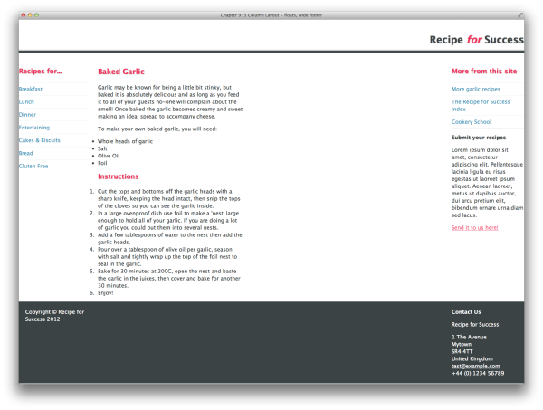
header
div
end tag, so that it starts to wrap content from before the subnav
div, and close it above the start of the
footer
div. This will pull the main content back into
place on the page, leaving the header and footer spread out full width,
as shown in Figure 9.12.
Now use the wrapper class again to wrap 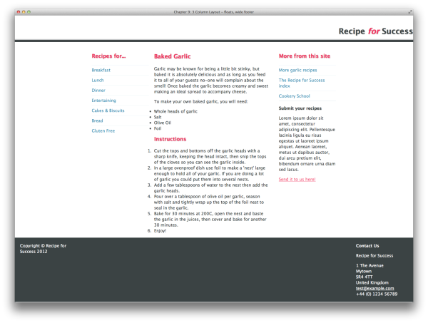
divs around the contents of the header and
footer, adding them directly after the opening header and footer
div
tags, and closing them before the corresponding end tags. This will
bring the contents of the header and footer back into the centered
position, while allowing the footer background and the bottom border on
the header to remain full width, as in Figure 9.13.
We need to do a little bit of tidying up, removing the left and
right padding on the footer and adding it back to the internal columns
of content (on their width values). We want these columns to line up
with the columns above them, as was shown earlier in Figure 9.10:
chapter_09/3col-wide-footer.css
(excerpt)
/* remove the bottom border from the h1 and add to the new .inner */
.header h1 {
font-size: 187.5%;
padding-bottom: 10px;
color: rgb(59,67,68);
}
.header .inner {
border-bottom: 1px solid rgb(59,67,68);
margin-bottom: 2px;
}
/* remove the left and right padding on footer and add back to
internal columns */
.footer {
clear: both;
background-color: rgb(59,67,68);
color: rgb(255,255,255);
overflow: auto;
padding: 20px 0 20px 0;
}
.footer .copy {
float: left;
width: 220px;
}
.footer .vcard {
float: right;
width: 220px;
}
h1 nested inside it, that border
is now contained within our wrapper
div and won’t run full width. To fix
this, we can add an extra div with a
class of inner just outside the
header wrapper, and apply the border values to that in the
stylesheet.
Fixed-width layouts work well for desktop and are fairly
easy to implement. We can calculate our widths in units of measurement
that are easy to understand, work out our gutter widths, and achieve a
pleasing design aesthetic. Increasingly, though, people aren’t viewing the
sites that we design on a desktop browser; instead, they’re viewing
content on smartphones or tablets, and these devices have a range of
screen sizes and viewing formats.
Up until recently, the big debate was whether you should use
a fixed-width layout—like the one we’ve been building in this chapter—or a
liquid layout. A liquid layout stretches out to fit
the browser window, and uses percentages for column measurements. Liquid
layouts worked well when most people were using a fairly limited range of
screen resolutions. Not so long ago, you’d mostly be dealing with
resolutions between 800 by 600 pixels to 1,600 by 1,200 pixels. Creating a
design that would look reasonable if stretched to 1,600 pixels but still
worked at 800 was possible, although it did require compromise.
The problem with liquid layouts becomes obvious at large screen
resolutions with the browser maximized: lines become very long and text
hard to read. These layouts also struggle when viewed on mobile devices,
as the columns then become tiny, often with a single word on each
line.
Many website owners, developers, and designers have attempted to
remedy this issue by maintaining completely separate, independent mobile
sites. The problem with this technique is that modern mobile devices are
very flexible when it comes to web page display, and users don’t
necessarily want to view a bare-bones, pared-down version of a site. They
want to see all of the content, but want it displayed
in a way that makes it easy to read on their device.
The best solution to supporting a wide range of devices
with differing viewport widths is to use responsive
design. Responsive design is quite a broad topic, but in a
nutshell it involves flexible design methods that respond to a user’s
behavior and preferences when viewing websites. We’re going to learn how
to transform your fixed-width layout into a mobile-first responsive
design.
There are no changes to the markup of the wide footer example in
the section called “How do I create a fixed-width layout with a full-width header and footer?
” apart from some stylesheet links,
which we’ll explore shortly; however, changes need to be made to the
CSS. You can see the results of our responsive layouts in various
browser sizes in Figure 9.14, Figure 9.15, and Figure 9.16.
The rules for laying out text remain the same as our previous
example:
chapter_09/3col-responsive.css
(excerpt)
.wrapper {
width: 90%;
margin: 0 auto 0 auto;
}
@media only screen and (min-width: 768px) {
.subnav {
width: 31.42857%; /* 220/700 */
float: left;
}
.article {
float: right;
width: 65.71428%; /* 460/700 */
}
.aside {
width: 100%;
clear: both;
}
.footer .copy {
float: left;
width: 31.42857%; /* 220/700 */
}
.footer .vcard {
float: right;
width: 31.42857%; /* 220/700 */
}
}
@media only screen and (min-width: 992px) {
.wrapper {
max-width: 1180px;
}
.subnav {
width: 23.404255%; /* 220/940 */
margin-right: 2.1276596%; /* 20/940 */
}
.article {
float: left;
width: 46.808511%; /* 440/940 */
}
.aside {
width: 23.404255%; /* 220/940 */
float: right;
clear: none; /* to counteract the clearing of the previous
breakpoint */
}
.footer .copy {
width: 23.404255%; /* 220/940 */
}
.footer .vcard {
width: 23.404255%; /* 220/940 */
}
}
The majority of our stylesheet remains the same as in the section called “How do I create a fixed-width layout with a full-width header and footer?
”; we want to display all our text styling in
the top part of the document to all users, whether they’re using a
smartphone, a tablet, or a desktop browser.
We change the rule for
Okay, let’s test it. Load the site in your browser, and pull your
window down to a narrow view, so that the content displays as one
column. Now stretch it out wider to see it rearrange itself into two
columns. Your first fluid grid!
To tidy up this screen width, we can use the same width
calculations to arrange the two chunks of footer content into two
columns as we have had in previous examples. Our final media query for
Now let’s create the three-column version, which will provide
desktop-browser users with the same experience they had when they viewed
the fixed-width version of our site.
Our completed
Our first task is to set
.wrapper, removing the
fixed 940-pixel width and replacing it with a value of 90%:
Our layout will now display as in Figure 9.17.
We now need to create our set of media
queries, which you can see in our stylesheet. Media queries
are part of the CSS3 specification and enable us to target devices by
certain properties, such as their screen width. You can use media
queries within a stylesheet as we have here, or in your HTML document,
as we will do in a later example.
For this simple site, we’re going to target three width-related
breakpoints. First, we’ll have a default stylesheet that will be used by
all devices. Then we’ll use a media query to check if the browser window
is wider than 768 pixels. If it is, we’ll arrange the content into two
columns. Finally, we’re also going to check for desktop widths by
looking for screens wider than 992 pixels, in which the layout will
display over three columns. The media queries we’ll need are as
follows:
@media only screen and (min-width: 768px) {
/* css for 768 pixel width devices and wider goes here */
}
@media only screen and (min-width: 992px) {
/* css for 992 pixel width devices and wider goes here */
}
Inside the section for min-width: 768px, we
need to add code that will arrange our site into two columns. As we have
a three-column layout—consisting of our subnav, article, and aside—we’re going to drop the aside
div
below the other two columns at this width.
We need to be able to calculate the new widths of our columns, but
as we’ve set the width of .wrapper to a percentage
(90%), we’re unsure what its exact width will be at
this point. The actual viewport could be anywhere from 768 pixels to 991
pixels, and with the width of the wrapper set to 90%, that makes its
potential exact width anywhere between 691 pixels and 892 pixels. This
means we can’t use pixels to size our individual columns; we need to
calculate percentages.
First, we decide on an arbitrary width for
.wrapper at this breakpoint that’s between these two
values; let’s go with 700 pixels. The calculation that we need to
remember is this: target / container = percentage.
So, our wrapper is 700 pixels wide and our
.subnav is 220 pixels wide. We also want to leave a
20-pixel gutter between .subnav and
.article; therefore, .article will
be 460 pixels wide if we float these columns left and right
respectively. We calculate the percentage width of
.subnav as follows: 220/700 = 31.42857%.
We then calculate .article: 460/700 =
65.71428%. We can now enter these values as the column widths into our
CSS. We also need to set our .aside to a width of
100%, and give it a rule of clear: both so that it
drops underneath these first two columns:
chapter_09/3col-responsive.css
(excerpt)
@media only screen and (min-width: 768px) {
.subnav {
width: 31.42857%; /* 220/700 */
float: left;
}
.article {
float: right;
width: 65.71428%; /* 460/700 */
}
.aside {
width: 100%;
clear: both;
}
}
min-width: 768px is as follows:
chapter_09/3col-responsive.css
(excerpt)
@media only screen and (min-width: 768px) {
.subnav {
width: 31.42857%; /* 220/700 */
float: left;
}
.article {
float: right;
width: 65.71428%; /* 460/700 */
}
.aside {
width: 100%;
clear: both;
}
.footer .copy {
float: left;
width: 31.42857%; /* 220/700 */
}
.footer .vcard {
float: right;
width: 31.42857%; /* 220/700 */
}
}
min-width: 992px section follows.
It should be fairly familiar to you from the previous width
calculations, with a couple of exceptions:
chapter_09/3col-responsive.css
(excerpt)
@media only screen and (min-width: 992px) {
.wrapper {
max-width: 1180px;
}
.subnav {
width: 23.404255%; /* 220/940 */
margin-right: 2.1276596%; /* 20/940 */
}
.article {
float: left;
width: 46.808511%; /* 440/940 */
}
.aside {
width: 23.404255%; /* 220/940 */
float: right;
clear: none; /* to counteract the clearing of the previous
breakpoint */
}
.footer .copy {
width: 23.404255%; /* 220/940 */
}
.footer .vcard {
width: 23.404255%; /* 220/940 */
}
}
.wrapper to have a
maximum width of 1,180 pixels. What this does is stop the layout from
being any wider than 1,180 pixels, so that users avoid the problem of
content being laid out too widely to be readable.
Let’s set our target container at 940 pixels wide in this version,
and then use that to calculate our percentages. This time round, of
course, we have three columns to calculate widths for.
With the first two columns both floated left, we need to add a
margin-right to .subnav to stop
.article colliding against it. We calculate the
20-pixel margin in exactly the same way as we calculate the column
widths: 20 / 940 = 2.1276596%.
The final addition to this media query is to our
.aside. In our previous media query, we gave it a
rule of clear: both. Here, though, we need to unset
this rule so that the other two columns aren’t cleared, and the
.aside floats up into its place on the far right of
the layout.
There are a couple of lines you will want to add to your
HTML document if you’re creating a responsive design. The first is a
So, that’s it—we’ve created a simple responsive layout. Despite
this being a basic project, the principles we’ve investigated remain
the same for more complex responsive layouts, and we’ll have a look at
a slightly different example in the section called “How can I use responsive-design techniques when my site is image-heavy?
”
meta tag:
<meta name="viewport" content="width=device-width, target-densitydpi=160dpi, initial-scale=1.0" />This
meta tag means that
mobile browsers will set the width of the browser viewport equal to
the width of the device. If you’ve browsed the Web using a mobile
device, you’ll have noticed that your first view of a website is
usually zoomed out. In the case of our earlier fixed-width,
three-column layout, the first view you would be presented with on a
smartphone is all three columns on the page; you’d need to zoom in to
read the content you wanted to isolate.
As we’ve gone to the effort of creating a customized smartphone
version of our layout, we want mobile browsers to display it zoomed
in, and this meta tag will ensure
this happens.
The second line we want to add to our HTML is a
link—just above the closing body
tag at the bottom of the page—to a JavaScript file:
<script src="ios-orientationchange-fix.js"></script>I have included the file in the code archive, or you can download it from GitHub. This file fixes an orientation problem (at the time of writing), where iOS devices may display a layout incorrectly when a user switches from landscape to portrait. At some point, Apple will no doubt fix this bug, and it will eventually only be an issue for older iOS devices still in circulation; hence, check that this is still a requirement when implementing your layouts.
Note: Enquiries May Be Ignored
Versions of Internet Explorer earlier than IE9 offer no support for media queries, so they’ll ignore all media query declarations within your CSS, thus serving only the mobile version of the site. See the section called “What about older browsers and responsive design? ” for some suggestions as to how to accommodate visitors using these browsers.
While we are ensuring that users on a range of mobile or desktop
devices have a rewarding experience viewing our site, there’s another
group we should consider: those who wish to print content displayed on our
site.
Fortunately, we can create a print-specific stylesheet for our
site, as illustrated in Figure 9.18. We’ll
also need to add a
link tag in the
head of our HTML document that points
to this standalone stylesheet:
chapter_09/3col-responsive.html
(excerpt)
<link rel="stylesheet" href="3col-responsive.css" media="screen" /> … <link rel="stylesheet" href="3col-responsive-print.css" media="print" />
chapter_09/3col-responsive-print.css
body {
background-color: rgb(255,255,255);
color: rgb(0,0,0);
padding: 20px;
font: 1em/1.4 "Lucida Grande", "Lucida Sans Unicode",
"Lucida Sans", Verdana, Tahoma, sans-serif;
}
h1, h2, h3 {
margin: 0;
padding: 0 0 1em 0;
}
p {
margin:0;
padding: 0 0 1em 0;
}
ul, ol {
margin:0;
padding: 0 0 1em 1em;
}
h1 {
font-size: 137.5%;
}
h2 {
font-size: 125%;
}
h3 {
font-size: 100%;
}
a:link, a:visited {
color: rgb(0,0,0);
}
.header {
text-align: right;
padding: 20px 0 0 0;
border-bottom: 8px solid rgb(0,0,0);
margin-bottom: 40px;
}
.header h1 {
font-size: 187.5%;
padding-bottom: 10px;
}
.header .inner {
border-bottom: 1px solid rgb(0,0,0);
margin-bottom: 2px;
}
.header h1 span {
font-style: italic;
}
.footer {
border-top: 1px solid rgb(0,0,0);
padding: 20px 0 20px 0;
overflow: auto;
}
.wrapper {
width: 90%;
margin: 0 auto 0 auto;
}
.subnav {
display: none;
}
.aside {
display: none;
}
.footer .vcard {
display: none;
}
Our example site is a recipe site, so it’s highly likely that
people will want to print out the recipes to refer to them in the
kitchen. We can customize a separate print stylesheet to ensure that
users only print out the recipe itself, and not the navigation area or
other elements on the site that are unnecessary for their
purpose.
The first action is to set the
We can then go and tweak other styles to suit a printed copy of
our web page; for instance, eliminating the
media attribute on
the link to our original stylesheet
to screen. The means that the main
stylesheet (3col-responsive.css) will only be used
when the site is displayed onscreen. We then add a second link tag pointing to our print-specific
stylesheet; this has a media
attribute of print. Browsers will
use this stylesheet to render the document ready to be printed
out.
We can now set some basic CSS for the print-view text. Our first
task is to go through the stylesheet and set any element on the page
that we don’t want users to print to display:
none:
chapter_09/3col-responsive-print.css
(excerpt)
.subnav {
display: none;
}
.aside {
display: none;
}
.footer .vcard {
display: none;
}
color
and text-shadow properties on our h1s, h2s,
and h3s, and deleting our
a:hover selector altogether. We’ll test in our
browser’s print preview facility until we’re happy with the
result.
Note: Think of the Ink
When creating a print stylesheet, think about how the content to be printed will be used. The Automobile Association (AA) website in the UK allows you to print out driving directions, for example, and the print stylesheet for the site prints out map directions using a large font size, which is useful when you’re trying to navigate while driving. Many browsers won’t print out background colors and images, so make sure everything remains legible. Furthermore, unless you’re creating a multicolumn layout for print, either avoid setting widths on containers or set them to100%; that way the content will fit the page
nicely, whatever size the paper is used for printing.
If your content has a lot of inline links, you can use generated
content to display a URL after its corresponding link in the printed
document by adding the following CSS:
a:link:after {
content: “ (“ attr(href) “) “;
}
Finally, be considerate of your user’s ink supply: set large
images to display: none and hide advertising
banners.
Our responsive layout has behaved nicely, but so far it’s only
comprised text—an unlikely scenario for most modern websites. How can we
use images in responsive design without them breaking out of their
bounding boxes?
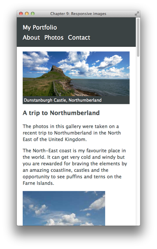
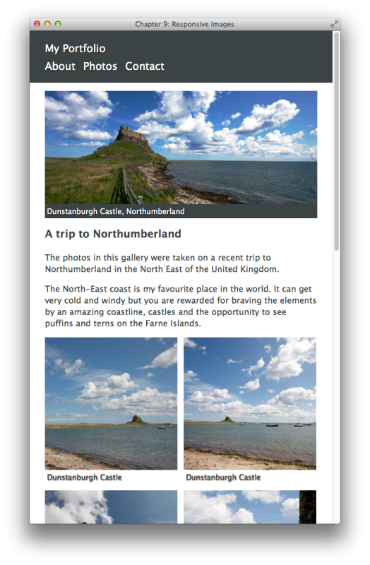
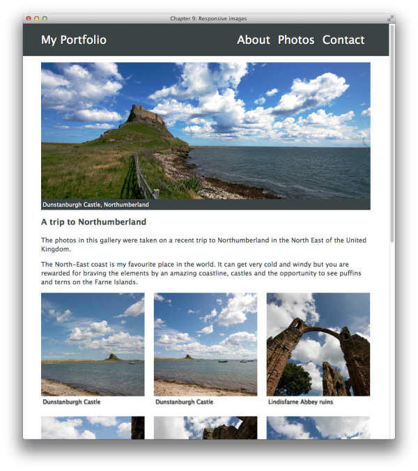
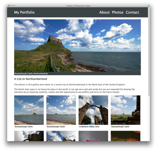
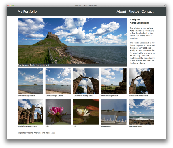
The design shown in Figure 9.19, Figure 9.20, Figure 9.21, Figure 9.22, and Figure 9.23
is a photography portfolio design containing a number of images. It also
complies to a strict grid layout, no matter what screen width you view
it at. Here’s our foundation HTML markup, followed by a series of
specific stylesheets applying to each grid layout:
chapter_09/responsive.html
<!DOCTYPE html>
<html>
<head>
<meta charset="utf-8" />
<title>Chapter 9: Responsive images</title>
<meta name="viewport" content="width=device-width,
target-densitydpi=160dpi, initial-scale=1.0" />
<link rel="stylesheet" href="responsive-basic.css" />
<link rel="stylesheet" media="only screen and (min-width: 460px)"
href="responsive-410.css" />
<link rel="stylesheet" media="only screen and (min-width: 768px)"
href="responsive-700.css" />
<link rel="stylesheet" media="only screen and (min-width: 992px)"
href="responsive-940.css" />
<link rel="stylesheet" media="only screen and (min-width: 1280px)"
href="responsive-1180.css" />
<!--[if (lt IE 9) & (!IEMobile)]>
<script src="selectivizr-min.js"></script>
<link rel="stylesheet" href="responsive-ie-old.css" />
<![endif]-->
</head>
<body>
<div class="header">
<div class="wrapper">
<h1>My Portfolio</h1>
<ul class="nav">
<li><a href="">About</a></li>
<li><a href="">Photos</a></li>
<li><a href="">Contact</a></li>
</ul>
</div>
</div>
<div class="wrapper">
<div class="feature">
<img src="gallery/main.jpg" alt="path from the coast to
Dunstanburgh Castle, Northumberland" />
<div class="caption">Dunstanburgh Castle, Northumberland</div>
</div>
<div class="intro">
<h2>A trip to Northumberland</h2>
<p>The photos in this gallery were taken on a recent trip to
Northumberland in the North East of the United Kingdom.</p>
<p>The North-East coast is my favourite place in the world.
It can get very cold and windy but you are rewarded for
braving the elements by an amazing coastline, castles and
the opportunity to see puffins and terns on the Farne
Islands.</p>
</div>
<div class="gallery">
<ul>
<li><img src="gallery/one.jpg" alt="Dunstanburgh Castle"
width="280" />
<span class="caption">Dunstanburgh Castle</span>
</li>
<li><img src="gallery/two.jpg" alt="Dunstanburgh Castle"
width="280" />
<span class="caption">Dunstanburgh Castle</span>
</li>
<li><img src="gallery/three.jpg" alt="Lindisfarne Abbey
ruins" width="280" />
<span class="caption">Lindisfarne Abbey ruins</span>
</li>
<li><img src="gallery/four.jpg" alt="Dunstanburgh Castle"
width="280" />
<span class="caption">Dunstanburgh Castle</span>
</li>
<li><img src="gallery/five.jpg" alt="Lindisfarne Abbey
ruins" width="280" />
<span class="caption">Lindisfarne Abbey ruins</span>
</li>
<li><img src="gallery/six.jpg" alt="Lindisfarne Abbey ruins"
width="280" />
<span class="caption">Lindisfarne Abbey ruins</span>
</li>
<li><img src="gallery/seven.jpg" alt="Lily" width="280" />
<span class="caption">Lily</span>
</li>
<li><img src="gallery/eight.jpg" alt="Lily" width="280" />
<span class="caption">Lily</span>
</li>
<li><img src="gallery/nine.jpg" alt="Glasshouses"
width="280" />
<span class="caption">Glasshouses</span>
</li>
<li><img src="gallery/ten.jpg" alt="Beach at Craster"
width="280" />
<span class="caption">Beach at Craster</span>
</li>
</ul>
</div>
</div>
<div class="footer">
<div class="wrapper">
<p>All photos © Rachel Andrew | Find me on
<a href="http://www.flickr.com/photos/rachelandrew/">
Flickr</a></p>
</div>
</div>
<script src="ios-orientationchange-fix.js"></script>
</body>
</html>
chapter_09/responsive-basic.css
body {
margin: 0;
padding: 0;
font: 1em/1.4 "Lucida Grande", "Lucida Sans Unicode",
"Lucida Sans", Verdana, Tahoma, sans-serif;
background-color: rgb(255,255,255);
color: rgb(59,67,68);
}
.wrapper {
width: 90%;
margin: 0 auto 0 auto;
}
img {
max-width: 100%;
display: block;
}
h1,h2,h3 {
margin: 0;
padding: 0;
}
h2 {
font-size: 125%;
padding: 0 0 1em 0;
}
p {
margin: 0;
padding: 0 0 1em 0;
}
ul {
margin: 0;
padding: 0;
}
a:link, a:visited {
color: rgb(122,106,83);
}
.header {
background-color: rgb(59,67,68);
color: rgb(255,255,255);
border-bottom: 1px solid rgb(0,0,0);
margin-bottom: 1em;
}
.header .wrapper {
position: relative;
}
.header h1 {
display: inline-block;
padding: 1em 0 0.3em 0;
font-size: 125%;
font-weight: normal;
text-shadow: 1px 1px 2px rgba(0,0,0,0.7);
}
.header .nav {
padding-bottom: 1em;
}
.header .nav li {
display: inline;
font-size: 125%;
color: rgb(255,255,255);
padding: 0 0.5em 0 0;
text-shadow: 1px 1px 2px rgba(0,0,0,0.7);
}
.header .nav a:link, .header .nav a:visited {
text-decoration: none;
color: rgb(255,255,255);
}
.feature {
background-color: rgb(59,67,68);
color: rgb(255,255,255);
margin: 0 0 1em 0;
}
.caption {
padding: 0.3em;
font-size: 87.5%;
text-shadow: 1px 1px 2px rgba(0,0,0,0.7);
}
.gallery ul {
list-style-type: none;
margin: 0 0 1em 0;
padding: 0;
}
.footer {
border-top: 1px solid rgb(59,67,68);
font-size: 87.5%;
padding: 1em 0 1em 0;
}
chapter_09/responsive-410.css
(excerpt)
.gallery {
overflow: hidden;
clear: both;
}
.gallery li {
float: left;
width: 48.78048%;
margin: 0 0 2.43902% 2.43902%;
}
.gallery li:nth-child(2n+1) {
margin-left: 0;
}
chapter_09/responsive-700.css
(excerpt)
.header .nav {
position: absolute;
top: 20px;
right: 0;
list-style-type: none;
}
.header h1 {
padding: 20px 0 20px 0;
font-size: 175%;
}
.header .nav li {
font-size: 175%;
}
.gallery li:nth-child(n) {
width: 31.42857%;
margin: 0 0 2.85714% 2.85714%;
}
.gallery li:nth-child(3n+1) {
margin-left: 0;
}
chapter_09/responsive-940.css
(excerpt)
.gallery {
overflow: hidden;
clear: both;
}
.gallery li:nth-child(n) {
width: 23.40425%;
margin: 0 0 2.12765% 2.12765%;
}
.gallery li:nth-child(4n+1) {
margin-left: 0;
}
If you look at this design in a browser, you’ll discover that not
only does the grid scale between width breakpoints, the images do as
well. To facilitate this, we need to add a very simple rule in our
CSS:
When we set this rule, all images’ maximum widths will be, at
most, equal to the width of the image itself; they’ll display smaller as
their containers shrink when the browser is resized.
We can see this behavior by looking at the large feature image,
main.jpg. We use the same image on all screen
sizes, but it scales right down to neatly fit our mobile layout, or up
to its full size on a desktop layout.
Now we can look at the rest of our layout.
As with our recipe website, we’ll use a mobile-first
strategy, but this time we’re going to employ separate stylesheets. Mobile-first means that we only load
the stylesheets that the device being used can actually utilize. Our
responsive-basic.css stylesheet is the file that we
expect all devices to download and use, so it contains all our basic
formatting. It’s linked into our HTML document with a regular
We also add a left and bottom margin of 2.43902%, the calculation
we arrived at in evaluating gutters of 10 pixels:
Finally, we need to remove the left-hand margin on the
first and every other
We then recalculate our column widths so that we end up with three
images on each row of the grid, each being three columns in
width:
Now let’s deal with our desktop layouts, inserting another
Nearly there! Last of all, we can add the
Now we can recalculate the widths of our list items and the
margins on the first and every fifth element
thereafter. Our gallery images each take up three columns, and this
means that the image in the
That’s it! You have a responsive, image-heavy layout that complies
with a strict grid.
When creating these layouts, I tend to calculate my column widths
and gutters just as we did at the start of each stylesheet here. It
certainly pays to insert the calculations in a block comment at the
start of your stylesheet. There are also a number of grid frameworks
available that use this same basic technique, which you may find
useful.
Note: Size Matters
If you’re thinking that it’s not ideal having mobile users download images with large footprints, you’d be right. At the time of writing, however, this problem doesn’t have an easy solution. Responsive design is a new field, and serving responsive images at appropriate sizes for various viewport dimensions is something that is being discussed at length within the web community. Searching for the phrase “responsive images” should bring up the latest thinking on the issue, and there are helpful tools and articles popping up on the Web all the time. If you are just using a single image, optimize the image as much as possible, and make sure it is no larger than it needs to be for the largest width it will display at. Don’t let the fact that you are using responsive images make you avoid resizing and optimizing your images before uploading them to your site!link element:
<link rel="stylesheet" href="responsive-basic.css" />With this stylesheet in play, our image gallery will display in a linear fashion, one image below another. Next, let’s add a stylesheet that will be used by a browser viewport wider than or equal to 460 pixels:
<link rel="stylesheet" media="only screen and (min-width: 460px)"
  href="responsive-410.css" />
The
media attribute used here
is just like the media query we used within our CSS for the recipe
website. In this stylesheet, we’re using a grid that is 410 pixels wide
with six columns of 60 pixels, each with a ten-pixel gutter. The
dimensions of this grid will help us work out the calculations for the
percentage widths we need:
gutter = 10px | 2.43902%
1 = 60px | 14.63414%
2 = 130px | 31.70731%
3 = 200px | 48.78048%
4 = 270px | 65.85365%
5 = 340px | 82.92682%
6 = 410px | 100%
In this stylesheet, we’ll set
.gallery to
overflow: hidden so that it contains the floated
elements inside. We can then float our gallery list items left, and give
each a percentage width of 48.78048%. We obtain this value from the
three-column width calculation.
Note: Spacing Issues
In Chapter 8, we looked at a gallery example that useddisplay: inline-block for layout
purposes. Ideally, we would use that here, but
inline-block preserves whitespace and creates gaps
between elements, unfortunately. Counteracting this can be
problematic; spacing can be inconsistent between browsers, so where
the calculations are vital (as in this layout), I’ve reverted to using
floats.
If you can remove all the whitespace between the li elements—for example, if you’re
generating your content from a server-side script and can ensure the
script outputs no whitespace—you would be safe to replace the
float here with
inline-block.
As you’ll discover, CSS development tends to involve a range of
compromises, and it pays to have a few tricks up your sleeve when
deciding what works best in each circumstance.
chapter_09/responsive-410.css
(excerpt)
.gallery {
  overflow: hidden;
  clear: both;
}

.gallery li {
  float: left;
  width: 48.78048%;
  margin: 0 0 2.43902% 2.43902%;
}
li using the nth-child
selector:
This creates the layout shown in Figure 9.20.
We can now move on to our tablet layout. We’ll link to this
stylesheet once again using a media query:
<link rel="stylesheet" media="only screen and (min-width: 768px)"
  href="responsive-700.css" />
This stylesheet is working from a width of 700 pixels; that’s nine columns of 60 pixels, with gutters in between that are 20 pixels wide. Here are our calculations:
gutter = 20px | 2.85714%
1 = 60px | 8.57142%
2 = 140px | 20%
3 = 220px | 31.42857%
4 = 300px | 42.85714%
5 = 380px | 54.28571%
6 = 460px | 65.71428%
7 = 540px | 77.14285%
8 = 620px | 88.57142%
9 = 700px | 100%
The stylesheet that we need to use follows. At this breakpoint, we have enough room in the header to move the navigation menu onto the same line as the
h1 element (My
Portfolio), as well as increase the size of this text:
chapter_09/responsive-700.css
(excerpt)
.header .nav {
  position: absolute;
  top: 20px;
  right: 0;
  list-style-type: none;
}

.header h1 {
  padding: 20px 0 20px 0;
  font-size: 175%;
}

.header .nav li {
  font-size: 175%;
}
.gallery li {
  width: 31.42857%;
  margin: 0 0 2.85714% 2.85714%;
}
Finally, we need to change the .gallery li
selector so that the first and every third list
item thereafter (:nth-child(3n+1)) has no left
margin. However, in addition to implementing its own rules, this
stylesheet will also inherit the CSS rules from the stylesheet before
it; in particular, responsive-410.css. Here we
removed the left margin on the first and every
second list item thereafter. This isn’t what we
want in our new stylesheet and corresponding screen size; we need to
update the margin-left property for our
.gallery li:nth-child(2n+1) selector with our new
gutter width:
.gallery li:nth-child(2n+1) {
  margin-left: 2.85714%;
}

.gallery li:nth-child(3n+1) {
  margin-left: 0;
}
Of course, we could refine this markup by writing a rule for all
.gallery lis as well as our
:nth-child(2n+1) items using
:nth-child(n):
Now all items will have a correct column width, but because we
have placed our :nth-child(3n+1) selector at the end,
specificity determines that each first, fourth, seventh (etc) item will
have its margin-left value overridden with a value
of 0.
Tip: Keep Checking Your Stylesheets
As you move up through layouts of different widths, check whether you need to update anything done in an earlier stylesheet.link into our HTML document’s
head:
<link rel="stylesheet" media="only screen and (min-width: 992px)"
  href="responsive-940.css" />
This layout still uses an overall 940-pixel width grid of 12 columns of 60 pixels each, separated by 20-pixel gutters:
gutter = 20px | 2.12765%
1 = 60px | 6.38297%
2 = 140px | 14.89361%
3 = 220px | 23.40425%
4 = 300px | 31.91489%
5 = 380px | 40.42553%
6 = 460px | 48.93617%
7 = 540px | 57.4468%
8 = 620px | 65.95744%
9 = 700px | 74.46808%
10 = 780px | 82.97872%
11 = 860px | 91.48936%
12 = 940px | 100%
We display four images to each row, and thus add a
margin-left: 0 value to our first item and every
fourth thereafter
(:nth-child(4n+1)). As we did in our
responsive-700.css stylesheet, we need to remember
to update :nth-child selectors from previous
stylesheets to our recalculated gutter widths:
chapter_09/responsive-940.css
(excerpt)
.gallery li:nth-child(n) {
  width: 23.40425%;
  margin: 0 0 2.12765% 2.12765%;
}

.gallery li:nth-child(4n+1) {
  margin-left: 0;
}
link to our wide desktop stylesheet:
<link rel="stylesheet" media="only screen and (min-width: 1280px)"
  href="responsive-1180.css" />
To prevent our layout from becoming too wide, we set
.wrapper to a maximum width of 1180 pixels:
We can also calculate our grid from that width: 15 columns, 60
pixels wide, with 20-pixel gutters:
gutter = 20px | 1.69491%
1 = 60px | 5.08474%
2 = 140px | 11.8644%
3 = 220px | 18.64406%
4 = 300px | 25.42372%
5 = 380px | 32.20338%
6 = 460px | 38.98305%
7 = 540px | 45.76271%
8 = 620px | 52.54237%
9 = 700px | 59.32203%
10 = 780px | 66.10169%
11 = 860px | 72.88135%
12 = 940px | 79.66101%
13 = 1020 | 86.44067%
14 = 1100 | 93.22033%
15 = 1180 | 100%
We can capitalize on the space afforded to us by this screen width by changing the layout of the
feature and intro
divs, floating the first element left and the
second right. Let’s have feature
take up 12 columns, and intro three
columns:
chapter_09/responsive-1180.css
(excerpt)
.feature {
  float: left;
  width: 79.66101%;
}

.intro {
  float: right;
  width: 18.64406%;
}
feature
div will line up with the first four
images in the gallery below it—with intro sitting in a column that lines up with
the fifth image below it:
chapter_09/responsive-1180.css
(excerpt)
.gallery li:nth-child(n) {
  width: 18.64406%;
  margin: 0 0 1.69491% 1.69491%;
}

.gallery li:nth-child(5n+1) {
  margin-left: 0;
}
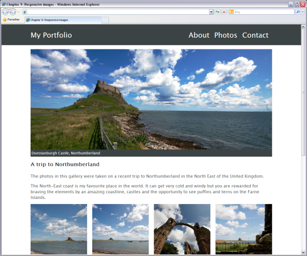
It’s impossible to discuss responsive design without considering
older browser support. In the section called “How do I create a design that works well on mobile devices?
”, we added a
JavaScript file to provide a fix for a bug in iOS devices, but what can we
use to accommodate older browsers that don’t deal so well with modern
responsive design techniques?
As already mentioned, Internet Explorer below IE9 doesn’t
support media queries. If a user is viewing our previous example sites
in Internet Explorer 6, 7, or 8, they’ll be presented with the view
rendered by our basic, mobile-specific stylesheet. These browsers will
completely ignore the media queries we inserted into our CSS, as well as
the separate stylesheets we created and linked to in our HTML
document.
There are two possible solutions to this issue. The first is to
use a JavaScript
polyfill called Respond.js that causes these older
browsers to load the CSS rules within the media queries. A polyfill is
simply a piece of code or plugin that takes care of functionality you’d
expect a browser to perform natively.
You can download the Respond.js project from GitHub. Remember to
read the attached notes to ensure that your stylesheets can be parsed by
the script.
The second solution is what I tend to do in production, and that
is not to try to serve media queries to old
versions of Internet Explorer at all. Instead, I add a separate
stylesheet (or stylesheets) that sets Internet Explorer to display the
site at a fixed width as in the CSS below. The result can be seen in
Figure 9.24:
chapter_09/responsive.html
(excerpt)
<!--[if (lt IE 9) & (!IEMobile)]>
  <link rel="stylesheet" href="responsive-ie-old.css" />
<![endif]-->
chapter_09/responsive-ie-old.css
.wrapper {
  width: 940px;
}

.header .nav {
  position: absolute;
  top: 20px;
  right: 0;
  list-style-type: none;
}

.header h1 {
  padding: 20px 0 20px 0;
  font-size: 175%;
}

.header .nav li {
  font-size: 175%;
}

.feature img {
  width: 940px;
}

.gallery {
  overflow: hidden;
  clear: both;
  width: 960px;
  margin-left: -20px;
}

.gallery li {
  float: left;
  width: 220px;
  margin: 0 0 20px 20px;
}

.gallery li img {
  display: block;
  height: 220px;
  width: 220px;
}
The CSS for this solution should look fairly straightforward.
Remember that Internet Explorer versions lower than IE9 receive no
positioning information from your media query-linked stylesheets, so you
need to add all the rules that you want applied in your IE-only
stylesheet.
Here, we’ve fixed the width of
We’ve also set widths and heights on images, as there’s no need
for them to respond to changing column widths anymore. If you go back as
far as IE6, you’ll find that
Whether you try to polyfill media queries or just serve older
browsers a fixed-width stylesheet is up to you. As always, check what
browsers visitors to your site are using and formulate a browser support
policy based on that.
.wrapper to 940
pixels, and then set the widths of other elements in pixels too—just as
we would have done had we been creating a fixed-width layout from the
outset.
Another issue we can take care of in this stylesheet is to
compensate for Internet Explorer not supporting the
nth-child selector prior to IE9. Instead of using
nth-child to remove the left margin on list elements
as they wrap around each row with the browser’s resizing, we can use an
old trick: setting a negative left margin on
.gallery, and then ignoring the extra left margin on
each .gallery li. These left margins will be
counteracted by the negative margin set on the gallery itself:
chapter_09/responsive-ie-old.css
(excerpt)
.gallery {
  overflow: hidden;
  clear: both;
  width: 960px;
  margin-left: -20px;
}

.gallery li {
  float: left;
  width: 220px;
  margin: 0 0 20px 20px;
}
max-width has no
support, so the images will display at their largest size.
If you’re going to polyfill Internet Explorer’s lack of support
for media queries, you’d do well to read Ethan
Marcotte’s article on fluid images, which includes some tips for
working with old versions of IE.
Tip: Leave IE till Last
I usually create my old-IE stylesheet right at the end of development. That way, I can just copy in the rules that are needed from the other stylesheets, rather than having to constantly remember adding them throughout the development process.
At the beginning of this chapter, I mentioned that there have been
fewer practical, usable advances for CSS layouts than we’ve seen in other
parts of the specification. However, this is about to change, and I hope
that by the time a fifth edition of this book comes out, we’ll have the
browser support to really take advantage of these new features.
So, just as a quick glance into the future, and to give you some
extras to play with in your own time to keep your skills up to date, let’s
have a look at the tools we hope to be able to use soon.
The CSS3 Grid Layout is currently a W3C Working Draft
and at the time of writing is implemented only in Internet Explorer 10
Developer Preview, with an
–ms prefix. What’s
exciting about Grid Layout is that it will enable the sort of control
you have when laying a site out using tables, but is not tied to
source-ordered content—that is, placing your most
important content at the beginning of your HTML document. This would be
incredibly useful for responsive design.
Currently, when creating a complex responsive design we have to
think very carefully about the order of the HTML source. We want it to
be able to collapse to one column in a usable way if necessary, but
still enable us to float the columns into the right position for
multicolumn layouts.
There’s an alternate proposal for Grid Layout in the
CSS
Template Layout Module. This is also currently in Working Draft,
but with no browser implementation at present.
Also in Working Draft is the Flexible Box
Layout Module, another potentially useful module when working
with responsive designs.
Currently, we have no good way of vertically centering elements,
or placing a set of elements inside a box and using CSS to say “spread
these items out evenly.” These are problems that the Flexible Box Layout
Module should solve. Where Grid Layout should solve our full-page layout
problems, flexible boxes will solve many of the small issues we have
with components in our layouts.
Support is reasonably good for flexible boxes; it’s included in
IE10 Preview, and Firefox and Chrome have implemented it in recent
releases. There’s also a polyfill called flexie.js, which provides
cross-browser support for the module, and the developers of
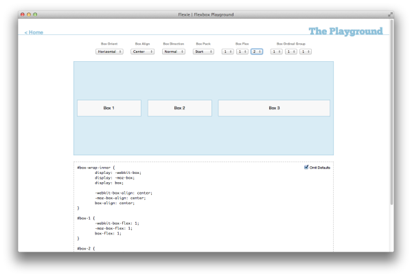
flexie.js have created a Flexbox Playground for you
to experiment inside, as seen in Figure 9.25.
Another module with reasonable cross-browser support is CSS3 Multicolumn Layout
Module. This module is at Candidate Recommendation stage, the
next stage up from Working Draft. With the exception of Internet Explorer, it’s implemented in current browsers,
and is also part of IE10 Developer Preview, so we can assume it will
make it into Internet Explorer 10.
Multicolumn layouts will enable us to create newspaper-style
columns of equal measurements by adding a
column-count property to the containing
element:
.article {
  column-count: 3;
}
There are also properties for controlling the width of columns,
setting points where you want content to break, and balancing columns so
that they all end up the same length.
Once Internet Explorer 10 is released—which will mean that all
current browsers provide support for much that’s included in the above
modules—I expect that we’ll see more and more examples of developers
using these new CSS layout properties. The future of CSS layouts is very
exciting, and these modules mean that we’ll have to make far fewer
compromises when designing and developing CSS layouts than we do at
present.
In this chapter, we’ve seen how to use the fundamental building
blocks of CSS layout to create responsive designs for all web users,
regardless of what device they’re using. More complex designs use the same
techniques to structure the different components of a layout. When you
come to tackle any design, try to break it down into its component
parts—the main layout structure and the elements inside
—and then approach their positioning in the simplest way possible.
You’ll sometimes need to make compromises to deal with the thorny
issues of browser support, but as we’ve seen, CSS for layout is improving
all the time. Browsers now support the older tools of our trade more
consistently—such as floats and positioning—with support arriving for new
and exciting CSS3 modules.
This is an exciting time to be a web designer or developer! Whether
you’re reading this book as a newcomer to CSS, or as an old hand
refreshing your skills, I hope you continue to experiment and build on the
tips and tricks we’ve studied together.
..................Content has been hidden....................
You can't read the all page of ebook, please click here login for view all page.