This chapter will explore the application of CSS for styling text. It
will cover a lot of CSS basics, as well as answer some of the more
frequently asked questions about these techniques. If you’re new to CSS,
these examples will introduce a variety of properties and their usages, and
provide a solid foundation from which to start your own experiments. For
those already familiar with CSS, this chapter will serve as a quick
refresher for those moments when you’re struggling to remember how to
achieve a certain effect.
The examples I’ve provided here are well supported across a variety of
browsers and versions, though, as always, testing your code in different
browsers is important. While there may be small inconsistencies or a lack of
support for these techniques in older browsers, none of the solutions
presented here should cause you any serious problems. For more information
on browser support, Chapter 7 is dedicated to
the subject.
The browser will display text in the default font used for that
browser and operating system. How do you change it to the one used in your
design?
Specify the typeface that your text will adopt using the
font-family property:
p {
  font-family: Verdana;
}
As well as specific fonts, such as Verdana or Times, CSS allows
the specification of some more-generic family names:
When you specify fonts, it’s important to remember that users are
unlikely to have the same fonts installed that you have on your
computer. If you define a font that the user doesn’t have, your text
will display according to their browsers’ default fonts, regardless of
what you’d prefer.
To avoid this eventuality, you can simply specify generic font
names and let users’ systems decide which font to apply. For instance,
if you want your document to appear in a sans-serif font such as Arial,
you could use the following style rule:
This list reveals the reason why we chose the fonts we specified
in our style rule. We begin by specifying our first preference, a common
Windows font (Verdana), then list a similar Mac font (Geneva). Then we
follow up with other fonts that would be usable if neither of these
fonts were available.
There is a handy article on the SitePoint website that describes
some common font stacks, and these would be a good starting point if you
are just beginning to explore web
typography.
- serif
- sans-serif
- monospace
- cursive
- fantasy
p {
  font-family: sans-serif;
}
Now, you will probably want more control than this over the way
your site displays—and you can. It’s possible to specify both font names
and generic fonts in the same declaration block. Take, for example, the
following style rule for the p
element:
p {
  font-family: Verdana, Geneva, Arial, Helvetica, sans-serif;
}
Here, we’ve specified that if Verdana is installed on the system,
it should be used; otherwise, the browser is instructed to see if Geneva
is installed; failing that, the computer will look for Arial, then
Helvetica. If none of these fonts are available, the browser will then
use that system’s default sans-serif font.
If a font-family name contains spaces, it should be enclosed in
quotation marks, like so:
p {
  font-family: "Courier New", "Andale Mono", monospace;
}
The generic font-family names should always be without quotes and
appear last in the list. The list of fonts is often termed a “font stack,” which is a good term
to search on if you’re looking for information on fonts to use in this
way.
Fonts that you can feel fairly confident using are:
- Windows
- Arial, Lucida, Impact, Times New Roman, Courier New, Tahoma, Comic Sans, Verdana, Georgia, Garamond
- Mac
- Helvetica, Futura, Bodoni, Times, Palatino, Courier, Gill Sans, Geneva, Baskerville, Andale Mono
You can size text in CSS using the
font-size property, like so:
font-size: 12px;
We’ve used pixel sizing here, but the
font-size property can take a variety of values.
Before you decide which to use, you should know the relative merits of
each option.
Table 2.1 identifies the units that you
can use to size fonts.
Table 2.1. Units of measurement for sizing fonts
| Unit Identifier | Corresponding Units |
|---|---|
| pt | points |
| pc | picas |
| px | pixels |
| em | ems |
| ex | exes |
| % | percentages |
You should avoid using points and
picas to style text for display on screen. The
point unit is an excellent way to set font sizes for print design, as
the point measurement was created for that purpose:
p {
  font-size: 10pt;
}
A point has a fixed size of 1/72nd of an inch, while a pica
is one-sixth of an inch. A printed document whose fonts are specified
using these units will appear exactly as you intended; after all,
one-sixth of an inch is the same physical measurement whether you’re
printing on an A4 page or a billboard. However, computers are unable
to accurately predict the physical size at which elements will appear
on the monitor, so they guess—and guess badly—at the size of a point
or pica, with results that vary between platforms.
If you’re creating a print stylesheet (as we do in the section called “How do I create a print stylesheet?
” in Chapter 9) or a document that’s intended for
print—rather than on screen—viewing, points and picas are the units to
use. However, as a general rule of thumb we should avoid them when
designing for the Web.
Many designers like to set font sizes in
pixel measurements:
p {
  font-size: 12px;
}
Using pixels makes it easy to achieve consistent text
displays across various browsers and platforms. However, pixel
measurements ignore any preferences users may have set in their own
browsers; furthermore, in the case of
Internet Explorer, font sizes that the designer has
dictated in pixels cannot to be resized by users. This limitation
presents a serious accessibility problem for users who need to make
text larger in order to read it clearly.
While pixel measurements may seem like the easiest option for
setting font sizes, they should be avoided if another method can be
used. Even if you disregard the text resizing issue, given that many
users will use page zoom rather than resize the text, using scalable
font sizes will make your life far easier once you venture into modern
layout techniques (we’ll discuss these later in the book). If you’re
creating a document for print or creating a print stylesheet, you
should avoid pixels entirely. Pixels have no meaning in the world of
print and, like the application of points to the on-screen
environment, when print applications are provided with a pixel
measurement, they’ll simply try to guess the size at which the font
should appear on paper—with erratic results.
The em is a relative font measurement.
The name em comes from the typographical world, where it relates to
the size of the capital letter M, usually the widest character in a
font. In CSS, 1em is seen to be equal to the user’s default font size,
or the font size of the parent element when it’s set to a value other
than the default.
If you use ems (or any other relative unit) to set your
font sizes, users will be able to resize the text in old browsers. For
example, IE6 users are unable to resize text set in pixels, and have
no other zoom control.
Em values can be set using decimal numbers. For example, to
display text at a size 10% smaller than the user’s default (or the
font size of its parent element), you could use this rule:
p {
  font-size: 0.9em;
}
To display the text 10% larger than the default or inherited
size, you’d use this rule:
p {
  font-size: 1.1em;
}
The ex is a relative unit measurement
that corresponds to the height of the lowercase letter x in the
default font size. In theory, if you set the font size of some text to
1ex, the uppercase letters will display at the height at which the
lowercase letter x would have appeared if the font size had been
unspecified. Furthermore, the lowercase letters will be sized relative
to those uppercase letters.
Historically, browsers lacked support for the typographical
features needed to determine the precise size of an ex, making a rough
guess for this measurement. For this reason, exes are rarely used at
the time of writing.
As with ems and exes, font sizes that are set in
percentages will honor users’ text size
settings and can be resized by users:
p {
  font-size: 100%;
}
Setting the size of a p
element to 100% will display your text at users’ default font-size
settings (as will setting the font size to 1 em). Decreasing the
percentage will make the text smaller:
p {
  font-size: 90%;
}
Increasing the percentage will make the text larger:
p {
  font-size: 150%;
}
As an alternative to using numerical values to set text sizes,
you can use absolute and relative keywords.
We can use any of seven absolute-size keywords to set text
size in CSS:
These keywords are defined relative to each other, and
browsers implement them in different ways. Most browsers display
medium at the same size as unstyled text, with the other keywords
resizing text to varying degrees, as indicated by their
names.
These keyword measurements are considered absolute in that
they don’t inherit from any parent element. Yet, unlike the absolute
values provided for height, such as pixels and points, they do allow the text to be resized in the browser,
and will honor users’ browser settings. The main problem with using
these keywords is consistency between
browsers—
x-small-sized text may be perfectly
readable in one browser and minuscule in another. Due to this lack
of control, you rarely see these keywords in use.
Text sized using relative-size keywords—
larger and
smaller—takes its size from the
parent element in the same way that text sized with em and % does.
Therefore, if you set the size of your p element to small
using absolute keywords and decide that you want emphasized text to
display comparatively larger, you could add the following to the
stylesheet:
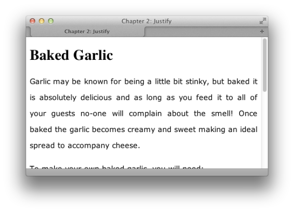
The following markup would display as shown in Figure 2.1, because the text between the
<em> and </em>
tags will display larger than its parent, the p element:
chapter_02/relative.html
(excerpt)
<p>Garlic may be known for being a little bit <em>stinky</em>, but
  baked it is absolutely delicious and as long as you feed it to
  all of your guests no-one will complain about the smell! Once
  baked the garlic becomes creamy and sweet making an ideal spread
  to accompany cheese.</p>
When you’re deciding which method of text sizing to use,
it’s best to select one that allows all users to resize the text, as
well as ensuring that the text complies with the settings users have
chosen within their browsers. Relative font sizing works well as long as
you’re careful about the way the elements inherit sizing. In order to
achieve even a basic level of accessibility, though, it’s important to
enable users to set fonts to a comfortable level.
Designing your layout with resizable text in mind also allows you
to avoid another issue. Sometimes designers assume that setting font
sizes in pixels will allow them to fix the heights of containers, or
place text on top of fixed-height images. This approach will work in
Internet Explorer, which doesn’t resize text set in
pixels; it may, however, result in a complete mess of overflowing text
in Firefox (versions prior to 3, or version 3 with
set to ), where the height of boxes containing text is always
unknown.
I tend to use a combination of ems (to set the base size) and
percentages within the document (percentages of that base size). This
means that if the client decides they want the site’s text to be larger
or smaller, I can simply adjust the base size and all other text stays
in proportion to it.
Tip: The Sky’s the Limit
When designing for the Web, it’s best to assume that you do not know the height of anything; it will save you a lot of grief in the future. Text resizing, people adding more text than expected via a content management system, or long words causing odd line-wrapping can all blow apart a layout that counts on elements being a fixed height.
When you use any kind of relative sizing, remember that the
element will inherit its starting size from its parent element, then
adjust its size accordingly. Be careful, though, when using a relative
font size for the parent element as well; this can become problematic in
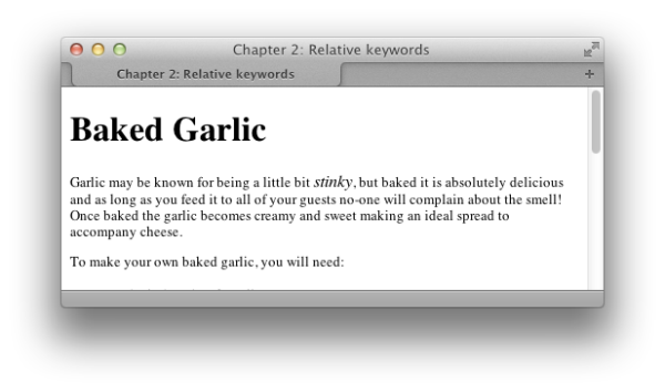
complex layouts where the parent element is less obvious. Consider the
following markup:
Let’s say we wanted to set the
chapter_02/nesting.html (excerpt)
<div>
  <p>
    You'll <em>probably</em> be surprised when using
    <a href="#">a relative <code>font-size</code></a>
    and nested elements.
  </p>
</div>
font-size of
the markup text to 130% of the default size, and we made the mistake of
setting it this way:
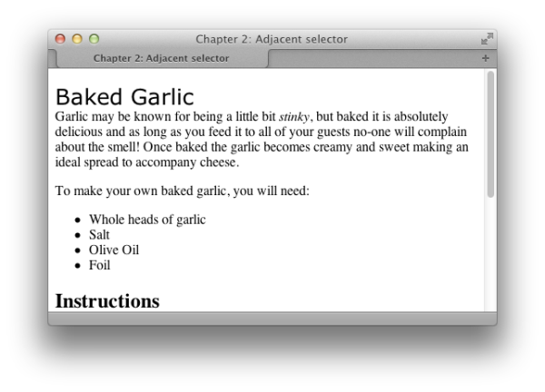
The effect of this style rule is to make the
font-size of the nested elements progressively
bigger; that’s 130% of the font-size of the parent
element, which is already 130% of the font-size of
its parent and so on, as demonstrated in Figure 2.2.
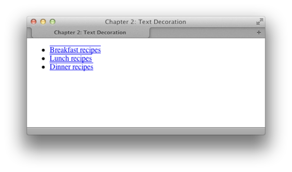
The widely accepted default indicator that text on a web page links
to another document is that it is underlined and displays in a different
color from the rest of the text. However, there may be instances in which
you want to remove that underline.
We use the
text-decoration property to remove
the underlines from link text. By default, the browser will set the
text-decoration property of all elements to
underline. To remove the underline, simply set the
text-decoration property for the link to
none:
text-decoration: none;The CSS used to create the effect shown in Figure 2.3 is as follows:
In addition to
underline and
none, there are other values for
text-decoration that you can try out:
It is possible to combine these values. For instance, should you
wish to have an underline and
overline on a particular link—as illustrated in Figure 2.4—you’d use this style rule:
Tip: Avoid Applying Misleading Lines
You can use thetext-decoration property to
apply underlines to any text, even if it’s standard unlinked text, but
be wary of doing this. The underlining of links is so widely accepted
that users are inclined to think that any underlined text is a link to
another document.
Note: When is removing underlines a bad idea?
Underlining links is a standard convention followed by all web browsers, and, consequently, users expect to see links underlined. Removing the underline from links that appear within large areas of text can make it very difficult for people to realize that these words are, in fact, links, rather than just highlighted text. I’d advise against removing the underlines from links within text. There are other ways in which you can style links so that they look attractive, and removing the underline is rarely, if ever, necessary. Links that are used as part of a menu, or appear in some other situation in which the text is quite obviously a link—for instance, where the text is styled with CSS to resemble a graphical button—are a different story. If you wish, you can remove the underline from these kinds of links, because it should be obvious from their context what they are.
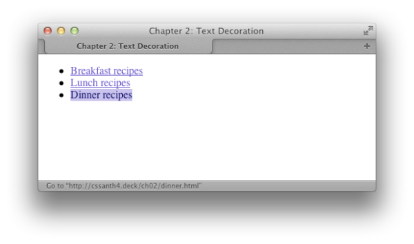
There’s an attractive link effect that changes the color or
otherwise alters a link’s appearance when the cursor is moved across it.
This effect can be applied to great advantage on navigation menus created
with CSS, but it can also be used on links within regular paragraph
text.
To create this effect, we need to style the
When this stylesheet is applied, our links will display in the
blue color
:hover and
:active dynamic pseudo-classes of the
anchor element differently from its other pseudo-classes.
Let’s look at an example. Here’s a typical style rule that applies
the same declarations to all of an anchor element’s
pseudo-classes:
chapter_02/textdecoration3.css
a:link, a:visited, a:hover, a:active {
  text-decoration: underline;
  color: #6A5ACD;
  background-color: transparent;
}
#6A5ACD with an underline, as shown in
Figure 2.5.
To style our 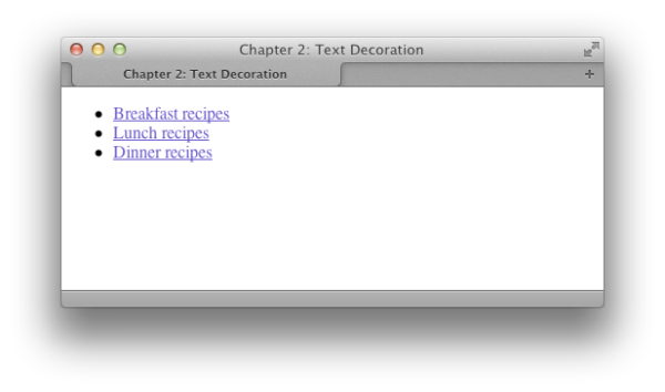
:hover and
:active pseudo-classes differently, we need to remove
them from the declaration with the other pseudo-classes and give them
their own separate declaration. In the CSS below, I decided to remove
the underline on hover. I’ve also set a background color and made the
link’s text a darker color; Figure 2.6 shows how
these styles display in a browser:
As you’ve probably realized, you can style the anchor’s other
pseudo-classes separately, too. In particular, you might like to apply a
different style to links that users have visited. To do so, you’d simply
style the
:visited pseudo-class
separately.
When styling pseudo-classes, take care that you leave the size or
weight (or boldness) of the text unchanged. Otherwise, you’ll find that
your page appears to jiggle, as the surrounding content has to move to
make way for the larger text to display when your cursor hovers over the
link.
The anchor pseudo-classes should be declared in the following
order:
:link, :visited,
:hover, :active, or else you may
find that they work differently to how you intended. One way to remember
this order is by using the mnemonic: LoVeHAte.
Note: Fashion Police
You are limited in the styles you may apply to visited links. This is because of the potential privacy implications of your browser knowing which links you have visited. If visited styles do not appear to be showing in a particular browser, it may be due to this issue.
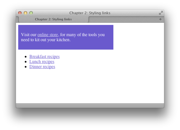
The previous solution explained how to style the different selectors
of the anchor element, but what if you want to use different link styles
within the same document? Perhaps you want to display links without
underlines in your navigation menu, yet make sure that links within the
body content are easily identifiable. Or maybe part of your document has a
dark background color, so you need to use a lighter colored link style
there.
To demonstrate how to create multiple styles for links displayed
on one page, let’s take an example in which we’ve already styled the
regular links:
These should be taken as the default link styles: they reflect the
way links will normally be styled within your documents. The first rule
makes the link blue, so if an area of our page has a blue background,
the links that appear in that space will be unreadable. We need to
create a second set of styles for links in that area.
First, let’s create a
We need to create a style rule that affects any link appearing
within an element with the
As you can see in Figure 2.7, this rule
will display all links in the document as per the first style except for
those that appear within the
chapter_02/linktypes.css (excerpt)
a:link, a:visited {
  text-decoration: underline;
  color: #6A5ACD;
  background-color: transparent;
}

a:hover, a:active {
  text-decoration: underline overline;
  color: #191970;
  background-color: #C9C3ED;
}
class
or an id for the element that will
contain the differently colored links. If the container is already
styled with CSS, it may already have a class or id that we can use. Suppose that our
document contains the following markup:
chapter_02/linktypes.html
(excerpt)
<div class="boxout">
  <p>Visit our <a href="#store">online store</a>, for many of the
    tools you need to kit out your kitchen.</p>
</div>
class
boxout:
chapter_02/linktypes.css (excerpt)
.boxout {
  color: #FFFFFF;
  background-color: #6A5ACD;
  …
}

.boxout a:link, .boxout a:visited {
  text-decoration: underline;
  color: #E4E2F6;
  background-color: transparent;
}

.boxout a:hover, .boxout a:active {
  background-color: #C9C3ED;
  color: #191970;
  text-decoration: none;
}
div
element with the class
boxout: these links will be displayed in the
lighter color.
Frequently, designers find that they need to style the first of a
set of items—be they list items or a number of paragraphs within a
container—distinct from the rest of the set. One way to achieve this is to
assign a
class to the first item, and
then style that class uniquely from
other items; however, there’s a more elegant way to create this effect
using the pseudo-class selector
first-child.
Here’s a simple list of items marked up as an unordered
list:
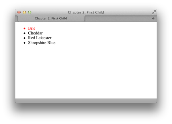
To change the color of the first item in the list without
affecting its neighbors, we can use the
chapter_02/firstchild.html
(excerpt)
<ul>
  <li>Brie</li>
  <li>Cheddar</li>
  <li>Red Leicester</li>
  <li>Shropshire Blue</li>
</ul>
first-child
selector. This allows us to target the first element within the ul element, as shown in Figure 2.8:
The
first-child pseudo-class selector is well
supported in browsers as it has existed since the CSS2.1 specification.
The only browser you’re likely to be concerned about without support is
IE6. See Chapter 7 for
suggestions as to how to manage this lack of support.
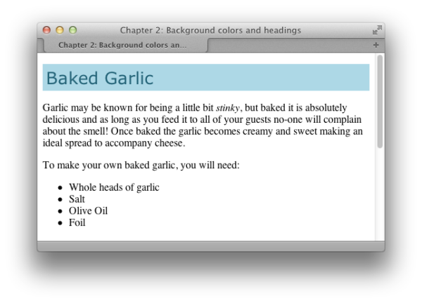
CSS allows us to add a background color to any element, including a
heading.
Below is a CSS rule created for all the level-one headings in a
document:
The result is shown in Figure 2.9.
chapter_02/headingcolor.css
(excerpt)
h1 {
  background-color: #ADD8E6;
  color: #256579;
  font: 1.6em Verdana, Geneva, Arial, Helvetica, sans-serif;
  padding: 0.2em;
}
Using CSS, there are two ways in which you can add an underline to
your text.
The simplest way to add an underline is to use the
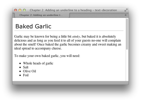
You can also create an underline effect by adding a bottom
border to the heading. This solution, which produces the result shown in
Figure 2.11, is more flexible in that it allows
you to separate the underline from the heading with the use of padding,
and you can change the color of the underline so that it differs from
that of the text.
A heading with this effect is also less likely to be confused with
underlined link text than one whose underline is created using the
text-decoration property that we
encountered earlier in the section called “How do I remove underlines from my links?
” This
method will allow you to apply to text an underline that’s the same
color as the text itself, as this code and Figure 2.10, show:
chapter_02/headingunderline.css
(excerpt)
h1 {
  font: 1.6em Verdana, Geneva, Arial, Helvetica, sans-serif;
  text-decoration: underline;
}
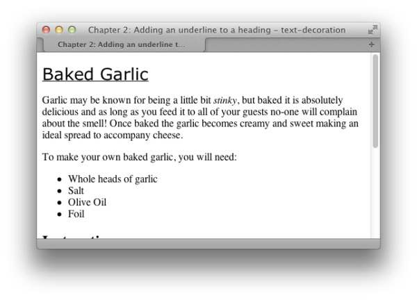
text-decoration property. Here’s the style rule
you’ll need:
chapter_02/headingunderline2.css
h1 {
  font: 1.6em Verdana, Geneva, Arial, Helvetica, sans-serif;
  padding: 0.2em;
  border-bottom: 1px solid #AAAAAA;
}
By default, browsers render a gap between all heading and paragraph
elements. The gap is produced by default top and bottom margins that
browsers apply to these elements. The margin on the heading shown in Figure 2.12 reflects the default value. This gap can be
removed using CSS.
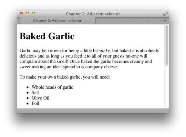
To remove all space between a heading and the paragraph that
follows it, you must remove the bottom margin from the heading as well
as the top margin from the paragraph. In modern browsers—including
Internet Explorer 7 and above—we can do this through CSS using an
adjacent selector. To achieve the same effect in older browsers,
however, we need to revert to other techniques that are better
supported.
An adjacent selector lets you target an element that follows
another element, as long as both share the same parent. In fact, you
can use adjacent selectors to specify an element that follows several
other elements instead of just one. The element to which the style is
applied is always the last element in the chain.
If you’re confused, be assured that this concept will be clearer once
we’ve seen it in action.
The following style rules remove the top margin from any
paragraph that immediately follows a level-one heading. Note that the
top margin is actually removed from the paragraph
that follows the
Figure 2.13 shows the display of the
original page once this rule is applied.
As you can see, the first paragraph that follows the
h1, rather than
the level-one heading itself:
chapter_02/headingnospace.css
(excerpt)
h1 {
  font: 1.6em Verdana, Geneva, Arial, Helvetica, sans-serif;
  margin-bottom: 0;
}

h1+p {
  margin-top: 0;
}
h1 no longer has a top margin; all
subsequent paragraphs, however, retain their top margins.
The adjacent selector is supported in Internet Explorer 7 and
above, and in all recent versions of other browsers. See Chapter 7 for details of how to manage support for
IE6 if this is required.
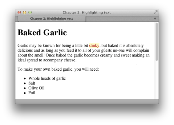
A common feature on many websites is to highlight an important term
on a page, such as the search terms visitors have used to locate our web
page through a search engine. It’s easy to highlight text using
CSS.
If you wrap the text to be highlighted with
The style rule for the
span tags and add a class attribute, you can easily add a CSS
rule for that class. For example,
in the following paragraph, we’ve wrapped a phrase in span tags that apply the class
hilite:
chapter_02/hilite.html (excerpt)
<p>Garlic may be known for being a little bit <span class="hilite">
  stinky</span>, but baked it is absolutely delicious and as long as
  you feed it to all of your guests no-one will complain about the
  smell! Once baked the garlic becomes creamy and sweet making an
  ideal spread to accompany cheese.</p>
hilite class is
shown below; the highlighted section will display as seen in Figure 2.14:
Tip: When It’s All Done for Show
You should only highlight text in this way if the effect is purely presentational, and only relevant to those who can see the text in the browser. If the text needs to be highlighted in order to convey its meaning, consider usingem (for emphasis) or
strong instead, and
then style the em or strong element. By using em or strong, you affect the meaning of the
document. In such cases where highlighting is for looks only and no
additional semantic elements are required, the technique explained
here is the best one to use.
One of the great advantages that CSS had over earlier web design
methods like
font tags is that it gave
you far more control over the way text looked on the page. In this
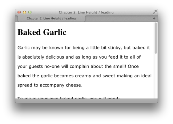
solution, we’ll alter the leading of the text in your document.
If the default spacing between the lines of text on your page
looks a little narrow, you can change it with the
The result is shown in Figure 2.15.
Just take care not to overdo it by spacing the text out so much
that it’s hard to read.
line-height property:
chapter_02/leading.css
p {
  font: 1em Verdana, Geneva, Arial, Helvetica, sans-serif;
  line-height: 2.2;
}
Note: For Good Measure
You’ll notice that we didn’t specify any unit of measurement in this example; that’s because the value of 2.2 is a ratio. You can specify a value forline-height using standard CSS units of
measurement, such as ems or pixels, but doing so breaks the link
between the line height and the font size for child elements. For
instance, if this example contained a span that set a large
font-size, the line height would scale up
proportionally and maintain the same ratio, because the
line-height of the paragraph was set to the
numerical value 2.2. If, however, the line-height
was set to 2.2em or 220%, the span
would inherit the actual line height instead of the ratio, and the
large font size would have no effect on the line height of the
span. Depending on the effect
you’re going for, this may actually be a desirable result.
When you justify text, you alter the spacing between the words so
that both the left and right margins are aligned. You can create this
effect easily using CSS.
You can justify paragraph text with the help of the
text-align property, like so:
The other values for
Note: The Language of
The default value for
text-align are:
-
right: aligns the text to the right of the container -
left: aligns the text to the left of the container -
center: centers the text in the container
Note: The Language of text-align
The default value for text-align is
left for languages that are read from left to right
(such as English and French) and right for
languages that are read right to left (Hebrew or Arabic). If no
text-align value is set, the text will be
displayed depending on the text direction of the language the site is being viewed
in. If your site has to support bidirectional text flowed into the
same templates, take care to test text-align in
both language directions.
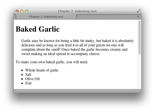
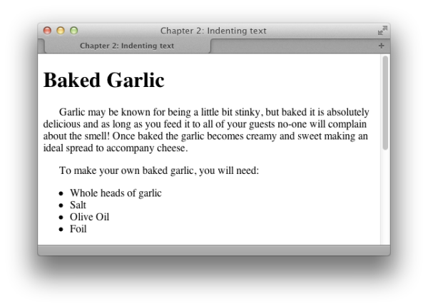
To indent text, we apply a rule to its container that sets a
Here’s the rule:
You can see the indented paragraph in Figure 2.17.
padding-left value, for example:
chapter_02/indent.html (excerpt)
<p class="indent">Garlic may be known for being a little bit
  <span class="hilite">stinky</span>, but baked it is absolutely
  delicious and as long as you feed it to all of your guests no-one
  will complain about the smell! Once baked the garlic becomes
  creamy and sweet making an ideal spread to accompany cheese.</p>
You should avoid using the HTML tag
blockquote to indent
text unless the text is actually a quote. This bad habit was a technique
encouraged in the past by visual editing environments such as
Dreamweaver, which played on the fact that a browser’s default
stylesheet usually indents a blockquote. Some WYSIWYG (What You See Is What
You Get) editors used in content management systems also do this. If
you’re currently using an editor that employs blockquote tags to indent text, you should
resist the temptation to use it for this purpose; instead, set up a CSS
rule to indent the appropriate blocks as just shown.
The blockquote tag is designed
to mark up a quote, and devices such as screen readers used by visually
impaired people will read this text in a way that helps them understand
that it’s a quote. Hence, using blockquote to indent regular paragraphs will
be very confusing for such users.
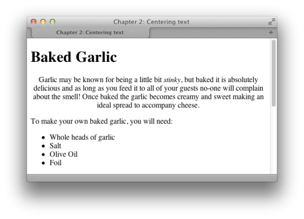
You can center text, or any other element, using the
text-align property.
To center a paragraph using the
text-align
property, give it a value of center:
The result of this rule can be seen in Figure 2.19.
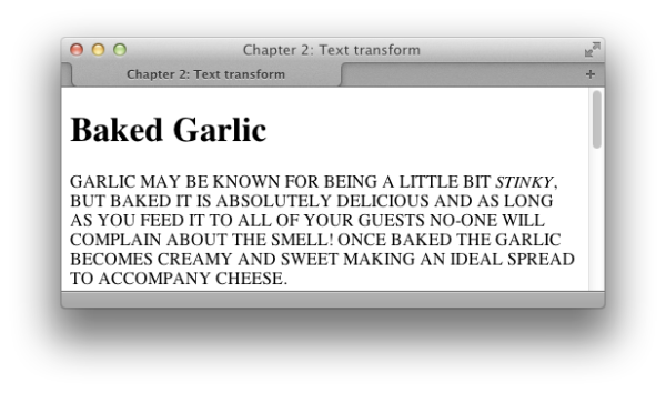
You can change text to all capitals, and perform other
transformations, by using the
text-transform
property:
Note the uppercase text in Figure 2.20.
The
text-transform property has other useful
values. The value capitalize will capitalize the
first letter of each word, as illustrated in Figure 2.21. This is very useful for transforming
headings when text is being entered via a CMS. Users are unlikely to
remember to capitalize everything correctly, but with CSS you can ensure
that text will display neatly, regardless of what has been entered. You
should be aware, however, that words such as “a” and “the” will also be
capitalized.
The other values that the 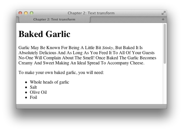
text-transform
property can take are:
-
lowercase -
none
Making the first letter in a paragraph larger—a simple drop-capitals
effect—is easily achieved with CSS.
This can be achieved by using the
first-letter
pseudo-class selector:
chapter_02/dropcaps.html (excerpt)
<h1>Baked Garlic</h1>
<p>Garlic may be known for being a little bit <em>stinky</em>, but
  baked it is absolutely delicious and as long as you feed it to all
  of your guests no-one will complain about the smell! Once baked
  the garlic becomes creamy and sweet making an ideal spread to
  accompany cheese.</p>
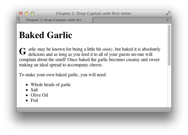
This is a basic example demonstrating the use of the pseudo-class
selector
first-letter. I’ve also used an adjacent
selector to only target the paragraph that comes directly after an
h1; without this, the first letter of
every paragraph would have a drop cap. Because browsers interpret
line-height differently, the results can be a
little inconsistent, so you’ll need to experiment a little for a
pleasing effect.
There is a useful article by James Edwards on the SitePoint website that discusses
creating a
drop-caps effect in some detail.
A drop shadow can be used to add a tiny shadow, whether to gently
highlight some text, or allow a more dramatic shadow effect.
The
text-shadow property lets you add
shadows to text—from the subtle to the completely crazy:
chapter_02/textshadow.html
(excerpt)
<h1>Baked Garlic</h1>
<p>Garlic may be known for being a little bit <em>stinky</em>, but
  baked it is absolutely delicious and as long as you feed it to all
  of your guests no-one will complain about the smell! Once baked
  the garlic becomes creamy and sweet making an ideal spread to
  accompany cheese.</p>
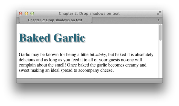
The syntax for the
text-shadow property is
straightforward:
text-shadow: 5px, 5px, 5px, #999;The first value is the horizontal distance from the text; the second is the vertical distance; the third is the blur radius or spread of the shadow; and the final value is the color. The easiest way to see how
text-shadow works is to create a large heading
—so you can easily see your
changes—and then play around with the values. You can also have a play
around with text-shadow and many other CSS3
properties at the online
CSS3
Generator.
Note: Beyond a Shadow of Doubt
When adding shadows to text, make sure that your text is still legible. I findtext-shadow most useful when
adding effects to form buttons and big headings, but large quantities
of body copy can be hard to read with a shadow applied. Sadly, the
text-shadow property is unsupported in Internet Explorer (including version 9). We’ll discuss
this further in Chapter 7, where we’ll
cover ways of dealing with it.
You can change the style of bullets displayed on an unordered list
by altering the
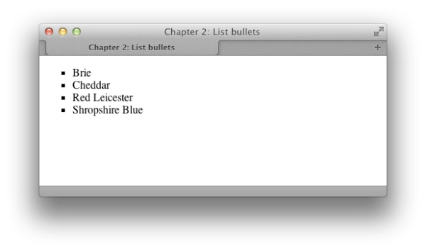
To display square bullets as in Figure 2.24, set the
list-style-type property. First,
here’s the markup for the list:
chapter_02/listtype.html (excerpt)
<ul>
  <li>Brie</li>
  <li>Cheddar</li>
  <li>Red Leicester</li>
  <li>Shropshire Blue</li>
</ul>
list-style-type property to square:
Some of the other values that the
list-style-type property can take are
disc, circle,
decimal-leading-zero, decimal,
lower-roman, upper-roman,
lower-alpha, upper-alpha, and
none.
You’ll find that some of these values have no support in certain
browsers; those browsers without support for a particular bullet type
will display the default type instead. You can see the different types,
and check the support your browser has for them, at the CSS Test
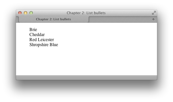
Suite for list-style-type. Setting
list-style-type to none will
remove bullets from the display, although the list will still be
indented as if the bullets were there, as Figure 2.25 shows:
ul {
  list-style-type: none;
}
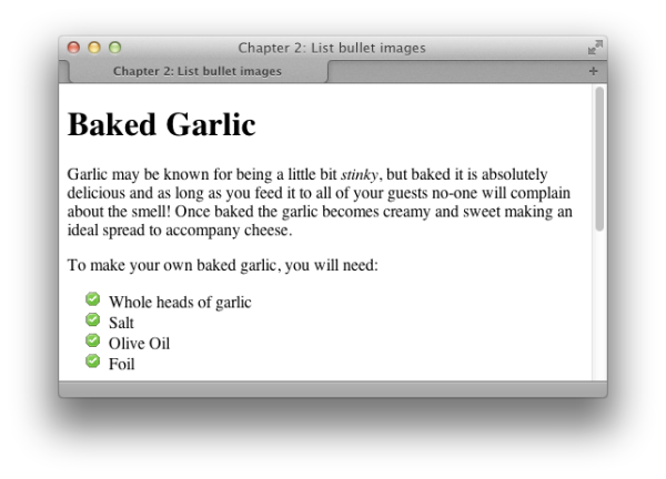
Create your image, then use the
list-style-image property to set your
bullets rather than list-style-type. This property
accepts a URL, which can incorporate the path to your image file as a
value:
Figure 2.26 shows how this effect can be
used to spruce up a list.
The
list-style-image property applies to
the list item (li) elements in the
list. But if you apply list-style-image to the
list as a whole (the ul or ol element), each individual list item will
inherit it. You do, however, have the option of setting the property
on individual list items by assigning a class or id to each, giving individual items their
own unique bullet images.
If turning the bullet into an image is falling short of the
desired result, your other option would be to use a background image,
which we’ll discuss in Chapter 3.
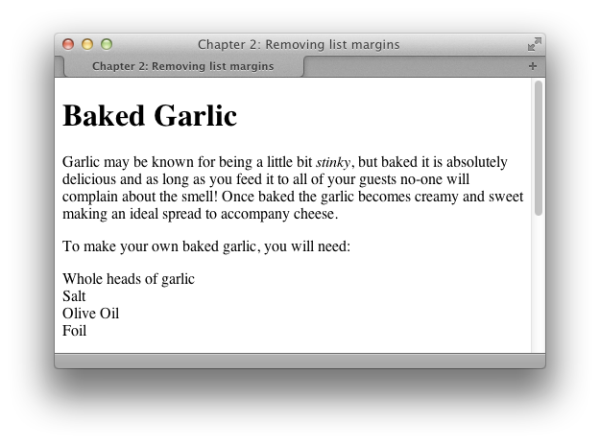
If you’ve set
list-style-type to
none, you may also wish to remove or decrease the
default left-hand margin that the browser sets on a list.
To remove the indentation entirely and have your list align left
so that it lines up with a preceding paragraph as shown in Figure 2.27, use a style rule similar to
this:
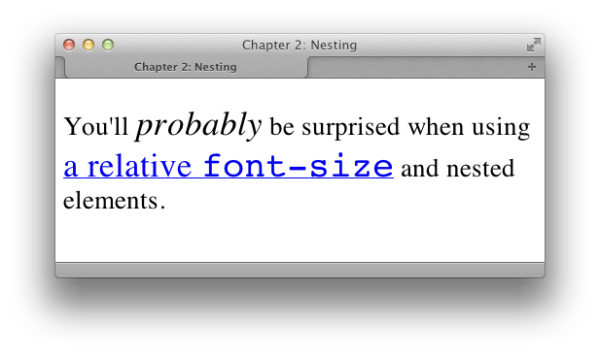
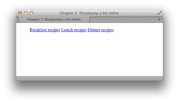
By default, list items display as block elements; therefore, each
new item will display on a new line. However, there may be times when some
content on your page is, structurally speaking, a list, even though you’d
prefer to display it in a different way—a collection of navigation links
is a good example. How can you display these list items
horizontally?
You can set a list to display horizontally by altering the
display property of the li element to inline, like
so:
chapter_02/listinline.html
(excerpt)
<ul class="nav">
  <li><a href="#breakfast">Breakfast recipes</a></li>
  <li><a href="#lunch">Lunch recipes</a></li>
  <li><a href="#dinner">Dinner recipes</a></li>
</ul>
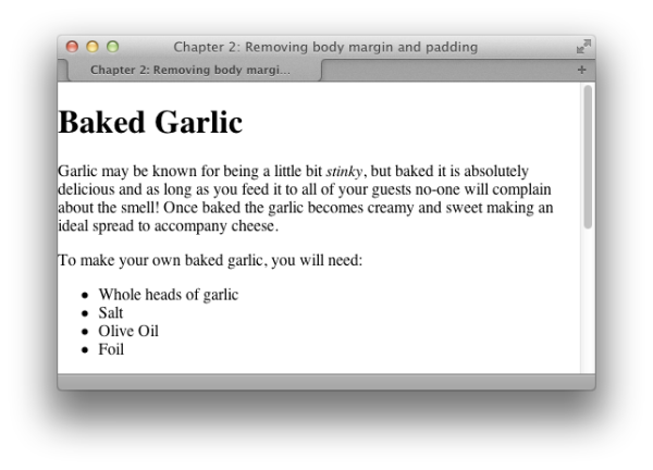
The default styles of most browsers add margins or padding between
the browser chrome and the page content; this is so that text in an
unstyled page ends before the edge of the browser window. You’ll probably
want to remove this gap or dictate the size of it, rather than leave it up
to the browser.
To remove all margin and padding around your content, use the
following style rules, which have been defined for the
body element:
body {
  margin: 0;
  padding: 0;
}
The result is shown in Figure 2.29.
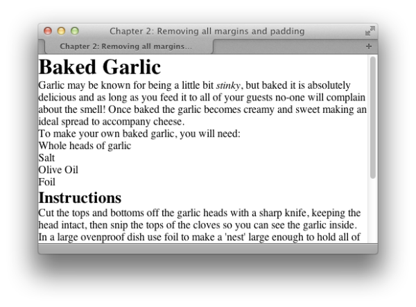
The display that you see in a browser when you view an unstyled
document is the result of the browser’s internal stylesheet. Often, the
differences that arise in the way various browsers display an unstyled
page occur because those browsers have slightly different internal
stylesheets.
One way to solve this problem is to remove the default margins and
padding from all elements before you create your styles. The following
rule will set the padding and margins on all elements to zero. It will
have the effect of causing every element on the page—paragraphs,
headings, lists, and more—to display without leaving any space between
them, as Figure 2.30 demonstrates:
This style rule uses the
universal selector—also known as the asterisk or star
(
*)—to remove the margins and padding
from everything, a technique known as performing a global
whitespace reset. If you’re working on a particularly
complex design, this may be the best way to start.
Once you’ve done this, though, you’ll need to go back and add
margins and padding to every element you use. This is particularly
important for some form elements, which may be rendered unusable by this
style rule.
For simpler designs, removing the whitespace from every element is
usually overkill, and simply generates more work; you’ll need to go back
and add padding and margins to elements such as paragraphs, blockquotes,
and lists. A viable alternative is to remove the margins and padding
from a select set of elements only. The following style rule shows how
this works, removing whitespace from heading and list elements:
h1, h2, h3, h4, h5, h6, ul, ol {
  margin: 0;
  padding: 0;
}
There has been much discussion in the web development community
over whether CSS Resets are a good idea or not. Personally, I don’t use
them, instead preferring to perform a similar method to what we’ve just
seen, depending on the project. If you do find them helpful, I’d suggest
looking at Eric
Meyer’s CSS Reset as a solid starting point.
When we discussed
font-family at the beginning
of this chapter, I mentioned that you have to be careful about selecting
fonts, as there are only a few fonts that you can safely assume are on
most users’ computers. However, CSS provides a way to use other fonts,
too, by loading a font file from the server.
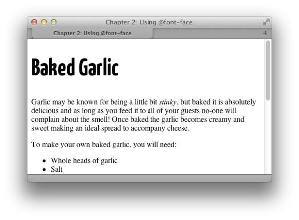
In theory, we can import a new font using the
font-face property:
@font-face {
  font-family: KaffeesatzBold;
  src: url(YanoneKaffeesatz-Bold.ttf);
}

h1 {
  font-family: KaffeesatzBold, sans-serif;
  font-weight: normal;
}
The @font-face rule declares the name of the
font, then enables you to load in a font file that’s on your server with
the
src property. You can then just use
this font in your font-family list as you would any
other font.
There are two issues with using
@font-face
currently. The first is that no single font format is supported across
all browsers and operating systems; therefore, importing a font is a
little more complicated than just loading in a single file as in the
preceding example.
The second issue is licensing. Many of the fonts that you
might use in Photoshop on your own computer aren’t licensed to be
uploaded to a web server and served in this way, as other users could
download the font file itself—just as they can download an image that
you’re using on your website.
If you do have a font that’s licensed for use on the
Web, your main issue is generating a package of fonts that will cover
all browsers and operating systems. The simplest way to do this is to
use one of the sites that can generate you a set of font files; I like
to use
Font
Squirrel. In addition to having a library of fonts you may use
on the Web, the site has a
Add the rule to your CSS, and you can then use this font as
normal. Make sure that you remember to upload the font files when
deploying your site.
@font-face generator
that will create your set of fonts from one that you upload. Upload
your font, and you can then download a package of various font types
along with the CSS rules needed to include them in your site:
chapter_02/fontface.css
(excerpt)
@font-face {
  font-family: 'YanoneKaffeesatzBold';
  src: url('yanonekaffeesatz-bold-webfont.eot'),
  src: url('yanonekaffeesatz-bold-webfont.eot?#iefix')
         format('embedded-opentype'),
       url('yanonekaffeesatz-bold-webfont.woff') format('woff'),
       url('yanonekaffeesatz-bold-webfont.ttf') format('truetype'),
       url('yanonekaffeesatz-bold-webfont.svg#YanoneKaffeesatzBold')
         format('svg'),
  font-weight: normal;
  font-style: normal;
}
If your font is without a license for such use, you can either
search sites such as Font Squirrel for a similar font, or take up
another option. There are a number of services now available—some from
the font foundries themselves—that offer served, licensed fonts for
use on websites, such as:
These services host the fonts in a secure way; you sign up for
an account, and can then use the fonts on your website by loading them
in from the remote server. Typically, they have a tool that allows you
to generate the code required for your site. Each service works in a
slightly different way, but getting up and running with a font usually
involves selecting it on the service and then pasting some code into
your site. You can then use the fonts as normal in your CSS.
Each service licenses different fonts, so generally you need to
select a service based on the font that you require. I think we’ll see
greater provision of web font services by the font foundries in the
future, as designers will be selecting fonts for projects based on the
availability of the web font.
This chapter has covered the more common questions asked by those
relatively new to CSS—questions that relate to styling and manipulating
text on the page. By combining these techniques, you can create attractive
effects that will degrade appropriately for browsers unable to support
certain aspects of CSS.
..................Content has been hidden....................
You can't read the all page of ebook, please click here login for view all page.