Unless you limit yourself to one-page websites, you’ll need to
incorporate navigation into your design. In fact, navigation is among the
most important parts of any web design, and requires a great deal of thought
if visitors are to move around your site easily.
Making site navigation easy is one area in which CSS really
comes into its own. While you could use images for your navigation, this
practice can have considerable downsides. Navigation created from images
means that it may be less accessible, as the images can’t be resized easily
to make the text larger. Zooming images of text can also lead to
hard-to-read text. In addition, if your site is built using a CMS, when you
want to add a new navigation item you’ll need to create a new image, which
may require the intervention of the designer. CSS allows you to create
attractive navigation that is, in reality, no more than text—text that can
be marked up in such a way as to ensure that it’s both accessible and
understandable by all, and easy to content-manage.
In this chapter, we’ll look at a variety of solutions for creating
CSS-based navigation and give you the skills to start creating your own
navigation styles.
Navigation is essentially a list of places to visit on your
site, so marking up navigation menus as lists makes sense semantically and
we can hook our CSS styles to the list elements themselves. It’s
important, however, to avoid having our navigation look like a standard
bulleted list as rendered by the browser’s internal stylesheet.
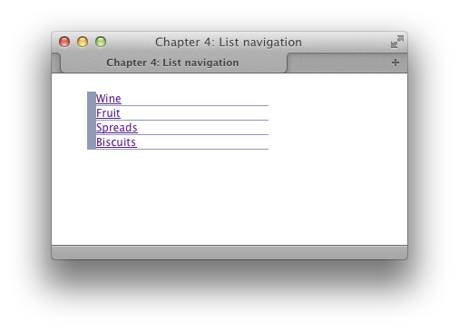
The simple navigation bar shown in Figure 4.1
is marked up as an unordered list and then styled using CSS.Here’s the markup:
Here is the CSS used to transform this plain list into a
standard-looking vertical navigation bar:
chapter_04/listnav.html
<!DOCTYPE html>
<html>
<head>
  <meta charset="utf-8" />
  <title>Chapter 4: List navigation</title>
  <link rel="stylesheet" href="listnav.css" />
</head>
<body>
  <div class="wrapper">
    <ul class="nav">
      <li><a href="">Wine</a></li>
      <li><a href="">Fruit</a></li>
      <li><a href="">Spreads</a></li>
      <li><a href="">Biscuits</a></li>
    </ul>
  </div>
</body>
</html>
chapter_04/listnav.css (excerpt)
.nav {
  list-style: none;
  margin: 0;
  padding: 0;
  width: 200px;
}

.nav li {
  border-left: 10px solid rgb(144,154,181);
  border-bottom: 1px solid rgb(144,154,181);
}

.nav li a:link,
.nav li a:visited {
  background-color: rgb(192,202,229);
  color: rgb(49,52,61);
  padding: 0.5em;
  display: block;
  text-decoration: none;
  border-left: 5px solid rgb(239,213,252);
}
To produce navigation based on an unordered list, you first have
to create your list, placing each navigation link inside a
You need to be able to identify this particular list, so
either add a class or ID to the opening
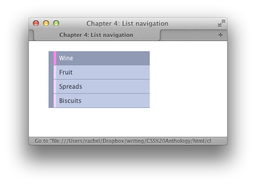
As Figure 4.2 shows, this now
looks like a regular list with the browser’s default styles
applied.Our next job is to style the unordered list itself, removing
list bullets, margins, and padding, and giving the list itself a width
as this will become the container for the items within:
Our list now displays as a list of text in the browser, with
nothing to visually identify it as a list, as seen in Figure 4.3. The next task is to add some CSS to the list items
themselves. All I’m doing is adding a chunky left border and thin bottom
border. No padding is added to the elements themselves here, so it all
looks a bit squashed up as you can see in Figure 4.4:
Finally, we’ll add CSS to the links themselves. This is where
our list really starts to look like navigation:
I have added a
li element:
chapter_04/listnav.html
(excerpt)
<ul>
  <li><a href="">Wine</a></li>
  <li><a href="">Fruit</a></li>
  <li><a href="">Spreads</a></li>
  <li><a href="">Biscuits</a></li>
</ul>
ul as we’re doing here, or place the list
inside another container:
chapter_04/listnav.html
(excerpt)
<ul class="nav">
  <li><a href="">Wine</a></li>
  <li><a href="">Fruit</a></li>
  <li><a href="">Spreads</a></li>
  <li><a href="">Biscuits</a></li>
</ul>
chapter_04/listnav.css (excerpt)
.nav {
  list-style-type: none;
  margin: 0;
  padding: 0;
  width: 200px;
}
chapter_04/listnav.css (excerpt)
.nav li {
  border-left: 10px solid rgb(144,154,181);
  border-bottom: 1px solid rgb(144,154,181);
}
chapter_04/listnav.css (excerpt)
.nav li a:link,
.nav li a:visited {
  background-color: rgb(192,202,229);
  color: rgb(49,52,61);
  padding: 0.5em;
  display: block;
  text-decoration: none;
  border-left: 5px solid rgb(239,213,252);
}
background-color and
color using RGB color values in this case, although
you could also use hex. I’ve also added padding to the link itself and
set it to display: block.
This last tweak is important, because the link is an inline
element and by default doesn’t take up the full area of the li—so it’s not a nice easy target to click. To
make links display like block-level elements, we need to
explicitly declare the value of the
display property to be
block. We’ll discover more about this in later
chapters; for now, remember that if you want your link to take up the
full area of its container, it needs to be set to display:
block.
We need to add the padding to the link, not the list item; if we
added it to the list item, the padding area would be unclickable—and we
want to create an area where it’s easy to click the link.
I’ve also set text-decoration to be
none so as to remove the underline that browsers
apply to links, and given the link a left border, producing a double
border effect as the li already has a
border.
You should now have a navigation bar as shown in Figure 4.1. You can play around with this technique trying
different colors and stylistic effects once you’ve mastered the basic
idea.
Site navigation often features a rollover
effect: when a user holds the cursor over a menu button, a new
button image displays, creating a highlighting effect. We can create this
effect a number of ways, and we’ll look at more advanced variations later
in the chapter. Here, however, is a very simple method.
Using CSS to build your navigation makes the creation of
attractive rollover effects far simpler than it would be if you used
images. The CSS rollover is created using the
Figure 4.5 shows the effect seen
when the cursor is positioned over the first menu item.
:hover pseudo-class, which we met when
discussing styling links in Chapter 2.
Let’s take the previous list-navigation example and add the
following rule to create a rollover effect:
chapter_04/listnav-hover.css
(excerpt)
.nav li a:hover {
background-color: rgb(144,154,181);
color: rgb(255,255,255);
border-left: 5px solid rgb(250,136,234);
}
Put simply, I’ve changed the color of three rules applied to the
link: background color, color of the text, and left border. This then
creates a pleasing visual effect when the link is hovered over.
So far we’ve only looked at one simple level of navigation. How do
we include a second level of navigation within a menu?
Lists remain a perfect tool to structure navigation that contains
subnavigation, as we can create a list within a list, and the two lists
will be easy to understand when marked up this way. This applies even
for browsers without support for CSS, or that read the contents of the
navigation to a user.
To demonstrate multilevel navigation, we can edit the example used
in Figure 4.5 and add a nested list:
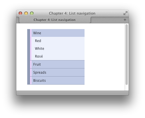
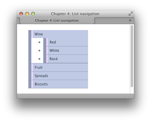
The result of this can be seen in Figure 4.6.
chapter_04/listnav-nested.html
<!DOCTYPE html>
<html>
<head>
<meta charset="utf-8" />
<title>Chapter 4: List navigation</title>
<link rel="stylesheet" href="listnav-nested.css" />
</head>
<body>
<div class="wrapper">
<ul class="nav">
<li><a href="">Wine</a>
<ul>
<li><a href="">Red</a></li>
<li><a href="">White</a></li>
<li><a href="">Rosé</a></li>
</ul>
</li>
<li><a href="">Fruit</a></li>
<li><a href="">Spreads</a></li>
<li><a href="">Biscuits</a></li>
</ul>
</div>
</body>
</html>
chapter_04/listnav-nested.css
body {
background-color: #fff;
color: #000;
margin: 0;
padding: 0;
font: 0.75em/1.3 "Lucida Grande", "Lucida Sans Unicode",
"Lucida Sans", Verdana, Tahoma, sans-serif;
}
.wrapper {
width: 80%;
margin: 20px auto 40px auto;
}
.nav {
list-style: none;
margin: 0;
padding: 0;
width: 200px;
}
.nav li {
border-left: 10px solid rgb(144,154,181);
border-bottom: 1px solid rgb(144,154,181);
}
.nav li a:link,
.nav li a:visited {
background-color: rgb(192,202,229);
color: rgb(49,52,61);
padding: 0.5em;
display: block;
text-decoration: none;
border-left: 5px solid rgb(239,213,252);
}
.nav li a:hover {
  background-color: rgb(144,154,181);
  color: rgb(255,255,255);
  border-left: 5px solid rgb(250,136,234);
}
.nav ul {
  list-style: none;
  margin: 0;
  padding: 0;
  border: 0;
}

.nav ul li {
  border: 0;
}
.nav ul li a:link,
.nav ul li a:visited {
  background-color: rgb(237,241,252);
  color: rgb(49,52,61);
  padding: 0.5em 0.5em 0.5em 1em;
  display: block;
  text-decoration: none;
  border-left: 5px solid rgb(239,213,252);
}

.nav ul li a:hover {
  background-color: rgb(255,255,255);
  color: rgb(49,52,61);
  border-left: 5px solid rgb(250,136,234);
}
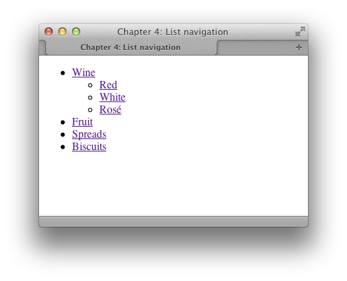
Nested lists are a perfect way to describe the navigation system
that we’re working with here. The first list contains the main sections
of my site: food and drink that goes nicely with cheese. The subsections
of the wine section are then nested underneath the Wine list item. Even
without any CSS styling, the structure of the site is clear and
intelligible, as you can see in Figure 4.7.The markup simply nests the sublist within the
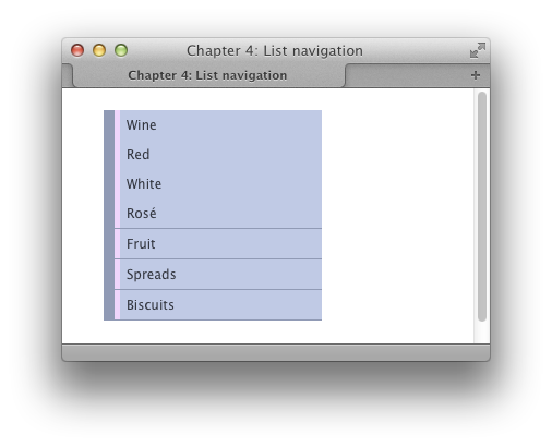
If we took our example from earlier and just added the
nested list markup, we’d end up with the example shown in Figure 4.8: our second list has inherited a
lot of the styling of the parent list, but looks a little strange. Due
to this inheritance effect, we need to overwrite values used in the
first list when styling our nested list.First, I remove the bullets, margins, and padding from the
nested list. Then I remove the decorative left-hand border from the
The nested links are now harder to distinguish from the
top-level items, so I’ll style the links within the nested list so that
they’re distinct from the main section links:
All I’ve done here is change the colors and padding on the
links within our nested
li element of the main list:
chapter_04/listnav-nested.html
(excerpt)
<ul class="nav">
<li><a href="">Wine</a>
<ul>
<li><a href="">Red</a></li>
<li><a href="">White</a></li>
<li><a href="">Rosé</a></li>
</ul>
</li>
<li><a href="">Fruit</a></li>
<li><a href="">Spreads</a></li>
<li><a href="">Biscuits</a></li>
</ul>
li. The list now displays as in Figure 4.9:
chapter_04/listnav-nested.css
(excerpt)
.nav ul {
list-style: none;
margin: 0;
padding: 0;
border: 0;
}
.nav ul li {
border: 0;
}
chapter_04/listnav-nested.css
(excerpt)
.nav ul li a:link,
.nav ul li a:visited {
background-color: rgb(237,241,252);
color: rgb(49,52,61);
padding: 0.5em 0.5em 0.5em 1em;
display: block;
text-decoration: none;
border-left: 5px solid rgb(239,213,252);
}
.nav ul li a:hover {
background-color: rgb(255,255,255);
color: rgb(49,52,61);
border-left: 5px solid rgb(250,136,234);
}
li to create
a pleasing effect; I also added some different rules for the hover state
of these subitems. Remember that here you’re overwriting the values set
on links for the external list, so you only need to set those you’ve
changed.
The examples so far in this chapter have dealt with vertical
navigation, usually found to the left or right of a site’s main content
area; however, site navigation is also commonly found as a horizontal menu
close to the top of the document.
Figure 4.10 shows a horizontal navigation
menu that’s created using a list.Here’s the HTML and CSS used to create this display:
chapter_04/horizontal.html
<!DOCTYPE html>
<html>
<head>
  <meta charset="utf-8" />
  <title>Chapter 4: Horizontal navigation</title>
  <link rel="stylesheet" href="horizontal.css" />
</head>
<body>
  <div class="wrapper">
    <ul class="nav">
      <li><a href="">Wine</a></li>
      <li><a href="">Fruit</a></li>
      <li><a href="">Spreads</a></li>
      <li><a href="">Biscuits</a></li>
    </ul>
  </div>
</body>
</html>
chapter_04/horizontal.css
(excerpt)
.nav {
  list-style: none;
  margin: 0;
  padding: 0;
}

.nav li {
  float: left;
  min-width: 8em;
  margin-right: 0.5em;
  text-align: center;
}

.nav li a:link,
.nav li a:visited {
  background-color: rgb(255, 255, 255);
  color: rgb(85, 85, 102);
  display: block;
  padding: 0.2em;
  text-decoration: none;
  font-weight: bold;
  margin: 0 0 0.2em 0;
  -webkit-border-radius: 3px;
  -moz-border-radius: 3px;
  border-radius: 3px;
  -webkit-box-shadow: 3px 3px 3px 3px rgba(43, 43, 77, 0.5);
  -moz-box-shadow: 3px 3px 3px 3px rgba(43, 43, 77, 0.5);
  box-shadow: 3px 3px 3px 3px rgba(43, 43, 77, 0.5);
}

.nav li a:hover {
  background-color: rgba(255, 255, 255, 0.8);
  color: rgb(43, 43, 77);
}
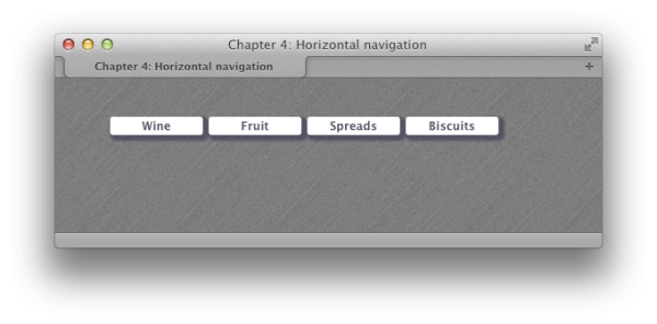
This navigation starts out with an identical list to the one we
used earlier to create vertical navigation:
I start by removing the list bullets, margins and
padding:
We now want our list items to display next to each other, rather than on separate lines. There are two ways we can do this. We could set the
Our menu displays as in
Figure 4.11
.
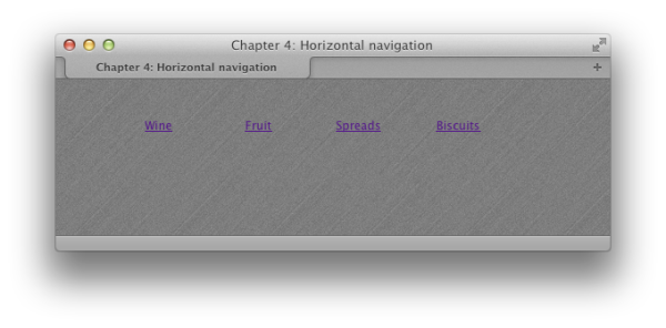
With our list items in place, we just need to style the links. First, we can style these items using CSS that will work even with very old browsers:
This gives us little block-like navigation items. I really want them to be rounded, though, and have drop shadows, so to achieve this I use some CSS3 properties:
It’s quite possible that a person is going to view the site using a browser lacking support for these properties; however, the navigation looks fine without them—I’ve added them as extra styling for those browsers with support. This practice is known as
progressive enhancement, and we’ll discuss this tactic for supporting older browsers later in the book.
Finally, I’ve added a hover state, tweaking the alpha value of the
background color using RGBA. I could equally have just set a different
color here:
If you’re creating boxes around each link—as I have
here—remember that in order to make more space between the text and the
edge of its container, you’ll need to add more left and right padding to
the links. To create more space between the navigation items, add left
and right margins to the links.
chapter_04/horizontal.html
(excerpt)
<ul class="nav">
  <li><a href="">Wine</a></li>
  <li><a href="">Fruit</a></li>
  <li><a href="">Spreads</a></li>
  <li><a href="">Biscuits</a></li>
</ul>
display
property of the
li
to
inline
as we discussed in
Chapter 2
; however, to make the list items easier to style, I’m going to use a different method that relies on the
float
property. We’ll discuss
float
properly later in the book; for now, you can see how it floats items alongside each other:
chapter_04/horizontal.css
(excerpt)
.nav li {
float: left;
min-width: 8em;
margin-right: 0.5em;
text-align: center;
}
chapter_04/horizontal.css
(excerpt)
.nav li a:link,
.nav li a:visited {
background-color: rgb(255, 255, 255);
color: rgb(85, 85, 102);
display: block;
padding: 0.2em;
text-decoration: none;
font-weight: bold;
margin: 0 0 0.2em 0;
…
}
chapter_04/horizontal.css
(excerpt)
.nav li a:link,
.nav li a:visited {
background-color: rgb(255, 255, 255);
color: rgb(85, 85, 102);
display: block;
padding: 0.2em;
text-decoration: none;
font-weight: bold;
margin: 0 0 0.2em 0;
-webkit-border-radius: 3px;
-moz-border-radius: 3px;
border-radius: 3px;
-webkit-box-shadow: 3px 3px 3px 3px rgba(43, 43, 77, 0.5);
-moz-box-shadow: 3px 3px 3px 3px rgba(43, 43, 77, 0.5);
box-shadow: 3px 3px 3px 3px rgba(43, 43, 77, 0.5);
}
chapter_04/horizontal.css
(excerpt)
.nav li a:hover {
background-color: rgba(255, 255, 255, 0.8);
color: rgb(43, 43, 77);
}
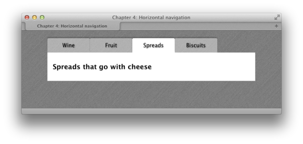
Navigation that appears as tabs across the top of the page is
popular. Many sites create these tabs using images; however, this can make
it less accessible, and it’s also problematic if your navigation is
created using a Content Management System, as users of such a system are
unable to add tabs or change the text in the tabs. The good news is it’s
possible to create a tab effect just using CSS.
The navigation in Figure 4.12 was created by
styling a horizontal list with CSS.And here’s the markup for it:
chapter_04/tabs.html
<!DOCTYPE html>
<html>
<head>
<meta charset="utf-8" />
<title>Chapter 4: Horizontal navigation</title>
<link rel="stylesheet" href="tabs.css" />
</head>
<body>
<div class="wrapper">
<ul class="nav">
<li><a href="">Wine</a></li>
<li><a href="">Fruit</a></li>
<li class="selected"><a href="">Spreads</a></li>
<li><a href="">Biscuits</a></li>
</ul>
<div class="content">
<h1>Spreads that go with cheese</h1>
</div>
</div>
</body>
</html>
chapter_04/tabs.css (excerpt)
.nav {
list-style: none;
margin: 0;
padding: 0;
float: left;
width: 100%;
}
.nav li {
float: left;
min-width: 8em;
text-align: center;
}
.nav li a:link,
.nav li a:visited {
background-color: rgba(255,255,255,0.4);
color: rgb(0,0,0);
text-decoration: none;
display: block;
padding: 0.75em;
-moz-border-radius-topleft: 3px;
-moz-border-radius-topright: 3px;
-webkit-border-radius: 3px 3px 0px 0px;
border-radius: 3px 3px 0px 0px;
-webkit-box-shadow: 0px -3px 2px 0px rgba(0, 0, 0, 0.2);
-moz-box-shadow: 0px -3px 2px 0px rgba(0, 0, 0, 0.2);
box-shadow: 0px -3px 2px 0px rgba(0, 0, 0, 0.2);
text-shadow: 1px 1px 3px rgba(0, 0, 0, 0.5);
}
.nav li.selected a:link,
.nav li.selected a:visited {
background-color: rgb(255,255,255);
}
.nav li a:hover {
background-color: rgba(255,255,255,0.8);
}
.content {
clear: both;
background-color: #fff;
color: #000;
padding: 1em;
}
h1 {
font-size: 128.6%;
}
This navigation started life in a similar way to the previous
solution that created horizontal navigation—marked up as a list. Imagine
that we’re now on the main page of one of our sections, so we want to
have a tab highlighted to show where we are. I’ve added a
The first two CSS declarations put our list items into
horizontal alignment:
Now we can start to style the unselected tabs. I am using
RGBA for the background color; this creates a
semitransparent effect, letting the background show through. If you’re
concerned about browsers that lack RGBA support, you could use a solid
color here instead:
This gives us a set of tabs as shown in Figure 4.13. I’m using
A final touch is to add a hover state to the tabs. Again,
I’m just tweaking the opacity using RGBA, but this could also be a solid
color:
class of selected to one item:
chapter_04/tabs.html (excerpt)
<ul class="nav">
<li><a href="">Wine</a></li>
<li><a href="">Fruit</a></li>
<li class="selected"><a href="">Spreads</a></li>
<li><a href="">Biscuits</a></li>
</ul>
chapter_04/tabs.css (excerpt)
.nav {
list-style: none;
margin: 0;
padding: 0;
float: left;
width: 100%;
}
.nav li {
float: left;
min-width: 8em;
text-align: center;
}
chapter_04/tabs.css (excerpt)
.nav li a:link,
.nav li a:visited {
background-color: rgba(255,255,255,0.4);
color: rgb(0,0,0);
text-decoration: none;
display: block;
padding: 0.75em;
-moz-border-radius-topleft: 3px;
-moz-border-radius-topright: 3px;
-webkit-border-radius: 3px 3px 0px 0px;
border-radius: 3px 3px 0px 0px;
-webkit-box-shadow: 0px -3px 2px 0px rgba(0, 0, 0, 0.2);
-moz-box-shadow: 0px -3px 2px 0px rgba(0, 0, 0, 0.2);
box-shadow: 0px -3px 2px 0px rgba(0, 0, 0, 0.2);
text-shadow: 1px 1px 3px rgba(0, 0, 0, 0.5);
}
border-radius to slightly curve the
top corners of the tabs,
box-shadow to create a shadow effect
round the sides and top, and
text-shadow to enhance the
text.I now want to make my selected tab look as if it joins onto
the background color of the content area. I do this using the following
declaration which targets the 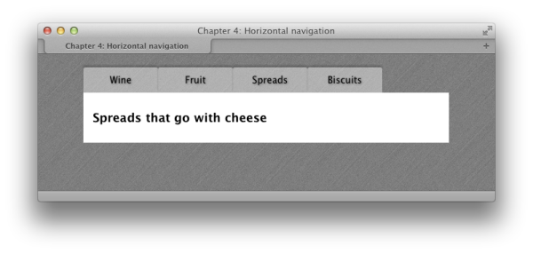
li with
a class of selected. All it does is change the
background color to white:
chapter_04/tabs.css (excerpt)
.nav li.selected a:link,
.nav li.selected a:visited {
background-color: rgb(255,255,255);
}
Note: Embrace CSS3-enhanced Effects
With the use of CSS—and, in particular, the finishing touches offered by CSS3—we can easily create attractive tab effects. But this hasn’t always been the case. Previous versions of this book contained a solution that was based on the popular “sliding doors” method of using images to create flexible tabs. This method uses four background images to create the rounded-corner tab effect. If you need to support ancient browsers with a full visual effect, or are tied to a look and feel that’s very graphic-heavy, you may need to consider these older methods. For most sites, I’d encourage you to make clever use of CSS3 to enhance a slightly plainer view of the site for older browsers.
The last solution added a class to the selected menu item, but if
your menu is stored in a linked server-side file—say a PHP file pulled in
with an
include statement—this may not be possible. How
can you indicate which menu item is selected here?
Here’s a neat little trick for highlighting a menu tab. First,
edit the HTML to add a class to every menu tab; I usually use the
section name. Add an ID to the
In the CSS, we can now target the
body
element of the page that is the same as one of the classes:
chapter_04/selected.html
<!DOCTYPE html> <html> <head> <meta charset="utf-8" /> <title>Chapter 4: Horizontal navigation</title> <link rel="stylesheet" href="selected.css" /> </head> <body id="spreads"> <div class="wrapper"> <ul class="nav"> <li class="wine"><a href="">Wine</a></li> <li class="fruit"><a href="">Fruit</a></li> <li class="spreads"><a href="">Spreads</a></li> <li class="biscuits"><a href="">Biscuits</a></li> </ul> <div class="content"> <h1>Spreads that go with cheese</h1> </div> </div> </body> </html>
li with a class only if it’s inside the body with the same id:
chapter_04/selected.css
(excerpt)
.nav {
list-style: none;
margin: 0;
padding: 0;
float: left;
width: 100%;
}
.nav li {
float: left;
min-width: 8em;
text-align: center;
}
.nav li a:link,
.nav li a:visited {
background-color: rgba(255,255,255,0.4);
color: rgb(0,0,0);
text-decoration: none;
display: block;
padding: 0.75em;
-moz-border-radius-topleft: 3px;
-moz-border-radius-topright: 3px;
-webkit-border-radius: 3px 3px 0px 0px;
border-radius: 3px 3px 0px 0px;
-webkit-box-shadow: 0px -3px 2px 0px rgba(0, 0, 0, 0.2);
-moz-box-shadow: 0px -3px 2px 0px rgba(0, 0, 0, 0.2);
box-shadow: 0px -3px 2px 0px rgba(0, 0, 0, 0.2);
text-shadow: 1px 1px 3px rgba(0, 0, 0, 0.5);
}
#spreads .nav li.spreads a:link,
#spreads .nav li.spreads a:visited,
#fruit .nav li.fruit a:link,
#fruit .nav li.fruit a:visited,
#wine .nav li.wine a:link,
#wine .nav li.wine a:visited,
#biscuits .nav li.biscuits a:link,
#biscuits .nav li.biscuits a:visited {
background-color: rgb(255,255,255);
}
.nav li a:hover {
background-color: rgba(255,255,255,0.8);
}
If you switch the
body
element’s ID to any of the other ID names, you will see the selected
menu tab change. This works because when we use the following selector,
we’re saying, “target the link inside an li with a class of spreads, which is inside an element with an
ID of spreads”:#spreads .nav li.spreads a:linkSo a
li with a class of wine fails to match, and a li with a class of spreads inside the body with an id of wine also wouldn’t match. You then just need
to output the section name as an id
on the body tag, which you may have
access to in your page, or be able to output via your CMS.
A popular style of navigation is to have the title of the section
plus some descriptive text underneath. How should we create this using
CSS?
Once again, we’re using a list structure for our navigation, but
this time adding more information to each link. This creates the
navigation shown in Figure 4.14.
In this example, the section titles are in the same
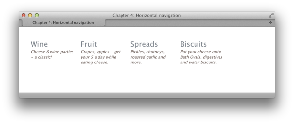
a elements as their descriptions, but also
within strong elements set to display
as blocks:
chapter_04/horizontal2.html
<!DOCTYPE html>
<html>
<head>
<meta charset="utf-8" />
<title>Chapter 4: Horizontal navigation</title>
<link rel="stylesheet" href="horizontal2.css" />
</head>
<body>
<div class="wrapper">
<ul class="nav">
<li><a href=""><strong>Wine</strong>
<small>Cheese & wine parties - a classic!</small>
</a></li>
<li><a href=""><strong>Fruit</strong>
<small>Grapes, apples - get your 5 a day while eating
cheese.</small>
</a></li>
<li><a href=""><strong>Spreads</strong>
<small>Pickles, chutneys, roasted garlic and more.</small>
</a></li>
<li><a href=""><strong>Biscuits</strong>
<small>Put your cheese onto Bath Ovals, digestives and water
biscuits.</small>
</a></li>
</ul>
</div>
</body>
</html>
chapter_04/horizontal2.css
(excerpt)
.nav {
  list-style: none;
  margin: 0;
  padding: 0;
}
.nav li {
float: left;
width: 130px;
margin-right: 20px;
}
.nav li a:link strong,
.nav li a:visited strong {
font-size: 157.1%;
display: block;
font-weight: normal;
color: rgb(119,126,134);
font-style: normal;
}
.nav li a:link,
.nav li a:visited {
text-decoration: none;
color: rgb(93,78,72);
font-style: italic;
}
.nav li a:hover, .nav li a:hover strong {
color: rgb(0,0,0);
}
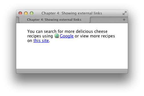
It can be helpful to visitors if links that lead to another site are
displayed differently from links to pages on your own site. Adding a class
to every link in order to be able to select it, however, is far from
practical.
If your internal links omit your site’s full domain, we can use
attribute selectors to target external links: icons are
placed next to external links, but not internal links.
We can use an attribute selector that looks for
Now, any links on our page that start with
chapter_04/external-links.html
<!DOCTYPE html>
<html>
<head>
  <meta charset="utf-8" />
  <title>Chapter 4: Showing external links</title>
  <link rel="stylesheet" href="external-links.css" />
</head>
<body>
  <div class="wrapper">
    <p>You can search for more delicious cheese recipes using
      <a href="http://google.com">Google</a> or view more recipes on
      <a href="/recipes">this site</a>.</p>
  </div>
</body>
</html>
href attributes containing a value starting
with http: and add a background
image:
chapter_04/external-links.css
(excerpt)
a[href^="http:"] {
  padding-left: 20px;
  background-image: url(icon-link-external.png);
  background-repeat: no-repeat;
}
http: (which should be external, as we don’t
link to pages on our own site this way) will display with the world
icon.
The attribute selector is widely supported in modern browsers,
although it will be ignored in
Internet Explorer 6. In browsers that lack support for
this selector, the link will just display as normal; thus, it’s a nice
enhancement for browsers with support while leaving the experience
unchanged for those with older browsers.
Let’s take a closer look at that selector:
Figure 4.16 shows all three types in
action.
a[href ^="http:"]We’re selecting the
href
attribute, and we want our selector to match when it finds the text
http: at the beginning of the
attribute value. The ^= operator means “begins with.”
You could use a similar selector to match all email links; for example,
a[href ^="mailto:"].
Another
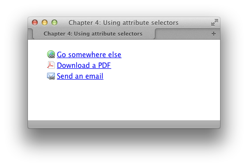
useful attribute selector is to target the file extension of a link.
This means that you can add a small icon to show that a document is a
PDF or other document type, depending on the extension. The selector
a[href $=".pdf"] will match any link that has a file
extension of .pdf. The $=
operator means “ends with,” so this selector will match when an href attribute value ends with
.pdf:
chapter_04/external-links2.html
<!DOCTYPE html>
<html>
<head>
  <meta charset="utf-8" />
  <title>Chapter 4: Using attribute selectors</title>
  <link rel="stylesheet" href="external-links2.css" />
</head>
<body>
  <div class="wrapper">
    <ul class="links">
      <li><a href="http://google.com">Go somewhere else</a></li>
      <li><a href="/files/example.pdf">Download a PDF</a></li>
      <li><a href="mailto:[email protected]">Send an email</a></li>
    </ul>
  </div>
</body>
</html>
chapter_04/external-links2.css
(excerpt)
a[href^="http:"] {
  padding-left: 20px;
  background-image: url(icon-link-external.png);
  background-repeat: no-repeat;
}

a[href^="mailto:"] {
  padding-left: 20px;
  background-image: url(icon-link-email.png);
  background-repeat: no-repeat;
}

a[href$=".pdf"] {
  padding-left: 20px;
  background-image: url(icon-pdf.png);
  background-repeat: no-repeat;
}
With the properties offered by CSS3, we can create many navigation
effects without using images at all; however, you’re likely to also want
to work with images in your navigation. Combining images and text gives
you many opportunities to create attractive and usable navigation.
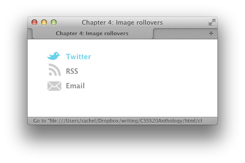
This solution demonstrates how to use images in your navigation,
including a rollover effect without JavaScript, as seen in Figure 4.17.
chapter_04/rollover-image.html
<!DOCTYPE html>
<html>
<head>
  <meta charset="utf-8" />
  <title>Chapter 4: Image rollovers</title>
  <link rel="stylesheet" href="rollover-image.css" />
</head>
<body>
  <div class="wrapper">
    <ul class="intouch">
      <li class="twitter"><a href="">Twitter</a></li>
      <li class="rss"><a href="">RSS</a></li>
      <li class="email"><a href="">Email</a></li>
    </ul>
  </div>
</body>
</html>
chapter_04/rollover-image.css
(excerpt)
.intouch {
  list-style: none;
  margin: 0;
  padding: 0;
}

.intouch li a:link, .intouch li a:visited {
  padding: 0.5em 0 0.5em 40px;
  display: block;
  font-weight: bold;
  background-repeat: no-repeat;
  background-image: url(sprite-roll.png);
  text-decoration: none;
  color: rgb(136,136,136);
}

.intouch li.twitter a:link, .intouch li.twitter a:visited {
  background-position: 0 6px;
}

.intouch li.rss a:link, .intouch li.rss a:visited {
  background-position: 0 -30px;
}

.intouch li.email a:link, .intouch li.email a:visited {
  background-position: 0 -60px;
}

.intouch li.twitter a:hover {
  background-position: 0 -90px;
  color: rgb(105,210,231);
}

.intouch li.rss a:hover {
  background-position: 0 -126px;
  color: rgb(243,134,48);
}

.intouch li.email a:hover {
  background-position: 0 -156px;
  color: rgb(56,55,54);
}
This solution uses one single image file
(sprite-roll.png, shown in Figure 4.18) that combines all the inactive and hovered
states of the image. We then use this file as a background image,
adjusting its location to show the default image for each link, and then
the hover image on hovering the link.
Combining images in this way is known as creating an
image sprite, and it’s a highly
useful technique that helps to reduce load on your server by enabling
one request to be made for a file, rather than several requests for lots
of small files.
The markup is just a list of links, where I’ve given each
I add some basic styles to the list and each list item, and
then style the links, adding the sprite as a background image set to
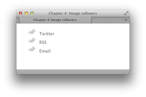
If you look at the list now in Figure 4.19, I can see the sprite showing the same
image for all items.We can now start to shift the background image into place to
show the initial images (the gray icon). The first link is almost
correct; I just want to tweak the position of the bird a little:
With the second link, I need to shift the background image
until it shows the gray RSS icon. I then do the same for the final mail
icon:
Our gray icons are now in place, and I can add some CSS to
pull the background into position when each link is hovered over using
exactly the same principle:
This gives us a rollover image effect that combines a single
background image and text for an accessible, search-engine-friendly
navigation bar.
li a class to indicate the type of link it
is:
chapter_04/rollover-image.html
(excerpt)
<ul class="intouch">
  <li class="twitter"><a href="">Twitter</a></li>
  <li class="rss"><a href="">RSS</a></li>
  <li class="email"><a href="">Email</a></li>
</ul>
no-repeat:
chapter_04/rollover-image.css
(excerpt)
.intouch {
  list-style: none;
  margin: 0;
  padding: 0;
}

.intouch li a:link, .intouch li a:visited {
  padding: 0.5em 0 0.5em 40px;
  display: block;
  font-weight: bold;
  background-repeat: no-repeat;
  background-image: url(sprite-roll.png);
  text-decoration: none;
  color: rgb(136,136,136);
}
chapter_04/rollover-image.css
(excerpt)
.intouch li.twitter a:link, .intouch li.twitter a:visited {
  background-position: 0 6px;
}
chapter_04/rollover-image.css
(excerpt)
.intouch li.rss a:link, .intouch li.rss a:visited {
  background-position: 0 -30px;
}

.intouch li.email a:link, .intouch li.email a:visited {
  background-position: 0 -60px;
}
chapter_04/rollover-image.css
(excerpt)
.intouch li.twitter a:hover {
  background-position: 0 -90px;
  color: rgb(105,210,231);
}

.intouch li.rss a:hover {
  background-position: 0 -126px;
  color: rgb(243,134,48);
}

.intouch li.email a:hover {
  background-position: 0 -156px;
  color: rgb(56,55,54);
}
Before finishing this solution, I want to show you an alternate
method of creating a nice rollover effect using the
opacity property.
The effect shown in Figure 4.20 is
achieved with the same markup we’ve been using and an image sprite,
but this one only has three states in it. I have then used the
opacity property to make the image and text
semitransparent.
On hover, I set 
opacity to
1—that’s fully opaque (not transparent at all),
making a simple rollover effect:
chapter_04/rollover-opacity.css
(excerpt)
.intouch li a:link, .intouch li a:visited {
  padding: 0.5em 0 0.5em 40px;
  display: block;
  font-weight: bold;
  background-repeat: no-repeat;
  background-image: url(sprite.png);
  text-decoration: none;
}

.intouch li.twitter a:link, .intouch li.twitter a:visited {
  background-position: 0 6px;
  color: rgb(105,210,231);
  opacity: 0.5;
}

.intouch li.rss a:link, .intouch li.rss a:visited {
  background-position: 0 -30px;
  color: rgb(243,134,48);
  opacity: 0.5;
}

.intouch li.email a:link, .intouch li.email a:visited {
  background-position: 0 -60px;
  color: rgb(56,55,54);
  opacity: 0.5;
}

.intouch li.twitter a:hover,
.intouch li.rss a:hover,
.intouch li.email a:hover {
  opacity: 1;
}
A sitemap is a helpful page on your website that lists all pages in
the site. It can help those who are unable to find what they’re looking
for in the navigation, as well as provide a quick way to see what’s
available and go to it with one click.
A sitemap is really a list of all the destinations on your site,
so it’s ideally marked up as a set of nested lists. The first list is
your main navigation, with the internal navigation nested within each
main navigation point. A list works even if your site structure has many
levels and should be easy to generate from a content management system.
Figure 4.21 displays the results of the following
code:
chapter_04/sitemap.html
<!DOCTYPE html>
<html>
<head>
  <meta charset="utf-8" />
  <title>Chapter 4: Sitemaps</title>
  <link rel="stylesheet" href="sitemap.css" />
</head>
<body>
  <div class="wrapper">
    <ul class="sitemap">
      <li><a href="">Home</a></li>
      <li><a href="">About us</a>
        <ul>
          <li><a href="">Directors</a></li>
          <li><a href="">History</a></li>
        </ul>
      </li>
      <li><a href="">Products</a></li>
      <li><a href="">Ordering information</a>
        <ul>
          <li><a href="">Our shops</a>
            <ul>
              <li><a href="">London</a></li>
              <li><a href="">Newcastle</a></li>
            </ul>
          </li>
          <li><a href="">Other stockists</a></li>
        </ul>
      </li>
      <li><a href="">Contact Us</a></li>
    </ul>
  </div>
</body>
</html>
chapter_04/sitemap.css (excerpt)
.sitemap {
  list-style: none;
  margin: 0;
  padding: 0;
}

.sitemap > li {
  border: 2px solid rgba(153,178,183,0.2);
  -webkit-border-radius: 10px;
  -moz-border-radius: 10px;
  border-radius: 10px;
  margin: 0 0 1em 0;
}

.sitemap > li:hover {
  border: 2px solid rgba(153,178,183,1);
}

.sitemap > li > a:link, .sitemap > li > a:visited {
  background-color: rgba(153,178,183,0.1);
  color: rgb(0,0,0);
  text-decoration: none;
  display: block;
  padding: 0.75em;
}

.sitemap > li:hover > a:link, .sitemap > li:hover > a:visited {
  background-color: rgba(153,178,183,0.5);
}

.sitemap ul {
  margin: 1em 0 1em 0;
  padding: 0;
  list-style: none;
  line-height: 1.8;
}

.sitemap ul ul {
  margin: 0.5em 0 0.5em 0;
}

.sitemap ul a:link, .sitemap ul a:visited {
  padding: 0.75em;
  text-decoration: none;
  color: rgb(69,80,83);
}

.sitemap ul ul a:link:before, .sitemap ul ul a:visited:before {
  content: "> ";
}
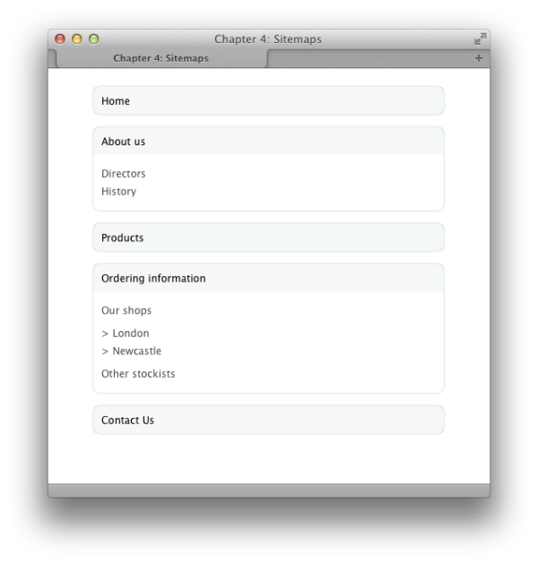
The sitemap starts life as a list for the main navigation elements
with the submenus nested inside—the same way the list with subnavigation
discussed in the section called “Can I use CSS and lists to create a navigation system with subnavigation?
” did. The
difference with the sitemap is that all menus will
display their subnavigation. If the sitemap becomes deeper (with further
levels), you just continue nesting in the same way, with subpages being
a sublist of their parent page.
Take care to nest the list items properly. The submenu needs to go
before the closing
I’ve used the child selector here as I only want to target
the
Note that I’m targeting the links inside
This should all be quite familiar now if you’ve looked at
the other examples in this chapter. I’m using descendant selectors to
style the internal list and sublists, and adding a
li of the parent
list. Without CSS, the sitemap displays as in Figure 4.22. I’m going to wrap each main section—that’s each top-level
navigation point and its subnavigation—with a border to help demonstrate
it is a section of the site: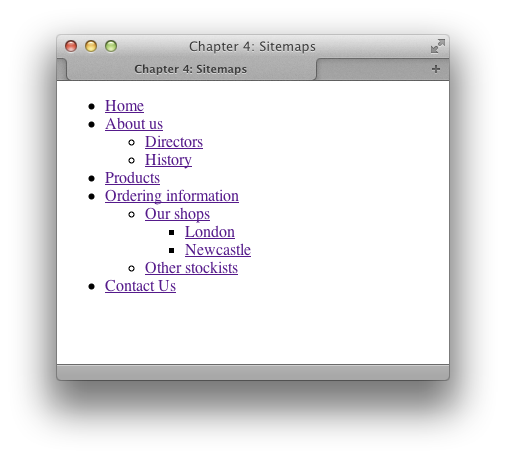
chapter_04/sitemap.css (excerpt)
.sitemap {
  list-style: none;
  margin: 0;
  padding: 0;
}

.sitemap > li {
  border: 2px solid rgba(153,178,183,0.2);
  -webkit-border-radius: 10px;
  -moz-border-radius: 10px;
  border-radius: 10px;
  margin: 0 0 1em 0;
}

.sitemap > li:hover {
  border: 2px solid rgba(153,178,183,1);
}
li that is a direct child of
.sitemap; these will be the top-level navigation
elements. This is indicated in Figure 4.23. I’m
using RGBA for the border so that I can tweak the alpha value on hover
of the list item; this will give a nice visual indication of the part of
the map the user is in. Now I move on to the links that are within these top-level
list items, making them visually display as the main navigation item for
that section: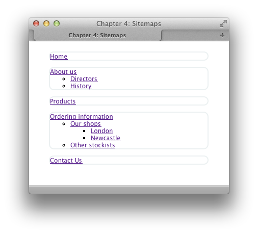
chapter_04/sitemap.css (excerpt)
.sitemap > li > a:link, .sitemap > li > a:visited {
  background-color: rgba(153,178,183,0.1);
  color: rgb(0,0,0);
  text-decoration: none;
  display: block;
  padding: 0.75em;
}

.sitemap > li:hover > a:link, .sitemap > li:hover > a:visited {
  background-color: rgba(153,178,183,0.5);
}
li:hover so that the state change happens when any
part of the li is hovered over, as in
Figure 4.24. We can now style the items inside the section—the sublists
and links: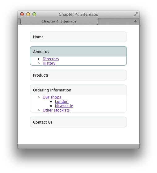
chapter_04/sitemap.css (excerpt)
.sitemap ul {
  margin: 1em 0 1em 0;
  padding: 0;
  list-style: none;
  line-height: 1.8;
}

.sitemap ul ul {
  margin: 0.5em 0 0.5em 0;
}

.sitemap ul a:link, .sitemap ul a:visited {
  padding: 0.75em;
  text-decoration: none;
  color: rgb(69,80,83);
}

.sitemap ul ul a:link:before, .sitemap ul ul a:visited:before {
  content: "> ";
}
> character on the “sub-sub” lists using the
pseudo-element :before and generated
content.
Drop-down menus have lost some of their popularity in recent years,
but they can be used to give quick access to parts of your site, so you
might want to know how to use them in a sensible way.
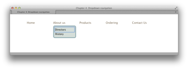
This solution creates a drop-down menu from a nested, horizontal
list and uses a jQuery plugin to enhance the CSS:
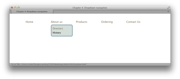
Figure 4.25 shows the result.
chapter_04/dropdown.html
<!DOCTYPE html>
<html>
<head>
  <meta charset="utf-8" />
  <title>Chapter 4: Dropdown navigation</title>
  <link rel="stylesheet" href="dropdown.css" />
  <script src="http://ajax.googleapis.com/ajax/libs/jquery/1.7.1/
↵jquery.min.js" type="text/javascript"></script>
  <script src="superfish.js" type="text/javascript"></script>
  <script>
    $(document).ready(function() {
      $('ul.nav').superfish({
        delay:       1000,
        animation:   {opacity:'show',height:'show'},
        speed:       'fast',
        autoArrows:  false,
        dropShadows: false
      });
    });
  </script>
</head>
<body>
  <div class="wrapper">
    <ul class="nav">
      <li><a href="">Home</a></li>
      <li><a href="">About us</a>
        <ul>
          <li><a href="">Directors</a></li>
          <li><a href="">History</a></li>
        </ul>
      </li>
      <li><a href="">Products</a></li>
      <li><a href="">Ordering</a>
        <ul>
          <li><a href="">Our shops</a></li>
          <li><a href="">Other stockists</a></li>
        </ul>
      </li>
      <li><a href="">Contact Us</a></li>
    </ul>
  </div>
</body>
</html>
chapter_04/dropdown.css
.nav {
  list-style: none;
  margin: 0;
  padding: 0;
  font-size: 114.3%;
}

.nav > li {
  float: left;
  width: 130px;
  margin-right: 20px;
  position: relative;
}

.nav li a:link, .nav li a:visited {
  display: block;
  text-decoration: none;
  color: rgb(122,106,83);
}

.nav li:hover ul, .nav li.sfHover ul {
  margin-left: 0;
}

.nav li a:hover {
  color: rgb(153,178,183);
}

.nav ul {
  position: absolute;
  background-color: rgb(213,222,217);
  border: 5px solid rgb(153,178,183);
  -webkit-border-radius: 10px;
  -moz-border-radius: 10px;
  border-radius: 10px;
  padding: 0.5em;
  margin: 0.5em 0 0 -9999px;
  -webkit-box-shadow: 2px 2px 2px 2px rgba(0,0,0,0.2));
  -moz-box-shadow: 2px 2px 2px 2px rgba(0,0,0,0.2);
  box-shadow: 2px 2px 2px 2px rgba(0,0,0,0.2));
  list-style: none;
  font-size: 85.7%;
  width: 8em;
  line-height: 1.8;
}

.nav ul li a:link, .nav ul li a:visited {
  color: rgb(0,0,0);
}

.nav ul li a:hover {
  color: rgb(122,106,83);
}
The original drop-down menus were knocked for being inaccessible
and bloated. They often required JavaScript to work, leaving you without
any navigation at all if you didn't have JavaScript enabled. Because of
this, drop-down menus were never popular with web designers.
More recently, web developers realized that the support of the
I’ve added a rule here to style the links as well. If you
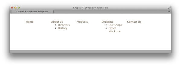
refresh the browser, you will see that we have created a horizontal menu
with the subnavigation displaying underneath the main navigation points,
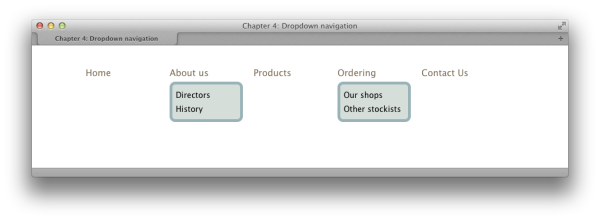
as indicated in Figure 4.27.Next, we want to style our drop-downs. The drop-down part is
the nested
Refreshing the browser should give you the completed effect,
with both menus showing as you can see in Figure 4.28.
We hide the menus by setting the left margin on the menu
You could also set the menus to The only change you need to make is to add an extra selector to
the rule where you set your margin on hover:
We’re including the latest jQuery and the Superfish plugin,
with some configuration settings for Superfish. There are lots of ways
you can customize the plugin; details
are on the Superfish website.
You should now find that your menus are much easier to use. Even
better, when you tab to a main item, the submenu displays and you can
tab to the subitems as shown in Figure 4.29.
When assessing any plugin or script to create drop-down menus, this is a
basic test of whether you should use it.
:hover dynamic pseudo-class on elements
other than links would enable us to create CSS-only drop-down menus
without needing JavaScript at all. Solutions such as the now-famous
Suckerfish menus were developed using this
technique.
The problem with CSS-only menus is that they can be very difficult
to use. While there are no accessibility issues for screen-reader users
in the way there were for those using old JavaScript-inserted menus
(because the markup is right there on the page), the menus are generally
inaccessible for those using a keyboard to navigate, and can be fiddly
to click on when using a mouse, as we’ll soon see. My advice is to
create your menus using CSS, but then use JavaScript to enhance their
usability, as I’ll show you here.
We start with a set of nested lists, as seen in Figure 4.26. We can now use CSS to display this list as a horizontal
menu: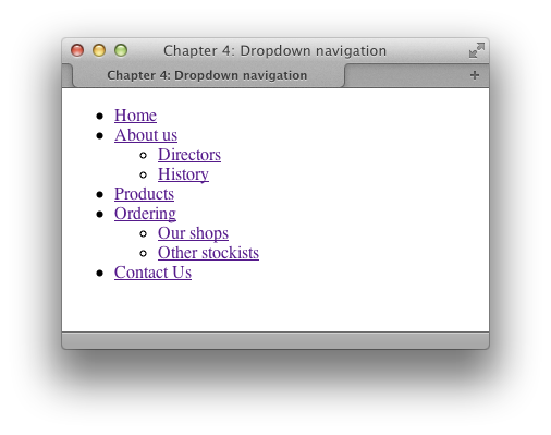
chapter_04/dropdown.css
(excerpt)
.nav {
  list-style: none;
  margin: 0;
  padding: 0;
  font-size: 114.3%;
}

.nav > li {
  float: left;
  width: 130px;
  margin-right: 20px;
  position: relative;
}

.nav li a:link, .nav li a:visited {
  display: block;
  text-decoration: none;
  color: rgb(122,106,83);
}

.nav li a:hover {
  color: rgb(153,178,183);
}
ul. I’m giving these a
border and background color, and also having some fun with CSS3
properties, adding rounded corners and a
box-shadow:
chapter_04/dropdown.css
(excerpt)
.nav ul {
  position: absolute;
  background-color: rgb(213,222,217);
  border: 5px solid rgb(153,178,183);
  -webkit-border-radius: 10px;
  -moz-border-radius: 10px;
  border-radius: 10px;
  padding: 0.5em;
  margin: 0.5em 0 0 0;
  -webkit-box-shadow: 2px 2px 2px 2px rgba(0,0,0,0.2));
  -moz-box-shadow: 2px 2px 2px 2px rgba(0,0,0,0.2);
  box-shadow: 2px 2px 2px 2px rgba(0,0,0,0.2));
  list-style: none;
  font-size: 85.7%;
  width: 8em;
  line-height: 1.8;
}

.nav ul li a:link, .nav ul li a:visited {
  color: rgb(0,0,0);
}

.nav ul li a:hover {
  color: rgb(122,106,83);
}
ul to a large negative value,
throwing it off the side of the screen:
chapter_04/dropdown.css
(excerpt)
.nav ul {
  position: absolute;
  background-color: rgb(213,222,217);
  border: 5px solid rgb(153,178,183);
  -webkit-border-radius: 10px;
  -moz-border-radius: 10px;
  border-radius: 10px;
  padding: 0.5em;
  margin: 0.5em 0 0 -9999px;
  -webkit-box-shadow: 2px 2px 2px 2px rgba(0,0,0,0.2));
  -moz-box-shadow: 2px 2px 2px 2px rgba(0,0,0,0.2);
  box-shadow: 2px 2px 2px 2px rgba(0,0,0,0.2));
  list-style: none;
  font-size: 85.7%;
  width: 8em;
  line-height: 1.8;
}
display:
      none
to hide them. I’m using a negative margin rather than
display: none because screen readers that honor CSS
may read the display: none declaration and not give
the user the opportunity to navigate to the hidden items.
The menus will now disappear when the page is reloaded. To bring
them back on hover, add the following rule: .nav li:hover ul {
margin-left: 0;
}When we hover over the li, the ul
within that li will have its
margin-left set to 0, bringing
it back into view.
If you test this out, you’ll see that your drop-downs work;
however, you’ll probably also find that being able to click a link in
the drop-down is tricky. Sometimes it will disappear before you get onto
it! The other issue is that if you try and tab to the links using the
keyboard, you’ll find that the browser does tab to the hidden items—but
because they’re offscreen, they’re invisible to the naked eye.
To deal with this issue, we can add some JavaScript. There
are a number of methods of doing this, but as an example, I’m going to
use a jQuery plugin called
Superfish.
This plugin simply enhances the CSS menu you’ve already built. Note: Introducing jQuery
jQuery is a JavaScript library designed to make using JavaScript simpler and more efficient. In addition to the basic library, there is a range of plugins that can help you to achieve various tasks—such as drop-down menus. To use a jQuery plugin, you need to include jQuery in your page and the plugin itself. The jQuery link I’ve used in the following markup points to a version of the library hosted on Google; you can, however, also download the latest version of jQuery from the jQuery website..nav li:hover ul, .nav li.sfHover ul {
margin-left: 0;
}Download Superfish, add the
superfish.js file to your site, and then add the
JavaScript to the head of your document:
chapter_04/dropdown.html
(excerpt)
<head>
  <meta charset="utf-8" />
  <title>Chapter 4: Dropdown navigation</title>
  <link rel="stylesheet" href="dropdown.css" />
  <script src="http://ajax.googleapis.com/ajax/libs/
↵jquery/1.7.1/jquery.min.js" type="text/javascript"></script>
  <script src="superfish.js" type="text/javascript"></script>
  <script>
    $(document).ready(function() {
      $('ul.nav').superfish({
        delay:       1000,
        animation:   {opacity:'show',height:'show'},
        speed:       'fast',
        autoArrows:  false,
        dropShadows: false
      });
    });
  </script>
</head>
We’ve now looked at a whole range of navigation styles, while using
many CSS properties and techniques. As you can see, even the most
complicated-looking menu can be broken down into some fairly simple
techniques. For navigation inspiration, I’d recommend checking out the
Navigation
collection on the Pattern Tap website. With a solid knowledge of
CSS and your own design skills, you should be able to create navigation
that’s both attractive and usable with CSS.
..................Content has been hidden....................
You can't read the all page of ebook, please click here login for view all page.