Chapter 7. Implementation Strategies for Your Workplace
With the ability to put together compelling data visualisations that communicate your points clearly and effectively, you’d think this would be where the book ends. Sadly not. Now that you have the fundamental skills to deploy against the requirements set for you, or set yourself, it’s time to learn about the challenges you will face when using the products of your labour. This chapter will take you through the main challenges that constantly occur across all industries. The subjects in this chapter paint the picture of the battle between different viewpoints of what makes good communication of data and what misses the point entirely. Each team, department, organization and industry you work with will approach these challenges differently. This is very much a subjective debate but by being aware of the differing opinions, you’ll be more likely to deliver what is required.
This chapter will highlight where the subjective blurs into a more objective consideration. This allows you to utilize the skills discussed thus far in the book to ensure you can justify the choices of how you are communicating your points. No data visualization is ever perfect and can always be changed, tweaked or adjusted based on the stakeholders’ design, as well as analytical or subject matter expertise. Therefore, do not expect many hard written rules when it comes to the do’s and don’ts in this chapter. After reading this chapter, you will have a better understanding of where to strike the balance.
The challenges we will cover include:
-
Attitudes towards the use of visualization techniques to demonstrate stories in data
-
How interactive your analytical products can be before the audience will not attempt to explore the work
-
How centralized data teams and assets pose different challenges to a more decentralized model
-
Working with current live data or extracted, static data sets
-
Whether you’ll be making your data communications using set templates or crafting the methods from scratch
-
Striking the balance between presenting structured reports and bespoke analytical visualisations
This chapter will look at how these types of balances affect your access to data, use of data and ability to share your solutions with others. Each organization I have worked with have all had to strike unique balances between the challenges we are about to assess. However, by being conscious of these will allow us to pick a more effective path to delivering value with the knowledge you have developed by reading the book to this point.
To illustrate how to find the balance between all of the challenges and some tactics you might use to improve the situation, I’m going to use Prep Air and Chin & Beard Suds Co. These organizations are at the opposite end of most of the spectrums covered meaning your organization is likely to fall somewhere in the middle.
I have given each organization a score between 0 to 10 to represent their position on the spectrum between each competing factor.
Let’s start with the big, corporate airline Prep Air.

Figure 7-1. 1 - Prep Air logo
Prep Air factsheet:
Business: global airline selling tickets online.
Founded: 2000
Employees: 5,000 (Head Office 500, Customer facing 4,500)

Figure 7-2. 2 - Prep Air Organizational Challenges Scores
Like many large, traditional organizations, Prep Air set most of their reporting up early on in the company’s development and haven’t invested much in more modern self-service tools since. The airline industry is full of traditional data feeds due to the regulators having to operate worldwide in a range of economies. Paper print out, tables of itineraries and data feeds from other partner operators mean the leadership of Prep Air have been hesitant to invest more in data driven decision making.
Due to movement of staff between other airlines, a few more visual requests do get through to the central data team. The data team is heavily centralized as the focus of data work is reporting to regulators and producing financial returns. This means the data people work primarily with static views based on extracts so as not to strain the aging data infrastructure. Data is seen as an expense rather than a benefit creator and therefore, automation of reporting has been the major focus.
For Prep Air to stay competitive, and give their newer staff members the data tools they are used to elsewhere, the company needs to make use of the high quality data resources that have been built up by a strong centralisation of data. These data assets are well structured but access needs to be given to subject matter experts across the organization to make use of the data sets. Modern self-service data visualization tools would be perfect for this job as they would connect directly to the central sources. This would create more exploratory analysis that will complete the baseline knowledge formed through the current reporting. The goal of the exploratory analysis is to find the nuances required to stay with or ahead of their competitors. While the downside of the exploratory analysis is the proliferation of alternate data sets, as long as this is managed, this downside should not cause much of a problem.
Trying to create the energy for the change is the harder part. Often it takes a new member of the executive team or a few subject matter experts finding a new data tool to demonstrate the benefits that data can offer. A new member of the executive team asking for more analysis creates the drive to provide what they are asking for. If you are used to working with data to drive the organization, you will quickly try to replace it if it isn’t there. The new executive doesn’t have to come in from the same industry to drive that change as industries can learn from each other in crossover functions like marketing or sales. A new tool can empower subject matter experts in the organization. This can create friction between the IT function and these individuals but this is where the difference between reporting and analytics is really felt. Using their subject matter expertise creates work that the IT function can not. You can then share good quality analytics with the executive team and other teams are likely to also feel the influence of such a change.
Let’s now assess how data is used differently by a small retailer.

Figure 7-3. 3 - Chin & Beard Suds Co logo
Chin & Beard Suds Co (C&BSCo) factsheet:
Business: retailer of soap based products selling in-store and online.
Founded: 2018
Employees: 100 (Head Office 20, Customer facing 80)

Figure 7-4. 4 - Chin & Beard Suds Co Organizational Challenges Scores.png
As a newer organization and without heavy regulation, C&BSCo have a lot more flexibility with their use of data and a newer set of tools to make use of it. Like any modern retailer, much more business is driven from online sales rather than in-person, store based sales. This means C&BSCo have had to make use of analytics to monitor competitor pricing and promotions to stay competitive whilst not overly discounting to the point of losing money. As the team in the stores are younger, as the company is new, the store management are more data savvy and enjoy working with data sets to understand their customers. The store managers are experienced in using modern applications that utilize data visualization throughout.
However, as a retailer, a lot of the focus on the expenses of the organization goes into the stores and the products sold. This means IT and data expenditure has been less compared to what we saw at Prep Air. This reduced expenditure means centralized data sources are not as closely managed and different teams throughout the organization have their own data sets. Lots of the data sources are run within the Head Office team instead of the stores though.
Due to their background of using data, the analysts in the team can be more innovative and try different techniques to share their insights. Being in retail means people are often quite creative and therefore, can flex their visual style to make something more memorable and attractive for the teams to use.
We’ll keep referring back to these organizations throughout the chapter to see how they respond to the challenges they face.
Tables Versus Pretty Pictures
After specialising in data visualization for the majority of my career, I have lost count of the number of times people have told me, “I don’t need pretty pictures, just the answers.” This is a clear sign that they haven’t encountered data visualisations that communicate clearly. (Some haven’t encountered data visualization at all). As communicators, we have to get people over the perception of “pretty pictures” before they can gain the benefits of visual analytics. So why not just use data visualization for everything?
Sometimes the precision of a table is the best approach. There are many reasons people request a table instead of a visualization, but the two I’ve found most common are that they don’t trust visualizations to tell the data’s story, and that they want to use the data elsewhere. Let’s dig into these reasons.
- Trust
-
Early data visualization software wasn’t designed for storytelling. Instead, they often defaulted to visualisations that hid the data. This made them easy to misinterpret, leading to bad decisions and undermining trust. Like any form of communication, if you don’t trust the source of the information, you are unlikely to trust the findings. Trust also needs to exist between the person who is encoding the data into the visual communication and the recipient. If a stakeholder doesn’t trust the data, the format, or the person presenting them, they are likely to request the data in table form so they can “see it for themselves.”
- Data to be used elsewhere
-
Sometimes people request tables because they want to use them with another tool that they may feel more comfortable with when conducting their own analysis. Often the tool people feel more comfortable with is the one they have the most experience on, namely Microsoft Excel. The question here is: What are they really looking for? What answers do they need? If they aren’t getting those answers from your visualization, this may indicate a failing in your requirement gathering process. As covered in Chapter 2 - The Right Data, you need to determine what answers the stakeholder is looking for and deliver those. If another process is needed, you can design a visualization to find the right data points to kickstart that process.
When should you respect someone’s request for a table, and when should you challenge it? It’s all about context, and that is what this section will delve into.
Data Culture
How much does your organization incorporate data into everyday decision-making? Do your people trust your organization’s data? Are they comfortable using it in their daily tasks?
Your answers will tell you something about your organization’s data culture: how comfortable people are with trusting and using data. If your organization routinely includes data in everyday decision making, that’s a sign of a strong data culture. If people are requesting tables instead of visualizations because they don’t trust the data or use data only sporadically in decision-making, you might have a weak data culture.
If you want users of your analysis to accept the stories your visualisations tell without questioning what you may be trying to hide, you’ll need to develop a strong data culture-- and that means trust. Don’t use visualisations only when you want to convey positive news; you want people to get used to working with visualisations and to have a sense of perspective and context when viewing them. Without that? Try to use visualizations to convey bad news, and you’re likely to find your audience blaming the charts for ‘exaggerating’ the message rather than focusing on the causes of under-performance.
Once you’ve built that trust, you’ll have more freedom to build the best visualization for the analysis rather than making suboptimal design decisions just to ensure that your point gets across. With better use of data visualisations, you are more likely to be able to articulate the story in the data quickly and clearly to the users of the analytical views. Having a richer set of tools at your fingertips will allow you to understand how different views have different strengths when it comes to the type of data being analyzed. A stronger data culture will not just be better positioned to make use of the views but will also be open to alternate visualization that may not be as commonly used. Tables will also be less likely to be requested as standard but will still be used where needed within the analytical products.
However, data cultures don’t just switch from weak to strong overnight. The development of a data culture takes time and requires a couple of facets to be present in the organization:
-
Data Driven Leadership
-
Investment in Data Tools
- Data Driven Leadership
-
The executive team of an organization sets the tone for the rest of an organization. If the leadership team is looking to make data driven decisions, then they will expect their teams to be well versed in the organization’s data. During my time as a consultant I was frequently asked to support teams who were trying to get up to speed to be able to answer the data driven questions their leadership team were posing.
These situations were frequently caused by a change in the leadership team through a new member joining the executive team or the whole team being replaced. With the greater emphasis on data, new skills have to either be developed within the existing team members or brought in through new hires.
If you are in this situation and are part of the team being asked to produce more data analytics, you have already made a step in the right direction by reading this book. By understanding where data is coming from, what charting options you have when analysing data, and how you can communicate your findings through visualization, you will be able to respond to your leadership’s questions.
Adding a new member to the executive board of Prep Air would kickstart this transformation, as it is difficult to create that drive without previous experience.
- Investment in Data Tools
-
Just being asked for data sets, or answers based on data, is not the easiest path to a strong data culture. Without investment in products to assist in the storage, transformation and visualization of data, there are likely to be workarounds and resistance to using data because it will be difficult to achieve the required output. With investment in data tools, the organization is likely to become faster and better at answering questions than otherwise achievable.
You are unlikely to successfully make the purchasing decision for new data tools if you work at a large organization like Prep Air, but highlighting the challenges you face due to the tools you currently have to work with is an important first step. Most leadership teams I have worked with are unaware of the quantity of work being undertaken to deliver even basic answers. By highlighting the effort involved, or where savings could be made, you may prompt investment in tools that will reduce your workload on preparatory tasks and instead allow you to focus on your analysis and communication of the findings.
A lot of Prep Air’s investment in data tools was made 20+ years ago. Therefore, they are working with tools that do not take advantage of recent technological improvements. In data rich industries, like travel and transport, being able to form decisions quickly can be the difference between being a market leader or follower. For example, being able to change your ticket prices based on ticket sales to date, website traffic and pricing by your competitors will allow you to stay competitive. With modern analytics tools being able to connect to live data sources (we’ll come back to these later in this chapter), you can base your analysis on the latest position rather than last week, month or quarter.
Data Literacy
Having a strong data culture isn’t enough to harness the value that data visualization can offer when being used in analytical products. To make sure data informed decisions are being made, your organization needs a base level of comfort with data based solutions. The skills required to work with and understand data driven solutions is referred to as Data Literacy.
Data Literacy can be defined as the ability to work with and understand data. Data Literacy is commonly regarded as the key element that describes how well data is used in an organization. However, Data literacy isn’t just one skill as Ben Jones of dataliteracy.com describes. Ben articulates that Data Literacy involves:
-
Domain Acumen
-
Graphicacy
-
Communication Skills
-
Technical Skills
-
Numeracy
Let’s focus on two of these: numeracy and graphicacy.
Numeracy is the ability to work with and understand numerical information and mathematical concepts. In your organization, this is likely to include working percentages and looking at variances. You might even be tested for numeracy by your organization before you are able to join, as it is a core skill for many jobs through mathematical reasoning tests. For many users of data visualization, they will be used to looking at charts containing these elements and being able to understand what the percentages or variances represent ultimately means the user will understand what the chart is representing. If you are not comfortable with these elements then no matter how the data is visualized, you are unlikely to correctly understand the insight in the data.
The numerical elements of the visualization are not the only aspect that requires understanding in order to gain value from using data visualisations. The actual parts of the visualization need to be clear to the reader in order for them to understand what the chart is showing. This is what the term graphicacy represents in Ben’s definition of Data Literacy.
Graphicacy is the ability to read and interpret charts. One of the most significant challenges for an analyst is to use charts everyday, but remember that not everyone who will view their graphs will have the same amount of exposure to visualisations. Familiarity with any topic breeds comfort. It is incumbent on the analyst to build the skills required for the user to understand their analytics or to not use those techniques in the first place. Many of the most basic chart types are widely taught but I’ve found you don’t have to develop much beyond basic bar and line charts before some will start to struggle to understand what the chart is showing. However, by adding more explanation to analytical products as you introduce developments to your existing stable of charts or new chart types, you can grow your users’ graphicacy.
Without strong levels of graphicacy, there is a much greater likelihood of your stakeholders asking for tables instead of charts. Domain expertise, technical skills in use of data and communication skills will obviously also have an effect on the requirements set, but graphicacy and numeracy are the major drivers for a more table-based request. Developing both of these key skills over time is likely to help your organization develop a strong data culture through building trust in the analytical products created and reducing the number of mistakes that undercut the trust and culture you are aiming to form.
Both of our featured organizations should assess their data literacy and graphicacy levels before developing analytical solutions. Progress can be made over time by building on top of the baseline skills. Giving a radial bar chart when people aren’t even used to reading normal bar charts is a recipe for disaster and confusion.
Improving the Visualization Mix
There are a number of exercises that can help improve your organization’s visualization mix depending on their existing data culture and literacy. The visualization mix is the variety of methods used to communicate data. This might be a range of charts or the format of visual communications like slides, dashboards or infographics. From early, developing data cultures to more advanced data cultures, continuing to develop the mix of visualisations used in an organization is important. It’s a process of gradual development and improvement rather than a “once and done” thing you will need to do. Here are a number of techniques you can try to help improve the visualization mix in your work depending on your organization’s data literacy levels:
Start with the basics
If the consumers of your analysis have lower levels of data literacy or there isn’t a strong data culture, you will need to build basic visualisations into your work to avoid creating even more barriers to people using data. Simple Key Performance Indicators (KPI), as discussed in Chapter 6, with iconography that demonstrates rising or falling values can be a simple demonstration of the benefits of visualization.
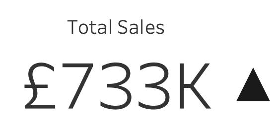
Figure 7-5. 5 - Basic KPI with change indicator
If the visualizations are successful and well received by the audience, building on the KPI concept can involve adding a sparkline to add additional context to the initial KPI. The sparkline is a simple line chart that doesn’t start at zero and shows the trend of how the value has changed overtime. Those who are familiar with the value will know whether the current value is good, bad or indifferent. For those that do not, the sparkline gives an indication of previous performance. A sudden rise of 10% sounds good unless you find the value had fallen 50% the month before.
Figure 7-6. 6 - Basic KPI with sparkline
Using tables of data is a great way for people to become more comfortable making decisions with data although they may have to work harder to find the insight in the data. Tables of data, if kept as small and summarized as possible, can provide a view that is familiar to data that they will see in their everyday lives in newspapers, bank statements and sports league tables. By adding visual indicators to the table, it will help guide their attention to the key changes in the data. Tables will help to build trust with the users of your analysis and the data set it is formed from. In Figure 7-15.3, when more bikes have been ordered than delivered, the red dot indicator draws the reader’s attention to the relevant rows where the issue occurs.

Figure 7-7. 7 - Table with added indicators
Other charts types make it much easier to see the insight in your data at a quick glance as covered in Chapter 3. By starting with simple bar or line charts, you can begin to get your consumers used to using charts. If these charts are built on a data set your previous analysis was constructed upon then you can leverage the trust gained. Adding annotations to help people understand the new charts when they are first introduced can help user adoption and understanding.
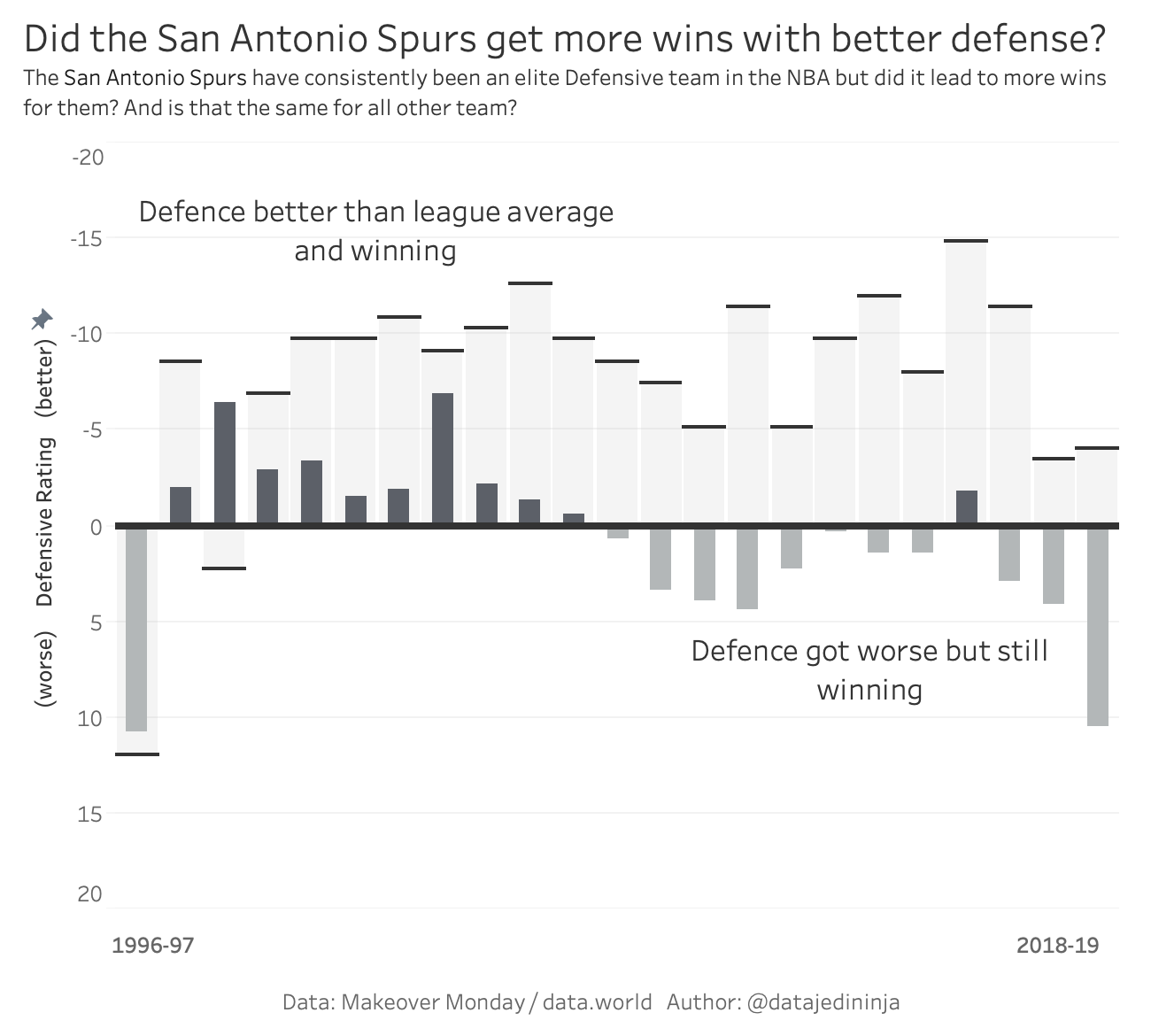
Figure 7-8. 8 - Annotations on a Bar chart
When introducing newer chart types, small panes of explanation can be used to make it clearer how to read and interpret a chart. Instead of a small example and extra explanation, you will need to use a lot of text to describe what the user should be taking from the chart. If you don’t take care, the chart soon becomes redundant to the text or swamped by the amount of text it takes to interpret the chart. Therefore, using a simple, visual example alongside the new chart might help avoid vast volumes of text. In Figure 7-15.5, I used a pop-out explainer to describe how to read the chart where I had layered two elements over the top of each other. Extra explanation might need to be added a number of times to help people get used to the chart type and what it is showing within the data.
Figure 7-9. 9 - Basketball analysis with Chart Explainer
For more major pieces of work consumed by a wide audience, you might consider putting together a video walk-through of the analysis or even provide training to users. If your audience is the general public this will lend itself to a video walk-through as you won’t be able to gather the general public together for training. If your audience is your own organization, the size and geographical spread will factor into whether you can train users in how to use the work in-person or not. The benefit of in-person training is that it provides both the chance for the users to ask questions and for the creator to see how the users interpret the visualisations. You should look to complete user testing throughout the build process of your work but collecting a lot of users together is sometimes a tough challenge to complete earlier in the process.
When using new visual elements, it is better to introduce them via easier to read charts. For example, when using average lines for the first time within a chart, it is better to use them on a single-axis chart like a line or bar chart. This allows a user to become familiar with what you are trying to demonstrate with the charting element before using multiple elements in a single chart. Once a user is familiar with the element, you can begin to use multiple elements on a single chart like average lines on a scatterplot, or a line chart that is broken up into multiple years (Figure 7-15.6).
Figure 7-10. 10 - Simple Reference Lines
Building trust through beginning with tables or key performance indicators are a great place to start when your audience has lower levels of data literacy or you are operating in an organization with a weaker data culture. Trying to gradually develop data visualization rather than add too much novel complexity is a key consideration to make. If successful you will soon be able to have an engaged audience for your visualisations. If unsuccessful, you’ll need to take multiple steps backwards to re-engage the audience and develop the trust from scratch once more.
Static Versus Interactive
For many organizations, static reporting is the main method of viewing analysis. The main forms of static reporting are covered in Chapter 7. As a recap most data professionals have heard the request of “can I get that as a slide?”. Ensuring the analysis is in a form that allows the audience to make best use of the work is important but an interactive visualization opens up a number of possibilities that static visualisations do not. Despite championing many forms of interactive data communication, there are a number of situations where using static reporting will be the favourable option for you.
Let’s Talk About Powerpoint
A book about communicating with data with a focus on how to effectively communicate in organizations has to mention the ‘P’ word at some point. For many, being able to communicate clearly through Powerpoint is one of the most important skills to develop. Mastering the tool you use to design your slides, whether it is Microsoft Powerpoint or Google Slides, is something that takes a lot of time and practice. But why are slides such an effective communication method?
Many of the elements that make a slide clear and understandable, are the same as what makes data visualisations effective forms of communication.
- Simplified Messages
-
Slides should have as fewer words as possible on them so require the key points of the slides to be concentrated into simple points.
- Clear Titles
-
Like data visualization, the title of a slide should make clear the question being answered or the point being made.
- Visual Clues
-
The imagery, font, color and theme all can add visual clues as what the message is within the slide
With similar elements to data visualisations, it’s not a surprise that visualisations are often asked to fit into this communication method. The data analysis is often requested to be added to the slide deck in order to fit into the communication of the rest of the supporting points. Slide decks are frequently used to communicate to the managers in your own organization or leaders of other organizations. By designing for slides, you are likely to be designing for communication to leadership teams.
By including data analysis into the rest of the slide deck, the analysis is being actively used in the support of the points being made. All of these things are beneficial to the use of data and the growth of an organization’s data culture when done well. However, that is the challenge: it is difficult to make effective visuals that fit in the small space of an image on a slide alongside the slide title and text. Data visualisations are often not specially made for the slides and therefore, are cut and pasted into the slide deck, often taking the work out of its original context. If the work is specifically made for the slides and to fit the spacing, it is difficult to sum up complex, multi-faceted points into a single image.
More Than Just Powerpoint
Static visualization need not only be used in slides though. There are many reasons to use a static visualization to demonstrate clear findings in your data without having to output them as slides.
Easier Production
Building a static visualization is much easier than an interactive. Planning how the user will see and view the visualization is much more straightforward when building a static view by sketching the output. A sketch will allow you to plan what data you need to form the analysis whilst ensuring the output will meet the requirements set.

Figure 7-11. 11 Sketch of static view
This is much harder to do with interactive visualisations, as not only are the sketches more challenging to piece together but you also can only determine how users will actually interact with the work via testing. Sitting next to someone and observing how they use your analysis is an important step to take whenever you get the chance. Watching without interrupting or correcting the user will help you understand how they access and interact with the visualization as well as what they miss. Clearly, after you’ve made your observation you can correct them on what they missed but asking them ‘why?’ they missed that interactive feature or explanatory text will help you refine your future outputs. Thinking all of this through as you produce a visualization is why static work can be much easier to conceptualise and produce.
Easier to use
The production isn’t the only factor where producing static work is easier than interactive views. For the viewer of the analysis, the work can be much easier to consume when you don’t have to hunt for the insights. For many stakeholders, they will be time poor and being able to get straight to the point is an important requirement for them. A common theory in the data visualization field is to design your views so the message is easily seen within five seconds of the audience opening the work. With static visualisations more care needs to be taken to show the message clearly as it’s less likely the user will be able to form it themselves. If you needed to compare some key states’ profits, as in Figure 7-15.8, it would take longer compared to simply having the values highlighted based on a search box.

Figure 7-12. 12 - Searching for data points
Easier data storage
The data the visualization is based on should also be considered when deciding how it will be stored. With a static visualization, this thought process can be much easier to decide on the best approach. Take for example a data set based on everyone’s salary in your organization, you don’t want to pass the individual data points widely around any of the divisions. Creating a static visualization which can export just the image and none of the underlying data points will save having to worry about the data storage. If this same visualization was made interactive, careful aggregations of the data has to be made to ensure sensitive information isn’t revealed whilst filtering or drilling into the information.
Data governance is an important aspect of any data work to ensure that data sources are used in the manner they were intended for. This is covered more deeply in the Centralized versus Decentralized section of this chapter. On a more personal level, you can ensure that your work is stored correctly by ensuring those that have access to it are clear on how it should and should not be used. Controlling access to your work and the data it contains is a necessary part of data work. In many organizations, data source access is controlled and linked to the job role someone completes. This might seem like a bureaucratic hurdle to overcome when you want to get access to a new data source, but it’s a necessary restriction to ensure the right data is shared and used in the right way.
Taking time to think about how your audience could use your data communication or the data it contains is a must, especially when that work is interactive as it is likely to contain much more granular data to allow for the interactivity.
Interactive User Experience
With so many benefits of the static method of communicating with data, are interactive visualisations ever worth the extra effort to create them? Very much yes. While creating interactive visualisations means more planning, more effort in production, and requires more data management, they can actually create less work in the long term. To assess how, firstly let’s look at the different forms of interactivity that are commonly found in workplace reporting:
- Filters
-
Common across most data tools from spreadsheets to specialist visualization tools. Filters allow the analyst and user to remove irrelevant data points to the questions they are attempting to answer. You will find there are many different types of filters but the two major types are: sliders which allow you to choose the range of values returned, and dropdown selection which allow you pick which categorical values you want to analyze.
You or your audience can use filters to tailor the data visualisations more specifically to what you are interested in. Examples of filters could be to focus a map to your local area or change the time period being shown.
- Tooltips
-
These are the visual or text objects that pop up when you hover over a mark on a chart. Useful for extra contextual information or an additional chart that adds more detail to the mark being hovered over. In more complex visualisations, or where the data contains specific terminology, tooltips can provide definitions or descriptions to help the user understand what they are looking at.
- Links
-
Links can redirect the user to a more detailed view, change the visualization type being shown to offer a different perspective, or send to a non-data web page to add context to the interpretation of the data.
- Altering a value
-
This allows a user to enter their own value or picking a value in a range can allow for visualization to be used to model ‘what if’ scenarios to not just demonstrate what is happening now but what the results of a n% change would be.
Each of these interactions can allow a user to not just answer their initial questions but answer some additional questions they form from their initial analysis. This is one reason interactive visualisations are much more likely to be created to allow people to explore the analysis for themselves rather than have you present the work to them. Creating a clear storyline in a format that allows the user to explore the subject themselves is a harder task. However, interactive visualisations offer timesavings that can be created for those producing the analysis as without the interactivity, you are likely to receive three or more requests before you get to the same point:
“Is the trend the same as last year?”
“Is the trend the same across each department?”
“Is the trend the same if we ignore the executive team?”
If these questions haven’t been set as initial requirements, it is difficult to predict that they will be asked as follow-up questions. These questions could be built into static reports but very quickly the static view could become very difficult to consume. Allowing as many of the categorical data fields in the analysis to be interacted with, can allow the user to explore what they are intrigued about. Interactivity can remove the need to show all these potential trends at once and allow the user to show these facets when required. Enabling these options saves the analyst having to rework the initial visualization each time the user wants to explore another question. Eventually the user will have refined their questions they are asking of the work to the point that no matter what interactivity is built into the initial work, the user will require a bespoke piece. As someone who ran a business intelligence team, this deep, unexplored analysis is what makes the team’s role much more interesting.
As your audience begins to work with the interactive data communications more, they will begin to ask better questions in their initial requirements. This is a great sign that data literacy levels are increasing and the data culture is developing well. Creating data analytics when there are lots of clear requests with the right question being asked the first time is a good situation for the organization. Less rework and iteration means you can produce more pieces of analysis, answering more questions. The data sources powering this work can be developed more succinctly if it is also focused on the right questions the first time.
By developing the line of questioning from the audience about the subject, the questions might go beyond the initial data source. Sourcing and having to add in additional data sources to answer deeper questions can be a challenge. This is why it’s important for anyone completing data analysis to be confident and comfortable with adding their own additional data sources through joins and unions.
The use of interactivity can pose more challenges to newer users getting used to the reporting. Often greater interactivity can only come with greater complexity into how the users need to interact with the view. If someone is new to this style of reporting, it is rare that they will be able to fully utilize the work as intended so you must ensure that all of your audience will be able to understand the messages conveyed. It is therefore important to monitor the usage of the interactive work to make sure you are reaching the intended audience and that they are getting the answers they require. Once used to the interaction and the options available, interactivity can create much deeper insights and flexibility for users to make the work relevant for them. Determining whether the additional planning and testing is worth saving time building iterations is very much dependent on the context of the request and experience of the users.
Centralized Versus Decentralized Data Teams
Whether you can work with data visualization tools or even access data is heavily dependent on how centralized your organization’s use of data is. By the use of data, I mean the data sources, the products made from that data and the individuals who work with the data. In large organizations, there may have been multiple cycles of centralisation and decentralisation of data work. So what is centralisation?
Centralisation simply refers to how a certain skill, in our case data, is organized in a single team. Decentralisation occurs when that skill is spread across multiple teams and departments across the organization. The capabilities covered can include subject specialism, management of the task or control over the infrastructure used for the capability, like the governance and storage of the data.
The battle between centralized versus decentralized is not a simple one or other option. A blended approach should be adopted to take advantage of pooled skills and knowledge. However, to reduce the normal frustrations which arise with centralized data, access to bespoke reporting, self-service can meet the needs of many.
The Data Team
One reference I make throughout this chapter is the difference between a centralized data team and those who work with data in the differing lines of business instead. By a data team, I refer to centralized teams who pool data knowledge, skills and experience to create a focal point for data work. These teams were traditionally in charge of storing data and producing reports from those repositories. Depending on the size of your organization, this team could involve hundreds or people or just a few. There isn’t always a clear separation of data from a central Information Technology (IT) function especially in small organizations.
Data teams will be responsible for much more than just producing the various communications that utilize data throughout the organization. The data team will be responsible for managing the data sources, governing access to the sources, standardization across the data tools in which to make use of the sources as well as administering the updates to software and policies across the organization.
Just because there is a centralized data team doesn’t mean individuals in disparate teams can’t specialise in data too but this poses different challenges. A centralized team has to make their work relevant to the specific needs of each team whereas the decentralized individuals know their own challenges more acutely but may struggle to scale their solutions or get the technical investment they need to deliver their solutions. You are likely to recognise one of the options to be more prevalent in your organization than the other.
Like the other organizational challenges covered in this chapter, there is no perfect way to manage data resources in an organization but there are significantly different impacts to you depending on your organization’s setup.
Data Sources
An important aspect of data work in an organization is how data is stored and maintained.
Data is likely to be stored and managed in many different states.
The most raw data that is extracted from operational systems into a data store that is commonly called a data lake. The data lake often holds data that hasn’t had any preparation steps or cleaning processes made to it. These raw data feeds are often set up by those with more expertise in conducting these tasks which may require coding of API queries or setting up access through firewalls. Due to the skills involved, you are very likely to need specialists in your organization to help you set up any data sources where these feeds don’t already exist. These individuals are usually in centralized functions in most organizations.
Data often goes through multiple stages of cleaning and preparation to make it more easily usable. As the data get more processed and further refined, the processes are more likely to be found in decentralized teams than centralized teams. Creating and governing access to the main data sources in an organization normally sits in a central team as the sources are used by many different individuals and teams across the organization. If different versions were created for each team, it’s likely different answers would begin to appear for the same questions.
Control of data source acces and use is called data governance. Data governance involves tasks like controlling access to, updating and deleting data from sources. With the greater collation and use of data, more regulations have come into place to protect consumers’ data. This regulation differs across the world but in Europe the General Data Protection Regulation (GDPR) which began in 2016 details out a lot of the fundamentals applied all over the world. Some of the regulations include:
-
The individual who the data is about has the right to be forgotten and their data deleted
-
The data is used in a manner in line with the permissions granted to it
-
The data is retained for at least a minimum time if required for audit or legal purposes
If data is poorly stored, it is likely that all subsequent work based on data will be flawed. Forming your conclusions on incorrect data runs the risk of the wrong choices being made on any number of decisions from what investment decision to make or how successful the organization is currently being.
Good control of data sources means the source can be trusted and any constraints or gaps should be clearly documented. For many organizations having control over data sources have sometimes created tension between the uses of data and control over the original sources. For many data analytics projects, the original data source may need to be filtered or restructured to allow for easier analysis. This restructured data can create additional data sources that others then work from if they are not carefully named and stored.
Having a clear process in place to store new or revised data sets is a key part in the analytical process. Sometimes you may hear this referred to as ‘productionalising’ the work. This normally involves setting the data sets up to be refreshed on a schedule, stored along with other key data sets and having the analytics checked. This work often needs to fit the organization’s data rules and processes, if your organization has developed them, and therefore the work often involves a centralized team. Decentralising this work often creates a range of differences from slight changes in naming convention through to completely different use of tools.
Reporting
Data storage of sources of information isn’t the only aspect that should be considered for centralisation. Reporting is a common task that is centralized as part of the productionalisation process. By reporting, I mean the regular production of a piece of analytics that gets shared to stakeholders in the organization. Reporting will often involve measuring changes in performance versus a previous time period or give a snapshot in time of the current performance. Some examples that you are likely to see on a daily basis might be stock reports for a retail store, student attendance in college or precipitation levels when monitoring the weather.
Due to the regularularity of reporting, the amount of effort that the production of the reports can be substantial depending on the tools involved in the process. By centralising the reporting effort, the central teams can ensure the best use of the tools available can be deployed. Central teams are much more likely to be able to have access to a wider range of tools, or deeper knowledge in the selection of tools available, to optimize the workload.
Once the reports are set up, the task isn’t over as frequent amendments will be required as the business changes or the audience’s questions evolve. Chapter 2 has already demonstrated how collecting and communicating requirements can be a challenge to ensure the analysis delivered actually meets the needs. Subject matter experts can make sure the reports are telling people what they need to know. Those same experts can also help to develop the reporting as understanding of the field of expertise changes or learnings become embedded and therefore, the reporting needs to go further.
The significant challenge that arises from centralising reporting is that updates do not happen as frequently as required. The lack of updates are often due to the time it takes a central team to understand the request, make the change, and then re-productionalise the data source and report. If the subject matter experts had the access to the tools and skills needed, the changes would more likely happen in a timely manner. To ensure completeness and retaining data accuracy, the work to update a report often goes beyond just that report. For example, any changes to a data source needs to be assessed as it is likely to affect any other report that shares that data source. By pooling together the reporting to achieve economies of scale, means the work is also pooled and thus the requests can quickly pile up.
If the reporting is not updated, the reports will quickly be ignored and other ‘uncontrolled’ methods of reporting will arise. By not receiving the analytics needed, ‘cottage industries’ will begin to pop up across the organization to form the reporting that is needed. All of the hard work on setting up strategic data sources is eradicated as people will cobble together the piece they need. Overtime, the pieces add up as illustrated by Figure 7-15.9, to the point where people are hired and resources consumed in maintaining the additional reports.

Figure 7-13. 13 - Growth of Cottage Industry Reporting
Pooling expertise can therefore create a lot of benefits but as per centralising reporting, care must be taken to not ignore the wider organization in case they stop using the centralized functions. If teams in the business start producing their own bespoke work, it can be difficult for central teams to regain control of the work.
You might be the data worker who by showing increasing competency, builds some bespoke work for your team that utilizes your subject matter expertise and clear communication with data. To regain the work, the business team producing the work, sometimes called a cottage industry, has to be centralized through strategic decisions made by the organization’s leadership team. This means you might end up in a different team and using your skills to communicate other subjects than just your initial subject matter expertise.
By giving a disparate group of analysts and subject matter experts a process to submit changes with an expectation of how long the change will take, you will help prevent the uncontrolled decentralisation you might experience otherwise. If the cottage industries grow, typically you will find differing tools or versions of the software, less adherence to data policies, differing versions of the truth and duplication of effort, as seen in Figure 7-15.13.
Pooling Data Expertise
Data tools are forever evolving and staying aware of these changes can almost feel like a full time job in it’s own right. One advantage of a centralized data function is to disseminate these changes and deploy them on mass. Software changes are not the only benefit of collecting a lot of your top data workers together. There are a few other benefits to centralising the data function that cover the people, the tools and the data:
- Analyst community
-
Creating a team or community of analysts will help create better analytical outputs as each analyst will ask different questions of the requirements and data. With modern technology, those analysts do not have to be located together but channels of communication and collaboration need to be inplace to allow people to share ideas and feedback.
- Tool expertise
-
With ever improving and increasing user focused data tool interfaces, expertise in the tool can add a lot of benefit to the data work conducted. Pooling data expertise can share performance improvement tips as well as best practices for those tools. Centres of excellence have sprung up in many organizations as a way to share the expertise on particular tools used widely in the organization.
- Knowledge of the data
-
Subject matter experts are useful when setting context for why findings might be what they are but without getting the right data, these will still be gut-instinct opinions. The perfect data set rarely exists so having knowledge of multiple data sets across the organization means it is likely the individual will know what is possible to use and combine for richer analysis.
Self-Service
Due to the benefits of centralized data work detailed above, it is of little surprise that many organizations have taken advantage of centralized data teams. Yet, there is a rise of aspects of data work in the majority of people’s role in an organization. You might be reading this book because of this exact evolution. This growth of data work is reconciled by the growth of data software that allows for increased self-service. The tools have increased self-service by reducing the barriers to use that previously existed. Those barriers included coding requirements as well as only seeing the output of your work when executing a query. With more drag and drop tools, as well as those that allow you to iterate rapidly, self-service has increasingly become a way to reduce the waiting time on getting hold of the information needed.
Tableau is the tool most synonymous with the growth of self-serve business intelligence. It was the tool that allowed me to go from being a history and politics student to writing this book on all things data. Whilst requiring some initial training to get started, Tableau Desktop has become an enabler for many people to begin creating their own analysis rather than putting in requests to central data teams. This faster time to analysis has changed how many people work with data. The expectation of many people in organizations is that they should have the access to the data sources and tools to enable them to conduct their own analysis.
The key benefit of self-service data analytics is that it pairs together lots of the benefits of both the centralized and the decentralized model. Centralized data sources can be connected directly to the self-service tools to prevent the most technical part of the process stopping those who are learning to use data. Centralized knowledge can be shared through organization of people using technology to allow newer users to learn from more experienced teams. The knowledge that is harder to share is the subject matter expertise of all of the different folks in the organization. This is the power of self-service tools as the experts on the context of data can form their own views and iterate rapidly.
Once self service data visualization becomes more common, the focus of data visualization can rapidly become making something look attractive as well as informative. For many stakeholders, the need is for the answer and not for a beautifully formatted report. If you apply the pragmatic approach that aesthetics aren’t as important as the message being conveyed clearly, it can prevent overwork.
Self-service can also assist with the validation of the answer. As discussed in Chapter 8 - Pretty Pictures versus Tables, the challenge of communicating with data is the stakeholder trusting the findings. Finding the trust is harder to do with a visualization as it is more refined as an output than a table. Therefore, if the stakeholder is building their own visualization, they receive the benefit of using visualisations, whilst also developing the trust through processing their own work.
Live Versus Extracted Data
Whether the data sources you use to form your analysis are centralized or decentralized, you will need to decide on whether to link your analysis to live data sets or use an extract instead. A live data source means the tool you are using to form your analysis is connected to the data source directly. This means that as the data source updates and changes, the visualisations of the data will change also. An extract is a static snapshot of data that means any change to the original source of the information won’t be reflected in the extract. To form an extract, you can take a copy of the live data set. This section covers why you want to consider the storage of the data you are using for your analysis carefully.
Live Data
Live data is a frequent request you will receive from many stakeholders but live data means many different things in different situations:
Direct connection - this is as live as data can be. As the data is entered into the system, the data will be available instantly for analysis. The data analysis tool will read data directly from the system where it is stored.
Analytical data store connection - connecting to an operating system can create issues if the data analysis queries slows down the responsiveness of the system. For this reason, regular data loads occur from the operating system to a data store. The data store is then used for analytical work. To avoid performance impacts during peak operating times, the data loads often occur overnight.
Being clear on which type of live data is required can dramatically change what type of analysis is possible as well as what tools can be used. Only when decisions are likely to change with the latest few seconds of data points does the first definition of live data fit the need. For example, a stock broker needs to see the latest price to make the right decision or they will be deciding whether to sell or buy based on a previous price. Most stakeholders want the latest view of the data but are still looking for longer term trends. Therefore, data connections into a data store is the most common real requirement when a stakeholder asks for a live connection.
Using Prep Air as an example, they will have lots of live data sets that are essential to their on-going operations. Let’s dive into a few specific cases to show the importance of live updates:
- Ticket Sales
-
The number of tickets sold have a huge impact on all the services involved in running the airline. By knowing the number of tickets sold for each flight, the correct fuel levels can be provided, meals loaded on board to avoid waste and ticket prices updated to ensure the revenue earned per flight is optimized. Without having a clear view on who is flying or how many people should be on a plane, there are significant issues that would arise.
- Departures and Arrival Times
-
As an airline, you are not just reliant on your own operations but of the airports you operate out of too. If a gate isn’t available for your passengers to disembark a plane or ground crew to load the cargo on to the plane, you will experience delays and knock-on impacts to the next flight for that plane. By having a live view of the latest information, your operational crew will be able to highlight potential problems for subsequent flights as well as warn passengers as soon as possible to prevent frustrated people waiting at the departure gate.
- Weather
-
As commercial aircraft can now fly halfway round the world at a time, it’s not just the weather conditions at the departure or arrival airport that needs monitoring. Wind patterns will need to be monitored to ensure that a sudden prolonged headwind doesn’t create an unexpected late arrival at the destination with all the support services not being aware.
Extracted Data Sets
Seeing the latest data is going to help give the most up-to-date information so that is always preferable for making the right decision, correct? Well not quite. Creating an extract, or copy of the data that won’t update unless you refresh the extract, can help fix the data to a point in time. This allows the analysis to be formed without having to try to stay on top of changing data points. Analysts are frequently asked to assess certain situations to understand why something may have occurred at a given time. This means that live data just isn’t needed in these situations.
Using extracts can be particularly useful as the data in operational systems and data stores refresh in different ways. One of the key benefits of working with an extract rather than a live connection is the ability to use a cache of the data. A cache is where software loads the data once but then refers to the same data multiple times to ask different queries of it. With a live data set, you will want the data to continually update to ensure you are seeing the latest results. Whereas, the ability to get faster answers by refining the questions being asked against the same data, is significantly beneficial. Some data loads can take 30 seconds plus, depending on the tool, so removing this wait time can help encourage iterations.
Some data sets do not store the full data forever and therefore data can be lost if not moved to a data store. The extract can act as a data store for the sake of analysing the data. Extracts can be updated through incremental or full refreshes:
- Incremental refresh
-
Data is added in small additions known as increments based on a set field; normally an integer or date. The increment added is based on an ordinal data field to allow the refreshing tool to understand what the maximum value is in the extract and therefore, what values need to be added subsequently.
- Full refresh
-
A complete update of everything in the extract by removing the previous data and replacing it with whatever is in the current data source.
Therefore, if the data is updating over time and is removed from the original source, an incremental update is what is needed as the old data, potentially no longer in the tool, is not removed. The full refresh is useful where rows of data could be updated, for example, if analysing a sales pipeline of opportunities, the value of sales could change as the opportunity progresses.
Getting a static data set can be beneficial when sharing the results with others if you have a set story you’ve found within the data. Presenting to your organization’s board your findings would be more challenging if the data was going to potentially change. Imagine preparing for a meeting to share the latest sales numbers without being sure that the data feeding your analysis might change as you are presenting. Therefore, having static data sets can be useful when you want to be assured the data won’t change once you have completed your analysis.
An extract can also open up the number of tools you can use to analyze the data. For example, Excel doesn’t directly connect to operational systems but that might be the tool you feel the most comfortable with. By taking an extract, more tools are able to read common forms of extracted data like a comma separated variable file. Being comfortable with a tool will allow you to make the most of the tool’s ability to find and communicate the message in the data as clearly as possible and not be dependent on having to connect to a live data set.
What type of data source should you use? This is very much an “it depends” situation based on the questions you are trying to answer, the tools you prefer to use and how the data updates in the source over time. Being conscious of the choice you are making is the most important part. Figure 7-15.14 is a decision tree that covers the questions you need to ask when picking what type of data connection to make.

Figure 7-14. 14 - Decision tree to help when to connect to a live data source or extract
Standardization Versus Innovation
With data literacy levels varying across most organizations as a data culture develops, surely anything to help data literacy is the right thing to do? Templates for data visualisations have become much more common as a method to make production easier and more consistent. The templates give a structure for newer users to choose either a chart, how to collate different charts together, or guide user interaction on their communications. The consistency that templates offer make the consumption of data communications much easier as well. However, before you rush off to start developing your organization’s template, there are some constraints a template creates too. This section explores the benefits and constraints of analytical templates in organizations.
Importance of Standardization
Communicating data is all about how you encode the message in a form the receiver of the information can quickly understand. Any technique that reduces the effort to decode the information is more likely to encourage the user to spend the time in understanding the work.
Having most of the data communications formatted in a similar way can help overcome the first glance familiarization challenge. Creating a template can create consistency between different communications (Figure 7-15.15). The familiarity means the user spends less time scanning the work to understand where they need to look.

Figure 7-15. 15 - Example of a template layout
In an organization with lower levels of data culture, using a template can begin to create a common data language. There are a number of elements to include within a template that can help develop the common data language:
- Color
-
Many organizations have a brand related color palette that needs to be used on any visualization that might be shown externally or to the executive team. Consistently choosing a color for a positive metric and another for a negative value is a good idea. Choosing corporate colors can become a challenge when they clash with common visual concepts. For example, if the corporate color scheme is dominated by red, it is the color that is normally associated with poor performance or negative values, as discussed in Chapter 5. It can take a number of data communications to get past the instinct that red can actually be a positive thing.
Yet corporate colors are not the only option when deciding a color palette. Many organizations choose the traffic light as the default color with green representing good and red for poor performance. This concept plays on the visual cue of green for go and red for stop on the traffic light. Other visual metaphors are used when communicating with data like red and black in financial data. Being ‘in the red’ is common accountancy language for having a negative value and ‘in the black’ as having a positive measure. This language comes from traditional representations of the data in financial reporting so more visual representations can use the same color palette as traditional reporting making it easier for users to know what the color represents without having to refer to a color legend explaining the use of color.
- Layout
-
Having a clear layout can make not just interpreting the message being shared much easier but also encourage the user to interact with the work too. The layout template will likely dictate how titles and subtitles are used whilst also positioning the work. A good layout can encourage white space and remove a lot of the uncertainty that a lack of a template can create. A set layout can create the greatest amount of visual consistency between different works. By simply placing filters and legend in a consistent place can help users get straight to the analysis whilst knowing what filter options they can make in seconds. If the template isn’t there, the user may spend time searching for the different filter options rather than interpreting the information being shown.
- Icons
-
Small icons used consistently can direct users in a number of ways. From showing help instructions to highlighting whether you need to click or hover to interact with a view, icons can make a significant difference to encouraging users. If these icons are used consistently across the majority of analytical work, the familiarity will not require much cognitive work to deduce the options available.
These supporting factors can make a significant difference to the overall ease of interpreting the work but the individual charts themselves can fit templates too. The use of axises, size of mark and chart types for certain use cases can all make the visual language easier to read. If different analysts have different styles for the same chart type, the user can miss interpret key elements that may ultimately change the message being communicated.
The use of templates can have benefits that don’t just occur when developing the visualisations but in the preparation work too. Knowing the structure of data that feeds certain charts or filter options used within the templates can simplify the data preparation stage. Knowing the required structure of data can ensure that time isn’t wasted iterating between different options. This is especially important when the data preparation is not completed by those building the analysis. Imagine how frustrated you’d be if you spent hours cleaning data fields to make sure they are easy to use when they weren’t needed at all.
Overall, the use of templates can save time and effort for everyone within the process of building the product. Creating against a number of known, controlled elements makes production more efficient as less variability exists throughout the process. However, the standardization can stifle the creation of innovative and unique work that is more memorable.
Importance of Innovation
Communication of a message requires something particularly special to be truly remarkable with so many other messages being communicated at us each day. Advertising is no longer on just billboards or newspapers but everywhere we look. The art of advertising is to get your message across in a way that stays with the consumer long beyond the time when they look away. The same can be said of data communications as the message not only needs to be clearly communicated but also the message needs to be memorable. With a memorable message, there is much more likely to be the desired action as the communication will stay with the audience for longer.
The challenge with templates and standardization naturally leans towards less memorable visual messages. If everything looks similar to make the message easier to read, it is much harder to create a strong emotive reaction. This is where innovation shows it’s importance. Using different visual techniques, themes or chart types can not only grab the attention of the consumer but also leave a lasting impression.
Innovation allows for, and actually encourages, the analyst to explore the data set more thoroughly. By trying different methods to communicate the data, analysts will often find insights within the data they may not have been looking for. Rather than creating cookie-cutter visualisations, trying different techniques is much more fun for the analyst to complete. Insights come from analysts thinking about what the data is showing rather than just following a step-by-step process.
If you are leading the data teams in your organization or a team focused on data, you will need to choose how to strike the balance between standardization and innovation. The balance will largely be decided based on the skills of the individuals in your team. Just because someone has strong data skills does not mean that they should ignore templates. Templates will allow those individuals to deploy solutions more efficiently as they are not having to make a number of design decisions. As soon as you or your team see the templates as restricting their work with data, they should be dropped in favour of allowing for innovative, free-flowing analysis. Therefore, having templates to provide a starting point without forcing their use is as good of a balance you will be able to create.
Creating memorable visualisations is much easier when trying different techniques and exploring the data further. However, finding the right balance between creating something unique without having to make the consumer work too hard to decode the message being shared is the balance to achieve. Templates should give a solid framework to build off without stifling all innovation.
Reporting Versus Analytics
Reporting versus analytics is the final piece of the battles you face when using data solutions in your organization as it draws a number of the factors discussed so far together. Reporting is the term commonly used to describe the mass production of data products. Analytics used in this context describes a more bespoke, flexible approach. The choice of data tools available to the data workers largely sets whether they are likely to create reports or analytical products. The data culture level sets the requested requirements, as less established data cultures are likely to ask for more reporting than deeper analytical studies. Due to the more complex, time consuming nature of analytics, the stakeholders making the requests need to be confident in the longer production time will be worth the investment.
Reporting - Mass Production
Using reports to analyze data has become a typical method of data analysis in an organization but the onus is placed on the receiver to find the key findings in the data. Reports are typically generated to show the latest position or how trends have changed overtime. The benefits of reports are that they don’t frequently change format so once they are established, reports in most modern tools do not take much effort to refresh.
Choosing to communicate with data through reporting is a more blunt tool than analysis as it is frequently targeted at a wider audience than analytics. To create data communications via reporting will likely involve using parts of the report to demonstrate the point you are looking to portray. Reporting does offer many in the organization the opportunity to get access to the data they wouldn’t have the skills for otherwise. By serving up data in simple and easy to consume manner begins to let people get more practice with understanding different elements of graphicacy.
Reporting can be quite limiting for the users as if their questions go beyond the original scope then there needs to be an avenue to answer those questions but rarely they are. Remembering my basic premise that humans are intelligent means that as they learn something from the report they will naturally want to ask more questions.
Let’s take the stock reports that I used to receive at a clothing retailer, and one which we’d expect Chin & Beard Suds Co to have, too. These were simple item-by-item reports of the quantity the store was expected to have. Whilst my first question might have been to ask whether we had a particular item, I would have many follow up questions that would be impossible to answer in the report:
-
How many of those items in stock had been held for customers already?
-
How many were likely to be delivered this week, this month or this season?
-
How many customers have we left frustrated with a shortage in a certain item?
-
Why is the Head Office still sending us certain items that aren’t selling?
No matter how good your reporting or analytics is, it’s unlikely you will always be able to answer all the questions the audience of those reports will have but ensuring the report will be able to answer a good number of them will ensure the report fits its purpose. If you and your organization are going to use reporting, you need to ensure there is access to more analytical tools and teams to be able to answer these follow up questions. When thinking about the stock levels at Chin & Beard Suds Co, they are likely to be able to optimize stock levels, sunk cost for a retailer, if the stores are able to answer their questions generated by the reports and change the company’s buying decisions because of it.
If the channels for further questions are not there, cottage industries are likely to spring up to cobble together disparate data sets to answer those next questions. If the data sources are not gathered from the proper sources, the proliferation of data sets is likely to lead to confusion and mixed messages down the line. What if Chin & Beard Suds Co allowed stores to feed back into the buying decisions by Head Office but the store’s opinions were based on incomplete or inaccurate data?
When key decisions are being made from data sets formed by individuals and are not reconciled to validated sources, it is always possible for mistakes to creep in. In the Chin & Beard Suds Co stores, imagine one of the stores manually capturing a list of the items sold. The stores would probably use a spreadsheet tool to capture the items and the quantity sold. It’s very easy to mistype a value or have a calculation not include all the records needed. The store would be likely to use this data source to form their opinions that they are sharing back to the buying teams. The potential is high to accidentally point the buyers to a non-existent trend or miss some key sales made. In a small retail chain, it doesn’t take many data points to point to an inaccurate conclusion. By ensuring key decisions are based on data sets that are reconciled and controlled is a must for all organizations.
Analytics - Flexibility but Uncertainty
Analytical data products have almost the reverse issues to that of reporting work. The majority of the effort comes from the analyst preparing the data, finding the insights and sharing them through a series of charts and graphs. You produce an analysis to enable the consumer to understand why the findings you’re sharing are the key insights they need to see, and hopefully spurring them into action.
It is much harder to scope and articulate the time it will take to form the views that are required when producing analytical work. Analytical outputs are often the first time questions posed so it is difficult to know what it will take to answer the questions within the context of your organization. In organizations that have a lower data culture, they may struggle to understand why the timescales can be uncertain or why it might not be possible to be very prescriptive with the requirements. Organizations with better levels of data culture will be more used to knowing fixed deadlines are not possible as well as having more data sources at hand to solve the questions in the first place. Analytical work is much more likely to be very bespoke through the visualisations used to communicate the message as well as the insights that are going to be found. Creating good data analytics often feels like a chef breaking away from their standard recipes to create something they know the customer exactly wants no matter what is on the menu.
Taking the example from the previous section, imagine the Chin & Beards Co staff having to form a view from scratch each time they wanted to understand stock levels. With analytics they might be able to give a customer enquiring about a product’s availability a full picture of the history of the product’s sales, when it is likely to be ordered into the company’s warehouse and finally delivered to the store. Yet this isn’t the information that the customer is likely to care about. The customer wants to know when they will be able to get their hands on the product. They’d also probably be very unhappy to wait for the answers. Answering common key questions in reports is a necessary part of most businesses to prevent overwork and ensure the right data is available at the right time.
Even if analytical products exist to answer the question being asked, the analytical products’ unique views are what makes the work harder to consume as analysis often comes in a greater variety of forms. This can make analysis harder to consume for those who are less data literate as not only do they need to absorb the information but also work their way through the format. By breaking away from the templated format, not only are the original requirements answered but the analyst is likely to propose answers to the follow-on questions a user might ask.
In the Chin & Beards Suds Co stores, it is unlikely there will be an environment conducive to allow the team to form their own analysis. To produce a good piece of analysis, it can take quite a lot of mental labour to work through the task. The task is only possible if the skills actually exist to be able to complete the task in the first place. This is why analytics is often more prevalent and suited to non-customer facing roles. Creating a fixed, uninterrupted amount of time to dig into the data can be tough. This is why, despite how good of a self service functionality set-up you might offer your peers, they might not be in a position to take advantage of it.
One of the biggest challenges of analytical work is maintaining the bespoke data sources that arise. I’ve mentioned throughout this book that you should tailor your data source to the questions you are attempting to answer. Whilst this helps to focus on the task in hand, if you answer hundreds of questions, you will end up with hundreds of data sources to maintain. If you are able to reuse data sources or amalgamate those with a lot of crossover in the columns used or time period covered, it can save a lot of work. The productionalisation of analytics is much more challenging as the charts are not the only thing that needs to be updated but also the annotations and text articulating the findings. Reporting is intentionally designed to be updated and run on a regular frequency but this isn’t to mean your analytical work can’t be.
When communicating with data, both reporting and analytics has a place in sharing the insights found in the data. Sharing work in a consistent manner can help consumers work through the findings faster. Reporting can help establish a wider data culture by creating familiarity with data in an organization. Analytical work is what takes that basic data culture and really allows you to share deeper, more powerful findings. A combination of both techniques should be used to create a well rounded experience with data. Both products should be used to encourage more data driven decisions which creates the virtuous cycle of data. Reporting offered the team in the Chin & Beard Suds Co stores the chance to get the basic answers they needed to complete the majority of their day-to-day tasks. Giving the same team a way to go further with data and answer more bespoke questions will allow them to communicate their points with data to help improve the business.
Finding the ‘Perfect’ Balance
Whichever organization and industry you work in, all of these competing challenges will affect you and the data work you use. Finding a balance between all of these factors can feel like walking on a tightrope at times as no organization has just one set of individuals who all have the same views on where the right balance is. Some organizations will have a rich data culture, favouring innovative visualisations for their quick insights, built from well controlled centralized data sources. Other organizations may have less experience with data, relying more on tables where data is used to help to steer decisions, find data used in small pockets of the organization in a decentralized manner meaning it is difficult to create single sources of truth. By a single source of the truth I am referring to the data sources that have been validated across the organization as being accurate.
To help find the perfect balance for your organization, I thought it would be useful to share some tips for each of our challenges that I’ve found to allow both sides of the argument to get what they need from the data products.
- Tables versus pretty pictures
-
This really doesn’t have to be a single sided answer. Understanding what your audience requires to answer their questions is the most important point here. If you are unsure of the balance between tables and visualisations, use both. A visualization or two to add context to a communication can help steer the audience to look at, or filter to, the right part of a table.
- Static versus interactive
-
Chapter 7 gave lots of different ways to pull tables and visualisations together into a single communication but ensuring these are interactive to allow the audience to focus on what they care about can make the work more trusted and relative to them. Static reporting still has its place when your audience doesn’t have the ability to interact with the views like on a factory floor. Driving up the amount of interactivity can help encourage the audience to ask their next questions that are based on the original views.
- Centralized versus decentralized
-
The balance here should be data sources and governance is controlled from a central team but the ability to work with data should exist in all teams. This balance enables the right controls to exist but no-one is prevented from trying to answer the questions that they need to.
- Live versus extracts
-
Knowing when you will need to use extracts instead of live sources is about all the guidance I can offer in this section. The choice of tools to form your analysis and make the communication should be a key factor rather than the inhibitor to this balance but you are unlikely to have control of which tools you have to work with data, especially in large organizations.
- Standardization versus innovation
-
Making the audience’s task of interpreting your message is one of the major focuses of this book. Standardization of your data based communications can absolutely help that to happen, up to a point. As soon as standardization feels like it is restricting the message being shared clearly, you should feel free to innovate with how you represent the data. Freedom to innovate will also ensure your work is more likely to remain memorable to your audience. Innovation takes skills that you should feel you have after reading through this book to this point.
- Reporting versus analytics
-
Very much like static versus interactive, reporting can offer a solid baseline to ensure many of the basics are covered but analytics is where data can become much more valuable. If you are answering the same question time and again, it’s unlikely you will find anything new. If you are able to ask and answer different questions in different ways, you’ll be much more likely to find new insights.
Summary
There is no single formula to handle all of these challenges as this chapter has hopefully shown you. By being aware of them, you’ll be ready to negotiate the challenges as they arise in your organization. As you work with data more, you will inevitably come across each challenge, and in likelihood, more than once as the organization evolves as people change roles.
No matter where your organization lies on the different spectrum of challenges, there are different aspects to be cautious about to prevent the balance going too far one way or the other. Developing a strong data culture with people who are comfortable with all elements of data literacy is an important step in developing your data culture. This can be centrally driven or bubble up from non-data teams using new tools that emphase self-service. Different organizations have different needs but even within the same organization, different departments have different needs, which is what we will explore in our final chapter.