
Chapter 1: Selectors
Understanding selectors is key to writing maintainable, scalable CSS. Selectors are the mechanism by which CSS rules are matched to elements. There are various ways to do this, and you’re probably familiar with most of them. Element type, class name, ID, and attribute selectors are all well supported and widely used.
In this chapter, we’ll firstly review the types of selectors. Then we’ll look at the current browser landscape for CSS selectors, with a focus on newer selectors defined by the Selectors Level 3 and Selectors Level 4 specifications.
This chapter stops short of being a comprehensive look at all selectors, as that could take up a whole book in itself. Instead, we’ll focus on selectors with good browser support that are likely to be useful in your current work. Some material may be old hat, but it’s included for context.
Types of Selectors
Selectors can be grouped into four basic types: simple, compound, combinator, and complex.
Simple selectors are the oldest form of CSS selector, and may be the type used most often. Simple selectors specify a single condition for matching elements. The universal selector (*) is a simple selector. So are type (or element) selectors such as p and pseudo-element selectors such as ::first-letter. Attribute selectors such as [hidden], class selectors such .message-error, and ID selectors such as #masthead also fall into this category.
Compound selectors, such as p:last-child or .message.error, are a sequence of simple selectors that reflect a set of simultaneous conditions to meet when applying rules to an element. In other words, .message.error will match <div class="message error">, but not <div class="message"> or <div class="error">.
Combinator selectors express a relationship between elements. There are four:
- the descendant combinator, as in
article p - the child combinator (
>), as in.sidebar > h2 - the adjacent sibling combinator (
+), as inul + p - the general sibling combinator (
~), as inp ~ figure
Rules are applied to the right-most element in a combinator selector when it fits the condition indicated by the combinator. We’ll discuss combinator selectors in detail later in the chapter.
Lastly, there are complex selectors. Complex selectors consist of one or more compound selectors separated by a combinator. The selector ul:not(.square) > a[rel=external] is an example of a complex selector.
Selectors can be grouped into what’s known as a selector list by separating them with a comma. Selector lists apply styles to elements that match any of the selectors in the list. For example, the rule article, div { padding: 20px; } adds 20 pixels of padding to both <article> and <div> elements.
Knowing what kind of selectors you’re working with will help you grasp one of the more confusing aspects of CSS: specificity. Keeping specificity low increases the reusability of your CSS rules. A selector such as #menu > .pop-open means that you can only use the .pop-open pattern when it’s a direct descendant of #menu, even if there are similar interactions elsewhere in your project.
We’ll return to specificity in Chapter 2, “CSS Architecture and Organization”. For the rest of this chapter, however, we’ll discuss specific groups of selectors: combinators, attribute selectors, pseudo-elements, and pseudo-classes.
Combinators
As we saw above, a combinator is a character sequence that expresses a relationship between the selectors on either side of it. Using a combinator creates a complex selector. Using complex selectors can, in some cases, be the most concise way to define styles.
In the previous section, we listed the four combinators: descendant (via whitespace), child (>), adjacent sibling (+), and general sibling (~).
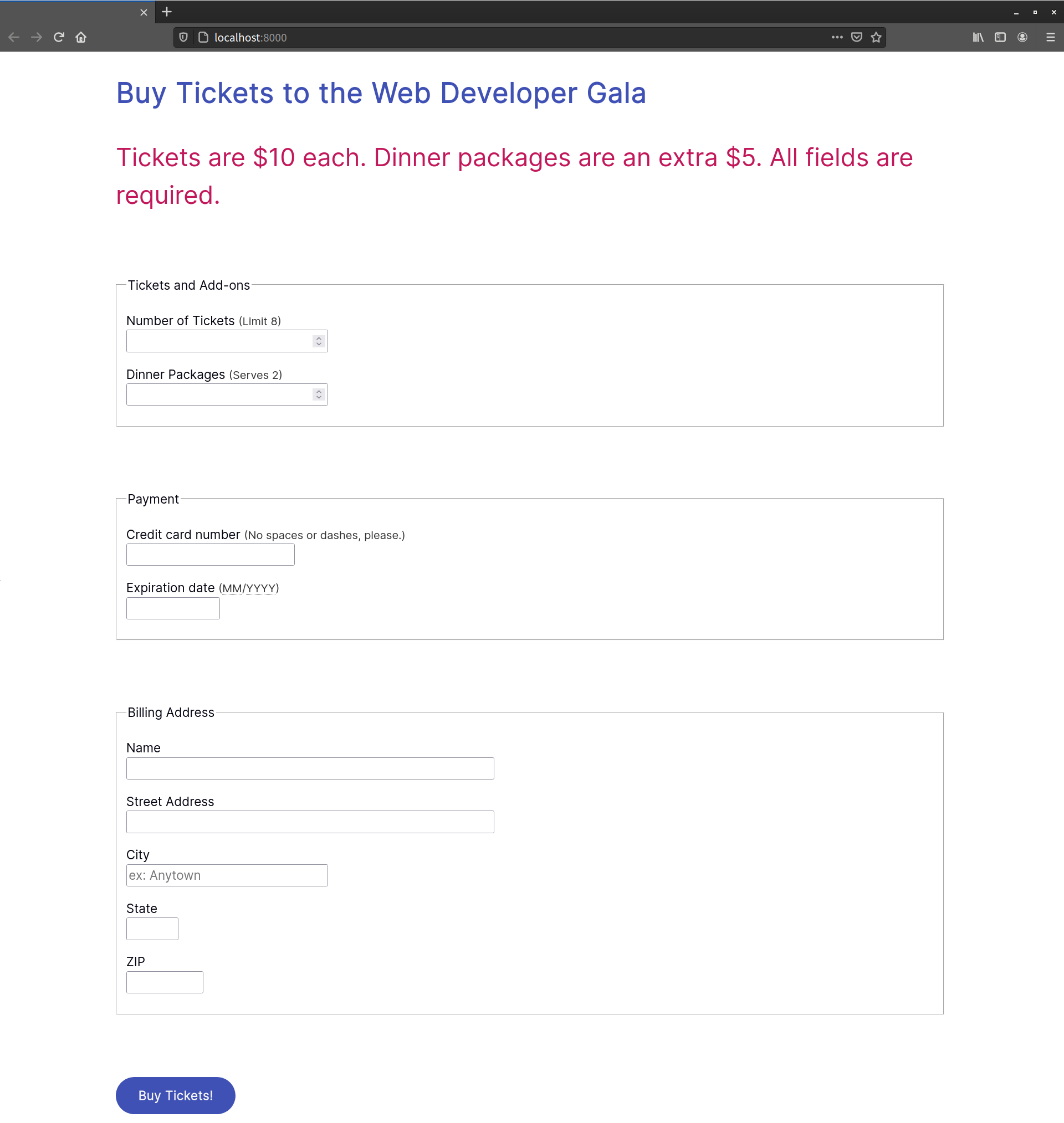
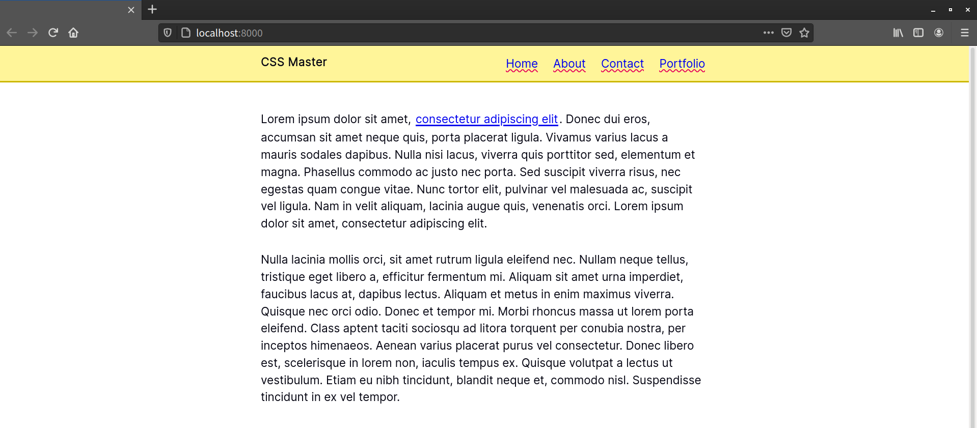
Let’s illustrate each of these combinators. We’ll use them to add styles to the HTML form shown below.
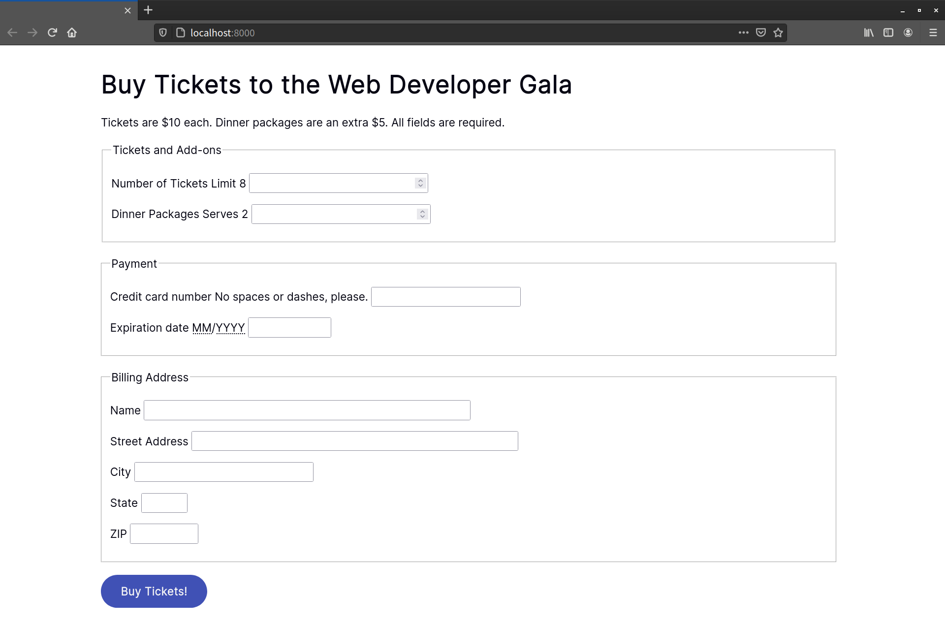
The form pictured above was created using the following chunk of HTML:
<form method="GET" action="/processor">
    <h1>Buy Tickets to the Web Developer Gala</h1>
    <p>Tickets are $10 each. Dinner packages are an extra $5. All fields are required.</p>
    <fieldset>
        <legend>Tickets and Add-ons</legend>

        <p>
            <label for="quantity">Number of Tickets</label>
            <span class="help">Limit 8</span>
            <input type="number" value="1" name="quantity" id="quantity" step="1" min="1" max="8">
    </p>

        <p>
            <label for="quantity">Dinner Packages</label>
            <span class="help">Serves 2</span>
            <input type="number" value="1" name="quantity" id="quantity" step="1" min="1" max="8">
        </p>

    </fieldset>
    <fieldset>
        <legend>Payment</legend>
        <p>
            <label for="ccn">Credit card number</label>
            <span class="help">No spaces or dashes, please.</span>
            <input type="text" id="ccn" name="ccn" placeholder="372000000000008" maxlength="16" size="16">
        </p>
        <p>
            <label for="expiration">Expiration date</label>
            <span class="help"><abbr title="Two-digit month">MM</abbr>/<abbr title="Four-digit Year">YYYY</abbr></span>
            <input type="text" id="expiration" name="expiration" placeholder="01/2018" maxlength="7" size="7">
        </p>

    </fieldset>
    <fieldset>
        <legend>Billing Address</legend>
        <p>
            <label for="name">Name</label>
            <input type="text" id="name" name="name" placeholder="ex: John Q. Public" size="40">
        </p>
        <p>
            <label for="street_address">Street Address</label>
            <input type="text" id="name" name="name" placeholder="ex: 12345 Main Street, Apt 23" size="40">
        </p>

        <p>
            <label for="city">City</label>
            <input type="text" id="city" name="city" placeholder="ex: Anytown">
        </p>

        <p>
            <label for="state">State</label>
            <input type="text" id="state" name="state" placeholder="CA" maxlength="2" pattern="[A-W]{2}" size="2">
        </p>

        <p>
            <label for="zip">ZIP</label>
            <input type="text" id="zip" name="zip" placeholder="12345" maxlength="5" pattern="0-9{5}" size="5">
        </p>
    </fieldset>

    <button type="submit">Buy Tickets!</button>
</form>
The Descendant Combinator
You’re probably quite familiar with the descendant combinator. It’s been around since the early days of CSS (though it lacked a proper name until CSS2.1). It’s widely used and widely supported.
The descendant combinator is simply a whitespace character. It separates the parent selector from its descendant, following the pattern A B, where B is an element contained by A. Let’s add some CSS to our markup from above and see how this works:
form h1 {
    color: hsl(231, 48%, 48%);
}
We’ve just changed the color of our form title, the result of which can be seen below.

Let’s add some more CSS, this time to increase the size of our pricing message (“Tickets are $10 each”). We’ll also make it hot pink:
form p {
    font-size: 36px;
    color: #c2185b;
}
There’s a problem with this selector, however, as you can see in the image below. Our selector is too broad.
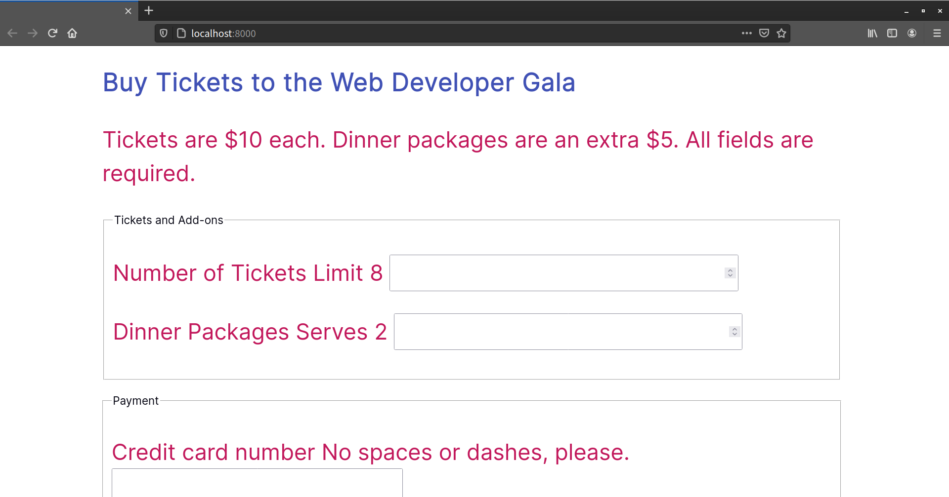
We’ve actually increased the size of the text in all of our form’s paragraphs, which isn’t what we want. How can we fix this? Let’s try the child combinator.
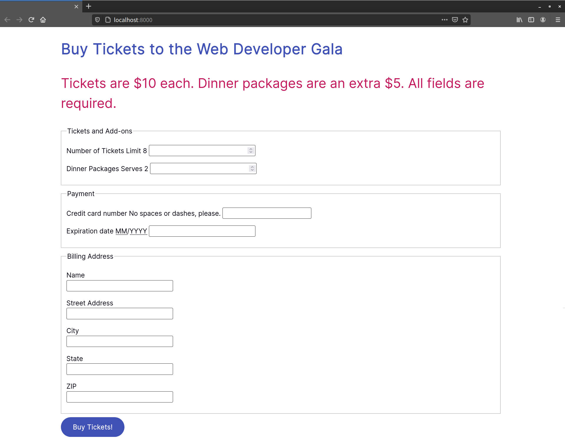
The Child Combinator
In contrast to the descendant combinator, the child combinator (>) selects only the immediate children of an element. It follows the pattern A > B, matching any element B where A is the immediate ancestor.
If elements were people, to use an analogy, the child combinator would match the child of the mother element. But the descendant combinator would also match her grandchildren, and great-grandchildren. Let’s modify our previous selector to use the child combinator:
form > p {
    font-size: 36px;
}
Now only the direct children of form are affected, as shown in the image below.

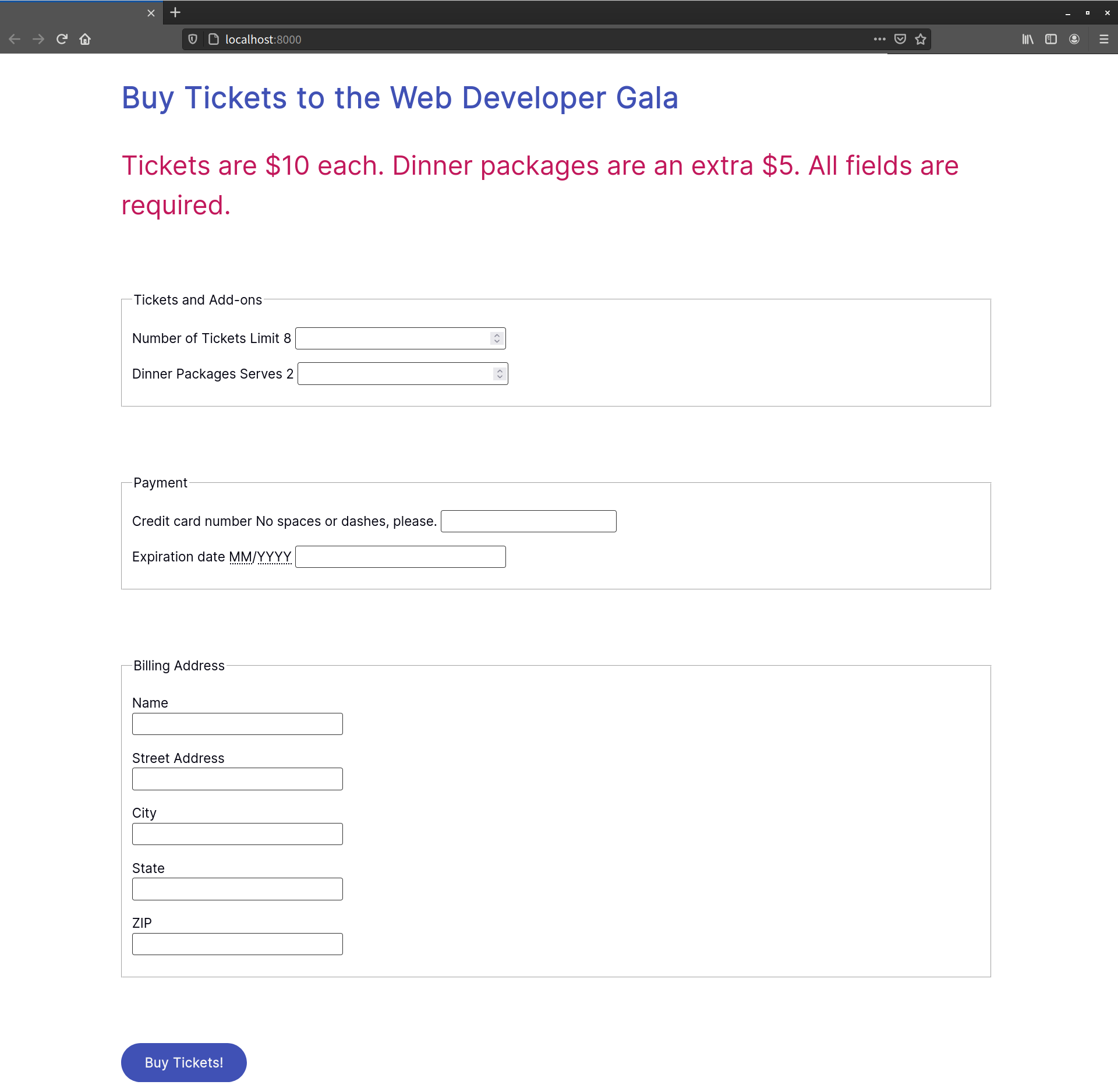
The Adjacent Sibling Combinator
With the adjacent sibling combinator (+), we can select elements that follow each other and have the same parent. It uses the pattern A + B. Styles are applied to B elements that are immediately preceded by A elements.
Let’s go back to our example. Notice that, in the Billing Address section, our labels and inputs sit next to each other. That means we can use the adjacent sibling combinator to make them sit on separate lines:
label + input {
    display: block;
    clear: both;
}
You can see the results in the image below.
You can see in the image above that some of our labels remain on the same line as their input fields. In those instances, there’s a <span> element between the <label> and <input> elements, meaning they’re not adjacent siblings. To match sibling elements that aren’t adjacent, we’ll have to use the general sibling combinator (as we’ll see in the next section).
Let’s look at another example that combines the universal selector (*) with a type selector:
* + fieldset {
    margin: 5em 0;
}
This example adds a 5em margin to the top and bottom of every <fieldset> element, as shown in the image below.
Since we’re using the universal selector, there’s no need to worry about whether the previous element is another <fieldset> or <p> element.
More Uses of the Adjacent Sibling Selector
Heydon Pickering explores more clever uses of the adjacent sibling selector in his article “Axiomatic CSS and Lobotomized Owls”.
The General Sibling Combinator
With the general sibling combinator (~) we can select elements that share the same parent without considering whether they’re adjacent. Given the pattern A ~ B, this selector matches all B elements that are preceded by an A element.
Let’s look at the Number of Tickets field again. Its markup looks like this:
<p>
    <label for="quantity">Number of Tickets</label>
    <span class="help">Limit 8</span>
    <input type="number" value="1" name="quantity" id="quantity" step="1" min="1" max="8">
</p>
Our <input> element follows the <label> element, but there’s a <span> element in between. The adjacent sibling combinator will fail to work here. Let’s change our adjacent sibling combinator to a general sibling combinator:
label ~ input {
    display: block;
}
Now all of our <input> elements sit on a separate line from their <label> elements, as seen in the following image.
Because the general sibling combinator matches any subsequent sibling, you’ll want to use it judiciously. Consider the markup and CSS below:
<!DOCTYPE html>
   <html lang="en-US">
   <head>
        <meta charset="utf-8">
        <title>In This Essay, I Will</title>
        <style>
        h1 ~ p {
          background: yellow
        }
        h2 + p {
          outline: 5px dotted #009;
        }
        </style>
    </head>
    <body>
        <h1>In This Essay, I Will</h1>

        <p>Lorem ipsum dolor sit amet, consectetur adipiscing elit. Fusce odio leo, sollicitudin vel mattis eget.…</p>

        <p>Nulla sit amet neque eleifend diam aliquam rhoncus. Donec id congue est. Aliquam sagittis euismod tristique.…</p>

        <h2>Show how the general sibling combinator works</h2>

        <p>Proin condimentum elit sapien, ut tempor nisl porta quis. …</p>
    </body>
</html>
Here we’ve used the general sibling combinator with an <h1> element. As a result, every paragraph element that follows an <h1> element has a yellow background. This includes the paragraph that follows the <h2> heading, as shown below.

If you have control over the document’s markup, I’d recommend using a class selector instead of the general sibling combinator. The general sibling combinator makes it too easy to accidentally style more elements than you intended to.
Attribute Selectors
Introduced with the CSS Level 2 Specification, attribute selectors make it possible to style elements based on the presence of an attribute, such as [controls] for a media player, or [disabled] for a form field.
You can also use attribute selectors to match elements based on the presence of an attribute and its value. For example, to style submit buttons, you might use the following CSS:
[type=submit] {
   background: seagreen;
   border: 0;
   border-radius: 1000px;
   color: #fff;
   font-size: 18pt;
   padding: 10px 20px;
}
There are also several attribute selectors for partially matching attribute values, as well as substrings. Being able to target partially matching attribute values is one of my favorite features of CSS selectors. When used thoughtfully, they can reduce the number of rules and declarations you need to write. We’ll look at them shortly. Most of the attribute selectors we’ll cover are old hat. I’ve included them, however, for context and completeness.
A Note About Quotes
Quoting the values of attribute selectors is optional in most cases. Both [type=checkbox] and [type="checkbox"] are valid and well-supported syntaxes for attribute selectors. Use quotes when the attribute’s value contains spaces or punctuation characters, such as [class="piechart animated"], [data-action="modal:close"] or [id='section-2.2'].
Matching Space-separated Attribute Values
Although we can select elements based on an attribute value, as discussed above, a selector such as [rel=external] won’t match <a href="/" rel="external citation">, because the rel value isn’t exactly external. Instead, we need to use a selector that can accommodate space-separated values, which takes the form of [att~=val].
The space-separated attribute value selector matches elements with the attribute (att) and a list of values, one of which is val. This can be any attribute that accepts space-separated values, including class or data-*.
Space-separated lists of attributes are admittedly uncommon. They’re sometimes used with the rel attribute and microformats to describe relationships between people and documents. As an example, we might mark up external links like so:
<nav>
<a href="http://bob.example.com/" rel="external friend">Bob</a>
<a href="http://maria.example.com/" rel="external acquaintance">María</a>
<a href="http://ifeoma.example.com/" rel="external colleague">Ifeoma</a>
</nav>
We can then use this presence-based attribute selector to match links that contain friend as one of its attribute values:
[rel~=friend] {
    font-size: 2em;
    background: #eee;
    padding: 4px;
    text-decoration: none;
    border-bottom: 3px solid #ccc;
}
[rel~=friend]:link, [rel~=friend]:visited {
    color: #34444C;
}
[rel~=friend]:hover{
    background: #ffeb3b;
    border-color: #ffc107;
}
The result of this is shown in the image below.

Matching Hyphenated Attribute Values
One of the more interesting tasks we can do with attribute selectors is to use [attr|=val] to match the first part of an attribute value before the first hyphen. For example, [lang|=en] would match an element like <p lang="en-US">.
The main purpose of this selector is for working with languages and language codes, such as en-US and es-MX.
Let’s say we have some markup like this:
<p lang="fr-FR"><q>Tout le monde</q></p>
<p><q>All the world</q>, or <q>Everyone</q></p>
We can italicize our French text and add language-appropriate angle quotes (« and ») to either side of it:
[lang|="fr"] {
font-style: italic;
}
[lang|="fr"] q:before{
content: '�0AB'; /* Left angle quote */
}
[lang|="fr"] q:after{
content: '�0BB'; /* Right angle quote */
}
What’s cool about this selector is that it works even if there’s no hyphen. So the styles above would also apply to <p lang="fr">. And we can further limit the scope of these selectors by adding an element selector, such as p[lang|="fr"].
This selector isn’t limited to language codes. We can use it with any hyphenated attribute value. Consider the following markup:
<article class="promo">
    <h3>U.S. Meets Climate Goals 5 Years Early</h3>
    <p>Lorem ipsum dolor sit amet, consectetur adipisicing ....</p>
</article>

<article class="promo-entertainment">
    <h3>Prince-Bythewood, Duvernay Among Nominees At Oscars</h3>
    <p>Lorem ipsum dolor sit amet, consectetur adipisicing ....</p>
</article>

<article class="promo-sports">
    <h3>New York Knicks win NBA title</h3>
    <p>Lorem ipsum dolor sit amet, consectetur adipisicing ....</p>
</article>

<article class="promo-business">
    <h3>GrubDash to Hire 3,000 Drivers, Offer Benefits</h3>
    <p>Lorem ipsum dolor sit amet, consectetur adipisicing ....</p>
</article>
These are all article promos or teasers. They share some of the same visual characteristics and behavior, along with classes prefixed with promo. Here, too, we can use the hyphenated attribute selector to match these class names:
[class|="promo"] {
    border-top: 5px solid #4caf50;
    color: #555;
    line-height: 1.3;
    padding-top: .5em;
}
[class|="promo"] h3 {
    color: #000;
    font-size: 1.2em;
    margin:0;
}
[class|="promo"] p {
    margin: 0 0 1em;
}
Follow this up with specific border colors for each section type, and you’ll achieve something along the lines of the layout pictured below.

We can also use this selector with ID names. For example, [id|=global] would match #global-footer, #global-menu, and so on.
Matching Attribute Values by Substring
We can also select elements when the attribute values match a particular substring using [att^=val], [att$=val] and [att*=val].
The ^= selector matches a substring at the beginning of an attribute value. For example, think about links using tel: (non-standard) or mailto:. Since they behave differently from other hyperlinks, it makes sense to style them differently just as a hint to the user. Take a “Call this business” link:
<a href="tel:+14045555555">Call this business</a>
We can select this and other tel: links by using [href^="tel:"]. Let’s add some declarations:
[href^="tel:"] {
    background: #2196f3 url(../../Images/phone-icon.svg) 10px center / 20px auto no-repeat;
    border-radius: 100px;
    padding: .5em 1em .5em 2em;
}
You can see the result in the image below.

The $= selector matches a substring at the end of an attribute value. If, for example, we wanted to give a special color to PDF file links, we could use a[href$=".pdf"]:
a[href$=".pdf"] {
    color: #e91e63;
}
This selector would also be handy for matching elements whose attribute values end with the same suffix. For example, you could match both <aside class="sports-sidebar"> and <aside class="arts-sidebar"> with [class$=sidebar].
The *= selector matches a substring in any position within the attribute value. Using the selector [class*=sidebar], we could select an element with a class of sports-sidebar-a, along with elements with the classes sports-sidebar and arts-sidebar.
Matching Attribute Values by Case
CSS is, for the most part, a case-insensitive language. Both color: tomato and COLOR: TOMATO do the same thing. Both p {…} and P {…} will style paragraphs in HTML, whether the HTML uses <p> or <P>. The same applies with attribute names, where [href] and [HREF] will both match href="…" and HREF="…".
However, the same doesn’t apply to attribute values. Letter case matters with these. In the following markup, the ID attribute for our <div> tag mixes uppercase and lowercase letters:
<div id="MixedCaseIDExample">
    The identifier for this tag mixes uppercase and lowercase letters.
</div>
To style the <div>, we might use its ID selector—that is, #MixedCaseIDExample. But we’d have to use it exactly as it appears in the HTML. Using #mixedcaseidexample, for example, wouldn’t cut it.
But there is an alternative. We could instead use case-insensitive attribute matching. It’s a feature defined by the Selectors Level 4 specification.
Case-insensitive attribute matching uses the i flag to indicate that these styles should be applied to any case combination:
[id=mixedcaseidexample i] {
  color: blue;
}
Now our selector will match the ID attribute whether its value is mixedcaseidexample, MixedCaseIDExample, or mIxEdCaSeIdExAmPlE.
In some cases, you may want to enforce case-sensitive value matching. To enforce case-sensitive matching, use the s flag:
[id="mixedcaseidexample" s] {
  color: orange;
}
The s flag matches #mixedcaseidexample, but not #MixedCaseIDExample or #mIxEdCaSeIdExAmPlE.
Pseudo-classes and Pseudo-elements
Most of the new selectors added in CSS3 and CSS4 are not attribute selectors at all. They’re pseudo-classes and pseudo-elements.
Though you’ve probably used pseudo-classes and pseudo-elements in your CSS, you may not have thought about what they are or how they differ from each other.
Pseudo-classes let us style objects based on information—such as their state—that’s distinct from the document tree, or that can’t be expressed using simple selectors. For example, an element can only have a hover or focus state once the user interacts with it. With the :hover and :focus pseudo-classes, we can define styles for those states. Otherwise, we’d have to rely on scripting to add and remove class names.
Pseudo-elements, on the other hand, let us style elements that aren’t directly present in the document tree. HTML doesn’t define a firstletter element, so we need another way to select it. The ::first-letter pseudo-element gives us that capability.
Beware of Universal Selection
Using pseudo-classes and pseudo-elements without a simple selector is the equivalent of using them with the universal selector. For a selector such as :not([type=radio]), every element that lacks a type attribute and value of radio will match—including <html> and <body>. To prevent this, use :not() as part of a compound selector, such as with a class name or element, as in p:not(.error).
In the same way, using class names, IDs and attribute selectors on their own applies them universally. For example, .warning and [type=radio] are the same as *.warning and *[type=radio].
Pseudo-elements
The CSS Pseudo-elements Module Level 4 specification clarifies behavior for existing pseudo-elements and defines several new ones. We’ll focus on the ones that currently have browser support:
::afterinserts additional generated content after the content of an element::beforeinserts additional generated content before the content of an element::first–letterselects the first letter of an element::first–lineselects the first line of an element::markerstyles bullets and numbers for list items and the<summary>element::placeholderstyles placeholder text for form controls using theplaceholderattribute::selectionstyles text selected by the cursor
Of these, ::first–letter, ::first–line, ::selection, ::marker and ::placeholder affect content that’s part of the document source. The ::before and ::after pseudo-elements, on the other hand, inject content into a document. Let’s look at each of these pseudo-elements more closely.
::before and ::after
Most pseudo-elements allow us to select content that’s already part of the document source—that is, the HTML you authored—but that’s not specified by the language. But ::before and ::after work differently. These pseudo-elements add generated content to the document tree. This content doesn’t exist in the HTML source, but it’s available visually.
Why would you want to use generated content? You might, for example, want to indicate which form fields are required by adding content after their label:
/* Apply to the label element associated with a required field */
.required::after {
    content: ' (Required) ';
    color: #c00;
    font-size: .8em;
}
Required form fields use the required HTML property. Since that information is already available to the DOM, using ::before or ::after to add helper text is supplemental. It isn’t critical content, so it’s okay that it’s not part of the document source.
Generated Content and Accessibility
Some screen reader and browser combinations recognize and read generated content, but most don’t. You can’t be sure that content generated using ::before or ::after will be available to assistive technology users. You can read more about this in Leonie Watson’s piece “Accessibility support for CSS generated content”.
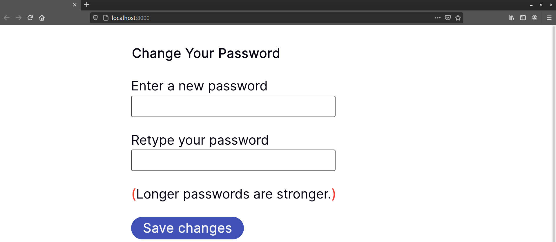
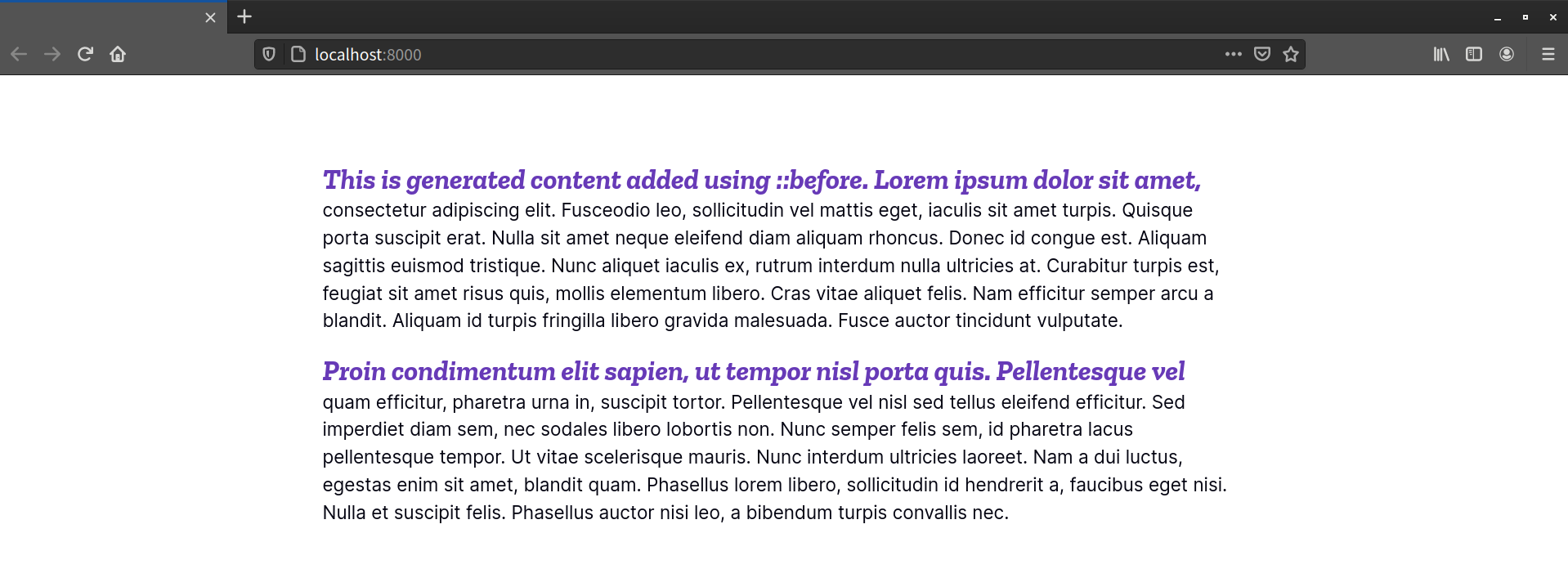
Another use case for ::before or ::after is adding a prefix or suffix to content. For example, the form mentioned above might include helper text, as shown here:
<form method="post" action="/save">
    <fieldset>
        <legend>Change Your Password</legend>
        <p>
            <label for="password">Enter a new password</label>
            <input type="password" id="password" name="password">
        </p>
        <p>
            <label for="password2">Retype your password</label>
            <input type="password" id="password2" name="password2">
        </p>
        <p class="helptext">Longer passwords are stronger.</p>
        <p><button type="submit">Save changes</button></p>
    </fieldset>
</form>
Let’s enclose our helper text in red parentheses using ::before and ::after:
.helptext::before,
.helptext::after {
    color: hsl(340, 82%, 52%);
}
.helptext::before {
    content: '( ';
}
.helptext::after {
    content: ')';
}
The result is shown below.
Both ::before and ::after behave similarly to other descendant elements. They inherit the inheritable properties of their parent, and are contained within it. They also interact with other element boxes as though they were true elements.
One Pseudo-element per Selector
Currently, only one pseudo-element is allowed per selector. A selector such as p::first-line::before is invalid and unsupported.
This means that we can use ::before and ::after with CSS Grid and Flexbox. One use case is decorated headings, such as the one shown below.
The CSS required to create this heading is as follows:
h1 {
display: grid;
grid-template-columns: 1fr auto 1fr;
gap: 3rem;
}
h1::before,
h1::after {
content: '�0a0';
background: url('decoration.svg') repeat-x center / 50% auto;
}
You can read more about CSS Grid and Flexbox layout in Chapter 5, “Layouts”.
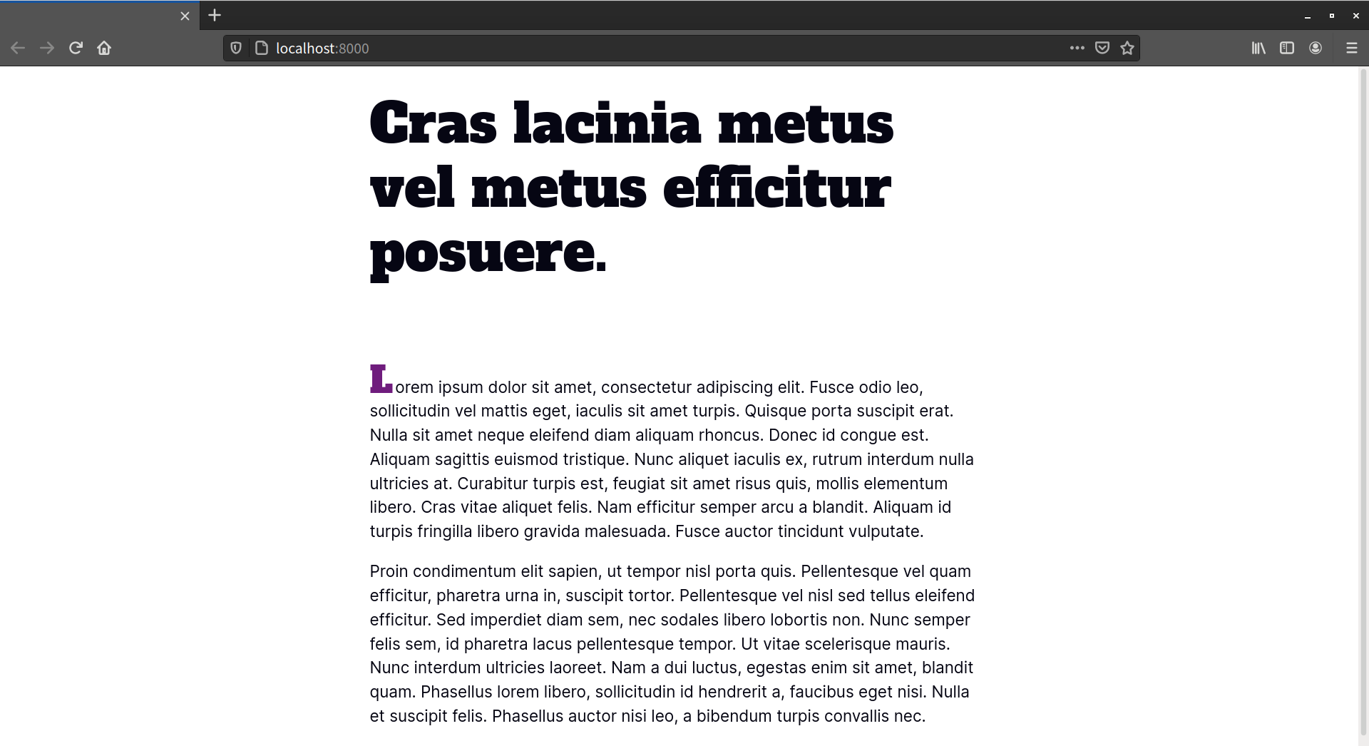
Creating Typographic Effects with ::first-letter
While the ::before and ::after pseudo-elements inject content, ::first-letter works with content that exists as part of the document source. With ::first-letter, we can create initial letter effects, such as drop caps, as you might see in a magazine or book layout.
Initial and Drop Caps
An initial capital is an uppercase letter at the start of a block of text that’s set in a larger font size than the rest of the body copy. A drop capital (or drop cap) is similar to an initial capital, but is inset into the first paragraph by at least two lines.
This CSS snippet adds an initial capital letter to every <p> element in our document:
p::first-letter {
    font-family: serif;
    font-weight: bold;
    font-size: 3em;
    font-style: italic;
    color: #3f51b5;
}
The result is shown below.

As you may have noticed from the image above, ::first–letter will affect the line-height of the first line if you’ve set a unitless line-height for the element. In this case, each <p> element inherits a line-height value of 1.5 from the <body> element. There are three ways to mitigate this:
- Decrease the value of
line-heightfor the::first–letterpseudo-element. A value of.5seems to work well most of the time, depending on the font. - Set a
line-heightwith units on the::first–letterpseudo-element. - Set a
line-heightwith units on either the<body>or the::first–letterparent.
The first option preserves the vertical rhythm that comes with using a unitless line-height. The second option limits the side effects of using a fixed line-height just to those pseudo-elements. Option three, however, introduces a high likelihood that you’ll create a side effect that requires more CSS to undo.
Why Unitless?
The Mozilla Developer Network entry for line-height explains why unitless values are the way to go.
In this case, let’s decrease the line-height value for p::first-letter to .5 (and rewrite our file properties to use the font shorthand):
p::first-letter {
    font: normal 10rem / 1 'Alfa Slab One', serif;
    color: hsl(291, 64%, 30%);
    display: inline-block;
    padding-right: .25rem;
}
This change produces the result shown in the image below.

Notice here that we adjusted the bottom margin of each <p> element to compensate for the reduced line-height of p::first-letter.
Creating a drop capital requires a few more lines of CSS. Unlike an initial capital, the text adjacent to the drop capital letter wraps around it. This means that we need to add float:left; to our rule set:
p::first-letter {
    float: left;    /* Makes the text wrap around the drop cap */
    font: normal 10rem / 1 'Alfa Slab One', serif;
    color: hsl(200, 18%, 46%);
    margin-bottom: .4rem;
    padding: 1rem 1.4rem 0 0;
    text-shadow: 2px 2px 0px hsl(200, 100%, 10%);
}
Floating an element, or in this case a pseudo-element, causes the remaining text to flow around it, as illustrated below.
Be aware that ::first-letter can be difficult to style with pixel-perfect accuracy across browsers, unless you use px or rem units for size, margin, and line height.
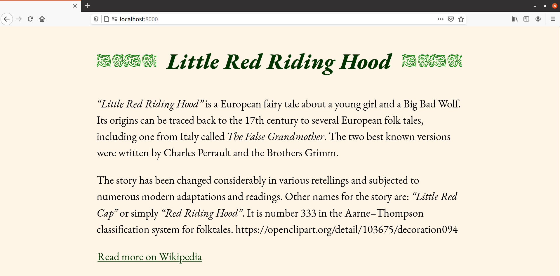
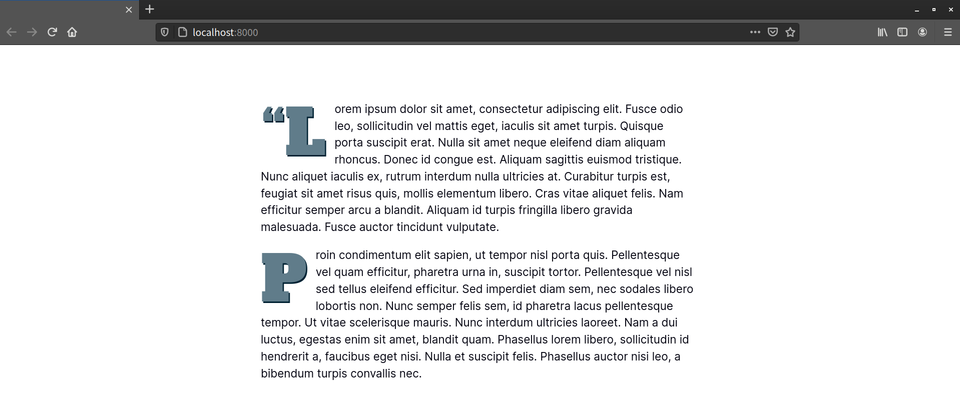
Sometimes the first letter of a text element is actually punctuation—such as in a news story that begins with a quote:
<p>“Lorem ipsum dolor sit amet, consectetur adipiscing elit.” Fusce odio leo, sollicitudin vel mattis eget, …</p>
In this case, the styles defined for ::first-letter affect both the opening punctuation mark and the first letter, as shown below. All browsers handle this in the same way.
However, this isn’t necessarily how it works when the punctuation mark is generated by an element. Consider the following markup:
<p><q>Lorem ipsum dolor sit amet, consectetur adipiscing elit.</q> Fusce odio leo, sollicitudin vel mattis eget, iaculis sit …</p>
Current browsers typically render the <q> element with language-appropriate quotation marks before and after the enclosed text. Safari, Chrome, and Edge ignore the opening quotation mark. However, Firefox versions 90 and under apply ::first-letter styles to the opening quotation mark, not the first letter.
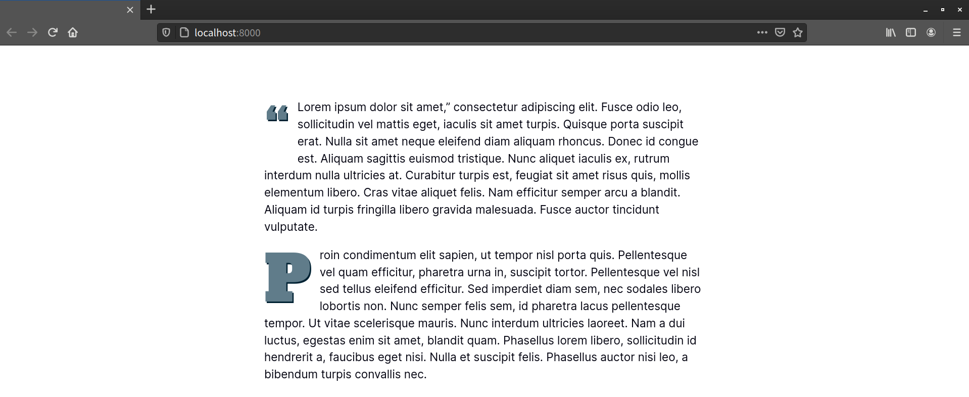
In Chrome-based browsers and Safari, neither the opening quotation mark for the <q> element nor the first letter of the paragraph are restyled. The image below shows how this looks in Chrome.

According to the CSS Pseudo-elements Module Level 4 specification, punctuation that immediately precedes or succeeds the first letter or character should be included. However, the specification is unclear about whether this also applies to generated punctuation.
In Firefox 90 and earlier, some punctuation characters cause Firefox to ignore a ::first–letter rule altogether. These include, but are not limited to, the dollar sign ($), caret (^), back tick (`) and tilde (~) characters. Firefox, to date, also doesn’t apply ::first-letter styles to emoji.
This is true whether the first character is set using ::before and the content property, or included in the document source. There’s no fix for this. Avoid using these characters as the first character if you’re also using ::first-letter.
The ::first-letter pseudo-element doesn’t apply to elements such as <a>, <b>, or <code>. Nor does it apply to parent elements with a display property value of inline.
Creating Typographic Effects with ::first-line
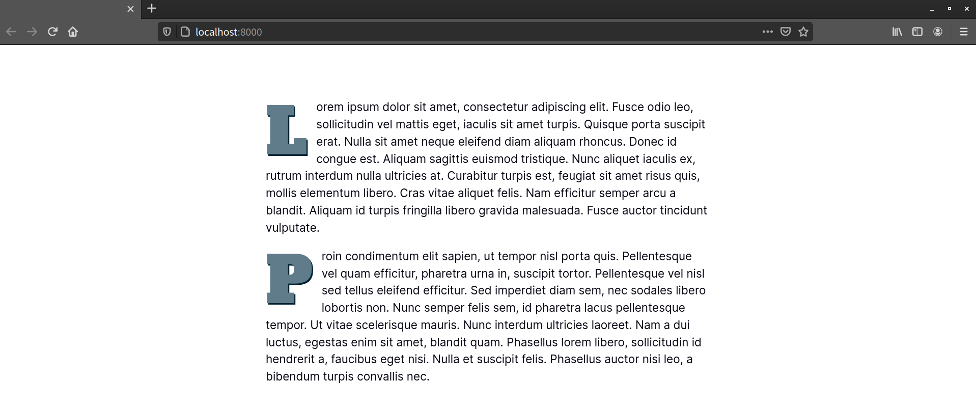
The ::first-line pseudo-element works similarly to ::first-letter, but affects the entire first line of an element. For example, the first line of every paragraph could have larger text and a different color from the rest of the paragraph:
p::first-line {
    font: bold 1.5em serif;
    font-style: italic;
    color: #673ab7;
}
You can see the result in the image below.
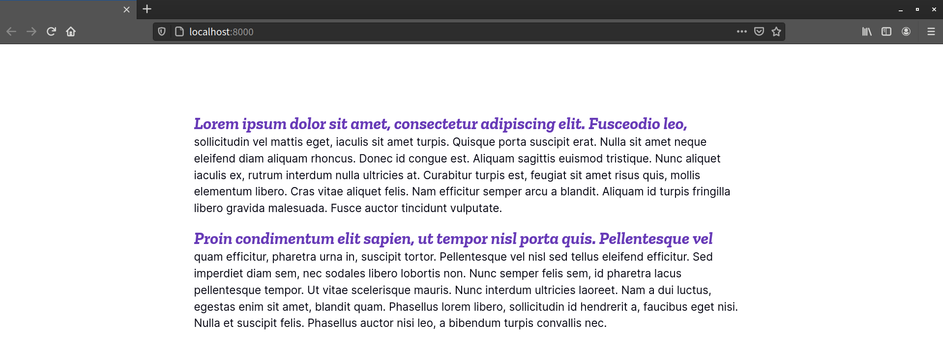
Notice that the first line of each paragraph is affected, rather than the first sentence. The font size and element width determine how many characters fit on this first line.
It’s possible to force the end of a first line by using a <br> or <hr> element, as shown below.
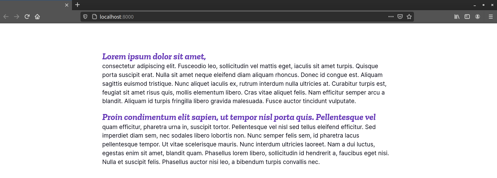
Unfortunately, this is far from perfect. If your element is only wide enough to accommodate 72 characters, adding a <br> element after the 80th character won’t affect the ::first-line pseudo-element. You’ll end up with an oddly placed line break.
Similarly, using a non-breaking space ( ) to prevent a line break between words won’t affect ::first-line. Instead, the word that sits before the will be forced onto the same line as the text that comes after it.
Generated content that’s added using ::before will become part of the first line, as shown in the image below.
If the generated text is long enough, it will fill the entire first line. However, if we add a display: block declaration—such as p::before {content: '!!!'; display: block;}—that content will become the entire first line.
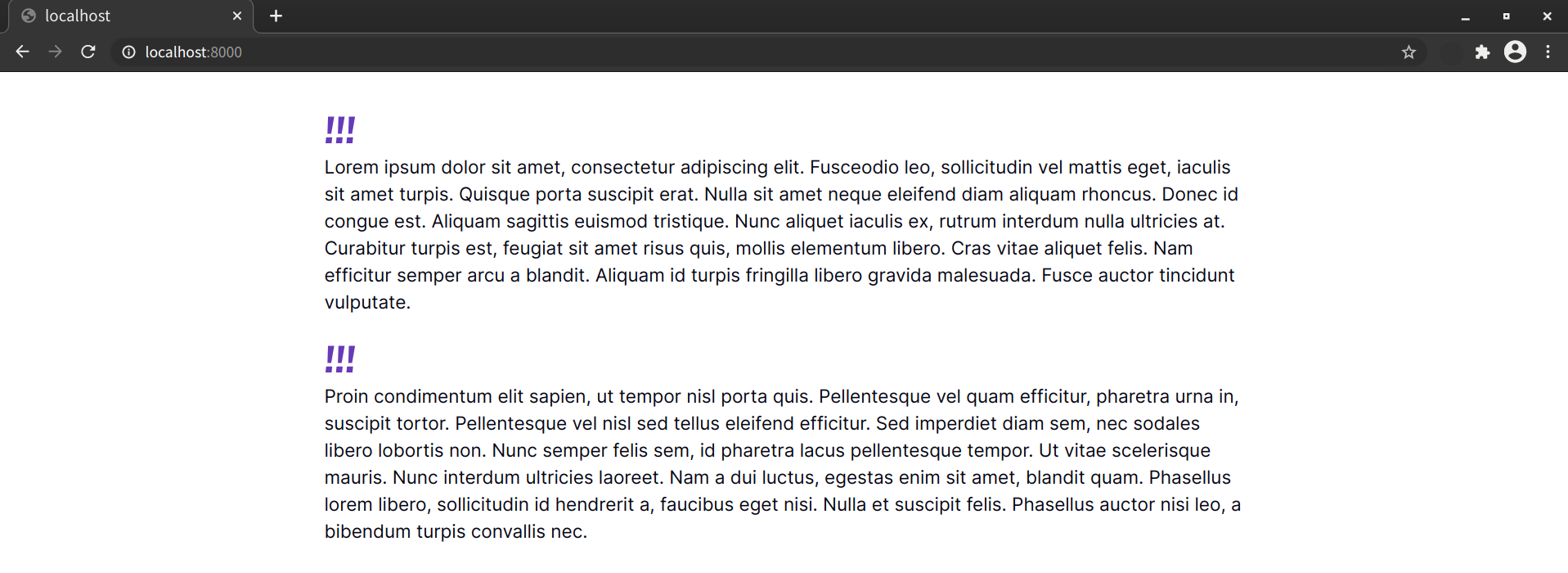
Unfortunately, versions of Firefox 90 and below handle this differently. Firefox correctly inserts the value of the content property, but adding display: block causes the ::first-line rule to fail completely.
Not all properties are compatible with ::first-line. Only the following are supported:
backgroundand thebackground-prefixed propertiescolorfontand thefont-prefixed group of propertiesletter-spacingline-heightopacitytext-decoration, including expanded properties such astext-decoration-linetext-transformtext-shadowword-spacingvertical-align
User Interface Fun with ::selection
The ::selection pseudo-element is one of the so-called “highlight pseudo-elements” defined by the CSS Pseudo-Elements Module Level 4 specification. Formerly part of the Selectors Level 3 specification, it’s the only highlight pseudo-element that’s currently supported by browsers. Three other properties—::target-text, ::spelling-error and ::grammar-error—are still in flux.
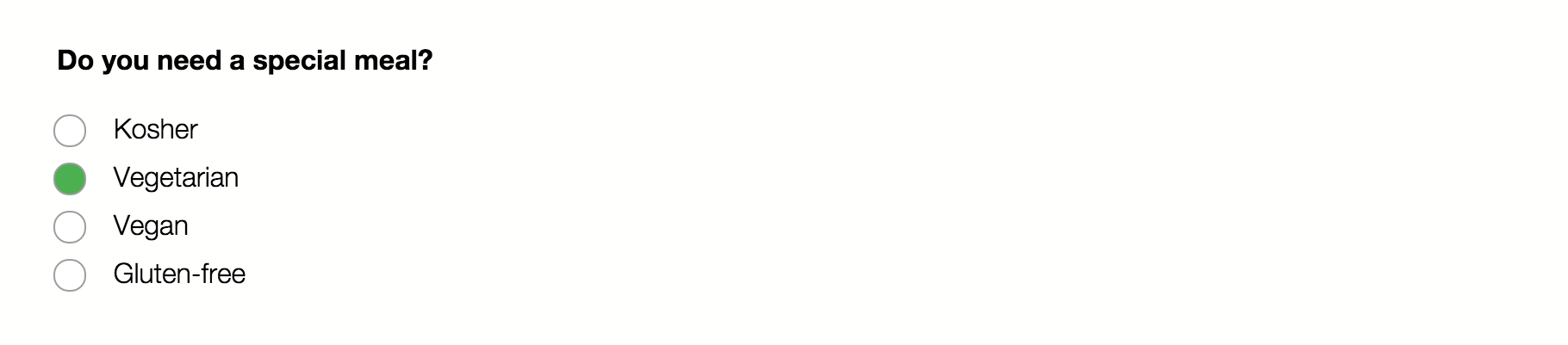
With ::selection, we can apply CSS styles to content that users have highlighted with their mouse. By default, the background and text color of highlighted content is determined by the user’s system settings. Developers, however, can change what that highlight looks like—as shown below, where the selection color has been set to green.
Not every CSS property can be used with ::selection. Only a few properties are permitted by the specification:
colorbackground-colortext-decoration, and related properties such astext-decoration-styletext-shadowstroke-colorfill-colorstroke-width
To date, only text-shadow, color and background-color have been implemented in browsers. Let’s look at an example:
::selection {
    background: #9f0; /* lime green */
    color: #600;
}
This CSS adds a lime-green background to any element the user highlights, and changes the text color to a deep red. The example works in every browser that supports ::selection, and you can see the effect in the image below.

Color Combinations
When selecting foreground and background colors to use with ::selection, keep accessibility in mind. Some color combinations fail to generate enough contrast to be read by low-vision users. Other color combinations may be illegible for color-blind users. Be sure to use a contrast checker and color-blindness simulator before selecting your final colors.
Custom List and Summary Icons with ::marker
::marker is a pseudo-element that represents a bullet or number indicator of elements with a display value of list-item. In most current browser versions, the default user-agent stylesheet applies display: list-item to <li> and <summary> elements.
Any element with a list-item display value will generate a marker box that can be selected and styled using ::marker. Using a display value other than list-item—such as display: inline or display: grid—removes the marker box and the ability to use ::marker.
Browser support for ::marker
Safari 14.2 and below, and Chrome/Edge versions 88 and below, don’t support ::marker when used with the <summary> element. Instead, use the ::-webkit-details-marker pseudo-element. Keep in mind, however, that ::-webkit-details-marker is limited to color and font properties.
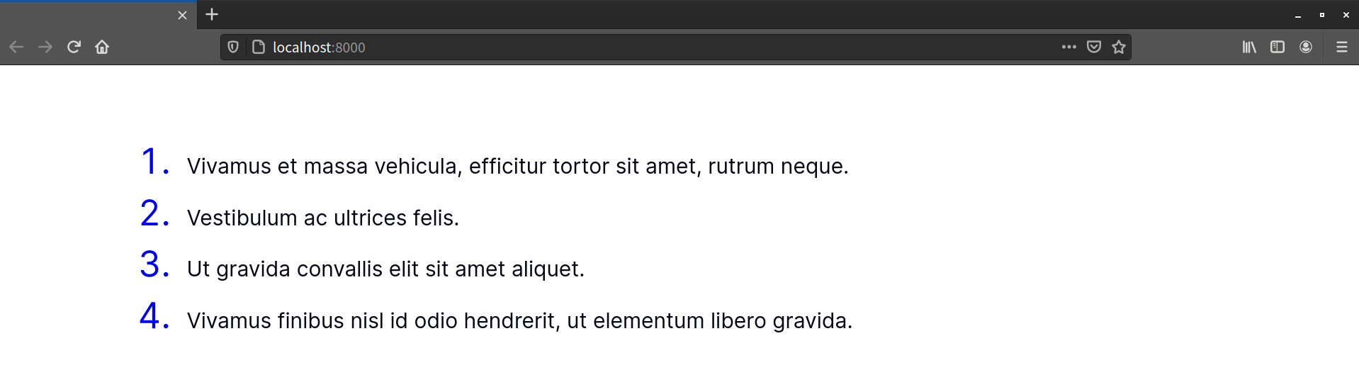
With ::marker, we can do things like define custom bullet content for unordered lists, or change the size and color of the numbers in an ordered list:
ol ::marker {
  color: blue;
  font-size: 4rem;
}
You can see the effect of this rule in the image below.
Only a small subset of CSS properties can be used with ::marker, as outlined in the CSS Lists and Counters Module Level 3 specification:
colorcontentdirectionfont, along with its longhand properties such asfont-sizeandfont-weightwhite-space- animation and transition properties, such as
animation-transitionandtransition-delay text-combine-uprightunicode-bidi
Future versions of the specification may expand this list. To date, we’re limited to the above properties.
Further Safari Limitations
Safari versions 14.2 and below only partially support ::marker. They render color and font styles, but not the value of the content property.
Because of these limitations, li::before can be a more flexible option for adding custom bullets or numbers. Using ::before gives you more control over things like horizontal spacing between bullets and content, and vertical alignment. It’s also well-supported in older browsers.
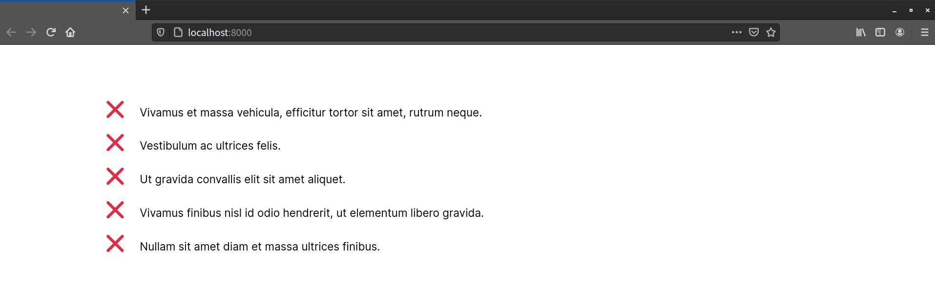
In browsers that support both, you may instead choose to use both ::marker and ::before:
li::marker {
content: '❌';
}
li::before {
content: '�0a0'; /* Unicode for a non-breaking space */
display: inline-block;
padding: 0 10px;
}
In the preceding example, we’ve used ::marker to set the content and color of list item bullets, and ::before to manage the spacing between the markers and each list item’s contents. You can see the results below.
For the most part, list style properties interact with the ::marker pseudo-element. Adding a list-style: upper-roman declaration, for example, sets the numeric markers for an unordered list. You can then use ::marker to change the size and color:
ul {
    list-style: upper-roman;
}
ul ::marker {
    font-size: 4rem;
    color: green;
}
But there’s an exception: if you set the content property of a list item using ::marker, most browsers will render that value instead of the value of list-style or list-style-type:
ul ::marker {
    content: '?';       /* Rendered in browsers that support ::marker */
    font-size: 2.3rem;
    font-weight: bold;
    color: #090;
}
ul {
    list-style: '→';     /* Visible when ::marker is unsupported */
}
The image below shows how, in Firefox 90, ::marker takes precedence over list-style when both are defined and supported.

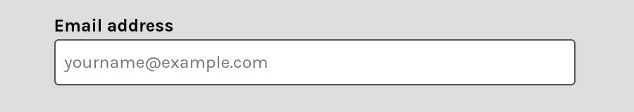
Styling Input ::placeholder Values
Text-based form inputs have a placeholder attribute that lets us add a hint about what kind of data the field expects:
<form>
    <p>
        <label for="subscriber_email">Your email address</label>
        <input type="email" name="subscriber_email" id="subscriber_email" placeholder="[email protected]">
    </p>
</form>
Most browsers display the value of the placeholder attribute within the form control as black text with a reduced opacity, as pictured below.
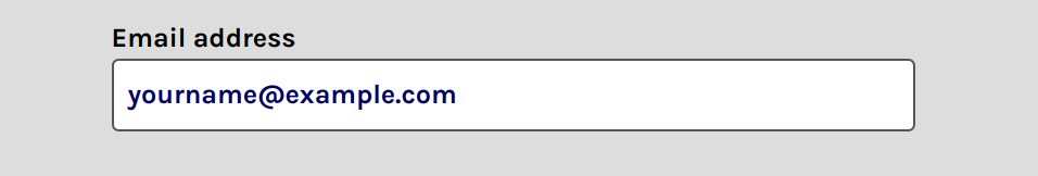
We can change the appearance of this text using the ::placeholder pseudo-element selector. Let’s change the color and size of our placeholder text:
::placeholder {
    color: rgba(0, 0, 100, 1);
    font-weight: bold;
}
Now this is what we see.
Placeholder Text Can Be Harmful
Placeholder text can be confusing for many users, particularly those with cognitive impairments. Consider using descriptive text positioned near the form control instead. Placeholder text is also not a replacement for the <label> element. Use labels with your form controls, even if you use the placeholder attribute.
::placeholder supports the same subset of CSS properties as ::first-line. When changing the appearance of ::placeholder text, choose colors and text sizes that create sufficient contrast. Firefox includes tools to check for basic accessibility blunders such as poor contrast between text and background colors.
Later in this chapter, we’ll discuss the :placeholder-shown pseudo-class, which applies to the form control itself.
Pseudo-classes
As mentioned earlier in this chapter, pseudo-classes help us define styles for documents based on information that can’t be gleaned from the document tree or that can’t be targeted using simple selectors. Among them are logical and linguistic pseudo-classes such as :not() and :lang(), as well as user-triggered pseudo-classes such as :hover and :focus, and form state pseudo-classes such as :checked and :invalid.
Styling the :root of a Document
One pseudo-class you often see in CSS snippets and demos is the :root pseudo-class. The :root pseudo-class matches the root element of the document. When working with HTML, this matches the <html> element. For SVG documents, it’s the <svg> element.
You might choose :root over html if you need to define a set of custom properties (variables) for a stylesheet that will be shared across HTML and SVG documents. The following example uses :root and custom properties to define a color palette:
:root {
  --color-primary: blue;
  --color-secondary: magenta;
  --color-tertiary: yellowgreen;
}
Linking this stylesheet from an SVG or HTML document makes these properties available for use with either in a way that using html as a selector doesn’t.
Highlighting Page Fragments with :target
A fragment identifier is the part of a URL starting with a # character—such as #top or #footnote1. You may have used them to create in-page navigation links—sometimes called “jump links”. With the :target pseudo-class, we can highlight the portion of the document that corresponds to that fragment.
Say, for example, you have a series of comments in a discussion board thread:
<section id="comments">
    <h2>Comments</h2>
    <article class="comment" id="comment-1146937891">...</article>
    <article class="comment" id="comment-1146937892">...</article>
    <article class="comment" id="comment-1146937893">...</article>
</section>
With some CSS and other fancy bits, it might look a little like what’s pictured below.
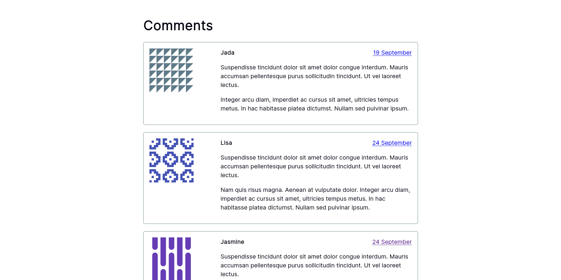
Each comment in the code above has a fragment identifier, which means we can link directly to it with an anchor link such as <a href="#comment-1146937891"> or <a href="http://example.com/post/#comment-1146937891">. Then all we need to do is specify a style for this comment using the :target pseudo-class:
.comment:target {
    background: #ffeb3b;
    border-color: #ffc107
}
When someone clicks a link to an <article> element with a class of comment, the browser will take them to that comment and give it a yellow background, as shown below.

You can use any combination of CSS with :target, but be cautious about using properties that can show or hide content. Adjusting the z-index property, for example, can hide content on the page, but still expose it to assistive technology. That may not be what you want.
Styling Elements That Have No Children Using :empty
Sometimes WYSIWYG (what you see is what you get) editors add empty <p> elements to your content. These empty elements may affect your document layout if your stylesheet also uses p as a type selector. It’s possible to visually exclude these elements, however, with the :empty pseudo-class:
p:empty {
  display: none;
}
Earlier versions of the selectors specifications defined :empty elements as elements devoid of any element or text nodes—including space or newline characters. This means that for most current implementations, p:empty matches <p></p>, but not <p> </p>.
Perhaps unexpectedly, :empty will always match <img> and <input> elements when used with the universal selector (again, :empty is the same as *:empty). For <input> elements, this is true even if the field contains text.
In the meantime, you can use the :placeholder-shown pseudo-class to select blank form control fields. We’ll discuss this selector later in the chapter.
Concise and Resilient Selectors with :is()
The :is() pseudo-class is one of three logical pseudo-classes available in CSS—the other two being :not() and :where() (which we’ll discuss in the next sections).
Can I :has() a Parent Selector?
CSS Selectors Level 4 also defines a fourth logical pseudo-class, :has(). Unfortunately, :has() lacks browser support, so we won’t cover it in this chapter. It’s sometimes referred to as the elusive “parent selector”, a long wished for but difficult to implement concept. In early 2021, Igalia announced an intent to prototype support for :has(). Full browser support may take some time. In the meantime, parent selection remains the preserve of JavaScript.
You can use :is() to create more concise and resilient selectors. It’s a functional pseudo-class that accepts a selector list as its argument. Here’s an example:
article :is( h1, h2, h3, h4 ) {
    font-family: 'EB Garamond', serif;
    font-style: italic 45deg;
}
In this case, our selector matches <h1>,<h2>,<h3>, or <h4> elements that are the descendants of an <article>. It’s the equivalent of writing the following:
article h1,
article h2,
article h3,
article h4 {
    font-family: 'EB Garamond', serif;
    font-style: italic 45deg;
}
That’s a much longer selector list! Using :is() significantly reduces the length of selectors.
Before :is() Was
WebKit implemented an earlier version of the :is() pseudo-class as :-webkit-any(). The main difference was that :-webkit-any() didn’t support a selector list argument. Earlier versions of the Selectors Level 4 specification also defined a :matches() pseudo-class. It’s been replaced by :is().
The :is() function accepts what’s known as a forgiving selector list. Consider the following CSS:
:is( :blank, :placeholder-shown ) {
    font: inherit;
    padding: 1rem;
    color: #003a;
}
The selector above matches input elements that are blank or that have visible placeholder text. Here’s the catch: most browsers don’t yet support the :blank pseudo-class. Despite this, our declarations will still be applied to elements that match :placeholder-shown. A forgiving selector lists tells browsers to ignore selectors that the browser doesn’t understand.
Forgiving selector lists are a newer CSS concept. Earlier CSS specifications defined how a browser should treat a selector list that it can’t fully parse, whether the error is due to a lack of browser support or a typo. As explained in the CSS 2.1 Specification:
CSS 2.1 gives a special meaning to the comma (
,) in selectors. However, since it is not known if the comma may acquire other meanings in future updates of CSS, the whole statement should be ignored if there is an error anywhere in the selector, even though the rest of the selector may look reasonable in CSS 2.1.
In other words, if any item in a standard selector list isn’t supported, the browser ignores the entire rule. Using :is(), on the other hand, lets the browser ignore selectors that it doesn’t understand.
Browser Support
Yes, :is() lets us write resilient selectors, but that resiliency still requires browser support. If the browser doesn’t support :is(), the original parsing rules still apply. The entire rule will fail.
Negating Selectors with :not()
The :not() pseudo-class is the opposite of :is(). It returns all elements except for those that match the selector argument. For example, p:not(.message) matches every <p> element that doesn’t have a class of message.
Here’s an example of a form that uses textual input types and radio buttons:
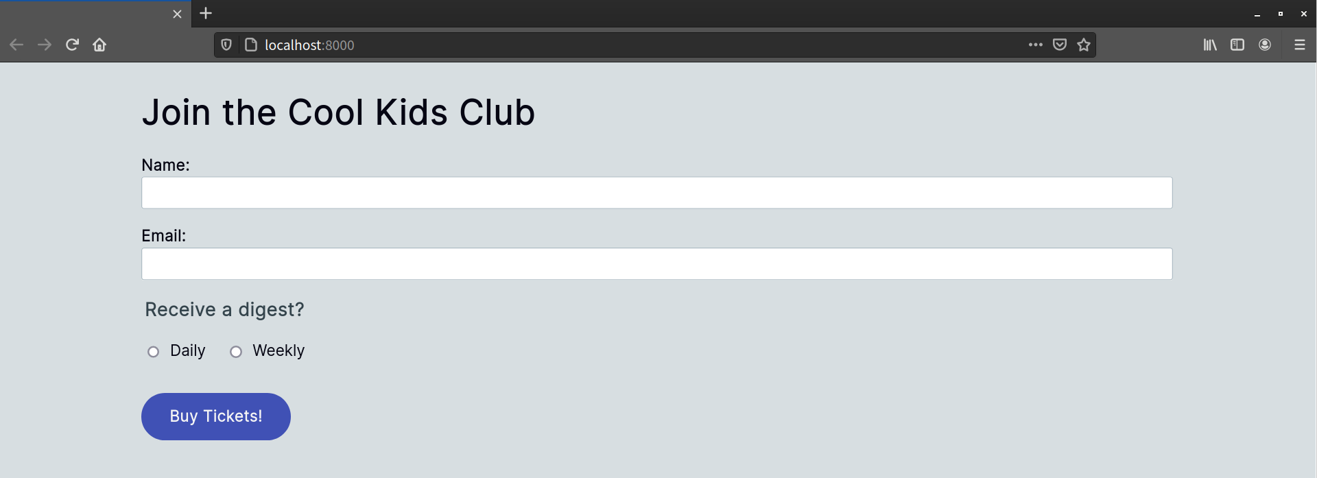
<form method="post" action="#">
      <h1>Join the Cool Kids Club</h1>
      <p>
          <label for="name">Name:</label>
          <input type="text" id="name" name="name" required>
      </p>

      <p>
          <label for="email">Email:</label>
          <input type="email" id="email" name="email" required>
      </p>
      <fieldset>
      <legend>Receive a digest?</legend>
      <p>
          <input type="radio" id="daily" name="digest">
          <label for="daily" class="label-radio">Daily</label>
          <input type="radio" id="weekly" name="digest">
          <label for="weekly" class="label-radio">Weekly</label>
      </p>
      </fieldset>
      <button type="submit">Buy Tickets!</button>
</form>
In the HTML, labels associated with a radio type have a .label-radio class. We can use :not() to target those elements without a .label-radio class:
label:not( .label-radio ) {
    font-weight: bold;
    display: block;
}
The end result is shown below.
Here’s a slightly trickier example. Let’s create styles for textual inputs. These include input types such as number, email, and text along with password and URL. Let’s do this by excluding radio button, checkbox, and range inputs:
input:not( [type=radio], [type=checkbox], [type=range] ) {
    ...
}
As with :is(), the :not() pseudo-class accepts either a single selector or a selector list as an argument. It will match any and all of the supported selectors in the list.
Chrome and Edge versions 87 and below, and Firefox versions 83 and below, implement an earlier definition of :not() that doesn’t accept selector lists. Instead, those browsers accept a single selector argument. For those browsers, we’ll need a different approach.
Your instinct might be to rewrite the preceding example like so:
input:not( [type=radio] ),
input:not( [type=checkbox] ),
input:not( [type=range] ) {
    ...
}
Unfortunately, this won’t work. Each selector overrides the previous one. It’s the equivalent of typing:
input:not( [type=radio] ){ ... }
input:not( [type=checkbox] ) { ... }
input:not( [type=range] ) { ... }
Instead, you’ll need to use the following selector:
input:not( [type=radio] ):not( [type=checkbox] ):not( [type=range] ) {
    ...
}
Each instance of :not() in this selector further filters the list, achieving our desired result.
Pseudo-elements aren’t valid arguments for :is() and :not(). A selector such as :is(::first-letter) or :is(::marker, ::-webkit-details-marker) won’t match any elements, and browsers will ignore the rules associated with that selector.
Adjusting Selector Specificity with :where()
The CSS Selectors Level 4 specification calls :where() the “specificity-adjustment pseudo-class”. It’s also a functional pseudo-class that accepts a selector or a selector list as its argument. Using :where() limits the impact of a selector’s specificity without changing it.
Consider this CSS snippet:
a:not( :hover ) { /* Specificity of 0,1,1 */
    text-decoration: underline 2px;
}
nav a { /* Specificity of 0,0,2. This rule does not take effect */
    text-decoration: hsl( 340, 82%, 52% ) wavy underline 1.5px;
}
In this example, our first rule has a more specific selector than our second. As a result, the second rule is never applied, and the links don’t get a wavy, pink underline.

One way to resolve this would be to change nav a to nav a:not(:hover). Doing so would increase the specificity of that rule, which may not be what you want. Let’s try :where() instead:
a:where( :not( :hover ) ) { /* Retains specificity of 0,1,1 but with an adjustment */
    text-decoration: underline 2px;
}
nav a { /* Rule takes effect. Still has a specificity of 0,0,2 */
    text-decoration: red wavy underline 1.5px;
}
Adding :where() says to the browser: “Apply this style to <a> elements only where they don’t have a hover state.” Now our navigation links have squiggly underlines.
Again, using :where() doesn’t modify the specificity value of a selector. In fact, its specificity value is zero. Instead, think of it as a way to clarify your intent.
Selecting Elements by Their Index
CSS also provides selectors for matching elements based on their position in the document subtree. These are known as child–indexed pseudo-classes, because they rely on the position or order of the element rather than its type, attributes, or ID. There are five:
:first-child:last-child:only-child:nth-child():nth-last-child()
:first-child and :last-child
As you’ve probably guessed from the names, the :first-child and :last-child pseudo-classes make it possible to select elements that are the first child or last child of a node (element). As with other pseudo-classes, :first-child and :last-child have the fewest side effects when they’re part of a compound selector.
Let’s take a look at the HTML and CSS below:
<!DOCTYPE html>
    <html lang="en-US">
    <head>
    <meta charset="utf-8">
    <title>:first-child and :last-child</title>
    <style type="text/css">
    body {
        font: 16px / 1.5 sans-serif;
    }
    :first-child {
        color: #e91e63; /* hot pink */
    }
    :last-child {
         color: #4caf50; /* green */
    }
    </style>
</head>
<body>
    <h2>List of fruits</h2>
    <ul>
        <li>Apples</li>
        <li>Bananas</li>
        <li>Blueberries</li>
        <li>Oranges</li>
        <li>Strawberries</li>
    </ul>
</body>
</html>
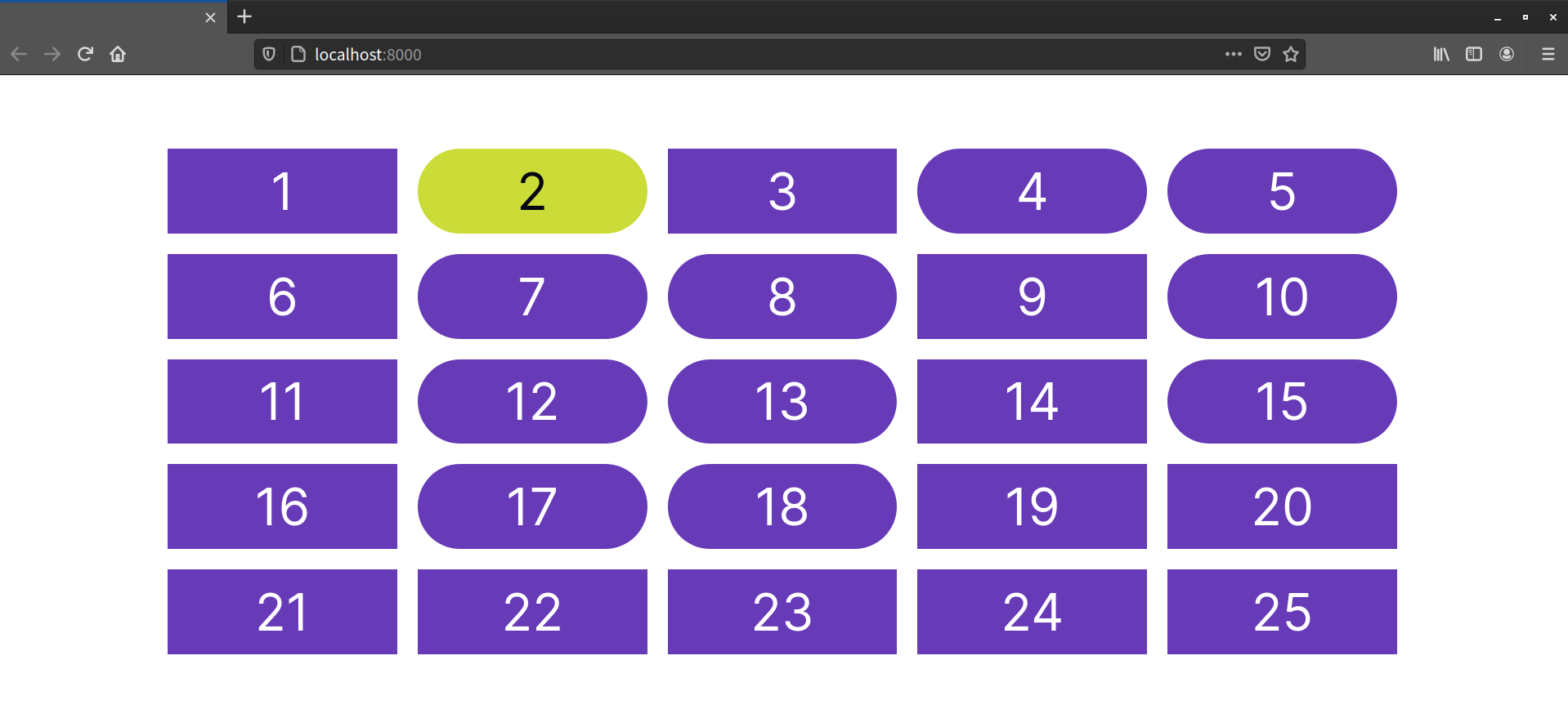
This code produces the result shown below. Using :first-child by itself matches more elements than we want.

Because :first-child is unqualified, both the <h2> element and first <li> element are hot pink. After all, <h2> is the first child of <body>, and the Apples <li> is the first child of the <ul> element. But why are the remaining <li> elements green? Well, that’s because :last-child is also unqualified, and <ul> is the last child of body. It’s effectively the same as typing *:first-child and *:last-child.
If we qualify :first-child and :last-child by adding a simple selector, it all makes more sense. Let’s limit our selection to list items. Change :first-child to li:first-child and :last-child to li:last-child. The result is shown below.

:only-child
The :only-child pseudo-class matches elements if they’re the only child of another element. In the following example, we have two parent <div> elements and their child elements. The first <div> contains one item, while the second contains three:
<div>
   <span class="fruit">Apple</span>
</div>

<div>
   <span class="fruit">Banana</span>
   <span class="vegetable">Spinach</span>
   <span class="vegetable">Okra</span>
</div>
Using .fruit:only-child {color: #9c27b0; /* violet */} will match <span class="fruit">Apple</span>, since it’s the only child of the first <div>. None of the items in the second <div> match, however, because there are three siblings. You can see what this looks like below.

:nth-child() and :nth-last-child()
The ability to select the first and last children of a document is fine. But what if we want to select odd or even elements instead? Perhaps we’d like to pick the sixth element in a document subtree, or apply styles to every third element. This is where the :nth-child() and the :nth-last-child() pseudo-classes come into play.
Like :not(), :nth-child() and :nth-last-child() are also functional pseudo-classes. They accept a single argument, which should be one of the following:
- the
oddkeyword - the
evenkeyword - an integer (such as 2 or 8)
- an argument in the form
An+B(whereAis a step interval,Bis the offset, andnis a variable representing a positive integer). ThisAn+Bsyntax is described in CSS Syntax Module Level 3.
That last item has a degree of complexity. We’ll come back to it shortly.
The difference between :nth-child() and :nth-last-child() is the starting point. :nth-child() counts forward and :nth-last-child() counts backward. CSS indexes use counting numbers and start with one rather than zero.
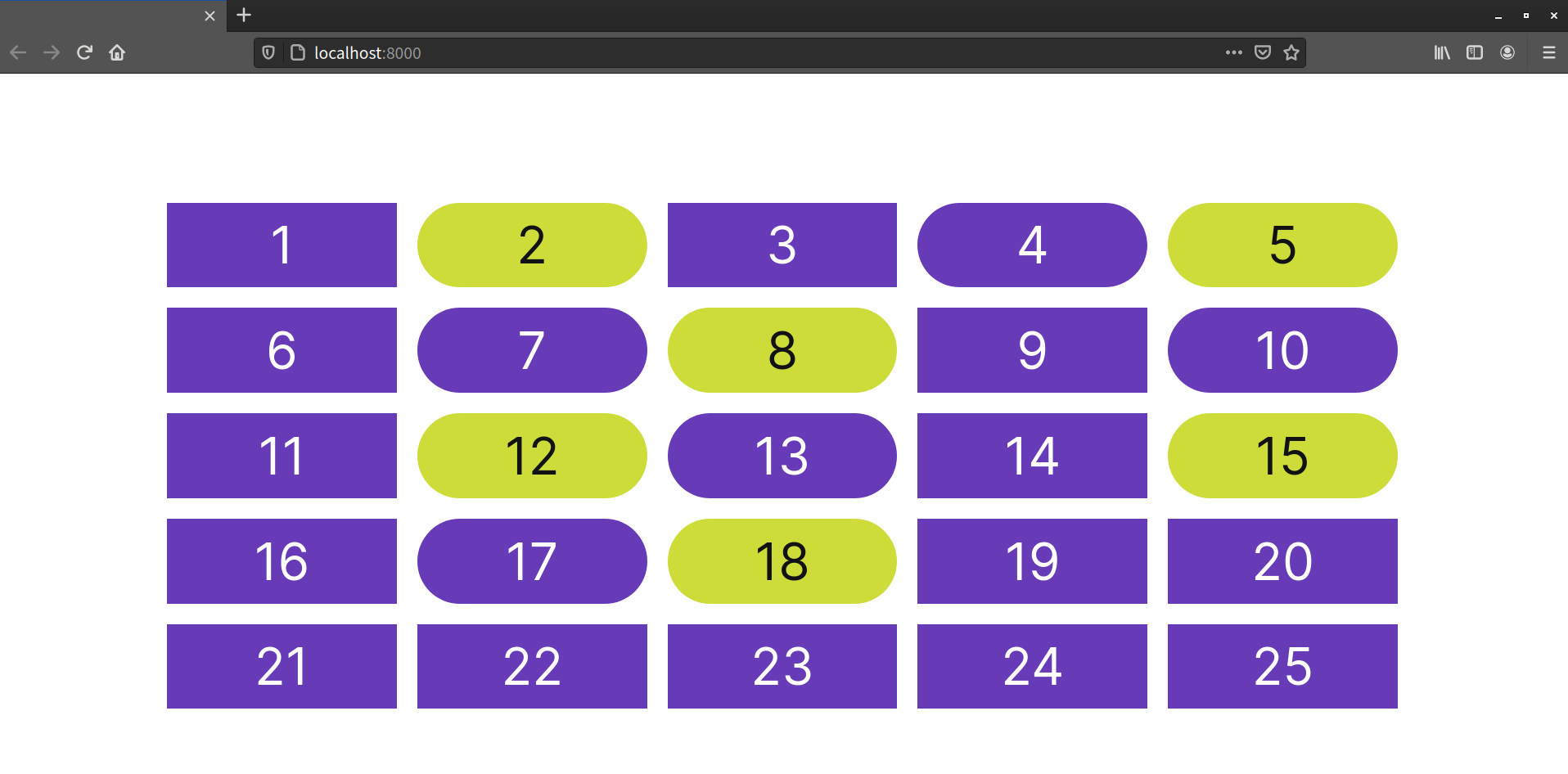
Both :nth-child() and :nth-last-child() are useful for alternating patterns. Creating zebra-striped table row colors is a perfect use case. The CSS that follows gives even-numbered table rows a light, bluish-gray background:
tr:nth-child(even) {
    background: rgba(96, 125, 139, 0.1);
}
Here’s the result seen in the browser.
Changing :nth-child() to :nth-last-child() inverts this banding, since the counting begins from the bottom.
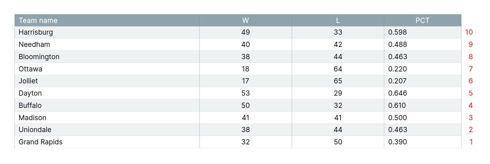
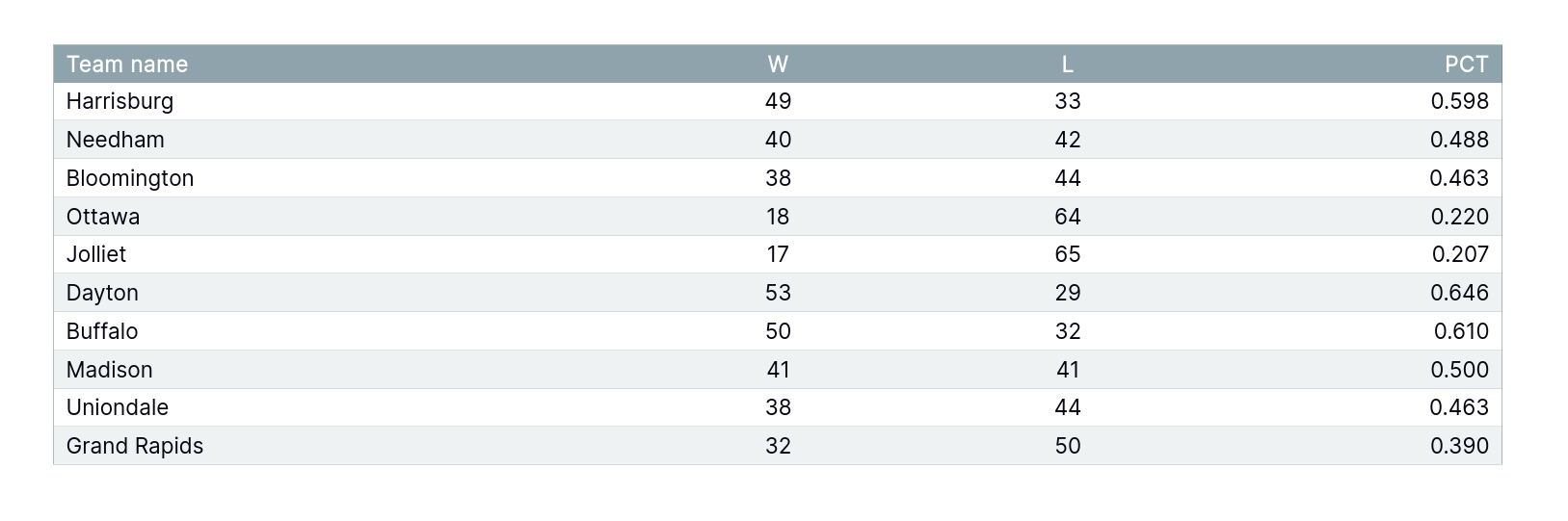
How about trying some complex examples using more complex arguments? We’ll start with the document pictured below, which contains 20 <div> items.
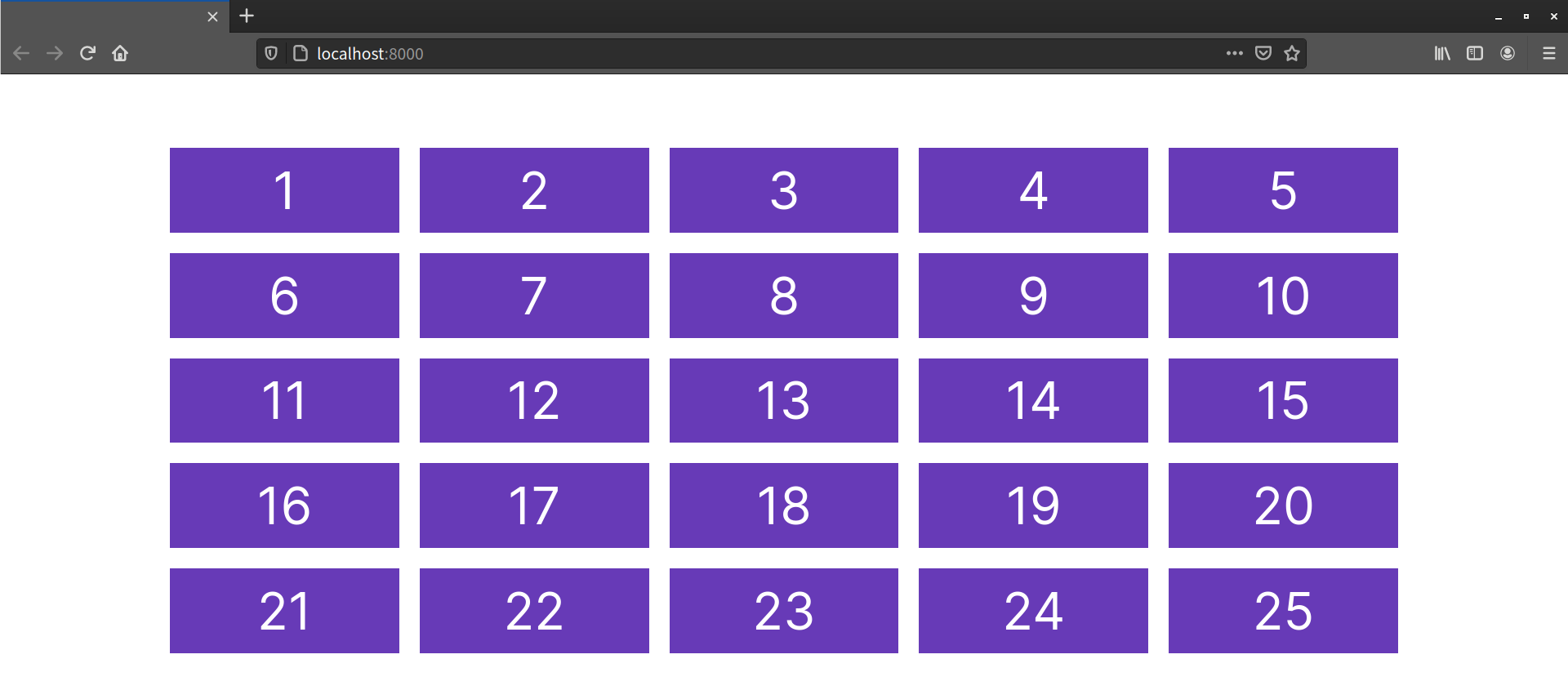
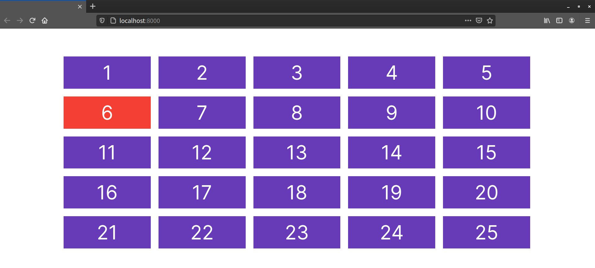
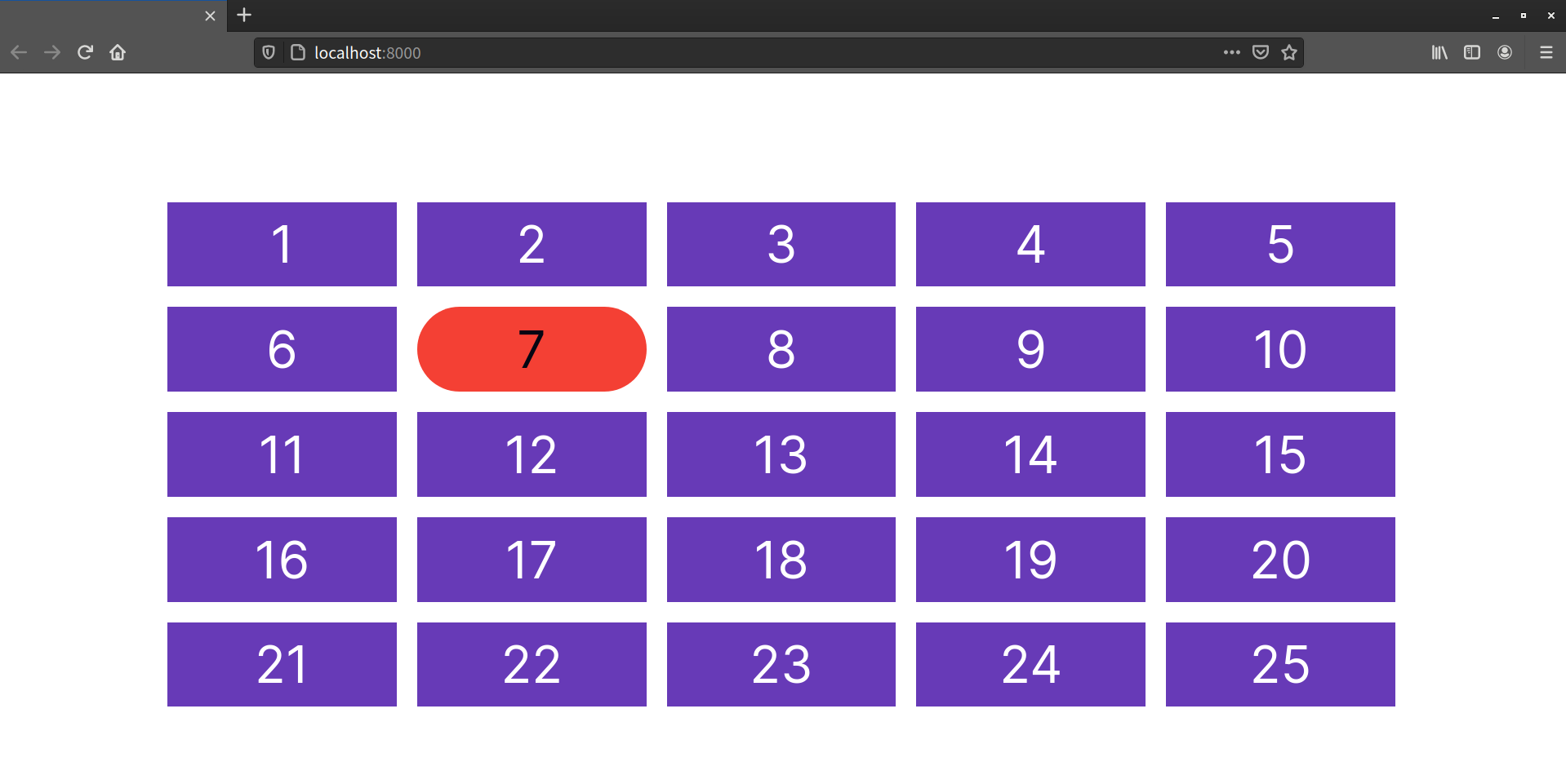
With :nth-child() and :nth-last-child(), we can select a single child at a particular position. We can select all of the children after a particular position, or we can select elements by multiples, with an offset. Let’s change the background color of the sixth item:
.item:nth-child(6) {
    background: #e91e63; /* red */
}
This gives us the result below.
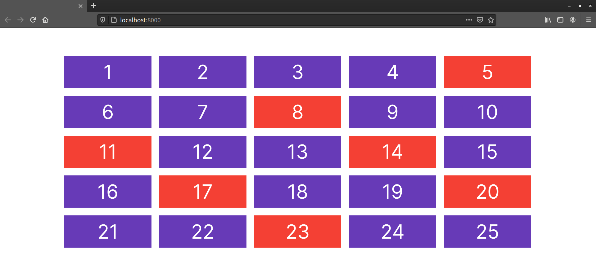
But what if we want to select every third element? Here’s where the An+B syntax comes in:
.item:nth-child(3n) {
    background: #e91e63; /* red */
}
Again, A is a step interval. It’s kind of a multiplier for n, which starts at 0. So if A equals 3, then 3n would match every third element (the 3rd, 6th, 9th elements, and so on). That’s exactly what happens, as you can see below.

Counting with n
We noted earlier that selectors count elements from 1. However, n is a variable that represents any number from zero. The 3n in our .item:nth-child(3n) selector above produces 3 x 0, 3 x 1, 3 x 2 and so on. Of course, 3 x 0 equals zero, so we don’t see any visual styling based on this, as there’s no element zero. It’s important to note that n starts at zero, because, as we’ll see below when we introduce +, n+8 will produce results starting from 8 (because 0 + 8 equals 8).
Matters become even more interesting when we use :nth-child() and :nth-last-child() to select all elements after a certain point. Let’s try selecting all but the first seven elements:
.item:nth-child(n+8) {
    background: #e91e63;
}
Here, there’s no step value. As a result, n+8 matches every element n beginning with the eighth element, as shown below.

Negative Offsets
Negative offset and range values are also valid. Using :nth-child(-n+8) would invert our selection, and match the first eight elements.
We can also use the offset and step values to select every third element, starting with the fifth:
.item:nth-child(3n+5) {
    background: #e91e63;
}
You can see the results of this selector below.
Selecting Elements of a Particular Type by Their Index
The pseudo-classes discussed in the previous section match elements if they occupy the given position in a document subtree. For instance, p:nth-last-child(2) selects every <p> element that’s the next-to-last element of its parent.
In this section, we’ll discuss typed child-indexed pseudo-classes. These pseudo-classes also match elements based on the value of their indexes, but matches are limited to elements of a particular type or tag name—such as selecting the fifth <p> element, or all even-indexed <h2> elements.
There are five such pseudo-classes with names that mirror those of their untyped counterparts:
:first-of-type:last-of-type:only-of-type:nth-of-type():nth-last-of-type()
The difference between these and child-indexed pseudo-classes is a subtle one. Where p:nth-child(5) matches the fifth item only if it’s a <p> element, p:nth-of-type(5) matches all <p> elements, then finds the fifth <p> element among those.
Let’s start with a slightly different document. It still has 20 items, but some of them are <p> elements and some of them are <div> elements. The <p> elements have rounded corners, as can be seen below.

Using :first-of-type, :last-of-type, and :only-type
With :first-of-type, we can select the first element that matches a selector. How about we give our first <p> element a lime-green background:
p:first-of-type {
    background: #cddc39; /* lime green */
}
This will match every <p> element that’s the first <p> element of its parent.
The :last-of-type pseudo-class works similarly, matching the last such element of its parent.

However, :only-of-type will match an element if it’s the only child element of that type of its parent. In the image below, we're using p:only-of-type to match the only child that’s a paragraph element.
Let’s look at another example of using :first-of-type, but this time with a pseudo-element. Remember the ::first-letter pseudo-element from earlier in this chapter? Well, as you saw, it created an initial capital for every element it was applied to. We’ll now go one step further and limit this initial capital to the first paragraph instead:
p:first-of-type::first-letter {
    font: bold italic 3em / .5 serif;
    color: #3f51b5;
}
Now our paragraph will have an initial capital, even if it’s preceded by a headline.
Using :nth-of-type() and :nth-last-of-type()
The :nth-of-type() and :nth-last-of-type() are also functional pseudo-classes. They accept the same arguments as :nth-child() and :nth-last-child(). But like :first-of-type and :last-of-type, the indexes resolve to elements of the same type. For example, to select every odd-numbered <p> element, we can use the odd keyword with :nth-of-type():
p:nth-of-type(odd) {
    background: #cddc39;
    color: #121212;
}
As you can see from the image below, this only matches odd-numbered paragraph elements, even though there are other element types in between them.
Similarly, using :nth-last-of-type(even) selects even-numbered <p> elements, but the count begins from the last <p> element in the document—in this case, item 18.

Using *-of-type Pseudo-classes with Non-element Selectors
The “of-type” selectors are designed to be used with element selectors—such as p:first-of-type. You might be tempted to use “of-type” selectors to target the first instance of some other kind of hook, such as a class—as in .item:first-of-type. But this can lead to unexpected results. In the markup that follows, we have three list items and a paragraph element, all of which have a class attribute value of item:
<ul>
  <li class="item">Lorem ipsum dolor sit amet, consectetur adipiscing elit.</li>
  <li class="item">Pellentesque sodales at risus vel fermentum.</li>
  <li class="item">Fusce et eros iaculis, accumsan ligula ac felis. </li>
</ul>

<p class="item">Duis nec ex at arcu rhoncus rhoncus sit amet at est. Donec condimentum accumsan justo. Ut convallis faucibus sollicitudin.</p>
Let’s say we want to target just the first element with a class of item. If we add a rule .item:first-of-type {background: magenta;}, you might expect just the first list item to have a magenta background. That isn’t what happens, however, as you can see in the image below.
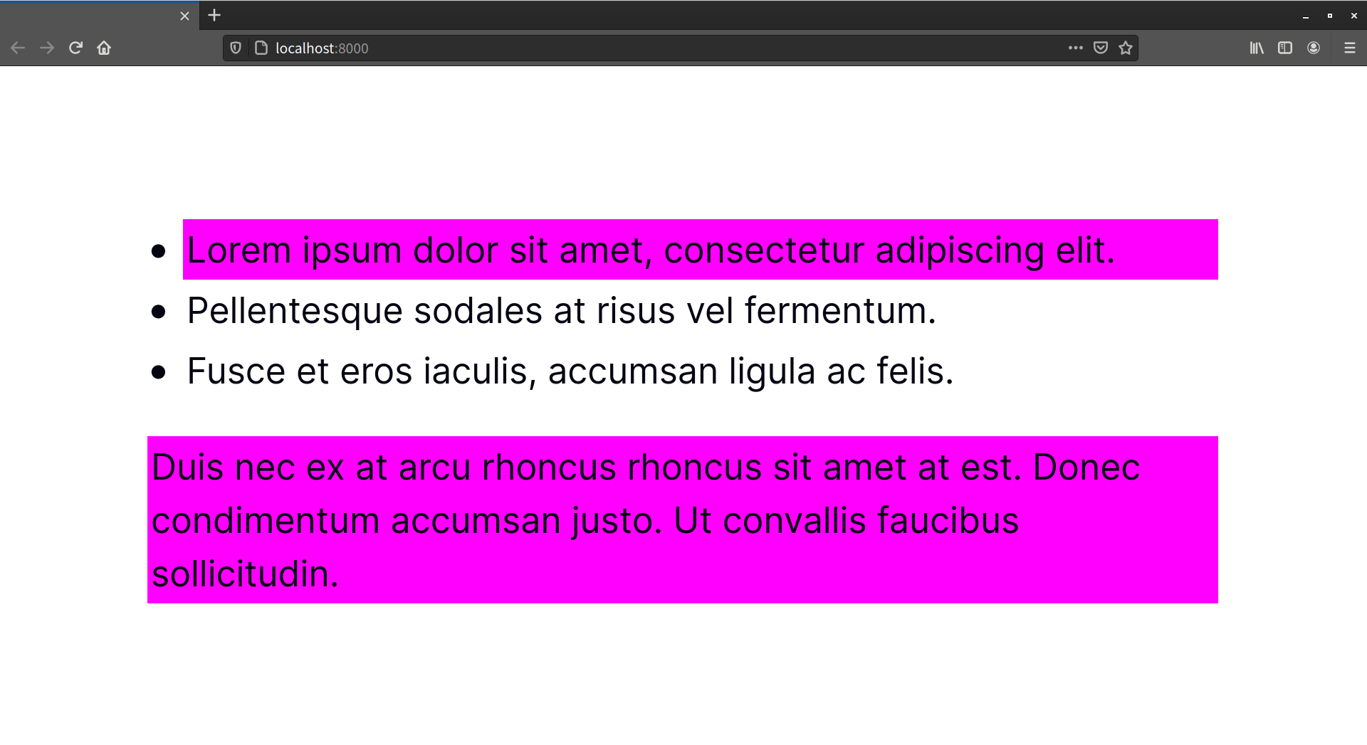
Instead, our paragraph element also has a magenta background. Because it’s the first paragraph type element in the document, it also matches the .item:first-of-type selector.
The Selectors Level 4 specification adds a new argument syntax for :nth-of-type()/:nth-last-of-type() to bring its behavior more into line with developer expectations: the of [S] syntax, where [S] is a non-element selector.
To use our previous markup example, we could select the first instance of an element with the item class using the following CSS:
:nth-of-type(1 of .item) {
   background: magenta;
}
This matches the first element with an item class attribute value. To date, however, Safari is the only browser that supports this syntax.
Styling Form Fields Based on Input
Let’s take a look at some pseudo-classes that are specific to form fields and form field input. These pseudo-classes can be used to style fields based on the validity of user input, whether the field is required or currently enabled.
All of the pseudo-classes that follow are specific to forms. As a result, there’s less of a need to limit the scope with a selector. Using :enabled won’t introduce side effects for <span> elements. Limiting the scope is helpful, however, when you want to style various types of form controls differently.
:enabled and :disabled
As their name suggests, these pseudo-classes match elements that have (or lack) the HTML5 disabled attribute. This can be elements such as <input>, <select>, <button> or <fieldset>:
<button type="submit" disabled>Save draft</button>
Form elements are enabled by default. That is, they only become disabled if the disabled attribute is set. Using input:enabled will match every input element that doesn’t have a disabled attribute. Conversely, button:disabled will match all button elements with a disabled attribute:
button:disabled {
    opacity: .5;
}
The image below shows the :enabled and :disabled states for our <button> element.

:required and :optional
Required and optional states are determined by the presence or absence of the required attribute on the field. Remember that, in HTML5, the presence or absence of the attribute determines its value. In other words, required="false" has the same effect as required="true", required="required" and required. For example:
<p>
    <label for="email">Email:</label>
    <input type="email" id="email" name="email" placeholder="example: [email protected]" required>
</p>
Most browsers only indicate whether a field is required once the form is submitted. With the :required pseudo-class, we can indicate to the user that the field is required before submission. For example, the following CSS will add a yellow border to our email field:
input:required {
    border: 1px solid #ffc107;
}

The :optional class works similarly, by matching elements that don’t have a required attribute. For example, take the following CSS:
select:optional {
    border: 1px solid #ccc;
}
This produces the following result in Firefox 86.

:checked
Unlike the other form-related pseudo-classes we’ve covered, :checked only applies to radio and checkbox form controls. As the name indicates, this pseudo-class lets us define separate styles for selected inputs.
In order to create custom radio button and checkbox inputs that work well across browsers, we’ll need to be a little bit clever with our selectors. Let’s combine an adjacent sibling combinator, a pseudo-element, and :checked to create custom radio button and checkbox controls. For example, to change the style of a label when its associated radio button is checked, we could use the following CSS:
[type=radio]:checked + label {
    font-weight: bold;
    font-size: 1.1rem;
}
This makes the label bold and increases its size when its associated control is checked. We can improve this, though, by using the ::before pseudo-element with our <label> element to inject a custom control:
[type=radio] {
  /*
    appearance: none removes default browser styles for radio buttons
    and other elements. Safari supports this property with a -webkit-
    prefix.
  */
  -webkit-appearance: none;
          appearance: none;
}
[type=radio] + label::before {
    background: #fff;
    content: '';
    display: inline-block;
    border: 1px solid #444;
    border-radius: 1000px;
    height: 1.2rem;
    margin-right: 1em;
    vertical-align: middle;
    width: 1.2rem;
}
[type=radio]:checked + label::before {
    background: #4caf50;
}
This gives us the customized controls you see below.
In order for this technique to work, of course, our HTML needs to be structured appropriately:
- The
<label>element must be immediately adjacent to its<input>control. - The form control must have an
idattribute in addition to thenameattribute (for example,<input type="radio" id="chocolate" name="flavor">). - The label must have a
forattribute, and its value must match the ID of the form control (for example,<label for="chocolate">Chocolate</label>).
Associating the <label> using for with the input ensures that the form input will be selected when the user clicks or taps the label or its child pseudo-element (::before).
:indeterminate
The :indeterminate pseudo-class lets you set styles for elements that are in an indeterminate state. Only three types of elements can have an indeterminate state:
<progress>elements, when it’s unclear how much work remains (such as when waiting for a server response)- grouped
input[type=radio]form controls, before the user selects an option input[type=checkbox]controls, when theindeterminateattribute is set totrue(which can only be done via DOM scripting)
Indeterminate Checkboxes
CSS-Tricks.com provides a useful overview of indeterminate checkbox controls, including when and why you might use them.
Let’s look at an example using the <progress> element:
<div>
    <label for="upload">Uploading progress</label>
    <progress max="100" id="upload" aria-describedby="progress-text"></progress>
    <span id="progress-text">0 of <i>unknown</i> bytes.</span>
</div>
Notice here that we haven’t included a value attribute. For most WebKit- and Blink-based browsers, the presence or absence of the value attribute determines whether a <progress> element has an indeterminate state. Firefox, on the other hand, sets an indeterminate state for <progress> elements when the value attribute is empty.
Unfortunately, <progress> elements still require vendor-prefixed pseudo-elements. Here’s our CSS:
progress {
    background: #ccc;
    box-shadow: 0 0 8px 0px #000a;
    border-radius: 1000rem;
    display: block;
    overflow: hidden;
    width: 100%;
}
/* Firefox progress bars */
progress:indeterminate::-moz-progress-bar {
    background: repeating-linear-gradient(-45deg, #999,  #999 1rem, #eee 1rem, #eee 2rem);
}
/* WebKit and Blink progress bars */
progress:indeterminate::-webkit-progress-bar {
    background: repeating-linear-gradient(-45deg, #999,  #999 1rem, #eee 1rem, #eee 2rem);
}
/* Perhaps someday we'll be able to do this */
progress:indeterminate {
    background: repeating-linear-gradient(-45deg, #999,  #999 1rem, #eee 1rem, #eee 2rem);
}
This CSS gives us the progress bar shown below.

When the value of the progress element changes, it will no longer have an :indeterminate state.
:in-range and :out-of-range
The :in-range and :out-of-range pseudo-classes can be used with range, number, and date input form controls. Using :in-range and :out-of-range requires setting min and/or max attribute values for the control. Here’s an example using the number input type:
<p>
    <label for="picknum">Enter a number from 1-100</label>
    <input type="number" min="1" max="100" id="picknum" name="picknum" step="1">
</p>
Let’s add a little bit of CSS to change styles if the values are within or outside of our range of one to 100:
:out-of-range {
    background: #ffeb3b;
}
:in-range {
    background: #fff;
}
If the user enters -3 or 101, the background color of #picknum will change to yellow, as defined in our :out-of-range rule.
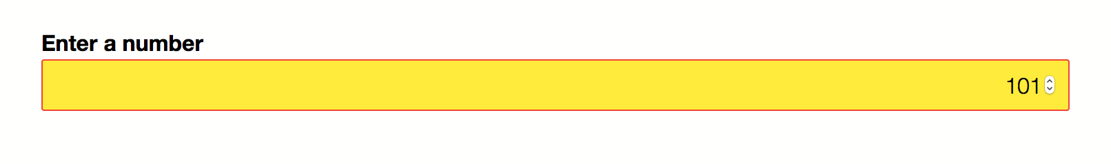
Otherwise, it will remain white, as defined in our :in-range rule.
:valid and :invalid
With the :valid and :invalid pseudo-classes, we can set styles based on whether or not the form input meets our requirements. This will depend on the validation constraints imposed by the type or pattern attribute value. For example, an <input> with type="email" will be invalid if the user input is “foo 123”, as shown below.
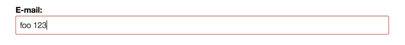
A form control will have an invalid state under the following conditions:
- when a required field is empty
- when the user’s input doesn’t match the type or pattern constraints—such as
abcentered in aninput[type=number]field - when the field’s input falls outside of the range of its
minandmaxattribute values
Optional fields with empty values are valid by default. Obviously, if user input satisfies the constraints of the field, it exists in a valid state.
Form controls can have multiple states at once. So you may find yourself managing specificity (discussed in the next section) and cascade conflicts. A way to mitigate this is by limiting which pseudo-classes you use in your projects. For example, don’t bother defining an :optional rule set if you’ll also define a :valid rule set.
It’s also possible, however, to chain pseudo-classes. For example, we can mix the :focus and :invalid pseudo-classes to style an element only if it has focus: input:focus:invalid. By chaining pseudo-classes, we can style an element that has more than one state.
:placeholder-shown
Where ::placeholder matches the placeholder text, the :placeholder-shown pseudo-class matches elements that currently have a visible placeholder. Placeholder text is typically visible when the form control is empty—that is, before the user has entered any information in the field. Any property that can be used with <input> elements can also be used with :placeholder-shown.
Remember that :invalid matches form controls that have a required attribute and no user data. But we can exclude fields for which no data has been entered by combining :invalid with :not() and :placeholder-shown:
input:not(:placeholder-shown):invalid {
    background-color: rgba(195, 4, 4, .25);
    border-color: rgba(195, 4, 4, 1);
    outline-color:  rgba(195,4,4, 1);
}
The image below shows the results. Both form fields are required, but only the field with invalid user-entered data is highlighted.
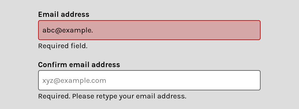
Our first field is visually marked invalid because the user has entered an invalid email address. However, the second field hasn’t changed, because the user hasn’t entered data.
As mentioned earlier in this section, placeholder text can introduce usability challenges. For that reason, it’s best avoided. Removing the attribute, however, prevents us from using the :placeholder-shown pseudo-class.
But there’s a simple fix. Set the value of the placeholder attribute to a whitespace character: placeholder=" ". This lets us avoid the usability issues associated with using placeholder text, but still takes advantage of the :placeholder-shown selector.
Conclusion
You’ve made it to the end of the chapter! I know that was a lot to take in. You should now have a good understanding of:
- what kinds of selectors are available for matching elements
- the difference between pseudo-elements and pseudo-classes
- how to use newer pseudo-classes introduced by the Selectors Level 3 and 4 specifications
In the next chapter, we’ll address some golden rules for writing maintainable, scalable CSS.