
Chapter 7: Transitions and Animations
Now let’s look at how to add some whimsy, delight, and polish to our documents and applications. In this chapter, we’ll cover CSS transitions and animations. Transitions and animations can clarify the effect of an action. A menu that slides into view, for example, is less abrupt and jarring than one that appears suddenly after a button is clicked. Transitions and animations can also draw attention to a page change or problem. You might, for instance, transition the border color of a form field to highlight that its value is invalid.
Background
“Animation for Attention and Comprehension”, from the Nielsen Norman Group, is a nice backgrounder on how animation and transitions can enhance usability.
This is probably a good time to explain how animations and transitions differ. With a transition, you define start and end states, and the browser fills in the states in between. With an animation, on the other hand, you can define those in-between states to control how the animation progresses.
CSS Transitions
CSS transitions are a CSS-based way—as opposed to a JavaScript way—to update the value of a CSS property over a specified duration. Given a start value and an end value, the browser will interpolate in-between values over the course of the transition. They’re great for simple effects where you don’t mind giving up control over how the animation progresses.
In my own work, I sometimes use transitions for :hover states. I also use them when revealing or concealing content, such as showing an off-screen menu. You could create animations for such effects, but animations are generally more verbose, as you’ll see later in the chapter.
We can’t transition every property. We can only use transitions with properties that accept interpolatable values. Interpolation is a method of calculating values that fall within a range. These values are typically numeric unit values such as lengths, percentages, or colors. That means we can’t transition between visibility: visible and visibility: hidden, or display: block and display: none. Nor can we transition to or from auto values.
Animatable CSS Properties
The CSS Transitions specification includes a list of animatable CSS properties and values.
Creating Your First Transition
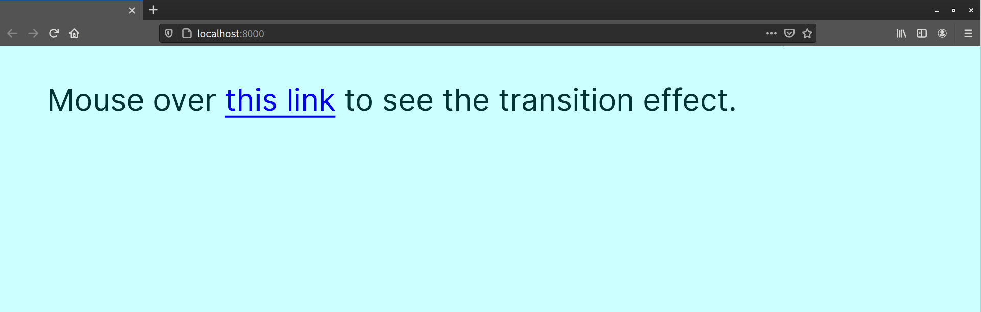
In this example, we’ll make our link color transition from blue to pink when users move their mouse over it, and back to blue when users moves their mouse off it.
Here’s our bare-bones HTML:
<!DOCTYPE html>
    <html lang="en-US">
    <head>
        <link rel="stylesheet" href="style.css">
    </head>
    <body>
        <p>Mouse over <a href="https://sitepoint.com/">this link</a>to see the transition effect.</p>
    </body>
</html>
This gives us the page shown below.
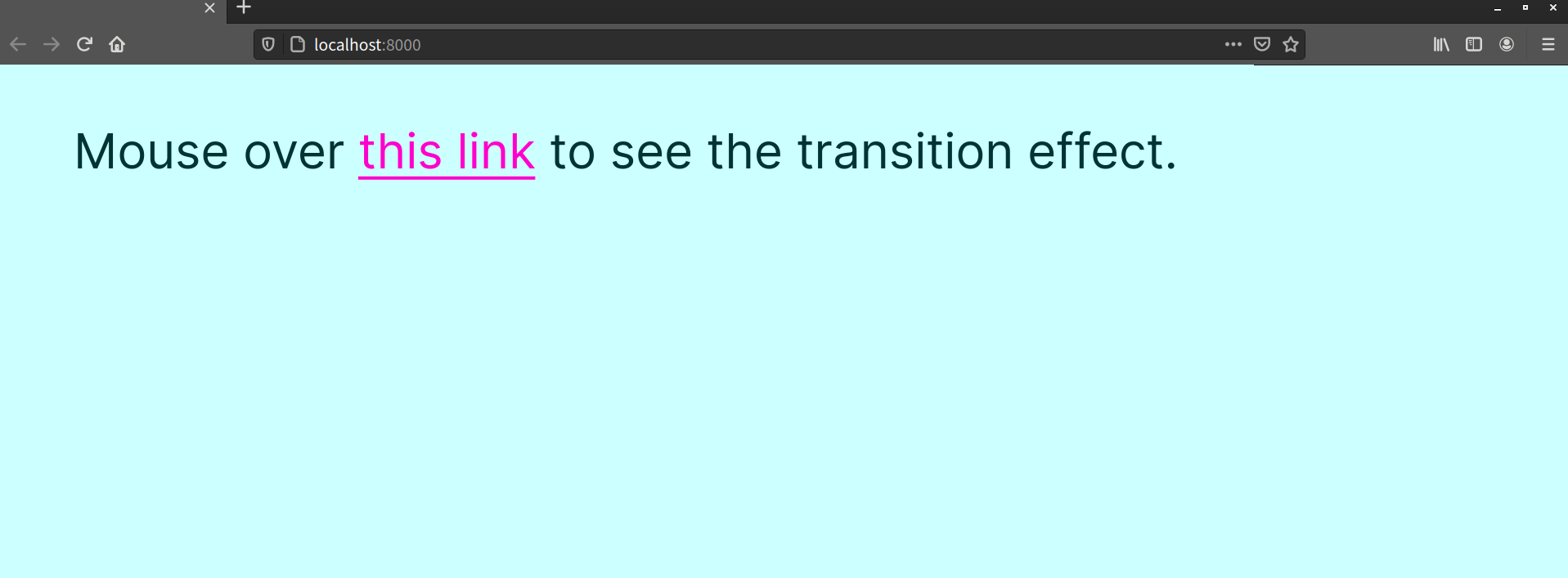
Now let’s add the following CSS to our style.css:
a {
    transition: 1s;
}
a:link {
    color: #309;
}
a:hover {
    color: #f0c;
}
This is the bare minimum CSS required for a transition to work: a start value (color: #309), an end value (color: #f0c), and a transition duration (transition: 1s;). When you mouse over the link, you’ll see a gradual transition from blue to hot pink, as illustrated below.
Transitions need to be triggered by some kind of event. Often, this is a user interaction. We might transition between colors when entering and leaving a :hover state, as we’ve done here. But we can also trigger a transition by adding or removing a class name using JavaScript. In the following example, we modify an element’s classList attribute to do just that:
const btn = document.querySelector( 'button' );

const clickHandler = () => {
    document.body.classList.toggle( 'change' );
}

btn.addEventListener( 'click', clickHandler );
In the code, we’ve first defined a variable named btn. If you’re unfamiliar with programming, a variable is simply a bucket of sorts that holds a value. We can then use the variable anywhere we need that value.
The value of btn is our button element, as returned by document.querySelector('button'). The document.querySelector() method is defined by the Selectors API specification. It accepts any CSS selector as its argument, and returns the first item that matches. It’s a way to select elements using JavaScript.
Next, we’ve defined a clickHandler function. This will be the event listener for our click event. Finally, we’ve added the event listener to btn using addEventListener. The addEventListener method is part of the Document Object Model. It allows us to define a function that’s invoked when a particular event occurs.
The magic happens within the clickHandler function. Here we’ve used the Element.classList.toggle() method to add or remove the change class from the <body> element (document.body). This is what triggers our transition. The classList property is part of the Document Object Model API. It provides a handful of methods for manipulating the class names of an element.
Understanding JavaScript
If any of that went over your head, don’t worry. Pick up Darren Jones’ JavaScript: Novice to Ninja, 2nd Edition if you want to get up to speed with JavaScript.
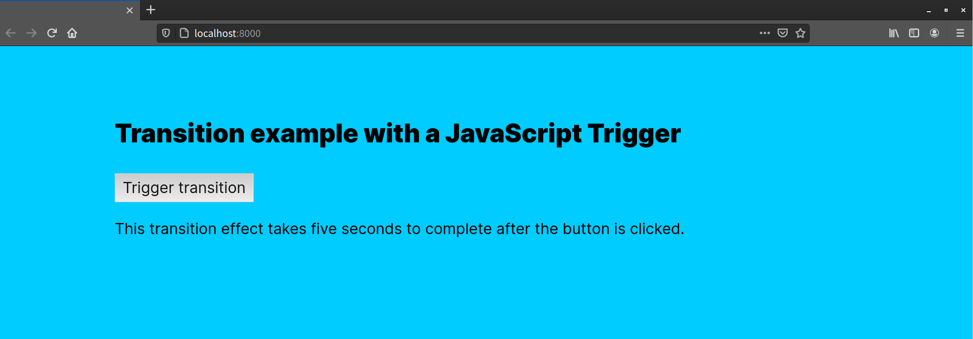
Now let’s look at our CSS. It’s only a few lines long:
body {
    background: #fcf;
    transition: 5s;
}
.change {
    background: #0cf;
}
Here, we’ve defined a starting background color for our <body> element, and a transition. We’ve also defined a .change class, which has a different value for background. When our event handler runs, it adds the change class to our <body> element. This triggers a transition from the original background color to the one defined in the .change declaration block, as shown below.
If you want a transition to work in both directions—for example, when the class is both added and removed—you should add it to whichever declaration block is your start state. We’ve done that here by including the transition property in the body declaration block. If we moved the transition to the change class, our transition would only work when change was added to our <body> element, but not when it was removed.
So far, we’ve used the transition shorthand property. It’s a condensed way of specifying four “longhand” properties, which are listed in the table below.
| Property | Description | Initial value |
|---|---|---|
transition-duration |
How long the transition should last | 0s (no transition) |
transition-property |
Which property to transition | all (all animatable properties) |
transition-timing-function |
How to calculate the values between the start and end values | ease |
transition-delay |
How long the browser should wait between changing the property and starting the transition | 0s (no delay) |
Each longhand property has an initial value. The browser uses the initial value for the property, unless you explicitly set its value. For example, the initial value of transition-property is all (all properties), and the initial value of transition-timing-function is ease. When we set a transition duration—such as transition: 1s—the values for transition-property and transition-timing-function are implied. This is why we can get away with setting the transition property and nothing else.
Using the transition Property
As we’ve already seen in the previous examples, time units are one acceptable value for the transition property. The CSS Values and Units Module Level 3 specification defines two kinds of time units for use with transitions and animations: s for seconds, and ms for milliseconds. We can also collapse values for transition-timing-function, transition-delay, and transition-property into this shorthand transition property:
body {
    background: red;
    transition: background 500ms linear 1s;
}
Here, we’ve told the browser to transition the background property. The duration will last 500 milliseconds (which we could also write as .5s). It will use the linear timing function (discussed later in this chapter), and the start of the transition will be delayed by one second. It’s a compact version of the following CSS:
body {
    background: red;
    transition–property: background;
    transition–duration: 500ms;
    transition–timing–function: linear;
    transition–delay: 1s;
}
Order matters somewhat when using the transition shorthand property. The first value that can be interpreted as a time will become the transition duration no matter where it sits in the value string. The second time value will determine the transition delay. In other words, we could reorder the values in our transition property like so:
body {
    background: red;
    transition: 500ms 1s background linear;
}
Here, our transition duration will be 500ms with a one-second delay.
Using the transition property is the most concise way to define a transition. However, there may be cases in which you want to define a global transition effect (for example, transition: 500ms ease) in one part of your CSS, and limit it to specific CSS properties (for example, transition-property: color) in another. This is where the longhand properties are useful.
Transition Durations and Delays
The transition-duration property sets the duration of the transition, or how long it takes to complete. The transition-delay property determines how much time should elapse before the transition begins. Both properties accept time units as a value. These can be seconds or milliseconds: 1s, 2.5s, and 200ms are all valid values.
Both transition-duration and transition-delay have an initial value of 0s, or zero seconds. For transition-duration, this means there will be no gradual transition between the start and end states. For transition-delay, this means the transition will occur immediately.
With transition-duration, you must use values greater than zero, such as .5s or 2500ms. Negative values will be treated like a value of 0s, and the transition will fail to execute, as illustrated below.
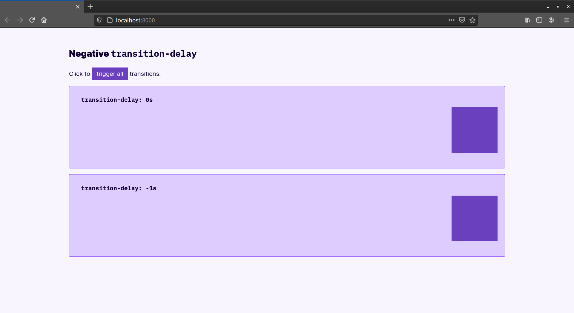
However, negative values are valid for transition-delay. Positive transition-delay values shift the start of the animation by the specified amount of time. Negative values, however, offset the beginning of the transition, as seen above. Using transition-duration: 2s; transition-delay: -1s will cause the transition to jump one second into the play cycle before continuing. Using a negative transition-delay value can create a snappier transition experience by shortening its perceived duration.
Timing Functions
We can also shape transition effects using the transition-timing-function property. Timing functions are formulas of sorts that determine how the in-between values of a transition are calculated. Which timing function you use will depend on what kind of transition effect you’d like to achieve: a stepped transition or a smooth, gradual one.
Stepped Transitions
With stepped transitions, the play cycle is divided into intervals of equal value and duration. We can set how many intervals a transition should have using the steps timing function.
Let’s revisit our background color example from earlier in this chapter. Instead of using the default ease timing function, we’ll instead use the steps function to create a five-step transition. Our revised CSS looks like this:
body {
    background: #f0f;
    transition: 5s steps(5);
}
.change {
    background: #0cf;
}
Rather than a smooth, gradual shift between colors, this transition cycles through five distinct color states.
There are also two keywords we can use to create stepped animations: step-start and step-end. These are equivalent to steps(1, start) and steps(1, end). With these keywords (or their step function equivalents), you’ll see one transition step between the starting and ending values.
Smooth Transitions
Smooth transitions use the cubic-bezier function to interpolate values. Understanding how this function works involves a bit of math, along with some handwaving and magic. Read Pomax’s “A Primer on Bézier Curves” if you’re interested in the intimate details. What follows is a simplified explanation.
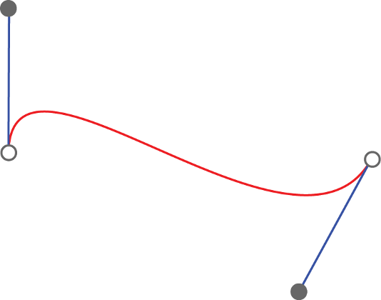
The cubic Bézier function is based on the cubic Bézier curve. A Bézier curve consists of a start point and an end point, and one or more control points that affect the shape of the curve. A cubic Bézier curve always has two of these control points, which can be seen below. Curves are drawn from the start point to the end point, towards the control points.
The arguments passed to the cubic-bezier function represent the coordinates of those control points: x1, y1, x2, y2. But there’s a constraint on these points: X values (the first and third parameters) must fall between 0 and 1. Y values (the second and fourth parameters) can exceed this range in either direction. In other words, cubic-bezier(0, 1.02, 1, 0) and cubic-bezier(0, 1.08, .98, -0.58) are valid values, but cubic-bezier(2, 1.02, -1, 0) is not.
Experimenting with Bézier Curves
Lea Verou’s cubic-bezier.com is a great tool for experimenting with the cubic-bezier function. Easing Function Cheat Sheet also offers several ready-made cubic-bezier snippets for easing functions that are not defined by the specification.
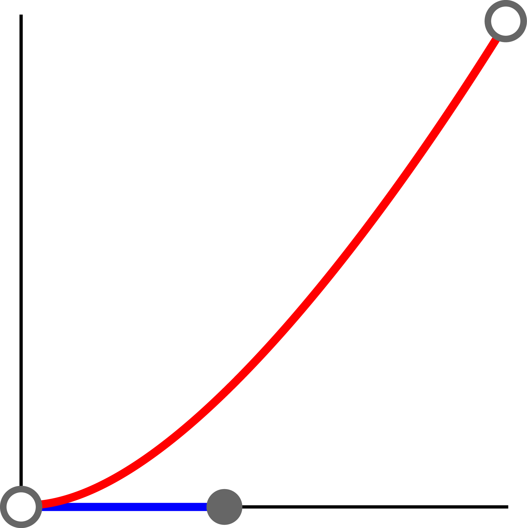
Graphs are the best way to illustrate how cubic-bezier works. The X-axis is a function of the transition’s duration, as can be seen in the image below, which shows a graph of cubic-bezier(0.42, 0, 1, 1). The Y-axis is a function of the value of the property that’s being transitioned. The outputs for these function determine the values of the property at a particular point in the transition. Changes in the graph match the changes in speed over the course of a transition. The image below shows a graph of cubic-bezier(0.42, 0, 1, 1).
In most cases, it’s easier to use a timing function keyword. We mentioned step-start and step-end in the previous section, but there are five more keywords, each of which is an alias for cubic-bezier values. They’re listed in the following table:
| Keyword | Equivalent function | Effect |
|---|---|---|
ease |
cubic-bezier(0.25, 0.1, 0.25, 1) |
Begins slowly, accelerates quickly, then slows towards the end of the transition |
ease-in |
cubic-bezier(0.42, 0, 1, 1) |
Begins quickly, then accelerates slowly but steadily until the end of the transition |
ease-out |
cubic-bezier(0, 0, 0.58, 1) |
Accelerates quickly but slows towards the end of the transition |
ease-in-out |
cubic-bezier(0.42, 0, 0.58, 1) |
Begins slowly, accelerates quickly, then decelerates towards the end of the transition |
linear |
cubic-bezier(0, 0, 1, 1) |
Speed remains consistent over the course of the animation |
Transitioning Multiple Properties
It’s possible to transition multiple properties of a single element using a transition list. Let’s look at an example:
div {
    background: #E91E63;
    height: 200px;
    width: 200px;
    margin: 10px 0;
    position: relative;
    left: 0;
    top: 3em;
    transition: left 4s cubic-bezier(0.175, 0.885, 0.32, 1.275),
                background 2s 500ms;
}
.transthem {
    left: 30%;
    background: #00BCD4;
}
Here, we’ve defined transitions for the left and background properties. The difference is that each item is separated by a comma. The left transition will last four seconds and use a cubic-bezier timing function. The background transition will only last two seconds, but it begins after a half-second (500ms) delay.
Occasionally, you may need to detect when a transition ends in order to take another action. For example, if you transition opacity: 1 to opacity: 0, it’s a good idea to add a hidden attribute to the element for improved assistive technology support. This is where the transitionend event comes in handy.
When a transition completes, the browser fires a transitionend event on the affected element—one for each property. We can listen for these events using addEventListener:
const transitionEndHandler = function() {
    // Do something.
}

const element = document.getElementById('el');
element.addEventListener('transitionend', transitionEndHandler);
HTML also supports an ontransitionend attribute. The code above could also be written as follows:
const transitionEndHandler = function() {
    // Do something.
}
const element = document.getElementById('el');
element.ontransitionend = transitionEndHandler;
Shorthand Properties
In cases where the property is a shorthand property, the browser will fire one event for each longhand property. In other words, a transition of the padding property will result in transitionend events for padding-top, padding-right, padding-bottom, and padding-left.
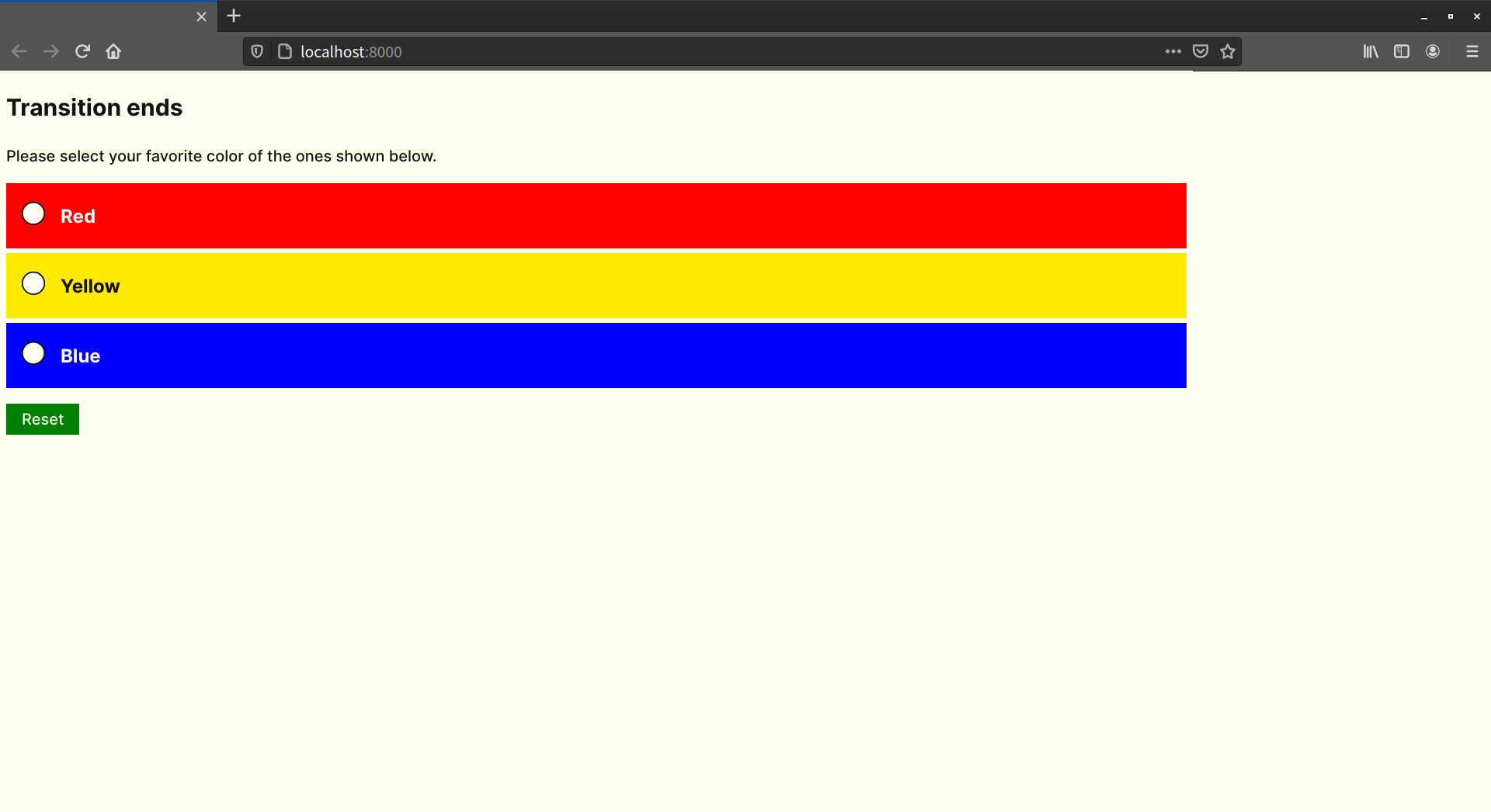
Let’s put this knowledge to use. In this example, we’ll hide unselected form options when the user picks one. Our (simplified) HTML follows:
<h1>Please select your favorite color of the ones shown below.</h1>
<form>
    <ul>
        <li>
            <input type="radio" name="favecolor" id="red"><label for="red">Red</label>
        </li>
        <li>
            <input type="radio" name="favecolor" id="yellow"><label for="yellow">Yellow</label>
        </li>
        <li>
            <input type="radio" name="favecolor" id="blue"><label for="blue">Blue</label>
        </li>
    </ul>
    <div id="thanks" hidden>Thank you for selecting your favorite color.</div>
    <button type="reset">Reset</button>
</form>
And here’s our (also simplified) CSS:
li {
    transition: 500ms;
}
.fade {
    opacity: 0;
}
Add some styles for color and font size, and we end up with the example below.
Now let’s tie it together with JavaScript. First, let’s define an action that adds the fade class—in this case, a change event handler:
const changeHandler = function() {
    // Select unchecked radio buttons. Returns a NodeList.
    const notfave = document.querySelectorAll( 'input:not( :checked )' );

    // Create a new array from the NodeList
    notfave.forEach( function( item ) {
        // Find the parent node, and add a 'fade' class
        item.parentNode.classList.add( 'fade' );
    });
};

const form = document.querySelector( 'form' );
form.addEventListener( 'change', changeHandler );
When the user selects a color, our form element will receive a change event. That in turn triggers the changeHandler method, which adds a fade class to the parent element of each radio button. This is what triggers our transition.
The forEach DOM Function
The forEach method used above is a DOM function for iterating through a NodeList, or collection of elements. It’s supported in most major browsers, with the exception of Internet Explorer 11. It’s not the forEach method of JavaScript. The Mozilla Developer Network covers forEach in depth.
Now let’s take a look at our transitionend handler. It’s slightly different from the other examples in this chapter:
const transitionendHandler = function( domEvent ) {
    domEvent.target.setAttribute( 'hidden', '' );
    document.getElementById( 'thanks' ).removeAttribute( 'hidden' );
};

document.addEventListener( 'transitionend', transitionendHandler );
Our transitionendHandler accepts a single event object argument. Here, we’ve named it domEvent, but you could name it evt, foo—just about anything. This event object is passed automatically, according to behavior defined by the Document Object Model Level 2 specification. In order to reference this event object within our handler, we need to define it as a parameter for our function.
Every event object includes a target property. This is a reference to the element that received the event. In this case, it’s a list item, and we’re adding a hidden attribute to each (eventObject.target.setAttribute('hidden', '')). The last line of our event handler removes the hidden attribute from our “Thank you” message, as seen below.

Multiple Transitions and transitionend Events
Transitions of multiple properties trigger multiple transitionend events. A declaration such as transition: left 4s linear, background 2s 500ms ease; triggers a transitionend event for the left property and another for background. To determine which transition triggered the event, you can check the propertyName property of the event object:
const transitionendHandler = function ( eventObject ) {
    if ( eventObject.propertyName === 'opacity' ) {
        // Do something based on this value.
    }
};
Occasionally, a transition will fail to complete. This can typically happen when the property is overridden while it’s in progress—such as when a user action removes the class name. In those situations, the transitionend event won’t fire.
Because of this risk, avoid using the transitionend event to trigger anything “mission critical”, such as a form submission.
CSS Animation
Think of CSS animation as the more sophisticated sister to CSS transitions. Animations differ from transitions in a few key ways:
- Animations don’t degrade gracefully. If there’s no support from the browser, the user is out of luck. The alternative is to use JavaScript.
- Animations can repeat, and repeat infinitely. Transitions are always finite.
- Animations use keyframes, which offer the ability to create more complex and nuanced effects.
- Animations can be paused in the middle of the play cycle.
The latest versions of all major browsers support CSS animations. Firefox versions 15 and earlier require a -moz- prefix; later version don’t. Internet Explorer versions 10 and 11 also support animations without a prefix, as do all versions of Microsoft Edge.
We can check for CSS animations support in a few ways. The first is by testing for the presence of CSSKeyframeRule as a method of the window object:
const hasAnimations = 'CSSKeyframeRule' in window;
If the browser supports the @supports rule and the CSS.supports() API (discussed in Chapter 10, “Applying CSS Conditionally”), we can use that instead:
const hasAnimations = CSS.supports( 'animation-duration: 2s' );
As with transitions, we can only animate interpolatable values such as color values, lengths, and percentages.
Creating Your First Animation
We first have to define an animation using an @keyframes rule. The @keyframes rule has two purposes:
- setting the name of our animation
- grouping our keyframe rules
Let’s create an animation named pulse:
@keyframes pulse {

}
Our keyframes will be defined within this block. In animation, a keyframe is a point at which the action changes. With CSS animations specifically, keyframe rules are used to set property values at particular points in the animation cycle. Values that fall between the values in a keyframe rule are interpolated.
At the minimum, an animation requires two keyframes: a from keyframe, which is the starting state for our animation, and a to frame, which is its end state. Within each individual keyframe block, we can define which properties to animate:
@keyframes pulse {
    from {
        transform: scale(0.5);
        opacity: .8;
    }
    to {
        transform: scale(1);
        opacity: 1;
    }
}
This code will scale our object from half its size to its full size, and change the opacity from 80% to 100%.
The keyframes rule only defines an animation, though. By itself, it doesn’t make elements move. We need to apply it. Let’s also define a pulse class that we can use to add this animation to any element:
.pulse {
    animation: pulse 500ms;
}
Here, we’ve used the animation shorthand property to set the animation name and duration. In order for an animation to play, we need the name of an @keyframes rule (in this case, pulse) and a duration. Other properties are optional.
The order of properties for animation is similar to that of transition. The first value that can be parsed becomes the value of animation-duration. The second value becomes the value for animation-delay. Words that aren’t CSS-wide keywords or animation property keyword values are assumed to be @keyframe rule set names.
As with transition, animation also accepts an animation list. The animation list is a comma-separated list of values. We could, for example, split our pulse animation into two rules—pulse and fade:
@keyframes pulse {
    from {
        transform: scale(0.5);
    }
    to {
        transform: scale(1);
    }
}
@keyframes fade {
    from {
        opacity: .5;
    }
    to {
        opacity: 1;
    }
}
We can combine them as part of a single animation list:
.pulse-and-fade {
    animation: pulse 500ms infinite, fade 500ms 8;
}
Or, as an alternative, we can combine them using longhand properties:
.pulse-and-fade {
    animation-name: pulse, fade;
    animation-duration: 500ms; /* used for both animations */
    animation-iteration-count: infinite, 8;
}
Animation Properties
Though using the animation property is shorter, sometimes longhand properties are clearer. Longhand animation properties are listed in the following table:
| Property | Description | Initial value |
|---|---|---|
animation-delay |
How long to wait before executing the animation | 0s (executes immediately) |
animation-duration |
How long the cycle of an animation should last | 0s (no animation occurs) |
animation-name |
The name of an @keyframes rule |
none |
animation-timing-function |
How to calculate the values between the start and end states | ease |
animation-iteration-count |
How many times to repeat the animation | 1 |
animation-direction |
Whether or not the animation should ever play in reverse | normal (no reverse) |
animation-play-state |
Whether the animation is running or paused | running |
animation-fill-mode |
Specifies what property values are applied when the animation isn’t running | none |
The animation-delay and animation-duration properties function like transition-delay and transition-duration. Both accept time units as a value, either in seconds (s) or milliseconds (ms). Negative time values are valid for animation-delay, but not animation-duration.
Let’s rewrite our .pulse rule set using longhand properties. Doing so gives us the following:
.pulse {
    animation-name: pulse;
    animation-duration: 500ms;
}
The animation-name property is fairly straightforward. Its value can be either none or the name of the @keyframes rule. Animation names have few restrictions. CSS keywords such as initial, inherit, default, and none are forbidden. Most punctuation characters won’t work, while letters, underscores, digits, and emojis (and other Unicode characters) usually will. For clarity and maintainability, it’s a good idea to give your animations descriptive names, and avoid using CSS properties or emojis as names.
To Loop or Not to Loop: The animation-iteration-count Property
If you’re following along with your own code, you’ll notice that this animation only happens once. We want our animation to repeat. For that, we’ll need the animation-iteration-count property.
The animation-iteration-count property accepts most numeric values. Whole numbers and decimal numbers are valid values. With decimal numbers, however, the animation will stop partway through the last animation cycle, ending in the to state. Negative animation-iteration-count values are treated the same as 1.
To make an animation run indefinitely, use the infinite keyword. The animation will play an infinite number of times. Of course, infinite really means until the document is unloaded, the browser window closes, the animation styles are removed, or the device shuts down. Let’s make our animation infinite:
.pulse {
    animation-name: pulse;
    animation-duration: 500ms;
    animation-iteration-count: infinite;
}
Or, using the animation shorthand property:
.pulse {
    animation: pulse 500ms infinite;
}
Playing Animations: The animation-direction Property
There’s still a problem with our animation, however. It doesn’t so much pulse as repeat our scaling-up animation. What we want is for this element to scale up and down. Enter the animation-direction property.
The animation-direction property accepts one of four values:
normal: the initial value, playing the animation as specifiedreverse: flips thefromandtostates and plays the animation in reversealternate: plays even-numbered animation cycles in reversealternate-reverse: plays odd-numbered animation cycles in reverse
To continue with our current example, reverse would scale down our object by a factor of 0.5. Using alternate would scale our object up for the odd-numbered cycles and down for the even-numbered ones. Conversely, using alternate-reverse would scale our object down for the odd-numbered cycles and up for the even ones. Since this is the effect we want, we’ll set our animation-direction property to alternate-reverse:
.pulse {
    animation-name: pulse;
    animation-duration: 500ms;
    animation-iteration-count: infinite;
    animation-direction: alternate-reverse;
}
Or, using the shorthand property:
.pulse {
    animation: pulse 500ms infinite alternate-reverse;
}
Using Percentage Keyframes
Our previous example was a simple pulse animation. We can create more complex animation sequences using percentage keyframes. Rather than using from and to, percentage keyframes indicate specific points of change over the course of the animation. Below is an example using an animation named wiggle:
@keyframes wiggle {
    25% {
        transform: scale(.5) skewX(-5deg) rotate(-5deg);
    }
    50% {
         transform: skewY(5deg) rotate(5deg);
    }
    75% {
         transform: skewX(-5deg) rotate(-5deg) scale(1.5);
     }
    100% {
        transform: scale(1.5);
    }
}
We’ve used increments of 25% here, but these keyframes could be 5%, 10%, or 33.2%. As the animation plays, the browser will interpolate the values between each state. As with our previous example, we can assign it to a selector:
/* Our animation will play once */
.wiggle {
    animation-name: wiggle;
    animation-duration: 500ms;
}
Or using the animation shorthand property:
.wiggle {
    animation: wiggle 500ms;
}
There’s just one problem here. When our animation ends, it goes back to the original, pre-animated state. To prevent this, use the animation-fill-mode property.
The animation-fill-mode Property
Animations have no effect on properties before they begin or after they stop playing. But as you’ve seen with the wiggle example, once an animation ends, it reverts to its pre-animation state. With animation-fill-mode, we can fill in those states before the animation starts and ends.
The animation-fill-mode property accepts one of four values:
none: the animation has no effect when it’s not executingforwards: when the animation ends, the property values of the end state will still applybackwards: property values for the first keyframe will be applied during the animation delay periodboth: effects for bothforwardsandbackwardsapply
Since we want our animated element to remain in its final, scaled-up state, we’re going to use animation-fill-mode: forwards (noting that animation-fill-mode: both would also work).
The effect of animation-fill-mode: backwards is most apparent when the animation-delay property is set to 500ms or higher. When animation-fill-mode is set to backwards, the property values of the first keyframe are applied, but the animation isn’t executed until the delay elapses.
Pausing Animations
As has been mentioned, animations can be paused. Transitions can be reversed midway, or stopped altogether by toggling a class name. Animations, on the other hand, can be paused partway through the play cycle using animation-play-state. It has two defined values—running and paused—and its initial value is running.
Let’s look at a simple example of using animation-play-state to play or pause an animation. First, our CSS:
.wobble {
    animation: wobble 3s ease-in infinite forwards alternate;
    animation-play-state: paused;
}
.running {
    animation-play-state: running;
}
Here, we have two declaration blocks: wobble, which defines a wobbling animation, and running, which sets a play state. As part of our animation declaration, we’ve set an animation-play-state value of paused. To run our animation, we’ll add the running class to our element. Let’s assume that our markup includes a Run animation button with an id of trigger:
const trigger = document.querySelector( '#trigger' );
const moveIt = document.querySelector( '.wobble' );

trigger.addEventListener( 'click', function() {
    moveIt.classList.toggle( 'running' );
});
Adding .running to our element overrides the animation-play-state value set in .wobble, and causes the animation to play.
Detecting When Animations Start, End, or Repeat
Like transitions, animations fire an event when they end: animationend. Unlike transitions, animations also fire animationstart and animationiteration events when they begin to repeat. As with transitions, you might use these events to trigger another action on the page. For example, you might use animationstart to contextually reveal a Stop Animation button, or animationend to reveal a Replay button.
We can listen for these events with JavaScript. Below, we’re listening for the animationend event:
const animate = document.getElementById( 'animate' );

animate.addEventListener( 'animationend', function( domEvent ) {
    // Do something
});
Here, too, the event handler function receives an event object as its sole argument. In order to determine which animation ended, we can query the animationName property of the event object.
Animation and Accessibility
Transitions and animations can enhance the user experience by making interactions smooth rather than jumpy, and otherwise bring delight to the interface. But they have accessibility risks. Large spinning animations, for example, can cause dizziness or nausea for people with vestibular disorders, such as vertigo. Consider adding controls for larger, longer, or infinite animations so users can turn them off.
Vestibular Disorders and Accessible Animation
Rachel Nabors’ “Infinite Canvas 6: Vestibular Disorders and Accessible Animation” is a great introduction to the subject of vestibular disorders and animation.
You can also use media queries and the prefers-reduced-motion feature to reduce or disable animation. Users can indicate that they prefer less motion, typically by adjusting the accessibility settings for their operating system.
If you’d like your website to respect those preferences, you must include the prefers-reduced-motion media query. Browsers won’t do it on their own. For example:
.wobble {
    animation: wobble 3s ease-in infinite forwards alternate;
    animation-play-state: paused;
}
.running {
    animation-play-state: running;
}
@media screen and ( prefers-reduced-motion ) {
    .running {
        animation-play-state: paused;
    }
}
In this example, if the user has indicated that they prefer reduced motion, the animation-play-state will be paused. If there are controls associated with this animation (such as a Play button), you might use JavaScript to add a hidden attribute to them.
You don’t have to completely disable your animations. For example, if your animation scales and also skews, as with our .wobble animation, you can instead disable a portion of it. Here we’ll change the scale value:
.wobble {
    --wobble-min-scale: .5;
    --wobble-max-scale: 1.5;
}
@media screen and ( prefers-reduced-motion ) {
    .wobble {
        --wobble-min-scale: 1;
        --wobble-max-scale: 1;
    }
}
@keyframes wobble {
    25% {
        transform: scale( var(--wobble-min-scale) ) skewX(-5deg) rotate(-5deg);
    }
    50% {
         transform: skewY(5deg) rotate(5deg);
    }
    75% {
         transform: skewX(-5deg) rotate(-5deg) scale( var(--wobble-max-scale) );
     }
    100% {
        transform: scale( var(--wobble-max-scale) );
    }
}
Notice that we’ve used custom properties (see Chapter 4) to manage the scale factor, and applied them to the .wobble selector.
We’ll cover the ins and outs of media queries in Chapter 10, “Applying CSS Conditionally”.
Flashing animations can trigger seizures in some people with photosensitive epilepsy; WCAG 2.1 includes advice for for avoiding flashes and animations that are known to trigger seizures. Avoid flashing content more than three times per second, particularly across large areas of the screen.
A Note about Performance
Some properties create better-performing transitions and animations than others. If an animation updates a property that triggers a reflow or repaint, it may perform poorly on low-powered devices such a phones and tablets.
Properties that trigger a reflow are ones that affect layout. These include the following animatable properties:
block-sizeborder-width(andborder-*-widthproperties)border(andborder-*properties)bottomfont-sizefont-weightheightinset-block(andinset-block-*) longhand propertiesinset-inline(andinset-inline-*) longhand propertiesinline-sizeleftline-heightmargin(andmargin-*properties)min-heightmin-widthmax-heightmax-widthpadding(andpadding-*properties)righttopvertical-alignwidth
When these properties are animated, the browser must recalculate the size and position of the affected—and often neighboring—elements. Use transforms where you can. Transitioning or animating translation transforms can replace top, left, right, and bottom or inset-block-* and inset-inline-* properties. Take, for example, the animation below that reveals a menu:
[id=menu] {
    left: -300px;
    transition: left 500ms ease-in;
}
[id=menu].open {
    left: 0;
}
We could rewrite this using a translation transform:
[id=menu] {
    transform: translateX( -300px );
    transition: transform 500ms ease-in;
}
[id=menu].open {
    transform: translateX( 0 );
}
Browsers calculate and apply transforms after they calculate the document’s layout. As a result, transforms tend to be smoother, and less resource-intensive. We’ll cover transforms in Chapter 8.
CSS Triggers
The CSS Triggers reference is a good starting point for learning how browsers treat various CSS-related properties. Keep in mind that it’s a little dated. Newer properties such as block-size aren’t included, and Microsoft Edge has moved away from the EdgeHTML engine. Still, it’s one of the more comprehensive guides available.
Animations that take up a lot of screen real estate or that contain a lot of child elements may also perform poorly. In such cases, try adding the will-change property to an element:
header {
    perspective: 400px;
    perspective-origin: 50% 50%;
}
[id=megamenu] {
    width: 100vw;
    height: 100vh;
    transform: rotateX( -90deg );
    transform-origin: 50% 0;
    transition: transform 1s;

    will-change: transform;
}
[id=megamenu].open {
    transform: rotateX( 0deg );
}
The will-change property indicates to the browser that an element will change soon. Set its value to the value of the property you plan to animate. Be careful with will-change, however. It’s best used for a single element, and only after you’ve determined that a particular animation or transition doesn’t perform well. Consider it a property of last resort.
Using will-change
Use will-change sparingly. Even the Will Change specification says that the optimizations that will-change triggers may use more of the machine’s resources if used too widely. Sara Soueidan’s “Everything You Need to Know About the CSS will-change Property” has more detail about when to use—and not to use—will-change.
Properties that trigger a repaint are typically those that cause a color change. These include:
backgroundbackground-imagebackground-positionbackground-repeatbackground-sizeborder-radiusborder-stylebox-shadowcoloroutlineoutline-coloroutline-styleoutline-width
Changes to these properties are less expensive to calculate than those that affect layout, but they do still have a cost. Changes to box-shadow and border-radius are especially expensive to calculate, especially for low-powered devices. Use caution when animating these properties.
Conclusion
In this chapter, we’ve looked at how to add motion to web pages using CSS transitions and animations, and why you might like to do so. We’ve also touched on performance and accessibility concerns, and explained the finer points of the cubic-bezier function.
As you use transitions and animations, consider how you’re using them. They’re best used to focus the user’s attention or clarify an action. But they can also be used to add whimsy and delight.