
Levels and Curves in Color Correction
With your reference photos in hand, you’ll quickly discover that they’re in different color spaces. Before you begin to work with the photos, they will require color correction. The following is a primer on Levels and Curves, the indispensable tools of color correction.
Anatomy of Curves and Levels
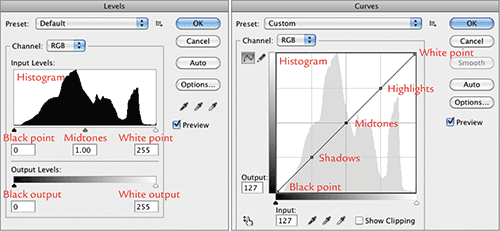
You can’t use Curves and Levels at the same time, but they share many of the same controls. By pressing Command/Ctrl+L to open the Levels dialog box, or Command/Ctrl+M to open the Curves dialog box, you access control of the open image’s entire range of tones and colors.
Let’s look at the similarities. On the left side of Levels is the black point input control that matches the black point input on the left side of Curves. The same is true of the midtones and white point controls, which are in both dialog boxes.
There are differences between the two, however. The sliders at the bottom of the Levels dialog control the output levels for the image’s brightest brights and darkest darks. In contrast, the slider at the bottom of the Curves dialog functions as a redundant control of the white and black point inputs.
Take a moment to study the controls in Levels and Curves (Figure 7-31).
Figure 7-31: Controls for Levels and Curves
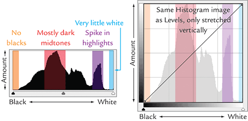
Behind both Levels and Curves is a graph that resembles a spiky mountain range, known as a Histogram, which maps the tones in the image (Figure 7-32). You can tell a lot about an image by looking at its Histogram. In Levels, the white tones in an image are graphed above the white point slider, the midtones are above the midtone slider, and the blacks are above the black point slider. Curves is the same, but the points are on a line rather than a slider. The graphs show how much of each tone you have. For instance, the image with the Histogram shown in Figure 7-32 has no pure blacks: the graph at that point is flat. The graph rises to the maximum around the dark midtones. Another lower spike occurs in the highlights. Above the white point, the graph returns to zero again except for a few very small bumps.
Figure 7-32: Reading an image’s Histogram
Open the file that displays this Histogram: Castles_of_Great_Britain_612022.jpg in the Chapter 7 materials on the DVD. You’ll use it to learn more about Levels and Curves in the following section.
Common Color Corrections
To acquaint you with the most common color corrections in Photoshop, let’s look at the same correction done in Curves (shown on the left in the figures in this section) and Levels (on the right in the figures). Each correction will be applied to the castle photo you just opened.
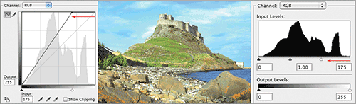
Moving the White Point to the Left
At the white point, the image is completely white, or 255, 255, 255 in the RGB readout. If you move the white point in (to the left in Curves or Levels), you brighten the tones in the picture. Everything to the right of the white point in the Histogram will turn completely white. The only part of the tonal scale left unchanged in this adjustment is the darkest dark or black point.
For the first example, you’ll brighten all the highlights and midtones in the image, plus heighten the contrast and saturation, by moving in the white point. Press Command/Ctrl+M to open Curves, and move the upper-right point to the left (Figure 7-33). Click OK, and look at the adjustment. Click Undo to return to the original image.
Press Command/Ctrl+L to open Levels, and move the right slider in Levels to the left (again, Figure 7-33). Click OK, and look at the adjustment. It’s the same as the adjustment in Curves. Undo to return to the original image.
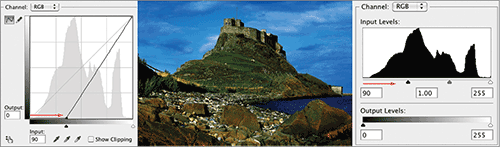
The Opposite: Moving the Black Point to the Right
At the black point, the image is completely black, or 0, 0, 0 in the RGB readout. If you move the black point in (to the right in Curves or Levels), you darken the tones throughout the picture. Everything to the left of the black point in the Histogram will turn completely black. The one part of the tonal scale left unchanged in this adjustment is the lightest light or white point.
To darken all the shadows and midtones by moving in the black point, go through the process of opening both Curves and Levels to compare the adjustment. Move the lower-left point on Curves to the right, and then move the left slider in Levels to the right. This is the opposite of what you did with the white point. Moving the black point also adds significant contrast and saturation (Figure 7-34). After each adjustment, click Undo to return to the original image.
Figure 7-34: Darkening an image by moving the black point
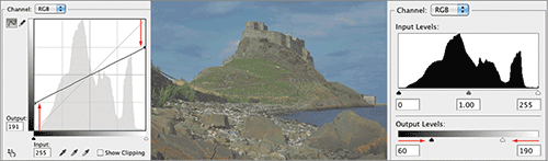
Reducing Contrast
To reduce contrast in the image, move the black point straight up and the white point straight down in Curves. Doing so reduces contrast and saturation and makes the image grayer and duller.
Notice that Levels requires separate sliders to change the Output Levels (Figure 7-35). To reduce contrast, move both these sliders toward the middle.
Figure 7-35: Reducing contrast and saturation of an image
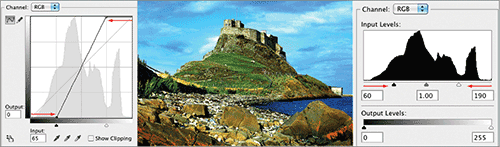
The Opposite: Adding Contrast
To add contrast to the image in both Curves and Levels, move the black point to the right and white point to the left. Doing so raises the white point and lowers the black point, adding a double dose of contrast and saturation (Figure 7-36).
Figure 7-36: Adding contrast to the image by raising the white point and lowering the black point
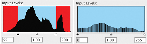
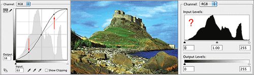
Clipping
Whenever you raise the white point or lower the black point, you throw away part of the image and cause sections to turn completely white or black. This is known as clipping. You can see the effects of clipping by reopening Levels after applying a correction (Figure 7-37). The Histogram looks quite different. The information in the red areas has been thrown away and replaced by white at the location of the white point and by black at the location of the black point. When you apply a correction, the remaining information in blue is spread across the Histogram. Furthermore, the Histogram is no longer solid, as indicated by breaks in the graph. The breaks show that the tonal values from the middle of the graph have been spread over a larger area, causing gaps in the information. Because you have fewer steps for fine gradations, smooth transitions in the image can become coarse jumps between tones.
Figure 7-37: Extreme color correction causes clipping in an image.
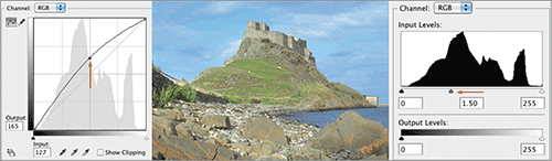
Raising the Midtones
Although correcting an image using the white and black points gets the job done, it’s a harsh correction. There is a way to lighten an image without losing part of the tonal range or adding excessive contrast and saturation: you can raise the midtones, which is often a better option. In Curves, add a new point in the middle of the curve by clicking the line, and drag the point straight up. In Levels, drag the middle slider to the left. Both techniques lighten the image without changing the color dramatically (Figure 7-38). Both midtone adjustments leave the white and black points untouched.
Figure 7-38: Lightening an image by raising the midtones
The Opposite: Lowering the Midtones
The same goes for darkening an image by pulling the middle of the curve lower, or dragging the middle Levels slider to the right. These two moves offer a less severe way of darkening an image (Figure 7-39).
Figure 7-39: Darkening an image by lowering the midtones
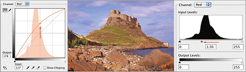
Altering the RGB Channels: Raising the Red Channel
In the previous examples, you’ve worked on all three RGB channels simultaneously, altering the image overall. However, you can adjust the channels one at a time. If an image is too green, you can select the Red channel in the Channel drop-down menu at the top of both Curves and Levels. You can add more red to the image overall by pulling up in the middle of the curve or moving the slider to the left in the Levels. When you add red to the midtones, you lighten the image (Figure 7-40).
Figure 7-40: Raising the red midtones to add red
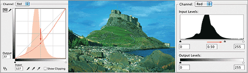
The Opposite: Lowering the Red Channel
If you pull the red curve down or move the Levels slider to the left, you remove red from the image and, in the process, add its RGB opposite, blue-green. This mainly affects the midtones and darkens the image (Figure 7-41).
Figure 7-41: Lowering the red midtones to reduce red and add green
The same holds true for the other color channels. Pull up on the Blue curve, or move the Levels slider to the right, to add blue and make the image lighter. Do the opposite, and you remove blue and add its RGB opposite color, yellow. Pull up on the Green curve, or move the Levels slider to the right, to add green and make the image lighter. Do the opposite, and you remove green and add its RGB opposite, magenta-red.
Why Curves?
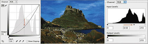
At this point, you may be thinking “If Curves and Levels do the same thing, and Curves is more complicated, why shouldn’t I stick to Levels?” The answer is that you’d be selling yourself short. Curves can do many things that Levels can’t. For instance, Curves allows you to make highlights brighter and shadows darker, all in one economical move. You create an S curve to do both (Figure 7-42). With only one midtone slider, there is no way to do this in Levels.
When you get more proficient at color correction, Curves is the tool you’ll use most often.
Figure 7-42: Curves as opposed to Levels
This section merely scratches the surface of the power of color correction. If you want more control over your images, I highly recommend that you seek out Professional Photoshop: The Classic Guide to Color Correction by Dan Margulis (Peachpit Press, 2006).
Dan’s book is considered the Bible of color correction, and it imparts important lessons for any matte artist. Several editions of this book have been released, but even the first one has enough information for an advanced degree in image wrangling.