
7
FORMS
- How to collect information from visitors
- Different kinds of form controls
- New HTML5 form controls
Traditionally, the term ‘form’ has referred to a printed document that contains spaces for you to fill in information.
HTML borrows the concept of a form to refer to different elements that allow you to collect information from visitors to your site.
Whether you are adding a simple search box to your website or you need to create more complicated insurance applications, HTML forms give you a set of elements to collect data from your users. In this chapter you will learn:
- How to create a form on your website
- The different tools for collecting data
- New HTML5 form controls

WHY FORMS?
The best known form on the web is probably the search box that sits right in the middle of Google's homepage.
In addition to enabling users to search, forms also allow users to perform other functions online. You will see forms when registering as a member of a website, when shopping online, and when signing up for newsletters or mailing lists.

FORM CONTROLS
There are several types of form controls that you can use to collect information from visitors to your site.
ADDING TEXT:
Text input (single-line)
Used for a single line of text such as email addresses and names.
Password input
Like a single line text box but it masks the characters entered.
Text area (multi-line)
For longer areas of text, such as messages and comments.

MAKING CHOICES:
Radio buttons
For use when a user must select one of a number of options.
Checkboxes
When a user can select and unselect one or more options.
Drop-down boxes
When a user must pick one of a number of options from a list.
SUBMITTING FORMS:
Submit buttons
To submit data from your form to another web page.
Image buttons
Similar to submit buttons but they allow you to use an image.
UPLOADING FILES:
File upload
Allows users to upload files (e.g. images) to a website.
HOW FORMS WORK
A user fills in a form and then presses a button to submit the information to the server.

A form may have several form controls, each gathering different information. The server needs to know which piece of inputted data corresponds with which form element.

To differentiate between various pieces of inputted data, information is sent from the browser to the server using name/value pairs. In this example, the form asks for the visitor's username and also for their favorite jazz musician. The name/value pairs sent to the server are:
If the form control allows the user to enter text, then the value of the form control is whatever the user has typed in.
If the form control allows you to choose from a fixed set of answers (e.g. radio buttons, checkboxes or a drop down list), the web page author will add code that gives each option an automatic value.
You should never change the name of a form control in a page unless you know that the code on the server will understand this new value.
FORM STRUCTURE
<form>
Form controls live inside <form> a element. This element should always carry the action attribute and will usually have a and id attribute too.
action
Every <form> element requires an action attribute. Its value is the URL for the page on the server that will receive the information in the form when it is submitted.
method
Forms can be sent using one of two methods: get or post.
With the get method, the values from the form are added to the end of the URL specified in the action attribute. The get method is ideal for:
- short forms (such as search boxes)
- when you are just retrieving data from the web server (not sending information that should be added to or deleted from a database)

With the post method the values are sent in what are known as HTTP headers. As a rule of thumb you should use the post method if your form:
- allows users to upload a file
- is very long
- contains sensitive data (e.g. passwords)
- adds information to, or deletes information from, a database
If the method attribute is not used, the form data will be sent using the get method.
id
We look at the id attribute on page 183, but the value is used to identify the form distinctly from other elements on the page (and is often used by scripts — such as those that check you have entered information into fields that require values).
TEXT INPUT


size
The size attribute should not be used on new forms. It was used in older forms to indicate the width of the text input (measured by the number of characters that would be seen).
For example, a value of 3 would create a box wide enough to display three characters (although a user could enter more characters if they desired).
In any new forms you write, CSS should be used to control the width of form elements. The size attribute is only mentioned here because you may come across it when looking at older code.
<input>
The <input> element is used to create several different form controls. The value of the type attribute determines what kind of input they will be creating.
type=“text”
When the type attribute has a value of text, it creates a single-line text input.
name
When users enter information into a form, the server needs to know which form control each piece of data was entered into. (For example, in a login form, the server needs to know what has been entered as the username and what has been given as the password.) Therefore, each form control requires a name attribute. The value of this attribute identifies the form control and is sent along with the information they enter to the server.
maxlength
You can use the maxlength attribute to limit the number of characters a user may enter into the text field. Its value is the number of characters they may enter. For example, if you were asking for a year, the maxlength attribute could have a value of 4.
PASSWORD INPUT
<input>
type=“password”
When the type attribute has a value of password it creates a text box that acts just like a single-line text input, except the characters are blocked out. They are hidden in this way so that if someone is looking over the user's shoulder, they cannot see sensitive data such as passwords.
name
The name attribute indicates the name of the password input, which is sent to the server with the password the user enters.
size, maxlength
It can also carry the size and maxlength attributes like the the single-line text input.


Although the password is hidden on the screen, this does not mean that the data in a password control is sent securely to the server. You should never use these for sending sensitive data such as credit card numbers.
For full security, the server needs to be set up to communicate with users' browsers using Secure Sockets Layer (SSL). The topic of SSL is beyond the scope of this book, however there are links to learn more about it on the accompanying website.
TEXT AREA


If you are creating a new form, you should use CSS to control the width and height of a <textarea>. However, if you are looking at older code, you may see the cols and rows attributes used with this element.
The cols attribute indicates how wide the text area should be (measured in numbers of characters). The rows attribute indicates how many rows the text area should take up vertically.
<textarea>
The <textarea> element is used to create a mutli-line text input. Unlike other input elements this is not an empty element. It should therefore have an opening and a closing tag.
Any text that appears between the opening <textarea> and closing </textarea> tags will appear in the text box when the page loads.
If the user does not delete any text between these tags, this message will get sent to the server along with whatever the user has typed. (Some sites use JavaScript to clear this information when the user clicks in the text area.)
RADIO BUTTON
<input>
type=“radio”
Radio buttons allow users to pick just one of a number of options.
name
The name attribute is sent to the server with the value of the option the user selects. When a question provides users with options for answers in the form of radio buttons, the value of the name attribute should be the same for all of the radio buttons used to answer that question.
value
The value attribute indicates the value that is sent to the server for the selected option. The value of each of the buttons in a group should be different (so that the server knows which option the user has selected).
checked
The checked attribute can be used to indicate which value (if any) should be selected when the page loads. The value of this attribute is checked. Only one radio button in a group should use this attribute.


Please note: Once a radio button has been selected it cannot be deselected. The user can only select a different option. If you are only allowing the user one option and want them to be able to deselect it (for example if they are indicating they agree to terms and conditions), you should use a checkbox instead.
CHECKBOX


<input>
type=“checkbox”
Checkboxes allow users to select (and unselect) one or more options in answer to a question.
name
The name attribute is sent to the server with the value of the option(s) the user selects. When a question provides users with options for answers in the form of checkboxes, the value of the name attribute should be the same for all of the buttons that answer that question.
value
The value attribute indicates the value sent to the server if this checkbox is checked.
checked
The checked attribute indicates that this box should be checked when the page loads. If used, its value should be checked.
DROP DOWN LIST BOX
<select>
A drop down list box (also known as a select box) allows users to select one option from a drop down list.
The <select> element is used to create a drop down list box. It contains two or more <option> elements.
name
The name attribute indicates the name of the form control being sent to the server, along with the value the user selected.
<option>
The <option> element is used to specify the options that the user can select from. The words between the opening <option> and closing </option> tags will be shown to the user in the drop down box.
value
The <option> element uses the value attribute to indicate the value that is sent to the server along with the name of the control if this option is selected.


selected
The selected attribute can be used to indicate the option that should be selected when the page loads. The value of this attribute should be selected.
If this attribute is not used, the first option will be shown when the page loads. If the user does not select an option, then the first item will be sent to the server as the value for this control.
The function of the drop down list box is similar to that of the radio buttons (in that only one option can be selected). There are two key factors in choosing which to use:
- If users need to see all options at a glance, radio buttons are better suited.
- If there is a very long list of options (such as a list of countries), drop down list boxes work better.
MULTIPLE SELECT BOX


<select>
size
You can turn a drop down select box into a box that shows more than one option by adding the size attribute. Its value should be the number of options you want to show at once. In the example you can see that three of the four options are shown.
Unfortunately, the way that browsers have implemented this attribute is not perfect, and it should be tested throroughly if used (in particular in Firefox and Safari on a Mac).
multiple
You can allow users to select multiple options from this list by adding the multiple attribute with a value of multiple.
It is a good idea to tell users if they can select more than one option at a time. It is also helpful to indicate that on a PC they should hold down the control key while selecting multiple options and on a Mac they should use the command key while selecting options.
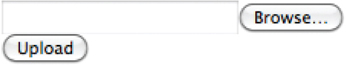
FILE INPUT BOX
<input>
If you want to allow users to upload a file (for example an image, video, mp3, or a PDF), you will need to use a file input box.
type=“file”
This type of input creates a box that looks like a text input followed by a browse button. When the user clicks on the browse button, a window opens up that allows them to select a file from their computer to be uploaded to the website.
When you are allowing users to upload files, the method attribute on the <form> element must have a value of post. (You cannot send files using the HTTP get method.)
When a user clicks on the browse button, the presentation of the window that allows them to browse for the file they want to upload will match the windows of the user's operating system. You cannot control the appearance of these windows.


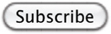
SUBMIT BUTTON


<input>
type=“submit”
The submit button is used to send a form to the server.
name
It can use a name attribute but it does not need to have one.
value
The value attribute is used to control the text that appears on a button. It is a good idea to specify the words you want to appear on a button because the default value of buttons on some browsers is ‘Submit query’ and this might not be appropriate for all kinds of form.
Different browsers will show submit buttons in different ways and tend to fit the visual presentation of the browser. If you want to control the appearance of a submit button, you can either use CSS (as you will learn on page 343), or you can use an image for the button.
IMAGE BUTTON
<input>
type=“image”
If you want to use an image for the submit button, you can give the type attribute a value of image. The src, width, height, and alt attributes work just like they do when used with the <img> element (which we saw on pages 99-100).


BUTTON & HIDDEN CONTROLS


<button>
The <button> element was introduced to allow users more control over how their buttons appear, and to allow other elements to appear inside the button.
This means that you can combine text and images between the opening <button> tag and closing </button> tag.
<input>
type=“hidden”
This example also shows a hidden form control. These form controls are not shown on the page (although you can see them if you use the View Source option in the browser). They allow web page authors to add values to forms that users cannot see. For example, a web page author might use a hidden field to indicate which page the user was on when they submitted a form.
LABELLING FORM CONTROLS
<label>
When introducing form controls, the code was kept simple by indicating the purpose of each one in text next to it. However, each form control should have its own <label> element as this makes the form accessible to vision-impaired users.
The <label> element can be used in two ways. It can:
- Wrap around both the text description and the form input (as shown on the first line of the example to your right).
- Be kept separate from the form control and use the for attribute to indicate which form control it is a label for (as shown with the radio buttons).
for
The for attribute states which form control the label belongs to. Note how the radio buttons use the id attribute. The value of the id attribute uniquely identifies an element from all other elements on a page. (The id attribute is covered on page 183.)
The value of the for attribute matches that of the id attribute on the form control it is labelling. This technique using the for and id attributes can be used on any form control. When a <label> element is used with a checkbox or radio button, users can click on either the form control or the label to select. The expanded clickable area makes the form easier to use. The position of the label is very important. If users do not know where to enter information or what information to enter, they are less likely to use the form correctly.


As a rule of thumb, here are the best places to place labels on form controls.
ABOVE OR TO THE LEFT:
- Text inputs
- Text areas
- Select boxes
- File uploads
TO THE RIGHT:
- Individual checkboxes
- Individual radio buttons
GROUPING FORM ELEMENTS
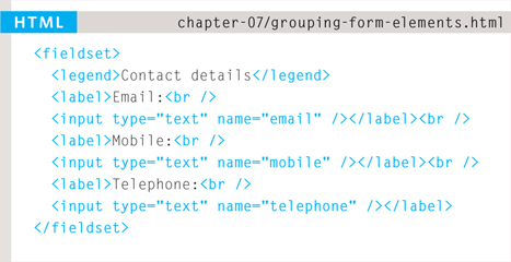
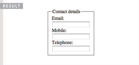
<fieldset>
You can group related form controls together inside the <fieldset> element. This is particularly helpful for longer forms.
Most browsers will show the fieldset with a line around the edge to show how they are related. The appearance of these lines can be adjusted using CSS.
<legend>
The <legend> element can come directly after the opening <fieldset> tag and contains a caption which helps identify the purpose of that group of form controls.
HTML5: FORM VALIDATION
You have probably seen forms on the web that give users messages if the form control has not been filled in correctly; this is known as form validation.
Traditionally, form validation has been performed using JavaScript (which is beyond the scope of this book). But HTML5 is introducing validation and leaving the work to the browser.
Validation helps ensure the user enters information in a form that the server will be able to understand when the form is submitted. Validating the contents of the form before it is sent to the server the helps:
- Reduce the amount of work the server has to do
- Enables users to see if there are problems with the form faster than if validation were performed on the server.


At the time of writing, only Chrome and Opera supported HTML5 validation, although other browsers are expected to follow. In order to support older browsers (that do not understand HTML5), web page authors are likely to continue using JavaScript to validate forms.
An example of HTML5 form validation is the required attribute, which can be used on any form element that the user is expected to fill in. This HTML5 attribute does not need a value, but in HTML 4 all attributes must have a value. So, some people give this attribute a value of required.
HTML5: DATE INPUT
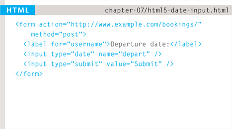

<input>
Many forms need to gather information such as dates, email addresses, and URLs. This has traditionally been done using text inputs.
HTML5 introduces new form controls to standardize the way that some information is gathered. Older browsers that do not recognize these inputs will just treat them as a single line text box.
type=“date”
If you are asking the user for a date, you can use an <input> element and give the type attribute a value of date. This will create a date input in browsers that support the new HMTL5 input types.
This example shows what the date input looks like in the Opera browser. The appearance of the date input changes across different browsers.
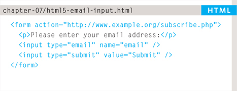
HTML5: EMAIL & URL INPUT
<input>
HTML5 has also introduced inputs that allow visitors to enter email addresses and URLs. Browsers that do not support these input types will just treat them as text boxes.
type=“email”
If you ask a user for an email address, you can use the email input. Browsers that support HTML5 validation will check that the user has provided information in the correct format of an email address. Some smart phones also optimize their keyboard to display the keys you are most likely to need when entering an email address (such as the @ symbol).
type=“url”
A URL input can be used when you are asking a user for a web page address. Browsers that support HTML5 validation will check that the user has provided information in the format of a URL. Some smart phones also optimize their keyboard to display the keys you are most likely to need when entering a URL.


HTML5: SEARCH INPUT


<input>
If you want to create a single line text box for search queries, HTML5 provides a special type of input for that purpose.
type=“search”
If you want to create a single line text box for search queries, HTML5 provides a special search input.
To create the HTML5 search box the <input> element should have a type attribute whose value is search. Older browsers will simply treat it like a single line text box.
Recent browsers add some features that improve usability. For example, Safari on a Mac adds a cross to clear the search box when you have started to enter information. Safari also automatically rounds the corners on the search input field.
placeholder
On any text input, you can also use an attribute called placeholder whose value is text that will be shown in the text box until the user clicks in that area. Older browsers simply ignore this attribute.

EXAMPLE
FORMS
This example shows a feedback and newsletter sign-up form. It uses a variety of form controls.
The <form> element uses the action attribute to indicate the page that the data is being sent to. Each of the form controls sits inside the <form> element. Different types of form control are suited to collecting different types of data. The <fieldset> element is used to group related questions together. The <label> element indicates the purpose of each form control.
<html>
  <head>
    <title>Forms</title>
  </head>
  <body>
    <form action=“http://www.example.com/review.php” method=“get”>
      <fieldset>
        <legend>
          Your Details:
        </legend>
        <label>
          Name:
          <input type=“text” name=“name” size=“30” maxlength=“100”>
        </label>
        <br />
        <label>
          Email:
          <input type=“email” name=“email” size=“30” maxlength=“100”>
        </label>
        <br />
      </fieldset>
      <br />
      <fieldset>
        <legend>
          Your Review:
        </legend>
        <p>
          <label for=“hear-about”>
            How did you hear about us?
          </label>
          <select name=“referrer” id=“hear-about”>
            <option value=“google”>Google</option>
            <option value=“friend”>Friend</option>
            <option value=“advert”>Advert</option>
            <option value=“other”>Other</option>
          </select>
        </p>
        <p>
Would you visit again?
          <br />
          <label>
            <input type=“radio” name=“rating” value=“yes” />
            Yes
          </label>
          <label>
            <input type=“radio” name=“rating” value=“no” />
            No
          </label>
          <label>
            <input type=“radio” name=“rating” value=“maybe” />
            Maybe
          </label>
        </p>
        <p>
          <label for=“comments”>
            Comments:
          </label>
          <br />
          <textarea rows=“4” cols=“40” id=“comments”>
          </textarea>
        </p>
        <label>
          <input type=“checkbox” name=“subscribe” checked=“checked” />
          Sign me up for email updates
        </label>
        <br />
        <input type=“submit” value=“Submit review” />
      </fieldset>
    </form>
  </body>
</html>
SUMMARY
FORMS
- Whenever you want to collect information from visitors you will need a form, which lives inside a <form> element.
- Information from a form is sent in name/value pairs.
- Each form control is given a name, and the text the user types in or the values of the options they select are sent to the server.
- HTML5 introduces new form elements which make it easier for visitors to fill in forms.