
CHAPTER 8
TEXT CLUSTERING
This chapter discusses how to partition a collection of texts into groups, which is called clustering. For example, a researcher analyzes a corpus of emails to find subsets having common themes. These are not known beforehand and are determined as part of the analysis. A related task called classification also partitions texts into groups, but these are known prior to the analysis. For example, there are commercial programs that classify incoming emails as either spam or nonspam.
These two tasks need different types of information. First, if the groups are unknown prior to the analysis, then a quantitative similarity measure is required that can be applied to any two documents. This approach is called unsupervised because computing similarities can be done by the program without human intervention.
Second, if the groups are known beforehand, then the algorithm requires training data that includes the correct group assignments. For example, developing a spam program requires training the algorithm with emails that are correctly labeled. A human provides these, so this approach is called supervised. However, creating or purchasing training data requires resources.
Because classification needs training data, which typically does not exist in the public domain, this chapter focuses on clustering. This only requires texts and an algorithm. As seen earlier in this book, there are plenty of the former available on the Web, and the latter exists in the statistical package R.
Similarity measures are introduced in section 5.7. Although cosine similarity or TF-IDF can be used, this chapter uses the simpler Euclidean distance formula from geometry, but once this approach is mastered, the others are straightforward to do.
8.2.1 Two-Variable Example of k-Means
We start by considering only two variables, so the data can be plotted. Once two-dimensional clustering is understood, then it is not hard to imagine similar ideas in higher dimensions.
The k-means clustering algorithm is a simple technique that can be extended to perform classification, so it is a good algorithm to start with. The letter k stands for the number of clusters desired. If this number is not known beforehand, analyzing several values finds the best one.
Let us consider a simple, made-up example that consists of two variables x and y. The data set is shown in figure 8.1, where it is obvious (to a human) that there are two clusters, which are in the northeast and southwest corners of the plot. Does k-means agree with our intuition?
Figure 8.1 A two variable data set that has two obvious clusters.
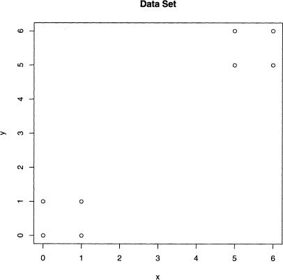
Since k must be specified before k-means begins, this plot is useful because it suggests k = 2. There are 256 ways to partition eight objects data into 2 groups. In general, for k groups and n data values, there are kn partitions: see problem 8.1 for details. Unfortunately, this function grows quickly. With 100 data values and four groups, 4100 has 61 digits, which is enormous. Hence, any clustering algorithm cannot perform an exhaustive examination of all the possibilities.
For k = 2, k-means picks two data values at random, which become the initial “centers” of two regions, which are the sets of points in the plain closest to its center. For two, this creates two half-planes, where each point on the dividing line is exactly equidistant from the centers. Suppose that the points (0,1) and (1,1) are the initial centers.
it is well known from geometry that this dividing line is the perpendicular bisector of the line segment formed by these two points. This is best understood by looking at figure 8.2. This line is half-way between the points (0,1) and (1,1), and it is at right angles to this line segment. As claimed, the points in the left half-plain are closer to the point (0,1), and those in the right half-plain are closest to the point (1,1).
Figure 8.2 The perpendicular bisector of the line segment from (0,1) to (1,1) divides this plot into two half-planes. The points in each form the two clusters.
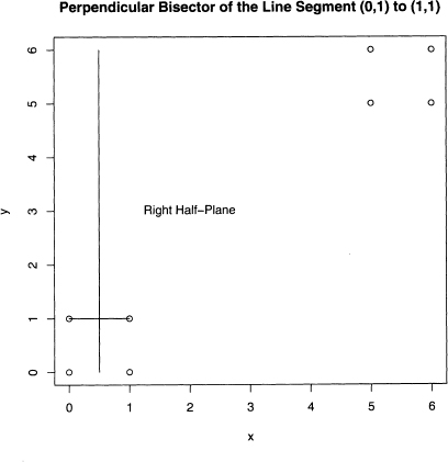
This line partitions the eight data points into two groups. The left one consists of (0,0) and (0,1), and the other six points are in the right one. Once the data is partitioned, then the old centers are replaced by the centroids of these groups of points. Recall that the centroid is the center of mass, and its x-coordinate is the average of the x-coordinates of its group, and its y-coordinate is likewise the average of its group’s y-coordinates. So in figure 8.3, the two centroids are given by equations 8.1 and 8.2.
(8.1) ![]()
(8.2) ![]()
These two centroids are denoted by the asterisks in figure 8.3. The line segment betweer these centroids is not drawn this time, just the perpendicular bisecting line, which divides the data into two groups of four points: the two squares in the southwest and northeasi corners of the plot that intuition suggests.
Figure 8.3 The next iteration of k-means after figure 8.2. The line splits the data intc two groups, and the two centroids are given by the asterisks.
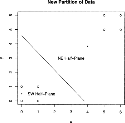
Note that the centroids of these two squares are (0.5, 0.5) and (5.5, 5.5). The new dividing line goes from (0, 6) to (6,0), which cuts the region of the plot into southwest ani northeast triangles. Hence the two groups have not changed, and so the k-means algorithif has converged. That is, the next iteration of centers does not change. The final answer is that the two groups are {(0, 0), (1,0), (0, 1), (1, 1)} and {(5, 5), (5,6), (6, 5), (6, 6)}.
The above example captures the spirit of k-means. In general, the algorithm follows these steps for k groups, m variables, and n data values. First, k data points are selected at random and are designated as the k centers. Second, these centers partition all the data points into k subsets. The data points in any set are exactly those that are closer to its centei than to any other center.
Third, the data points in each subset are averaged together to form the centroid, which is done for each of the coordinates. These centroids become the new centers. Fourth, steps two and three are repeated until the centers do not change anymore. Once this is achieved. then this partition of the data are the k clusters.
These steps can be implemented into Perl, but R already has the function kmeans (). The above example is repeated using R in the next section. Also, for more on making plots that partition the plane when there is more than two centers, see problem 8.2.
8.2.2 k-Means with R
Using R is much easier than hand computations, of course. The function kmeans () just needs a data matrix and the number of centers, that is, the value of k. Once the eight data points in figure 8.1 are put into the matrix data and k is set to 2, then R does the rest, which is shown in output 8.1.
Output 8.1 An example of k-means using the data in figure 8.1 and k set to 2.
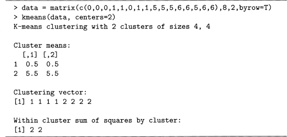
As found by hand, the final centroids (denoted cluster means in the R output) are (0.5, 0.5) and (5.5, 5.5). The clustering vector labels each data point in the matrix data. That is, the first four points are in cluster 1, and the last four points are in cluster 2. This again agrees with the partition found by hand.
The within sum of squares is the sum of the squared distances from each point of a clustei to its center. For example, for group 1, which consists of the fourpoints {(0, 0), (0, 1), (1, 0), (1, 1)}, the distance from each of these to the centroid, (0.5, 0.5) is 1/![]() . This distance squared is 0.5 for each point, so the sum is four times as big, or 2, which is the value given in the R output.
. This distance squared is 0.5 for each point, so the sum is four times as big, or 2, which is the value given in the R output.
By looking at figure 8.1, setting k to 2 is obvious. However, kmeans() produces clusters for any value of k between 1 and n (these two extreme cases are trivial, so they are not allowed). Consider k = 4 where intuition suggests that each square splits into twc opposite sides. However, there are two ways to do this for each square. For example, the southwest square can be split into {(0, 0), (0, 1)} and {(1, 0), (1, 1)}, but {(0, 0), (1, 0)} and {(0, 1), (1, 1)} is also possible. Hence there are four ways all together to cluster this data set, or so says intuition. Output 8.2 puts this claim to the test.
Output 8.2 Second example of k-means using the data in figure 8.1 with 4 centers.
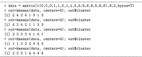
Note that the semicolon allows multiple statements on the same line (as is true with Perl). Also, out$cluster contains the cluster labels. The first four cases agree with the argument made above using intuition. For example, the first result gives 2 4 2 4 1 3 1 3. This means that the first and third points, {(O, 0), (1, 0)}, compose cluster 2, and the second and fourth points, {(0, 1), (1, 1)}, are cluster 4, and so forth.
However, the fifth result makes cluster 4 the entire northeast square of points, and the southwest square is split into three clusters. Since this type of division occurred only once, kmeans() does not find it as often as the intuitive solution. However, this example does underscore two properties of this algorithm. First, its output is not deterministic due to the random choice of initial centers. Second, as shown by the fifth result, the quality of the solutions can vary.
Because the clusters produced by kmeans() can vary, the researcher should try computing several solutions to see how consistent the results are. For example, when centers=2 is used, the results are consistently the northeast and southwest squares (although which ol these squares is labeled 1 varies). That this is false for centers=4 suggests that these data values do not naturally split into four clusters.
The next section applies clustering to analyzing pronouns in Poe’s 68 short stories. The first example considers two pronouns for simplicity. However, several values of k are tried.
8.2.3 He versus She in Poe’s Short Stories
The data values in figure 8.1 were picked to illustrate the k-means algorithm. This section returns to text data, and we analyze the use of the pronouns he and she in the 68 short stories of Edgar Allan Poe.
Since the counts for these two function words probably depend on the story lengths, we consider the rate of usage, which is a count divided by the length of its story. Although it is possible these are still a function of story length (see the discussion of mean word frequency in section 4.6 for a cautionary example), this should be mitigated.
These rates can be computed in Perl, or we can read the story lengths into R, which then does the computations. Both approaches are fine, and the latter one is done here.
Code sample 7.4 shows how to create a CSV file that contains the counts for the eighl pronouns. Since he and she are included, they are extractable once read into R.
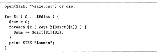
Code sample 7.1 creates a file with the number of words in each story. This results in an array of hashes called @dict that stores the number of times each word appears in each Poe story. Summing up the counts for all the words in a particular story produces the length of that story, which is done in code sample 8.1.
Code Sample 8.1 Computes the word lengths of the 68 Poe stories. This requires the array of hashes @dict from code sample 7.1.
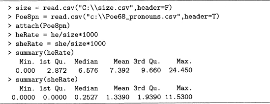
Assuming that the files Poe68. csv and size. csv have been created by code sample 7.4 and the combination of code samples 7.1 and 8.1, then these are read into R as done in output 8.3. Note that the rate is per thousand words so that the resulting numbers are near 1. Values this size are easier for a person to grasp.
Output 8.3 Computation of the rate per thousand words of the pronouns he and she.
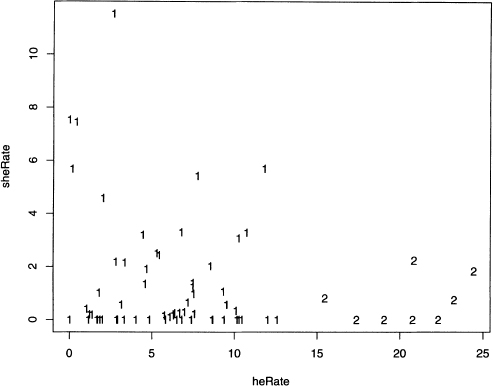
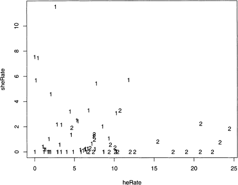
Since this data is two-dimensional, plotting heRate against sheRate shows the complete data set. This is done with the plot() function, as given below. figure 8.4 shows the results.
Figure 8.4 Scatterplot of heRate against sheRate for Poe’s 68 short stories.
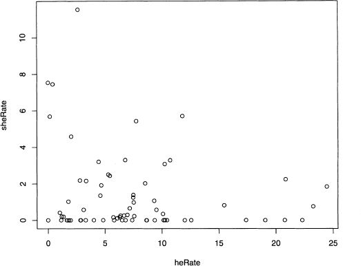
> plot(heRate, sheRate)
Although the data points are not uniformly distributed, the number and location of the clusters are not intuitively clear. Now kmeans() proves its worth by providing insight on potential clusters.
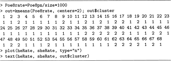
The type option for plot() changes the symbol used to indicate points. Setting type=”n” produces a blank plot, but the locations of the data points are remembered by R. The function text() then prints characters at these data point locations. These are the cluster labels produced by kmeans(), which is done in output 8.4, and figure 8.5 shows the resulting plot. Note that the function cbind() combines the vectors heRate and sheRate as columns into a matrix called heSheRate.
Figure 8.5 Plot of two short story clusters fitted to the heRate and sheRate data.
Output 8.4 Computation of two clusters for the heRate and sheRate data.
> hesheRate = cbind(heRate, sheRate) |
> plot(heRate, sheRate, type=“n”) |
> text(heRate, sheRate, kmeans(heSheRate,centers=2)$cluster) |
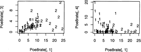
Figure 8.5 shows that a group of stories with high rates of he is identified as a cluster. Since the computer is doing the work, investigating other values of k is easily done. Output 8.5 shows the code that produces figure 8.6. Note that the command par (mfrow=c (2,2)) creates a two by two grid of plots in this figure.
Figure 8.6 Plots of three, four, five, and six short story clusters fitted to the heRate and sheRate data.
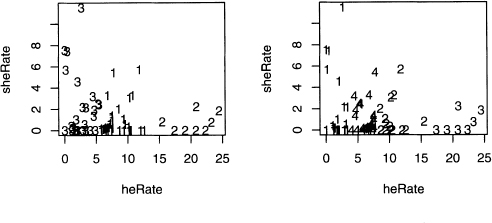
As the number of clusters goes from two to three, the large cluster on the left in figure 8.5 (its points are labeled with l’s) is split into two parts. However, the cluster on the right (labeled with 2’s) remains intact. Remember that the labels of the clusters can easily change, as shown in output 8.2, so referring to clusters by location makes sense.
Going from three to four clusters, the rightmost one is almost intact (one data value is relabeled), but a small cluster is formed within the two on the left. Nonetheless, the original three clusters are relatively stable. For k equals five and six, subdividing continues.
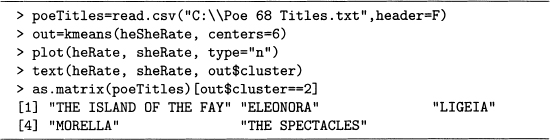
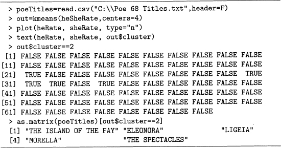
Now that R has done its work, it is up to the researcher to decide whether or not any of these clusters seem meaningful. We consider cluster 2 for k = 6. This has stories with high usages of she (above 4 per 1000 words), but low usages of he (below 3 per 1000 words). The titles printed out by code sample 7.1 are read into R by output 8.6, which prints out the ones corresponding to the cluster. For more on how this code works, see problem 8.3.
Output 8.5 Computation of three, four, five, and six clusters for the heRate and sheRate data.
> par(mfrow=c(2,2)) |
> plot(heRate, sheRate, type="n") |
> text(heRate, sheRate, kmeans (heSheRate, centers=3) $cluster) |
> plot(heRate, sheRate, type="n") |
> text(heRate, sheRate, kmeans (heSheRate, centers=4) $cluster) |
> plot(heRate, sheRate, type="n") |
> text(heRate, sheRate, kmeans (heSheRate, centers=5) $cluster) |
> plot(heRate, sheRate, type="n") |
> text(heRate, sheRate, kmeans (heSheRate, centers=6) $cluster) |
Three of these stories are similar in their literary plots. “Eleonora,” “Ligeia,” and “Morella” are all told by a male narrator and are about the death of a wife (more precisely, in “Eleonora” the narrator’s cousin dies before they can wed, and in “Morella,” two wives in a row die). A human reader also thinks of “Berenice” since in this story the narrator’s cousin also dies before they are to wed. It turns out that this story is not far from the above cluster (he occurs at 2.80 per 1000, but she only occurs at 2.18 per 1000). “The Spectacles” is about a man who falls in love and eventually marries, but this story is unlike the above four stories in that it is humorous in tone. Finally, “The Island of the Fay” is narrated by a man who sees a female fay (which is a fairy).
The above clustering is rather crude compared to how a human reader groups stories. On the other hand, the cluster considered did consist entirely of stories with narrators talking about a woman, though it does not capture all of them. Nonetheless, k-means is detecting structure among these works.
Output 8.6 Finding the names of the stories of cluster 2 in figure 8.6 for k = 6.
8.2.4 Poe Clusters Using Eight Pronouns
There is nothing special about two variables except for the ease of plotting, and k-means has no such limitation because it only needs the ability to compute the distance between centers and data values. The distance formula in n-dimensional space is given by equation 5.9 and is not hard to compute, so k-means is easily done for more than two variables.
To illustrate this, we use the pronoun data read into Poe8pn in output 8.3. There the variables heRate and sheRate are created, but by using matrix methods, it is easy to create rates for all eight variables at once. This is done in output 8.7, which also performs the k-means analysis with two clusters, and then plots these results for the first two pronouns, he and she. Note that heRate is the same as Poe8rate [, 1], and that sheRate is the same as Poe8rate [,2]. This is easily checked by subtraction, for example, the command below returns a vector of 68 zeros.
heRate — Poe8rate[,1]
Output 8.7 The third-person pronoun rates in Poe’s short stories clustered into two groups, which are labeled 1 and 2.
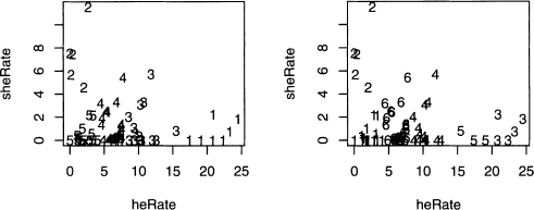
The clusters computed in output 8.7 are plotted in figure 8.7. Note there are similarities with figure 8.5. For example, cluster 2 for both plots include all the stories with rates of the word he above 15 words per 1000. However, there are additional points in cluster 2 in figure 8.7, and these appear to be closer to the other cluster’s center. However, remember that this only shows two of the eight variables, and so these 2’s are closest to a center in 8 dimensions.
Figure 8.7 Plots of two short story clusters based on eight variables, but only plotted for the two variables heRate and sheRate.
The above example reveals one problem when working with 3 or more variables: visualization is hard to do. Since there are 8 variables in this data set, there is a total of 28 plots of 2 variables at a time. A sample of 4 more projections of the rates is plotted in figure 8.8.
Figure 8.8 Four more plots showing projections of the two short story clusters found in output 8.7 onto two pronoun rate axes.
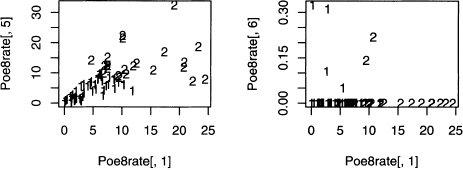
All five plots in figures 8.7 and 8.8 show the same two clusters. They are all just different views of the eight-dimensional data projected onto planes defined by two axes corresponding to two pronoun rates. However, there are an infinite number of planes that can be projected onto, so these five plots are far from exhausting the possibilities. For an example of losing information by just looking at a few projections, see problem 8.4.
As the number of variables grows, this problem of visualization becomes worse and worse. And with text, high dimensionality is common. For example, if each word gets its own dimension, then all of Poe’s short stories are representable in 20,000-dimensional space.
However, there are ways to reduce dimensionality. In chapter 7, the technique of PCA is introduced, which is a way to transform the original data set into principal components. Often a few of these contain most of the variability in the original data set. In the next section, PCA is applied to the Poe8rate data set.
8.2.5 Clustering Poe Using Principal Components
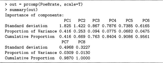
Output 7.13 shows a PCA of the eight third-person pronouns counts. Since 78.2% of the variability is contained in the first two principal components, and 84.97% are in the first three, using only two or three makes sense.
In this section we do a PCA of the eight pronoun rate variables computed earlier in this chapter, and then perform clustering using two of the PCs. These results are plotted and are compared with the clusters in the preceding section. In addition, we compare the PCA of the rates with the PCA of the counts. Any differences are likely due to the effect of story size.
Output 8.7 defines the matrix Poe8rate, which is the input to prcomp () in output 8.8. The cumulative proportions for the PCA model of the pronoun counts (see output 7.13) are reproduced below.
0.457 0.782 0.8497 0.8992 0.943 0.9716 0.9910 1.0000
Notice that the cumulative proportions of the rate PCs grow even slower, so the variability is more spread out. The other extreme is output 7.12, where the first PC has 97% of the variability. In this case, using just one is reasonable because little variability is lost. However, here the first PC has only 41.6% of it, so considering additional PCs is reasonable.
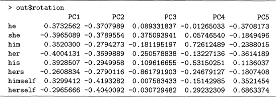
Output 8.9 gives the weights of the first five PCs of Poe8rate. Note that PC1 compares the male and female pronouns, and PC2 is close to an average of the pronoun rates. Compare this to output 7.13, where the same interpretations hold except that the order is reversed, so controlling for story size by using rates increases the importance of gender in pronoun usage.
Output 8.8 Principal components analysis of the eight third-person pronoun rates for the 68 Poe short stories.
Since the later PCs still explain 33.1% of the variability, it is worth checking how interpretable they are. This is done by noting the largest weights in absolute value, and then considering their signs. For example, she, her, and hers have the biggest weights in PC3, where the first two are positive and the last one is negative. So this PC contrasts she and her with hers. Similarly, PC4 contrasts him with his.
The theory of statistics states that PCs partition variability in a certain way, but practical importance is a separate issue. Hence, collaboration with a subject domain expert is useful for interpreting statistical results. Consequently, to decide whether or not these PCs are interesting is a question to ask a linguist.
Output 8.9 The weights of the first five PCs of Poe8rate from output 8.8.
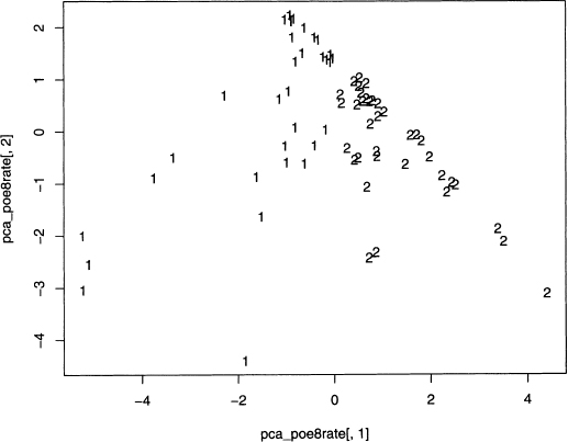
Now that the PC weights are computed, these create a new data set of eight uncorrelated variables. We use all eight PCs for clustering in output 8.10, although only the first two PCs are plotted in figure 8.9, which represents 66.9% of the variability.
Figure 8.9 Eight principal components split into two short story clusters and projected onto the first two PCs.
However, clustering using only the first two PCs is also possible, which is done by replacing the second line of output 8.10 by the command below. Now the square brackets specify just the first two columns. This is left for the interested reader to try.
Output 8.10 Computing clusters by using all eight principal components.
> pca_Poe8rate = scale(Poe8rate) %*% out$rotation |
> out = kmeans(pca_Poe8rate, centers=2) |
> plot(pca_Poe8rate[, 1], pca_Poe8rate[,2] ,type="n") |
> text(pca_Poe8rate[,1], pca_Poe8rate[,2] ,out$cluster) |
> out = kmeans(pca.Poe8rate[,1:2], centers=2)
As done in output 8.6, after the models have been run, the last step is to consider what is in each cluster. In this case, how have the Poe stories been partitioned? And as a human reader, do these two groups matter? This is also left to the interested reader.
Remember that kmeans () is just one type of grouping. The next section briefly introduces hierarchical clustering. However, there are many more algorithms, which are left to the references given at the end of this chapter.
8.2.6 Hierarchical Clustering of Poe’s Short Stories
Clustering is popular, and there are many algorithms that do it. This section gives an example of one additional technique, hierarchical clustering.
Any type of clustering requires a similarity measure. The geometric (or Euclidean) distance between two stories is the distance between the vectors that represent them, which is used in this chapter. However, other measures are used, for example, the Mahalanobis distance, which takes into account the correlations between variables. So when reading about clustering, note how similarity is computed.
The example in this section uses hierarchical clustering and Euclidean distance applied to the Poe8rate data set. Doing this in R is easy because hclust ()computes the former, and dist () computes the latter.
In hierarchical clustering the groups are summarized in a tree structure, which is called a dendrogram and resembles a mobile. The code to do this is given in output 8.11, and the results are given in figure 8.10.
Output 8.11 Computing the hierarchical clustering dendrogram for the 68 Poe stories.
> out = hclust(dist(Poe8rate)) |
> plot(as.dendrogram(out)) |
Figure 8.10 A portion of the dendrogram computed in output 8.11, which shows hierarchical clusters for Poe’s 68 short stories.
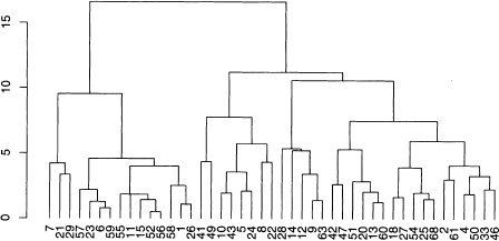
This figure indicates distances on the y-axis. At the bottom of each branch of the tree there is a number that labels the story, for example, 1 stands for “The Unparalleled Adventures of One Hans Pfaall.” The clusters are obtained by cutting a branch of the dendrogram. For example, stories 40 and 67 form a small cluster (these are second and third from the left in figure 8.10). Going a level further up the tree, the following is a cluster: 40, 67, 17, 53, 16, 37. In general, all the stories below any point of the dendrogram constitute a cluster, and ii is up to the researcher to decide which ones are meaningful.
Unfortunately, the numbers at the bottom of figure 8.10 are small and crammed togethei due to the size of the tree. However, see problem 8.5 for another example using the transpose of Poe8rate. This finds the clusters among the eight pronouns.
This ends our discussion of clustering. The next section focuses on classification, and the chapter ends with references for further reading on this vast subject.
Classification of texts is both practical and profitable. For example, email spam filters are big business. However, we do not cover this because it requires a training data set. The other examples in this book use text that is available over the Web and in the public domain. However, public domain collections of text that are already classified are rare.
In addition, many texts in this book come from famous writers, for example, Charles Dickens and Edgar Allan Poe, and almost all of their literary output is known. So training an algorithm on what they have written in order to classify newly discovered works is rarely needed.
When working with classification algorithms, researchers avoid overfitting because this usually generalizes poorly. However, literary critics often search for peculiarities of a specific text, or for the subtle interconnections of a group of texts. So overfitting a complete body of work can be profitable if it uncovers information interesting to a researcher. However, the results can be trivial, too, as seen in the example in the next section.
8.3.1 Decision Trees and Overfitting
A decision tree algorithm classifies objects by creating if-then statements of the following form.
If Property P is true, then classify object with Label L.
If a researcher uses words to classify texts without worrying about overfitting, then it is easy to identify any group of texts. This is a consequence of Zipf’s law (see section 3.7.1) because it implies there are numerous words that only appear once in any collection of texts.
Here is an example of this using Poe’s short Stories. Suppose a rule is desired to select exactly the following: “The Balloon Hoax,” “X-ing a Paragrab,” “The Oblong Box,” and “The Sphinx.” These stories are arbitrary, and the idea below works for any group of Poe stories.
This is one rule that works. A Poe story is one of these four if and only if it has one of the following words: authentic, doll, leak, or seventy-four. This rule is created by examining a frequency list of words for all 68 stories put together. By Zipf’s law this contains numerous words that appear exactly once. Among these, one word for each of these four stories is picked. There are many such words, so there are many rules like this, but few, if any, provide any insight into the literary similarities of this group.
In spite of this example, decision rule algorithms can be useful. For more information on this, look at the appropriate references in the next section. Finally, for some specific advise on finding the above rule using Perl, see problem 8.6, which reveals one trivial property that these four stories do share.
This chapter is just an introduction to clustering. Many more techniques exist in the literature, and many functions to do clustering exist in R. For another introductory explanation of this, see chapter 8 of Daniel Larose’s Discovering Knowledge in Data [69]. For clustering applied to the Web, see chapters 3 and 4 of Zdravko Markov and Daniel Larose’s Data Mining the Web [77]. Both of these books give clear exposition and examples.
For clustering applied to language, start with chapter 14 of Christopher Manning and Hinrich Schütze’s Foundations of Statistical Natural Language Processing [75]. Then try Jakob Kogan’s Introduction to Clustering Large and High-Dimensional Data [66]. This book focuses on sparse data, which is generally true for text applications.
Clustering belongs to the world of unsupervised methods in data mining. For an introduction that assumes a strong statistical background, see chapter 14 of Trevor Hastie, Robert Tibshirani, and Jerome Friedman’s The Elements of Statistical Learning [52]. This book also discusses a number of other data mining techniques. Sholom Weiss, Nitin Indurkhya, Tong Zhang, and Fred Damerau’s Text Mining [125] also covers both clustering and classification, and also discusses the links between data mining and text mining.
There are many more books, but the above are informative and provide many further references in their bibliographies.
Chapters 4 through 8 each focus on different disciplines that are related to text mining. For example, chapter 5 shows how to use the technique of term-document matrices to analyze text. Moreover, chapters 2 through 8 give extensive programming examples.
Chapter 9, however, introduces three, short topics in text mining. These include brief programming examples that are less detailed than the rest of this book. These, along with references to books that deal with text mining directly, provide some parting ideas for the reader.
8.1 In section 8.2.1 it is claimed that for k groups and n data values, there are kn partitions. This problem shows why this is the case.
a) Any clustering is representable by a vector with n entries, each with a label of a number from 1 through k. In fact, this is how kmeans () indicates the clusters it has found; for example, see output 8.2.
Suppose there are only two data values, hence only two entries in this vector. The first can have any label from 1 through k. For each of these, the second entry also can have any label from 1 through k. This makes k choices for the first, and for each of these, k choices for the second. So for both labels, there are k times or k2, choices.
Extend this argument for n entries, each having k choices. This justifies the claim made at the beginning of section 8.2.1.
b) The above argument, unfortunately, is a simplification. For example, the third and fourth repetitions of kmeans () in output 8.2 represent the same clusters, but they are labeled with different numbers. Counting up the number of groups without duplications from changing labels requires a more complicated approach, which is not done here. For more information, see chapter 1 of Constantine’s Combinatorial Theory and Statistical Design [32].
8.2 As discussed in section 8.2.1, for two centers, the plane is divided into two half-planes. For each, all the points in it are closer to its center than to the other center, and the dividing line between these is the perpendicular bisector of the line segment between the centers.
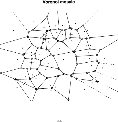
For three or more centers, the situation is more complex and requires a more sophisticated algorithm. The result is called a Voronoi diagram, which is interesting to see. Since there is an R function to do it, we consider an example here.
Like Perl, R also has packages that are downloadable, which provide new functions for the user. The most current information on how to do this is at the Comprehensive R Archive Network (CRAN) [34], so it is not described in this book. For this problem, go to CRAN and figure out how to perform downloads, and then do this for the package Tripack [105].
Then try running output 8.12, which creates the Voronoi diagram for a set of 50 random centers where both coordinates are between 0 and 1. That is, these are random points in the unit square. Your plot will resemble the one in figure 8.11, where the stars are the centers and each region is a polygon with circles at its corners.
Output 8.12 Creating a Voronoi diagram for a set of 50 random centers for problem 8.2.
> x = runif(50) |
> y = runif(50) |
> out = voronoi.mosaic(x, y) |
> plot. voronoi (out) |
Figure 8.11 The plot of the Voronoi diagram computed in output 8.12.
8.3 This problem discusses how to select subsets of a vector in R. In output 8.6, story titles are printed that corresponded to one of the clusters found by kmeans (). This is accomplished by putting a vector of logical values in the square brackets.
Output 8.13 reproduces output 8.6 and, in addition, shows that the names of the stories are selected by TRUEs. In this case, these are the titles of the stories in cluster 2.
Output 8.13 Using a logical vector to select a subset of another vector for problem 8.3.
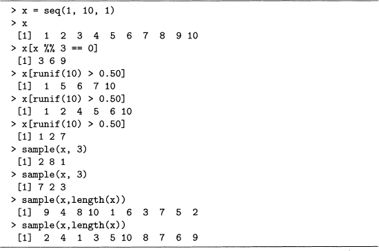
Try this trick with simpler vectors using output 8.14 as a model. Note that the function seq() produces a sequence of values. Its first and second arguments are the starting and stopping values, and the third argument is the increment. Finally, the logical operators in R are the same as the numerical ones in Perl: == for equals, > for greater than, and so forth.
a) Construct a vector with the values 1 through 100 inclusive and then select all the multiples of 7. Hint: %% is the modulus operator, which returns the remainder when dividing an integer by another one.
b) Construct a vector with the values 1 through 100 inclusive. Select a sample such that every value has a 10% chance of being picked. Hint: try using runif (100) < 0. 10. Note that runif (n) returns a vector containing n random values between 0 and 1.
c) Construct a vector with the values 1 through 100 inclusive. Take a random sample of size 10 using sample ().
d) Perform a random permutation of the numbers 1 through 100 inclusive. Hint: use sample () This also can be done by using order () as shown in code sample 9.7.
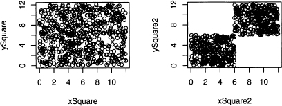
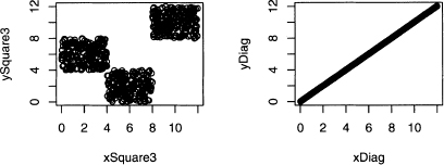
8.4 Section 8.2.4 claims that a finite number of projections loses some information from the original data set. To prove this requires knowledge about calculus and the Radon transform. This problem merely gives an example of information loss when two-dimensional data is projected onto the x and y-axes.
Output 8.14 Examples of selecting entries of a vector. For problem 8.3.
Consider the four two-dimensional plots in figure 8.12. All have points distributed uniformly in certain regions. All the projections of these four plots onto either the x or y-axis produces a uniform distribution. In fact, these four plots suggest numerous other two-dimensional distributions with uniform projections. Hence two projections do not uniquely determine the two-dimensional distribution of the data.
Figure 8.12 All four plots have uniform marginal distributions for both the x and y-axes. For problem 8.4.
Unfortunately, this problem only gets worse when higher dimensional data is projected onto planes. Nonetheless, looking at these projections is better than not using visual aids.
For this problem, generate the top two plots for this figure with R. Then produce his tograms of the projections onto the x and y-axes using the following steps.
a) For the upper left plot, the x and y-coordinates are random values from 0 to 12. These are produced by output 8.15. The projections of these points onto the x-axis is just the vector x. Hence hist (x) produces one of the two desired histograms. Do the same for the y-axis.
Output 8.15 Code for problem 8.4.a.
> x = runif(1000)*12 |
> y = runif(1000)*12 |
> plot(x, y) |
> hist(x) |
b) For the upper right plot, the x and y-coordinates are either both from 0 to 6 or both from 6 to 12. These are produced by output 8.16. Use them to create the two desired histograms.
Output 8.16 Code for problem 8.4.b.
> x = c(runif(500)*6, runif(500)*6+6) |
> y = c(runif(500)*6, runif(500)*6+6) |
8.5 When working with term-document matrices, it is common to focus on word distributions in texts, but there is another point of view. A researcher can also analyze the text distribution for a word, which emphasizes the rows of the term-document matrix. This provides insight on how certain words are used in a collection of documents.
After reading the material on hierarchical clustering in section 8.2.6, try to reproduce output 8.17 and figure 8.13 to answer the questions below. Hint: use output 8.11 replacing Poe8rate with its transpose.
Figure 8.13 The dendrogram for the distances between pronouns based on Poe’s 68 short stories. For problem 8.5.
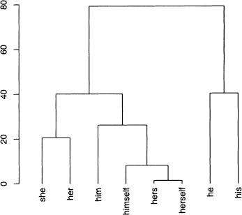
a) Which two pronouns are farthest apart according to output 8.17? Find these on the dendrogram.
b) The pronouns he and his form a group as does she and her. Notice that the bai connecting the latter is lower than the one for the former. Find the distances between these two words for each pair to determine exactly how high each bar is.
Output 8.17 Distances between every pair of columns in Poe8rate. For problem 8.5.
c) It pays to think about why a result is true. For example, the main reason that hers and herself are close as vectors is that they both have many rates equal to zero, and even the nonzero rates are small. Confirm this with a scatterplot. However, two vectors with many zero or small entries are close to each other.
8.6 Section 8.3.1 gives an example of a rule that decides if a Poe story is one of four particular stories. For this problem, find the words that appear exactly once among all of his stories, and then identify which stories each word appears in.
Here are some suggestions. First, use code sample 7.1 to compute word frequencies foi each story by itself and for all of them put together. The former are stored in the array ol hashes dict, the latter in the hash %combined.
Second, print out each of the words that appear exactly once in %hcombined, as well as the story in which it appears. The latter part can be done by a for loop letting $i go from 0 through 67. Then exactly one of these entries $dict [$i] {$word} is 1 for any $word found to appear exactly once in %hcombined. Finally, use the array @name to print out thc title of this story.
The list just made allows any set of stories to be identified. For example, authentic appears only in “The Balloon Hoax,” doll in “X-ing a Paragrab,” leak in “The Oblong Box,” and seventy-four in “The Sphinx.” Hence, the rule given in the text works.
Finally, what do these four stories have in common? They are exactly the ones thai contain the letter x in their titles.