
Chapter 2
Designing Your User Experience
What's In This Chapter?
- Defining a functional scope for each screen
- Evaluating what data should be displayed
- Whiteboarding exercises to facilitate app design and identify discrete pieces of functionality
- Prototyping to get stakeholder and user feedback
- Using Agile to get software into the hands of beta testers
Almost as diverse as the development languages and mobile operating systems of the targeted devices, the User Interface (UI) controls that make up the user experience on today's mobile platforms vary greatly. A common thread is the complete abandonment of the DataGrid layout. Made famous in Windows Forms, the DataGrid quickly made the migration to the mobile platform when Microsoft ported the UI control to Windows CE. Although DataGrids performed reasonably well in desktop applications, the significantly reduced screen resolution of quarter VGA mobile devices forced the fonts used within DataGrids to be too small when rendered on the device.
When Apple launched the iPhone, it included some data-intensive workflows. The first killer app for iOS was iTunes. The application provides users with a rich experience while they browse a vast array of digital entertainment content. By implementing a linear application workflow, Apple enabled iTunes users to browse through the details of each song by drilling through lists. Using the linear paradigm enables developers to display information in a more readable fashion when it is displayed on mobile devices. Two primary advantages of this approach are larger font sizes and the lack of horizontal screen scrolling.
When Microsoft introduced the successor to Windows CE at the launch of Windows Phone 7, it was impossible to miss the use of extra large fonts. The mantra of the device, “Get it and get out,” made it clear there was no time for putting on your reading glasses. The device is ready for use by all ages. The UI paradigm for Windows Phone 7 is a far cry from the DataGrid.
In the spirit of advancing mobile applications, Google brought its own version of innovation to the mobile application landscape. The Android platform gave the open source community a vast array of computing devices for which to develop software. Google harnessed the power of social coding and built a mobile operating system (OS) with future innovation in mind. The UI is not as polished as iOS or as dramatic as Window Phone 7; but the combination of a powerful UI API and XML gives UI designers and developers the ability to tag-team in creating almost any UI experience the pair can dream up.
As mobile devices have matured, users' expectations for the applications they use have heightened. Using mobile apps can be fun and convenient. However, the individual user's experience can be crushed if the app's navigation is clunky, its performance is poor, or it requires a user manual to master. Today's apps need to be sleek, perform seamlessly, and be optimized for the tasks at hand. The application design discussions in this chapter center around defining the app. Things to consider when designing the UI are data, process flow, and objectives. Carefully consider what data needs to be displayed and at which points of the workflow each piece of data becomes relevant. Verify each piece of data retrieved is necessary for the user to complete their core workflow objectives.
Making Your Applications Usable
The secret to creating usable apps is to keep the app simple. The initial design process is the starting point for identifying key parts of your application's functionality. Project managers and developers alike can start drawing initial conclusions around timeline and scope as teams start defining workflows and identifying the data those workflows rely on. In addition, the initial workflow design and mockup exercises often highlight unnecessary data or nice-to-have workflows that don't need to be included in the initial scope.
 Remember the 80/20 rule and focus first on designing the app to handle 80% of the functionality; don't focus on the edge case functionality until after the application has a general flow.
Identifying the Scope of Each Screen
Historically, one of the biggest challenges to mobile software development was designing the UI for smaller screen resolutions. Although tablets are starting to bring larger resolutions to handheld devices, developers are still forced to limit the content and pieces of functionality contained in each screen.
When starting to design the application, you need to break the application into functional sections. With each section identified, an individual or small team can work to determine what each section's screens might look like.
In the enterprise, a majority of the applications are designed to deliver information for real-time business decisions. Identifying the data you want to display is a crucial step in the design process. Failing to weed out the data that is not needed on the screen can, ultimately, result in wasting hours trying to provide and display useless information.
After you identify the data to be displayed, it is then best to designate information as either primary or secondary information. Primary information should be presented in larger fonts, without truncation, whereas secondary information can be presented in less distinguishing fonts and colors — or placed on a subscreen. A paradigm made popular by today's modern smartphones is making it possible to reveal secondary information by touching a portion of the primary information or its disclosure decorator.
A disclosure decorator is a visual cue on the screen that a user can touch to reveal more information about a specific piece for data. This is most commonly seen in List views, such as a contact list.
Conforming to Platform Standards
Perhaps one of the greatest cost-saving benefits of today's new mobile applications is the lack of training materials. In the cutting-edge book iPad in the Enterprise from Wrox, author Nathan Clevenger assembles a mass of enterprise application implementation use cases. In his research, Clevenger points out that an entire ecosystem of mobile applications was produced without training and documentation departments having to produce a single page of user documentation, quick reference sheets, or supporting wikis. Creating an app that harnesses the power of UI adoptability is the responsibility of those designing the UI. Using the controls and conventions native to each platform drastically cuts the time each user must spend learning the app. Applications that utilize the native controls and workflows of the platform help the user intuitively learn the app's functionality. Much as immersion is useful for teaching languages, creating an application the user can navigate intuitively should increase the adoption rate of your enterprise apps.
Apple is the undisputed leader in the realm of user experience on mobile devices. Its iOS interface has proven intuitive to everyone from toddlers to grandparents. This achievement did not come without causing some frustration among Apple's application development community. As the first apps made their way into the app store, Apple meticulously reviewed their conformity to a published set of UI standards. It was not uncommon for Apple to reject an app because the reviewer did not like how the user controllers were laid out. Although Apple has largely relaxed its rigid enforcement of UI guidelines, it did so only after the user base had gotten used to the “the right way to do things.”
Google took a different approach. The Android Market is open, and apps are generally rejected only if basic functionality is failing. Even with the lack of UI convention enforcement, there is still a standard way to do things. If you have any confusion on how to implement specific functionality or workflows, it's best to review the apps that come loaded on every Android device. Those apps generally adhere to the best practices of the platform and can help jump start ideas on how to implement your own workflows.
Microsoft has never willingly been outdone by competitors. With Apple and Google encroaching on the mobile enterprise space, Microsoft released Windows Phone 7, which uses Silverlight under the hood. The result is a UI paradigm that relates well to web pages. This is convenient for cross-platform development because placement of navigation endpoints throughout a screen is one of the easiest ways to write portable code. Each navigation endpoint provides the controller (the shared business code) an opportunity to execute shared C# code before the rendering or re-rendering of a screen.
By far the most loosely standardized platform is the World Wide Web. There are a ton of advantages that come with web-based implementations. Ease of deployment is probably its greatest asset. With web-based deployments, the transition from one version of the UI to another is as simple as updating the web server. Updates to the web server immediately transition the entire user base to the new version. This is something that cannot be accomplished with applications deployed to individual devices. Writing and deploying apps to each user's device, by nature, introduces a migration period. Web-based deployments also bring the advantage of contained data access, where all data remains stored behind a firewall. No datasets are transferred off premise of the data center. Web applications can access data servers and retrieve information necessary for creating a view without exposing that traffic to public networks. With data securely retrieved, the web app can send only the data contained within the view to the mobile web client.
Webkit is a layout engine web browsers use under the covers. The standardized use of the engine provides a more reliable rendering of web pages across multiple browsers. While the Webkit standard is no substitute for developing a native app with native controls, it does allow developers to have reasonable confidence that their Webkit-compatible web pages will render nicely across several mobile platforms. The heavy adoption of the Webkit engine by mobile browsers opens the door for real cross-platform web-based implementations. With general standardization on the Webkit browser engine, mobile web applications have a de facto browser standard to target. This empowers developers and solution designers to develop full-featured web-based apps or to utilize embedded web controls in their native apps.
Each mobile platform has its own set of best practices. Apple, Google, and Microsoft have all published and revised their user interface guidelines. It can be beneficial to take a look through them before diving into designing an application. Each guideline document is published by its respective organization and placed on the organization's public-facing websites. The document names are different, but the content is all similar. Windows Phone 7 has User Experience Design Guidelines. Apple publishes the iOS Human Interface Guidelines. And Google publishes the more traditionally named User Interface Guidelines.
Each of the guidelines should be easy to find with a Google or Bing search for the document's name. At the time of publication the guidelines were available at the following URLs.
Microsoft:
http://msdn.microsoft.com/en-us/library/hh202915(v=vs.92).aspx
Apple:
Google:
http://developer.android.com/guide/practices/ui_guidelines/index.html
Separating Platform from Design
When targeting an application for cross-platform deployment, you need to separate function from implementation. You can accomplish the same objective using entirely different user interface implementations. At the most rudimentary level, there is the native control. On Android devices developers can work with a familiar UI control concept, the drop-down box. On iPhones you observe an entirely different implementation with the select list. Both implementations enable the user to select a single option from a list of choices. The drop-down box overlays the choices on the current screen. Apple's select list concept utilizes the entire screen real estate to display the list of options. A third paradigm common among Webkit implementations is the picker wheel. Much like the drop-down list, the picker wheel displays on the same screen, usually appearing docked to the bottom of the screen when the control is touched.
Before focusing on the controller, it is important to consider the workflow. Developers can choose many different approaches to collecting data. A traditional approach is the form. Take an address form, for example. To enter the last three fields in an address, the user would move between the City, State, and ZIP code fields. After entering data in all the fields, the user would locate the UI control for triggering a submission of that data. An entirely different approach is the step-through workflow. The users can select a single UI control that transitions them into a workflow that first selects a State, then a City, and finally a ZIP code. This kind of workflow provides new opportunities to improve usability. One opportunity for streamlining the workflow in this example might be to take advantage of the GPS technology in most smartphones and prepopulate the ZIP code field with a default value and then render a UI control for the user to confirm or correct the prepopulated value.
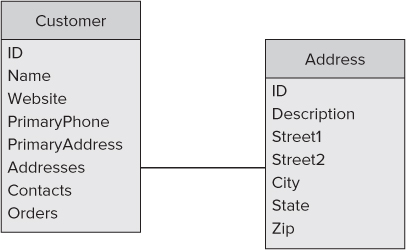
Implementations vary drastically. What makes sense for one business group might not for another. When starting to design cross-platform applications, don't get bogged down in these types of details. The primary goal for the initial design sessions should focus around data and tasks. Identify what data the user must see to complete the tasks the application is being built to facilitate. Consider the example of a customer management application. The purpose of the application is to display company information. The data necessary to accomplish that are typical address book data and order history information (see Figure 2.1).
Figure 2.1 A customer management application can use a simple data model diagram.
When the data elements are identified first, it can help declutter your UI. It is not only helpful, but also necessary to limit the information displayed at any given time; the smaller screen sizes demand such discipline.
Using the example of the application and the data defined in Figure 2.1, you can begin the workflow discussion. In this simple example the goal is to help the user locate and display information about a particular customer. The first design decisions encompass the workflow for selecting the customer. The user could drill through menus to locate a company or contact name. The user could be presented with a paginated list and click through it page by page while looking for the customer. Or the user could see the full list and use a search bar to filter it. These kinds of workflows are at the root of the MonoCross pattern. They affect the number of views you have to create as well as the opportunities for the shared code in the controller to execute. Such decisions are generally worked out among teams. To help facilitate decisions about shared code, most teams use the process of prototyping.
Most development groups engage in some sort of prototyping exercises early in their development process. Prototyping is the process of developing less-than-complete implementations of software for the purpose of evaluating scope, functionality, and usability. This process can become invaluable when writing cross-platform applications.
It can be easy to assume, with today's object-oriented programming languages, that rapid application development means you can quickly modify your code if it doesn't meet user's needs, but the challenge in the enterprise is not so much to create something quickly as it is to create something solid. Creating applications that are efficient in workflow, intuitive in nature, and rock solid in execution can reap immeasurable benefits for your organization. Whiteboarding and prototyping exercises are worth the expenditure of time and effort, and when you are engaging in cross-platform development the rewards associated with those exercises are exponential.
The following prototype exercises should help you flesh out application experiences without getting caught up on individual platform differences.
Whiteboarding
In today's smartphone world, every whiteboard is a digital whiteboard. It's easy to take a quickly sketched mockup and capture it as a digital photo that you can share by e-mail, post on collaborative websites, and archive for reference later in the project. These initial designs can flesh out general business requirements and then be parlayed into functional prototypes as general workflows are pushed out.
There are many steps between the conception of an app and a completed implementation. One of the most vital is the up-front design of the application's workflow, user interface, and back-end data modeling. The root of most enterprise applications is the data. Whiteboarding an application's workflow is the first opportunity to size up the amount of data it will require.
Deciding What Data to Display
A primary step in mobile application development is distilling what data must display on each screen. One of the easiest ways to do this is to steal a subset of the relational database modeling language and model it out screen by screen. Using a simple diagramming paradigm, you can quickly identify and document the amount and type of data each screen needs to display.
As an example, continue using the customer management use case. You mapped out the important data about a customer, but now you must put the data to use by displaying it on pertinent screens. Figure 2.2 is an example of a two-screen workflow for a customer lookup workflow.
Figure 2.2 An activity diagram helps describe general functionality and required data.
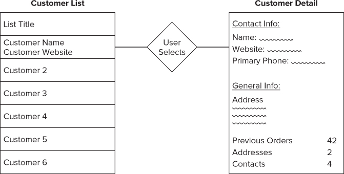
In the example you see two screens. On the left side is a repeating set of information for each customer in the list. The list just displays the primary pieces of information. Selecting an item transitions it to a screen (to the right) that includes more details about that particular customer. Neither of these screens is specific about platform UI control, or even the location of the control. The purpose of this diagramming exercise is to identify the data and where within the app it will display. Layout can be tackled in a different whiteboarding exercise.
Diagramming Activities
The first step in application workflow design is defining the exit points for each screen. One suggestion might be to start with an initial screen and work your way out. Here you explore how to diagram different tasks associated with a customer. A user sitting at the customer detail screen might have several tasks that can be performed on that customer. Possibilities include things such as editing the customer's profile or starting a transaction for that customer. Figure 2.3 is an example of what a rudimentary activity diagram might look like.
Figure 2.3 This activity diagram is useful for designing the Customer screen.
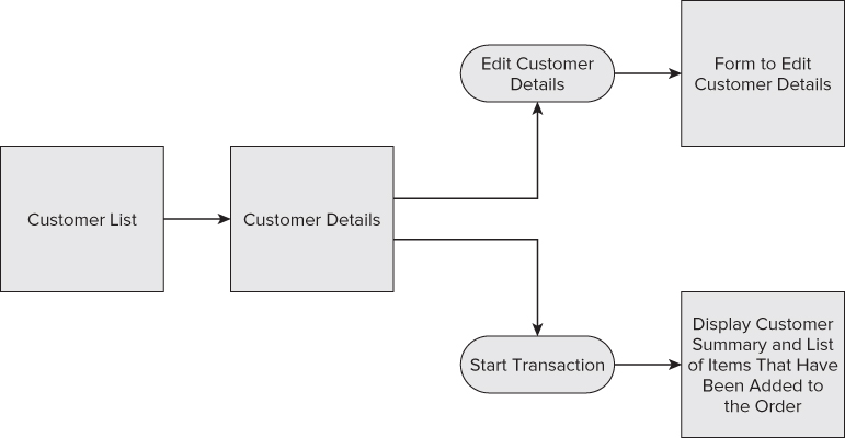
In the diagram in Figure 2.3, the ovals contain descriptions of actions that can be taken from the Customer detail screen, whereas the boxes identify screens and the data they display. Here you see three exit points from the Customer details screen. A user can choose to edit the customer, start a transaction for the customer, or return to the customer list screen.
So, how does this all fit into the MVC design pattern? Whiteboarding exercises such as an activity diagram can be directly translated to general development tasks. Each piece of data displayed on the screen must be retrieved by the Model. Each exit point on the screen must be coded to reach a new endpoint through the Controller. The whiteboard exercise can help development teams formulate what Views will contain while getting a feel for the amount of data and complexity of the exit points.
Whiteboard exercises can also serve as a good way to create UI interfaces for different platforms. Although object-oriented languages do facilitate rapid application development, nothing is as down and dirty as a whiteboard. Even the worst art class dropouts can usually draw a few shapes that can resemble native controls. After the data and actions are defined for each screen, the inevitable question is: How will they be displayed? Each platform comes with its own set of controls and its own UI best practices. Even with the variations, it's possible to draw general UI principals in a whiteboard mock up.
Using Functional Prototypes
Before investing in a team of database developers and software testers, you need to create a functional prototype. The prototype can display canned data and doesn't need to include every screen. It just needs to be sufficient to provide a solid walk-through of the primary tasks of the application. There is a lot that goes into a finished enterprise software application; a good functional prototype can help verify the complexity of the application will not outweigh the return on investment, and in so doing, save on the bottom line.
Functional prototyping, also referred to wireframing, is a development strategy that uses basic UI controls to construct application workflows. Each screen in the prototype needs only one valid navigation point, and the entire navigational structure of each screen does not need to be completed. Restricting the wireframed app's functionality to a few tried-and-true paths through the app, sometimes called happy paths, is good practice. The objective of the prototype should be to demonstrate the app with tried-and-true navigational paths through it. Developers should refrain from hardening the app to a point at which users can deviate from the happy path and expect the app to respond robustly.
Development of these applications can generally occur rapidly with today's modern languages. Leveraging C# and .NET across all the platforms adds icing on the cake. Building a minimal application with a skeleton look and feel with little graphic pizzazz can still provide great feedback to the project stakeholders. It can also serve as an indicator for the potential level of effort some of the application's development tasks might take.
Prototyping Pitfalls
There are plenty of pitfalls you need to avoid when venturing into wireframing your mobile project. You need to keep in mind the purpose of the exercise. If the goal is to create a functional walk-through of the app, it can be easy to walk into the pitfall of focusing only on the straightforward workflows. Using a prototype is an opportunity to work through the more difficult workflows and perhaps create multiple solutions to explore the differences in feasibility and user acceptance between them.
You do not need to add polish and shine to your functional prototype. Wireframing is not the time to get bogged down with fancy graphics or lengthy implementation tasks. If something is difficult to implement, take a few minutes to note the challenges, and then put a placeholder screen in that location. The placeholder screen could consist of nothing more than a single control that contains a screenshot from previous prototyping exercises in the application design process. The purpose of the functional prototyping exercise is to size up the task and put a basic application in the hands of the subject matter experts.
Creating Functional Prototypes
Consider a customer management theme. Let's look at what your prototype might look like. You addressed the customer and customer editing. From those workflows you can derive two workflow paths and three screens. When you start discussing screens, it immediately brings the platform back into the discussion. You cannot create a prototype without implementing it on more than one platform. For the purpose of this example, start with the console. Although the console is not likely a target platform for most implementations, it nicely illustrates how native UIs can translate down to the lowest common denominators on less capable platforms. In addition, the user experience can individually be raised to the level typical of each native platform.
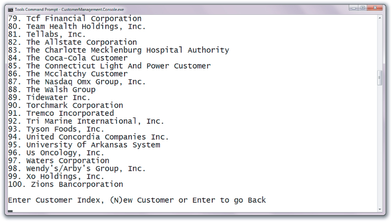
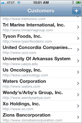
The first screen to look at is the customer list screen (see Figure 2.4). In the console, the content is straightforward: a numbered list. Choosing a number can bring the user to the details of that customer. It's not likely this prototype can be improved, so its look and feel would likely stand as-is.
Figure 2.4 A functional prototype can be created to display a customer list.
A little more work goes into wireframing the application on an iPhone (as shown in Figure 2.5), and there is usually a great discrepancy in the graphical sizzle in the prototype as compared to the final application.
Figure 2.5 The customer list prototype looks different on an iPhone.
The customer look-up screen on the iPhone can be improved in countless ways. The native UI controls available for today's smartphone and tablet devices include transparency, tint, shading, and color gradients. A developer with UI expertise or a strong graphical eye can spend painstaking hours tweaking those settings to achieve a beautiful application. A prototyped app is, of course, not the place to invest this kind of effort.
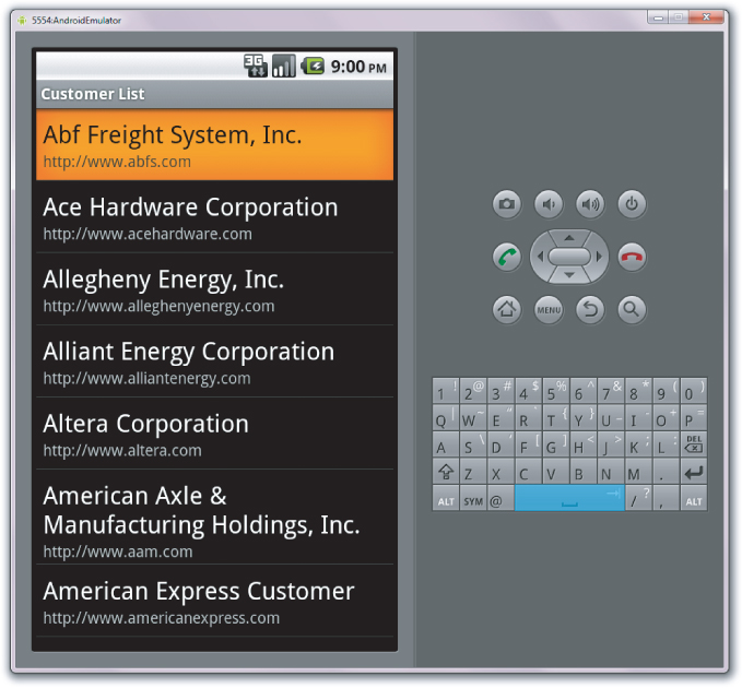
Similar to the iPhone's application, the Customer Management app on Android can be spruced up using countless graphical tricks and secrets (see Figure 2.6). With Android controls being laid out in XML, it's possible for coders to hand off styling tasks to those who are graphically inclined. For developers with both graphical and software development skill sets, application development for the Android platform will exercise both skill sets.
Figure 2.6 The Android Simulator displays the customer list prototype.
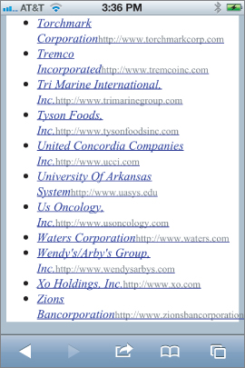
Web-based implementations can take advantage of those same graphical skill sets, because the HTML can be laid out in any tool the designer chooses (see Figure 2.7).
Figure 2.7 The customer list prototype displays on an iPhone.
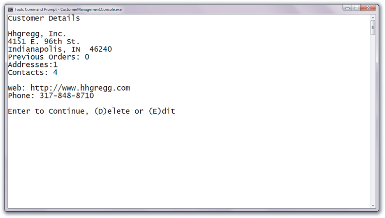
Although the customer list on the prototype could be improved, there still isn't much to that screen. If you look at the customer details screen, you see there is more to display. Looking at the console screen in Figure 2.8 you see something that closely matches the Customer Detail screen whiteboarded in Figure 2.2. Because of the graphically limiting nature of the console, it's no surprise the elements on the screen closely match the properties from your Model.
Figure 2.8 The customer detail prototype displays in the console with little or no graphics.
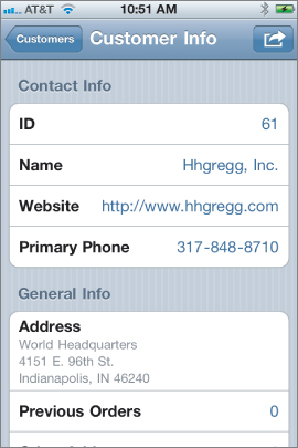
As you move to the prototype on the iPhone, you can focus on the screen location of each piece of data. Although the general look and feel of the final software product is important, hard-coding information into native controls or HTML base views can speed up prototyping. HTML generally cannot provide all the functionality of standalone native applications, but it can be leveraged to provide reusable UI between devices. Figure 2.9 shows the iPhone version of the customer details screen.
Figure 2.9 The iPhone displaysthe customer detail prototype.
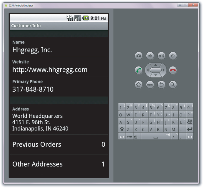
The Android UI, shown in Figure 2.10, is built using a few basic native controls to display the different pieces of information about the customer.
Figure 2.10 The Android Simulator displays the customer detail prototype.
Obtaining User Feedback
One of the advantages of prototyping an application is that it provides a skeleton application that members of the targeted user base can test. To make the most of such an opportunity, the prototype application must be hardened a bit. Generally speaking, usability testing is about letting the end user work throughout the app. The data can still be canned from local XML files or hard-coded in to the C# code. However, workflows need to be robust enough for the user to experiment with the app. The user might not want to move through the prototyped workflow exactly as you envisioned it. Getting that feedback early in your application development cycle can be crucial in preventing the development of undesired workflows or functionality.
Using Agile Iterations
Application development teams no longer need to pigeonhole their efforts into following a waterfall-style development approach. Designing the user interface is a great time in the development cycle to embrace Agile development practices. Such practices center around not being locked down to requirements for long periods of time. Although you need to keep a consistent requirement while developing a feature, the development cycle should never be so long that throwing away the work is too costly. Quick development cycles enable you to gather feedback in a timely manner.
The principles of Agile development rest firmly in achieving an outcome of functional software, not producing pristine documentation or dogmatically following processes. Agile practices generally start with chunking the development tasks into small pieces of functionality. When the application's functionality is compartmentalized to discrete pieces, it enables development groups to turn around working software in shorter time periods. The sooner pieces of functionality can be evaluated by the end user, the sooner the project stakeholders can be assured the investment is on the right track. Consequently, the same is true if functionality does not meet the end user's need. The ability to modify the development direction earlier in the development life cycle means more efficiency and happier end users.
One of the cruelest penalties in software development is creating applications that don't get used, or worse, are thrown away before they make it into production. The penalties feel the worst when you've gone through formal testing of code. Hot-off-the-press code usually includes a few bugs; that isn't anything new. Getting applications to enterprise grade takes a few more steps. You must take the time to get user feedback early and often. Users can ultimately judge whether the application is worthy of daily use.
For the investment to pay off, the application must be accessible, intuitively usable, and responsive. Individual user groups may vary in their determinations of whether an application meets those criteria; however, getting your software in front of them increases adoption. Agile development is a tool designed for that purpose.
Collaboration is at the heart of an Agile development process. It's the development team that is well-versed in the principles and best practices for creating software, but the user group is best qualified to envision the day-to-day use and function the application needs to fulfill. Demonstrating functioning software to users is, by far, the best way to communicate the development team's ideas and develop a shared vision with the project stakeholders.
Developing carefully crafted designs for applications that will be deployed across several platforms requires a lot of groundwork. The code portability options provided by the Mono toolsets can increase productivity and maximize the deployability of each line. And just as with desktop development, over-engineering solutions can slow down your implementation schedule. Those same perils can exist in developing mobile applications, but they become amplified when the implementation is extended to multiple platforms. Keeping your design simple is imperative when managing scope, risk, and delivery of the software.
The exercises discussed in this chapter are not a set of sequential steps. The necessity of whiteboarding and prototyping varies with each application. The same can be true for diagramming data. The important thing to remember is that each requirement or implementation detail you flesh out in the design phase can prevent unnecessary code from finding its way into the development effort of multiple platforms.
In the next chapter you look at the development environment. You learn who makes the tools and where to find the software development kits.