Chapter 7
Putting Your Best Foot Forward with Your Website
In This Chapter
![]() Discovering website usability and design
Discovering website usability and design
![]() Forming calls-to-action that get results
Forming calls-to-action that get results
![]() Constructing landing pages that work
Constructing landing pages that work
![]() Verifying and optimizing website conversion points
Verifying and optimizing website conversion points
If you have to absolutely nail one thing for lead generation success, it is your website. Your website tells a lead who you are, what you do, and why she should care. It is your calling card, and if you don’t get it right, your lead is going to shrug, turn around, and leave. As Kissmetrics, a blog about website analytics and testing, puts it, “Your leads are only as good as the website that produces them.” Powerful words, and so true.
In order for your lead generation strategy to be effective, your website needs to be the ultimate lead generation tool because that is where you are going to be driving the majority of your traffic.
A good lead generation website should have great copy, clear calls-to-action (CTAs), efficient forms, and attention-grabbing content. But the trick is creating a healthy balance between good lead generation tactics and a well-designed and usable website for ultimate conversion.
You have many different goals for your website, and you don’t want it to end up looking like a crazy lead generation website from 2006, like in Figure 7-1.
The trick is to make sure your viewers know exactly what to do and where to do it. And if you can clean up a cluttered website, your conversion numbers will steadily move upwards.
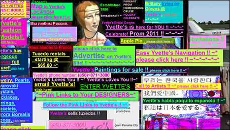
Figure 7-1: A lead generation website design to avoid.
Here are some convincing statistics from Kissmetrics on website viewers and conversions:
- You have zero to eight seconds to reach users with a compelling headline and landing page. After eight seconds, the majority of visitors leave.
- Approximately 96 percent of visitors who come to your website are not ready to buy.
- The more landing pages you have, the more leads you are likely to get.
Exploring Website Usability and Design
Think of your website’s utility and usability as the baseline for your website lead generation strategy. A website that looks great can only get you so far. You need your website to be functional. By functional, I mean that your website has to be logical to the buying personas visiting it, must do what you intend it to do (inform visitors and move them along the lead lifecycle), and should provide clear conversion paths for your viewers. To be truly effective with your website design, you need to take a user-centric approach to your thinking — how does a viewer consume information, where is she most likely to click, and how does he want to navigate your site? (If you haven't yet read Chapter 6, which discusses creating buyer personas, now's the time to do it.)
If you are only thinking in terms of raw lead generation and bombarding your viewers with a million calls-to-action in hopes of throwing some spaghetti at a wall and seeing what sticks, you will likely find that your website isn’t very effective at actually generating qualified leads.
Instead, think about how you view a website. Where do you navigate to? What are some examples of where you have bounced off of the site due to poor usability? Also, think of some websites that you really admire. Who does a good job at telling you exactly what to do and how to do it?
Making your site scannable
If you understand how your visitors think about navigating a website, you can make smarter choices. According to Smashing Magazine, “Basically, users’ habits on the web aren’t that different from customers’ habits in a store. Visitors glance at a new page, scan some of the text, and click on the first link that catches their interest or vaguely resembles something they are looking for. In fact, there are large parts of the page they don’t even look at.”
The key takeaway here is to make sure that your calls-to-action (CTAs) are clear and your content concise.
A recent usability study conducted by Jakob Nielson, principal analyst at Nielson Norman Group, claims that website viewers only read about 28 percent of the text on a web page. Therefore, you need to make your point as quickly and concisely as possible. For instance, if you want to include a tagline on your home page, make sure that it illustrates what your company does. Also, be sure to break up the text with headings and subheadings to optimize for website skimming.
Figure 7-2 shows an example from a Mashable article illustrating two different versions of their website copy — one with headings and one without headings. The one with headings is easier to skim, making it more digestible for a website visitor.
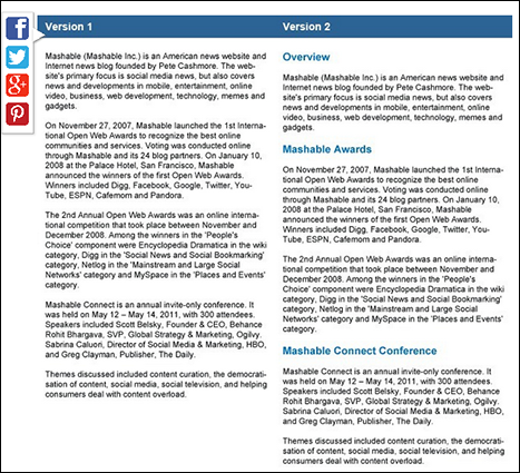
Figure 7-2: Mashable’s scannable website copy.
 You can also implement a heat mapping technology such as Crazy Egg to get a better visualization of where people click, where they scroll, and how they interact and read your website. This can help you make better decisions when it comes to how you lay out your text and where you put your CTAs. Figure 7-3 shows an example of Crazy Egg heat mapping — the darker areas on the heat map show where a visitor clicks, scrolls, or interacts with the page in some way.
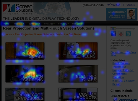
Figure 7-3: A Crazy Egg heat map.
Implementing clear conversion paths
In order for a website visitor to become a lead, you have to tell him where to go and what you want him to do. This sounds easy, but in reality can be quite difficult, especially if multiple groups within your company have input into what goes on your website. Smashing Magazine explains, “If the navigation and site architecture aren’t intuitive, the number of question marks grows and makes it harder for users to comprehend how the system works and how to get from point A to point B. A clear structure, moderate visual cues, and easily recognizable links can help users find their path and aim.”
Remember that crazy website in Figure 7-1? That is an example of a site with extremely poor conversion paths. Too many conflicting messages and not enough direction. Most likely, when a viewer comes to your site, she knows what she is looking for. Whether it is your latest content asset, or a product demo, show her where to go so that she can download that asset or fill out a form for that demo, quickly.
Take a look at Figure 7-4, which illustrates Salesforce’s (www.salesforce.com) home page navigation. If I am looking for information about one of their products, I can easily head to the Products tab, where they give a breakdown of each product they offer and a brief descriptor. Or if I am looking for information on what industries they serve, I can easily navigate to the Industries page for a clear breakdown. Their navigation is intuitive and easy.
Many marketers attempt to put a creative spin on navigation verbiage — thinking that it looks more creative and appealing to the viewer. However, nothing beats good old-fashioned simplicity when dealing with the equivalent of virtual signposts on your website. Cute or witty synonyms for navigation verbiage only serve to puff up a marketer’s ego at the cost of leads that leave your site because they’re confused about where to go. Remember, you’re a click away from being abandoned, so keep it simple.
After a viewer successfully finds the information he needs, make it easy for him to click on the correct CTA or fill out the right download form.
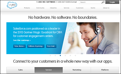
Figure 7-4: Salesforce’s website has intuitive navigation.
Still using the Salesforce example, say I want information on their sales product, Sales Cloud. I click the corresponding navigation, and the first screen I get is a concise description of Sales Cloud and a CTA to view a demo. Check out what I mean in Figure 7-5. Their demo CTA is visual, appealing, and very large. There is no question what they want me to do.
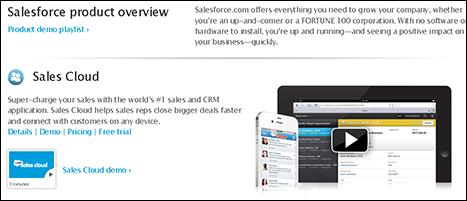
Figure 7-5: Salesforce’s website has a clear demo request.
Improving website readability
The other key item to keep in mind is your website readability. As I pointed out earlier, viewers like to scan, so your copy must be clear, concise, and readable. In fact, according to the usability study conducted by Jakob Nielson, “A 58 percent increase in website usability can be achieved simply by cutting roughly half of the words on a website page.”
Using too many fancy words that take up room but leave the visitor uninformed as to what your business does helps no one. Make sure your vocabulary is appropriate for someone at a more junior reading level. I’ve read suggestions to target an eighth-grade reading level, and I’ve also seen suggestions for fifth- to sixth-grade. This is not to say your viewers are not intelligent, but it means you should keep concepts straightforward and concise.
So many marketers are stuck on wordy descriptors, but try to view your website as more utilitarian — the shorter, the better.
To get a sense of where your site ranks on the readability scale, check out www.read-able.com. This is a free readability test tool. Simply type in your website's URL to get a readability score and explanation.
Keep in mind that most often, your viewers are going to scan for keywords that are applicable to what they are looking for on your website, so make sure your main points and keywords are front and center. Consider putting them in your headings and breaking up each page by using strategically placed bullet points. This focuses your readers’ attention so they know exactly what they should be looking at.
Figure 7-6 illustrates using bullets to break up text and draw the eye. This example is from the Marketo website and explains the company's lead nurturing functionality. Note how “key features” jumps out. The page uses bullets and bold type to draw attention to the key benefits of their lead nurturing software. These benefits also serve as keywords for what your visitors could be looking for.
In fact, according to an eye tracking study by ClickTale, users concentrate more on and are drawn to copy with bullets and bold text. Their study is illustrated in Figure 7-7, which shows how long participants focused on bulleted and bold copy.
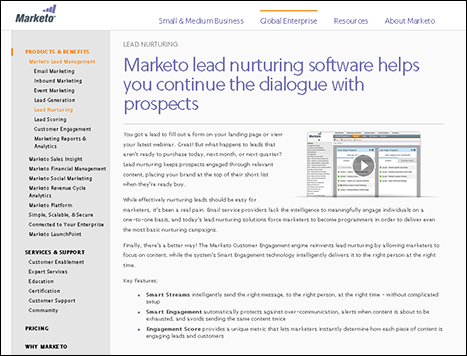
Figure 7-6: Use bullets and bolding to make key points stand out.

Figure 7-7: A ClickTale eye tracking study.
Creating Calls-to-Action (CTAs) That Convert
The bread and butter of a great lead generation website are your calls-to-action (CTAs). What is a CTA? According to HubSpot, a CTA is “an image or line of text that prompts your visitors, leads, and customers to take action. It is quite literally, a ‘call’ to take an ‘action’.”
But what is that action? It could be anything from contacting your sales team directly, to downloading an ebook, signing up for an event, and so on. A CTA can live anywhere on your website and is typically asking the visitor for his information — resulting in a fresh new lead entering your database.
The trick is making sure that your CTAs are well placed, stand out, provide very clear instructions, and align to a specific lead generation initiative. Figure 7-8 shows an example of a CTA asking the visitor to download an ebook. Notice that there is no question what the website is asking the visitor to do.
Figure 7-8: A clear CTA.
Working with CTA best practices
Before I dive into specifics around where to place your CTAs for the best conversions, I want to go over some CTA best practices. Although they seem very easy, CTAs can get tricky if you overthink, overcomplicate, and overdesign them.
When developing your optimal website CTAs, here are some best practices to keep in mind:
- Your CTA must stand out: The number one thing to consider when developing the look of your CTA is that it must stand out. This can be done by using a bold color, clever website placement, or by making your CTA appear large on the page. Just be sure that you aren’t cluttering your page or taking away from your overall website design.
- Clearly define what you want the lead to do: You need to be very clear and concise when it comes to CTA copy. A lead won’t click on a button if she isn’t exactly sure what action she will be taking. Start your CTA with a word that’s a verb so that it already assumes action will happen. Instead of having a vague button that says Download, you can be more exact by having the button text read, Download ebook. You want to make sure your lead knows what he is getting and how he is getting it.
- Create urgency: A good best practice is to create urgency with your CTA by offering a time-sensitive special or deal. Let your lead know that by acting now, she can receive an extra discount or a limited offer. For instance, maybe it is the end of the month and you need additional leads, so you are offering a $50 Amazon gift card with a product demo. Make sure that this information is on your CTA to encourage visitors to act immediately.
- Position prominently: Whether it is a CTA on your home page or another page on your site, make sure your chief CTA is positioned in a prominent location. Place your top CTA above the fold (the portion of your website visible without scrolling), have a sidebar that moves as a visitor scrolls, or place it in an obvious spot at the top or side of the page.
Leveraging the home page CTA
Now that I've gone over some key best practices to get you thinking about how to create an effective CTA, I want to talk through some examples. The most important lead-generating CTAs are going to live on your home page. Don’t think you have to limit your home page CTA to one. You can have a few: Just make sure you prioritize them through intelligent placement.
As Figure 7-9 indicates, this home page has four CTAs above the fold. The most important ones are showcased as orange buttons — 4 Min Demo, Contact Us, and Free Trial. Additional copy reads Want to learn more? Get started now, with an arrow pointing to the CTAs. This draws the eye and entices people to click. Each of these CTAs goes to a form that captures lead information.

Figure 7-9: Marketo home page CTAs.
Also note that the home page has another CTA above the fold: See What We Do. If a person is curious as to what Marketo does, they can click on that CTA and watch an overview video.
Marketo's site also uses secondary CTAs, as illustrated in Figure 7-10, which are slightly below the fold and showcase key content assets. However, the home page CTAs are reserved for pure lead-generation content pieces, so all content that is advertised on the home page links to a form to capture lead information.

Figure 7-10: Secondary content download CTAs.
The website has more CTAs as you scroll down, but as you get further below the fold, each CTA is a lower priority.
Another great example of a home page CTA that pops is from the software company Zuora. Their primary CTAs are housed on the side of their home page. Take a look at the lower left side of Figure 7-11 as an example. Zoura is strategic about this dynamic placement — their CTAs move with the visitor as he scrolls up and down the site.
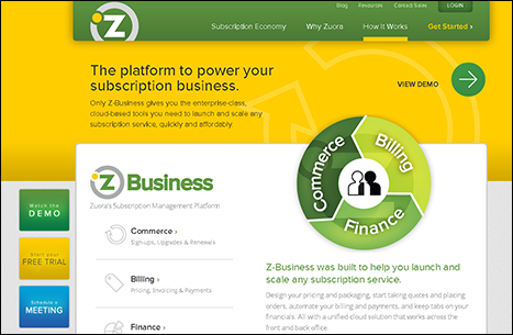
Figure 7-11: Zoura uses scrolling CTAs.
Including an obvious contact link
For many companies, a website visitor responding to a Contact Us CTA is lead-generation gold. This means that a visitor is a hand-raiser. You often don’t need to nurture her. You don’t need sales banging down her door. She is ready to talk to you. It’s critical to have an obvious Contact Us button or link.
If a person wants to contact your company and he has to jump through hoops to find your contact information, this is a major lead-generation fail (and a personal pet peeve of mine). There are no excuses for that. If I want to contact someone from your company, I want a form, a number, or something to make it easy for me to ask you a question directly or purchase your product or service.
Marketo has a Contact Us button showcased on the home page (as illustrated in Figure 7-9) and on each page on the site. However, one important factor to keep in mind with your Contact Us CTA is that it should go to a very specific landing page. Your Contact Us landing page should have a form where a lead can fill out all of his information, and you might also want to include some additional information on there — your phone number in case a lead wants to call directly, what the lead gains by filling out the form, and some additional content pieces that might answer your lead's questions.
Figure 7-12 shows an example of the Contact Us landing page form. Note that it includes a form and also includes some additional information that a lead might find helpful.
 If you have a marketing automation tool, you can often implement progressive profiling. Progressive profiling allows you to collect information and build qualification over time. Each time a person fills out a form on your site, the progressive form asks for new and different information.
In addition to the Contact Us CTA on the home page, Marketo includes a Contact Us form on each product page. You certainly don’t want someone distracting themselves from getting excited about a feature on your products page by searching for your contact information. Instead, you want to make sure that they contact you immediately!
Offering a chat option
A chat option is another touch point that can be a successful lead generation tool on your website. It is no longer used just by the customer support side of the business. Through chat, you can often engage leads who might not be ready to speak to you on the phone — which can be a substantial number of people in today’s digital world. Personally, I would rather communicate via email, social media, or chat than call a sales representative, so a chat option is great to capture leads like me. In fact, according to LivePerson, a company that offers chat services, using a chat feature increases conversion rates by 20 percent.
Chat options are common on retail websites, but are also becoming more common for other services. Marketo uses a chat feature that pops up when a visitor has been on the site for a certain number of seconds. You can easily click out of it, or you can engage with a knowledgeable representative who can answer your questions. Depending on where the visitor is on a website, the conversations can be handled either by sales development reps or by customer support agents.
Figure 7-13 demonstrates an example of a chat option. After a person clicks to chat, they have to enter their first name, last name, and email address. After the lead enters the chat, the representative is armed to answer a multitude of questions.
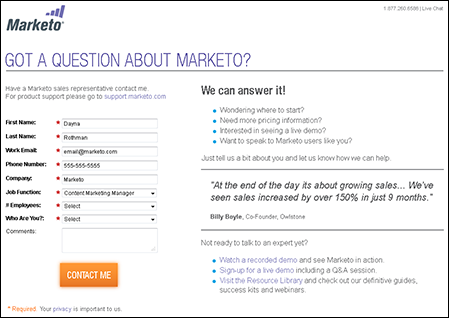
Figure 7-12: A Contact Us form.
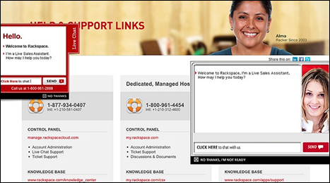
Figure 7-13: A live chat window.
Developing Landing Pages That Work
Aside from CTAs, having landing pages that are optimized for conversion is key to a good lead generating website. When a lead clicks on your CTA, you want to make sure that she doesn’t bounce — and that certainly does happen. By ensuring that your landing page, where a lead lands after she has filled out a form, is clear and speaks directly to the CTA, you have a smaller chance of that lead bouncing.
For instance, if a lead fills out a form to download an ebook and she is sent to a random webpage that has a huge list of ebooks, she might scratch her head, grow impatient, and leave (or bounce). However, if you make sure that she goes to a targeted page that applies specifically to the CTA she clicked, you are in much better shape.
Landing pages can be leveraged on your website for various reasons, including content asset downloads, demo requests, other product-specific information, events, webinars, and so on.
Landing pages are also critical for SEO (search engine optimization) reasons. A relevant ad-optimized landing page has a dramatically higher conversion rate — meaning you get more leads for your money.
Sticking with short forms
Short forms on landing pages always outperform long forms on lead generation tests. In a recent test conducted at Marketo, short forms with 5 fields had a 13.4 percent conversion rate, medium forms with 7 fields had a 12 percent conversion rate, and long forms with 9 fields had a 10 percent conversion rate.
It’s common sense, really. People don’t like filling out a lot of information about themselves. Not only is it time-consuming for your visitors, but they also don’t want to get calls and emails, especially when they’re in the early stages of research about your company. So the more information they have to put in, the more time they have to weigh the pros and cons of filling out your form.
As a best practice, only ask for what you really need. And if you have marketing automation, you can employ progressive profiling. That way, your website can intelligently know what information your visitor already filled out. For instance, if he already gave you his name, email address, and title, this information can be retained in your marketing automation system. The next time he fills out a form, you can ask for company, industry, phone number, and so on.
For B2B companies, some marketing products are able to capture the IP address of the website visitor, make assumptions about where she works, and use that information to prefill a form. This assumes that a visitor is researching products or services from work.
When creating a form for a landing page, consider sticking to these five fields:
- First Name
- Last Name
- Work Email
- Job Function
- Industry
For an example of different form lengths and what information you could potentially ask for, take a look at Figure 7-14, which shows the short, medium, and long forms that Marketo tested in their benchmark study.
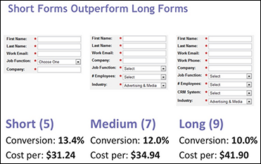
Figure 7-14: Varying form lengths.
Designing for success
Well-designed landing pages lead to conversions. This is a fact. A messy, poorly written, and poorly optimized page equals a high bounce rate. Of course, every business is different, with different products and different target audiences, so you need to test to know what works best for you.
However, as a starter, consider these following best practices for landing page design and layout:
- Build some templates: Build some HTML templates to use. If you have a marketing automation tool or email service provider (ESP), this is even easier. But remember, this isn’t your home page, so remove all of the navigation. Your templates should be simple — distractions kill conversions!
- Always think about graphics: Your landing page should be simple. Include a logo and a hero shot. A hero shot is the primary image that illustrates your CTA. Think of a mock-up of your ebook, a photo of your webinar speaker, and so on. Also think about making your graphics clickable. People tend to click on graphics.
- Focus on concise copy: Make your copy straight and to the point, but give your lead a good reason to give you her information. Here's a simple formula to remember: Set up the problem, talk about your solution (or offer), and deliver the goods (an ebook, video, or webinar registration). Also make sure you have bullet points and a great, eye-catching headline.
- Think about reassurance and trust: Your prospect is risking her privacy by filling out your form. She is probably giving you her email and phone number, so add some reassuring elements to your landing page. Consider mentioning privacy statements, customer testimonials, guarantees, and awards won by your business.
- Use confirmation and thank you pages: It’s just plain good manners to say thank you after getting something you want! So have a page that both confirms the form submittal and lets your lead know that you appreciate his time. Do you have something else your lead may be interested in? Make another offer! The confirmation page is a great place to deepen the relationship with additional offers.
- Pay attention to your page URL: This is especially important, and an area that many people ignore. The name of the page, along with the rest of the URL path, is weighed fairly heavily on search engines. You can use up to 1,024 characters, so you don’t have to be stingy! Also use dashes between words instead of underscores, for SEO purposes.
- Use metadata: In the early days of Internet search, the importance of metadata was beaten into everyone's heads. Metadata are words used within a web page to provide basic information to search engines about that site. For example, if I write a blog post, there could be metadata that states that the author is Dayna Rothman. Although we don’t hear about it much anymore, search engines still view it as important. They use it one way or another and typically weigh metadata in results lists. So enter a title and craft good 100-word descriptions as well as keywords.
Figure 7-15 shows an example of a landing page for an ebook from a mobile app development company called Kinvey. Notice the hero shot, the bullet points, the short form, and the privacy information.
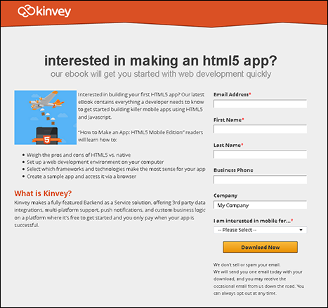
Figure 7-15: The Kinvey landing page.