Chapter 6
Improving Your App
In This Chapter
 Improving the look of an app
Helping people in other countries use your app
Getting your app to communicate with the outside world
Face it — the app in Chapter 5 of this minibook is boring! Really boring! Who wants to click a button to see the words Pepperoni Extra Cheese on a device’s screen?
In this chapter, you improve on the app that you created in Chapter 5. I can’t promise instant excitement, but with modest effort, you can add features to make the app more interesting. (I confess: In this chapter, the real reason for making the app interesting is to show you some additional Android developer tricks. Anyway, read on …)
Improving the Layout
In addition to being boring, the app in Chapter 5 is ugly. You can improve an app’s look in two ways — the way it looks to a user and the way it looks to another developer. In this section, you do both. When you’re done, you have a layout like the one in Figure 6-1.
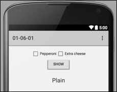
Figure 6-1: Your mission, should you decide to accept it.
Before creating the layout’s code, I want to make some observations about the layout in Figure 6-1:
- The button is below the pair of check boxes.
- The check boxes are side-by-side.
- The pair of check boxes is centered (side by side) on the screen.
- The button is centered on the screen.
- Taken as a group, the check boxes and the button don’t fill the entire screen.
You may wonder why I make these five observations and not others. If so, read on.
-
Launch Android Studio and create a new Android project.
For details on creating a new project, see Chapter 3 of this minibook.
-
In the Designer tool’s preview screen, select the Hello World! text view.
It’s time to get rid of this silly text view.
-
Press Delete.
Goodbye world!
You want something that aligns objects vertically so that the button is below the pair of check boxes.
-
Click the LinearLayout (Vertical) element in the palette’s Layouts group. Then click in the preview screen.
As a result, the new LinearLayout (Vertical) element’s outline appears on the preview screen.
-
Click the Button element in the palette’s Widgets group. Then click inside your vertical linear layout element in the preview screen.
Voilà! Your app has a button.
Next, you want something that aligns objects horizontally so that the check boxes are side by side.
-
Click the LinearLayout (Horizontal) element in the palette’s Layouts group. Then click inside your vertical linear layout element in the preview screen.
Try to place the horizontal linear layout element above the button. If you have trouble doing that, go to the Component tree and drag the
LinearLayout (Horizontal)branch so that it’s above thebuttonbranch but still subordinate to theLinearLayout (Vertical)branch. (See Figure 6-2.)Next, you put the check boxes into your horizontal linear layout.
-
Click the CheckBox element in the palette’s Widgets group. Then, click inside the horizontal linear layout element in the preview screen.
If you have trouble clicking inside the horizontal linear layout, place the check box anywhere on the preview screen. Then, in the Component tree, drag the
checkBoxbranch so that it’s subordinate to theLinearLayout(Horizontal)branch. -
Click the CheckBox element in the palette’s Widgets group again. Then click in the preview screen to the right of the first check box.
Like the first check box, this second check box is inside your horizontal linear layout.
The button and the two check boxes might not be centered side by side on the screen. You want to fix that, and I show you how in the next step.
-
In the Component tree, select your horizontal linear layout element.
You can try selecting this element in the preview screen but, for an element with nothing but a border, it’s easier to do the selecting in the Component tree.
-
In the Properties panel, look for the
gravityentry. Don’t confuse the
 layout:gravityentry with thegravityentry. They’re two different rows in the Properties tree. One of them (thelayout:gravityentry) is associated with anandroid:layout_gravityattribute in the layout’s XML code. The other (thegravityentry) is associated with anandroid:gravityentry in the layout’s XML code. (I know. This couldn’t be more confusing. With any luck, the material in Book IV, Chapter 1 can help you sort it all out.) -
In the Properties panel, the
gravityentry is a branch of a tree. Expand this branch and put a check mark in thecenter_horizontalitem within that branch.The
gravityproperty helps determine the positions of objects inside a layout (in this example, inside your horizontal linear layout element). Thegravityvaluecenter_horizontalcenters objects side by side within the layout. After checking thecenter_horizontalitem, notice that the two check boxes are centered (side by side) in the preview screen. - In the Component tree, select your vertical linear layout element.
-
In the Properties panel, expand the vertical linear layout element’s
gravitybranch. Put a check mark in thecenter_horizontalitem within that branch.When you do this, the button snaps sideways to the center of the preview screen.
The vertical linear layout element holds the check boxes and the button, but there’s another widget in Figure 6-1. (It’s a TextView displaying the word Plain.) To make room for this additional widget, you want to tell Android that the vertical linear layout doesn’t fill up the entire screen. The next step tells you how to do that.
- With the vertical linear layout element still selected, look for the
layout:heightentry in the Properties panel. -
Click in the right column of the
layout:heightentry. In the drop-down list that appears, selectwrap_content.As a result, your vertical linear layout element shrinks so that it’s large enough for only the two check boxes and the button.
You have a bit more work to do, but the work isn’t burdensome.
-
Change the text on the check boxes and the button so that it matches what you see in Figure 6-1.
Don’t worry about the word Plain in Figure 6-1. You work on that in the section “Reusing a layout,” later in this chapter.
For help changing the text, see to Chapter 5 of this minibook.
-
Set the
onClickproperty of the button toonButtonClick.For help setting the
onClickproperty, see Chapter 5 of this minibook.
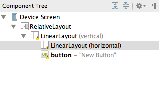
Figure 6-2: The Component tree (what you have so far, anyway).
Creating a reusable layout
The check boxes and the button in Figure 6-1 are useful in more than one situation. You might place these widgets in an app with a confirmation word (such as the word Plain in Figure 6-1). You might use the same widgets in a different app with a picture of a pizza below the widgets. One way or another, it’s worth your while to save the layout containing these widgets. You save these widgets in a new layout resource document (a blahblah.xml document in the res/layout directory). This section tells you how to do that.
- Open the project that you created in this chapter’s “Improving the Layout” section.
-
In the preview screen, click in a neutral place inside the vertical linear layout that you created.
Make sure that you see the outline of the layout that contains both check boxes and the button. If you have trouble selecting this layout, you can ignore the preview screen and select the
LinearLayout (Vertical)branch in the Component tree. -
In Android Studio’s main menu, choose Refactor ⇒ Refactor This.
A pop-up menu containing the Style and Layout options appears.
-
In the pop-up menu, select Layout.
An Extract Android Layout dialog box appears.
-
In the dialog box’s File Name field, type the name of your new resource document.
In Figure 6-3, I type reusable_layout.xml.
The names of Android’s resource files must not contain capital letters. You can use lowercase letters and underscores. You cannot use Java’s customary “camelCase” naming convention with names like reUsableLayout.xml. And, yes, a layout filename must end with the extension.xml. -
Click OK to close the dialog box.
The
app/res/layoutbranch in the Project tool window now has a new item. If you named the file as I did in Step 5, the branch is labeledreusable_layout.xml. -
Double-click the
reusable_layout.xmlbranch in the Project tool window.Android Studio displays the Designer tool for the
reusable_layout.xmlfile. -
Make sure that the Designer tool is in Design mode (as opposed to Text mode).
In Design mode, you can see the Component tree.
-
Make note of the labels on the branches in the Component tree.
Look for names like
checkBox,checkBox2, andbutton. (See Figure 6-4.) You use these names (these id values) in the code that you write later in this chapter. To change an element’s id, double-click that element in the preview screen. The resulting pop-up menu has a text field labeled id. Change whatever is entered in that text field.
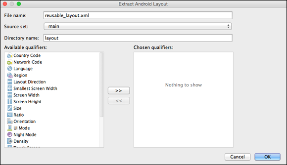
Figure 6-3: The Extract Android Layout dialog box.
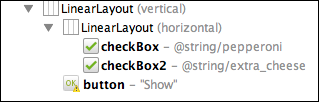
Figure 6-4: The Component tree.
Congratulations! You have a group of widgets that you can use and reuse.
Reusing a layout
In the “Creating a reusable layout” section, you create a layout with check boxes and a button. You can reuse this layout in many of this chapter’s examples. Here’s how:
-
Follow the steps in the “Creating a reusable layout” section.
If you’re impatient, you can skip a few of that section’s steps, but be sure to create a
reusable_layout.xmlfile and to populate the file with a few widgets. - In the Project tool window, select the project’s
reusable_layout.xmlfile. -
In Android Studio’s main menu, choose Edit ⇒ Copy.
You don’t see much happening, but now your Clipboard contains a copy of the
reusable_layout.xmlfile. - Start a new Android project.
- In the Project tool window, select the new project’s
app/res/layoutbranch. -
In Android Studio’s main menu, choose Edit ⇒ Paste.
Now the
app/res/layoutbranch contains areusable_layout.xmlfile. -
Open your project’s
res/layout/activity_main.xmlfile.When you do, you see your new project’s preview screen (which is mostly empty).
-
In the Custom group in the Designer tool’s palette, click the <include> item.
The palette has its own scroll bar. Use this scroll bar to find the palette’s Custom group.When you do this, a Resources dialog box appears. (See Figure 6-5.)
-
In the Resources dialog box, select your reusable layout — the one you named
reusable_layout.xml; then click OK.The Resources dialog box closes.
-
Click in the Designer tool’s preview screen.
As if by magic, the stuff that you created in the “Creating a reusable layout” section appears on the preview screen. (Well, anyway, it looks like magic to me.) This stuff appears as one group, so you can drag that group around in the preview screen.
-
If necessary, reshape the newly included group (two check boxes and a button) by dragging its edges in the preview screen. Also, drag the entire group so that it’s centered inside the preview screen.
If all goes well, your layout looks like the stuff in Figure 6-1.
In the next step, you add the word Plain to your app’s screen. (Refer to Figure 6-1.)
- From the palette, place a Large Text element on the preview screen.
- Replace the Large Text element’s placeholder text with the word Plain.
-
(Optional) If you’re very ambitious, follow the steps in Chapter 5 of this minibook for coding your app’s behavior. Then run your app.
Ambitious or not, you have a decent-looking layout with a reusable component. Nice work!
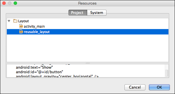
Figure 6-5: The Resources dialog box.
Starting Another Activity
As I mention in Chapter 4 of this minibook, an Android activity is one “screenful” of components. So juggling activities is a major endeavor for Android developers. This section’s example does the simplest thing you can do with an activity — namely, make it run.
-
Launch Android Studio and create a new project.
In this section’s listings, I name the application
01_06_01, and I name the packagecom.allyourcode.p01_06_01. -
Follow the instructions in the earlier section “Reusing a layout” to include
reusable_layouton your new app’s screen.You have two check boxes and a button. When a user clicks the button, you want Android to display a different activity’s screen. So you have to create another activity.
Let’s get cracking …
-
In the Project tool window, right-click or (on a Mac) Ctrl-click your project’s
app/java/your.packagebranch.In Listing 6-1, the package name is
com.allyourcode.p01_06_01. So I Ctrl-click my project’sapp/java/com.allyourcode.p01_06_01branch. -
In the context menu that appears, choose New ⇒ Activity ⇒ Blank Activity.
A dialog box appears. (You see this dialog box whenever you create a new blank activity. The dialog box is labeled Choose Options for Your New File.)
-
In the dialog box, fill in the Activity Name and Layout Name fields.
In Listings 6-1 and 6-2, I refer to
OtherActivityandother_layout. So, if you’re following along letter for letter with these instructions, type OtherActivity in the Activity Name field, and type other_layout in the Layout Name field. You can accept the defaults for all the other fields in the dialog box. -
Click Finish to close the dialog box.
Your new
other_layoutnow appears in Android Studio’s Designer tool. -
(Optional, but worth doing.) In this step, you don’t have to do anything. Just look at something! In your project’s
AndroidManifest.xmlfile, notice the following code:<activityandroid:name=".OtherActivity"android:label="OtherActivity" ></activity>Android Studio added this
<activity>element when you createdOtherActivityin Steps 3 through 6.Each activity in your application must have an
<activity>element in theAndroidManifest.xmlfile. In an<activity>element, theandroid:nameattribute points to the name of the activity’s Java class. In this step, the attribute’s value is “.OtherActivity". The initial dot refers to the application’s package name (the namecom.allyourcode.p01_06_01from Step 1). The rest of the attribute refers to the class name in Listing 6-2. Each activity in your application must have an
 <activity>element. If you’re missing an<activity>element, the app can’t start that activity. (Instead, the app crashes, and you see an Unable to find explicit activity message in the Logcat panel.) -
With
other_layoutshowing in the preview screen, drag a Large Text element from the palette ontoother_layout.Now, other_layout has a TextView element (with large text).
Your project has two activities (two Java files) and a layout for each activity (two XML files in the Project view’s app/res/layoutbranch). In addition, your project has areusable_layoutthat’s included inside your main activity’s layout. You can switch back and forth between the two activities and their layout files, but try to be mindful of the switching. Try not to be become confused by editing the wrong Java code or the wrong layout file (the way I often do). -
Look for your new TextView element in the Component tree.
Make note of the label on that element’s branch of the tree. In my version of the app, the label is
textView3. If you switch momentarily to the Designer tool’s Text mode, you see the attribute
 android:id="@+id/textView3"inside theTextViewtag. The id of this element istextView3. To change an element’s id, double-click that element in the preview screen. The pop-up menu that appears has a text field labeled id. Change whatever is entered in that text field. -
Modify your main activity’s code, as shown in Listing 6-1.
I set the code to be added in boldface type.
Double-check the expressions R.id.checkBoxandR.id.checkBox2in Listing 6-1 against the names in the Component tree at the end of the “Creating a reusable layout” section. If the Component tree’s labels aren’tcheckBoxandcheckBox2, change your Listing 6-1 code appropriately.In the
MainActivity(Listing 6-1), you have code that starts up theOtherActivity. You don’t start an activity by calling the activity’s methods. Instead, you create an intent. An intent is like an open-ended method call. In Listing 6-1, you create an explicit intent — an intent that invokes a specific class’s code.- The intent in Listing 6-1 invokes the code in a class named
OtherActivity(or whatever you name your app’s second activity). - The intent in Listing 6-1 has two extra pieces of information. Each “extra piece” of information is a name/value pair. For example, if the user checks the Pepperoni box,
pepBox.isChecked()istrue, so the intent contains the extra pair "Pepperoni", true. - In Listing 6-1, the call
startActivity(intent)invokes theOtherActivityclass’s code.
 This section’s explanation of Android’s intent mechanism shows you the tiniest tip of the iceberg. To read all about activities and intents, see Book III, Chapter 2.
Next up, your
OtherActivityshould have some code that responds to the fact thatOtherActivitywas started. - The intent in Listing 6-1 invokes the code in a class named
-
In your new
OtherActivityclass, add the code in Listing 6-2.I set the code to be added in boldface type.
In Listing 6-2, I assume that the TextViewin theother_layout.xmlfile istextView3. (That is, I assume that, in the XML file itself, the TextView element has an attribute that readsandroid:id="@+id/textView3".) If this TextView element has an id other thantextView3, change the code in Listing 6-2 accordingly.In Listing 6-2, the call to
getIntentgets the stuff that started this activity running. So, by callinggetIntentandintent.getBooleanExtra, theOtherActivitydiscovers the values ofpepBox.isChecked()andcheeseBox.isChecked()from Listing 6-1. For example, the callintent.getBooleanExtra("Pepperoni", false)returns
trueif the value ofpepBox.isChecked()in Listing 6-1 istrue. The call returnsfalseif the value ofpepBox.isChecked()in Listing 6-1 isfalse. The call’s second argument is a default value. So, in Listing 6-2, the call tointent.getBooleanExtra("Pepperoni", false)returnsfalseif the intent created in Listing 6-1 doesn’t have an extra named"Pepperoni". -
Run your app.
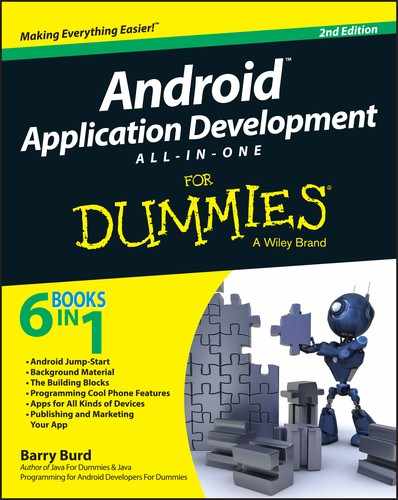
When you click the app’s button, you see a new activity like the one pictured in Figure 6-6.
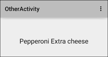
Figure 6-6: A new activity appears on the device’s screen.
Listing 6-1: Starting OtherActivity from the MainActivity
package com.allyourcode.p01_06_01;
import android.app.Activity;
import android.content.Intent;
import android.os.Bundle;
import android.view.Menu;
import android.view.MenuItem;
import android.view.View;
import android.widget.CheckBox;
public class MainActivity extends Activity {
CheckBox pepBox, cheeseBox;
@Override
protected void onCreate(Bundle savedInstanceState) {
super.onCreate(savedInstanceState);
setContentView(R.layout.activity_main);
pepBox = (CheckBox) findViewById(R.id.checkBox);
cheeseBox = (CheckBox) findViewById(R.id.checkBox2);
}
public void onButtonClick(View view) {
Intent intent =
new Intent(this, OtherActivity.class);
intent.putExtra
("Pepperoni", pepBox.isChecked());
intent.putExtra
("Extra cheese", cheeseBox.isChecked());
startActivity(intent);
}
// You don’t have to add any code below this point
@Override
public boolean onCreateOptionsMenu(Menu menu) {
// … Et cetera
Listing 6-2: The OtherActivity
package com.allyourcode.p01_06_01;
import android.app.Activity;
import android.content.Intent;
import android.os.Bundle;
import android.view.Menu;
import android.view.MenuItem;
import android.widget.TextView;
public class OtherActivity extends Activity {
TextView textView;
@Override
protected void onCreate(Bundle savedInstanceState) {
super.onCreate(savedInstanceState);
setContentView(R.layout.other_layout);
textView = (TextView) findViewById(R.id.textView3);
Intent intent = getIntent();
StringBuilder str = new StringBuilder("");
if (intent.getBooleanExtra("Pepperoni", false)) {
str.append("Pepperoni ");
}
if (intent.getBooleanExtra("Extra cheese", false)) {
str.append("Extra cheese");
}
if (str.length() == 0) {
str.append("Plain");
}
textView.setText(str);
}
// You don’t have to add any code below this point
@Override
public boolean onCreateOptionsMenu(Menu menu) {
// … Et cetera
Localizing Your App
Words, words, words. The apps in this chapter have so many words. "Pepperoni" here; "Extra cheese" there! It’s a wonder a developer can keep this stuff straight. It’s too easy to type a word one way in one part of the code and misspell the word in a different part.
You can reduce the problem by creating string constants. For example, you can write
public final String pep = "Pepperoni";
at the top of your Java program and use the variable pep in place of the string "Pepperoni" throughout the code. But then, to change from the English word pepperoni to the Italian word merguez, you have to mess with your Java code. In a world where only six percent of all mobile phones are in the United States,* you don’t want to edit Java code for dozens of countries.
The elegant solution to this problem is to use Android’s string externalization feature. Here’s what you do:
-
Open the project that you created in this chapter’s “Reusing a layout” section.
 If you’ve messed with that project since you created it, or if you didn’t faithfully execute each of my instructions in that section, don’t despair. You can find that project in the stuff that you download from my website. Visit
 http://allmycode.com/androidand follow the instructions in Chapter 3 of this minibook for running the downloaded examples. -
Open the project’s
reusable_layout.xmlfile and put the Designer tool in Text mode.Notice lines such as
android:text="Extra cheese"in the
reusable_layout.xmlfile? What if the user isn’t an English language speaker? A layout file describes the look of the app’s screen. The look of the screen shouldn’t depend on the user’s being able to understand whatExtra cheesemeans. - In the editor, click inside the string
"Extra cheese". -
Press Alt-Enter.
A pop-up menu appears. This menu is called an intention action menu. The menu contains a list of actions from which you can choose.
-
In the intention action menu, select Extract String Resource.
Well, wha' da' ya' know?! An Extract Resource dialog box appears! (See Figure 6-7.)
-
In the Resource Name field, type extra_cheese.
A resource name must not contain blank spaces. In this step, extra_cheeseis okay andextracheeseis also okay. Butextra cheeseisn’t okay. -
Click OK.
Android Studio adds the following element to your
res/values/strings.xmlfile:<string name="extra_cheese">Extra cheese</string>Android Studio also replaces
"Extra cheese"in your layout’s CheckBox element with an@stringexpression:<CheckBoxandroid:text="@string/extra_cheese" -
(Optional, but very nice if you do it.) Repeat Steps 3 through 7 for the strings
"Pepperoni","Show", and (in theactivity_main.xmlfile)"Plain".With your app’s strings externalized, you’re ready to go international.
- Right-click (or on a Mac, Ctrl-click) the
strings.xmlfile in your project’sres/valuesfolder in the Project tool window. -
In the context menu that appears, select Open Translations Editor.
The Translations Editor appears in place of the Designer tool. (See Figure 6-8.)
-
Near the top of the Translations Editor, click the globe icon.
A list of language locales appears. (See Figure 6-9.)
-
Select a language locale from the list.
For this exercise, I select Italian (it). (I’d be disloyal to my buddy Steve if I did otherwise.) For the full scoop on language locales, visit
www.iso.org/iso/country_names_and_code_elements.As a result, the
strings.xmlbranch in the Project tool window now has two sub-branches. Both sub-branches sport the labelstrings.xml, but the new sub-branch’s icon is a tiny picture of the flag of Italy. (See Figure 6-10.) Temporarily change the Project tool window from Android view to Project view. Your project’s resfolder now has avaluessubfolder and avalues-itsubfolder. Thevalues-itsubfolder contains its ownstrings.xmlfile. (Okay, you can go back to the Android view now!)In the Translations Editor, the term
extra_cheeseis in red because you haven’t yet translatedextra_cheeseinto Italian. The same is true for other terms that you haven’t yet translated. -
Double-click the Italian (it) column in the
extra_cheeserow. In that column, typeCon più formaggio, and then press Enter.(Sorry. The Translations Editor doesn’t do any translating for you. The Translations Editor only adds code to your project when you type in the translations of words and phrases.)
-
Repeat Step 13 for the pepperoni, show, and plain rows.
If your Italian is a bit rusty, copy the text from the
res/values-it/strings.xmlfile in Listing 6-3. -
Test your app.
As with most devices, the emulator has a setting for Language & Input. Change this setting to Italiano (Italia), and suddenly, your app looks like the display in Figure 6-11.
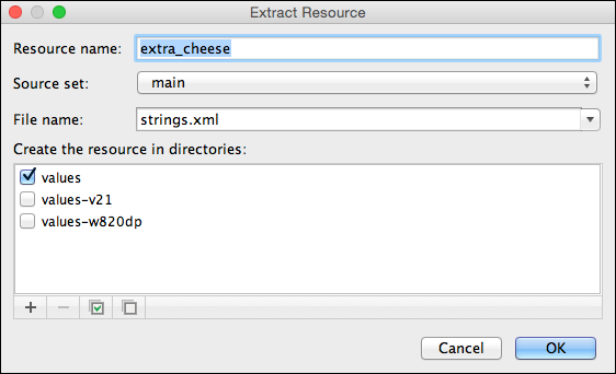
Figure 6-7: The Extract Resource dialog box.
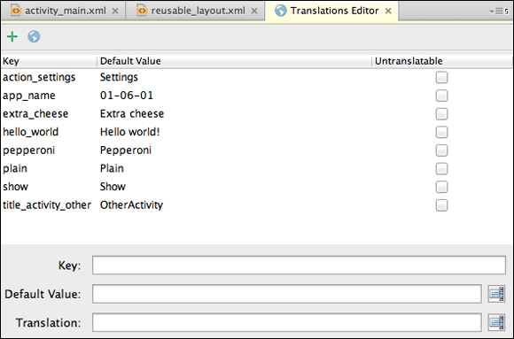
Figure 6-8: The Translations Editor.
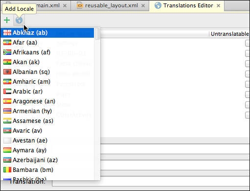
Figure 6-9: Select a language.
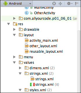
Figure 6-10: Look! You have two strings.xml files.
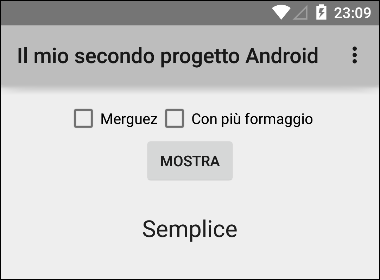
Figure 6-11: Buongiorno!
Elenco 6-3: Benvenuto in Italia!
<?xml version="1.0" encoding="utf-8"?>
<resources>
<string name="hello">
Ciao mondo, la mia attività!</string>
<string name="app_name">
Il mio secondo progetto Android</string>
<string name="extra_cheese">Con più formaggio</string>
<string name="pepperoni">Merguez</string>
<string name="plain">Semplice</string>
<string name="show">Mostra</string>
</resources>
Responding to Check Box Events
Why click twice when you can do the same thing by clicking only once? Think about the example in the previous section. Your app responds to the contents of check boxes when the user clicks a button. In a streamlined scenario, your app might respond as soon as the user checks a box. Listing 6-4 shows you how to make this happen.
Listing 6-4: Responding to CheckBox Events
package com.allyourcode.p01_06_04;
import android.app.Activity;
import android.os.Bundle;
import android.view.Menu;
import android.view.MenuItem;
import android.widget.CheckBox;
import android.widget.CompoundButton;
import android.widget.CompoundButton.
OnCheckedChangeListener;
import android.widget.TextView;
public class MainActivity extends Activity
implements OnCheckedChangeListener {
TextView textView;
@Override
protected void onCreate(Bundle savedInstanceState) {
super.onCreate(savedInstanceState);
setContentView(R.layout.activity_main);
((CheckBox) findViewById(R.id.checkBox))
.setOnCheckedChangeListener(this);
((CheckBox) findViewById(R.id.checkBox2))
.setOnCheckedChangeListener(this);
textView =
(TextView) findViewById(R.id.textView);
}
@Override
public void onCheckedChanged(CompoundButton box,
boolean isChecked) {
StringBuilder str =
new StringBuilder(textView.getText());
CharSequence boxText = box.getText();
if (isChecked) {
str.append(" " + boxText);
} else {
int start = str.indexOf(boxText.toString());
int length = boxText.length();
str.replace(start, start + length, "");
}
textView.setText(str.toString().trim());
}
//… Et cetera
Like a button, each check box listens for onClick events. So you can write this section’s code very much like the code in Listing 6-1. But in this section’s listing, I avoid using the onClick property and illustrate the use of a different event listener.
A check box listens for changes to its state (its “checked” versus “unchecked” state). So when the user touches a check box, Android fires an onCheckedChanged event. By registering this (the entire MainActivity instance) as each check box’s OnCheckedChangeListener, you make Android call the onCheckedChanged method in Listing 6-4.
The onCheckedChanged method has two parameters — the component that was touched and the state of the component as a result of the touch. I’ve contrived the code in Listing 6-4 to make use of these two method parameters.
A CompoundButton is a widget with checked and unchecked states. The CheckBox class is a subclass of CompoundButton. Other subclasses of CompoundButton are RadioButton and ToggleButton. A ToggleButton is that cute little thing that lights when it’s checked.
In Listing 6-4, the onCheckedChanged method’s box parameter refers to whichever check box the user touches. That check box has a getText method, so in Listing 6-4, I use the getText method to help fill the textView element. I use the onCheckedChanged method’s isChecked parameter to decide whether to add text to the textView element or delete text from the textView element.
Displaying Images
After designing an app and its variations in the previous sections, you may decide that your app needs some flair. How about designing your app so that when a user clicks a button, your app displays a picture of the pizza being ordered? The SHOW button in Figure 6-1 is perfect for this.
Android has all kinds of features for drawing images and displaying bitmap files. I cover many of these features in Book IV, Chapter 3. In this section, I cover one possible approach:
-
Launch Android Studio and create a new project.
In this section’s listings, I call the project
01_06_05, and I use the packagecom.allmycode.p01_06_05. - Copy the
reusable_layout.xmlfile from this chapter’s “Creating a reusable layout” section to your new project’sapp/res/layoutbranch in the Project tool window. -
Include
reusable_layoutin your project’sactivity_main.xmlfile.For details, see Steps 7 through 11 in the section “Reusing a layout.”
-
Find four images — one for plain, one for pepperoni, one for extra cheese, and one for pepperoni with extra cheese.
Android’s official documentation recommends the
.pngformat for images. If you don’t have.pngimages, Android’s docs call the.jpgformat “acceptable.” If you don’t have.pngor.jpg, the docs tell you to hold your nose and use.gif. But remember, in this section, you’re creating a practice application, not a work of art. Your images don’t have to look good. They don’t even have to look like pizzas. Besides, you can download my silly-looking drawings of pizzas from this book’s website atwww.allmycode.com/Android.In creating my project, I use the filenames
plain.png,pepperoni.png,extracheese.png, andpep_extracheese.png. The names of Android’s resource files must not contain capital letters. You can use only lowercase letters and underscores. For working with image formats, the program IrfanView has always served me well. You can get this Windows program at http://www.irfanview.com. The program is free for noncommercial use. - In your operating system’s File Explorer or Finder, select the image files. Then, in the main menu, choose Edit ⇒ Copy.
- In Android Studio’s Project tool window, select the
app/res/drawablebranch. -
In the main menu, choose Edit ⇒ Paste.
A Choose Destination Directory dialog box appears.
-
In the Choose Destination Directory dialog box, select the
drawablebranch (as opposed to one of thedrawable-dpibranches), and then click OK.In a real-life app, you use the
drawable-dpidirectories as alternatives for devices with high, medium, extra-high, and extra-extra-high screen densities. But in this practice app, a defaultdrawablefolder is the easiest to use. The letters dpi stand for dots per inch. Android senses a device’s screen density and uses the resources in the most appropriate drawable-?dpifolder. To find out what Android considers “most appropriate,” visithttp://developer.android.com/guide/practices/screens_support.html. - Right-click (on Windows) or Ctrl-click (on a Mac) the
app/res/drawablebranch. -
In the menu that appears, select New ⇒ File.
Once again, the Choose Destination Directory dialog box rears its ugly head.
-
Select the
drawablebranch, and then click OK.A New File dialog box appears. This dialog box has only one field — a field for the name of your new file. (See Figure 6-12.)
- In the New File dialog box’s field, type levels.xml.
- Click OK to dismiss the New File dialog box.
-
Use Android Studio’s editor to populate your
levels.xmlfile with the code in Listing 6-5.A level-list is a list of alternative drawables for a single image component to display. At any moment during an app’s run, the image component has an integer level. You set the component’s level using the
setImageLevelmethod.When your app calls
setImageLevel, Android starts at the top of the level-list and looks for the first item whoseandroid:maxLevelis greater than or equal to the new image level. You can also assign anandroid:minLevelattribute to an item. But in most situations,android:maxLevelis all you need. -
Add an ImageView element to your activity’s layout.
You can drag an ImageView element from the Widgets group in the Designer tool’s palette, or you can add the following element to your app’s
activity_main.xmlfile:<ImageView android:id="@+id/imageView1"android:layout_height="wrap_content"android:layout_width="wrap_content"android:src="@drawable/levels"></ImageView> -
Make sure that your ImageView element’s
android:srcattribute refers to your newlevels.xmlfile.In the
srcentry in the Properties view, look for the value@drawable/levels. -
Code your project’s activity file as in Listing 6-6.
In Listing 6-6, the
onButtonClickmethod calls thesetImageLevelmethod. The method parameter’s value depends on the states of the activity’s check boxes. -
Run the app.
The results, along with my beautiful drawings of pizza with toppings, are shown in Figure 6-13.
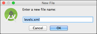
Figure 6-12: The New File dialog box.
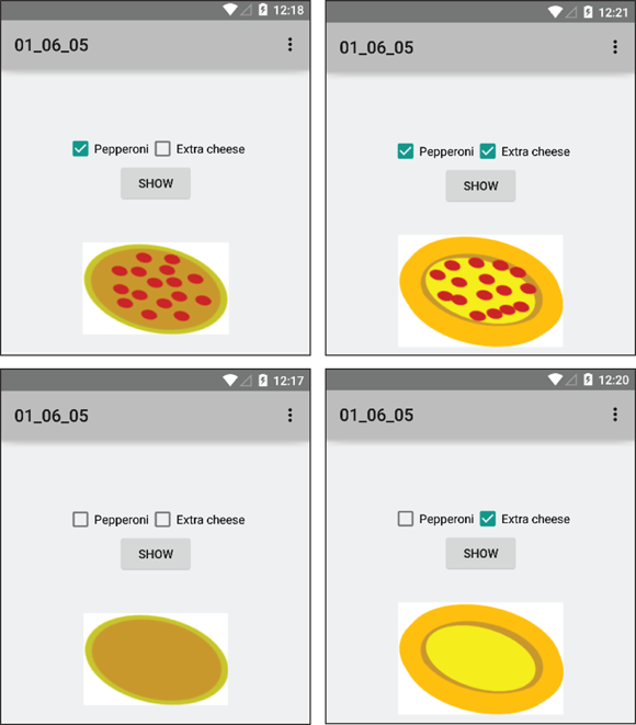
Figure 6-13: What lovely drawings!
Listing 6-5: A Level-List Document
<?xml version="1.0" encoding="utf-8"?>
<level-list xmlns:android=
"http://schemas.android.com/apk/res/android">
<item android:drawable="@drawable/plain"
android:maxLevel="0" />
<item android:drawable="@drawable/pepperoni"
android:maxLevel="1" />
<item android:drawable="@drawable/extracheese"
android:maxLevel="2" />
<item android:drawable="@drawable/pep_extracheese"
android:maxLevel="3" />
</level-list>
Listing 6-6: Changing Images
package com.allmycode.p01_06_05;
import android.app.Activity;
import android.os.Bundle;
import android.view.Menu;
import android.view.MenuItem;
import android.view.View;
import android.widget.CheckBox;
import android.widget.ImageView;
public class MainActivity extends Activity {
CheckBox pepBox, cheeseBox;
ImageView imageView;
@Override
protected void onCreate(Bundle savedInstanceState) {
super.onCreate(savedInstanceState);
setContentView(R.layout.activity_main);
pepBox =
(CheckBox) findViewById(R.id.checkBox);
cheeseBox =
(CheckBox) findViewById(R.id.checkBox2);
imageView =
(ImageView) findViewById(R.id.imageView);
}
public void onButtonClick(View view) {
int level = 0;
if (pepBox.isChecked()) {
level += 1;
}
if (cheeseBox.isChecked()) {
level += 2;
}
imageView.setImageLevel(level);
}
// You don’t have to add any code below this point
@Override
public boolean onCreateOptionsMenu(Menu menu) {
// … Et cetera
Sending in Your Order
If you’ve read any of this chapter’s previous sections, you’re probably very hungry. An app with nothing but pictures and the names of pizza toppings is a real tease.
So you’d better add some purchasing power to this chapter’s example. Real e-commerce functionality is the subject of several other books. But in this book, you can get a small taste of the online pizza-ordering process (pun intended). You can submit your choice of toppings to an existing web server — Google’s search engine, to be precise. It’s not as good as biting into a tasty pizza, but the example shows you one way to send information from a mobile device.
In a real application, you might program your own server to respond intelligently to users' requests. For passing money back and forth, you might use the Google Play Store’s in-app billing facilities.
Programming web servers isn’t an Android-specific topic. To read all about servers, check out Apache, MySQL, and PHP Web Development All-in-One Desk Reference For Dummies, by Jeff Cogswell (John Wiley & Sons, Inc.).
-
Launch Android Studio and create a new project.
In this section’s listing, I call the project
01_06_07, and I use the packagecom.allmycode.p01_06_07. - Copy the
reusable_layout.xmlfile from this chapter’s “Creating a reusable layout” section to your new project’sapp/res/layoutbranch in the Project tool window. -
Include
reusable_layoutin your project’sactivity_main.xmlfile.For details, see Steps 7 through 11 in the section “Reusing a layout.”
-
Get a WebView element from the Widgets group of the Designer tool’s palette. Place that WebView element anywhere on your app’s preview screen.
A WebView is a mini web browser that you can add to an existing activity.
It doesn’t matter how you position the WebView element on the screen. When the user visits a web page, the page will take up the entire screen. (If you want the page to appear below your check boxes and button, you’ll have to see Chapter 1 in Book IV.)
- Code your project’s activity file as in Listing 6-7.
-
Add the following element to your project’s
AndroidManifest.xmlfile:<uses-permissionandroid:name="android.permission.INTERNET" />Make this
uses-permissionelement a direct sub-element of the document’smanifestelement.The
uses-permissionelement grants your app permission to access the Internet. Access to the Internet will appear in the list the user sees before installing your app. When you create an app, don’t forget to add the appropriate permissions to the app’s AndroidManifest.xmlfile. In a recent survey of For Dummies book authors, all respondents reported that they frequently forget to add permissions to their apps' manifest files. (Survey sample size: one.) -
Run your app.
You might have to wait for the web page to load. When the page loads, your app looks something like the screen in Figure 6-14.
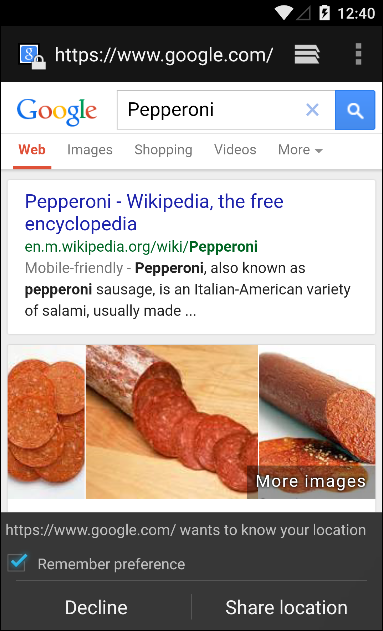
Figure 6-14: Your app sends stuff to a web server.
Listing 6-7: Sending Info to a Server
package com.allmycode.p01_06_07;
import android.app.Activity;
import android.os.Bundle;
import android.view.Menu;
import android.view.MenuItem;
import android.view.View;
import android.webkit.WebView;
import android.widget.CheckBox;
public class MainActivity extends Activity {
CheckBox pepBox, cheeseBox;
WebView webView;
@Override
protected void onCreate(Bundle savedInstanceState) {
super.onCreate(savedInstanceState);
setContentView(R.layout.activity_main);
pepBox = (CheckBox) findViewById(R.id.checkBox);
cheeseBox = (CheckBox) findViewById(R.id.checkBox2);
webView = (WebView) findViewById(R.id.webView);
}
public void onButtonClick(View view) {
StringBuilder str = new StringBuilder("");
if (pepBox.isChecked()) {
str.append("Pepperoni");
}
if (cheeseBox.isChecked()) {
str.append(""Extra cheese"");
}
if (str.length() == 23) {
str.insert(9, '+');
}
if (str.length() == 0) {
str.append("Plain");
}
webView.loadUrl
("http://www.google.com/search?q="+str.toString());
}
// You don’t have to add any code below this point
@Override
public boolean onCreateOptionsMenu(Menu menu) {
// … Et cetera