
Chapter 13
Giving Your Images a Text Message
IN THIS CHAPTER
![]() Testing your type techniques
Testing your type techniques
![]() Creating paragraphs with type containers
Creating paragraphs with type containers
![]() Shaping up with Warp Text and type on a path
Shaping up with Warp Text and type on a path
Un bon croquis vaut mieux qu’un long discours. Or, as folks often paraphrase Napoleon, “A picture is worth a thousand words.” (Yes, 1,000 words might equal “a long speech.”) But sometimes in your Photoshop artwork, nothing says Bob’s Hardware quite like the very words Bob’s Hardware. A picture of a hammer and a picture of a nail — perhaps toss in some nuts and bolts — all are great symbols for your client’s logo. However, you also need to give Bob’s customers a name and an address so they can actually spend some money, which goes a long way toward helping Bob pay you.
For a program that’s designed to work with photographic images, Photoshop has incredibly powerful text capabilities. Although it’s not a page-layout program such as Adobe InDesign, a web development program such as Dreamweaver, or a word processing program such as Microsoft Word, Photoshop can certainly enable you to add lines, paragraphs, or even columns of text to your images.
Photoshop offers you three categories of text:
- Point type is one or more lines of text, comparable with the headlines in a newspaper or the text that you add to, say, a Bob’s Hardware advertisement. Click with a type tool to add point type.
- Paragraph type consists of multiple lines of text. Like in a word processing program, a new line is started whenever your typing reaches the margin. Drag a type tool to create paragraph type.
- Warp type and type on a path are typically single lines of type that are bent, curved, or otherwise distorted as a special effect. Use the Option bar’s Warp Text feature (or choose Edit ⇒ Transform ⇒ Warp), or click with a type tool on a path.
In this chapter, I discuss the tools and panels that you use to add text to an image, how to add paragraphs and columns of text (as you might use in a brochure or booklet), and even how to make your type bend and twist along paths.
Making a Word Worth a Thousand Pixels
To control your basic work with text, Photoshop offers you four type tools, the Options bar, and several options in the Preferences dialog box, both in the Type section, visible in Figure 13-1, and in the Units & Rulers section. Photoshop also has a menu of type-related commands (shown in Figure 13-2).

FIGURE 13-1: Photoshop gives you lots of tools for working with text.

FIGURE 13-2: Use the Character Styles and Paragraph Styles panels to ensure consistency and to make changes quickly.
As you can see in Figure 13-1, the Font menus in the Options bar can show a sample of the typeface (using the word Sample) when you click it. You can activate the preview and choose from 6 (including None) different sizes for the font preview in the Type menu’s Font Preview Size list (shown are Small, Large, and Huge).
In addition to the Type menu shown in Figure 13-2, you’ll also find four panels for more advanced work with text. Along with the Character and Paragraph panels, Photoshop offers Character Styles and Paragraph Styles panels. (See Figure 13-2.) By default, the panels are hidden because you can make the major type-related decisions (such as font style and alignment) right in the Options bar. You might need to show the panels if you’re doing some fine-tuning of the text appearance. When you need the panels, you can show them through the Type ⇒ Panels menu or Photoshop’s Window menu.
Type can be informative or decorative or both. You can use the type tools to add paragraphs of text or a single character as an element of your artwork. (In Chapter 11, you can even see how to make custom shapes from your various symbol fonts.) The text can be plain and unadorned or elaborately dressed up with layer styles, such as drop shadows, glows, bevel effects, and other effects that you apply to make the layer content fancier. (Layer styles are discussed in Chapter 12.) However you use it, text can be a powerful element of both communication and symbolism. Take a look at Figure 13-3, in which I use the Type tool to add the binary code to the left and even the musical notes below. (You can see the individual layers of Figure 13-3 back in Figure 10-1.)

FIGURE 13-3: You can also use type as symbolic or decorative elements.
But before you add any text to your artwork, you need to have a good handle on the various type tools, panels, menus, and options available to you. I start with an introduction to Photoshop’s type tools.
A type tool for every season, or reason
Photoshop offers four type tools — or, perhaps more accurately, two pairs of type tools — that assist you with adding text to your images. The Horizontal Type tool and the Vertical Type tool (the first pair) create type layers, which show up as special layers in the Layers panel that enable you to later re-edit the text that you put there. The Horizontal Type Mask tool and the Vertical Type Mask tool (the second pair) make selections on the active layer, similar to using the Rectangular Marquee and Lasso tools (as I describe in Chapter 8). When creating more than one line of type, the Horizontal Type tool starts the subsequent lines below the first. Keep in mind, however, that the Vertical Type tool will add additional lines of type to the left of the first line.
When working with type layers, you can easily make changes to the font, font size, and even the text itself at any time. In addition, you can add layer styles and blend the text with other elements of your artwork using blending modes and reduced opacity.
 You can ignore the type mask tools. Instead, use the regular type tools, ⌘ /Ctrl+click the layer thumbnail in the Layers panel to load a selection in the shape of the text, and then click the eyeball symbol to the left to hide the type layer. Later, if necessary, you can easily reload the selection — or make changes to the text and load a new selection.
 When working with a text-shaped selection, add a new empty layer on which you can create a text-shaped stroke or fill, or work with an existing layer’s content. You might, for example, make a text-shaped selection to delete or hide an area of another layer, as you can see in Figure 13-4.

FIGURE 13-4: ⌘ /Ctrl+click a type layer’s thumbnail to make a text-shaped selection for editing other artwork.
Whether working with type layers (or the type mask tools), you have the option of using either horizontal or vertical type. The difference between type that is set vertically and the very common horizontal type rotated 90 degrees is illustrated in Figure 13-5.

FIGURE 13-5: Vertical type stacks the individual characters. You can rotate horizontal type for a different look.
You can select type options before adding text to the image, or you can change your options afterward. When you make the type layer active in the Layers panel — but haven’t yet selected any text in your image — any changes that you make are applied to all the text on the layer. You can also click and drag to select some of the text on the layer and make changes to only those characters or words.
When you’re done adding or editing text, you can end the editing session in any of a number of ways:
- Click the check mark button (or the Cancel button) on the Options bar.
- Switch to a different tool in the Toolbox.
- Press ⌘ +Return or Ctrl+Enter.
- ⌘ +Shift+click or Ctrl+Shift+click to finish that type layer and start a new type layer.
The Type tool’s Options bar also includes a 3D button to convert the type layer to a 3D object. (You’ll find an overview of 3D in Chapter 18.)
 By default, when adding type, pressing the Escape key deletes the type layer and the type you have added. Now, however, you can elect to have the Escape key commit the text and end the editing session. The option can be activated in Preferences ⇒ Type.
What are all those options?
Here you are, the proud owner of the world’s state-of-the-art image editor, and now you’re adding text, setting type, and pecking away on the keyboard. You’re faced with a lot of variables. Which options are you going to need all the time? Which ones are you going to need now and then? Which ones can you ignore altogether? Read on as I introduce you to the various text and type variables, and toss in a few general guidelines on which options are most (and least) frequently required.
Take a look at Figure 13-6, in which you can see (in all their glory) the most commonly used text attributes, all of which are available to you from the Options bar whenever a type tool is active.

FIGURE 13-6: Use the Options bar to quickly and easily change the primary attributes of your text.
You can change the following text attributes via the Options bar, which is usually available at the top of your screen:
- Tool Presets: The Tool Presets panel enables you to select a predefined set of options that you’ve already saved. Set up each as a preset and then activate all the options with a single click. (See Chapter 3 for more detailed information on tool presets.)
-
Orientation: The Orientation button toggles existing type layers between horizontal and vertical. Regardless of what text is selected, the entire type layer is flipped when you click this button.
- Font menu: Click the triangle to the right of the Font Family field to open the Font menu, showing all your active fonts in alphabetical order. You can also click in the field itself and use the arrow keys to switch fonts. If you select some type with a type tool first (as shown in Figure 13-7), using an arrow key automatically applies the change to the selected characters. If no characters are selected, you change the entire type layer.
- Font Style: When a font has multiple styles built in, you can choose a variation of the font from the Font Style menu. Styles include Regular (or Roman), Bold, Semibold, Italic, Condensed, Light, and combinations thereof (as shown in Figure 13-8). Some fonts, however, have no built-in styles.
- Font Size: You can select a font size in three ways: by typing a number in the Font Size field, by clicking the triangle to the right of the field and selecting a font size from the pop-up menu that appears, or by clicking the Tt icon to the left of the Font Size field and then dragging left or right to change the value in the field. Font size is generally measured in points (1 point =
 inch), but you can elect to use pixels or millimeters. Make the units change in Photoshop’s Preferences (choose Preferences ⇒ Units & Rulers, not Preferences ⇒ Type). Keep in mind that when type is measured in points, the image’s resolution comes into play. (Resolution is discussed in Chapter 2.)
 -
Anti-aliasing: Anti-aliasing softens the edges of each character so that it appears smooth on-screen. As part of this process, anti-aliasing hides the corners of the individual pixels with which the text is created. When outputting to a laser printer or other PostScript device, anti-aliasing isn’t required. It is, however, critical when printing to an inkjet or when producing web graphics or designing for tablets and smartphones. Smooth is a good choice unless your text begins to look blurry, in which case you should switch to Crisp. Use the Strong option with very large type when the individual character width must be preserved. When designing for on-screen projects (web pages, tablets, smartphones, and so on), choose System or System Gray for anti-aliasing.
 Never choose System or System Gray for text that will be printed, either on an inkjet or using a PostScript device. These two anti-aliasing methods are designed to help text appear properly in web browsers.
 - Alignment: The three alignment choices on the Options bar determine how lines of type are positioned relative to each other. The buttons do a rather eloquent job of expressing themselves, wouldn’t you say? Note: Don’t confuse the term alignment with justification, which straightens both the left and right margins (and is selected in the Paragraph panel).
- Type color: Click the color swatch on the Options bar to open the Color Picker and select a type color. You can select a color before adding text, or you can change the color of the text later. If you start by selecting a type layer from the Layers panel, you’ll change all the characters on that layer when you select a new color in the Color Picker. Alternatively, use a type tool to select one or more characters for a color change, as shown in Figure 13-9.
- Warp Text: Warp Text, which I discuss later in this chapter, bends the line of type according to any number of preset shapes, each of which can be customized with sliders. (The text in Figure 13-9 uses the Arc Lower warp style.) Keep in mind, however, that the Warp Text feature isn’t available when the Faux Bold style is applied through the Character panel. (I talk about faux styles later in this chapter.)
-
3D: After you click the Type tool in your image, the last button on the Type tool’s Options bar is active and you can create a 3D object from the text. (3D is discussed in Chapter 18.) Also appearing (just to the left of the 3D button) when in the process of adding text are new buttons to reject the text (deleting the type layer) and a checkmark button to accept and end the text editing.

FIGURE 13-7: Select specific characters, such as the words SELECTING THEM, to change some, or make no selection to change all.

FIGURE 13-8: Some fonts have many styles available.

FIGURE 13-9: Select any individual character and change its font, color, size, or any other attribute.
Each character in a type layer can have its own attributes. Click and drag over one or more characters with a type tool and then use the Options bar or Character panel to change the text attributes. Color, font, style — just about any attribute can be assigned as shown in Figure 13-9.
Like many word processing programs, you can select an entire word in Photoshop by double-clicking the word (with a type tool). Triple-click to select the entire line. Quadruple-click to select the entire paragraph. Click five times very fast to select all the text on that layer.
Taking control of your text with panels
For incredible control over the appearance of your text, use the Character and Paragraph panels. In addition to all the text attributes available on the Options bar, the panels provide a wide range of choices. With them, you can customize the general appearance of the text or apply sophisticated typographic styling. The Character and Paragraph panels can be shown and hidden by clicking the Panels button near the right end of any type tool’s Options bar or through the Window menu.
You can use the Character panel to edit a single selected character, a series of selected characters, or the entire content of a type layer. Figure 13-10 shows what you face when “building character” using this panel.

FIGURE 13-10: More choices!
When an OpenType font is selected in the upper-left field, the Character panel offers OpenType options as buttons. Which buttons are grayed out and which are available depends on which features are built into that particular OpenType font.
Unless you’re a typographer, a number of the fields in the Character panel might require explanation:
- Leading: Leading (pronounced LED-ding rather than LEED-ing and which refers to the lead strips of metal that typesetters used to place between lines of type) is the vertical space between lines of text. Generally, you’ll leave Leading set to Auto. However, you can select one or more lines of text (select the whole line) and change the spacing. Adding more space gives the text an airy, light appearance. Reducing the leading tightens up the text, which enables you to fit more lines in the same area.
- Kerning: The space between two characters is determined by the kerning built into a font. You can, however, override that spacing. Click with a type tool between two letters and then change the setting in the Kerning field to change the distance between the letters. You might, for example, want to reduce the kerning between a capital P and a lowercase o to tuck the second character protectively under the overhang of the taller letter. This can produce a cleaner and better-connected relationship between the two characters.
- Scaling: Vertical and horizontal scaling modifies the height and width of the selected character(s). You’ll find this useful primarily for customizing short bits of type rather than long chunks of text.
- Baseline Shift: Produce subscript and superscript characters, such as those used in H2O and E = mc2, with the Baseline Shift field. It’s generally easier to use the Superscript and Subscript styles (see the next bullet on faux styles).
- Faux Styles: Use faux styles to apply the appearance of a character style, even when they’re not built into the font. From the left, as the buttons show, the available faux styles are Bold, Italic, All Caps, Small Caps, Superscript, Subscript, Underline, and Strikethrough. Select the character or characters to which you want to apply the style, and then click the appropriate button or buttons. Generally speaking, if a font offers a specific style on the Font Style menu, you’ll use the font’s built-in style rather than the faux style. Remember that you can’t use Faux Bold when you want to warp text.
- OpenType Options: OpenType fonts, which can include many more glyphs (characters) than can TrueType or Type 1 fonts, may include a number of special features, including (from left) Standard Ligatures, Contextual Alternates, Discretionary Ligatures, Swashes, Stylistic Alternates, Titling Alternates, Ordinals, and Fractions. If you type certain character combinations, a single character, more visually pleasing, will be substituted. Not all OpenType fonts include all options.
- Dictionary: Photoshop has more than four dozen dictionaries built in. And, wonderfully or confusingly depending on your personal linguistic talents, you can assign dictionaries on a word-by-word (or even character-by-character) basis. You could, for example, insert a bon mot into the middle of your text in the language of your choice, assign the appropriate language dictionary, and not have that phrase trigger an alert when you run a spell check (which you do by choosing Edit ⇒ Check Spelling).
If you click in your image window and start typing but no characters appear, check the Layers panel to make sure no layer is hiding your type layer and verify in the Options bar that your text color isn’t the same as the background over which you’re typing. If neither of those factors is the problem, it’s likely an invalid setting in the Character panel (perhaps Baseline Shift). Press the Escape key, and then right-click on the Type tool icon at the left end of the Options bar and select Reset Tool.
You’ll probably find yourself using certain sets of options pretty regularly in Photoshop. Luckily for you, you don’t need to make changes on the Options bar and Character panel every time you want to, for example, add headlines or titles in Minion Bold, 24 pt, no anti-aliasing, tracking +180, faux bold, with standard ligatures. Set up the options once and then click the Create New Tool Preset button in the panel at the left end of the Options bar, as shown in Figure 13-11. The next time that you want those specific text attributes, select the preset from that list or the Tool Presets panel, and you’re ready to type! (Also take a look at the “Working with Styles” section, later in this chapter.)

FIGURE 13-11: Tool presets can save you lots of time.
The Paragraph panel is used, not surprisingly, with paragraph type. The alignment options that you see in the upper left of the Paragraph panel in Figure 13-12 can be applied to both point type and type on a path, but you can usually access your alignment options much more easily from the Options bar.

FIGURE 13-12: Most of this panel is only for paragraph type.
I use the term type container when I discuss the Paragraph panel and paragraph type. Think of it as a rectangular column of text, with the words flowing from line to line, just as they do when you compose e-mail or use a word processor. You drag a type tool to create the rectangle, and then you type inside that rectangle. In contrast, when you simply click a type tool and start typing, you need to press Return (Mac) or Enter (Windows) at the end of each line.
You can find specific information about some of these options later in the chapter (when I discuss paragraph type), but here’s a quick look at the choices in the Paragraph panel:
- Alignment: As the text flows from line to line in your type container, the alignment option determines how the lines will stack. You can align the text for a straight left edge or a straight right edge, or you can have the lines stack centered upon each other.
- Justification: Unlike alignment, which balances one margin of a paragraph, justification equalizes both the left and right margins of a paragraph. As you can see by the icons, the difference among the four options is the last line in the paragraph. That last line can be aligned left, centered, aligned right, or stretched to fit from left to right (called full justification).
- Indent Margins: Paragraphs of text can be indented from the left margin or the right. Even if you have only a single word selected, the entire paragraph is indented. Harkening back to that last term paper you wrote (whenever that might have been), think in terms of a block quote. You can also use negative numbers in the Indent Margin fields, which extends the paragraph beyond the margin.
- Indent First Line: You can indent the first line of your paragraphs (or extend the first line to the left past the margin with a negative value) without having to press the Tab key. The option can be set before you start adding text and is applied to each paragraph.
- Space Before/After: When your type container includes multiple paragraphs (created by pressing the Return/Enter key), you can specify the distance that’s automatically added between them. Rather than pressing the Return/Enter key an extra time between paragraphs, set the spacing in the Paragraph panel.
- Hyphenation: If you’re using justification rather than alignment, I recommend keeping the Hyphenate check box selected. When words at the ends of lines of justified type aren’t hyphenated, the spacing within the lines can get rather messy. If you don’t like the look of hyphens along the right margin, deselect the Hyphenate check box or change the hyphenation settings, as described later in this chapter.
Keep in mind that after you drag a type tool to create a type container, you can have as many paragraphs as fit. When you reach the end of a paragraph, press Return/Enter. A new paragraph is created within the type container. Consider the type container to be a column of text, such as you’d see in a newspaper, magazine, or newsletter.
The panel menus — even more options
Like most of Photoshop’s panels, clicking the Menu button in the upper-right corner of the Character or Paragraph panel opens the Panel menu, which holds a cornucopia of options you probably never need to see. (Consider this: If it were a really important option, it would be easier to get to, wouldn’t it?)
As you can see in Figure 13-13, not all menu options are available for all fonts. Some of the options are merely command forms of the panel menus (such as the faux styles). A number of the options apply only to OpenType fonts, which include a much larger selection of glyphs (characters) than do other fonts.

FIGURE 13-13: Not all options are used with all fonts.
Here are a couple of panel menu options with which you should be familiar:
- Fractional Widths: When selected, Photoshop uses this option to adjust the spacing between letters on an individual basis. Will you or I spot the difference? Not with large type, but if you’re creating small text (especially for the web or smart devices), deselect this option. How small is small? Generally 10 points or smaller.
- System Layout: Unless you need to match the appearance of text in TextEdit for Mac or Windows Notepad, leave this option deselected. When might you need it? When designing interface items for a program or game.
- No Break: When working with paragraph type, you can select one or more words and choose No Break to prevent them from being hyphenated. You might want to do this with words that are difficult to recognize when split between two lines.
- Roman Hanging Punctuation: Found on the Paragraph panel menu, this option permits the smaller punctuation marks located at the left and right margins of justified text to hang out past the margins. When commas and the like are outside the margin, the margin itself has a cleaner look. Don’t use this option if your layout can’t handle text that extends past the edges of your column.
- Adobe Composer: This choice is actually quite simple: Single-Line Composer looks at one line of type to determine hyphenation. Every-Line Composer looks at the entire block of text, generally producing a more pleasing appearance.
- Reset (panel name): If you’re seeing some strange behavior from your type tools, you might want to invoke the Reset Character and Reset Paragraph commands. They restore the settings in their respective panels to the defaults, eliminating any errant setting that might be causing the problem.
Remember that you can right-click the tool icon at the left end of the Options bar and select Reset Tool (or Reset All Tools) to immediately return to the tool’s default settings. If the Type tool doesn’t seem to be working correctly, reset and then reselect your options.
Working with Styles
The Character Style and Paragraph Style panels are shown in Figure 13-14. You define a character style based on the character format (font, size, style, and so on), the advanced format (scaling, baseline shift), and OpenType features (when working with an OpenType font, of course). Later, even in another document, you can load and apply the character style and instantly re-format the selected text in the style as defined.

FIGURE 13-14: Defining a character style (left) and a paragraph style.
A paragraph style includes all the features found in a character style, plus paragraph-specific options, such as indentation, composition, justification, and hyphenation.
After applying a character style or paragraph style, you can select some or all of the text and make changes to any character or paragraph attribute. Keep in mind this hierarchy: Any attribute you define after assigning a style trumps the attribute as defined in that style. If both a paragraph style and a character style are applied to the same text, attributes defined in the character style trump those in the paragraph style. Say, for example, that the paragraph style specifies Minion Pro as the font and the character style specifies Myriad Pro; the text will be Myriad Pro.
You can click the New Style button at the bottom of either panel, and then double-click the style to open a panel in which you manually select each style attribute. (See Figure 13-14.) Alternatively, create some text and with that text selected, click the New Style button. The new style will use the attributes of the selected text.
If you assign a style and then manually make changes to attributes, a small plus sign appears next to the style name in the panel. Later, if desired, click the left button at the bottom of the panel to restore the attributes with which the style was defined. The second button at the bottom of the panels redefines the style, incorporating those attributes you manually changed.
Styles are stored within a document saved in the PSD (Photoshop) format. For example, if you have styles in Document-1.psd that you’d like to use in Document-2.psd, here’s what you would do: Open Document-2.psd, open the appropriate styles panel, select the styles panel menu command Load Styles, navigate to and select Document-1.psd, and then click the Open button.
You may never use the Character Styles and Paragraph Styles panels, especially if you already have numerous Type tool presets, but they are a very powerful way to speed formatting of text — and to ensure consistency from word to word, paragraph to paragraph, and project to project.
Putting a picture in your text
Enough of that heavy stuff for now — time to take a look at one of the coolest things that you can do with text. Here’s an easy way to create a text-shaped picture, one that’s fully editable.
- Using File ⇒ Open or by double-clicking an image file, open a photo in Photoshop.
-
If the Layers panel has a layer named Background, click the Lock icon to the right of the layer name to unlock it. If the image has multiple layers, choose Layer ⇒ Merge Visible.
You want to work with a single regular (not background) layer for this project. Background layers don’t support transparency, and no layers can be placed below a Background layer.
- Add your type with the Horizontal Type tool.
- Click the type layer in the Layers panel and drag it below the image layer.
-
In the Layers panel, Option+click (Mac) or Alt+click (Windows) the line between the two layers.
The two layers are joined together, as shown in Figure 13-15. When you clip two layers, the lower layer serves as a mask for the upper layer. The upper layer is visible only where the lower layer has pixels and adopts the opacity of those lower-layer pixels.
-
Finish the image with a layer style (applied to the lower layer) and any other artwork that the project requires.
You can click the lower layer in the Layers panel and then click a favorite layer style in the Styles panel. Or, of course, you can create a custom layer style by choosing Layer ⇒ Layer Style. In Figure 13-16, you see a bevel, a stroke, and a slight inner glow applied to the type layer.

FIGURE 13-15: “Clip” the upper layer to the lower layer.

FIGURE 13-16: Add layer styles to the lower layer so that the effects are visible.
Creating Paragraphs with Type Containers
Although the vast majority of the text that you add to Photoshop artwork is point type — that is, type that exists on just one or a couple of lines — you’ll certainly find situations in which you need to use paragraph type in a type container. The primary advantage of using paragraph type is word wrap. While you type, the text automatically starts a new line every time it reaches the margin.
“Why is that a big deal?” you might ask. “I don’t mind pressing the Return or Enter key at the end of each line.” Ah, but consider the ever-present (when you type like me) typographical error! Or what if the very first sentence of your manual-Return paragraph is missing a word? To insert that word and maintain a visually pleasing right margin, you’d need to go back and redo every line of type. With paragraph type, the content of each line automatically adjusts as you insert that forgotten word.
The difference between point type to create a column of type and paragraph type is comparable with the difference between a typewriter and a word processor. (If you’re old enough to remember Wite-Out and Liquid Paper, raise your hand, but not for very long — I don’t want to tire you out.)
Adding a type container is simple. Click and drag with the Horizontal Type tool (or, in some rare cases, you might want to use the Vertical Type tool), and then start typing. (Keep in mind that a paragraph of text created with the Vertical Type tool has the first line along the right margin and subsequent lines are added to the left, making for rather difficult reading.) The type automatically starts the next line as soon as you press enough keys to reach the far margin. You can keep typing until you fill the type container. Press Return or Enter whenever you want to start a new paragraph within your type container.
You can also copy/paste text from a word processing or text-editing program. You can, for example, open a Microsoft Word document in Word, select the text that you want by clicking and dragging, and then choose Edit ⇒ Copy to place the text into the computer’s memory (on the Clipboard). Switch to your Photoshop document; select a font, font size, and other attributes (or select a character style or paragraph style after pasting); drag a type container; and then choose Edit ⇒ Paste (or the assigned keyboard shortcut) to place your text inside the container. When the text you need already exists, you not only save time by using copy/paste, but you also eliminate the possibility of introducing typos.
But what if you have more text than fits in the type container? Unlike Illustrator and InDesign, you can’t link two type containers, enabling the excess text to automatically move to the next container. Photoshop does, however, remind you that your text doesn’t fit by showing you a symbol in the lower-right corner of the type container’s bounding box — the dashed line surrounding the type container. As you can see in Figure 13-17, the lower-right anchor point of the bounding box has a plus sign in it.

FIGURE 13-17: A plus sign in the lower-right anchor point warns you that text doesn’t fit in the type container.
When you have more text than the type container can hold, you have a number of options:
- Enlarge the type container. Click one of the bounding box’s anchor points and drag to increase the size of the type container. Making a type container a little bit wider often gives you an extra line or two of text at the bottom.
- Shrink the font. Select the text with a keyboard shortcut (⌘ +A/Ctrl+A) and select a smaller font size on the Options bar.
- Decrease the space between lines. Select the text and decrease the leading — the amount of space between lines of type — in the Leading field found in the upper right of the Character panel. By default (the Auto setting in the Leading field), Photoshop uses an amount equal to 120 percent of the font size. You can often reduce the leading to 1 or 2 points larger than the font size before you start overlapping lowercase letters with descenders (g, j, p, q, and y) and uppercase letters on the line below.
- Edit the text. Rephrase the text, using fewer words to convey the same message. If you’re not the author, however, this option might not be available.
You can also use a path created with any of the Shape tools or the Pen tool as a type container. Select the tool, use the Options bar to set it to create a path (rather than a shape or pixels), then drag the tool in the image window. With that done, switch to the Type tool, click within the path, and add your text.
Selecting alignment or justification
Photoshop gives you several options for controlling the appearance of your margins. In the “Taking control of your text with panels” section, earlier in this chapter, I outline a number of options that you can find on the Paragraph panel menu. But let me go into more detail about a couple of options that you have when adding paragraph type.
Perhaps the most important decision (other than font and font size) that you make when preparing paragraph type is a choice of alignment or justification. When text is aligned left, the left margin is perfectly straight, and the right margin is ragged, with each line ending where it ends, without any relationship to the lines of type above and below. (The vast majority of the text you see in this book is left aligned.) A column of text that’s aligned right has a clean right margin and a ragged left margin. If you choose center aligned, the middle of each line of text is centered. Take a look at Figure 13-18 for a visual comparison.

FIGURE 13-18: Compare the left and right margins of each column of text.
Unlike alignment, justification gives you straight margins on both sides of the column of text. The four justification options to the right at the top of the Paragraph panel (see Figure 13-13) differ only in how they treat the last line of a paragraph. The last line can be independently aligned left, center, or right; or it can be fully justified, spreading the last line from margin to margin. You shouldn’t use the fourth option unless that last line (of every paragraph) is rather full because it looks rather strange when just a couple of words are stretched edge to edge.
Ready, BREAK! Hyphenating your text
When a word is too long to fit on the current line of text, either it can be moved to the beginning of the next line (wrapped) or it can be broken into two parts: one finishing the upper line and the other starting the next line (hyphenated). The default hyphenation settings are shown in Figure 13-19.

FIGURE 13-19: Default hyphenation values give you good results and a pleasing appearance.
 The hyphenation options are for the truly geeky, my-typography-is-my-life types. The defaults are excellent and can suffice for all but the most precise layouts (which you should be doing in InDesign or perhaps Illustrator, anyway). If you want to fine-tune how hyphenation is applied (or have far too much time on your hands), select Hyphenate from the Paragraph panel menu to open the options shown in Figure 13-19. The Hyphenation check box (upper left) activates/deactivates hyphenation. The top three fields govern which words to hyphenate and what limits to place on the hyphenation. (Think of the second and third fields as Hyphenate or cram into the line without hyphenating.) The lower two fields control the appearance of the margin, limiting the number of consecutive lines that can be hyphenated and the maximum distance from that margin that a hyphen can be placed.
Shaping Up Your Language with Warp Text and Type on a Path
You can change the line along which your type flows either by using the Warp Text feature or by typing on a path. Type warping uses predefined shapes to which your type is formed (and can be used with both point and paragraph type), and typing on a path uses a custom path (and is used only with point type).
Warping type and placing type along a path are great ways to spice up your message as long as you don’t overdo it and make the message illegible or distract from the overall appearance of your artwork. Warp Text is a quick and easy way to bend text, whereas placing type on a path is a more complex — and more controlled — technique.
Applying the predefined warps
With a type layer active in the Layers panel and a type tool selected, click the button to the right of the color swatch on the Options bar. That opens the Warp Text dialog box, as shown in Figure 13-20, in which you choose both the distortion you want to apply as well as the settings.

FIGURE 13-20: The illustration uses two separate type layers, each with its own Warp Text settings.
Photoshop offers 15 different Warp Text presets, each of which you can customize by dragging any of three sliders. Negative numbers can be used, too, reversing the warp. You can also set the Bend slider to 0 and adjust the lower two sliders to create the appearance of depth or perspective for a type layer, but keep in mind that the Horizontal and Vertical buttons aren’t available for some of the styles. Warp Text is one of Photoshop’s truly fun features. The best way to become familiar with it is to open the dialog box and test-drive each of the variations. And don’t forget to try the Horizontal and Vertical buttons when they’re available!
Customizing the course with paths
You can use the shape tools or the Pen tool to create a custom path along which you add your text. (You find full information about paths and shapes in Chapter 11.) To add type along a path, simply select the Horizontal Type or Vertical Type tool, click the path, and type. The flow of the type from the point on the path where you click is determined by the alignment option that you select from the Options bar or the Paragraph panel. If the text is left aligned, characters are added to the right of the point where you click (called the point of origin for the type). Left alignment is great when adding type along an open path, such as the upper path in Figure 13-21. You might, however, want to choose center alignment when adding type along the top of an arc or circle, so you can click on the top of the arc and not worry about dragging the type later to center it.

FIGURE 13-21: Text alignment determines where the text goes from the point where you click on the path.
If you want type to go in two different directions — say, pointed upward along both the top and the bottom of a circle — and you want the appearance to be uniform, with the same radius for each arc of text, create two separate paths and two separate type layers, as shown in Figure 13-22.
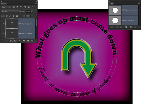
FIGURE 13-22: Sometimes you need to create two separate type layers, using two separate paths, to achieve your artistic goals.
After you add your type to the path, you can press the ⌘ /Ctrl key and reposition the type along the path by dragging. When you press and hold ⌘ /Ctrl, the type tool’s cursor changes to an I-beam cursor with a heavy black arrow on either side, indicating which way you can drag the type. You see the type’s point of origin as a hollow diamond on the path (not to be confused with the hollow squares that represent the path’s anchor points). Figure 13-23 gives you a zoomed-in look at the converted cursor and a comparison of the point of origin diamond and the anchor point square. Note, too, that not only can you drag type along a path, but you can also drag it across the path, flipping over the type.

FIGURE 13-23: When you drag the cursor across the path a short distance, type flips over.
After flipping type across a path, you might need to adjust the tracking (the space between characters), which is the second field from the top on the right in the Character panel. And don’t be afraid to click in the type and press the spacebar a few times to adjust the placement of words along the path.