Chapter 5
Asking Technical Indicators for Directions
IN THIS CHAPTER
![]() Knowing how to make the most of technical indicators in your swing trading
Knowing how to make the most of technical indicators in your swing trading
![]() Identifying popular indicators and using them with chart patterns
Identifying popular indicators and using them with chart patterns
![]() Understanding how to use indicators to determine whether to be in or out of the market
Understanding how to use indicators to determine whether to be in or out of the market
Swing trading used to be far more difficult before the advent of charting programs — many of them now free and online — that calculate technical indicators so that you never need to pick up a pencil and figure them out by hand. In keeping with the advanced times, this chapter doesn’t linger on how to calculate indicators beyond the basic knowledge necessary to analyze them effectively and understand how price, volume, or both impact their direction. Instead, it introduces you to the popular indicators you can apply to your charts — whether you trade trends, ranges, or both.
No indicator can consistently yield profitable results on all securities under all time frames. That’s why this chapter begins with an explanation of what technical indicators are based on and when you should use them. This chapter also helps you grasp the power of combining technical indicators and chart patterns so that you can swing trade successfully.
Even when you know which technical indicators you want to use, you have to know which inputs to use with which indicator. Throughout this chapter, I explicitly state what input variables you should use with the indicators I cover. In most cases, the inputs are the standards most charting programs use. Some of them, however, are different, because they’re based on what’s most appropriate for a swing trader.
All You Need to Know about Analyzing Indicators
Before you dive into the sea of technical indicators, you must remember a few important things, which I run through in this section.
You must apply the right type of indicator
Often, traders apply trending indicators haphazardly to all security price charts. The problem with this approach is that trending indicators always assume a market is in a trend, and they give false signals when applied to non-trending markets, which are characterized by oscillation between two price levels: a support level and a resistance level. The trending indicator generates false signals because it incorrectly assumes that a price moving to a support or resistance level indicates the beginning of a new trend (when, in fact, these movements are simply normal price fluctuations within an established range of value). Therefore, you shouldn’t apply trending indicators to markets that oscillate.
Just as trending indicators wreak havoc when applied to non-trending markets, the reverse also holds true. If you apply a non-trending indicator to a trending market, the indicator continually flashes red lights due to an extreme overbought or oversold level. Non-trending indicators, unlike their trending counterparts, assume price stability. The lack of price stability means that non-trending indicators always assume mean reversion (the theory that prices will return to the mean, or average). Mean reversion doesn’t occur in trending markets.
Figure 5-1 highlights the problems that can arise when you misapply indicators. The figure compares the correct application of a trending indicator (a moving average) in a trending security and the incorrect application of a non-trending indicator (stochastic, located at the bottom of the chart) to the same security. Notice how the moving average keeps the swing trader in for most of the trade, while the non-trending indicator gives premature sell signals. During trending markets, non-trending indicators give false signals.

Source: StockCharts.com
FIGURE 5-1: Applying a non-trending indicator to a trending security leads to premature sell or buy signals.
Not all price swings are meaningful
 Technical indicators can go haywire, turning that significant price swing into nothing. Sometimes a price swing on a chart can reflect a data error (which happens more often than you may think), or your charting software provider may fail to account for a stock split. Now and then the price swing is due to an unsubstantiated rumor. That’s why you must intelligently judge all price swings.
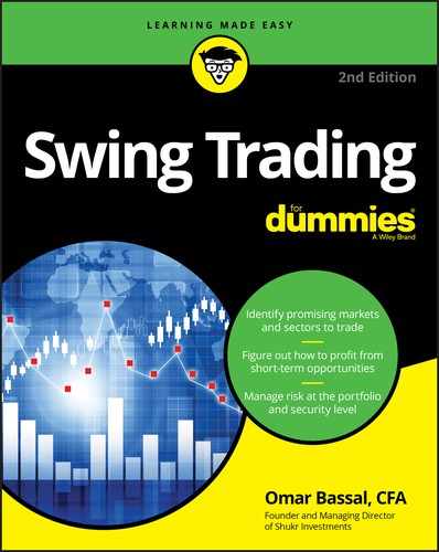
Figure 5-2 provides an example of how a data error can throw a technical indicator off the mark. Shares of SPX Corporation (symbol: SPXC) showed a wild price swing on January 22, when they supposedly opened at $89.50, traded down to $73.31, and then closed at $95.23. However, the intraday chart shows a bad tick (an incorrect price) at $73.31. A technical indicator that looks solely at the closing price wouldn’t be affected by this price error. However, an indicator that incorporates the highs and lows of the day would be affected.
Source: TradeStation Technologies
FIGURE 5-2: A data error can cause indicators to yield incorrect signals.
The data error throws off one technical indicator shown in Figure 5-2 called the Directional Movement Index, or DMI (see “The compass of indicators: Directional Movement Index (DMI),” later in this chapter for details on this indicator). The DMI, confused by the data error, assumes that sellers are in control of shares of SPX Corporation due to the negative price swing. As the company’s share price rises, the DMI fails to track this strength due to the data error.
 You have a few options to protect yourself from getting messed up by a data error:
- Rely on an indicator that doesn’t incorporate the data error.
- Ignore that security for trading purposes.
- Turn to other technical tools, such as chart patterns and candlesticks.
- Report the data error to the trading system administrator, who can usually correct the error in a day or two.
Prices don’t reflect volume, so you need to account for it
Together, price and volume form an important picture for you as a swing trader. Any new information that any single person may possess about a security — be it good or bad — can only be acted upon by buying or selling shares of a security. That buying and selling is reflected on the ticker tape — the price and the volume.
Basing an indicator on price alone does make intuitive sense. After all, a security’s price is believed to contain all known information. However, volume explains traders’ commitment, which price can’t do. Light volume can signal indifference, whereas heavy volume is usually associated with meaningful moves. Also, a security rising on increasing volume has more staying power than a security rising on decreasing volume. An indicator that looks only at price (that is, the vast majority of indicators) can’t distinguish between the two movements. That’s why you should have at least one indicator in your arsenal that incorporates volume.
But even if an indicator does look at price and volume, there’s always the possibility of an event occurring outside all market participants’ knowledge. For example, a company’s headquarters may be destroyed due to a hurricane or fire, an incident no one can predict.
An indicator’s accuracy isn’t the best measure of its value
 Indicators, like all trading techniques, aren’t always accurate. Keep an eye out for whipsaws, when prices move violently and throw indicators off, and be sure to plan for and incorporate the possibility that an indicator’s signal is a false positive (meaning the indicator generates a signal that is false). The simplest way to protect yourself from inevitable whipsaws is to have a risk management system that helps you exit early when a particular trade doesn’t go your way.
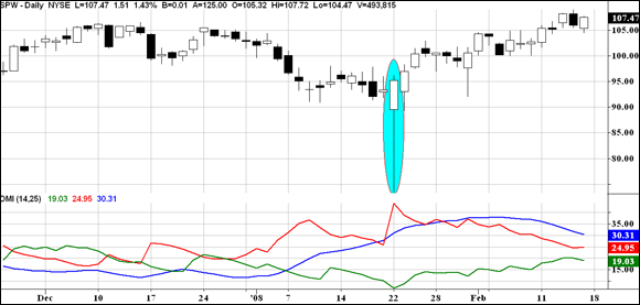
That said, indicators don’t have to be foolproof to be profitable, so accuracy’s not a good way to judge whether a particular indicator is valuable. An indicator can generate so-called correct results 30 percent of the time and still be profitable — if the profits generated on the profitable trades far outweigh the losses generated on the losing trades. Consider the trading system of fictitious Trader Josh. He relies on two technical indicators in his trading system. However, his system’s usually wrong; the trades he places lose money 70 percent of the time. Is this system worth following?
That question can’t be answered without additional information. Swing traders who rely on riding strong trends may be wrong more often than they’re right but still generate sizeable profits. Trader Josh’s trading log (shown in Figure 5-3) displays his profits, losses, and net gains or losses over the course of ten trading days in January. During this time, Trader Josh lost money on seven days. What a lousy trader, right?
Source: John Wiley & Sons, Inc.
FIGURE 5-3: This trading log shows profits and losses over the course of ten trades.
Not so fast. Trader Josh made money on three trading days out of the ten. And those three days made up for all the losses and much more. Trader Josh actually generated net profits of $7,660 in those ten trading days — a strong return on a beginning account value of $100,000.
Two to three indicators are enough
Adding an indicator is as simple as clicking your mouse and being dazzled by the charts of many colors that appear quite easily. This simplicity leads some swing traders to incorporate five, six, or even more indicators to a single security. But doing so isn’t wise.
The more indicators you add to a system, the more likely your system will fail to generate consistent signals. Rarely do all indicators point in the same direction, because all indicators are based on price, volume, or both. This principle doesn’t change, regardless of how many indicators you add to your system. When you apply five or six technical indicators to a security’s price chart simultaneously, you amplify the amount of noise (unimportant information). Or you wind up not trading anything because the indicators never all point in the same direction.
Stick to four indicators or fewer. Having more than four doesn’t add significant value.
If you’re still not convinced, consider the world of regression analysis, which reinforces this point. A regression is simply a model that depicts how well one factor or many factors explain something else. For example, housing prices may be a function of location, the number of rooms in the house, and interest rates. Think of housing prices as a security’s price, and think of the factors used to predict prices as technical indicators. As a swing trader, you’re trying to forecast the direction of prices based on the information contained in the indicators. A model that explains housing prices well is useful for forecasting. One way to improve a regression’s ability to explain the variable you’re trying to predict is to add additional factors. In this example, you may add the color of the house or the number of garages to the model. If the additional factor doesn’t add value, the model’s ability to forecast remains unchanged. But if the additional factor adds some value — regardless of how small — the model’s effectiveness improves. But that doesn’t mean you should forecast using 25 variables when four key ones explain most of the variability in housing prices. The same holds true with technical indicators.
Inputs should always fit your time horizon
Practically every technical indicator has settings that can be adjusted. Moving averages, for example, can be set to short-term lengths (4 days and 9 days), medium term (50 or 100 days), or long-term lengths (200 days). The smaller the number, the quicker an indicator responds to changes in price. The downside to such quick reflexes is an increased number of whipsaws. The larger the input figure used in an indicator, the fewer the number of whipsaws.
However, you can’t use an unresponsive indicator. Trading based on the 200-day moving average may generate two or three signals a year, and that doesn’t help when you’re looking to trade in and out of shares over the next week. The input you use should always fit your time horizon.
Some swing traders experiment with each indicator on each security, testing the historical effectiveness of an indicator on a particular security. They may even adjust the technical indicator’s inputs for each security they trade. I don’t recommend this approach. Besides being complex and time consuming, it doesn’t provide a clear payoff in the long run. Customizing indicators for each security also may lead to curve fitting. Curve fitting occurs when you try additional input numbers until one of them produces the so-called best fit. But those factors may be the result of chance and have little relevance for future trading.
Divergences are the strongest signals in technical analysis
Divergences represent low-risk entry points — or exits if you’re holding a position contradictory to the technical indicator — because the market crowd is convinced that either buyers or sellers are stronger than the other, when in fact the opposite is true. Divergences don’t always lead to profitable results, but they’re more accurate than most signals coming from indicators.
When a technical indicator, like stochastics, diverges from the price chart, an alert should go off in your mind, because divergences represent a contradiction of sorts between the exterior and interior of a security (sounds deep, doesn’t it?). The contradiction comes about when prices move in one direction and the indicator moves in another. Well-respected technical analysts, such as Alexander Elder or John Murphy, have said that divergences are the strongest signals in technical analysis.
Unfortunately, divergences are difficult to screen for. You can ask your technical analysis software program to search for securities where this indicator crossed over that one. But divergences usually require an interpretive eye, so score one for humankind versus the machines! Unfortunately, this is becoming less true every day because machines are tough to beat!
Determining Whether a Security Is Trending
To swing trade successfully, you need to know whether a security is trending so you can apply the right indicator. Because of the importance of correctly applying trending indicators to trending markets and non-trending indicators to non-trending markets, the next logical question you should ask yourself is: How do I know whether the market I’m looking at is trending?
You can answer this question in two ways. Both approaches should yield the same answer if done correctly, so the approach you choose to use doesn’t make a huge difference.
One way of determining whether a trend exists is to eyeball a security’s chart. If you see a series of higher highs and higher lows or a series of lower highs and lower lows, you know a trend exists. Black and white signals don’t exist when it comes to eyeballing a security’s price chart and calling a trend or non-trend (that is, trading range). The onus is on you to recognize trending markets and non-trending ones.
When eyeballing a chart, the first question you should ask is: Do I see a series of higher lows and higher highs or a series of lower lows and lower highs? If the answer is yes to either question, then you’re working with a security that’s trending. If the answer’s no, then your next question is: Do I see a clear support area that prices consistently rise from and a clear resistance area that prices consistently fall from? If the answer’s yes, you’re working with a security that’s non-trending or in a trading range. Note: If the answers to the first and second questions are no, then the security you’re looking at can’t be classified and should be avoided.
Timeframe affects what you see. You may observe a security’s price chart that’s set to hourly bars and see a clear trend but switch to a daily bar chart and see an obvious trading range. As a swing trader, you should rely on hourly and daily bar charts. Anything longer is appropriate only for position traders or buy-and-hold investors.
If eyeballing isn’t your cup of tea, have no fear — a technical indicator can come to your rescue. The most popular indicator that shows whether a security is trending is the Average Directional Index (ADX), which actually measures the strength of a trend rather than its direction. Part of the Directional Movement Index (DMI), the ADX
- Can be plotted by itself
- Oscillates between the values of 0 and 100
- Is the average difference between the two other components of the DMI (covered in more detail later in this chapter)
All ADX examples in this chapter calculate the indicator over a period of 14 periods, the standard setting for this popular indicator.
If a security’s ADX reading is 20 or below, that security is in a trading range. If the ADX reading is 30 or higher, consider that security to be in a trend. Readings between 20 and 30 are ambiguous. When I see a reading between 20 and 30, I incorporate the direction of the ADX into my analysis to help me determine whether the security’s trending. For example, if ADX is rising and above 20, then I consider that as a sign that the security’s trending. On the other hand, if the ADX value is below 30 and falling, I consider that as a sign the security may be in or may be entering a trading range.
Figure 5-4 shows ADX applied to a price chart for shares of Old Dominion Freight Line (symbol: ODFL). This security experienced a strong uptrend in September 2017 through January 2018. The ADX indicator rose from below 20 in early September to above 30 by late September, which was a clear sign the stock had gone from a trading range into a trend. Shares of ODFL rose from $109 at the end of September to around $150 by late January 2018. The ADX indicator rose as high as 53, indicating a roaring trend. However, the stock lost steam in 2018 and the ADX fell precipitously to below 20, indicating the stock was now back in a trading range.
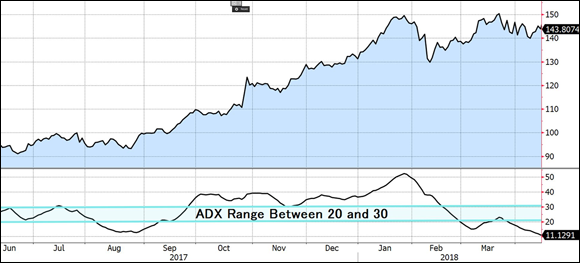
Source: Bloomberg Finance L.P.
FIGURE 5-4: The ADX indicator applied to shares of Old Dominion Freight Line.
The last item you want to remember about trending indicators is that they can be applied to all securities: stocks, commodities, mutual funds, ETFs, and so on. You can even apply them to relative strength — the ratio between two securities. How you interpret trending indicators is the same regardless of whether you apply the indicators to prices or to some derivative of prices.
Recognizing Major Trending Indicators
Unlike non-trending indicators, trending indicators tend to have no upper or lower limits. The higher an indicator’s reading, the stronger the underlying trend. You should only apply trending indicators after you’ve determined that a security is in fact trending either by eyeballing the chart or by using the ADX indicator, which I explain in the earlier section, “Determining Whether a Security Is Trending.”
The following sections help you get up close and personal with three major trending indicators:
- Directional Movement Index (DMI)
- Moving averages
- Moving Average Convergence/Divergence (MACD)
The compass of indicators: Directional Movement Index (DMI)
The Directional Movement Index (DMI) is a powerful technical indicator. Not only does it reveal whether a security is trending, but it also reveals the direction of that trend, whether it’s increasing in strength, and when it ends.
DMI is composed of three plots:
- +DMI: The positive directional movement index (+DMI) plot indicates how effective bulls were in pushing prices above the previous day’s high. +DMI ranges between 0 and 100. The higher the reading, the stronger the bulls.
- –DMI: The negative directional movement index (–DMI) plot shows how efficient bears were in pushing prices below the previous day’s low. –DMI ranges between 0 and 100. The higher the reading, the stronger the bears.
- ADX: ADX measures the difference between +DMI and –DMI. So basically it measures the strength — or lack thereof — of a trend.
Although some traders typically use crossovers in +DMI and –DMI as trading signals, I don’t recommend doing so. When +DMI crosses above –DMI, buyers have wrestled control of shares. When –DMI crosses above +DMI, on the other hand, sellers have wrestled control of shares. Frequent crossovers between +DMI and –DMI signify that neither bulls nor bears have control of shares, a fact that’s reflected in an ADX reading below 20. This means you’re not dealing with a trending security but a range bound one.
Most charting software calculates DMI over 14 periods and uses 25 as the standard ADX average. Both settings are recommended.
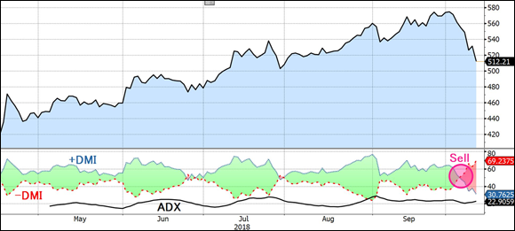
Figure 5-5 provides a sample of what DMI looks like in shares of Intuitive Surgical (symbol: ISRG). For most of 2018, +DMI was clearly above –DMI (indicating the trend was up). When –DMI definitively crosses above +DMI, as it did on October 4, a sell signal is generated.
Source: Bloomberg Finance L.P.
FIGURE 5-5: A chart of ISRG with the DMI indicator.
You may have noticed two whipsaws in the chart. If you look closely, you can see that in late June and again in late July, –DMI crossed above +DMI for a day or two. These were both false signals because +DMI quickly rebounded back above –DMI. There’s no way to protect yourself from such whipsaws. Instead, you must use judgment: Is the crossover a major one due to a big price change or just a small blip that could be quickly reversed? You have to make that call.
Consider the rest of the market to help you decide correctly; is the market raging higher or stuck in reverse? And was there a significant event that just occurred for the company or the industry? These factors can help you determine if these signals are true ones or false positives.
As I stated, I don’t buy a security when +DMI crosses above –DMI, nor do I recommend you do so. Although practically every uptrend is preceded by +DMI crossing above –DMI, whipsaws occur frequently. That’s why I find DMI to be of more value when used as an exit indicator than when used as an entry indicator. While I own shares of XYZ Corp., for example, I don’t want to see –DMI cross over +DMI by a significant amount (as explained in the example of Intuitive Surgical). If there is a meaningful cross of –DMI above +DMI, I exit as quickly as possible.
Use DMI in the following manner to get the most bang for your investing buck:
- Confirm that a trend is in place by using the ADX plot in the DMI.
If a trend exists, enter a trade using moving averages or MACD.
For more on either of these trend-following indicators, check out the following sections in this chapter.
Ensure that +DMI is above –DMI when purchasing shares
If +DMI is above –DMI, you can purchase shares.
- Exit when –DMI crosses above +DMI.
A mean, lean revelation machine: Moving averages
Moving averages — rolling averages of price data designed to reveal the underlying trend in that data — are the most widely used technical indicators. When you use them, understand that the shorter the average, the more frequently the average generates signals. Shorter averages are quick to catch changes in trends but also more likely to generate whipsaws. Longer moving averages are slower to catch trends but less likely to generate whipsaws.
A ten-day moving average, for example, averages the last ten days of price history. On the eleventh day, the moving average drops the oldest day and uses the new day in its formula. (Note: The simple moving average equally weights all bars in its calculation.)
You’ll encounter two types of moving averages in your swing-trading ventures, and whether you use one more than the other is entirely up to you:
- Simple moving averages: This indicator reveals the consensus price agreement over X number of days, where X represents the length of the moving average. When prices rise above their ten-day moving average, for example, you can conclude that market participants believe the security’s value (called market capitalization or market cap for short) has risen above the ten-day average value (meaning, the company is becoming more valuable). Conversely, when a security’s price falls below its ten-day moving average, the security’s value or market cap has fallen below the ten-day average value (meaning, the company is becoming less valuable).
- Exponential moving averages (EMA): This indicator also shows consensus price agreement over a certain time frame, but it weights historical prices differently. Exponential moving averages respond faster than simple moving averages because they weight recent price action more heavily than older price action. The downside to this responsiveness is an increase in the number of false signals.
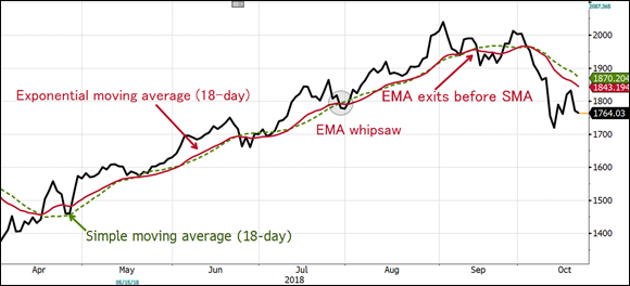
Figure 5-6 provides a comparison of the two moving averages using a chart with an 18-day simple moving average and an 18-day EMA. This chart shows shares of Amazon.com (symbol: AMZN) in late 2018. The slope of the EMA changes before the slope of the simple moving average, as highlighted in mid-September. The EMA gave a sell signal a few days before the simple moving average. But this quickness came at the cost of whipsaws. Notice that in late June and late July, the slope of the EMA turned negative prematurely, whereas the slope of the simple moving average remained positive. A swing trader relying on the EMA may have exited too early and missed out on a price gain of more than 10 percent.
Source: Bloomberg Finance L.P.
FIGURE 5-6: A comparison of the simple moving average and the EMA using shares of AMZN.
The most important part of both moving averages is slope. The slope can be positive (the moving average is rising), negative (the moving average is falling), or zero (the moving average is flat).
You should only buy a security when the slope of the moving average is positive — no exceptions. But when is the best time to enter? You can either enter just when the slope turns positive or you can enter when you have a moving average crossover (for instance, a short-term moving average crossing above a longer-term moving average). Swing trading securities based on a moving average isn’t a complete trading system. The moving average is simply an entry (and sometimes, exit) signal. It doesn’t tell you how much of your capital to allocate to the position, where you should place your stop loss, or when you’ll take profits. For more on these topics, flip to Chapter 10.
In the next couple of sections, I show you how to swing trade using slope changes and moving average crossovers.
Riding the roller coaster: Trading slope changes
The first question you must consider when trading securities based on changes in the slope of moving averages is what moving-average length, or the number of periods, to use. Assuming you’re using daily charts, stick to a moving-average length of 18 days or fewer. (I’m partial to the nine-day moving average myself.)
After you’ve determined the number of days you’re looking at, follow these steps to buy a desired security using slope changes:
Find a security that’s trending, as shown by the ADX indicator.
When the ADX indicator is above 20 (at a minimum), the security is trending. But you still don’t know the direction of that trend. You can figure it out by simply examining the chart and determining whether prices are forming a series of higher lows and higher highs or a series of lower highs and lower lows. Or you can use the DMI indicator described previously in this chapter.
Trade only in the direction of the trend. If the trend is down (such as –DMI is above +DMI) and the nine-day moving average slope turns positive, don’t buy the security. Although the slope of the moving average is now positive (a prerequisite for buying the stock), the overall trend is down; buying in these situations can be like swimming against the tide.After you’ve determined that a trend is in place and that the direction is up, buy when the slope of the moving average changes from flat or negative to positive.
If you trade during market hours, the slope may change to positive at 10 a.m., only to be reversed by closing time at 4 p.m. If you can watch the market intraday, I recommend trading in the last hour, when it’s likely the slope change won’t be reversed. Wait to trade on the day following the slope change if you can’t watch the market intraday.Place the stop-loss level below a recent low.
Some swing traders place their stop-loss order below the low of the day when the buy signal occurred, which represents the exit in the event of loss.
Exit after the moving average turns flat or negative.
In the event of profit, you may exit when the slope of the moving average turns from positive to negative, when a certain return objective is met, or after a certain period of days. However, I prefer the method recommended in this step.
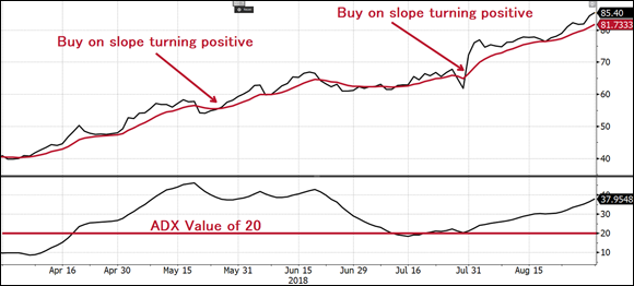
Figure 5-7 highlights buying shares of a security on the upswing as the slope of the moving average turns negative or flat to positive. With the ADX well above 20, you can see that shares of Appfolio are trending, so trending indicators are appropriate. Also plotted on this chart is the nine-day exponential moving average (EMA). As a swing trader, you’d wait for the nine-day EMA slope to turn positive (if the slope is already positive, you’ve missed the opportunity and should pass on the trade). After the slope turns positive, buy the security with a stop loss below a recent trough. Your exit would depend on your trading strategy.
Source: Bloomberg Finance L.P.
FIGURE 5-7: Shares of APPF plotted with a nine-day EMA and ADX.
Crissing and crossing: Trading moving average crossovers
Another way to use a moving average is by trading crossovers. Moving average crossovers occur frequently, assuming both moving averages are short term (for example, two averages with lengths below 18). The longer the averages you use, the fewer the whipsaws but the less frequent the signals. The shorter the averages you use, the more frequent the signals but the more frequent the whipsaws. There is a trade-off.
Multiple moving averages convey information on the value of a security over several time periods. When a short-term moving average crosses above a moving average of longer length, market participants are beginning to change their opinion of the security. Specifically, investors’ perception of the company in the near term is in excess of the average consensus over the longer term. This could signal that the company is undergoing change and its value is reflecting that change. Or (more often), it could be simply noise. That’s where volume can come into play to help you determine the signal from the noise. When a short-term moving average crosses below a long-term moving average, the security’s value is declining relative to price consensus established over the long-term moving average, which may precede a price decline.
The basic method of trading moving average crossovers on the buy side is as follows:
- Determine whether a trend exists by using ADX or the eyeball approach.
- Confirm that a moving average crossover occurs in the direction of the trend by using DMI or the eyeball approach.
- Buy when the short-term moving average crosses above the long-term moving average.
- Place a stop-loss order below a recent trough.
- Exit based on time, return objective, or when the short-term moving average crosses below the long-term moving average.
Stick to moving averages that are 18 days in length or fewer. Although longer-term moving averages — such as the 50-day moving average — are more meaningful than shorter-term moving averages, they generate signals too infrequently for swing traders.
Also remember to only purchase shares on the actual signal. You can’t purchase shares today when the signal was made last week. You’ve arrived late to the party.
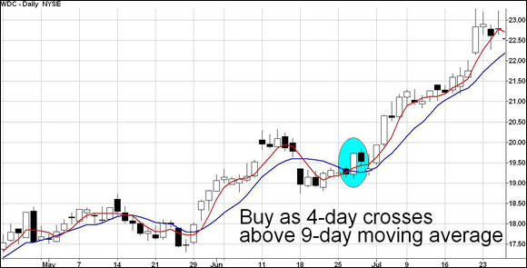
I recommend you use the crossover of the four-day moving average and nine-day moving average. When the four-day moving average crosses
- Above the nine-day moving average in an established uptrend, you should buy the underlying security
- Below the nine-day moving average, you should sell the underlying security
Figure 5-8 highlights a purchase in shares of Western Digital (symbol: WDC) based on the crossover of the four-day moving average above the nine-day moving average. If you’d found this potential trade when the four-day moving average had already crossed above the nine-day moving average, you’d be too late to buy.
Source: TradeStation Technologies
FIGURE 5-8: A four-day moving average and a nine-day moving average crossing over in shares of WDC.
A meeting of the means: MACD
Moving average convergence/divergence (MACD), a variation on the moving average crossover covered in the preceding section, is a third popular trending indicator. Unlike standard trending indicators, MACD shows the direction of a trend as well as its intensity and measures the strength of buyers and sellers.
MACD is a plot of the difference between two exponential moving averages: the 12-day exponential moving average (EMA) and the 26-day EMA. The MACD line rises and falls as the difference between the 12-day EMA and the 26-day EMA expands and contracts. When the 12-day EMA crosses above the 26-day EMA, the MACD line crosses above 0. When the 12-day EMA crosses below the 26-day EMA, the MACD line crosses below 0.
But the difference of these two exponential moving averages isn’t the only plot in the MACD indicator. Believe it or not, the MACD line has a moving average applied to it — an average of an average, if you will. And the difference between the MACD line and its moving average is plotted as a histogram — a graphical representation of this difference. A rising histogram is a sign that buyers are increasing in strength. A falling histogram is a sign that sellers are increasing in strength.
The standard settings for the MACD indicator are to use the 12-day and 26-day exponential moving averages and to smooth out the MACD line using a 9-day moving average. I always use these standard settings.
To see MACD in action and to fully understand its moving parts, take a look at Figure 5-9, which shows MACD applied to shares of First Solar (symbol: FSLR). The MACD line plot is shown along with the nine-day moving average of the MACD line. The difference between these two plots is represented graphically in the form of a histogram below the two lines.
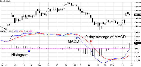
Source: TradeStation Technologies
FIGURE 5-9: This chart shows shares of FSLR with the MACD indicator applied.
MACD can generate trading signals in three ways:
- Positive and negative divergences
- MACD crossover above or below its nine-day moving average
- MACD line crossing above or below the 0 line
I don’t recommend trading securities based off of the MACD line’s crossing of the 0 line. Doing so is identical to trading a security based off of the crossover of the 12-day and 26-day exponential moving averages. (For a refresher on EMAs, see “A lean, mean revelation machine: Moving averages,” earlier in this chapter.)
The following sections delve into the ins and outs of trading using MACD.
Marking highs and lows: Positive and negative divergences in MACD
A positive divergence in MACD occurs when a security makes a new low but the MACD histogram fails to confirm that low, indicating that sellers are weakening in strength and that a trend change is imminent. A negative divergence develops when a security’s price reaches a new high but the MACD histogram fails to confirm that high, indicating that buyers are weakening and that a trend change is looming.
Figure 5-10 depicts a positive divergence in the MACD histogram on a chart of SPDR Gold (symbol: GLD), an exchange traded fund that holds gold bullion (meaning it represents the price of gold). The positive divergence developed in late June as the price of SPDR Gold fell to new lows while the MACD histogram made higher lows. The chart also shows an opportunity to trade off of the crossover in the MACD line. In late April, this line fell below its nine-day moving average, generating a sell signal.
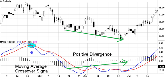
Source: TradeStation Technologies
FIGURE 5-10: This chart of GLD shows the different ways you can use MACD.
If you use divergences, you must use a stop-loss order after entering your orders. Also, enter the position only after the MACD histogram turns in the direction of the trade. If you’re looking to buy a positive divergence in MACD, wait for the histogram to stop falling and turn up — that’s your signal to enter the trade.
Crossing the line: MACD crossover of its nine-day moving average
The MACD line often crosses over its nine-day moving average. When the MACD line crosses above this moving average, you have a buy signal (assuming trending markets). When the MACD line crosses below it, you have a sell signal (again, assuming trending markets). You can interpret a moving average crossover the same as you would a standard moving average crossover.
Follow these steps to enter your trade:
- Verify whether a trend is in place by using ADX or the eyeball approach.
- Wait for an MACD line to cross above its nine-day moving average.
- Enter the day of the crossover (if you watch markets intraday) or the day after the crossover (if you trade using end-of-day figures).
- Place a stop loss below a recent low.
- Exit when the MACD line crosses back below the nine-day moving average.
Spotting Major Non-Trending Indicators
Non-trending indicators, also called oscillators, are designed to track swings in trading ranges. Securities are in trading ranges more often than they trend. Trading ranges represent a stalemate. Neither bulls nor bears can meaningfully push prices past the battle lines. The bulls’ home front is the support zone. The bears’ home front is the resistance zone. Both groups are struggling to push prices deep into the other’s territory. And yet, every attempt is rebuffed.
Non-trending indicators are banded between two extreme values: one overbought and the other oversold. When bulls push prices to the area of resistance, the security is overbought and is likely to reverse (otherwise, a trend would begin and non-trending indicators wouldn’t be appropriate). The key to determining whether a trend exists is to use the tried-and-true method of the ADX indicator or the eyeball approach (see “Determining Whether a Security Is Trending” for how to use the eyeball approach).
When ADX is below a value of 20, a trading range is in force, so you want to use non-trending indicators to stay on the right side of the trade as you attempt to profit from the back-and-forth swings in the trading range. The wider the trading range, the more potential profit you can extract. A range between $50 and $60 is more lucrative than one between $55 and $60 because you have an opportunity to profit off of $10 in the range versus only $5 in the narrower range.
The non-trending indicators you should get to know are stochastics and the Relative Strength Index, both of which I cover in the next two sections.
Stochastics: A study of change over time
The most popular non-trending indicator is stochastics, which calculates the position of today’s close relative to a range established over a time period specified by the user. The higher the close today relative to the range, the more overbought the security. An overbought security is expected to revert to its mean. The best way to explain this phenomenon is to imagine stretching a rubber band as far as you can. If you let go, the rubber band snaps back into place. Stochastics measures how far the rubber band stretches.
This particular indicator also points out when the rubber band is beginning to contract and return to its starting position. Just because a security is overbought doesn’t mean it must immediately turn around and march back to the oversold territory. Oh how easy trading would be if things were that simple!
Following are the two major components of the stochastics indicator:
- %K plot: This plot measures where the current close of the security’s price relates to the highest high and lowest low over a period.
- %D plot: This plot is simply a three-day average of the %K plot.
Common swing trading practice calls for traders to use a 14-day stochastics period. I see no reason to disagree.
The stochastics indicator generates two main signals (which I explain further in the following sections):
- Positive and negative divergences between stochastics and the security’s price pattern
- Crossovers of %K and %D from above the overbought level or below the oversold level
Positive and negative divergences
A positive divergence in stochastics forms when a security’s price falls to a new low while the stochastics indicator traces a higher trough, signaling that sellers are exhausted and buyers are preparing to turn prices around. A negative divergence in stochastics can be seen when prices reach a new high while the stochastics indicator traces a lower high, signaling that buyers are exhausted and sellers are preparing to turn prices lower.
Figure 5-11 illustrates how a divergence, in this case between the price of Best Buy (symbol: BBY) common stock and the stochastics indicator, can flash an important signal about an imminent change in a security’s price direction. While shares of Best Buy rallied to the $51 to $52 level twice in December, the stochastics indicator formed a lower peak on the second rally. This movement signaled that buyers were exhausted and sellers were gaining the upper hand. Shortly thereafter, shares of Best Buy fell 15 percent in two weeks.
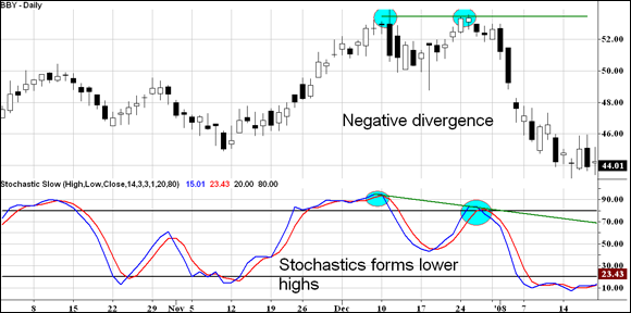
Source: TradeStation Technologies
FIGURE 5-11: This chart illustrates the effectiveness of divergence as an important sell signal in shares of Best Buy.
Follow these steps to use stochastics in your trading program:
- Confirm whether a trading range exists by using ADX or the eyeball approach.
- If a trading range exists, buy when %K turns up over %D following a bullish divergence in stochastics (meaning, the stochastics indicator positively diverges from the price, forming a higher low while the share price is forming a lower low or retesting a support level).
Crossovers from overbought and oversold levels
The more popular use of stochastics trading signals occurs when the %K plot crosses over the %D plot and exits an overbought or oversold territory (note, both %K and %D should be below the oversold level of 20 percent). Charting programs peg overbought and oversold territories as 80 and 20, respectively. This measurement simply means that when prices move to an extreme, within 20 percent of the upper or lower boundaries of a historical price range, you can expect a reversal of the extreme.
Amateur swing traders often buy a security in a trading range simply because stochastics is overbought or oversold. This move is a recipe for whipsaws galore. Instead, wait for stochastics to enter the overbought or oversold territory. After it has, consider your rifle aimed, but don’t pull the trigger just yet. Wait for stochastics to exit the overbought or oversold area. By being patient, you save yourself the heartache that can come when an overbought or oversold security decides to exit its range and enter a trend. When that occurs, stochastics remains overbought or oversold for several days or weeks.
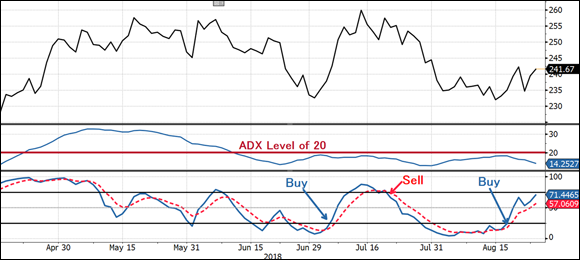
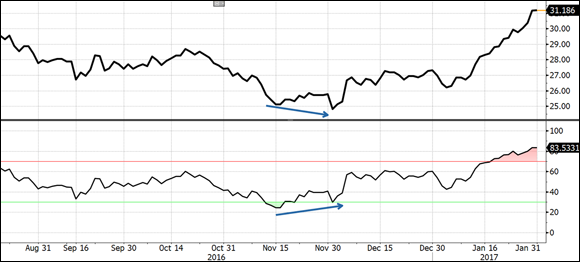
Figure 5-12 demonstrates trades of shares of Ulta Beauty Inc. (symbol: ULTA).With ADX below 20, shares of Ulta Beauty were clearly in a trading range. In this type of scenario, you’d wait for stochastics to enter the oversold territory and buy when %K crosses above %D and above the oversold zone of 20.
Source: Bloomberg Finance L.P.
FIGURE 5-12: This chart shows how observing overbought and oversold levels can help you profit from short-term swings in a trading range.
To trade using stochastics and the overbought and oversold levels, follow these steps:
- Identify whether a trading range exists by using ADX (preferably below 20) or the eyeball approach.
Wait for %K and %D to enter the overbought or oversold territory.
Buy the security when %K crosses up through %D and above the oversold zone.
Exit after stochastics reaches the opposite zone.
Alternatively, you can exit after a return target is achieved or a certain number of days have passed.
Relative Strength Index (RSI): A comparison of apples and oranges
The Relative Strength Index (RSI) is an underused non-trending oscillator that compares a security to itself. Not only does it tell you when a security’s price is overbought or oversold, but it can also form chart patterns that are useful for determining the likely direction of a breakout.
RSI isn’t relative strength in the traditional sense of the term. Relative strength, as explained in Chapter 6, usually refers to comparing the strength of one security to another. For example, shares of Microsoft may be advancing while the market is falling — a classic sign of relative strength.
RSI actually examines the price history of a security over a certain number of days (14 is the standard setting, which I recommend). It compares the average gain achieved on up days with the average loss realized on down days. An average of the gains on up days and the losses on down days is computed, and the ratio between the two (average gains over average losses) yields the indicator.
Like most oscillators, the RSI is range-bound between 0 and 100. Unlike stochastics (covered in the previous section), a reading below 30 indicates an oversold level, whereas a reading above 70 indicates an overbought region. RSI is particularly helpful because chart patterns like the head-and-shoulders or cup-and-handle patterns (explained in Chapter 4) form from time to time. These chart patterns can be interpreted in the same way as if they’d occurred in the price chart.
The next few sections cover the three major ways of using the RSI indicator to trade by using
- Positive and negative divergences
- Chart patterns that develop in the RSI
- The indicator’s turn down from an overbought region or turn up from an oversold territory
Making use of positive and negative divergences in RSI
A positive or negative divergence develops when RSI fails to confirm a new high or new low in a security’s price. You should trade divergences only after RSI turns down (if the divergence is negative) or turns up (if the divergence is positive). And of course, always use stop losses to protect your capital.
Follow these steps to trade divergences in the Relative Strength Index:
- Determine whether a trading range exists by using ADX or the eyeball approach.
- Identify a divergence when the security makes a new high or new low while the RSI fails to confirm the new peak or trough.
- Wait for the RSI to turn up (in the case of positive divergences and entering a buy order) or turn down (in the case of negative divergences and exiting an existing position).
Keep a tight stop loss below a recent trough if you’re buying.
You want to take this step in case the divergence fails or the security traces multiple divergences.
Figure 5-13 shows a chart of Ford Otomotiv Sanayi (symbol: FROTO on the Istanbul Exchange) that demonstrates a positive divergence in RSI. Shares of FROTO made new lows in early December while RSI traced a higher trough — a signal of underlying strength that should be purchased with a stop loss below the recent low.
Source: Bloomberg Finance L.P.
FIGURE 5-13: This chart demonstrates a positive divergence in RSI for shares of FROTO.
Observing RSI chart patterns
Seeing chart patterns in RSI is uncommon. Yet these patterns are more reliable than trading based off of overbought or oversold zones. RSI chart patterns may form at the same time as a chart pattern in the actual price of the security.
Figure 5-14 demonstrates a classic inverse head-and-shoulders chart pattern occurring in the RSI indicator in shares of Callaway Golf (symbol: ELY). Despite prices falling to $8 in early February, RSI signaled that an underlying strength was brewing when it formed a higher trough than the January low (even though the price hit new lows). The actual signal to buy didn’t occur until the inverse head-and-shoulders pattern was completed by the RSI indicator breaking above the neckline (drawn in the chart). In a situation like this, you should buy on the breakout of RSI above the neckline.
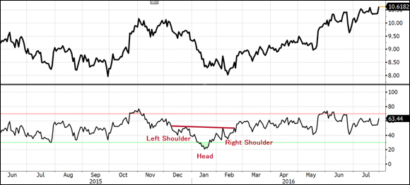
Source: Bloomberg Finance L.P.
FIGURE 5-14: This chart shows an inverse head-and-shoulders pattern in the RSI indicator of Callaway Golf (symbol: ELY).
Trading the RSI indicator’s overbought and oversold zones
The process of trading the RSI indicator’s turn up from the oversold region and turn down from the overbought region is nearly identical to the process of trading overbought and oversold regions using stochastics, covered earlier in this chapter. Here’s how you do it:
- Figure out whether a trading range exists by using ADX (preferably below 20) or the eyeball approach.
Wait for the RSI indicator to enter the overbought or oversold territory (above 70 or below 30 on most charting programs).
Buy when RSI turns up from an oversold reading and through the oversold zone.
Exit after RSI reaches the opposite zone.
Sell the position when RSI turns down from the overbought region, when a stop loss is triggered, or when another indicator you use signals a sell (depending on your strategy).
Combining Technical Indicators with Chart Patterns
Using technical indicators with chart patterns helps you increase your swing trading accuracy. To combine the two, you need to evaluate trades based on what the chart is saying and what the technical indicators are saying, and only take those trades where both chart and indicators communicate the same message. Perhaps the chart pattern is a cup-and-handle formation or a potential breakaway gap to the upside — both positive developments. If your technical indicator — say the DMI indicator — flashes a buy at that same time, you may have good reason to believe a buy is profitable.
Figure 5-15 demonstrates this point beautifully. Shares of ManTech International (symbol: MANT) develop what appears to be a classic cup-and-handle formation. Cup-and-handle formations are bullish, and swing traders normally buy a security after it crosses above its handle, as ManTech International did on December 19. However, the trade failed a few days later.
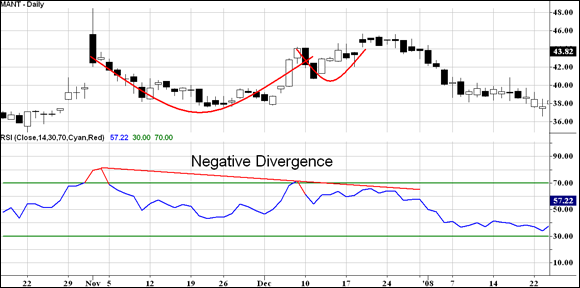
Source: TradeStation Technologies
FIGURE 5-15: A chart of MANT shows the value of combining chart pattern observations with technical indicators.
To spot the brewing trouble in a case like this, you can’t use chart patterns alone. You need to use the RSI indicator in conjunction with a chart pattern to avoid a loss on your trade. In this example, the RSI flagged a troubling divergence forming during the cup-and-handle pattern. While prices of ManTech International moved to new highs, the RSI failed to confirm that strength.
Using Technical Indicators to Determine Whether to Be In or Out of the Market
One of the key questions you face as a swing trader is whether to be in or out of the market. You want to have the wind at your back when swing trading. So, if the market isn’t cooperating, you’re better off waiting on the sidelines until things improve.
When markets are roaring higher, it’s difficult to lose money. You buy and things go up. Sell and repeat. When the markets are falling, the wind is in your face and it’s difficult to make profits. Your trades start out fine but fail quickly thereafter. You start to doubt your skills as a trader.
Technical indicators are useful tools to assist you in determining whether to be in the market or not. And don’t forget that just because one market (say, the United States) is falling doesn’t mean you can’t be trading Chinese stocks that could be in a bull market (this is where a good broker with global market coverage comes in handy).
So what should you do as a swing trader to know whether to trade U.S. equities or not? Well, you can apply an indicator to a market index and simply be in the market or out, based on the results of that indicator. But if you choose this route, make sure your indicator provides few and accurate signals. You don’t want to be jumping in and out of the market and opening and closing positions.
I recommend using the 18-week moving average. When the slope of the 18-week moving average is negative, get out of the market! When the slope of the 18-week moving average is positive, you can comfortably enter buy orders. Figure 5-16 shows a chart of the S&P 500 Index with an 18-week moving average.
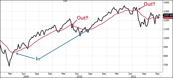
Source: Bloomberg Finance L.P.
FIGURE 5-16: The S&P 500 Index with an 18-week moving average.
You may rely on basic chart analysis to signal the changes between being in or out of the market. Remember that the long-term trend in equity markets is up — at least for U.S. equity markets — but this doesn’t hold true for all equity markets … just ask the Japanese. Therefore, you generally will be in the market for longer periods than you are out.