Chapter 6
Trend Following or Trading Ranges
IN THIS CHAPTER
![]() Understanding the differences between trading trends and ranges
Understanding the differences between trading trends and ranges
![]() Making the most of a strong trend
Making the most of a strong trend
![]() Working with an identified trading range
Working with an identified trading range
![]() Conducting intermarket and relative strength analysis
Conducting intermarket and relative strength analysis
Most swing traders make their money in one of three ways: trading strong trends, trading ranges, or both. A trend is the persistent up or down movement of a security’s price. Trends can last anywhere from a few days to a few years, but generally, a security must rise to new highs or fall to new lows every few weeks to be considered trending (for a swing trader, that is; long-term investors define trends in a different time frame). If you choose to accept trading trends, your job is to find the strongest uptrends and ride them until you exit for a profit or are forced out for a loss (a small one, hopefully!).
Many markets and securities are neither trending upward nor downward, though. Instead, they’re oscillating up and down between clearly defined price levels called support and resistance, resulting in a trading range. As with trends, trading ranges can occur over short periods or long periods. The longer a trading range has been in place, the more likely it is to continue. For example, if Dummies Corporation stock has been trading between $50 and $60 for the last three months, it’s safe to assume that the stock is in a trading range. Your job is to buy near $50 and sell near $60 if your strategy is built around trading ranges.
But just what makes a trend strong or weak? And how do you know whether to trade trends or ranges (or a mixture of both)? I help you figure out your answers to these questions in this chapter (emphasis on your; there is no right answer because it depends on your risk tolerance and temperament). Please note, though, that in order to fully understand the guidance in this chapter, you need to have a solid understanding of chart patterns and technical indicators, which I cover in Chapters 4 and 5 — head to those chapters first if you need a refresher.
Trading Trends versus Trading Ranges: A Quick Rundown
Most swing traders focus primarily on trading trends simply because the profits tend to be bigger than when trading ranges. The added beauty of trends is that they require little or no work on your part to manage. In an uptrend, the security’s price rises consistently and doesn’t fall much from its highs — say 5 percent to 10 percent at the most. Entering a trend early (in the first few days of the start of a new trend) allows you to enter when the risk is lowest. Entering a trend that has been in place for several weeks or (gulp!) months raises the chance that you’re getting on just when you should be getting off.
 The difficulty in riding trends arises from identifying when a trend has begun and exiting quickly when it’s clear the trend is over. The latter problem is the biggest concern for you as a swing trader. Trends aren’t difficult to find and enter, but when a security moves counter to its trend, you have to decide whether that move is simply a normal part of the trend development or something more sinister (the end of that trend).
Although trading ranges isn’t as popular among swing traders as trading trends, don’t be fooled by the ranges’ small profits. Swing traders tend to have a higher win ratio when trading ranges than when trading trends. In other words, you may make smaller profits per trade if you trade ranges, but you’ll also tend to be right more often than if you were trading trends.
One of the advantages of trading ranges versus trading trends is that with ranges your profit and risk objectives are easily identified. Your profit objective is simply the other side of the range; for example, if you’re buying a stock at $60 per share, your goal is to sell at the resistance range of say $70 per share. Similarly, your risk is clearly defined: If you buy near $60 per share, you’re going to exit your trade if the stock trades below $57 or $58. Such a move outside the established trading range likely signals the beginning of a new trend.
When trading ranges, the biggest risk you face is a security beginning a new trend. Because your trade depends on the continuation of the range, you’re unlikely to be on the right side of the trade should a trend develop. For example, you could lose a bundle on a stock if you buy shares near $60 (with a range between $60 and $70) and the stock proceeds to break down below its lower trading range of $60 per share and falls to $50 or less. If the stock rallies to the upper level of the trading range of $70 per share, pauses, and then moves even higher, you’re like to miss out on any gains above $70 per share because your trading strategy likely calls for exiting a security in a trading range at the upper bound of that range ($70 in this case). Therefore, you’re unlikely to ever be on the right side of a trend if you focus on trading ranges.
 So should you trade trends, ranges, or both?
Unfortunately, as with many aspects of swing trading, you won’t find a one-size-fits-all answer. Some traders are looking for those big moves — that 10 percent or 20 percent move that will happen over a few days. They’re willing to tolerate being wrong some (or even most) of the time in their quest for home runs. Such swing traders should focus on trends. Other traders are patient and are content with hitting singles and doubles each inning. They’re fine with 3 percent or 5 percent returns on each trade. They’re right 50 percent or more of the time, and they cut losses fast. Such swing traders are best suited for trading ranges. If you’re not sure which method fits your personality, read about the methods outlined in this chapter and pick the one you feel most comfortable with.
If you understand how ranges work, you’re more likely to recognize a range that represents true consensus and not simply a small pause in a security’s move upward or downward. Also, you’re attuned to how news or events may affect a security breaking out of its range. Advanced traders may use both methods to take advantage of both ranges and trends. That’s because the overall market may determine whether range trading or trend trading is easier at any given moment. A zooming bull market pushes the majority of stocks higher, and trading ranges is difficult. A tough bear market pushes the majority of stocks down, regardless of their fundamentals. When a market is gridlocked in a trading range, trends are few and far between.
Trend Trading
Trend trading is swinging for that home run and occasional grand slam. Swing traders focusing on trends are looking for big returns in short periods. They’re looking to enter a trend that has clearly established itself. Because trends move fast and furious, they have to keep stop loss orders tight to exit on a moment’s notice if the wave they’re riding crests.
So first things first: How exactly do you find strong enough trends to trade? And when you find a strong trend, how do you know whether the time is right to enter on that trend?
Finding a strong trend
You can find trending securities in multiple ways. You can do a bottom-up search — where you’re performing a ranking of some sort (based on fundamental or technical criteria) and examining each security, one by one, or you can do a top-down search, where you’re scoping out industry groups and then narrowing your view to individual stocks. You then can determine trend strength through a variety of ways. One way is the eyeball approach, in which you size up a chart by simply looking at it. Or you can use technical indicators that tell you — with little interpretation — whether the security you want to trade is trending and whether that trend is up or down. The ADX indicator is often used to measure whether a security is trending or non-trending without regard to whether the trend is upward or downward. Most popular charting programs include the ADX or include it as part of the DMI indicator. You can find out more about ADX and DMI indicators in Chapter 5.
An ADX reading above 30 signals a trend. The higher above 30 the ADX reading is, the stronger the trend. But excessive values (for example, readings above 60) may indicate an overheated trend that’s about to reverse. ADX values between 20 and 30 are ambiguous, meaning the security may be in trend or not. ADX values below 20 are characteristic of trading ranges.
Here’s a quick look at how you can use both search methods:
Bottom-up search: Trending stocks can be found with Investor’s Business Daily (IBD). IBD publishes which stocks are making new 52-week highs as well as the “IBD 50 Stock List”— a screen highlighting 50 companies exhibiting strong growth characteristics with strong charts. What you want to see is a stock that hasn’t made a new high in a long time and then bursts onto the scene. These stocks are often just beginning their trends. (Check out the Appendix for more about IBD.)
Another bottom-up method of identifying trending stocks is through research services. High Growth Stock (HGS) Investor software, for example, allows users to screen stocks in particular groups, markets, and so on by those making new highs or new lows over any chosen time period. The period you choose should be long enough to signal a meaningful trend, but not so short as to capture stocks moving normally up and down. After all, a stock making a new one-day high isn’t very meaningful.
Top-down search: You can locate strongly trending stocks by looking at strongly trending industry groups. Popular research services like MarketSmith (by IBD), HGS Investor, and StockCharts.com provide data on which industry groups are the top performers over the last several months. Just because a group is hot right now, however, doesn’t mean it will be hot forever; industries fall out of favor just as individual securities do.
Begin your search by looking at the top ten performing industry groups and drilling down to find securities that may be trending. Again, you want stocks just making new highs after a period of moving sideways. Examine the chart and see if the security is clearly rising. You get more tools on measuring trends using indicators in Chapter 5.
Just because a stock belongs to an industry group that’s in an uptrend doesn’t necessarily mean that the stock is also trending or that it’s trending upward. It’s possible to find stocks that belong to a hot industry but that are falling on hard times. So, make sure you’re only buying stocks in strong trends in groups that are trending upward.
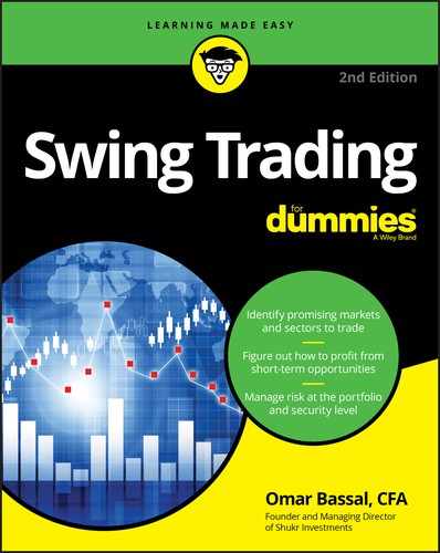
Figure 6-1 highlights shares of F&F Company (symbol: 007700 KS) traded in South Korea, which is ripe for trading on a trending basis. On May 18, 2018, shares hit a 52-week high, beginning a powerful move that would see the stock rise 100 percent in less than four months.
Source: Bloomberg Finance L.P.
FIGURE 6-1: This security hits a new 52-week high and is a prime candidate for trend trading.
Knowing when to enter a trend
The biggest risk swing traders who focus on trends face is the possibility of buying a trending stock that’s just about to end. Ian Woodward, a professional investor, compares buying stocks late in their trends to acting like an unruly dog chasing speeding cars. Sure, it may be fun for the dog, but sooner or later he’s going to be run over.
To minimize your risk of riding a crashing wave, you must follow some system that only enters at the right time. The ideal setup is a security making a fresh, new high over the last 26 days.
So how do you know if the trend you’re riding is just beginning or winding down? There’s no foolproof way, but you can minimize the chance of failure by ensuring the market is in a strong uptrend, the security has just made a new high (after being in a range), and that the ADX value confirms the trend (preferably above 30).
As with all aspects of trading, you can never be 100 percent sure about a trade. The best you can do is put the odds in your favor by only entering on some type of signal. If the trend is genuine and is going to continue, you’ve entered early. If the trend is failing, you’ll know shortly because your signal will likely reverse itself if the trend ends or breaks down.
The signal you use can be based on chart patterns or technical signals. Generally, chart patterns give traders earlier warning than technical signals, but technical indicators require little interpretation, which makes your job easier. For example, a stock rising above its 50-day moving average could be a signal to buy, or a MACD crossover (covered in Chapter 5) could be a signal to buy (depending on the direction of the crossover). Many swing traders only enter trends when a security first makes a new high of X number of days, provided this is the first new high in the last month or two. Otherwise, you run the risk of buying a stock that’s extended or has been making new highs for a long time.
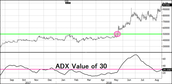
 Another approach to entering swing trade orders is to wait for a pause in the trend and enter on a day of strength. To enter on a day of strength, you must wait for the stock to form three consecutive bars of declining highs. Then you enter on the next bar that trades higher than the previous bar’s high.
In Figure 6-2, the chart of Apple Inc. (symbol: AAPL) shows a strong uptrend that began in late July 2007 on a strong gap up in share prices. After rising 40 percent, shares retraced their steps and made three consecutive lower highs marked by the numbers 1, 2, and 3. (Notice that the day prior to number 1 doesn’t count because its high exceeds the previous bar.) After making four lower highs, the stock moved higher and exceeded the high of the fourth bar, signaling the continuation of the uptrend and an ideal entry point.
Source: TradeStation Technologies
FIGURE 6-2: A day of strength is often a good opportunity to enter a strong trend.
Whatever signal method you use, make sure to only enter the trade on that actual signal. You’ll find dozens of trending stocks that gave signals 5, 10, or 20 days ago — ignore them. You can’t be disciplined if you’re entering trends late. Only enter on a signal you choose on the day of the signal.
If you look back at Figure 6-1, you’ll notice that the 52-week high registered on May 18, 2018, was the first in a few months. Remember, you want to avoid buying a strong trending stock that has been making new 52-week highs every other day. An extended period of time between 52-week highs is a means of protecting yourself from buying an extended stock. Enter either on the sign of a new high over the last 20 or more days or on a day of strength (the day of strength approach will help you avoid getting run over by speeding cars).
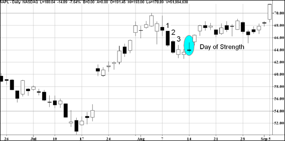
Figure 6-3 highlights the day of strength for Mosaic with an ADX reading above 20 on the day of strength (but interestingly, not on the day of the 52-week high). In this example, the day of strength allows ADX time to give a clear signal on whether the stock is trending or not. Should you have entered on February 13, 2007, the day of the 52-week high? That depends on what your trading strategy calls for: If you buy new highs immediately, then the answer is yes. However, I recommend using ADX as a means of weeding out weak trends from strong trends. In this case, the ADX was below 20 on the day the stock made a new high. The ADX indicator didn’t register a reading over 20 until February 20, 2007. Notice also a second entry point after a second day of strength later in the trend.
Source: Bloomberg Finance L.P.
FIGURE 6-3: ADX above 20 signals the existence of a trend — enter on a day of strength.
Managing risk by determining your pain threshold
Determining when you will exit a failed trade will depend on when you entered the security. I cover exit levels in more detail in Chapter 10, but in short, your exit price for a failed trade will either be based on a technical indicator signal, a predefined price level or the passage of time (that is, exiting after a certain number of days have passed). Following is an explanation of each of these exit-setting mechanisms:
- Technical-indicator emergency exit signal: This includes exiting on the break down below a moving average or on a MACD sell signal (both of which are covered in Chapter 5).
- Price-level emergency exit level: Entering on a new 52-week high will require an stop-loss exit level right in the trading range that the stock is emerging from. If you bought shares of Mosaic as they made a new high on February 13, you would set an exit level between $21 and $22 per share. If the trend is real, the stock shouldn’t fall back into its original base.
- Time-based exit level: A time-based exit simply calls for you to enter after X number of days when neither your profit target has been achieved nor has your emergency exit level been breached.
If you enter on the day of strength that I recommend in the preceding section, your exit level is easier to compute than it would be using the other methods identified here. In this case, your exit should be based off the low directly preceding the day of strength.
Trading Ranges: Perhaps Stasis Is Bliss?
Finding a security in a trading range can be more difficult than a finding a trending stock. Screening for securities making new highs is much easier.
Technical indicators (which I cover in Chapter 5) can be useful in identifying when a security is in a trading range and when to enter or exit a trade. However, not all technical indicators are applicable to trading ranges. Trending indicators, as the name suggests, are useful when a security is in a trend. Non-trending indicators (often called oscillators), on the other hand, should be used when securities are in a trading range. You should choose two or three oscillators (at most) to use in a trading system.
Finding a security in a wide trading range
When swing traders want to determine if a security is in a trading range, they often use an ADX indicator. The calculation methodology is beyond the scope of this book, but I can tell you that most popular charting programs include ADX (or include ADX as part of the DMI indicator). What you need to know is that an ADX value below 20 signals a non-trending market, and an ADX value above 30 often signals a trending market.
A range must be wide enough to allow for meaningful profits. For example, if a stock trades between $56 and $60, the range would be so tight that profits would be eaten up by commissions, taxes, and so on. No hard and fast rule exists for how wide is wide enough, but shoot for ranges where you can make at least 10% profit buying at the support level and selling at the resistance level.
The strength of trading ranges depends on a few factors:
- Time: The longer a trading range has been in force, the more likely it is to continue.
- Touches of support and resistance: The more times a security touches its support and/or resistance level (see Chapter 4), the more powerful that support or resistance level is. Look for trading ranges with several touches or tests of support and resistance.
- Flat ranges: When I refer to flat ranges, I mean how much a trading range resembles a rectangle. Some trading ranges have resistance levels that rise or support levels that fall; these ranges are suspect because they don’t clearly identify true areas of support or resistance. In fact, they may be some other chart formation entirely. The flatter the support and resistance levels, the stronger your conviction should be that the trading range is genuine.
Figure 6-4 shows a chart of MEMC Electronics Materials (no longer listed). You can see the trading range by eyeballing the chart and identifying clear support and resistance levels. Notice also that the ADX level is below 20 on the chart, signaling a non-trending market.
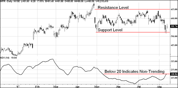
Source: TradeStation Technologies
FIGURE 6-4: This chart shows a trading range with resistance at $65 and support at $52.
Entering on a range and setting your exit level
Your entry is likely to be driven by either a day of strength (defined earlier in this chapter) or a technical signal. For the MEMC Electronics example, I assume you’re using stochastics (an indicator useful in measuring strength or weakness in trendless markets; see Chapter 5 for more on stochastics) to signal a buy order.
Stochastics flashes a buy signal when the signal line crosses above the moving average from an oversold level. That area is highlighted in Figure 6-5. In the case of MEMC Electronics, the buy signal from stochastics occurs when shares are around $55.
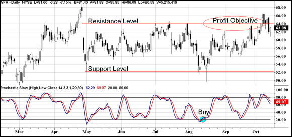
Source: TradeStation Technologies
FIGURE 6-5: This chart shows a buy signal from stochastics and a profit objective near the upper end of the trading range.
The target profit in trading ranges is just the opposite side of the trading range. In this case, resistance was solid around $65 per share, so a reasonable profit target is $64. Shares of WFR hit that level roughly six weeks after the buy signal was generated.
The risk level of this trading range is located slightly below the support level. A meaningful movement in share price below the support level signals the trading range has ended, but don’t be strict on what you consider meaningful. For example, if the support level is at $52, a risk level of $51 may be unreasonable given the volatility in the chart.
I prefer to set risk levels right below major, whole, round numbers. Traders often fall into the trap of putting stop loss orders or buy stop orders at round number levels. The problem with setting risk levels or buy orders at round numbers is that hundreds of other traders may be the doing the exact same thing, meaning that you’re likely to get a bad execution or get whipsawed (shaken out of the trade by a rapid price movement).
For the example shown in Figure 6-5, with support at $52 and an upper resistance level at $65, I recommend placing a stop-loss order below $50 per share. In my view, a trade below $50 is a good indication that the trading range has ended and the stock is beginning a downtrend.
Note: Right after the buy signal from stochastics is generated, shares of WFR trade down sharply, touching a low of $49.70. (Notice, though, that shares never close below $53.) If you had set your risk level exit at $50, you would have been exited from this trade early.
Comparing Markets to One Another: Intermarket Analysis
Intermarket analysis is an underutilized technique in technical analysis. Intermarket technicians analyze currencies, equity markets, fixed income markets, and commodities to determine which market holds the most promise. Often, an upturn in one market signals an upturn or downturn in another market, and intermarket analysis can give you an early lead on a rally or decline in that sector or market. Rising fixed income prices often precede equity market rallies. Rising commodity prices, on the other hand, can lead to a downturn in stock prices. Knowing the relationships among the four major markets — bonds, currencies, commodities, and stocks — means that you can anticipate changes in market leadership.
I begin this review of intermarket analysis by taking a bird’s-eye view of the investment landscape. Currencies (specifically, the U.S. dollar) analysis is helpful as investors seek to profit from strength or weakness in an investor’s domestic currency. Then I cover commodities (for example, oil, gold, and copper) given their importance to the global economy. I also discuss bond prices and interest rates, which affect equity markets.
Passing the buck: The U.S. dollar
The U.S. dollar is the world’s reserve currency, or the most widely used currency. The dollar is affected by a host of factors, including the interest rates the Federal Reserve sets (known as monetary policy), the national debt, and the current budget deficit or surplus. As you may have learned in your economics course, the value of a currency (assuming it freely floats on the world markets) is determined by the supply and demand for that currency.
The Federal Reserve controls short-term interest rates in the United States, and short-term interest rates, in turn, have a significant impact on the value (or demand) for U.S. dollars. If the Federal Reserve raises interest rates, the dollar is likely to strengthen because investors seek out high yields on their investments. However, if that government cuts interest rates to 2 percent, fewer investors will invest in that country, which will negatively affect that country’s currency (assuming all else is equal as other countries’ policies affect a currency’s movement).
Fiscal policies — government spending or taxes — affect the dollar but usually take longer to materialize. If the U.S. government spends more than it has (that is, it generates budget deficits), the dollar’s value may decrease because a budget deficit represents borrowing money today at the expense of paying it back in the future. The larger the deficit or the larger a country’s national debt, the more pressure on the currency. Think of it this way: The more the government spends, the more available U.S. dollars are. By increasing the supply, you decrease prices.
So how can you make money with this knowledge? Here’s how you may benefit when the dollar strengthens or weakens:
- Dollar strengthening: When the U.S. dollar strengthens, it usually bodes well for U.S. stocks. International investors are attracted to strong currencies because the investors can increase their potential return by profiting from the rise in a U.S. stock and a rise in the U.S. currency. The exception to this rule would be U.S.-listed companies deriving significant portions of their revenues outside the United States; such companies are hurt when the U.S. dollar strengthens because their earnings in foreign currencies are worth less when translated into U.S. dollars.
- Dollar weakening: Weakness in the U.S. dollar can translate into higher commodity prices. Look for gold, crude oil, and other world commodities to benefit from a weak dollar.
The chart in Figure 6-6, which shows the U.S. dollar (top) and gold prices (bottom), illustrates how intermarket analysis can boost your returns. The U.S. dollar began a major decline in August 2007 while gold prices began a major advance. If you see the U.S. dollar weaken, look for swing trading opportunities in commodities or commodity-related securities (like gold miners or oil exploration companies). A weak U.S. dollar tends to lead to higher commodity prices (in U.S. dollars), and a strong U.S. dollar tends to lead to lower commodity prices (in U.S. dollars).
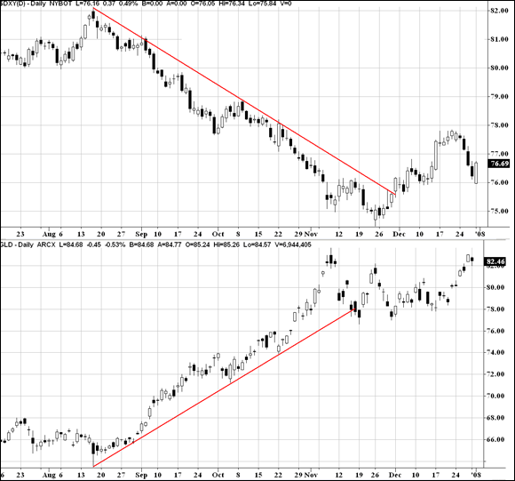
Source: TradeStation Technologies
FIGURE 6-6: Watch the strength or weakness of the U.S. dollar for clues on the direction of commodity prices.
Tracking commodities
Commodities come in different flavors:
- Energy commodities include items like crude oil, heating oil, and natural gas.
- Metal commodities include gold, silver, and platinum.
- Livestock and meat commodities include live cattle.
- Agricultural commodities include corn and soybeans.
Between the 1980s and early 2000, commodities didn’t get much respect and were considered unimportant in the so-called new economy. Many traders underweighted or divested altogether investments in the commodity space.
All that changed in 2000. With the equity market top in 2000, investors sought out new investment opportunities, and gold, oil, and other commodities benefited from the interest. Later, at the turn of the 21st century, demand for commodities from emerging markets like China and India rose markedly. Because commodity prices in general had been poor investment options in prior years, commodity producers hadn’t invested in sourcing new supplies. For example, because crude oil prices had been range-bound during much of the 1990s, energy firms didn’t invest in new equipment or search for new oil discoveries. As a result, prices of these commodities shot up when demand increased.
Most individual investors never buy commodities directly because of the risks and complexity of trading futures contracts. But recent innovations have allowed equity investors to take advantage of movements in commodity prices. For example, a trader wanting to take advantage of a bull market in gold prices can purchase shares of GLD, the SPDR Gold shares, which trade on the New York Stock Exchange.
In general, investors would be better served buying the shares of commodity producers rather than the commodities. That’s because the long-term returns of commodities aren’t much higher than the rate of inflation. Companies, on the other hand, can expand production, invest in opportunities and earn higher rates of return over the long term.
You can track the prices of commodities in many ways, but the most popular baskets are the Reuters-CRB Index and the Goldman Sachs Commodity Index.
Although commodities can make you a pretty penny (made out of copper, I might add), they also give important signals on the direction of other asset classes. Commodities represent goods that you and I buy day-to-day — whether we realize it or not. When prices of commodities rise, inflation can result. Inflation is a principal risk of fixed income investors because payments aren’t usually adjusted for the value of the dollar.
Therefore, commodity prices tend to correlate negatively to bond prices (and thus, positively correlate with interest rates because bond yields move inversely to bond prices). Rising commodity prices usually occur with falling bond prices and rising yields. Conversely, falling commodity prices usually occur with rising bond prices and falling yields.
No relationship is guaranteed in the financial market, and it’s possible for commodity prices to trend in the same direction as bond prices. But such action is unlikely to last long. Bond investors eventually sell bonds if they believe the risks of inflation are rising. A small move in the prices of commodities may not convince them that such a risk is imminent, but a sustained rally or decline in commodity prices affects the strength or weakness in bond prices.
Figure 6-7 shows just how that relationship played out once. Commodity prices, as measured by the Reuters-CRB Index, began rallying in late March. Shortly thereafter, bond prices fell (and bond yields rose). The bottom chart shows the yield on the 30-Year U.S. Treasury Bond. As you can see, commodity prices and bond yields move in the same direction. As a swing trader, you can use this knowledge to your advantage — a sustained rally in commodity prices leads to higher bond yields and trading opportunities in commodity-producing companies.
Source: TradeStation Technologies
FIGURE 6-7: Commodity prices (top chart) tend to be positively correlated to bond yields (bottom chart).
Commodity price performance relative to bonds can help you pinpoint market sectors to target for investments. Here are some guidelines:
- If the ratio between commodity prices and bond prices is rising (meaning that commodity prices are outperforming bond prices), you should look for investment in sectors that are inflation-sensitive, like basic material manufacturers (aluminum manufacturers, copper producers, energy companies, and so on).
- If the ratio between commodity prices and bond prices is falling (meaning that bond prices are outperforming commodity prices), then look for investment opportunities in interest rate-sensitive sectors such as home builders, real estate, and utilities.
Watching how bond price and stock price movements correlate
Bond prices are extremely sensitive to inflation. As inflation rises, the value of the series of payments that bonds pay decreases. A higher-than-expected Consumer Price Index reading will cause bond prices to fall. A lower-than-expected inflation report, on the other hand, tends to push bond prices higher.
Many valuation models of the U.S. stock market compare the yield on government or corporate bonds to the earnings yield of equity securities. For example, the Fed Model compares the yield on the 10-Year Treasury Bond to the earnings yield of the S&P 500 Index. If the 10-Year Treasury Bond currently yields 5 percent and the S&P 500 Index forward P/E ratio is 15 times earnings, investors using this model would conclude that equity prices are undervalued when compared to bonds. (To get the earnings yield of the S&P 500 Index, you simply calculate 1 divided by the P/E ratio. In this example, 1 divided by 15 equals 6.67 percent, which is higher than the 5 percent the 10-Year Treasury Bond paid.)
Bond prices tend to lead stock price movements. As bond prices rally, bond yields fall, making stocks an attractive alternative. Conversely, falling bond prices (and thus, rising bond yields) tend to lead stock price weakness. This relationship doesn’t hold in deflationary environments where bond prices rise while stock prices fall (deflation is the opposite of inflation; that is, a period of economy-wide falling prices). However, deflationary environments are the exception in U.S. economic history.
Figure 6-8 highlights an example of the typical relationship between equity prices and bond prices. The figure compares bond yields for the 30-Year Treasury Bond (top) and the S&P 500 Index (bottom) in 1996–1997. Notice that a peak in the yield of the 30-Year Bond in July 1996 corresponds with a bottom in equity prices. A similar peak/bottom occurs in April 1997. A sustained decline in bond yields corresponds with a rallying equity market. But correlation doesn’t imply causation. In other words, although there’s a relationship between these markets, you can’t say that the rally in equity prices was caused by the declining yield of the 30-Year Treasury Bond.

Source: TradeStation Technologies
FIGURE 6-8: Equity prices and bond yields tend to be negatively correlated.
As a swing trader, you should watch the relationship between bond yields and stock prices. When yields enjoy a sustained rally, be on the lookout for a pullback in stock prices. If you see yields falling, it may precede a rally in stock prices. Be on the lookout for stocks hitting 52-week highs or exhibiting strength via breakouts from trading ranges when you see a sustained fall in yields.
Putting Securities in a Market Head-to-Head: Relative Strength Analysis
A twist on intermarket analysis — where a swing trader looks at how commodity prices or bond yields affect equity markets — is intramarket analysis, often called relative strength analysis. In addition to comparing markets to one another, swing traders should use intramarket analysis to compare securities within one market. Relative strength analysis is like having your own pair of X-ray vision goggles that allow you to see which securities are truly strong and which are totally faking it.
Relative strength analysis involves charting one security or index relative to another. The ratio generated from the two can be analyzed like any stock chart. Most charting programs calculate such ratios for you with the click of a mouse. You can compare all sorts of things against each other: Apple Inc. versus Google, or Clorox versus the overall market. You can even compare markets against each other to get an idea of when leadership switches from one market to the other.
Suppose you want to buy a strong stock. Should you be focusing on large cap, mid cap, or small cap stocks? Relative strength analysis can answer that question. By comparing one group to another, you can detect when one group is strengthening relative to the other.
But be careful — you want to make meaningful comparisons. Comparing General Motors to Ford or General Motors to the auto industry in general makes perfect sense, but I’m not sure what you could gain from comparing General Motors to Google.
I like to begin my analysis with a macro view of the world. I want to know which equity markets are hot and therefore worthy of my dollars. One advantage swing traders have these days is the ease of accessing equity markets from all over the world. Many exchange-traded funds and American Depository Receipts allow swing traders to gain profits from almost anywhere on earth. Or, a swing trader can open a brokerage account with a firm that gives direct access to equities in major financial hubs (for example, London, Hong Kong, Singapore, Japan, and such).
Treating the world as your oyster: The global scope
Because this book is targeted to swing traders, the first step that I address in intramarket analysis is to explore which equity markets are exhibiting strength globally.
The following are the major equity markets you should be familiar with and can compare to one another:
- Developed world
- The United States (S&P 500 Index)
- Western Europe (use iShares S&P 350 Index, symbol: IEV)
- Japan (use iShares MSCI Japan Index, symbol: EWJ)
- Australia (use iShares MSCI Australia Index, symbol: EWA)
- Emerging markets
- Latin America (use iShares S&P Latin American 40 Index, symbol: ILF)
- China (use iShares FTSE/Xinhua China 25 Index, symbol: FXI or the iShares MSCI China ETF, symbol: MCHI)
- Emerging markets in Asia (use SPDR S&P Emerging Asia Pacific, symbol: GMF)
You can analyze dozens of other individual markets using proxies such as the iShares or SPDR shares mentioned here (you can find proxies for the markets in Austria, Belgium, Australia, South Africa, Brazil, and so on). But I like to keep things simple and present only the major developed markets and the key emerging markets.
The second step in analyzing relative strength between equity markets is to construct a ratio chart between two different markets. When analyzing ratio charts, apply the technical tools you pick up in Chapters 4 and 5. Look for support and resistance ranges. Also, determine whether the ratio is trending (which indicates that one market is dominating the other) or in a trading range (which indicates that both markets are achieving similar returns).
Make sure you read your ratio chart correctly. The first thing you should do when you examine a ratio chart is determine whether a rising ratio means market A or market B is performing well. Most charting programs clearly designate which market is in the numerator of the fraction and which market is in the denominator of the fraction. (In the example shown in Figure 6-9, the numerator market is designated by being charted above the denominator market.)
Source: TradeStation Technologies
FIGURE 6-9: Comparing markets to one another helps you determine which markets are most lucrative for trading.
A general rule is that a rising ratio means the market index in the numerator of the fraction is outperforming the market index in the denominator of the fraction.
Talk of numerators and denominators may bring back unpleasant memories from grade school, so take a look at an example that helps bring the analysis home.
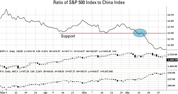
Figure 6-9 shows the ratio of the S&P 500 Index to the FTSE/Xinhua China 25 Index as measured by the iShares security. This figure shows three charts. The first chart is the actual ratio between the two indexes (S&P 500 divided by the FTSE/Xinhua China 25 Index). The second and third charts are just plots of the actual indexes used in the computation of the first chart. (Most charting programs provide the underlying indexes used in the computation of a ratio chart.)
This chart covers the two equity markets from March 2007 through June 2007. Notice that the ratio chart is declining in March (signaling strength of China or relative underperformance of the U.S. equity market) but stabilizing in May and June. However, a break below that support level on June 11 signals the resumed outperformance of the Chinese stock market over the U.S. equity market. That break is a strong signal to buy China public equities.
Intramarket analysis isn’t confined to equities. As a swing trader, you can compare gold prices to the Reuters-CRB Index, for example, to determine whether gold prices are outperforming other major commodities. Or you can compare the relative strength of shares of Google to the Nasdaq 100 Index (a popular tech index) through the Invesco QQQ Trust, an ETF with symbol QQQ. The combinations are endless.
Holding industry groups to the market standard
Another application of relative strength analysis is to compare industry groups to the overall market. According to William J. O’Neil, founder of Investor’s Business Daily, industry group performance can explain between 30 percent and 40 percent of a stock’s performance. When oil service company stocks are hot, for example, shares of companies in the industry will rise together. When Internet retailer stocks are out of favor, look out below! These stocks will tend to go down together.
Why do stocks sometimes behave like a herd of animals? Well, think of it on a simple level: If you operate a shoe store in Run of the Mill City, USA, you probably experience sales increases or decreases in line with other shoe retailers. If a hot brand comes out one year and propels your sales higher, don’t you expect other shoe retailers to experience similar success? The reason stocks in industry groups tend to behave in a similar fashion is they face many of the same market forces in their industry: both the benefits and risks. When the U.S. government spends more on defense, all defense companies benefit together. One company may get a bigger slice of the pie than another, but the entire pie is bigger, so other companies benefit. On the other hand, when the government tightens its purse strings, expect to see shares of most defense companies fall on hard times.
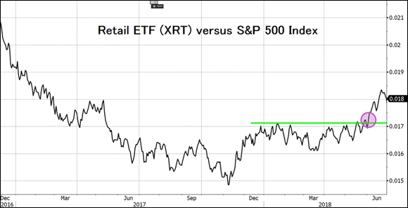
Industry group intramarket analysis compares industry groups to the overall market. When the ratio between the two is rising (meaning the industry group is outperforming the overall market), that may mean the industry group warrants further research for opportunities. You use the normal technical analysis tools from Chapters 4 and 5 on the ratio. Figure 6-10 highlights the S&P Retail ETF (symbol: XRT) as compared to the S&P 500 Index in 2017–2018. A rising ratio in this chart means that the retail index is outperforming the general market. On the other hand, a declining ratio implies the opposite — that the S&P 500 Index is outperforming the retail index.
Source: Bloomberg Finance L.P.
FIGURE 6-10: Comparing industry groups to the broader market can help you identify promising industries to trade.
For most of 2017, the ratio of the retail index to the S&P 500 Index was falling. This indicated that the retail index was underperforming the overall markets. However, in November, the ratio bottomed and moved into a trading range, which signals that the retail index was no longer underperforming the broader market. In early June 2018, the ratio broke out of a range and moved higher, which signaled that the retail index was going to begin a period of outperformance overall the general market.
After you identify a turning point among an industry group and the market, you can take advantage of that difference by drilling down into the industry group to find trading candidates.
In the case of the example in Figure 6-10, you know that the retail index is likely to begin a period of outperformance over the market. So, now compare each stock in the sector to the sector itself to find out which stocks are outperforming the industry. This comparison will uncover a strong stock in a strong group, heavily pushing the odds into your favor.
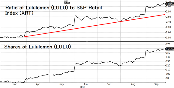
One company that fits the bill is Lululemon (symbol: LULU). Figure 6-11 shows a ratio chart of Lululemon compared to the S&P Retail ETF Index (symbol: XRT). Recall that in early June, the ratio of the Retail Index compared to the S&P 500 Index broke out of a trading range. If you drilled down to the companies in the retail industry, you’d find that Lululemon was exhibiting strong relative strength as evidenced by uptrend in the ratio of Lululemon shares versus the S&P Retail Index. If you bought shares of Lululemon in early June, you would have enjoyed a strong rally in shares of more than 30 percent in the following months.
Source: Bloomberg Finance L.P.
FIGURE 6-11: Comparing an individual security to its industry group can help you identify promising trading candidates.