

Miniature #2 by Vanessa Paxton
In this gallery, some of the leading lights in surreal photography share their images and their techniques. Whether you are using an iPhone or a top-of-the-range DSLR along with the latest version of Photoshop, there will be something here to inspire and inform you.
Some images show the world we know from a new perspective, others transport you to a fantasy realm. There are dark and brooding creations as well as those bursting with energy and color. Enjoy!
Urban Vulture Tracy Munson
Urban Vulture was created entirely on an iPhone 5. Don’t feel that it has to be either Instagram or Photoshop! The Apple app store is supersaturated with camera and photo-editing apps and most effects can be created with any number of different apps or techniques. I’ve tried about 200 apps in total, but in this walkthrough I use some of my favorites.
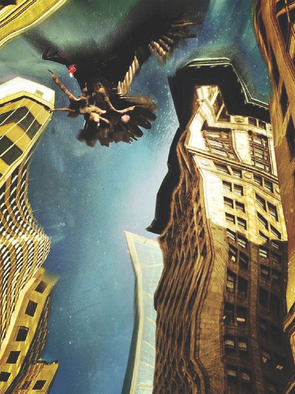
This photo of downtown skyscrapers had been bothering me for a while. I loved the warm light and the way that the buildings looked like they were made of gold, but I felt that the picture needed something else; it was a great background, but needed some other element to create interest. Distorting the buildings created a surreal feeling that I liked, and the effect reminded me of how buildings look when they are reflected on the tinted windows of a building opposite. I needed an element for the open space in the middle, so I began looking for the perfect centerpiece. I thought of balloons, people, objects—all sorts of things—but when I remembered the image I’d taken of a vulture, it seemed so fitting with the image of the business district and its gilded appearance that I knew I had to use it. I think of the vulture as a corporate scavenger, speeding through the golden city with talons outstretched to grab whatever it can.


TOOLS

PhotoGoo

TouchRetouch

Juxtaposer

FocalLab

PicBoost

Filterstorm
1: THE BACKGROUND

I started out with the drive-by shot of some skyscrapers in downtown Toronto. To make them look wavy and distorted, I used a free app called PhotoGoo.
I dragged my finger across the screen to smear the image, and happy with the result, tapped the icon showing the arrow pointing to the right and saved the image to my Camera Roll.
2: LOSING DISTRACTIONS

The power line running across the bottom of the shot was distracting. I used the TouchRetouch app set to the Brush tool to get rid of it. To use, tap on the Paintbrush icon and a slider will appear that allows you to adjust the brush size. Zoom into the image and begin to paint over the unwanted item until it is covered by a red mask, preferably in one pass. When you start to paint, a close-up window will pop up.

Hit the triangle button on the bottom of the control panel, and voilà! The unwanted item has disappeared.
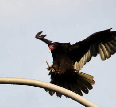
The next element in my image was a photo that I took with my DSLR of a turkey vulture coming in to land on a lamppost. To remove the lamppost I used TouchRetouch again. This time, I was less impressed with the results when I used the Paintbrush tool; it filled in the tail area with a lot of sky, which just looked wrong. I needed to tell the app what to use to fill in the background.

Instead, I used the Stamp tool, which is the option second from the right on the bottom toolbar. This tool brings up a double circle that you place over the part of the photo that you want to clone.

I painted over the part of the image I wanted to remove, and it copied from the area where the cursor was sitting. I wasn’t terribly fussy about the accuracy of this, because I knew that I would be adding more textures and effects later.
4: MERGING THE TWO IMAGES
I now needed to merge my images. For this, I turned to Juxtaposer, which is my favorite app for this type of image blending. I like how the Masking tool handles and being able to save the masked image as a stamp to use again is another nice feature.

First I imported the background layer—the buildings—and then the top layer, the vulture.

I selected the brush I wanted to use and zoomed into the image, then erased the sky from the top layer.

I then maneuvered the bird into position, and saved.

I also saved the masked top image (the vulture) as a stamp for use later on.

To add a zoom-blur-style effect and increase the sense of motion even further I turned to FocalLab.
I loaded the photo and selected the Zoom Blur option, which applies a blur effect, but leaves the center in focus.
I dragged two fingers around the image to adjust the focal point and the area where the zoom effect will radiate from. The amount of blur is adjustable via a slider—a very useful feature.
6: MAKING ADJUSTMENTS
I didn’t want to leave the buildings blurred, because that would make it seem as if we were zooming toward the bird, and not the other way around. To blend the blurred image with the focused version, I used the Filterstorm app.
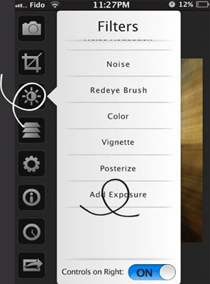

I loaded the photo into the app and selected the button that resembles a sun. From the drop-down menu I selected Add Exposure, which then prompted me to select a second, sharp image to combine with the first from my Camera Roll. Using the Fit to Image function under the Double Exposure heading, the two images were aligned one on top of the other.

I then used the Brush and Eraser tools to paint away the top image to reveal the lower one.
7: ADDING TEXTURE

Last of all, I needed to add some texture, which would also help to hide the low resolution and any sloppy areas of masking. I eventually chose a texture from PicBoost, after experimenting with a selection of apps and filters. It’s really a case of trying on different looks until you find the one that fits. Apps like Pixlr-o-matic with their Randomize option can be a lifesaver when you’re feeling creatively uninspired and unsure of where you want to go with your next edit.
8: FINALLY

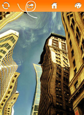
The final image
At this point I realized that I didn’t like this edit. There wasn’t enough detail in the vulture and he was too low in the image. What can I say? I’m just not a “measure twice, cut once” kinda gal! I started again, repeating the same steps, and at last I got the effect I wanted.
One Step & Then the Next Gets You Where You’re Going Janine Graf
The day that I created One Step & Then the Next Gets You Where You’re Going, I honestly did not have a preconceived final result in mind. Although my final effect was not a conscious choice to begin with, after running my chosen image through a particular iPhone app, I realized where I wanted to take the composition.

It was a beautiful day in downtown Seattle and this image of a woman walking across the street was one of many pictures I just randomly snapped.
I liked the lines and color of this accordion section (below right) from a metro bus, so I snapped the image in the hope that it would become useful some time, though obviously it’s not too interesting on its own.
Whenever I can I like to take pictures of random scenes or objects with the idea that, manipulated in the right apps, you can deconstruct and then reconstruct them into something creative and interesting. Even the dullest of images can be manipulated in a wonderful way, so don’t be too quick to discount a particular shot.


TOOLS

Tiny Planet Photos

ScratchCam FX

Juxtaposer
1: FIRING UP TINY PLANET PHOTOS

I loaded the image of the metro bus accordion section into an app I like called Tiny Planet Photos and bumped up the resolution of the image to 2,000 pixels using the slider at the bottom of the screen.
2: CREATING A SWIRL

There are only two swirl options in Tiny Planet Photos: Sphere and Tube. To swirl this image in the way I wanted I selected the second option, Sphere, the button on the right.

As soon as I saw the outcome of the swirl effect, I knew what direction I wanted to take the composition. I was happy with the result so I saved the image.
4: ERASING WITH JUXTAPOSER

I decided to do my erasing with Juxtaposer. I loaded the Tiny Planet Photos-altered metro bus accordion image into Juxtaposer as the base layer, and set the streetscape as the upper image.


After zooming in on the top image to make it easier to see what I was doing (you use a pinch-and-zoom action with your fingers to do this) and selecting an appropriate brush size to ensure that I made accurate adjustments, I started to erase the top image in order to isolate the pedestrian and her shadow. I use a Nomad Brush to help with this sort of detailed work. I highly recommend it; it’s a paintbrush stylus that you can purchase online. I have the “Short Tip” series and find this tool invaluable.
Throughout the course of erasing I zoomed in and out many times in order to get into those tight places. Don’t be afraid to zoom in or move the top layer around; you will be able to position your top layer perfectly when the time comes.
5: REPOSITIONING WITH JUXTAPOSER

Once I isolated the subject in my top image, I used the Pan & Zoom feature to bring the base image back to full size. Then I moved the top image into position, using the Move Top Image button, and adjusted it to the size I wanted. Satisfied, I saved the image to my Camera Roll.

Next I turned to my favorite app for adding texture and color: ScratchCam. This app has an amazing assortment of effects that you can either randomly or selectively apply. I often start with random and then fine-tune the color and texture myself. If you hit upon a combination you like, you have the option to save that combination for future use.
I fired up ScratchCam and selected the Album icon to upload the saved image I had just finished in Juxtaposer. ScratchCam then immediately applied random color, texture, and scratches.
7: COLOR IN SCRATCHCAM

As I wanted to have some control over my color and texture, I selected the edit icon on the far bottom left and then selected colors. I scrolled through the colors until I found one I liked, which was coincidentally very close to the original image color. Using the slider bar on the top of the screen, I drew back on the color just a bit.
8: TEXTURE IN SCRATCHCAM

After selecting a color I was happy with, I moved on to texture. Using the Textures and Borders button, I scrolled through the available textures and borders and settled upon a texture that added a nice element of stone (you will see here that I used the slider bar at the top again to pull back the texture a bit). In this image I did not use any additional scratches from the Scratches section; that option/layer was turned off.
9: SAVING THE FINAL IMAGE

I saved my image by selecting the Edit option again and then the Send icon on the far bottom right of the screen. I chose to save my image to my album.
10: FINALLY

The final image
Here is the final piece. The inspiration for this image comes from my love of taking long walks—sometimes too long. Just when my feet and legs start to ache I chant to myself, “One step and then the next …”
Cashmere Amy Weber
Cashmere is based on a photograph of Ziggy Smalls, my miniature lionhead rabbit. He’s very friendly and curious, and makes me smile. I love taking pictures of him and then compositing his image into different backgrounds before using different brushes and textures to add a whimsical touch. I also love the way his white fur contrasts with his surroundings.

I wanted to start with an image that would look good when enlarged, so I had to pick a close-up with clarity and definition. The image also has personal significance because it is one of my favorites of my beloved pet.


TOOLS
Photoshop
1: PREPPING THE CANVAS

I created a new Photoshop document with a canvas size of 12 × 18 inches and opened up the image of Ziggy by selecting File > Place. In this instance, the image was opened as a Smart Object. Ensure that your Smart Object is fully editable and then name the layer.
2: SELECTING THE RABBIT

I zoomed in 200% and used the Pen tool to make an accurate selection around the outline of the rabbit. Remember, you will need patience for this step! You can select the entire bunny or work like I did, in sections.
3: LOADING THE SELECTION

Once I made my selections I opened the Paths palette and selected Load Path from the bottom of the palette. “Marching ants” indicate that a selection was made. I then deleted the background. Note that if you select the background in sections (as I did), you should hit delete. If you select the subject, invert your selection first and then hit delete.

I opened the image of the headphones and selected the headphones using the same technique I used to cut out Ziggy.
This time I needed to resize the image to fit the rabbit. Making sure that I was in the correct layer, I selected the Transform option (Edit > Transform) and resized the picture. By holding down the Shift key and clicking and dragging one of the corner anchor points, I retained the proportions of the image. To rotate the headphones, I simply hovered the mouse over one of the corners. The arrow turned into a curved arrow and gave me the option to rotate the image.
I erased the portion of the headphones that belonged behind the rabbit and merged the layers together by selecting Layer > Merge Visible. I was happy with my results, but if you think the contrast or Levels need to be altered to enhance your image, create a new Adjustment Layer and make your edits.
I renamed the layer with the headphones “BunnyHeadphones.”
5: CREATING THE BLACK BACKGROUND

I created a new layer by selecting Layer > New Layer. I then changed my foreground color to black by clicking the small black-and-white icon next to the color swatches. I selected the Paint Bucket tool and filled the background with black by clicking on the canvas.
6: CASTING A REFLECTION

Next, I selected the rabbit and copied it to a new layer. I did this by CMD-clicking (CTRL-clicking on a Windows machine) on BunnyHeadphones in the Layers palette and then selecting the rabbit with Edit > Copy. I created a new layer, named it “Bunny Headphone Reflection” and pasted it to the new layer.
To lose the marching ants, I pressed CTRL-D (CMD-D on a Mac). Next, I chose the Bunny Headphones Reflection layer and went to Edit > Transform > Flip Vertical. I used the Move tool to position the rabbit, and the arrow keys to nudge him into place. From here, I placed a Gaussian Blur over the image by selecting Filter > Blur > Gaussian Blur and moved the Radius slider to about 4.0.
7: DRAWING THE HEADPHONE CORD

In a new layer, I went back to the Pen tool to start creating the cord for the headphones. I clicked and dragged to create a curved line that became the cord.
After I created my line, I went to the Brush tool and selected a hard round brush in a size 4. I made sure that my foreground color was set to black. I selected the Pen tool again, right-clicked on the line, and selected Stroke Path from the drop-down menu. I made sure that the Brush tool was selected and clicked OK.
8: ADDING A LIGHT SOURCE

To add shading to the cord, I double-clicked on the Headphone Cord layer and the Layer Style dialog box appeared. I checked the Bevel and Emboss box and turned up both the Opacity and the Fill Opacity to 100%.
Next, I copied and pasted the cord to a new layer, and just as I did in step 6, created a reflection for it.

I downloaded a selection of splatters from cgtextures.com to bring interest to the background, then copied and pasted the largest of the splatters into a new layer.
I began to customize the splatter by selecting Edit > Transform > Scale and resizing and reshaping it.
Next, I removed the white background behind the splatters by selecting the Magic Eraser tool and zoomed in closer to remove the small white areas within the splatter. I selected the splatter itself by CTRL-clicking (the equivalent command on a Mac is CMD-click) on the icon of the splatter in the Layers palette, and used my brush to add color.
I varied the opacity and color of the brush and continued to add more layers of splatters to make it interesting. I ensured each splatter was on a different layer so they could be edited independently.
Finally, I clicked and dragged the splatter layers so they were underneath the layer containing the rabbit.
10: ADDING SHAPES

From within the Custom Shape tool, I selected the Circle Frame. This is in the drop-down menu on the Options bar, toward the right. I began by creating circles of different sizes, each on a new layer.
To create a gradient for some of the circles, double-click on the layer, which will bring up the Layer Style dialog box. Select the Gradient Overlay option and make your selections.
11: BRUSHSTROKES

Photoshop has a huge range of brushes, and you can create your own brush presets. If you can’t find or make something that meets your needs, head over to brusheezy.com, where you can download many more options.
Select the Brush tool, and if you’ve acquired some preset brushes, go to the Preset Manager to import them (Edit > Presets > Preset Manager). You will then be able to access your new brushes from the brushes palette. As you add brush strokes to the image, don’t forget to create a new layer for each brush.
For this image I selected brushes that gave the impression of movement and imitated streams of light. After downloading the brushes, I created a new layer and set the foreground color.

The final image
Wingardium Leviosa Megan Wilson
The choice of title is inspired by the Harry Potter series, as in the books, “wingardium leviosa”* is the spell of levitation. At the same time, the teacup and saucer remind the viewer of Alice in Wonderland. These stories inspired me to create something that was both interesting to look at and exhibits the whimsical feeling that the books represent.
Creating a levitation effect isn’t as hard as you might imagine. It all starts with your initial shoot. Once you have planned what you are shooting and where, you need to set up the shot to optimize the levitation effect later.
Since I knew I would be making a series of photographs and blending them together, I purposely shot in manual mode to ensure consistent focus and exposure across my series of images. Using a tripod was also necessary to enable me to shoot from the same position for every frame. This made the photos more straightforward to process.
When I created this piece I took four photos. Two of them were of me holding up the saucer and the teacup, the third was of my hand reaching out, and the fourth was simply the background.
Using Photoshop, I navigated to the Lasso tool and cut out the teacup, the saucer, and my hand. The trick to the levitation effect is the blending of multiple images. Using the background image as my base, I layered and blended the other three photos on top and removed the unwanted areas (such as my hand holding the teacup and saucer), and then used the Clone tool to fill in the missing fragments. When removing unwanted areas or using the Clone tool, I find a soft brush will help blend the photos together and avoid sharp, jagged edges that end up looking distracting.
When I was satisfied with my image blending, I continued to process the composite by adjusting the color and lighting. Finally, Wingardium Leviosa was a complete creation!
Wingardium Leviosa was inspired by Alice in Wonderland, and the mystery and magic of J.K. Rowling’s Harry Potter series.

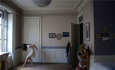
The Weight of Time Julie de Waroquier
My ideas come to me spontaneously, with the compositions appearing clearly preformed in my mind. However, to make sure that an idea that occurs to me has the potential to become a real picture, I usually draw a sketch of my vision. It tends to highlight any possible issues that I might encounter on a photoshoot, and so is a useful tool to help compose the whole picture.

These images were taken specifically for this project using my Nikon D700. I chose a room with a high ceiling as a location, which would allow me to insert an over-large clock into the final composition.

TOOLS

GIMP
1: DRAW A SKETCH OF THE IDEA
For this picture, the concept was quite simple; the weight of time, symbolized by a huge clock, is about to crush the female subject.
2: MAKE SURE THAT THE COMPOSITION WORKS


If you choose to sketch beforehand, your sketch doesn’t have to be detailed; for this picture I drew mine quickly using GIMP. It was helpful because I realized that the composition was more effective with the character on the right side. This accentuated the weight of the clock, and the clock hands following the lines of the character made it look more dynamic. The goal of this step is to ensure that the picture works as a whole, and can be read and understood easily.
3: LIGHTING

I decided to use the natural light coming through the window. This kind of lateral lighting creates nice contrasts and remains soft, so it is perfect for complex compositions. The more complicated your composition, the less complicated your lighting should be in order to have a picture that works.

I wanted an overall view of the room, because seeing the walls from top to bottom and from the corners of the room would accentuate the huge size of the clock. Therefore, I used an 18–55mm lens at 18mm, giving me a wide angle and including the entire room in the frame. I chose neutral settings (an aperture of ƒ/3.5 and a shutter speed of 1/60 second as seen in the below histogram), because I didn’t want anything unusual in the exposure.
5: THE IMAGE OF THE CHARACTER

As I don’t in reality own a gigantic clock, I needed to manipulate a series of images to achieve my desired final result. First, I took a picture of myself standing as if I were holding the clock. I used a tripod and the self-timer on my camera, and simply posed in front of it.
At this stage in the process, you can’t be certain that the photomontage will work, because you can only imagine the final version, not actually see it. In this instance, what I was trying to achieve worked, but sometimes during the editing process you will realize that the combination you have doesn’t fit, and you’ll need to reshoot your base images.
6: THE PICTURE OF THE CLOCK

Next, I photographed the clock. When you create a composite like this using several pictures, try to keep the same settings, lighting, and location to help the final image look coherent.
In this case I did, however, move closer to the clock so that it wouldn’t appear too small or far away in the base image. I also turned it around so that it would be pointing the direction I wanted it in the final image.
7: COMBINING THE IMAGES

Then, I began the editing process. First, I combined the two images into one. Using GIMP, I opened one as the background picture and the second in a new layer (File > Open as new layer). I now had one file with two layers that I could move using the Move tool.
8: USING LAYERS AND LAYER MASKS

In order to position the different elements of the image where I wanted them, I had to move the layers around. In this instance, I moved the clock to the right-hand side. Changing the opacity of the layers helped me to see things better. When I was satisfied with the position of the elements, I added a layer mask by right-clicking on the layer and selecting Add a Layer Mask, in black. This hid the layer picture and added a black box next to the thumbnail of the layer.

Note that the Layer Mask indicates which parts of the layer will be visible in the final image. When it is all black, nothing will be visible. By painting over the mask with a white brush, you will reveal parts of the layer in the final version. For my image I used the white brush to reveal the clock.
10: MORE ACCURATE CUTTING OUT

At first I used a large brush, which isn’t very precise. I zoomed in closer and chose a smaller brush to refine my selection. Remember that if you accidentally reveal too much when you’re cutting out, you can paint over the area with black to hide it again.
11: ADDING SHADOW

However accurate your cutting out is, the effect will never look natural without shadows. For this image, I needed to add a shadow to the giant clock. I added a new layer (Layer > New Layer) and selected a black brush. I then reduced the opacity and painted the shadow in beneath the clock. Rather than using the Normal blending mode on this new layer, I chose Multiply, which inlays the black into the picture. I added the shadow in several layers to produce a more realistic look.
12: THE FINAL COMPOSITION

When I completed the cut-out, I took an overall view of the image that allowed me to make my final adjustments. On reflection, I decided to crop the image and flip it on its vertical axis.
13: COLOR EDITING

My final step was to edit the color. I used the Curves tool (Colors > Curves), which allowed me to adjust the colors in the highlights and shadows. In general I find that the best way to achieve the effect that I want is to play around with the different red, green, and blue channels. In this instance, I added vintage greenish and yellow hues. I really liked the strange, atmospheric quality this gave my final image.

The final image
Miniature #2 Vanessa Paxton
The concept behind this image was simple: a miniature girl in a normal-sized world. I thought that it would be interesting to use photography to bring to life the story of Thumbelina with some images inspired by the concept. This image comes from a series of seven; for each one I photographed myself in the same location as the scene I’d later be inserting myself into. I did this so that the lighting conditions for my character and the background images would be the same. Keeping the lighting conditions the same is key if you don’t want your figure to look out of place in your compositions.
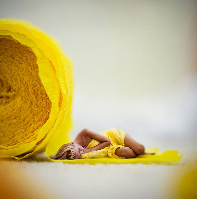
I chose to shoot these particular images in my bedroom because of the large amount of natural light it gets. I knew that I wanted to interact with an object in the environment because it makes the images more believable, but it didn’t really matter what the object was. I chose a yellow party streamer to form the background because I had a matching yellow tablecloth that I could wrap myself in for the self-portrait.


TOOLS
Photoshop
1: IMPORT YOUR IMAGES

I imported both the scene and the images of the character into Photoshop, set the scene as the background image, and saved the image that contained the figure as Layer 1.
2: SCALING THE SCENE
I then dragged the image of the figure into the scene and brought up the Transform tool (Edit > Transform).

I scaled the image to 50% of its original size by changing the Width and Height values in the Options bar indicated by the “W” and “H.”

Next, I changed the opacity in the Layers panel to 65% so that the background layer was visible through the layer containing the figure. This made it easier to position accurately. I then double-clicked to lock in the transformation when I had the figure about the right size and in the right location, and set the opacity back to 100%.
3: CREATING A LAYER MASK

The next step was to click on the Layer Mask icon to create a Layer Mask over Layer 1.

Using the Magnetic Lasso tool, I outlined the figure.

Once I completed my selection, it was surrounded by marching ants. I then chose Select > Inverse to invert the selection.
I converted the Layer Mask to black (CMD-I on a Mac machine, and CTRL- I on a Windows machine). Refining my selection by painting with black or white on the Layer Mask revealed or concealed more of the scene image.

The end result looked like this.
5: CROPPING THE IMAGE

When I was satisfied that the figure was in the right place and that the cut-out was refined enough, I cropped the entire image by selecting the Crop tool from the Tool bar. For all my images in this series I used a square crop.
RESIZE WITH SCALE
You can resize the figure whenever you need to by selecting Edit > Transform > Scale.
6: CONTRAST AND BRIGHTENING
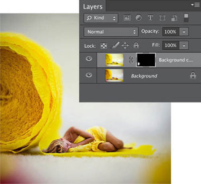
I was happy with my image so far, so I flattened the layers (Layer > Flatten Image), and then duplicated the background layer (Layer > Duplicate Layer).
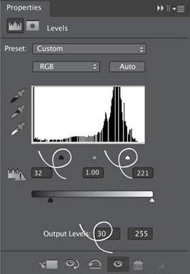
I created a new Levels Adjustment Layer (Layer > New Adjustment Layer > Levels) and clipped it to the Background copy layer (to do this ALT- click between the two layers in the Layers panel). I moved the black slider to the right to darken the image, and moved the white slider to the left, lightening the highlights.
I felt that this particular image needed to be brightened, so on the Output Levels I moved the blacks pointer inwards until I was happy with the look.

I then created a new Brightness/Contrast Adjustment Layer above the Levels layer (Layer > New Adjustment Layer > Brightness/Contrast) to brighten the image, and moved the Brightness slider to the right.
When I was content with my adjustments, I merged the layers together by selecting Layer > Flatten Image and once more duplicated the background image to make a new layer.

I wanted to apply some lens blur to simulate a fall-off of focus, so I chose the Lens Blur option by going to Filter > Blur > Lens Blur and applied a touch of Radial Blur to the background.
I also added some noise, because I think that a little bit makes edited images look more natural.
8: CREATING A VIGNETTE

I flattened the image again and then made a new layer (Layer > New Layer). I selected the Soft Light mode from the Options bar.
I set the Opacity to 20% and used a white brush to highlight the character’s hair and lighten the image. This helped to create a vignette that draws in the viewer.
I then intensifed the vignette by switching to a black brush and painting the edges of the image.
9: FINE-TUNING
On reflection, the red blur from another streamer disrupted the harmony of the image. I removed it by duplicating the background layer and then selecting the Selective Color option, under Image > Adjustments > Selective Color.

It so happened that the default color was red, which was the color I needed to remove. I reduced the reds in the image and brought in as much yellow as possible.

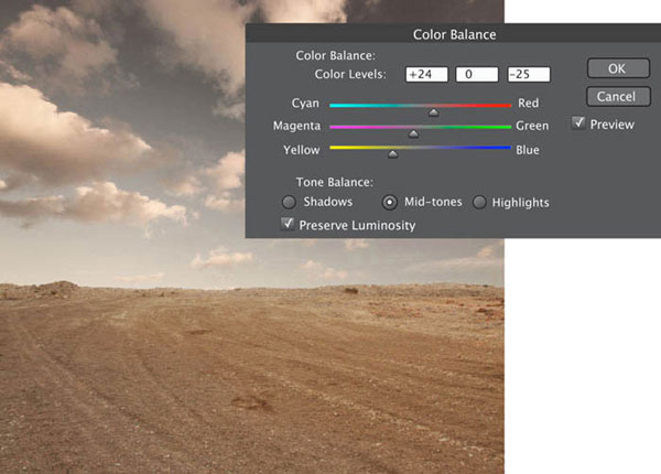
Next, I adjusted the color balance by choosing Image > Adjustments > Color Balance. Here, I selected the mid-tones option first and used it to bring back more yellows; I did the same with the highlights option.

As you can see, this affected the color balance of the entire image.
This isn’t what I wanted, so I applied a Layer Mask, inverted it, and then painted with white to reveal just the bottom left corner. This meant that the selective color adjustment applied to just that too-red area, not the entire image.
CLIPPING MASKS

The final image
Relax Maria Kaimaki
An infrared (IR) filter is a powerful tool that can serve as a window to the alternative reality of a parallel world. If photography is about painting with light, then IR photography is about painting with invisible light.
It isn’t just an IR filter that can transform an ordinary scene into a surreal one. Sometimes it can be something indefineable about a place that lends itself to this interpretation.
This tree stands right in the middle of nowhere, on the side of a narrow, winding country road that leads to an almost-forgotten little village. The place itself seems, in a way, out of time and out of place. It has its own life, and its own seasons. It is very different from the rest of the countryside around it. When you are sitting there alone with your thoughts no disturbance from the world will reach you since there is no cellphone signal and traffic is sparse.
IR photography is not for snap-shooters; it requires time and patience to set up your shot. In this instance I made sure to visit the location when it was flooded with bright sunlight and the texture of the tree’s foliage was well-illuminated. I set a custom white balance on my camera by shooting a patch of well-lit grass and calibrating my camera to recognize green as IR white. I composed my frame carefully with my camera on a tripod and also took a shot without the filter, which I planned to later combine with the IR image. I then locked the focus—important, as the camera cannot focus through the dark filter—and mounted the filter.
It took a couple of test shots to find the correct exposure, which turned out to be an aperture of ƒ/13, a shutter speed of 1.3 seconds, and a sensitivity of ISO 200, and a short wait, too, for that serendipitous cloud to enter my frame, but basically that was all there was to it.
When I looked at my LCD screen, the leafy green tree in front of me seemed gilded with snow. In post-production I added a few finishing touches. I swapped the blue and red channels, which is common procedure with IR images, and used the normal image to mask over the bench to retain its natural bright color.
This place has always been very special to me, but conventional photography had never seemed capable of capturing its quiet beauty. When I encountered IR filters I thought that this was the only fitting way to capture the unreal quality of this place.

Autumn Mood Gwladys Rose
I was inspired to create this surreal image while looking at a self-portrait where my mood seemed melancholy. I started to visualize an image that expressed an autumnal mood. Fall is my favorite season because it offers such a variation in color, particularly warm colors. The way I was dressed in the self-portrait seemed to fit with this idea, exactly suiting a crisp fall day. To me, a surreal scene is a scene that shows you something in a context that you wouldn’t usually expect. To achieve that perspective in this image I decided to find a slightly different location that would also reinforce the melancholy mood of the picture. I settled on the idea of a desert, and after a lot of searching found the perfect location in a limestone quarry.

I prefer to use my own images for my work; it allows me to feel as if I’m the ultimate creator. Some of these were archived images while others I took specifically for this project.


TOOLS
Photoshop

Wacom Tablet (Intuos 4m)
1: CREATING THE DOCUMENT

I opened Photoshop and created a new document. I often use a square format, but for this picture I made a document 4,100 pixels wide by 4,000 pixels high with a density of 600 ppi (pixels per inch).
2: THE GROUND

I respect a ritual for my images, and always create the landscape (inclusive of the ground and sky) first. I imported the image of the ground (File > Import), and renamed this layer from “Layer 1” to “Ground.” This helped me to instantly identify the ground layer as the number of layers comprising the image grew.
Using the Transform tool (Edit > Transform), I adjusted the image’s height a touch.

After I settled the ground, I imported the sky. I followed the same process as for the ground, but renamed this layer “Sky.”
4: BREAKING THE HORIZON

Looking at the landscape, the horizon felt too linear, too straight, and I decided that I needed to introduce a break in the blandness. Luckily, I had also photographed a dune while I was exploring the quarry where I took my base images.
I made a Quick Selection of the dune and refined the selection by deleting the unwanted background and using the Rectangular Marquee tool.
5: ADJUSTING THE BRIGHTNESS AND COLOR

The dune was standing out too much from the rest of the background; I needed to correct its brightness and color to help everything work together. I named the new layer “Dune,” created a Brightness/Contrast Adjustment Layer (Layer > New Adjustment Layer > Brightness/Contrast), and corrected the brightness there.
Next, I made a Color Balance Adjustment Layer to control the color balance. I experimented with the tools until I found a color combination that worked.


When I was satisfied with the look of the landscape, I merged together the dune and ground layers by selecting them and then choosing Layer > Merge Visible. Before I merged the layers I ensured that there were no unwanted elements, such as trees, reappearing in the layers. Sometimes when you are superimposing images and merging layers, previously hidden things can pop back up. In this instance, there were some rogue trees. I selected them using the Rectangular Marquee tool, then deleted them and continued with the merge.
7: ADJUSTING THE CONTRAST


I decided that the contrast needed to be increased, so I gave it a quick tweak upwards.
8: ADDING THE PROTAGONIST

When I was satisfied with my landscape, I went ahead and added my character, my portrait of myself.
I selected the figure using the Quick Selection tool, copied the selected area, and then pasted it onto the landscape.
This selection needed to be refined; I did this by using the Eraser tool (set to 30 pixels) along with my graphics tablet. If you don’t have a tablet, your mouse will do fine.
CUTTING OUT
Photoshop offers you a huge choice of methods for cutting out elements of images and refining them; we looked at some in Chapter 5: At the Touch of a Button. Use the method that you find the most comfortable and works best with the element you’re cutting out.
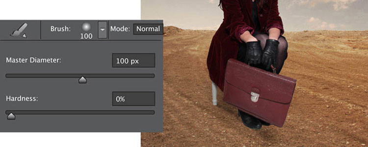
I painted in a shadow to make the image of the protagonist more realistic and prevent the composite from looking obvious. As there was no particular light source in this image, I decided to paint the shadow beneath and slightly behind the chair.
I selected the Brush tool with a 100% black foreground color, 30% Opacity, and a round brush with a diameter of 100 pixels. Again, I used my tablet to draw the shadow, but you could use a mouse if you don’t work with a tablet.
10: ADDITIONAL HAIR

I wanted to create some movement in the character’s hair, and did so by introducing some locks from a photograph of a wig. I used the Quick Selection tool to cut out some extra hair, and then copied and pasted it into place on a new layer.

You can see that the extra hair does not match the color of my hair in the self-portrait. To make it match, I used the Color Balance tool (Image > Adjustments > Color Balance) and raised the levels of red. I also cleaned up the selection using the Eraser tool.

To create the impression of a moving head of hair, I duplicated the layer several times and modified the look of the hair with the Warp tool (Edit > Transform > Warp). When I was satisfied, I merged the modified-hair layers with the layer containing the character.
11: DISTORTING THE SKY

I felt that the sky looked far too realistic for a surreal image, so I decided to distort it. I duplicated the sky layer and then used the Liquify tool (Filter > Liquify) to adjust it.

To introduce some clouds I used the Clone Stamp tool.
I duplicated and deleted clouds until I had the result that I wanted.

Then I increased the contrast to make the sky more impressive.

To introduce the leafless tree to the scene, I opened the document containing the tree, selected it using the Quick Selection tool, and then pasted it into my scene. As the selection was initially very rough, I spent quite some time refining it with the Quick Mask tool and my graphics tablet.
I wanted this tree to be as surreal as it possibly could be. First, as it looked far too blue, I worked with the Color Balance tool to desaturate it, and warm up its shade. I also duplicated the layer it was on, rotating it to add some more branches.
Finally, I created the hand-like branches by duplicating one of its extremities and drawing a shadow at its base.
13: THE ABANDONED GRAVES
By adding some gravestones I was able to fill the empty gap on the right side of the image as well as enhance the melancholy mood.

I opened up an image of a cemetery and began to select some of its elements.

I selected only the front of this grave and deliberately excluded the door before I pasted it into my scene. I love the idea of open doors in the middle of nowhere.

I reduced the size of the door using the Transform tool before erasing a small portion of the bottom left corner with the Erase tool and rotating it, again using the Transform tool, so that it gave the impression of sinking into the ground.
Using the Color Balance tool, I increased the red and yellow tones so that it blended better with the sandy ground.
I followed the same process to add the other graves.

I liked the subtle wrongness of the idea of a dead tree with apples hanging from it and windfalls at its roots. To create this part of the scene I went to the market, bought the reddest apple that I could find, and photographed it.

I then used my tablet, together with a round-head brush set to a small diameter and weak opacity, to draw some black strings from which to hang the apples. As I did not want to decorate the tree too much, I only hung three apples from it, but I decided to scatter some at the roots of the tree.

I created shadows for the apples, just as I did with the protagonist. I chose the Drop Shadow effect from the Blending options in the Layer Style menu (Layer > Layer Style > Drop Shadow). When you do this, make sure to zoom in close and focus on the element that you want to blend.

These shadows did not really satisfy me, so I created some additional shadows on a new layer called “Shadow Apples.” I drew these on using the Brush tool.
When I was finally happy with the apples and their shadows, I merged together all of the apple layers and called this layer “Apples at Roots.”
PLAIN BACKGROUND
If you are photographing items to be cut out and inserted into a composite, use a plain black or plain white background. It will make the selection process far easier.
BACK UP
Don’t forget, you can always step backwards and try different edits and different combinations of effects until you achieve the look that you want.

Looking over my image I decided that it was lacking in movement, especially in the area of the sand. I rectified this by creating the impression of wind trails in the sand.
First, I used the Eyedropper tool to select a shade from the sand. With a light, round brush set to an opacity of 30%, a size of 450 pixels, and the color I had selected, I drew some trails moving from the left background to the right foreground. I strengthened the sense of movement by adding some Gaussian Blur (Filter > Blur > Gaussian Blur).
16: THE FINAL ADJUSTMENTS
All of the elements that I wanted to include in my picture were now in place, so I took a good look at it to consider my final adjustments.
First of all, I chose to add some light to the coat, to enhance the look of the velvet. On a new layer I selected a white brush, Overlay mode, an opacity of 48%, and a diameter of 131 pixels. Being careful not to paint over the protagonist’s hair or anything else, I covered the coat and gloves.

When it came to the suitcase, I created a new layer, selected the Soft Light mode, chose a red color in the Foreground Color box, and brushed over it just as I did the coat and gloves.

I also adjusted the image’s hue and saturation levels as well as its brightness and contrast, and applied a warming filter (Image > Adjustments > Photo Filter) over the protagonist. I further adjusted the contrast of the image by creating a new layer set to Soft Light mode, selecting black as my foreground color, and a brush with an opacity of 25%. I painted where I felt the image needed more contrast.

You should always step away from your work for a while before deciding that the image is final. At this point, I took a break to rest my eyes and returned later, refreshed, to make my final adjustments. In particular, I cleaned up any small errors using the Eraser tool or the Clone Stamp tool. Before merging everything I saved the composition with all the layers visible, in case I needed to make any amendments in the future. I gave the contrast a quick tweak, and I was done.

The final image
Wind Adrian Sommeling
The idea for this photo came about when I was out walking with my son. It was a tremendously windy day and he could barely stand up, but at the same time he found it great fun. A seed of thought began germinating, and before long I found myself shooting an entire series of photos to create the final composite.

All of these images were taken specially for use in this project.


TOOLS
Photoshop
1: CREATING THE SEPARATE IMAGES


I needed six different photos to create this composite. The first is of the background, where the grass is blowing in the wind.
Unfortunately, the clouds at that moment weren’t dramatic enough for the look that I wanted, so I took another photo of the sky about an hour later.
To emphasize the strength of the wind, I recruited my son to toss leaves into the air, which I also captured.
The photos of my son and I were shot at home. He was propped up on stools and pillows while my flashes were pointed toward the ceiling to simulate more natural, outdoor light.
My son helped with the self-portrait of me. He held the ropes that were attached to my coat, making it look as if it was being blown by the wind. Once we had all of the photos, it was a case of compositing the image in Photoshop.

You can see that the road in the original photo had white lines running down its middle and that there were some buildings in the background. I used the Clone Stamp tool to remove them so that they wouldn’t detract from the overall image.
3: DRAMATIZING THE CLOUDS

The clouds still didn’t look dramatic enough to me, so I added another layer with heavier cloud cover. I cropped the heavier cloud cover from the second sky image and copied and pasted it over the background image in a new layer.
4: BLENDING THE LANDSCAPE AND CLOUDS


So that the two layers would look more natural, I added another layer over the top, then selected the Blend mode on Overlay. Using a white-colored brush, I worked over the horizon a little to help blend them together better.
5: ADDING THE CHARACTERS

After I had cut us out from the original photos, I added us to the scene on separate layers. I also added another layer and placed it underneath the previously added layers. I drew a shadow under my feet with a soft, black brush—an important touch that makes it look as if I were really standing in that place. You could use a soft black brush to paint in a shadow by hand, or use Photoshop’s Drop Shadow tool.

At this stage the image didn’t look right to me. It was too bright for something that was supposed to have been taken on a wet and windy day. To remedy this I turned it black and white by adding a Black & White Adjustment Layer over the top of all the existing layers. (See more on Drop Shadows on pages 64–65.)
7: MAKING IT RAIN
Now it was time to add some rain to the scene. I created this effect by adding a new a solid color Fill Layer and filling it with a color. Then I used the Noise filter (Filter > Noise > Add Noise) set to a high amount to generate thousands of tiny dots within the Fill Layer. By applying the Motion Blur filter (Filter > Blur > Motion Blur) I was able to turn the dots into stripes, and by using the angle selector, could control the direction of the blur.
When you’ve done this, all you can see is the grainy blur of color, with none of the background image you’ve worked so hard to create. By adjusting the Blend mode to Screen, you’ll be able to view the background image covered with rain.
8: ADDING THE LEAVES

To emphasize the strong wind, I took some photos of leaves that my son threw into the air. I cut these leaves out from the background and added them in a new layer to the scene. It was simple to extract the leaves from their photos using the Quick Selection tool and then copy and paste them onto a new layer over the background image.
9: DODGING AND BURNING
The Dodge and Burn tools are likely the ones that I use the most in Photoshop, and I always apply them on a new layer over the layer that I want to change. For this composite, they proved very important because they helped to make the light more dramatic. I filled my new layer with 50% gray and selected the Blend mode on Soft Light. Then, by selecting the Create Clipping Mask I was able to ensure that my dodging and burning affected just the layer immediately beneath it, and not every layer in the composite. Then I dodged to lighten areas and burned to darken patches to get the light right. (See more on Clipping Masks on page 62.)
Natural Nature Jess Rigley
This image is part of my series titled “Natural Nature.” The series features a nude woman, her nakedness complementing the natural landscape, nothing manufactured or fake. I wanted to channel my own ideas to distance the series from both fine-art nudes and erotica and decided to interpret “surrealism in the nude,” as it is something which I haven’t seen previously explored in any significant way. I wanted to see how I could visualize the concept, while also incorporating the natural world.

As surreal photography is a huge part of my work, I’ve had to learn the art of digital editing in great detail. Even though I have had some formal instruction in Photoshop, I have found that I’ve learned the most through my own practice and trial and error. In my eyes experimentation is a much easier way to learn to process your own images.


TOOLS
Photoshop
1: CREATING THE CANVAS

The main feature of this image is the repetition of the female figure, so I had to remember that anything applied to one image of the character had to be applied to all of the images.
I started off with a background image. I wanted to have one image where the character was already in position, and then add in more images to the scene. I selected File > Open and chose the images that I wanted to add into my base image.
2: MAKING THE CUT

Most often people are taught to copy the entire image over to the base image, which is sometimes the right method to use, but for this image I knew I didn’t need to copy over the background for every one as I was only going to be using the female figure in each image. For this reason for each image I selected the Patch tool and created a rough outline surrounding the model without too much of the background in it.
SEPARATE DOCUMENTS
Once all of your images are loaded into Photoshop they will all open up as separate documents, so you need to have a method of placing the images onto the base image.

Next I needed to make a selection, one image at a time, to get each of my chosen figures into my background image. To create my selection, I pressed and held down the mouse and drew a line around the figure with the Lasso tool, meeting back at the point where I started. Once I released the mouse button marching ants appeared around the selected area to indicate that I’d successfully made my selection. (The ants also show you what parts of the image your selection includes so that you can have a quick look around to see if there’s anything you’ve missed.)
4: TRANSFERRING A SELECTION INTO THE MAIN IMAGE

I next needed to transfer each of my selected figures into the base image. There are two ways to copy a selection: going to the top bar and selecting Edit > Copy, or pressing CTRL-C on a Windows keyboard, or CMD-C on a Mac. I then went back to my base image and selected Edit > Paste to paste the selection on the base image (click CTRL-V on a Windows machine or CMD-V on a Mac). My selection appeared as a new layer on the image so I was able to place it where I wanted it. In this instance this was to the left to make room for more copies of the model.
My advice is to try to get used to using keyboard shortcuts if you can. They may be a little confusing at first, but in digital surreal photography, image-editing takes up a lot of time, so shortcuts where possible are always welcome!
5: WORKING WITH LAYER MASKS

Next I simply repeated the process of selecting the model for each of the others, and copying and pasting them onto the base image. To try to keep the composition organized I placed each layer of the model roughly into its final position. This helped me decide which image should be on the top layer and which arrangement looked best. As each of the images was placed on a separate layer, it made editing much easier.
The next step of the editing was the Layer Masks. To access these I navigated to the bottom of the Layer palette and clicked on the Layer Masks button below each separate image (it resembles a circle in a square). The purpose of Layer Masks is to give the user the ability to hide/paint out parts of the layer. For this image I used the Layer Masks to help remove the background and make the model look more realistic in context.
6: PAINTING IN/OUT THE LAYER MASKS
Once I added a Layer Mask to every layer but the base layer (nothing should happen to this one), I next needed to hide the layers.
There should be a eye-shaped symbol next to each layer; I clicked on the eye-shaped symbol to hide each layer but the base layer and the layer I wanted to work on. This made it much easier to see the effects my edits had as my layers were not overlapping.
Once I did this I selected the layer containing my model, navigated to the side toolbar, and clicked the Brush tool. The Black and White tool is located at the bottom of the toolbar on the left, and is used to paint in and out the Layer Masks over each image. Selecting the black option allows you to “paint out” the image where required, and selecting the white allows you to paint back in part of the image you’ve previously painted out. This method of erasing I find useful as it doesn’t permanently delete sections of the image, just hides the white behind the black—a great option to have if you’re prone to changing your mind.
I like to use a medium-sized brush for painting in and out layers—80 pixels is typical. A brush that is too hard will give the pixes a very jagged edge and an unrealistic effect, so I like to avoid full hardness. Conversely, 0% hardness will create a fuzzy edge to your subject and parts of it will seem to be invisible, which again is something that you don’t want. I used around 80% hardness here as it gave a solid edge, but still enough softness so that the model didn’t look completely cut off from the background.
Next, I chose black, selected the layer mask (not the image itself), and started painting it out. To begin I wanted to get as close to the skin as possible, but not go over the skin. It’s not necessary to do this perfectly—as you can see here I got close without interfering with the pixels that make up the border of the skin, and then moved around the whole body to make it consistent.
7: ZOOMING IN FOR GREATER CONTROL

Once this was done I zoomed into the image to 200%, keeping all the settings exactly the same other than the brush size. I usually decrease this by around 20 pixels, as I need more control when I’m zoomed in.
I then slowly worked around the body again, being careful not to paint out any of the skin. If you make a mistake during this step, it is very easy to just go back to the paint palette, select white, and then paint the skin back in again. Though this is time-consuming, I find it’s the best way to get a very detailed end result, so don’t rush it!
Most image-editors dislike being zoomed into an image this much when painting in/out, but I like to have the control to avoid the dreaded “halo effect,” where visible halos appear around the outline of the subject. Zooming in to 200% helps you notice subtle flaws, thus providing a much higher-quality end result.

USE LAYER MASKS
Get into the habit of using Layer Masks to paint elements of your image in or out. If you use the Eraser tool and a few weeks or months down the line you want to change something in the image, you won’t be able to. You’ll need to start the image all over again!
Leave coloring until the end of your editing workflow, otherwise you may end up with lots of variations that will be difficult to composite.
Also always remember to blend the layers together if you want them to look as realistic as possible.

One problem I always face with compositing figures together is the hair. Wherever possible, always shoot hair you’re planning to composite against the same background every time. This will save you both a lot of time, and from pulling out your own in frustration.
Using a brush similar to the one I used to paint in around the body, I increased the size and then the Opacity to roughly 10%. It is very easy to get carried away and start to lose hair while painting, so I like to try and blend the layer’s background into the base background. This creates a slight gradient which smoothes out the pixels before you have to touch the hair, and voilà, the hair remains undamaged within the layer.
9: PAINTING AROUND DIFFICULT SHAPES

Painting around hands, feet, and the face—or anything with a difficult shape—can be tricky to conquer. I’ve found that these settings make the job easier to handle. This is a typical situation of when you have to paint around something that is a difficult shape, for example hands, feet, or the facial area. These are tricky areas to conquer, but a soft, small brush helps you get into the smaller areas with a few strokes.
This image took around three hours to get to this stage, so remember that patience really is a virtue! It does pay to get a beautiful end result.
10: MERGING THE LAYERS

Here are the black outlines hidden from the end image, the remnants of what was painted out. Once I finished the Layer Masks I copied all of the images and merged them into one. To do this I selected all of the layers, navigated to the bottom of the Layer palette, and dragged all of the layers to the layer symbol next to the bin. This duplicated all of the layers for me. I always make sure to take this step when I’m processing images.
11: MERGING VISIBLE
For the layers that weren’t selected I needed to click the eye next to each layer. This turned off the layer, making it invisible. I didn’t see any immediate change however as I’d already copied the images, which were sitting on top of the original layers.
I then navigated to the button at the top right of the Layers palette and from the drop-down menu selected Layer > Merge Visible. It’s very important to click “visible,” otherwise all the layers would have merged, and I wouldn’t have had access to the original edited layers.
12: TWEAKING THE COLOR

Ultimately the image was now complete, but just as a finishing touch I changed the colors slightly to add more atmosphere. I navigated to Image > Adjustments > Curves to bring up the dialog box as shown here.
As a rule I always go to the Channel drop-down menu and edit each color separately so that I have full control over the coloring of the image. Once I had a result I was happy with, I clicked OK.
13: ADDING A VIGNETTE

The next and final adjustment I made was to add a vignette to the image. This was just to help draw the viewer’s eye to the models; I wanted to make the corners darker to emphasize the center. To do this I went to the side toolbar menu and clicked the Burn tool. The Brush tool adjustments are also very important. It is very wise to set the Opacity to around 8%. This sounds low, but for the mid-tones selection a setting of 8% with a large soft brush is very effective.
Once my tweaks with the Burn tool were finalized, I then needed to create a new layer (Layer > New > Layer).

A new dialog box appeared asking for the settings I wanted. I selected Overlay mode and checked the 50% gray box underneath, then clicked OK, and a new gray layer appeared in the Layer palette box. I selected this layer, made sure I still had the Burn tool selected, and darkened the corners of the image.
Once I did this I sat back, looked at my image and knew it was complete.
VIGNETTES UNDER ADJUSTMENT LAYERS
When you add a vignette, be sure to keep its layer or layers underneath your Adjustment Layers (Curves, Levels, and so forth) to retain the correct color balance.

The final image
About Accepting Jon Jacobsen
Surreal photography doesn’t always rely entirely on digital manipulation. Props, backgrounds, and how you set up your shots can all play a part, too. This is just what I did when I created About Accepting, part of a series called “Apartar” that covered the end of a romantic relationship.
This shot involved quite a lot of physical surreal effects. I used makeup to give myself an older appearance, put talcum powder in my hair to color it gray, and also constructed the eruption from my chest from papier-mâché.
After the shoot, I edited the image so that it had an aged and drained look, and used the Liquify tool to manipulate some of my gestures. I made my hairline recede and also added some wrinkles using a stock library image and the Lighten, Multiply, and Overlay blending modes.
Next I carried out some dodging and burning to even up the light and emphasize my skin, and there was a touch of color manipulation as the cold colors were toned down and the reds increased in intensity. With this final tweak, the dramatic look of the image was complete and About Accepting was done.
This piece represents the day when you start the process of metamorphosis, accept the reality of your situation, and begin to grow into a new self.

Frozen Inferno Paula Cobleigh
The thing I love most about infrared photography is that it makes a normal-looking world look surreal. To visitors, this pond is just an ordinary place to take your kids to feed the ducks. My photography, however, makes it look like a place from your dreams.

This pond is located pretty close to where I live. One of my first IR pictures was taken at this pond and now it has become my “test” spot every time I get a new IR-capable camera. The setting contains my ideal combination of sky, water, and foliage with the added bonus of the interestingly textured dead tree. For this particular shot, I lured the ducks out of the frame with bread. In other shots, I have included them. This image was taken using a Canon EOS Rebel XTi and a Canon 17–40mm ƒ/4 lens. Most people will use a Hoya R72 IR filter; in this case I had a 72mm filter.

TOOLS

Lightroom
1: COMPOSING YOUR SHOT
An IR filter is so dark that it almost looks black; you can hardly see through it. For this reason, I composed and focused my shot before putting the filter over the lens. The long shutter speed required me to use a tripod, and to minimize camera shake in a similar situation you should use a remote, cable release, or the built-in timer on your camera. If you have it, a mirror lock-up is also recommended.
2: APPLYING THE FILTER
When I’d composed and focused my shot I switched to manual focus to ensure the focus didn’t alter when I released the shutter.
Now I carefully screwed the filter onto the end of my lens. The 17–40mm lens zooms internally, so there is no risk of changing the composition, but if you have a lens that moves physically as it zooms, it will be very difficult to maintain any sort of zoom. In this case, you should be zoomed out as wide as your lens will allow.
3: EXPERIMENTING WITH SETTINGS
Just as with any exposure, I needed to achieve a balance between aperture, shutter speed, and ISO. The longer my shutter speed, the more blur I would see in the trees, so I experimented a little first.
For this image, I used a focal length of 18mm, and chose a sensitivity of ISO 200 to reduce the amount of noise in the image. I prefer not to shoot wide open, so I had my aperture set at ƒ/5.6. With these settings, I needed a 20-second exposure. This worked out well for me because the long shutter speed allowed the movement of the water to smooth over, and gave me time to lure the ducks away from where I was shooting with bread.
4: FIRING UP LIGHTROOM
With the shooting done, I needed to turn to an editing suite to finalize the image.
When I first started to shoot IR, I used Microsoft Digital Image Suite 2006 to process my work, but this is now defunct. I currently use Lightroom, where I have saved quite a few presets to help me with my IR work.

Adjusting the white balance on an infrared picture is trickier than adjusting it on a normal image. When you adjust the white balance on a normal image, you are either trying to reproduce the same coloring that was in the scene as you saw it, or you change it up to produce a mood that you want to achieve. Since infrared images aren’t the same as what you saw with your eyes, when you are adjusting the white balance, you are just trying to get a look that you find appealing. For me, I prefer my trees to have a whitish-pink hue to them. This particular camera produced more red than I’ve ever gotten with an infrared image, but the end result still focused on the hue of the trees in the background. I changed the Temperature to -47 and the Tint to -6.
6: TONE

To achieve the tone that I wanted, I pushed up the Exposure a touch, to 0.6 and the Shadows to 8; meanwhile the Blacks got moved to 5, and the Contrast boosted by 7.
7: PRESENCE

Here, I also pushed up the numbers to increase the intensity in the colors. Clarity went to +29, the Vibrance to +13, and Saturation to +8.

In the Split Toning menu, I changed the Highlights Hue to 128 and the Saturation to 40; I also adjusted the Shadows Hue to 108 and the Saturation to 22.
Getting the colors right is a matter of experimenting. I usually slide the Saturation slider to the middle and then move the Hue slider back and forth looking for the sweet spot. Then I move the Saturation back and forth until I find the look I’m trying to achieve.
9: SHARPENING

Once I was done with all of that, I opened up the Detail menu and changed the Sharpening to 19, the Masking to 10, and the Luminance to 14. You need to be careful not to over-sharpen your image, as an over-sharpened image is very harsh on the eyes and not pretty to look at.
There are a lot of theories as to why hot spots (areas of odd brightness in an image) occur so often in IR images. The current thinking is that it is due to the particular lens you use. Regardless, if you end up with a hot spot in an image, it can be a pain to get rid of. Check out this list of lenses that are and aren’t affected by hot spots at DPanswers.com.
You can see the hot spot quite clearly in this image: it’s the large pale lilac “bruise” in the center of the frame. I was able to fix it using a combination of brushes.
FIRST BRUSH SETTINGS
EXPOSURE: -1.56 |
BRUSH SIZE: 34.1 |
CONTRAST: 61 |
FEATHER: 44 |
CLARITY: 29 |
FLOW: 100 |
SHARPNESS: 34 |
|
I placed the brush directly over the hot spot and clicked once, applying a circular stroke.

SECOND BRUSH SETTINGS
For the second brush the settings were much simpler:
EXPOSURE: -0.58 |
FEATHER: 44 |
BRUSH SIZE: 3.2 |
FLOW: 45 |
With this smaller brush size I moved over the area of the trunk that had a bluish tint to it and also over the foliage to the left that still looked a little “hot.”

THIRD BRUSH SETTINGS
After applying the brush to those areas, I used the Erase function with the following settings:
EXPOSURE: -0.58 |
FEATHER: 25 |
BRUSH SIZE: 16.4 |
FLOW: 36 |
I lightly erased some of the brush strokes around the foliage that had gotten too dark and also in the spots that I had brushed outside of the trunk.


Something that happens to me is that once I have done what I think is the final edit, I’ll look at the picture again the next day to see if there is something else I want to tweak on it. For this image, after I was done with my original editing, I felt the color balance wasn’t quite right and it was still too dark, so I went back and made the following changes:
COLOR BALANCE SETTINGS
TEMPERATURE: -63 |
BRIGHTNESS: 12 |
TINT: -20 |
SHARPENING: 43 |
EXPOSURE: 1.24 |
MASKING: 22 |
FILL LIGHT: 25 |
LUMINANCE: 18 |
12: CLEANING UP

Then I went over the image at 100% to look for any dust spots or dead pixels. This particular camera had several dead pixels, so I used the Spot Removal tool, set to Heal, to remove them.
13: FRINGING

Lastly, I noticed that the image had some edge issues on the branches. This was solved by setting the Defringe to All Edges.
Love at First Sight Shon E. Richards
Some years ago I was planning a huge dinner for a family celebration. The problem was that though I enjoy eating, I certainly never considered myself a cook. I knew what I wanted to serve, but needed to consult my father on how to put it all together.
I had all the ingredients and some minor direction on the steps I needed to take, but no real clue about the “how to” and “how much.” When I asked my father what to do his response was, “I can’t tell you all of the measurements because I don’t know. You just have to do it until it’s right.”

I ended up doing just that—I added what he said to add and tasted a bit, then put my own little twists on it here and there. Years afterward, I’m still begged to make the dish that once intimidated me so much.
It’s the same with the creation of surreal images. I’ll attempt to give you all the instructions necessary to recreate the effect of what I’ve done here, but in the end, for your own work you just have to “do it until it’s right,” as my father said. You’ll need a vision of your final goal, to taste as you work, and to add or subtract different ingredients as you go along.
I capture all of my IR images on an infrared-converted Nikon D70 that I purchased online. If you don’t have an IR-converted camera, you can of course capture IR images using filters on your regular camera.
Typically, I shoot Raw in Aperture Priority mode with a sensitivity of ISO 200, and make adjustments depending on the amount of sunlight available. For IR photography, I love to capture scenes with lots of foliage and a sky full of puffy clouds for a bit of drama.
BASE IMAGES
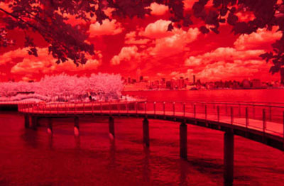
I took this IR image in Hoboken, NJ because I felt like in its natural state it told a story that I could easily emphasize with the fantasy element afforded by IR editing. From the tree leaves that shade the foreground of the picture to the bridge winding to a place that begs to be explored to the cityscape across the waters … the story begins with the viewers, and continues to unfold as far as they choose to travel with it.

TOOLS
Photoshop
IR CONVERTED
If you find yourself shooting IR a lot, you might decide to get a camera converted for IR use. It can significantly streamline the process. Just remember, once a camera has been converted, it cannot be used again to shoot ordinary images.
1: OPENING YOUR FILES
Since all my images are captured as Raw files, I need special software to view the .NEF files. I use ViewNX2 which can be downloaded for free on Nikon’s website. Once I had chosen the picture I wished to edit, I opened the image in Adobe Camera Raw, which is part of Photoshop.
2: ADJUSTING THE WHITE BALANCE

Camera Raw allows you to make lots of adjustments to your images, but I use it primarily to adjust the white balance before moving on to Photoshop.
To do this, I clicked on the White Balance tool icon on the top left corner, selected an area with the balance I wanted to use, and just touched that area with the White Balance tool. Usually, I would use an area in the foliage that has the amount of brightness I want, and the Raw processor will then make the necessary adjustments.
Once you are satisfied with the white balance you might want to toy around with some of the other settings or just click Open Image to move forward to the next step in the process.
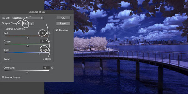
Once I’d opened my image in Photoshop and working in the Background Layer, I swapped the red and blue channels with each other using the Channel Mixer. To do this, I went to Image > Adjustments > Channel Mixer.
I selected the Channel Mixer and in the Red Output Channel I switched the Blue to 100% and the Red to 0%. Then I did the same swap with the Blue Output Channel by switching the Red to 100% and the Blue to 0%. Here’s the image with the swapped out colors.
4: CREATING A DUPLICATE BACKGROUND LAYER

Next I created a duplicate of my Background Layer. I selected Layer > Duplicate Layer, but alternatively you could drag the layer you wish to copy onto the Duplicate Layer icon at the bottom of the Layers palette.
5: MAKING SELECTIVE COLOR ADJUSTMENTS
Once I had my duplicate layer the first thing I did was to make some color adjustments based on my vision of the final image. I did this by selecting Image > Adjustments > Selective Color.

I sometimes play around with the blue and cyan to make them a little softer by subtracting from the magenta (which adds green) and subtracting from black (adding more white), but mainly I make adjustments to the neutrals.

For this image, I created a place where the foliage was slightly warmer with hints of red and magenta. I also brightened it a bit by taking a decent amount of black out of the neutrals.
I like my photos to be very “punchy” with great detail; next, I used a little trick to achieve my desired effect. I like to edit my images with HDR Toning—an adjustment introduced with Photoshop CS5 that is only usable with a flattened image. So first, I flattened my layers by right-clicking on an open layer and selecting Flatten Image. Then I saved the image as a JPEG by selecting File > Save As, named it Love at First Sight, and saved it one more time.

Once I’d saved the JPEG version of the image I returned to my active screen in Photoshop. (Don’t close anything in Photoshop after you’ve saved the JPEG, you’ll want to continue working on that original, newly-flattened version.) I selected HDR Toning (Image > Adjustments > HDR Toning) and began to make my next adjustments. There are a variety of options you may use in HDR Toning, but I always play around with the settings to get the amount of detail, light, and saturation that I want.
Once I was satisfied with the settings (shown here) I’d selected, I clicked OK to open up my new image.
7: TONING THINGS DOWN

The photo now had a lot of extra detail—actually, too much detail for my liking. I went over the top intentionally, but on balance I decided to reduce some of the punch.
I went to the folder where the JPEG version had been saved, dragged that image onto the Photoshop screen, and placed it on top of my HDR edit. When I did this, I made sure that it was placed evenly over the image below it. If you are working on this step and notice that the top image is misplaced, you can adjust it by clicking on the layer that is not currently on, using the Transform tool, and making the necessary adjustments.
8: DUPLICATING THE BACKGROUND LAYER

I next made a duplicate of the Background Layer as I did the first time, so that if I made any mistakes, my original would be preserved. I then reduced the opacity of Love at First Sight until I achieved my desired level of detail. This is different for each image I work on; you’ve got to just “do it until its right.”

To save this new image without affecting any of the existing layers, I pressed and held down CTRL-Alt Shift-E (CMD-Alt-Shift-E on a Mac) with the top layer highlighted. This created a flattened image of the layers while leaving the originals untouched. I could have renamed this layer, but for the time being I left it as Layer 1.
9: ADJUSTING THE SHADOWS AND HIGHLIGHTS

On another duplicate layer, I adjusted the shadows and highlights using the Shadows/Highlights tool (Image > Adjustments > Shadows/Highlights).
Once I’d made the adjustments to my liking, I clicked OK and then reduced the opacity of the new layer until I got the blend that I was looking for. Next I merged the new layer with the one below it by right-clicking on the upper layer and selecting Merge Down.
10: OVERLAY

I had more or less achieved my desired results by this stage, but I still wanted to make a few more tweaks. The next step was to duplicate my new layer and set the duplicate’s blending mode to Overlay. Overlay is a popular option that is often used to add more contrast and saturation. However, it can give too “punchy” an effect, so in this example I reduced the layer’s Opacity to 15% once I’d changed its blending mode. I then merged it with the layer beneath it.
SAVE AS A PSD FILE
Remember to save your work as a PSD file as you go along for added security against losing the progress you’ve made so far.

To add yet more punch, I like to experiment with the Levels tool (Image > Adjustments > Levels). For this image, I used the Auto adjustment, but I often choose options from the Presets list or even make my own manual adjustments. Once I’d made my selection, I clicked OK, and as I’d done before, reduced the opacity of the layer to my liking. This time, I reduced the Opacity to 46% and merged it with the layer below.
Again, you may choose to use CTRL-ALT-Shift-E to compress the work you’ve done without touching the previous layers.
12: REVISITING SELECTIVE COLOR

Using a duplicate of the new layer, I revisited the Selective Color option for a bit more tweaking.
I didn’t want such hard blues in my image, so I softened the cyan and blue by adding more green (subtracting from magenta), and also adjusted the black levels of both to my liking. I added a touch more contrast to the photo too by going to the black section and pushing it to 8%.
13: BENDING THE CURVES

Next, I used the Curves tool to experiment a bit (Image > Adjustments > Curves). I chose to slightly intensify the light and shadows on a duplicate layer by adjusting the curve.
After clicking OK, I reduced the new layer’s Opacity to 50% and merged it with the one beneath it.
My image was almost complete, but not quite. I next used some dodging and burning techniques to draw the viewer’s focus to where I wanted it to be. This was done by darkening, or burning, the areas of the photo that I wanted to draw less attention to, and lightening, or dodging, the areas I wanted to make stand out.
I tend to do my dodging and burning on separate layers, and also use these layers to give a bit more depth to the photo by burning details such as the shadows in the leaves, grass, or a building located behind another building. Here, I wanted to give more drama to the clouds by making the bottoms of them and some of their swells a bit darker and dodging their fronts and sides. To create Burn and Dodge Layers, I performed the following steps:

I created a new layer and selected Edit > Fill on the upper left side of the screen.

I changed the Contents to 50% Gray and made sure the Blending was set to Normal and 100%. Then I clicked OK.

Once I had set the blend mode of this 50% Gray layer to Overlay, the layer appeared transparent. Next I used black paint to darken areas, and white paint to lighten areas. I used a soft paintbrush with an opacity of about 10% so that the burning and dodging was very minimal and subtle.

I used as many layers as was necessary to achieve the look that I wanted. I just kept tasting and testing! You can adjust the opacity to your liking, and don’t forget to name your layers to help keep track of them.
In this image, I burned the shadows of the waves, the shadows of the bridge in the water, portions of the beams of the bridge, areas of the trees, and also the clouds. I dodged areas like the reflections of the trees and buildings in the water, and parts of the trees where rays of sunshine were peeking through. I added a little shine to the water by dodging areas where natural light bounced off it.
One of the most important places that I brightened was the bridge. I then added a small patch of light near the end of the bridge. I did this to give the eyes somewhere to travel and also to give them a resting point (but not necessarily an endpoint).
15: CLEANING UP THE DUST SPOTS

All that remained for me to do was to make a compressed version of my image (CTRL-ALT-Shift-E on a Windows machine, CMD-ALT-Shift-E on a Mac), clean off any dust spots on it, flatten the layers, and save my final copy of Love at First Sight.

You could use either the Clone Stamp tool or the Spot Healing Brush tool to clean up dust spots. I used the Spot Healing Brush because it’s simple. Once this tool was selected, I right-clicked and chose my size of brush and level of hardness. I used a brush at 50% hardness for this. I enlarged my screen using the magnifying glass from the toolbar so that no or very few spots escaped me. I simply clicked on the spots I saw and the Spot Healing Brush tool corrected the area.

The final image
Foreboding Krishan Gungah
I used two photographs for this image: one diamond-studded skull that had the texture that I wanted, and one photograph of a winter forest path. I used GIMP software for the effects.
The skull needed to have a white, cloudy look. To achieve this, I converted the original into a monochrome image, then applied two effects: Motion Blur at a 90 degree angle, followed by Motion Blur Zoom. These effects can be found under the Filters tab in GIMP. The blur parameters can be adjusted until you are satisfied with the image’s new look, while the zoom breaks any solid texture and gives the impression that the skull is moving toward the viewer.
I next layered the skull over the winter forest path and adjusted its parameters so that it blended in perfectly with the forest image. I needed the skull to appear “natural” and not artificial, and luckily enough, the two trees opposite formed the eyes and the rest fitted perfectly. Once you have the combined image, you can adjust the contrast if required.
While this image was a lucky fit, it will not always be possible for you to place your images in a composition so easily. It’s always a good idea to try to keep an eye on a particular element in your scene or setting, and to experiment with overlaying different images on it.
I love to find and photograph peculiar shapes in nature that resemble faces. However, coming across those that are especially dark, spooky, and apparition-like is rare, so I decided to create my own.

Swimming Palace Bethany de Forest
Surreal photography made with a pinhole camera has its benefits. When people ask me how I manage to create such magical-looking images without Photoshop, I tell them that I would probably have a hard time creating them with Photoshop! I create all of my surreal photography by first creating a physical diorama, the “scene” within which the action takes place, and then by using a simple pinhole camera to record the image. There is no digital phase in the creation of my surreal images until the very end of the process when I scan my analog slide-film. If I use Photoshop, it’s for color correction or to remove any dust spots, stray wires, or mirror edges.
In this section I concentrate on explaining how I create my surreal pinhole compositions, rather than providing an in-depth tutorial on how to make a pinhole camera. There is a wealth of material online and in print explaining how to do this, and though the process is very simple, to make your own surreal images with pinhole photography you’ll need to experiment and create a few cameras first. Above all, be patient—pinhole is an artform in itself!

Pinhole cameras are the simplest form of camera there is, and have the simplest lens—one that is easily made yourself. All you really need is a light-tight box (the camera body into which film is placed), and a small piece of “shim,” or thin sheet metal which then has a tiny “pinhole” made in it to allow light through (the camera lens). To create sharp images, the lens needs to be made out of metal, which lets you make the smallest and finest pinhole in it possible—brass shim or aluminum shim (taken from an aluminum drinks can for example) are ideal.
For step-by-step tutorials on how to create your own pinhole cameras, the following website provides excellent guidance:
1: THE PROCESS
My process starts with an idea, or with a material I want to work with. Usually I have several ideas at once and I work on them simultaneously.


Building a setting, something that is usually constructed inside a box, can take as little as a day or up to a month, mostly depending on the construction materials I use. If I’m working with fresh fruit and vegetables, or anything else perishable, I need to work fast. 1a) and 1b) shown here showcase some of my fresh food creations.

Conversely, glass constructions made using the Tiffany technique (a method for creating stained glass developed in the late 1800s, often also referred to as the “copper foil method”) can take months.
The inspiration for Swimming Palace started with an arch of epoxy resin I made and studded with the ball bearings from a bicycle.


At some point I made a connection between the arch and the interiors of Hungarian bathhouses, where visitors can play chess while bathing. The architecture of these buildings is magnificent, and of course there’s always a lot of water.
2: PUTTING TOGETHER THE STORY ELEMENTS
I hardly ever use human figures in my work. Small creatures, such as insects, are much better. They add a story element to the dioramas, as well as a sense of scale and a means by which to draw the viewer into the image. The actors in the cast of Swimming Palace were fish and shrimp.

It was styrofoam packing material that determined the shape of the pools. One of these boxes was shaped more or less like an Olympic pool and I decided to make this more obvious by adding the typical orange-and-white lines indicating the lanes. The orange of the fish swimming their laps and bright blue of the pool formed a good contrast. In the other pools, the shrimp are treading water, as if it were their first swimming lesson.

The whole process is more or less an action-reaction way of working. My studio consists of racks full of objects and articles that I’ve collected through the years, and these inform my designs.
At some point I decided that I’d created the scene that I wanted and the diorama was ready to be photographed. I use a pinhole camera, which is the simplest camera available; in fact so simple it doesn’t look like a camera. This last factor is essential to my work. I use a lot of mirrors in my dioramas and the camera is reflected in them, but as it’s hardly recognizable as a camera I’m easily able to disguise it, blending it into the scene. Here are some examples of various pinhole cameras I’ve made.
One crucial quality of a pinhole camera is that it lacks a focus point. Everything in the image is in focus (or a little bit out of focus). It’s possible, then, to photograph very close-up while at the same time keeping the background clear. This gives a strange, alien sense of scale and perception, and makes the dioramas look gigantic. It’s very easy to alter focal length with a pinhole camera: the closer the hole is to the film, the wider the angle is. I like using a very wide angle, about 160 degrees.

When it came to shooting this image, I placed the camera in the diorama box and closed the box with the last mirror. As with most pinhole photography, I had no idea what the camera could see as there was no viewfinder to look through—I couldn’t even see into the box. I turned on the light, which beams down from above, and set my stopwatch.
4: EXPOSURE TIMING

Exposure times for a pinhole camera are far longer than for an ordinary camera—up to 19 minutes is not unusual. It’s vital, therefore, to make sure that nothing on the set moves. For the first shoot, I take a series of images with scaled exposure times. For example, for this piece I took a series of one, two, four, six, and eight-minute exposures. When the film was developed I determined which exposure time was optimal. I often restyle the set or change the lighting until I am satisfied with the result.
When I work with a pinhole, I can’t see what I’m doing, so a great deal of the process is out of my control. When creating this image, as is the case with all the images I make, it was trial and error.
5: SELECTING, SCANNING, AND EDITING
From a selection of quite a few shots, I chose the best ones and scanned them. This is the first point at which a computer is involved. I use slide-film (color positive film) because of its contrast and intensity in color; basically, what I try to do when editing digitally is to reach the same intensity of color and brightness that I see in the original slide.
Finally Swimming Palace was complete. I sent it out to have a Lambda print made and mounted it on a dibond aluminum panel with an acrylic glass layer.
The final image
Winter Soul Dariusz Klimczak
My inspiration for Winter Soul came on a foggy morning in the countryside near my village. As I was driving I saw a herd of horses grazing in a meadow. The trees straggling across the horizon looked to my mind like combs. Intrigued with the surrealism of this image, I decided to create a piece that reflected my vision, using actual comb-shaped illustrations.

I took these photographs specifically for use in this project, while the comb was simply one I photographed against a bright background and cut out carefully in Photoshop.


TOOLS
Photoshop
1: ERASING THE SKY

My first step was to open the background image in Photoshop and to crop out the sky, as I had some more dramatic clouds from a different image that I wanted to incorporate instead.
2: CHECKING THE DIRECTION OF THE LIGHT

In selecting a new sky, I needed to ensure that the direction of the light was consistent between the two images to create a realistic effect.

I decided that I wanted a square crop for this image, but I also decided to enlarge, rather than reduce, the overall area of the image. This gave the effect of fully centering the horses, as shown here.
4: ADDING THE CLOUDS

Using an auxiliary line to help me determine the position of the sun, I pasted in the new sky.
5: BLENDING THE TWO IMAGES

The delineation between the two images was both obvious and far too harsh, so I blended them with much more subtlety by changing the blending mode to Soft Light, reducing the opacity, and using the Eraser tool set to a soft brush on the horizon, where the imported sky meets the base image. This helped to soften the join and allow the detail from the lower image to show through.
6: THE COMBS

I created the comb shape by photographing the dark comb in close-up against a bright, uniform background, which made it easy to cut out from the background with the Quick Selection tool. When I had cut out the comb I saved it so that it could be used again in the future. Then I copied and pasted it onto a new layer and removed half of the teeth to give it a better shape. Then I applied some Gaussian Blur (Filter > Blur > Gaussian Blur) to it, to help give the impression that the comb was shrouded in mist.

I copied the comb onto several new layers to make editing them individually easy. Then using the Transform tool I resized each of them, and positioned them as a series, fading off into the background. I applied a touch more Gaussian Blur to each, and painted in some haze to the background to create a sense of depth and atmospheric perspective. I then reduced the opacity of the foremost comb to 80%, decreasing this more for each one to ensure that the further away the combs were intended to be, the more obscured by mist they appeared.
8: CONVERTING TO BLACK AND WHITE
My last step was to convert the image to black and white. The method I use to convert my images to black and white differs almost every time I do it, but in the case of this piece I used the red channel output, which I always find gives the softest effect. First, I duplicated the image and then converted it to black and white. I then created a new duplicate layer and in the Channels panel selected the red channel. I reduced the opacity of this layer to 50%, and then I flattened the image. My next step was to duplicate the layer, set the Opacity to 10%, and then apply the Equalize function (Image > Adjustments > Equalize). Finally, I adjusted the Levels and the Curves to ensure a large dynamic range over the whites, blacks, and grays.

The final image
Come Join Us Andrii Bondart
A Slavic mermaid, also known as a rusalka, is nothing like Disney’s Ariel; she is a dark, sinister, undead creature. According to Ukrainian mythology, an unmarried girl would turn into a rusalka after committing suicide by drowning in a river or a lake. Later, these mermaids would lure any passing males into the water and tickle them to death. For this piece I wanted to depict a young lady on the verge of committing suicide with rusalkas surrounding her, trying to convince her to join them. I worked with two models on this piece: Emma was cast as the character of the young girl, and Gala (who is much paler), posed with her arms upright to be used for the mermaids.

I shot these images with a Canon EOS 5D and a vintage Soviet Gelios lens. What the images lack in crispness, they make up for in painting-like softness.


TOOLS
Photoshop
1: CLEANING UP THE BASE IMAGE

The background image needed to be cleaned up of passers-by, bits of trash, and even some mosquito bites and bruises on the model’s legs. I did this using the Patch and Healing Brush tools.
2: CROPPING THE HANDS

I photographed Gala’s arms against a blue background, which made them simpler to cut out. To make this process even easier, I highlighted the blues and decreased the yellows in the image (Image > Adjustments > Selective Color).

By using the Magic Wand tool, I was able to select the blue background, and then invert the selection (Select > Inverse) to isolate the hands.

I selected the hands, moved them onto the base image using the Move tool, and resized them as intended with the Free Transform tool (Edit > Free Transform).

I ensured that they looked pale in comparison with the base image by balancing the color and reducing the cyan while slightly boosting the magentas and yellows (Image > Adjustments > Color Balance).
4: FRANKENSTEINING THE ARMS
The term “frankensteining” refers to the process of cutting out and copying bits and pieces of a model to create a final body composite. This method is often used to create levitation images or to add new limbs onto a subject. Here, I used the technique to boost the surrealism of the image by making all of the waving arms echo the twisted trees and their reflections in the background.

The “donor tissue” used to extend each twisted arm was copied from the lengths of the arms themselves.

I selected the forearm section of each arm using the Lasso tool and copied each forearm onto a new layer. At this point I made sure that I named every layer to avoid possible confusion.

Next, I twisted each arm with the Free Transform tool, and erased the extra parts with a soft Eraser tool. As soon as the extended segments of arms and hands blended together perfectly, I merged together their respective layers.
CONTENT AWARE EXTEND
Depending on the complexity of the body part that you are compositing, it might be possible to use the Content Aware Extend tool to elongate it. You can read more about using the Content Aware Extend tool on pages 58-59.

When all of the manipulations were finished, I twisted the arms even more using the Liquify tool (Filter > Liquify).
6: EDITING THE ARMS IN THE CENTER OF THE IMAGE

I first reduced the opacity of the arms before I selected the wood on the base image using the Magnetic Lasso tool.

Back on each respective layer I erased any superfluous areas with the Eraser tool.
7: EDITING THE ARMS ON THE FAR RIGHT AND FAR LEFT OF THE IMAGE
This next set of arms were trickier to clean up.

With the opacity of the layers set to 50%, and using the Eraser tool at 100%, I erased the excess flesh where the arm emerged from the water.

I then changed the Eraser’s hardness to 0% and its Opacity to 20% and used it on the stub end of the arm to replicate submersion.
In order to increase the realism in this composition, I needed to recreate the reflections the arms would make in the water.

The first step was to make a copy of each arm layer, which I did by selecting Layer > New > Layer Via Copy. Then, I flipped the arm vertically using Edit > Transform > Flip Vertical to create a mirror image.

Next, I used the Perspective tool (Edit > Transform > Perspective) to try and mimic the angle of distortion proportional to the one we can see in the actual reflection of the female figure.

Then selecting Image > Adjustments > Hue/Saturation, I darkened the image and changed the Hue to a less saturated yellowish-green.

Finally, I altered the opacity of the layer to 70% and erased the bottom part of the hand to match the contour of the original hand sticking out of the water.
9: LIGHT AND DARK BALANCE

Next, I made sure to save a backup file with all the layers kept separately. Once that step was complete, I merged them all together.
I created a new layer via the Copy command and set the layer mode to Multiply with opacity at 48%. Then with the Eraser at 30%, I erased the parts I wanted to be lighter—the face, parts of the lake, and the hands.
10: ADDING A VIGNETTE

I then merged the layers, created another copy of the layer, and added a vignette with the Flashlight mode available under Filter > Render > Lighting Effects (Point Light mode could also have been used). After tweaking the effect’s opacity I merged the layers again.
I tend to use textures every now and then, and it’s always fun to create your own. For this piece I used a simple image I’d taken of some grass as the basis of my texture.

In a separate window I desaturated the image, duplicated a layer and placed it in Multiply mode, and then flipped it vertically.

I then merged the layers, dragged the image into my composite piece, and used the Soft Light mode.
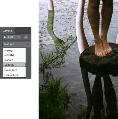
The effect was a cool glow throughout the finished piece that water usually casts on objects near it, though I’ve erased parts of the texture from the model’s face.
12: LAST TOUCHES

After adding the texture I decided to do some final tweaking to the brightness and contrast using Curves (Image > Adjustment > Curves). Adding a bit of grain (Filter > Filter Gallery > Texture > Grain) with the Intensity set to 12 and Contrast to 50 also made the final image look crisper and sharper when printed.

The final image
Headache Christophe Kiciak
I suppose everybody sometimes feels internally like a stranger, even though they might be in a friendly place. Something simply gets disconnected from reality, and suddenly everything around us feels meaningless. A kind of dream occurs: voices and sounds get distorted in the background, eyes stare at nothing. Then all of a sudden someone asks, “What are you thinking about?” Answering a question like that honestly is difficult. The usual answer is a commonplace: “Nothing …” Answering like this is much easier than trying to actually explain such complex feelings of alienation, but for this project I decided to try to create a picture that would accurately depict this feeling.

BASE IMAGES


TOOLS

Color Efex Pro 4
Photoshop
1: CREATING THE CANVAS

First I needed to create my main canvas. For this project, I set up a square document of 5616 × 5616 pixels, but you can use any size you like. You’re limited only by what your computer can handle.
2: IMPORTING THE SKY
I then simply added the photo containing the sky to a new layer, and positioned it so that the bright part was in the upper right corner of the canvas.

The fun began here. I distorted the sky creatively, using Photoshop’s Warp tool (Edit > Transform > Warp) to create these curvy shapes. All of the Transform tools are great for different things, so feel free to use whichever option you want in your own work.
4: MODIFYING THE SKY

I then adjusted the tint of the sky. You can do this using various different tools, but for this image I used a Hue/Saturation Adjustment Layer.
I continued by darkening some parts and brightening others—adding these enhancements is totally optional, and how far you go depends entirely on your taste level. There are plenty of ways of editing a stormy sky, but my preferred method is to add a new layer, change its blending mode to Soft Light, then gently brush some black or white (using a round brush with 0% hardness, 5% Opacity) to darken or brighten various areas.
5: KEEPING TRACK OF YOUR LAYERS

I created a group and named it conveniently as “Step 1—Sky,” then placed all my layers in it. (Sorting your layers is a great help when they start to add up.)
6: ADDING THE GROUND


I created a new group called “Ground,” and added a first layer: my photo of the path. As for the ground, I transformed it using the Warp tool.
7: INSERTING THE STAIRCASE

Creating the staircase was tricky. I had to use two photos and blend them together to obtain the size I wanted. I manipulated the stairs as I saw fit and tried to position them on the canvas so that the topmost step sat just by the brightest part of the sky, leading the eye naturally upwards.

Next I added a Layer Mask to my active layer, and painted in black to mask out some small undesirable elements of the image. I took my time to do this accurately as I knew it would give me a better final result.

In order to create the pile of rocks on the left side of the picture, I created a new layer group called “Rocks” and added to it four individual pieces of the base image I’d taken of moss-covered stones. I used the Lasso tool to select the four different areas on my base image, added the selections to the new “Rocks” layer, and blended them together. I then blended the melded-together rock pile into my main image, and finally, made sure to add the “Rocks” group above the path in the layers hierarchy, but under the staircase. To do the same kind of job in your own work you could either use Layer Masks, or the Eraser tool if you’re comfortable with it.
9: FINALIZING THE GROUND

I now finalized the layout of the ground by adding some borders to the staircase and the rocks (just like before, I used a selection tool to grab parts of what I needed from other photos and pasted them into my main scene). I had all of the elements, so it was just a case of moving, adjusting, and deforming all the separate parts to obtain a foreground that looked credible. I took my time to check all the joins between the blended parts to avoid visual inconsistencies.
Using a large number of Adjustment Layers in conjunction with Layer Masks, I adjusted the foreground to make it more dramatic. I wanted some harsh contrast, a desaturated mood, and strong, dark tones.
10: PHOTOGRAPHING THE HEAD

To incorporate the head into the scenery as realistically as possible, I shot a self-portrait with strong lighting coming from behind to simulate light coming from behind the clouds in the main picture.
11: PREPARING THE HEAD IMAGE

In Photoshop I manually masked the head as accurately as possible (I tend to use a graphics tablet for this kind of work as I find it more intuitive than the mouse). Ignoring my hair, I created the mask as if I were bald, then used the Stamp tool to copy and paste some facial skin to cover my hair. I then placed the final head as a new layer in the main image.

I positioned the head in the scene, desaturating it partially so that the skin was not too pink in comparison with its direct surroundings.

I created the twisting neck with the Stamp tool. I didn’t worry about being very accurate, just simply copying and pasting skin texture, then using the Eraser tool on the edges of the neck to adjust its shape.
13: ADDING SHADOWING TO THE HEAD

Next I added some shadows and highlights to the face and neck: I wanted the bottom part to be dark, and the upper part to be brighter. I achieved this by creating another new layer, changing the blend mode to Soft Light, and gently painting some black or white where needed. I used a very soft round brush at 5% Opacity, and tried to be very patient and accurate.
I made sure to apply the Adjustment Layers to the head as Clipping Masks, so that they adjusted only the head, not the rest of the composition.
14: TEXTURIZING THE HEAD

Finally, I applied some texture to the skin, simply photographing a wall with an interesting texture and pushing the saturation a bit to obtain a grungy look.
I put the texture in a new layer above the head and neck, and changed the blending mode to Overlay. I then added a Layer Mask to it and painted some black on the mask where I didn’t want the texture to appear, such as on the eyes and teeth. I also made some other minor tweaks, such as adding a new layer in Color Blend mode and painting some red around the eyes for a more disconcerting look.
15: ADDING THE BODY

This step was simple, since all I needed was a silhouette. I took a photo of myself against a strong light, then masked out my body.

I wanted to adjust the posture, bending it slightly, so I decided to try using the Puppet Warp and Liquify tools; these are very powerful, and, to a degree, made it easy to move an arm or a leg.
Also as the body wasn’t dark enough (a bit too colorful for my taste), I simply added new Adjustment Layers to desaturate it and lower its brightness.

I took several photos of an old-fashioned key, remembering for consistency to use the same lighting setup as the previous shots.

Next I masked the keys out, pasting them into the scenery. I used the Free Transform tool to adjust the sizes and perspectives of the keys as needed. In the main image I positioned five keys on the ground, then one last one in the character’s hand.
I also made sure to create shadows for each key. For this, I simply duplicated the layer containing the key photo, turning it black (Image > Adjustments > Exposure), blurring it a little (Filter > Blur > Gaussian Blur), and positioning it slightly under and to the left of the key. I then repeated the process for each key.
17: EXCISING THE KEYHOLE IN THE FOREHEAD
I also created a keyhole in the forehead of the character. This was tricky to do; I needed to take my time and be patient.
There were many methods I could have used to get the result I wanted, but I decided to paint the keyhole directly onto the forehead using a standard round brush. I wanted the hole itself to be pure black, and the “sides” to be drawn using the dark skin tones already in place.
I also could have used a photo of a real keyhole to guide me. It would have been easy to put the photo in a layer above my work on a low opacity so that I could still see what I was doing.
18: TIDYING UP

At this point I was almost finished with the image; all I needed to do was to finalize the tones. I used a Photoshop plug-in from Nik Software called Color FX Pro 4. Here are the tweaks I made using the plugin, and some alternative methods of getting the same effect using Photoshop or another image-editing program:
I added some extra contrast to the image. With Photoshop or another image-editing program I would recommend using Curves or Levels in a new Adjustment Layer to get a similar effect.
I added some more contrast to the corners with Color Efex Pro 4. To get this effect in Photoshop or another image-editing program I would recommend painting in some black using a soft brush at low opacity.
I also raised saturation of the reds and blurred some of the objects’ edges (especially the edges of the keys) so that they didn’t look so much as if they’d been pasted into the scene. The same tools in Photoshop or another image-editing program will give you the same effect.
I was now satisfied with how my image looked. My advice to all surreal photographers is not to hesitate to experiment—not only is it a great way to learn and improve, it’s also a huge amount of fun.

The final image
Learning to Fly Nikolai Gorski
I shot this photograph in the art nouveau Printemps department store in Paris, in April 2010. Technically, it’s a panorama made from three separate frames taken with a Nikon D90 camera and a Sigma 10-20mm lens. The images were then developed using the Hugin panorama stitcher.
This image almost never saw the light of day. I wasn’t convinced that the panorama would come to anything much after stitching it together, and ignored the shots for almost nine months. When I did finally process the panorama, I still wasn’t happy with the result, and archived the image. But a lightning strike of inspiration came in the form of the Pink Floyd song, Learning to Fly. Suddenly the words of the song and the image of the staircase had merged themselves together in my mind—the stairs were attempting to fly. So I returned to the panorama, and within about 40 minutes, I’d produced the final version.
I rotated the image clockwise 50 degrees, converted it to black and white, and dodged and burned here and there to emphasize the subject.
For me, the image resembles a bird attempting to fly, but other viewers see a fly or a moth, a teasing tongue or a Möbius strip. It is, though, a perfectly surreal image: a dreamlike step into the imagination, where reality has been skewed—quite literally—and as the viewer looks at it, they search for a familiar interpretation.

Swan Lake Eve Livesey
Swan Lake is an image that reminds me of the aspirations of human beings and the dedication and desire that are required to make your dreams come true. The dancer seems fragile but strong, and the mirroring of her posture with that of the swan along with the softness of the textures adds a wonderful, delicate surrealism to the scene.

BASE IMAGES
Whether you already have your own or you need to find images from a stock agency, spending the time to find exactly the right images pays off in the end as you’ll spend much less time editing the images. I chose this ballet-dancer photo from Photl.com as when I imagine aspiring ballet dancers I think that their ideal ballet must be Swan Lake. I chose this photo because there is such a wonderful feeling of motion in the dancer’s leap. The swan image is my own, one I’d previously manipulated to achieve a magical, twinkling effect.

Above: Ballet Dancer © Studio CL Art, photl.com

TOOLS
Photoshop
1: CREATE A NEW FILE

I felt a square image was ideal for this composite, so I created a document measuring 6000 × 6000 pixels with a resolution of 300 ppi. I set the color mode to 8-bit RGB and the background contents to transparent, which I knew would help when I cut out the elements of the composite.
2: ADD ELEMENTS
When I created my file and built up the composite. “I opened the first image to be included (the dancer) and cropped it to exclude as much of the background as possible.
Then I transfered this layer into the new document using the Move tool. Now I had two layers: the transparent background which I titled Transparent Background, and the ballerina photograph. I find it very helpful to name my layers.

I next cut out the ballerina. A method of cutting out common for pre-CS3 versions of Photoshop is to use the Eraser tool, slowly erasing around the edge of the subject and changing the size of the brush head with the + and - keys as necessary. This is something of a traditionalist’s approach, but does give great manual control.
In versions of Photoshop from CS3 on, you can select the Quick Selection tool via the toolbar, and with a large brush click once in the center of your subject. Photoshop automatically detects the edges of the subject and makes a selection for you. I used this method, and to refine my selection, clicked (or dragged on) any areas of “spread” bleeding outside the edges of my subject, shift-clicking on parts I’d missed, and reducing the brush size with the - key as my refinements became ever more precise.
When using the Quick Selection tool, note that as you hold down the Shift, the central minus symbol switches to a plus sign to indicate you’re about to add to the selection rather than reduce it.
4: SOFTEN THE IMAGE

Once I removed all of the background, I set the Eraser tool’s brush to a larger size and the Opacity to 5% and went over the whole model with the Eraser tool. This softened the edges of the image and made it look less “cut out.”
The edges of the tutu were already semi-transparent, but by using a large brush set to 30% Opacity I was able to allow the new background to show through the net.
5: ADD THE SECOND ELEMENT TO THE COMPOSITE

Next I needed to add the second element to my composite. In this case, it was a photo of a swan that I’d already treated with a filter to give it a dreamy look. I opened the file and added it to my composite as a new layer using the Move tool.
6: SCALE AND HARMONIZE THE IMAGES

At this stage, the proportions of the ballerina and the swan needed to be adjusted in order to look right in the final image. I scaled the ballerina and the swan on both layers using the Edit > Transform > Scale option. I positioned them with the Move tool. I then realized I needed to harmonize the tones and colors of the ballerina and the swan. I started by desaturating the image to match the tone of the ballerina with the swan (Image > Adjustments > Hue/Saturation).
A diffuse glow is a good touch; I experimented with just how much I wanted to add (Filter > Distort > Diffuse Glow).
7: ADD A BACKGROUND

As the image seemed to have evolved into monochrome, I decided to add a plain black background. To do so, I selected the Background layer, then filled it black using the Paint Bucket tool, though I could also have created a solid color layer.

Now that the two main elements of the composition were in place on the black background I needed to blend them together to make them look as though they were one photo. Because it would look strange with part of the image being warped and the rest left unwarped, I chose the Edit > Transform > Warp command to extend the background of the swan image to the right, at the same time ensuring that I didn’t distort the swan in the process. The dashed arrows show the movement already made, and the two control points that still need to be moved.
Next I added some mist to the left of the swan using a glittery smoke brush. If I was concerned about making a mistake, I could have done this on a separate layer. You can thin out and blur mist using the Eraser and Blur tools.
9: CORRECT THE LIGHT

Next, I wanted to correct the light on both elements of the image so that it looked consistent, as if it were falling from the same direction with the same degree of intensity. I decided to include the full moon as the purported light source, which enhanced the dreamy feel of the composition. Adding another layer, I used a moon brush purchased under license from obsidiandawn.com to place a full moon in the top right corner of the frame. A moon brush can be used to paint (or almost stamp) a moon onto your scenes, and in this case its inclusion helped to balance the composition.
10: DODGE AND BURN

I then created another layer and added a light beam from the moon using a Light Beam brush, positioning and sizing the beam with the Edit > Transform options.
Taking into account how the light was falling on the ballerina and swan, I used the Dodge tool to lighten and the Burn tool to add shadow to their layers, enhancing the realism of the effect. There are many ways of assessing where the light should fall on a subject, but my most trusted method is to create a new layer and sketch lines from the light source onto the subjects using the Pen tool. I then delete this layer when I’m done with it.
11: FINAL COMPOSITION AND A TOUCH OF MAGIC
Looking at the composition, I felt it needed to be more balanced, so I added some magic dust to the left side using a glitter brush purchased from obsidiandawn.com. I also softened the ray of light by reducing the Opacity to 29% on the Layers palette.
When I was happy with my image, I saved it as a PSD file with all its layers intact, allowing me the option to use the cut-out elements in another composition or make alterations at a later date.
Finally, I flattened the image using the Layer > Flatten Image option and saved it as a JPEG.

The final image
Untitled Sarolta Bán
The concept behind this image was to make an image that had a light and playful mood, something almost weightless—like a child might feel. I thought a seesaw could symbolize this, but by adding the butterflies the image was turned into a surreal scene with layers of meaning. Usually my ideas come to me while I’m working; it was no different in this case.

BASE IMAGES
These images were all taken on a summer vacation, so without any chance of reshooting anything, I had to find a way to work with what I had. I took the photo of the seesaw at Lake Balaton in Hungary, at a playground by a beach where I used to play a lot when I was a child.


TOOLS
Photoshop
1: CUTTING OUT THE SEESAW


First, I cut out the seesaw from its background using the Polygonal Lasso tool. Once I had made the selection I duplicated the layer, inverted the selection, and deleted the surrounding grass. I could have used Layer Masks, but I prefer to keep it simple and work using only what I really need.
2: RESIZING THE SEESAW

The seesaw was originally a double seesaw, but I reduced it to a single one quite easily. All I had to do was to cut out the superfluous extra bar, resize things a little, and move the left upright in closer to the rest.
3: CUTTING OUT AND RESIZING THE BUTTERFLIES

I used the same cutting-out process for the butterfly photos. Then it was simply a case of experimenting and trying to find a good size and placement for them against the seesaw.

To further the aura of lightness I thought that the seesaw should be in the air, and found it looked best placed on a little cloud. So the seesaw would be visible against a blue sky, I changed it from blue to red using the Replace Color tool (Image > Adjustments > Replace Color).

I created the cloud from several photos I had of clouds, experimenting until I achieved the form that I wanted, and then layering it with the butterfly-seesaw group. To ensure that the combination of seesaw and cloud looked real, I decreased the opacity of the cloud around the legs to give it a transparent appearance.
5: CREATING THE BACKGROUND

My pictures are mostly squares, so I cropped the background image for the scene into a square-shaped composition. Then I added some light layers by creating a new layer, painting with a soft white brush where the image needed it, and blurring it with Gaussian Blur (Filter > Blur > Gaussian Blur). Next I changed the layer mode to Soft Light, reduced the opacity, and used this over the center part of the sky and horizon.

After the light, I added a soft vignette with the Gradient tool. To do this I created a new layer and selected the Gradient tool from the toolbar.
From the gradient picker on the Options bar I selected the Transparent effect and set the Opacity to 30% in Normal mode (I could also have used Multiply mode).

I dragged the cursor from the edge of the image toward its center, covering about a third of the image. I then repeated this for all four edges.
REPLACING COLOR

Next I placed the seesaw-butterflies-cloud group onto the background. With hard-edged cut-out elements, like the seesaw and the butterflies, it can be good to use the Layer > Matting > Defringe option, set at one pixel, for better blending.
The butterflies needed some shadow, especially the upper one. I placed the shadows on new layers between the seesaw and the butterflies, painting with a small black brush where the shadow would naturally appear, and adding a touch of blur. When doing similar work you will probably find that you can achieve the best natural-looking effect by playing with layer modes, opacity, and soft deleting.
7: COLOR ADJUSTMENT

After putting all the elements into place, I started the color and contrast adjustments. I felt that the color version of this picture was too much, so decided to convert it to sepia.
I created a new Fill Layer (Layer > New Fill Layer > Solid Color) and selected a gray tone from the color picker for it. The ability to choose from so many tones and shades allowed me to apply the right effect to the image. Note that if the mode is set to Normal it will cover the background image entirely, but by changing the mode to Color and retaining the opacity at 100%, the background image will be revealed with a beautiful sepia effect. You can intensify this with the addition of some texture.
It’s also possible to create a sepia effect by inserting a new Black and White Adjustment Layer (Layer > New Adjustment Layer > Black and White), and placing a Photo Filter Adjustment layer over the top of that (Layer > New Adjustment Layer > Photo Filter). Then from the drop-down select Sepia (or Deep Yellow).
8: ADDING TEXTURE

Adding texture (for example by layering a photo of some paper over the image, applying some Gaussian Blur, and then playing with the layer modes and opacity), can create interesting color and lighting effects. In this case I added several different textures from my archive, importing them into Photoshop and layering them over the composite. Then I manipulated them by adding some blur and by adjusting the layer modes and different opacities until I had an effect that I thought worked.
If you don’t have your own texture photos, you can add texture effects from Photoshop by applying a textured filter such as Grain (Filter > Filter Gallery > Texture > Grain). You can then adjust the type and degree of grain to your preference.
9: FINALLY
Lastly, I adjusted the color and contrast to achieve the look that I wanted, and Untitled was complete. My advice to aspiring digital surreal image-makers is to remember that you can add as many Adjustment Layers as you need—keep working until you achieve exactly what you want.

The final image
Dear Deer, You Don’t Belong Here! Stella Sidiropoulou
Dear Deer, You Don’t Belong Here came from a moment’s inspiration. The creation of the image wasn’t the difficult part; rather it was ensuring the emotional connection of the elements in the photo so that the result wouldn’t be some ordinary Photoshop work. I wanted an image that anyone would see with pleasure again and again. That’s what I imagined, and I hope what I achieved.

BASE IMAGES
The underwater photos where shot with a Pentax Optio WG1 in Chalkidiki, Greece. The sea there is fabulously clear, and I was instantly captivated by the underwater world. The photos of the deer were taken with my Canon EOS 550D in Xanthi, Greece. The hotel where I was staying had a small zoo nearby, and the deer were there, relaxing and being so beautiful I just had to photograph them.


TOOLS
Photoshop
1: CREATING THE CANVAS


My first step was to import my background image into Photoshop and use the Lens Correction filter (Filter > Lens Correction) to straighten the horizon.

I next selected the deer on the right side of the photo using the Quick Selection tool. If you need to tidy up the selection, you can always use the Refine Edge tool. (See more on the Refine Edge tool on page 57.)
3: PLACING THE DEER

When I had decided where I wanted the deer in the composition, I copied and pasted it onto the background image (Edit > Copy; Edit > Paste). It would still be easy to move if I thought its placement didn’t look quite right, though.

I then selected the copy of the deer and rotated it on its vertical axis so that it was facing into the composition, rather than looking out of it. To change its orientation I right-clicked on the selected element (in this case the deer) and then chose Flip Horizontal from the menu.
4: ADDING THE FISH


I copied and pasted the fish into the scene using the same method as for the deer. Then I straightened them using the Free Transform tool. You’ll find the Free Transform tool in the menu when you right-click on the image.

When all of the elements were in place, I used the Clone Stamp tool to tidy up the background around the inserted images. This helps to ensure that the different elements blend into the composite seamlessly, and don’t appear too super-imposed.
It isn’t an easy process, but I prefer to use the Clone Stamp tool because I feel that when using it I am in total control of the edits that I’m making.
6: INTENSIFYING THE COLOR

Now the image was ready for final processing. In particular I thought that it needed to be bolder, so I used HDR toning (Image > Adjustments > HDR Toning) to boost the intensity of the colors. If you don’t feel confident using HDR toning or don’t want to flatten your image (HDR toning only works on flattened images), there are many other ways to increase color intensity in Photoshop. I use HDR toning because I like the results that it gives, but you might want to consider adjusting the saturation or tweaking the color balance.
Upon completing my surreal image, the last step was to name it. I settled on Dear Deer, You Don’t Belong Here! I think it looks as if the fish is trying to stare down the deer and send him back where he belongs. The final image wasn’t what I’d imagined before I began the composition, it came to me as I worked through the process. It’s not so unusual for inspiration to strike as you’re processing. But then again, it happens the other way around, too!

The final image
Memoirs Lisa Karlsson
When creating Memoirs I wanted to portray how I see memories, which is that they are like windows to past experiences and feelings.
I see memories as a kind of organized chaos that includes experiences and feelings arranged by time. A wall full of windows felt like the perfect symbol for this: closed windows representing locked-away memories, and those wide open for the ones you want to revel in. The idea also pleased me as even though a window might be closed, what is inside is still visible; thus every experience and memory a person has still shapes them as an individual. The possibility to open and close windows symbolizes both the choice of when to remember, and the choice of when to learn from your experiences.
But the picture alone was still no more than an image of a building—I needed a portrait for the concept to become more visible. I started experimenting with lighting to get the right kind of silhouette for the portrait. After many attempts I hit on an arrangement that had harsh light falling from the side, and so I managed to achieve with a self-portrait the melancholy feeling I wanted.
In Adobe Photoshop I merged my portrait with the base image, placing the self-portrait layer on top, and setting the blending mode to Screen. I used a soft Eraser tool on the self-portrait layer in the parts where I wanted the image of the building to shine through completely—for example, on the right eye. I also used several layers of Curves in specific areas to enhance the shadows and highlights.
And with that last adjustment, Memoirs was done.
The origin of this image owes a lot to serendipity. One day I happened to be looking through a series of pictures taken in Copenhagen some years ago, and on finding this picture of a building, an idea took root. The concept of memories had been on my mind for quite some time, but it wasn’t until I found this picture that the idea took solid form.

To Dream the Dream of Seagulls Marc Ward
Albert Einstein once said that “Reality is an illusion, albeit a very persistent one.” In my work I use real images to produce illusionary and surreal composites. Sometimes I go in search of specific objects to photograph, and other times I search my library of collected images to find the perfect pieces to assemble something new. This example is the result of the latter process.

BASE IMAGES
I keep a large photographic collection of “things.” Photos of clouds, water, animals, and other interesting objects take up large sections of my hard drive. They are the toolbox that I use to assemble my images. Many of these component images have been prepared for compositing by being “deep etched,” or removed from their original backgrounds, before I save them. This way, I have a large selection of images ready to be inserted into composites as and when I need them.


TOOLS
Photoshop
LIGHT DIRECTION
How light reflects and how it falls on objects is the key to making composite images that feel and look right. Pay attention to your light’s direction and how it lands on your subjects. If all the light sources and directions don’t match, the viewer will feel a sense of unease and not accept the vision you’re trying to create.

I started with a background made up of sunset clouds that I shot quite by chance one day while out for a drive, pulling off the road to point my camera at the sky.

My next step was to enlarge the canvas to make room for the foreground by going to Image > Canvas Size.

With the canvas enlarged, I inserted the water image that was shot from a boat at sunset into the newly created space. The two combined formed the background.
2: THE TREE

The image of the tree was shot at the same time as the lake; as you can see, I had already removed it from its background. I did this by using the Lasso tool; once I’d made the selection I duplicated the layer, inverted my selection, and deleted the extra landscape that surrounded the tree. On my new layer I centered the tree on top of the sky and water background.
3: THE HOLE IN THE ROCK

A small window that I’d shot while in Barcelona was then placed on top of the rock at the base of the tree. Next, I merged together the window and tree/rock layers. This allowed me to erase the inside of the window so that there appeared to be a hole in the rock. If the two layers were not merged, I wouldn’t have been able to erase all the way through the rock.
4: THE REFLECTION

The reflection of the rock and tree was a copy of the tree-and-rock image that had been previously placed beneath the original, but inaccurately as opposed to perfectly covering the other. My next step was to apply a Motion Blur filter (Filter > Blur > Motion Blur), to give the illusion that the reflection was being cast on moving water.

I adjusted the angle of the blur to match the direction of the water and then experimented with the intensity of the blur to get the amount I wanted.

I then reduced the opacity of the image in the blending layer to make the image seem to become part of the water.

The waterfall was deep etched from a shot of a waterfall near my home. I positioned it so that it appeared to be flowing from a window in the rock. By using the Transform function I elongated the waterfall so that it flowed all the way down to the water below. On a new layer, I then took a white-colored brush and created some splashes of water where the waterfall ended.
6: THE SEAGULLS

I shot the seagulls from a balcony on the Gulf Coast of Florida. As previously, I’d already removed these birds from their backgrounds ready to be placed in the image. I positioned each bird (as with all other components) on its own layer so that they could all be moved around easily or removed according to the needs of the composition.

To make it seem as if the seagulls were receding into the distance, I reduced the opacity of their layers. This put the impression of a haze of atmosphere between the birds and the viewer and helped achieve a feeling of depth. This is a technique that works for any element of any image that you want to present as possessing some depth.

The final image
CHECKBOARD
Any time that you see a checkerboard background you are working on a transparent layer that can be placed over another layer. The checkerboard will disappear when these type of images are placed over or on top of another image.
The Spectators Miss Aniela (aka Natalie Dybisz)
The Spectators is a composite image made up of four shots of the model, Bella Grace, sitting in the chairs of an abandoned theater. The image was shot during a workshop where I was demonstrating surreal techniques and how to achieve interesting results with composites to a group of students. The technique of cloning a figure, or “multiplicity,” is very simple. In this case the technique was applied at the post-production stage, but in order to get a good result it was important to shoot the images in a particular way. This kind of shoot requires a certain amount of preparation, keeping the final image in mind.

BASE IMAGES
The technique used to create the multiple figures was very straightforward. I had Bella sit in each seat in turn while I kept my camera locked down on the tripod, and chose camera settings that allowed for motion blur in-shot so that her facial features and limbs would be distorted. I generally do not like to fake blur in post-production, so I try to make a decision on the spot about whether or not I can achieve it in-camera.


TOOLS
Photoshop

First I chose the angle at which I wanted to shoot. Once I had done so, it was important that I kept the camera still in this position, and did not move it throughout the shots. This meant that I had to pick the right composition to keep the consistency.
I wanted to shoot close to the seats, so I erected my tripod at a high angle, but from a height at which I could still see the face of the model, Bella, without feeling as though I was too high above her. I also chose a particular angle, titled slightly to one side, so that the chairs moved across the frame diagonally, giving the impression of depth without turning the portrait into a profile shot.
All of these choices were made on the spot. I only realized their importance when I shot an image in the same seats at a subsequent workshop, which didn’t work as well.
2: THE MODEL

The images were taken at ƒ/3.5 and ISO 400, with a shutter speed of 1/5 second, using only the ambient light. By the end of the shoot I’d taken about 20 different shots of Bella in various seats and poses, all with the same composition in-frame.
3: THE MASTER IMAGE

In Photoshop, I chose an image that would be the main picture onto which the other figures would be placed once cut out. For the master image I chose the shot of Bella in a central position—the shot I liked the most. If you end up doing something similar in a project of your own, an alternative method I’d recommend would be to start with a “blank” shot of the scene. Starting with this blank slate and beginning to build your figures from scratch gives you a usefully large amount of flexibility.
4: CUTTING OUT THE SECOND FIGURE

Opening up a second picture, I used the Pen tool to place a series of points around the figure (not too close to the edges), and then completed the path by clicking the first point I had made.

To cut out the piece without taking any of the background with me, I made sure that the Pen tool settings on the Options bar were set to Paths, Pen tool, and Add to Path Area. To make a selection from this point, I navigated to Paths next to the Layers palette (if you cannot see the Paths option, select Window in the Options bar at the top of the screen, and make sure Paths is checked). I then was able to see the work path I’d created with the Pen tool. Click on this with the CMD key (on a Mac) or CTRL key (on a Windows machine) pressed down, or right-click and choose Make Selection.
The marching ants now appeared around my figure, and I made a new layer from this via Layer > New > Layer. The marching ants then disappeared and the new layer appeared in my Layers palette. This new layer contained just the figure, duplicated from the background.
5: MOVING THE SECOND FIGURE
My next step was to select the Move tool and click onto the figure, holding it down and dragging it straight onto the master image. By holding down the Shift key while I did this, the figure landed in the same place it was shot, as the images were taken without the camera moving. However, I still had to deal with the inevitable edges around each new layer once placed, as there will always be subtle exposure differences between images.
6: THE OTHER FIGURES

For each new figure-containing layer I added a Layer Mask by clicking the mask icon at the bottom of the Layers palette and selecting the Brush tool. (On black, this erases the layer and on white, it brings back the layer.) I selected a small feather-edged brush and erased away the edges of the new layer so that it fit in with the image seamlessly.
I did this for each and every new Bella I added to my master composite. I placed the figures roughly to begin with because my main aim was to figure out how many figures looked right before I committed to doing the polishing work.

Although the post-production stage was straightforward, it was also a little fiddly. This was because I had so many choices from which to make a combination of the ideal number of figures. When I make a multiplicity composite, it is not the novelty itself of having multiple figures that I thrive on. The key for me is in creating an interesting shape within the frame. It is about achieving the right placement to form a particular line and motion between one figure and the next. In this case, because of the blurred ghostly poses, I wanted to achieve a pleasing flow between the figures, with a depth and shape to them as the viewer’s eye moves across the frame.
Some of the figures could be moved from one seat to another, which added further choice. Once I had a range of figures, I toggled the visibility of each layer by pressing the eye symbol next to the layer in the Layers palette to work out the final choice and positioning.
8: PERFECTING THE BACKGROUND

I settled for four figures in the end, considering that any more was overcrowding. Other important changes were to give a slight crop, make the chairs retreat into infinity, and eliminate clutter at the back of the theater. I made these edits by merging everything to a top layer (once all the main compositing work was done) by pressing CTRL-ALT-Shift-E if using a Windows machine, and CMD-ALT-Shift-E on a Mac. I also could have flattened the whole image and saved it as a new file. Then, I used the Clone Stamp tool to carry on the lines of chairs to the edges of the frame. Later versions of Photoshop have a predictive Clone view, which allows you to align the Clone Stamp into place before cloning. This helped me to align the chairs as I swept the brush across.
As with all my images, especially constructed trick-composites, I made sure I saved the file with all the layers intact as a PSD file, in case I wanted to go back to it later. After I had flattened the image, I saved it as a separate file (TIFF) and worked on the overall color adjustments.
10: COLOR ADJUSTMENTS

I could see that because the colors throughout the picture were quite pale and light it was a good candidate for some tonal adjustments. I used the Curves and Color Balance tools to deepen the tones and play on the color scheme of black and red in the image.

I also decided to enhance the color of the dresses by drawing a selection around the figures and adjusting the colors slightly in Hue and Saturation, making them slightly bluer.

Finally, I added vignetting by going into Filter > Lens Correction and subtly adjusting the sliders to draw the focus of the scene toward the subject.
11: THE FINAL IMAGE
Inspired by the semi-derelict quality of the theater setting itself, I wanted this image to be an eerie scene of multiple figures, each alike and moving similarly, but in a frenzied way that suggested a possession or something similarly inhuman. I also liked the bold primary colors, and the combination of red, green, and vivid skin tones.

The final image
* The phrase “wingardium leviosa” is a quotation from J.K. Rowling’s Harry Potter series, first introduced in Harry Potter and the Philosopher’s Stone (published in some countries as Harry Potter and the Sorcerer’s Stone).