CHAPTER
26 Using AWT Controls, Layout Managers, and Menus
This chapter continues our overview of the Abstract Window Toolkit (AWT). It begins with a look at several of the AWT’s controls and layout managers. It then discusses menus and the menu bar. The chapter also includes a discussion of the dialog box.
Controls are components that allow a user to interact with your application in various ways—for example, a commonly used control is the push button. A layout manager automatically positions components within a container. Thus, the appearance of a window is determined by a combination of the controls that it contains and the layout manager used to position them.
In addition to the controls, a frame window can also include a standard-style menu bar. Each entry in a menu bar activates a drop-down menu of options from which the user can choose. This constitutes the main menu of an application. As a general rule, a menu bar is positioned at the top of a window. Although different in appearance, menu bars are handled in much the same way as are the other controls.
While it is possible to manually position components within a window, doing so is quite tedious. The layout manager automates this task. For the first part of this chapter, which introduces various controls, a simple layout manager will be used that displays components in a container using line-by-line, top-to-bottom organization. Once the controls have been covered, several other layout managers will be examined. There, you will see ways to better manage the positioning of controls.
Before continuing, it is important to emphasize that today you will seldom create GUIs based solely on the AWT because more powerful GUI frameworks (Swing and JavaFX) have been developed for Java. However, the material presented here remains important for the following reasons. First, much of the information and many of the techniques related to controls and event handling are generalizable to the other Java GUI frameworks. (As mentioned in the previous chapter, Swing is built upon the AWT.) Second, the layout managers described here are also used by Swing. Third, for some small applications, the AWT components might be the appropriate choice. Finally, you may encounter legacy code that uses the AWT. Therefore, a basic understanding of the AWT is important for all Java programmers.
AWT Control Fundamentals
The AWT supports the following types of controls:
• Labels
• Push buttons
• Check boxes
• Choice lists
• Lists
• Scroll bars
• Text Editing
All AWT controls are subclasses of Component. Although the set of controls provided by the AWT is not particularly rich, it is sufficient for simple applications, such as short utility programs intended for your own use. It is also quite useful for introducing the basic concepts and techniques related to handling events in controls. It is important to point out, however, that both Swing and JavaFX provide a substantially larger, more sophisticated set of controls, and that you will typically use one of those frameworks when creating commercial applications.
Adding and Removing Controls
To include a control in a window, you must add it to the window. To do this, you must first create an instance of the desired control and then add it to a window by calling add( ), which is defined by Container. The add( ) method has several forms. The following form is the one that is used for the first part of this chapter:
Component add(Component compRef)
Here, compRef is a reference to an instance of the control that you want to add. A reference to the object is returned. Once a control has been added, it will automatically be visible whenever its parent window is displayed.
Sometimes you will want to remove a control from a window when the control is no longer needed. To do this, call remove( ). This method is also defined by Container. Here is one of its forms:
void remove(Component compRef)
Here, compRef is a reference to the control you want to remove. You can remove all controls by calling removeAll( ).
Responding to Controls
Except for labels, which are passive, all other controls generate events when they are accessed by the user. For example, when the user clicks on a push button, an event is sent that identifies the push button. In general, your program simply implements the appropriate interface and then registers an event listener for each control that you need to monitor. As explained in Chapter 24, once a listener has been installed, events are automatically sent to it. In the sections that follow, the appropriate interface for each control is specified.
The HeadlessException
Most of the AWT controls described in this chapter have constructors that can throw a HeadlessException when an attempt is made to instantiate a GUI component in a non-interactive environment (such as one in which no display, mouse, or keyboard is present). You can use this exception to write code that can adapt to non-interactive environments. (Of course, this is not always possible.) This exception is not handled by the programs in this chapter because an interactive environment is required to demonstrate the AWT controls.
Labels
The easiest control to use is a label. A label is an object of type Label, and it contains a string, which it displays. Labels are passive controls that do not support any interaction with the user. Label defines the following constructors:
Label( ) throws HeadlessException
Label(String str) throws HeadlessException
Label(String str, int how) throws HeadlessException
The first version creates a blank label. The second version creates a label that contains the string specified by str. This string is left-justified. The third version creates a label that contains the string specified by str using the alignment specified by how. The value of how must be one of these three constants: Label.LEFT, Label.RIGHT, or Label.CENTER.
You can set or change the text in a label by using the setText( ) method. You can obtain the current label by calling getText( ). These methods are shown here:
void setText(String str)
String getText( )
For setText( ), str specifies the new label. For getText( ), the current label is returned.
You can set the alignment of the string within the label by calling setAlignment( ). To obtain the current alignment, call getAlignment( ). The methods are as follows:
void setAlignment(int how)
int getAlignment( )
Here, how must be one of the alignment constants shown earlier.
The following example creates three labels and adds them to a Frame.


Here is sample output from the LabelDemo program.

Notice that the labels are organized in the window left-to-right. This is handled automatically by the FlowLayout layout manager, which is one of the layout managers provided by the AWT. Here it is used in its default configuration, which lays out components line-by-line, left-to-right, top-to-bottom, and centered. As you will see later in this chapter, it supports several options, but for now, its default behavior is sufficient. Notice that FlowLayout is selected as the layout manager by use of setLayout( ). This method sets the layout manager associated with the container, which in this case is the enclosing frame. Although FlowLayout is very convenient and sufficient for our purposes at this time, it does not give you detailed control over the placement of components within a window. Later in this chapter, when the topic of layout managers is examined in detail, you will see how to gain more control over the organization of your windows.
Using Buttons
Perhaps the most widely used control is the push button. A push button is a component that contains a label and generates an event when it is pressed. Push buttons are objects of type Button. Button defines these two constructors:
Button( ) throws HeadlessException
Button(String str) throws HeadlessException
The first version creates an empty button. The second creates a button that contains str as a label.
After a button has been created, you can set its label by calling setLabel( ). You can retrieve its label by calling getLabel( ). These methods are as follows:
void setLabel(String str)
String getLabel( )
Here, str becomes the new label for the button.
Handling Buttons
Each time a button is pressed, an action event is generated. This is sent to any listeners that previously registered an interest in receiving action event notifications from that component. Each listener implements the ActionListener interface. That interface defines the actionPerformed( ) method, which is called when an event occurs. An ActionEvent object is supplied as the argument to this method. It contains both a reference to the button that generated the event and a reference to the action command string associated with the button. By default, the action command string is the label of the button. Either the button reference or the action command string can be used to identify the button. (You will soon see examples of each approach.)
Here is an example that creates three buttons labeled "Yes", "No", and "Undecided". Each time one is pressed, a message is displayed that reports which button has been pressed. In this version, the action command of the button (which, by default, is its label) is used to determine which button has been pressed. The label is obtained by calling the getActionCommand( ) method on the ActionEvent object passed to actionPerformed( ).


Sample output from the ButtonDemo program is shown in Figure 26-1.

Figure 26-1 Sample output from the ButtonDemo program
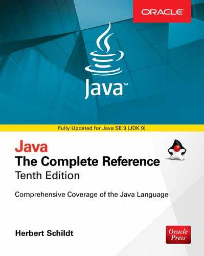
As mentioned, in addition to comparing button action command strings, you can also determine which button has been pressed by comparing the object obtained from the getSource( ) method to the button objects that you added to the window. To do this, you must keep a list of the objects when they are added. The following program shows this approach:

In this version, the program stores each button reference in an array when the buttons are added to the frame. (Recall that the add( ) method returns a reference to the button when it is added.) Inside actionPerformed( ), this array is then used to determine which button has been pressed.
For simple programs, it is usually easier to recognize buttons by their labels. However, in situations in which you will be changing the label inside a button during the execution of your program, or using buttons that have the same label, it may be easier to determine which button has been pushed by using its object reference. It is also possible to set the action command string associated with a button to something other than its label by calling setActionCommand( ). This method changes the action command string, but does not affect the string used to label the button. Thus, setting the action command enables the action command and the label of a button to differ.
In some cases, you can handle the action events generated by a button (or some other type of control) by use of an anonymous inner class (as described in Chapter 24) or a lambda expression (discussed in Chapter 15). For example, assuming the previous programs, here is a set of action event handlers that use lambda expressions:

This code works because ActionListener defines a functional interface, which is an interface with exactly one abstract method. Thus, it can be used by a lambda expression. In general, you can use a lambda expression to handle an AWT event when its listener defines a functional interface. For example, ItemListener is also a functional interface. Of course, whether you use the traditional approach, an anonymous inner class, or a lambda expression will be determined by the precise nature of your application.
Applying Check Boxes
A check box is a control that is used to turn an option on or off. It consists of a small box that can either contain a check mark or not. There is a label associated with each check box that describes what option the box represents. You change the state of a check box by clicking on it. Check boxes can be used individually or as part of a group. Check boxes are objects of the Checkbox class.
Checkbox supports these constructors:
Checkbox( ) throws HeadlessException
Checkbox(String str) throws HeadlessException
Checkbox(String str, boolean on) throws HeadlessException
Checkbox(String str, boolean on, CheckboxGroup cbGroup) throws HeadlessException
Checkbox(String str, CheckboxGroup cbGroup, boolean on) throws HeadlessException
The first form creates a check box whose label is initially blank. The state of the check box is unchecked. The second form creates a check box whose label is specified by str. The state of the check box is unchecked. The third form allows you to set the initial state of the check box. If on is true, the check box is initially checked; otherwise, it is cleared. The fourth and fifth forms create a check box whose label is specified by str and whose group is specified by cbGroup. If this check box is not part of a group, then cbGroup must be null. (Check box groups are described in the next section.) The value of on determines the initial state of the check box.
To retrieve the current state of a check box, call getState( ). To set its state, call setState( ). You can obtain the current label associated with a check box by calling getLabel( ). To set the label, call setLabel( ). These methods are as follows:
boolean getState( )
void setState(boolean on)
String getLabel( )
void setLabel(String str)
Here, if on is true, the box is checked. If it is false, the box is cleared. The string passed in str becomes the new label associated with the invoking check box.
Handling Check Boxes
Each time a check box is selected or deselected, an item event is generated. This is sent to any listeners that previously registered an interest in receiving item event notifications from that component. Each listener implements the ItemListener interface. That interface defines the itemStateChanged( ) method. An ItemEvent object is supplied as the argument to this method. It contains information about the event (for example, whether it was a selection or deselection).
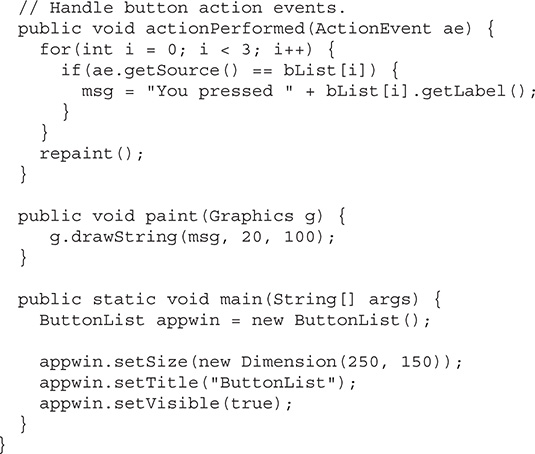
The following program creates four check boxes. The initial state of the first box is checked. The status of each check box is displayed. Each time you change the state of a check box, the status display is updated.


Sample output is shown in Figure 26-2.
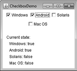
Figure 26-2 Sample output from the CheckboxDemo program
CheckboxGroup
It is possible to create a set of mutually exclusive check boxes in which one and only one check box in the group can be checked at any one time. These check boxes are often called radio buttons, because they act like the station selector on a car radio—only one station can be selected at any one time. To create a set of mutually exclusive check boxes, you must first define the group to which they will belong and then specify that group when you construct the check boxes. Check box groups are objects of type CheckboxGroup. Only the default constructor is defined, which creates an empty group.
You can determine which check box in a group is currently selected by calling getSelectedCheckbox( ). You can set a check box by calling setSelectedCheckbox( ). These methods are as follows:
Checkbox getSelectedCheckbox( )
void setSelectedCheckbox(Checkbox which)
Here, which is the check box that you want to be selected. The previously selected check box will be turned off.
Here is a program that uses check boxes that are part of a group:


Sample output generated by the CBGroup program is shown in Figure 26-3. Notice that the check boxes are now circular in shape.

Figure 26-3 Sample output from the CBGroup program
Choice Controls
The Choice class is used to create a pop-up list of items from which the user may choose. Thus, a Choice control is a form of menu. When inactive, a Choice component takes up only enough space to show the currently selected item. When the user clicks on it, the whole list of choices pops up, and a new selection can be made. Each item in the list is a string that appears as a left-justified label in the order it is added to the Choice object. Choice defines only the default constructor, which creates an empty list.
To add a selection to the list, call add( ). It has this general form:
void add(String name)
Here, name is the name of the item being added. Items are added to the list in the order in which calls to add( ) occur.
To determine which item is currently selected, you may call either getSelectedItem( ) or getSelectedIndex( ). These methods are shown here:
String getSelectedItem( )
int getSelectedIndex( )
The getSelectedItem( ) method returns a string containing the name of the item. getSelectedIndex( ) returns the index of the item. The first item is at index 0. By default, the first item added to the list is selected.
To obtain the number of items in the list, call getItemCount( ). You can set the currently selected item using the select( ) method with either a zero-based integer index or a string that will match a name in the list. These methods are shown here:
int getItemCount( )
void select(int index)
void select(String name)
Given an index, you can obtain the name associated with the item at that index by calling getItem( ), which has this general form:
String getItem(int index)
Here, index specifies the index of the desired item.
Handling Choice Lists
Each time a choice is selected, an item event is generated. This is sent to any listeners that previously registered an interest in receiving item event notifications from that component. Each listener implements the ItemListener interface. That interface defines the itemStateChanged( ) method. An ItemEvent object is supplied as the argument to this method.
Here is an example that creates two Choice menus. One selects the operating system. The other selects the browser.


Sample output is shown in Figure 26-4.

Figure 26-4 Sample output from the ChoiceDemo program
Using Lists
The List class provides a compact, multiple-choice, scrolling selection list. Unlike the Choice object, which shows only the single selected item in the menu, a List object can be constructed to show any number of choices in the visible window. It can also be created to allow multiple selections. List provides these constructors:
List( ) throws HeadlessException
List(int numRows) throws HeadlessException
List(int numRows, boolean multipleSelect) throws HeadlessException
The first version creates a List control that allows only one item to be selected at any one time. In the second form, the value of numRows specifies the number of entries in the list that will always be visible (others can be scrolled into view as needed). In the third form, if multipleSelect is true, then the user may select two or more items at a time. If it is false, then only one item may be selected.
To add a selection to the list, call add( ). It has the following two forms:
void add(String name)
void add(String name, int index)
Here, name is the name of the item added to the list. The first form adds items to the end of the list. The second form adds the item at the index specified by index. Indexing begins at zero. You can specify –1 to add the item to the end of the list.
For lists that allow only single selection, you can determine which item is currently selected by calling either getSelectedItem( ) or getSelectedIndex( ). These methods are shown here:
String getSelectedItem( )
int getSelectedIndex( )
The getSelectedItem( ) method returns a string containing the name of the item. If more than one item is selected, or if no selection has yet been made, null is returned. getSelectedIndex( ) returns the index of the item. The first item is at index 0. If more than one item is selected, or if no selection has yet been made, –1 is returned.
For lists that allow multiple selection, you must use either getSelectedItems( ) or getSelectedIndexes( ), shown here, to determine the current selections:
String[ ] getSelectedItems( )
int[ ] getSelectedIndexes( )
getSelectedItems( ) returns an array containing the names of the currently selected items. getSelectedIndexes( ) returns an array containing the indexes of the currently selected items.
To obtain the number of items in the list, call getItemCount( ). You can set the currently selected item by using the select( ) method with a zero-based integer index. These methods are shown here:
int getItemCount( )
void select(int index)
Given an index, you can obtain the name associated with the item at that index by calling getItem( ), which has this general form:
String getItem(int index)
Here, index specifies the index of the desired item.
Handling Lists
To process list events, you will need to implement the ActionListener interface. Each time a List item is double-clicked, an ActionEvent object is generated. Its getActionCommand( ) method can be used to retrieve the name of the newly selected item. Also, each time an item is selected or deselected with a single click, an ItemEvent object is generated. Its getStateChange( ) method can be used to determine whether a selection or deselection triggered this event. getItemSelectable( ) returns a reference to the object that triggered this event.
Here is an example that converts the Choice controls in the preceding section into List components, one multiple choice and the other single choice:


Sample output generated by the ListDemo program is shown in Figure 26-5.

Figure 26-5 Sample output from the ListDemo program
Managing Scroll Bars
Scroll bars are used to select continuous values between a specified minimum and maximum. Scroll bars may be oriented horizontally or vertically. A scroll bar is actually a composite of several individual parts. Each end has an arrow that you can click to move the current value of the scroll bar one unit in the direction of the arrow. The current value of the scroll bar relative to its minimum and maximum values is indicated by the slider box (or thumb) for the scroll bar. The slider box can be dragged by the user to a new position. The scroll bar will then reflect this value. In the background space on either side of the thumb, the user can click to cause the thumb to jump in that direction by some increment larger than 1. Typically, this action translates into some form of page up and page down. Scroll bars are encapsulated by the Scrollbar class.
Scrollbar defines the following constructors:
Scrollbar( ) throws HeadlessException
Scrollbar(int style) throws HeadlessException
Scrollbar(int style, int initialValue, int thumbSize, int min, int max) throws HeadlessException
The first form creates a vertical scroll bar. The second and third forms allow you to specify the orientation of the scroll bar. If style is Scrollbar.VERTICAL, a vertical scroll bar is created. If style is Scrollbar.HORIZONTAL, the scroll bar is horizontal. In the third form of the constructor, the initial value of the scroll bar is passed in initialValue. The number of units represented by the height of the thumb is passed in thumbSize. The minimum and maximum values for the scroll bar are specified by min and max.
If you construct a scroll bar by using one of the first two constructors, then you need to set its parameters by using setValues( ), shown here, before it can be used:
void setValues(int initialValue, int thumbSize, int min, int max)
The parameters have the same meaning as they have in the third constructor just described.
To obtain the current value of the scroll bar, call getValue( ). It returns the current setting. To set the current value, call setValue( ). These methods are as follows:
int getValue( )
void setValue(int newValue)
Here, newValue specifies the new value for the scroll bar. When you set a value, the slider box inside the scroll bar will be positioned to reflect the new value.
You can also retrieve the minimum and maximum values via getMinimum( ) and getMaximum( ), shown here:
int getMinimum( )
int getMaximum( )
They return the requested quantity.
By default, 1 is the increment added to or subtracted from the scroll bar each time it is scrolled up or down one line. You can change this increment by calling setUnitIncrement( ). By default, page-up and page-down increments are 10. You can change this value by calling setBlockIncrement( ). These methods are shown here:
void setUnitIncrement(int newIncr)
void setBlockIncrement(int newIncr)
Handling Scroll Bars
To process scroll bar events, you need to implement the AdjustmentListener interface. Each time a user interacts with a scroll bar, an AdjustmentEvent object is generated. Its getAdjustmentType( ) method can be used to determine the type of the adjustment. The types of adjustment events are as follows:

The following example creates both a vertical and a horizontal scroll bar. The current settings of the scroll bars are displayed. If you drag the mouse while inside the window, the coordinates of each drag event are used to update the scroll bars. An asterisk is displayed at the current drag position. Notice the use of setPreferredSize( ) to set the size of the scrollbars.


Sample output from the SBDemo program is shown in Figure 26-6.

Figure 26-6 Sample output from the SBDemo program
Using a TextField
The TextField class implements a single-line text-entry area, usually called an edit control. Text fields allow the user to enter strings and to edit the text using the arrow keys, cut and paste keys, and mouse selections. TextField is a subclass of TextComponent. TextField defines the following constructors:
TextField( ) throws HeadlessException
TextField(int numChars) throws HeadlessException
TextField(String str) throws HeadlessException
TextField(String str, int numChars) throws HeadlessException
The first version creates a default text field. The second form creates a text field that is numChars characters wide. The third form initializes the text field with the string contained in str. The fourth form initializes a text field and sets its width.
TextField (and its superclass TextComponent) provides several methods that allow you to utilize a text field. To obtain the string currently contained in the text field, call getText( ). To set the text, call setText( ). These methods are as follows:
String getText( )
void setText(String str)
Here, str is the new string.
The user can select a portion of the text in a text field. Also, you can select a portion of text under program control by using select( ). Your program can obtain the currently selected text by calling getSelectedText( ). These methods are shown here:
String getSelectedText( )
void select(int startIndex, int endIndex)
getSelectedText( ) returns the selected text. The select( ) method selects the characters beginning at startIndex and ending at endIndex –1.
You can control whether the contents of a text field may be modified by the user by calling setEditable( ). You can determine editability by calling isEditable( ). These methods are shown here:
boolean isEditable( )
void setEditable(boolean canEdit)
isEditable( ) returns true if the text may be changed and false if not. In setEditable( ), if canEdit is true, the text may be changed. If it is false, the text cannot be altered.
There may be times when you will want the user to enter text that is not displayed, such as a password. You can disable the echoing of the characters as they are typed by calling setEchoChar( ). This method specifies a single character that the TextField will display when characters are entered (thus, the actual characters typed will not be shown). You can check a text field to see if it is in this mode with the echoCharIsSet( ) method. You can retrieve the echo character by calling the getEchoChar( ) method. These methods are as follows:
void setEchoChar(char ch)
boolean echoCharIsSet( )
char getEchoChar( )
Here, ch specifies the character to be echoed. If ch is zero, then normal echoing is restored.
Handling a TextField
Since text fields perform their own editing functions, your program generally will not respond to individual key events that occur within a text field. However, you may want to respond when the user presses enter. When this occurs, an action event is generated.
Here is an example that creates the classic user name and password screen:


Sample output from the TextFieldDemo program is shown in Figure 26-7.

Figure 26-7 Sample output from the TextFieldDemo program
Using a TextArea
Sometimes a single line of text input is not enough for a given task. To handle these situations, the AWT includes a simple multiline editor called TextArea. Following are the constructors for TextArea:
TextArea( ) throws HeadlessException
TextArea(int numLines, int numChars) throws HeadlessException
TextArea(String str) throws HeadlessException
TextArea(String str, int numLines, int numChars) throws HeadlessException
TextArea(String str, int numLines, int numChars, int sBars) throws HeadlessException
Here, numLines specifies the height, in lines, of the text area, and numChars specifies its width, in characters. Initial text can be specified by str. In the fifth form, you can specify the scroll bars that you want the control to have. sBars must be one of these values:

TextArea is a subclass of TextComponent. Therefore, it supports the getText( ), setText( ), getSelectedText( ), select( ), isEditable( ), and setEditable( ) methods described in the preceding section.
TextArea adds the following editing methods:
void append(String str)
void insert(String str, int index)
void replaceRange(String str, int startIndex, int endIndex)
The append( ) method appends the string specified by str to the end of the current text. insert( ) inserts the string passed in str at the specified index. To replace text, call replaceRange( ). It replaces the characters from startIndex to endIndex–1, with the replacement text passed in str.
Text areas are almost self-contained controls. Your program incurs virtually no management overhead. Normally, your program simply obtains the current text when it is needed. You can, however, listen for TextEvents, if you choose.
The following program creates a TextArea control:


Here is sample output from the TextAreaDemo program:

Understanding Layout Managers
All of the components that we have shown so far have been positioned by the FlowLayout layout manager. As we mentioned at the beginning of this chapter, a layout manager automatically arranges your controls within a window by using some type of algorithm. While it is possible to lay out Java controls by hand, you generally won’t want to, for two main reasons. First, it is very tedious to manually lay out a large number of components. Second, sometimes the width and height information is not yet available when you need to arrange some control, because the native toolkit components haven’t been realized. This is a chicken-and-egg situation; it is pretty confusing to figure out when it is okay to use the size of a given component to position it relative to another.
Each Container object has a layout manager associated with it. A layout manager is an instance of any class that implements the LayoutManager interface. The layout manager is set by the setLayout( ) method. If no call to setLayout( ) is made, then the default layout manager is used. Whenever a container is resized (or sized for the first time), the layout manager is used to position each of the components within it.
The setLayout( ) method has the following general form:
void setLayout(LayoutManager layoutObj)
Here, layoutObj is a reference to the desired layout manager. If you wish to disable the layout manager and position components manually, pass null for layoutObj. If you do this, you will need to determine the shape and position of each component manually, using the setBounds( ) method defined by Component. Normally, you will want to use a layout manager.
Each layout manager keeps track of a list of components that are stored by their names. The layout manager is notified each time you add a component to a container. Whenever the container needs to be resized, the layout manager is consulted via its minimumLayoutSize( ) and preferredLayoutSize( ) methods. Each component that is being managed by a layout manager contains the getPreferredSize( ) and getMinimumSize( ) methods. These return the preferred and minimum size required to display each component. The layout manager will honor these requests if at all possible, while maintaining the integrity of the layout policy. You may override these methods for controls that you subclass. Default values are provided otherwise.
Java has several predefined LayoutManager classes, several of which are described next. You can use the layout manager that best fits your application.
FlowLayout
You have already seen FlowLayout in action. It is the layout manager that the preceding examples have used. FlowLayout implements a simple layout style, which is similar to how words flow in a text editor. The direction of the layout is governed by the container’s component orientation property, which, by default, is left to right, top to bottom. Therefore, by default, components are laid out line-by-line beginning at the upper-left corner. In all cases, when a line is filled, layout advances to the next line. A small space is left between each component, above and below, as well as left and right. Here are the constructors for FlowLayout:
FlowLayout( )
FlowLayout(int how)
FlowLayout(int how, int horz, int vert)
The first form creates the default layout, which centers components and leaves five pixels of space between each component. The second form lets you specify how each line is aligned. Valid values for how are as follows:
FlowLayout.LEFT
FlowLayout.CENTER
FlowLayout.RIGHT
FlowLayout.LEADING
FlowLayout.TRAILING
These values specify left, center, right, leading edge, and trailing edge alignment, respectively. The third constructor allows you to specify the horizontal and vertical space left between components in horz and vert, respectively.
You can see the effect of specifying an alignment with FlowLayout by substituting this line in the CheckboxDemo program shown earlier:
After making this change, the output will look like that shown here. Compare this with the original output, shown in Figure 26-2.

BorderLayout
The BorderLayout class implements a layout style that has four narrow, fixed-width components at the edges and one large area in the center. The four sides are referred to as north, south, east, and west. The middle area is called the center. BorderLayout is the default layout manager for Frame. Here are the constructors defined by BorderLayout:
BorderLayout( )
BorderLayout(int horz, int vert)
The first form creates a default border layout. The second allows you to specify the horizontal and vertical space left between components in horz and vert, respectively.
BorderLayout defines the following commonly used constants that specify the regions:

When adding components, you will use these constants with the following form of add( ), which is defined by Container:
void add(Component compRef, Object region)
Here, compRef is a reference to the component to be added, and region specifies where the component will be added.
Here is an example of a BorderLayout with a component in each layout area:


Sample output from the BorderLayoutDemo program is shown here:

Using Insets
Sometimes you will want to leave a small amount of space between the container that holds your components and the window that contains it. To do this, override the getInsets( ) method that is defined by Container. This method returns an Insets object that contains the top, bottom, left, and right inset to be used when the container is displayed. These values are used by the layout manager to inset the components when it lays out the window. The constructor for Insets is shown here:
Insets(int top, int left, int bottom, int right)
The values passed in top, left, bottom, and right specify the amount of space between the container and its enclosing window.
The getInsets( ) method has this general form:
Insets getInsets( )
When overriding this method, you must return a new Insets object that contains the inset spacing you desire.
Here is the preceding BorderLayout example modified so that it insets its components. The background color has been set to cyan to help make the insets more visible.


Sample output from the InsetsDemo program is shown here:

GridLayout
GridLayout lays out components in a two-dimensional grid. When you instantiate a GridLayout, you define the number of rows and columns. The constructors supported by GridLayout are shown here:
GridLayout( )
GridLayout(int numRows, int numColumns)
GridLayout(int numRows, int numColumns, int horz, int vert)
The first form creates a single-column grid layout. The second form creates a grid layout with the specified number of rows and columns. The third form allows you to specify the horizontal and vertical space left between components in horz and vert, respectively. Either numRows or numColumns can be zero. Specifying numRows as zero allows for unlimited-length columns. Specifying numColumns as zero allows for unlimited-length rows.
Here is a sample program that creates a 4×4 grid and fills it in with 15 buttons, each labeled with its index:


Following is sample output generated by the GridLayoutDemo program:

TIP You might try using this example as the starting point for a 15-square puzzle.
CardLayout
The CardLayout class is unique among the other layout managers in that it stores several different layouts. Each layout can be thought of as being on a separate index card in a deck that can be shuffled so that any card is on top at a given time. This can be useful for user interfaces with optional components that can be dynamically enabled and disabled upon user input. You can prepare the other layouts and have them hidden, ready to be activated when needed.
CardLayout provides these two constructors:
CardLayout( )
CardLayout(int horz, int vert)
The first form creates a default card layout. The second form allows you to specify the horizontal and vertical space left between components in horz and vert, respectively.
Use of a card layout requires a bit more work than the other layouts. The cards are typically held in an object of type Panel. This panel must have CardLayout selected as its layout manager. The cards that form the deck are also typically objects of type Panel. Thus, you must create a panel that contains the deck and a panel for each card in the deck. Next, you add to the appropriate panel the components that form each card. You then add these panels to the panel for which CardLayout is the layout manager. Finally, you add this panel to the window. Once these steps are complete, you must provide some way for the user to select between cards. One common approach is to include one push button for each card in the deck.
When card panels are added to a panel, they are usually given a name. One way to do this is to use this form of add( ) when adding cards to a panel:
void add(Component panelRef, Object name)
Here, name is a string that specifies the name of the card whose panel is specified by panelRef.
After you have created a deck, your program activates a card by calling one of the following methods defined by CardLayout:
void first(Container deck)
void last(Container deck)
void next(Container deck)
void previous(Container deck)
void show(Container deck, String cardName)
Here, deck is a reference to the container (usually a panel) that holds the cards, and cardName is the name of a card. Calling first( ) causes the first card in the deck to be shown. To show the last card, call last( ). To show the next card, call next( ). To show the previous card, call previous( ). Both next( ) and previous( ) automatically cycle back to the top or bottom of the deck, respectively. The show( ) method displays the card whose name is passed in cardName.
The following example creates a two-level card deck that allows the user to select an operating system. Windows-based operating systems are displayed in one card. Mac OS, Android, and Solaris are displayed in the other card.


Here is sample output generated by the CardLayoutDemo program. Each card is activated by pushing its button. You can also cycle through the cards by clicking the mouse.

GridBagLayout
Although the preceding layouts are perfectly acceptable for many uses, some situations will require that you take a bit more control over how the components are arranged. A good way to do this is to use a grid bag layout, which is specified by the GridBagLayout class. What makes the grid bag useful is that you can specify the relative placement of components by specifying their positions within cells inside a grid. The key to the grid bag is that each component can be a different size, and each row in the grid can have a different number of columns. This is why the layout is called a grid bag. It’s a collection of small grids joined together.
The location and size of each component in a grid bag are determined by a set of constraints linked to it. The constraints are contained in an object of type GridBagConstraints. Constraints include the height and width of a cell, and the placement of a component, its alignment, and its anchor point within the cell.
The general procedure for using a grid bag is to first create a new GridBagLayout object and to make it the current layout manager. Then, set the constraints that apply to each component that will be added to the grid bag. Finally, add the components to the layout manager. Although GridBagLayout is a bit more complicated than the other layout managers, it is still quite easy to use once you understand how it works.
GridBagLayout defines only one constructor, which is shown here:
GridBagLayout( )
GridBagLayout defines several methods, of which many are protected and not for general use. There is one method, however, that you must use: setConstraints( ). It is shown here:
void setConstraints(Component comp, GridBagConstraints cons)
Here, comp is the component for which the constraints specified by cons apply. This method sets the constraints that apply to each component in the grid bag.
The key to successfully using GridBagLayout is the proper setting of the constraints, which are stored in a GridBagConstraints object. GridBagConstraints defines several fields that you can set to govern the size, placement, and spacing of a component. These are shown in Table 26-1. Several are described in greater detail in the following discussion.

Table 26-1 Constraint Fields Defined by GridBagConstraints
GridBagConstraints also defines several static fields that contain standard constraint values, such as GridBagConstraints.CENTER and GridBagConstraints.VERTICAL.
When a component is smaller than its cell, you can use the anchor field to specify where within the cell the component’s top-left corner will be located. There are three types of values that you can give to anchor. The first are absolute:
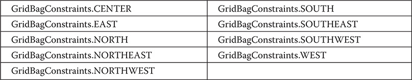
As their names imply, these values cause the component to be placed at the specific locations.
The second type of values that can be given to anchor is relative, which means the values are relative to the container’s orientation, which might differ for non-Western languages. The relative values are shown here:

Their names describe the placement.
The third type of values that can be given to anchor allows you to position components relative to the baseline of the row. These values are shown here:
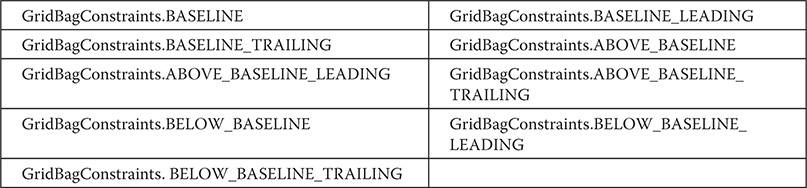
The horizontal position can be either centered, against the leading edge (LEADING), or against the trailing edge (TRAILING).
The weightx and weighty fields are both quite important and quite confusing at first glance. In general, their values determine how much of the extra space within a container is allocated to each row and column. By default, both these values are zero. When all values within a row or a column are zero, extra space is distributed evenly between the edges of the window. By increasing the weight, you increase that row or column’s allocation of space proportional to the other rows or columns. The best way to understand how these values work is to experiment with them a bit.
The gridwidth variable lets you specify the width of a cell in terms of cell units. The default is 1. To specify that a component use the remaining space in a row, use GridBagConstraints.REMAINDER. To specify that a component use the next-to-last cell in a row, use GridBagConstraints.RELATIVE. The gridheight constraint works the same way, but in the vertical direction.
You can specify a padding value that will be used to increase the minimum size of a cell. To pad horizontally, assign a value to ipadx. To pad vertically, assign a value to ipady.
Here is an example that uses GridBagLayout to demonstrate several of the points just discussed:


Sample output produced by the program is shown here.

In this layout, the operating system check boxes are positioned in a 2×2 grid. Each cell has a horizontal padding of 200. Each component is inset slightly (by 6 units) from the left. The column weight is set to 1, which causes any extra horizontal space to be distributed evenly between the columns. The first row uses a default weight of 0; the second has a weight of 1. This means that any extra vertical space is added to the second row.
GridBagLayout is a powerful layout manager. It is worth taking some time to experiment with and explore. Once you understand what the various settings do, you can use GridBagLayout to position components with a high degree of precision.
Menu Bars and Menus
A top-level window can have a menu bar associated with it. A menu bar displays a list of top-level menu choices. Each choice is associated with a drop-down menu. This concept is implemented in the AWT by the following classes: MenuBar, Menu, and MenuItem. In general, a menu bar contains one or more Menu objects. Each Menu object contains a list of MenuItem objects. Each MenuItem object represents something that can be selected by the user. Since Menu is a subclass of MenuItem, a hierarchy of nested submenus can be created. It is also possible to include checkable menu items. These are menu options of type CheckboxMenuItem and will have a check mark next to them when they are selected.
To create a menu bar, first create an instance of MenuBar. This class defines only the default constructor. Next, create instances of Menu that will define the selections displayed on the bar. Following are the constructors for Menu:
Menu( ) throws HeadlessException
Menu(String optionName) throws HeadlessException
Menu(String optionName, boolean removable) throws HeadlessException
Here, optionName specifies the name of the menu selection. If removable is true, the menu can be removed and allowed to float free. Otherwise, it will remain attached to the menu bar. (Removable menus are implementation-dependent.) The first form creates an empty menu.
Individual menu items are of type MenuItem. It defines these constructors:
MenuItem( ) throws HeadlessException
MenuItem(String itemName) throws HeadlessException
MenuItem(String itemName, MenuShortcut keyAccel) throws HeadlessException
Here, itemName is the name shown in the menu, and keyAccel is the menu shortcut for this item.
You can disable or enable a menu item by using the setEnabled( ) method. Its form is shown here:
void setEnabled(boolean enabledFlag)
If the argument enabledFlag is true, the menu item is enabled. If false, the menu item is disabled.
You can determine an item’s status by calling isEnabled( ). This method is shown here:
boolean isEnabled( )
isEnabled( ) returns true if the menu item on which it is called is enabled. Otherwise, it returns false.
You can change the name of a menu item by calling setLabel( ). You can retrieve the current name by using getLabel( ). These methods are as follows:
void setLabel(String newName)
String getLabel( )
Here, newName becomes the new name of the invoking menu item. getLabel( ) returns the current name.
You can create a checkable menu item by using a subclass of MenuItem called CheckboxMenuItem. It has these constructors:
CheckboxMenuItem( ) throws HeadlessException
CheckboxMenuItem(String itemName) throws HeadlessException
CheckboxMenuItem(String itemName, boolean on) throws HeadlessException
Here, itemName is the name shown in the menu. Checkable items operate as toggles. Each time one is selected, its state changes. In the first two forms, the checkable entry is unchecked. In the third form, if on is true, the checkable entry is initially checked. Otherwise, it is cleared.
You can obtain the status of a checkable item by calling getState( ). You can set it to a known state by using setState( ). These methods are shown here:
boolean getState( )
void setState(boolean checked)
If the item is checked, getState( ) returns true. Otherwise, it returns false. To check an item, pass true to setState( ). To clear an item, pass false.
Once you have created a menu item, you must add the item to a Menu object by using add( ), which has the following general form:
MenuItem add(MenuItem item)
Here, item is the item being added. Items are added to a menu in the order in which the calls to add( ) take place. The item is returned.
Once you have added all items to a Menu object, you can add that object to the menu bar by using this version of add( ) defined by MenuBar:
Menu add(Menu menu)
Here, menu is the menu being added. The menu is returned.
Menus generate events only when an item of type MenuItem or CheckboxMenuItem is selected. They do not generate events when a menu bar is accessed to display a drop-down menu, for example. Each time a menu item is selected, an ActionEvent object is generated. By default, the action command string is the name of the menu item. However, you can specify a different action command string by calling setActionCommand( ) on the menu item. Each time a check box menu item is checked or unchecked, an ItemEvent object is generated. Thus, you must implement the ActionListener and/or ItemListener interfaces in order to handle these menu events.
The getItem( ) method of ItemEvent returns a reference to the item that generated this event. The general form of this method is shown here:
Object getItem( )
Following is an example that adds a series of nested menus to a pop-up window. The item selected is displayed in the window. The state of the two check box menu items is also displayed.


Sample output from the MenuDemo program is shown in Figure 26-8.

Figure 26-8 Sample output from the MenuDemo program
There is one other menu-related class that you might find interesting: PopupMenu. It works just like Menu, but produces a menu that can be displayed at a specific location. PopupMenu provides a flexible, useful alternative for some types of menuing situations.
Dialog Boxes
Often, you will want to use a dialog box to hold a set of related controls. Dialog boxes are primarily used to obtain user input and are often child windows of a top-level window. Dialog boxes don’t have menu bars, but in other respects, they function like frame windows. (You can add controls to them, for example, in the same way that you add controls to a frame window.) Dialog boxes may be modal or modeless. In general terms, when a modal dialog box is active, you cannot access other windows in your program (except for child windows of the dialog window) until you have closed the dialog box. When a modeless dialog box is active, input focus can be directed to another window in your program. Thus, other parts of your program remain active and accessible. Beginning with JDK 6, modal dialog boxes can be created with three different types of modality, as specified by the Dialog.ModalityType enumeration. The default is APPLICATION_MODAL, which prevents the use of other top-level windows in the application. This is the traditional type of modality. Other types are DOCUMENT_MODAL and TOOLKIT_MODAL. The MODELESS type is also included.
In the AWT, dialog boxes are of type Dialog. Two commonly used constructors are shown here:
Dialog(Frame parentWindow, boolean mode)
Dialog(Frame parentWindow, String title, boolean mode)
Here, parentWindow is the owner of the dialog box. If mode is true, the dialog box uses the default modality. Otherwise, it is modeless. The title of the dialog box can be passed in title. Generally, you will subclass Dialog, adding the functionality required by your application.
Following is a modified version of the preceding menu program that displays a modeless dialog box when the New option is chosen. Notice that when the dialog box is closed, dispose( ) is called. This method is defined by Window, and it frees all system resources associated with the dialog box window.


Here is sample output from the DialogDemo program:

TIP On your own, try defining dialog boxes for the other options presented by the menus.
A Word About Overriding paint( )
Before concluding our examination of AWT controls, a short word about overriding paint( ) is in order. Although not relevant to the simple AWT examples shown in this book, when overriding paint( ), there are times when it is necessary to call the superclass implementation of paint( ). Therefore, for some programs, you will need to use this paint( ) skeleton:

In Java, there are two general types of components: heavyweight and lightweight. A heavyweight component has its own native window, which is called its peer. A lightweight component is implemented completely in Java code and uses the window provided by an ancestor. The AWT controls described and used in this chapter are all heavyweight. However, if a container holds any lightweight components (that is, has lightweight child components), your override of paint( ) for that container must call super.paint( ). By calling super.paint( ), you ensure that any lightweight child components, such as lightweight controls, get properly painted. If you are unsure of a child component’s type, you can call isLightweight( ), defined by Component, to find out. It returns true if the component is lightweight, and false otherwise.