CHAPTER
35 Exploring JavaFX Controls
The previous chapter described several of the core concepts relating to the JavaFX GUI framework. In the process, it introduced two controls: the label and the button. This chapter continues the discussion of JavaFX controls. It begins by describing how to include images in a label and button. It then presents an overview of several more JavaFX controls, including check boxes, lists, and trees. Keep in mind that JavaFX is a rich and powerful framework. The purpose of this chapter is to introduce a representative sampling of the JavaFX controls and to describe several common techniques. Once you understand the basics, you will be able to easily learn the other controls.
The JavaFX control classes discussed in this chapter are shown here:

These and the other JavaFX controls are packaged in javafx.scene.control.
Also discussed are the Image and ImageView classes, which provide support for images in controls; Tooltip, which is used to add tooltips to a control; as well as various effects and transforms.
Using Image and ImageView
Several of JavaFX’s controls let you include an image. For example, in addition to text, you can specify an image in a label or a button. Furthermore, you can embed stand-alone images in a scene directly. At the foundation for JavaFX’s support for images are two classes: Image and ImageView. Image encapsulates the image, itself, and ImageView manages the display of an image. Both classes are packaged in javafx.scene.image.
The Image class loads an image from either an InputStream, a URL, or a path to the image file. Image defines several constructors; this is the one we will use:
Image(String url)
Here, url specifies a URL or a path to a file that supplies the image. The argument is assumed to refer to a path if it does not constitute a properly formed URL. Otherwise, the image is loaded from the URL. The examples that follow will load images from files on the local file system. Other constructors let you specify various options, such as the image’s width and height. One other point: Image is not derived from Node. Thus, it cannot, itself, be part of a scene graph.
Once you have an Image, you will use ImageView to display it. ImageView is derived from Node, which means that it can be part of a scene graph. ImageView defines three constructors. The first one we will use is shown here:
ImageView(Image image)
This constructor creates an ImageView that uses image for its image.
Putting the preceding discussion into action, here is a program that loads an image of an hourglass and displays it via ImageView. The hourglass image is contained in a file called hourglass.png, which is assumed to be in the local directory.


Sample output from the program is shown here:

In the program, pay close attention to the following sequence that loads the image and then creates an ImageView that uses that image:

As explained, an image by itself cannot be added to the scene graph. It must first be embedded in an ImageView.
In cases in which you won’t make further use of the image, you can specify a URL or filename when creating an ImageView. In this case, there is no need to explicitly create an Image. Instead, an Image instance containing the specified image is constructed automatically and embedded in the ImageView. Here is the ImageView constructor that does this:
Here, url specifies the URL or the path to a file that contains the image.
Adding an Image to a Label
As explained in the previous chapter, the Label class encapsulates a label. It can display a text message, a graphic, or both. So far, we have used it to display only text, but it is easy to add an image. To do so, use this form of Label’s constructor:
Label(String str, Node image)
Here, str specifies the text message and image specifies the image. Notice that the image is of type Node. This allows great flexibility in the type of image added to the label, but for our purposes, the image type will be ImageView.
Here is a program that demonstrates a label that includes a graphic. It creates a label that displays the string "Hourglass" and shows the image of an hourglass that is loaded from the hourglass.png file.


Here is the window produced by the program:

As you can see, both the image and the text are displayed. Notice that the text is to the right of the image. This is the default. You can change the relative positions of the image and text by calling setContentDisplay( ) on the label. It is shown here:
final void setContentDisplay(ContentDisplay position)
The value passed to position determines how the text and image is displayed. It must be one of these values, which are defined by the ContentDisplay enumeration:

With the exception of TEXT_ONLY and GRAPHIC_ONLY, the values specify the location of the image. For example, if you add this line to the preceding program:
the image of the hourglass will be above the text, as shown here:

The other two values let you display either just the text or just the image. This might be useful if your application wants to use an image at some times, and not at others, for example. (If you want only an image, you can simply display it without using a label, as described in the previous section.)
You can also add an image to a label after it has been constructed by using the setGraphic( ) method. It is shown here:
final void setGraphic(Node image)
Here, image specifies the image to add.
Using an Image with a Button
Button is JavaFX’s class for push buttons. The preceding chapter introduced the Button class. There, you saw an example of a button that contained text. Although such buttons are common, you are not limited to this approach because you can include an image. You can also use only the image if you choose. The procedure for adding an image to a button is similar to that used to add an image to a label. First obtain an ImageView of the image. Then add it to the button. One way to add the image is to use this constructor:
Button(String str, Node image)
Here, str specifies the text that is displayed within the button and image specifies the image. You can specify the position of the image relative to the text by using setContentDisplay( ) in the same way as just described for Label.
Here is an example that displays two buttons that contain images. The first shows an hourglass. The second shows an analog clock. When a button is pressed, the selected timepiece is reported. Notice that the text is displayed beneath the image.


The output produced by this program is shown here:

If you want a button that contains only the image, pass a null string for the text when constructing the button and then call setContentDisplay( ), passing in the parameter ContentDisplay.GRAPHIC_ONLY. For example, if you make these modifications to the previous program, the output will look like this:

ToggleButton
A useful variation on the push button is called the toggle button. A toggle button looks just like a push button, but it acts differently because it has two states: pushed and released. That is, when you press a toggle button, it stays pressed rather than popping back up as a regular push button does. When you press the toggle button a second time, it releases (pops up). Therefore, each time a toggle button is pushed, it toggles between these two states. In JavaFX, a toggle button is encapsulated in the ToggleButton class. Like Button, ToggleButton is also derived from ButtonBase. It implements the Toggle interface, which defines functionality common to all types of two-state buttons.
ToggleButton defines three constructors. This is the one we will use:
ToggleButton(String str)
Here, str is the text displayed in the button. Another constructor allows you to include an image. Like other buttons, a ToggleButton generates an action event when it is pressed.
Because ToggleButton defines a two-state control, it is commonly used to let the user select an option. When the button is pressed, the option is selected. When the button is released, the option is deselected. For this reason, a program usually needs to determine the toggle button’s state. To do this, use the isSelected( ) method, shown here:
final boolean isSelected( )
It returns true if the button is pressed and false otherwise.
Here is a short program that demonstrates ToggleButton:


Sample output produced by the program is shown here, with the button pressed:
In the program, notice how the pressed/released state of the toggle button is determined by the following lines of code inside the button’s action event handler:

When the button is pressed, isSelected( ) returns true. When the button is released, isSelected( ) returns false.
One other point: It is possible to use two or more toggle buttons in a group. In this case, only one button can be in its pressed state at any one time. The process of creating and using a group of toggle buttons is similar to that required to use radio buttons. It is described in the following section.
RadioButton
Another type of button provided by JavaFX is the radio button. Radio buttons are a group of mutually exclusive buttons, in which only one button can be selected at any one time. They are supported by the RadioButton class, which extends both ButtonBase and ToggleButton. It also implements the Toggle interface. Thus, a radio button is a specialized form of a toggle button. You have almost certainly seen radio buttons in action because they are the primary control employed when the user must select only one option among several alternatives.
To create a radio button, we will use the following constructor:
RadioButton(String str)
Here, str is the label for the button. Like other buttons, when a RadioButton is used, an action event is generated.
For their mutually exclusive nature to be activated, radio buttons must be configured into a group. Only one of the buttons in the group can be selected at any time. For example, if a user presses a radio button that is in a group, any previously selected button in that group is automatically deselected. A button group is created by the ToggleGroup class, which is packaged in javafx.scene.control. ToggleGroup provides only a default constructor.
Radio buttons are added to the toggle group by calling the setToggleGroup( ) method, defined by ToggleButton, on the button. It is shown here:
final void setToggleGroup(ToggleGroup tg)
Here, tg is a reference to the toggle button group to which the button is added. After all radio buttons have been added to the same group, their mutually exclusive behavior will be enabled.
In general, when radio buttons are used in a group, one of the buttons is selected when the group is first displayed in the GUI. Here are two ways to do this.
First, you can call setSelected( ) on the button that you want to select. It is defined by ToggleButton (which is a superclass of RadioButton). It is shown here:
final void setSelected(boolean state)
If state is true, the button is selected. Otherwise, it is deselected. Although the button is selected, no action event is generated.
A second way to initially select a radio button is to call fire( ) on the button. It is shown here:
void fire( )
This method results in an action event being generated for the button if the button was previously not selected.
There are a number of different ways to use radio buttons. Perhaps the simplest is to simply respond to the action event that is generated when one is selected. The following program shows an example of this approach. It uses radio buttons to allow the user to select a type of transportation.


Sample output is shown here:

In the program, pay special attention to how the radio buttons and the toggle group are created. First, the buttons are created using this sequence:

Next, a ToggleGroup is constructed:
Finally, each radio button is added to the toggle group:

As explained, radio buttons must be part of a toggle group in order for their mutually exclusive behavior to be activated.
After the event handlers for each radio button have been defined, the rbTrain button is selected by calling fire( ) on it. This causes that button to be selected and an action event to be generated for it. This causes the button to be initialized with the default selection.
Handling Change Events in a Toggle Group
Although there is nothing wrong, per se, with managing radio buttons by handling action events, as just shown, sometimes it is more appropriate (and easier) to listen to the entire toggle group for changes. When a change takes place, the event handler can easily determine which radio button has been selected and take action accordingly. To use this approach, you must register a ChangeListener on the toggle group. When a change event occurs, you can then determine which button was selected. To try this approach, remove the action event handlers and the call to fire( ) from the preceding program and substitute the following:

You will also need to add this import statement:
It supports the ChangeListener interface.
The output from this program is the same as before; each time a selection is made, the response label is updated. However, in this case, only one event handler is needed for the enter group, rather than three (one for each button). Let’s now look at this code more closely.
First, a change event listener is registered for the toggle group. To listen for change events, you must implement the ChangeListener interface. This is done by calling addListener( ) on the object returned by selectedToggleProperty( ). The ChangeListener interface defines only one method, called changed( ). It is shown here:
void changed(ObservableValue<? extends T> changed, T oldVal, T newVal)
In this case, changed is the instance of ObservableValue<T>, which encapsulates an object that can be watched for changes. The oldVal and newVal parameters pass the previous value and the new value, respectively. Thus, in this case, newVal holds a reference to the radio button that has just been selected.
In this example, the setSelected( ) method, rather than fire( ), is called to set the initial selection. Because setting the initial selection causes a change to the toggle group, it results in a change event being generated when the program first begins. You can also use fire( ), but setSelected( ) was used to demonstrate that any change to the toggle group generates a change event.
An Alternative Way to Handle Radio Buttons
Although handling events generated by radio buttons is often useful, sometimes it is more appropriate to ignore those events and simply obtain the currently selected button when that information is needed. This approach is demonstrated by the following program. It adds a button called Confirm Transport Selection. When this button is pressed, the currently selected radio button is obtained and then the selected transport is displayed in a label. When you try the program, notice that changing the selected radio button does not cause the confirmed transport to change until you press the Confirm Transport Selection button.


The output from the program is shown here:

Most of the program is easy to understand, but two key points are of special interest. First, inside the action event handler for the btnConfirm button, notice that the selected radio button is obtained by the following line:
Here, the getSelectedToggle( ) method (defined by ToggleGroup) obtains the current selection for the toggle group (which, in this case, is a group of radio buttons). It is shown here:
final Toggle getSelectedToggle( )
It returns a reference to the Toggle that is selected. In this case, the return value is cast to RadioButton because this is the type of button in the group.
The second thing to notice is the use of a visual separator, which is created by this sequence:
The Separator class creates a line, which can be either vertical or horizontal. By default, it creates a horizontal line. (A second constructor lets you choose a vertical separator.) Separator helps visually organize the layout of controls. It is packaged in javafx.scene.control. Next, the width of the separator line is set by calling setPrefWidth( ), passing in the width.
CheckBox
The CheckBox class encapsulates the functionality of a check box. Its immediate superclass is ButtonBase. Although you are no doubt familiar with check boxes because they are widely used controls, the JavaFX check box is a bit more sophisticated than you may at first think. This is because CheckBox supports three states. The first two are checked or unchecked, as you would expect, and this is the default behavior. The third state is indeterminate (also called undefined). It is typically used to indicate that the state of the check box has not been set or that it is not relevant to a specific situation. If you need the indeterminate state, you will need to explicitly enable it.
CheckBox defines two constructors. The first is the default constructor. The second lets you specify a string that identifies the box. It is shown here:
CheckBox(String str)
It creates a check box that has the text specified by str as a label. As with other buttons, a CheckBox generates an action event when it is selected.
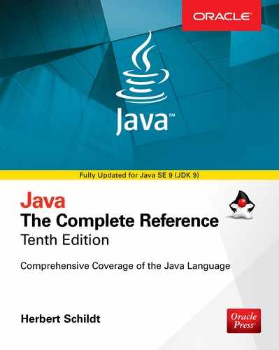
Here is a program that demonstrates check boxes. It displays check boxes that let the user select various deployment options, which are Web, Desktop, and Mobile. Each time a check box state changes, an action event is generated and handled by displaying the new state (selected or cleared) and by displaying a list of all selected boxes.


Sample output is shown here:

The operation of this program is straightforward. Each time a check box is changed, an action command is generated. To determine if the box is checked or unchecked, the isSelected( ) method is called.
As mentioned, by default, CheckBox implements two states: checked and unchecked. If you want to add the indeterminate state, it must be explicitly enabled. To do this, call setAllowIndeterminate( ), shown here:
final void setAllowIndeterminate(boolean enable)
In this case, if enable is true, the indeterminate state is enabled. Otherwise, it is disabled. When the indeterminate state is enabled, the user can select between checked, unchecked, and indeterminate.
You can determine if a check box is in the indeterminate state by calling isIndeterminate( ), shown here:
final boolean isIndeterminate( )
It returns true if the checkbox state is indeterminate and false otherwise.
You can see the effect of a three-state check box by modifying the preceding program. First, enable the indeterminate state on the check boxes by calling setAllowIndeterminate( ) on each check box, as shown here:

Next, handle the indeterminate state inside the action event handlers. For example, here is the modified handler for cbWeb:

Now, all three states are tested. Update the other two handlers in the same way. After making these changes, the indeterminate state can be selected, as this sample output shows:

Here, the Web check box is indeterminate.
ListView
Another commonly used control is the list view, which in JavaFX is encapsulated by ListView. List views are controls that display a list of entries from which you can select one or more. Because of their ability to make efficient use of limited screen space, list views are popular alternatives to other types of selection controls.
ListView is a generic class that is declared like this:
class ListView<T>
Here, T specifies the type of entries stored in the list view. Often, these are entries of type String, but other types are also allowed.
ListView defines two constructors. The first is the default constructor, which creates an empty ListView. The second lets you specify the list of entries in the list. It is shown here:
ListView(ObservableList<T> list)
Here, list specifies a list of the items that will be displayed. It is an object of type ObservableList, which defines a list of observable objects. It inherits java.util.List. Thus, it supports the standard collection methods. ObservableList is packaged in javafx.collections.
Probably the easiest way to create an ObservableList for use in a ListView is to use the factory method observableArrayList( ), which is a static method defined by the FXCollections class (which is also packaged in javafx.collections). The version we will use is shown here:
static <E> ObservableList<E> observableArrayList( E … elements)
In this case, E specifies the type of elements, which are passed via elements.
By default, a ListView allows only one item in the list to be selected at any one time. However, you can allow multiple selections by changing the selection mode. For now, we will use the default, single-selection model.
Although ListView provides a default size, sometimes you will want to set the preferred height and/or width to best match your needs. One way to do this is to call the setPrefHeight( ) and setPrefWidth( ) methods, shown here:
final void setPrefHeight(double height)
final void setPrefWidth(double width)
Alternatively, you can use a single call to set both dimensions at the same time by use of setPrefSize( ), shown here:
void setPrefSize(double width, double height)
There are two basic ways in which you can use a ListView. First, you can ignore events generated by the list and simply obtain the selection in the list when your program needs it. Second, you can monitor the list for changes by registering a change listener. This lets you respond each time the user changes a selection in the list. This is the approach used here.
To listen for change events, you must first obtain the selection model used by the ListView. This is done by calling getSelectionModel( ) on the list. It is shown here:
final MultipleSelectionModel<T> getSelectionModel( )
It returns a reference to the model. MultipleSelectionModel is a class that defines the model used for multiple selections, and it inherits SelectionModel. However, multiple selections are allowed in a ListView only if multiple-selection mode is turned on.
Using the model returned by getSelectionModel( ), you will obtain a reference to the selected item property that defines what takes place when an element in the list is selected. This is done by calling selectedItemProperty( ), shown next:
final ReadOnlyObjectProperty<T> selectedItemProperty( )
You will add the change listener to this property.
The following example puts the preceding discussion into action. It creates a list view that displays various types of transportation, allowing the user to select one. When one is chosen, the selection is displayed.


Sample output is shown here:

In the program, pay special attention to how the ListView is constructed. First, an ObservableList is created by this line:
It uses the observableArrayList( ) method to create a list of strings. Then, the ObservableList is used to initialize a ListView, as shown here:
The program then sets the preferred width and height of the control.
Now, notice how the selection model is obtained for lvTransport:
As explained, ListView uses MultipleSelectionModel, even when only a single selection is allowed. The selectedItemProperty( ) method is then called on the model and a change listener is registered to the returned item.
ListView Scroll Bars
One very useful feature of ListView is that when the number of items in the list exceeds the number that can be displayed within its dimensions, scroll bars are automatically added. For example, if you change the declaration of transportTypes so that it includes "Bicycle" and "Walking", as shown here:

the lvTransport control now looks like the one shown here:

Enabling Multiple Selections
If you want to allow more than one item to be selected, you must explicitly request it. To do so, you must set the selection mode to SelectionMode.MULTIPLE by calling setSelectionMode( ) on the ListView model. It is shown here:
final void setSelectionMode(SelectionMode mode)
In this case, mode must be either SelectionMode.MULTIPLE or SelectionMode.SINGLE.
When multiple-selection mode is enabled, you can obtain the list of the selections two ways: as a list of selected indices or as a list of selected items. We will use a list of selected items, but the procedure is similar when using a list of the indices of the selected items. (Note, indexing of items in a ListView begins at zero.)
To get a list of the selected items, call getSelectedItems( ) on the selection model. It is shown here:
ObservableList<T> getSelectedItems( )
It returns an ObservableList of the items. Because ObservableList extends java.util.List, you can access the items in the list just as you would any other List collection.
To experiment with multiple selections, you can modify the preceding program as follows. First, add this line:
It enables multiple-selection mode for lvTransport. Next, replace the change event handler with the one shown here:

After making these changes, the program will display all selected forms of transports, as the following output shows:

ComboBox
A control related to the list view is the combo box, which is implemented in JavaFX by the ComboBox class. A combo box displays one selection, but it will also display a drop-down list that allows the user to select a different item. You can also allow the user to edit a selection. ComboBox inherits ComboBoxBase, which provides much of its functionality. Unlike the ListView, which can allow multiple selections, ComboBox is designed for single-selection.
ComboBox is a generic class that is declared like this:
class ComboBox<T>
Here, T specifies the type of entries. Often, these are entries of type String, but other types are also allowed.
ComboBox defines two constructors. The first is the default constructor, which creates an empty ComboBox. The second lets you specify the list of entries. It is shown here:
ComboBox(ObservableList<T> list)
In this case, list specifies a list of the items that will be displayed. It is an object of type ObservableList, which defines a list of observable objects. As explained in the previous section, ObservableList inherits java.util.List. As also previously explained, an easy way to create an ObservableList is to use the factory method observableArrayList( ), which is a static method defined by the FXCollections class.
A ComboBox generates an action event when its selection changes. It will also generate a change event. Alternatively, it is also possible to ignore events and simply obtain the current selection when needed.
You can obtain the current selection by calling getValue( ), shown here:
final T getValue( )
If the value of a combo box has not yet been set (by the user or under program control), then getValue( ) will return null. To set the value of a ComboBox under program control, call setValue( ):
final void setValue(T newVal)
Here, newVal becomes the new value.
The following program demonstrates a combo box by reworking the previous list view example. It handles the action event generated by the combo box.


Sample output is shown here:

As mentioned, ComboBox can be configured to allow the user to edit a selection. Assuming that it contains only entries of type String, it is easy to enable editing capabilities. Simply call setEditable( ), shown here:
final void setEditable(boolean enable)
If enable is true, editing is enabled. Otherwise, it is disabled. To see the effects of editing, add this line to the preceding program:
After making this addition, you will be able to edit the selection.
ComboBox supports many additional features and functionality beyond those mentioned here. You might find it interesting to explore further. Also, an alternative to a combo box in some cases is the ChoiceBox control. You will find it easy to use because it is has similarities to both ListView and ComboBox.
TextField
Although the controls discussed earlier are quite useful and are frequently found in a user interface, they all implement a means of selecting a predetermined option or action. However, sometimes you will want the user to enter a string of his or her own choosing. To accommodate this type of input, JavaFX includes several text-based controls. The one we will look at is TextField. It allows one line of text to be entered. Thus, it is useful for obtaining names, ID strings, addresses, and the like. Like all text controls, TextField inherits TextInputControl, which defines much of its functionality.
TextField defines two constructors. The first is the default constructor, which creates an empty text field that has the default size. The second lets you specify the initial contents of the field. Here, we will use the default constructor.
Although the default size is sometimes adequate, often you will want to specify its size. This is done by calling setPrefColumnCount( ), shown here:
final void setPrefColumnCount(int columns)
The columns value is used by TextField to determine its size.
You can set the text in a text field by calling setText( ). You can obtain the current text by calling getText( ). In addition to these fundamental operations, TextField supports several other capabilities that you might want to explore, such as cut, paste, and append. You can also select a portion of the text under program control.
One especially useful TextField option is the ability to set a prompting message inside the text field when the user attempts to use a blank field. To do this, call setPromptText( ), shown here:
final void setPromptText(String str)
In this case, str is the string displayed in the text field when no text has been entered. It is displayed using low-intensity (such as a gray tone).
When the user presses enter while inside a TextField, an action event is generated. Although handling this event is often helpful, in some cases, your program will simply obtain the text when it is needed, rather than handling action events. Both approaches are demonstrated by the following program. It creates a text field that requests a search string. When the user presses enter while the text field has input focus, or presses the Get Search String button, the string is obtained and displayed. Notice that a prompting message is also included.


Sample output is shown here:

Other text controls that you will want to examine include TextArea, which supports multiline text, and PasswordField, which can be used to input passwords. You might also find TextInputDialog and HTMLEditor helpful.
ScrollPane
Sometimes, the contents of a control will exceed the amount of screen space that you want to give to it. Here are two examples: A large image may not fit within reasonable boundaries, or you might want to display text that is longer than will fit within a small window. Whatever the reason, JavaFX makes it easy to provide scrolling capabilities to any node in a scene graph. This is accomplished by wrapping the node in a ScrollPane. When a ScrollPane is used, scroll bars are automatically implemented that scroll the contents of the wrapped node. No further action is required on your part. Because of the versatility of ScrollPane, you will seldom need to use individual scroll bar controls.
ScrollPane defines two constructors. The first is the default constructor. The second lets you specify a node that you want to scroll. It is shown here:
ScrollPane(Node content)
In this case, content specifies the information to be scrolled. When using the default constructor, you will add the node to be scrolled by calling setContent( ). It is shown here:
final void setContent(Node content)
After you have set the content, add the scroll pane to the scene graph. When displayed, the content can be scrolled.
NOTE You can also use setContent( ) to change the content being scrolled by the scroll pane. Thus, what is being scrolled can be changed during the execution of your program.
Although a default size is provided, as a general rule, you will want to set the dimensions of the viewport. The viewport is the viewable area of a scroll pane. It is the area in which the content being scrolled is displayed. In other words, the viewport displays the visible portion of the content. The scroll bars scroll the content through the viewport. Thus, by moving a scroll bar, you change what part of the content is visible.
You can set the viewport dimensions by using these two methods:
final void setPrefViewportHeight(double height)
final void setPrefViewportWidth(double width)
In its default behavior, a ScrollPane will dynamically add or remove a scroll bar as needed. For example, if the component is taller than the viewport, a vertical scroll bar is added. If the component will completely fit within the viewport, the scroll bars are removed.
One nice feature of ScrollPane is its ability to pan the contents by dragging the mouse. By default, this feature is off. To turn it on, use setPannable( ), shown here:
final void setPannable(boolean enable)
If enable is true, then panning is allowed. Otherwise, it is disabled.
You can set the position of the scroll bars under program control using setHvalue( ) and setVvalue( ), shown here:
final void setHvalue(double newHval)
final void setVvalue(double newVval)
The new horizontal position is specified by newHval, and the new vertical position is specified by newVval. Be default, scroll bar positions start at zero.
ScrollPane supports various other options. For example, it is possible to set the minimum and maximum scroll bar positions. You can also specify when and if the scroll bars are shown by setting a scroll bar policy. The current position of the scroll bars can be obtained by calling getHvalue( ) and getVvalue( ).
The following program demonstrates ScrollPane by using one to scroll the contents of a multiline label. Notice that it also enables panning.


Sample output is shown here:

TreeView
One of JavaFX’s most powerful controls is the TreeView. It presents a hierarchical view of data in a tree-like format. In this context, the term hierarchical means some items are subordinate to others. For example, a tree is commonly used to display the contents of a file system. In this case, the individual files are subordinate to the directory that contains them. In a TreeView, branches can be expanded or collapsed on demand by the user. This allows hierarchical data to be presented in a compact, yet expandable form. Although TreeView supports many customization options, you will often find that the default tree style and capabilities are suitable. Therefore, even though trees support a sophisticated structure, they are still quite easy to work with.
TreeView implements a conceptually simple, tree-based data structure. A tree begins with a single root node that indicates the start of the tree. Under the root are one or more child nodes There are two types of child nodes: leaf nodes (also called terminal nodes), which have no children, and branch nodes, which form the root nodes of subtrees. A subtree is simply a tree that is part of a larger tree. The sequence of nodes that leads from the root to a specific node is called a path.
One very useful feature of TreeView is that it automatically provides scroll bars when the size of the tree exceeds the dimensions of the view. Although a fully collapsed tree might be quite small, its expanded form may be quite large. By automatically adding scroll bars as needed, TreeView lets you use a smaller space than would ordinarily be possible.
TreeView is a generic class that is defined like this:
class TreeView<T>
Here, T specifies the type of value held by an item in the tree. Often, this will be of type String. TreeView defines two constructors. This is the one we will use:
TreeView(TreeItem<T> rootNode)
Here, rootNode specifies the root of the tree. Because all nodes descend from the root, it is the only one that needs to be passed to TreeView.
The items that form the tree are objects of type TreeItem. At the outset, it is important to state that TreeItem does not inherit Node. Thus, TreeItems are not general-purpose objects. They can be used in a TreeView, but not as stand-alone controls. TreeItem is a generic class, as shown here:
class TreeItem<T>
Here, T specifies the type of value held by the TreeItem.
Before you can use a TreeView, you must construct the tree that it will display. To do this, you must first create the root. Next, add other nodes to that root. You do this by calling either add( ) or addAll( ) on the list returned by getChildren( ). These other nodes can be leaf nodes or subtrees. After the tree has been constructed, you create the TreeView by passing the root node to its constructor.
You can handle selection events in the TreeView in a way similar to the way that you handle them in a ListView, through the use of a change listener. To do so, first, obtain the selection model by calling getSelectionModel( ). Then, call selectedItemProperty( ) to obtain the property for the selected item. On that return value, call addListener( ) to add a change listener. Each time a selection is made, a reference to the new selection will be passed to the changed( ) handler as the new value. (See ListView for more details on handling change events.)
You can obtain the value of a TreeItem by calling getValue( ). You can also follow the tree path of an item in either the forward or backward direction. To obtain the parent, call getParent( ). To obtain the children, call getChildren( ).
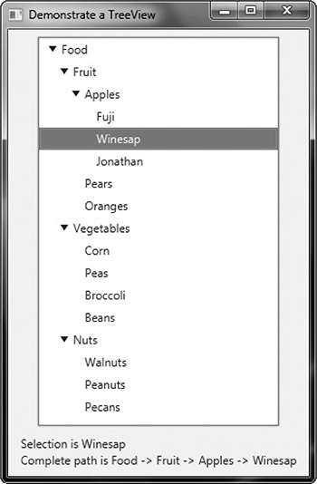
The following example shows how to build and use a TreeView. The tree presents a hierarchy of food. The type of items stored in the tree are strings. The root is labeled Food. Under it are three direct descendent nodes: Fruit, Vegetables, and Nuts. Under Fruit are three child nodes: Apples, Pears, and Oranges. Under Apples are three leaf nodes: Fuji, Winesap, and Jonathan. Each time a selection is made, the name of the item is displayed. Also, the path from the root to the item is shown. This is done by the repeated use of getParent( ).


Sample output is shown here:
There are two things to pay special attention to in this program. First, notice how the tree is constructed. First, the root node is created by this statement:
Next, the nodes under the root are constructed. These nodes consist of the root nodes of subtrees: one for fruit, one for vegetables, and one for nuts. Next, the leaves are added to these subtrees. However, one of these, the fruit subtree, consists of another subtree that contains varieties of apples. The point here is that each branch in a tree leads either to a leaf or to the root of a subtree. After all of the nodes have been constructed, the root nodes of each subtree are added to the root node of the tree. This is done by calling add( ) on the root node. For example, this is how the Nuts subtree is added to tiRoot:
The process is the same for adding any child node to its parent node.
The second thing to notice in the program is the way the path from the root to the selected node is constructed within the change event handler. It is shown here:

The code works like this: First, the value of the newly selected node is obtained. In this example, the value will be a string, which is the node’s name. This string is assigned to the path string. Then, a temporary variable of type TreeItem<String> is created and initialized to refer to the parent of the newly selected node. If the newly selected node does not have a parent, then tmp will be null. Otherwise, the loop is entered, within which each parent’s value (which is its name in this case) is added to path. This process continues until the root node of the tree (which has no parent) is found.
Although the preceding shows the basic mechanism required to handle a TreeView, it is important to point out that several customizations and options are supported. TreeView is a powerful control that you will want to examine fully on your own.
Introducing Effects and Transforms
A principal advantage of JavaFX is its ability to alter the precise look of a control (or any node in the scene graph) through the application of an effect and/or a transform. Both effects and transforms help give your GUI the sophisticated, modern look that users have come to expect. Although it is beyond the scope of this book to examine each effect and transform supported by JavaFX, the following introduction will give you an idea of the benefits they provide.
Effects
Effects are supported by the abstract Effect class and its concrete subclasses, which are packaged in javafx.scene.effect. Using these effects, you can customize the way a node in a scene graph looks. Several built-in effects are provided. Here is a sampling:

These, and the other effects, are easy to use and are available for use by any Node, including controls. Of course, depending on the control, some effects will be more appropriate than others.
To set an effect on a node, call setEffect( ), which is defined by Node. It is shown here:
final void setEffect(Effect effect)
Here, effect is the effect that will be applied. To specify no effect, pass null. Thus, to add an effect to a node, first create an instance of that effect and then pass it to setEffect( ). Once this has been done, the effect will be used whenever the node is rendered (as long as the effect is supported by the environment). To demonstrate the power of effects, we will use two of them: Glow and InnerShadow. However, the process of adding an effect is essentially the same no matter what effect you choose.
Glow produces an effect that gives a node a glowing appearance. The amount of glow is under your control. To use a glow effect, you must first create a Glow instance. This is the constructor that we will use:
Glow(double glowLevel)
Here, glowLevel specifies the amount of glowing, which must be a value between 0.0 and 1.0.
After a Glow instance has been created, the glow level can be changed by using setLevel( ), shown here:
final void setLevel(double glowLevel)
As before, glowLevel specifies the glow level, which must be between 0.0 and 1.0.
InnerShadow produces an effect that simulates a shadow on the inside of the node. It supports various constructors. This is the one we will use:
InnerShadow(double radius, Color shadowColor)
Here, radius specifies the radius of the shadow inside the node. In essence, the radius describes the size of the shadow. The color of the shadow is specified by shadowColor. Here, the type Color is the JavaFX type javafx.scene.paint.Color. It defines a large number of constants, such as Color.GREEN, Color.RED, and Color.BLUE, which makes it easy to use.
Transforms
Transforms are supported by the abstract Transform class, which is packaged in javafx.scene.transform. Four of its subclasses are Rotate, Scale, Shear, and Translate. Each does what its name suggests. (Another subclass is Affine, but typically you will use one or more of the preceding transform classes.) It is possible to perform more than one transform on a node. For example, you could rotate it and scale it. Transforms are supported by the Node class as described next.
One way to add a transform to a node is to add it to the list of transforms maintained by the node. This list is obtained by calling getTransforms( ), which is defined by Node. It is shown here:
final ObservableList<Transform> getTransforms( )
It returns a reference to the list of transforms. To add a transform, simply add it to this list by calling add( ). You can clear the list by calling clear( ). You can use remove( ) to remove a specific element.
In some cases, you can specify a transform directly, by setting one of Node’s properties. For example, you can set the rotation angle of a node, with the pivot point being at the center of the node, by calling setRotate( ), passing in the desired angle. You can set a scale by using setScaleX( ) and setScaleY( ), and you can translate a node by using setTranslateX( ) and setTranslateY( ). (Z axis translations may also be supported by the platform.) However, using the transforms list offers the greatest flexibility, and that is the approach demonstrated here.
NOTE Any transforms specified on a node directly will be applied after all transforms in the transforms list.
To demonstrate the use of transforms, we will use the Rotate and Scale classes. The other transforms are used in the same general way. Rotate rotates a node around a specified point. It defines several constructors. Here is one example:
Rotate(double angle, double x, double y)
Here, angle specifies the number of degrees to rotate. The center of rotation, called the pivot point, is specified by x and y. It is also possible to use the default constructor and set these values after a Rotate object has been created, which is what the following demonstration program will do. This is done by using the setAngle( ), setPivotX( ), and setPivotY( ) methods, shown here:
final void setAngle(double angle)
final void setPivotX(double x)
final void setPivotY(double y)
As before, angle specifies the number of degrees to rotate and the center of rotation is specified by x and y.
Scale scales a node as specified by a scale factor. Scale defines several constructors. This is the one we will use:
Scale(double widthFactor, double heightFactor)
Here, widthFactor specifies the scaling factor applied to the node’s width, and heightFactor specifies the scaling factor applied to the node’s height. These factors can be changed after a Scale instance has been created by using setX( ) and setY( ), shown here:
final void setX(double widthFactor)
final void setY(double heightFactor)
As before, widthFactor specifies the scaling factor applied to the node’s width, and heightFactor specifies the scaling factor applied to the node’s height.
Demonstrating Effects and Transforms
The following program demonstrates the use of effects and transforms. It does so by creating four buttons called Rotate, Scale, Glow, and Shadow. Each time one of these buttons is pressed, the corresponding effect or transform is applied to the button. Sample output is shown here:

When you examine the program, you will see how easy it is to customize the look of your GUI. You might find it interesting to experiment with it, trying different transforms or effects, or trying the effects on different types of nodes other than buttons.


Before leaving the topic of effects and transforms, it is useful to mention that several of them are particularly pleasing when used on a Text node. Text is a class packaged in javafx.scene.text. It creates a node that consists of text. Because it is a node, the text can be easily manipulated as a unit and various effects and transforms can be applied.
Adding Tooltips
One very popular element in the modern GUI is the tooltip. A tooltip is a short message that is displayed when the mouse hovers over a control. In JavaFX, a tooltip can be easily added to any control. Frankly, because of the benefits that tooltips offer and the ease by which they can be incorporated into your GUI, there is virtually no reason not to use them where appropriate.
To add a tooltip, you call the setTooltip( ) method defined by Control. (Control is a base class for all controls.) The setTooltip( ) method is shown here:
final void setTooltip(Tooltip tip)
In this case, tip is an instance of Tooltip, which specifies the tooltip. Once a tooltip has been set, it is automatically displayed when the mouse hovers over the control. No other action is required on your part.
The Tooltip class encapsulates a tooltip. This is the constructor that we will use:
Tooltip(String str)
Here, str specifies the message that will be displayed by the tooltip.
To see tooltips in action, try adding the following statements to the CheckboxDemo program shown earlier.

After these additions, the tooltips will be displayed for each check box.
Disabling a Control
Before leaving the subject of controls, it is useful to describe one more feature. Any node in the scene graph, including a control, can be disabled under program control. To disable a control, use setDisable( ), defined by Node. It is shown here:
final void setDisable(boolean disable)
If disable is true, the control is disabled; otherwise, it is enabled. Thus, using setDisable( ), you can disable a control and then enable it later.