
3.3
STATISTICS

Purpose
This chapter introduces some of the mathematical vocabulary that is used by traders to communicate numeric results between one another. A substantial amount of trading vocabulary comes from the mathematical discipline of statistics. Statistics is the branch of mathematics focused on organizing, analyzing, and summarizing data.
Summary
Statistics is a tool that traders use to describe things to other traders. Traders spend a lot of time analyzing prices, and it is necessary to convey those results unambiguously to other people. Statistical terms like volatility and correlation have a specific meaning that isn’t open to personal interpretation. Every trader needs to understand those terms.
• Volatility is used by traders to describe the risk of holding an asset. The definition of volatility is typically based on standard deviation of continuously compounded returns. It measures the likely dispersion of prices between two periods of time. A highly volatile asset is one that commonly experiences large price changes. The term volatility does not describe the investment merit of a trade.
• Correlation is used by traders to describe how closely two things are related. When two assets are highly correlated, their prices tend to move together. There may or may not be a causal relationship between the two assets. Correlation can result from either random chance or a shared cause for behavior.
Statistics can also be used to solve difficult math problems through the use of simulation. This is called Monte Carlo analysis and is one of the primary ways to value complicated investments.
Key Topics
• Volatility is heavily used by traders as a measure for risk.
• Risk/reward relationships (Sharpe or Information Ratios) are commonly used to compare the merits of multiple investments.
• Correlation is used to describe how closely two price series are related. This is a key variable in many option pricing models used in the energy world.
• Monte Carlo Analysis involves the use of statistics to solve mathematical problems that are difficult to solve using Algebra or Calculus.
Statistics is a tool that traders use to describe things to other traders. Traders spend a lot of time analyzing prices, and it is necessary to convey those results unambiguously to other people. Statistical terms like volatility and correlation have specific meanings that aren’t open to personal interpretation. Every trader needs to understand those terms.
There are three main goals of statistical analysis: summarizing time-series data, determining the confidence that the summary is accurate, and identifying relationships between phenomena. It is important to understand the difference between statistics, facts, and wishful thinking. Statistics aren’t facts. At best, they are a simplified description of something that may or may not be true. As a result, statistics come with an error bound—a description of how likely the statistic is to be a fact.
Too much data is incomprehensible. To understand data, it is often necessary to organize it and determine whether it is important or unimportant. Sometimes this is often called data reduction; in other cases, it is called summarizing the data. In either case, it is common for some of the data to be eliminated, so that something important can be seen in the remaining data.
Data reduction is not perfect. It is as easy to eliminate important data and to summarize the unimportant data as vice versa. By judiciously removing parts of the data, it is possible to come to almost any conclusion—all this requires is eliminating the right (or wrong) data. Statistics is not a substitute for understanding what is going on. It is a tool to clearly summarize data for other people—and it is just as easy to summarize bad data as good.1
Because it is so easy to come to the wrong conclusion, a second focus in statistics is to attempt to estimate the probability that a conclusion is wrong. Commonly, this involves the estimate of the margin of error or the development of a confidence interval. Like summarization, estimating the likelihood of being wrong is not a perfect process. However, taking the effort to estimate the reliability of a conclusion is a good habit for traders. It’s one of several things that make statistical analysis more reliable than pulling numbers out of a hat.
Finally, statistics are used to precisely describe relationships between things—how much two things are alike or different. For example, a vague description of a relationship might be “the two prices act alike most of the time.” A more precise estimate is “the two prices are 40 percent correlated.” In this case, statistics is used to eliminate ambiguity and vagueness.
It is possible to misuse comparisons. Being overly precise with unnecessary data is both confusing and misleading. Even if a correlation exists, that does not imply that a cause/effect relationship also exists. For example, there is a superstition in the stock market that the National Football League (NFL) team that wins the Super Bowl determines whether the market will go up or down in the following year. Historically, the market has risen fairly commonly when a National Football Conference (NFC) team beats an American Football Conference (AFC) team. However, that doesn’t mean there is a cause/effect relationship between the two events.
Common Notations
Statistics has its own terminology that is commonly used as shorthand. The most common notation for indicating an average is to place a bar over the top of some name. For example, ‐x (with a line over it) represents the mean (arithmetic average) of the x distribution. Another convention is for the letter n to represent the number of elements in a distribution (Figure 3.3.1).

Figure 3.3.1 Common notation
So, if x represents some series of numbers (1, 2, 5, 8, 10, 12, 15, 20), then subscripted values of x refer to the individual components of the series: x1 = 1, x2 = 2, x3 = 5, … x8 = 20. There are eight elements in this series, so nx = 8. The formula to calculate the average of this series can be shown in the same notation (Figure 3.3.2). For example, the formula for the average of x, is the sum of all values of x (between values 1 to n), divided by the number of samples (n).

Figure 3.3.2 Formula for mean
In this case, there is only one series, so the n has not been subscripted. Had there been more than one series being described, it would be necessary to weigh the disadvantage of even more confusing notion (subscripting n as nx) against the need for greater precision.
Sampling
The simplest use of statistics is to organize and describe some type of data. For example, there might be 100 gas stations in the area, each selling gasoline at a different price. However, learning anything useful about those prices will be difficult unless they are organized into some type of summary. An example of a way to summarize data is a histogram (Figure 3.3.3). This kind of chart organizes data into buckets showing the number of samples (gas stations in this example) that match each bucket.
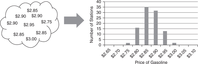
Figure 3.3.3 Organizing data into a histogram
When a large amount of data is analyzed, histograms are commonly fitted by a well understood mathematical function and represented as a smooth line. This makes it easier to use mathematics to analyze the data. The two types of charts most commonly used to summarize statistical data are frequency distributions and cumulative distributions (Figure 3.3.4). Both charts allow the calculation of the probability that a random draw will be between two points in a distribution. These charts are different ways to look at the same data.
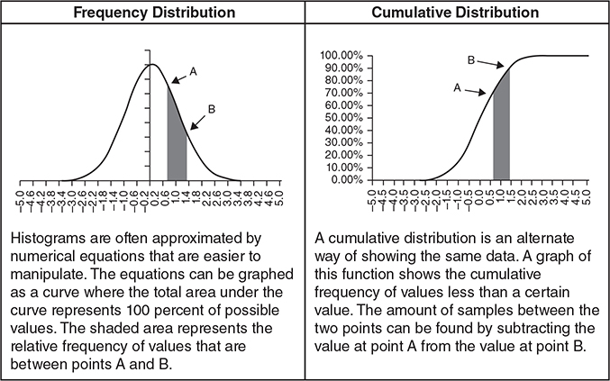
Figure 3.3.4 Frequency and cumulative distributions
In a frequency distribution, the area under the curve represents 100 percent of the possible values. The likelihood that a random selection will be within a range of values can be found by finding that area underneath the curve between those two points. Frequency distributions are basically smoothed-out versions of histograms.
A cumulative distribution function is an alternate way of looking at the same data. For every point on the X axis (gasoline prices in the initial example), it shows the percentage of samples (gas stations) that have prices equal to or lower than that price. The benefit of a cumulative distribution function is that it is possible to find the probability that samples will be within a range found through subtraction. For example, it is possible to find the percentage of gas stations with gas prices between $2.95 and $3.00 by subtraction. The cumulative number of gas stations with prices less than $2.95 can be subtracted from the cumulative number of gas stations with prices less than $3. Although they are not quite as intuitive, the cumulative distributions are generally easier to use because of this subtraction property. As a result, most spreadsheet statistical functions use cumulative distributions.
Calculus examines properties of lines and this makes it well suited for examining statistical distributions. Calculus makes it easy to find the area under a line (Figure 3.3.5). This process is called integration. For example, it is often necessary to find the area underneath a probability curve. The area underneath a frequency distribution represents the probability of a random draw from the distribution coming from that part of the curve. For example, in the chart below, there is approximately a 22.8 percent chance that number will be between 0.5 and 1.4.
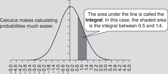
Figure 3.3.5 Area under a curve
To explain integration, it is easiest to start with a simple example. Using a histogram, it is possible to manually approximate the number of samples between two points (Figure 3.3.6). The height of each bar in a histogram indicates the number of samples in that bucket. Counting the number of samples in those buckets and dividing by the total number of samples provides an estimate of the probability that a sample would come from that area.
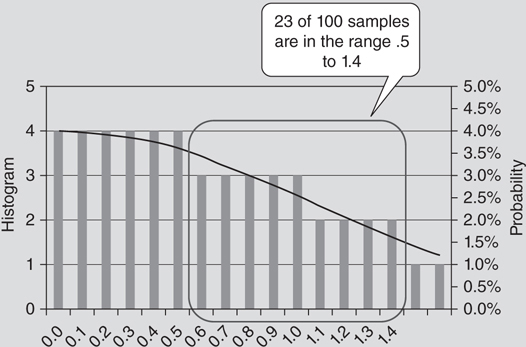
Figure 3.3.6 Comparison of a histogram to a frequency distribution
Integration of a line works the same way. The only difference is that the height of the line is defined by an equation, and a large number of buckets is chosen. The more buckets used for a histogram, the more precise the estimates become (Figure 3.3.7).
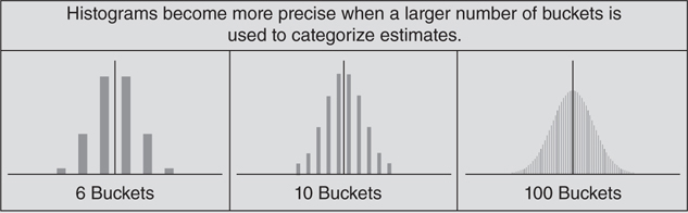
Figure 3.3.7 Histograms
Mathematically, the notation for integration is pretty straightforward. The symbol, sigma (S), is used to indicate a sum. Using summation, it is possible to calculate the probability that a sample chosen randomly from a histogram will be between two points. For example, it is possible to calculate the probability that an observation would fall between .5 and 1.4 (Figure 3.3.8).
![]()
Figure 3.3.8 Discrete probability
Calculus is a study of what happens when the number of buckets approaches infinity. In that case, a similar notion is used (Figure 3.3.9). An integral sign (which looks like a stretched out S) replaces the sum sign (S), but means much the same thing. The table of discrete values (which we called samples) is replaced by a mathematical function abbreviated S(x). This can be read that the function S depends on the variable x. Finally, the sum will be in relation to the X axis (which we will denote by the symbol dx).
![]()
Figure 3.3.9 Continuous probability
Even if you don’t know how to solve a calculus equation, knowing how to read the notation will often make it possible to find a spreadsheet formula or add-in that will do the math for you. However, you still need to know what function to call and what parameters the function requires.
Mode, Median, and Mean
One of the best ways to describe either a frequency distribution or a histogram is by its central tendency. In other words, what values of the distribution can be expected to come up most commonly? The three standard measures of central tendency are mode, median, and mean.
The mode of a distribution is the value that occurs most frequently. For example, a distribution might contain the numbers 1, 1, 1, 3, 5, 8, and 12. The number 1 comes up three times—more frequently than any other number. Therefore, the number 1 is the mode of the distribution. In practice, mode is not used very often because it is difficult to calculate. It requires searching the entire distribution for the value that comes up most frequently. Another reason that mode is not often used is that there can be more than one mode for a distribution. For example, heads and tails are equally likely on a fair coin flip. As a result, both heads and tails are modes.
The median of a distribution is its midpoint. It is the value that separates the highest 50 percent of samples from the bottom 50 percent. For example, in a distribution of 7 numbers, 1, 3, 5, 7, 14, 20, and 25, the middle of the distribution is 7. There are three numbers below 7 and three numbers higher. In the case of an even number of samples, the median is halfway between the two middle numbers. For example, if a new value of 30 was added to the distribution, the median would become 10.5—the value halfway between 7 and 14. In a practical sense, the big problem with using a median is that it requires sorting the sequence. Even on a fast computer, sorting a very large set of samples can take a while.
The mean (arithmetic mean) is the final and most important measure of central tendency. It represents the expected value of a random variable (like the typical gasoline price in one’s neighborhood). The mean is the average value of all the samples. The biggest benefit of the arithmetic mean is that it is very easy to calculate. It can be calculated by adding up each value and dividing by the number of values.
Even though mean, median, and mode all describe a central tendency, these values do not always behave the same way. There are many different types of distributions (Figure 3.3.10). The mean of each series is indicated by a black vertical line. The white and gray shaded pieces show the bottom and top halves of each distribution. Finally, the mode is always located at the peaks of the distributions.
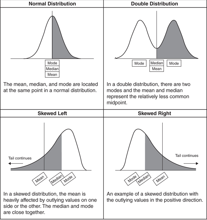
Figure 3.3.10 Variety of distributions
Variation and Volatility
In most cases, just knowing the average behavior of some data isn’t sufficient information. It is also necessary to know how much variation there is in the sample data. For example, it is possible for two sets of data to have the same average behavior and still look very different from one another (Figure 3.3.11). Even though two distributions may both be shaped like bell curves and have the same central tendency, one of them might have a much wider range of values than the other.
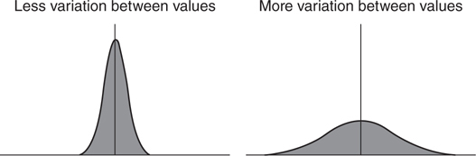
Figure 3.3.11 Distributions with different volatility
For energy trading, variation is often a very important piece of information. For example, suppose you are analyzing two different investments. Both have an expected payoff of $10 million. However, there is a significant difference between a relatively certain payoff (less variation in value) and one that has a huge range of outcomes (more variation in values). It’s the type of information that an investor—or your boss—will definitely want to know.
In trading, the term volatility is used to refer to the standard deviation of a series. However, this number is fairly complicated to calculate, so two other measures of dispersion will be examined first—mean absolute deviation and variance.
The mean absolute deviation is the average distance between a set of sample points and the mean of a distribution. Since distance is always a positive number, this means that the average distance is the average of the absolute difference between each point and the mean of a series divided by the number of samples. In the formula for mean average deviation (Figure 3.3.12), x is the value of the number and n is the number of samples.
![]()
Figure 3.3.12 Mean average deviation
This would be an excellent measure of variance except for one problem—absolute value is difficult to incorporate into calculus equations. Calculus is the key to making statistics problems easier to solve. It’s a bit more work to solve an equation the first time through with calculus, but afterward, anyone can plug in values to get the right result. Most people aren’t going to actually solve the calculus themselves—they are going to use a pre-built spreadsheet function or math library that someone else has written. As a result, it will be necessary to use a measure of variance that can be used in those functions.
Fortunately, there is another way to ensure that a number isn’t negative—it is possible to multiply a number by itself. This is called taking the square of a number. Applied to a variance formula, squaring the distance between the mean and each value will calculate the mean squared deviation of a number. This quantity is also called variance. In mathematical formulas, variance is typically abbreviated σ2 and is called “sigma squared” (Figure 3.3.13).
![]()
Figure 3.3.13 Variance
Taking the square root of the variance gives an answer in the same units as the original series. For price series, the units of variance are dollars-squared. These units are less understandable than having a result in dollars. Because the square root of variance is the most common measure of deviation, it is usually called the standard deviation (see Figure 3.3.14). It is typically denoted by the lowercase Greek letter sigma (σ). In scientific and engineering applications, it is called the root mean square (RMS). In financial applications, this value is known as volatility of a set of data.
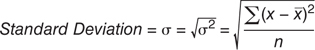
Figure 3.3.14 Standard deviation
Volatility is a key concept in trading. It is commonplace to hear traders discussing market volatility. For example, it is common to overhear someone saying, “The market was volatile today,” or “The volatility in the market has doubled in the last month.” Although the general intuition is that prices have moved around a lot recently, volatility actually refers to the root mean squared deviation of recent returns.
Estimating Variance and Standard Deviation from Sampled Data
In many cases, it is impossible to include every possible value of a distribution in a variance or standard deviation calculation. This causes a problem because estimating the volatility of an entire set of data from a set of sample data consistently underestimates the actual volatility and variance. This error can be corrected by modifying the formulas for variance and volatility slightly; dividing by n – 1 instead of by n (Figures 3.3.15 and 3.3.16).
![]()
Figure 3.3.15 Variance of a sample
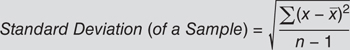
Figure 3.3.16 Standard deviation of a sample
In most cases, this doesn’t make much of a difference. For example, if n = 1,001, there isn’t a lot of difference between dividing a number by 1,000 and dividing that same number by 1,001. However, for a small number of samples, this can be an important correction.
Exponentially Weighted Volatility
In the financial markets, one common way to estimate the volatility of an asset is to use a rolling window of time. For example, a risk manager might estimate the volatility of spot petroleum by examining daily price changes for the past year or two. This is most commonly done by examining the daily return. The daily return can be calculated by taking the natural log of the current price divided by the previous price (e.g., return = ln (pricet/pricet-1).
In this calculation, one new value joins the distribution each day and another leaves. If a large outlier leaves the calculation, it is possible the volatility can fall dramatically overnight (Figure 3.3.17). For example, on June 11, 1986, there was a 9.21 percent one-day jump in the price of crude oil. Using seven days of historical data to estimate volatility, the June 19 calculation includes the large price move, however, the following day, June 20, does not. This causes the June 20 estimate of volatility to fall dramatically from the day before. The seven-day estimate of volatility fell from 3.5 percent to 2.1 percent because the largest variation in the data set dropped out of the sample.
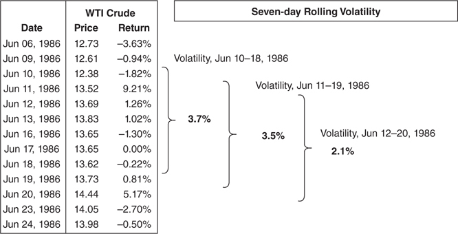
Figure 3.3.17 Rolling volatility
To a trader or risk manager, this is important. The value of many financial instruments, like options, is extremely sensitive to volatility estimates. Many of these volatilities are estimated based on historical prices. If that largest outlier leaves the sample set, volatility estimates can drop dramatically even though recent prices haven’t changed at all. Of course, the real probability of large price moves is unlikely to have changed substantially. This can make for an awkward conversation to explain why an option portfolio just made or lost millions of dollars in the absence of a major market move.
A common modification to volatility calculations is to apply a weighting scheme that causes the recent observations to influence the estimate more than older observations. This is similar to a typical calculation for variance and standard deviation with the addition of another variable in the formula. This complicates the calculation, but eliminates the problem of large values dropping out of the calculation. As large values get further away, they have a progressively smaller impact on the calculation.
Exponentially weighted returns use a decay factor, commonly called lambda (λ) that progressively decreases the weight of each sample as the samples go further back in time. For example, the current day’s observation receives a 100 percent weighting. Today is indicated mathematically by a variable time, t, being equal to zero. Previous samples get progressively less weight in the volatility calculation (Figure 3.3.18).
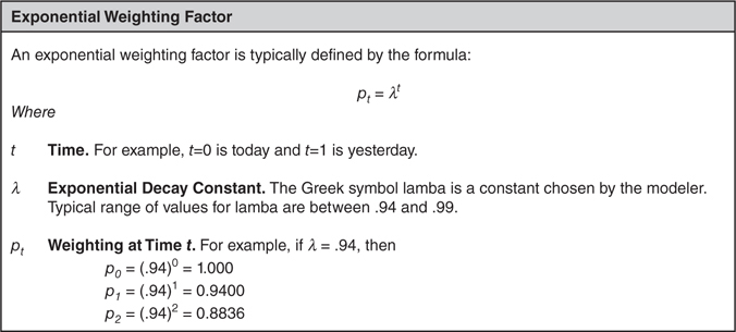
Figure 3.3.18 Exponential weighting factor
The addition of a weighting factor that depends on time alters the volatility calculation (Figure 3.3.19). In addition to complicating the formula, an exponential weighting places much more emphasis on recent events. Immediately when a very large daily change enters the data set, the volatility estimate will change. As time passes, that value will have less and less effect and will slowly drop out of the calculation.
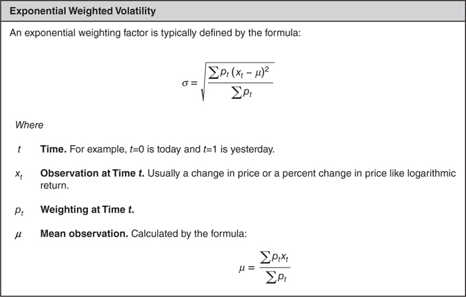
Figure 3.3.19 Exponentially weighted volatility
Exponential weighting effectively limits the number of samples used in the equation. Eventually the weights will get so small that the value has a negligible effect on the volatility calculation. This is called exponential decay. For example, when lambda equals 0.94, observations older than 75 days are weighted less than 1 percent of more recent observations. At a lambda equals 0.96, this occurs after 113 days, and at lambda equals 0.98, it occurs after 228 days (Figure 3.3.20).

Figure 3.3.20 Exponential decay
Risk/Reward Measures
When traders analyze trading opportunities, neither the average return nor the volatility of an investment indicates whether it was a good investment without the other factor. A more useful measurement of investment performance is reward-to-risk measure. In this type of measure, the average return is divided by the standard deviation of returns. Commonly, this is known as a Sharpe Ratio or an Information Ratio2 (Figure 3.3.21). Both of these ratios work the same way. The average return of the investment (net of some benchmark) is divided by the variability of the return (net of some benchmark). Higher ratios are considered superior investments to lower ratios.
![]()
Figure 3.3.21 Information Ratio
Like any model, risk/reward ratios have to be used carefully. These measures are not predictions of the future. Typically, these ratios use historical data and they rely on that data to be representative of actual performance. If market conditions change, or if accounting sleight of hand is being used to smooth out earnings, these measures will fail to work properly. Also, these measures only work correctly when returns are positive. When returns are negative, higher volatility leads to better (less negative) ratios.
Finally, it is misleading to look at an investment opportunity without considering its effect on the entire portfolio. Unless the returns for different strategies are perfectly correlated, a combination of strategies will always have a lower volatility than any single strategy. For example, consider two strategies. One strategy always makes $1 when the price of natural gas rises, and loses $0.98 when the market falls. Another strategy always makes $1 when the price of natural gas falls, and loses $0.99 when the market rises. The long strategy (the one that makes money when the market rises) is the better strategy if the market is equally likely to rise and fall. However, the combination of both strategies is far superior to either one alone. A combined strategy makes a risk-free profit!
Correlation
Another aspect of statistics that is particularly useful for energy traders to understand is correlation. When two things are statistically correlated, they have a direct linear relationship. For example, natural gas prices in New York and New Jersey are usually correlated. When prices in one area are high, prices in the other area are also likely to be high.
Often, it is possible to see the relationship between two numbers by plotting two price series on a graph. For example, it might be useful to understand if the price of peak electricity in an area is correlated to the price of natural gas. Even though this won’t indicate the exact relationship between the two prices, it is a good way to see if there is a relationship. Another way of looking at the data is to use a scatter diagram to compare prices (Figure 3.3.22). Two different ways of looking at the data are shown in the graphs. The top graph shows daily prices for each commodity; the bottom graph is a scatter graph that matches natural gas prices to peak electricity prices of the same day.
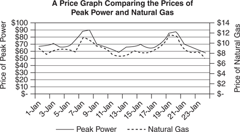
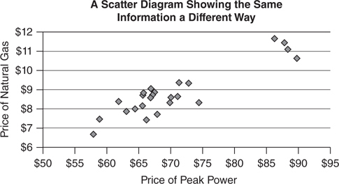
Figure 3.3.22 Different ways of looking at data
Correlation assumes that there is a linear (straight-line) relationship between two data series. It’s fairly obvious from both graphs that the prices of the two assets acted similarly throughout this entire period. A straight line can be drawn through the scatter diagram and capture the primary relationship between electricity prices and natural gas prices. However, it would still be helpful to be able to define a single number that can summarize the strength of this relationship. Ideally, this would work the same way that the average and standard deviation describe a single set of data.
The most common way to measure the relationship between two sets of data is to use the correlation coefficient, abbreviated r. The correlation coefficient produces a number between –1 and +1 that indicates the strength of the relationship between the two data series. A correlation coefficient equal to +1 means that the series behaves identically in all situations. A correlation coefficient of –1 means that prices are inversely proportional to one another (when one price rises, the other price falls). A correlation coefficient of zero indicates no relationship between the two values (Figure 3.3.23).
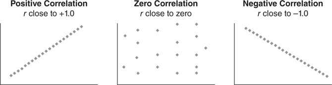
Figure 3.3.23 Types of correlation
Using the example of correlated prices, a positive correlation indicates that the prices move up and down together. A negative correlation indicates the prices tend to move in the opposite direction—when one rises, the other falls. No correlation means that prices tend to move up and down randomly—sometimes rising together and sometimes rising at opposite times. Correlation is calculated by a mathematical formula (Figure 3.3.24).
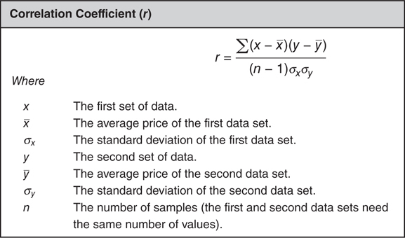
Figure 3.3.24 Correlation coefficient
The key to understanding correlation is examining numbers that are far away from the mean. Prices for each series are multiplied together after having the mean of their respective series subtracted out. If either the x or y value is zero after subtracting the mean value, it will cancel out the other value. Multiplication by zero is always zero. However, multiplying two large numbers produces a very large number. As a result, what matters in a correlation relationship is the behavior of outlying results. As long as the outlying values of x (the values far from the mean) match up to the outlying values of y, the two series will show a strong relationship. Particularly in the case of energy prices that are very volatile, a couple of outlier prices often determine the correlation between two price series.
Correlated Does Not Mean a Good Hedge!
One of the most dangerous traps that an energy trader can fall into is to trust statistics without actually looking at the underlying data. For example, because energy prices are cyclical, it is common for all energy prices to be highly correlated. That doesn’t necessarily mean that those prices are trending in the same direction. A graphical example of this is shown in Figure 3.3.25—the two series are highly correlated with r = 0.5, but they are going in opposite directions!
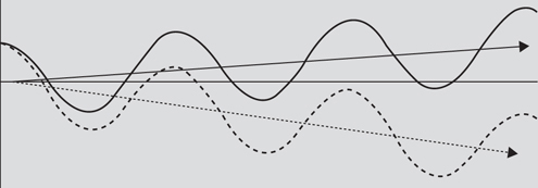
Figure 3.3.25 Correlated series trending apart
A practical example might be a steel producer that is a major user of electricity. The year is 1990, and the steel producer is located in the PJM-East service area halfway between Washington, D.C., and Baltimore. For protection against a rise in electricity prices, the steel producer wants to buy electricity futures. However, exchange-traded futures are not available for PJM-East. The closest futures trading location is PJM-West. This service area is located to the west of Washington, D.C., near the intersection of western Maryland, West Virginia, and Pennsylvania. The steel producer checks that PJM-East and PJM-West prices are highly correlated, finds they are, and buys $500 million of PJM-West power forwards; $20 million of forwards per year for the next 25 years.
Going forward 10 years, the population in the Baltimore-Washington area has boomed. New housing developments and increased commercial activity are straining the power grid. As a result, power prices in PJM-East are soaring. However, the population to the west of Washington, D.C., has not experienced the same growth in population. Instead, power prices in PJM-West have declined. The price of power in the two regions has remained highly correlated since the weather in both areas is nearly identical. Power prices reach their peaks on the same days (hot summer days in August) and are low on the same days. However, the price of power in PJM-East has gone up in price, while the power in PJM-West has declined in value.
The steel producer, relying on estimates of correlation, never noticed that the prices were diverging for almost 10 years. Because the prices in the two areas generally moved up and down at the same time, the futures effectively limited the day-to-day volatility. Since correlations remained high, no one thought to actually look at the underlying data. As a result, by the time the problem was identified, the steel producer faced a huge loss on the hedge!
Monte Carlo Testing
A common application of statistics is to develop valuation models to determine the price of various energy assets using an approach called Monte Carlo modeling. Monte Carlo models were developed in the middle of the twentieth century shortly after computers were first developed. The concept is that sometimes it is faster to use computer time to calculate hundreds of thousands of scenarios and observe the results than it is to use math to determine which scenario is optimal for a specific purpose.
For example, it is very difficult to figure out how often it is possible to win the one-player card game, solitaire, with a standard 52-card deck. It is relatively easy to prove that some games are possible to win and others impossible. However, because there are so many permutations of cards, it is extremely difficult to find the probability equation that will give an exact answer as to what percent of games are winnable.
Another approach to solving this problem is to play enough games of solitaire. This is called simulation and is the basis for Monte Carlo analysis. If enough games were played, a computer could easily keep track of how many games were won and lost. This analysis is fairly easy to extend. For example, if one wanted to define several strategies for playing the game, it would be possible to identify which strategy was most effective by keeping track of how often that strategy won.
There is no single approach to Monte Carlo methods. Each simulation has to be individually modeled. For example, it would be necessary to program to play solitaire before you could use Monte Carlo to figure out what percentage of solitaire games could be run. However, here are several common steps that most Monte Carlo simulations have in common:
1. Develop random inputs.
2. Generate the simulation defined by the random inputs.
3. Calculate the result of the simulation.
4. Aggregate results after running the simulation multiple times.
Develop Random Inputs
Monte Carlo simulations are driven by random inputs. For example, when playing solitaire, it is necessary to shuffle the deck of cards and choose a playing card for each game. This is sometimes as much an art as a science.
Generate the Simulation
After inputs are calculated, it is necessary to implement the simulation. This is typically a deterministic process based on the random inputs.
Calculate Results
Once a simulation is completed, the results of the simulation need to be determined. In the solitaire example, this would involve determining if the game was won or lost.
Aggregate Results
Finally, the last step of a Monte Carlo simulation is to run through the process a large number of times and to aggregate results. Commonly, Monte Carlo analysis involves 10,000 or more simulations.
1 Numbers don’t make wrong data more accurate—a fact that is well known in popular culture, but still confuses people on a daily basis. A famous quote on statistics was written in the autobiography of Mark Twain, where he quotes Benjamin Disraeli as saying, “There are three kinds of lies: lies, damned lies, and statistics.”
2 A Sharpe Ratio subtracts out the risk-free rate of return from the average return. An Information Ratio subtracts out some industry benchmark. The distinction is important to investment managers who benchmark their returns against an index. However, for everyone else, the most important thing is to ensure that a consistent measure is used across a business and either a Sharpe Ratio or an Information Ratio will work equally well.