Chapter 15
Using Quicken Reports
In This Chapter:
• Reviewing report and graph types
• Creating reports and graphs
• Working with a report window
• Customizing reports and graphs
• Working with subreports
• Saving reports and graphs
• Exporting your reports
• Printing reports and graphs
After you have downloaded or entered your financial data, you may need to see an explanation of your current financial position. Quicken offers a variety of reports and graphs, each of which can be customized to meet your needs. After data is entered into your file, Quicken crunches the numbers for you, provides reports and graphs to analyze your spending habits, helps you find ways to save money, aids you when preparing for taxes, and formats your data to submit information to financial institutions when you apply for loans or credit cards.
 Quicken Reports Overview
Nearly every tab offers options for you to review your data and see where you stand. For example, from the Spending tab, you can quickly create reports that deal with both your income and the ways you have spent your money. You can access reports from the Reports button in both the Planning and Investing tabs as well as the Reports And Graphs Center found when you select the Reports menu. When you select Reports from the Standard menu bar, you see a wide variety of available reports, as shown here. In this chapter, you’ll learn about the various types of reports and graphs Quicken offers. Then you’ll learn how you can use an array of techniques to quickly create reports and graphs based on the information in your Quicken data file, regardless of where it appears.

There currently is a bug in Quicken in that the menu may collapse before you can access the desired submenu. A temporary workaround is to click Help | Enable Accessibility. Unfortunately, the Enable Accessibility setting needs to be enabled each time you open Quicken.
Reviewing Report and Graph Types
Within Quicken are two kinds of reports and graphs: the Quicken standard reports and those you can customize to meet your needs. By starting with any of Quicken’s standard reports you can design reports and graphs to reflect the information you want to see. Here’s an overview of each type of report.
Standard Quicken Reports
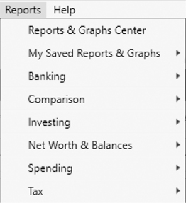
As seen earlier, selecting Reports on the menu bar displays a number of standard reports and graphs, organized by topic, such as Banking, Comparison, Investing, Net Worth & Balances, Spending, and Tax. There are also links to “EasyAnswer” reports, Graphs, the Reports & Graphs Center, and your credit score.
This section discusses standard reports found in the Deluxe and Premier editions of Quicken. The Home, Business & Rental Property Manager edition of Quicken offers even more reports available for you to use.
EXPERIENCED USERS RECOMMEND
Many Quicken users have found that reports and graphs are their reward for taking the time to download and enter their transactions and reconcile their accounts. You can quickly create a report of everything you’ve spent on cell phone bills since the first of the year, for example, or summarize the total income from your second job.
Your tax preparer may appreciate you even more when you next walk in the office with a complete list of all of your income, every expense, including your itemized charitable contributions, and property tax amounts. Those reports may even save you some money when that tax person sends your bill!
For example, the Banking report options include Banking Summary, Cash Flow, Cash Flow By Tag, Missing Checks, Reconciliation, and Transaction reports that explain your banking-related information. EasyAnswer reports and graphs, as seen next, answer specific, predefined questions, such as, “Where did I spend my money during the period…?” and “How much did I spend on…?” You select a question and then provide optional information, such as a date range, payee, or account. Quicken gathers the information and generates the report or graph.

Customized and Saved Reports
You can customize reports and graphs using the information found in standard reports and graphs. This multiplies your reporting capabilities, enabling you to create reports or graphs that show exactly what you need to show. When you save your custom reports and graphs, they can be recalled with just a few mouse clicks to display current information.
EXPERIENCED USERS RECOMMEND
Recently a new user asked how to find the beginning and ending balances on his transaction report from last month. When he looked at the report again, he saw that the beginning balance for the account (or accounts when including more than one bank account) is shown at the top of the report and the ending balance shows on the bottom line entitled “Balance.” You may find as well that most of the Quicken reports do have the information you need—you just have to look a bit at the report you’ve created.
Another person asked why one of her checks showed up in the Income category of her report. When she double-clicked that transaction, she found she had entered that check into the register with an income category rather than an expense category. Once she found the error, it was easily corrected—she just had to change the category.
Creating Reports and Graphs
With Quicken, creating a report or graph is as simple as clicking a few buttons. You can use several techniques: choosing a report or graph from the Reports menu, setting options in the Reports And Graphs window, using the Reports button, and choosing commands from contextual menus. In this section, you’ll learn to use all of these techniques.
Reports & Graphs Center
The Reports And Graphs window (see Figure 15-1) offers one way to create reports and graphs. Open the Spending, Planning, or Investing tab, and from the Reports button in each of those tabs, choose All Reports | Reports & Graphs Center to display it. You can also access the Reports & Graphs Center from the Quicken menu bar by clicking Reports | Reports & Graphs Center.
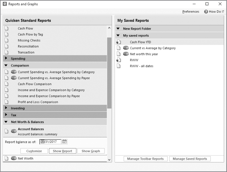
Figure 15-1 · Use the Reports And Graphs window to create both written and graphic reports.
The tabs show as Spend, Plan, and Invest if the number of tabs displayed is wider than the available display window.
Consider adding the Reports & Graphs Center icon to your Quicken Toolbar to open the center for quick access.
Click one of the sections in any of the Quicken Standard Reports sections to display a list of the available reports and graphs as seen in Figure 15-1. The icon that appears to the left of the report name indicates what you are choosing. Those items that have both the graph and the report symbols to their left let you choose between the two when you create the report.
To create a standard report or graph, click its name. Set the Date Range option in the settings field. Click the Customize button to further customize the report or graph, as explained in the section “Customizing Reports and Graphs.” Then click Show Report or Show Graph to display the report or graph. Figure 15-2 shows an example of the graph we created from the settings shown in Figure 15-1.
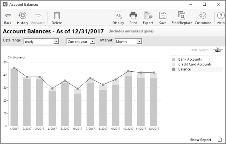
Figure 15-2 · Quicken’s reports display your financial picture with only a few mouse clicks.
The All Reports Menu
In the Spending, Planning, and Investing tabs, you see a Reports button from which you can open the All Reports menu. This menu is the same as the menu you see in the Reports option on the Quicken menu bar.
To create a report or graph from the All Reports menu, click a topic submenu, and then click a report name. Quicken creates the report with default date settings, usually the current year to date as seen earlier in Figure 15-2. Click Reports & Graphs Center from the All Reports submenu to go directly to the Reports & Graphs Center. Use the drop-down lists to sort within reports.
You can set the default date range in Preferences. Click Edit | Preferences | Reports And Graphs and then set the dates you want in the Default Date Range and Default Comparison Date Range.
If you start creating reports and find that you often want to change settings or adapt the report in some way, you can tell Quicken to open the customization dialog at the time you select a report to create. To set this preference, click Edit | Preferences | Reports And Graphs; then, from the Customizing Reports And Graphs section, click Customize Report/Graph Before Creating, as shown next. Click OK to close the Preferences dialog. Then, the next time you want to create a report, the Customize dialog will appear before the report displays. Learn more about customization in the “Customizing Reports and Graphs” section later in this chapter.

Reports from Other Menus
You can also create a report by using the menus in some windows. This normally creates a report based on information selected within the window. For example, you could create a Register report for a specific account. From the register for that account, click the Action gear icon and choose More Reports | Register Report, as seen next.

A mini-report button also appears in an account register window when you activate the Payee or Category field. Clicking this button displays a pop-up mini-report of recent activity for the payee or category. Clicking the Show Report button in the mini-report opens a report window with the information. And if you hover your mouse over the word “Split” in a transaction, the mini-report icon is available from each separate category.
Contextual Menus
The contextual menu that appears when you right-click while pointing to an item sometimes includes a command that will create a report for the item. For example, right-clicking the name of a payee in the account register window displays a context menu that includes the Payments Made To and Launch Mini-Report For Payee nnnnn at the bottom of that context menu. If you right-click a deposit’s payee, the report will be Payments Received From.
You can also create a report from almost all Quicken screens by using the shortcut CTRL-P or File | Print nnnnn, where nnnnn is the Quicken screen. As with the other report types, you can print a hard copy, print to a PDF file, or “print” to a tab-delimited file that you can use in Excel.
Working with Reports and Graphs
Although Quicken’s standard reports and graphs often provide just the information you need, you may want to do more with them. In this section, you will see how you can customize reports and graphs, save the reports and graphs you create so they’re easy to recall, and print reports and graphs so you have hard copies when you need them.
EXPERIENCED USERS RECOMMEND
A report requested often on the Quicken Community is the Portfolio, which lists all open lots for each security and account you have selected. To create this report, click the Investing tab and, if necessary, click the Portfolio button to display the Portfolio. You can click Customize to select the accounts and securities you wish to include in the report, or use Expand All/Collapse All buttons to show/hide all the lots for each security. Then click File | Print Portfolio.
Working with a Report Window
When you create a report or graph, it appears in a report/graph window, as seen in Figure 15-2. Each report or graph has a number of features and options, discussed next, with which you can customize the report to meet your specific needs. Quicken has added a few more options to view settings to set different font size, alternate row colors, and so on.
Toolbar Icons
The report window includes a number of toolbar icons, shown here, that work with report contents:
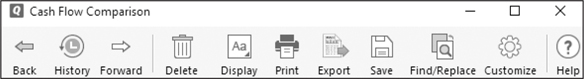
• The Back arrow returns you to the Reports & Graphs Center when you have created your report from that center. The arrow does not appear if you have created your report from a Reports button within the Spending, Planning, or Investment tab. If you have created a subreport, you may see both forward and back arrows.
• The History icon displays a list of the parent report and all subreports you have created. Click the History icon and select the name of a subreport to display it. Choose the Show Report List option to display the Report History navigation bar. This is a list of all of the subreports related to the current report. Click the Hide Report List to close the navigation bar.
• The Forward arrow is available only if you have clicked the Back button, and it allows you to move through subreports.
• The Delete icon deletes the report from the current Report History List. This button label is gray if the report has not been added to the report list. See more about the report list in the section “Saving Reports and Graphs,” later in this chapter.
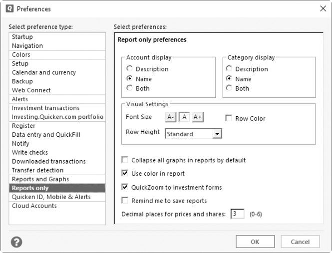
• The Display icon opens preferences for the Report Only options, as shown here. Use these options to tell Quicken how you want your report displayed. The preference name in the left-hand pane of the Preferences window is labeled “Reports Only” (reports is plural), whereas the preferences window with Reports Only selected is labeled “Report Only Preferences.”
• Click the Print icon to send the report or graph to the printer or a file.
• Click the Export icon to display a menu. From this menu, you can export the contents of the current report in several ways. See “Exporting Your Reports” later in this chapter.
• Select the Save icon to save the current report. See “Saving Reports and Graphs” later in this chapter for more information.
• The Find/Replace icon opens the Find And Replace dialog. See Chapter 5 for more information about using Find And Replace.
• Use the Customize icon, which looks like a small gear, to use the Customize dialog to tailor the currently displayed report.
• The last item on this toolbar is the familiar question mark Help icon.
Hiding or Displaying Report Detail
You can show or hide the details for some reports by clicking a plus (+) or minus (–) button beside a report line. Some reports include additional items that allow you to change what appears on the current report without using the Customize dialog. The following items appear under the report title:
• The Expand All and Collapse All buttons do the same thing as the plus and minus signs by individual categories, but for all groups in that report.
• The Edit drop-down list, which displays in transactions reports, allows you to:
• Resolve a placeholder in an investment transaction report (if any exist).
• Delete a selected transaction (or a group of transactions) from the account register as well as the report.
• Re-categorize the selected transaction (or group).
• Retag the selected transaction or group of transactions.
• Rename selected payees.
• Edit transaction memos.
When you double-click a transaction shown on a report, Quicken opens that transaction in the appropriate account register. You can return to the report by clicking the report’s name at the bottom of the register.
• Date Range, Column, Sort By, and Subtotal By fields allow you to change the focus of the current report. What you see in a report varies according to type.
• Show/Hide Graph and Show/Hide Report toggles allow you to show and hide either the graph or the report.
• Update To Show offers additional options for the report you’ve run.
EXPERIENCED USERS RECOMMEND
When you see Uncategorized as a category or No Payee as a payee on any report, double-click the amount to drill down to each transaction so that you can add a category. Because many financial institutions download checks with only the check number, date it cleared, and the amount, you may have quite a number of uncategorized transactions in one report. As explained in Chapter 6, ensure that you review each downloaded transaction and categorize it if necessary.
Spending Trends
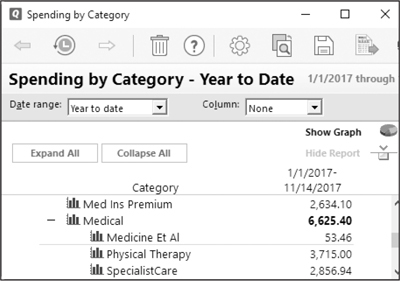
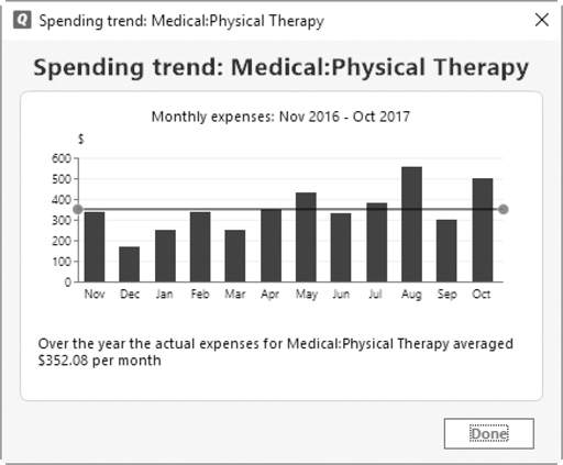
A useful tool you will see in some Quicken reports is the Spending Trend report. You see the symbol (shown next) in both the Spending by Payee and Spending by Category reports. Click the Spending Trend symbol to the left of a category or payee to see a small graph, also shown next, that shows the trend for this category or payee over the time period for which you have entered data. Click Done to close the graph and return to your report.
To choose only one bank for a report, use the Accounts tab in the Customize dialog and clear the check marks from all the other accounts.
Customizing Reports and Graphs
You can customize just about any report or graph you create so it displays only the information you choose. Customization options vary from one type of report or graph to another, so it is impossible to cover all variables in this chapter. Here are the most common options so you know what to expect. When you can customize it, however, depends on how you create it.
When you create a report or graph using the Reports And Graphs window (refer to Figure 15-1), you can customize it before or after you create it.
When you create a report using other commands, you may be able to customize it only after you have created it, unless you have set your preferences to always display the Customize dialog.
EasyAnswer reports do not display a Customize button when you use the Reports & Graphs Center to create them; however, once the report is displayed on your screen, the Customize icon is available from the report toolbar.
You can adjust the columns on many reports by placing your mouse cursor on the line between headings. A small horizontal arrow appears. Hold down your left mouse button and drag the line to the left or right as you require.
Using the Customize Dialog
To customize a report or graph, click the Customize button in the options area for the report or graph in the Reports And Graphs window or the Customize button at the top of the report window (refer to Figure 15-2). The Customize dialog, as shown next, appears. The dialog’s full name includes the name of the report or graph.
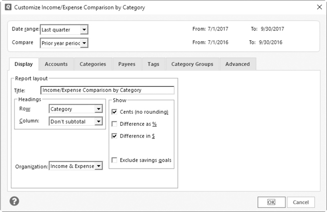
The Customize dialog includes several tab options that you can set to customize the report:
• Display enables you to set display options for the report, such as the title, row and column headings, organization, number formatting, and columns.
• Accounts lets you select the accounts that should be included in the report. Quicken will include transactions or balances in this report for only the accounts you specify.
• From Categories, you can select the categories to include in the report. If you choose, you can use this tab to include only transactions for which the payee, category, or memo contains what you select in the Matching fields.
• The Payees tab shows options from which you can select the payees to include in the report. If desired, you can use this tab to include only transactions for which the category, payee, or memo matches your selections.
• The Tags tab lets you select the tags you want to show in your report.
When working with split transactions where some items have tags and others do not, ensure you have cleared the Not Tagged check box in the Tags tab in the Customize dialog so that the non-tagged items are not included in your report.
• If you have created any category groups, you may also see a Category Groups tab in Summary, Comparison, or Budget reports. See Chapter 4 for more information about creating this type of group.
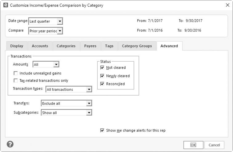
• The Advanced tab offers different options, depending on the standard report with which you are working. For example, you can set additional criteria for transactions to be included in the report, such as amount, status, and transaction type. It is also from this Advanced tab that you can tell Quicken to exclude all transfers you make between your accounts, as seen next.
• The Securities tab, available on some reports, allows you to choose the securities you want included in the report. From this tab, you can also instruct Quicken to include hidden securities.
• The Actions tab, seen in the Investment Income and Investment Transactions reports, lets you opt to display only certain investment actions you have taken, such as purchases or sales.
• The Security Types tab, again only available in some investment reports, lets you determine which security type is displayed on the report.
• The Investing Goals tab allows you to create a report that displays the current status of your various investing goals.
Once you have set options as desired, click the Show Report or Show Graph button as necessary.
Some of the investing and tax schedule reports are available only in the Premier or higher editions of Quicken.
If the custom report or graph isn’t exactly what you want, that’s okay. Just click the Customize button in the report or graph window and change settings in the Customize dialog to fine-tune the report or graph. When you click OK, Quicken creates a new report. You can repeat this process until the report or graph is exactly the way you want it.
Using QuickZoom
Quicken’s QuickZoom feature helps you create a report or graph on the fly. Simply double-click a report line item, graph bar, or legend item. Quicken generates and displays a subreport for the item you double-clicked. Click the Back arrow to return to your original report.
Working with Subreports
Each time you make changes to an existing report or graph, or create a QuickZoom report, Quicken creates a subreport. As you can imagine, it’s easy to accumulate quite a few of these subreports when experimenting with Quicken’s reporting features. This can be reduced somewhat by changing your preference settings. Select Edit | Preferences | Reports And Graphs | Customizing Reports And Graphs, and select Customizing Modifies Current Report Or Graph. Click OK to close the Preferences dialog.
To view a specific subreport, choose its name from the History menu in the report window’s toolbar. The view changes to the report. You can also choose Show Report List from the History menu in the toolbar to display the Report History List. Click the name of the report you want to view to display it.
You can click the Back or Forward button at the top of the navigation bar to move among subreports you have already viewed.
To delete a subreport, display it and then click the Delete icon in the toolbar. You can also delete any subreport (other than the first one in the report list) by right-clicking the subreport name in the Report History List and selecting Delete This Report from the context menu.
Saving Reports and Graphs
You may customize a predefined report to create a report you want to be able to see again and again. Rather than creating and customizing the report from scratch each time you want to see it, you can save the report’s settings. Then, when you want to view the report again, just select it from a list and it appears. You can do the same for graphs.
Saving a Report or Graph
To save a report or graph, start by creating, customizing, and displaying it. When it looks just the way you want, click the Save icon in the report window’s toolbar. The Save Report dialog appears as seen here.
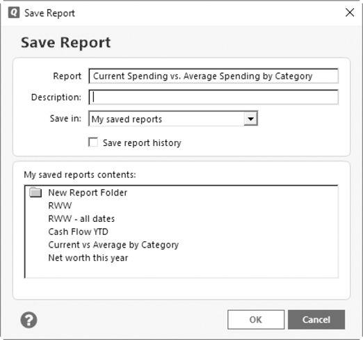
Enter a name and description for the report or graph in the appropriate boxes. To save the report or graph in a specific folder, choose the folder name from the Save In drop-down list. You can create a new folder by clicking the Create New Report Folder option, which appears on the Save In drop-down list. Enter a name for the folder in the dialog that appears, and click OK. To save all versions of the report that you create, select the Save Report History check box. When you’re finished setting options, click OK to save the report.
Viewing a Saved Report or Graph
When you save a report or graph, it appears in a number of places throughout Quicken, organized by folder if you have saved them into specific folders. Your saved reports and graphs appear in the My Saved Reports area of the Reports And Graphs window, as seen earlier in Figure 15-1. Click the name of the report or graph, change the date range if you choose, and click Show Report or Show Graph to display it.
Saved reports and graphs also appear on the Reports menu as My Saved Reports & Graphs. (This submenu appears only if at least one report has been saved.) Choose a report name to display it. If you have a lot of saved reports, you will see an item, More Saved Reports & Graphs, which you can click to open the Reports And Graphs window.
Working with Saved Reports
Quicken offers two tools for managing saved reports: the Manage Saved Reports and Manage Toolbar Reports dialogs. When you choose the Reports & Graphs Center from the menu and look at the My Saved Reports pane, you will see one or two buttons at the bottom of the pane: Manage Toolbar Reports and Manage Saved Reports as referenced in Figure 15-1.
Manage Toolbar Reports When you click the Manage Toolbar Reports button, its dialog appears. This dialog allows you to add saved reports to the Quicken Toolbar for easy access, as seen below. (This option appears only when you have chosen to show the Quicken Toolbar. Click View | Show Toolbar if you do not see this button on the My Saved Reports pane of the Reports And Graphs dialog.)

In the dialog, click the check box of each report you want to show as an icon in the Quicken Toolbar. Then, click OK to save your settings. You will see the icon on your toolbar. If the name is long, the entire name may not appear. (If you do not see the text for your report’s icon, right-click in the toolbar and choose Customize Toolbar | Show Icons And Text. Click Done to close the Customize Toolbar dialog.)
If you have created your own folders, as described next in “Manage Saved Reports,” for your saved reports, you can choose to have one or more of those folders display on the Quicken Toolbar as well. When you click a saved report folder icon on the toolbar, it will appear as a pop-up menu button that lists the reports within it. Learn more about customizing the Quicken Toolbar in Appendix B.
Manage Saved Reports The Manage Saved Reports dialog, shown here, enables you to organize saved reports by folder, edit report settings, or delete reports. Select the item you want to work with in the report list, and click the appropriate button:
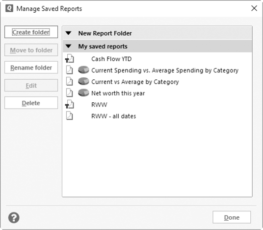
• Create Folder displays the Create New Report Folder dialog. Enter a name for the folder in the Name box, and click OK. The folder appears in the list.
• Move To Folder displays the Move To Report Folder dialog. When you select a report from the list, this button becomes available. Click the Move To Folder button to open the dialog, and select a different folder from the Name drop-down list. Click OK when you’ve made your choice, and the report is moved to that folder.
• Select a current folder, and the Rename Folder button becomes available. From the dialog that appears when you click this button, enter a new name for the folder in the Name box and click OK. The folder’s name changes.
• When you have selected one of the saved reports, the Edit button is available for use. This button allows you to enter a new name and description for the report. Click OK to save your changes.
• Delete removes any selected item. When you click this button, a confirmation dialog appears. You must click OK to delete the item permanently. Remember, when you delete a folder you are deleting all the items in that folder. Should you want to save any of the items, move them before deleting the folder.
• Done closes the Manage Saved Reports dialog and returns you to the Reports And Graphs window.
Exporting Your Reports
Another method of working with your reports is to export them into other formats or programs. From your report’s toolbar, choose the Export icon to view this menu. As you can see, there are four choices, each of which is explained in the sections that follow.
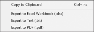
Copy To Clipboard
Use this option to copy the report into another program. To “paste” this report into another program, use the Paste option in the program or the keyboard shortcut CTRL-V. CTRL-V works in the other program whether you are using CTRL-INS or CTRL-C. If the Quicken standard shortcuts for copy/paste are selected in preferences, CTRL-INS will be used for paste instead of CTRL-C.
Export to Excel Workbook (.xlsx)
Use this option to save your report in Microsoft Office Excel format. The file is saved as an Excel worksheet file in .xlsx format. The process is new in this new version of Quicken. To save your file in this format:
1. From the Export menu, choose Export To Excel Workbook (.xlsx) to open the Create Excel File dialog.
2. Browse to find the folder into which you want to save this file, and click that folder.
Enter a name for your file, and click Save. The file will have a .xlsx extension. The new file is saved into the folder you designated. An Export Summary message appears telling you the export was successful and notes the location of the Excel file, as shown next.
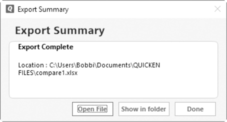
Select Open File to work with it right away, or choose Show In Folder to see the worksheet in the folder you selected. You may select Done to close the message.
Export to Text
This option saves the report in .txt format. When you select this option, the Create Excel File dialog opens as seen earlier. Follow the same steps to name and save your report. When the file has been saved, the Export Summary message appears with the same choices as described in the “Export to Excel Workbook” section earlier.
Export to PDF
PDF stands for Portable Document Format. This format, patented by Adobe Systems, allows the reader to view and/or print a document from nearly any computer or word processor. This option is particularly useful if you are saving the report to e-mail it or sharing the file with someone who does not have either Quicken or Microsoft Office. To save as a .pdf file:
1. From the Export menu, click Export To PDF.
2. The Print dialog appears. In the Printer field you will see “Quicken PDF Printer on nnnn” rather than your regular printer.
3. Click Print. The Save To PDF File dialog appears. Locate the folder into which you want to save your file, type a name, and click Save. Your file is now saved with a .pdf extension.
Printing Reports and Graphs
One of the best things about reports and graphs is the ability to print and share them with others. You can create hard copies for your paper files, you can print a copy to take to your tax professional (and make that person very happy), or you can include professional reports with a loan application.
To print a report, subreport, or graph, begin by displaying it in the report window. Then click the Print icon on the window’s toolbar. The Print dialog appears, as seen in Figure 15-3. Set options as desired and click Print.
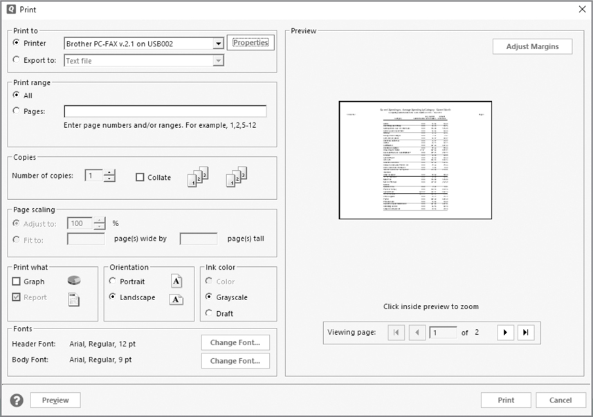
Figure 15-3 · Printing reports means you can share your financial information with other authorized entities.
Here’s a look at the available options:
• Print To options determine the destination of the printed report or graph. You have two choices:
• Printer prints to the printer you choose from the drop-down list, which includes all printers, faxes, and related devices you have set up in Windows.
• Export To makes it possible to export the report information in one of three formats you choose from the drop-down list: Text File, Tab-Delimited (Excel-Compatible) Disk File, or PRN (123-Compatible) Disk File. This option is only available if you are printing a report.
• Print Range determines which pages will print. You can use this if the printed report is more than one page. The default setting is All, which prints all pages of the report. To print a range of pages, select Pages and then enter the page numbers for the page range you want to print.
• Copies determines how many copies of the report will print. If you enter a value greater than 1, you can select the Collate check box to collate the copies as they are printed.
• Page Scaling options enable you to resize a report or graph to a specific percentage or to fit on a certain number of pages. These options are only available for certain printers.
• Print What lets you toggle between two check boxes to determine whether to print a graph or report or both. The available options depend on what’s in the report window.
• Orientation determines how the printed report will be viewed. The options are Portrait or Landscape. These are standard options offered by nearly all programs. The icon beside each orientation option illustrates it.
• Ink Color allows you to choose between three options to determine the ink color and quality of the printout: Color (available only if a color printer is selected from the Printer drop-down list), Grayscale, or Draft.
• Fonts let you use the two Change Font buttons to change the header and body typefaces of the report or graph. Clicking the button displays the Font dialog, which you can use to set standard font options, such as font, size, and style.
• Preview shows a thumbnail preview of the document. You can click the buttons in the Viewing Page area to scroll through all pages of the report. To change the margins for the document, click the Adjust Margins button. The Preview area changes to offer boxes for entering margin values. To view a full-size preview, click the thumbnail in this area or click the Preview button at the bottom of the dialog.
• Viewing Page dialog allows you to scroll through the pages of your report to see how each page will look when printed.