
Key Terms
Elements of Design
Color
Dot
Form
Line
Pattern
Shape
Space
Texture
Principles of Design
Unity
Alignment
Proximity
Similarity
Repetition
Emphasis
Contrast
Color
Depth
Proportion
Perceptual Forces
Balance
Continuation
Figure-Ground
Psychological Closure
2D/3D Space
Aesthetics
Aspect Ratio
Asymmetrical Balance
Color Temperature
Composition
Content and Form
Dutch Tilt
Field of View
Focal Point
Frame
Graphic Vector
Grayscale
Halftone Image
High-/Low-Key Image
Hue
Index Vector
Light Intensity
Light Hardness
Motion Vector
Negative Space/White Space
Perception
Perspective
Positive Space
Rule of Thirds
Saturation
Symmetrical Balance
Theory of Perceptual Grouping
Tonal Range
Visual Communication
X-, Y-, and Z-Axis
Design is the method of putting form and content together. Design, just as art, has multiple definitions; there is no single definition. Design can be art. Design can be aesthetics. Design is so simple, that’s why it is so complicated. Without aesthetic, design is either the humdrum repetition of familiar clichés or a wild scramble for novelty. Without the aesthetic, the computer is but a mindless speed machine, producing effects without substance, form without relevant content, or content without meaningful form.
— Paul Rand, American author and graphic designer
Chapter Highlights
This chapter examines:
- ■ The process of visual communication
- ■ The role of content and form in visual space
- ■ Eight elements of visual design: space, dot, line, shape, form, texture, pattern, and color
- ■ Twelve principles of visual design
- ■ Unity: proximity, alignment, similarity, and repetition
- ■ Emphasis: contrast, color, depth, and proportion
- ■ Perceptual forces: balance, continuation, figure-ground, and psychological closure
Visual Communication
Visual communication (sometimes referred to as vis-com) is an area of study that investigates the transmission of ideas and information through visual forms and symbols. On a deeper level, it also looks at the cognitive and affective processes that affect the way we perceive (or sense) visual stimuli. Seeing is one thing and perceiving is another. The former has to do with the objective realities of sight, while the latter has to do with the transmission of culture and meaning. Two people with equal vision can stand in front of a painting and physically “see” the same thing.

Figure 4.1
Seeing and perceiving are two different things. These gallery patrons “see” the artwork on the wall in much the same way (assuming equal vision). However, their perceptions of aesthetic value and beauty are individually constructed. What one person likes, another may disdain.
Source: Adriano Castelli/Shutterstock.com.
The “seeing” part of the event will be pretty much the same for both participants. However, each person’s experience, point of view, knowledge, and aesthetic sensibilities will shape his or her personal judgments about the painting’s beauty or the artist’s ability. One of them may like what he or she sees while the other may not (see Figure 4.1).
Content and Form
Visual communication involves the interaction of content and form. Content is the tangible essence of a work: the stories, ideas, and information we exchange with others. Form is the manner in which content is designed, packaged, and delivered for consumption (see Figure 4.2). Put another way, content can be thought of as a person’s body, while form is the makeup, clothing, jewelry, and accessories used to accentuate physical appearance. Content relates to what we want to say, while form has to do with how we choose to express or communicate it. We would not expect a history teacher to explain an event that took place during World War II in the same way to a second grader as he or she would to a college student. While the material substance of the content may be the same, differences in the age, skill level, and maturity of the audience inform decisions about how best to tell the story and shape its presentation.

Figure 4.2
The congressional lawmakers who penned the Bill of Rights provided the content for this illustration of the First Amendment. A graphic designer created its form.
Source: Courtesy of the Freedom Forum.
Content and form are complementary components of a visual design. Both are required for success. Without good content, even the best designs and visual treatments will fall flat. The phrase “eye candy” has become a popular cliché for describing something that is visually appealing but lacking in substantive value. In multimedia, there are many tools at our fingertips that we can use to create an eye-catching first impression. We sometimes call it the WOW factor or hook. While the WOW factor can play a useful role in gaining the attention of the audience, without meaningful content, people will quickly lose interest and move on. There’s simply no substitute for a good message, and in the absence of a compelling story or idea, good designs are nothing more than eye candy.
Likewise, without an appealing visual design, even the best messages can pass by unnoticed. Good form enhances the pleasure of consuming good content. A well-designed presentation reduces eyestrain and provides cues to the audience to help them navigate through visual information quickly, to find what is most important to them at any given moment. Form should never be a distraction, but instead should complement the message in such a way as to optimize the effectiveness of communication with an individual or group.
Communication theorist Marshall McLuhan is renowned for his classic statement, “the medium is the message.” While interpretations of this phrase vary, one reading suggests that if the form of the medium dominates the content, the message can be adversely affected. While McLuhan was speaking in a larger sense about mass media technologies such as television and radio, the principle holds true for individual designs and presentations of visual media. The delivery medium or form, when elevated above content, can overshadow the message to the point where communication with an audience is diminished or made entirely ineffective.
Flashback
The Medium Is the Message
The electric light is pure information. It is a medium without a message, as it were, unless it is used to spell out some verbal ad or name. This fact, characteristic of all media, means that the “content” of any medium is always another medium. The content of writing is speech, just as the written word is the content of print, and print is the content of the telegraph. If it is asked, “What is the content of speech?,” it is necessary to say, “It is an actual process of thought, which is in itself nonverbal.” An abstract painting represents direct manifestation of creative thought processes as they might appear in computer designs. What we are considering here, however, are the psychic and social consequences of the designs or patterns as they amplify or accelerate existing processes. For the “message” of any medium or technology is the change of scale or pace or pattern that it introduces into human affairs.
—Marshall McLuhan, Understanding Media: The Extensions of Man (1964)
Adobe’s Flash authoring tool is an excellent example of McLuhan’s idea in practice. While a computer animation can bring visual energy to an otherwise static page, designers continue to debate how much is too much when it comes to enhancing the WOW factor of a website or gaming experience. In its heyday, Flash was often overused, to the point where it trumped “the message,” leaving the audience with an empty candy wrapper and a craving for a more significant and satisfying meal.
We need to remember that the phrase “content is king,” coined by Bill Gates, still holds true. Although form plays an essential role in the visual design process, it is a secondary role that must be carefully handled by the visual designer. The expression “less is more” is a popular saying that encourages a minimalist approach. “Less is more” promotes a healthy sense of self-restraint in the application of form with a focus on simplicity and the fundamental elements of design. This is good advice for the beginner or amateur designer. Adding bells and whistles to a project just because you can or because you think it’s cool will not necessarily impress the client or contribute to the overall effectiveness of a communication product. It usually does just the opposite. These bells and whistles can make a product less usable, in part by impairing its efficiency, its ability to be learned, and its ability to satisfy users, as discussed in chapter 3.
Aesthetics

Figure 4.3
Our aesthetic sensibilities vary widely depending on many factors including context and place. Which armchair would you select as décor for a mountain cabin? Which one is better suited for a lawyer’s office?
We make perceptual judgments about visual beauty every day. We might observe that a certain website looks amazing while another one appears drab and unattractive. We turn up our nose at unsightly outfits in a store that grate against our personal taste, then rave when we find the one that’s just right for us. Likewise, people have diverse, and often pronounced, sensibilities regarding color. Some of us favor blue, while others prefer red. Think about the color and style preferences that have influenced your selection of a new car, a pair of shoes, eyeglasses, or a laptop computer (see Figure 4.3). While content, function, and usability are important, our affinity for things is greatly affected by our perceptions of outward beauty or appearance. This is true for the physical objects we eat, wear, drive, live in, or otherwise enjoy, as well as for artistic works or media products we interact with visually.
People can be passionate when expressing their personal judgments about appearance. One person may exclaim, “I hate green!” Another shouts out, “I wouldn’t be caught dead wearing that in broad daylight!” Likewise, someone might comment on a piece of pottery, “This is the most beautiful bowl I have ever seen!” while another gasps in disgust as he thinks about how ugly it looks. How can two people respond so differently to the same visual stimuli? This question and others like it are explored in the field of aesthetics, a theoretical branch of visual communication that deals with the nature of beauty and human perceptions of visual form and presentation.
For professional designers, the field of applied aesthetics addresses the need for industry-specific rules and guidelines used in trade crafts such as cinematography, graphic design, television production, website design, and photography. Each field is guided by its own design rules and guidelines, a set of formal and informal practices that influence the choices made during each phase of the creative process. Learning and practicing the principles of applied aesthetics is essential for developing a professional framework through which you can critically examine your own work as well as the design choices of others. Applied aesthetics moves us away from unfounded judgments that are rooted in personal bias and opinion to the place where we begin to make reasoned and informed observations based on formal theory and research. Thus, a photojournalist has to learn how to articulate the difference between a well-composed shot and one that is poorly framed. In the same way, a film critic has to assess the difference between a movie that gets five stars (Hollywood Oscar material) and one that falls flat at the box office (a candidate for the Razzies, perhaps).
The work of professional designers is persistently subject to the aesthetic judgments of others, and, on occasion, you may receive more feedback than you want on your work. Sometimes the comments may be overwhelmingly positive; at other times they may be severe, mercilessly harsh, sending you back to the proverbial drawing board to start over. More often than not, they will fall somewhere in the middle, prompting you to reconsider certain aspects of your design and make changes accordingly. An old proverb says, “There is wisdom in a multitude of counselors.” This doesn’t mean every tidbit of advice you receive from others will be constructive or helpful. But it does suggest that the more eyeballs you have evaluating the aesthetic value of your work, the more direction you will have for improving its presentation. Because aesthetic sensibilities are so diverse and wide-ranging, you need the input of others to help you see past your personal tastes. Just remember, the purpose of criticism is not to attack the messenger (or designer), but to objectively assess creative output in an effort to optimize a message’s effectiveness. Learning the elements of design can help you provide effective feedback, too, and ground your criticism in theory.
Elements of Design
Design is the strategic arrangement of visual elements within a two-dimensional space to form a unified and holistic impression. Sometimes, the word composition is used as an alternative way of describing the same process. For example, in one situation it may be appropriate to say, “I like the design of your web page or corporate logo,” while in another it makes more sense to say, “I like the way you composed this shot” or “the composition is well-balanced.” In both cases, I am referring to same thing: the intentional organization of a visual space.
The elements of design are the fundamental building blocks of visual content. In the same way that a house is constructed of essential components like the foundation, floors, walls, windows, doors, and roof, graphic images are formed using the elements of design. This section focuses on eight elements of design that are common to all forms of visual communication: space, dot, line, shape, form, texture, pattern, and color.
A popular cooking program pits two skilled chefs in a timed competition. Each chef is given one hour to prepare a multicourse meal for a panel of judges. At the beginning of each program, the host reveals the “secret ingredient,” a specific food component such as corn, honey, fish, or peppers that must be featured in each dish. Among other things, contestants are judged on their ability to incorporate the secret ingredient into every course. They will use other ingredients, but their goal is to make the secret ingredient stand out as the star attraction. It may be helpful for you to think of the elements of design as a master list of ingredients that you can use when designing a graphic or composing an image. Typically, one or two of the elements in a design will contend for the starring role of “secret” ingredient. Rarely do you see a design that will incorporate every element within a single visual representation. Sometimes, the designer will choose to accentuate the element of line. At other times the designer may want to highlight form or color. By combining the elements of design, we can create an endless array of variations.
Understanding the elements of design and their influence on human perception will help you become a better visual communicator and media consumer. It will also strengthen your ability to make informed judgments about the overall quality and beauty of a visual design. Learning the language of visual design will help you better defend and critique your own work as well as that of others. Doing so will help you complete the sentence, “I like this because …” or “Photograph ‘A’ is better than Photograph ‘B’ because …”
Space
Like a traditional artist, a digital designer begins with a blank surface or design space that comes to life as the creative process unfolds (see Figure 4.4). In Adobe Photoshop and Illustrator, the document window or workspace is referred to metaphorically as the canvas. Like an artist’s canvas, the digital canvas is flat and boxy. It has an outer frame that defines the area of the design surface where visual elements reside. The designer’s job is to fill this empty space with meaningful visual content that communicates a message.

Figure 4.4
A visual communicator’s job is to fill empty space with meaningful content that communicates a message.
In photography, the design space is called the field of view. The field of view is the area of a scene that is visible to the camera at any given moment in time (see Figure 4.5). Looking through the viewfinder, a camera operator can change the field of view by zooming the lens in or out or by moving closer to or farther away from the subject. “Framing a shot” involves making conscious decisions about what to include and exclude within the frame (a process called cropping). The spatial area of the scene the camera “sees” is controlled by the person composing the shot.
Two-Dimensional Space (2D)
Digital workspaces only have two dimensions: width and height. These dimensions are measured in pixels—tiny rectangular or square blocks of color—rather than by using an absolute unit of measurement, such as inches or centimeters (see Figure 4.6). As a result, the size is relative because the actual appearance of the spatial area will vary depending on the settings of the display device rendering the design on screen. We’ll talk more about pixels in chapter 9, “Graphics.” The workspace’s width is measured along its x-axis (horizontally), and its height is measured on its y-axis (vertically). When we refer to coordinates within the workspace, an x:y position, we set the upper left-hand corner as zero (0:0), counting pixels from left to right and from top to bottom.

Figure 4.5
A camera sees only what the photographer wants it to see. The design space is composed within the frame of a camera’s viewfinder and is referred to as the field of view.
Digital spaces are rectangular, so they conform to the boxlike frames of electronic displays and projectors. The term aspect ratio refers to the relationship between the width and height of a design space. A 4:3 space is 4 units wide by 3 units high. A 16:9 space is 16 units wide by 9 units high. Although the physical dimensions of a display monitor or viewfinder can vary from small to large, as long as the aspect ratios are compatible, images will stay true to their original proportions. Using compatible aspect ratios for output or presentation prevents unwanted distortion.

Figure 4.6
Gridlines are used to subdivide the design space in Adobe Photoshop. The darker gridlines are spaced 100 pixels apart while the lighter ones denote subdivisions that are 10 pixels square. A designer uses gridlines to precisely position and align visual elements within a design space—such as the six red squares. Rulers are another visual aid for designers. Here, the ruler’s unit of measurement is set to pixels. It could just as easily be set to inches, centimeters, points, or picas.
Source: Adobe product screenshot reprinted with permission from Adobe Systems Incorporated.
Digital spaces are physically limited to width and height, but people have the ability to perceive the third dimension of depth when viewing two-dimensional representations. Depth in two-dimensional space is only a perceptual illusion. Through skilled control of lighting, perspective, shading, texture, color, contrast, relative speed (for media with movement), and so on, visual designs can be made to look remarkably three-dimensional. Depth is represented by the z-axis, an imaginary sight vector that extends away from the viewer and into the center of the design. Our ability to perceive depth depends on our ability to make sense of the relative position of background, mid-ground, and foreground elements along the z-axis. As creatures of three-dimensional space, we tend to favor designs that promote a sense of depth. A design or image that is lacking in depth is said to be flat.

Figure 4.7
White space (also called negative space) doesn’t have to be white.
Positive and Negative Space
The design window is divided into areas of positive and negative space. Positive space is the portion of an image where visual elements (lines, shapes, forms, etc.) reside. Negative space is the rest of an image, where no visual content exists. In a book, the letters, words, sentences, paragraphs, and illustrations make up the positive space on a page. In this example, you can think of positive space as every part of the page that has been pressed with ink to form a visual impression. Negative space is everything else. Since paper stock for books, newspapers, and magazines is often white, the terms white space and negative space are used interchangeably. So, even if the background of a web page is blue, most designers will refer to the empty portions of the design as white space (see Figure 4.7).
White space is essential because it adds breathing room to visual information, making it easier for users to consume content and navigate the page. The terms margins, padding, tabs, spaces, and line breaks describe specific instances of negative space. Research indicates that we read faster when white space separates lines of text and forms margins at the edges of a page. The same is true for content that’s presented on an electronic display. Without sufficient white space, designs can become visually cluttered and difficult to read.

Figure 4.8
This image is formed entirely of colored dots. Up close the dots are noticeable. The further back you are, the more they coalesce to form a composite image.
Dot
The most basic representation of form is the dot. It’s the starting point for all other elements of design. A line begins and ends with a dot, but more importantly, dots can be combined in large numbers to portray complex visual objects and images (see Figure 4.8). Under a magnifying glass, you can see that a printed newspaper image (or halftone print) is made up of dots (positive space) surrounded by white space. From a proper reading distance, the dots merge, and coalesce, completing the optical illusion of a continuous-tone image in our visual receptors.
Halftone Image In the 1850s, William Henry Fox Talbot came up with a method for printing photographic images in newsprint. Using a special large-format camera, a printer would reshoot a photograph through a perforated screen containing hundreds of small holes. The holes in the screen served to break up the continuous tonal structure of the image into discrete points of light represented by a single color or shade of gray. Talbot’s procedure—similar to the technique of sampling that’s used in digital imaging today—produced a halftone version of the original image made up entirely of dots of varying sizes along a uniform linear grid (see Figure 4.9).
The size of each dot in the grid is directly proportional to the intensity of color at that given point. In black and white halftone printing, the darkest areas of the image are represented by the largest dots, and the lighter areas are made up of smaller dots. The size of the dots in the halftone screen regulate how much black ink is applied to the paper, producing varying shades of gray (from black to white) with a single shade of pigment.

Figure 4.9
This halftone image is formed with black dots of various sizes and shades.
While the printing process has become more sophisticated over the years, halftone imaging is still used today. In process printing, printers make screens for each primary color channel—cyan, magenta, yellow, and black, or CMYK. During printing, each primary color is applied separately to control the density of its ink droplets. Under the microscope, color dots appear as clusters of four dots of varying sizes, each representing the intensity of the color pigment needed to make the final color.
We use similar principles to form electronic images. Whereas in printing, we refer to the tiny droplets of ink on a page as dots, in digital imaging, we refer to the individual square points of light on an electronic display as pixels. Hi-resolution television and computer images are comprised of millions of pixels—each one containing various intensities of red, green, and blue to create a tiny square of color. Unlike the dots in a halftone image, the pixels in a digital image are so small the human eye can’t discern them. Instead, we perceive only the holistic image formed by their merger. In digital photography, a similar process occurs. The camera’s image sensor contains a large array of photosites that are uniformly arranged in columns and rows. A photosite is a tiny light-sensitive diode that registers the intensity of a single point of light and records its value as binary data. When viewing a digital image on an electronic display, the process reverses. The computer renders the image on screen by reproducing the color of each corresponding pixel in the image array. Photosites are designed to capture light. Pixels reproduce it.
Line
A line is the visual connector between two points in space. Lines can be real or implied. For example, a white line painted on the edge of a road is real. We know the line did not just appear. It was intentionally painted to warn drivers not to run off the road. Lines can also be implied by natural alignment or the purposeful placement of objects within a graphic composition. The top of a rail fence, a distant horizon, a row of trees, the edge of a skyscraper, and a winding road all imply the element of line. In visual design, lines can be used to stir the emotions or to create a specific mood or atmosphere (see Figure 4.10). Some lines have the effect of relaxing a design and putting the viewer at ease. Other lines connote a sense of direction, movement, or visual energy.

Figure 4.10
Lines can be horizontal, vertical, curved, or diagonal and can be combined in an infinite number of ways. The visual world is full of them in a myriad array of shapes, sizes, and colors. Take a look around you. What kind of lines do you see? Can you describe them?
Straight Lines
Straight lines can be static (horizontal or vertical) or dynamic (diagonal). Horizontal lines often communicate a sense of peace and calm. Perhaps this is tied to the fact that we lie down to rest and stand up to move and walk around. Placing a flat object on a level surface such as a desk or countertop, we would expect it not to move. The laws of physics should ensure a period of stasis. We perceive horizontal lines in much the same way. They are a natural and reliable reference point that can reinforce a sense of balance and stability within a design. Vertical lines reach upward, promoting a sense of power, strength, grandeur, and awe. They too are stable because gravity holds them in place. We naturally associate vertical lines with height. Intersecting horizontal and vertical lines form strong visual frameworks, much like a building’s intersection of studs and joists increases its structural strength.

Figure 4.11
The parallel tracks appear to converge along the z-axis, contributing to the illusion of depth in this two-dimensional photograph.
Diagonal lines hold the greatest potential for energizing a visual design. They exude a sense of speed, movement, and depth. Photographing the facade of a building head-on will evoke a relatively stable response from the viewer because the natural lines produced by structural elements such as bricks, windows, doorframes, and so on are largely parallel or perpendicular to the ground. If you shift the angle of view along the x- or y-axis, you capture diagonal lines, and the previously stable lines now appear to converge into a distant vanishing point. A similar effect occurs when photographing a set of railroad tracks along the z-axis. We know that railroad tracks are always parallel, but perceptually, their lines appear to converge and seemingly will meet at some distant point (see Figure 4.11). This is just a perceptual illusion, of course. In art, this technique is called perspective and is used to create the illusion of a third dimension in a two-dimensional frame. Perspective breaks up the visual monotony of a stable image by emphasizing depth and distance through the use of diagonal lines.
Curved Lines
Curved lines can create a sense of peace and tranquility in a design. The smooth edges of a curved element provide a sense of flow and directionality and are easy for the eye to follow without abrupt stops or interruptions. Car bodies are typically curved to improve the aerodynamic performance of the vehicle, but curves also improve the appearance of a car, making it look sleek and stylish. Curves accentuate the shape and form of other elements and are among the most common lines found in nature.
Vertigo and 3D The vestibular system, comprised of organs of the inner ear, sends messages to the brain that enable us to retain our balance and spatial orientation. When this system fails, we can experience vertigo, sensing the feeling of movement when we are stationary. Vertigo can make you feel dizzy or nauseated. Using visual trickery, we can lead people into a momentary state of vertigo, affecting their sense of equilibrium. IMAX, 3D and 4D film, and Circle-Vision 360° are cinematic technologies used to add a physical sense of movement to a 2D viewing experience.
In most cases, accentuating angles and diagonal lines in a still image will not induce a case of vertigo. But this technique can help the viewer perceive motion in a scene, enhancing the visual dynamic. The Dutch tilt is a cinematic technique that involves tilting the camera so the horizon is not parallel to the bottom of the frame (see Figure 4.12). This technique, also known as the canted angle, is popular in sports and action photography. Tilting the camera destabilizes an image and can give the viewer a heightened sense of movement and tension in the shot.

Figure 4.12
The photographic technique of Dutch tilt adds visual energy to this shot of a lone competitor in the Tour de France.
Source: Peter Kirillov/Shutterstock.com.
Diagonals and curves are particularly effective when used as leading line elements in a design (see Figure 4.13). A leading line steers the eyes of the viewer through a design, guiding them from one element to another or directly to the main subject or focal point.
Shape
A shape is a two-dimensional element formed by the enclosure of dots and lines (see Figure 4.14). We perceive shapes as flat objects without depth (either real or implied). A shape can be as simple as a circle or as complex and intricately conceived as a snowflake. The basic geometric shapes are circles, triangles, and squares. When we combine them in various ways, they can form virtually any other shape imaginable. They are called geometric shapes because they can be rendered mathematically using formal rules of construction.

Figure 4.13
In this photo, an S-curve is used to guide the viewer’s eye along a linear path to the main subject.
Organic shapes are so called because they resemble objects in the natural world. Organic shapes have an imperfect, soft, and flowing appearance. They are often constructed of continuous curves or circular elements. For this reason, curvilinear and free-form shapes frequently fall into the same category. Organic shapes are often based on familiar objects such as animals, clouds, insects, leaves, plants, fruits, and vegetables. The famous logo for Apple computers is a great example of how a company has used an organic shape for branding its public identity.

Figure 4.14
Shapes often connote a sense of the familiar. Like lines, they can be combined in an infinite number of ways to form new, more complex shapes.
Shapes can be powerful visual forces in design. Shapes can evoke the memory of objects or symbols with which we have established points of reference or emotional connections (see Figure 4.15). The shape of a flower can stir up the memory of a fragrance. The shape of a male or female silhouette reminds us instantly which restroom to use in a public space. The recognizable shapes of the Manhattan skyline and Statute of Liberty transport us immediately to New York City, potentially unlocking memories or impressions from past experiences. Shapes often have symbolic meanings that can be used as visual shorthand to elicit a feeling or thought. What shape comes to mind first when you think of things like love, peace, warmth, or money? Perhaps, like me, you envisioned a heart, a dove, the sun, and a dollar sign.

Figure 4.15
The element of shape is emphasized in this backlit photograph of a lone fisherman at sunrise.
Source: Vic Costello.
Form
Form adds the dimension of depth to shape. Form is three-dimensional and connects us more fully to the way we see objects in the natural world (see Figure 4.16). In terms of geometric elements, it may be helpful to compare the two-dimensional shapes of a circle and square to their three-dimensional counterparts, the sphere and the cube. In order to show depth within a two-dimensional design space, a designer or photographer must learn to manipulate lighting, shading, color, and contrast within the frame. In film, a single backlight can create the shape or silhouette of a person on screen. To create form, more sophisticated lighting from multiple angles is required. In graphic design, 3D modeling tools and software can be used to create the illusion of form. With such programs, you can add and manipulate virtual lighting to the same end. One medium relies on natural light and physical instruments to do the job. The other uses virtual instruments and algorithms to do the trick. As discussed earlier, using perspective also enhances the viewer’s ability to perceive depth along the z-axis.

Figure 4.16
A 3D modeling program was used to create these visual forms. Form adds a sense of depth, a perceptual illusion that can be produced by manipulating light, shadow, color, and other elements within 2D space.
Lighting
As we’ve already established, lighting affects form as does color, contrast, and depth, as we’ll see later on in this chapter. Good designers carefully plan their lighting when they take photographs, capture video, and create graphics (see chapter 13 for more detail on the application of lighting in film and video). We describe light as having three primary characteristics: 1) intensity, 2) color temperature, and 3) hardness.
Light intensity is a measure of overall brightness of a light source (the sun, a lamp, etc.) or the level of illumination on a subject being photographed. A light meter is a device that can measure illuminance, or the amount of incidental light striking a surface—such as the subject’s face—and quantify it numerically in a standardized unit of measurement such as foot-candles or lux.
Color temperature refers to the general hue of a light source and varies across a range from reddish-orange to blue and is measured in Kelvin units. On the low end of the Kelvin scale, a lit match emits a warm orange glow at around 1,700 Kelvin (K). Incandescent lights, such as those used in television studio lighting, operate at around 3,200 K. Normal daylight is roughly 5,600 K. Cooler colors (blues) kick in around 6,500 K, with the clear blue sky falling anywhere from 15,000–27,000 K. Hardness is the degree to which the edges of cast shadows are hard or soft. Hard lighting from distant or narrow light sources casts sharply defined crisp shadows and will give your image an illusion of volume and emphasize textures. If you angle a light to the side of a texture (called short lighting in portrait photography), small shadows will emphasize the lines in a face or the grains of sand of a dune. Soft lighting from broad (frontally placed), multiple, close, or diffused (scattered) light sources—even lighting diffused by clouds or from backlighting—can soften an image, making an older subject appear a bit younger or creating an ethereal quality.
Low light, universal light, and light falloff also affect an image. In low light, a still image camera has to keep its shutter open longer, and objects in motion can become blurry; in video, the image becomes grainy. And when you work with images and graphics in editing applications such as Photoshop, using universal lighting will make light-dependent effects (drop shadows and beveling, for instance) more cohesive. Universal lighting makes the illusion of light consistent, so light appears to come from only one angle. Finally, you can light a scene to emphasize selective parts of a composition, taking advantage of light falloff, or the lower illumination of objects farther from your light source.
Texture
Texture is the surface attribute of a visual object that evokes a sense of tactile interaction, and it can be implied in images. We perceive texture with the sense of touch. Some surfaces feel smooth whereas others are coarse. Some are wet, and others are dry. Some are soft, others are hard. Texture can affect us on a multisensory level, evoking in us a sense of touch, smell, and even taste. A digital image can only imply a sensory response, but the power of suggestion is real. As with shape, the visual element of texture can stir up memories and associations in the user. The sight of grill marks on a hamburger can remind us of the sound of sizzling fat and stir up thoughts of familiar smells and flavors. The grill marks attest not only to how the meat was cooked, but also may bring to mind positive recollections of summer cookouts and backyard parties. Of course, those who don’t eat meat may respond entirely differently to such a visual prompt. Knowing your audience and its associations is important, especially when your audience is intercultural.
Looking at a familiar texture on screen, you can easily imagine what it might feel like. Adding sound to the experience makes the connection even stronger. What if you could hear the burger sizzle? Just imagine the grinding sound of sandpaper rubbing up and down the edge of a board, and the relative graininess of the surface becomes all the more apparent. What about the sound of feet walking on a gravel road? Does it change depending on the size of the gravel?
Texture ignites the imagination, allowing us to interact with a design at a deeper cognitive level. For example, the texture of a person’s skin can tell us a lot about an individual. We associate soft, smooth skin with the touch of a baby’s face. Likewise, we expect older people to have dry, cracked, or wrinkled skin that is weathered by age and the elements of life. Rust and peeling paint also speak to us about age and the passing of time. And the designs of many websites and applications play to our expectations of current technology as smooth and sleek.
Texture also serves to break up visual monotony. It adds visual depth, since most textures rise above the surface of an object. When properly incorporated into a design, texture can enhance the interest and perceived realism of a visual work.
Pattern
Pattern is the reoccurrence of a visual element within a design space. Clothing, furniture, and wallpaper are often identified by the characteristic pattern they employ (checkerboard, herringbone, polka dot, paisley, plaid, etc.). As with texture, pattern can add visual interest to an otherwise plain and monochromatic object. Like shape, pattern can be geometric or organic. The Spirograph toy, invented in the 1960s, is a popular plaything that enables kids to draw intricate geometric patterns of lines, shapes, and colors. The device, made up of a drawing frame and design templates with gears and tracks to control movement, allows the child to combine curves, circles, loops, and lines to form highly complex patterns and designs. The long-term popularity of this toy testifies to our innate fascination with repetition and pattern.

Figure 4.17
1) Lighting, 2) texture, 3) pattern, and 4) color are used in these images to achieve a desired effect or mood. The elements of design can also be combined in a single image. For example, the umbrella shot features both the elements of color and pattern.
Organic patterns are found in nature, such as a flock of geese flying in formation, the woven matrix of a spider web, or an aerial view of a pumpkin patch at harvest time. Patterns can be uniform and predictable as in the repetition of colors and shapes in the American flag. The random or natural scattering of similar elements within a shared space can also lead to interesting patterns, such as hieroglyphics on a cave wall or shots of sunbathers strewn along a crowded beach.
Color
Color has three dimensions: 1) hue, 2) saturation, and 3) brightness. Hue is the color shade of an object as a single point on the color spectrum. We refer to colors most often by their hue (red, green, blue, etc.). Saturation is the strength or purity of a color. The red in a stop sign is a highly saturated hue, whereas pink is a desatu-rated version of the same color. A completely desaturated color contains only variations of white and black as measured along the grayscale. Brightness (also called value) is the relative lightness or darkness of a color. Brightness can be thought of as the dimmer control on a light switch that raises or lowers the level of light in a room.
We can use color to set tone and mood, to elicit instant associations, to attract attention, and even to help users remember things. In the beginning of the movie Catch Me If You Can, Leonardo DiCaprio’s character is in control of his life, and the palette is subdued. The colors become vivid as he loses control and takes bigger chances. You might buy a beach towel with an orange and red design because the colors bring to mind oceanside sunsets and stir up related emotions. And the orange can generate positive emotions on its own, without bringing a past trip to mind. Or you might paint a baby’s room a pale, desaturated green to create a soothing environment.

Figure 4.18
Boy or girl? What role does color play in your decision?
Colors also have cultural associations. What sex is a baby dressed in blue (see Figure 4.18)? Does a website with a pink background target men or women? These are purely learned associations: in Western nations and prior to the end of World War II, pink and blue were often used interchangeably across genders. What does red mean to you? That depends on where you’re from. In the United States, red is associated with danger and passion, among other things, whereas in China, it has a number of other associations, such as luck. If you want to attract attention to an element on a page, what color would you use? Brown would probably not be your first choice! Psychologists have tied color to memory, too. If you have used a coloring book to study anatomy, color may have helped you pass your exams.
The Principles of Design
In the previous section, I referred to the elements of design as the “ingredients” used in making visual art. If the elements are the ingredients, then the principles of design can be thought of as the recipe for combining elements within a visual space. The principles of design are formal rules and concepts for optimizing the arrangement and presentation of two-dimensional visual elements. The 12 general principles covered in this section fall into the three broad categories of 1) unity, 2) emphasis, and 3) perceptual forces. The principles of unity can be thought of as the perceptual glue that holds a design together and maintains a sense of visual harmony. The principles of emphasis address the need for maintaining a visual focal point. They also relate to the way designers designate the importance or weight of the subject matter. Emphasis is often used to communicate to the viewer the relative importance of visual objects or information in a design. Finally, the principles of perceptual force help us understand some of the psychological processes that affect the way we interact with visual content within a frame.
Unity
You have heard the saying, “the whole is greater than the sum of its parts.” In visual theory, this means that the viewer should be able to grasp the essence of the “big picture” without being distracted by the individual elements of a design. This is the principle of unity, which is achieved when the visual subcomponents of a design coalesce to form a holistic impression. Unity means that the constituent parts of a work reside together in harmony. In a good design, each visual element or group of elements should contribute to the whole without competing against other elements or distracting the viewer from the primary point of interest.
In 1923, German psychologist Max Wertheimer (1880–1943) developed the theory of perceptual grouping as a part of a larger set of axioms dealing with perceptual organization. Rooted in Gestalt psychology, a branch of study dealing with the self-organizing tendencies of the mind and brain, the laws of perceptual organization suggest that the human brain favors whole forms over random smatterings of disconnected elements. To this end, the brain strives for unity by organizing visual information into meaningful clusters or groups. This tendency enables people to retain holistic impressions of shapes and patterns while ignoring the constituent parts used in their construction.
When visual content is haphazardly arranged and disorganized, the brain must work harder to make sense of it. When information conforms to known principles of organization, the brain can work faster, and communication is more effective. These unifying principles include proximity, alignment, similarity, and repetition (see Figures 4.19 – 4.22).

Figure 4.19
Observe how the designer of this layout for the U.S. Coast Guard website incorporated the laws of proximity, alignment, similarity, and repetition to achieve unity.
Source: http://gocoastguard.com.
Proximity
The law of proximity states that objects are more likely to be perceived as related when they are positioned close together. Think for a moment about how Google returns search results. Google displays a series of listings, each with a linked web page title, a URL (web address), and an excerpt or page description. Evenly distributed spaces separate the listings, allowing you to quickly identify each snippet as a separate entry in the list of results—with all its material grouped accordingly.
Proximity reminds me to keep captions close to the images and illustrations they refer to. It informs us that titles should appear near the first line of text in an article. It also reminds us never to scatter the location of buttons on a toolbar that belong together by virtue of a similar function. White space is often associated with proximity. If you add too much white space between related objects in a design, the audience may fail to see that they are connected. If there’s not enough white space, clutter may result, making it difficult for people to perceive the presence of individual elements.
Alignment
The principle of alignment encourages designers to position objects that belong together along a common edge or implied line. Visual objects—text, graphics, and so on—are normally aligned along their outer edges (left, right, top, or bottom) or centers. However, any line will do, as long as the placement is thoughtful and consistent. When composing text, we use the terms left, right, and center justified to indicate which edge to line up against. To enhance readability, we almost always left justify paragraph text or body copy, providing readers with a consistent starting point at the beginning of each line.
Depending on the designer’s preferences and the nature of the content, the right edge can remain ragged (uneven) or each edge can be justified (both flush left and flush right). Leaving the right side ragged preserves the uniformity of the word spacing and gives readers visual reference points in longer blocks of text, which enhance readability. Justifying both sides of a paragraph adds spaces between words to expand each line to its outer limits; it affects readability but gives a design a clean look.
Within a single design frame or multipage layout, alignments should be consistent. Mixing them is normally not recommended. If you choose to left justify the body copy on one page, be sure to apply the same formatting to every page in the site. Alignment can also be used to unify different, yet related, visual elements. For example, left justifying a photo caption along the left side of the image it refers to ties both elements together along a common vertical edge. This lets the viewer know they belong together. Be careful not to have too many implied lines: a handful of well-chosen lines enhances a design, but too many make it look cluttered.
Similarity
The law of similarity states that the brain will perceive visual objects as belonging together when their style attributes are similar and uniform.
For example, the unity of this paragraph is diminished by the ARBITRARY ANd random mixing of dissimilar STYLES.
Here, a lack of similarity results in poor organization of the content and diminished readability of the text. The more objects are alike, the more likely they will stick together naturally as a group. The more dissimilar they are, the more likely they will resist grouping and pull apart. The law of similarity does not presuppose that all the elements in a group should be identically styled. If this were the case, many designs would be rather boring and flat in terms of visual contrast. Designers often take advantage of the fact that dissimilar objects pull apart in order to create emphasis.
Repetition
Repetition is related to similarity and suggests that repeating visual elements such as lines, colors, shapes, and patterns help strengthen the overall unity of a design. In web design, repetition can be used to bring harmony and consistency to the look of a multipage website. Repeating important symbols or components such as a banner graphic or menu bar at the top of each page enhances usability and brings visual synergy to the site. Similarly, it’s common to see visual elements or scenes from a movie repeated in the jacket design of a DVD and on the movie poster and website promoting the film. Repeating elements can help a company preserve its visual brand identification across multiple communication channels as it promotes its products and services to consumers.

Figure 4.20
The principles of similarity and repetition were used here to bring visual unity to the design of two different, yet related, program logos.

Figure 4.21
The colored pencils in the first vector illustration are haphazardly arranged. The second illustration features a more purposeful arrangement, applying the laws of proximity and alignment. How is your perception of each version influenced by the use of proximity, alignment, similarity, and repetition?
Repetition occurs frequently in nature, and photographers enjoy capturing it on film. Repetition produces pattern, and patterns are intriguing to the eye. Think about how stable and fascinating the pattern of a honeycomb is. There’s something innately interesting about its uniform structure and appearance that captures our interest and provides a natural sense of awe and wonder.

Figure 4.22
Notice how proximity, alignment, similarity, and repetition are combined in this web page design template.
Emphasis
The principle of emphasis suggests that a good design must have a primary focal point or center of interest. In a newspaper, the headline type is set to a very large font size in order to draw the attention of the reader to what the editor believes is the most important story of the day.
Emphasis can be used to quickly guide the viewer’s attention to the main subject or message in a communication exchange. Large bold headings on a web page help you navigate quickly to the item or information you are most interested in. Google’s homepage clearly emphasizes the text entry window to make it easy for users to enter keywords in a search. Just imagine if all the text in a newspaper or on a website were exactly the same size, style, and color. The usability of the content would suffer tremendously, and users would quickly get frustrated and lose interest. Since our eyes are naturally drawn to larger objects in a design, varying the size of spatial elements is a common way to connote emphasis. Although there are many ways to create emphasis in a design, we will look briefly at contrast, color, depth, and proportion (see Figure 4.23).
Contrast and Value
The term value describes the range of light and dark portions in an image or design. In photography, film, and television, value is usually expressed as contrast. The strongest visible contrast is represented by the difference between black and white. One of the reasons that books are traditionally produced with black text on a white page is because this method creates the best contrast for reading. The text “pops” out against the lighter background and makes reading more pleasant and efficient. The text is the main event, and the background should not present a distraction by competing for the reader’s attention.

Figure 4.23
Contrast, color, depth, and proportion can be used to emphasize the main subject in a visual design.
The number of colors or gradient steps in a composition that fall between the bipolar extremes of black and white is called tonal range. The greater the tonal range, the greater the contrast, and the more interesting a composition will generally appear (Figure 4.23). The eye is attracted first to the areas of a composition with highest contrast (or high-key), regardless of whether they contain color.
Increasing contrast is one of the easiest ways to emphasize the main subject or visual object. In photography, contrast impacts image detail, clarity, and mood. A low-key image contains mostly dark tones or color levels and communicates a serious, somber, or reflective mood. Such images can also ignite a sense of foreboding, mystery, horror, and fright. Photographic film was touted for years because of its ability to reproduce quality low-key images. Most narrative filmmakers prefer shooting on film for this very reason. Achieving low-key tonality is necessary in order to create realistic and compelling moments of heightened visual drama. Digital cameras have come a long way, although some professionals still prefer film’s ability to handle low-contrast lighting situations. A high-key image is characterized by bright tones with very few dark areas, and a mid-key image falls in between. The higher the overall contrast in an image, the brighter and more cheerful the overall impression will be. In photography, film, and videography, pushing contrast too far in either direction will lead to an unusable image. This occurs when an image is under- or overexposed due to poor lighting in the scene or on the main subject.
Contrast is at work in other components of multimedia design as well. Multimedia works are often combinations of elements, and the contrast in each may vary. A web page or animation’s background is often more than a solid color. It may be a graphic or have images. Designers often make such backgrounds low-key to keep these elements from competing with the design’s secret ingredient, its star attraction.
Color
Color is a powerful tool for enhancing contrast in visual design space, and color contrast has been used particularly well in the advertising industry. Perhaps you’ve seen a print or television ad in which a single colored object (like a hat or a can of soda) stood out against the backdrop of a black and white or monochromatic setting. A selective splash of color can immediately grab our attention, providing a sense of focus and direction for the viewer.
Colors are classified as warm, cool, or neutral, depending on which portion of the color spectrum they fall into. Warm colors reside near the orange area of the spectrum and include shades of red and orange, as well as warm greens. The human eye is attracted to the warm color regions of a design first (see Figure 4.27). We tend to perceive warm colors as breaking free from the background and advancing toward us from a printed page or screen. A designer can use this effect to bring attention to an object by increasing the figure-ground contrast. But be careful! Too much warm color in a design can be visually overwhelming. Cool colors such as violets, blues, and cool greens seem to recede away from us into the background, appearing distant and detached. Cool colors are calm, soothing, and placid, like the blue waters of a still mountain lake. A design can accommodate large areas of cool colors without visually overwhelming the user. Neutral colors are achromatic (effectively lack hues). We’ll get more into color in chapter 9, “Graphics,” but white, black, and achromatic grays work well with warm and cool colors. Another caution: many grays are not achromatic, and their hint of hue limits how effectively they can be used.
Depth
Depth is related to the principle of figure-ground, or what we perceive in the foreground or background, which we’ll discuss later. It is a powerful tool for achieving emphasis in a design. In photography, film, and videography, the term depth of field describes the portion of the z-axis that viewers perceive as being in focus at any one time. When this portion of the z-axis is small, the image is said to have a shallow depth of field (see Figure 4.24). When it is large, the image is said to have great depth of field. You can emphasize the main subject by keeping it in focus (sharp and clear) and the background clutter or dead space out of focus. In graphic design, drop shadows, lighting, perspective, and other visual effects can be applied to a foreground image to simulate the appearance of depth.
Proportion
Proportion is the scale of an object relative to other elements within a composition (see Figure 4.25). Our perception of an object’s size is related to the size and position of other objects within the field of view. Decreasing the size of an object makes it recede into the distance, creating the perception that it is getting farther and farther away. Increasing the size of an object elevates its visual status, making it appear closer to the viewer. The location of an object also affects our perception of size. Objects placed near the top of the screen appear smaller and farther away than objects placed near the bottom. Including familiar objects of a known size within a design can help a viewer make accurate perceptual judgments about the actual, or relative, size of other elements nearby.

Figure 4.24
This image, originally shot for video, emphasizes the z-axis— enhancing shallow depth of field and the overall perception of depth.
Source: Bryan Baker.

Figure 4.25
Our expectation of proportionality is challenged by the contrast in physical size between the main subject and the unusually large structural logo she is standing next to.
Perceptual Forces
When we look at a graphic representation within a frame (still picture or moving image), our brains are constantly processing the relative push and pull of perceptual field forces within the visual space. For example, regardless of whether we view a photograph when it is lying flat on a table, hanging on a wall, or even rotated a quarter turn, we tend to perceive the top of the image as up and the bottom of the image as down. The bottom of the frame simulates the natural gravitational field of our human experience. But unlike gravity, which acts upon us from only one direction, perceptual field forces can tug at visual matter from any direction.
When a visual element is positioned too close to the edge of the frame, the attraction between the object and the side of the frame increases. The effect is similar to bringing the opposite poles of two magnets within close range. As the magnets get closer, the attraction increases, until they eventually snap together. White space can provide necessary breathing room around visual objects and will help counteract the natural pull of the frame. When we discuss the perceptual forces humans experience, we talk about the principles of balance, continuation, figure-ground, and psychological closure.
Balance
A balanced composition is achieved when the visual weight of objects is equally dispersed within the frame, producing a perceived state of equilibrium. On occasion, the designer may want to purposely destabilize an image for effect, but generally our goal is to achieve balance in design. The size, color, and position of graphical elements affect our sense of balance or instability within a composition. Like a set of scales, the frame rests on an imaginary fulcrum at the center of its baseline. To the viewer, some objects will naturally appear heavier or lighter than others. Typically, we perceive large or dark-colored objects as heavier than small or light-colored ones. If the designer places a large dark-colored sphere in the upper left-hand corner of the frame, then an object, or multiple objects, of equal combined mass will need to be positioned in the lower right-hand corner to achieve balance. Compositional balance can be achieved using either a symmetrical or asymmetrical approach (see Figure 4.26 and Figure 4.27).
Symmetrical Balance
In a symmetrical composition, objects of similar shape, color, and size are weighted equally on opposite sides of the frame. This can be accomplished by centering the subject, or multiple visual elements, along the vertical or horizontal dividing line of the frame, with the weight of the elements evenly distributed in each half. Symmetrical balance is analogous to a seesaw whose pivot point or fulcrum is centered, and children of equal weight are positioned on opposite ends. This approach is also called formal balance because it leads to designs that are perceived as tranquil, elegant, traditional, and conservative. Symmetrical balance can lead to a somewhat predictable and less creative visual design.
Asymmetrical Balance
With asymmetrical or informal balance, equilibrium is established with objects of differing size, color, and tone. This approach is analogous to a seesaw whose fulcrum is located in an off-center position. In this configuration, placing two children of equal size on opposite ends of the seesaw will not lead to balance. More weight must be added to one side in order to compensate for the new pivot point. Asymmetrical, or informal, compositions are much more interesting to design and compose and can appear more visually interesting and dynamic.

Figure 4.26
Symmetrical balance (top) and asymmetrical balance (bottom) work in different ways to achieve visual equilibrium.

Figure 4.27
The principles of color, contrast, and balance are featured in this staged shot for a promotional video program.
Source: Bryan Baker.
Rule of Thirds The rule of thirds is a compositional tool used to produce visually appealing images using asymmetrical balance. With the rule of thirds, the area of an image is figuratively divided into thirds, both horizontally and vertically, to produce a three-by-three grid. Four points are created by the intersection of the lines. The points and lines serve as a guide to the designer or photographer for optimally placing subjects. The four intersection points are the most visually compelling areas within the frame. Likewise, the weakest area of the design space is in the middle of the frame, in the center box (see Figure 4.28).
According to the rule of thirds, the focal point of the image should be located at one of the four intersection points. These are the natural landing points for the eye. However, people do not perceive the left and right side of the frame equally. In Western cultures, our eyes tend to land first on the left side of the frame and then flow to the right in search of a resting place. We often place the main subject on the left side of the frame and dead space on the right. Professionals vary the intersections at which they place subjects and background matter, depending on whether they have a single or group subject, have background matter, want to create tension, and so forth. The rule of thirds is not a hard and fast rule, but adopting this simple technique will allow you to quickly boost the effectiveness of a two-dimensional design or photographic image.
The purpose of the vertical and horizontal lines is to guide the placement of subjects to an off-center position, approximately one-third in from each side of the frame. It also reminds us to avoid the practice of dividing screen space in half along either its vertical or horizontal center. For example, a dominant vertical element like a street lamp, tree trunk, or flagpole should be positioned approximately one-third to the left or right edge of the frame. Likewise, the horizon is best positioned along the upper- or lower-third of the frame.
The term lower-third comes from the rule of thirds convention. The lower-third is the horizontal line nearest to the bottom of the frame. Television producers routinely superimpose the name and title of the person speaking on camera along this line. When you hear someone say they need to insert a lower-third, they are referring to this type of title graphic.
To aid photographers in composing shots, many cameras now come with a rule-of-thirds overlay feature. When activated, the rule-of-thirds grid is superimposed in the viewfinder of the camera. This is a great tool for amateur photographers. However, if your device lacks this feature, you just need a little bit of practice to learn how to mentally break up the frame into thirds. Incidentally, the rule of thirds works regardless of the size or aspect ratio of the frame or the visual medium you are designing in. It works just as well if you’re designing a business card, taking a digital photo, or composing a 16:9 high-definition image for a documentary.
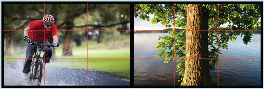
Figure 4.28
Using the rule of thirds as a guide, how would you critique the composition of these two photographs?
Continuation
The law of continuation suggests our brains tend to process what we see as continuing along lines that are predictable and free of obstacles and that don’t abruptly change direction. So in a design with overlapping curves, our brains interpret each vector (line) as a smooth curve; we don’t see each as changing direction at their intersection. More precisely, vectors are directional forces within the frame that guide the eye from one point to another. Three types of vectors occur most often in visual space: graphic vectors, index vectors, and motion vectors (see Figure 4.29).
Graphic vectors are created by strategically placing stationary line elements within the frame. The lines can be real or implied through the placement of other visual elements. They focus the viewer’s gaze in a specific direction or guide the viewer along a visual path. In photography, these pathways are called leading lines because they “lead” the eyes from point to point or directly to the primary focal point of the image. A barbed wire fence stretching across a landscape, the line created by the water’s edge at the beach, and a row of people waiting for a movie are all examples of graphic vectors.
Index vectors are created by placing objects that conspicuously point in a specific direction. A crowd gazing upward, a road sign with a large arrow pointing to the right, and a hitchhiker with his hand extended are visual examples of index vectors.
Motion vectors are created by the real or apparent movement of subjects within the frame. Motion connotes a sense of directionality. We can usually tell which direction a person or object is moving by observing which way it is facing. Although best demonstrated with time-based media, motion vectors can be implied in a still image or graphic. The addition of a motion blur or trailing edge can intensify the perception of speed and directionality.
Figure-Ground

Figure 4.29
Graphic, index, and motion vectors work together with the law of continuation to guide the viewer’s eyes from one point to another within the frame.
In Gestalt psychology an element that appears in the foreground of our perceptual field is called a figure, whereas everything behind it is the ground. In nature, the phenomenon of depth perception enables us to distinguish between figure and ground (see Figure 4.30). In two-dimensional space, we must rely on visual cues within the frame to provide a sense of order along the z-axis. You need to remember that the viewer wants to make sense of what he or she is seeing. Our brain is wired to organize the visual field into meaningful figure-ground relationships. The degree to which the viewer can do so effectively attests to the skill of the designer or photographer. Providing good contrast between the foreground and background elements in the frame is the best way to keep viewers from being perceptually confused or overwhelmed.

Figure 4.30
Some optical illusions work by playing with the figure-ground relationship. What do you see in this image? Relax your focus and look again. How about now?
Psychological Closure
The final perceptual force we will look at is psychological closure. One of the most powerful abilities we have is to mentally complete a visual pattern or impression when only partial information is provided. Psychological closure is the human equivalent of connecting the dots or filling in the gaps. For this reason, objects within the frame can extend past the boundary of the frame. As long as enough visual information is provided, an individual can complete a picture in her head, thus maintaining a stable perceptual experience (see Figure 4.31).
The principle of psychological closure is used in visual design all the time. Literal interpretations of words and symbols can be replaced with partial impressions or abstract variations of larger elements. With psychological closure, the brain seeks to create meaningful order out of visual chaos. As long as enough visual cues are provided, the brain will kick in to form a complete mental impression. The extra measure of sensory activity can give us a deeper and more satisfying experience because we are more cognitively engaged with the visual stimuli.

Figure 4.31
Kanizsa’s triangle illustrates the principle of closure to suggest a second triangle overlaying the first.
Chapter Summary
Content is still king, but if we deliver content without good design, users will not know where to focus, will not make the connections we intend, will not be engaged, and may even misunderstand the message. The elements and principles of design are a designer’s foundation. They give you the tools to understand aesthetics and preferences and to both make and defend sound choices. Rarely do we work solely for our own pleasure. We often work in teams, and we work for clients who hire us for our expertise. Occasionally, others make suggestions that go against our better judgment. Being able to explain why an idea won’t work well may be the difference between creating an outstanding graphic or video and getting stuck creating something that will fall flat with its audience.
Ultimately, we create for our users, the people who will visit our websites, see our photos, watch our podcasts, and use our kiosks. Designers strive to make products usable and engaging. Good design makes users’ experiences positive and rewarding. Bad design serves no one.
A foundation in design elements and principles inspires not only good practice but also creativity. Return to the foundation when you feel you are in a creative rut. Do you need to add energy to a graphic? Perhaps you can add dynamic lines. Are your action photographs missing the action? A canted angle might help. Does your video need to evoke other senses? Consider lighting your subject so it has more texture, and add appropriate sounds. Are you at a loss for how to create a new logo? The principle of closure may suggest a creative solution. The combinations are limitless, but be judicious: don’t emphasize too much. If you do, you might emphasize nothing at all, leaving your users to wonder what your secret ingredient was supposed to be.