
Key Terms
Body Copy
Border
Box Model
Cell
Chunking
Column
F-Layout
Fixed Layout
Floating Graphic
Fluid Layout
Golden Ratio
Grid System
Gutenberg Diagram
Heading
Headline
Inline Graphic
Layout
Margin
Modular Grid
Multicolumn Grid
Padding
Page
Page Template
Row
Sidebar
Single-Column Grid
Splash Page
Static Page
Style Sheet
Table
Visual Hierarchy
Z-layout
The more personal computer displays become like lightweight books, the more people are going to feel comfortable reading from them. A PC that you can open up and physically handle easily, that has the right kind of battery and display, will give the same visual impression as a page.
—John Warnock, inventor of PostScript and the founder of Adobe Systems (Wired.com, 1994)
Chapter Highlights
This chapter examines:
- ■ Strategies for the effective placement of visual content within the page
- ■ The influence of visual hierarchy on viewing behavior
- ■ Use of the grid system for managing page and screen space
- ■ Commonly used layouts in multimedia page design
- ■ Design tips when using page templates and style sheets
Organizing Content on a Page
Page layout is the area of graphic design that refers to the visual arrangement of text and images on a page. It is essentially the role of visual information management, using the general principles of design and typography to bring order and structure to a page. The term originated in the printing industry as the specialized craft of designing the physical pages in books, magazines, and newspapers. In publishing houses, agencies, and newsrooms, it’s the job of authors, reporters, copywriters, editors, and the like to generate the text (or copy) for visual pages, while photographers, illustrators, and graphic designers produce the images. It’s the job of a layout artist or page compositor to combine the various elements of visual information (text and graphics) within the page, creating a presentation that is both pleasing to the eye and easy to consume.
Programs like QuarkXPress and Adobe InDesign are professional software tools used in the desktop publishing industry for the prepress layout and design of printed pages. In multimedia, the concept of page layout has migrated metaphorically from the kinds of physical pages you can touch and turn to digital pages that appear on a computer screen or monitor. The page metaphor was extended into the field of web design but can also be more broadly applied to any type of screen space where visual information must be arranged and ordered for presentation. In multimedia work, the principles of page design can be applied to the creation of a DVD menu screen, a full-screen title graphic in a television commercial, or the welcome screen of a micro app running on a tablet computer or smartphone. Anytime you combine visual content within the fixed or fluid space of a digital page or screen, you are engaging in the activity of page design (see Figure 5.1).
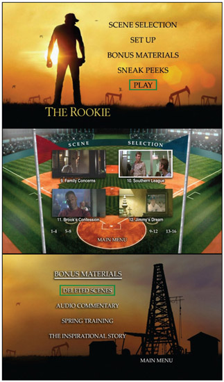
Figure 5.1
The DVD menu system for the Walt Disney film The Rookie includes a main menu, a scene selection submenu, and a bonus materials submenu. The visual layout of each menu is the product of multimedia page design, where diverse visual elements such as video, graphics, text, and animation are arranged within the screen space of a 16-by-9 television frame.
The Gutenberg Diagram
In the early days of printing, page layouts were densely populated with text. While early printing systems, like the Gutenberg press, could easily mass-produce the transfer of letterforms on paper, they were not equipped to reproduce artwork, illustrations, or other visual elements that are commonly used today to break up the heavy flow of printed text. If artwork was included, it was drawn by hand after the pages were printed.
The Gutenberg diagram is a primitive eye-tracking model that is used to show how readers scan through a page comprised entirely of evenly distributed text (see Figure 5.2). The Gutenberg diagram divides a page across its horizontal and vertical centers to produce four equal quadrants. A reader’s interaction with the text begins in the top left quadrant on the page. This is the dominant section of the page known as the primary optical area. Next, they move across each line of text, from left to right, in a series of horizontal sweeps or scans referred to as the axis of orientation.

Figure 5.2
The Gutenberg diagram illustrates the general pattern the eyes follow as they scan visual information within a page. It applies primarily to text-dominant layouts where there is little to no visual hierarchy, such as a page from a novel containing only printed words and sentences.
Metaphorically, reading exerts a gravitational force on the user that continually pushes his or her gaze downward and to the right. As a result, the eye is persistently led along a diagonal path from the primary optical area in the top left part of the page to the terminal area located in the bottom right. The strong fallow area (in the upper right) and the weak fallow area (in the lower left) lie beyond this path and, as such, are demoted in terms of their visual influence. A reader typically pays less attention to content that’s placed in these regions of the page.
Breaking Out of the Box
The layout of a page directly affects the way a user scans its contents. As page designs have shifted from print to digital forms, and from heavy text-based layouts to visually dynamic designs with rich media content, users have adopted more sophisticated methods for scanning pages. Two familiar scanning methods are often talked about with regard to how users interact with web pages online.
F-Layout
The F-layout is one of the most common page layouts on the Web. As the name suggests, the reader’s gaze is directed though the page in a pattern that resembles the letter F (see Figure 5.3). As with most layouts, this one encourages the user to begin reading in the top left part of the page. He then proceeds to make a full scan from left to right across the first row of visual information. Next, the user makes a partial scan of the second row. This pass rarely extends to the end of the line or column. Each subsequent row of information is scanned in short bursts from left to right as the user settles into a normal rhythm and pattern for processing the main content on the page.
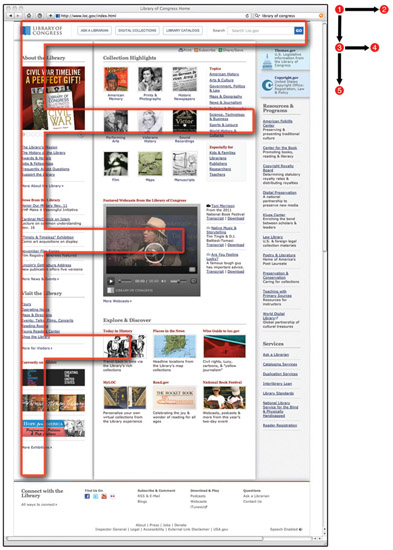
Figure 5.3
This version of the Library of Congress homepage features the classic F-layout design. A prominent vertical sidebar along the left edge of the page serves as a visual anchor for the eyes as the user scans from left to right in progressively shorter bursts from top to bottom.
Humans are creatures of habit. For this reason, the F-pattern is an all-too-familiar format for people who spend any amount of time in front of a computer surfing the Web. We have grown accustomed to the most important information being placed along the top edge of the page, usually in the form of an eye-catching mast-head or banner graphic. The masthead provides important visual cues about the contents of the page. It can be scanned quickly and will often influence a user’s next step. Will he continue scanning or bail from the page? The second row of a web page often contains navigational prompts like menu buttons or hyperlinks. If the first scan did its job by hooking the user’s attention, then the second scan will take on more meaning as he seeks to understand how the page and site contents are organized. A sidebar along the left edge of a page often comes into play on the third scan. It pulls the user’s gaze toward the left edge of the document window, directing him downward into a series of shorter bursts of scanning activity. Research shows that conforming layouts to the F-pattern will enhance the usability of the page, making it easier for users to glean information in an expedient manner.
Z-Layout

Figure 5.4
The Smithsonian homepage pictured here guides the user’s eyes through the page along a Z-shaped path. Can you locate other examples of the F-layout and Z-layout in action?
A less popular format, the Z-layout is a variation of the Gutenberg diagram (see Figure 5.4). Scanning begins with a full visual sweep across the top row of the page. The second scan flows diagonally through the center of the page in a downward movement toward the bottom left-hand corner. The final scan is a horizontal sweep across the bottom of the page. Important visual elements should be placed along the path of the Z. While the Z-layout suggests a rigid zigzag path, the chiseled angles of the Z-pattern can be softened to produce a more organic S-curve feel. The Z-layout works best when a large visual element or content region (such as a single photo or visual montage) is placed in the center of the page, between two rows of linear information. It is a simple layout to create and can be used effectively for pages containing only a handful of key elements that need to be communicated quickly without a lot of visual clutter.
Great Ideas
Visual Hierarchy
The term visual hierarchy refers to the perceived ordering of content within a page by the reader. A page that consists only of text that is equally spaced and uniform in size is perceptually flat (see Figure 5.5, left). In such a design, every word carries the same weight, and therefore nothing rises to the forefront of the reader’s perception. However, when certain words or phrases are set apart stylistically using the principles of design covered in chapter 4, “Visual Communication,” such as alignment, color, emphasis, proportion, and so on, they will rise above the background noise of the page, vying for attention (see Figure 5.5, right).

Figure 5.5
A thoughtfully constructed visual hierarchy can improve the order and flow of content on a multimedia page.
Chunking Body Copy
One of the easiest ways to begin establishing visual hierarchy in a page is to subdivide large blocks of body copy into smaller segments or chunks. Body copy is the main text of a published document or advertisement, and it is often the most plentiful source of content on a page. Chunking is a practice that involves the visual consolidation of related sentences or ideas into small blocks of information that can be quickly and easily digested. Paragraphs are a common chunking tool, as are lists, callouts, and text boxes. From a consumer’s point of view, chunking is like eating a steak. The meat is easier to ingest after it is cut into smaller bite-sized pieces. Placing too much text on the screen at a time, or within a specific region of the page, can overwhelm the senses and lead to eye fatigue. A reader can quickly tire out or lose interest. Chunking is highly recommended when writing copy for multimedia consumption since reading on a low-resolution digital display is more difficult than reading the same text in a high-resolution print publication. Chunking reduces the visual density of the text on a page. It transforms unwieldy blocks of strung-together words and sentences into manageable parcels of visual information.
Headings
The next thing you can do to bring order and structure to the presentation of text is to add section headings and subheadings. A heading is a short descriptive title or subtitle used to mark the beginning of a paragraph or content area. Magazines and newspapers use headings routinely to set stories apart and to provide readers with a brief informative prompt as they scan the page for what interests them most. In a newspaper, the most important story of the day is given visual prominence by placing it on the front page, above the fold, and under a special type of heading called the headline. The headline carries the biggest and boldest font style on the page. Less significant stories are attached to progressively smaller headings or subheadings.
In web page design, HTML (Hypertext Markup Language) specifies six levels of headings, identified with the tags <h1>, <h2>, <h3>, <h4>, <h5>, and <h6> (see Figure 5.6). Heading 1 is the largest and is often used for the masthead (master heading) to identify the title of a page. Sectional content areas often begin with heading 2 or heading 3. Subsections within each area can be further delineated with headings 4 to 6. To distinguish them from body copy, headings are set in a larger font and weight, typically from twenty-four point down to ten point in steadily declining increments. However, headings can be customized to any size. They can also be assigned a custom typeface, color, or border (see Figure 5.7). It’s important to keep heading styles consistent within the page and across a series of connected pages. For example, heading 1 should look the same on page one as it does when reused on pages two and three; doing so reinforces the design principle of unity.
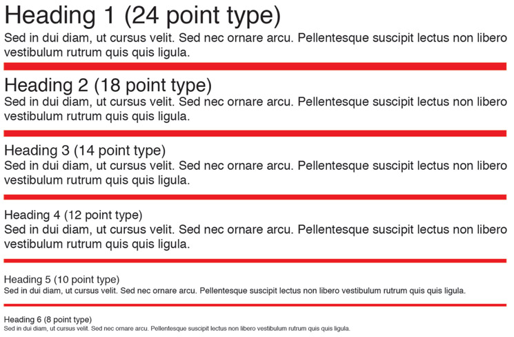
Figure 5.6
HTML specifies six levels of headings with default font sizes that get progressively smaller from first to last.
Figure 5.7
Headings are often custom designed as part of the overall theme of a page layout.
The principles of alignment, proximity, and repetition are critical ingredients for creating a meaningful and aesthetically pleasing visual hierarchy.
The Golden Ratio
The Golden Ratio is a mathematical construct that has been widely used for centuries determining the proportions of a visual space. It can be seen in architecture, painting, printing, and photography and more recently in new media and the Web. Also known as the Divine Proportion, the ratio is defined by the numerical constant Phi, or 1.61803. As a ratio, it suggests that the optimum visual space is a rectangle whose height is slightly longer than one and a half times its width (see Figure 5.8). The vast majority of books printed prior to 1800 conformed to the Golden Ratio, which served for centuries as a near universal standard for page proportions. Whether horizontal or vertical in orientation, humans tend to favor visual pages and screens that closely mirror the Golden Ratio. For this reason, it is still embraced by many today, albeit more loosely. The Golden Ratio has greatly influenced the design of page and screen spaces used today in multimedia design.

Figure 5.8
The spiral form of a nautilus shell closely conforms to Phi, the golden number.
Bringing Order to Chaos
Imagine for a moment that you live in a house with only four walls. You step through the front door, and because there are no visual obstructions, you are able to see the entire layout of the house. There’s no living room, no bedrooms, no bathroom, kitchen, closets, or garage—just one large area of uninterrupted space. A house like this has no internally defined spaces that can be arranged or decorated independently. Making a change to one area of the house affects the entire house because, spatially, everything is connected. Very few architects would design a house like this, and if given a choice, most people would not want to live in one. The walls and rooms of a house are functional features that create order and meaning for its occupants. Without them, a home would look empty and bare or constantly cluttered and disorganized.
Figure 5.9
Staring at a blank page is a bit like walking into a large empty room. Where to start? For a designer, the first step is to subdivide the unitary space of a blank page or screen into smaller editable regions that can be individually arranged and populated with content.
A blank page is very much like a house without walls. It is an empty two-dimensional shell with fixed boundaries on four sides (see Figure 5.9). One of the first things a page designer must do is break up the unitary real estate of an empty page into modular regions that can be independently managed and populated with content. As you become acquainted with some of the different page design programs and workflows, you will see that each one uses slightly different terminology and techniques for breaking up the page into modular regions. We can’t possibly go into all of the specific methods and applications here but will instead deal with some general concepts and provide a few examples.
The Grid System
The typographic grid system is a popular conceptual tool for breaking up pages into smaller editable parts. While many variations of the grid system have been formulated, all are based on the fundamental idea of using horizontal and vertical lines for subdividing a page into modular units of space (see Figure 5.10).

Figure 5.10
The design of a new web page often begins with simple sketches like this one showing how the screen space will be broken apart into various content regions.
Graph Paper Grid System
While designed primarily for use in engineering and mathematics, graph paper is a handy visual aid you can use for creating mockups of multimedia pages. Graph paper is overlaid with thin ruled lines that are evenly spaced at set distances across the width and length of the page. In the United States, an off-the-shelf brand of graph paper typically comes printed with four gridlines per inch. This grid structure produces a page that is covered edge-to-edge with an array of one-quarter-inch square blocks.
The first step in creating a mockup on graph paper is specifying the grid scale and unit of measurement. A scale is required for conforming the paper grid to the actual dimensions of a digital page as defined in pixels (see Figure 5.11). For example, you may decide that each square on the graph paper represents an area of 400 pixels (20 px × 20 px). Using this scale, the length of a 100-pixel line can be represented on graph paper as a line 5 block units wide (5 px × 20 px). Likewise, a 200-pixel-wide column can be drawn on the page using a grid width of 10 block units. White space separating visual elements on the page can be visualized on the grid as a margin of 20 pixels, or one block unit. In this example, the graph paper serves as a conceptual framework, on top of which a designer can specify the size and shape of columns and boxes used for holding visual information. Used correctly, a grid can provide a uniform page structure where elements are consistently aligned and sized in proportion to the page as a whole and to other elements within the shared space of the page.

Figure 5.11
Graph paper can be used to break up a page into a variety of subspaces.
The Anatomy of a Grid In his seminal work on the subject, Making and Breaking the Grid, author Timothy Samara notes that “a grid consists of a distinct set of alignment-based relationships that act as guides for distributing elements across a format. Every grid contains the same basic parts, no matter how complex the grid becomes. Each part fulfills a specific function; the parts can be combined as needed, or omitted from the overall structure at the designer’s discretion, depending on how they interpret the informational requirements of the material.”1
The Parts of a Grid (see Figure 5.12)
- ■ Columns: A column is a vertically oriented space that is typically taller than it is wide. Columns are often used as holding areas for continuous running text and visual information.
- ■ Rows: A row breaks up space into horizontal strips that flow from left to right. Rows establish linear flowlines that can help guide the reader’s eye across a design.
- ■ Modules: A module is a uniform square unit of space created by the intersection of perpendicular lines in a grid. Independently, modules are the smallest spatial unit in a grid.
- ■ Spatial zones: A spatial zone is formed when two or more modules are grouped together. Spatial zones can be large or small, square or rectangular in shape. There are a seemingly endless number of ways that modules can be combined to form spatial zones of various shapes and sizes.
- ■ Margins: A margin is the negative space between modules and the outside edges of a page or spatial zone.

Figure 5.12
The typographic grid.
Common Grid Structures
The starting point for designing a new layout often begins with defining the grid structure of the page. However, for this process to be successful, the designer needs to have some idea of the scope, size, and proportionality of the content that will fill the page. Once a grid is created and populated with content, it cannot be altered without affecting the arrangement of the visual information within the page. Thus it is very important to have a vision and plan on the front end for how a page will look when completed. The size of text and graphics needs to be established early on to ensure the columns and spatial zones formed by the grid are made sufficiently large or small enough to hold the intended contents. Proper planning is essential! A prudent designer will rarely embark on creating a grid without giving long and careful forethought to the intended structure and contents of the page. With this word of caution established, let’s take a look at three of the most common grid structures used in page design: 1) the single-column grid, 2) the multicolumn grid, and 3) the modular grid (see Figure 5.13).

Figure 5.13
By altering the grid structure, a design space can be subdivided in a number of ways.
Single-Column Grid
The simplest grid system features a single column of visual information bordered by margins on either side of the page. Also called the manuscript grid, this layout is commonly used for document processing and book publishing, where the content consists mostly of continuous text and few images. It is the simplest grid to design. In fact, many programs, such as word processors, use the single-column grid as a default starting point when a new document is created. Because single-column formats are most often associated with high-density text-based layouts, they are also most susceptible to the effects of the Gutenberg diagram.
Multicolumn Grid
A multicolumn grid breaks up the page with vertical divisions from left to right, providing greater flexibility for integrating text and graphics within the page. Multi-column grids come in many varieties, with two- and three-column formats being the most popular. Establishing a visual hierarchy is made easier in a multicolumn grid because columns can be assigned different roles for handling different kinds of content. For example, on a web page, a narrow sidebar column might be used for small snippets of visual information such as links, menu buttons, and short chunks of text that can be quickly scanned by the user. A wider column might contain running text for displaying the main content of a page. Columns can be equal in width or different. They can be independent of other columns on the page, or connected, allowing text and images to spill over from the end of one column into the next. With a multicolumn grid, text no longer needs to flow in an uninterrupted stream of continuous lines from the top of the page to the bottom. Columns can contain negative space, headings, and illustrations, allowing text to stop and resume less predictably at various points in the page. All things being equal, reading text on a computer monitor is improved when it is formatted into columns, as opposed to running across the full width of the screen. Doing so changes the start and stop points in a line, reducing the distance the eye has to travel back and forth with each scan. For smaller screens, like those on smartphones and book readers, single-column layouts tend to be more common.
Tech Talk
Inline and Floating Graphics An inline graphic is an image or illustration that is inserted into a text-based column or spatial area. By default, an inline graphic behaves just like a text character. It dissects the line at the point of insertion, pushing adjacent text to the right and thereby producing a gap in the line for it to reside in. The size of the gap depends on the width of the image. The bottom of an inline graphic aligns with the baseline of the text it is joined to. If the height of an inline graphic is the same height as the line, then the layout of the paragraph or column will be largely unaffected. However, graphics often exceed the height of the lines they are combined with. When this happens, the line height (or leading) will automatically expand to match the height of the inline image. This increases the white space around the image and can cause unintended consequences affecting the layout of the page.
To fix this problem, many layout programs, including the Cascading Style Sheets (CSS) standard in web page design, offer a feature called image floating. When an inline graphic is floated, the surrounding text will wrap around it to the left and/or the right, creating a more pleasing interaction between the two. Floating a graphic to the left locks it to the left edge of the column, causing text to wrap around it to the right. Floating it to the right yields the opposite effect. Floating a graphic in the center causes text to wrap around it evenly on either side. After an image is floated, it is generally a good idea to add padding between the image, the text, and column edges. Padding adds negative space and breathing room to the newly formed union of image and text (see Figure 5.14).

Figure 5.14
Left: An inline photograph pushes the text downward, resulting in an undesirable page layout with too much white space. Right: A more pleasing visual layout is achieved when the photograph is “floated,” forcing the text to wrap around it on the opposite side.
Modular Grid

Figure 5.15
Observe how headings and a modular grid work together to break up the page into subdivisions and create a visual hierarchy in this mockup of a traditional newspaper layout.
Modular grids include consistently spaced vertical divisions from left to right as well as horizontal divisions from top to bottom (see Figure 5.15). With this grid structure, designers are free to create spatial zones, modular design spaces that can span across the width of multiple columns. Spatial zones add horizontal flowlines to a page by subdividing column spaces into rows. With spatial zones, designers can break free from a purely linear flow of content in either direction. Modular grids are the most complex and difficult to construct. However, they also tend to be the most visually dynamic and interesting to work with.
Tables
A table is a rectangular grid consisting of editable regions called cells. Similar to a typographic grid system, cells are formed by the intersection of columns and rows. However, this is where the similarity ends. A typographic grid is purely a conceptual framework underlying the structure of a page. It is a fixed foundation of modularity that will not change as the page structure on top of it is formed and modified. A table, on the other hand, is a physical part of the page. It is an algorithmic component created and modified from within the page-authoring program. A table is a fluid structure that expands and contracts to accommodate the placement of content within its cells.
Tables can be subdivided into row groups and column groups. Prior to the development of Cascading Style Sheets (CSS), a topic discussed in chapter 7, “Web Design,” tables were routinely used for structurally dividing the area of a web page. While the World Wide Web Consortium (W3C) no longer encourages this practice, tables can still be used “to arrange data—text, preformatted text, images, links, forms, form fields, other tables, etc.—into rows and columns of cells” within a page or regional subsection.2
Defining Tables
A table is defined by how many columns, rows, and cells it contains. A table with one column and one row (1 × 1) produces a single cell or region for storing visual information. A table with three columns and four rows (3 × 4) produces 12 cells. The more columns and rows in the table matrix, the more cells you have to work with.
Splitting and Merging Cells
Table 5.1 A Simple 2 × 3 Table with Two Columns and Three Rows
| Cell #1 | Cell #2 |
| Cell #3 | Cell #4 |
| Cell #5 | Cell #6 |
Table cells can be split or merged to produce highly complex table structures. Splitting is the process of dividing a cell into multiple rows and/or columns. Merging is the process of consolidating multiple cells back into a single cell structure. For example, here are the steps you would go through for transforming the simple two-by-three table pictured in Table 5.1 into the more elaborate structure shown in Table 5.2.
- Step 1: Begin by inserting a 2 × 3 table into the page.
- Step 2: Split cell #1 (first column, first row) into four rows.
- Step 3: Split cell #2 (second column, first row) into two columns.
- Step 4: Merge cells #3 and #4 (second row).
- Step 5: Merge cells #5 and #6 (third row).
- Step 6: Split the newly merged cell created in Step 5 into three columns.
As you can see, the contents of each cell can be independently formatted. Cells 1–4 feature standard-issue black text on a white background. In cell 5, white text is inverted on a black background. Text alignment, styles, padding, and borders can be customized at the tabular or cellular level, creating many possibilities for visual organization. By default, table borders are turned on. Keeping table borders visible in a page layout can draw unwanted attention to the underlying structure of the grid. Turning off borders masks the grid and often helps reduce distractions caused by overt visible divisions. Table 5.3 shows a simple three-column layout using a three-by-two table structure.
Table 5.2 A 10-Cell Grid System Created by Splitting and Merging Cells within a 2 × 3 Table
| 1 Align left | 5 | 6 |
| 2 Align center | ||
| 3 Align right | ||
| 4 The height of this cell automatically increases as more content is placed into the cell. Lorem ipsum dolor sit amet, consectetur adipiscing elit. Aenean eu tortor sit amet libero placerat molestie at sit amet metus. Ut malesuada dolor sed leo imperdiet feugiat. | ||
| 7 | ||
| 8 | 9 | 10 |
Table 5.3 A 3 × 2 Table is Used to Form a Simple Three-Column Layout
| Step 1 | Step 2 | Step 3 |
| Lorem ipsum dolor sit amet, consectetuer adipiscing elit. Aenean commodo ligula eget dolor. Aenean massa. Cum sociis natoque penatibus et magnis dis parturient montes, nascetur ridiculus mus. Donec quam felis, ultricies nec, pellentesque eu, pretium quis, sem. Nulla consequat massa quis enim. | Donec pede justo, fringilla vel, aliquet nec, vulputate eget, arcu. In enim justo, rhoncus ut, imperdiet a, venenatis vitae, justo. Nullam dictum felis eu pede mollis pretium. Integer tincidunt. Cras dapibus. Vivamus elementum semper nisi. Aenean vulputate eleifend tellus. Aenean leo ligula, porttitor eu, consequat vitae, eleifend ac, enim. | Aliquam lorem ante, dapibus in, viverra quis, feugiat a, tellus. Phasellus viverra nulla ut metus varius laoreet. Aenean imperdiet. Curabitur ullamcorper ultricies nisi. Nam eget dui. Etiam rhoncus. Maecenas tempus, tellus eget condimentum rhoncus, sem quam semper libero, sit amet adipiscing sem neque sed ipsum. |
The CSS Box Model The CSS box model was created to give web designers greater control over the presentation of visual elements in a page (see Figure 5.16). In CSS, whenever a text or image element is added to the page, it is placed within a definable spatial area or box. The box has property values that can be adjusted to alter the padding, borders, and margins around the element. Padding refers to the amount of white space between the content’s outer edge and its border. With padding set to 0, the content edge will be aligned automatically with the border. The border property can be set to thin, medium, or thick, or to any specific width. The border is typically a solid line, but other line styles can be specified (dotted, dashed, groove, etc.). The margin edge surrounds the box, and its width determines how much white space is placed between the outside of the box and adjacent elements within the page or spatial zone. A CSS box value can be applied uniformly to all four sides of an element or individually to one or more sides at a time. For example, to insert a horizontal line beneath a box element, such as a heading or caption, the border property can be set to “medium” for the bottom edge of the box and to 0 for the left, right, and top edges.

Figure 5.16
The CSS box model.
Page Templates
Unless you are an experienced graphic designer or page compositor, you probably lack the skills needed to design complex page layouts from scratch. Fortunately, many programs come with layout templates or style sheets that can be used for forming the grid system of a page. A page template provides the structural divisions, color scheme, and general formatting for a page layout and its contents (see Figure 5.17 and Figure 5.18). The content regions of the template are initially filled with placeholder text and images. Placeholder material will eventually be swapped out with the template user’s actual content. Nonsensical Latin sentences and paragraphs are often used for placeholder text (also called filler or dummy text).
With templates, you often get what you pay for. The templates included with your software, or those downloaded for free from the Internet, are often not as well designed or sophisticated as the ones you can get from commercial design companies. While professionals tend to shy away from using templates in commercial

Figure 5.17
A web page template included with Adobe Fireworks CS5.
Source: Adobe product screenshot reprinted with permission from Adobe Systems Incorporated.
work, sometimes there just isn’t enough time or client money to provide a custom design from start to finish. If you have to use a template, spend some time researching your options. Commercial templates are not too terribly expensive and can offer you many more choices and options. Also, resist the temptation to blindly accept the color scheme and formatting included in the template by default. Most templates give you some leeway in customizing the theme and contents of the page. Take advantage of this by pushing the template as far as you can. Remember: if you found the template, then someone else likely found it as well. To make your version of the template stand out against the work of others, you will need to take time to reshape it and rework it to fit your own design preferences.

Figure 5.18
The template shown in Figure 5.17 was transformed by replacing the placeholder contents (images and text) with custom assets designed for the project.
Static and Dynamic Pages
A static page delivers the same page layout and contents to every user viewing the page. It can also refer to a page whose content is rarely, if ever, updated. Many small businesses and organizations want a Web presence but do not have the financial resources or personnel to keep a website up-to-date or make changes to it on a regular basis. For some, a site consisting of static pages with generic undated content is the only option they have. A splash page is a normally static web page that briefly appears before a user is given access to the homepage. It is sometimes used as a visual placeholder while the main page is being loaded. The same concept is used in game design and DVD authoring. Commercial DVDs typically force the viewer to watch a full-screen copyright notice before granting them access to the main menu. Likewise, a series of splash screens is a common prelude to entering the main interface or menu screen of a gaming program. And who hasn’t seen the all-too-familiar Microsoft Windows and Apple icons flash on screen when booting up a computer or mobile device? As simple as they sometimes are, someone has to be paid to design them. These are just a few examples of how static pages are used in multimedia to deliver basic information to users, the same way, every time.
A dynamic page is one whose content changes over time or with each individual viewing experience. Dynamic pages can be changed manually through input from the author or end user. In the latter case, a web-delivered weather forecast can be customized to the individual preferences of users by prompting them to enter information about their location (city, state, or postal code). With commercial sites, dynamic pages are usually refreshed automatically via the help of a content management system (CMS). A CMS is a database system used to store and manage the contents of dynamic web pages and websites. In a system like this, content resides in the database and not directly on the page. Dynamic HTML pages function as the layout engine for rendering CMS content on screen. While the content of a dynamic page changes often, the layout of the page remains relatively constant.
People return to their favorite website expecting the content of the page to be refreshed since their last viewing. Facebook is a good example. As a social media site, Facebook uses CMS technologies to deliver dynamic page content to viewers around the world. The vast majority of the dynamic content (posts, photos, videos, etc.) is user generated. However, the advertisements are also dynamic and, typically, customized to the gender, age, and profile of the user.
Fixed Layouts
In the printing world, pages have a predetermined fixed width and height. For example, a printed book, newspaper, or magazine has physical dimensions that can be described by absolute units of measurement (inches, centimeters, picas, etc.). Multimedia pages can be fixed as well, but given the proliferation of so many different kinds of multiresolution monitors, browsers, platforms, and so on, it’s virtually impossible to design a page layout that will look the same on every device.
The homepage of a website often has a fixed width and height in order to ensure the entire page is viewable within the desktop space of the average consumer monitor. In 2011, nearly 30% of all websites were designed with a fixed pixel resolution of 1280 × 1024 (14.8%) or 1280 × 800 (14.4%).3 Since then, the average resolution of web pages has increased steadily as computer displays have grown larger and increased in pixel density. Today, the majority of users browse the Web using computers with much higher screen resolutions (1920 × 1080 and up). Once the user moves past the homepage, it is more common to see page layouts that have a fixed width and a fluid height. The conventional wisdom in web design is never to force the user to scroll horizontally. However, allowing content to run down the page vertically, below the bottom edge of the browser window, is acceptable and quite common. A fixed-width layout is designed to expand vertically down the page as content is added.
The HD video standard accommodates a variety of fixed resolutions. For this reason, full-screen television graphics must conform to a fixed width and height. Fortunately, the choices are few, and most video systems are designed to scale standard HD screen formats to the output resolution of any HD television monitor or projector. As an example, the screen layout for a Blu-ray DVD menu should be set to a fixed width and height of 1920 × 1080 pixels, the most common display format for HD video.
Fluid Layouts
When a web page is defined by pixels, the size of the page will vary with the resolution of the client monitor used to view the page. If the client is using a small monitor such as a tablet or smartphone device, or if the display is set to a particularly low resolution such as 800 × 600, then any page layout that exceeds this size (e.g., 1280 × 1024) will spill off the screen, forcing the client to scroll horizontally. A fluid (or liquid) layout fixes this potential dilemma by using percentages instead of pixels to define page size. When a fluid layout is used, the client’s browser will scale the page to fit within the document window at whatever percentage is specified. It is resolution independent. For example, a page that’s set to a width of 100% will fit edge to edge within the client’s browser window. With the width set to 80%, the page will shrink, leaving 20% of padding around the outer edge. Fluid layouts can be tricky to work with, but if used correctly, they can lead to a more consistent viewing experience for the client across computer platforms and devices. With fluid layouts, the main content of the page will appear “above the fold” as intended and horizontal scroll bars will be suppressed.
In recent years, responsive web design (a topic covered in Chapter 6) has emerged as the ultimate fluid grid concept and layout solution. Responsive websites automatically adapt their layouts to fit the screen space of the user’s device, covering the full gamut from large desktop displays to smartphones.
Chapter Summary
Page design is an important part of the multimedia design process. While web pages tend to garner the lion’s share of attention in the field of multimedia design, the general concepts of page design presented in this chapter extend much further. They apply to any activity related to the arrangement of visual elements within the shared space of a multimedia page or digital screen.
Notes
1 Samara, T. (2002). Making and breaking the grid. Beverly, MA: Rockport Publishers.
2 W3C. (2011). W3C recommendations: Tables in HTML documents. Retrieved from http://www.w3.org/TR/html4/struct/tables.html
3 W3Schools. (2011). Higher screen resolutions. Retrieved from http://www.w3schools.com/browsers/browsers_resolution_higher.asp