CHAPTER 14
USING COMPONENTS
Components can be though of as premade, purpose-built mini-applications, or widgets of a sort. They come in all shapes and sizes. Some are made by Adobe and are included with Flash, others are made by the Flash community or other companies (third parties), and still others might possibly come from you after reading this chapter! In short, components give you, the Flash author, a quick way of including complex functionality in your applications quickly and consistently.
In this chapter we're going to talk about
- Compiled vs. FLA components
- Flash UI components
- Adding components to your applications
- Configuring components
- Listening to components
Understanding components
In the context of Flash, a component is a movie clip or compiled clip that the Flash developer can drag out of the Components panel into an FLA file or add to his or her application using ActionScript. Components expose parameters that can be set in the Parameters tab of the Property inspector or in the Component inspector. This lets nondeveloper types quickly and easily implement the component (whatever it may be) without having to know any ActionScript!
SWC-based components
SWC-based components are made of an FLA file and an ActionScript class file that have been compiled and exported together as a SWC. When you put a SWC-based component onto your stage, a compiled clip that cannot be edited is added to your library.
An advantage to using a SWC-based component is that it allows you to save some time and avoid recompiling symbols and code that will not change.
The downside, of course, is that the symbols and code can't change, so if you want to change anything that falls outside of the parameters available in the Component inspector, you're out of luck.
FLA-based components
FLA-based components are FLA files with built-in skins that you can access for editing by double-clicking such a component on the stage. When you put an FLA-based component onto your stage, all of the symbols that make up the component are added to your library and are available for you to edit.
The advantage to using FLA-based components is that you can easily manipulate the visual appearance of the component within the Flash environment. The downside might be that if you are using this type of component, all of your code and assets will be out there for everyone to see.
The component architecture reuses components by combining them with others to make more complex components. This includes not only visual assets, but also the ActionScript that the components use. This reuse results in a smaller file footprint when using many types of components in your application.
Tour de Components
Now that you have a little background info on components, let's have a look at the various groups of components included with Flash CS4. If you are targeting the Flash Player using AS 2, the components available to you will be different from those you would see if you are targeting the Flash Player using AS 3.
Because this book is focused primarily on ActionScript 3.0, we will introduce you to each of the AS 3 components and what its main purpose is.
You will find the components in the aptly named Components panel, shown here in Figure 14-1. You can open the Components panel by selecting Window 
Components from the application menu or by pressing Ctrl+F7 (or Cmd+F7 on a Mac).
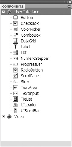
Figure 14-1. The User Interface group of components
User interface components
The user interface components shown in Figure 14-1 include the most common controls required when creating an application that deals with standard forms and data, such as text fields for entering data and buttons that can be used to let the user tell an application to submit or retrieve data.
There are many options for each component that can be configured using either the Components inspector or Property inspector, or through ActionScript. While we can't cover all these options in one chapter, we'll show you a few examples in the section of this chapter called "Configuring components in Flash."
The components that make up the User Interface group include the following:
Button: Represents an element a user can press that initiates an action. While it can display a label or tooltip, it isn't used for presenting data.CheckBox: Represents a square that the user "checks" to indicatetrue. Components of this type can be grouped to provide an array of values.ColorPicker: Lets a user select a color from a grid of color boxes called a swatch list.ComboBox: Presents a list of options to the user for selection and can optionally include multiple selections.DataGrid: Presents data to the user in a table format, with each column having a heading that when clicked will raise an event that allows sorting on the column and cells that can display data or even other controls for input.Label: Presents text and can have properties to control font, size, color, and so forth.List: Presents a list of items. Usually this component contains text, but it can include images or other controls.NumericStepper: Provides an easy-to-use control for "stepping" up or down in numbers by a set number of "steps." For example, clicking the up arrow on a numeric stepper will change the input values by an increment set in the stepper for the step value.ProgressBar: Displays the progress of a background process that updates the component as it goes.RadioButton: Displays as filled when clicked, or true, and empty when false. This round component is typically grouped, with each option being unique to the group.ScrollPane: Represents an area on the screen that can display a larger image or movie/SWF file than is available by allowing scrolling.Slider: Allows the user to select from a range of values by sliding the control bar from one end to the other.TextArea: Allows entry of multiple lines of text, with optional scrollbars.TextInput: Allows entry of one line of text with input limits.TileList: Allows creation of a fixed or dynamic grid of other components such as a table of images in a "tiled" format.UILoader: Functions like a component without a visible part and allows you to load components and monitor the progress.UIScrollBar: Adds scrolling to other components or new components you may develop.
Video components
Components in the Video group of the Components panel include those that aid in the playback of video and provide captioning, as well as custom video controls like a volume slider or Play button. The components that make up the Video group, shown in Figure 14-2, include the following:
FLVPlayback: Allows the Flash author to quickly and easily integrate video into his or her application. It combines a video player with play controls. For more information about using theFLVPlaybackcomponent, see Chapter 17.FLVPlaybackCaptioning: Allows you to synchronize specially formatted text documents with video playback. For more information about using theFLVPlaybackCaptioningcomponent, see Chapter 17.- FLV custom UI components: These components can be used to create custom controls for the
FLVPlaybackcomponent:BackButton: Seeks to the closest navigation cue point prior to the current playhead location. If your video is at 6:13 and there is a navigation cue point at 5:02 (and no other navigation cue points in between), clicking theBackButtonwill make theFLVPlaybackcomponent seek to 5:02 in the video.BufferingBar: Represents an animated clip that is triggered when theFLVPlaybackcomponent enters theBufferingstate.CaptionButton: Toggles off and on closed captions provided by theFLVCaptionComponent.ForwardButton: Causes theFLVPlaybackcomponent to seek to the next navigation cue point in a given video.FullScreenButton: Causes the associatedFLVPlaybackcomponent to enter full-screen mode.MuteButton: Changes the volume of the audio for a video playing in theFLVPlaybackcomponent to 0.PauseButton: Pauses playback of the associatedFLVPlaybackcomponent.PlayButton: Begins or resumes playback of the associatedFLVPlaybackcomponent.PlayPauseButton: Represents a toggle that combines both thePauseButtonandPlayButtoncomponents.SeekBar: Displays the progress of a video playing in the associatedFLVPlaybackcomponent and can be made to allow the user to seek to other parts of the video by clicking it or dragging a handle.StopButton: Stops playback of the associateFLVPlaybackcomponent and returns its video to the beginning.VolumeBar: Allows the user to control the volume of the audio of the associatedFLVPlaybackcomponent.
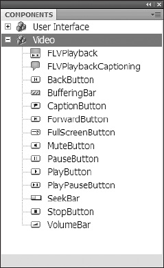
Figure 14-2. The Video group of components
Third-party components
The list of third-party components is vast, and certainly we can't cover even a small number of the third-party components available. What we can do is tell you where to find them and what to expect when you install them.
The best place to find third-party components is on the Adobe Flash Exchange web site. Install third-party components at your own risk, and understand that not all third-party components are created equally. Some are tested more thoroughly than others, and there are varying degrees of reliability as well.
One way to distribute components is with an MXP file. While an in-depth discussion of MXP files is beyond the scope of this book, follow these brief instructions for installing and removing extensions.
The packaged Flash extension comes in the form of an MXP file. In order to use such files, you will need the Adobe Extension Manager, which comes with your installation of Flash CS4. The Adobe Extension Manager, shown here Figure 14-3, will allow you to install, remove, and otherwise keep track all of the extensions you have applied to Flash.
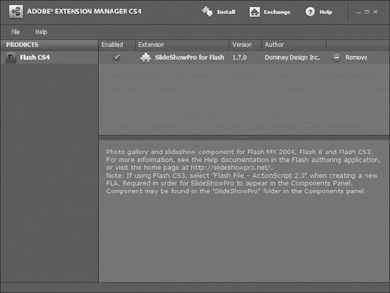
Figure 14-3. The Adobe Extension Manager allows you to manage extensions installed to all of your Adobe CS4 software. You can find this tool in your Start menu (Windows) or Applications folder (Mac).
To install a third-party extension, simply double-click the MXP file and follow the instructions given by the Adobe Extension Manager. To remove an extension, open the Adobe Extension Manager and select Remove on the row of the extension you wish to remove.
Now that you know more about the various types of components and their uses, let's look at how to add them to your application.
Adding components to your application
Generally speaking, there are two ways to get components into your applications; either by placing them on stage in Flash or through ActionScript. In this section we talk about how to do both.
Adding components to your application in Flash
To add a component to your application in the Flash authoring environment, either-double-click the component in the Components panel or simply drag that component onto the stage. Double-clicking the component will add that component to the horizontal and vertical center of your visible document window. Figure 14-4 shows what happens when we double-click the Button component in the Components panel.
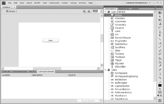
Figure 14-4. When you double-click a component in the Components panel, it will get placed smack in the center of your document window.
Adding components to your application using ActionScript
To add a component to your application using ActionScript is pretty straightforward. Whether you use a document class file (recommended as a best practice) or have your code in the FLA file itself, you must have a copy of the component you wish to add to your application in your library. In this example of a document class file, we add a ComboBox component and a Button component to the stage. Figure 14-5 shows the library of our file.
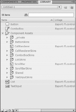
Figure 14-5. Even though we only placed a ComboBox and Button component on stage, notice that the components used to make them, the List and TextInput components, appear in the Library panel as well.
package {


  import flash.display.MovieClip;

  import fl.controls.ComboBox;

  import fl.controls.Button;


  public class AddingComponents_AS extends MovieClip{


    public function AddingComponents_AS()    {

      var myCBox:fl.controls.ComboBox = new ComboBox();

      addChild(myCBox);


      var aButton:Button = new Button();

      this.addChild(aButton);

      aButton.label = "On/Off";

      aButton.toggle =true;

      aButton.move(50, 50);


    }

  }

}
Being able to add components to your application is nice; but what's nicer is being able to make them do stuff! So let's talk about controlling components.
Controlling components
When we talk about controlling components, we really mean two things: controlling what they do (configuring) and controlling what they look like (skinning).
Configuring components in Flash
By now you know that every component is different and built for a specific purpose. What they all have in common, however, is the Component inspector. When you select a component, the Component inspector changes to reflect the properties of that component that are configurable in Flash.
To configure a component in Flash, add it to the stage and open the Component inspector by pressing Shift+F7 or selecting Window Component Inspector. Select the component you wish to configure. Figure 14-6 shows the Component inspector for the ComboBox component.
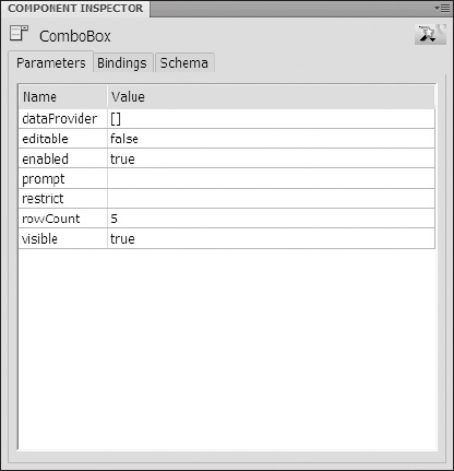
Figure 14-6. The Component inspector lets the Flash author configure a component without needing to use ActionScript.
Using the Component inspector
To configure a component, you'll need to understand the Component inspector. Since this book is focused primarily on ActionScript 3.0, we will limit our discussion to the Parameters tab of the Component inspector, as the Bindings and Schema tabs do not apply to ActionScript 3.0 projects.
The Parameters tab of the Component inspector is a panel divided into two columns, Name and Value. The Name column lists all of the parameters available for author-time configuration of the component. The Value column shows the default values for each of those parameters. Clicking into the Value column next to a parameter name will allow you to change the value assigned to that parameter.
It's important to understand that the values you can assign to parameters are often limited. For instance, some can only have a value of True or False (Boolean), and others may only be allowed to be numbers. In any event, the Component inspector will provide you with an input method that best suits the type of value that can be entered—a drop-down menu for selecting between three possible alignment options, for instance.
Some parameters, like the source parameter of the Loader component, give you a free-form text box, while the source parameter of the FLVPlayback component will prompt you with a Content Path dialog. Let the Component inspector guide you.
When setting values for the dataProvider parameter, you will use yet another form of data entry called the Values dialog (which we discuss in the upcoming exercise).
Follow these steps to configure an instance of the ComboBox parameter with the options sometimes, always, and never:
- Add a
ComboBoxcomponent to an open FLA file by double-clicking theComboBoxcomponent in theComponentspanel or by dragging it onto the stage. - Open the
Component inspector. Make sure theComboBoxcomponent you put on stage is selected. - Either double-click the value field of the
dataProviderparameter or single click it, and then click themagnifying glassicon that appears next to it, as shown in Figure 14-7. You should now see theValuesdialog, as shown in Figure 14-8.
Figure 14-7. If you single-click the dataProvider parameter, use this magnifying glass icon to launch the Values dialog.
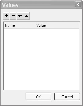
Figure 14-8. An empty
Valuesdialog shows there is no data in thedataProviderfor this component. - Use the
Addbutton (plusicon) to add a new label/data pair to yourComboBoxcomponent. The default name of the label/data pair you just added islabel0. The name of the label/data pair merely reflects the value of itslabelproperty. - Click the
Valuecolumn next to thelabelproperty and enter the textsometimes. Notice that the name of the label/data pair has changed tosometimes. You can collapse and expand the label/data pair by clicking the small triangle next to the label/data pair's name. - Click the
Valuecolumn next to thedataproperty and enter the number1.
Repeat steps 4 through 6 until you have three label/data pairs with the labels sometimes, always, and never and values 1, 2, and 0, respectively, as shown in Figure 14-9.
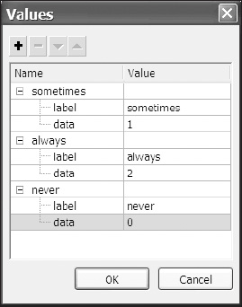
Figure 14-9. The Values dialog after some data has been entered
You should see a ComboBox component on stage that, when you click it, drops down a menu with the options sometimes, always, and never as we show in Figure 14-10.
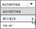
Figure 14-10. If you do not specify a value for the prompt parameter, the first item in the dataProvider will be the default selection.
Clearly there is much more to be done if we want this ComboBox to do anything worthwhile, and we will as we incorporate it into the activities that follow in the chapter.
Let's begin by making one small adjustment to it using the Component inspector before we move to ActionScript; we'll change the prompt—the default text that appears in the ComboBox as a nonselectable item. Having a prompt is considered good form when making your applications usable since it tells your users what the combo box is for.
To set the prompt of a ComboBox component, click the Value column of the prompt parameter in the Component inspector. Enter some meaningful text—in this case how often?—and test your movie again. You will notice that the ComboBox now appears with the text how often?, as you see in Figure 14-11.
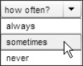
Figure 14-11. Use the prompt parameter to tell your users what type of data is in the drop-down menu before they have to open it.
Configuring components using ActionScript
In this section we're going to create a form using three TextInput components (and three Label components to label them) and a Button component. The form will be used to configure our ComboBox component from the previous section of this chapter. You might use this approach in the case where you have a multipage form for which data entered on one page might need to be reflected in the drop-down menu options on another.
The Flash UI components follow the usual convention of making properties, methods, and events available to the Flash developer through ActionScript, so if you want a little refresher, refer to Chapter 8 for the ActionScript primer and Chapter 9 for more on event-based ActionScript.
Creating an application using the document class
Throughout this book we have been encouraging you to go through the exercise of creating a document class for your FLA files and putting all of your ActionScript there, and this example is no exception.
To create an application using the document class, follow these steps:
- Save your FLA (previously unnamed) from the previous section as
menuForm.FLAand set the document class toMenuForm.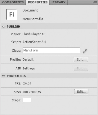
Figure 14-12. Creating document classes for your Flash projects rather than putting ActionScript on the timeline is a good habit to get into. Use the
Property inspectorto define the document class. - Create a new AS file by selecting
File Newfrom the application menu (or by pressing Ctrl+N, or Cmd+N on a Mac) and then selectingNew ActionScript filefrom theNew Documentwindow. Add the following ActionScript to the file and save it asMenuForm.AS:
package{

  import flash.display.MovieClip

  public class MenuForm extends MovieClip{

    public function MenuForm(){

      trace("menu form!"); //menu form!

    }

  }

} - Test your movie and make sure that
menu form!appears in theOutputwindow.
Creating the form
To simplify this example, we'll dispense with the code involved in laying out a form using ActionScript. We're going to add our form elements to the stage in Flash, and then configure them using ActionScript in our document class file.
To create the form, follow these steps:
- Drag a
TextInputcomponent from theComponentspanel to the stage. Give it an instance name ofitem1input. - Drag a
Labelcomponent from theComponentspanel to the stage. - Align the
Labelcomponent with theTextInputcomponent. - Select the
Labelcomponent and open theComponent inspector. In theValuecolumn of thetextparameter, enter the textitem 1, as shown in Figure 14-13.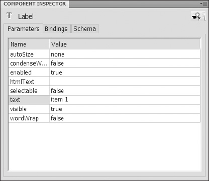
Figure 14-13. The
Component inspectorfor theLabelcomponent
Your stage should now look something like Figure 14-14.
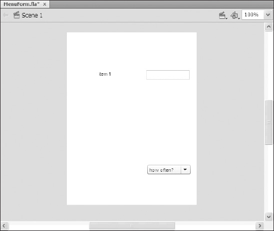
Figure 14-14. Our initial layout
- Select both the
Labeland theTextInputcomponents and press Ctrl+C or Cmd+C on a Mac to copy them. Press Ctrl+Shift+V or Cmd+Shift+V to paste in place. - With the copies selected (they will be selected after you paste in place), press Shift+down arrow three times. (This will move them down 30 pixels, which should be enough to move them clear of the originals.)
- With the copies still selected, repeat steps 5 and 6.
- All of your labels will read
item 1at this point. Using the method from step 4, change the labels so they readitem 1, item 2, anditem 3from top to bottom. - All of your
TextInputcomponent instances will be nameditem1input. Change their instance names so that they areitem1input, item2input, anditem3inputfrom top to bottom. - Make sure your
ComboBoxhas an instance name so you can address it in code—we named oursmyCombo. - Finally, drag a
Buttoncomponent from theComponent inspectorto the stage, place it under your three text input fields, and give it an instance name ofsubmitBtn. - Select the
Buttoncomponent. In theValuecolumn of thelabelparameter on theComponent inspector, change thetextparameter toSubmit.
Your stage should now look something like Figure 14-15.
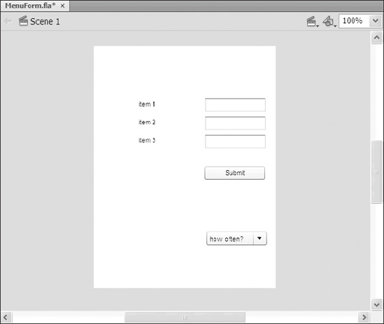
Figure 14-15. The finished layout of our simple form
Well now, isn't that lovely? Aside from setting a few parameters in the Component inspector, though, we haven't done anything spectacularly component-like, so let's make this form do something.
Making the form do something—listening to components
The goal here is to populate the ComboBox component with the values in the TextInput components when the Button component is clicked. The first step is getting our little application to listen for the button click. The following code shows how we import the flash.events.* package, add an event listener for the CLICK event, and create a handler function for the event:
package{

  import flash.display.MovieClip;


  // need to import these classes to listen for the event

  import flash.events.*;


  public class MenuForm extends MovieClip{


    public function MenuForm(){

      trace("menu form");

      // here we add a listener for the CLICK event

      addEventListener(MouseEvent.CLICK, handleClick);

    }


    // this function will execute when any object that broadcasts

    // the CLICK event is clicked.

    private function handleClick(e:MouseEvent){

        // this tells us who was clicked

      trace(e.target.name)

    }

  }

}
Now that we can hear the clicking of the Submit button, what are we going do about it? With the following additions to the code (in bold), we're going to import the fl.controls.ComboBox class in order to configure the component in ActionScript, import the fl.Data.DataProvider class to create and manipulate the ComboBox's dataProvider, and lastly, quickly check to make sure that it's the Submit button being clicked before we go making any changes to our ComboBox:
package{

  import flash.display.MovieClip;

  import flash.events.*;


  // importing the necessary classes

  import fl.controls.ComboBox;

  import fl.data.DataProvider;

  public class MenuForm extends MovieClip{


    // declare the data provder

    private var theDataProvider:DataProvider;


    public function MenuForm(){

      trace("menu form");

      // create the data provider

      theDataProvider = new DataProvider();

      addEventListener(MouseEvent.CLICK, handleClick);

    }

    private function handleClick(e:MouseEvent){


      // make sure it's the Submit button being clicked

      if(e.target.name == "submitBtn"){


        // clear any old data

        theDataProvider.removeAll();


        // adding new data for the ComboBox, these label/value pairs

        // are what you set in the Value dialog when changing the

        // dataProvider parameter in the Component inspector!

        theDataProvider.addItem({label:item1input.text, value:0});

        theDataProvider.addItem({label:item2input.text, value:1});

        theDataProvider.addItem({label:item3input.text, value:2});


        // finally set the dataProvider property of the

        // component the DataProvider instance we created

        // here - 'theDataProvider'

        myCombo.dataProvider = theDataProvider;

      }

    }

  }

}
When you test your movie, you should be able to enter text in the three TextInput components, click the Submit button, and see your new text in the drop-down of the ComboBox.
Now that you have your feet wet with making some components work, let's look at how to change their appearance using both the Flash CS4 authoring environment and ActionScript.
Skinning components in Flash
Skinning components should really be called modifying the skins of components. All of the assets that make up the visual appearance of all of the states of the components in your application are available to you in Flash as soon as you drag them onto the stage (or into your library).
As an example, open a new FLA file and add a UIScrollBar component to the stage. In the library, look in Component Assets ScrollBarSkins to see all of the symbols that make up all of the states for that component (or just look at Figure 14-16).

Figure 14-16. All of the skins that represent the various states of all of the parts of a scrollbar
Let's return to the FLA, menuForm.FLA, from the previous example to demonstrate how quickly you can modify a component's skin.
To quickly change the rollover color for the ComboBox component, follow these steps:
- Open
menuForm.FLAand save it asskinning_menuForm.FLA. - Double-click the
ComboBoxcomponent on stage, and you will see theComboBoxskin palette screen shown in Figure 14-17.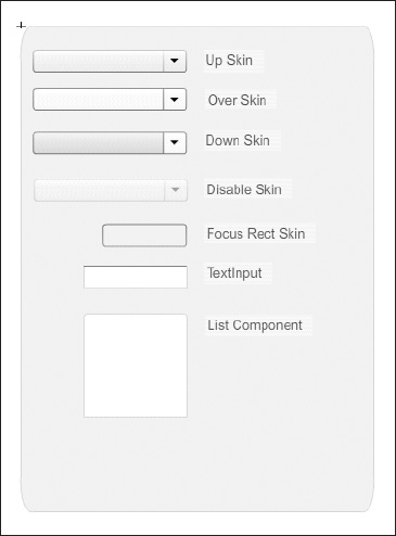
Figure 14-17. The
skinpalette for theComboBoxcomponent. Notice that theListandTextInputcomponents are included. - Double-click the symbol on stage labeled
Over Skin. - Select the fill shape and change the color.
- Test your movie.
You'll see that when you roll over the ComboBox on stage, the color now changes to the one you selected; but hold on, when you open the drop-down menu and roll over the menu items, the color has not changed. Why not?
The reason is because the drop-down menu of the ComboBox component is really a List component, and the List component uses the cell renderer skins to control the visual appearance of its items. Let's look at how to change that now.
To quickly change the rollover color for the items in the drop-down menu of a ComboBox component, follow these steps:
- Open
menuForm.FLAand save it asskinning_menuForm.FLA. - Double-click the
ComboBoxcomponent on stage. - Double-click the symbol on stage labeled
List Component. - Double-click the symbol on stage labeled
Cell Renderer skins, and you will see the screen shown in Figure 14-18.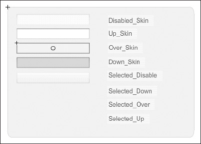
Figure 14-18. The cell renderer skins
- Double-click the symbol on stage labeled
Over_Skin. - Select the fill shape and change the color.
- Test your movie.
Now you will see that the rollover color of the drop-down menu has changed to the color you selected in the preceding exercise. The trick is to be aware of what components are made of other components and therefore use their visual assets.
Skinning components using ActionScript
Because components are often made by reusing other components, they share the same visual assets—which is usually a good thing—unless of course you want the rollover color of your ComboBox component to be different from the rollover color of your List component. Or what if you wanted different instances of the same component to look different?
You saw in the previous section that the ComboBox uses the List component's cell renderer skins for its drop-down menus, so how can you change one without affecting the other? By using ActionScript, that's how.
Component style definitions
Style definitions dictate not only the size and placement of elements like text within a component, but also which skin assets to use for various states of a component.
The following code, which comes from the Flash documentation (http://help.adobe.com/en_US/AS3LCR/Flash_10.0/index.html), creates a style browser that lets you easily see what properties make up the style definition for many of the UI components. Paste this code into the Actions panel on the first frame of an FLA and make sure you have a ComboBox component and DataGrid component in your library. This collection of code will save you some time trying to track down what properties can be changed using the setStyle() method of the UI components. Figure 14-19 shows the style browser that the following code generates.
import fl.controls.*;

import fl.containers.*;

import fl.controls.listClasses.*;

import fl.controls.dataGridClasses.*;

import fl.controls.progressBarClasses.*;

import fl.core.UIComponent;

import fl.data.DataProvider;


var dp:DataProvider = new DataProvider();

dp.addItem( { label: "BaseScrollPane",    data:BaseScrollPane } );

dp.addItem( { label: "Button",             data:Button } );

dp.addItem( { label: "CellRenderer",    data:CellRenderer } );

dp.addItem( { label: "CheckBox",         data:CheckBox } );

dp.addItem( { label: "ColorPicker",     data:ColorPicker } );

dp.addItem( { label: "ComboBox",         data:ComboBox } );

dp.addItem( { label: "DataGrid",         data:DataGrid } );

dp.addItem( { label: "HeaderRenderer",    data:HeaderRenderer } );

dp.addItem( { label: "ImageCell",        data:ImageCell } );

dp.addItem( { label: "IndeterminateBar",data:IndeterminateBar } );

dp.addItem( { label: "Label",             data:Label } );

dp.addItem( { label: "List",             data:List } );

dp.addItem( { label: "NumericStepper",     data:NumericStepper } );

dp.addItem( { label: "ProgressBar",     data:ProgressBar } );

dp.addItem( { label: "RadioButton",     data:RadioButton } );

dp.addItem( { label: "ScrollPane",         data:ScrollPane } );

dp.addItem( { label: "Slider",             data:Slider } );

dp.addItem( { label: "TextArea",         data:TextArea } );

dp.addItem( { label: "TextInput",         data:TextInput } );

dp.addItem( { label: "TileList",         data:TileList } );

dp.addItem( { label: "UILoader",         data:UILoader } );

dp.addItem( { label: "UIComponent",     data:UIComponent } );


var cb:ComboBox = new ComboBox();

cb.move(10,10);

cb.setSize(300,25);

cb.prompt = "Select a component to view its styles";

cb.rowCount = 12;

cb.dataProvider = dp;

cb.addEventListener(Event.CHANGE, showStyleDefinition);

addChild(cb);


var dg:DataGrid = new DataGrid();

dg.setSize(425,300);

dg.move(10,50);

dg.columns = [ new DataGridColumn("StyleName"), new DataGridColumn

("DefaultValue") ];

addChild(dg);


function showStyleDefinition(e:Event):void {

  var componentClass:Class = e.target.selectedItem.data as Class;

  var styles:Object = componentClass["getStyleDefinition"].call(this);

  trace(styles.toString());

  var styleData:DataProvider = new DataProvider();

  for(var i:* in styles) {

    trace(i + " : " + styles[i]);

    styleData.addItem( { StyleName:i, DefaultValue:styles[i] } );

  }

  styleData.sortOn("StyleName");

  dg.dataProvider = styleData;

}
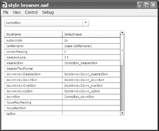
Figure 14-19. The style browser created with the code found at http://help.adobe.com/en_US/AS3LCR/Flash_10.0/index.html
Component styles work at three different levels. Using setStyle() or setComponentStyle(), you can
- Change the style of all Adobe UI components used in your application.
- Change the style of all of one type of component in your application—all of your
Buttoninstances, for example. - Change the style of an instance of a component in your application.
To change the style of all components used in your application, use the following convention:
StyleManager.setStyle("textFormat", myTextFmt);
What you do not see in this example is that you need to import the StyleManager class in your code (which we show how to do in the next exercise) and that a TextFormat object named myTextFmt has been created.
To change the style of all of one type of component in your application, use the following convention:
StyleManager.setComponentStyle(Button, "textFormat", myTextFmt);
What you do not see in this example is that you need to have the class for the component you're trying to change imported in your code and that a TextFormat object named myTextFmt has been created. You also need to have the StyleManager class imported (which, again, we will show how to do in the next exercise).
To change the style of an instance of a component in your application, use the following convention:
instanceName.setStyle("styleName", value);
Let's look at one last example to demonstrate the flexibility we have with skinning components. We're going to build on the simple form we made earlier in the chapter and change the text formatting of our TextInput components (component-wide style change). Then we'll change the focus rectangle color of each TextInput component to be different from the others (instance-level style change).
To make component-wide style changes as well as instance-level style changes, follow these steps:
- Open
menuForm.FLAand save it asstyles_menuForm.FLA. Change its document class toStylesMenuForm. - Open
MenuForm.ASand save it asStylesMenuForm.AS. Change the class name and constructor function to match as shown here in bold:
public class StylesMenuForm extends MovieClip{

    private var theDataProvider:DataProvider;

public function StylesMenuForm(){ - In
StylesMenuForm.ASimport theStyleManagerclass,TextInputclass, and theTextFormatclass using the following code:
import fl.controls.TextInput;

import fl.managers.StyleManager;

import flash.text.TextFormat; - Add the following code to the constructor function of
StylesMenuForm.ASto apply a component-wide change to the text formatting of theTextInputcomponent:
var myTxtFmt:TextFormat = new TextFormat();

myTxtFmt.color = 0x1234FF; //Blue!

myTxtFmt.font = "Arial";


StyleManager.setComponentStyle(TextInput, "textFormat", myTxtFmt); - Add the following code to the constructor function to change the skin clip that's used for each
TextInputcomponent's instance in the focus state. The parameterscustomFocus1, customFocus2, andcustomFocus3, shown in bold, refer to clips in the library ofstyles_MenuForm.FLA, which we have not created yet. What we're doing here is telling each instance of theTextInputcomponent individually what skin clip (e.g.,customFocus1foritem1input) to use when it enters the focus state.
item1input.setStyle("focusRectSkin", customFocus1);

item2input.setStyle("focusRectSkin", customFocus2);

item3input.setStyle("focusRectSkin", customFocus3);
Now let's create the custom focus clips in styles_MenuForm.FLA.
- Open
styles_menuForm.FLA, in the library browse toComponent Assets Shared, and find thefocusRectSkinmovie clip. - Right-click (or Ctrl-click on a Mac) the
focusRectSkinmovie clip and selectDuplicatefrom the menu. Name the new clipcustomFocus1. - In the
Linkagesection of theDuplicate Symboldialog, select theExport for ActionScriptoption. The class should auto-populate with the name of the symbol. - Repeat steps 7 and 8 to create
customFocus2andcustomFocus3. - Edit each of the new symbols so that the color of the border shape shown in Figure 14-20 is different for each symbol.
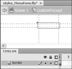
Figure 14-20. Changing the color of the border graphic for the
customFocus2skin - Test your movie.
Click into each TextInput component and notice that the focus rectangle for each is a different color. You might also notice that the text of the ComboBox is now blue instead of black. Why do you think that is? If you guessed that it's blue because the ComboBox component uses the TextInput component for the prompt, you would be correct!
If you wanted the TextInput components to have a different text style from that of the ComboBox prompt text, you'd need to set the TextFormat style at the instance level for each TextInput component.
Summary
Many components are available for Flash, and there are many, many things you can do with them. It is our hope that you are now comfortable enough with components to use them effectively in your work.
In this chapter we talked about
- The types of component architectures
- The array of UI and video components available in Flash CS4
- How to add components to your application using Flash or ActionScript
- How to control the configuration, behavior, and appearance of the components you use through the Flash authoring environment and through ActionScript