
Chapter 2
Setting Up: Developing a Simple Silverlight Application
Before you get a deep-dive detailing of advanced features, design concepts, and implementation approaches of Silverlight and developing an enterprise service-oriented training portal using Silverlight, it is important you understand the key differences between developing an enterprise RIA and developing a quick (by breaking some traditional design rules), but very impressive, rich application using the Silverlight technology. This exercise will also help to demonstrate how easy it is to develop Silverlight applications in a short time, and how Silverlight is scalable and can fulfill the needs of a broad audience ranging from individuals to enterprises.
This chapter serves as a base for the rest of the book. In this chapter, we will create an application concept for our end game—developing an Enterprise Training Portal using Silverlight. We'll use an individual application-centric development approach to develop an RIA named My Album. Using the same My Album RIA concept, we will build the Enterprise Training Portal RIA following an enterprise application–centric development approach in Chapter 5.
Without wasting any further time, let's start with defining the My Album RIA to develop a quick but very sound and attractive Silverlight RIA.
Defining the My Album RIA Project
The My Album application will have rich presentation capabilities to display videos and images with proper categorization, just as a traditional desktop application would have. Figure 2-1 shows a sample screen of the My Album RIA.
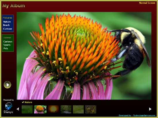
Figure 2.1 My Album RIA
I'll assume you are familiar with the Silverlight technology and tools and have some experience with the development of Microsoft Silverlight–based applications using Microsoft development and design tools.
Now let's consider the details of the application.
The application has the following features:
Desktop application–like, individual usage-centric rich user interface and functions
Presentation/slide show capabilities for image files
Play and stop capabilities for video files
Video and image file preview capabilities using thumbnails
Categorized presentation of images and videos to show a collection of images and videos belonging to the same group/category
Easy jumping from one image/video to another
Full-screen view option
Design and Development Considerations
When developing the application, you need to bear the following goals in mind:
Rapid development (finishing development in minutes)
Lightweight
Easy to deploy and maintain
Easy to use to categorize pictures and videos
Pluggable into an existing web application
High performing
The application will support the following types of media:
Pictures (Images) file types: JPG, PNG, BMP, GIF (other file types should be supported but not tested) with a minimum resolution of 800×600 to ensure image files are of good quality
Video file types: WMV (compressed broadband version)
Technology Platform Used to Develop the My Album RIA
The application will be based on the following platforms:
Microsoft Silverlight 2
Microsoft .NET Framework 3.5 SP1
Development Tools Used to Develop the My Album RIA
We'll use the following tools to develop the application:
Microsoft Visual Studio 2008 SP1
Microsoft Silverlight Tools for Visual Studio 2008 SP1
Microsoft Expression Blend 2 SP1
Microsoft Expression Encoder 2 SP1
My Album RIA Design Considerations
One of the key aspects of designing RIAs is creating a fluent user interface to provide high-application usability. As a result, your first design consideration when developing any RIA is to understand the scope of the application and user requirements and expectations, and then define the application capabilities aligning with the application features (defined during the scoping phase).
We can define the following application capabilities based on the application features discussed earlier in this chapter:
Desktop application–like richness
Categorized (three categories for this sample application) image files with "play slide show" functionality
Presentation/Slide show mode for image files and play/stop mode for video files
Categorized (three categories for this example application) video files with "play video" functionality
Preview list functionality with scrolling list capability to display thumbnails of a list of image and video files of the selected category
Selected image or video from the preview list displayed within the application
Full-screen view functionality
The next action item is to define the user interface framework of the RIA that can support the defined application capabilities. The definition of the user interface framework will also help us with the implementation of the refactored application user interface design, which is aligned with the enterprise strategies.
It is critical to consider capabilities and limitations of the technology platform that will be used for application development as well as the deployment strategy before finalizing the user interface framework of the RIA. For the My Album RIA, we are going to use the Microsoft Silverlight technology as the development platform and Microsoft Silverlight Streaming provided by Windows Live to deploy the application and media files.
Figure 2-2 shows the user interface framework definition for the My Album application. As shown in Figure 2-2, the theme for the My Album application is a single center stage page user interface, where the majority of the page displays the selected image or plays the selected video.
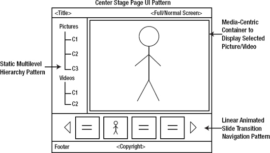
Figure 2.2 My Album user interface framework definition
Supporting the center stage theme, we have two types of visual hierarchy navigation patterns: first for the selection of image or video category, and second for the selection of a particular picture or video from the selected category.
Now let's take a look at the navigation patterns used in different areas of the application interface:
Since we are going to simplify the categorization for this sample application and have only one level of category for images and one for videos, we can follow the static multilevel hierarchy navigation pattern to display various categories for images and videos.
We will follow the linear animated slide transition navigation pattern to preview collections of images or videos based on the selection of the category.
The application window layout will be configured as a liquid layout to enable us to resize the application when the user resizes the browser window to match the browser window size.
User controls are Silverlight's basic unit for defining XAML-based user interfaces and code-behind files. For this version of the My Album application, we will use the default Page class (containing an XAML markup file and code-behind file) as a main user interface, which is derived from the UserControl.
We will keep the custom managed code-behind to a minimum and will define most of the functionality within the XAML markup file.
We want to keep the first version of the My Album application simple and straightforward. As a result, we'll stick to the following restrictions for our application, considerations which are normally realized during the design and implementation process:
No custom user control or class library
Minimum code-behind
Media files defined and embedded within the project
Predefined categories
No use of major enterprise application design concepts such as abstracted presentation layer, externalization of media source definition, externalized files, and so forth
No use of Web Services or other service-oriented application architecture
We will reconsider the preceding concepts in Chapter 5 during the design of the Enterprise Training Portal RIA.
Microsoft Expression Blend is the tool for helping user interface designers develop rich, interactive WPF- and XAML-based user interfaces. It is also tightly integrated with Visual Studio, enabling designers and developers to rapidly develop, debug, and test Silverlight-based rich, interactive applications in integrated mode.
We will utilize Expression Blend to develop rich user interface. I assume that you are familiar with the Expression Blend tool, so this book will not focus on explaining it in detail.
Microsoft Expression Encoder contains several Silverlight Media Player templates to create, manage, and publish media in VC-1 quality for Silverlight applications. We are going to use Expression Encoder to develop the thumbnail images for the video files, which will appear in the My Album application preview pane.
I assume that you are familiar with the Expression Encoder tool, so this book will not focus on explaining it in detail.
Now that the scope and high-level application design for the My Album RIA have been determined, our next task is to develop the Silverlight-based My Album RIA. Figure 2-3 shows the application in full-screen mode.
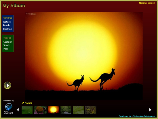
Figure 2.3 My Album RIA in full-screen mode
As shown in Figure 2-3, the My Album RIA follows the center stage theme to display the selected picture and video in the main container.
Figure 2-4 defines the My Album RIA layout and its specifications. We will accommodate different parts of the application in a 2×2 grid, which will ease the work of designing and placing the controls. Here we set the width of the first column and height of the second row to 128 pixels (px), and the width of the second column and the height of the first row to * to cover the remaining portion of the window. This allows the application to resize according to the browser window's size and also maintains the original aspect ratio of the different parts of the application.
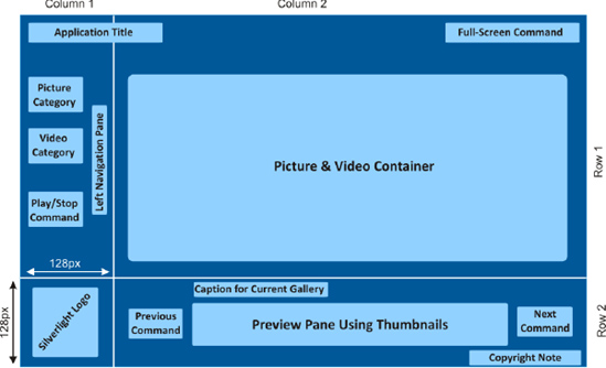
Figure 2.4 The My Album RIA layout design and specifications
The left navigation pane helps the user to find and select a category of picture or video. As you saw in the "User Interface Framework" section earlier, it follows the static multilevel hierarchy navigation pattern to display different categories (i.e., Nature, Beach, and Cartoon for pictures and Cartoon, Sports, and Pets for videos) under two main categories—Pictures and Videos.
A Play Presentation button, which is available in the left pane and applies to pictures only, runs the slide show of pictures in the selected category.
On the bottom is the preview pane with Next and Previous functionality. The selected picture/video will be animated and highlighted, and the rest will be dimmed slightly. As discussed previously, the preview pane follows the linear animated slide transition navigation pattern.
You can visit the following link to get access to the My Album application: http://www.technologyopinion.com/myalbum.aspx.
Creating the My Album Silverlight Project Using the Silverlight Application Project Template
Create a myAlbum Silverlight application project by selecting the Silverlight Application project template with a web project to host the Silverlight control for testing.
We need to make a couple of changes in the default main user interface UserControl element:
1. Set Height to 600 and Width to 800. Later we will remove the Height and Width attributes to align/adjust the application window size with the browser window size.
2. Set Background to red (#FF000000) and Foreground to white (#FFFFFFFF).
3. Set the Grid's Background value to #FFB7BB57.
4. Define two rows and two columns of the Grid using Grid.ColumnDefinition and Grid.RowDefinition elements, as shown in the following snippet:
<UserControl x:Class="myAlbum.Page"

    xmlns="http://schemas.microsoft.com/winfx/2006/xaml/presentation"

    xmlns:x="http://schemas.microsoft.com/winfx/2006/xaml"

    Width="800" Height="600" Background="#FF000000" Foreground="#FFFFFFFF">

    <Grid x:Name="LayoutRoot" Background="#FFB7BB57">>

        <Grid.ColumnDefinitions>

            <ColumnDefinition Width="128" />

            <ColumnDefinition Width="*" />

        </Grid.ColumnDefinitions>


        <Grid.RowDefinitions>

            <RowDefinition Height="*"/>

            <RowDefinition Height="128"/>

        </Grid.RowDefinitions>

    </Grid>

</UserControl>
Tip Keeping the Height and Width attributes of the UserControl element with some appropriate values (say, Height = 600 and Width = 800) will ease your work at design time using Expression Blend 2 SP1. Once the application is designed, you can remove them, allowing auto adjustment of application window size to the browser window size.
The following sections will start defining the application with the simple XAML code generated with the help of Visual Studio 2008 SP1. Then we'll use Expression Blend to create the rich user interface, where the XAML code will be created automatically and integrated with the myAlbum Visual Studio project.
Defining the Left Navigation Pane
With the help of IntelliSense, it is very easy and quick to set up user controls. First create a Rectangle XAML control with the name mainBack that occupies about 95% of the area of the user interface (achieved by setting its Margin value and the RowSpan and ColumnSpan properties of the Grid) with the background color set to Red by using the Fill attribute.
<Rectangle

    x:Name="mainBack" Margin="8,8,8,8" Fill="Red" Grid.ColumnSpan="2"

    Grid.RowSpan="2">

</Rectangle>
The Width and Height attributes of the Rectangle are not hard-coded; this allows the application window to resize automatically to fit the browser window size. You can see this within the design window of the Visual Studio IDE, as shown in Figure 2-5; the user interface of the myAlbum application will change to the Red color.
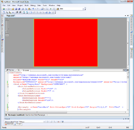
Figure 2.5 Application window background
To add the title "My Album" at the top-left corner of the window, we will use two TextBlock XAML controls. For the first TextBlock, named title_shadow, and the second TextBlock, named title, specify the Text, Background, Foreground, FontSize, FontWeight, Margin, and Grid.ColumnSpan values shown in the following code snippet. The shadow effect will appear for the title text by having two TextBlock controls overlapping by setting the Margin property.
<TextBlock x:Name="title_shadow" Grid.ColumnSpan="2" FontFamily="Trebuchet MS"

            FontSize="32" FontWeight="Bold" Foreground="Black" Text="My Album"

            Margin="18,15,0,0"></TextBlock>


<TextBlock x:Name="title" Grid.ColumnSpan="2" FontFamily="Trebuchet MS"

            FontSize="32" FontWeight="Bold" Foreground="Yellow" Text="My Album"

            Margin="17,17,0,0"></TextBlock>
Now the XAML design window will display the "My Album" title text with the shadow effect as shown in Figure 2-6.

Figure 2.6 My Album application title screenshot
The My Album application contains two album categories—Pictures and Videos. To create the category windows, we need to create two sections using Rectangle and TextBlock XAML controls. For the Pictures category (named backGroundBlue), we will set the Fill attribute of the Rectangle to DarkBlue. For the Videos category (named backGroundGreen), this attribute is set to DarkGreen. Then we place TextBlock controls over them for defining different categories.
<Rectangle x:Name="backGroundBlue"

    HorizontalAlignment="Left" Margin="12,97,0,0" VerticalAlignment="Top" Width="76"

    Height="112" Stroke="#FFB7BB57" Fill="DarkBlue" />

<Rectangle x:Name="backGroundGreen"

    HorizontalAlignment="Left" Margin="12,225,0,0" VerticalAlignment="Top" Width="76"

    Height="112" Stroke="#FFB7BB57" Fill="DarkGreen" />
Now we create the album category titles "Pictures" and "Videos" the way we created the My Album application title using the TextBlock XAML controls, as shown in the following code snippet. Similar to the application title, we create the shadow effect of the category titles by slightly changing the Margin property of two overlapped TextBlock controls.
<TextBlock x:Name="cPicturesShadows"

   Text="Pictures" FontSize="16" FontFamily="Trebuchet MS" FontWeight="Bold"

   Foreground="Black" VerticalAlignment="Top" Margin="18.249,107.204,0,0"

   HorizontalAlignment="Left" Height="23.751" Width="66.74" / >


<TextBlock x:Name="cPictures"

   FontFamily="Trebuchet MS" FontSize="16" FontWeight="Bold"

   Margin="17,107,0,0" Text="Pictures" Foreground="Yellow"

   VerticalAlignment="Top"HorizontalAlignment="Left"/>


<TextBlock x:Name="cVideosShadows"

   Text="Videos" FontSize="16" FontFamily="Trebuchet MS" FontWeight="Bold"

   Foreground="Black" VerticalAlignment="Top"

   Margin="22.2199993133545,235.404006958008,0,0"

   HorizontalAlignment="Left" Height="23.751" Width="65.772" />


<TextBlock x:Name="cVideos"

   FontFamily="Trebuchet MS" FontSize="16" FontWeight="Bold"

   Margin="21,236,0,0" Text="Videos" Foreground="Yellow" VerticalAlignment="Top"

   HorizontalAlignment="Left"/>
For the sake of simplicity, the My Album application has a total of six categories hard-coded (three categories for each album category—Nature, Beach, and Cartoon for the Pictures album category, and Cartoon, Sports, and Pet for the Videos album category) within the application by using six TextBlock XAML controls as shown here:
<TextBlock x:Name="catNature"

   Foreground="White" Text="Nature" Height="27" Width="65"

   HorizontalAlignment="Left" Margin="22,131,0,0" VerticalAlignment="Top"

   Cursor="Hand" />


<TextBlock x:Name="catBeach"

   HorizontalAlignment="Left" Margin="21,153,0,0" VerticalAlignment="Top"

   Cursor="Hand" Text="Beach" Foreground="White" Width="102" Height="27" />


<TextBlock x:Name="catCartoon"

   HorizontalAlignment="Left" Margin="21,177,0,0" VerticalAlignment="Top"

   Cursor="Hand" Text="Cartoon" Foreground="White" Width="102" Height="31.2" />


<TextBlock x:Name="vcatSports"

   Text="Sports" Foreground="White" HorizontalAlignment="Left"

   Margin="22,282,0,0" VerticalAlignment="Top" Width="83" Cursor="Hand"/>


<TextBlock x:Name="vcatCartoon"

   Text="Cartoon" Foreground="White" HorizontalAlignment="Left" Margin="22,260,0,0"

   VerticalAlignment="Top" Width="83" Cursor="Hand" Height="27" />


<TextBlock x:Name="vcatPets"

   Text="Pets" Foreground="White" HorizontalAlignment="Left" Margin="22,304,0,0"

   VerticalAlignment="Top" Width="83" Cursor="Hand" Height="27"/>
Please note that the Cursor property of the TextBlock XAML control is set to Hand to control the mouse cursor.
Now the design window will look as shown in Figure 2-7.
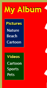
Figure 2.7 My Album application with categories
As I explained earlier in Chapter 1, Microsoft provides tight integration between Visual Studio and Expression Blend. Expression Blend is a designer's tool and mainly used to enhance and develop rich navigation through its user-friendly IDE.
If Expression Blend is installed and set up properly on your development machine, you will be able to access the Open in Expression Blend option, shown in Figure 2-8, by right-clicking the Page.xaml file within Visual Studio's Solution Explorer window.
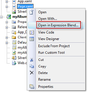
Figure 2.8 Accessing Expression Blend within a Visual Studio Silverlight project
You can use this option to switch to Expression Blend at any time from Visual Studio. In this book, we are going to use this option frequently as we build the rich user interface of the My Album application and the Enterprise Training Portal application.
After successfully opening the project in Expression Blend, we are ready to design the application interface. We will alter the red background in such a way that it changes from red to black in a linear gradient. You can achieve this by navigating to the Properties tab of the mainBack XAML Rectangle control, choosing the Gradient Brush under the Brushes category, and adjusting the two colors as shown in Figure 2-9.
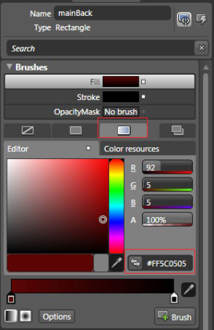
Figure 2.9 Setting up Rectangle.Fill with LinearGradientBrush
The following XAML code is generated and integrated with the myAlbum Visual Studio Silverlight project as we design with Expression Blend.
<Rectangle.Fill>

  <LinearGradientBrush EndPoint="0.5,1" StartPoint="0.5,0">

    <GradientStop Color="#FF5C0505" />

    <GradientStop Color="#FF000000" Offset="1"/>

  </LinearGradientBrush>

</Rectangle.Fill>
Similarly, enhance the "My Album" title of the application (the TextBlock XAML control with title name) by setting the TextBlock.Foreground property with the Gradient Brush under the Brushes category to give it a metallic look, which will generate the following XAML code:
<TextBlock x:Name="title"

   Grid.ColumnSpan="2" FontFamily="Trebuchet MS" FontSize="32" FontWeight="Bold"

   Text="My Album" Width="202" Height="43.2" RenderTransformOrigin="0.5,0.5"

   VerticalAlignment="Top" HorizontalAlignment="Left" Margin="17,17,0,0" >

       <TextBlock.Foreground>

         <LinearGradientBrush EndPoint="0.5,1" StartPoint="0.5,0">

            <GradientStop Color="#FF191804"/>

            <GradientStop Color="#FFFFFD28" Offset="1"/>

         </LinearGradientBrush>

       </TextBlock.Foreground>

 </TextBlock>
To give a metallic look to both category titles—"Pictures" and "Videos"—we will use the same approach that we used to give a gradient metallic look to the application title. For the Pictures category, the following is the revised XAML code:
<TextBlock x:Name="cPictures"

   Text="Pictures" FontSize="16" FontFamily="Trebuchet MS" FontWeight="Bold"

   RenderTransformOrigin="0.5,0.5" VerticalAlignment="Top"

   HorizontalAlignment="Left" Margin="18.7110004425049,105.199996948242,0,0"

   Height="23.755" Width="67.254" >

   <TextBlock.Foreground>

      <LinearGradientBrush EndPoint="0.5,1" StartPoint="0.5,0">

         <GradientStop Color="#FF000000"/>

         <GradientStop Color="#FFFAFF77" Offset="1"/>

      </LinearGradientBrush>

   </TextBlock.Foreground>

</TextBlock>
For the Videos category, the following is the revised XAML code:
<TextBlock x:Name="cVideos"

  Text="Videos" FontSize="16" FontFamily="Trebuchet MS" FontWeight="Bold"

  RenderTransformOrigin="0.5,0.5" VerticalAlignment="Top"

  HorizontalAlignment="Left" Margin="22.7110004425049,235.399993896484,0,0"

  Height="23.755" Width="66.279" >

  <TextBlock.Foreground>

     <LinearGradientBrush EndPoint="0.5,1" StartPoint="0.5,0">

        <GradientStop Color="#FF000000"/>

        <GradientStop Color="#FFFAFF77" Offset="1"/>

     </LinearGradientBrush>

  </TextBlock.Foreground>

</TextBlock>
Within Visual Studio, the design window should look as shown in Figure 2-10.
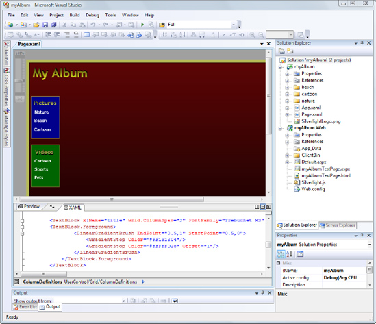
Figure 2.10 Application with populated title and categories
Note I started with some simple XAML to define the left navigation pane for demonstration purposes only. As a matter of fact, it would be much simpler to use Expression Blend directly to define the UI.
The My Album application contains a horizontal preview pane at the bottom center where we display thumbnails of items from the selected category. On both sides of the thumbnails, Previous and Next commands let the user navigate through the content of the selected category. To implement such behavior, we'll use a StackPanel XAML control named thumbBar. At both ends of the StackPanel, we'll draw a triangle-shaped symbol to indicate Previous and Next navigation as shown in Figure 2-11.
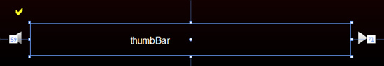
Figure 2.11 Designing the preview pane using Expression Blend
We will place the StackPanel in the second row and second column of the Grid named LayoutRoot. For a horizontal view of thumbnails, set the thumbBar StackPanel XAML control's Orientation property to Horizontal along with the Name, Width, Height, Grid.Row, and VerticalAlignment properties as follows:
<StackPanel x:Name="thumbBar"

    VerticalAlignment="Bottom" Height="52.754" Orientation="Horizontal"

     Margin="59,0,71,29.246000289917" Grid.Row="1" Grid.Column="1"/>
In the "Defining Application Behavior Through the Code-Behind" section of this chapter, we will use image controls to populate images of the selected category using the managed code-behind file for the Page.xaml file.
The Pen tool of Expression Blend, shown in Figure 2-12, enables us to draw lines that appear in the XAML as <Path> elements. We need to use the Pen tool to implement the Previous and Next commands.
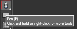
Figure 2.12 Pen tool of Expression Blend
Before we start drawing the Previous symbol, we need to make sure that we draw it right in the cell in the second row and second column of Grid as shown previously in Figure 2-11. Expression Blend makes a designer's life very easy because, as shown in Figure 2-13, it highlights the rows and columns so you can position controls without worrying about properties.
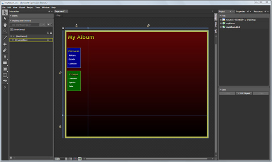
Figure 2.13 Expression Blend Designer displays grid lines to define the control position easily.
Let's first create the triangle shape for the Previous symbol using the Pen tool. To draw a triangle shape, you need to click three points. Based on those three points, the Pen tool will generate an opaque triangle with a default Fill color of White. The following is the XAML for the Previous command:
<Path x:Name="prev"

   Height="23" HorizontalAlignment="Left" Margin="106,0,0,45"

   VerticalAlignment="Bottom" Width="17.827" Stretch="Fill" Stroke="#FF000000"

   Data="M239.33333,359.33334 L279.33334,396.66666 L278.66702,320.00107"

   Cursor="Hand" >

  <Path.Fill>

    <LinearGradientBrush EndPoint="0.5,1" StartPoint="0.5,0">

      <GradientStop Color="#FF747272" />

      <GradientStop Color="#FFFFFFFF" Offset="1"/>

    </LinearGradientBrush>

  </Path.Fill>

</Path>
We also set the Name property to prev and Cursor property to Hand using Expression Blend's Properties tab.
Figure 2-14 shows the Layout and Common Properties tabs for the Previous symbol that we just drew. The figure includes the highlighted properties—HorizontalAlignment, VerticalAlignment, and Cursor—that we set for our application.
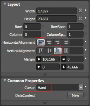
Figure 2.14 Setting up the Previous symbol's properties using Expression Blend
Rather than making the Next symbol from scratch, we'll use the Previous symbol as a shortcut. Create a copy of the Previous symbol. Within the Transform category, flip this object to the x axis to make the Next symbol, as shown in Figure 2-15. Then you need to change the name to next for this Path object. Place the Next symbol at the right end of thumbBar StackPanel in the same cell (i.e., the second row and second column) as the Previous symbol.
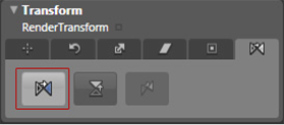
Figure 2.15 Transforming objects using Expression Blend
Adding the Selected Gallery Display
Now just above the left corner of the thumbBar StackPanel control, we need to add two TextBlock controls that will display the current gallery selected by the user.
We want to show the check mark before the name of the selected gallery. For that we use the Webdings font type for the first TextBlock XAML control (named Symbol) and set the Text property to a, which is equivalent to the check mark symbol, as shown in Figure 2-16.
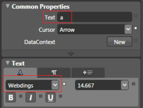
Figure 2.16 Setting up common properties of the object using Expression Blend
The following is the related XAML code snippet:
<TextBlock x:Name="Symbol"

   Grid.Column="1" Grid.Row="1" HorizontalAlignment="Left"

   Margin="28,0,0,91.1370010375977" VerticalAlignment="Bottom"

   Foreground="#FFFFFF00" Width="29" Height="24" Text="a"

   FontFamily="Webdings" FontSize="24"/>
On the right side of this symbol we put another TextBlock XAML control to display the name of the currently selected gallery. We name this TextBlock XAML control currentView. The following is the XAML code that is generated upon designing the TextBlock XAML control using Expression Blend:
<TextBlock x:Name="currentView"

   Grid.Column="1" Grid.Row="1" HorizontalAlignment="Left"

    VerticalAlignment="Bottom" Margin="50.8269996643066,0,0,86.1370010375977"

    Text="Nature" Foreground="#FFFFFF00" Width="79.339" Height="27"/>
The application, which now includes the preview pane, should look as shown in Figure 2-17.
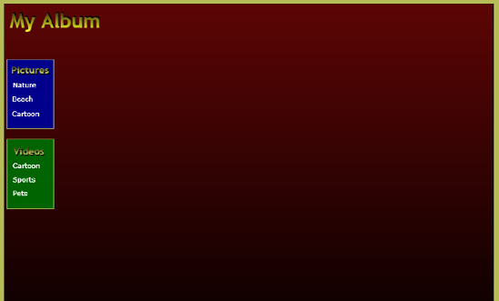
Figure 2.17 Application with the preview pane
Defining a Container for Pictures
We want to display selected pictures of various categories in the center (slightly floated to the right) of the application. We also need to take care that the picture container is of the same width as the thumbBar StackPanel XAML control and exactly aligned with it. Our aim is to create a neat, good-looking application and align with the window size when the application resizes or when in full-screen mode.
It is very easy to achieve this functionality using Expression Blend. We just need to select the Image control from the Asset Library of the Expression Blend. To bring up the Asset Library, click the >> symbol in the toolbox (as shown in Figure 2-18). By default the toolbox is located at the left side of the Expression Blend IDE.
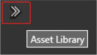
Figure 2.18 The Asset Library button displays the Asset Library in Expression Blend.
Upon clicking the Asset Library button, you will see a window containing different system controls within the library. Select the Image control (make sure Show All is checked at the top right of the window) as highlighted in Figure 2-19.
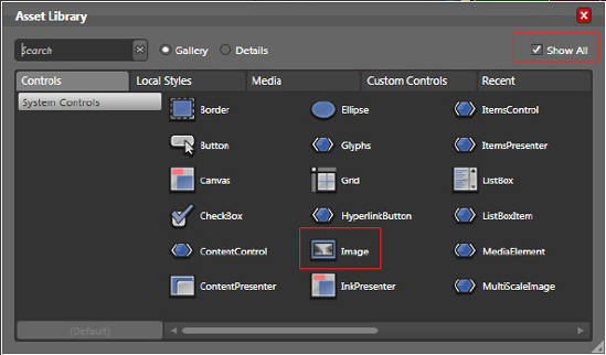
Figure 2.19 Asset Library controls in Expression Blend
Now you can start drawing an Image control right on the center area of the application window. When doing so, you will notice that Expression Blend will guide you so you can draw a picture container that is properly aligned on the x and y axes to the thumbBar StackPanel XAML control. It implements this by showing a red-white dotted line as you design the control (see Figure 2-20).
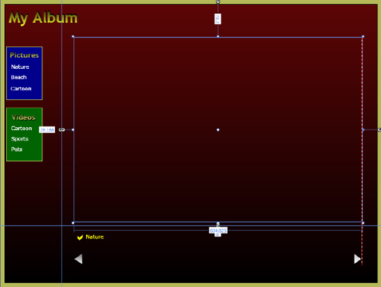
Figure 2.20 Drawing a picture container using the Image control
After successfully drawing the picture container, we will name it imgStage to identify it in the code-behind when we dynamically load images into it. We also need to make sure that it is on top of all the controls by choosing Order  Bring to front from the right-click context menu.
The following is the XAML code created by doing this exercise:
<Image x:Name="imgStage" Grid.Column="1"

  Margin="26.1660003662109,78.1999969482422,41.0110015869141,8" Grid.RowSpan="1"/>
Defining a Container for Media
To create a container for media, we select the MediaElement control from the Expression Blend Asset Library, place it on the central area of the application (at the same place and with the same dimensions as the imgStage Image control), and name it vidStage. One thing you need to do in addition to what you did for the Image container is to set the AutoPlay property of the MediaElement control to True. This will allow the selected video to play automatically upon loading the file using the code-behind managed code.
The following is the XAML code for the MediaElement container:
<MediaElement x:Name="vidStage" Grid.Column="1" AutoPlay="True"

  Margin="26.1660003662109,78.1999969482422,41.0110015869141,8"

  Grid.RowSpan="1"/>
Defining Full-Screen/Normal-Screen Mode
To implement the full-screen/normal-screen functionality, at the top right of the application area draw a TextBlock XAML control using Expression Blend and name it goFullscreen. Set the Cursor property value to Hand and Foreground property to Yellow. The following XAML will be created by Expression Blend:
<TextBlock x:Name="goFullscreen"

  Grid.Column="1" Height="25" HorizontalAlignment="Right"

  Margin="0,8,8,0"VerticalAlignment="Top" Width="114"

  Text="Full screen" TextWrapping="Wrap" Foreground="#FFFFFD27" Cursor="Hand"/>
Defining the Play/Stop Command
One of the features of our application is to start a slide show of a selected pictures gallery automatically. To implement this, we need to have a toggle symbol that plays and stops the slide show and also changes symbol shape to indicate the current state of the slide show. For the sake of simplicity, we draw two different symbols: one is a triangle (like the typical Play symbol in Windows Media Player), and the second is a rectangle with visibility set to Collapsed.
As shown in Figure 2-21, we draw a simple Ellipse (while holding Shift down so it creates a perfectly round shape). Now we make it more attractive by setting Fill and Stroke properties.
Figure 2.21 DrawingEllipse control for the Play/Stop symbols
We set Fill using the Gradient Brush and Stroke to Yellow as shown in Figure 2-22.
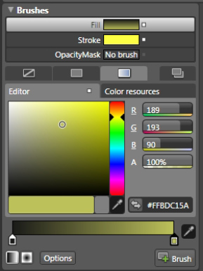
Figure 2.22 Defining brushes for the Ellipse control
We name it roundBack. The following is the XAML that is generated as we design in Expression Blend:
<Ellipse x:Name="roundBack"

   ToolTipService.ToolTip="Start automatic presentation" Height="47"

   HorizontalAlignment="Left" Margin="24.9810009002686,380,0,42.5369987487793"

   VerticalAlignment="Top" Width="47" Stroke="#FFFDFF44" >

    <Ellipse.Fill>

      <LinearGradientBrush EndPoint="0.5,1" StartPoint="0.5,0">

         <GradientStop Color="#FF1A1A19" />

         <GradientStop Color="#FFBDC15A" Offset="1"/>

      </LinearGradientBrush>

    </Ellipse.Fill>

</Ellipse>
In the center of the Ellipse, we draw a Play and a Stop symbol using the Pen tool and Rectangle, respectively, and change the Cursor property to Hand. Here we also have populated the ToolTip to display the tooltip when the symbol has the focus. The following is the XAML code for the Play symbol, which is named Play:
<Path x:Name="Play"

   ToolTipService.ToolTip="Start automatic presentation" Height="28.235"

   Width="20" HorizontalAlignment="Left" Margin="41.9809989929199,392,0,51"

   VerticalAlignment="Top" Fill="#FFFFFFFF" Stretch="Fill" Stroke="#FF000000"

   Data="M120,362 L120,385 L136,373.99991" Cursor="Hand" />
Then we set the Visibility of the Stop symbol to Collapsed in the Appearance category under the Properties tab, as highlighted in Figure 2-23.
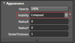
Figure 2.23 Defining the appearance of the Stop symbol
We name this symbol Stop. The following is the equivalent XAML code for the Stop symbol:
<Rectangle x:Name="Stop" ToolTipService.ToolTip="Stop automatic presentation"

   HorizontalAlignment="Left" Margin="38,396,0,54" VerticalAlignment="Top"

   Fill="#FFFFFFFF" Visibility="Collapsed" Width="21" Height="20"

   Stroke="#FF000000"/>
Figure 2-24 shows the Play/Stop symbol we just created.

Figure 2.24 Play/Stop symbol for the My Album RIA
Later in the code-behind step, we will bind an event handler to the Play and Stop symbols to implement the slide show feature.
Defining Animations Using a Storyboard
We'll create four animations: two for a fade-in effect for pictures and thumbnails and two for mouse over and out animations for each category's TextBlock XAML control. Here we define each animation as a Storyboard in Page.xaml using a ContentControl as a Resources item.
The grow and shrink storyboards are initiated for the various categories' MouseEnter and MouseLeave events. You will see in the "Defining Application Behavior Through the Code-Behind" section that we will develop some event handlers that will use both of these animations for the TextBlock XAML controls. Note that for the grow, shrink, and fadeThumb storyboards, we will set the Storyboard.TargetName property dynamically in the Page.xaml.cs code-behind within MouseEnter and MouseLeave event handlers. We assign single storyboard animations for every category and thumbnail by providing the TargetName property dynamically.
The following is the animation implementation using Storyboard elements:
<ContentControl Grid.RowSpan="1" Content="">

   <ContentControl.Resources>


      <Storyboard x:Name="grow">

         <DoubleAnimation

             Storyboard.TargetProperty ="FontSize"

             From="14.667"

             To="19"

             SpeedRatio="5"/>

      </Storyboard>


      <Storyboard x:Name="shrink">

         <DoubleAnimation

            Storyboard.TargetProperty ="FontSize"

            From="19"

            To="14.667"

            SpeedRatio="5"/>

     </Storyboard>


     <Storyboard x:Name="fadeIn">

        <DoubleAnimation

           Storyboard.TargetName = "imgStage"

           Storyboard.TargetProperty ="Opacity"

           From="0"

           To="1"/>

     </Storyboard>


     <Storyboard x:Name="fadeThumb">

        <DoubleAnimation

           Storyboard.TargetProperty ="Opacity"

           From="0.4"

           To="1"

           SpeedRatio="5"/>

     </Storyboard>


   </ContentControl.Resources>

</ContentControl>
Preparing Thumbnails for the Preview Pane Using Microsoft Expression Encoder
We'll use Expression Encoder to create thumbnails of the pictures and videos of different categories for the preview pane. The following steps explain how to create thumbnails of a video using Expression Encoder:
1. Start Microsoft Expression Encoder.
2. In the File menu, click New Job.
3. In the Media Content section, click Import (see Figure 2-25). This will bring up the Import Media Files dialog box.
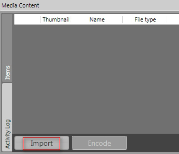
Figure 2.25 Importing media files using Expression Encoder
4. Select a video file and then click Open. The Media Content section displays the selected video in the vertical Item tab, as shown in Figure 2-26.
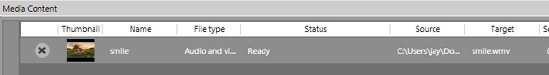
Figure 2.26 The Item tab displaying imported media files
5. Add additional videos by repeating steps 3 and 4.
6. On the right side of the application window, click the Output tab (see Figure 2-27).
Figure 2.27 The Output tab defining encoding properties of imported media files
7. You are now presented with three options to extract thumbnails from a selected video file: Best Frame, 1st Frame, and Custom (see Figure 2-28). You can choose any one of these you like. When choosing Custom, Expression Encoder will ask for a specified instance of time from which the frame is extracted. If you select None, the thumbnails will not be extracted.
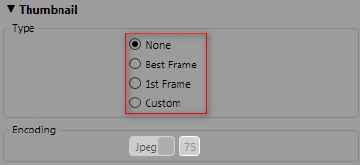
Figure 2.28 Setting up the Thumbnail section within the Output tab
8. In the Encoding category, jpeg is the default. Leave this as is for now.
9. In the Job Output category, set Template to None (see Figure 2-29). This will just create video and thumbnail.
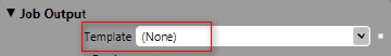
Figure 2.29 Setting up the Job Output section within the Output tab
10. In the Media Content section, click Encode to encode the video and generate the thumbnail.
11. Note the directory location that is displayed in the Job Output section of the Media Content section. This directory contains the encoded videos and the thumbnail images. To simplify development efforts, we will keep the original name for the video and related thumbnail by renaming the thumbnail appropriately.
Let's add image files to the myAlbum Silverlight project at root level. We will organize image files using the directory structure <CategoryName>/0#.jpg, where # will be the file number (in our case, it will be from 1 to 6 for each category) as shown in Figure 2-30. So the first image in the Cartoon category would be cartoon/01.jpg.
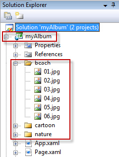
Figure 2.30 Adding image files to the Silverlight Project
Since image files will be small compared to video files, we will keep image files as part of the myAlbum deployment package (XAP file). You can achieve this by keeping the default value, Resource, of the Build Action property and the default value, Do not copy, of the Copy to Output Directory property.
Now let's reference video files to the myAlbum Silverlight project by adding them under the ClientBin folder of the myAlbum.Web project. We will organize video files and related thumbnail image files using the directory structure v<CategoryName>/0#.wmv for video files and v<CategoryName>/0#.jpg for related thumbnail files, where # will be the file number as shown in Figure 2-31. So the first video in the Cartoon category would be vcartoon/01.wmv, and the related thumbnail image would be vcartoon/01.jpg.
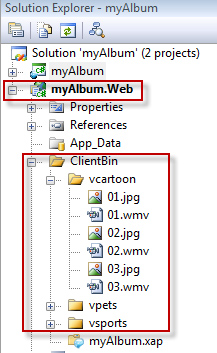
Figure 2.31 Adding video files to the Silverlight project
To keep the myAlbum deployment package (XAP file) at the minimum size and thus reduce the initial application loading time, we will not include video files as part of the deployment package. You can achieve this by accessing the advance properties of each video file in the Solution Explorer window. Set the Build Action property to None and Copy to Output Directory property to Do not copy (the default value) for each video file.
So when we deploy the My Album application, we need to copy all of these video files to the ClientBin folder manually. For debugging purposes, we need to copy them from the myAlbum project to the ClientBin folder under the myAlbum.Web project as shown in Figure 2-31.
The build action topic will be covered in detail in the "Packaging the My Album Silverlight Application" section of this chapter.
Defining Application Behavior Through the Code-Behind
So far we have created a very rich user interface for the My Album application without writing a single line of code. As you have seen, we have used Expression Blend to define the look and feel of the My Album application. Now we will use Visual Studio 2008 SP1 to define the behavior of the application by implementing different event integrations using managed code-behind.
Figure 2-32 demonstrates the different types of required event integration to implement the required functionalities.
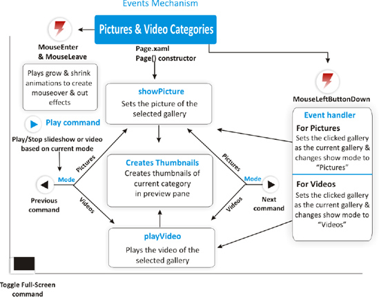
Figure 2.32 My Album application code-behind events integration
Now let's write a few lines of code to implement the functionality that allows the user to surf through the various picture and video categories of the My Album application.
When we create a new Silverlight application project using Visual Studio 2008, the following namespaces are added by default:
using System;

using System.Collections.Generic;

using System.Linq; using System.Net;

using System.Windows; using System.Windows.Controls;

using System.Windows.Documents;

using System.Windows.Input;

using System.Windows.Media;

using System.Windows.Media.Animation;

using System.Windows.Shapes;
In addition to the preceding namespaces, we need to add the following two namespaces in order to support the My Album functionality:
using System.Windows.Media.Imaging;

using System.Windows.Threading;
The System.Windows.Media.Imaging namespace allows us to access the BitmapImage object. We will use this object to dynamically set the source of the thumbnails as well as to set the source of the Image container (i.e., the imgStage XAML user control).
The System.Windows.Threading namespace allows us to access the DispatcherTimer object that will enable the My Album application's autoplay slide show feature. We will use a fixed time interval for changing pictures of the currently selected gallery.
We need to declare a strongly typed list of Uri objects to represent the picture path, video path, and thumbnails. The following global class-level variables are defined for the My Album application:
        //Different Uri for each category of pictures

        List<Uri> natureUri;

        List<Uri> cartoonUri;

        List<Uri> beachUri;


        //Different Uri for each category of videos

        List<Uri> vcartoonUri;

        List<Uri> vpetsUri;

        List<Uri> vsportsUri;


        //Different Uri for each category of video thumbnails

        List<Uri> vthumbcartoonUri;

        List<Uri> vthumbpetsUri;

        List<Uri> vthumbsportsUri;


        //Uri list for storing reference for active picture category

        List<Uri> currentPicCategory;


        //Uri list for storing reference for active video category

        List<Uri> currentVidCategory;

        List<Uri> currentVidThumbCategory;
Also add two more global class-level variables to iterate through the preceding defined collections and determine the mode of play (i.e., videos or pictures).
       //Int variable to iterate through Uri collection

       int playIndex;


       //String to determine current show mode i.e., videos or pictures

       string showMode;
Next, create a DispatcherTimer object called timer to enable the automatic slide show.
       //Timer for automatic slide show

       DispatcherTimer timer = new DispatcherTimer();
Now let's define the constructor of the Page class.
First we need to initialize the list of earlier declared Uri objects using the following code snippet:
         //Initializing the Uri collections

         currentPicCategory = new List<Uri>();

         currentVidCategory = new List<Uri>();

         currentVidThumbCategory = new List<Uri>();
Now assign the hard-coded relative path for images, videos, and thumbnails to the Uri object using the Add() method. The following is the sample code snippet.
Note For simplification, I have hard-coded the path of the media files, which is not a best practice, especially for the development of enterprise applications. However, the main goal of this chapter is to create a quick RIA using Microsoft Silverlight.
         //Different picture category intialization

         //Any number of images can be added to the album category.

         //Nature pictures

         natureUri = new List<Uri>();

         natureUri.Add(new Uri("nature/01.jpg", UriKind.Relative));

         natureUri.Add(new Uri("nature/02.jpg", UriKind.Relative));

         ...


         //Beach Pictures

         beachUri = new List<Uri>();

         beachUri.Add(new Uri("beach/01.jpg", UriKind.Relative));

         beachUri.Add(new Uri("beach/02.jpg", UriKind.Relative));

         ...


         //Cartoon pictures

         cartoonUri = new List<Uri>();

         cartoonUri.Add(new Uri("cartoon/01.jpg", UriKind.Relative));

         cartoonUri.Add(new Uri("cartoon/02.jpg", UriKind.Relative));

         ...


         //Different video category intialization

         //Any number of videos can be added to the album category.

         //Cartoon videos

         vcartoonUri = new List<Uri>();

         vcartoonUri.Add(new Uri("vcartoon/01.wmv", UriKind.Relative));

         ...


         //Pets videos

         vpetsUri = new List<Uri>();

         vpetsUri.Add(new Uri("vpets/01.wmv", UriKind.Relative));

         ...


         //Sports videos

         vsportsUri = new List<Uri>();

         ...


         //Sports thumbnails

         vthumbsportsUri = new List<Uri>();

         vthumbsportsUri.Add(new Uri("vsports/01.jpg", UriKind.Relative));
Our application starts with the pictures gallery, so we need to set the showMode to picture and also specify the name of the initial gallery that should be displayed when the application loads. So add the following lines of code immediately after InitializeComponent():
         //Default mode is picture

         showMode = "picture";
         //Default picture category

         currentPicCategory = natureUri;
Finally, we call the showPicture() method so it can create thumbnails and set the first picture in the imgStage picture container. You'll see this method in the section "The showPicture Method" later in this chapter.
         //Set startup picture and thumbnails

         showPicture ();
Category MouseEnter, MouseLeave, and MouseLeftButtonDown Events
Now we need to use Expression Blend to define the MouseEnter, MouseLeave, and MouseLeftButtonDown events for the Pictures (see Figure 2-33) and Videos (see Figure 2-34) categories.
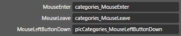
Figure 2.33 Defining events for the Pictures category using Microsoft Expression Blend
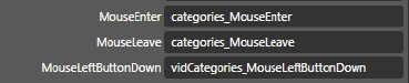
Figure 2.34 Defining events for the Videos category using Microsoft Expression Blend
Common MouseEnter Event for the Picture and Video Categories
To make things simple and quick, we created the simple grow animation that targets the FontSize property of a TextBlock in the "Defining Animations Using a Storyboard" section. This animation increases the FontSize on MouseEnter, thus highlighting the user's choice. Here we use that animation in the code-behind:
//Categories MouseEnter animations

private void categories_MouseEnter(object sender, MouseEventArgs e)

{

      //Stop running "grow" storyboard

      grow.Stop();

      //Get the reference of TextBlock that raises this event by casting

      //sender object to TextBlock

      TextBlock txtRef = (TextBlock)sender;

      //Set TargetNameProperty value of grow storyboard using cast

      //sender object

      grow.SetValue(Storyboard.TargetNameProperty, txtRef.Name);

      //Begin the storyboard

      grow.Begin();

}
Common MouseLeave Event for the Picture and Video Categories
We also created the simple shrink animation that decreases the value of the FontSize property of a TextBlock. Here we use that animation in the code-behind:
//Categories MouseLeave animations

private void categories_MouseLeave(object sender, MouseEventArgs e)

{

      //Stop running "shrink" storyboard

      shrink.Stop();

      //Get the reference of TextBlock that raises this event by casting

      //sender object to TextBlock

      TextBlock txtRef = (TextBlock)sender;

      //Set TargetNameProperty value of shrink storyboard using cast sender object

      shrink.SetValue(Storyboard.TargetNameProperty, txtRef.Name);

      //Begin the storyboard

      shrink.Begin();

}
MouseLeftButtonDown Event for the Pictures Categories
We use one central event handler named picCategories_MouseLeftButtonDown for all three Pictures categories. Here we need to cast the sender object to a TextBlock object so at runtime the event handler can determine which category has raised this event. For that, we use the Name property of the cast catRef TextBlock. Based on the Name property value, we set the currentPicCategory to point to the appropriate category. We also set the showMode variable to picture, make the proper presentation play mode visible, and display the first picture within the container by calling the showPicture() method. The following is the appropriate code snippet:
//Picture categories MouseLeftButtonDown

private void

   picCategories_MouseLeftButtonDown(object sender, MouseButtonEventArgs e)

       {

           TextBlock catRef = (TextBlock)sender;

           switch (catRef.Name.ToUpper())

           {

               case "CATNATURE":

                   currentPicCategory = natureUri;

                   currentView.Text = "Nature";

                   break;


               case "CATBEACH":

                   currentPicCategory = beachUri;

                   currentView.Text = "Beach";

                   break;


               case "CATCARTOON":

                   currentPicCategory = cartoonUri;

                   currentView.Text = "Cartoon";

                   break;

           }

           //Set mode to "picture"

           showMode = "picture";


           //Changing visibility of round play button according to play mode

           Play.Visibility = Visibility.Visible;

           Stop.Visibility = Visibility.Collapsed;


           //Changing visibility of imgStage & vidStage according to mode

           vidStage.Visibility = Visibility.Collapsed;

           imgStage.Visibility = Visibility.Visible;
          //Reset index so it now points to first picture in the selected category

           playIndex = 0;


           //Show the picture and create thumbnails of selected category

           showPicture ();

     }
MouseLeftButtonDown event for the Video Categories
As implemented for the picture categories, we also will use one central event handler named vidCategories_MouseLeftButtonDown for all three video categories. We will cast sender to TextBlock, so the event handler can determine which category has raised this event at runtime. Again, we use the Name property of the cast TextBlock object. Based on the Name property value, we set currentVidCategory to point to the right category. We also set the showMode variable to video, make the proper presentation play mode visible, and play the first video within the container by calling the playVideo() method. The following is the appropriate code snippet:
//Video categories MouseLeftButtonDown

private void

  vidCategories_MouseLeftButtonDown(object sender, MouseButtonEventArgs e)

        {


            TextBlock catRef = (TextBlock)sender;

            switch (catRef.Name.ToUpper())

            {

                case "VCATSPORTS":

                    currentVidCategory = vsportsUri;

                    currentVidThumbCategory = vthumbsportsUri;

                    currentView.Text = "Sports";

                    break;


                case "VCATPETS":

                    currentVidCategory = vpetsUri;

                    currentVidThumbCategory = vthumbpetsUri;

                    currentView.Text = "Pets";

                    break;


                case "VCATCARTOON":

                    currentVidCategory = vcartoonUri;

                    currentVidThumbCategory = vthumbcartoonUri;

                    currentView.Text = "Cartoon";

                    break;

            }


            //Set mode to "video"

            showMode = "video";


            //Changing visibility of round play button according to play mode

            Play.Visibility = Visibility.Collapsed;

            Stop.Visibility = Visibility.Visible;


            //Changing visibility of imgStage & vidStage according to mode

            imgStage.Visibility = Visibility.Collapsed;

            vidStage.Visibility = Visibility.Visible;
             //Reset index so it now points to first video in the selected category

            playIndex = 0;


            //Plays the video and creates thumbnails of selected category

            playVideo ();

         }
The showPicture() method creates thumbnails by calling the createThumbnails() method and sets up pictures of the selected category. The following is a self-explanatory code-snippet of this method:
//Central method for showing picture of current gallery

private void showPicture()

{

  //Shows the image

  imgStage.SetValue(Image.SourceProperty,

     new BitmapImage(currentPicCategory[playIndex]));


  //Creates thumbnails of current category in preview pane

  createThumbnails();


  //Synchronizes the thumbnail with active picture in imgStage image control

  fadeThumb.SetValue(Storyboard.TargetNameProperty, "thumb" + imgIndex);

  fadeThumb.Begin();

  fadeIn.Begin();

}
Similarly, the playVideo() method creates thumbnails by calling the createThumbnails() method and plays a video of the selected category.
//Central method for playing video of current gallery

private void playVideo()

{

  //Plays the video

  vidStage.SetValue(MediaElement.SourceProperty, currentVidCategory[imgIndex]);

  vidStage.AutoPlay = true;


  //Creates thumbnails of current category in preview pane

  createThumbnails();


  //Synchronizes the thumbnail with active video in vidStage media element

  fadeThumb.SetValue(Storyboard.TargetNameProperty, "thumb" + imgIndex);

  fadeThumb.Begin();

  fadeIn.Begin();

}
We use one method to create thumbnails for both picture and video categories based on the value of the showMode string variable. We will use an Image object to create a series of thumbnail objects with proper events (see the following steps) to enable selection of the thumbnail and view/play relative pictures/videos upon selection.
1. Set the Margin property using the Thickness object so each thumbnail will have a slight amount of space at the right.
2. For unique naming of each thumbnail, we will use the idx integer type variable and will increment its value and use the SetValue property to name each thumbnail as we create it.
3. Set Opacity to 0.4 to make thumbnails slightly fade out as default behavior while they are not selected.
4. Set the Cursor property to change from Arrow to Hand on MouseEnter.
5. We also need to dynamically bind two event handlers—MouseLeftButtonDown and MouseEnter— to thumbnails.
6. Finally, we will add each thumbnail Image object to the thumbBar StackPanel preview pane. See the following code snippet for more details:
//Central method for creating thumbnails of current gallery

private void createThumbnails()

{

  //Clear thumbnails before displaying the currently selected one

  thumbBar.Children.Clear();

  int idx = 0;


  if (showMode.ToUpper() == "PICTURE")

  {

    foreach (Uri item in currentPicCategory)

    {


      Image thumbnails = new Image();

      //Right margin for each thumbnail

      thumbnails.Margin = new Thickness(0, 0, 10, 0);

      //Unique naming for each thumbnail to reference it later in codeBehind

      thumbnails.SetValue(NameProperty, "thumb" + idx);

      //Set thumbnail image control source property

      thumbnails.Source = new BitmapImage(item);

      //On mouseOver, cursor will be changed to Hand from Arrow

      thumbnails.Cursor = Cursors.Hand;

      //Opacity decreased

      thumbnails.Opacity = 0.4;

      //Add thumbnail image controls to stackpanel thumbBar

      thumbBar.Children.Add(thumbnails);

      //Dynamically attaching event handlers MouseLeftButtonDown & MouseEnter to

      //each thumbnail

      thumbnails.MouseLeftButtonDown += new

          MouseButtonEventHandler(thumbnails_MouseLeftButtonDown);

      thumbnails.MouseEnter += new MouseEventHandler(thumbnails_MouseEnter);

      //Increment in index that will be used in naming of each thumbnail

      idx++;

    }

  }


  else //The mode is video.


  {

    foreach (Uri item in currentVidThumbCategory)

    {


      Image vthumbnails = new Image();
      //Right margin for each thumbnail

      vthumbnails.Margin = new Thickness(0, 0, 10, 0);

      //Unique naming for each thumbnail to reference it later in codeBehind

      vthumbnails.SetValue(NameProperty, "thumb" + idx);

      //Set thumbnail image control source property

      vthumbnails.Source = new BitmapImage(item);

      //On mouseOver, cursor will be changed to Hand from Arrow

      vthumbnails.Cursor = Cursors.Hand;

      //Opacity decreased

      vthumbnails.Opacity = 0.4;

      //Add thumbnail image controls to stackpanel thumbBar

      thumbBar.Children.Add(vthumbnails);

      //Dynamically attaching event handlers MouseLeftButtonDown & MouseEnter to

      //each thumbnail

      vthumbnails.MouseLeftButtonDown += new

          MouseButtonEventHandler(thumbnails_MouseLeftButtonDown);

      vthumbnails.MouseEnter += new MouseEventHandler(thumbnails_MouseEnter);

      //Increment in index that will be used in naming of each thumbnail

      idx++;

    }

  }


}
Thumbnails MouseEnter and MouseLeftButtonDown Events
As shown in the showPicture() and playVideo() methods, we dynamically assign event handlers for MouseEnter and MouseLeftButtonDown for each thumbnail when we create them. The following sections show implementation of both these methods.
thumbnails_MouseEnter Event Implementation
When users mouse over a thumbnail, the MouseEnter event is raised. As we set Opacity to 0.5 when creating thumbnails in the createThumbnails() method, we will increase this Opacity value to 1 using the fadeThumb storyboard by setting the TargetNameProperty property of this storyboard dynamically. This is a similar approach to the one we used for the categories' MouseLeftButtonDown event (i.e., casting the sender object to an Image object named imgRef in this case). The following is the code snippet:
//This event is raised when user mouses over a thumbnail and

//changes Opacity to 1

public void thumbnails_MouseEnter(object sender, MouseEventArgs e)

{

    //Stop animation

    fadeThumb.Stop();


    //Cast reference from sender object to Image control

   Image imgRef = (Image)sender;


    //Using name property of cast image, dynamically set

    //TargetNameProperty of fadeThumb storyboard

    fadeThumb.SetValue(Storyboard.TargetNameProperty, imgRef.Name);


    //Start animation

    fadeThumb.Begin();

}
thumbnails_MouseLeftButtonDown Event Implementation
When a user clicks a thumbnail, the picture or video gets displayed in the appropriate container. To achieve this function, we bind the MouseLeftButtonDown event for thumbnails as shown in the following code snippet. Note that to set the vidStage Media element's Source property, we have to perform string manipulation to keep it simplified.
vidStage.Source = new

   Uri(bmi.UriSource.ToString().Replace(".jpg",".wmv"),UriKind.Relative);
In the preceding code, we simply get the Uri for the video file by replacing .jpg with .wmv, and we keep the same name for the video and related thumbnail image. So by just changing the file extension, we can refer to the related video file. As explained earlier, for the enterprise application we should come up with a more generic approach.
//This event is raised when user clicks thumbnail to display image/video

//in imgStage/vidStage control

public void

   thumbnails_MouseLeftButtonDown(object sender, MouseButtonEventArgs e)

{

   //Cast reference from sender object to Image control

   Image img = (Image)sender;

   //Using source property of cast image, dynamically create

   //bitmapImage to display in imgStage image control

   BitmapImage bmi = (BitmapImage)img.Source;

   if (showMode == "picture")

       imgStage.Source = new BitmapImage(bmi.UriSource);

   else

   //Getting video source from thumbnail by some string manipulation

   vidStage.Source = new

      Uri(bmi.UriSource.ToString().Replace(".jpg",".wmv"),UriKind.Relative);

   fadeIn.Begin();


}
Implementing Full-Screen/Normal-Screen Mode Using the MouseLeftButtonDown Event
As shown in Figure 2-35, Expression Blend allows integration with the XAML control event through its IDE.
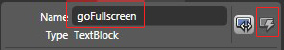
Figure 2.35 Defining XAML control properties using Expression Blend
Click the Event section of the Full-Screen button within the IDE (the highlighted command in Figure 2-35). This will bring up the section shown in Figure 2-36 to automatically create and bind the code-behind event handler for the goFullscreen TextBlock control's MouseLeftButtonDown event.
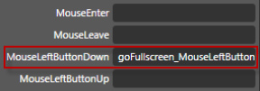
Figure 2.36 XAML controls event integration using Expression Blend
As soon as we type goFullscreen_MouseLeftButtonDown in the MouseLeftButtonDown event text box and press Enter, Visual Studio will open the Page.xaml.cs code-behind file and create an empty event handler.
The next step is to write simple custom code to control the behavior of the image/video content control mode.
     //Toggle button for changing view between full and normal screen

     private void

         goFullscreen_MouseLeftButtonDown(object sender, MouseButtonEventArgs e)

     {

         Application.Current.Host.Content.IsFullScreen =

              !Application.Current.Host.Content.IsFullScreen;

         if (goFullscreen.Text.ToUpper() == "FULL SCREEN")

             goFullscreen.Text = "Normal Screen";

         else

             goFullscreen.Text = "Full Screen";

     }
As shown, we toggle the content control to full-screen or normal-screen mode based on the current value of the goFullscreen XAML control Text value.
Previous and Next Symbol MouseLeftButtonDown Events
Implement the MouseLeftButtonDown event for the prev and next symbols using Expression Blend as explained in the previous section to move to the previous or next picture or video based on the selected category. The following is the prev version:
         //Previous button

         private void prev_MouseLeftButtonDown(object sender, MouseButtonEventArgs e)

         {

             if (showMode == "picture")

             {

                 if (playIndex == 0)

                     playIndex = currentPicCategory.Count −1;

                 else

                     playIndex--;


                 showPicture();

             }

             else

             {

                if (playIndex == 0)

                    playIndex = currentVidCategory.Count −1;

                else

                   playIndex--;


                playVideo();

             }

           }
Similarly, you can implement the next symbol event to display the next picture or video.
//Next command

private void next_MouseLeftButtonDown(object sender, MouseButtonEventArgs e)

{

    if (showMode == "picture")

    {
if (playIndex == currentPicCategory.Count −1)

        playIndex = 0;

    else

       playIndex++;


    showPicture();

 }

 else

 {

    if (playIndex == currentVidCategory.Count −1)

        playIndex = 0;

    else

       playIndex++;


    playVideo();

 }

}
Play and Stop picture Slide Show or Video
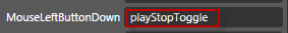
To play or stop the picture slide show of the selected category or the selected video, we need to bind an event handler to the previously created Play, Stop, and roundBack symbols. We'll use Expression Blend to quickly set up an event handler for play, as shown in Figure 2-37.
Figure 2.37 Binding event handlers to the object using Expression Blend
Next we'll discuss the code-behind.
Play/Stop Picture Slide Show or Video
As our application has the play presentation feature for the picture category and play/stop video feature for the video category, we need to implement behavior for the command based on the user selection of media type. The showMode variable defines the selected category. With the value picture for the showMode variable, we implement the play presentation feature for the picture category. Here we use the DispatcherTimer object named timer with the Interval property set to 4 seconds.
For the video category, the same event handler performs the play/stop function on the vidStage media element object. As shown in the following code, we stop the timer object and thus stop the automatic slide show of pictures or currently playing video based on the selected media type category:
private void playStopToggle(object sender, MouseButtonEventArgs e)

{

    //Start slide show of pictures and start video


    if (Play.Visibility == Visibility.Visible)

    {

        Play.Visibility = Visibility.Collapsed;

        Stop.Visibility = Visibility.Visible;


        if (showMode == "picture")

        {

            timer.Interval = new TimeSpan(0, 0, 4);
            timer.Start();

            timer.Tick += new EventHandler(timer_Tick);

        }

        else

        {

            vidStage.Play();

        }

     }

     else

     {

         //Stop the current presentation or video


         Play.Visibility = Visibility.Visible ;

         Stop.Visibility = Visibility.Collapsed ;


         if (showMode == "picture")

         {

             timer.Stop();

         }

         else

         {

             vidStage.Pause();

         }

      }
The slide show has a 4-second interval, which is implemented using the DispatcherTimer named timer. We need to implement the timer_Tick event to raise the event every 4 seconds as shown in the following code snippet. Every 4 seconds, we move to the next picture, or if it is the last picture, we move to the first picture.
//In picture gallery presentation mode, this event is raised every 4 secs

    void timer_Tick(object sender, EventArgs e)

    {

        if (imgIndex == currentPicCategory.Count −1)

            imgIndex = 0;

        else

            imgIndex++;


        showPicture();

    }
Finishing the Development of the My Album Application
We've now finished the development of the My Album application. If you revisit the preceding sections, you will notice that Silverlight, Visual Studio, and Expression Blend provide a promising agile RIA development platform. I believe this application can easily be developed in 60 minutes, once you know what you are going to develop and have designed it.
If you compile and build the application and run it, it should function properly, meeting our objectives.
Packaging the My Album Silverlight Application
When you compile any Silverlight project, the associated files such as images, videos, text files, and XML files get added into one package with the file extension .xap along with the compiled DLL of Page.xaml.cs, Page.xaml, and any other referenced assemblies. We will deploy the compiled My Album XAP package to the Silverlight hosting server on Microsoft Silverlight Streaming service provided by Windows Live. When a user requests the page, which has Silverlight content embedded, the XAP package is downloaded on the client machine. To reduce the initial download time and improve the overall application startup performance, it is crucial to keep the size of the XAP package as small as possible.
Note The XAP package is nothing but a standard ZIP archive, and you can view its contents using any standard files compression software like WinZip (http://www.winzip.com) or WinRAR (http://www.rarlab.com).
We need to consider the XAP package definition when we work with an application that has a large number of video or image files in order to provide better performance and user experience. If all the files are compiled into the XAP package, it would be a large XAP package that can take significant time to download on the client machine.
The build actions describe how a file relates to the build and deployment processes. You can set the Build Action property of any file that is part of your project through the Properties window of that file as shown in Figure 2-38.
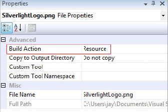
Figure 2.38 Defining individual file deployment behavior using the Build Action property
Now let's take a look at the different possible values of the Build Action property and its impact on the compilation of the Silverlight project as an XAP file.
Figure 2-39 shows the different values of the Build Action property.
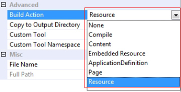
Figure 2.39 Different options for the Build Action property
In the following text, we will discuss the Build Action values that are applicable within the scope of our application.
Usually you use the Content option to add small web or media files to your Silverlight application within the package file without impacting the application startup performance. In this case the file is
Added to the XAP package at the application root level.
Accessible using a URI relative to the application root. You must precede the URI with a leading slash (/)—for example,
<Image Source="/SilverlightLogo.jpg" />.
Build Action As None with the Copy to Output Directory Property Set Relatively
The None option is a good one when you are working with large video or image files and want to keep them out of the XAP package. By default, a video file's Build Action property is set to None with the Copy to Output Directory property set to Do not copy. As mentioned earlier for this project, we have set the Build Action property to None for our video files. So upon deployment, you must upload the referenced video files alongside the XAP package. You can also use streaming or progressive download to access them efficiently, as well as employ an absolute URI here.
In this case the file
Is not added to the XAP package, but the Copy to Output Directory property will ensure it gets copied to the directory where the XAP file is.
Is accessible using a URI relative to the application root. You must precede the URI with a leading slash (/)—for example,
<Image Source="/SilverlightLogo.jpg" />.
By default, the XAP package is created in the ...PrecompiledWeb<your project name>Client-Bin directory as the <your Project name>.xap file. If you set the file's Build Action property to Resource, it gets embedded into the project DLL file. In this case it will not be straightforward to access the resource file. You can retrieve the resource file by decompiling the DLL file using third party tools. There is no need for a leading slash (/) before the URI—for example, <Image Source="SilverlightLogo.jpg" />.
Deploying the My Album Silverlight Application on Microsoft Silverlight Streaming by Windows Live
Once an application has been fully tested and is ensured to be stable, the application can be deployed. The simplest deployment option is to copy the application files and resources to a server. In most cases, Silverlight applications just need to be copied to a web server where users can access them over the Web using a web browser.
To support and accelerate the use of Silverlight among developers and designers, Microsoft created a space online to host Silverlight applications under the Windows Live suite and services. The Microsoft Silverlight Streaming Service, which is free to use (as of the time of writing), can be found at http://silverlight.live.com/.
As described on the Microsoft Silverlight Streaming web site:
Microsoft® Silverlight™ Streaming by Windows Live™ is a companion service for Silver-light that makes it easier for developers and designers to deliver and scale rich media as part of their Silverlight applications. The service offers web designers and developers a free and convenient solution for hosting and streaming cross-platform, cross-browser media experiences and rich interactive applications that run on Windows™ and Mac. Combined with the ability to create content with Microsoft® Expression and other 3rd party tools, web designers and content publishers wishing to integrate Silverlight applications into their online properties can enjoy complete control of the end user experience.
To start with the Microsoft Silverlight Streaming Service, you need to obtain an account ID and account key. To obtain an account, you will need a Windows Live ID. If you have one, you can simply log in to the Microsoft Silverlight Streaming Service and generate your account ID and key. If you do not have a Windows Live ID, you can sign up for one at the streaming service web site.
Once you have an account ID and account key, you are ready to upload the application to the service. The following step-by-step explanation details how to deploy the My Album Silverlight application using the Microsoft Silverlight Streaming Service:
1. Sign up for a Silverlight Live service.
2. Create a Silverlight application.
3. Create valid ZIP package of necessary files.
4. Upload this ZIP archive to Microsoft Silverlight Streaming Server.
5. Create a web page to share the application.
I will assume that you have successfully logged in to the Windows Silverlight Streaming Service using your Windows Live ID.
For deploying the My Album application on the Microsoft Silverlight Streaming Server, you need to work with the Manage Applications feature available on the logged-in page, as highlighted in Figure 2-40.
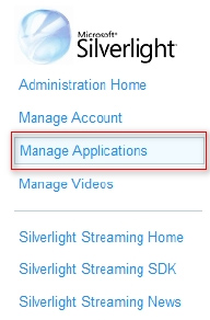
Figure 2.40 Deploying Silverlight applications on Microsoft Silverlight Streaming Server provided by Windows Live
The Manage Applications option allows users to upload and manage one or more Silverlight applications on the Microsoft Silverlight Streaming Server. Clicking the Manage Applications option will bring up the page shown in Figure 2-41. Click the Upload an application option.
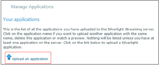
Figure 2.41 Uploading a Silverlight application XAP package on Microsoft Silverlight Streaming Server
You will get a screen similar to the one in Figure 2-42. You need to enter your application name, in this case My Album, and click the Create button.
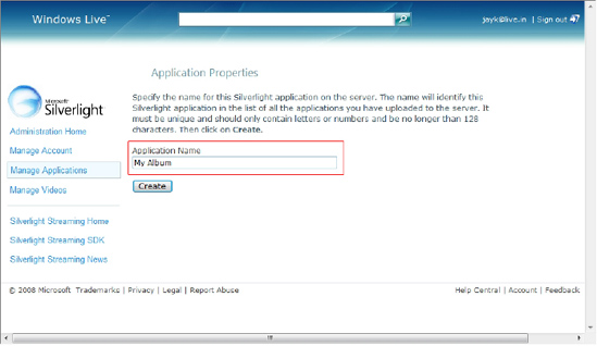
Figure 2.42 Creating a new Silverlight application on the Microsoft Silverlight Streaming Server
Once the My Album application is created, you can upload application files using the Browse option.
Note The size for a single video file must be smaller than 105MB to upload the file successfully on the Microsoft Silverlight Streaming Server.
The selected file must be a valid ZIP archive defining a Silverlight application with its manifest. As our application has videos, you need to copy all of them to the ClientBin folder as described earlier in the "Defining Application Behavior Through the Code-Behind" section. Now you need to create a valid ZIP archive—say, myAlbum.zip—that includes the XAP package and videos: select all the files including myAlbum.xap, right-click myAlbum.xap, and choose Send To Compressed (zipped) Folder.
Now click the Browse button, and navigate to the ...PrecompiledWebMy AlbumClientBin folder. Choose myAlbum.zip, click Open, and then click Upload.
After successfully uploading the myAlbum.zip file, you need to create the manifest for the Silver-light application. Click Create to create the manifest, as shown in Figure 2-43.
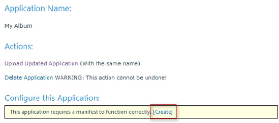
Figure 2.43 Creating a manifest for the Silverlight application
Clicking this button creates a manifest for the application and displays the message box shown in Figure 2-44.
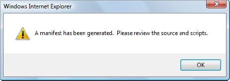
Figure 2.44 A message indicating the successful creation of your Silverlight application manifest
When you click OK, you will see the form where you can set different properties that will control the appearance of your Silverlight application. Here we will set three properties, Display name, Height, and Width, as shown in Figure 2-45.
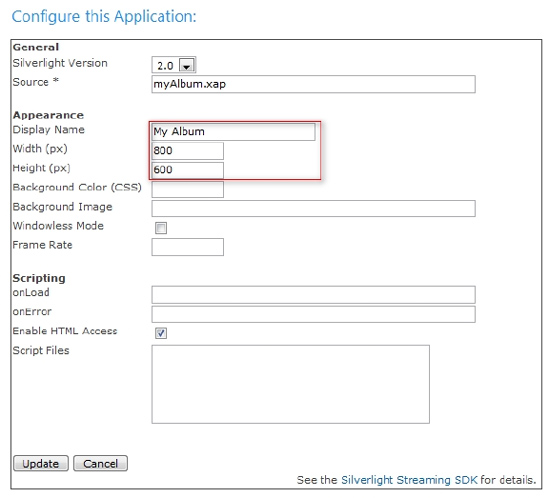
Figure 2.45 Configuring the Silverlight application
After filling up the required values, click Update. Now you can visit the Microsoft Silverlight Streaming site to check your deployed application. The application URL will be based on your account ID and the application name. In this case, the account ID is 60973 and the application name is My Album. As a result, the My Album application can be accessed on the Microsoft Silver-light Streaming Server using the following URL for testing purposes:
http://silverlight.services.live.com/invoke/60973/My%20Album/iframe.html
Note When you deploy your Silverlight application on the Microsoft Silverlight Streaming Server using your account, you will get a different unique account ID from the one mentioned in the preceding text. The deployed application can be accessed using the proper account ID only.
The next step is to include this deployed application within your page. Microsoft Silverlight Streaming Service provides two options to add the deployed Silverlight application to a web page, as shown in Figure 2-46.
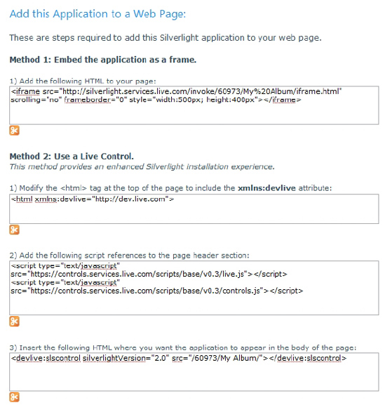
Figure 2.46 Different options for adding the deployed Silverlight application (on the Microsoft Silver-light Streaming Server) to your web page/application
Let's look at both approaches in detail.
Method 1: Embed the Application As a Frame
Embedding the Silverlight application as a frame is the simplest approach to adding the Silverlight application to your page. You need to copy the provided code (see Figure 2-46) and paste it into your HTML or ASPX page within the <td> or <div> section to embed the application as a frame. This approach has some common IFRAME limitations from the browser support point of view.
Method 2: Using a Live Control
Adding the Silverlight application as a Live Control is an enhancement that provides a better Silverlight installer experience than using an IFRAME. Follow the steps provided in Figure 2-46 to add your application as a Live Control to your page.
You can use one of these approaches to add the My Album application to your main web site as well. I have used Method 1 and embedded the My Album application as a frame to my web site, TechnologyOpinion.com. You can visit http://www.technologyopinion.com/myalbum.aspx to access the application.
This chapter provided a kick-start on introducing the development of a Silverlight-based RIA. The developed My Album application is a base application for this book, and later I will refer to it again and show you how to transform it into the Enterprise Training Portal RIA by explaining how to develop Silverlight-based enterprise RIAs.
There are two project templates available to develop Silverlight-based projects using Microsoft Visual Studio 2008 SP1. The Application project template helps to create a Silverlight-based RIA, whereas with the Class Library project template we can create reusable Silverlight library components.
We developed the My Album RIA with categorized presentation of images and video files supported. During the development of the application, I covered various aspects of the Silverlight technology capabilities:
Integration of Silverlight with Visual Studio IDE and development environment
Seamless integration with Microsoft Expression Blend for rich user interface definition and event integration
Use of WPF and XAML for the user interface definition
Managed code-behind integration to develop an interactive application
Rich .NET class library integration
Animation capabilities
Rich media integration
Use of Expression Encoder
With the development of the My Album application, it can be easily concluded that the combination of Microsoft .NET Framework 3.5, WPF-based Silverlight technology, Microsoft Visual Studio, and Expression Blend provides a promising agile RIA development platform.
The chapter evaluated different approaches to packaging Silverlight applications and the use of Microsoft Silverlight Streaming Service provided by Windows Live to deploy Silverlight applications. We deployed the developed My Album application on the Microsoft Silverlight Streaming Server to understand how you can use the free Microsoft Silverlight Streaming Service to host your media files and Silverlight application.
Use the following link to access the developed Microsoft Silverlight–based My Album RIA: http://www.technologyopinion.com/myalbum.aspx.
As you saw during the development of the My Album RIA, there is a lot we can improve (e.g., hard-coded content) to make it a properly designed enterprise-level application. Silverlight has all the features and capabilities to support the development and deployment of enterprise-level applications and services.
The next chapter uncovers the real meaning of the term "enterprise-ready technology platform" in the era of Enterprise 2.0 and Web 2.0. We will focus on what features and capabilities are required of an enterprise-ready technology platform. The chapter then maps these features and capabilities to those of Microsoft Silverlight to confirm that Silverlight is an enterprise-ready technology platform.
Links from the Microsoft Web Site
ASP .NET Controls for Silverlight, http://quickstarts.asp.net/3-5-extensions/silverlight/default.aspx
Developing Silverlight Library Assembly, http://msdn.microsoft.com/en-us/library/cc296243(VS.95).aspx
Animations in Silverlight Projects, http://www.silverlight.net/quickstarts/silverlight10/animations.aspx
Microsoft Expression home page, http://expression.microsoft.com/en-us/default.aspx (click the Products tab and either Expression Blend or Expression Encoder to go to product-specific pages)
ScottGu's Blog, "First Look at Using Expression Blend with Silverlight 2," http://weblogs.asp.net/scottgu/archive/2008/02/28/first-look-at-using-expression-blend-with-silverlight-2.aspx