
When it comes to data binding, not all ASP.NET controls are created equal. In the previous chapter, you saw how data binding can help you automatically insert single values and lists into all kinds of common controls. In this chapter, you'll concentrate on three more advanced controls—GridView, DetailsView, and FormView—that allow you to bind entire tables of data.
The rich data controls are quite a bit different from the simple list controls—for one thing, they are designed exclusively for data binding. They also have the ability to display more than one field at a time, often in a table-based layout, or according to what you've defined. They also support higher-level features such as selecting, editing, and sorting.
The rich data controls include the following:
GridView: The GridView is an all-purpose grid control for showing large tables of information. The GridView is the heavyweight of ASP.NET data controls.
DetailsView: The DetailsView is ideal for showing a single record at a time, in a table that has one row per field. The DetailsView also supports editing.
FormView: Like the DetailsView, the FormView shows a single record at a time and supports editing. The difference is that the FormView is based on templates, which allow you to combine fields in a flexible layout that doesn't need to be table-based.
ListView: The ListView plays the same role as the GridView—it allows you to show multiple records. The difference is that the ListView is based on templates. As a result, using the ListView requires a bit more work and gives you slightly more layout flexibility. The ListView isn't described in this book, although you can learn more about it in the Visual Studio Help, or in the book Pro ASP.NET 4 in VB 2010 (Apress).
In this chapter, you'll explore the rich data controls in detail.
The GridView is an extremely flexible grid control that displays a multicolumn table. Each record in your data source becomes a separate row in the grid. Each field in the record becomes a separate column in the grid.
The GridView is the most powerful of the rich data controls you'll learn about in this chapter, because it comes equipped with the most ready-made functionality. This functionality includes features for automatic paging, sorting, selecting, and editing. The GridView is also the only data control you'll consider in this chapter that can show more than one record at a time.
The GridView provides a DataSource property for the data object you want to display, much like the list controls you saw in Chapter 15. Once you've set the DataSource property, you call the DataBind() method to perform the data binding and display each record in the GridView. However, the GridView doesn't provide properties, such as DataTextField and DataValueField, that allow you to choose what column you want to display. That's because the GridView automatically generates a column for every field, as long as the AutoGenerateColumns property is True (which is the default).
Here's all you need to create a basic grid with one column for each field:
<asp:GridView ID="GridView1" runat="server" />
Once you've added this GridView tag to your page, you can fill it with data. Here's an example that performs a query using the ADO.NET objects and binds the retrieved DataSet:
Protected Sub Page_Load(ByVal sender As Object, _
  ByVal e As EventArgs) Handles Me.Load

    ' Define the ADO.NET objects.
    Dim connectionString As String = _
      WebConfigurationManager.ConnectionStrings("Northwind").ConnectionString
    Dim selectSQL As String = _
      "SELECT ProductID, ProductName, UnitPrice FROM Products"
    Dim con As New SqlConnection(connectionString)
    Dim cmd As New SqlCommand(selectSQL, con)
    Dim adapter As New SqlDataAdapter(cmd)

    ' Fill the DataSet.
    Dim ds As New DataSet()
    adapter.Fill(ds, "Products")

    ' Perform the binding.
    GridView1.DataSource = ds
    GridView1.DataBind()
End Sub
Remember, in order for this code to work you must have a connection string named Northwind in the web.config file (just as you did for the examples in the previous two chapters).
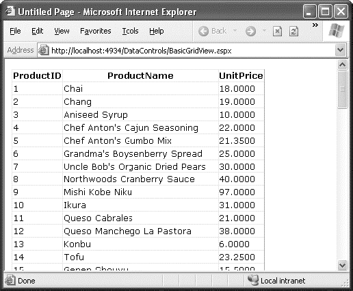
Figure 16-1 shows the GridView this code creates.
Of course, you don't need to write this data access code by hand. As you learned in the previous chapter, you can use the SqlDataSource control to define your query. You can then link that query directly to your data control, and ASP.NET will take care of the entire data binding process.
Here's how you would define a SqlDataSource to perform the query shown in the previous example:
<asp:SqlDataSource ID="sourceProducts" runat="server"
  ConnectionString="<%$ ConnectionStrings:Northwind %>"
  SelectCommand="SELECT ProductID, ProductName, UnitPrice FROM Products" />
Next, set the GridView.DataSourceID property to link the data source to your grid:
<asp:GridView ID="GridView1" runat="server"
DataSourceID="sourceProducts" />
These two tags duplicate the example in Figure 16-1 but with significantly less effort. Now you don't have to write any code to execute the query and bind the DataSet.
Using the SqlDataSource has positive and negative sides. Although it gives you less control, it streamlines your code quite a bit, and it allows you to remove all the database details from your code-behind class. In this chapter, you'll focus on the data source approach, because it's much simpler when creating complex data-bound pages that support features such as editing. In Chapter 22, you'll learn how to adapt these examples to use the ObjectDataSource instead of the SqlDataSource. The ObjectDataSource is a great compromise—it allows you to write customized data access code in a database component without giving up the convenient design-time features of the data source controls.
By default, the GridView.AutoGenerateColumns property is True, and the GridView creates a column for each field in the bound DataTable. This automatic column generation is good for creating quick test pages, but it doesn't give you the flexibility you'll usually want. For example, what if you want to hide columns, change their order, or configure some aspect of their display, such as the formatting or heading text? In all these cases, you need to set AutoGenerateColumns to False and define the columns in the <Columns> section of the GridView control tag.
Tip
It's possible to have AutoGenerateColumns set to True and define columns in the <Columns> section. In this case, the columns you explicitly define are added before the autogenerated columns. However, for the most flexibility, you'll usually want to explicitly define every column.
Each column can be any of several column types, as described in Table 16-1. The order of your column tags determines the left-to-right order of columns in the GridView.
Table 16.1. Column Types
Class | Description |
|---|---|
BoundField | This column displays text from a field in the data source. |
ButtonField | This column displays a button in this grid column. |
CheckBoxField | This column displays a check box in this grid column. It's used automatically for true/false fields (in SQL Server, these are fields that use the bit data type). |
CommandField | This column provides selection or editing buttons. |
HyperLinkField | This column displays its contents (a field from the data source or static text) as a hyperlink. |
ImageField | This column displays image data from a binary field (providing it can be successfully interpreted as a supported image format). |
TemplateField | This column allows you to specify multiple fields, custom controls, and arbitrary HTML using a custom template. It gives you the highest degree of control but requires the most work. |
The most basic column type is BoundField, which binds to one field in the data object. For example, here's the definition for a single data-bound column that displays the ProductID field:
<asp:BoundField DataField="ProductID" HeaderText="ID" />
This tag demonstrates how you can change the header text at the top of a column from ProductID to just ID.
Here's a complete GridView declaration with explicit columns:
<asp:GridView ID="GridView1" runat="server" DataSourceID="sourceProducts"
 AutoGenerateColumns="False">
  <Columns>
    <asp:BoundField DataField="ProductID" HeaderText="ID" />
    <asp:BoundField DataField="ProductName" HeaderText="Product Name" />
    <asp:BoundField DataField="UnitPrice" HeaderText="Price" />
  </Columns>
</asp:GridView>
Explicitly defining columns has several advantages:
You can easily fine-tune your column order, column headings, and other details by tweaking the properties of your column object.
You can hide columns you don't want to show by removing the column tag. (Don't overuse this technique, because it's better to reduce the amount of data you're retrieving if you don't intend to display it.)
You'll see your columns in the design environment (in Visual Studio). With automatically generated columns, the GridView simply shows a few generic placeholder columns.
You can add extra columns to the mix for selecting, editing, and more.
This example shows how you can use this approach to change the header text. However, the HeaderText property isn't the only column property you can change in a column. In the next section, you'll learn about a few more.
When you explicitly declare a bound field, you have the opportunity to set other properties. Table 16-2 lists these properties.
Table 16.2. BoundField Properties
Property | Description |
|---|---|
DataField | Identifies the field (by name) that you want to display in this column. |
DataFormatString | Formats the field. This is useful for getting the right representation of numbers and dates. |
ApplyFormatInEditMode | If True, the DataFormat string is used to format the value even when the value appears in a text box in edit mode. The default is False, which means the underlying value will be used (such as 1143.02 instead of $1,143.02). |
FooterText, HeaderText, and HeaderImageUrl | Sets the text in the header and footer region of the grid if this grid has a header (GridView.ShowHeader is True) and footer (GridView.ShowFooter is True). The header is most commonly used for a descriptive label such as the field name; the footer can contain a dynamically calculated value such as a summary. To show an image in the header instead of text, set the HeaderImageUrl property. |
ReadOnly | If True, it prevents the value for this column from being changed in edit mode. No edit control will be provided. Primary key fields are often read-only. |
InsertVisible | If True, it prevents the value for this column from being set in insert mode. If you want a column value to be set programmatically or based on a default value defined in the database, you can use this feature. |
Visible | If False, the column won't be visible in the page (and no HTML will be rendered for it). This gives you a convenient way to programmatically hide or show specific columns, changing the overall view of the data. |
SortExpression | Sorts your results based on one or more columns. You'll learn about sorting later in the "Sorting and Paging the GridView" section of this chapter. |
HtmlEncode | If True (the default), all text will be HTML encoded to prevent special characters from mangling the page. You could disable HTML encoding if you want to embed a working HTML tag (such as a hyperlink), but this approach isn't safe. It's always a better idea to use HTML encoding on all values and provide other functionality by reacting to GridView selection events. |
NullDisplayText | Displays the text that will be shown for a null value. The default is an empty string, although you could change this to a hard-coded value, such as "(not specified)." |
ConvertEmptyStringToNull | If True, converts all empty strings to null values (and uses the NullDisplayText to display them). |
ControlStyle, HeaderStyle, FooterStyle, and ItemStyle | Configures the appearance for just this column, overriding the styles for the row. You'll learn more about styles throughout this chapter. |
As you've already learned, you can create a GridView that shows all your fields by setting the AutoGenerateColumns property to True. Unfortunately, when you use this approach you lose the ability to control any of the details over your columns, including their order, formatting, sorting, and so on. To configure these details, you need to set AutoGenerateColumns to False and define your columns explicitly. This requires more work, and it's a bit tedious.
However, there is a nifty trick that solves this problem. You can use explicit columns but get Visual Studio to create the column tags for you automatically. Here's how it works: select the GridView control, and click Refresh Schema in the smart tag. At this point, Visual Studio will retrieve the basic schema information from your data source (for example, the names and data type of each column) and then add one <BoundField> element for each field.
Tip
If you modify the data source so it returns a different set of columns, you can regenerate the GridView columns. Just select the GridView, and click the Refresh Schema link in the smart tag. This step will wipe out any custom columns you've added (such as editing controls).
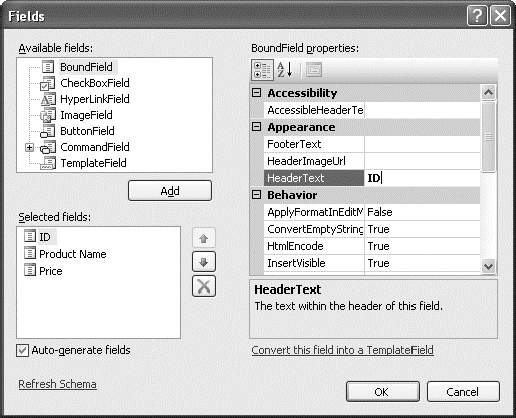
Once you've created your columns, you can also use some helpful design-time support to configure the properties of each column (rather than editing the column tag by hand). To do this, select the GridView, and click the ellipsis ( . . . ) next to the Columns property in the Properties window. You'll see a Fields dialog box that lets you add, remove, and refine your columns (see Figure 16-2).
Now that you understand the underpinnings of the GridView, you've still only started to explore its higher-level features. In the following sections, you'll tackle these topics:
- Formatting:
How to format rows and data values
- Selecting:
How to let users select a row in the GridView and respond accordingly
- Editing:
How to let users commit record updates, inserts, and deletes
- Sorting:
How to dynamically reorder the GridView in response to clicks on a column header
- Paging:
How to divide a large result set into multiple pages of data
- Templates:
How to take complete control of designing, formatting, and editing by defining templates
Formatting consists of several related tasks. First, you want to ensure that dates, currencies, and other number values are presented in the appropriate way. You handle this job with the DataFormatString property. Next, you'll want to apply the perfect mix of colors, fonts, borders, and alignment options to each aspect of the grid, from headers to data items. The GridView supports these features through styles. Finally, you can intercept events, examine row data, and apply formatting to specific values programmatically. In the following sections, you'll consider each of these techniques.
The GridView also exposes several self-explanatory formatting properties that aren't covered here. These include GridLines (for adding or hiding table borders), CellPadding and CellSpacing (for controlling the overall spacing between cells), and Caption and CaptionAlign (for adding a title to the top of the grid).
Tip
Want to create a GridView that scrolls—inside a web page? It's easy. Just place the GridView inside a Panel control, set the appropriate size for the panel, and set the Panel.Scrollbars property to Auto, Vertical, or Both.
Each BoundField column provides a DataFormatString property you can use to configure the appearance of numbers and dates using a format string.
Format strings generally consist of a placeholder and a format indicator, which are wrapped inside curly brackets. A typical format string looks something like this:
{0:C}In this case, the 0 represents the value that will be formatted, and the letter indicates a predetermined format style. Here, C means currency format, which formats a number as an amount of money (so 3400.34 becomes $3,400.34, assuming the web server is set to use U.S. regional settings). Here's a column that uses this format string:
<asp:BoundField DataField="UnitPrice" HeaderText="Price"
  DataFormatString="{0:C}" />
Table 16-3 shows some of the other formatting options for numeric values.
Table 16.3. Numeric Format Strings
Type | Format String | Example |
|---|---|---|
Currency | {0:C} | $1,234.50. Brackets indicate negative values: ($1,234.50). The currency sign is locale-specific. |
Scientific (Exponential) | {0:E} | 1.234500E+003 |
Percentage | {0:P} | 45.6% |
Fixed Decimal | {0:F?} | Depends on the number of decimal places you set. {0:F3} would be 123.400. {0:F0} would be 123. |
You can find other examples in the MSDN Help. For date or time values, you'll find an extensive list. For example, if you want to write the BirthDate value in the format month/day/year (as in 12/30/08), you use the following column:
<asp:BoundField DataField="BirthDate" HeaderText="Birth Date"
 DataFormatString="{0:MM/dd/yy}" />
Table 16-4 shows some more examples.
Table 16.4. Time and Date Format Strings
Type | Format String | Syntax | Example |
|---|---|---|---|
Short Date | {0:d} | M/d/yyyy | 10/30/2010 |
Long Date | {0:D} | dddd, MMMM dd, yyyy | Monday, January 30, 2010 |
Long Date and Short Time | {0:f} | dddd, MMMM dd, yyyy HH:mm aa | Monday, January 30, 2010 10:00 AM |
Long Date and Long Time | {0:F} | dddd, MMMM dd, yyyy HH:mm:ss aa | Monday, January 30 2010 10:00:23 AM |
ISO Sortable Standard | {0:s} | yyyy-MM-ddTHH:mm:ss | 2010-01-30T10:00:23 |
Month and Day | {0:M} | MMMM dd | January 30 |
General | {0:G} | M/d/yyyy HH:mm:ss aa (depends on locale-specific settings) | 10/30/2010 10:00:23 AM |
The format characters are not specific to the GridView. You can use them with other controls, with data-bound expressions in templates (as you'll see later in the "Using GridView Templates" section), and as parameters for many methods. For example, the Decimal and DateTime types expose their own ToString() methods that accept a format string, allowing you to format values manually.
The GridView exposes a rich formatting model that's based on styles. Altogether, you can set eight GridView styles, as described in Table 16-5.
Table 16.5. GridView Styles
Style | Description |
|---|---|
HeaderStyle | Configures the appearance of the header row that contains column titles, if you've chosen to show it (if ShowHeader is True). |
RowStyle | Configures the appearance of every data row. |
AlternatingRowStyle | If set, applies additional formatting to every other row. This formatting acts in addition to the RowStyle formatting. For example, if you set a font using RowStyle, it is also applied to alternating rows, unless you explicitly set a different font through AlternatingRowStyle. |
SelectedRowStyle | Configures the appearance of the row that's currently selected. This formatting acts in addition to the RowStyle formatting. |
EditRowStyle | Configures the appearance of the row that's in edit mode. This formatting acts in addition to the RowStyle formatting. |
EmptyDataRowStyle | Configures the style that's used for the single empty row in the special case where the bound data object contains no rows. |
FooterStyle | Configures the appearance of the footer row at the bottom of the GridView, if you've chosen to show it (if ShowFooter is True). |
PagerStyle | Configures the appearance of the row with the page links, if you've enabled paging (set AllowPaging to True). |
Styles are not simple single-value properties. Instead, each style exposes a Style object that includes properties for choosing colors (ForeColor and BackColor), adding borders (BorderColor, BorderStyle, and BorderWidth), sizing the row (Height and Width), aligning the row (HorizontalAlign and VerticalAlign), and configuring the appearance of text (Font and Wrap). These style properties allow you to refine almost every aspect of an item's appearance.
Here's an example that changes the style of rows and headers in a GridView:
<asp:GridView ID="GridView1" runat="server" DataSourceID="sourceProducts"
AutoGenerateColumns="False">
<RowStyle BackColor="#E7E7FF" ForeColor="#4A3C8C" />
<HeaderStyle BackColor="#4A3C8C" Font-Bold="True" ForeColor="#F7F7F7" />
<Columns>
<asp:BoundField DataField="ProductID" HeaderText="ID" />
<asp:BoundField DataField="ProductName" HeaderText="Product Name" />
<asp:BoundField DataField="UnitPrice" HeaderText="Price" />
</Columns>
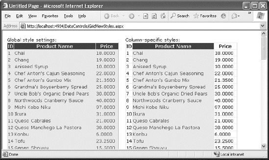
</asp:GridView>In this example, every column is affected by the formatting changes. However, you can also define column-specific styles. To create a column-specific style, you simply need to rearrange the control tag so that the formatting tag becomes a nested tag inside the appropriate column tag. Here's an example that formats just the ProductName column:
<asp:GridView ID="GridView2" runat="server" DataSourceID="sourceProducts"
  AutoGenerateColumns="False" >
    <Columns>
      <asp:BoundField DataField="ProductID" HeaderText="ID" />
      <asp:BoundField DataField="ProductName" HeaderText="Product Name">
        <ItemStyle BackColor="#E7E7FF" ForeColor="#4A3C8C" />
        <HeaderStyle BackColor="#4A3C8C" Font-Bold="True" ForeColor="#F7F7F7" />
      </asp:BoundField>
      <asp:BoundField DataField="UnitPrice" HeaderText="Price" />
    </Columns>
</asp:GridView>
Figure 16-3 compares these two examples. You can use a combination of ordinary style settings and column-specific style settings (which override ordinary style settings if they conflict).
One reason you might use column-specific formatting is to define specific column widths. If you don't define a specific column width, ASP.NET makes each column just wide enough to fit the data it contains (or, if wrapping is enabled, to fit the text without splitting a word over a line break). If values range in size, the width is determined by the largest value or the width of the column header, whichever is larger. However, if the grid is wide enough, you might want to expand a column so it doesn't appear to be crowded against the adjacent columns. In this case, you need to explicitly define a larger width.
There's no reason to code style properties by hand in the GridView control tag, because the GridView provides rich design-time support. To set style properties, you can use the Properties window to modify the style properties. For example, to configure the font of the header, expand the HeaderStyle property to show the nested Font property, and set that. The only limitation of this approach is that it doesn't allow you to set the style for individual columns—if you need that trick, you must first call up the Fields dialog box (shown in Figure 16-2) by editing the Columns property. Then, select the appropriate column, and set the style properties accordingly.
You can even set a combination of styles using a preset theme by clicking the Auto Format link in the GridView smart tag. Figure 16-4 shows the Auto Format dialog box with some of the preset styles you can choose. Select Remove Formatting to clear all the style settings.

Once you've chosen and inserted the styles into your GridView tag, and you can tweak them by hand or by using the Properties window.
The formatting you've learned so far isn't that fine-grained. At its most specific, this formatting applies to a single column of values. But what if you want to change the formatting for a specific row or even just a single cell?
The solution is to react to the GridView.RowDataBound event. This event is raised for each row, just after it's filled with data. At this point, you can access the current row as a GridViewRow object. The GridViewRow.DataItem property provides the data object for the given row, and the GridViewRow.Cells collection allows you to retrieve the row content. You can use the GridViewRow to change colors and alignment, add or remove child controls, and so on.
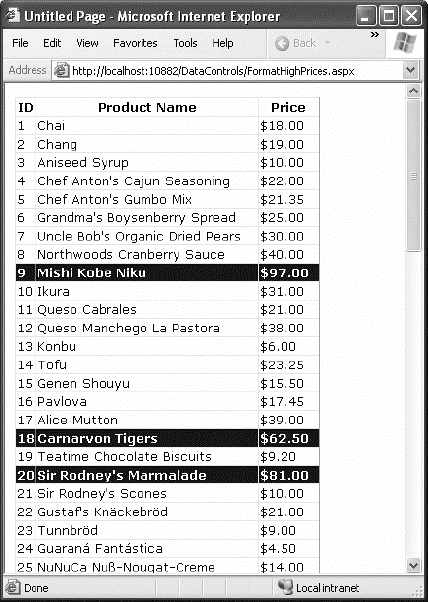
The following example handles the RowDataBound event and changes the background color to highlight high prices (those more expensive than $50):
Protected Sub GridView1_RowDataBound(ByVal sender As Object, _
  ByVal e As System.Web.UI.WebControls.GridViewRowEventArgs) _
  Handles GridView1.RowDataBound

    If e.Row.RowType = DataControlRowType.DataRow Then
        ' Get the price for this row.
        Dim price As Decimal
        price = CType(DataBinder.Eval(e.Row.DataItem, "UnitPrice"), Decimal)

        If price > 50 Then
            e.Row.BackColor = System.Drawing.Color.Maroon
            e.Row.ForeColor = System.Drawing.Color.White
            e.Row.Font.Bold = True
        End If
    End If
End Sub
First, the code checks whether the item being created is a row or an alternate row. If neither, it means the item is another interface element, such as the pager, footer, or header, and the procedure does nothing. If the item is the right type, the code extracts the UnitPrice field from the data-bound item.
To get a value from the bound data object (provided through the GridViewRowEventArgs.Row.DataItem property), you need to cast the data object to the correct type. The trick is that the type depends on the way you're performing your data binding. In this example, you're binding to the SqlDataSource in DataSet mode, which means each data item will be a DataRowView object. (If you were to bind in DataReader mode, a DbDataRecord represents each item instead.) To avoid coding these details, which can make it more difficult to change your data access code, you can rely on the DataBinder.Eval() helper method, which understands all these types of data objects. That's the technique used in this example.
Figure 16-5 shows the resulting page.
Selecting an item refers to the ability to click a row and have it change color (or become highlighted) to indicate that the user is currently working with this record. At the same time, you might want to display additional information about the record in another control. With the GridView, selection happens almost automatically once you set up a few basics.
Before you can use item selection, you must define a different style for selected items. The SelectedRowStyle determines how the selected row or cell will appear. If you don't set this style, it will default to the same value as RowStyle, which means the user won't be able to tell which row is currently selected. Usually, selected rows will have a different BackColor property.
To find out what item is currently selected (or to change the selection), you can use the GridView.SelectedIndex property. It will be −1 if no item is currently selected. Also, you can react to the SelectedIndexChanged event to handle any additional related tasks. For example, you might want to update another control with additional information about the selected record.
The GridView provides built-in support for selection. You simply need to add a CommandField column with the ShowSelectButton property set to True. ASP.NET can render the CommandField as a hyperlink, a button, or a fixed image. You choose the type using the ButtonType property. You can then specify the text through the SelectText property or specify the link to the image through the SelectImageUrl property.
Here's an example that displays a select button:
<asp:CommandField ShowSelectButton="True" ButtonType="Button"
 SelectText="Select" />
And here's an example that shows a small clickable icon:
<asp:CommandField ShowSelectButton="True" ButtonType="Image"
 SelectImageUrl="select.gif" />
Figure 16-6 shows a page with a text select button (and product 14 selected).
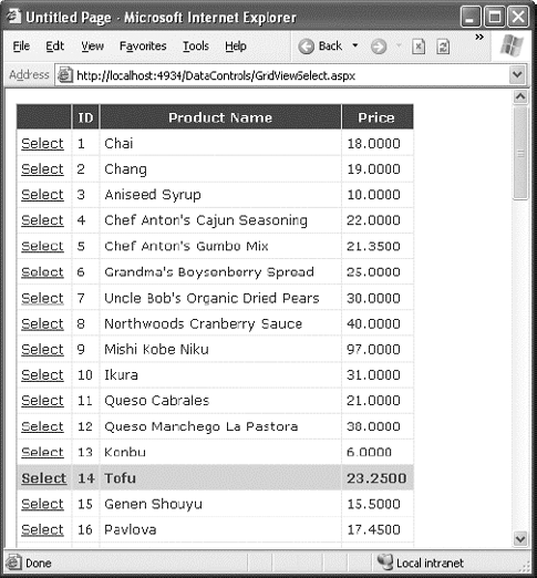
When you click a select button, the page is posted back, and a series of steps unfolds. First, the GridView.SelectedIndexChanging event fires, which you can intercept to cancel the operation. Next, the GridView.SelectedIndex property is adjusted to point to the selected row. Finally, the GridView.SelectedIndexChanged event fires, which you can handle if you want to manually update other controls to reflect the new selection. When the page is rendered, the selected row is given the selected row style.
Tip
Rather than add the select button yourself, you can choose Enable Selection from the GridView's smart tag, which adds a basic select button for you.
You don't need to create a new column to support row selection. Instead, you can turn an existing column into a link. This technique is commonly implemented to allow users to select rows in a table by the unique ID value.
To use this technique, remove the CommandField column, and add a ButtonField column instead. Then, set the DataTextField to the name of the field you want to use.
<asp:ButtonField ButtonType="Button" DataTextField="ProductID" />
This field will be underlined and turned into a button that, when clicked, will post back the page and trigger the GridView.RowCommand event. You could handle this event, determine which row has been clicked, and programmatically set the SelectedIndex property of the GridView. However, you can use an easier method. Instead, just configure the link to raise the SelectedIndexChanged event by specifying a CommandName with the text Select, as shown here:
<asp:ButtonField CommandName="Select" ButtonType="Button"
 DataTextField="ProductID" />
Now clicking the data field automatically selects the record.
As demonstrated in the previous chapter, you can draw a value out of a control and use it to perform a query in your data source. For example, you can take the currently selected item in a list, and feed that value to a SqlDataSource that gets more information for the corresponding record.
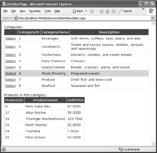
This trick is a great way to build master-details pages—pages that let you navigate relationships in a database. A typical master-details page has two GridView controls. The first GridView shows the master (or parent) table. When a user selects an item in the first GridView, the second GridView is filled with related records from the details (or parent) table. For example, a typical implementation of this technique might have a customers table in the first GridView. Select a customer, and the second GridView is filled with the list of orders made by that customer.
To create a master-details page, you need to extract the SelectedIndex property from the first GridView and use that to craft a query for the second GridView. However, this approach has one problem. SelectedIndex returns a zero-based index number that represents where the row occurs in the grid. This isn't the information you need to insert into the query that gets the related records. Instead, you need a unique key field from the corresponding row. For example, if you have a table of products, you need to be able to get the ProductID for the selected row. In order to get this information, you need to tell the GridView to keep track of the key field values.
The way you do this is by setting the DataKeyNames property for the GridView. This property requires a comma-separated list of one or more key fields. Each name you supply must match one of the fields in the bound data source. Usually, you'll have only one key field. Here's an example that tells the GridView to keep track of the CategoryID values in a list of product categories:
<asp:GridView ID="gridCategories" runat="server"
DataKeyNames="CategoryID" ... >
Once you've established this link, the GridView is nice enough to keep track of the key fields for the selected record. It allows you to retrieve this information at any time through the SelectedDataKey property.
The following example puts it all together. It defines two GridView controls. The first shows a list of categories. The second shows the products that fall into the currently selected category (or, if no category has been selected, this GridView doesn't appear at all).
Here's the page markup for this example:
Categories:<br />
<asp:GridView ID="gridCategories" runat="server" DataSourceID="sourceCategories"
  DataKeyNames="CategoryID">
    <Columns>
      <asp:CommandField ShowSelectButton="True" />
    </Columns>
    <SelectedRowStyle BackColor="#FFCC66" Font-Bold="True"
     ForeColor="#663399" />
</asp:GridView>
<asp:SqlDataSource ID="sourceCategories" runat="server"
  ConnectionString="<%$ ConnectionStrings:Northwind %>"
  SelectCommand="SELECT * FROM Categories"></asp:SqlDataSource>
<br />

Products in this category:<br />
<asp:GridView ID="gridProducts" runat="server" DataSourceID="sourceProducts">
  <SelectedRowStyle BackColor="#FFCC66" Font-Bold="True" ForeColor="#663399" />
</asp:GridView>
<asp:SqlDataSource ID="sourceProducts" runat="server"
  ConnectionString="<%$ ConnectionStrings:Northwind %>"
  SelectCommand="SELECT ProductID, ProductName, UnitPrice FROM Products WHERE
CategoryID=@CategoryID">
    <SelectParameters>
      <asp:ControlParameter Name="CategoryID" ControlID="gridCategories"
        PropertyName="SelectedDataKey.Value" />
    </SelectParameters>
</asp:SqlDataSource>
As you can see, you need two data sources, one for each GridView. The second data source uses a ControlParameter that links it to the SelectedDataKey property of the first GridView. Best of all, you still don't need to write any code or handle the SelectedIndexChanged event on your own.
Figure 16-7 shows this example in action.
The GridView provides support for editing that's almost as convenient as its support for selection. To switch a row into select mode, you simply set the SelectedIndex property to the corresponding row number. To switch a row into edit mode, you set the EditIndex property in the same way.
Of course, both of these tasks can take place automatically if you use specialized button types. For selection, you use a CommandField column with the ShowSelectButton property set to True. To add edit controls, you follow almost the same step—once again, you use the CommandField column, but now you set ShowEditButton to True.
Here's an example of a GridView that supports editing:
<asp:GridView ID="gridProducts" runat="server" DataSourceID="sourceProducts"
  AutoGenerateColumns="False" DataKeyNames="ProductID">
    <Columns>
      <asp:BoundField DataField="ProductID" HeaderText="ID" ReadOnly="True" />
<asp:BoundField DataField="ProductName" HeaderText="Product Name"/>
<asp:BoundField DataField="UnitPrice" HeaderText="Price" />
<asp:CommandField ShowEditButton="True" />
</Columns>
</asp:GridView>And here's a revised data source control that can commit your changes:
<asp:SqlDataSource id="sourceProducts" runat="server"
  ConnectionString="<%$ ConnectionStrings:Northwind %>"
  SelectCommand="SELECT ProductID, ProductName, UnitPrice FROM Products"
  UpdateCommand="UPDATE Products SET ProductName=@ProductName,
UnitPrice=@UnitPrice WHERE ProductID=@ProductID" />
Note
If you receive a SqlException that says "Must declare the scalar variable @ProductID," the most likely problem is that you haven't set the GridView.DataKeyNames property. Because the ProductID field can't be modified, the GridView won't pass the ProductID value to the SqlDataSource unless it's designated a key field.
Remember, you don't need to define the update parameters, as long as you make sure they match the field names (with an at sign [@] at the beginning). Chapter 15 has more information about using update commands with the SqlDataSource control.
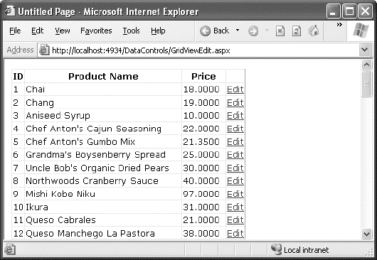
When you add a CommandField with the ShowEditButton property set to True, the GridView editing controls appear in an additional column. When you run the page and the GridView is bound and displayed, the edit column shows an Edit link next to every record (see Figure 16-8).
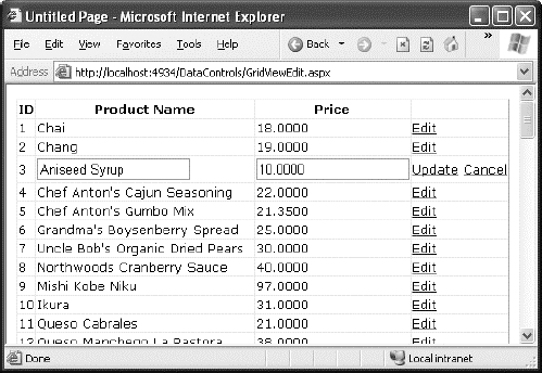
When clicked, this link switches the corresponding row into edit mode. All fields are changed to text boxes, with the exception of read-only fields (which are not editable) and true/false bit fields (which are shown as check boxes). The Edit link is replaced with an Update link and a Cancel link (see Figure 16-9).
The Cancel link returns the row to its initial state. The Update link passes the values to the SqlDataSource.UpdateParameters collection (using the field names) and then triggers the SqlDataSource.Update() method to apply the change to the database. Once again, you don't have to write any code, provided you've filled in the UpdateCommand for the linked data source control.
You can use a similar approach to add support for record deleting. To enable deleting, you need to add a column to the GridView that has the ShowDeleteButton property set to True. As long as your linked SqlDataSource has the DeleteCommand property filled in, these operations will work automatically. If you want to write your own code that plugs into this process (for example, updating a label to inform the user the update has been made), consider reacting to the GridView event that fires after an update operation is committed, such as RowDeleted and RowUpdated. You can also prevent changes you don't like by reacting to the RowDeleting and RowUpdating events and setting the cancel flag in the event arguments.
The GridView does not support inserting records. If you want that ability, you can use one of the single-record display controls described later in this chapter, such as the DetailsView or FormView. For example, a typical ASP.NET page for data entry might show a list of records in a GridView, and provide a DetailsView that allows the user to add new records.
Note
The basic built-in updating features of the GridView don't give you a lot of flexibility. You can't change the types of controls that are used for editing, format these controls, or add validation. However, you can add all these features by building your own editing templates, a topic you'll consider later in the "Using GridView Templates" section.
The GridView is a great all-in-one solution for displaying all kinds of data, but it becomes a little unwieldy as the number of fields and rows in your data source grows. Dense grids contribute to large pages that are slow to transmit over the network and difficult for the user to navigate. The GridView has two features that address these issues and make data more manageable: sorting and paging.
Both sorting and paging can be performed by the database server, provided you craft the right SQL using the Order By and Where clauses. In fact, sometimes this is the best approach for performance. However, the sorting and paging provided by the GridView and SqlDataSource is easy to implement and thoroughly flexible. These techniques are particularly useful if you need to show the same data in several ways and you want to let the user decide how the data should be ordered.
The GridView sorting features allow the user to reorder the results in the GridView by clicking a column header. It's convenient—and easy to implement.
Although you may not realize it, when you bind to a DataTable, you actually use another object called the DataView. The DataView sits between the ASP.NET web page binding and your DataTable. Usually it does little aside from providing the information from the associated DataTable. However, you can customize the DataView so it applies its own sort order. That way, you can customize the data that appears in the web page, without needing to actually modify your data.
You can create a new DataView object by hand and bind the DataView directly to a data control such as the GridView. However, the GridView and SqlDataSource controls make it even easier. They provide several properties you can set to control sorting. Once you've configured these properties, the sorting is automatic, and you still won't need to write any code in your page class.
To enable sorting, you must set the GridView.AllowSorting property to True. Next, you need to define a SortExpression for each column that can be sorted. In theory, a sort expression takes the form used in the ORDER BY clause of a SQL query and can use any syntax that's understood by the data source control. In practice, you'll almost always use a single field name to sort the grid using the data in that column. For example, here's how you could define the ProductName column so it sorts by alphabetically ordering rows:
<asp:BoundField DataField="ProductName" HeaderText="Product Name"
 SortExpression="ProductName" />
Note that if you don't want a column to be sort-enabled, you simply don't set its SortExpression property. Figure 16-10 shows an example with a grid that has sort expressions for all three columns, and is currently sorted by product name.
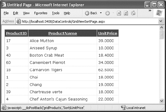
Once you've associated a sort expression with the column and set the AllowSorting property to True, the GridView will render the headers with clickable links, as shown in Figure 16-10. However, it's up to the data source control to implement the actual sorting logic. How the sorting is implemented depends on the data source you're using.
Not all data sources support sorting, but the SqlDataSource does, provided the DataSourceMode property is set to DataSet (the default), not DataReader. In DataReader mode, the records are retrieved one at a time, and each record is stuffed into the bound control (such as a GridView) before the SqlDataSource moves to the next one. In DataSet mode, the entire results are placed in a DataSet and then the records are copied from the DataSet into the bound control. If the data needs to be sorted, the sorting happens between these two steps—after the records are retrieved but before they're bound in the web page.
Note
The sort is according to the data type of the column. Numeric and date columns are ordered from smallest to largest. String columns are sorted alphanumerically without regard to case. Columns that contain binary data cannot be sorted. However, if you click a column header twice, the second click reverses the sort order, putting the records in descending order. (Click a third time to switch it back to ascending order.)
If you use sorting and selection at the same time, you'll discover another issue. To see this problem in action, select a row, and then sort the data by any column. You'll see that the selection will remain, but it will shift to a new item that has the same index as the previous item. In other words, if you select the second row and perform a sort, the second row will still be selected in the new page, even though this isn't the record you selected.
To fix this problem, you must simply set the GridView.EnablePersistedSelection property True. Now, ASP.NET will ensure that the selected item is identified by its data key. As a result, the selected item will remain selected, even if it moves to a new position in the GridView after a sort.
Often, a database search will return too many rows to be realistically displayed in a single page. If the client is using a slow connection, an extremely large GridView can take a frustrating amount of time to arrive. Once the data is retrieved, the user may find out it doesn't contain the right content anyway or that the search was too broad and they can't easily wade through all the results to find the important information.
The GridView handles this scenario with an automatic paging feature. When you use automatic paging, the full results are retrieved from the data source and placed into a DataSet. Once the DataSet is bound to the GridView, however, the data is subdivided into smaller groupings (for example, with 20 rows each), and only a single batch is sent to the user. The other groups are abandoned when the page finishes processing. When the user moves to the next page, the same process is repeated—in other words, the full query is performed once again. The GridView extracts just one group of rows, and the page is rendered.
To allow the user to skip from one page to another, the GridView displays a group of pager controls at the bottom of the grid. These pager controls could be previous/next links (often displayed as < and >) or number links (1, 2, 3, 4, 5, . . . ) that lead to specific pages. If you've ever used a search engine, you've seen paging at work.
By setting a few properties, you can make the GridView control manage the paging for you. Table 16-6 describes the key properties.
Table 16.6. Paging Members of the GridView
Property | Description |
|---|---|
AllowPaging | Enables or disables the paging of the bound records. It is False by default. |
PageSize | Gets or sets the number of items to display on a single page of the grid. The default value is 10. |
PageIndex | Gets or sets the zero-based index of the currently displayed page, if paging is enabled. |
PagerSettings | Provides a PagerSettings object that wraps a variety of formatting options for the pager controls. These options determine where the paging controls are shown and what text or images they contain. You can set these properties to fine-tune the appearance of the pager controls, or you can use the defaults. |
PagerStyle | Provides a style object you can use to configure fonts, colors, and text alignment for the paging controls. |
PageIndexChanging and PageIndexChanged events | Occur when one of the page selection elements is clicked, just before the PageIndex is changed (PageIndexChanging) and just after (PageIndexChanged). |
To use automatic paging, you need to set AllowPaging to True (which shows the page controls), and you need to set PageSize to determine how many rows are allowed on each page.
Here's an example of a GridView control declaration that sets these properties:
<asp:GridView ID="GridView1" runat="server" DataSourceID="sourceProducts"
 PageSize="10" AllowPaging="True" >
  ...
</asp:GridView>
This is enough to start using paging. Figure 16-11 shows an example with ten records per page (for a total of eight pages).

By default, paging and selection don't play nicely together. If you enable both for the GridView, you'll notice that the same row position remains selected as you move from one page to another. For example, if you select the first row on the first page and then move to the second page, the first row on the second page will become selected. To fix this quirk, set the GridView.EnablePersistedSelection property to True. Now, as you move from one page to another, the selection will automatically be removed from the GridView (and the SelectedIndex property will be set to −1). But if you move back to the page that held the originally selected row, that row will be re-selected. This behavior is intuitive, and it neatly ensures that your code won't be confused by a selected row that isn't currently visible.
So far, the examples have used the GridView control to show data using separate bound columns for each field. If you want to place multiple values in the same cell, or you want the unlimited ability to customize the content in a cell by adding HTML tags and server controls, you need to use a TemplateField.
The TemplateField allows you to define a completely customized template for a column. Inside the template you can add control tags, arbitrary HTML elements, and data binding expressions. You have complete freedom to arrange everything the way you want.
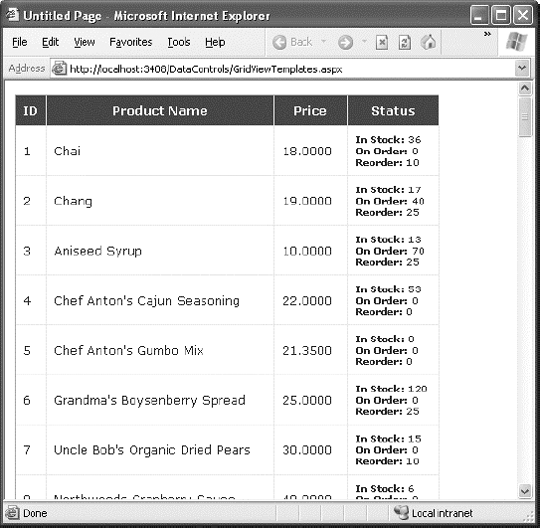
For example, imagine you want to create a column that combines the in stock, on order, and reorder level information for a product. To accomplish this trick, you can construct an ItemTemplate like this:
<asp:TemplateField HeaderText="Status">
  <ItemTemplate>
    <b>In Stock:</b>
    <%# Eval("UnitsInStock") %><br />
    <b>On Order:</b>
    <%# Eval("UnitsOnOrder") %><br />
    <b>Reorder:</b>
    <%# Eval("ReorderLevel") %>
  </ItemTemplate>
</asp:TemplateField>
Note
Your template only has access to the fields that are in the bound data object. So if you want to show the UnitsInStock, UnitsOnOrder, and ReorderLevel fields, you need to make sure the SqlDataSource query returns this information.
To create the data binding expressions, the template uses the Eval() method, which is a shared method of the System.Web.UI.DataBinder class. Eval() is an indispensable convenience—it automatically retrieves the data item that's bound to the current row, uses reflection to find the matching field, and retrieves the value.
Tip
The Eval() method also adds the extremely useful ability to format data fields on the fly. To use this feature, you must call the overloaded version of the Eval() method that accepts an additional format string parameter. Here's an example:
<%# Eval("BirthDate", "{0:MM/dd/yy}") %>You can use any of the format strings defined in Table 16-3 and Table 16-4 with the Eval() method.
You'll notice that this example template includes three data binding expressions. These expressions get the actual information from the current row. The rest of the content in the template defines static text, tags, and controls.
You also need to make sure the data source provides these three pieces of information. If you attempt to bind a field that isn't present in your result set, you'll receive a runtime error. If you retrieve additional fields that are never bound to any template, no problem will occur.
Here's the revised data source with these fields:
<asp:SqlDataSource ID="sourceProducts" runat="server"
  ConnectionString="<%$ ConnectionStrings:Northwind %>"
  SelectCommand="SELECT ProductID, ProductName, UnitPrice, UnitsInStock,
UnitsOnOrder,ReorderLevel FROM Products"
  UpdateCommand="UPDATE Products SET ProductName=@ProductName,
UnitPrice=@UnitPrice WHERE ProductID=@ProductID">
</asp:SqlDataSource>
When you bind the GridView, it fetches the data from the data source and walks through the collection of items. It processes the ItemTemplate for each item, evaluates the data binding expressions, and adds the rendered HTML to the table. You're free to mix template columns with other column types. Figure 16-12 shows an example with several normal columns and the template column at the end.
The previous example uses a single template to configure the appearance of data items. However, the ItemTemplate isn't the only template that the TemplateField provides. In fact, the TemplateField allows you to configure various aspects of its appearance with a number of templates. Inside every template column, you can use the templates listed in Table 16-7.
Table 16.7. TemplateField Templates
Mode | Description |
|---|---|
HeaderTemplate | Determines the appearance and content of the header cell. |
FooterTemplate | Determines the appearance and content of the footer cell (if you set ShowFooter to True). |
ItemTemplate | Determines the appearance and content of each data cell. |
AlternatingItemTemplate | Determines the appearance and content of even-numbered rows. For example, if you set the AlternatingItemTemplate to have a shaded background color, the GridView applies this shading to every second row. |
EditItemTemplate | Determines the appearance and controls used in edit mode. |
InsertItemTemplate | Determines the appearance and controls used in edit mode. The GridView doesn't support this template, but the DetailsView and FormView controls (which are described later in this chapter) do. |
Of the templates listed in Table 16-7, the EditItemTemplate is one of the most useful, because it gives you the ability to control the editing experience for the field. If you don't use template fields, you're limited to ordinary text boxes, and you won't have any validation. The GridView also defines two templates you can use outside any column. These are the PagerTemplate, which lets you customize the appearance of pager controls, and the EmptyDataTemplate, which lets you set the content that should appear if the GridView is bound to an empty data object.
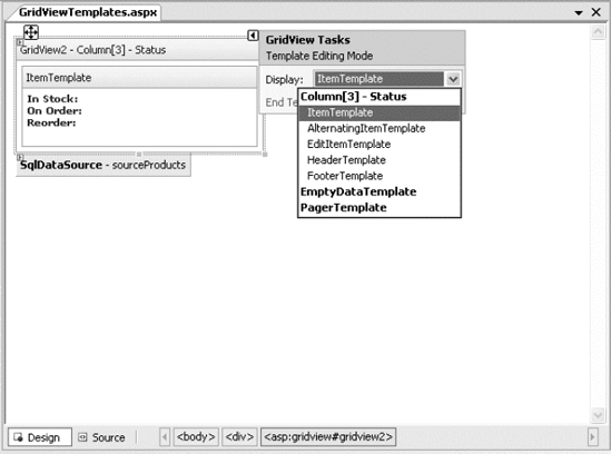
Visual Studio includes solid support for editing templates in the web page designer. To try this, follow these steps:
Create a GridView with at least one template column.
Select the GridView, and click Edit Templates in the smart tag. This switches the GridView into template edit mode.
In the smart tag, use the Display drop-down list to choose the template you want to edit (see Figure 16-13). You can choose either of the two templates that apply to the whole GridView (EmptyDataTemplate or PagerTemplate), or you can choose a specific template for one of the template columns.
Enter your content in the control. You can enter static content, drag and drop controls, and so on.
When you're finished, choose End Template Editing from the smart tag.
In some cases, you might need to handle events that are raised by the controls you add to a template column. For example, imagine you want to add a clickable image link by adding an ImageButton control. This is easy enough to accomplish:
<asp:TemplateField HeaderText="Status">
  <ItemTemplate>
    <asp:ImageButton ID="ImageButton1" runat="server"
     ImageUrl="statuspic.gif" />
  </ItemTemplate>
</asp:TemplateField>
The problem is that if you add a control to a template, the GridView creates multiple copies of that control, one for each data item. When the ImageButton is clicked, you need a way to determine which image was clicked and to which row it belongs.
The way to resolve this problem is to use an event from the GridView, not the contained button. The GridView.RowCommand event serves this purpose, because it fires whenever any button is clicked in any template. This process, where a control event in a template is turned into an event in the containing control, is called event bubbling.
Of course, you still need a way to pass information to the RowCommand event to identify the row where the action took place. The secret lies in two string properties that all button controls provide: CommandName and CommandArgument. CommandName sets a descriptive name you can use to distinguish clicks on your ImageButton from clicks on other button controls in the GridView. The CommandArgument supplies a piece of row-specific data you can use to identify the row that was clicked. You can supply this information using a data binding expression.
Here's a template field that contains the revised ImageButton tag:
<asp:TemplateField HeaderText="Status">
  <ItemTemplate>
    <asp:ImageButton ID="ImageButton1" runat="server"
     ImageUrl="statuspic.gif"
     CommandName="StatusClick" CommandArgument='<%# Eval("ProductID") %>' />
  </ItemTemplate>
</asp:TemplateField>
And here's the code you need in order to respond when an ImageButton is clicked:
Protected Sub GridView1_RowCommand(ByVal sender As Object, _
  ByVal e As GridViewCommandEventArgs) Handles GridView1.RowCommand

    If e.CommandName = "StatusClick" Then
      lblInfo.Text = "You clicked product #" & e.CommandArgument.ToString()
    End If
End Sub
This example displays a simple message with the ProductID in a label.
One of the best reasons to use a template is to provide a better editing experience. In the previous chapter, you saw how the GridView provides automatic editing capabilities—all you need to do is switch a row into edit mode by setting the GridView.EditIndex property. The easiest way to make this possible is to add a CommandField column with the ShowEditButton set to True. Then, the user simply needs to click a link in the appropriate row to begin editing it. At this point, every label in every column is replaced by a text box (unless the field is read-only).
The standard editing support has several limitations:
- It's not always appropriate to edit values using a text box:
Certain types of data are best handled with other controls (such as drop-down lists). Large fields need multiline text boxes, and so on.
- You get no validation:
It would be nice to restrict the editing possibilities so that currency figures can't be entered as negative numbers, for example. You can do that by adding validator controls to an EditItemTemplate.
- The visual appearance is often ugly:
A row of text boxes across a grid takes up too much space and rarely seems professional.
In a template column, you don't have these issues. Instead, you explicitly define the edit controls and their layout using the EditItemTemplate. This can be a somewhat laborious process.
Here's the template column used earlier for stock information with an editing template:
<asp:TemplateField HeaderText="Status">
<ItemStyle Width="100px" />
<ItemTemplate>
<b>In Stock:</b> <%# Eval("UnitsInStock") %><br />
<b>On Order:</b> <%# Eval("UnitsOnOrder") %><br />
<b>Reorder:</b> <%# Eval("ReorderLevel") %>
</ItemTemplate>
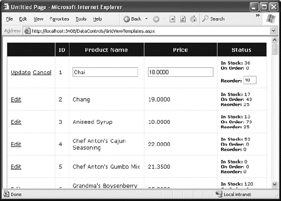
<EditItemTemplate>
<b>In Stock:</b> <%# Eval("UnitsInStock") %><br />
<b>On Order:</b> <%# Eval("UnitsOnOrder") %><br /><br />
<b>Reorder:</b>
<asp:TextBox Text='<%# Bind("ReorderLevel") %>' Width="25px"
runat="server" id="txtReorder" />
</EditItemTemplate>
</asp:TemplateField>Figure 16-14 shows the row in edit mode.
When binding an editable value to a control, you must use the Bind() method in your data binding expression instead of the ordinary Eval() method. Unlike the Eval() method, which can be placed anywhere in a page, the Bind() method must be used to set a control property. Only the Bind() method creates the two-way link, ensuring that updated values will be returned to the server.
One interesting detail here is that even though the item template shows three fields, the editing template allows only one of these to be changed. When the GridView commits an update, it will submit only the bound, editable parameters. In the previous example, this means the GridView will pass back a @ReorderLevel parameter but not a @UnitsInStock or @UnitsOnOrder parameter. This is important, because when you write your parameterized update command, it must use only the parameters you have available. Here's the modified SqlDataSource control with the correct command:
<asp:SqlDataSource ID="sourceProducts" runat="server"
  ConnectionString="<%$ ConnectionStrings:Northwind %>"
  SelectCommand="SELECT ProductID, ProductName, UnitPrice, UnitsInStock,
UnitsOnOrder,ReorderLevel FROM Products"
  UpdateCommand="UPDATE Products SET ProductName=@ProductName, UnitPrice=@UnitPrice,
ReorderLevel=@ReorderLevel WHERE ProductID=@ProductID">
</asp:SqlDataSource>
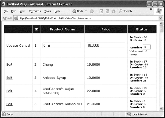
Now that you have your template ready, why not add an extra frill, such as a validator, to catch editing mistakes? In the following example, a RangeValidator prevents changes that put the ReorderLevel at less than 0 or more than 100:
<asp:TemplateField HeaderText="Status">
  <ItemStyle Width="100px" />
    <ItemTemplate>
      <b>In Stock:</b> <%# Eval("UnitsInStock") %><br />
      <b>On Order:</b> <%# Eval("UnitsOnOrder") %><br />
      <b>Reorder:</b> <%# Eval("ReorderLevel") %>
    </ItemTemplate>
  <EditItemTemplate>
    <b>In Stock:</b> <%# Eval("UnitsInStock") %><br />
    <b>On Order:</b> <%# Eval("UnitsOnOrder") %><br /><br />
    <b>Reorder:</b>
    <asp:TextBox Text='<%# Bind("ReorderLevel") %>' Width="25px"
     runat="server" id="txtReorder" />
    <asp:RangeValidator id="rngValidator" MinimumValue="0" MaximumValue="100"
     ControlToValidate="txtReorder" runat="server"
     ErrorMessage="Value out of range." Type="Integer"/>
  </EditItemTemplate>
</asp:TemplateField>
Figure 16-15 shows the validation at work. If the value isn't valid, the browser doesn't allow the page to be posted back, and no database code runs.
Note
The SqlDataSource is intelligent enough to handle validation properly even if you disabled client-side validation (or the browser doesn't support it). In this situation, the page is posted back, but the SqlDataSource notices that it contains invalid data (by inspecting the Page.IsValid property), and doesn't attempt to perform its update. For more information about client-side and server-side validation, refer to Chapter 9.
So far, all the examples you've seen have used a CommandField that automatically generates edit controls. However, now that you've made the transition over to a template-based approach, it's worth considering how you can add your own edit controls.
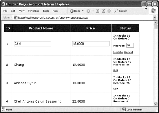
It's actually quite easy. All you need to do is add a button control to the item template and set the CommandName to Edit. This automatically triggers the editing process, which fires the appropriate events and switches the row into edit mode.
<ItemTemplate>
  <b>In Stock:</b> <%# Eval("UnitsInStock") %><br />
  <b>On Order:</b> <%# Eval("UnitsOnOrder") %><br />
  <b>Reorder:</b> <%# Eval("ReorderLevel") %>
  <br /><br />
  <asp:LinkButton runat="server" Text="Edit"
CommandName="Edit" ID="LinkButton1" />
</ItemTemplate>In the edit item template, you need two more buttons with CommandName values of Update and Cancel:
<EditItemTemplate>
  <b>In Stock:</b> <%# Eval("UnitsInStock") %><br />
  <b>On Order:</b> <%# Eval("UnitsOnOrder") %><br /><br />
  <b>Reorder:</b>
  <asp:TextBox Text='<%# Bind("ReorderLevel") %>' Width="25px"
   runat="server" id="txtReorder" />
  <br /><br />
  <asp:LinkButton runat="server" Text="Update"
   CommandName="Update" ID="LinkButton1" />
  <asp:LinkButton runat="server" Text="Cancel"
   CommandName="Cancel" ID="LinkButton2" CausesValidation="False" />
</EditItemTemplate>
Notice that the Cancel button must have its CausesValidation property set to False to bypass validation. That way, you can cancel the edit even if the current data isn't valid.
As long as you use these names, the GridView editing events will fire and the data source controls will react in the same way as if you were using the automatically generated editing controls. Figure 16-16 shows the custom edit buttons.
The GridView excels at showing a dense table with multiple rows of information. However, sometimes you want to provide a detailed look at a single record. You could work out a solution using a template column in a GridView, but ASP.NET includes two controls that are tailored for this purpose: the DetailsView and the FormView. Both show a single record at a time but can include optional pager buttons that let you step through a series of records (showing one per page). Both give you an easy way to insert a new record, which the GridView doesn't allow. And both support templates, but the FormView requires them. This is the key distinction between the two controls.
One other difference is the fact that the DetailsView renders its content inside a table, while the FormView gives you the flexibility to display your content without a table. Thus, if you're planning to use templates, the FormView gives you the most flexibility. But if you want to avoid the complexity of templates, the DetailsView gives you a simpler model that lets you build a multirow data display out of field objects, in much the same way that the GridView is built out of column objects.
Now that you understand the features of the GridView, you can get up to speed with the DetailsView and the FormView quite quickly. That's because both borrow a portion of the GridView model.
The DetailsView displays a single record at a time. It places each field in a separate row of a table.
You saw in Chapter 15 how to create a basic DetailsView to show the currently selected record. The DetailsView also allows you to move from one record to the next using paging controls, if you've set the AllowPaging property to True. You can configure the paging controls using the PagerStyle and PagerSettings properties in the same way as you tweak the pager for the GridView.
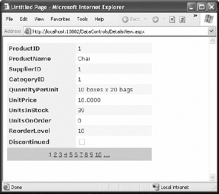
Figure 16-17 shows the DetailsView when it's bound to a set of product records, with full product information.
It's tempting to use the DetailsView pager controls to make a handy record browser. Unfortunately, this approach can be quite inefficient. One problem is that a separate postback is required each time the user moves from one record to another (whereas a grid control can show multiple records on the same page). But the real drawback is that each time the page is posted back, the full set of records is retrieved, even though only a single record is shown. This results in needless extra work for the database server. If you choose to implement a record browser page with the DetailsView, at a bare minimum you must enable caching to reduce the database work (see Chapter 23).
Tip
It's almost always a better idea to use another control to let the user choose a specific record (for example, by choosing an ID from a list box), and then show the full record in the DetailsView using a parameterized command that matches just the selected record. Chapter 15 demonstrates this technique.
The DetailsView uses reflection to generate the fields it shows. This means it examines the data object and creates a separate row for each field it finds, just like the GridView. You can disable this automatic row generation by setting AutoGenerateRows to False. It's then up to you to declare information you want to display.
Interestingly, you use the same field tags to build a DetailsView as you use to design a GridView. For example, fields from the data item are represented with the BoundField tag, buttons can be created with the ButtonField, and so on. For the full list, refer to the earlier Table 16-1.
The following code defines a DetailsView that shows product information. This tag creates the same grid of information shown in Figure 16-17, when AutoGenerateRows was set to True.
<asp:DetailsView ID="DetailsView1" runat="server" AutoGenerateRows="False"
 DataSourceID="sourceProducts">
  <Fields>
    <asp:BoundField DataField="ProductID" HeaderText="ProductID"
     ReadOnly="True" />
    <asp:BoundField DataField="ProductName" HeaderText="ProductName" />
    <asp:BoundField DataField="SupplierID" HeaderText="SupplierID" />
    <asp:BoundField DataField="CategoryID" HeaderText="CategoryID" />
    <asp:BoundField DataField="QuantityPerUnit" HeaderText="QuantityPerUnit" />
    <asp:BoundField DataField="UnitPrice" HeaderText="UnitPrice" />
    <asp:BoundField DataField="UnitsInStock" HeaderText="UnitsInStock" />
    <asp:BoundField DataField="UnitsOnOrder" HeaderText="UnitsOnOrder" />
    <asp:BoundField DataField="ReorderLevel" HeaderText="ReorderLevel" />
    <asp:CheckBoxField DataField="Discontinued" HeaderText="Discontinued" />
  </Fields>
  ...
</asp:DetailsView>
You can use the BoundField tag to set properties such as header text, formatting string, editing behavior, and so on (refer to Table 16-2). In addition, you can use the ShowHeader property. When it's False, the header text is left out of the row, and the field data takes up both cells.
Tip
Rather than coding each field by hand, you can use the same shortcut you used with the GridView. Simply select the control at design time, and select Refresh Schema from the smart tag.
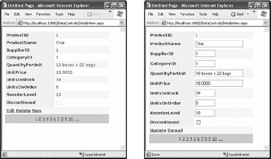
The field model isn't the only part of the GridView that the DetailsView control adopts. It also uses a similar set of styles, a similar set of events, and a similar editing model. The only difference is that instead of creating a dedicated column for editing controls, you simply set one of the Boolean properties of the DetailsView, such as AutoGenerateDeleteButton, AutoGenerateEditButton, and AutoGenerateInsertButton. The links for these tasks are added to the bottom of the DetailsView. When you add or edit a record, the DetailsView uses standard text box controls (see Figure 16-18), just like the GridView does. For more editing flexibility, you'll want to use templates with the DetailsView (by adding a TemplateField instead of a BoundField) or the FormView control (as described next).
If you need the ultimate flexibility of templates, the FormView provides a template-only control for displaying and editing a single record.
The beauty of the FormView template model is that it matches the model of the TemplateField in the GridView quite closely. This means you can work with the following templates:
ItemTemplate
EditItemTemplate
InsertItemTemplate
FooterTemplate
HeaderTemplate
EmptyDataTemplate
PagerTemplate
Note
Unlike the GridView and DetailsView, which allow you to add as many TemplateField objects as you want, the FormView allows just a single copy of each template. If you want to show multiple values, you must add multiple binding expressions to the same ItemTemplate.
You can use the same template content you use with a TemplateField in a GridView in the FormView. Earlier in this chapter, you saw how you can use a template field to combine the stock information of a product into one column (as shown in Figure 16-12). Here's how you can use the same template in the FormView:
<asp:FormView ID="FormView1" runat="server" DataSourceID="sourceProducts">
  <ItemTemplate>
    <b>In Stock:</b>
    <%# Eval("UnitsInStock") %>
    <br />
    <b>On Order:</b>
    <%# Eval("UnitsOnOrder") %>
    <br />
    <b>Reorder:</b>
    <%# Eval("ReorderLevel") %>
    <br />
  </ItemTemplate>
</asp:FormView>
Like the DetailsView, the FormView can show a single record at a time. (If the data source has more than one record, you'll see only the first one.) You can deal with this issue by setting the AllowPaging property to True so that paging links are automatically created. These links allow the user to move from one record to the next, as in the previous example with the DetailsView.
Another option is to bind to a data source that returns just one record. Figure 16-19 shows an example where a drop-down list control lets you choose a product, and a second data source shows the matching record in the FormView control.
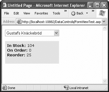
Here's the markup you need to define the drop-down list and its data source:
<asp:SqlDataSource ID="sourceProducts" runat="server"
  ConnectionString="<%$ ConnectionStrings:Northwind %>"
  SelectCommand="SELECT ProductID, ProductName FROM Products">
</asp:SqlDataSource>

<asp:DropDownList ID="lstProducts" runat="server"
  AutoPostBack="True" DataSourceID="sourceProducts"
  DataTextField="ProductName" DataValueField="ProductID" Width="184px">
</asp:DropDownList>
The FormView uses the template from the previous example (it's the shaded region on the page). Here's the markup for the FormView (not including the template) and the data source that gets the full details for the selected product.
<asp:SqlDataSource ID="sourceProductFull" runat="server"
  ConnectionString="<%$ ConnectionStrings:Northwind %>"
  SelectCommand="SELECT * FROM Products WHERE ProductID=@ProductID">
    <SelectParameters>
        <asp:ControlParameter Name="ProductID"
         ControlID="lstProducts" PropertyName="SelectedValue" />
    </SelectParameters>
</asp:SqlDataSource>

<asp:FormView ID="formProductDetails" runat="server"
  DataSourceID="sourceProductFull"
  BackColor="#FFE0C0" CellPadding="5">
    <ItemTemplate>
        ...
    </ItemTemplate>
</asp:FormView>
Note
If you want to support editing with the FormView, you need to add button controls that trigger the edit and update processes, as described in the "Editing with a Template" section.
In this chapter, you considered everything you need to build rich data-bound pages. You took a detailed tour of the GridView and considered its support for formatting, selecting, sorting, paging, using templates, and editing. You also considered the DetailsView and the FormView, which allow you to display and edit individual records. Using these three controls, you can build all-in-one pages that display and edit data, without needing to write pages of ADO.NET code. Best of all, every data control is thoroughly configurable, which means you can tailor it to fit just about any web application.