
The Omega theme is built on the 960 Grid System (960gs), a design platform whose methodology relies on the inherent divisibility of 960 to devise a layout for design elements on a page. The Omega theme, along with the Omega Starter Kit and Omega Tools developer resources, provide a rich set of functions you can use to create a unique theme with minimal development time.
In this appendix, I'll go through the process of starting with a Photoshop mock-up of a site and turning it into a rich CSS-based design that integrates with the Omega Starter Kit.
The 960 Grid System (http://960.gs) was created as a set of CSS styles that represent a web page in a fixed-width form 960 pixels wide. The number 960 was chosen for the same reason there are 36 dancers in a chorus line: the numbers can be divided evenly into a variety of different configurations. In the case of the 960.gs standard, you can divide the fixed number of pixels into a number of larger columns. Those columns, in turn, provide a vertical guide for laying out the elements of a page. Each layout column has a 10-pixel margin on each side, giving a 20-pixel gutter between columns. Creating a layout becomes the task of creating columns of content that line up with the grid boundaries.
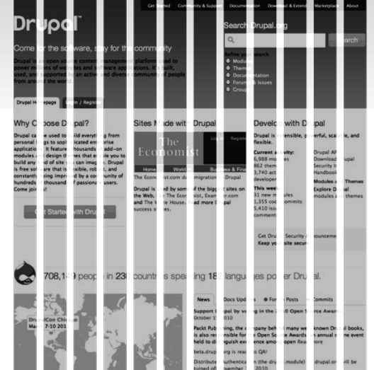
Take, for example, the drupal.org site, shown in Figure B-1.
Notice that the site uses a 12-column grid. Other popular grids are 16 and 24 columns. See how the top banner has two defined regions, the first being 6 columns and the second being 5, with a one-column gap in between. The Omega theme provides tools and a foundation that allow you to theme your site quickly and consistently.
Designers commonly use Photoshop to create a mock-up for a web site. The problem is that the creative people who make wonderful-looking mock-ups in Photoshop sometimes don't understand the details involved in building a content-rich web site that must rebuild every page based on the content desired by the user.
The trick, then, is to come up with an environment where the creative graphics people can design, and the creative programmer people can use that design to build a site.
In this example, we will use the 960 grid system, along with Omega, to achieve those goals.
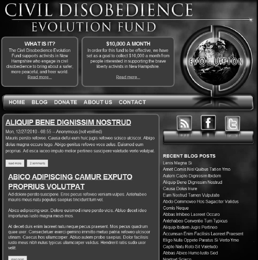
We've been given the task of creating a site. The client is the Civil Disobedience Evolution Fund, an educational charity devoted to providing information and support for "good people who break bad laws." The designer prefers to build mock-ups in Photoshop, and so I sent her a grid template.
This template is written as a Photoshop plug-in—an action script that must be installed in the Presets/Actions directory of the Photoshop program directory. Once it's installed, the plug-in will create a series of guides corresponding to the columns and gutters of the chosen 960gs scheme. In this case, we chose the 16-column grid.
Figure B-2 shows the Actions window after the plug-in was installed.
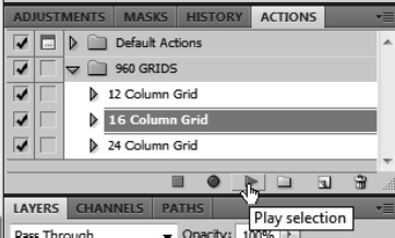
Selecting the 16 Column Grid action and pressing play gives us a new, empty document with guides at the appropriate column points, as shown in Figure B-3.
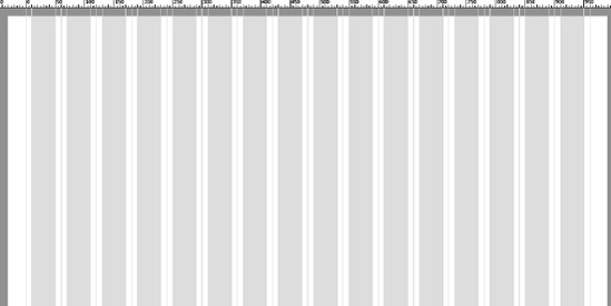
Notice that an overlay is also created to show where content goes and where the gutters are. Gutters are the white area. Each of the 16 columns has two gutters, one on each side. The width of these gutters varies with the template. For the 16-column template, each column is 60 pixels wide: 40 pixels for content and 20 pixels for gutters. The gutter space is split between the right and left side of the content column.
The gutter space is germane only when the gutter is at the edge of the region we are defining. This will become more evident as we go through the process, but suffice it to say, for now, that we will have 20 pixels between our elements once we start defining them on the page.
Note
The grid action script opens a new document. If you have an existing design and want to lay the guides over that, you must uncheck the first action in the script.
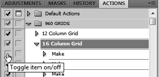
This is the action that opens a new document. To use an existing document, load it, uncheck the first "Make," and then run. The gridlines will show up and the overlay will be added as a new layer.
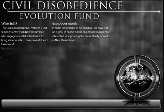
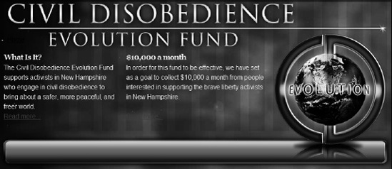
Once the guides have been established, the designer can create her mock-up, using the columns to guide the design. The final design is shown in Figure B-4.
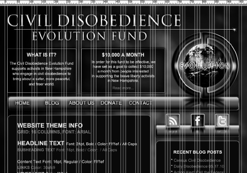
Notice that all of the content areas line up inside of the guides. The top brand area is 16 columns wide. The block titled "What is it?" is 5 columns and the next, "$10,000 a Month," is 6 columns. The main content area is 10 columns and the sidebar on the right is 6 columns.
There are some other components that we'll deal with later, but for now, let's get started on our Omega theme.
The Omega theme, like many "base" themes available in the Drupal world, doesn't really do anything after you install it. That is, such themes don't have pretty backgrounds or hover-over effects or much, if any, UI presentation. They are simply engines you can use to plug in your vision for theming.
The way Drupal enables this vision is through sub-theming. I discussed this in Chapter 7, so we'll do it here with the Omega theme.
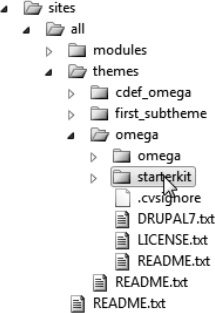
Omega ships with a starter kit ready for you to use for your sub-theme. You'll find it in the themes directory as shown in Figure B-5.
To get started with your sub-theme, follow these steps:
Copy the
starterkitfolder from the default Omega theme directory and place it in yoursites/all/themesdirectory.Rename the folder to the theme name of your choice. I'm calling mine
cdef_omega.Rename
omega_starterkit.infotocdef_omega.infoandmodify the default information in the.infofile as needed. This is shown in Listing B-1.Example B.1. Modifying the
.infoFile; $Id:$ ; ; / / / / / / / / / / ; / /:: / /::| / /:: / /:: / /:: ; / /:/: / /:|:| / /:/: / /:/: / /:/: ; / /:/ : / /:/|:|__ / /:: : / /:/ : / /:: : ; /__/:/ \__: /__/:/_|:::: /__/:/: : /__/:/_\_ : /__/:/:\_: ; : / /:/ \__/ /~~/:/ : :\_/ :\__/\_/ \__/ :/:/ ; : /:/ / /:/ : : : : \__::/ ; :/:/ / /:/ :\_/ :/:/ / /:/ ; ::/ /__/:/ : ::/ /__/:/ ; \__/ \__/ \__/ \__/ \__/ name = CDEvolution Theme description = Sub-themed from Omega starter kit screenshot = screenshot.png core = 7.x base theme = omega project = "cdef_omega"
Open
template.phpand search and replaceomega_starterkitwithcdef_omega. This is shown in Listing B-2.Example B.2. Updating
template.phpfor Your Sub-Theme<?php // $Id: template.php,v 1.3.2.2.2.1 2010/11/01 16:26:38 himerus Exp $ /** * @file * Starter template.php file for sub-themes of Omega. */ /** * Implements hook_theme(). */ function cdef_omega_theme(&$existing, $type, $theme, $path) { $hooks = array(); //$hooks = omega_theme($existing, $type, $theme, $path); return $hooks; }Open
theme-settings.phpand search and replaceomega_starterkitwithcdef_omega, as shown in Listing B-3.Example B.3. Updating
theme-settings.phpfor Your Sub-Theme<?php // $Id: theme-settings.php,v 1.3.2.3 2010/08/03 14:19:52 himerus Exp $
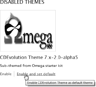
/**
 * @file
 * Theme settings for the Omega theme.
 */

/**
 * Implements hook_form_system_theme_settings_alter().
 *
 * @param $form
 *   Nested array of form elements that comprise the form.
 * @param $form_state
 *   A keyed array containing the current state of the form.
 */
function cdef_omega_form_system_theme_settings_alter(&$form, &$form_state) {
  // Include any changes to the theme settings here.
}
Go to Appearance on the administration menu and enable the new sub-theme as shown in Figure B-6
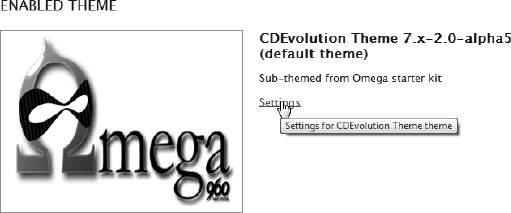
Click on Settings to start the configuration process (see Figure B-7).
This will display the Omega configuration administration screen, as shown in Figure B-8.
Omega is a fairly complex theme, but it has an interface that allows you to set things up in a consistent way. For this reason, I feel it's safe to introduce the new Drupal developer to such complexity. I've used many themes in Drupal and found the Omega-based theme the most accessible one that has real power.
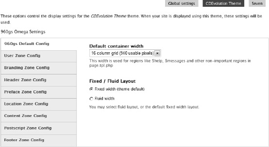
The first thing we will do is to set the default number of columns for the page. Our designer used the 16-column Photoshop guides, so we select a 16-column grid as our default.
The Omega 960 theme introduces the concept of zones—horizontal areas that are stacked vertically on top of each other to create a page. Each zone can have a different number of 960gs columns, but we'll stick with 16 columns for each zone in our theme.
Some zones contain "special" items like the breadcrumb, logo/title/slogan, etc. that are normally output separately in page.tpl.php.
By default, Omega defines eight zones, each broken into one or more regions.
user. The user zone is a set of two regions at the top of the page primarily used to display things like a horizontal login bar, user account menu, search block, etc. The two regions defined in the user zone are:user_bar_firstuser_bar_second
branding. The branding zone contains the default Drupal items for logo/site title/slogan, followed by the primary menu. The branding zone is required and contains "special" content items. The two regions defined in the branding zone are:brandingmenu
header. The header zone contains two simple regions for items below the primary menu. The header regions are usually used for callout items on specific pages, or for other items you want above your primary page content. The two regions defined in the header zone are:header_firstheader_second
preface. The preface zone works much like the header zone as a place for the themer to put various things. The three regions defined in the preface zone are:preface_firstpreface_secondpreface_third
location. The location zone is required and contains the default system breadcrumb on pages where the breadcrumb is specifiedcontent. The content zone is required and contains required content items. The content region should always be first for source ordering. Ordering is important because search engines generally assume that the higher something appears on a page, the more important it is. Omega has a feature that allows you to specify the content first and the first sidebar second, but still lets you render the first sidebar to the left of the content. This gives you the search-engine optimization you want, as well as the ability to lay out the page that makes the most sense to your designer. The three regions defined in the content zone are:contentsidebar_firstsidebar_second
postscript. The postscript zone is another place to put various elements. It is pretty common these days for a site to have a number of blocks at the bottom of the page, below the content but above the final footer. The four regions defined in the postscript zone are:postscript_firstpostscript_secondpostscript_thirdpostscript_fourth
footer. The footer zone is the last one on the page. This is usually where the copyrights and any other such information are placed. The two regions defined in the footer zone are:footer_firstfooter_second
These zones and regions are shipped with the Omega starter kit. As with most things in Drupal, they can be edited or extended. These zones and regions (and a lot more) are defined in the .info file of your sub-theme. As a word of caution, tread lightly here; you should understand how all of the pieces work together before editing this file.
The next step is to map these zones and regions to our Photoshop mock-up.
In picking our zones, we need to refer back to the Photoshop mock-up. Figure B-9 shows the mock-up with potential zones displayed as boxes.
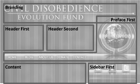
This map shows the Branding region on top, followed by the Header First and Header Second regions in the Header zone. And there's a Preface zone, which contains our Preface First region. After that are two regions in the Content zone, Content and Sidebar First. But there's a problem.
The problem is that zones are designed to be horizontal boxes that sit on top of each other and don't overlap. The Preface First region is not only not a rectangle, but it overlays the Branding region. This will not work with the theme as it is designed.
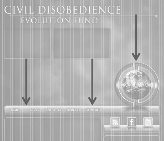
But not to despair. We can do some tricks with CSS to make this work. First, we'll go into Photoshop and select the graphic elements in the Preface First region and everything below it. Then, we'll move them all down to create nice rectangle boxes, as shown in Figure B-10.
After moving the graphic elements down, we can remap the mock-up, creating nice boxes that sit on top of each other without overlapping. (See Figure B-11.)
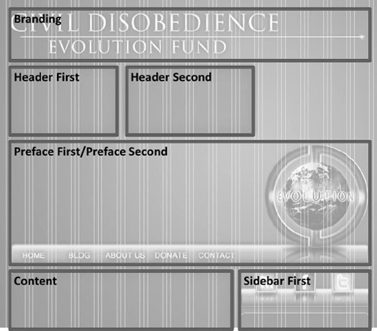
When we get to the CSS part of the exercise, we'll move the Preface First region back up to where it should be.
Now that we have our regions mapped out, let's continue with the Omega administration pages to declare the information about each zone. This is just a matter of going down the list of zones and setting various parameters. The first zone, User, will not be used in our theme, so we can turn it off. (See Figure B-12.)
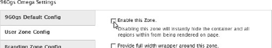
We will be using the next zone, Branding. This is a simple zone and we'll use just a single region. First, we need to enabled the zone and set the container width to 16 columns as shown in Figure B-13.
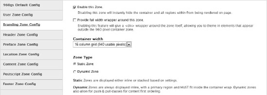
We'll set the Zone Type to Static, which is the default. There is a feature in the 960 Grid System that allows zones to stack on the page. If, for example, you have a 16-column grid and you define three 6-column regions inside of it, they won't fit. Omega will put the first two regions next to each other, and then stack the third one underneath the first two. We will be using this feature later.
Setting the Zone Type to Static Zone produces this behavior.
In contrast, choosing Dynamic Zone causes a region to expand and collapse depending on the nature of other regions in the same zone. For example, suppose you had a region that had only a user logon box. Once a user logs on, there's no need to show that box. If the logon box is not present, you might want the content next to it to fill the empty space. A dynamic zone lets this happen.
The Branding zone has two default regions, but we are only using one. The Branding region will hold our logo and will be 16-columns wide. (See Figure B-14.)
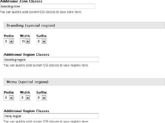
The Additional Zone Classes field is displayed on top, giving you a chance to provide CSS class names to the DIV that wraps all of the regions in the zone. You'll also notice the Additional Region Classes field that does the same thing for the DIV that wraps everything placed in the region.
We can see two regions declared for the Branding zone. Each region contains three settings, Prefix, Width, and Suffix. The width is the number of columns that will contain content. The Prefix and Suffix fields indicate the number of columns that will appear blank before and after the content.
It's important that the total of all of the selections on all of the regions add up to no more than the number of columns in the container. In this case, it's pretty easy; the width of the Branding region is the full 16 columns and everything else is set to zero.
Now let's look at the Header Zone, shown in Figure B-15.
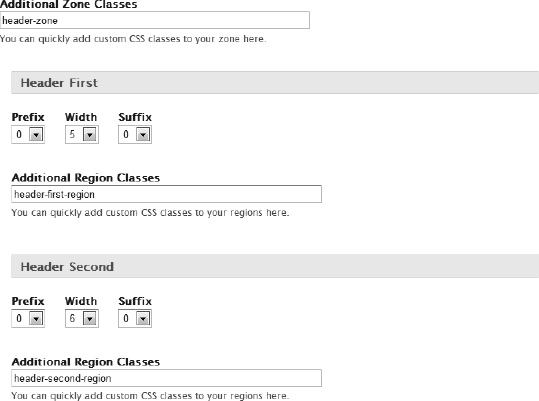
This is also a 16-column static zone, but we must now declare two regions to hold the content. The first region, Header First, is five columns with no prefix and suffix, and the second region, Header Second, is six columns wide with no prefix or suffix. Notice that the total of all fields is less than the 16-column width of our container. That's OK, since it fits with our design. The total columns, 11, will be formatted from the left, leaving five columns on the right empty. We will need that area empty when we use CSS magic to move the logo up the page.
The Preface zone will also be 16 columns and we will use two regions, Preface First and Preface Second. Preface First will hold the logo and background for the menu bar. Preface Second will contain the actual menu, generated by Drupal based on the content of the site. In this case, we'll need to stack to two regions vertically within the same zone. See Figure B-16 to see how we pull this off.
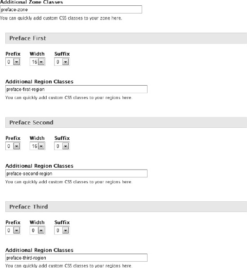
Notice the Width of the Preface First region. It is set to 16, which will completely fill the zone. But the Preface Second region is also set to 16. Because the first region fills up the zone, the second region will appear directly below it, which is exactly what we want.
Notice the third preface as well. We won't be using it in this theme, so we just set all three values to zero. If we wanted to optimize the site for maximum performance, we would go into the .info file and remove the Preface Third region altogether. For now, let's just set it to zero.
We won't be using the next zone, Location, either, so we'll clear the "Enable this Zone" checkbox.
The next zone, Content, is where our main content and sidebars will go. This is shown in Figure B-17.
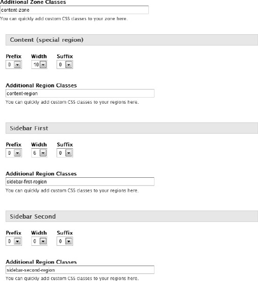
There's nothing special here. The content has a width of 10 columns, and the sidebar is 6 columns.
We won't be using the Postscript Zone or Footer Zone, so I'll clear the "Enable this Zone" checkbox for each of those. Now that the zones are set up, let's start filling in the regions with content and graphics.
We can place content in each region we defined in this exercise using blocks. For three of the regions, we have standard Drupal blocks, as shown in Figure B-18.
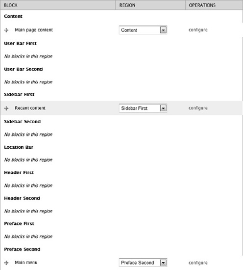
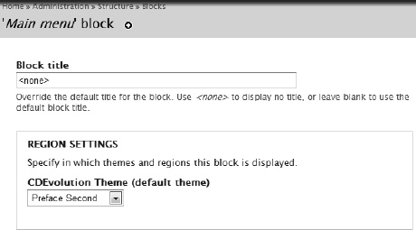
The main page content goes in our Content region. Recent content is placed in the first sidebar, and our main menu is placed in the Second Preface region. The main menu has a title by default, which we don't want since our menu will be formatted horizontally in the space our designer created. To get rid of the title, we need to click "configure" next to the main menu and set the title to <none>. (See Figure B-19.)
Now that we have the three Drupal-created blocks, we need to create three more blocks to hold our static information. This includes the two preface blocks above the menu bar and the follow block that will appear above the recent content in the first sidebar.
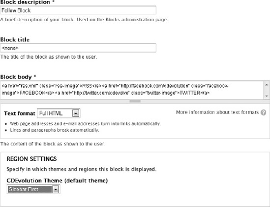
To create these blocks, we need to add them on the blocks administration page. Clicking "Add block" on that page brings up the new block screen shown in Figure B-20.
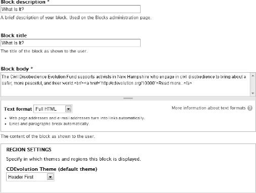
The Block description field indicates how the block will appear on the blocks administration page, and the Block title is the text that will be placed on the top of the block. If you don't want a title, enter <none>. In the Block body field, we enter the short text of the block and provide a link as an HTML tag. If you put HTML in the block, make sure the appropriate Text format filter is selected.
Finally, we indicate that we want this block to appear in the first header region. We do the same for the other two blocks.
Now it's time to put everything together on the page using CSS.
When you create a new site, it's a blank slate. You don't have any themes except the default. You don't have any modules except the core modules that were installed as part of your profile, and you don't have any content. Creating content takes time, and is really what your site is about. But it might be nice to have some content generated for you, just so you can see how a page will look with, say, 10 blog teasers. Or what a recent-content menu would look like with 20 articles.
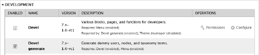
If you'd like to be able to do this, you're not alone, and there's a module that can help. The Devel module provides a toolbox of fun for the developer. If you want to create content, download and enable the Devel module and make sure the Devel generate module is enabled (see Figure B-21).
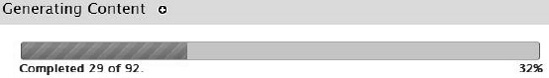
To create content, go to Configuration...Generate content. You'll see the screen shown in Figure B-22.
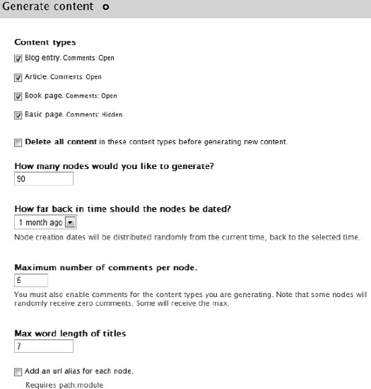
The first section on the page has a list of content types that are currently installed and enabled. The other parameters are pretty self-explanatory. You'll see the throbber going (Figure B-23) and then the happy screen showing how much content was generated.
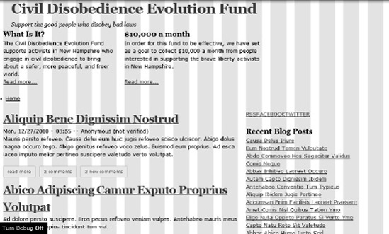
Now if we go to the front page of our site, we'll see the not-too-impressive, un-themed (but full of content) site (see Figure B-24).

Notice that the title and slogan appear at the top, as do the two blocks we created for the header zone. Also, notice that the second preface region has the main menu with our single link, Home. The content zone has the content region and the first sidebar, which contains a list of recent blog posts. And above that is the block that contains our follow links.
Tip
The content created by Devel generate is "greeked." That is, Devel generates dummy text, written in pseudo Latin, to bulk up the page. You might also notice geometric graphics placed randomly on various content that was generated.
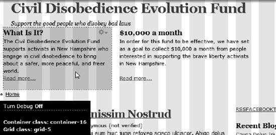
As you can see, the site is already adhering to the 16-column layout we designed. The Omega theme has a debugging feature that turns on the columns as an overlay so you can see how your theme is adhering to your specified layout. You can turn this on from the Settings page of your theme, as shown in Figure B-25.

By turning on the feature and going to the front page again, you can see that our columns are as we specified, as shown in Figure B-26.
This can be toggled on and off by clicking the "Turn Debug Off" button in the lower left corner of the page. A nice feature of the Devel module and Omega theme is the ability to hover over a block and see the styling characteristics. Figure B-27 shows an example.
I hope you see that we're really farther along than it looks, and now it's time to start styling.
Cascading Style Sheets are used heavily in Drupal's theming layer. The syntax of CSS is beyond the scope of this book, but you'll be seeing a lot of CSS in the next sections. Even if you're not familiar with it, you will probably be able to figure things out. If you want to know more about CSS, you'll find plenty of resources on the Internet where you can get more detailed information.
The Omega theme, like most, has a set of CSS files that perform certain styling tasks. We'll need to enhance those styles to create our own for this site. You should know by now that it's a bad practice to modify the core code or contributed modules unless you are on the project team. Fortunately, you don't need to do that. Drupal's theming engine let's add our own CSS classes to the ones defined by the other parts of Drupal that create our page.
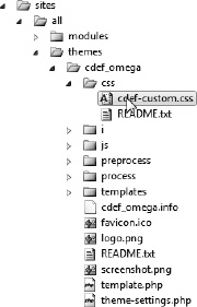
Our first step, then, is to create our own CSS file. The Omega starter kit has a place to put our custom CSS files, and a handy README.txt file that explains what to do. You can call the file anything you want, but it needs to go into the hierarchy of the theme we have been creating.
For my site, I used Visual Studio to create a new CSS file called cdef-custom.css in the directory sites/all/themes/cdef_omega/css, as shown in Figure B-28.
Now we need to tell Drupal to be aware of the file when it builds our pages. We do this the same way as when we add any other file that has code Drupal needs to know about, in the .info file. Listing B-4 shows the sample.
Example B.4. Modifying the .info File to Recognize a Style Sheet File
name        = CDEvolution Theme
description = Sub-themed from Omega starter kit
screenshot  = screenshot.png
core        = 7.x
base theme  = omega
project     = "cdef_omega"

stylesheets[all][] = css/cdef-custom.css
The stylesheets[] array contains all style sheets we want to add. The path is defined relative to the directory containing the theme's root file. We are defining a style sheet for all media types. Media types are defined by a W3C standard and are as follows:
all: Suitable for all devices.braille: Intended for braille tactile feedback devices.embossed: Intended for paged braille printers.handheld: Intended for handheld devices (small screen, limited bandwidth).print: Intended for paged material and for documents viewed on screen in print preview mode.projection: Intended for projected presentations.screen: Intended primarily for color computer screens.speech: Intended for speech synthesizers.tty: Intended for media using a fixed-pitch character grid (such as teletypes, terminals, or portable devices with limited display capabilities). Authors should not use pixel units with thettymedia type.tv: Intended for television-type devices (low resolution, color, limited scrolling, screens, sound available).
If you select [all], the style sheet will be used as the default for all media output types. By specifying various media types in your theme, you can provide different output for different devices. If you want a particular style sheet to be used by more than one media type, but not all, you can list them in a comma-delimited list in the array: stylesheet[handheld, tv][].
Note
Be sure to include the empty brackets after the media type. This ensures that your style sheet get loaded as next in the list of style sheets to be included.
Now that we've configured our style sheet, let's start entering our styles. I like to start with the easy big-ticket styles that will show up as noticeable changes on the site. That way, I get a feeling of accomplishment right away, and can build on that with the finer styles. Let's do the background first.
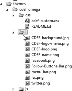
If you're lucky, your designer has extracted all of the graphic pieces as individual files so you can start right in with your theming. But chances are you'll have to do that yourself. Photoshop's capabilities are beyond the scope of this chapter, so I'll assume you've isolated the various parts of your mock-up to image files and placed them on the file system. The images I've isolated are shown in Table B-1.
Table B.1. Graphics Extracted from the Photoshop Mock-Up
 |
|
 |
|
 |
|
 | Follow-Buttons-Bar.png |
 | facebook.png |
 | rss.png |
 | twitter.png |
The most convenient place to put these images is in your sub-theme directory. I created a directory named with a single character to make typing easier. The structure is shown in Figure B-29.
Now that the files are in the right place and Drupal knows everything it should, the easy and fun part starts.
Our first task is to put the background image, CDEF-background.jpg in the CSS file we just created. We'll start with the block shown in Listing B-5.
Example B.5. CSS Block for Document Body
body {
  background: url('../i/CDEF-background-960.jpg') center top black;
  background-repeat:repeat-x;
  background-attachment:fixed;
  color:#f1f1ef;
  font-family:Arial;
  font-size:12pt;
}
You can see if everything is set up correctly by saving the CSS file and refreshing the site. You should get something like what's shown in Figure B-30.

If you refresh and don't see the background image, either something is not set up right in your chain of configuration settings or your theme information has been cached. You can clear the cache by going to Configuration
Tip
You can also use Drush to clear caches. The command is drush cc theme to clear just the theme cache, or drush cc all to clear all caches. I usually keep a command window open to issue these Drush commands from time to time. Very handy. You can learn more about Drush in Appendix A.
Setting a style for the body is pretty easy. Now we need to start placing the other graphics and setting other parameters to get our site just right.
Next, we'll put the main logo at the top. In our layout specification, we saw that the logo was set in the Branding zone. We need to find out the name of the container DIV and set the background image of that HTML element to our graphic. Here's where the browser-based developer tools come in handy. In Internet Explorer, the tools are accessed using F12. This brings up the tools window, as shown in Figure B-31.
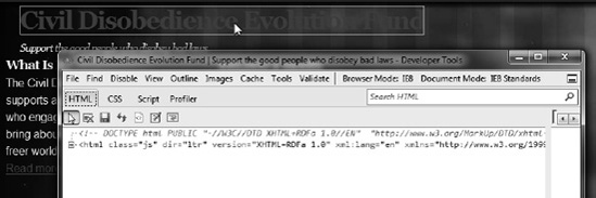
Clicking on the inspection arrow above the code window (or using Ctrl-B) allows you to select an element and see what it looks like in the source document. If we select the title, we can see that the link is somewhere in the middle of a group of nested DIV containers, as shown in Figure B-32.
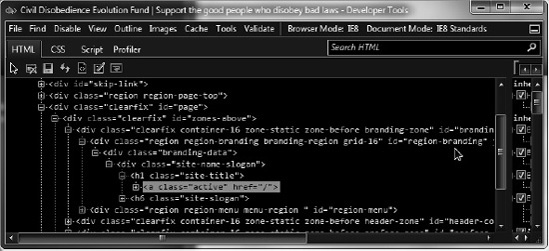
We can see that there's a DIV with an ID of region-branding. That's the one we'll use to attach our graphic. The code in Listing B-6 shows the CSS code for this.
Example B.6. CSS Code for Attaching a Graphic to an Identified DIV
#region-branding {
 background: transparent url('../i/CDEF-name.png') no-repeat right top;
 min-height :131px;
 float:right;
}
This locates the element with the specified ID and sets the background to the graphic. It also sets a couple of other parameters. Notice the min-height parameter. This is the actual height of the graphic. It's a good idea to specify this so the browser's rendering engine doesn't have to work as hard, and it will render faster for the user.
Saving the CSS file and refreshing the browser provides the desired results as shown in Figure B-33.

But there's a problem. The text title that contains the name of the site still prints, and it now displays on top of the graphic. There are a couple ways we can deal with this. On the settings page for the sub-theme, there is a section titled Toggle Display that lets you turn the display of various content items on or off. This is shown in Figure B-34.
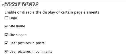
We could uncheck the Site name and Site slogan checkboxes so they don't appear on top of our graphic. While this will solve the problem of text overlays, it causes another problem. Search engines that crawl the web look for certain pieces of information to help optimize their results as they process their search queries. One of the important parts of your page is the title of your site. Even though we humans can see the title of the site because it's in the image, a site-crawling spider relies only on the HTML that is generated. If we remove the title, the search spider doesn't know the name of the site, and so we may miss getting our site to the eyes of potential users.
The trick, then, is to have Drupal generate the name of our site but have CSS hide it from view so it doesn't mess up the layout of the page. The code in Listing B-7 does just that.
This will take all text in the DIV container with the class site-name-slogan and indent the text 2,000 pixels to the left. The text will be rendered to the browser's canvas, but so far to the left that no human should see it. But search engines should.
So how did I know the name of the container that needed indenting? The same way I did above. In fact, the answer is in Listing B-7. The site- name-slogan is a container for an H1 element that contains the name, site-title, and an H6 that contains site-slogan.
This technique can be used any time you want to ensure search-engine optimization (SEO) but you don't want the text to appear to the user.
The next step is to position the main logo and menu bar so that it appears where our designer wanted it. If you recall from earlier in the text, this is the menu bar and globe logo that had to be moved down the page so we could capture it. Now we get to put it back where it belongs.
The CSS code to get started is shown in Listing B-8.
Example B.8. Adding an Image That Will Be Shifted Up
#preface-container {
  background: transparent url('../i/CDEF-logo-menu.png') no-repeat center top;
  min-height:334px;
  width:960px;
}
Here we set the background image and specify its height and width. The resulting effect is shown in Figure B-35.
This is probably what we should have expected from that code, but not really what we want. But adding three lines of code will give us exactly what we want (see Listing B-9).
Example B.9. Shifting the Image Out and Up
#preface-container {
  background: transparent url('../i/CDEF-logo-menu.png') no-repeat center top;
  min-height:334px;
  width:960px;
  position:relative;
  top:-240px;
  z-index:100;
}
First, we need to establish that the image is relative to the container in which it's located. This will give us an anchor on which to establish the top of the image. The top is specified as having a negative value, which will move it up on the page by 240 pixels. Finally, by moving the graphic up the page, it will be sitting on top of the artifacts above, so we need to move the image back a bit using the z-index parameter. The results of our efforts are shown in Figure B-36.
Now for the menu. Remember that we placed the main menu in the Preface Second region. We need to put that in the horizontal bar under the globe logo. The CSS in Listing B-10 will do the trick.
Example B.10. Placing the Main Menu Where It Belongs
#region-preface_second {
  position:relative;
  top:276px;
  left:10px;
}

#block-system-main-menu ul.menu {
  font-weight:bold;
  font-size:16pt;
  margin: 0;
  padding: 0;
  list-style-type:none;
  text-transform:uppercase;
}

#block-system-main-menu ul.menu li {
  padding: .2em;
  display:inline;
}

#block-system-main-menu ul.menu li a {
  text-decoration: none;
  color:#f1f1ef;
}
The identifier for the container is region-preface_second. That container is inside of the container that we hiked up the page, preface-container. Therefore, we need to move the menu back down a bit so it appears where we want it. That's the positive value in the top parameter, and the position parameter assures that there's something to move against.
The main menu is generated as an HTML unordered list. Setting list-style-type to none and display to inline will flatten the list so we can render it on a single line. The text-decoration parameter will get rid of the bullet. The rest of the settings are there to get the text to look just right. The menu appears as we would expect, as shown in Figure B-37.
The two header boxes are next. The code to format them is shown in Listing B-11.
Example B.11. Header Box Formatting
#region-header_first,
#region-header_second {
  border:3pt solid #3399cc;
  background-color:#336666;
  border-radius: 15px;
  -webkit-border-radius: 15px;
  -moz-border-radius: 15px;
}

#region-header_first,
#region-header_second {
  height: 180px;
  margin:6px;
  color:#f1f1ef;
  text-align:center;
  z-index:200;
}

#region-header_first a:link,
#region-header_second a:link {
  color:#a1f1ef;
}

#region-header_first h2.block-title,
#region-header_second h2.block-title {
  color:#f1f1ef;
font-size:16pt; font-family:Arial; text-transform:uppercase; }
The parameters are pretty straightforward except for the radius parameters in region-header_first and region-header_second. Our designer specified rounded rectangles on those two regions. In older browsers, rounded borders were quite a chore. To create the effect, the designer had to create the four different rounded corners and stitch them together in the HTML.
Fortunately, with CSS 3, there is a new parameter, border-radius, that effortlessly creates rounded borders. The problem is that hardly anyone supports it yet. Figure B-38 shows the page rendered in Internet Explorer.
Firefox and Google Chrome both support rounded corners, but they require their own extensions. That's why you see the three different parameters that do the same thing (border-radius, -webkit-border-radius, and -moz-border-radius). The –moz prefix is read by Firefox, and the –webkit prefix is read by Chrome. Some day, I imagine, all browsers will support the standard syntax, so I'll keep the standard border-radius parameter in the style sheet for now.
Figure B-39 shows our page rendered in Google Chrome.
The next item to style is the block that contains the social network links under the globe logo. Our designer gave us four graphics, one for the background bar and one for each of the links, RSS, Facebook, and Twitter.
The easiest way to get started is to create a new block with the HTML code we need to insert the links and images. We can create the block from Structure
Notice that the HTML is placed directly into the body of the block and each of the links is given a class so we can hook into them to set our background images. The CSS code to style this is shown in Listing B-12.
Example B.12. Styling Images and Links
#follow-block {
  text-align:center;
  background: url('../i/Follow-Buttons-Bar.png') no-repeat bottom center;
  min-height:120px;
  overflow:visible;
}

a.rss-image,
a.facebook-image,
a.twitter-image {
  text-indent:-2000px;
  height:96px;
  width:90px;
  display:inline-block;
}

a.rss-image {
  background: url('../i/rss.png') no-repeat bottom center;
}

a.facebook-image {
  background: url('../i/facebook.png') no-repeat bottom center;
}

a.twitter-image {
  background: url('../i/twitter.png') no-repeat bottom center;
}

#region-sidebar_first {
  position:relative;
  top:-240px;
}
The four images are set to be the background of each object, and some other parameters are set to make everything look just right. Notice the region-sidebar_first block. Just as we moved the logo up the page, we need to move the follow block.
The result of this styling is shown in Figure B-41.
Rounding out this part of the style process requires some minor styling of the text in the main content region. This requires a simple CSS block, as shown in Listing B-13.
Example B.13. Tweaking the Position and Layout of the Content Block
#region-content {
  color:#f1f1ef;
  position:relative;
  top:-240px;
}
The block is shown in Figure B-42.
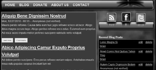
Now that most of the content has been formatted, another problem becomes apparent. Look at the contents of the first sidebar, the one to the right of the main content. It is formatted as a table, which is not what our designer envisioned. In order to change it, we'll need to go deeper into the theming layer and create a new template file.
If you've done everything according to best practices, all theming done by Drupal's theming layer is performed by the theme() function. It is the job of that function to create a list of candidates that it can invoke at a particular time, and then select the most appropriate candidate.
By default, the list of recent blog posts is formatted as a table. I'd rather just have a list of titles with a link that goes directly to each page.
In Chapter 7, I covered the topic of custom theme functions. We'll be creating one here, and then creating a template file to render the content in the block.
First, we need to declare the theme function and let Drupal know what arguments are to be passed to it. Since this theme will be specific to the theme we are using, it should be placed in a program file that's known to our theme. The file, template.php, is a standard part of most themes, and is available to us as part of our starter kit.
In that file, there is a placeholder function, cdef_omega_theme() that we will expand to declare our function. The code in Listing B-14 shows what we need.
Example B.14. Declaring a Theme Function in the Theme Hook
/**
 * Implements hook_theme().
 */
function cdef_omega_theme(&$existing, $type, $theme, $path) {
  $hooks = array(
    'recent_list' => array(
        'arguments' => array(
          'node-title' => NULL,
          'node-id' => NULL,
          )
        )
      );
  return $hooks;
}
The theme hook returns an array with the names of all of the themes we wish to register, just one in this case: recent_list. The structure also declares the names and default values of the two arguments that will be passed.
In keeping with the PHP requirement for unique function names, we will craft a function that Drupal's theme engine will find. The function, prefixed with the theme name, is shown in Listing B-15.
Example B.15. The Theme Function
function cdef_omega_recent_list($variables) {
  $title = $variables['node_title'];
  $id = $variables['node_id'];
  $content = '<div class="recent-title">' . l($title, 'node/' . $id) . '</div>';
  return $content;
}
The function builds a single DIV element with a class we can style and a link with the article title. We can now call this particular function through the theme() function. The call passes the name of the function, along with the arguments it is looking for: theme('recent_list', array(node_title => 'Some Title', node_id => 123);.
Tip
Notice the function used to create a link, l(). This handy function provides little gifts to us. First, it takes care of formatting a link, the HTML <a> tag. It also outputs whatever attributes are necessary to create the link we need. Plus, it takes care of escaping text in the link's URL. You should always use the l() function to create a link.
The last step is to figure out the name of the function that currently formats the table that we want to change. By setting some breakpoints and watching what was executing, I discovered that the name of the theme function is node_recent_block. We can work off of that name to build everything we need.
First, we need to create a function to process the data before it gets to the theming function. To do this, we will invoke the preprocess hook. The name of this function takes the form {theme name}_preprocess_{theme function} and is shown in Listing B-16.
Example B.16. The Preprocess Hook
function cdef_omega_preprocess_node_recent_block(&$vars) {
  $content = '';
  foreach ($vars['nodes'] as $recent_node) {
    $variables['node_title'] = $recent_node->title;
    $variables['node_id'] = $recent_node->nid;
    $content .= theme('recent_list', $variables);
  }
  $vars['content'] = $content;
}
This function is called with a reference to an array that contains the pertinent information. In this case, &$vars contains all of the nodes in the recent block. Creating the structure can be accomplished by simply iterating over this list, isolating the two variables we need, and then calling the theme function with the appropriate call. This calls the cdef_omega_recent_list() function we created above.
Now that we've created the content, we need to do something with it. There are several things we can do, but I've chosen to use a template. The name of the template is important, as it will be used by Drupal's theme() function to determine whether to load the template or execute a function to do the theming.
The name of the file is the name of the theme function with the underscores turned into hyphens. The extension of the file is tpl.php. In this case, the theme function is node_recent_block(), so our file name will be node-recent-block.tpl.php. Notice that the underscores have been converted to hyphens. The best place to put this file is in the templates folder of our sub-theme.
The structure of the file is straightforward, as you can see in Listing B-17.
The variable $content is the value of the member of the &$vars array that has the same name. That's why we set $vars['content'] to the HTML that was returned from the recent_list theme call. If we want other variables to be available in the template, all we need to do is create members of that &$vars array with the name of the variable as the name of the array key. This is described a bit more in Chapter 7.
Judging from the result shown in Figure B-43, it looks like the theming was a success.
That's about all I wanted to cover for this particular theme, though there are plenty of little tweaks we could do to make the site look just like our designer intended.
In this appendix, we went from a designer's mock-up of a site to an actual site using the Omega theme. Omega is an advanced theming environment but it need not be intimidating if you just understand a couple of fundamental concepts. As we've seen, Omega allows designers to design, and still let the developer make the content fit into the design's constraints. Other themes that are available for Drupal are not always as flexible as this. For this reason, I think the Omega theme and starter kit should get a lot of attention as Drupal 7 is implemented for more and more sites.
There are simpler themes and starter kits out there, but you'll be able to get comfortable with any of them once you learn how Drupal's page rendering engine works, and how the theming layer provides industrial-strength tools to enable rendering of just about any kind of site you can come up with.