Chapter 2
Targeting Applications for the Mobile Profile
Mobile devices are significantly resource-constrained when compared to their desktop brethren. Mobile processors are quickly catching up to the speed of yesterday's desktops, but RAM and storage are still at a premium. At the same time, users expect mobile applications to start up instantaneously and be entirely fault-tolerant to hard or soft crashes at any time.
For example, to conserve memory resources, the Android OS can choose to kill a background application at any time. When the user accesses the application, it depends upon the last known Activity state to start it up. If the application takes longer than one second to relaunch, the delay will be noticeable to the user, who believes the application is still running in the background.
While a lot of the same concepts apply as in desktop application development, such as the tools and programming languages used, server communication protocols available, and controls and skins available for UI development, there are unique characteristics of mobile devices that affect the UI and application design, such as screen size, input methods, and deployment.
Many of the same constraints on space, footprint, and startup time have existed on the Web for quite a while. Flash browser applications are often expected to fit within a confined web page, download quickly, share limited computing resources, and start instantaneously. As a result, your existing Flash and Flex applications may be good candidates for porting to mobile. In this chapter, we will show you how to build applications that take full advantage of the Android mobile platform.
Screen Size
Android is an operating system and software stack, not a hardware platform. Google provides an open source platform that includes a modified Linux kernel and Java-based applications that can run on a variety of hardware platforms. However, they don't control the exact characteristics of the final devices on which Android runs. This means that the exact configuration of the devices varies greatly, and screen size is one area where there are a lot of variations in terms of resolution, physical size, and pixel density. Table 2–1 shows the screen characteristics of a variety of common Android devices that end users may run your applications on.
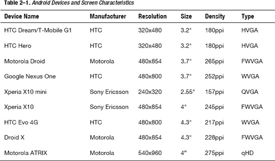
In Table 2–1, resolution is the number of physical pixels in the horizontal and vertical directions, size is the diagonal dimension of the screen, and density is the number of pixels per inch (ppi). Type gives you the common name for the screen resolution, which is one of the following:
- QVGA (Quarter Video Graphics Array): 240×320 pixels or one quarter of the resolution of a VGA display (480×640)
- HVGA (Half Video Graphics Array): 320×480 or half the resolution of a VGA display
- WVGA (Wide Video Graphics Array): 480×800 with the same height as VGA, but 800 width (when viewed in landscape)
- FWVGA (Full Wide Video Graphics Array): 480×854 with the same height as VGA, but a 16:9 ratio for displaying uncropped HD video
- qHD (Quarter High Definition): 540×960 or one quarter of a 1080p display with a 16:9 ratio for displaying uncropped HD video
The usable area of your application will also be reduced by the height of the Android status bar. The height of the bar is 25 pixels on a medium-density display (such as the HTC Hero), 38 pixels on a high-density display (such as the Nexus One), or 50 pixels on an ultra-high-density display. This also changes when the display is switched from portrait to landscape mode. For example, the usable area of a Nexus One in portrait mode is 480×762, while in landscape mode it changes to 442×800.
You will likely have only one or two of these devices to test against, but this doesn't mean that your application can't support them all. Flash can automatically scale your application to fit the screen size, and it is very easy to get the screen resolution to modify your interface programmatically. Listing 2–1 shows how you can retrieve the screen resolution and density from ActionScript code.
Listing 2–1. Programmatic Screen Resolution and Density Capture
var resY = Capabilities.screenResolutionX;

var resX = Capabilities.screenResolutionY;

var dpi = Capabilities.screenDPI;

trace("Screen Resolution is " + resX + "x" + resY + " at " + dpi + "ppi");
Note: The terms dots per inch (dpi) and pixels per inch (ppi) are equivalent measures. These are used interchangeably throughout the ActionScript APIs.
Screen Resolution vs. Density
While application developers are more likely to focus on differences in screen resolution, screen density is equally important. Your application needs to be able to scale to larger or smaller devices so that text is still readable and targets are large enough to be manipulated. Figure 2–1 compares the physical size as well as the screen resolution of several handsets with different characteristics.
While the screen resolution of the Xperia X10 mini is minuscule compared to the Nexus One, the physical size of the screen is only 30% smaller. This means that all the graphics in your user interface need to be scaled down significantly to fit on the screen. On the other hand, when building for the Xperia X10 mini, even small targets can easily be manipulated by the user since the pixels are so large. For a Nexus One, you need to make the targets much larger.
In a study done in 2006, researchers at the University of Oulu and in Maryland found that the minimum target size for manipulating a touchscreen using your thumb ranged from 9.2mm to 9.6mm.1 This is very helpful in determining how large to make hit targets in an Android user interface.
__________
1Pekka Parhi, Amy K. Karlson, and Benjamin B. Bederson, “Target size study for one-handed thumb use on small touchscreen devices”, http://portal.acm.org/citation.cfm?id=1152260, 2006
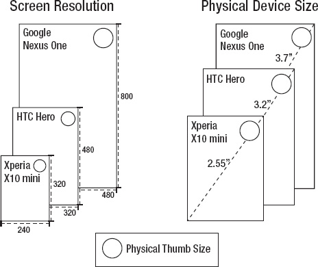
Figure 2–1. Physical size and resolution of several Android devices
For example, to allow for touch interaction, you would need to size your targets at 57 pixels wide on the Xperia X10 mini, or a whopping 92 pixels on the Nexus One. By sizing your UI to take density into account, you can ensure the UI is still usable while maximizing the screen real estate of the active device.
Simulating Device-Independent Pixels in Flash
Android has a concept of device-independent pixels, which can be used to do layouts that will appear similar even if the physical size of the display is different. It is based on the reference platform of a 160 dpi screen, which translates to approximately one 13×13 pixel square per inch. If you specify an Android layout with device-independent pixels, the platform will automatically adjust based on the device your app is running on.
Flash does not have a concept of device-independent pixels, but it is very easy to simulate in code. The basic formula is dips = pixels * (160 / density). Listing 2–2 demonstrates how you can calculate this in ActionScript.
Listing 2–2. ActionScript Function to Calculate Device-Independent Pixels (dips)
function pixelsToDips(pixels:int) {

    return pixels * (160 / Capabilities.screenDPI);

}

trace("100 pixels = " + pixelsToDips(100) + " dips");
Using simulated device-independent pixels, you can reproduce similar layout behavior in your Flash application to that of a native Android application.
If you plan on scaling your application graphics based on the current device density, make sure that your application is not set to auto-resize to fill the screen or center content on rotation. More information about how to do this can be found in the section entitled “Automatic Orientation Flipping in Flash” found later in this chapter.
Density in Flex Applications
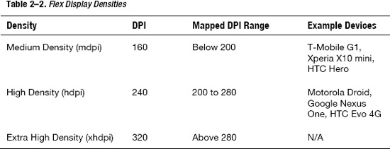
Flex has built-in support to scale the user interface of your application, including graphics, fonts, and controls. Rather than doing arbitrary scaling, it supports three discrete scale factors for common display densities. Table 2–2 lists all of the different display densities along with the mapped DPI range that is used to select a density for the current device.
To take advantage of the Flex density support, set the applicationDPI property on your Application object to the scale the application was originally designed for. At runtime your application will be automatically scaled based on the density of the device screen. An example of what your application descriptor should look like for a 240 dpi is included in Listing 2–3.
Listing 2–3. Application Descriptor to Set the applicationDPI
<s:ViewNavigatorApplication xmlns:fx="http://ns.adobe.com/mxml/2009"

    xmlns:s="library://ns.adobe.com/flex/spark" firstView="views.MainHomeView"

    applicationDPI="240">

</s:ViewNavigatorApplication>
The only valid values for applicationDPI are the text strings of “160”, “240”, and “320”, corresponding to the three supported densities. The applicationDPI property can be set only via MXML.
Based on the ratio of the author density to the device density, the portions of your application built using vector graphics and text are smoothly scaled up or down as needed. In the case of fonts, the font size is adjusted, ensuring that text is easily readable on any display.
Bitmap graphics will also be scaled, but may look blurry when scaled up or lose detail when scaled down. To ensure that your bitmaps are sized optimally for different densities, you can provide alternative images that will automatically be swapped in based on the display density by using the MultiDPIBitmapSource class.
Density Explorer Application
To better understand how density affects your Flex applications, we will guide you through the creation of the Density Explorer application. This application lets you input the application dpi and device dpi as parameters, and calculate the Flex-adjusted device density and scale factor that will be used on different devices.
To start, create a new Flex mobile project with the name “Density Explorer”, using the Mobile Application template. This will automatically generate a standard project template that includes an Adobe AIR application descriptor (DensityExplorer-app.xml), a ViewNavigatorApplication (DensityExplorer.mxml), and an initial View (DensityExplorerHomeView.mxml).
The first step is to open DensityExplorerHomeView.mxml and add in some controls that let you set the Author Density and the Device DPI. We will cover Flex controls in more detail in Chapter 5, but for this application a few labels, radio buttons, and a horizontal slider should be good enough.
Listing 2–4 shows the basic code to allow input of author density and device dpi using the RadioButton and HSlider classes.
Listing 2–4. Density Explorer Controls for applicationDPI and deviceDPI Entry
<fx:Script>

  <![CDATA[

    [Bindable]

    protectedvarapplicationDPI:Number;

    [Bindable]

    publicvardeviceDPI:Number;

  ]]>

</fx:Script>

<s:VGroup paddingTop="20" paddingLeft="15" paddingRight="15" paddingBottom="15"

          gap="20" width="100%" height="100%">

  <s:Label text="Application DPI:"/>

  <s:HGroup gap="30">

    <s:RadioButton id="ad160" content="160" click="applicationDPI = 160"/>

    <s:RadioButton id="ad240" content="240" click="applicationDPI = 240"/>

    <s:RadioButton id="ad320" content="320" click="applicationDPI = 320"/>

  </s:HGroup>

  <s:Label text="Device DPI: {deviceDPI}"/>

  <s:HSlider id="dpiSlider" minimum="130" maximum="320" value="@{deviceDPI}"

             width="100%"/>

</s:VGroup>
First, a few bindable script variables are introduced to hold the applicationDPI and deviceDPI. These are not required to display the basic UI, but they will make hooking up the output portion much easier later on. The main controls are organized vertically in a VGroup, while the RadioButtons are organized horizontally using an HGroup.
The RadioButtons are wired up to applicationDPI using a simple click handler. A bi-directional data binding expression (prefixed by the @ operator) is used to update the value of dpi when the slider changes. To complete this portion of the UI, the Device DPI text contains a bound reference to dpi so you can see the value of the slider as it changes.
Running this will give you a simple Flex application, as shown in Figure 2–2. You can validate the functionality by moving the slider, which will update the deviceDPI setting.
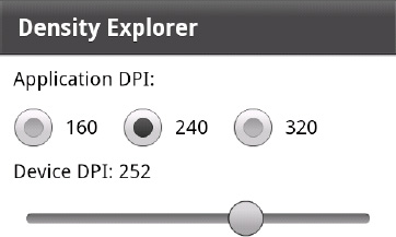
Figure 2–2. Density Explorer part 1: basic controls
The goal of this application is to calculate the adjusted device density and scale factor that Flex will use. Fortunately, there is a new Flex 4.5 API that exposes this information via ActionScript. The class that we need to invoke is called DensityUtil and can be found in the mx.utils package. DensityUtil has two static methods with the following signatures:
getRuntimeDPI():Number:This function returns theapplicationDPIif set, otherwise the current runtime DPI classification of the application; it will always return one of the following values: 160, 240, or 320.getDPIScale(sourceDPI:Number, targetDPI:Number):Number:This function calculates the scale that will be used by Flex given an application DPI (source) and a device DPI (target).
In addition to these functions, we also need to know the current applicationDPI and device dpi values so we can populate the initial values of the UI controls. These can be queried via the following APIs:
Application.applicationDPI:Member variable on theApplicationobject that can be queried to get the initialapplicationDPIvalueCapabilities.screenDPI:Static method on theCapabilitiesobject that returns the numeric dpi value of the screen
Making use of these APIs, we can augment the previous code to add in initialization logic and a readout of density and scale. Listing 2–5 shows the updated code with new additions in bold.
Listing 2–5. Updated Density Explorer Code with Initialization and Output
<?xml version="1.0" encoding="utf-8"?>

<s:View xmlns:fx="http://ns.adobe.com/mxml/2009"

    xmlns:mx="library://ns.adobe.com/flex/mx"

    xmlns:s="library://ns.adobe.com/flex/spark"

    title="Density Explorer" initialize="init()">

  <fx:Script>

    <![CDATA[

      import mx.binding.utils.BindingUtils;

      import mx.utils.DensityUtil;

      [Bindable]

      protectedvarapplicationDPI:Number;

      [Bindable]

      publicvardeviceDPI:Number;

      [Bindable]

      protectedvardpiClassification:Number;

      protectedfunction updateDensity(dpi:Number):void {

        dpiClassification = dpi < 200 ? 160 : dpi >= 280 ? 320 : 240;

      }

      protectedfunction init():void {

        applicationDPI= parentApplication.applicationDPI;

        if (applicationDPI!= null) {

          this["ad" + applicationDPI].selected = true;

        }

        BindingUtils.bindSetter(updateDensity, this, "deviceDPI");

        deviceDPI= Capabilities.screenDPI;

      }

    ]]>

  </fx:Script>

  <s:VGroup paddingTop="20" paddingLeft="15" paddingRight="15" paddingBottom="15"

                    gap="20" width="100%" height="100%">

    <s:Label text="ApplicationDPI:"/>

    <s:HGroup gap="30">

      <s:RadioButton id="ad160" content="160" click="applicationDPI= 160"/>

      <s:RadioButton id="ad240" content="240" click="applicationDPI= 240"/>

      <s:RadioButton id="ad320" content="320" click="applicationDPI= 320"/>

    </s:HGroup>

    <s:Label text="Device DPI: {dpi}"/>

    <s:HSlider id="dpiSlider" minimum="130" maximum="320" value="@{deviceDPI}"
               width="100%"/>

    <s:Group width="100%" height="100%">

      <s:BorderContainer bottom="0" minHeight="0"width="100%" borderStyle="inset"

                 backgroundColor="#d0d0d0"borderColor="#888888" backgroundAlpha=".6">

        <s:layout>

          <s:VerticalLayout gap="10"paddingLeft="10" paddingRight="10"

                    paddingTop="10" paddingBottom="10"/>

        </s:layout>

        <s:Label text="Adjusted Device Density: {dpiClassification}"/>

        <s:Label text="Scale Factor: {DensityUtil.getDPIScale(applicationDPI,

                                                           dpiClassification)}"/>

      </s:BorderContainer>
    </s:Group>

  </s:VGroup>

</s:View>
Initialization is performed inside a method called by View.initialize to ensure that all values are available. The applicationDPI is updated first from the parentApplication object, and the correct RadioButton is selected by performing an ID lookup on the returned string. Next the dpi is set from the Capabilities object. To ensure that all updates to dpi from both the initial value assignment and subsequent updates to the slider will recalculate the deviceDensity, a bind setter is configured to fire on all updates to dpi.
In order to display the current values of deviceDensity and the calculated scale, a BorderContainer with a few Labels is added to the end of the View. By using a BorderContainer as the surrounding group, it is easy to change the style to make the outputs visually distinct from the inputs.
The final touch is to add an extra group that will fade in device pictures as the dpi setting is updated. To ensure that the images are optimally scaled for different density displays, we make use of a MultiDPIBimapSource that refers to different pre-scaled artifacts. This code is shown in Listing 2–6.
Listing 2–6. MXML Code for Displaying Representative Device Images Using a MultiDPIBitmapSource
<s:Group id="phones" width="100%" height="100%">

  <s:Image alpha="{1-Math.abs(deviceDPI-157)/20}" horizontalCenter="0">

    <s:source>

      <s:MultiDPIBitmapSource

        source160dpi="@Embed('assets/xperia-x10-mini160.jpg')"

        source240dpi="@Embed('assets/xperia-x10-mini240.jpg')"

        source320dpi="@Embed('assets/xperia-x10-mini320.jpg')" />

    </s:source>

  </s:Image>

  <s:Image alpha="{1-Math.abs(deviceDPI-180)/20}" horizontalCenter="0">

    <s:source>

      <s:MultiDPIBitmapSource

        source160dpi="@Embed('assets/htc-hero160.jpg')"

        source240dpi="@Embed('assets/htc-hero240.jpg')"

        source320dpi="@Embed('assets/htc-hero320.jpg')" />

    </s:source>

  </s:Image>

  <s:Image alpha="{1-Math.abs(deviceDPI-217)/20}" horizontalCenter="0">

    <s:source>

      <s:MultiDPIBitmapSource

        source160dpi="@Embed('assets/htc-evo-4g160.jpg')"

        source240dpi="@Embed('assets/htc-evo-4g240.jpg')"

        source320dpi="@Embed('assets/htc-evo-4g320.jpg')" />

    </s:source>

  </s:Image>

  <s:Image alpha="{1-Math.abs(deviceDPI-252)/20}" horizontalCenter="0">

    <s:source>

      <s:MultiDPIBitmapSource

        source160dpi="@Embed('assets/nexus-one160.jpg')"

        source240dpi="@Embed('assets/nexus-one240.jpg')"

        source320dpi="@Embed('assets/nexus-one320.jpg')" />

    </s:source>
  </s:Image>

  <s:Image alpha="{1-Math.abs(deviceDPI-275)/20}" horizontalCenter="0">

    <s:source>

      <s:MultiDPIBitmapSource

        source160dpi="@Embed('assets/atrix160.jpg')"

        source240dpi="@Embed('assets/atrix240.jpg')"

        source320dpi="@Embed('assets/atrix320.jpg')" />

    </s:source>

  </s:Image>

</s:Group>
All of the pictures chosen are scaled versions of standard press images for the phones. In order to fade the devices in slowly as the dpi value is approached, a simple mathematical formula is applied to alpha:
1-Math.abs(deviceDPI-{physicalDPI})/{threshold}
For each of the phones, the actual dpi is substituted for the physicalDPI for that device, and the threshold is set to a value low enough that there will not be two phones overlapping for the target dpi value. For the devices selected, a threshold of 20 is lower than the difference between any of the phone dpi values.
The finished Density Explorer application is shown in Figure 2–3. This is a good opportunity to experiment with different values for application dpi and device dpi to see the effect they will have on your deployed application.
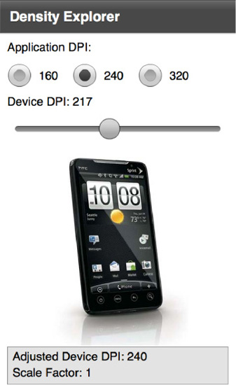
Figure 2–3. Completed Density Explorer application
For a side-by-side comparison, Figure 2–4 demonstrates screenshots of the Density Explorer running at 160, 240, and 320 dpi on a physical device. Notice that even though the physical dimensions of the screens are vastly different, the layout of the application and quality of the graphs are preserved. By setting the author density to 240, you are guaranteed that your application will have the same look and feel on a device of any density with no code modifications.
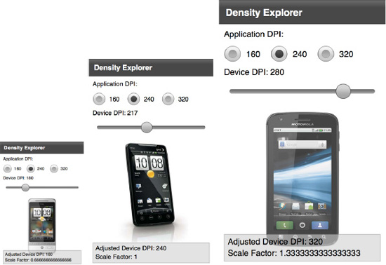
Figure 2–4. Side-by-side comparison of the Density Explorer when run on a device classified as 160 dpi (left), 240 dpi (center), and 320 dpi (right)
Density Support in CSS
While the applicationDPI setting in Flex gives you a simple mechanism to write your application for one density and let Flex take care of the resizing, it doesn't give you fine-grained control over the precise layout and style of your application when viewed on different devices. Setting applicationDPI to a constant works fine for simple applications, but as the complexity of the UI increases this is often not good enough. This is where CSS media queries come in.
Flex media queries let you exercise fine-grained control over the styles on different devices from within your CSS. They are based on the W3C CSS Media Query Candidate Recommendation,2 but contain only a subset of the functionality that is most relevant to Flex and mobile applications.
There are two types of selectors supported in Flex. The first type lets you choose the style based on the device type. The code in Listing 2–7 demonstrates how you can change the font color based on the type of device you are running on.
__________
Listing 2–7. Code Sample Demonstrating a Media Selector for Devices
@namespace s "library://ns.adobe.com/flex/spark";


@media (os-platform: "IOS") {

  s|Label

  {

    color: red;

  }

}


@media (os-platform: "Android") {

  s|Label {

    color: blue;

  }

}
Adding this style sheet to your application will turn the color of all Labels to blue or red, depending on the mobile platform you are running on. However, when running as a desktop application, this will have no effect.
The second type of selector lets you change the style based on the application dpi. The valid values to match against are the standard Flex densities of 160, 240, and 320. Using a dpi selector lets you fine-tune the layout and fonts, or even substitute images for different density displays.
IMPORTANT: In order to use CSS media selectors, you need to ensure that you have not set the applicationDPI property on your mobile application class.
To demonstrate the use of a dpi selector, we will update the Density Explorer example to make use of a style sheet to substitute the images rather than embedding it in the code with the MultiDPIBitmapSource. The simplified application code for the application images is shown in Listing 2–8.
Listing 2–8. Updated DensityExplorer Code for Integration CSS Media Queries
<s:Group id="phones" width="100%" height="100%">

  <s:Image alpha="{1-Math.abs(deviceDPI-157)/20}" horizontalCenter="0"

        source="{phones.getStyle('xperiaX10Mini')}"/>

  <s:Image alpha="{1-Math.abs(deviceDPI-180)/20}" horizontalCenter="0"

        source="{phones.getStyle('htcHero')}"/>

  <s:Image alpha="{1-Math.abs(deviceDPI-217)/20}" horizontalCenter="0"

        source="{phones.getStyle('htcEvo4g')}"/>

  <s:Image alpha="{1-Math.abs(deviceDPI-252)/20}" horizontalCenter="0"

        source="{phones.getStyle('nexusOne')}"/>

  <s:Image alpha="{1-Math.abs(deviceDPI-275)/20}" horizontalCenter="0"

        source="{phones.getStyle('atrix')}"/>

</s:Group>
Notice that we are making use of the getStyle method on the parent object to assign the image sources. This would normally not be required if you were working with a style such as icons or button states, but the source on the image class is a plain property. Using this technique to bind to a named style makes the Image source accessible via CSS.
To complete the example, we also need to create a style sheet that makes use of the dpi media selector to substitute an appropriately scaled image. This is similar to the device selector and is shown in Listing 2–9.
Listing 2–9. CSS for Switching Images Based on the Application dpi
@media (application-dpi: 160) {

  #phones {

    xperiaX10Mini: Embed("/assets/xperia-x10-mini160.jpg");

    htcHero: Embed("/assets/htc-hero160.jpg");

    htcEvo4g: Embed("/assets/htc-evo-4g160.jpg");

    nexusOne: Embed("/assets/nexus-one160.jpg");

    atrix: Embed("/assets/atrix160.jpg");

  }

}


@media (application-dpi: 240) {

  #phones {

    xperiaX10Mini: Embed("/assets/xperia-x10-mini240.jpg");

    htcHero: Embed("/assets/htc-hero240.jpg");

    htcEvo4g: Embed("/assets/htc-evo-4g240.jpg");

    nexusOne: Embed("/assets/nexus-one240.jpg");

    atrix: Embed("/assets/atrix240.jpg");

  }

}


@media (application-dpi: 320) {

  #phones {

    xperiaX10Mini: Embed("/assets/xperia-x10-mini320.jpg");

    htcHero: Embed("/assets/htc-hero320.jpg");

    htcEvo4g: Embed("/assets/htc-evo-4g320.jpg");

    nexusOne: Embed("/assets/nexus-one320.jpg");

    atrix: Embed("/assets/atrix320.jpg");

  }

}
The final step is to make sure we have referenced the style sheet in our ViewNavigatorApplication. You will also need to remove the applicationDPI setting, otherwise the style sheet selector will always report the dpi as a constant value, as shown in Listing 2–10.
Listing 2–10. Completed DensityExplorer Application Class for Integrating Media Query Support
<?xml version="1.0" encoding="utf-8"?>

<s:ViewNavigatorApplication xmlns:fx="http://ns.adobe.com/mxml/2009"

              xmlns:s="library://ns.adobe.com/flex/spark"

              splashScreenImage="@Embed('ProAndroidFlash400.png')"

              firstView="views.DensityExplorerHomeView">

  <fx:Style source="DensityExplorer.css"/>

</s:ViewNavigatorApplication>
The output of running this program on different devices is nearly identical to the earlier results in Figure 2–4, with some slight differences in spacing. The reason for this is that the Flex control team has also put dpi hints in their controls so that they automatically resize based on the target device, even without having applicationDPI fixed to a constant value.
Now that you have learned about CSS media selectors, you have a powerful tool to extract the styles out of your code, even for density-aware applications.
Screen Orientation
One of the unique aspects of mobile devices is the ability to rotate them in your hand. The equivalent to this in the desktop world would be to flip your monitor on its side. While there are some creative uses for rotating desktop monitors, as demonstrated in Figure 2–5, this is certainly not a common use case.
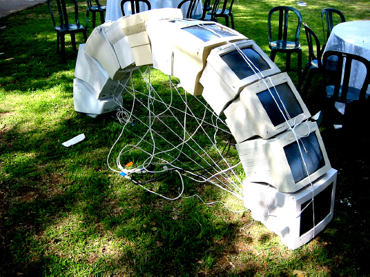
Figure 2–5. Unique use of monitor rotation to create a light arc3
In mobile devices, rotation is an important UI paradigm that lets you take full advantage of the limited screen real estate. A well-behaved mobile application should resize the UI on rotation simply to let the user stay in his or her preferred orientation, often displaying an entirely different view that is custom-built for that orientation.
__________
3 Creative Commons licensed photograph taken by Tim Pritlove:www.flickr.com/photos/timpritlove/123865627/.
Portrait/Landscape Switching in Flex
To turn on automatic orientation in a Flex project, there are two methods. The most convenient one is to simply check the “Automatically reorient” check box when creating a new Flex mobile application from the standard template. Figure 2–6 has a screenshot of the project creation wizard with the “Automatically reorient” option checked.
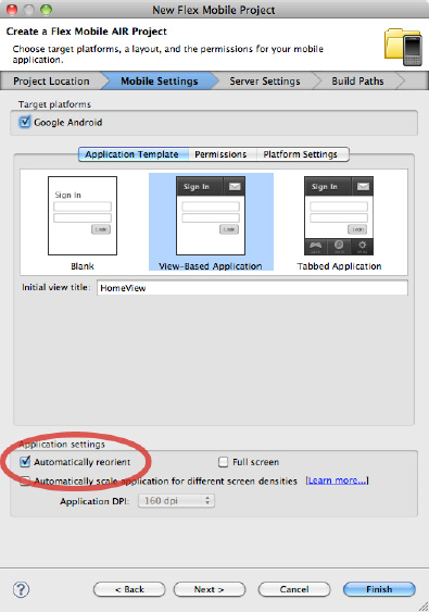
Figure 2–6. Flex builder project wizard with the “Automatically reorient” option checked
If you have an existing project or want to change auto-orientation manually, you need to set the autoOrients property in your application descriptor. The application descriptor is located in a file called *-app.xml in your root project directory, within which the autoOrients property should be created as a child of the initialWindow element and set to true, as shown in Listing 2–11.
Listing 2–11. Application Descriptor Changes to Allow Automatic Orientation of the Stage
<initialWindow>

  <content>[This value will be overwritten by Flash Builder in the output

app.xml]</content>

  <autoOrients>true</autoOrients>

</initialWindow>
This both rotates and resizes the stage, and also causes events to be fired that you can listen to in order to change your application layout.
However, simply turning on automatic orientation will often produce less than desirable results. For example, if you enable automatic orientation on the Density Explorer application, the bottom of the UI gets cropped off, as shown in Figure 2–7.
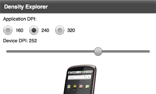
Figure 2–7. Density Explorer application in landscape mode with noticeable cropping
For a landscape orientation of the Density Explorer application, the ideal layout would be to have the phone picture to the left of the controls. There are two ways you can accomplish this in a Flex application. The first is to add an event handler for rotation events that changes the layout dynamically. Since this is a pure ActionScript approach, it also works equally well from Flash Professional. The second is to take advantage of the new portrait and landscape states, which are accessible only from MXML. In the following sections, we will demonstrate both of these approaches.
Portrait/Landscape Switching with Events
Each time a Flash mobile device is rotated, orientation events are fired to notify any listeners. Orientation event handlers are added via the standard addEventListener method on the Stage object. The event class for orientation events is StageOrientationEvent, with an event type of StageOrientationEvent.ORIENTATION_CHANGE.
CAUTION: There is also an ORIENTATION_CHANGING event type on the StageOrientationEvent class, but this is not applicable for Android devices.
The StageOrientationEvent has two variables on it that are particularly useful for handling orientation changes:
beforeOrientation: The handset orientation prior to the current rotation event being firedafterOrientation: The current handset orientation
Putting all of this together, you can modify the Density Explorer to change the layout based on the orientation of the phone.
The first step is to update the declarative MXML UI to include an additional HBox that will be used for the landscape orientation, to name the outer HBox and inner VBox with unique IDs, and to hook up an addedToStage event listener. The code to accomplish this is shown in Listing 2–12.
Listing 2–12. MXML Additions to Supported Stage Layout Changes
<s:HGroup id="outer" width="100%" height="100%" addedToStage="stageInit()">

  <s:VGroup paddingTop="20" paddingLeft="15" paddingRight="15"

                    paddingBottom="15" gap="20" width="100%" height="100%">

    …

    <s:Group id="inner" width="100%" height="100%">

      <s:Group id="phones" width="100%" height="100%">

        …

  </s:VGroup>

</s:HGroup>
The next step is to implement the stageInit function to hook up an orientation change event listener. In addition to hooking up the listener, it is often helpful to fire an initial event with the current orientation. This will ensure that even if your application starts in landscape mode, it will follow the same code path as if it opened in portrait and then was rotated by the user. The ActionScript for this is shown in Listing 2–13.
Listing 2–13. Implementation of the stageInit and orientationChange Functions
protected function orientationChange(e:StageOrientationEvent):void {

  switch (e.afterOrientation) {

    case StageOrientation.DEFAULT:

    case StageOrientation.UPSIDE_DOWN:
      inner.addElementAt(phones, 0);

      break;

    case StageOrientation.ROTATED_RIGHT:

    case StageOrientation.ROTATED_LEFT:

      outer.addElementAt(phones, 0);

      break;

  }

}

protected function stageInit():void {

  stage.addEventListener(StageOrientationEvent.ORIENTATION_CHANGE, orientationChange);

  orientationChange(new StageOrientationEvent(

                                StageOrientationEvent.ORIENTATION_CHANGE, false, false,

                                null, stage.orientation));

}
In this case, the behavior for right and left rotation is identical, although if you wanted to get creative you could put the device display on a different side of the screen based on which way the phone is rotated.
The result of running the modified Density Explorer application is shown in Figure 2–8. As you can see, the device display is shown at a usable size and the rest of the controls are no longer stretched across a very wide display. The most impressive part is that the layout will dynamically update to optimize for portrait and landscape as you rotate the phone.
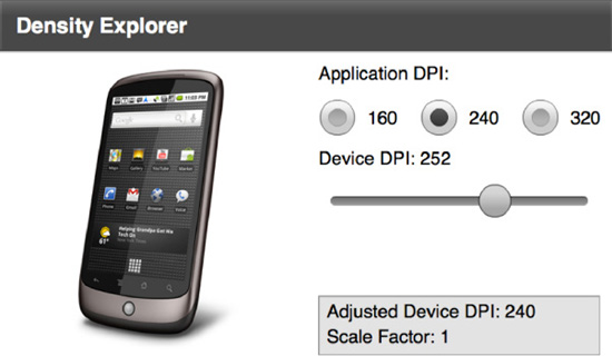
Figure 2–8. Density Explorer application with an improved landscape layout
Portrait/Landscape Switching with States
A second technique you can use in Flex for portrait/landscape switching is to make use of two built-in states that are triggered on device rotation called portrait and landscape. While this is accessible only from MXML and does not provide as much information as the event API about the orientation of the device, the code to implement this is much simpler and more declarative in nature, making it easier to read and maintain.
To expose the new portrait and landscape states, you need to add a states declaration to your view code that defines a portrait and landscape state, as shown in Listing 2–14.
Listing 2–14. State Declaration for portrait and landscape Modes
<s:states>

  <s:State name="portrait"/>

  <s:State name="landscape"/>

</s:states>
These states will automatically get triggered whenever the device changes orientation. To modify the layout, you can then take advantage of the includedIn property and Reparent tag in order to move the phone image position. The code changes you will need to make to accomplish this are shown in Listing 2–15.
Listing 2–15. UI Changes to Reparent the Phone Image When the State Changes
<s:HGroup width="100%" height="100%">

  <fx:Reparent target="phones" includeIn="landscape" />

  …

    <s:Group width="100%" height="100%">

      <s:Group id="phones" width="100%" height="100%" includeIn="portrait">

        …

  </s:VGroup>

</s:HGroup>
The end result is that with 8 lines of MXML code you can do what took 21 lines using the event approach. The results of running this application are identical to those obtained in Figure 2–8.
Automatic Orientation Flipping in Flash
Flash applications can also be configured to automatically flip the orientation of the stage when the device is rotated. To enable automatic orientation switching in a Flash project, you need to check the box for automatic orientation in the AIR for the Android publish settings dialog, as shown in Figure 2–9.
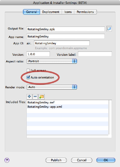
Figure 2–9. Auto-orientation setting for Flash CS5.5 circled
Setting this option will cause the aspect ratio of the application to automatically flip from landscape to portrait as the user rotates the device. Upon orientation change, the stage will be rotated so it is oriented vertically, resized to fill the new dimensions after rotation, and then centered within the display.
If you want to change the layout of your content to fill the screen and have full control over resizing the stage, you will need to disable the automatic scale and positioning. This can be accomplished in ActionScript by changing the scaleMode and align properties of the Stage object, as shown in Listing 2–16.
Listing 2–16. Disabling Stage Scaling and Alignment from ActionScript
stage.scaleMode = StageScaleMode.NO_SCALE;  // turn off scaling

stage.align = StageAlign.TOP_LEFT;  // align content to the top-left of the stage
This can be added to any key frame in your application that executes on startup, and will keep the stage top-left aligned with no resizing of the content. You can then add event listeners on orientation changes in order to modify your application to fit the screen size.
Rotating Smiley Flash Orientation Example
To demonstrate how you can quickly create content in Flash CS5.5 that adjusts for orientation, you will create a small sample application that morphs a happy smiley picture to a devilish one upon an orientation change.
To start with, you will need to create a new AIR for Android project with a size of 480×480 pixels. The reason for choosing a square canvas that is equal in size to the smaller device dimension is to ensure no additional scaling will take place upon rotation.
Figure 2–10 shows the starting state for the happy smiley picture, with boxes drawn denoting the extents of the landscape and portrait modes. The intersection of the two boxes is the 480×480 canvas, with additional graphics overflowing horizontally and vertically. These will get cropped out of frame upon orientation change, leaving the smiley face nicely centered.
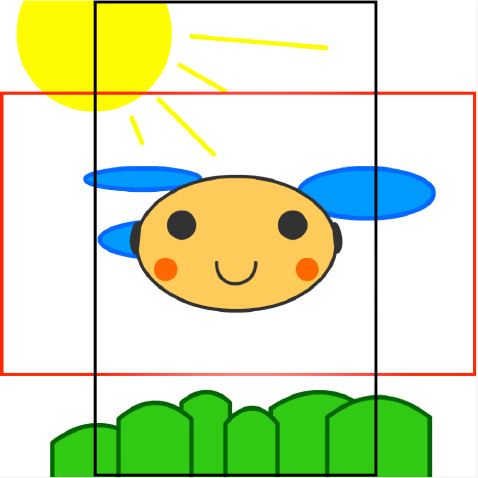
Figure 2–10. Happy smiley picture starting state, with boxes showing the landscape and portrait extents
Feel free to get creative with your own graphics, but keep elements in separate layers to make it easier to animate and morph them later.
The next step is to create the devilish smiley keyframe at around one second. This should include motion or shape tweens for a smooth transition from the happy smiley face. Figure 2–11 shows a few time-lapsed frames that animate the smiley face as well as some of the background scene elements.
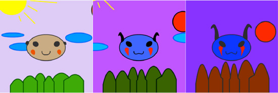
Figure 2–11. Animation of the smiley face from happy to devilish
At the same time, also create the reverse animation to get back to the happy smiley face at around two seconds. While there are some ActionScript techniques to reverse an animation in Flash, they are non-intuitive and generally carry a performance penalty.
Now that you have completed the graphics, you need to add in ActionScript code to animate the smiley face upon device rotation. This should be added to the first keyframe in the timeline, and should include both stopping the animation from automatically playing and attaching an orientation event listener to the scene, as shown in Listing 2–17.
Listing 2–17. ActionScript Code to Respond to Orientation Change Events
import flash.events.StageOrientationEvent;


stop();


stage.addEventListener(StageOrientationEvent.ORIENTATION_CHANGE, onChanged);


function onChanged(event:StageOrientationEvent):void {

  play();

}
Notice that the onChanged event handler simply has to play the movie on each orientation change event. All the heavy lifting for the animation is already taken care of by the timeline.
The final bit of required code is to add a stop() call on the devilish smiley frame so that it will stop there after a rotation event.
As a bonus, you can add in a warning to the user if orientation events are not supported on his or her device, such as if the user is running on desktop or TV. The simplest way to give feedback is to create a hidden layer that you make visible based upon checking the orientation support, as shown in Listing 2–18.
Listing 2–18. Orientation Check Code to Hide/Show Error Page
if (Stage.supportsOrientationChange) {

  orientationNotSupported.visible = false;

}
The completed rotating smiley face application running on the device is shown in Figure 2–12. While this example is fairly simple, it demonstrates how easy it is to add orientation support to your applications.
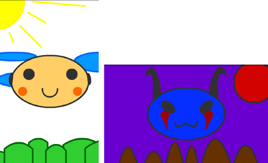
Figure 2–12. Completed rotating smiley face example in portrait (left) and landscape (right) orientations
Multitouch and Gestures
User interfaces have long been limited by the constraints of the desktop mouse. The first mouse was invented by Douglas Engelbart in 1963. It had two perpendicular wheels for tracking motion and a long cord that resembled the tail of a rodent or mouse. After this, mice with internal balls, optical tracking, and multiple buttons appeared, such as the Dépraz mouse produced in the early 80s. Both of these early devices are shown in Figure 2–13.
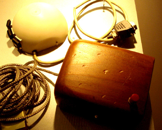
Figure 2–13. Photo of the Engelbart mouse (bottom-right) and Dépraz mouse (top-left)
Modern mice include features such as scroll wheels, laser tracking, and cordless operation. However, all mice share a common limitation, which is that they can support only a single cursor on the screen at a time.
Mobile interfaces originally started with the same limitation of pointer-driven, single touch interaction. However, they have evolved to take advantage of the human physique. We have two hands with ten fingers total, each capable of individually interacting with and manipulating a touch point on the device.
Most Android devices support at least two simultaneous touch points, which is the minimum required to handle all the mobile gestures. This is also the most common usage scenario where the mobile device is supported by the fingers and operated with both thumbs. However, new devices are being introduced that support a virtually unlimited number of touch points.
You can retrieve the number of touch points your device supports by querying the Multitouch object, as shown in Listing 2–19.
Listing 2–19. Retrieving the Number of Touch Points via ActionScript
trace("Max Touch Points: " + Multitouch.maxTouchPoints);
In this section, you will learn how to take advantage of multitouch and user gestures, improving the user experience and usability of your Flash applications.
Mobile Gestures
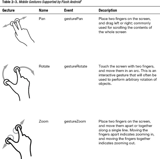
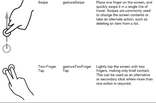
The easiest way to work with multitouch is to take advantage of the predefined gestures that Flash supports. For any Android device with at least two touch points, you will be able to use the gestures in Table 2–3.
__________
4 Creative Commons licensed illustrations provided by Gestureworks (www.gestureworks.com)
It is usually a good idea to provide some other mechanism to accomplish the same behavior in your application in case gestures are not supported; however, mobile users have come to expect the convenience and speed that gestures offer, so mapping them appropriately in your application design is important.
To discover if the device your application is running on supports gestures and to query the gesture capabilities dynamically, you can call the following static methods on the Multitouch class:
Multitouch.supportsGestureEvents: Whether the device you are running on supports emitting gesture eventsMultitouch.supportedGestures: A list of strings, one for each of the supported multitouch events
Before using gesture events, you need to set the touchMode to gesture input mode, as shown in Listing 2–20.
Listing 2–20. ActionScript Code to Enable Gesture Recognition Support
Multitouch.inputMode = MultitouchInputMode.GESTURE;
This should be called within your program before you expect to receive gesture events.
Flash Scrapbook Example
To demonstrate how to handle gesture events, we will go through a sample program to build a picture scrapbook that responds to multitouch events. For simplicity, we will load the images as resources (see Chapter 7 for more information about retrieving images from the camera roll).
Here are some of the multitouch events that we will support:
- Zoom: Increase or decrease the size of the pictures
- Rotate: Rotate the images to arbitrary angles
- Pan: Move the entire page of images as a unit
- Swipe: Swipe the header to switch between pages of images
- Two-FingerTap: Tap an image with two fingers to open it in its own view
Also, while it is not a multitouch gesture, we will hook in drag listeners so you can position the images by dragging them with a single finger.
There are two different ways to hook up multitouch listeners in a Flash application. The first is via pure ActionScript and will work equally well from a Flash- or Flex-based application. The second is by using the event hooks on the InteractiveObject class, which is the most convenient option if you are working with Flex components. We will show examples of both in this section.
Zoom and Rotate Gesture Handling
The core of the Flash Scrapbook example will be a MultitouchImage component that extends the spark Image class to add in resizing and rotation. For this class, we will use the addEventListener mechanism of hooking up multitouch listeners for the zoom and rotate gestures. The code for this is shown in Listing 2–21.
Listing 2–21. MultitouchImage Class to Add Rotation and Resizing Support
package com.proandroidflash {

  import flash.events.TransformGestureEvent;

  import flash.geom.Point;

  import flash.ui.Multitouch;

  import flash.ui.MultitouchInputMode;

  import mx.events.ResizeEvent;

  import spark.components.Image;


  publicclassMultitouchImageextends Image {

    publicfunctionMultitouchImage() {

      addEventListener(ResizeEvent.RESIZE, resizeListener);

      addEventListener(TransformGestureEvent.GESTURE_ROTATE, rotateListener);

      addEventListener(TransformGestureEvent.GESTURE_ZOOM, zoomListener);

      Multitouch.inputMode = MultitouchInputMode.GESTURE;

    }
    protectedfunction resizeListener(e:ResizeEvent):void {

      transformX = width/2;

      transformY = height/2;

    }


    protectedfunction rotateListener(e:TransformGestureEvent):void {

      rotation += e.rotation;

    }


    protectedfunction zoomListener(e:TransformGestureEvent):void {

      scaleX *= e.scaleX;

      scaleY *= e.scaleY;

    }

  }

}
In the constructor, we add listeners for both rotation and zooming by calling the addEventListener method and passing in the GESTURE_ROTATE and GESTURE_ZOOM constants. The rotation callback simply takes the rotation parameter of the TransformGestureEvent and adds it to the current rotation of the node, saving the value back. In both cases, the rotation is expressed in degrees as a numeric value. The zoom listener similarly takes the scaleX and scaleY parameters of the TransformGestureEvent and multiplies them by the scaleX and scaleY of the node to get the new values. In both cases, the gesture event gives you the delta since the last time the listener was called, so you can simply incrementally adjust the node values.
To ensure that the rotation and zoom occur at the center of the Image node, we set transformX and transformY to be at the midpoint of the node in the resizeListener. This is also hooked up via the addEventListener in the constructor so it will fire each time the node size changes.
The last thing we do is to set the inputMode to MultitouchInputMode.GESTURE so that the event listeners will fire. It is safe to set this value as frequently as we want, so we take the liberty of doing this on each constructor call.
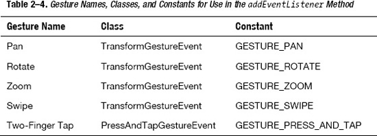
For the rest of the gesture events, we will take advantage of the InteractiveObject event hooks for easy wiring via MXML; however, you can also hook up all the other gestures using the addEventListener mechanism by following the class and constant information in Table 2–4.
Press and Drag Mouse Events
Another helper class we will be using is the DraggableGroup class. This implements a standard point and drag metaphor as an extension of a spark Group, as shown in Listing 2–22. Besides being good for encapsulation, extracting the mouse events from the gesture events allows you to handle multiple events simultaneously.
Listing 2–22. DraggableGroup Class That Implements Point and Drag Mechanics
package com.proandroidflash {

  import flash.events.MouseEvent;

  import mx.core.UIComponent;

  import spark.components.Form;

  import spark.components.Group;


  public class DraggableGroup extends Group {

    public function DraggableGroup() {

      mouseEnabledWhereTransparent = false;

      addEventListener(MouseEvent.MOUSE_DOWN, mouseDownListener);

      addEventListener(MouseEvent.MOUSE_UP, mouseUpListener);

    }


    protected function mouseDownListener(e:MouseEvent):void {

      (parent as Group).setElementIndex(this, parent.numChildren-1);

      startDrag();

    }


     protected function mouseUpListener(e:MouseEvent):void {

       stopDrag();

       // fix for bug in Flex where child elements don't get invalidated

       for (var i:int=0; i<numElements; i++) {

         (getElementAt(i) as UIComponent).invalidateProperties();

       }

     }

   }

}
The code for the DraggableGroup is a fairly straightforward Flex component implementation, and uses the same addEventListener/ callback paradigm as the gesture code did. While you could implement the same code using touch events, the advantage of sticking to mouse-up and mouse-down events is that this portion of the UI will work even where there is no touch support.
A few subtleties in the code are worth pointing out.
- By default the Group class fires events for any clicks in their bounding area. By setting
mouseEnabledWhereTransparenttofalse, you avoid misfires outside the bounds of the children. - To raise this object when clicked, you need to change the order in the parent container. This implementation assumes the parent is a
Groupand uses thesetElementIndexfunction to push this node to the front. - There is a bug in Flex where child elements won't have their layout properties invalidated after the drag. Manually calling
invalidatePropertieson all of the children works around this problem. For example, without this fix you would notice that the center of rotation/zoom does not translate with the drag.
Swipe Gesture Handling
To display the images, we will be using a simple view that delegates rendering of individual image pages to an ItemRenderer. First we will take a look at the View class that makes up the main screen of the Scrapbook example. The full code is shown in Listing 2–23.
Listing 2–23. Flash Scrapbook Main View Code with the Swipe Event Handler Highlighted in Bold
<?xml version="1.0" encoding="utf-8"?>

<s:View xmlns:fx="http://ns.adobe.com/mxml/2009"

    xmlns:s="library://ns.adobe.com/flex/spark"

    xmlns:mx="library://ns.adobe.com/flex/mx"

    xmlns:proandroidflash="com.proandroidflash.*"

    title="Home" backgroundColor="#333333" destructionPolicy="never">

  <fx:Script>

    <![CDATA[

      import mx.core.IVisualElement;

      [Bindable]

      protected var page:int = 0;

      protected function swipe(e:TransformGestureEvent):void {

        page = (page + e.offsetX + pages.numElements) % pages.numElements;

        updateVisibility();

      }

      protected function updateVisibility():void {

        for (var i:int=0; i<pages.numElements; i++) {

          var element:IVisualElement = pages.getElementAt(i);

          if (element != null) {

            element.visible = i == page;

          }

        }

     }

  ]]>

</fx:Script>

<s:layout>

  <s:VerticalLayout horizontalAlign="center" paddingTop="10"

                    paddingLeft="10" paddingRight="10" paddingBottom="10"/>

</s:layout>

<fx:Declarations>

  <s:ArrayList id="images">

    <fx:Object image1="@Embed(source='images/cassandra1.jpg')"

                     image2="@Embed(source='images/cassandra2.jpg')"

                     image3="@Embed(source='images/cassandra3.jpg')"/>

    <fx:Object image1="@Embed(source='images/cassandra4.jpg')"

                     image2="@Embed(source='images/cassandra5.jpg')"

                     image3="@Embed(source='images/cassandra6.jpg')"/>

    <fx:Object image1="@Embed(source='images/cassandra7.jpg')"

                     image2="@Embed(source='images/cassandra8.jpg')"

                     image3="@Embed(source='images/cassandra9.jpg')"/>

    <fx:Object image1="@Embed(source='images/cassandra10.jpg')"/>

  </s:ArrayList>

</fx:Declarations>

<s:VGroup gestureSwipe="swipe(event)">

  <s:Label text="Flash Scrapbook" fontSize="32" color="white"/>

  <s:Label text="Drag, Rotate, and Zoom with your fingers." fontSize="14"

           color="#aaaaaa"/>

</s:VGroup>

<s:DataGroup id="pages" itemRenderer="com.proandroidflash.ScrapbookPage"

             dataProvider="{images}" width="100%" height="100%"

             added="updateVisibility()"/>

</s:View>
While there is a fair amount of code to create the view, the actual view definition itself consists of only five lines to create a VGroup for the title and a DataGroup to display the images. The remainder is primarily a large chunk of code to simply load the embedded images into an ArrayList, and a few helper functions embedded in a Script tag.
The code needed to hook up the swipe event handler is highlighted in bold. By taking advantage of the gesture* event properties on InteractiveObject, you can rapidly hook up event listeners like this to your application. Each time the user swipes the title VGroup, the protected swipe method will get called with information about the direction of the swipe. Unlike rotate and zoom events that get continual calls for the duration of the gesture, swipe gets called exactly once at the end of the gesture. You can decipher the direction of the swipe by inspecting the offsetX and offsetY properties.
offsetX=0, offsetY=-1: Swipe UpoffsetX=0, offsetY=1: Swipe DownoffsetX=-1, offsetY=0: Swipe LeftoffsetX=1, offsetY=0: Swipe Right
It is worth noting that the swipes will always be in the horizontal or vertical direction. Diagonal swipes are not supported and will not be recognized as a gesture. Also, you need to ensure that the component you hook the swipe listener up to is wide or tall enough to provide enough travel for the gesture to be recognized. Once the user's finger leaves the component, the gesture recognition will end.
Adding Pan and Two-Finger-Tap Event Listeners
Now that we have a main page with a DataGroup, we need to implement the referenced ItemRenderer that will build the scrapbook page. This will also be the link between the MultitouchImage, DraggableGroup, and main view that we defined earlier.
Start by creating a new MXML file that has an outer ItemRenderer element with the page content declared inside. In this class, we will hook up two new gesture event listeners. On the outer BorderContainer, we will hook up a pan event listener so that the user can drag the entire page and all the images on it in one gesture. Also, on each of the MultitouchImages, we will add a two-finger-tap event listener for switching to a fullscreen view.
The complete code for the ScrapbookPage implementation is shown in Listing 2–24.
Listing 2–24. Flash ScrapbookPage Item Renderer Code with the Pan and Two-Finger-Tap Event Handlers Highlighted in Bold
<?xml version="1.0" encoding="utf-8"?>

<s:ItemRenderer xmlns:fx="http://ns.adobe.com/mxml/2009"

        xmlns:s="library://ns.adobe.com/flex/spark"

        xmlns:proandroidflash="com.proandroidflash.*"

        autoDrawBackground="false" width="100%" height="100%">

  <s:BorderContainer backgroundColor="#cccccc" borderColor="#555555"

                     gesturePan="pan(event)" rotation="5" x="50" width="100%"

                     height="100%">

    <fx:Script>

      <![CDATA[

        import spark.components.View;

        import views.ImageView;

        protected function pan(e:TransformGestureEvent):void {

          e.target.x += e.offsetX;

          e.target.y += e.offsetY;

        }

        protected function expand(source:Object):void {

          (parentDocument as View).navigator.pushView(ImageView, source);

        }

      ]]>

    </fx:Script>

    <proandroidflash:DraggableGroup>

      <proandroidflash:MultitouchImage source="{data.image1}" y="-70" x="10" width="350"

                               rotation="-3" gestureTwoFingerTap="expand(data.image1)"/>

    </proandroidflash:DraggableGroup>

    <proandroidflash:DraggableGroup>

      <proandroidflash:MultitouchImage source="{data.image2}" y="100" x="40" width="350"

                               rotation="13" gestureTwoFingerTap="expand(data.image2)"/>

    </proandroidflash:DraggableGroup>

    <proandroidflash:DraggableGroup>

  <proandroidflash:MultitouchImage source="{data.image3}" y="300" x="5" width="350"

                               rotation="-8" gestureTwoFingerTap="expand(data.image3)"/>

    </proandroidflash:DraggableGroup>

  </s:BorderContainer>

</s:ItemRenderer>
Both the pan and two-finger-tap event listeners are hooked up similarly to how we hooked up the swipe event listener earlier. The pan gesture happens to use the same offsetX and offsetY variables as the swipe gesture, but with a very different meaning. The pan event gets called continually for the duration of the user gesture with the delta in pixels passed in for offsetX and offsetY.
For the two-finger-tap gesture, we chose to not pass in the event, and instead to substitute a context-dependent variable that contains the image to display. This is then passed in as the data parameter of the ViewNavigator's pushView method.
Flash Scrapbook Image View
The final step is to implement the ImageView class referenced in the pushView method call. Since Flex takes care of all the view navigation logic for us, the implementation is extremely straightforward. The only extra feature we add in is another two-finger-tap gesture so you can navigate back to the main view without clicking the Android back button.
The code for the ImageView class is shown in Listing 2–25.
Listing 2–25. ImageView Code with the Two-Finger-Tap Event Handler Highlighted in Bold
<?xml version="1.0" encoding="utf-8"?>

<s:View xmlns:fx="http://ns.adobe.com/mxml/2009"

    xmlns:s="library://ns.adobe.com/flex/spark"

    title="Image Viewer" backgroundColor="#333333">

  <s:Image source="{data}" width="100%" height="100%"

           gestureTwoFingerTap="navigator.popView()"/>

</s:View>
Simple expressions can be inlined in the event handler as we have done here. This avoids the need to create a Script tag, making the code listing extremely concise.
This also completes the last file of the Flash Scrapbook application, so you can now give it a test drive. Upon launching the application, you should see a screen similar to that shown in Figure 2–14.
On this page of the application, try doing the following:
- Drag an image around the canvas by using one finger to press and drag—this exercises the
DraggableGroup. - Zoom in on an image by using two fingers to press and drag in opposite directions—this exercises the zoom listener on the
MultitouchImage. - Rotate an image by using two fingers to press and drag in a circle—this exercises the rotate listener on the
MultitouchImage. - Swipe one finger horizontally across the words “Flash Scrapbook” to change the page—this exercises the swipe listener on the main view.
- Drag the images out of the way so you can see the background and use two fingers to drag across the background, panning the scene—this exercises the pan listener on the
ScrapbookPage. - Use two fingers to tap one of the images and switch to the
ImageView—this exercises the two-finger-tap listener wired up to eachMultitouchImage.
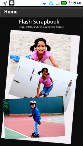
Figure 2–14. Completed Flash Scrapbook application on the home view page
Once you finish the last step, you will be on the ImageView page of the application, as shown in Figure 2–15. To get back to the main view, you can either two-finger-tap on the image again, or use the Android back button.
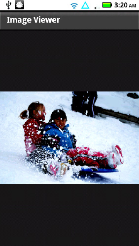
Figure 2–15. Completed Flash Scrapbook example on the Image Viewer page
By completing this simple example, you have successfully explored all of the available gesture events that are available on Flash Android. Try using these gestures in your own application in new and innovative ways!
Touch Point API
The other way to process multitouch input is to use the touch point API to get direct access to the events being generated on the device. This allows you to do custom multitouch processing that is tailored to your application needs. To determine if your device supports touch event processing, you can query the Multitouch object as shown in Listing 2–26.
Listing 2–26. Code Snippet That Prints Out Whether Touch Events Are Supported
trace("Supports touch events: " + Multitouch.supportsTouchEvents);
Since processing touch events directly conflicts with gesture recognition, you need to change the input mode of your application to start receiving touch point events. This can be accomplished by setting the Multitouch.inputMode variable to TOUCH_POINT, as shown in Listing 2–27.
Listing 2–27. Code Snippet to Enable Touch Point Events
Multitouch.inputMode = MultitouchInputMode.TOUCH_POINT;
NOTE: Setting the inputMode to TOUCH_POINT will disable recognition of any gestures, such as zoom, rotate, and pan.
The touch point API is fairly low-level in the number and type of events that get dispatched. You can register and listen for any of the events listed in Table 2–5, as long as the target object extends InteractiveObject.
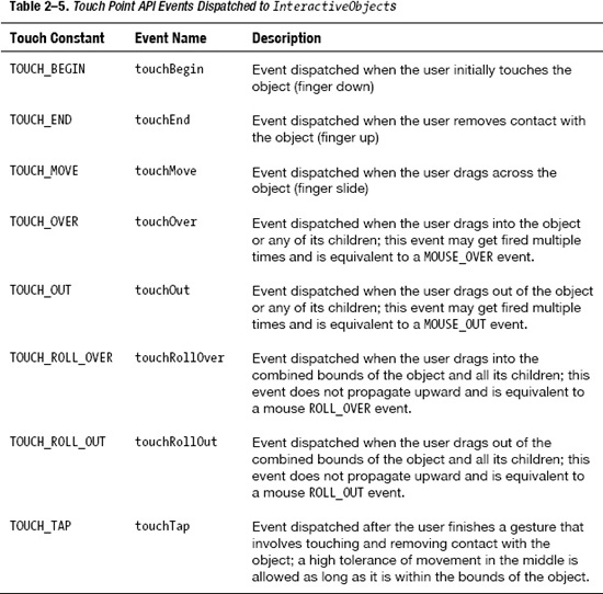
Most of the touch events are fairly self-explanatory, but the touchOver, touchOut, touchRollOver, and touchRollOut can be a little confusing. As an example, take three nested rectangles labeled A (outer), B (middle), and C (inner). As the finger rolls from A to C, you would receive the following roll events:
touchRollOver(A) -> touchRollOver(B) -> touchRollOver(C)
At the same time, you would also receive the following over/out events:
touchOver(A) -> touchOut(A) / touchOver(B) -> touchOut(B) / touchOver(C)
The events that rectangle A would directly receive are highlighted in bold. The roll events don't propagate, so you receive only one touchRollOver event. However, the touchOver/Out events do propagate to parents, so you receive three touchOver events besides the two additional touchOut events.
The easiest way to remember how these work is to relate the roll events to the implementation of a rollover effect. For a rollover effect, you typically want to display the effect if the node or any of its children are being touched, which is the semantic for touchRollOver.
Caterpillar Generator Example
As a simple example of the touch point API, we will guide you through how to create a multitouch-enabled Flash application that generates caterpillars as you drag your fingers around the screen.
To start with, we will create a few art assets that can be used to construct the example:
- Background: Create a layer called Background that will be the backdrop for the application. We chose to use the pattern paint brush to draw a virtual garden for the caterpillars to crawl in, but be as creative as you can.
- Green Ball: Create a simple movie clip called GreenBall that will make up the body of the caterpillars. For this we did a simple radial gradient on an oval primitive.
- Blue Ball: Create a simple movie clip called BlueBall that will make up the alternate body of the caterpillars. For this we did another radial gradient on an oval.
- Red Ball: Create a movie clip called RedBall with a sequence of faces that will be displayed on the caterpillars. Make sure to code a
stop()on each frame so we can step through them one at a time.
The mechanics of the application logic are extremely simple. As the user drags his or her finger around the screen, we will continually create new ball objects for the body of the caterpillar at the current touch location or locations. Once the user's finger leaves the screen, we will draw the head of the caterpillar. In addition, if the user taps one of the caterpillar heads, we will play the movie to change the face that is shown.
In order to accomplish this, we need to introduce the TouchEvent class, which is returned by each of the touch event callbacks. The variables on TouchEvent that are relevant to this example include the following:
stageX/stageY:The location that the touch event occurred at specified in global coordinates; to get the location relative to the currentSprite,uselocalX/localYinstead.pressure:The amount of pressure used on the display screen (typically related to the size); this is device-dependent, so you can't rely on it being available on all devices.target:The object that is being interacted withisPrimaryTouchPoint:Whether this is the first touch point registered or an additional touch point that was added later; we will use this to color the caterpillars differently.
The full code listing for the Caterpillar Generator application is shown in Listing 2–28. You will probably want to put this on the first frame of a separate layer called Actions to distinguish it from the graphical elements in the program.
Listing 2–28. Code Listing for the Caterpillar Generator Application
import flash.ui.Multitouch;

import flash.ui.MultitouchInputMode;

import flash.events.TouchEvent;

import flash.events.KeyboardEvent;

import flash.ui.Keyboard;


Multitouch.inputMode = MultitouchInputMode.TOUCH_POINT;

stage.addEventListener(TouchEvent.TOUCH_BEGIN, beginListener);

stage.addEventListener(TouchEvent.TOUCH_MOVE, moveListener);

stage.addEventListener(TouchEvent.TOUCH_END, endListener);

stage.addEventListener(KeyboardEvent.KEY_DOWN, keyListener);


var lastScale:Number;

var startX:Number;

var startY:Number;


function beginListener(event:TouchEvent):void {

  lastScale = 0;

}


function moveListener(event:TouchEvent):void {

  var ball;

  if (event.isPrimaryTouchPoint) {

    ball = new GreenBall();

  } else {

    ball = new BlueBall();

  }

  ball.x = event.stageX;

  ball.y = event.stageY;

  lastScale = Math.max(lastScale, event.pressure*7);

  ball.scaleX = lastScale;

  ball.scaleY = lastScale;

  addChild(ball);

}


function endListener(event:TouchEvent):void {

  var ball = new RedBall();

  ball.x = event.stageX;

  ball.y = event.stageY;

  ball.scaleX = lastScale;

  ball.scaleY = lastScale;

  ball.addEventListener(TouchEvent.TOUCH_MOVE, ballMoveListener);

  ball.addEventListener(TouchEvent.TOUCH_TAP, changeFace);

  addChild(ball);

}


function ballMoveListener(event:TouchEvent):void {

  event.stopImmediatePropagation();

}


function changeFace(event:TouchEvent):void {

  event.target.play();

}


function keyListener(event:KeyboardEvent):void {

  if (event.keyCode = Keyboard.MENU) {

    clearAll();

  }

}


function clearAll():void {

  for (var i:int=numChildren-1; i>=0; i--) {

    if (getChildAt(i).name != "background") {

      removeChildAt(i);

    }

  }

}
Notice that we add the event listeners to the Stage rather than the background. The reason for this is that as additional nodes are added under the finger to make up the caterpillar body, they will block the background, preventing additional move events from getting fired. However, the stage receives all events regardless of what object they occurred within.
Adding event listeners to the Stage is a dual-edged sword, because it also means that it is extremely hard to receive any tap events. To prevent the move events on a caterpillar's face from trickling up to the stage, we call event.stopImmediatePropogation(). This allows the tap gesture to be processed without interference from the stage event listeners.
One other technique we use is to ensure that each subsequent ball added is larger than the previous by using the Math.max function. This ensures that the caterpillar perspective is maintained even as the pressure decreases while the user removes his or her finger from the screen.
The final application should look similar to Figure 2–16 when run on a device.
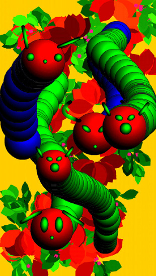
Figure 2–16. Caterpillar Generator application showing a few caterpillars in the weeds
This application also serves as a crude performance test since it continually generates and adds Sprites to the stage. You can clear the scene and reset the application at any time by pressing the menu button on your phone, which has been wired up to the clearAll function.
Try experimenting with different multipliers for the pressure to tweak the application for optimal performance on your device.
Summary
In this chapter, you learned how to design and build applications that take full advantage of the mobile platform. Some of the takeaways that you will be able to apply to your future mobile projects include the following:
- The importance of not just designing for screen resolution, but also taking density into account
- How to calculate device-independent pixels and take advantage of
applicationDPI - Tailoring your application layout for portrait and landscape modes
- Improving the usability of your application with multitouch gestures
- How to consume and process raw touch events within your application
We will continue to use these concepts throughout the book to build more intricate and powerful applications, but you should already have a good start to designing your own mobile user interfaces.