
C H A P T E R 12
Monitor Mayhem
Will your web site colors be the same on all monitors? Which type and size of monitor should you design for? Is it possible for a web site to look attractive on a wide range of screen sizes and resolutions? This chapter describes the problems and explores the possible solutions. The following topics will be presented and discussed:
- Monitors and the problem of color rendition
- Monitor sizes and resolutions
- Monitors and the problem with fixed-width layouts
- Monitors and the problem with liquid layouts
- Monitors and semi-liquid layouts—the best solution
- Other monitor-related considerations
Monitors and the Problem of Color Rendition
Cathode ray tube (CRT) monitors generally gave strong vibrant colors, and they were set to a fairly consistent standard by each manufacturer. The situation has changed since the introduction of TFT monitors (thin, flat-screen monitors; TFT stands for thin-film transistor). The overwhelming majority of TFT monitors bundled with computers are low-fidelity, twisted nematic (TN) screens; some of these are incapable of reproducing a wide and faithful range of colors.
In addition, they are often factory-set to maximum brilliance so that colors are washed-out pale pastels, sometimes with a distinct blue cast. Although TFT screens have adjustment buttons, users rarely notice these; if they do spot them, they are usually too timid to use them.
Rich web page colors designed on a CRT monitor can look very pale and muddy when viewed on a TFT screen. One of my sites had a background that was a lemon-yellow gradient; a few TFT screens rendered this color as a muddy, gray-green. I experimented with variations of lemon yellow and eventually the poorest screens showed a sort of lemon yellow; not as bright as I would have liked, but it was acceptable.
As most users have low-fidelity, twisted nematic (TN) screens, the best strategy is to design web sites on a similar screen. When designing web sites, you might even connect a low-fidelity screen in parallel with your expensive, high-quality TFT screen to ensure that your web pages look reasonable on poor screens. Set the screen to be slightly brighter (washed out) than you would personally prefer. Then design for colors that look reasonable on that screen. Use your graphics package to make pictures slightly darker than you would for a CRT monitor.
If you have been requested to alter an older web site so that it looks reasonable on a TFT screen, you may have to darken the pictures using your graphics program. Then darken the text and menu buttons using CSS. If you use hexadecimal code in your CSS to describe colors, you can darken them by reducing the numbers and letters; for instance
- Mid blue is
#0000FF; when FF is decreased to 80, it becomes#000080, which is navy blue.- Hexadecimal numbers are (from darkest to lightest) 0, 1, 2, 3, 4, 5, 6, 7, 8, 9, A, B, C, D, E, F.
- To make a color lighter, increase the hexadecimal characters. For instance, royal blue is
#0000FF; a paler version of the blue could be#7070FF.- To avoid spending too much time on trial and error when determining suitable colors, download the zip file
CCA-2.2.zipfromhttp://www.paciellogroup.com/resources/contrast-analyser.html
Scroll down the home page of The Paciello Group web site until you see Download and a list of language versions. Click the appropriate language version to download the zip file. Unzip it into a new folder, and then create a desktop shortcut to the file CCA-2.2.exe.
Figure 12-1 shows the Color Contrast Analyser (CCA-2.2) interface.
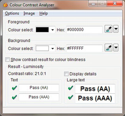
Figure 12-1. The Color Contrast Analyser ver. 2.2 interface
The Color Contrast Analyser can be used in two ways; if you click Options on the menu you can adjust colors by means of sliders, or you can see what happens to a color when you change the hexadecimal numbers.
- Double-click the shortcut (the spelling of “color” in the CCA interface is the UK and Australian colour).
- Type the color’s hexadecimal number in the Foreground Colour Select Hex field. You will see the color in the corresponding Colour Select field.
- Change the hexadecimal code a little at a time until you achieve the required color.
- Make a note of the hexadecimal color code and use it to amend your CSS style sheet.
 Tip Originally, only 17 colors could be specified by a name such as red or blue. Now, you can name 147 colors, such as
 color: mediumpurple; for example. For more information, visit www.w3schools.com/cssref/css_colornames.asp and http://somacon.com/p142.php.
One other problem will be encountered: compared with Internet Explorer, Mozilla Firefox displays paler border colors on menu buttons styled by the CSS dynamic pseudo-class method. In most cases, this is acceptable, but if not, you could experiment with the border colors to provide a compromise that looked reasonable in both IE and Mozilla Firefox. As an alternative, the CSS style sheet for IE could be made a conditional style sheet; the main style sheet would then provide the border colors for the other browsers.
Monitor Sizes and Screen Resolutions
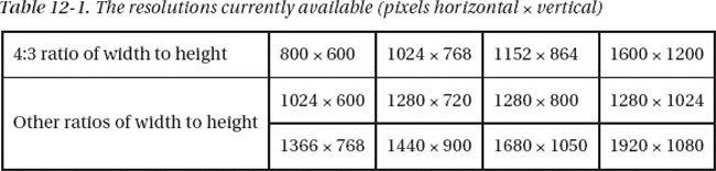
No matter which resolution you design for (see Table 12-1), there will be drawbacks. You cannot possibly know the size of the users’ monitors or how the resolution is set up. Elderly folk with fading eyesight may set a 19-inch screen to 800 × 600, preferring big, blurred icons and fonts to sharp but small icons and fonts.
Tip For an interesting page on various screen and color resolutions statistics, visit http://www.w3schools.com/browsers/browsers_display.asp.
Non-normal ratios can slightly distort the appearance of a web site; items are stretched vertically. Some wide screen ratios can introduce a horizontal distortion; for example, a soccer ball becomes oval like a rugby ball.
Some users have a Favorites panel permanently pinned on the browser window so that the usable width of the browser window is reduced, causing the user to scroll horizontally.
Most sites have both long and short pages. On short pages, no vertical scroll bar is displayed. On long pages, the vertical scroll bar appears and the page can move sideways a little so that items appear to jump around as the user moves from short pages to long pages. CSS absolute positioning can partly overcome this.
The real screen area is less than the stated number of pixels because of the following:
- People lose vertical screen space by adding extra and unnecessary toolbars, such as those provided by Google or Yahoo.
- The Windows vertical scroll bar takes up some of the width, allow at least 24 pixels for this when setting the width of your pages. For example, use a fixed width of around 980 pixels for the most common horizontal monitor resolution of 1024. Use 1200 pixels for a monitor with a horizontal resolution of 1280 pixels.
- There are slight differences in the way that Internet Explorer and Mozilla Firefox render pages; however, most of these can be smoothed out by a reset at the beginning of the style sheet.
Web designers must accept the fact that they can’t win. Whatever size and resolution they design for, the result for different screens sizes will always be a compromise. The rest of this chapter will help you to find the best compromise for your web site or your clients’ web sites.
The next section discusses the three types of layout: fixed, liquid, and semi liquid. It describes their problems, limitations, and possible solutions.
Note The markup for the next three examples is identical except for the content of the <title> tags and attributes shown bold in the CSS files. Heights are included in the CSS sheets to produce short screenshots, but heights should not normally be specified because you will need different heights for each page, depending on the amount of content. For instructional purposes, positional ids are used to indicate column positions.
Monitors and the Problem with Fixed-Width Layouts
I am sometimes requested to take over an older, fixed-width web site that was designed for screens with a resolution of 800 pixels × 600 pixels. The owner was disturbed by the fact that on modern screens (above 1024 × 768 resolution), the web site pages looked too small. With the advent of even larger resolutions and huge screens, the pages began to resemble postage stamps.
I might redesign the web site with a fixed width of 1024 × 800 and accept the fact that it will cause users to scroll horizontally on an 800 × 600 screen. Fixed-width web sites are the easiest to design and control, and because most web sites are fixed width, users currently accept their limitations on bigger screens. At some future date, the 1024-pixel fixed width will need to be increased to match the ever-increasing screen sizes and resolutions.
Figure 12-2 shows a fixed-width layout on a 19-inch screen.
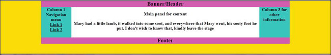
Figure 12-2. Example of a simple, three-column, 980-pixel, fixed-width layout on a 19–inch screen. This page would almost fill a screen that was set to 1024 pixels horizontal resolution.
The web page in Figure 12-2 has a fixed width of 980 pixels and is shown here on a 19-inch screen at its natural resolution. The fixed width (980 pixels) is the most popular at the moment. It is used by web sites such as www.bbc.co.uk. If the horizontal dimension is shrunk by using the cursor to drag the right-hand edge to the left, the edge slides over the content like drawing a curtain across it. This is good practice because the content layout is not disturbed by shrinking the width. On smaller or lower resolution screens or when the screen is shrunk by the user, the elements on a page may slide over each other. This can be prevented by using CSS positioning or by having a container set to a fixed width as in the Listing 12-2b.
Download the code files for this chapter from the book’s page at http://www.apress.com. View the three files in a browser on a 19-inch screen set to its native resolution, then try shrinking the width of the browser window to test that the layout does not collapse when the horizontal width is reduced.
The Listing 12-2a produces the screen display shown in Figure 12-2.
Note Semantic tags have not been used in the next three examples in order to keep the markup simple for instructional purposes.
Listing 12-2a. Creating a Fixed Width Page (fixed-3col.html)
<!doctype html>

<html lang=en>

<head>

<title>Fixed width layout with three columns</title>

<meta charset=utf-8>

        meta details go here

<link rel = "stylesheet" type = "text/css" href = "fixed.css">

</head>

<body>

<div id="container">

<div id = "hdr" >Banner/Header</div>

        <ul>Column 1 Navigation menu

                <li>Link 1</li>

                <li>Link 2</li>

        </ul>

<div id = "col-3">Column 3 for other information>

</div>

<div id = "main-panel"><p>

<strong>Main panel for content</strong></p><p>Mary had a little lamb, it walked into

some soot, and everywhere that Mary went, his sooty foot he put. I don't wish to

know that, kindly leave the stage</p>
</div>

<div id = "ftr">Footer

</div>

</div>

</body>

</html>
The width is fixed in the CSS (fixed.css) by simply inserting width:980px;. This is shown in bold in Listing 12-2b.
Listing 12-2b. The CSS Style Sheet for Listing 12-2a (fixed.css)
Width:100%; body { text-align: center;background-color:yellow; font-family:"times new roman";

font-size:large; font-weight:bold;

}

#container {width:980px; padding: 0; text-align: center; margin:auto;

background-color:white;

}

/* set widths and float on nav col and col 3*/

ul { float: left; padding:0; margin:0; width: 100px; height:120px;

}

li { padding-left:0; margin-left:0; list-style-type:none; text-decoration:underline;

}

#col-3 { float: right; width: 100px; height:120px;

}

/* set main-panel margins 5px greater than ul column and col-3 widths*/

#main-panel { margin-left: 105px; margin-right:105px;

}

#hdr { font-size:x-large; font-weight:bold;

}

/* force footer to stay at the bottom */

#ftr { clear: both; font-size:x-large; font-weight:bold;

}

/* show boundaries by using colors - for clarity only */

#hdr, #ftr { background: fuchsia;

}

ul, #col-3 { background: aqua;

}

#main-panel { background: white;

}
We next examine the liquid layout, which was developed to cope with the variations in screen width. It was a reasonable solution for a while, but as screens became wider and screen resolutions increased, it became clear that the liquid layout had its own problems. These will be explained next.
Monitors and the Problem with Liquid Layouts
On smaller screens, the liquid web site can go to pieces due to float drop. This means that an element on a page, such as an image, drops down below the other elements. See Chapter 19 for troubleshooting float drop.
Liquid sites have another problem: text can stretch across a high resolution wide screen, making reading difficult; the reader’s head waves too and fro like a windshield wiper. You should always present text in columns to solve this problem. On high-resolution wide screens, liquid layouts result in large, unsightly gaps between in-line pictures. This can be can be partly overcome by placing pictures one above the other on a page with the text to the side of the pictures.
If you have problems with liquid pages and you have a deadline to meet, don’t spend too much time on it, but change to a fixed width (let’s say 980 pixels). Then return to the problem after the launch date.
A CSS background pattern can be liquid if it is a repeating pattern. This can give the impression of continuity by repeating the background so that it spans the entire width and height of the screen.
A liquid layout page is shown filling the width of a 19-inch screen in Figure 12-3.
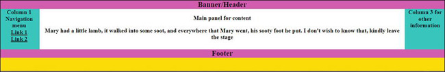
Figure 12-3. A simple, liquid, three-column layout. This example fills 100 percent of any screen width. Note the wide span of the central text. This effect would worsen on screens with high resolutions.
A liquid layout designed on a screen with 1024 horizontal resolution will look messy on screens with smaller resolutions. Listing 12-3a and its CSS Listing 12-3b provide a liquid layout by setting the container to a width of 100 percent. This is shown in bold type.
Listing 12-3a. Creating a Liquid Page that will Fill any Screen Width (liquid-3col.html)
<!doctype html>

<html lang=en>

<head>

<title>Liquid 3 column layout.</title>

<meta charset=utf-8>

        meta details go here

<link rel = "stylesheet" type = "text/css" href = "liquid.css">

</head>

<body>

<div id="container">

<div id = "hdr" >Banner/Header</div>

<ul>Column 1 Navigation menu

                <li>Link 1</li>

                <li>Link 2</li>

</ul>

<div id = "col-3">Column 3 for other information

</div>

<div id = "main-panel"><p><strong>Main panel for content</strong></p>

<p>Mary had a little lamb, it walked

into some soot, and everywhere that Mary went, his sooty foot he put.

I don't wish to know that, kindly leave the stage</p>

</div>

<div id = "ftr">Footer

</div>

</div>

</body>

 </html>
In Listing 12-3b (the CSS style), the liquid layout uses a width of 100 percent, but liquid layouts can have a smaller percentage figure. The key to liquid layouts is that a percentage is used to define the width instead of pixels.
Listing 12-3b. The CSS Style Sheet for Listing 12-3a (liquid.css)
/* flood the background with yellow */

body { text-align: center; background-color:yellow; font-family:"times new roman";

font-size:large; font-weight:bold;

}

#container {width:100%; padding: 0; text-align: center; margin:auto; background-color:white;

}

ul { float: left; padding:0; margin:0; width: 100px; height:120px;

}

li { padding-left:0; margin-left:0; list-style-type:none; text-decoration:underline;

}

#col-3 { float: right; width: 100px; height:120px;

}

/* set panel margins 5px greater than ul and col-3 widths*/

#main-panel { margin-left: 105px; margin-right:105px; font-weight:bold;

}

#hdr { font-size:x-large;font-weight:bold;

}

/* force footer to stay at the bottom */

#ftr { clear: both; font-size:x-large; font-weight:bold;

}

/* show boundaries and set colors - for clarity only */

#hdr, #ftr { background: fuchsia;

}

ul, #col-3 { background: aqua;

}

#main-panel { background: white;

}
We have seen that both fixed and liquid layouts have their problems. In the next example, we will examine an acceptable solution using semi-liquid layouts.
Monitors and Semi-Liquid Layouts
A semi-liquid layout is a variation on the liquid layout that uses two special attributes namely, min-width and max-width. A page using a semi-liquid layout is shown in Figure 12-4.
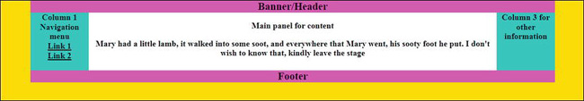
Figure 12-4. A semi-liquid layout with restricted max- and min-widths. This is the best compromise.
Figure 12-4 is shown on a 19-inch screen set to its native resolution. The page is designed to never exceed 1200-pixels horizontal width; therefore, the content in the white panel does not stretch excessively. Viewed on a screen with a resolution less than 960 pixels, the viewer will have to scroll to see some of the right-hand column. It is a good idea to put non-essential information in the right-hand column, such as credits and advertisements. This leaves the main content exactly as the designer intended, no matter what resolution or size is used to view it. Listing 12-4a and its associated CSS Listing 12-4b provide the semi-liquid layout shown in Figure 12-4.
Listing 12-4a. Creating a Semi-liquid Page (liquid-3col-max-min.html)
<!doctype html>

<html lang=en>

<head>

<title>Liquid layout with restricted max and min width</title>

<meta charset=utf-8>

        meta details go here

<head>

<link rel = "stylesheet" type = "text/css" href = "liquid-maxmin.css">

</head>

<body>

<div id="container">

<div id = "hdr">Header/Banner<br></div>

<ul>Column 1<br>Navigation menu

<li>Link 1</li>

<li>Link 2</li>

</ul>

<div id = "col-3">Column 3<br>for other information

</div>

<div id = "main-panel"><p><strong>Main panel for content</strong></p>

<p>Mary had a little lamb, it walked into

some soot, and everywhere that Mary went,<br>his sooty foot he put. I don't

wish to know that, kindly leave the stage</p>

</div>

<div id = "ftr">Footer

</div>

</div>

</body>

</html>
The CSS Listing 12-4b provides a neat solution for the problem of variations in screen width. The attributes max-width and min-width limit the display so that it does not become too wide and cannot be shrunk to the extent that the layout falls apart. The width is a percentage, like the liquid layout, and limits are set by the code shown in bold.
Listing 12-4b. The CSS Style Sheet for Listing 12-4a (liquid-maxmin.css)
/* flood the screen with yellow*/

body { text-align: center; background-color:yellow; font-family:"times new roman";

font-size:large; font-weight:bold;

}

#container { width:95%; margin:auto; background-color:white; text-align: center;

max-width:1200px; min-width:960px;

}

#hdr { font-size:x-large;font-weight:bold;

}
/* set widths and float on nav col and col 3*/

ul { float: left; padding:0; margin:0; width: 100px; height:120px;

}

li { padding-left:0; margin-left:0; list-style-type:none; text-decoration:underline;

}

#col-3 { float: right; width: 100px; height:120px;

}

/* set panel margins 5px greater than col-1 & col-3 widths */

#main-panel { margin-left: 105px; margin-right:105px; background-color:white;

}

/* force footer to stay at the bottom */

#ftr { clear: both;

}

/* color the elements - for clarity only */

#hdr, #ftr { background: fuchsia;

}

ul, #col-3 { background: aqua;

}

#main-panel { background: white;

}
By combining the two techniques—a full-width body background color and a semi-liquid layout—an acceptable solution can be applied to the problem of variations in screen width and resolution.
An Acceptable Compromise
Use a semi-liquid web site container or wrapper. Give the body a background color or gradient to fill any screen size and resolution. Define this color in the CSS, as follows:
/* Flood the whole screen with yellow*/

body { background-color:yellow; }

#container { width:95%; min-width:960px; max-width:1200px; margin:auto; }
This gives the impression of a page that fills the screen (the body’s background) while leaving the content (the #container) well laid-out in the center of the screen. Making the header/banner fill the width of the screen can reinforce this impression, but this is not always attractive. The semi-liquid container with minimum width prevents a layout going to pieces on smaller resolutions. The maximum width limit ensures that the content will not sprawl across a big screen showing huge gaps between elements.
Other considerations can determine the layout of a web site. You will need to consult your client about the equipment he is using and his future intentions concerning that equipment. Also the advent of handheld devices complicates the problem of choosing suitable layouts.
Other Monitor-Related Considerations
When designing a web site for an office or a factory’s internal use, you will need to visit the premises to determine the screen sizes and resolutions. The employees will not be pleased if they have to continually scroll horizontally to access items on the page. Should the company invest in new equipment with bigger screens, you will need to change the container width to match. You may have to put the text into two columns for ease of reading.
Note The employment of two columns for text is essential for wide layouts and particularly for liquid layouts. See Chapter 13 for methods of designing two or more columns of text.
Other types of users and devices will increasingly need special consideration. The advent of new handheld devices with different operating systems and browsers complicates and increases the difficulty of the tasks confronting the web site designer.
Will the Web Site Work on a Handheld Device?
Handheld is a term describing mobile phones and tablets. Designing for handheld devices is a big manual unto itself and, therefore, will only have a brief mention in this book. Many web sites designed for desktop computers already work reasonably well on larger mobiles and tablets (provided that they validate, and do not contain frames or table layout).
Tip Programming the Mobile Web by Maximiliano Firtman (O’Reilly Media, 2010) is a book on the subject.
The Problem
The advent of handheld devices that can view web sites is the web designers’ latest nightmare. The screen resolution can vary from 176 × 220 pixels to 1280 × 800 pixels. Mobile phones generally have portrait-style screens taller than their width, and screens vary from 2.8 inches to 4 inches. Tablet screens vary from 3.2 inches to 10 inches. The Samsung Galaxy Tab 10.1 has a 10.1-inch display with a resolution of 1280 × 800. The Apple iPad has a 9.7-inch display with 1024 × 768 pixels. Some mobiles and most tablets have the ability to flip the screen view from portrait to landscape. The higher resolution is possible on handheld touchscreen devices because they don’t have to provide room for a keyboard. Originally, handheld devices were either mobile phones or tablets; now the distinction is blurred because tablets incorporate phones and cameras.
At the Consumer Electronics Show in 2011, no less than 80 tablets were on display. As for operating systems, the battle is between several platforms/browsers at the moment and this seems set to increase. Among these are iOS4 OS6 4, Android, Opera, Windows 7, Windows 8, WebOS, Blackberry OS, Simbian, and QNX Neutrino.
At first, browsers for handheld devices were adaptations of desktop browsers. They are now more likely to be designed specifically for handheld devices. The browsers have to be more compact than desktop browsers because handhelds have less RAM and no hard disk to swap memory with.
Browsers for handheld devices are more compact; that means they have dispensed with much of the code that compensates for markup errors. Because they are less tolerant, validation of the pages becomes absolutely essential.
Web designers sometimes produce alternative style sheets to match the miniature screens, to the various mobile browsers, lower resolutions, and various operating systems. Handheld users are familiar with using a zoom facility to explore a web page. If you create special style sheets for handhelds, try to reduce the need for horizontal scrolling. When providing these alternative style sheets, place a link to them before any other link, as follows:
<link rel=”stylesheet” type=”text/css;” href=”md-sheet.css” media=”handheld” />

<link rel=”stylesheet” type=”text/css;” href=”stylesheet.css” media=”screen” />
Creating the alternative styles for a web site requires a great deal of trial and error followed by a series of tests on mobile devices. With 80 different handheld devices and a multitude of platforms and browsers, the task is truly daunting. No web designer can hope to ensure that the style sheets will be suitable for the entire range of devices.
Therefore, the designer’s first task is to decide which of her web sites are most likely to be viewed on handheld devices. She should then concentrate on making them handheld-friendly.
Web designers are faced with difficult choices. They could decide to
- Ignore handheld devices.
- Design for desktops, laptops, netbooks, tablets, and mobiles with screens larger than (let’s say) 6 inches.
- Design for desktops, laptops, netbooks, tablets, and mobiles with screens larger than (let’s say) 6 inches, as well as two or three of the smaller, most popular handhelds.
- Try to accommodate everything.
Choices one and two are manageable. The third solution requires that you wrestle with some testing methods. The fourth solution has a learning curve the size of Mount Everest. Larger companies can afford the time and manpower to create completely separate sites for handhelds and tablets. For some general guidance on how to set up and create alternative style sheets for solutions two and three, visit http://www.opera.com/developer/tools.
The Opera site contains useful tools, including a tablet and phone simulator.
Producing an Alternative Style Sheet for Handhelds
One solution would be to have a special style sheet for handhelds that makes the display acceptable. Although, you will probably discover that you also need modified HTML markup. This can be kept to a minimum with careful planning. The following are some hints on modifying the markup so that you can use two style sheets with HTML pages that support both desktops and handhelds.
- Reduce the size and quantity of images.
- Simplify the home page, making it a container for the links to the other pages. The links should be a simple, vertical, unordered list.
- Text should be in one column with a restricted maximum width if possible to avoid horizontal scrolling.
- Keep banners and logos to a basic minimum or hide them.
- The quantity of text should be condensed to the absolute minimum.
- Be sure to examine lots of web sites on handheld devices so that you can see the difference between good and bad adaptations of web sites.
Testing a Web Site for Handheld Compatibility
Individual web designers or small teams will have problems affording equipment for testing handhelds. This is because of the huge range of devices and their several operating systems and browsers. The following is a list of possibilities:
- Ask children, grandchildren, or friends with handheld devices to view your web site and ask them to comment on any problems.
- Download some handheld emulators for testing web sites.
- Buy some handhelds or pay monthly subscriptions for a selection of the most popular models.
- Enter “Remote device access” into a search engine and examine the results for possible remote-testing facilities.
- W3C has a validator for mobile markup at
http://validator.w3.org/mobile. Upload your file or URL to see if the markup is suitable for handheld devices.
Emulators
I found several downloadable emulators on the internet, but they were very difficult to set up and master. I needed a PhD in gobbledygook to follow the instructions; however, I did have some success with the Opera Mini emulator. Once installed, it has a launcher that enables you to choose various screen sizes, resolutions, and orientations (landscape or portrait).
You can download the Opera emulator from http://www.opera.com/developer/tools/.
The emulator was tricky to operate, but the help files on the Opera developer web site explained the non-intuitive controls. For the help files, visit http://dev.opera.com/articles/view/opera-mobile-emulator/.
Summary
This chapter discussed the problem of the wide variations in color, size, and resolution of desktop and laptop monitors. Compromise solutions were covered; these can be downloaded and tried on various screens. Fortunately, the physical size of monitors imposes its own limit; few users have room for anything wider than a 23-inch screen. You also learned how the max-width and min-width attributes offer the best solution to the problem of screen size variation.
Handheld devices can now receive and view web sites. We briefly covered the problems posed by these devices. Handhelds vary widely in size and have many different operating systems. New ones are being launched every month and their browsers are upgraded frequently. Manuals for designing web sites for handhelds will quickly date.
The next chapter is closely related to this chapter and deals with the appearance of a web site on the screen. You will learn what makes a page attractive to the user and how to keep the user interested enough to explore the site, rather than wandering away to another site. You will also discover how the site’s usefulness contributes to this aim.