
C H A P T E R 13
Appearance and Usefulness
Visitors will only explore a web site if it is attractive and useful. Some web site owners ask for a site that pleases them, without considering what will please their site’s visitors. Such a site makes the owner happy, but it may do nothing for the visitor or for the owner’s business. Site owners should ask themselves what the site will do for visitors. They should ask several people what they would hope to find if they accessed the site.
When talking to potential clients, explain that the web site design process starts not by thinking of text and pictures, but with planning. First and foremost, determine the general goal of the site. Is it for sharing information? Or is it expected to generate sales? Starting with a goal makes it easier to design the site and helps everyone concerned to focus on the purpose of the web site. Concentrate on making the web site’s message appear quickly, clearly, and directly.
Consider the navigation and how your secondary content interacts with your goal. Plan the pages or sections. Each page should cover one topic only. List the topics and use the list to plan the navigation menu. Plan the navigation menu and structure before starting to compose pages; this will save many hours of tedious revision later.
Appearance
This section on web site appearance begins with a brief discussion about the use and abuse of text; the manner in which the textual content is displayed can enhance or ruin a web page. Next, you will learn about the importance of the home page; how its appearance can either tempt users to explore further or drive them away from your web site. This is followed by a discussion on the effect of colors, and finally some useful tips are provided to help you create more attractive pages.
The Use and Abuse of Text
The guidelines in this section are just plain common sense, but be sure to use them as a checklist to improve your work in case the heart overrules the head. When I began designing web sites, some clients presented me with reams of text guaranteed to drive users away from their web site. I then had the tedious task of condensing the text and this occasionally annoyed the client, which was understandable. I demonstrated that it was possible to condense the text and still retain every bit of the message that the client wished to convey.
I also presented them with this little piece of advice: verbose text may be acceptable in a book, a magazine, or a brochure, but lots of text, especially if it is on the home page, will kill a web site stone dead.
Tests show that, when presented with a large quantity of text, a web site visitor will groan and switch to another web site. This is because reading text on a screen is very tiring compared to a printed page. Visitors do not visit web sites for a read; they surf to find particular information, and they want to find it quickly.
Condensing the text applies chiefly to the main pages, but if you are describing a product or a service, or giving information, don’t leave out important details for the sake of brevity; just eliminate the words that add nothing to the message.
That All Important Home Page Must Be Like a Venus Flytrap
All sites start with a home page. The design of the home page is especially important because it is the visitor’s first impression and it communicates the tone of the site. Make it an attractive magazine cover (see Figure 13-1). Use it to stimulate the visitor’s interest. This is easily done by revealing just enough and no more; this arouses curiosity.

Figure 13-1. The Venus flytrap. Photo courtesy of http://aboutfacts.net
The home page should be like a Venus Flytrap, an attractive landing place that draws the visitors in deeper and keeps them from going to another web site. Each page must clearly focus on one topic and one topic only. This particularly applies to the home page. The focus will be on a brief description of what the web site is about. This must be amplified by the wording on the buttons or links on the navigation menu.
What destroys the focus on a home page? Nothing could be worse than a home page plastered with RSS feeds, commendations, badges, links to irrelevant sites, flashing advertisements, marquees, and running videos. Badges, commendations, and certificates of accreditation have a part to play, but these are best located on an About Us page. W3C validation logos can be placed in a sidebar or in the footer because clients are often keen to show that they employed a competent designer. A yard-long home page and huge blocks of text are focus killers. A page without a clear focal point turns visitors away.
Figures 13-2 and 13-3 show a focused and an unfocused home page.
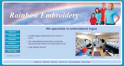
Figure 13-2. A clean, uncluttered home page
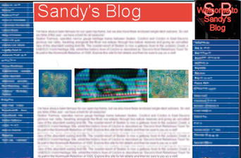
Figure 13-3. Yuck!
The home page must be very brief and uncluttered. Too much information on the home page is bad. It makes subsequent pages redundant. Why should visitors bother to click the menu items if the home page says it all?
The home page must clearly indicate what the site is about.
If you are The Haven Retirement Complex, don’t just show the heading “The Haven” with a picture of the building or some happy residents. Briefly shout out what is offered; something like the following:
Sheltered Retirement Accommodation
Rented accommodation for older people who want
independence with companionship and support in a caring environment
That says it all in a nutshell; don’t add any more text. Let the menu buttons tempt the user to discover the rest of the story.
Pictures can explain things quicker than words. But large pictures (or too many pictures) can make the home page load slowly. Visitors will then turn away to find a web site that loads faster.
White space is essential for focus. Use plenty of white space on each page to focus attention on the important bit. White space means space with no text or pictures. If you have a pale turquoise background, then the white space will be pale turquoise, but it is still classed as white space. White space focuses the attention on the essentials. Poor designers feel tempted to fill every available area of a page. A crowded page is a turn off.
Keep the home page short. Make the height of the home page no greater than the screen window height. Don’t make visitors scroll down the home page. If they have to scroll down, you have put too much on the home page. Scrolling down may mean that the menu will no longer be there to tempt them. Of course, subsequent pages can be longer. A short home page ensures that the visitor will look at the menu buttons for more information.
Choose colors carefully. The best text color for clarity and ease of reading is black text on a white background. Sharp background colors such as bright red are irritating if they cover large areas of the page. If your site is selling something, use bright but not garish colors, and use them sparingly (just for the products or the menu buttons). A garish color mix indicates a tasteless and amateurish web site. If you are not selling something but you are providing information, use backgrounds of pale pastel colors to create calm; the visitor will linger longer on a calm web site. Dark background colors are sinister and off-putting (especially black, which is really only suitable for a funeral parlor). Avoid full-page background graphics (watermarks or textures); they can result in a fussy page that makes text difficult to read. Ensure that the text and background color have enough contrast to enable partially-sighted persons to read your web site easily (see Chapter 14 for details on color contrast).
If the client has a house style with a color scheme, or a brochure, or a colored logo, any of these would make a good starting point for a color scheme. Showing a color palette to clients can also help them to choose a theme.
Originally, only 17 colors could be specified by a name such as red or blue. Now, 147 colors can be named like this example: color: mediumpurple;. For more information on this, see www.w3schools.com/css/css_colornames.asp and http://somacon.com/p142.php.
![]() Tip Need ideas for colors? Try the following web sites:
Tip Need ideas for colors? Try the following web sites: http://colorschemedesigner.com or http://colorschemer.com or http://www.elizabethcastro.com/html/colors/backflapcolors.html or www.december.com/html/spec/color.html.
Every graphic on your site should have a title and an alt so that even if your visitors have graphics turned off, they can discover what the pictures are about. More importantly, this allows partially-sighted and blind persons to hear a spoken description of the pictures. If a page has pictures without an alt, it will not validate. Logos should have empty alts and titles like this: alt= " " and title= " ", which will not hinder the disabled, but will validate. Mozilla will not show a tool tip unless the title tag is present.
Every hyperlink must have a title like this: <a href="Page-two.html" title="Page Two">Page Two</a></li>.
Avoid scrolling text (marquees), autostarting videos, and anything that moves. These gimmicks are the best way to drive people away from your web site. Gimmicks can be intensely irritating or they can become the main focus of attention—to the degree that the rest of the page is ignored. The only exception would be a moving picture (not on the home page) that shows how something works. Whether it runs or not should be under the control of the user; it should not autostart. If it is an animated .gif, it must have a limited number of cycles; let’s say between five and ten cycles. Video, audio, and slideshows are acceptable if they are not on the home page and users are given the choice as to whether they want to watch/hear it or not (the media files must not autostart).
Autostart means that the sound or video automatically begins when the page is loaded. It’s a bad idea because it is bound to irritate. The sudden burst of sound can cause users to jump out of their skins, especially blind users. Users will either immediately switch away from your web site or frantically search for a way to turn off the AV clip. They will probably never return to your site again. Make sure the AV can only begin at the user’s request. Autostart might just be acceptable for audio if it loads a short but quiet arpeggio. Perhaps a quiet, soothing piece of background music might be tolerable if it is brief and does not repeat in a never ending loop.
Frames:This was the design method that allowed the content to scroll up and down behind a fixed banner and menu. Frames are no longer acceptable; search engines refuse to penetrate frames in order to locate subsequent pages. Frames do not work on mobile devices and they make screen reading virtually impossible for the blind and partially sighted.
Pages Other Than the Home Page
Printed matter, audio, and film communicate in a linear manner. Viewers start at the beginning and work their way through to the end. A web site is quite different; it is non-linear. Users explore by jumping around on the site. Web sites are more like a telephone directory; to find Fred Blogg’s telephone number, you pick up the directory (equivalent to the home page), jump to the Bs (for Blogg), skipping past all the other pages. You then skip the B entries until you come to Blo—. After locating the correct phone number, you probably don’t explore other pages. The directory has served its purpose. If a visitor to a web site can jump straight to the information he is seeking, then the web site has served its purpose.
Suppose John Smith and his wife decide to take the children on a farm-based holiday in Devon, UK, between July 25 and August 25. John types “farm holiday Devon” into a search engine. He selects the first farm holiday on the results page. On the web site, he sees a menu button labeled Vacancies. He clicks it and is taken to a page that shows him that there are no vacancies on the dates he wants. Using the next search result, the home page is a horrible amateurish mess, so he skips to the next web site on the list. This site gives no indication on how to find out about vacancy dates, so he skips to the next search result. The next web site has no menu button for available dates; instead, the home page tells him to telephone for dates. He can’t be bothered with the hassle of telephoning, so off he goes to the next web site. This one has a menu button leading to available dates, which he clicks and sees that there is a suitable date. Good! He will now click the menu button for prices and finds it is far too expensive. So he continues his search until he finds the perfect fit.
Let’s analyze this.
- He visited the home page on six web sites.
- He abandoned two sites immediately.
- He explored one other page beyond the home page on three sites.
- Then he explored two other pages beyond the home page on the last site.
Web site owners find it hard to believe that users don’t read every one of their carefully crafted pages.
However, if John finds the right vacancy at the right price, he will then explore the other pages on that web site to find out what the accommodation is like, where it is located, what the local attractions are, who the owners are (in the About Us page), and finally, he will use the order form to book a holiday.
Visitors regard content on their computer screen as being directed only at them.Your tone and writing style should be casual and very concise. This gives a personal touch, as if you are speaking one-to-one. Verbose formal prose may demonstrate how articulate and learned you are, but it will irritate your busy visitors; they will go elsewhere.
Always use headings and subheadings. Use h1, h2, h3, h4, h5, and h6 headings. Visitors rarely read text; they bounce from heading to heading looking for specific topics that interest them. Blind and partially-sighted visitors can hop from heading to heading with a screen reader by tapping the H key. Headings were once neglected because of the big line spaces above and below them. The spaces and font sizes of headings are now easily adjusted using CSS (see Chapter 14).
Never spread text right across a page. When the eye has reached the end of a long line of text, the visitor turns his head back to the beginning of the line and is usually lost (and he eventually gives up the struggle). Use two columns instead. The accepted maximum width of a column is 5.25 inches (133 mm) on a resolution of 1024 × 768. A web site for children should have even smaller column widths.
Small fonts are not user-friendly. The text in the main body should never be smaller than 100 percent for Times New Roman and never less than 80 percent for Arial or Verdana. Nobody will bother to fetch a magnifying glass to peer at a web site set in 8 pt.
Try not to use more than two fonts on a page. Arial and Verdana are the preferred sans serif fonts because they were designed for easy reading on web sites. Times New Roman is the best serif font because it was specifically designed and tested for good readability, especially for printed matter.
Text should be split into bite-size chunks, use bullets or headings where appropriate. Selling points are best highlighted by bullets. If possible, let the text be interspersed with pictures. Once visitors have located a site that offers what they are looking for, they will be eager to explore more pages. Finally, when they are hooked, they will want to know more about the people offering the product. The About Us page is usually the last to be visited, but it can clinch a sale.
Do not use justified paragraphs. Justified text is a killer and must be avoided at all costs. The brain has to struggle to overcome the wild variation in gaps between the words. Also, justified text looks boring compared with the liveliness of ragged, right-justified text. Compare the two styles in magazines to see how interesting a ragged-right style looks. Justified text can be a problem to the dyslexic and to anyone using screen magnification software because the varying gaps between words are also magnified. Justified text has distracting rivers of white space running through it.
Small italic fonts never look good on a web site. Small italic font appears on a computer screen as a series of what typographical designers call “jaggies.” The text has a rough, sawtooth appearance; therefore, italics should be avoided except for larger fonts.
Helping Your Clients Choose a Design
If your clients have no experience of web site design, they will want to know how to proceed. Always be as helpful as possible because they will need to learn the basics; this calls for a great deal of patience. The more they learn from you, the less likely they are to ask for daft things. Strongly resist the temptation to demonstrate your expertise; it will contribute nothing to discovering what your client wants.
New clients sometimes present you with a printed page from a ghastly web site and say, “That is how I would like my web site to look.” The best approach is to agree at first then say something like “Let’s see how we can go one better than that. We need some input from both of us to tidy it up a little.” I gently point out why some of the ghastly bits in the client’s sample would detract from the proposed site.
As previously mentioned, any of the client’s existing marketing materials or logos make a great starting point. The client may have reached the point where he wants to change his house style; not only does this help you work with your client to create a completely new look and feel, but it provides an opportunity to generate more work for you or your team.
When talking to prospective clients who have no idea what they want or who have no knowledge of web site design, I sit them beside me in front of my computer screen to do each of the following:
- I show them a page of templates to help them choose a color and a page layout (see Figure 13-4).
- I ask them to list the topics they wish to include. I then explain that one topic equals one page and that one topic is one button or link on the navigation menu.
- I explain approximately how much each page will cost so that they are absolutely certain about their commitment if they agree to proceed.
- I explain how much hosting and domain registration will cost.
- I explain how much each image will cost to process and insert into a page.
- I ask how they intend to provide me with images.
- I ask what on-going maintenance they might require and I give them an estimate of the cost of updating the web site.
- I make sure the prospective client understands the size and time limitations of hosting videos (see Chapter 6 for details).
- I suggest they carefully consider everything we discussed before committing to the project.
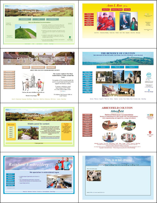
Figure 13-4. A typical page of samples to help a client choose a color and a design
The point of all this is that prospective clients should feel reassured and go away feeling that they know something about the process and are no longer dummies. If you make a prospective client feel foolish or ignorant, you deserve to lose him or her.
Make the project a fully cooperative venture. Using my own web site host, I create a folder called “hidden,” then I let the client know the URL to this folder. I upload the client’s draft pages one by one into that folder so that he or she can see the latest page and view any progress on earlier pages. The client can then contribute and comment every step of the way.
Arrange the registration and hosting of the web site with your clients. I have mine sit next to me and register the site in their names. Then I give the clients all the FTP details in case they should wish to switch to another webmaster at some time in the future. I explain that the web site will be registered and hosted in the client’s name and that he or she will own the copyright for the web site. Some despicable web designers will lock a client into an endless contract so that the client can never transfer the site to someone else. Having trapped the client, these loathsome web site designers will then charge an extortionate annual maintenance fee.
A Show/Hide Text Technique Giving a Compact Page
In this chapter’s “Use and Abuse of Text” section, I explained that too much text drives people away from a web site. A news page can be made more compact and easier to use by displaying only the headlines. Users can expand the headline to read the news item of their choice (see Figures 13-5 and 13-6). For this you will need to download the JavaScript file jquery.js and put it in the root folder of your web site. jQuery is a cross-browser library designed to simplify client-side scripting.
The following hide/show technique was perfected and published by Karl Swedberg. For the download, go to http://jquery.com. For more information, see http://www.learningjquery.com/2006/09/basic-show-and-hide and also http://www.learningjquery.com/2007/02/more-showing-more-hiding
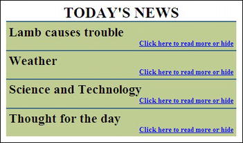
Figure 13-5. I have taken the simplest version of Karl Swedberg’s technique and added a few, user-friendly embellishments.
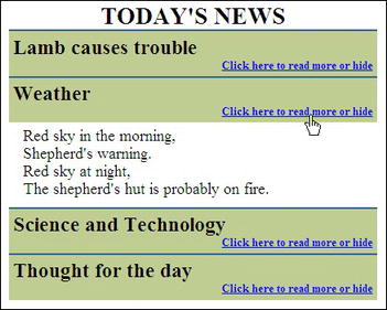
Figure 13-6. The news item is expanded when clicked.
The code for creating a page of headlines with a show/hide facility in Figures 13-5 and 13-6 is shown in Listing 13-5.
Listing 13-5. Creating a Show/Hide Page with jquery (show-hide.html)
<!doctype html>

<html lang=en>

<head>

<title> Show/hide text from learningjquery.com</title>

<meta charset=utf-8>

        meta details go here

<script src="jquery.js" type="text/JavaScript">

</script>

<script type="text/JavaScript">

$(document).ready(function() {

$('div.demo-show:eq(0)> div').hide();

$('div.demo-show:eq(0)> h3').click(function() {

$(this).next().slideToggle('fast'),

});

});

</script>

<style type="text/css">

body { font-size:110%;

}

.demo-show { width: 400px; margin:0 auto 0 auto; text-align:left;

}
h1 { font-size:150%; font-weight:bold; margin:5px 0 0 0;
}
.demo-show h2 { font-size:130%; margin:0; background: #bfcd93; 
border-top: 2px solid #386785; border-bottom:0; padding:5px 0 0 5px;
}
.demo-show h3 { font-size:small; margin: 0; color:blue; text-decoration:underline;
cursor:pointer; background: #bfcd93; text-align:right; padding:0 5px 5px 0;
}
.demo-show div { margin:0 0 5px 10px; padding:5px;
}
span.link { font-size:small; color:blue; text-decoration:underline; text-align:right;
}
#container { width:450px; margin:auto; text-align:center;
}
</style>
</head>
<body>
<div id="container">
<h1>TODAY'S NEWS</h1>
<div class="demo-show">
<h2>Lamb causes trouble</h2>
<h3>Click here to read more or hide</h3>
<div>Mary had a little lamb<br>that walked into some soot<br>And everywhere
that Mary went<br>His sooty foot he put
</div>
<h2>Weather</h2>
<h3>Click here to read more or hide</h3>
<div>Red sky in the morning,<br>Shepherd's warning.<br>
Red sky at night,<br>The shepherd's hut is probably on fire.
</div>
<h2>Science and Technology</h2>
<h3>Click here to read more or hide</h3>
<div>Scintillate, Scintillate globule ethereal<br>How I contemplate your
structure and material.<br>(with apologies to twinkle twinkle little star)
</div>
<h2>Thought for the day</h2>
<h3>Click here to read more or hide</h3>
<div>"Give me golf clubs, fresh air and a beautiful woman partner,<br>
and you can keep your clubs and the fresh air."<br>Jack Benny
</div>
</div>
</div>
</body>
</html>
An internal style was used in Listing 13-5 for convenience only. The second block of JavaScript code is shown, but it would normally be extracted into an external file and named show-hide.js. The markup would then call the JavaScript file like this:
script src="show-hide.js" type="text/JavaScript">

</script>
The first piece of JavaScript calls the file jquery.js; this is the engine that drives this technique.
The first line of the next block of JavaScript is $(document).ready(function() {
It is saying, “When the page is loaded, execute the next JavaScript lines.”
In the HTML markup all the news items are enclosed by a <div> with the class demo-show.
<div class="demo-show">

        News snippets go here

</div>
Each news item is written within a markup group like the following (shown in bold):
<h2>Lamb causes trouble</h2>

<h3>Click here to read more or hide</h3>

<div>Mary had a little lamb<br>that walked into some soot<br>And everywhere

that Mary went<br>His sooty foot he put

</div>
The second line of JavaScript interacts with the user. The line $('div.demo-show:eq(0)> div').hide(); targets each <div> within the demo-show class and hides the content of the <div>.
The next two lines target the <h3> tags within the demo-show group:
$('div.demo-show:eq(0)> h3').click(function() {

$(this).next().slideToggle('fast'),

);
They trigger a fast, toggle action that makes the content of the <h3> tags into links. These links show or hide the divs containing the expanded news item.
The CSS styles make these links blue and underlined to indicate that they are live links.
Finally, a cursor is added to the links in the CSS relating to the <h3> targets. The link and cursor styles are shown in bold type.
.demo-show h3 {  font-size:small; margin: 0; color:blue;

text-decoration:underline; cursor:pointer; background: #bfcd93;

text-align:right; padding:0 5px 5px 0;

}
![]() Note The cursor name
Note The cursor name pointer is a misnomer; you would expect it to be an arrow, but it is actually a hand.
The new HTML5 <details> and <summary> tags provide a show/hide feature but at the time of writing only Chrome them. As a result, I have been unable to test the proposed markup properly without a reasonable range of browser support. When this feature is used, the <summary> element will be clickable to expand or shrink the details.
Show/Hide in HTML5
The markup for the new HTML5 show/hide feature will be something like this:
<details>

<summary>Was the Mona Lisa a paint by numbers kit?</summary>

<p>No, Leonardo used a graphics program on the world’s first computer, Colossus </p>

</details>
Usefulness
A useful web site will become a popular web site. For example, a manufacturer of quiz-buzzers could become more popular than other quiz buzzer manufacturers if his web site contained useful things such as quiz questions and instructions on a variety of alternative quiz games. A web site is useful if it has a recognizable branding, an easily understood navigation system, and a simple means of searching the web site.
Boost the Site’s Image with a Favicon
The word favicon stands for favorites icon. Such icons can add a touch of importance to a web site simply because all the big names have a favicon. They are also useful for site recognition and branding. More importantly, it is useful, it helps the user to quickly identify a particular site in the Favorites list (bookmarks list) and on a browser tab. Figure 13-7 shows the the favicon on my computer-help web site.
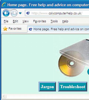
Figure 13-7. The “C” in the Address field and in the tab is the favicon for http://www.colycomputerhelp.co.uk
The favorites that stand out in a Favorites or History list, are the ones that have a favicon as shown in Figure 13-8.
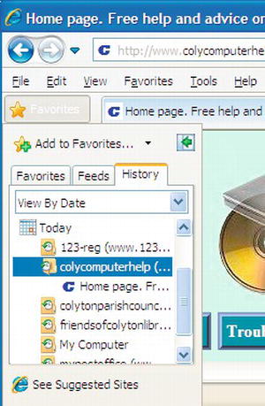
Figure 13-8. The “C” favicon stands out in the Favorites list.
Creating the Favicon
A favicon must be a 16-pixel square, which means that, because it is so small, you can forget about fine detail. In Figure 13-9 the Coly Computer Help favicon is shown enlarged; it demonstrates that favicons cannot show sharp detail. However, this does not matter as long as you simplify the content.

Figure 13-9. The Coly Computer Help favicon
Use some ingenuity and choose a meaningful icon.For my web site (http://www.colycomputerhelp.co.uk), I chose the first letter of the URL; that is, “C” in a distinctive uppercase font in blue. Use a color if you can; it will make it stand out in the Favorite’s list and on browser tabs. Shrink the image down to 16 × 16 pixels and save it as a .gif or .png file. It is important to save it as a 16-color image; otherwise it will become very blurred. Now it must be converted to an .ico file and renamed favicon.ico.
![]() Tip Many paint programs are unable to save an image in the
Tip Many paint programs are unable to save an image in the .ico format. Adobe Photoshop needs a plug-in and Paint Shop Pro 7 to 9 will not save in the .ico format. The free programs GIMP and IrfanView save .ico files. IcoFX is a free program for producing icons. It is available for download from http://www.icofx.ro. Although it is rather tricky to use, once mastered, it is a useful utility. As you would expect, it takes .png and .gif image files and saves the resulting icon as an .ico file.
Upload the favicon icon to your root directory at the host, it must be named favicon.ico. You do not have to add anything to the HTML code. However, if you wish to play safe, or the favicon does not show on a particular browser, you can add a link in the <head> section of the page like this:
<link rel="shortcut icon" href="favicon.ico">
All the browsers except Chrome will show the favicon on the left of the address bar. All except Chrome will show it on browser tabs and in the Favorites list (bookmarks).
![]() Caution If you have several web sites and each one has a favicon, they must all be named
Caution If you have several web sites and each one has a favicon, they must all be named favicon.ico. Clearly, to avoid confusion you must take great care to store them apart in folders relating to each web site.
There is a potential problem. After uploading the favicon, you may find it does not show up in the address bar although it might appear on a browser tab. This means that a copy of the previous non-favicon version of your page is stored in your browser’s cache, the old version is being displayed. You will need to empty the browser’s cache. Alternatively, look at that web site on another person’s computer or on one of your other computers. If you can see the favicon in another computer or in a different browser, then you know it was successfully loaded even though you can’t see it in your usual browser while the old page is in your cache.
Usefulness for Visitors and Owners
A web site is most useful if it contains everything the visitor need to know. It is less useful if the information is not easily accessed, not clear, or missing. It is useful if it is frequently updated and contains items that cause the visitor to return again and again. A page printer button also makes a web page more useful and it will save ink and paper (see Chapter 17 for the page printer button).
On the home page and all other pages of a commercial site, make it easy for visitors to contact the owner of the web site. The information could be included in the footer of each page. This way, no matter which pages are saved or printed, visitors will retain that important information. However, this could create a maintenance problem—if you change one of the items, every page will have to be changed. Or if you prefer to have the information on one page, use the Contact Us page or the About Us page. These pages should include an enciphered email address or a link to a feedback form so that visitors can readily email the owner; the owner’s phone number; and the owner’s postal address. Contact details—postal address and telephone number—are essential to instill confidence and to meet legal requirements. Sensible visitors do not order from sites that have no postal address or telephone number. Also include business registration numbers and links with appropriate trade associations so that the customer can check the reputation of the business.
If the site owner wants people to order items online, give the user all the information necessary to order immediately and with confidence. You must display prices: a sale will most probably be lost if the visitor has to stop and telephone for prices. Don’t hide information such as sales tax and delivery costs. A potential order will probably be abandoned if extra costs are suddenly tacked on at the end of the order process. Warn the customer in advance about the additional costs.
Don’t Baffle the User
The navigation system (the menu) must be crystal clear. The clearer the navigation, the more useful the site. To decide what to put in the menu, ask the question, “What might the visitor want to learn from this web site?” Better still, ask other people what information they would wish to find on the web site. For example, the menu buttons for a bed-and-breakfast web site might include Any Vacancies?, Prices, Location, Accommodations, Booking Form, About Us, and Contact Us.
Make it easy for the visitors to do two things:
- Get the information they are seeking quickly and easily.
- Be able to move easily and logically from one page to another.
Information is useless if users can’t find it easily and quickly.
The best navigational menu buttons are colored, non-pictorial buttons with contrasting text. Do not to use wordless pictures for menu buttons because navigation then needs to be explained; that is, you will have to tell people to click the picture for more information. Visitors expect a straightforward, horizontal or vertical menu that needs no explanation. If you have a large number of menu items, then use both horizontal and vertical menus on the page. Make the horizontal buttons bigger than the vertical buttons. Make sure site visitors do not feel bewildered or trapped. Test the web site with people who are not expert surfers. You have failed if your “guinea pig” says, “What do I do next?”
Avoid JavaScript drop-down menus. These hide the information the visitor is searching for (most unfriendly). Try not to use too many pages of sub-menus. Search engines are unable to penetrate JavaScript menus, that means that your home page will be the only page indexed by the search engines. This ensures that your site will have a very low ranking unless your site is about a unique topic. Also, a JavaScript menu can be difficult, if not impossible, to use on mobile and tablet browsers.
Don’t confuse visitors with lots of bits and pieces scattered randomly over the page. Make only one main point or topic per page. Layout each page so that the user can focus on your main point. A busy page fails to direct the user to the key feature. Show things in related groups.
Practice consistency. Use the same navigation buttons in the same position on every page. Use the same background color and font on every page. This is easily achieved by making a template from your home page. The style sheet should also ensure consistency.
Ensure that visitors know which page they are on and what each page will do for them. If visitors cannot work it out immediately, they will go elsewhere. Put a brief, explanatory heading at the top of the page so that people can see what the page is about without scrolling down. People will scroll down, but only if they are reasonably sure that there is something of interest to them on the rest of the page.
Avoid underlined words or phrases. Visitors will think these items are hyperlinks. And an underline can hide an underscore. Designers who underline text are revealing their age; underlining is a throwback to the days of ancient mechanical typewriters. Underlining is completely unnecessary now that you can use bold or a bigger font or color to emphasize a word or phrase.
Adding a Search Field to a Web Site
A search field can increase a web site’s usefulness or it can draw people away from your site, depending on how it is implemented. If you choose to provide search capability on only your own web site, this presents no problem. The searches concentrate on your web site, but occasionally one or two other web sites might show up on the search results. If you choose the code for searching the entire internet, then users will be tempted to explore some of the search results and abandon your web site; not a good idea. Next, I describe the web site search-box code provided by the three dominant search engines: Bing, Yahoo!, and Google.
Bing Search Box
Add a Bing search box that will only search your web site, as shown in Figure 13-10.
Figure 13-10. Add a Bing search field
The main search engines provide code snippets. Bing is the easiest to install. Listing 13-10 shows how to include a Bing search box in a web page.
Listing 13-10. Including a Bing Search Box in a Web Page (bing-search.html)
<!doctype html>

<html lang=en>

<head>

<title>Bing search box</title>

        <style type="text/css">

        #bingbox img { margin-bottom:-7px; border:none;

        }

        </style>

</head>

<body>

<div id="bingbox"><br>

<p>

<form method="get" action="http://www.bing.com/search">

        <input type="hidden" name="cp"value="1252">

        <input type="hidden" name="FORM" value="FREESS">

        <a href="http://www.bing.com/">

        <img rc="http://www.microsoft.com/presspass/_resources/images/

        img_windowsBingLogo.png" alt="Bing" ></a>

        <input type="text" name="q" size="30">

        <input type="submit" value="Search Site">

        <input type="hidden" name="q1" value="site:www.yourweb site.com">

</form>

</p>

</div>

</body>

</html>
The following notes refer to the bold items in Listing 13-10:
- The internal style removes the border from the Bing logo and pushes it down in line with the field.
<p>Bing uses a table here but because tables are deprecated, I changed the markup to a paragraph.- Change the figure 1252 to match the code page number of the
charsetyour web site is written in. For example, the number will be1252if your web site has<charset:windows-1252>in the head section. The number will beutf-8if your web site has<charset:utf-8>in the head section.- The URL is not
<input type="hidden" name="q1" value="http://www.yourweb site.com">as you would expect, but it must include the word “site” as follows:<input type="hidden" name="q1" value="http://site:www.your-web-site.com">Don’t forget to replace
www.your-web-site.comwith your own web site address.
Yahoo! Search Box
Although Yahoo! has united with Bing, some large organizations use Yahoo! as the default search engine on their web sites. Since many users are familiar with the Yahoo! interface, it is included in this section. For the Yahoo! search box code, go to Yahoo! at http://search.yahoo.com/info/ysearchbox_instructions.html or use Listing 13-11.
Figure 13-11 shows an enlarged view of one of the four available Yahoo! search boxes.
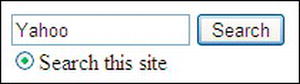
Figure 13-11. The Yahoo! search box
Four formats are available, but the instructions are rather confusing. I have simplified the Yahoo! code, as shown in Listing 13-11.
Listing 13-11. Include Yahoo! Search Box on a Web Page(yahoo-search.html)
<p class="search">

        <form method=get action="http://search.yahoo.com/search">

        <a href="http://search.yahoo.com/"></a>

        <input type="text" name="p" value="Yahoo" size=15>

        <input type="hidden" name="fr" value="yscpb">

        <input type="submit" value="Search"><br>

        <input type="radio" name="vs" value="http://www.your-web-site.com"

        checked="checked">Search this site

        </form>

</p>
Insert your own web site URL in place of www.your-web-site.com.
Google Search Box
Figure 13-12 shows one version of the various downloadable Google search boxes suitable for a web site.
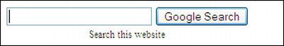
Figure 13-12. Add a Google search field
Google requires that you sign up to an account and then it presents you with a rather baffling form to fill. To avoid all this hassle, Dave Taylor has simplified and improved the Google code. See his web site at www.askdavetaylor.com/how_can_i_add_a_google_search_box_to_my_website.html.
Listing 13-12 is an adaptation of Dave Taylor’s code. An internal style sheet is used for illustration purposes only. No Google account is needed. It shows how to install a Google search box in a web page.
Listing 13-12. Inserting a Google Search Box in a Web Page (google-search-1.html)
<!doctype html>

<html lang=en>

<head>

<title>Google search field by Ask Dave Taylor</title>

<meta charset=utf-8>

        <style type="text/css">

        #outerbox { border:1px solid black; padding:4px; width:300px; height:40px;

        text-align:center; font-size:75%;

        }

        .googlebox { display:inline;

        }

        .hidden { display:none;

        }

        </style>

</head>

<body>

<div id="outerbox">

<p class="googlebox">

        <form method="get" action="http://www.google.com/search" >

        <input type="text" name="q" size="25" maxlength="255" value="">

        <input type="submit" value="Google Search"><br>

        <input class="hidden" type="checkbox" name="sitesearch"

          value="my-web-site.com" checked="checked">Search this web site

        </form>

</p>

</div>

</body>

</html>
For your own web site, change the URL shown in bold type in Listing 13-12.
Figure 13-13 shows the header on my web site. It contains the Google search box using my simplified version of Dave Taylor’s code (see Listing 13-13).
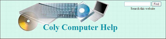
Figure 13-13. I have simplified the Google search for the web site; no Google account is needed for this.
In Listing 13-13a, I have embedded the Google search box in a page heading and I have further simplified Dave Taylor’s code. As previously mentioned, no Google account is needed.
Listing 13-13a. Embedding a Google Search Box in a Web Page (google-search-2.html)
<!doctype html>

<html lang=en>

<head>

<title>A page with a search field using Google</title>

<meta charset=utf-8>

<link rel="stylesheet" type="text/css" href="search.css">

</head>

<body >

<div id="hdr">

<h1 >Coly Computer Help</h1>

<div class="search">

        <form method="get" action="http://www.google.com/search">

        <input type="text"   name="q" size="15" maxlength="255" value="">

        <input type="submit" value="Find">

<input type="hidden" name="sitesearch" value="http://www.your-web-site.co.uk"><br>
Search this web site
</form>
</div>
</div>
</body>
</html>
For your own web site, change the URL shown in bold type.
Listing 13-13b is the CSS style sheet for HTML in Listing 13-13a.
Listing 13-13b. The CSS Style Sheet for Listing 13-13a (search.css)
/*reset browsers for cross-client consistency*/

html,body,h1,h2,h3,h4,h4,h5,h6,p {margin:0; padding:0

}

img { border-style: none; float: none; margin-left: 0px; margin-right: 0px;

}

body { text-align:center; background-color:#D7FFEB; color:black;

font-family: "times new roman"; max-width:1024px; min-width:800px; font-size: medium;

color: #000000; margin: auto; width:95%;

}
/* set header height and background image */

#hdr{ margin-top:0; margin-bottom:0; background-position:45% top; background-image:url('images/compbkgcrop.jpg'), background-repeat:no-repeat; height:160px; padding-bottom:0;

}

h1 { padding: 110px  0 0 12%; margin-bottom:0; font-family :"times new roman";
font-size: 250%; color: #0080a0;; font-weight:bold;

}

#hdr { position:relative;

}

.search { position:absolute; top:10px; right:40px; height: 56px;

}
Summary
This chapter described the features that make a web site attractive to visitors. It also showed ways to tempt visitors to explore beyond the home page. A section on usefulness emphasized that even an attractive site will be abandoned or never revisited if it is not useful. Tips for creating useful features were provided. Consult this chapter frequently and apply its advice as you try other projects in the book.
In the next chapter, you will learn the basic requirements for making web sites accessible to the disabled user, in particular to the blind and partially sighted. Many countries including the United States and the United Kingdom have either made recommendations or have passed laws regarding web site accessibility, and you will be made aware of the main points of these. Apart from the legal aspect, the chapter also explains that accessibility also offers advantages to able-bodied users.