
C H A P T E R 14
Accessibility
In the United States and the United Kingdom, one in three adults is over the age of 50 and some of these will have visual problems. It would be folly to prevent these people from accessing your web site. Many e-commerce sites have seen a marked increase in sales after making their web sites accessible to the blind and partially sighted. This chapter mainly deals with methods of helping partially sighted and blind persons to explore web sites. The severely visually handicapped and the blind can use a screen reader (speaking browser) that turns the textual content of a web site into speech. Screen readers can also explain the layout of a web page to the user as well as describing the nature of each element in the markup. Later in the chapter you will learn more about screen readers and how to design web sites that these devices can understand. We will first refer briefly to the current laws and guidelines on accessibility.
Laws and Guidelines
Australia and the United Kingdom have laws regarding accessibility of web sites for the visually impaired; other countries such as Sweden, Ireland, and Japan have produced guidelines.
In the United States, some states have issued guidelines, and at the time of writing, the US Department of Justice Civil Rights Division is considering Federal regulations for web site accessibility. Meanwhile W3CAG2 and WAI are the main forces behind the implementing of accessibility recommendations. WCAG2 is the acronym for Web Content Accessibility Guidelines (http://www.w3.org/TR/WCAG/). WAI is the Web Accessibility Initiative (http://www.w3.org/WAI/).
United Kingdom law states that it should be possible or reasonably possible for disabled persons to use a web site. The law is known as the DDA which stands for Disability Discrimination Act. Australia has adopted the DDA as the basis of its own law
There is no need to panic and start re-designing all your web sites to conform to the law, but make an effort to amend those web sites that are most likely to be explored by the partially sighted or by blind persons, especially those using screen readers. This will demonstrate that you have tried to make those sites reasonably accessible. When designing a new web site you should bear in mind the lessons to be learned from this chapter.
Most countries including UK and Australia have adopted the WCAG2 guidelines as a basis for their own laws or guidelines.
The WCAG2 Guide has three standards.
A: Minimal (but absolutely essential) conformance to the WCAG2 guidelines
AA: Medium conformance to the WCAG2 guidelines
AAA: Full conformance to the WCAG2 guidelines
Web sites must at least conform to both A and AA. If possible, try to conform to AAA.
The W3 and WAI status on accessibility specifications can be found at http://www.w3.org/WAI/intro/components.php. A list of check points is available from http://www.w3.org/TR/WAI-WEBCONTENT/checkpoint-list.html.
![]() Note The W3 WAI guidelines and the United Kingdom guidelines are similar. The following web sites give good advice on accessibility:
Note The W3 WAI guidelines and the United Kingdom guidelines are similar. The following web sites give good advice on accessibility: http://www.w3.org/WAI/PF/aria/; http://www.w3.org/WAI/intro/aria.php; http://www.webcredible.co.uk/user-friendly-resources/web-accessibility/uk-website-legal-requirements.shtml; and http://dev.opera.com/articles/view/introduction-to-wai-aria/.
We will now discuss the help that web designers can provide for users with partial sight or color blindness. These users will not have reached the stage where they need screen readers. Web designers can make the web site more legible for the partially sighted by applying a few basic rules, and these will be described in the next section.
Help for the Partially Sighted and Color Blind
This section deals with factors that assist the partially sighted and color blind, but the able bodied will also benefit from the section’s recommendations. It covers color contrast, text style/size, ease of navigation, and testing.
Color contrast ratios for text and background colors must meet certain standards.
- Hyperlink color should always be in a high-contrast color that is different from the normal text color.
- Text and background should have a contrast ratio of at least 4.5:1 at AA level, and 5:1 at AAA level. For specific recommendations, see
http://www.w3.org/TR/WCAG/.- Large text (extra-large normal or large bold) should have a contrast ratio of at least 3:1.
![]() Caution Ensure that your CSS style code contains both background color and foreground (text) color. For example,
Caution Ensure that your CSS style code contains both background color and foreground (text) color. For example, { …color:black; background-color:white; }. Do not split text and background colors between CSS and HTML. Be sure to define them both in one place.
![]() Tip The Juicy Studio web site http://
Tip The Juicy Studio web site http://www.juicystudio.com/services/luminositycontrastratio.php has an excellent online contrast ratio tester, just enter the hex codes for your background and foreground (text) colors. Or try the Snook.ca’s Colour Contrast Check athttp://www.snook.ca/technical/colour_contrast/colour.html.
My favorite analyzer, CCA-2.2 (see Figure 14-1), is available for downloading to your hard drive.
Download the zip file CCA-2.2.zip from http://www.paciellogroup.com/resources/contrast-analyser.html
You my have already downloaded CCA-2.2 when following Chapter 12. The instructions to do so are as follows: Scroll down the home page of the Paciello Group web site until you see Download and a list of language versions. Click the appropriate language version to download the zip file. Unzip it into a new folder then create a desktop short cut to access the file CCA-2.2.exe.
Figure 14-1 shows the Color Contrast Analyser (CCA-2.2) interface.
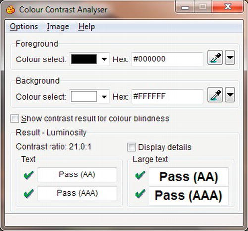
Figure 14-1. The CCA-2.2 color contrast analyser
To use the color contrast analyzer, follow these steps:
- Double-click the short cut on the Desktop (note that the spelling of color in the CCA interface is the UK and Australian colour).
- Select the foreground color (text color) either by using the drop-down arrow or by typing in the hexadecimal number.
- Select the background color in the same way.
- In the bottom panel, you will see the contrast ratio and you will be informed whether the contrast meets the AA or the AAA standard.
- Change the hexadecimal code a little at a time until you achieve the required color contrast.
- Make a note of the hexadecimal color code and use it to amend your CSS style sheet.
- Try this experiment for color blindness: choose the most common form of color blindness using a green foreground and a red background. Now tick the box labeled “Show contrast result for color blindness.” The bottom panel will expand to show the effect of those colors on three different forms of color blindness.
- If you click Options on the menu you can adjust the colors by means of sliders.
To put things in perspective, let’s look at an example of a color contrast change. A client asked me to use red menu buttons with white labels. The contrast ratio for white on red is 4:1. An almost identical red #D20B0D gave a much better contrast ratio of 5.4:1. Using this new red I was able to please the client and also make the text on the menu buttons visible to the partially sighted. Color contrast is not the whole story; we must also consider the size of the text.
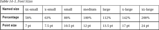
Allow partially-sighted users to change the text size by using their own CSS style sheet. Even without a special style sheet the user can change the text size; for instance in IE under Tools, select Internet Options, then select Accessibility to choose the font size. When designing the web site, do not use fixed sizes such as pt or px; always specify named font sizes or percentages according to Table 14-1. For example, the following code selects the named font size medium:
body { background-color:#d7ffeb; font-family: Arial; font-size: medium; color: #000; }
![]() Caution Do not use a color selection for navigation. An example of a bad piece of navigation would be “Click the green button to go to next page. Click the red button to return to previous page.” Such instructions are useless to the severely visually-impaired and to the user who is red/green color blind.
Caution Do not use a color selection for navigation. An example of a bad piece of navigation would be “Click the green button to go to next page. Click the red button to return to previous page.” Such instructions are useless to the severely visually-impaired and to the user who is red/green color blind.
Avoid entire sentences and paragraphs in uppercase letters or italics. The shapes of lowercase letters are easier for everyone to read, including partially-sighted persons.
Also avoid justified textbecause it difficult to read, even for able-bodied users. This is because of the large variations in the gaps between words. The large gaps can particularly cause problems for those using screen readers and magnifiers. Users half way through a line of text can be fooled into thinking they have reached the end of the line, causing them to move down to the start of the next line.
General Advice
The following tips will greatly assist the visually handicapped:
- You could create alternative pages that use a different style sheet, giving high contrast. For an excellent example, see
http://www.juicystudio.com/services/luminositycontrastratio.php.The second button on the Juicy Studio menu loads high-contrast pages. This is not a suitable solution if you have several pages because both versions of each page would have to be updated. Also, search engines do not like duplicate pages.
- Organize pages so they can be read in a logical sequence when the style sheet is turned off.
- Avoid JavaScript for navigation and functions other than buttons such as Print this Page, Bookmark this Page, and Return to Previous Page. These are acceptable only because they duplicate functions that are available in all the browsers.
- When providing information in PDF format, provide the same information in an alternative, accessible format (e.g., HTML or text) or provide links to the tools provided on the Adobe web site. Adobe is improving the PDF format so that it may soon be possible for screen readers to read PDF files.
- Ensure that links and page elements are keyboard navigable; create a logical tab key order for them.
- Do not cause pop-ups or other windows to appear without first warning the user.
- Give each page a unique
<title>so that users know where they are within the site.- Do not use tables for page layout. Use CSS for positioning items on your page. Table-based layouts are not suitable for disabled users. Most automated compliance scanners reject them because they cannot differentiate between data and layout tables.
- Avoid the use of ASCII art such as the “less than” (<) and “greater than” (>) symbols for pointing to something. Screen readers will read out its meaning, which is “less than” or “greater than.” Use a Webding arrow or some text instead.
- Add a duplicate menu and Back to Top links at intervals on long pages.
- Do not use too many radio buttons and checkboxes because they make the form harder to complete.
- To assist people with hand tremors, ensure adequate space between fields, checkboxes, menu buttons, and radio buttons.
- Graphical menu buttons are accessible as long as the title/alt text describes the purpose of each button.
- JavaScript drop-down menus are inaccessible to screen reader users. Drop-down menus in PHP or ASP are accessible.
- Ensure that the
<html>tag contains a language specification so that the screen reader can interpret the page correctly. For example,<html lang=en>for English.- All images that convey useful information must contain tool tips by using
altandtitle. Images that are purely decorative convey no useful information; therefore, the correct alt/title for those images would be an empty alt (alt=" ") and any empty title would be (title=" "). Screen readers do not read out emptyaltortitlestrings.- Ensure that videos have subtitles so that the deaf can understand and enjoy them.
- The Tab key should provide a logical sequence for the benefit of disabled users who are unable to use a mouse. The default tabbing order is logical, so do not change it.
- Use brief, simple language.
- Text depicted by means of an image is useless because screen readers cannot read it. If you use an image containing text, make sure you include an
"alt"tooltip that provides the text for the screen reader.- This tip is most important: make absolutely sure that audio and video clips are neither autostart nor
onmouseover. The sudden noise can cause blind or partially-sighted users to jump out of their skins. Always useonmousedownto start an audio or video clip and give an explanation and a warning.- Add a “Skip to main content” link at the start of each page (but not the home page) so that the screen reader user can skip straight to the content and does not have to repeatedly trawl through the navigation menus. Some designers do this by locating a normal link, or an image, or a 1-pixel GIF image (therefore, invisible) at the start of each page with the title text “Skip to main content.” Be sure that the wording is not “Skip to content.” Make the link jump to an anchor (bookmark) at the start of the page content.
<a href="#maincontent">

<img title="Skip to main content" src="onepx.gif" height="1" width="1"

border="0"

alt="Skip to main content"></a>

navigation menu which is to be skipped goes here

<!--Start of main content-->

<a id="maincontent"></a>

main content goes here
A minor drawback to this method is that the sudden appearance of a previously invisible link could confuse the sighted user. You might find it better to use a visible link; the choice is yours.
![]() Tip Valuable information can be gleaned from the Royal National Institute for the Blind web site. (http://
Tip Valuable information can be gleaned from the Royal National Institute for the Blind web site. (http://www.rnib.org.uk/webaccesscentre and www.rnib.org.uk/seeitright). RNIB uses the free WAVE program to monitor accessibility. RNIB checks the validity of the HTML and CSS with the WC3 and WDG validators. It browses the web site using various graphical browsers and Lynx, and listens to how the web site speaks using Freedom Scientific’s JAWS (Job Access with Speech).
Testing Your Web Sites for General Accessibility
Designers could ask a partially sighted or a blind person to act as a guinea pig to test a web site for accessibility. However, this may not be possible or practical, so here are some tests that you can carry out yourself. Use the following checklist to see if your web site is accessible:
- Validate the code on your web pages using the W3C online validator at
http://validator.w3.org- Rest the cursor on each image and each link to ensure that tool tips, alts, and titles show up.
- Turn the volume down to see whether any audio content has text equivalents.
- Use the browser to enlarge fonts and see if the page is still viable.
- Resize the browser window to see if the page content is satisfactory at smaller widths.
- Ensure that the user does not need to scroll horizontally to an unreasonable extent at low resolutions.
- Check that labels and title tags on menu links clearly indicate their destination.
- Make sure that the disabled can use the keyboard to navigate through the links and form fields. Use the tab key to check this.
- Use clear, brief, simple text, split it into bite-size chunks with informative headings.
- Use front-loading content so that each paragraph begins with the conclusion.
- Use ordered or unordered lists where appropriate.
- Remove all items that flash or flicker, including marquees.
- Make absolutely sure that audio and video are not set to autostart or
onmouseover.
Screen Readers for the Blind and Severely Visually-Impaired
The blind and the severely visually-impaired can use computers with the aid of a screen reader, sometimes called a “speaking browser,” or to use the stilted jargon beloved of techies, “assistive technology.” Screen readers do not actually read the screen, they read the source code. For an interesting audio demonstration of a screen reader and tables visit http://www.xstandard.com/en/articles/wysiwyg-editors-and-bad-markup/
![]() Tip A free, open-source screen reader with demonstration video is available at
Tip A free, open-source screen reader with demonstration video is available at www.nvda-project.org. Preliminary reports suggest that NVDA’s HTML5 support is more advanced than some commercial programs. NVDA is designed for use with Mozilla Firefox. It has a user’s guide; further tips are available athttp://www.marcozehe.de/articles/how-to-use-nvda-and-firefox-to-test-your-web-pages-for-accessibility/.
Screen readers and search engines rely on heading tags <h1> to <h6>. When using a screen reader, the user taps the H key to jump from heading to heading. The heading is spoken by the screen reader so that the user can decide whether the headed section is what he is looking for. If your page has no <h1> to <h6> headings, the screen reader says, “There are no headings on this page,” and the user is left floundering.
In the early 1990s, headings were often wrongly regarded as a way of making text bolder, bigger, or smaller. This is not surprising because W3Schools.com has this rather vague instruction: “<h1> defines the largest heading and <h6> defines the smallest heading.”
The correct definition is: “<h1> is the most important and <h6> is the least important.”
You may have avoided using <h1> to <h6> in the past because of the big gaps above and below the text. This is now easily remedied using CSS. For screen readers, the important heading should be at the top of the page and the least important at the bottom. Headings that appear earlier in the code are more important (and search engines and screen readers will regard them as being more important).
- A heading should be brief and accurately describe the topic of the paragraph it introduces.
- Use CSS to make the headings any size and any format you wish (see Figure 14-3).
- Start with
h1and never skip a heading; for instance, don’t jump fromh2toh5.
Figure 14-2 shows the default heading sizes and line spacing.
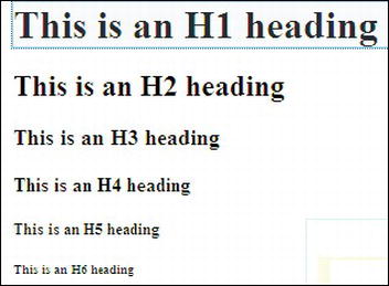
Figure 14-2. Unformatted headings (note the double-spacing between the lines of text)
Figure 14-2 shows the default heading styles. Figure 14-3 shows the headings when they are formatted using the CSS that is included in Listing 14-3. You would probably never change the font size in a real world page, this is simply a demonstration to prove that headings can be formatted. However, you could usefully change the line spacing for headings.
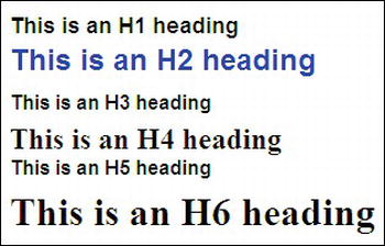
Figure 14-3.The appearance and size of each heading and the line spaces are changed by the use of CSS. Fortunately, screen readers will still recognize the headings as H1, H2, and so on.
Listing 14-3 shows the formatting applied to each heading. The heading size and line spacing can be changed to improve the appearance of a page for fully-sighted persons. A screen reader still accepts the hierarchy of the headings and it reads them out in order of importance. In other words, visually-impaired users understand the structure of the page because they hear the main heading (H1) spoken first, followed by H2, H3, and so on. Users move from heading to heading by pressing the H key.
Listing 14-3. Formatting the HTML Headings (hformatted.html)
<!doctype html>

<html lang=en>

<head>

<title>Formatted headings</title>

<meta charset=utf-8>

        <style type="text/css">

        h6 {font-size:200%; font-family:"Times New Roman"; margin-top:-20px;

        }

        h5 {font-size:medium; font-family: arial; margin-top:-10px;

        }

        h4 {font-size:150%; margin-top:-10px; margin-bottom:10px;

        }

        h3 {font-size:medium; font-family: arial; margin-top:-10px;

        }

        h2 {color:blue; font-family:arial; margin-top:-10px;

        }

        h1 {font-size:110%; font-family: arial;

        }

        </style>

</head>

<body>

<h1>This is an H1 heading</h1>

<h2>This is an H2 heading</h2>

<h3>This is an H3 heading</h3>

<h4>This is an H4 heading</h4>

<h5>This is an H5 heading</h5>

<h6>This is an H6 heading</h6>

</body>

</html>
Data Tables and Screen Readers
Data tables present a major problem for the visually impaired. If a table is not constructed to suit the way a screen reader works, a table with many columns is impossible to understand. The top row of headings will be spoken first, then the second row of cells will be spoken but with no reference to the headings, then the third row of cells, and so on. Unless the visually-impaired user is able to memorize all the headings, the rows will be unintelligible.
This section gives examples of tables varying from a simple, two-column table that needs no memorizing of headings, to tables with four columns with headings that would ordinarily have to be memorized. This section describes several methods of making the tables work with screen readers. Using these techniques, the column headings are linked to the cell content and spoken as the user moves along each row. The methods can be extended to more than four columns by adding extra columns to the markup.
![]() Note Tables should only be used to present data. Accessible pages must never contain layout tables.
Note Tables should only be used to present data. Accessible pages must never contain layout tables.
Data Table with Two Columns
Figure 14-4 shows a simple, two -column data table with content that is read easily by a screen reader and without the need for special tags. However, always use <caption> and <table…summary="…">. This enables screen readers to inform users that they have arrived at a table.
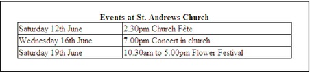
Figure 14-4. Two-column data table
A plain, two-column table needs no headers. A screen reader will read across each row cell by cell and no column headings need to be memorized. Figure 14-4 was created using Listing 14-4, which has an internal style sheet for instructional purposes only.
Listing 14-4. Creating a Two Column Table (simple-2col.html)
<!doctype html>

<html lang=en>

<head>

<title>Two column table with no need for headers</title>

<meta charset=utf-8>

<style type="text/css">

table { width: 500px; border:1px black solid; border-collapse:collapse;
font-family: "times new roman";

}
td { border:1px black solid;
}
th { border:1px black solid;
}
caption { font-weight:bold;
}
</style>
</head>
<body>
<table>
<caption>Events at St. Andrews Church</caption>
<tr>
<td>Saturday 12th June</td>
<td>2.30pm Church Fête</td>
</tr>
<tr>
<td>Wednesday 16th June</td>
<td>7.00pm Concert in church</td>
</tr>
<tr>
<td>Saturday 19th June</td>
<td>10.30am to 5.00pm Flower Festival</td>
</tr>
</table>
</body>
</html>
With tables containing three or more columns, blind users and those with a severe sight problem would have to memorize the headings to make sense of the data. The next example is our first method for overcoming this problem. The difficulty can be avoided by replacing <td> with <th> in the top row of column headings. The tag <th> describes a cell that contains header information.
![]() Note In order to hear the table cells spoken by a screen reader, a visually handicapped person would use the Ctrl+Alt keys and Right Arrow key to move along the rows.
Note In order to hear the table cells spoken by a screen reader, a visually handicapped person would use the Ctrl+Alt keys and Right Arrow key to move along the rows.
Data Table with Three or More Columns
Figure 14-5 shows a more complex, three-column table. A person using a screen reader would first hear the top row of headings, and by using a method for linking cells to headings, the headings would not need to be memorized. The user would place the cursor in the first cell in the row beneath the Place heading. The user would then use Ctrl+Alt and the Right Arrow key to move along the row. The user would hear the following: “Place London, Hotel King Fisher, Cost £200.”
Then tapping only the Down arrow would take the user to the start of the next row, the user would again use Ctrl+Alt and Right arrow to hear this: “Place Colyton, Hotel Leofric, Cost £30”.
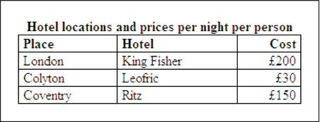
Figure 14-5. Three-column data table
![]() Caution At the time of writing, a table in an HTML5 page could not be read properly by most older screen readers. This especially applied to JAWS (Job Access with Speech). Until the screen readers catch up with HTML5, you will need to use an XHTML 1.0 page to enable blind persons to read your data tables. Any pages in the web site that do not contain data tables can be in HTML5, but avoid using semantic tags until the screen readers are able to support them. Validate the XHTML 1.0 pages in
Caution At the time of writing, a table in an HTML5 page could not be read properly by most older screen readers. This especially applied to JAWS (Job Access with Speech). Until the screen readers catch up with HTML5, you will need to use an XHTML 1.0 page to enable blind persons to read your data tables. Any pages in the web site that do not contain data tables can be in HTML5, but avoid using semantic tags until the screen readers are able to support them. Validate the XHTML 1.0 pages in http://validator.w3.org. See Chapter 18 for tips on validating XHTML 1.0 pages.
All the tables and Figures 14-5 through 14-9 can be read by current and older screen readers provided you use the XHTML DOCTYPE. When the screen readers catch up with HTML5, you could then change to the HTML5 DOCTYPE, but that will create a problem for users with older versions of JAWS. Listing 14-15 creates a table with three headings suitable for screen readers.
Listing 14-5. Creating an Accessible Table with Three Columns (three-col-hotels.html)
<!DOCTYPE html PUBLIC "-//W3C//DTD XHTML 1.0 Transitional//EN" "http://www.w3.org/TR/xhtml1/DTD/xhtml1-transitional.dtd">

<html xmlns="http://www.w3.org/1999/xhtml">

<head>

<meta content="text/html; charset=utf-8" http-equiv="Content-Type" />

<title>Three column table with th headers</title>

        <style type="text/css">

        table { width: 330px; border:1px black solid; border-collapse:collapse;

        font-family: "times new roman";

        }

        td { padding:0 5px 0 5px; border:1px black solid;

        }

        th { text-align:left; padding:0 5px 0 5px; border:1px black solid;

        }

        caption { font-weight:bold;

        }

        .right { text-align:right;

        }

        </style>
</head>
<body>
<table summary="Simple table with headers">
<caption>Hotel locations and prices per night per person</caption>
<tr>
<th>Place</th>
<th>Hotel</th>
<th class="right">Cost</th>
</tr>
<tr>
<td>London</td>
<td>King Fisher</td>
<td class="right">£200</td>
</tr>
<tr>
<td>Colyton</td>
<td>Leofric</td>
<td class="right">£30</td>
</tr>
<tr>
<td>Coventry</td>
<td>Ritz</td>
<td class="right">£150</td>
</tr>
</table>
</body>
</html>
Our second method allows for a slightly more sophisticated table using the tags <thead> and <tbody>. Again, XHTML 1.0 must be used until older screen readers have been replaced by newer versions capable of reading a table in an HTML5 page.
Data Table Using the <thead> and <tbody>
To link data to headers for screen readers, it is necessary to use tags such as <thead>, <tbody>, <th>, <tr>, and <td>. The tag <thead> is the heading area for a table; <tbody> is the area in a table that contains the data (see Figure 14-6).
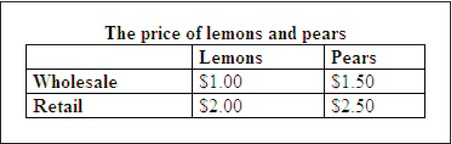
Figure 14-6. A more advanced data table
In Listing 14-6, the <thead> and <tbody> items are shown in bold type.
Listing 14-6. Creating a More Complex Accessible Table (three-col-fruit.html)
<!DOCTYPE html PUBLIC "-//W3C//DTD XHTML 1.0 Transitional//EN" "http://www.w3.org/TR/xhtml1/DTD/xhtml1-transitional.dtd">

<html xmlns="http://www.w3.org/1999/xhtml" xml:lang="en">

<head>

<meta content="text/html; charset=utf-8" http-equiv="Content-Type" />

<title>Three column table with thead and tbody</title>

<style type="text/css">

table { width: 500px; border:1px black solid; border-collapse:collapse; font-family:"times new roman"; font-size:medium;

}

td { border:1px black solid;

}

th { border:1px black solid;

}

caption { font-weight:bold;

}

</style>

</head>

<body>

<table summary="The price of lemons and pears">

                <caption>The price of lemons and pears</caption>

                <thead>

                        <tr>

                                <td></td>

                                <th>Lemons</th>

                                <th>Pears</th>

                        </tr>

                </thead>

                <tbody>

                        <tr>

                                <th>Wholesale</th>

                                <td>$1.00</td>

                                <td>$1.50</td>

                        </tr>

                        <tr>

                                <th>Retail</th>

                                <td>$2.00</td>

                                <td>$2.50</td>

                        </tr>

                </tbody>

        </table><br />

</body>

</html>
Next, we will look at a third way of creating tables giving intelligible speech on screen readers. Cells will be linked to headings using identities (id).
Using id to Link Columns and Rows to Headers
Normally a screen reader reads the cells as if they were <div> tags; for instance, if the table in Figure 14-7 was coded as a straightforward table without ids or header tags, the bottom two rows would be read out by a screen reader as: “To Lisbon No Yes Yes. To Isle of Wight Yes Yes No.”
Not very helpful. I am sure you will agree.
Instead, the table in Figure 14-7 uses id and header information to link the cells to the headings for screen readers.
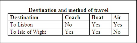
Figure 14-7. Linking columns and rows to headers with <id> and <th>
In the next method, the following code snippets show how each data cell is linked to its column heading and to the first item in its row by adding an <id> attribute to each <th> element. First, each heading is given an id that links it to its <th>. For example:
<tr>

<th id="th1">Destination</th>

<th id="th2">Coach</th>

<th id="th3">Boat</th>

<th id="th4">Air</th>

</tr>
Then the header id is linked to the data in each cell; for example:
<tr>

<td headers="th1">To Lisbon</td>

<td headers="th2">No</td>

<td headers="th3">Yes</td>

<td headers="th4">Yes</td>

</tr>
Each cell is linked to its heading so that a screen reader is able to state the relationship. As the user moves along the row below the headings, it reads the cell’s heading and content like this: “Destination to Lisbon, Coach No, Boat Yes, Air Yes.” Listing 14-7 includes the snippets as follows:
Listing 14-7. Creating an Accessible Table Using id and headers (four-col-travel.html)
<!DOCTYPE html PUBLIC "-//W3C//DTD XHTML 1.0 Transitional//EN" "http://www.w3.org/TR/xhtml1/DTD/xhtml1-transitional.dtd">

<html xmlns="http://www.w3.org/1999/xhtml">

<head>

        <meta content="text/html; charset=utf-8" http-equiv="Content-Type" />

        <title>Four column table with id and th</title>

                <style type="text/css">
                table { width: 330px; border:1px black solid; border-collapse:collapse;

                font-family: "times new roman";

                }

                td { padding:0 5px 0 5px; border:1px black solid;

                }

                th { text-align:left; padding:0 5px 0 5px; border:1px black solid;

                }

                caption { font-weight:bold;

                }

                .right { text-align:right;

                }

                </style>

        </head>

        <body>

        <table summary="Destination and method of travel">

        <caption>Destination and method of travel</caption>

        <tr>

                <th id="th1">Destination</th>

                <th id="th2">Coach</th>

                <th id="th3">Boat</th>

                <th id="th4">Air</th>

        </tr>

        <tr>

                <td headers="th1">To Lisbon</td>

                <td headers="th2">No</td>

                <td headers="th3">Yes</td>

                <td headers="th4">Yes</td>

        </tr>

        <tr>

                <td headers="th1">To Isle of Wight</td>

                <td headers="th2">Yes</td>

                <td headers="th3">Yes</td>

                <td headers="th4">No</td>

        </tr>

        </table>

        </body>

        </html>
The following example uses a fourth method employing the scope attribute instead of the id attribute to associate cell data with its heading and to the first item in its row.
Using Scope to Link Cells and Headings
For tables such as the one shown in Figure 14-8, the id/headers pair can be replaced with the scope attribute. It’s a pity that such a nondescript word was used; something like cell-linker would have explained its purpose better than scope.
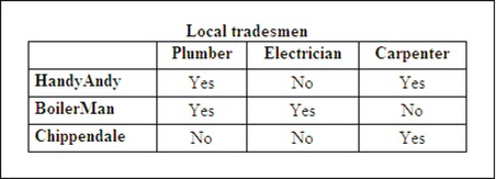
Figure 14-8. Linking cells and headings with scope
Listing 14-8. Creating an Accessible Table Using Scope (four-col-scope.html)
<!DOCTYPE html PUBLIC "-//W3C//DTD XHTML 1.0 Transitional//EN" "http://www.w3.org/TR/xhtml1/DTD/xhtml1-transitional.dtd">

<html xmlns="http://www.w3.org/1999/xhtml">

<head>

<meta content="text/html; charset=utf-8" http-equiv="Content-Type" />

<title> Four column table using scope</title>

                <style type="text/css">

                table { width: 330px; border:1px black solid; border-collapse:collapse;

                font-family: "times new roman";

                }

                td { padding:0 5px 0 5px; border:1px black solid;

                }

                th { text-align:left; padding:0 5px 0 5px; border:1px black solid;

                }

                caption { font-weight:bold;

                }

                </style>

        </head>

        <body>

        <table summary="Linking cells to headers using scope">

        <caption>Local tradesmen</caption>

        <tr>

                <th></th><!--empty cell-->

                <th scope="col">Plumber</th>

                <th scope="col">Electrician</th>

                <th scope="col">Carpenter</th>

        </tr>

        <tr>

                <th scope="row" class="left">HandyAndy</th>

                <td>Yes</td>

                <td>No</td>

                <td>Yes</td>

        </tr>

        <tr>

                <th scope="row" class="left">BoilerMan</th>

                <td>Yes</td>

                <td>Yes</td>

                <td>No</td>
        </tr>

        <tr>

                <th scope="row" class="left">Chippendale</th>

                <td>No</td>

                <td>No</td>

                <td>Yes</td>

        </tr>

        </table>

        </body>

        </html>
We will now look at our fifth example, presenting the same table shown in Figure 14-7 and using a method we learned earlier.
A Further Exercise in Using <th> and id to Link Cells and Headings
In Listing 14-7, we learned how to use <th> with id and headers to link cells to the table headings. We will now use this method on the Local Tradesmen table as an alternative to using scope. The table’s appearance will be identical to Figure 14-8 and for convenience, it is shown again as Figure 14-9 so that you can refer to it as you study the listing.

Figure 14-9. This table is the same as Figure 14-8 but was achieved by using <th>, id and headers instead of scope.
Listing 14-9 creates a four-column table with the same appearances as Figure 14-8 by using id instead of scope. Users of screen readers will hear each data cell related to its heading. The relevant tags and attributes are shown in bold type.
Listing 14-9. Creating Accessible Table Figure 14-9 Without Using Scope (four-col-trade-id.html)
<!DOCTYPE html PUBLIC "-//W3C//DTD XHTML 1.0 Transitional//EN" "http://www.w3.org/TR/xhtml1/DTD/xhtml1-transitional.dtd">

<html xmlns="http://www.w3.org/1999/xhtml">

<head>

<meta content="text/html; charset=utf-8" http-equiv="Content-Type" />

<title>Four column table but using id instead of scope</title>

        <style type="text/css">

        table { width: 330px; border:1px black solid; border-collapse:collapse;
        font-family: "times new roman";

        }

        td { padding:0 5px 0 5px; border:1px black solid; text-align:center;
        }

        th { text-align:left; padding:0 5px 0 5px; border:1px black solid;

        }

        caption { font-weight:bold;

        }

        .right { text-align:right;

        }

        </style>

        </head>

        <body>

        <table summary="Table 14-6. As table 5 but not using scope">

        <caption>Local Tradesmen</caption>

        <tr> <th></th><!--empty cell-->

                <th id="plumber">Plumber</th>

                <th id="electrician">Electrician</th>

                <th id="carpenter">Carpenter</th>

        </tr>

        <tr>

                <th id="ha">HandyAndy</th>

                <td headers="ha plumber">Yes</td>

                <td headers="ha electrician">No</td>

                <td headers="ha carpenter">Yes</td>

        </tr>

        <tr>

                <th id="el">BoilerMan</th>

                <td headers="el plumber">Yes</td>

                <td headers="el electrician">Yes</td>

                <td headers="el carpenter">No</td>

        </tr>

        <tr>

                <th id="ca">Chippendale</th>

                <td headers="ca plumber">No</td>

                <td headers="ca electrician">No</td>

                <td headers="ca carpenter">Yes</td>

        </tr>

        </table>

        </body>

        </html>
![]() Tip Instructions for a complex table using
Tip Instructions for a complex table using scope, colgroup, colspan, and rowgroup are on Roger Hudson’s web site at http://www.usability.com.au/resources.
We have seen that several different approaches are available for helping screen readers to speak the table cell data in a meaningful way; and they all work. So which method should you use?
Start by making the data table as simple as possible. Complex tables can usually be split into two or more simple tables. Having simplified a table, try the easiest of the methods we discussed first. If a screen reader such as JAWS can make sense of it, fine. If not, try one of the slightly more complex methods.
The next section deals with the way we can make feedback forms suitable for screen readers.
Screen Readers and Feedback Forms
The blind and the severely visually-impaired can use a screen reader to fill in forms. To make this possible, forms must follow these guidelines:
- Do not use table layout for forms. Use CSS and make the sequence of the form fields as logical as possible.
- Put plenty of space between form elements to help people who have difficulty placing the cursor due to hand tremor.
- Do not give instructions at the end of a form. Users with screen readers and screen magnification will not be aware of this information until they reach the end of the form.
A full listing for the layout of a form is not shown here because that topic is dealt with thoroughly in Chapter 11. Instead, the following list describes the most accessible format for individual form elements.
- Position prompts for optimum accessibility. Prompts are the texts explaining the purpose of the field; for example, Your Name, Your E-mail, and so forth.
- The prompt text for input fields and text areas should be to the left or above the field. To achieve this, the
<label>statement must appear before the<input>statement.- For screen readers, the code must include
forandid. Theidfor the<input>element must be associated with the<label>element and must be unique for that page. The label isforan identified input field. In this example, the label is for an<input>, which is identified asid="username".<label for="username">Your Name:</label>
<input id="username" name="username" size="30">The form element would appear on the screen with its prompt where the blind user would expect to find it, like this:
Your Name:.
- To indicate that some form fields or text areas are essential or required items use a text asterisk together with the
title="…"attribute within the input tag, as follows:<label for="email"><strong>Your Email Address<span class="red"> * </span></strong />
<input id="email" name="email" size="30" title="Required information"
alt="Required information">W3C validation requires the
'alt'attribute. Mozilla Firefox only responds to'title', therefore both are used.- Because not all of the check boxes or radio buttons need to be selected, you cannot apply “required” or “optional” to the individual boxes or buttons. Apply the required or optional instruction to the heading of each group of boxes or buttons instead.
- The prompt for check boxes and radio buttons must be to the right of the field and it must be unique and unambiguous. Compared with the previous examples, the order of the label and input statements must be reversed (input appears before label). This puts the prompt to the right of the element. Forms should always use
forandidfor able-bodied and disabled users. This is essential for screen readers.
The listing for a checkbox will look like this:
        <input type="checkbox" id="chkbox1" name="coffee" value="Yes">

        <label for="chkbox1"><strong>Coffee</strong></label>
The code for a radio button will look like this:
<label for="laptop">
<input type="radio" name="computer" value="Laptop" id="laptop">Laptop
</label>
<label for="desktop">
<input type="radio" name="computer" value="Desktop" id="desktop">Desktop
</label>
![]() Caution When using radio buttons (to ensure that only one choice can be selected), each radio button in a group of radio buttons must have the same name but a different value. In the previous example, the same name is “computer” and the different values are “laptop” and “desktop.”
Caution When using radio buttons (to ensure that only one choice can be selected), each radio button in a group of radio buttons must have the same name but a different value. In the previous example, the same name is “computer” and the different values are “laptop” and “desktop.”
The Code snippet for a textarea
The tag
<textarea…>is used instead of<input…>.Thelabelstatement must precede thetextareastatement, as follows:
        <label for="suggest"><b>Please type your content suggestion or message</b></label>

        <textarea id="suggest" name="suggestion" rows="12" cols="40">

        </textarea><br><br>
- Examine your form in a browser to test whether the prompt text has been correctly associated with the form item. When you click on the prompt text, a flashing cursor should appear in the field (the form field has become focused). A checkbox is ticked or a radio button is selected.
- In long forms, group information in related chunks. This helps both visually impaired web users and fully sighted users. You can also use the HTML tags
<fieldset>and<legend>tags, but not all browsers show fieldsets properly. The following is a code snippet for a fieldset:
<fieldset>

<legend>Personal details</legend>

--- Form items (eg title, name, age) ---

</fieldset>

<fieldset>

<legend>Contact information</legend>

--- Form items (eg address1, address2, town, postcode, phone) ---

</fieldset>
- Label all date fields, especially where separate input fields are placed in a row. A screen reader will only associate the Date text label with the first text input field. The recommendation is to use one field labeled DD/MM/YYYY or use three fields with label tags for each of the three fields Day, Month, and Year.
- Place-holding text in a field is no longer necessary and can be a nuisance to modern screen reader users.
- Do not use drop-down field selections that rely on JavaScript because they are inaccessible to screen reader users; although recent improvements have the latest screen readers able to cope with a certain amount of JavaScript.
- A fully worked example of an accessible form with anti-spam filter is provided in Chapter 11.
Screen Readers for HTML5, XHTML5, and CSS3
The creators of screen readers will need time to adapt their programs to the new recommendations. Until this occurs and until their behavior is known, web designers should use HTML4 or XHTML 1.0 for data tables.
The new <nav> tag for navigation menus will cause some head scratching until a standard for screen readers is decided; therefore, continue to use the “Skip to main content in HTML5” described earlier in the chapter.
The most problematic elements in an HTML5 page are multiple headings (h1 to h6) and <hgroup>. Until these are resolved, continue using HTML4 or XHTML.
What about “Skip to main content in HTML5”? In HTML5, you can specifically mark up all the “secondary” content on a page—such as navigation, branding, copyright notices—so it feels odd that you can’t specifically markup the most important part of your page – the content. But what would be the purpose of marking it up specifically, anyway? If you need to style it, use a <div>.
![]() Tip Many of the browsers that support HTML5 have not implemented accessibility support. To follow progress on this issue, see http://
Tip Many of the browsers that support HTML5 have not implemented accessibility support. To follow progress on this issue, see http://www.webaim.org/techniques/tables/data and http://www.accessibleculture.org/articles/2011/10/jaws-ie-and-headings-in-html5/.
Testing Your Web Site for Screen Reader Accessibility
The following are suggested steps to follow when testing your web site.
- Ask a partially-sighted person to look over the site while you take note of any problems found.
- Ask a severely visually-disabled user with a screen reader to listen to the site while you take note of any problems found.
- If possible, listen to your web site with a screen reader on your own computer. The most popular screen reader is JAWS for Windows (also the most expensive). You may be able to download a time-limited trial version of JAWS from
http://www.freedomscientific.comor search for a time limited version of MS Windows-Eye. For a free screen reader, go tohttp://www.nvda-project.org- Submit your amended site or page to a free, automated compliance scanner (ACS) such as WAVE at
http://wave.webaim.org. WAVE provides a report that gives details of where your web site does not comply. WAVE’s reports are reasonably easy to understand. WAVE concentrates on how a screen reader would respond to your page. It does it using colored icons that give a useful explanation when the cursor hovers over them. Unfortunately, WAVE does not currently cover color contrast ratio.
The AbilityNet ACS (www.abilitynet.org.uk/) reports on color contrast ratio. It uses the Compliance Sheriff scanner and only the initial scan is free. A Compliance Sheriff report can be baffling at first. It contains many boxes describing WCAG recommendations, but few hints on how to correct the non-compliances. Compliance Sheriff does not differentiate between layout tables and data tables. It incorrectly recommends that layout tables have captions, summaries, and even scope.
Be aware that although AbilityNet is an excellent charity, it has limited funds. It allows only one free scan of your web site. To progress past the first free scan costs of $170 (£120) per page. Remember, automated accessibility testing tools can’t check whether the content is written in a helpful manner for the visually handicapped. Their remit is to check if the markup is suitable for screen readers to interpret intelligently. It is important to use front-loading content so that each paragraph begins with the conclusion. This simply means do not force the user to read a long paragraph to find out what it is about. Use the journalist’s “headline” technique of telling what the paragraph is about in either the first line or the heading.
![]() Tip The following screen readers and other resources are also available for download: BrowseAloud http://
Tip The following screen readers and other resources are also available for download: BrowseAloud http://www.browsealoud.com Thunder http://www.screenreader.net and WebbIE (free) http://www.webbie.org.uk If you use Firefox, take a look at http://www.firevox.clcworld.net/about.html Fire Vox is the screen reader for Mozilla Firefox.
The Royal National Institute for the Blind provides a very useful checklist for designing accessible webs sites. See http://www.rnib.org.uk/professionals/Documents/WAC_See_it_Right_standard.doc
![]() Tip See
Tip See http://www.hassellinclusion.com/2011/01/web-accessibility-myths-2011-part2/ for stimulating and controversial thoughts on web site accessibility.
Summary
In this chapter, you learned about web accessibility problems experienced by the disabled, particularly the visually disabled. A brief reference to UK law and US guidance on this topic gave useful web site addresses for further reference. The chapter referred to the importance of color contrast and font sizes for partially-sighted persons.
A detailed checklist provided you with a way of assessing a web site for accessibility. The section on screen readers described how they function and the problems associated with data tables, especially with HTML5. The chapter described elements of forms that would work with screen readers. Try to keep these tips in mind when designing web sites, especially sites that might be useful to blind or partially-sighted persons.
The next chapter covers obsolete (deprecated) elements. You will learn how to replace these using CSS. HTML5 introduced new tags, which increased the number of deprecated elements. Worked examples will demonstrate how deprecated elements should be replaced.