![]()
Introduction to Windows 8.1
This chapter introduces you to Windows 8.1 and Windows Store apps, starting with the history of Windows, including a discussion on the evolution of user interfaces (UIs) from the textual interfaces up to modern gestures on multitouch devices. After we’ve refreshed your memory and highlighted the concepts of modern UIs, you’ll be ready to understand what’s under the hood of Windows 8.1. You will look at the Immersive apps and learn the philosophy behind the Windows Store apps’ UI and how it has influenced the development of Windows 8.1 to give you the knowledge to create user-centric applications. Obviously, having knowledge without the tools to implement it doesn’t make much sense; so during this introduction, we’ll also show you the developer environment that you need to use to develop applications for Windows 8.1.
Once Upon a Time in Windows
This section introduces you to the history of Windows versions, starting from version 1.0 up to Windows 8.1. We’ll list improvements introduced by Microsoft version to version, and we’ll follow the upgrade path made to the concept of the UI, starting from its introduction up to the new Windows 8.1 UI.
Once upon a time, everything had a text interface; then along came the mouse and everything changed. Microsoft’s first OS was MS-DOS, which was a simple command parser. This type of interface couldn’t be called a GUI and certainly did not encourage less-technical users to use a computer. To compensate, in 1983 Microsoft announced the Windows project (code name Interface Manager).
After 2 years, Microsoft released the first version of Windows (1.0), which many still think was simply a graphical interface for MS-DOS, but the executables that ran under this release were significantly different by format. Instead, Windows 1.0 was a complete system ready to work with multitasking, which offered the possibility to swap between various applications without having to close them. This was different from MS-DOS because it was a monotasking operating system (OS). Looking at Windows 1.0 as a real OS is still an error; more properly, it was a graphical environment hosting applications that ran on it.
The use of hand-eye coordination in UIs was the real turning point in User Experience (UX) because users were catapulted from pure text interfaces made of long sequences of key combinations to the ability to access software commands—and into a world of menu bars, scrollbars, and “windows.”
Two years later, Microsoft released Windows 2.0, designed to support Intel 286 processors. Shortly afterward, when Intel released the 386 processor, Windows/386 supported the functionality of extended memory that this processor was offering. With this release, the first software companies began to produce software for Windows. These apps were the first signs of the success of the Microsoft OS, supported by the fact that computers became “personal” (becoming part of everyday office employees’ lives).
The real breakthrough in the world of personal computers came in 1990, when versions 3.0 and 3.1 of Windows were released in rapid sequence (see Figure 1-1). These two versions of the OS from Redmond sold 10 million copies in the first 2 years and decreed the dominance of Microsoft in the world of personal computers. The main features of the 3.x releases were 16-color graphics; Program Manager; File Manager; and Print Manager, enriched by features that are included in the multimedia upgrade kits that comprised a CD-ROM drive and a sound card.
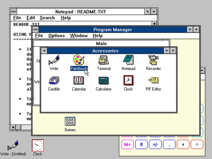
Figure 1-1. Windows 3.0 interface
In addition to the features that Microsoft has introduced for users since version 3.0, the story got interesting for developers with a new version of the Windows SDK that simplified software development. The PCs entered peoples’ homes as well as their workplaces, so there was a need for software capable of supporting users in their small daily tasks. With version 3.11 for Workgroups, Windows added support for peer-to-peer networks and domains, casting PCs as an integral part of the structures of client/server networks that emerged.
The growing interest by the community of developers and dizzying sales led Microsoft to invest in what would become the father of its own modern OS: Windows 95, a consumer-oriented OS. Among the various improvements for users were context menus; built-in Internet support, which was gradually becoming more widespread in the world; Plug and Play capabilities to easily install hardware; and a taskbar with a button named Start (see Figure 1-2), from which the user has access to virtually any element of the OS. Considering the whole of Windows 95, you can guess that the key to its success lay in the simplicity of use for nontechnical users, a concept that became crucial in the evolution of computing.
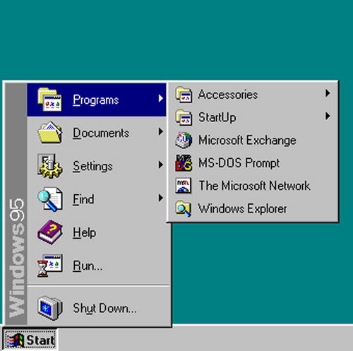
Figure 1-2. Taskbar with Start button
The next step in the evolution of Microsoft’s OS was the Memphis project known as Windows 98, which introduced several new features such as USB, support for DVD, and the Fat32 file system. But its main feature was the integration of Internet Explorer (IE) with the shell of the OS. This enabled another feature, Active Desktop, which allowed users to view and access HTML contents directly from the desktop.
The same features were also present in Windows Millennium Edition (ME), a version that has enjoyed little fame because it differed from Windows 98 only by multimedia features. The most publicized change from Windows 98 was that it didn’t include real mode MS-DOS; it included a MS-DOS virtual machine (VM). Windows ME was intended to be an update of Windows 98 instead of a new version; it supported domestic use with multimedia capabilities, providing software such as Windows Media Player 7 and Windows Movie Maker.
![]() Note The integration of IE some years later would cost Microsoft a legal battle with the European Commission on charges of abuse of dominant position.
Note The integration of IE some years later would cost Microsoft a legal battle with the European Commission on charges of abuse of dominant position.
Windows ME was probably the most unstable version of Microsoft’s OSs; Windows 2000, often abbreviated as W2K, replaced it. It was an OS based on Windows NT, thought to work with advanced network capabilities; ready to be used as a client in professional version; and used as a server with Server, Advanced Server, and Datacenter Server versions.
Windows 2000 was the link that joined the desktop to enterprise versions of the Microsoft OS, merging in the NT line of OSs some features from the Windows 9x branch, such as Windows Desktop Update, Outlook Express, and others. Among the more interesting features for the consumer market was the support for NTFS (a file system that manages the allocation of blocks in a more intelligent manner to avoid waste of space and allows users to easily manage security settings files by using different features). Another interesting enhancement was made to Windows Explorer, which allows users to customize the way folders look and behave. Unfortunately, this feature paved the way for malicious scripts and other form of infection.
From Windows XP to Windows Vista
In 2000, Microsoft merged the team members of project Neptune, a new consumer version of Windows built on Windows NT, into the team working on Windows Odyssey, an upgrade for Windows 2000 for business purposes. This new team worked on a project named Whistler. In the 2001 Microsoft release, Project Whistler was better known as Windows XP (eXPerience). After the experiment to reunite the desktop and server versions in a single product, Microsoft resumed the usual conduct, dividing them again into two separate lines.
For the server version, the next release was Windows Server 2003; but for the desktop version, there was the launch of Windows XP, still the longest-running OS from Microsoft. Windows XP came with a new fresh UI, improved by many visual effects, which the OS decide to use or not depending on system resources. All the explorer windows contained a sidebar window, Common Tasks, including the Open Documents folder or Images folder or Access to Network. From a technical point of view, Windows XP included GDI+, a sort of facade responsible for drawing lines and curves, and rendering fonts.
The taskbar supported the grouping of windows (see Figure 1-3). Many enhancements were included in the new version of the kernel, touching Power Management, Memory Management, I/O Subsystem, Logon, Registry, and much more.
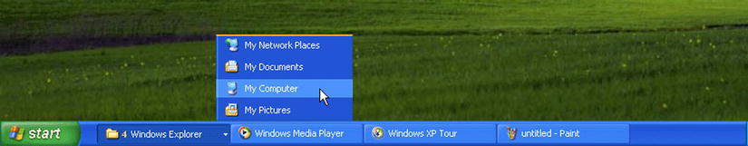
Figure 1-3. Grouping windows in the taskbar
Microsoft released three service packs for Windows XP:
- Service Pack 1: Released in September 2002, it contained a lot of security and stability fixes, and offered support for hard drives larger than 137 GB.
- Service Pack 2: Released in August 2004, it contained other security fixes, such as support for Wi-Fi Protected Access (WPA) encryption for Wi-Fi and enhancements for Windows Firewall.
- Service Pack 3: Released in April 2008, side by side with other security fixes, it introduced support for SHA-2 signatures in X.509 certificates and descriptive security options in Group Policy.
Five years after the release of Windows XP (in 2007), Microsoft announced the next version of Windows that was code-named Longhorn and better known as Windows Vista. From a nontechnical point of view, the most important updates in this version were the following:
- Windows Aero (which stood for authentic, energetic, reflective and open) was the new version of the Windows UI, intended to be cleaner, including glass-like effects that applied to window borders.
- Another interesting feature was Windows Flip 3d, which arranged the preview of all opened windows in a sort of carousel. Always referring to the preview effect, with Aero you could point to a Windows taskbar button to display a preview of the window (or windows, when grouped).
- The Start menu was changed, again losing the label and showing the Windows orb (see Figure 1-4), and showed a text box to search inside the computer for applications, files, and mail; and to run applications by just writing the name. Another significant change was the disappearance of the All Programs item, replaced with the entry Programs.
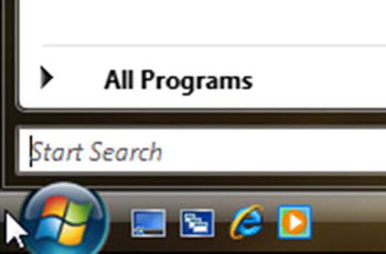
Figure 1-4. Windows Vista Start button
- Even Windows Explorer was changed in this version. The task panel was removed, and a new panel contained the favorite folders and the Details pane, which displayed information about the selected item. The address bar was modified, showing breadcrumbs about the current path that allowed users to click everywhere on the hierarchy to rapidly change the folder instead of pressing the Back button.
The technical aspects that changed in this version related largely to the core of the OS, in which audio, print, networking, and display subsystems changed.
Windows supported IPv6 for all network devices installed and the Link Local Multicast Name Resolution (LLMNR) protocol to resolve hostnames on networks without a DNS server.
Windows Vista had a rewritten audio stack that ran at user level, thus increasing the stability of the system. Every application that needed to use the audio needed to start a session using the Windows Audio Session API (WASAPI) that worked in two ways:
- Exclusive mode (DMA): Played only one stream from one application; was particularly efficient for applications that needed to output compressed audio such as Dolby Digital or DTS.
- Shared mode: Audio streams were rendered by the application, the global audio engine mixed the streams, and then the streams were rendered on the audio device.
Starting with this version of Windows was fully integrated support for speech recognition, which no longer required the installation of Office and was improved to command the computer through voice by using the Microsoft Speech API 5.3 and Speech Recognizer 8.
The print subsystem was rewritten to conform to the XML Paper Specification (XPS) and the Windows Presentation Foundation (WPF). These two technologies repaired the defects of the graphics device interface (GDI), improving the Color Management by adding support for a resolution-independent, vector–based, paged document format.
For programmers, it was the first version of Windows to use WPF to improve the UI, still retaining compatibility with Windows Forms and previous versions of the .NET Framework. For the uninitiated, WPF also made its first appearance with XAML, an XML dialect for designing graphical user interfaces (GUIs) that were used in this technology, in Silverlight, and in Silverlight for Windows Phone.
We have now discussed 23 years of Windows history, and the user experience has been at the center of the improvements introduced by Microsoft (which always considered the need to improve purely technical aspects to reduce the gap that arose with other OSs of the new generation). First, Microsoft focused on time spent to boot up the system. Until Windows 7, when you installed a service or a program that started with the OS, it meant that even unused services consumed resources that might otherwise be helpful to enable the system to run rapidly. For this reason, in Windows 7 you can set a service to start delayed in order to speed up the boot.
The taskbar has been modified in several ways: it is 10 pixels taller than in previous versions to allow touch capabilities, and the user can pin the application to the bar (this feature replaces the old Quick Launch bar).
Another interesting feature is support for multitouch, which refers to the capability of a touch device (touchpad, touchscreen, and so on) to recognize more than one point of contact on the surface.
The advent of multitouch devices shows endless horizons of evolution to developers and users; gestures are some of them.
Following is a list of the most common gestures (see the examples in Figures 1-5 to 1-12):
- Tap: Single or double touch (single tap, double tap).
- Double finger tap: Tap with two fingers at the same time, taking care to keep the target in the middle.
- Panning with inertia: Drag one or two fingers up and down.
- Press and tap: Press with a finger and tap using another finger.
- Pinch and stretch: Make a pinching motion with your fingers or move them apart.
- Rotate: Can be done in two ways: moving two fingers in opposing directions, or holding a finger and moving around another.
- Press and hold: Press and wait a range of time (can vary between systems) and then release.
- Flick: Swipe your finger quickly in a direction.
- Drag: Drag one finger left or right.
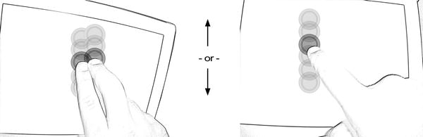
Figure 1-5. Panning with inertia
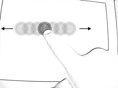
Figure 1-6. Drag
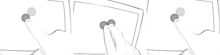
Figure 1-7. Press and tap
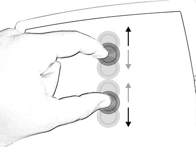
Figure 1-8. Pinch
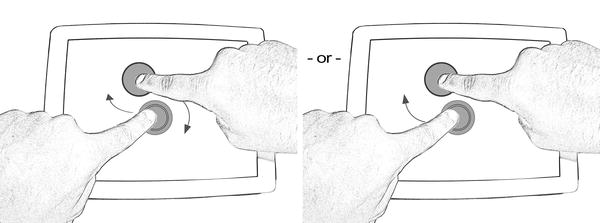
Figure 1-9. Rotate
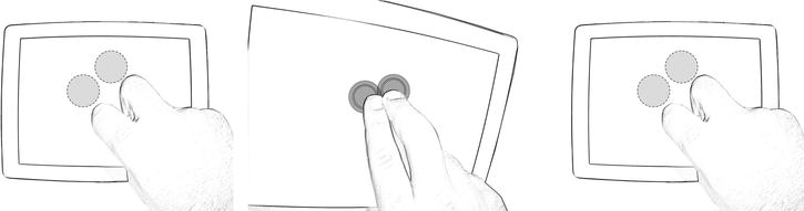
Figure 1-10. Double finger tap
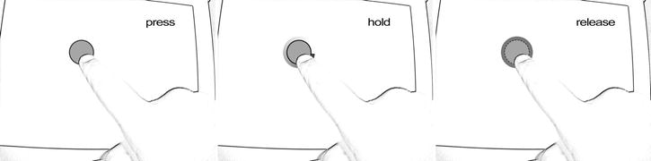
Figure 1-11. Press and hold
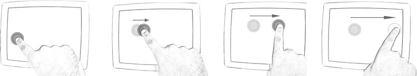
Figure 1-12. Flick
Not everyone knows that some of these gestures are implemented in the Windows 7 UI. For example, you can use press and hold or press and tap instead of right-click, zoom in and out using pinch and stretch, and rotate items using the rotate gesture.
With Windows 7, we conclude the history of Microsoft OSs and the most important features that have characterized their existence. You’ll now learn about the important features that are part of the OS known as Windows 8.
The cardinal principle of Windows 8 is the adoption of the Microsoft Design Style UI, which was introduced with Windows Phone and can be summarized in a few words: “Bring the immediacy of the signs we see every day in the metropolis in a UI with tiles containing simple icons (minimal) that allow the user to understand, in a very intuitive way, what functionality is being accessed.” Of course, these few words do not describe completely what is behind the idea of Microsoft Design Style (the code name for the Windows Store apps UI), but we need only to introduce it to explain what's new in Windows 8 (we will cover it in depth in the next section).
The feedback received regarding the Microsoft Design Style UI on Windows Phone inspired the idea to standardize the interface of various platforms, giving end users the same User Experience (UX) moving from one device type to another (e.g., phone, tablet, PC, or TV).
As we did with other OSs, we will examine the features of Windows 8 so you can compare it with other versions.
A first point of comparison is the disappearance of the Start button from the taskbar (as you can see in Figure 1-13). To be precise, it disappeared only visually, but conceptually it has been replaced by the Start screen that includes a mosaic of tiles (just like Windows Phone). We will discuss functionality from a technical point of view later in the book.

Figure 1-13. Windows 7 application bar
Tiles are a dynamic representation of applications. If your application doesn’t update the tile, it can be defined as “static” and operates as a link used to launch the application to which it refers; whereas a “dynamic tile” acts both as a link and as a summary of the actual state of the application.
The startup screen is the heart of the new UI concept that was created for the new OS. At first, many accused Windows 8 of being too tablet-oriented or more generally touch-oriented. It can probably look like this with the use of tiles that don’t seem to look like the classic menu and are made to have everything at users’ fingertips.
But consider the Microsoft point of view: to meet the new needs imposed by the modern era. Users are increasingly accustomed to using touch devices, children grow up already learning to perform gestures on tablets, and it doesn’t make sense to invest in a direction that isn’t related to new trends. The use of tiles responds to requests from users to stay connected with the information they need. For a comprehensive assessment, we must also put ourselves in the shoes of those who don’t use touch devices. For these users, Windows 8 retains all the stability of Windows 7 and (minimizing the concept) replaces the classic Start menu with the new Start screen, which will work both as a dashboard and as a menu to launch applications.
The new Windows Store app interface has also changed the login/lock screen, which now includes information such as date, time, pending notifications (only from a limited number of applications), and support for Picture Password (a sequence of gestures to be performed on an image for faster access on touch devices).
More great news about Windows 8 is the presence of IE. Now in its tenth version with a new Microsoft Design Style interface, it is ready for touchscreen, with full support for HTML5 and CSS3 to reduce the need of external plug-ins (which means “No plug-in, no external applications”). All apps come from the Windows Store (we will talk about that in the last chapter, which is dedicated to application publishing).
Windows 8 will resolve the problem linked to procedures (more or less complex) in order to put a Windows self-consistent installation within a USB stick. For Windows-To-Go enterprise users (who sign the enterprise license), it will create images of the PC and write them on a USB stick, so they can start the OS from any computer without compromising corporate security.
Windows 8.1, a.k.a. Blue, is the evolution of Windows 8. Based on feedback received from customers, Microsoft made many improvements. First, two new sizes of app tiles are available: one of 70 x 70 pixels and one of 310 x 310 pixels. Because both sizes are square shapes, we cannot continue to reference the 150 x 150 pixels tile as a square tile. From this version of Windows, the tiles sizes are named as follows:
- Small tile: square 70 x 70 px
- Medium tile: square 150 x 150 px
- Wide tile: wide 310 x 150 px
- Large tile square 310 x 310 px
These new tile sizes allow the user to customize the Start screen, showing more tiles or more information. And, keeping an eye on the customization, from this version of Windows, the user can choose to have a slideshow as the background of the lock screen.
Keeping our focus on the UX, we cannot forget to talk about the reintroduction of the Start button. In the first release of Windows 8, many users missed the Start button because they were used to it as the entry point for everything. With Windows 8.1, Microsoft integrates a new kind of Start button.
Clicking it with the primary button of your mouse (the left button if you are right-handed) will move you to the Start screen. Otherwise, with the right-click a contextual menu appears, as shown in Figure 1-14, that allows you to quickly access a list of system shortcuts, including the shutdown menu, (which was omitted in the first release and disappointed many users). The second update that will make Windows 8.1 similar to older versions of Windows is the Boot to Desktop feature that lets users boot directly to the desktop instead of the Start screen.
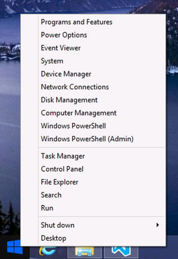
Figure 1-14. Contextual menu on the Start button
Another interesting feature is the introduction of aggregated search, which allows users to search on Bing, the Internet, apps, and locally all at once, which improves the user experience.
There are other enhancements that Microsoft groups under the “bring-your-own-device” category that helps users to rapidly associate resources with the OS. For example, the NFC Tap-to-Pair printing feature lets the user configure a printer by simply reading the NFC tag of the printer from the NFC sensor of the device; Windows will do everything else. Because users want to avoid the use of cables, Windows 8.1 introduced the support of Wi-Fi direct printing that allows a peer-to-peer connection to a Wi-Fi printer, avoiding the need for an access point. To avoid the use of wires, Microsoft introduced native support to Miracast Wireless Display that lets users use compatible devices as a remote display. Not many compatible devices are currently available because this is an extremely new standard, but we think that the Xbox One will surely be compatible.
Speaking of mobility enhancements, there is expanded support for a wider range of VPN clients, VPN auto-triggered connections, and tethering.
Finally, Windows 8.1 has the eleventh version of IE, which is faster than previous versions, even with many tabs on the Start page; and supports the SPDY protocol. The immersive version can now keep up to 100 tabs open instead of 10 and allows multiple instances.
Thinking in Metro: Fundamentals of the Windows Store App UI
This chapter will introduce the philosophy behind the new interface in the Windows 8 Store app, starting with different sources of inspiration and ending with the guidelines that a developer should follow.
What Is the Microsoft Design Style?
Microsoft Design Style is the code name for a new set of concepts that Microsoft has introduced in the Windows Phone interface. The aim is to make the UI cleaner, more intuitive, and faster.
Figure 1-15 shows an example of the Windows Phone Start screen.
Figure 1-15. Windows Phone Start screen
The screen is formed by squared elements called hubs, each of which is alive: every hub can display real-time notification and images.
Before Windows Phone, some of the distinct elements of the Microsoft Design Style were actually already present in a few Microsoft products such as Encarta 95, MSN 2.0, Windows Media Center, and Zune (see Figure 1-16).
Figure 1-16. Zune UI (Wikipedia)
This new kind of interface garnered much approval from customers, and Microsoft decided to use the same guidelines as a starting point for the Windows 8 UI. But what exactly are these concepts?
Origin of the Microsoft Design Style UI Design Language
The Microsoft Design Style UI is inspired by many sources. First are the signs that can be found in public transport systems. In fact, Microsoft designers declared that the King County Metro transit system in Seattle was one of the sources for the Microsoft Design Style because of its simplicity of providing information (see Figure 1-17).
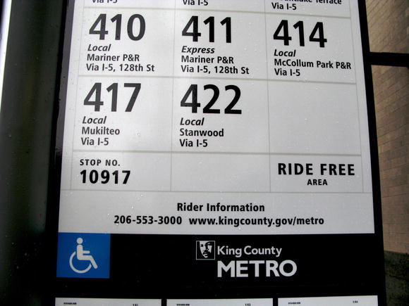
Figure 1-17. King County Metro signage (Wikipedia)
Microsoft Design Style is influenced by three concepts:
- Modern design
- International typographic style
- Motion design
The next sections provide details of each concept.
What do Windows Store apps have to do with modern design? To understand the reason why they are connected, we have to figure out where modern design comes from.
One of the main sources of inspiration of modern design was the Bauhaus school, which opened in Germany in 1919. The main principle of this school was to combine craftsmanship and the fine arts. All the works were characterized by the absence of adornments to show the matter properties to emphasize the pursuit of a balance between functionality, rationality, and technique.
All the Bauhaus ideas came from the historical context that preceded the period when the school was created (see Figure 1-18). We are talking about the second half of the nineteenth century, in which the effect of the Industrial Revolution, starting from the changes on every aspect of daily life, was spread all over the world.
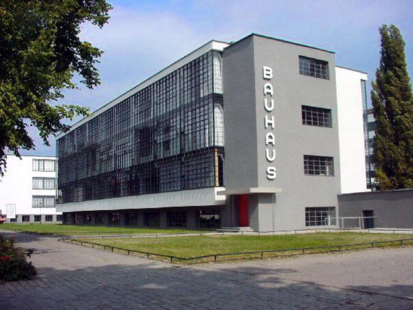
Figure 1-18. The Bauhaus building in Dessau
The progress that was made until today in every field of human knowledge has changed the ways we live our lives. Today, thanks to communication and travel, we feel more connected to each other.
For this reason, modern design fits very well in the Microsoft Design Style conception:
“Artisans were stills using yesterday’s design thinking"——Moreau (Designing Metro Style: Principles and Personality; Build Conference 2011).
We need the essential, we need something that is direct, and we need something that is present in our age.
International Typographic Style
Also known as Swiss style, the International Typographic Style is a graphic design developed in Switzerland in the 1950s. It was actually created in the 1920s in Russia, Germany, and the Netherlands, but only Swiss graphic designers were capable of expressing these principles in their work.
The main focus was the pursuit of simplicity, readability, and cleanliness. Craftspeople paid a lot of attention to keeping their works essential by preferring typography, content layout, or images to the use of texture and illustration.
Some of the concepts behind the Swiss design are the widespread use of whitespace and geometrical organization of the elements (thanks to the use of a grid system). In Figure 1-19, which shows a Helvetica format example, the typography is the strong point because it enables messages expressed in simple and clean ways. The use of hierarchy in the text also helps to organize information. And all that is not essential is removed.
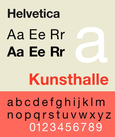
Figure 1-19. An example of Swiss design based on a Helvetica font (Wikipedia)
The way Swiss design expresses a message is so straightforward that today it is usually used in airport and metro signs (see Figure 1-20).

Figure 1-20. Melbourne Airport signs (Wikipedia)
Another source of inspiration for Microsoft Design Style is the use of design applied to cinematography. Many films use a mixture of sounds, images, and typography to express motion. Some examples can be seen in the opening credits by Saul Bass in the films Anatomy of a Murder, North by Northwest, and Ocean’s Eleven.
You can also find good examples in Steven Spielberg’s film Catch Me if You Can or in YouTube videos about kinetic typography such as Where Good Ideas Come From (by Steven Johnson).
Microsoft Design Style Principles
All the previously discussed concepts about Microsoft Design Style are the fundamentals of the five principles that every developer has to follow when designing apps.
Principle 1: Show Pride in Craftsmanship
Details are important and user experience is, too. When a developer has to design an application, he or she has to consider these aspects. It’s important to organize the space in the UI to achieve balance, hierarchy, simplicity, and clarity. It helps to use a grid in which the objects can be laid (see Figure 1-21). Remember that creating software is an art, but creating a good UI is an art, too. Only if both are perfect will you have good software!
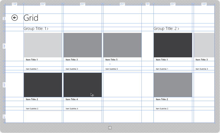
Figure 1-21. An example of using grid to lay text
Principle 2: Be Fast and Fluid
Life is always in motion. Whenever a person needs to use a device, he or she wants a simple, comprehensive, and responsive interface. An application must be intuitive, and a user must be carried away by its UI (maybe by using animations). Most of the modern devices are touch-based. The Microsoft Windows 8 development team has put lots of effort into studying how people interact with a touch-based UI. Developers need to be aware of this.
Principle 3: Authentically Digital
We live in a digital era, which means that we are always connected. Social networks, blogs, and cloud services have one thing in common: sharing information. All that matters today is information. And this is why typography is important. People need to share their everyday lives, and they need to do it in a modern way by using images, colors, motion, and typography.
Principle 4: Do More with Less
People need to see only what they are interested in. Content is the heart of the experience. There’s no need to always see bars, buttons, and icons. Interfaces must be direct and essential, and users want to explore the content by dipping into it.
Embrace the Microsoft Design Style spirit. It is an entire ecosystem that your app can use to work, communicate, and provide control to users. Fit into the UI model and you’ll be sure that users will love your applications. You can integrate a set of built-in contracts to add features to your app.
Making Great Windows Store Apps
How can developers use all this information to create their applications? First, a developer must have all the knowledge about the Windows 8 application life cycle. Then, by following Microsoft Design Style principles and maybe with the help of a designer, he or she has to create a UI focused on the content. No chrome, nothing unnecessary—just a clean and direct layout; well organized; and based on the use of images, colors, and typography.
Applications have to be touch. It’s important to understand how users interact with devices: by touching the screen, using gestures, and with their fingers. A developer could use what is already available; there are built-in controls and contracts that help to create full Windows Store apps. Last but not least, he or she shouldn’t be limited to these principles! They are good starting points, but it’s up to them to use them and reinvent them.
Platform and Tools
Developing the Windows 8.1 Store app requires the installation of Visual Studio 2013 (VS2013), which is available in full and express editions. The main differences are the price and the auxiliary tools: the Express Edition is free and contains all available tools for Windows 8.1 application development; the full edition (professional or ultimate) also provides tools not directly connected with Windows 8.1. All the examples in this book use the Express Edition, but the code and procedures can be applied to all the major Visual Studio editions.
You can install VS2013 on Windows 8 or previous versions of Windows without restrictions, but if you don’t choose Windows 8.1, you can’t develop the Windows 8.1 Store app. We’ll use Windows 8.1 for the book examples and we advise you to do the same, even in a VM.
When you are developing your application, you should pay attention to the user experience provided by the UI, following the Windows Store app guidelines for Windows 8.1. Visual Studio might not the best tool for this requirement because the designer provided for managing the UI isn’t as user-friendly for this scope. In fact, Blend for Visual Studio is more appropriate to design the user experience of your application, with an environment specifically created for the designer who hides the UI code generation behind a collection of graphical designers.
Installing the Tools
You can download Visual Studio 2013 Express for Windows 8.1 from the Microsoft site: http://go.microsoft.com/?linkid=9832256. When the download is complete, click winexpress_full.exe, agree to the license terms and conditions, and click the Install button. Don’t interrupt the Internet connection because the installation program must download the components for the installation process (see Figure 1-22).
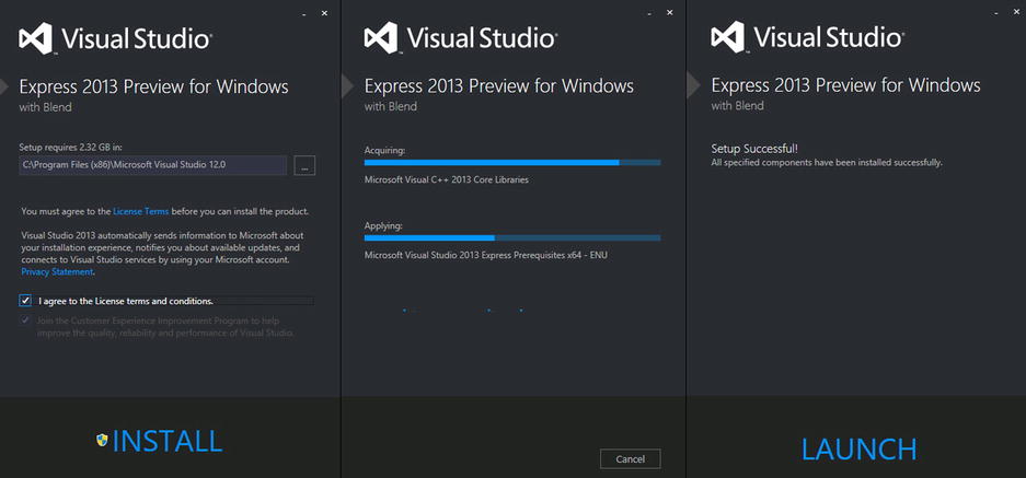
Figure 1-22. Installation process
If the Express Edition of VS2013 for Windows is free, it requires a valid product key that can be generated automatically by using a Windows Live account and following the steps suggested by the installation process (see Figure 1-23).
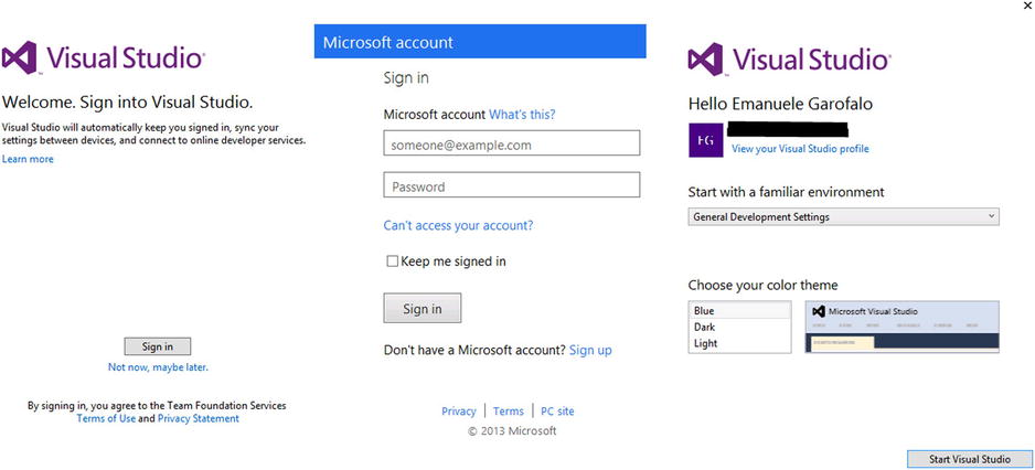
Figure 1-23. VS2013 for Windows 8 activation process
The last step is to acquire the developer license for Windows Store development. It is absolutely free (at the moment) and requires only a Windows Live account (see Figure 1-24).
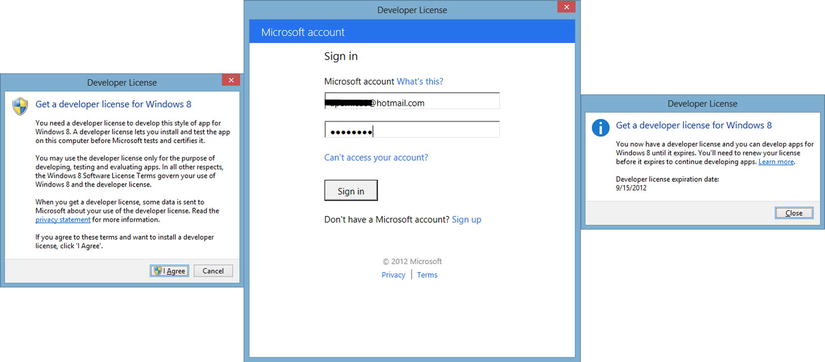
Figure 1-24. VS2013 for Windows 8 environment
At the end of the installation process, you can launch Visual Studio, which shows an environment that is completely new compared with previous versions (see Figure 1-25), all in Microsoft Design Style. If you use Visual Studio for the first time, don’t panic; it’s quite simple to start with this environment.

Figure 1-25. Visual Studio 2013 for Windows
There are five functional areas:
- Main menu (context sensitive): Area for all the commands available for the current view
- Command bar (context sensitive): Area of the main and most-used commands for the current view
- Toolbar (context sensitive): Area with all the tools for the current view
- Working area: Area with the code editors and/or the available designers
- Solution Explorer: Area in which you can explore the application structure
First, you have to create a new project with the New Project dialog box by clicking the New Project menu item of the File menu, clicking the new project icon on the command bar, or using the Ctrl+Shift+N shortcut.
In this wizard, you can choose a starter template (Grid App in this example), a name for the project (FirstApp, in this case), the location for the project files, and a solution name (by default, the same as the project name). Click OK and wait for the project creation (see Figure 1-26).
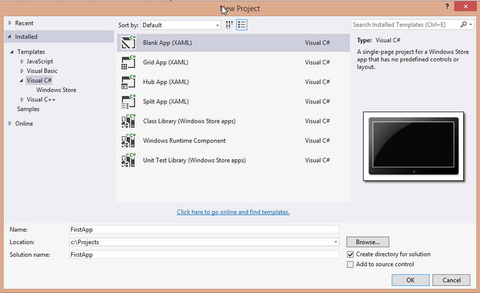
Figure 1-26. New Project Wizard
Starting Your Application in the Simulator
In the next chapters, you will analyze the code created by the template. At this time, try to launch the empty application that was created. Starting from VS2012 (and even in VS2013), we have more control over the environment that we want to use to test our app because the Play button (the F5 shortcut if you use the C# key configuration) is a combo box button (see Figure 1-27).
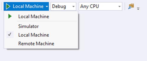
Figure 1-27. Starting application options
You can choose to launch the current project in the following:
- Local Machine: Launches the current project directly on the OS.
- Simulator: Runs the application on a Windows 8.1 tablet Simulator. This is the best choice if the current hardware doesn’t support touch or other device capabilities, and you want to simulate them.
- Remote Machine: Launches the application on an external device connected to the current device. This is the best choice if you can try the application on real hardware.
For example, choose Simulator and click the Play button (or press F5). Visual Studio launches the Simulator (see Figure 1-28): a complete environment that tests all the capabilities offered from Windows 8.1 and the major devices available for the market. Look at this simulation environment. The Simulator creates a terminal server connection to your OS. This is very cool because if you use Simulator for tests, touch, or GPS, you can do it in your Windows 8 configuration!
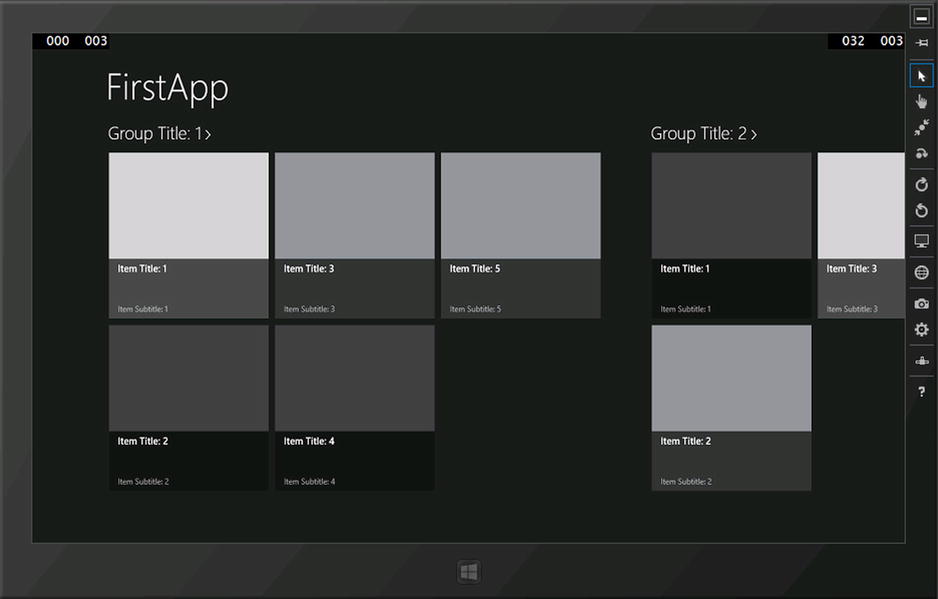
Figure 1-28. Windows 8 Simulator
The Simulator has a command bar on the right for changing the environment settings; these functionalities are introduced in Table 1-1.
Table 1-1. Simulator Commands
Mouse Mode |
The Simulator input type is a mouse pointer. |
|---|---|
Touch Mode |
The Simulator input type is touch–mode simulated with the mouse. |
Touch Emulation Pinch/Zoom |
The Simulator input is the touch combo for pinch and zoom operations. |
Touch Emulation Rotate |
The Simulator input is the touch rotation combo. |
Rotate Simulator Clockwise 90 Degrees |
Rotates the Simulator screen 90 degrees clockwise. |
Rotate Simulator Counterclockwise 90 Degrees |
Rotates the Simulator screen 90 degrees counterclockwise. |
Change Resolution |
Changes the resolution used by the Simulator. Possible values are these: 7" 1920 x 1200px |
Set Location |
Allows you to send geographic coordinates to a device as a GPS device. During first use, the device requires the authorization for GPS device configuration that wants administrator privileges. Manually set the latitude (degrees), longitude (degrees), altitude (meters), and error radius (meters) with a simple form (see Figure 1-29). |
Capture Screenshot |
Allows you to create a picture shoot of the Simulator content in the location indicated into screenshot settings. |
Screenshot Setting |
Allows you to change settings for the Capture Screenshot command via a pop-up menu:
|
Change Network Properties |
Access the Set Network Properties dialog box shown in Figure 1-30. Here you can set Network functionality such as to see if the connection is near the data limit or whether the connection has roaming enabled or not. This allows you to test your app against various scenarios. |
Help |
Opens the online help site for the Simulator. |
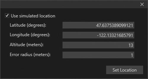
Figure 1-29. Set location authorization form and set location form
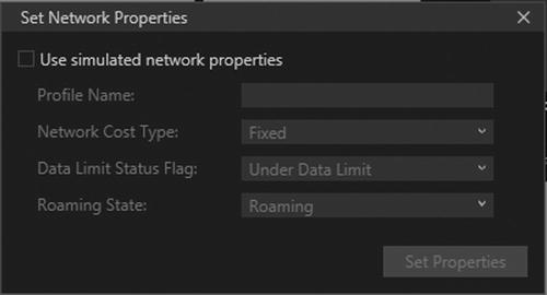
Figure 1-30. Set Network Properties dialog box
On the bottom you can see the windows button for switching between the immersive desktop and the last opened application. If the Simulator has the focus, the keyboard commands are captured from the Simulator, and you can also use the windows button on your keyboard or all the keyboard shortcuts available for Windows 8.
To close the Simulator, press the right mouse button and choose the Exit menu item from the contextual menu; the Minimize command obviously does not close the Simulator.
Blending for Microsoft Visual Studio 2013
If you are a designer, a user experience designer, or a developer who is creating the UI of an app, you probably prefer to use tools specifically made for this type of task to simplify your work. For this purpose, Microsoft has the Expression Studio suite, which is a component of the suite called Blend (see Figure 1-31).
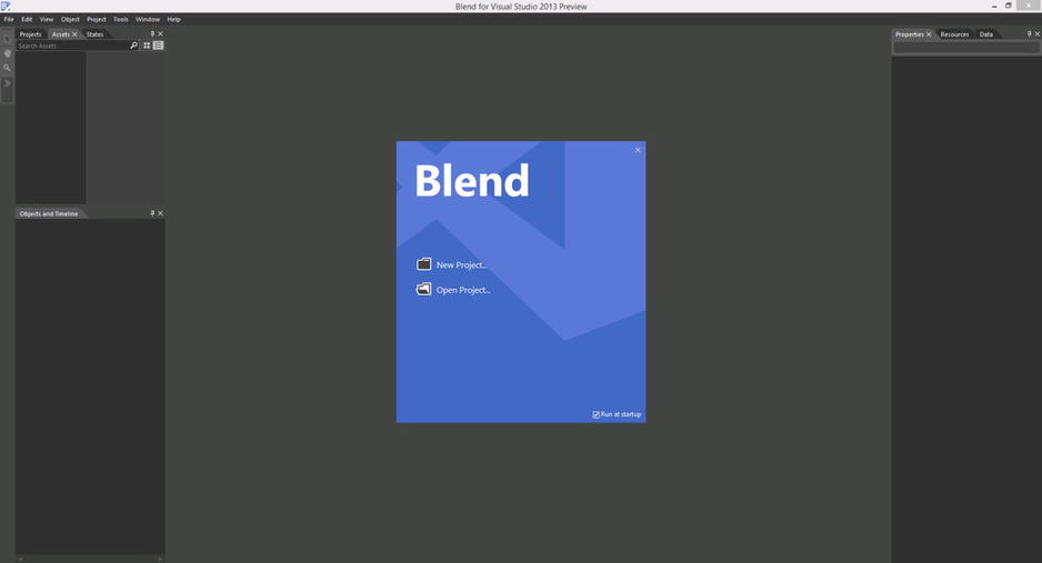
Figure 1-31. Blend for Visual Studio 2013
When it created Expression Studio, Microsoft wanted not only to create a suite for graphic users but also to create an environment to include graphics users in the team. In fact, Blend can open the same solution file of Visual Studio and share the code with it as the same source control server application, as Team Foundation Server, and directly launch the application with the classical F5 button. The idea is that the user experience designer is part of the team in all aspects of the developing process.
You can also create a new project directly with Blend by selecting the classical menu item File ![]() New Project and choosing your preferred options for the project creation (see Figure 1-32). If this is your first time working with Blend and you are a developer, remember that this tool is for designer users, and all the operations should be done with the graphical designer or the available palettes. You also can edit the HTML or the XAML directly. If you are a designer, you will feel at home with the Blend UI because it is in line with the most famous Adobe tools. Note that starting from VS2012 and so on to the 2013 XAML designer has been improved with many components in the past available only with Blend, so if you are a developer and you don’t want other software, you can use the new designer and be happy.
New Project and choosing your preferred options for the project creation (see Figure 1-32). If this is your first time working with Blend and you are a developer, remember that this tool is for designer users, and all the operations should be done with the graphical designer or the available palettes. You also can edit the HTML or the XAML directly. If you are a designer, you will feel at home with the Blend UI because it is in line with the most famous Adobe tools. Note that starting from VS2012 and so on to the 2013 XAML designer has been improved with many components in the past available only with Blend, so if you are a developer and you don’t want other software, you can use the new designer and be happy.
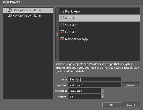
Figure 1-32. New Project Blend Wizard
Blend is made of five main components (shown in Figure 1-33):
- Menus: Area in which you can manage the project and have access to all application settings
- Tools Panel: Contains all available tools to modify applications
- Main Panels: Show all available main panels for projects
- Artboard: Area in which you can design applications
- Additional Panel: Area in which you can see all the other available panels with the current kind of project
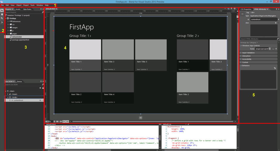
Figure 1-33. Five main Blend components
Begin with the Tools Panel (shown in Figure 1-34), which provides these elements for interacting with the environment:
- Selection Tools: Composed of the first two buttons with the arrow icons; used to select and the direct the selection of designer elements
- View Tools: Composed of the button with the hand and the magnifying glass; used for panning and zooming actions
- Asset Tools: Used for fast access to the Assets Panel (explained later)
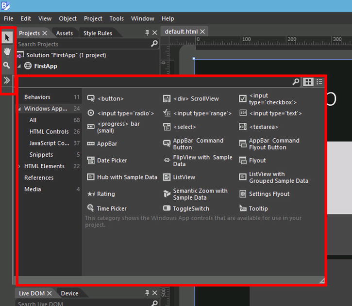
Figure 1-34. Tools Panel
The area called Main Panels (see Figure 1-35) includes the most important panels in the UI design process:
- Projects Panel: Area in which all the files that compose applications are managed
- Assets Panel: Area in which all the available controls for the current project type can be found
- Platform Panel: Area for selecting all the platform settings such as resolution, available views (landscape, filled, snapped, portrait), deploy target (local machine or Simulator), and other options
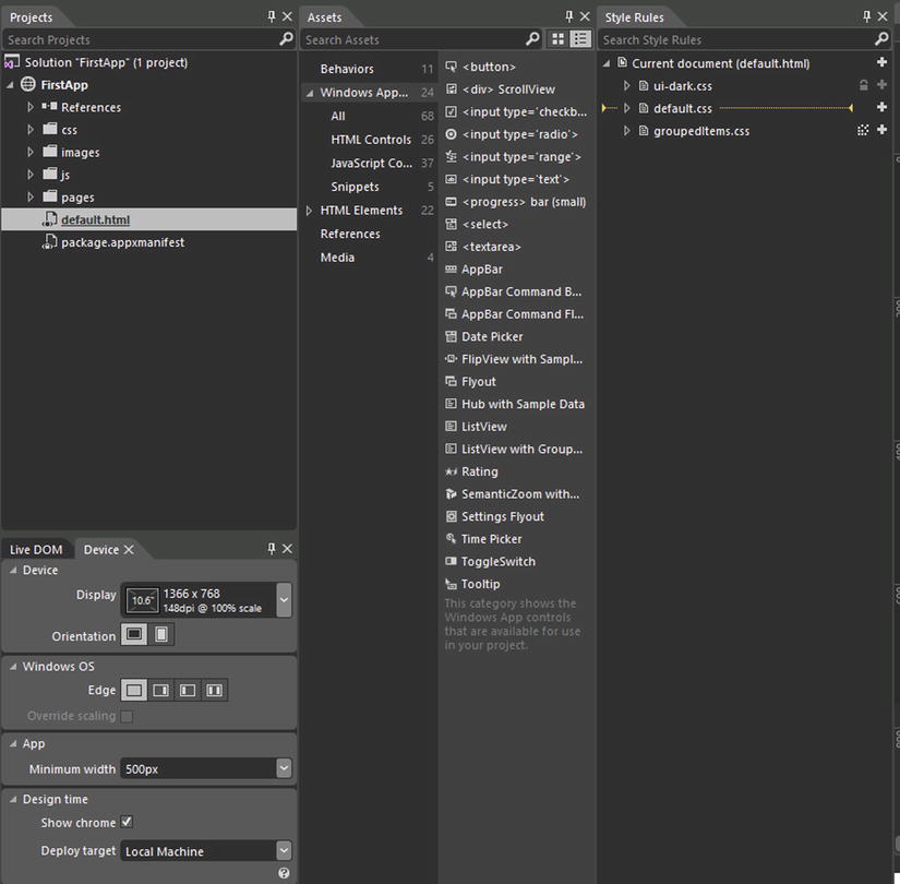
Figure 1-35. Main Panels
Other panels appear in this area, but they’re specific to project type. For example, the Styles Panel is for the CSS file managing of HTML Windows 8 applications, and the States Panel is for XAML Windows 8 application visual states managing (explained in Chapter 5).
Now we focus our attention on the Artboard (shown in Figure 1-36), which is the core of the environment. On the top left (see element 1 in Figure 1-36), you can see the tabs of the current opened views; the current view is shown in light gray in the designer. If you hover over these tabs, you can see the complete path of the files. Click once to change the current view. On the top right (element 2 of Figure 1-36), if you are in design mode and you have to choose HTML for your project, you see three buttons: the first shows the designer in full screen for helping you with element positioning and manipulation, the second alerts you about errors in the current file (hover with the mouse for the errors detail), and the third refreshes the designer.
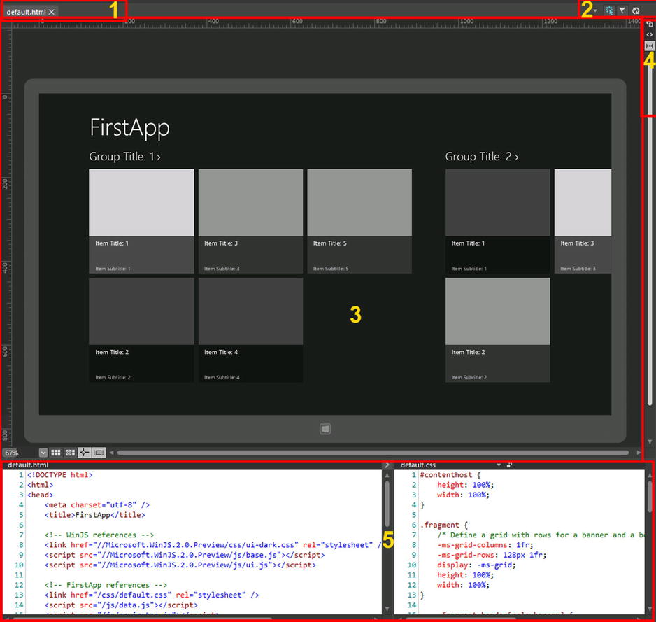
Figure 1-36. Artboard area
With the buttons on the middle right (see element 4 of Figure 1-36), you can choose whether the middle area must show the graphical designer (element 3 of Figure 1-36), the code editors (element 5 of Figure 1-36) or both (splitting them). As shown in Figure 1-36, if you use HTML 5 for your project, the code editor shows you HTML and the corresponding CSS elements.
The term Additional Panels means all the secondary panels shown, by default, on the right area of the Blend UI. One of them is the Properties Panel that shows the properties of the current selection (or multiselection), and its content is specific for the project type.
Conclusions
Window 8.1 introduces many improvements based on the WinRT and WinJS libraries, enabling you to create beautiful Windows Store apps by using the Microsoft Design Style principles. This kind of app, also known as an immersive app, opens new horizons of learning. These horizons are ready for desktop developers who come from WPF, Silverlight, or simply from the Web because immersive apps can be designed with XAML or HTML. When you work with XAML, you can write code using managed languages such as VB.NET and C#, or with C++. If you work with HTML, you know a lot of JavaScript; the good news is that you can use your knowledge to inject code in your application.
Of course, if you want to write a Windows Store app, you must know what Microsoft Design Language is. Indeed, this is the code name of the new UI introduced by Microsoft that resembles metropolitan signs, allowing you to design your application with an intuitive look that helps users quickly find and access available functionalities.
The time of writing code in Notepad is certainly over, so in order to be productive, you must know which tools you will need to use when you write a Windows Store app. The first tool is Visual Studio 2013 (VS2013), which you can get (in the Express Edition) from this link: http://go.microsoft.com/?linkid=9832256. With VS2013, you can start creating apps for the Windows Store using one of many templates included and choosing your preferred language.
This chapter gave you basic information about the philosophy and tools for Windows 8.1 Store app development. Of course, you cannot start developing without a concrete introduction to the life cycle of the Windows Design Style app or an introduction to the numerous possibilities that WinRT and WinJS offer that enable you to exploit all the capabilities of this OS.
Come with us now to Chapter 2, in which we introduce you to the Windows Runtime environment.