
17 The Golden Ratio and Elementary Construction
Good pictorial design means distributing pictorial elements in such a way that the eye perceives harmony and tension simultaneously. In other words, it is the placement of these elements that makes the composition interesting.
Mathematically speaking, the golden ratio is the division of a line into two differently sized parts. The smaller part relates to the larger part in the same way as the larger part relates to the entire line: a de facto ratio of 1:1.618. The golden ratio is relevant when dividing areas within a photo. The lines that divide an image in the golden ratio (i. e., in an approximate ratio of 5:8) are also known as harmonic dividing lines. Our eye perceives such a division as especially pleasant because it likes to move back and forth between two different sizes but at the same time also loves harmony. This balance between image tension and proportion is achieved with the golden ratio.
The golden ratio (or golden section): In mathematics and the arts, two quantities are in the golden ratio if the ratio between the sum of those quantities and the larger one is the same as the ratio between the larger one and the smaller. The golden ratio is approximately 1:1.618.
If you divide a photo into both axes of symmetry (the vertical and horizontal harmonic dividing lines, plus both diagonals in the picture), you will obtain a so-called elementary construction. However, a photo that clings too strictly to this rule is rather stiff, but if the individual elements in an image follow parts of this elementary construction, it will generally help you to obtain a good, well-structured impression.
Nonetheless, it is essential to remember that these pictorial rules reflect the basic principles of human perception. Therefore, you probably do not need to obsessively follow them when taking a photo because these principles are already inherent in the way the Western mind perceives harmony. Presumably, a Chinese viewer would read pictures differently, not from left to right as a Westerner would. It is better to create photos intuitively.
The objective in this and the following chapters is for you to considerably sharpen your ability to see and shoot photos through the analysis of various pictorial principles but without using rigid “Instructions for Use” for pictorial composition. It is useful for you to know these pictorial principles, explained in the following pages, in order to analyze your own photos and to develop an even stronger pictorial thinking. However, keep in mind something that applies to all academic rules: It is wonderful to master them, but once you have mastered them, you are allowed to free yourself from them.
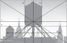
1 Horizontal symmetry axis
2 Lower horizontal harmonic dividing line
3 Left vertical harmonic dividing line
4 Vertical symmetry axis
5 Right vertical harmonic dividing line
6 Corresponding shapes
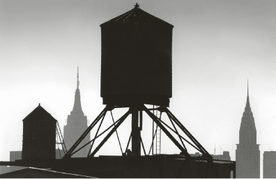
New York Water Tank
If you want to compose a photo with the golden ratio, it is enough to apply its rules to some pictorial elements, and then only partly or roughly. This example photo (figure 17–1) is centrally composed and includes axial symmetry. The vertical axis of symmetry runs exactly through the middle of the water tank, and both lateral boundaries of the tank are identical to the two vertical lines of the golden ratio. Because this is a backlit photo, the water tank appears in pitch-black silhouette and therefore dominates the image. The diagonal supports of the tank also show folding symmetry. The top of the Chrysler Building (right) is also symmetrical to the smaller water tank on the left. Only the Empire State Building breaks this symmetry and provides some variation in the sizes presented in this photo. Without this break, the photo’s composition would be too rigid. You can easily see this rigidity by covering the top of the building with your finger. In the horizontal plane, the lower corner of the water tank runs roughly along the lower horizontal harmonic dividing line. This highly graphic photo has a powerful composition due to its simplicity.
The photo was taken with an analog camera using a 200 mm telephoto lens.
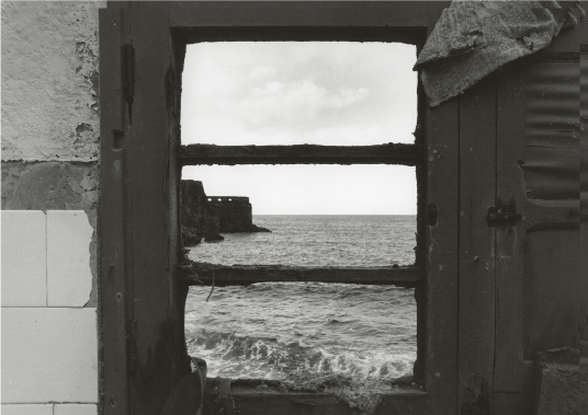
Wave Entering the Window
Three elements in the photo in figure 17–2 strictly follow the principles of the elementary construction, or the golden ratio: Both window beams run exactly through the upper and lower horizontal harmonic dividing lines, while the horizon runs across the horizontal axis of symmetry. The newspaper in the upper-right corner also hints at the rising diagonal, however. These elements give the photo a rigid composition, thus conveying a rather static impression.
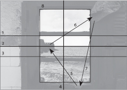
1 Upper horizontal harmonic dividing line
2 Horizontal symmetry axis
3 Lower horizontal harmonic dividing line
4 Vertical symmetry axis
5–7 Visual triangle
8 Perspective frame
Another component of the composition is the so-called frame of the perspective, the “photo-within-a-photo” (i. e., the window framing the second scene). The photo-within-a-photo was often used by the old painting masters as a stylistic medium to focus the gaze of the viewer.
Needless to say, the special attraction of this photo is the wave structure that links to the cloth structure, thereby giving the impression that the wave can break and enter through the window. The mood looks surreal, and even somewhat threatening.
This example shows how you can use photography to fuse two very different spaces into a single pictorial space.
This photo was taken with an analog camera, using aperture 16 of a 50 mm lens to provide the necessary depth of field.
symmetry: 1. An imprecise sense of harmonious or aesthetically pleasing proportionality and balance; such that it reflects beauty or perfection. 2. A precise and well-defined concept of balance or patterned self-similarity that can be demonstrated or proved according to the rules of a formal system, such as geometry or physics.
harmony: A technical term in music, it may also suggest the pleasing quality that arises from a just ordering of parts in other forms or artistic composition (i. e., harmony of line, color, mass).
The Axial Symmetry of Modern Architecture
The digitally photographed image in figure 17–3 has been strictly subdivided into four sections:
- The window beams would run exactly through the vertical and horizontal axis of symmetry if the photo did not extend slightly toward the bottom under the lower window pane. This extension adds tension to the very rigid composition and makes the photo stand out a bit. However, if you imagine the photo without this extension, you perceive the vertical and horizontal axis of symmetry that is created by the two crossing window panes.
- The dark line that runs below the beams describes precisely the lower horizontal harmonic dividing line.
- The somewhat shorter line above the axis of symmetry, although not running through the entire image, clearly indicates the upper horizontal harmonic dividing line.
- The person that stands to the left in the photo is in a spot that hints at the left vertical harmonic dividing line.
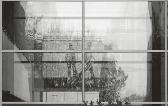
This clear but severe pictorial composition reflects the severity of this modern building located in Eschborn near Frankfurt. The photo’s austere symmetrical forms would appear rigid if the organic elements—the silhouettes of the two persons and the reflection of a tree—did not counteract the excessive rigidity of the composition. The photo was taken with a Nikon D70s and a 300 mm lens.
New York Street Scene
A busy, more complex pictorial situation in a turbulent metropolis like New York (figure 17–4) can be composed with the help of the golden ratio so it looks more ordered:
• The two legs of a woman appear to be walking on the roof of a bus, while three persons walk on the crosswalk.
• The woman in the foreground looks sideways.
• A man approaches her and also looks sideways, but they take no notice of each other, depicting a typical scene in a big city.
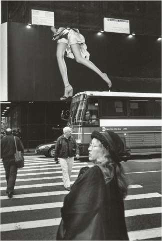
But where is the golden ratio? Well, here it is:
• The imaginary vertical line of the woman’s right leg on the advertisement (left in the photo) continues with the man below and the left arm of the woman in the foreground and describes the left vertical harmonic dividing line very well.
• The white stripe under the bus windows corresponds to the horizontal axis of symmetry.
• The stripe of the bus’s roof above lies almost exactly on the upper horizontal harmonic dividing line.
The photo is, in fact, significantly better composed than it seems at first glance. It plays with the omnipresence of oversized advertising that slowly creeps into everyday life but creates the impact that it should really get due to its size.
This photo was also taken with an analog camera using a 28 mm lens.
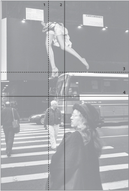
1 Left vertical harmonic dividing line
2 Vertical symmetry axis
3 Upper horizontal harmonic dividing line
4 Horizontal symmetry axis