
User Interface
Although every Android application runs as a full-screen application, the Android platform still provides a certain amount of window features, such as the action bar, toasts, dialogs, and notifications. This chapter provides a brief overview of these fundamental window features. Although not every Android application benefits from toasts and dialogs, the action bar and notifications are frequently used by almost every Android application to provide a smooth and consistent user experience.
Through the action bar,1 the Android platform provides window features to help the user to easily identify the running application, his location within the application, important application actions, and navigation options.
Note The three vertical dots icon on the right-hand side of the action bar is known as the overflow menu. Once it gets a click event, it shows a drop-down menu with a list of actions that are not displayed directly on the action bar.
As shown in Figure 6-1, the action bar consists of
- The application’s icon and title.
- Icons and labels of important application actions, and an overflow menu if the entire list of actions cannot be displayed on the action bar due to the amount of available space.
- Navigation support within the application through the back button, tabs, and drop-down menus.
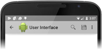
Figure 6-1. The action bar and its components
The action bar application programming interface (API) was first introduced in API Level 11, but it is also available for earlier API levels through the Android Support Library. Starting with API Level 11, the ActionBar is included in all activities using the default Theme.Holo theme. The application can access the ActionBar instance anytime through the getActionBar2 method of the Activity class, as shown in Listing 6-1.
Listing 6-1. Getting the ActionBar Instance from the Activity
ActionBar actionBar = getActionBar();
As the ActionBar instance is included by default starting from API Level 11 and beyond, the application can simply remote it using its hide3 method if it is not needed, as shown in Listing 6-2.
Listing 6-2. Removing the Action Bar
@Override
protected void onCreate(Bundle savedInstanceState) {
    ActionBar actionBar = getActionBar();
    actionBar.hide();
}
Adding Actions to the Action Bar
The action bar provides a prominent place to show important application actions related to the current context. These actions are displayed on the action bar with an icon and sometimes with both an icon and text based on how it gets declared.
Defining the Actions for the Action Bar
The actions are defined as a menu resource in the res/menu resource directory, as shown in Listing 6-3.
Listing 6-3. The Content of res/menu/menu_actions.xml File
<menu xmlns:android=
        "http://schemas.android.com/apk/res/android">

    <item
        android:id="@+id/action_search"
        android:title="@string/action_search"
        android:icon="@drawable/ic_action_search" />

    <item
        android:id="@+id/action_save"
        android:title="@string/action_save"
        android:icon="@drawable/ic_action_save" />

    <item android:id="@+id/action_share"
        android:title="@string/action_share"
        android:icon="@drawable/ic_action_share" />

    <item android:id="@+id/action_settings"
        android:title="@string/action_settings"
        android:icon="@drawable/ic_action_settings"
        android:showAsAction="never" />

    <item android:id="@+id/action_about"
        android:title="@string/action_about"
        android:icon="@drawable/ic_action_about"
        android:showAsAction="never" />
</menu>
Each action gets defined through the <item>4 XML tag, with an ID, an icon, and a title. The <item> tag can also take additional parameters that will define how the action should be displayed on the action bar.
Controlling the Appearance of Action Items
As the screen space is a scarce resource on mobile devices, if the actions cannot all fit into the action bar, they get placed in an overflow menu (see Figure 6-1). As shown in Listing 6-4, through the showAsAction parameter of the <item> tag, the application can provide a hint to the Android framework on how the action should be displayed.
- ifRoom: Only place this action in the action bar if there is enough room; otherwise, place it in the overflow menu.
- never: Never place this action in the action bar, always place it in the overflow menu.
- withText: Include text title for the action item.
- always: Always place this action in the action bar.
- collapseActionView: Collapse the action item if supported.
Caution It is recommended to use ifRoom instead of always. Android device form factors are highly fragmented, and it is better to let the Android platform make the proper judgment about how many actions should be placed in the action bar.
Listing 6-4. Controlling the Appearance of Action Items Using showAsAction Parameter
<item
    android:id="@+id/action_search"
    android:title="@string/action_search"
    android:icon="@drawable/ic_action_search"
    android:showAsAction="ifRoom|collapseActionView"/>
Displaying the Actions in the Action Bar
For the defined action bar items to be displayed in the action bar, they need to be inflated as a Menu5 instance. This should be done by overriding the onCreateOptionsMenu6 method of the Activity class, as shown in Listing 6-5. The Android framework will call this method when the action bar is getting displayed.
Listing 6-5. Inflating the Actions to the Action Bar
@Override
public boolean onCreateOptionsMenu(Menu menu) {
    getMenuInflater().inflate(R.menu.menu_actions, menu);
    return true;
}
Handling Clicks on Actions
The click events from the action bar get delivered to the application through the onOptionsItemSelected7 method of the Activity class. As shown in Listing 6-6, the onOptionsItemSelected method gets called with the MenuItem8 instance for the selected action. The application can then extract the item ID through the getItemId method to identify which action gets selected. If the click event got processed, the application is expected to return true to inform the Android platform.
Listing 6-6. Handling the Action Selection
@Override
public boolean onOptionsItemSelected(MenuItem item) {
    boolean consumed = true;

    switch (item.getItemId()) {
        case R.id.action_save:
            break;

        case R.id.action_share:
            break;

        default:
            consumed = super.onOptionsItemSelected(item);
    }

    return consumed;
}
In addition to the onOptionsItemSelected, the application can also use the android:onClick attribute of the item XML tag in the menu resource to specify a callback method to handle click events for individual actions, as shown in Listing 6-7.
Listing 6-7. Declaring a Callback Method to Handle the Click Event
<item
    android:id="@+id/action_save"
    android:title="@string/action_save"
    android:icon="@drawable/ic_action_save"
    android:showAsAction="ifRoom"
    android:onClick="save"/>
Once the action is clicked, the save method of the Activity instance will be invoked to handle the event, as shown in Listing 6-8.
Listing 6-8. The Callback Method in the Activity Class
public void save(MenuItem item) {
    // Handle action click event
}
Regular actions get displayed as an icon on the action bar, and the application is expected to present access to the actual action as a result of the user clicking on the action icon. In order to provide faster access to the actions, Android provides action views. Action views are widgets that appear on the action bar as a substitute for action icons. Action view widgets give direct access to actions without the extra step. As shown in Figure 6-2, the SearchView9 instance is a good example of the action view.
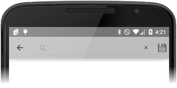
Figure 6-2. SearchView on the action bar
SearchView allows the user to start the search action immediately from the action bar.
Adding Action Views to the Action Bar
Action views are also declared through the actionViewClass attribute of the <item> tag, as shown in Listing 6-9.
Listing 6-9. Declaring an Action with an Action View
<item
    android:id="@+id/action_search"
    android:title="@string/action_search"
    android:icon="@drawable/ic_action_search"
    android:showAsAction="ifRoom "
    android:actionViewClass="android.widget.SearchView"/>
Action views can be a View, or they can be a view layout. The actionLayout attribute can be used instead of the actionViewClass attribute if a layout will be used for the action view.
Accessing the Action View Instance
The application can access the instance of the action view within the onCreateOptionsMenu method after inflating the menu resource, as shown in Listing 6-10.
Listing 6-10. Accessing the Action View Instance
@Override
public boolean onCreateOptionsMenu(Menu menu) {
    getMenuInflater().inflate(R.menu.menu_main, menu);

    MenuItem searchMenuItem =
            menu.findItem(R.id.action_search);
    SearchView searchView =
            (SearchView) searchMenuItem.getActionView();

    return true;
}
Collapsing Action Views to Preserve Space
As shown in Figure 6-2, action views, by their nature, can take up a large portion of the action bar. As shown in Listing 6-11, the application can use the collapseActionView in the showAsAction attribute to provide a hint to the Android platform that the action view should be collapsed into an action button.
Listing 6-11. Collapsing an Action View
<item
    android:id="@+id/action_search"
    android:title="@string/action_search"
    android:icon="@drawable/ic_action_search"
    android:showAsAction="ifRoom|collapseActionView"
    android:actionViewClass="android.widget.SearchView"/>
As shown in Figure 6-3, the Android platform is handling the collapse operation; the application does not have handle the click event for the action. It will automatically get expanded to show the action view.
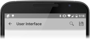
Figure 6-3. Collapsed action view shown as a button
Although action views allow replacing action buttons with rich widgets, they do not automatically handle the actual action that the widget should perform. The Android framework delivers action providers to fill this gap. Action providers, besides replacing the action button with a custom layout, also take full control of all the action’s behaviors.
The ShareActionProvider is a good example of action providers. As shown in Figure 6-4, the ShareActionProvider replaces the action button with a drop-down menu listing all possible ways that the content can be shared.
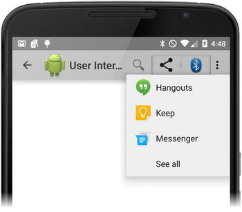
Figure 6-4. ShareActionProvider with a drop-down menu
Besides rendering the list, it also handles the internals of sharing the content per the user’s selection.
Adding the Action Provider to the Action Bar
Action views are also declared through the actionProviderClass attribute of the <item> tag, as shown in Listing 6-12.
Listing 6-12. Adding the Share Action Provider to the Action Bar
<item android:id="@+id/action_share"
    android:title="@string/action_share"
    android:showAsAction="ifRoom"
    android:actionProviderClass=
        "android.widget.ShareActionProvider"/>
Initializing the Action Provider
As the action provider needs to perform a certain operation, it may require some additional information from the application. As shown in Listing 6-13, the application can initialize action providers within the onCreateOptionsMenu method of the Activity class.
Listing 6-13. Initializing the Action Provider
@Override
public boolean onCreateOptionsMenu(Menu menu) {
    getMenuInflater().inflate(R.menu.menu_toast, menu);

    MenuItem menuItem = menu.findItem(R.id.action_share);
    ShareActionProvider shareActionProvider =
            (ShareActionProvider) menuItem.getActionProvider();

    Intent intent = new Intent(Intent.ACTION_SEND);
    intent.setType("image/*");

    shareActionProvider.setShareIntent(intent);
    return true;
}
Toast is a small pop-up window that provides feedback to the user about an application operation. Toast provides feedback as the Toast10 class in the Android framework. Toasts are displayed for a short period of time and disappear. Toasts are information-only pop-up windows; they cannot interact with the user, as shown in Figure 6-5.
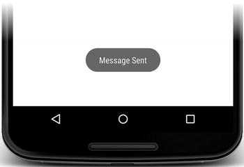
Figure 6-5. Toast message
The application can show a toast message anytime by creating the toast using the makeText11 method of the Toast class and then calling its show12 method, as shown in Listing 6-14.
Listing 6-14. Displaying a Toast Message
Toast toast = Toast.makeText(this,
        "Message Sent",
        Toast.LENGTH_SHORT);

toast.show();
The makeText method takes the current context, the message to display, and the toast duration. The message can be supplied as a simple string or a string resource ID. The Toast class provides two constants for the supported toast durations.
- LENGTH_SHORT: Toast message for a short period of time.
- LENGTH_LONG: Toast message for a long period of time.
Note As a best practice, toasts should only be used when the application is in the foreground. When the application is backgrounded, any feedback from the application should be delivered to the user through notifications rather than toasts.
Toast messages are informational only; they cannot receive the user’s input. If the application needs to prompt for the user’s input, the Android framework provides dialog messages. Similar to toasts, dialogs are also small pop-up windows that do not fill the screen. Dialogs can contain variety of input controls to interact with the user. On the Android platform, dialogs are implemented on top of the Dialog13 base class.
Dialog Flavors
In order to facilitate the usage of dialog messages, the Android platform also provides dialog flavors for most common use cases, such as the alert dialog, the date picker dialog, the progress dialog, the time picker dialog, the character picker dialog, the media route chooser dialer, and the media route controller dialog. Applications can easily customize these dialogs to fit unique application needs.
Caution We recommend that developers customize these dialog flavors instead of directly building a new dialog on top of the Dialog base class.
Alert dialogs are provided through the AlertDialog14 class. This is the most generic dialog flavor provided by the Android framework. All variety of dialogs can be built on top of the alert dialogs. As shown in Figure 6-6, an alert dialog consists of three parts.
- Title: An optional dialog title.
- Content: A message, a list, or other custom layout.
- Buttons: Up to three action buttons for the dialog.
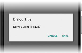
Figure 6-6. Alert dialog
An alert dialog can be created using the AlertDialog.Builder15 builder class, as shown in Listing 6-15.
Listing 6-15. Creating an Alert Dialog Using the Alert Dialog Builder
AlertDialog alertDialog = new AlertDialog.Builder(this)
        .setTitle("Dialog Title")
        .setMessage("Do you want to save?")
        .create();
The setMessage16 method of AlertDialog.Builder populates the content area of the alert dialog with the given message text. Both the setTitle17 method and the setMessage method accept the text as a string, or as a string resource. Calling the create18 method creates an AlertDialog instance.
Adding Buttons to an Alert Dialog
The alert dialog supports up to three buttons: the positive button, the negative button, and the neutral button.
(1) Adding the Positive Button
The positive button is used to for the accept action, such as the “OK” button. The setPositiveButton19 method of the AlertDialog.Builder is used to define the positive button, as shown in Listing 6-16.
Listing 6-16. Adding the Positive Button to the Alert Dialog
AlertDialog alertDialog = new AlertDialog.Builder(this)
        .setTitle("Dialog Title")
        .setMessage("Do you want to save your changes?")
        .setPositiveButton("Save",
                new DialogInterface.OnClickListener() {
            @Override
            public void onClick(
                    DialogInterface dialogInterface,
                    int which) {
                // Save the user's changes.
}
})
        .create();
    }
The setPositiveButton method takes the button’s label and a DialogInterface.OnClickListener20 interface implementation to handle the click action.
Tip The DialogInterface.OnClickListener’s onClick21 callback method takes the button type as its last parameter. Instead of providing multiple implementations of this interface, the application may choose to provide a single implementation, and use the button-type parameter to detect which button the user clicks.
(2) Adding the Negative Button
The negative button is used for the cancel action. Similar to the positive button, the setNegativeButton22 method of the AlertDialog.Builder class is used to add the negative button.
(3) Adding the Neutral Button
The neutral button allows the user to skip making a decision, such as clicking the “Remind me later” button. Similar to both positive and negative buttons, the neutral button is also added to the alert dialog through the setNeutralButton23 method of the AlertDialog.Builder class.
Using a List on an Alert Dialog
Besides these three support button types, the alert dialog can also contain complex input controls, such as a list of items to choose from, as shown in Figure 6-7.
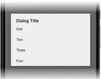
Figure 6-7. Using a list in the alert dialog
The setItems24 method of the AlertDialog.Builder class is used to set the content of such list. The AlertDialog.Builder class provides two flavors of setItems method. The method can either take the list of items from a string array, as shown in Listing 6-15, or, instead, take a string array resource ID.
Listing 6-17. Using a List in the Alert Dialog
final String[] items = {
        "One", "Two", "Three", "Four"
};

AlertDialog alertDialog = new AlertDialog.Builder(this)
        .setTitle("Dialog Title")
        .setItems(items,new DialogInterface.OnClickListener() {
            @Override
            public void onClick(
                    DialogInterface dialogInterface,
                    int what) {
                String item = items[what];
}
})
.create();
The alert dialog notifies the application about the selected item through the provided DialogInterface.OnClickListener instance. The which parameter of the onClick callback method takes the index position of the selected item.
(4) Using a Multi-Choice List in the Alert Dialog
Alert dialogs can also be configured to show either a multi-choice or a single-choice list, as shown in Figure 6-8.
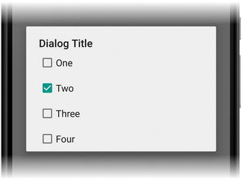
Figure 6-8. Using a multi-choice list in the alert dialog
The AlertDialog.Builder class provides the setMutiChoiceItems25 method to configure the alert dialog to render a multi-choice list, as shown in Listing 6-18.
Listing 6-18. Rendering a Multi-choice List in the Alert Dialog Using the setMultiChoiceItems Method
final String[] items = {
        "One", "Two", "Three", "Four"
};

final boolean[] checked = {
        false, true, false, false
};

AlertDialog alertDialog = new AlertDialog.Builder(ToastActivity.this)
        .setTitle("Dialog Title")
        .setMultiChoiceItems(
            items,
            checked,
            new DialogInterface.OnMultiChoiceClickListener() {
                    @Override
                    public void onClick(
                            DialogInterface dialogInterface,
                            int what,
                            boolean isChecked) {
}
}
)
.create();
The setMultiChoiceItems method takes a string array of list items, an optional Boolean array indicating which items must be checked by default. The list change events get delivered to the application through the DialogInterface.OnMultiChoiceClickListener26 interface.
(5) Using a Single-Choice List in the Alert Dialog
The setSingleChoiceItems27 method can be used the same way to render a single-choice list within the alert dialog, as shown in Figure 6-9.
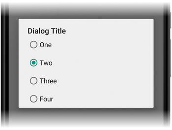
Figure 6-9. Using a single-choice list in the alert dialog
Note Both the setSingleChoiceItems and the setItems provide a single-choice list to the user. The advantage of using the single-choice list is that it persists the user’s choice, so that subsequent access to the same dialog will start with the user’s previous selection as the default.
The setSingleChoiceItems method takes a string array for the list options and an optional index value for the default selection. The selection change gets delivered to the application through the DialogInterface.OnClickListener, as shown in Listing 6-19.
Listing 6-19. Rendering a Single-Choice List in the Alert Dialog Using the setSingleChoiceItems Method
AlertDialog alertDialog = new AlertDialog.Builder(ToastActivity.this)
        .setTitle("Dialog Title")
        .setSingleChoiceItems(
                items,
                1,
                new DialogInterface.OnClickListener() {
                    @Override
                    public void onClick(
                            DialogInterface dialogInterface,
                            int what) {
}
}
)
.create();
Using a Custom Layout in an Alert Dialog
Besides the provided alert dialog types, through the setView method of the AlertDialog.Builder class, the application can also provide its own custom layout as the content of the alert dialog, as shown in Figure 6-10.
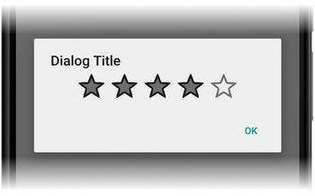
Figure 6-10. Using a custom layout on alert dialog
The setView method takes a custom view instance to fill the alert dialog’s content area. The custom view can be defined in a regular layout XML file and then inflated as a view, as shown in Listing 6-20.
Listing 6-20. Rendering a Custom Layout in an Alert Dialog
LayoutInflater layoutInflater = getLayoutInflater();
View customDialog = layoutInflater.inflate(
        R.layout.custom_dialog, null);

final RatingBar ratingBar = (RatingBar) customDialog.findViewById(R.id.ratingBar);

final AlertDialog alertDialog = new AlertDialog.Builder(ToastActivity.this)
        .setTitle("Dialog Title")
        .setView(customDialog)
        .setPositiveButton("OK",
                new DialogInterface.OnClickListener() {
            @Override
            public void onClick(
                    DialogInterface dialogInterface, int i) {
                int numberOfStars = ratingBar.getNumStars();
            }
        })
        .create();
Date Picker Dialog
The DatePickerDialog28 is a simple predefined alert dialog with a DatePicker29 widget as its content, as shown in Figure 6-11.
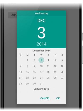
Figure 6-11. DatePickerDialog prompting the user for a date
It can easily be used by applications to prompt the user for a date selection. As shown in Listing 6-21, the DatePickerDialog, takes the current activity context, a DatePickerDialog.OnDateSetListener30 implementation, and the default values for year, month, and day.
Listing 6-21. DatePickerDialog Initialization
DatePickerDialog datePickerDialog = new DatePickerDialog(
        getActivity(),
        new DatePickerDialog.OnDateSetListener() {
            @Override
            public void onDateSet(DatePicker datePicker,
                                  int year,
                                  int monthOfYear,
                                  int dayOfMonth) {

            }
        },
        calendar.get(Calendar.YEAR),
        calendar.get(Calendar.MONTH),
        calendar.get(Calendar.DAY_OF_MONTH)
);
Time Picker Dialog
In the same way, the TimePickerDialog31 prompts the user to select a time using the TimePicker32 widget, as shown in Figure 6-12.
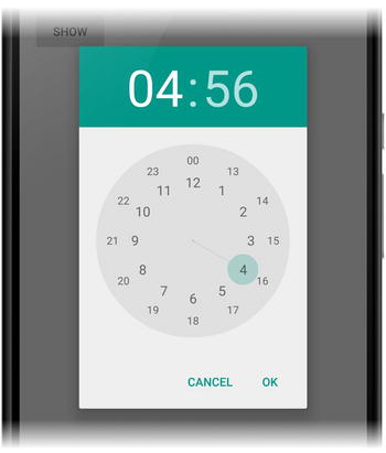
Figure 6-12. TimePickerDialog prompting user for time
The TimePickerDialog takes the current activity context, a TimePickerDialog.OnSetTimeListener33 instance, the default hour and minute, and whether to use a 24-hour view, as shown in Listing 6-22.
Listing 6-22. TimePickerDialog Initialization
TimePickerDialog timePickerDialog = new TimePickerDialog(
        getActivity(),
        new TimePickerDialog.OnTimeSetListener() {
            @Override
            public void onTimeSet(
                    TimePicker timePicker,
                    int hour,
                    int minute) {

            }
        },
        calendar.get(Calendar.HOUR),
        calendar.get(Calendar.MINUTE),
        true
);
Progress Dialog
The ProgressDialog34 provides an alert dialog with a ProgressBar35 widget. In addition to the progress indicator, it can show a message, as shown in Figure 6-13.
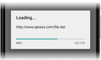
Figure 6-13. ProgressDialog showing the current progress percentage
The ProgressDialog provides methods to configure the ProgressBar. As shown in Listing 6-23, through these methods, the ProgressBar style, maximum value, and current progress can be changed.
Listing 6-23. Initializing the ProgressDialog Instance
ProgressDialog progressDialog = new ProgressDialog(getActivity());
progressDialog.setProgressStyle(
        ProgressDialog.STYLE_HORIZONTAL);
progressDialog.setTitle("Loading...");
progressDialog.setMessage("http://www.apress.com/file.dat");
progressDialog.setMax(100);
progressDialog.incrementProgressBy(60);
Showing a Dialog
Although the Dialog class provides a show method to display the dialog, this method does not handle the necessary life-cycle events directly. Android recommends wrapping the dialogs within a DialogFragment36 before showing them. The DialogFragment handles the life-cycle events such as the user clicking the back button. As shown in Listing 6-24, the actual dialog needs to be initialized and returned by overriding the onCreateDialog37 method of DialogFragment.
Listing 6-24. DialogFragment Wrapping an AlertDialog Instance
DialogFragment dialogFragment = new DialogFragment() {
    @Override
    public Dialog onCreateDialog(Bundle savedInstanceState) {
        AlertDialog alertDialog =
                new AlertDialog.Builder(getActivity())
                    .setTitle("Dialog Title")
                    .setMessage("Do you want to save?")
                    .create();

        return alertDialog;
    }
};
The DialogFragment provides methods to control the dialog and manage its appearance. The dialog can be displayed through the show38 method, as shown in Listing 6-25.
Listing 6-25. Showing an AlertDialog Using the DialogFragment
dialogFragment.show(
        getFragmentManager(),
        "dialog");
Through the toasts and the dialogs, the application can easily notify the user and prompt for information while the application is in the foreground. When the application is backgrounded, it can communicate with the user through the notifications. Once posted, the notifications appear as an icon in the notification area, as shown in Figure 6-14.

Figure 6-14. Notification icon displayed in the notification area
In order to see the details of the notification, as shown in Figure 6-15, the user can simply expand the notification drawer.
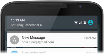
Figure 6-15. Notification expanded in the notification drawer
Accessing the Notification Service
The NotificationManager39 class provides the Notification API. As shown in Listing 6-26, the application can access the instance of the NotificationManager by requesting the system service through the getSystemService method of the current context and providing the constant NOTIFICATION_SERVICE40 as the name. The Android platform does not require special permission for applications to access the notification service.
Listing 6-26. Getting the Notification Manager Instance
NotificationManager notificationManager =
        (NotificationManager) getSystemService(
                Context.NOTIFICATION_SERVICE);
Each individual notification is represented through the Notification41 class. In order to display a notification, Android requires the notification object to contain at least a title, a detail text, and a small icon.
The Notification.Builder42 class is provided by the Android framework as a convenient way to set various characteristics of a Notification object. As shown in Listing 6-27, after setting the necessary fields, the application can invoke the build43 method of the Notification.Builder object to build a Notification class instance.
Listing 6-27. Building a Notification Object Through the Notification Builder
Notification notification = new Notification.Builder(this)
        .setContentTitle("New Message")
        .setContentText("[email protected]")
        .setSmallIcon(R.drawable.ic_apress)
        .build();
The notification can then be posted through the notify44 method of the NotificationManager class, as shown in Listing 6-28. The notify method takes a unique identifier for this notification within the application and a Notification object.
Listing 6-28. Posting a Notification to Be Shown in the Notification Area
notificationManager.notify(1, notification);
Adding Actions to a Notification
Notifications are expected to provide at least a single action to take the user back to the application once the user clicks the notification. The setContentIntent45 of the Notification.Builder can be used to set a PendingIntent to be started once the user clicks the notification, as shown in Listing 6-29.
Listing 6-29. Adding a Default Action to a Notification
Intent intent = new Intent(this, MessageActivity.class);

PendingIntent pendingIntent = PendingIntent.getActivity(
        this, 0, intent, 0);

Notification notification = new Notification.Builder(this)
        .setContentTitle("New Message")
        .setContentText("[email protected]")
        .setSmallIcon(R.drawable.ic_apress)
        .setContentIntent(pendingIntent)
        .build();
Consistent navigation is essential for a smooth user experience. The Android platform provides a back button to make it easier for the user to navigate backward through the history of screens that he previously visited. The Android platform achieves this by keeping a back stack of all started activities. Although this is automatically handled by the platform most of the time, there are certain exceptions, and notifications are one of them.
Notifications allow the user to enter a deep-level activity directly by clicking the notification. At this time, the deep-level activity starts without a back stack. For example, an e-mail application would normally have an inbox activity with a list of all messages and a message activity to display the content of each message. In case of a new message notification, the user will enter directly into the message activity without going through the inbox activity. In such cases, the application is expected to synthesize a new back stack.
Building the Back Stack
The Android framework provides the TaskStackBuilder46 class to allow anapplication to build the back stack, as shown in Listing 6-30.
Listing 6-30. Building the Back Stack Using the TaskStackBuilder
Intent intent = new Intent(this, ToastActivity.class);

TaskStackBuilder taskStackBuilder =
        TaskStackBuilder.create(this);

taskStackBuilder.addParentStack(MessageActivity.class);
taskStackBuilder.addNextIntent(intent);

PendingIntent pendingIntent =
        taskStackBuilder.getPendingIntent(
                0, PendingIntent.FLAG_UPDATE_CURRENT);
The addParentStack47 method of TaskStackBuilder tries to automatically build the back stack based on the parent hierarchy of the given activity. The parent hierarchy of an activity is declared in the manifest file. The parentActivityName48 attribute of the <activity> XML tag specifies the parent activity, as shown in Listing 6-31.
Listing 6-31. Declaring the Parent Hierarchy of an Activity
<activity android:name=".InboxActivity">
</activity>

<activity android:name=".MessageActivity"
    android:parentActivityName=".InboxActivity">

</activity>
Adding Action Buttons to a Notification
The Notification API also enables an application to incorporate up to three buttons in the notification for additional actions, as shown in Figure 6-16.
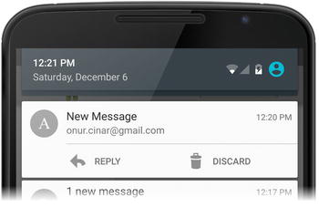
Figure 6-16. Notification with two action buttons
By default, when the notification is collapsed, these action buttons are not visible, and the application is still expected to provide a default action for this case. The addAction49 method of the Notification.Builder class is used to add action buttons to a notification as shown in Listing 6-32.
Listing 6-32. Adding Action Buttons to a Notification
Notification notification = new Notification.Builder(this)
        .setContentTitle("New Message")
        .setContentText("[email protected]")
        .setSmallIcon(R.drawable.ic_apress)
        .setContentIntent(pendingIntent)
        .addAction(R.drawable.ic_action_reply,
                "Reply", replyPendingIntent)
        .addAction(R.drawable.ic_action_discard,
                "Discard", discardPendingIntent)
        .build();
Once the notification gets displayed, the application can still update it. Using the same unique notification identifier, the application can post a new notification that will replace the previous one. For example, in case of a messaging application, the Notification.InboxStyle50 can be used to combine the notifications under a single notification, as shown in Figure 6-17.
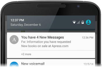
Figure 6-17. Combined notifications using the inbox style
The Android platform can display notifications in an expanded view when a layout is specified through the setStyle51 method. This makes it easier to update the notifications by combining multiple notifications under a single expandable notification, as shown in Listing 6-33.
Listing 6-33. Combining Notifications Under a Single Notification Using the Inbox Style
Notification.InboxStyle inboxStyle =
        new Notification.InboxStyle();
inboxStyle.addLine("Fw: Information you have requested");
inboxStyle.addLine("New books on sale at Apress.com");
inboxStyle.setSummaryText("+2 more");

notification = new Notification.Builder(this)
        .setContentTitle("You have 4 New Messages")
        .setContentText("[email protected]")
        .setSmallIcon(R.drawable.ic_apress)
        .setContentIntent(pendingIntent)
        .setStyle(inboxStyle)
        .build();

notificationManager.notify(1, notification);
If the notification is no longer needed, the application can use the cancel52 method of the NotificationManager to cancel an existing notification by providing its unique notification identifier, as shown in Listing 6-34.
Listing 6-34. Canceling a Notification Using the Unique Notification ID
notificationManager.cancel(1);
The application can also cancel all of its notifications through the cancelAll53 method of the NotificationManager class, as shown in Listing 6-35.
Listing 6-35. Canceling All Application Notifications
notificationManager.cancelAll();
Summary
This chapter provided a brief overview of the APIs that are employed by the Android framework to benefit from base window features, such as the action bar, toasts, dialogs, and notifications. The action bar is part of every Android application starting from API Level 11. It delivers a consistent way to provide identification about the application and a prominent place to list import application actions. Toasts and dialogs provide a way to launch a pop-up window to deliver notification to the user, and also to prompt the user for information while the application is still in the foreground. In a similar way, notifications allow applications to notify the user while the application is backgrounded. Once the notification gets posted for displaying in the notification area, the Android platform also propagates the notification to connected devices, such as smart watches. Proper use of these window features improves the user experience and provides a consistent way for users to interact with Android applications.
____________________
1http://developer.android.com/reference/android/app/ActionBar.html.
2http://developer.android.com/reference/android/app/Activity.html#getActionBar().
3http://developer.android.com/reference/android/app/ActionBar.html#hide().
4http://developer.android.com/guide/topics/resources/menu-resource.html#item-element.
5http://developer.android.com/reference/android/view/Menu.html.
6http://developer.android.com/reference/android/app/Activity.html #onCreateOptionsMenu(android.view.Menu).
7http://developer.android.com/reference/android/app/Activity.html#onOptionsItemSelected(android.view.MenuItem).
8http://developer.android.com/reference/android/view/MenuItem.html.
9http://developer.android.com/reference/android/widget/SearchView.html.
10http://developer.android.com/reference/android/widget/Toast.html.
11http://developer.android.com/reference/android/widget/Toast.html#makeText(android.content.Context, int, int).
12http://developer.android.com/reference/android/widget/Toast.html#show().
13http://developer.android.com/reference/android/app/Dialog.html.
14http://developer.android.com/reference/android/app/AlertDialog.html.
15http://developer.android.com/reference/android/app/AlertDialog.Builder.html.
16http://developer.android.com/reference/android/app/AlertDialog.Builder.html#setMessage(java.lang.CharSequence).
17http://developer.android.com/reference/android/app/AlertDialog.Builder.html#setTitle(java.lang.CharSequence).
18http://developer.android.com/reference/android/app/AlertDialog.Builder.html#create().
19http://developer.android.com/reference/android/app/AlertDialog.Builder.html#setPositiveButton(int,android.content.DialogInterface.OnClickListener).
20http://developer.android.com/reference/android/content/DialogInterface.OnClickListener.html.
21http://developer.android.com/reference/android/content/DialogInterface.OnClickListener.html#onClick(android.content.DialogInterface, int).
22http://developer.android.com/reference/android/app/AlertDialog.Builder.html#setNegativeButton(java.lang.CharSequence,android.content.Dialog Interface.OnClickListener).
23http://developer.android.com/reference/android/app/AlertDialog.Builder.html#setNeutralButton(java.lang.CharSequence,android.content.Dialog Interface.OnClickListener).
24http://developer.android.com/reference/android/app/AlertDialog.Builder.html.#setItems(java.lang.CharSequence[],android.content.DialogInterface.OnClickListener).
25http://developer.android.com/reference/android/app/AlertDialog.Builder.html#setMultiChoiceItems(java.lang.CharSequence[], boolean[], android.content.DialogInterface.OnMultiChoiceClickListener).
26http://developer.android.com/reference/android/content/DialogInterface.OnMultiChoiceClickListener.html.
27http://developer.android.com/reference/android/app/AlertDialog.Builder.html#setSingleChoiceItems(java.lang.CharSequence[], int, android.content.DialogInterface.OnClickListener).
28http://developer.android.com/reference/android/app/DatePickerDialog.html.
29http://developer.android.com/reference/android/widget/DatePicker.html.
30http://developer.android.com/reference/android/app/DatePickerDialog. OnDateSetListener.html.
31http://developer.android.com/reference/android/app/TimePickerDialog.html.
32http://developer.android.com/reference/android/widget/TimePicker.html.
33http://developer.android.com/reference/android/app/TimePickerDialog. OnTimeSetListener.html.
34http://developer.android.com/reference/android/app/ProgressDialog.html.
35http://developer.android.com/reference/android/widget/ProgressBar.html.
36http://developer.android.com/reference/android/app/DialogFragment.html.
37http://developer.android.com/reference/android/app/DialogFragment. html#onCreateDialog(android.os.Bundle).
38http://developer.android.com/reference/android/app/DialogFragment.html#show(android.app.FragmentManager, java.lang.String).
39http://developer.android.com/reference/android/app/NotificationManager.html.
40http://developer.android.com/reference/android/content/Context.html# NOTIFICATION_SERVICE.
41http://developer.android.com/reference/android/app/Notification.html.
42http://developer.android.com/reference/android/app/Notification.Builder.html.
43http://developer.android.com/reference/android/app/Notification.Builder.html#build().
44http://developer.android.com/reference/android/app/NotificationManager.html#notify(int, android.app.Notification).
45http://developer.android.com/reference/android/app/Notification.Builder.html#setContentIntent(android.app.PendingIntent).
46http://developer.android.com/reference/android/app/TaskStackBuilder.html.
47http://developer.android.com/reference/android/app/TaskStackBuilder.html #addParentStack(android.app.Activity).
48http://developer.android.com/guide/topics/manifest/activity-element.html#parent.
49http://developer.android.com/reference/android/app/Notification.Builder.html#addAction(int, java.lang.CharSequence, android.app.PendingIntent).
50http://developer.android.com/reference/android/app/Notification. InboxStyle.html.
51http://developer.android.com/reference/android/app/Notification.Builder.html#setStyle(android.app.Notification.Style).
52http://developer.android.com/reference/android/app/NotificationManager.html#cancel(int).
53http://developer.android.com/reference/android/app/NotificationManager.html#cancelAll().