
Sophisticated Interactions
Having the correct expected functionality, fast load times, and a great perceived performance is not enough for an application by today’s standards. The interface must also be refined, smooth, and include sophisticated interactions such as animated elements and drag-and-drop interactions.
Animation in React
React provides a default way of dealing with animations with its high level ReactCSSTransitionGroup (part of the add-ons module). The ReactCSSTransitionGroup is not full stack animation library. It doesn’t feature value interpolation, timeline management, or chaining, for example, but it does facilitate the integration of CSS transitioning with React by allowing you to trigger CSS transitions and animations when components are added or removed from the DOM. CSS transitions and animations are standard browser mechanisms that provide a way to interpolate from one CSS style configuration to another.
In the next two sections, you will take an overall look on how CSS animation works and how to use ReactCSSTransitionGroup to perform component animations.
CSS Transition and Animation 101
To use ReactCSSTransitionGroup, you need to be familiar with setting up CSS transitions and animations, and you need to know how to trigger them with JavaScript. Let’s briefly cover this subject before moving to integration with React components. If you already understand CSS transitions, feel free to skip straight to the React-specific content in the next section.
There are two categories of animations in CSS: CSS transitions and CSS keyframe animations.
- CSS transitions are animations made by interpolating values between two distinct states, a start state and an end state.
- CSS keyframe animations allow for more complex animations with control over intermediary steps besides start and end using keyframes.
CSS Transitions
CSS transitions provide a way to animate (or interpolate, to be more precise) the transition between CSS properties. For example, if you change the color of an element from grey to red, usually the change is instantaneous. With CSS transitions enabled, changes occur smoothly over a given period of time.
CSS transitions are controlled with the transition property. It tells the browser that the properties within that selector should have their values interpolated over time, creating an animated effect. The transition property accepts up to four attributes:
- The element property name to animate (such as color or width). If omitted, all properties that can be animated will transition.
- Duration of the animation.
- Optional timing function to control the acceleration curve (such as ease-in and ease-out).
- Optional delay before the animation starts.
Let’s create a button-shaped HTML link that that changes the background color when the mouse is over it. In Listing 4-1, notice the presence of the .button and .button:hover selectors, which contain different values for the properties background-color and box-shadow, as well as the transition attribute defining the duration of the animation. Figure 4-1 illustrates the process of the button animating to the hovered state.

Figure 4-1. A representation of what the hover animation looks like
Note About Prefixes
As of the time of writing, some WebKit-based browsers still required the use of a prefix on the name of the properties of both kinds of animations, keyframes and transitions. Until they adopt the standard version, you’ll want to include both unprefixed and prefixed versions in your code.
For example, for the hover button you should include
.button:hover{
  background-color: #ee2222;
  box-shadow: 0 4px #990000;
  webkit-transition: 0.5s;
  transition: 0.5s;
}
For simplicity, the examples in this book are unprefixed.
Keyframe Animations
Transition-based animations only provide control over two points of the animation: the beginning state and the final state. All the intermediary steps are interpolated by the browser. Another method of creating CSS animations is the keyframe property, which gives you more specific control over the intermediate steps of the animation sequence than you get when letting the browser handle everything automatically.
To use keyframes, you specify your animation steps in a separate block of CSS, with a @keyframes rule and a name, such as:
@keyframes pulsing-heart {
  0% { transform: none; }
  50% { transform: scale(1.4); }
  100% { transform: none; }
}
The block above is a set of keyframes named pulsing-heart. It defines three keyframes: one at the very beginning of the animation (represented by 0%), one at the middle of the animation (50%), and one at the end.
A keyframes definition can be later referenced in any style definition through the animation property. The animation property accepts the name of the set of keyframes, the animation duration, and other optional configurations (such as repetitions). As an example, let’s create a simple heart that pulses when the mouse is over it.
<!DOCTYPE html>
<html>
<head>
<meta charset="utf-8">
<title>Pulsing Heart</title>
<style media="screen">
body{
text-align: center;
}
@keyframes pulsing-heart {
0% { transform: none; }
50% { transform: scale(1.4); }
100% { transform: none; }
}
.heart {
font-size: 10rem;
color: #FF0000;
}
.heart:hover {
animation: pulsing-heart .5s infinite;
transform-origin: center;
}
</style>
</head>
<body>
<div>
<div class="heart">♥ </div>
</div>
</body>
</html>
Programmatically Starting CSS Transitions and Animations
Since the pseudo selectors only cover the most basic interaction scenarios, you will want to use JavaScript to have more flexibility over when to trigger the CSS transitions and animations. This is usually done through class swapping: you create two separate classes for the same element, containing different property values between them. The HTML element starts using just one of these classes, and via JavaScript you dynamically remove the old class reference and add a new one, which will trigger the CSS animated transition.
Let’s try this out with a very basic sketch of a side menu that is triggered by a “hamburger” menu on the page header, as shown in Figure 4-2.
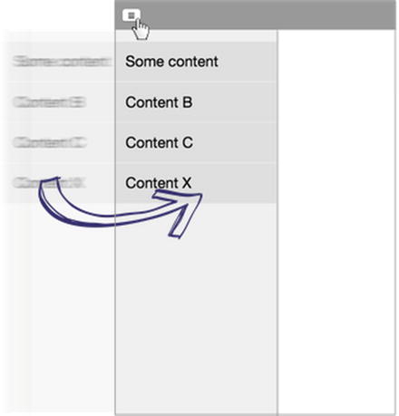
Figure 4-2. Project with sidebar opened on button click
You will start with a CSS class that defines the basic sidebar styling:
/* Sidebar default style */
.sidebar{
  background-color:#eee;
  box-shadow: 1px 0 3px #888888;
  position:absolute;
  width: 15rem;
  height: 100%;
}
Next, let’s create two classes with the same properties and different values. While the first class (.sidebar-transition) sets the sidebar opacity to 0 (transparent) and positions it off the screen boundaries, the .sidebar-transition-active sets the opacity to 1 (visible) and positions the sidebar inside the screen bounds. Notice that the sidebar-transition-active class also defines the transition property for an animated transition of 0.5 seconds.
.sidebar-transition{
  opacity: 0;
  left: -15rem;
}

.sidebar-transition-active{
  opacity: 1;
  left: 0;
  transition: ease-in-out 0.5s;
}
In the HTML code, the sidebar is declared only with the .sidebar-transition class, not the .sidebar-transition–active one (so it starts off as hidden):
<div class=’sidebar sidebar-transition’>
  <ul>
    <li>Some content</li>
    <li>Content B</li>
           ...
    <li>Concent X</li>
  </ul>
</div>
You won’t use React or any other library here. To trigger this bare-bones example, you will use an inline JavaScript code hacked together with HTML, which is not exactly an example of good practices, but it’s just a prototype to demonstrate the concept. What the JavaScript code does is add the .sidebar-transition–active class to the sidebar when the menu button is clicked. The sample code is shown in Listing 4-2.
Listing 4-2. Dynamicly Adding a CSS Class to Trigger a CSS Transition
<!DOCTYPE html>
<html>
<head>
<meta charset="utf-8">
<title>Hacked together sidebar Transition</title>
<style media="screen">
/* the sidebar will have a list of contents. Let’s style them too */
ul {
list-style-type: none;
padding: 0;
}
li{
padding: 15px;
border-bottom: solid 1px #eee;
background-color: #ddd;
}
.sidebar{
background-color:#eee;
box-shadow: 1px 0 3px #888888;
position:absolute;
width: 15rem;
height: 100%;
}
.sidebar-transition{
opacity: 0;
left: -15rem;
}
.sidebar-transition-active{
opacity: 1;
left: 0;
transition: 0.5s;
}
</style>
</head>
<body>
<header>
<button onclick="
document.querySelector(’.sidebar’).classList.add(’sidebar-transition-active’);
"></button>
<!--
</header>
<div class=’sidebar sidebar-transition’>
<ul>
...
</ul>
</div>
</body>
</html>
React CSSTransitionGroup
ReactCSSTransitionGroup is a simple element that wraps all of the components you are interested in animating, and triggers CSS animations and transitions at specific moments related to the component’s lifecycle, such as mounting and unmounting. It is provided as an add-on, so be sure to install it using npm install --save react-addons-css-transition-group.
React Animation Example: Shopping List
As an example, let’s create a basic animated shopping list where you can add and remove items.
Basic Application Setup
To begin, create a new React project (you can use this book’s app boilerplate, found at https://github.com/pro-react/react-app-boilerplate) and edit the main JavaScript file to create the AnimatedShoppingList base structure, as shown in Listing 4-3.
Some things to notice in this component are
- Clicking on a shopping list item will remove that item.
- The user can create new items by typing in the text field and pressing the Enter key.
- Each shopping item has an ID (you’re even generating a new ID for every new item based on a timestamp). IDs are used as item keys. You must provide the key attribute for all children of ReactCSSTransitionGroup, even when only rendering a single item because this is how React will determine which children have entered, left, or stayed.
Let’s throw in some CSS rules for basic styling. For now, this CSS won’t contain any transition rules, but they will be added in the next step.
input {
  padding: 5px;
  width: 120px;
  margin-top:10px;
}

.item {
  background-color: #efefef;
  cursor: pointer;
  display: block;
  margin-bottom: 1px;
  padding: 8px 12px;
  width: 120px;
}
Adding the ReactCSSTransitionGroup Element
The component is already working, and it’s possible to add and remove shopping items. Now let’s animate the entering and leaving of items.
The ReactCSSTransitionGroup element must be inserted around the children elements that you want to animate. It accepts three props: transitionName (which will be mapped to CSS class names containing the actual animation definition), transitionEnterTimeout, and transitionLeaveTimeout (with the animation’s duration in milliseconds).
In your Shopping List example, you will insert the ReactCSSTransitionGroup around the shoppingItems variable in the render method. You will call the transition name “Example” and set an enter and leave duration of 300 ms:
return(
  <div>
    <ReactCSSTransitionGroup transitionName="example"
                             transitionEnterTimeout={300}
                             transitionLeaveTimeout={300}>
      {shoppingItems}
    </ReactCSSTransitionGroup>
    <input type="text" value={this.state.newItem} onKeyDown={this.handleChange.bind(this)}/>
  </div>
);
From this point on, every time a new item is added to the state, React will render the item with the additional className of example-enter. Immediately after, in the next browser tick, React will also attach the className example-enter-active: because of the nature of CSS transitions; it needs a starting class with the default style properties, and the animation is triggered when a second class with different properties and a transition rule is added to the element. Finally, after the time defined in transitionEnterTimeout prop expires, both classes will be removed.
Let’s add both example-enter and example-enter-active classes to your CSS. For this project, you will transition the translateX property (making the item come from the left side of the screen):
.example-enter {
  opacity: 0;
  transform: translateX(-250px);
}
.example-enter.example-enter-active {
  opacity: 1;
  transform:   translateX(0);
  transition: 0.3s;
}
Figure 4-3 illustrates the new item’s animation.

Figure 4-3. Animating the new item
The same mechanism applies for removing elements from the DOM. Before removing a shopping item, React will add an example-leave className followed by example-leave-active. When the defined LeaveTimeout expires, React will finally remove the element from the DOM. To complete your example, try adding this CSS:
.example-leave {
  opacity: 1;
  transform: translateX(0);
}

.example-leave.example-leave-active {
  opacity: 0;
  transform: translateX(250px);
  transition: 0.3s;
}
When testing this sample code, you may realize that the animation is performed for adding and removing elements, but the initial hard-coded items don’t appear with a transition in the beginning. ReactCSSTransitionGroup provides the optional prop transitionAppear to add an extra transition phase at the initial mount of the component. There is generally no transition phase at the initial mount because the default value of transitionAppear is false. The following is an example that passes the prop transitionAppear with the value true:
<ReactCSSTransitionGroup transitionName="example"
                         transitionEnterTimeout={300}
                         transitionLeaveTimeout={300}
                         transitionAppear={true}
                         transitionAppearTimeout={300}>
  {shoppingItems}
</ReactCSSTransitionGroup>
You also need to provide extra CSS classes to control the appearing transitions:
.example-appear {
  opacity: 0;
  transform: translateX(-250px);
}
.example-appear.example-appear-active {
  opacity: 1;
  transform:   translateX(0);
  transition: .5s;
}
Now your application starts transitioning the initial elements. Listing 4-4 shows the final source code for the animated shopping list application.
Drag-and-drop is a very common feature in sophisticated user interfaces. It is when you “grab” an object and drag it to a different location. Developing drag-and-drop interactions can be tricky. Until very recently there wasn’t a standard API on browsers. Even in modern browsers (where a standard HTML5 drag-and-drop API is available), the API has inconsistencies across vendors and doesn’t work on mobile devices. For these reasons, you will use React DnD, a drag-and-drop library that lets us work in a “React way” (not touching the DOM, embracing unidirectional data flow, defining source and drop target logic as pure data, among other benefits). Under the hood, React DnD plugs into the available API (such as the default HTML5 API for desktop browsers), and manages inconsistencies, quirks, and hides implementation details.
 Note Being an external library, to use React DnD you need to install and declare it as a dependency with npm. The examples in this book use React DND 2 with an HTML5 backend, installed via npm install –-save [email protected] [email protected].
React DnD Implementation Overview
The implementation of drag-and-drop behavior in your React application through the React DnD library is done using higher-order components. Higher-order components are JavaScript functions that accept a component as a parameter and return an enhanced version of that component, with added functionality.
The React DnD library provides three higher-order components that must be used on different components of your application: DragSource, DropTarget, and DragDropContext.
The DragSource returns an enhanced version of the given component with the added behavior of being a “draggable” element; the DropTarget returns an enhanced component with the ability to handle elements being dragged into it; and DragDropContext wraps the parent component where the drag-and-drop interaction occurs, setting up the shared DnD state behind the scenes (it is also is the simplest to implement).
The React DnD library also supports the use of JavaScript decorators as an alternative to higher-order components. JavaScript decorators are still in the experimental stage and are not part of ES 2015 specifications, so the examples in this book use higher-order components.
A React DnD Sample Implementation
Let’s work on an example to see how all these parts connect together. In this example, you’ll make a snack shop-themed app, with a lot of different circles representing the snacks that can be dragged into the shopping cart area. Figure 4-4 shows the end result.

Figure 4-4. The Snack Drag’nDrop
The app will be composed of three components besides the main App component: a draggable Snack (which will be enhanced by the DragSource higher-order component), ShoppingCard (which will be enhanced by the DropTarget higher-order component), and a Container component, which will contain both the ShoppingCart and various Snacks and will be enhanced by the DragDropContext higher-order component to orchestrate the drag-and-drop workings between Snacks and the Shopping Cart.
Since the DragDropContext is the easiest part of React DnD to implement, let’s start your application top-down, beginning with the App component, followed by the Container, Snack, and ShoppingCart.
The App component is straightforward: it just imports and renders the container’s HOC. Listing 4-5 shows the source code.
The Container
Next, let’s create the Container component, where all the drag-and-drop interaction will happen. You are going to render some Snack components with different name props and a ShoppingCart component below them. Listing 4-6 shows the source code.
Pay special attention to the fact that the module isn’t exporting your Container component but a higher-order component based on the Container with all the drag-and-drop state and functions injected into it. Also notice that you imported and used the HTML5 back end to React DnD. As mentioned, the React Drag’nDrop supports different back ends.
DragSource and DropTarget Higher Order Components
Next, you create the Snack and ShoppingCart components, which are enhanced by the dragSource and the dropTarget wrappers, respectively. Both dragSource and dropTarget require some boilerplate setup that needs further explanation. To create higher-order components using any of them, you need to provide three parameters: a type, a spec, and a collecting function.
Type
It’s the name of the component. In a complex UI, it is possible to have multiple types of drag sources interacting with multiple types of drop targets, so it is important that each one of them is uniquely identified.
Spec Object
The spec object describes how the enhanced component “reacts” to the drag and drop events. A spec is a plain JavaScript object with functions that are called when a drag-and-drop interaction occurs, such as beginDrag and endDrag (in the case of a DragSource) and canDrag and onDrop (in the case of a DropTarget component).
The collecting function certainly looks complicated, but it is actually simple. To get some context, in Chapter 3 you learned that React components pass information to each other through props. The same happens with React DnD: both dragSource and dropTarget wrappers will inject props into the given component.
Instead of directly injecting all possible props into your component, though, reactDnD uses the collecting function to give you the control over how and which props will get injected. This gives you a lot of power, including the ability to preprocess the props before they get injected, change their names, and so on.
When a drag-and-drop interaction occurs, the React DnD library will invoke the collecting function defined in your component, passing two parameters: a connector and a monitor.
The connector must be mapped to a prop that will be used in the render function of your component to delimit a part of your component’s DOM. For dragSource components, this part of the DOM will be used to represent your component while it’s being dragged. For dropTarget components, this delimited part of the DOM will be used as a drop area.
The monitor lets you map props to the Drag’nDrop state. Bear with me; a drag-and-drop is inherently a stateful operation. (It can be in progress or idle. If it is in progress, there is a current type and a current item. If the user is dragging, it could possibly be over a drop target, etc.) Using the monitor you can create props such as isDragging or canDrop, for example, which are useful for rendering different things based on their value (such as rendering the element with a different text or CSS attribute when it’s being dragged.)
Let’s see how this works in practice. Start with the basic skeleton for the ShoppingCart component, without the dropTarget wrapper. Listing 4-7 shows the source code.
As you can see, it’s basically a render function that returns a div. It also contains an inline CSS style with the backgroundColor attribute set to white.
In the sequence, let’s implement a spec object. Remember, the spec object describes how the drop target reacts to drag and drop events. You will only respond to the drop event (called when a dragSource is dropped). Listing 4-8 shows the updated component, with some code omitted for brevity.
In this example, you’re just returning a string when the drop event happens. This returned text will be used later, in the Snack component.
Next, you will implement the collect function, which lets you map the React DnD connector and state to the component’s props. You will inject three props into your component: connectDropTarget (the required connector), isOver, and canDrop.
The collect function alone will look like this:
// ShoppingCart DropTarget - collect
//
//  - connect: An instance of DropTargetConnector.
//             You use it to assign the drop target role to a DOM node.
//
//  - monitor: An instance of DropTargetMonitor.
//    You use it to connect state from the React DnD to props.
//    Available functions to get state include canDrop(), isOver() and didDrop()

let collect = (connect, monitor) => {
  return {
    connectDropTarget: connect.dropTarget(),
    isOver: monitor.isOver(),
    canDrop: monitor.canDrop()
  };
}
Notice that the prop names you’ve created happen to have the same or similar names as the methods from connect and monitor, but they could really be anything (e.g draggingSomethingOverMe: monitor.isOver())
All these props will be used in the render function. The connectDropTarget prop should return which part of this component’s DOM is the target area for draggable objects. To make things simple, you will make the whole div target.
The isOver and canDrop props are used to display a different text and a different background color when the user is dragging an element over the shopping cart. The updated render function looks like this:
render() {
  const { canDrop, isOver, connectDropTarget } = this.props;
  const isActive = canDrop && isOver;

  let backgroundColor = ’#FFFFFF’;
  if (isActive) {
    backgroundColor = ’#F7F7BD’;
  } else if (canDrop) {
    backgroundColor = ’#F7F7F7’;
  }

  const style = {
    backgroundColor: backgroundColor
  };

  return connectDropTarget(
    <div className=’shopping-cart’ style={style}>
      {isActive ?
        ’Hummmm, snack!’ :
        ’Drag here to order!’
      }
    </div>
  );
}
A few things to notice in the updated render method:
- You are using destructuring assignment as a shortcut to canDrop, isOver, and connectDropTarget props (so you can later type only canDrop instead of this.props.canDrop).
- The background color varies based on whether the user is dragging something and if it’s dragging it over the Shopping Cart.
- The text also varies; by default it displays “’Drag here to order!”, but when the user drags an item over the Shopping cart, it will display “Hummmm, snack!”.
- Instead of returning the div as before, you’re wrapping the div in connectDropTarget.
To finish, all you have left to do is export the higher-order component using the DropTarget wrapper. Also, since you’re injecting props in the component, let’s take the opportunity to declare propTypes. Listing 4-9 shows the complete source code for the ShoppingCart component.
Notice that that the type parameter for the DropTarget higher-order wrapper refers to the type of drag sources that can be dragged to this component (in your case, ‘snack’).
Next, let’s implement the Snack component. The process is similar to what you’ve done to the ShoppingCart component. Listing 4-10 shows the basic component skeleton.
At its basic form, the Snack component accepts a name prop and renders it inside a div tag. It also contains an inline style that currently sets the opacity to 1.
Next, let’s implement the spec object. You respond to the beginDrag and endDrag events. In beginDrag you return a string (just like you did in the ShoppingCart drop event). In endDrag, you finally do something about both returned values. You take the returned string from the element you dragged, the returned string from the element where you dropped, and log both to the console. Listing 4-11 shows the updated Snack component with the spec object.
For the last step in the Snack component, let’s implement the collecting function, where you will connect the DOM node to be dragged and map the DnD state to component’s props. And since you’re connecting DnD state with your component’s props, you will take the opportunity to do two other things: declare the additional propTypes and use the prop isDragging inside an inline style rule to make the element opacity change when it’s being dragged. To finish, you will export the higher-order component using the dragSource wrapper. Listing 4-12 shows the complete source code.
Styling
To conclude, all you need to do is throw in some styling, as shown in Listing 4-13.
If you test on the browser, you’ll see that your sample code is already working and it’s possible to drag snacks to the shopping cart. As always, the complete source code for this sample implementation is available from the www.apress.com site as well as from this book’s github page (https://github.com/pro-react).
Refactor: Using Constants
Despite already working on the browser, there is one necessary adjustment before considering the example concluded: both dragSource and dropTarget require a type parameter that is used to uniquely identify the draggable component. So far, you’ve simply typed the same string (“snack”) on both the Snack and ShoppingCart components, but manually typing an identifier across different files when it absolutely needs to be the same exact string is an error-prone task.
The best approach in cases like this is to create a separate JavaScript file for defining constant, read-only values that can be referenced anywhere in the application. This is a good practice not only for React DnD, but for any case where you need a unique identifier that can be used in different JavaScript modules and components across your application.
So, let’s create a constants.js file. It will be a JavaScript module that exports an object with the SNACK constant. Listing 4-14 shows the source code.
In the sequence, let’s edit the Snack and ShoppingCart components to import and reference this constant instead of having a hard-coded “snack” string. Listing 4-15 shows the updated ShoppingCart component. Listing 4-16 shows the updated Snack component.
Kanban App: Animations and Drag-and-Drop Support
Let’s go back to the Kanban app you’ve been developing throughout the book to add animations and drag-and-drop capability. You will add a simple transition for opening and closing cards, and the ability to move a card between lists by dragging and dropping it.
Card Toggle Animation
To animate the card toggling when showing/hiding details, you will use the React CssTransitionGroup add-on, so let’s begin by installing it on the Kanban project via npm install --save react-addons-css-transition-group.
Next, in the card component, you will import ReactCSSTransitionGroup and add the wrapper around the cardDetails. In the stylesheet, you’ll create a CSS transition to change the max-height property. Listing 4-17 shows the Card components (with the changes highlighted). Listing 4-18 shows the added CSS styles.
Finally, you will implement the card drag-and-drop, but differently from what you’ve done so far. Here you’re also going to make the cards sortable, so not only will you be able to drag a card across lists, but you’ll also be able to switch the card position with the other cards. You start by installing React DND 2 and its HTML5 back end:
npm install --save [email protected] [email protected]
Next, you create two new methods inside the KanbanAppContainer component, one to update the Card status (the list in which the Card is in) and another one to update the Card position. Both methods are along the lines of the task methods and callbacks you did before: receive the Card Id; find the Card’s index; use the immutability helpers to update the state information, and, finally, set the state (you won’t persist anything on the server yet). Listing 4-19 shows updated KanbanBoardContainer.
Also notice in this code that an object cardCallbacks with references to the new methods is being passed to the KanbanBoard component. The new cardCallbacks function is invoked by both the list component (when you drag the card to a different list) and by the Card itself (when you make the sorting functionality later), so you must edit all the components in the middle of the hierarchy to receive and pass along this prop. These components are the KanbanBoard and the List. Listings 4-20 and 4-21 show the updated code for each.
To finish all the preparations for the drag-and-drop, let’s create a constants.js file and declare the CARD type, as shown in Listing 4-22.
Dragging Across Lists
Now you need to use React DnD’s higher-order components to set up a drag source, a drop target, and a drag-and-drop context. The DragSource will be the card component, the DropTarget will be the List, and the context will be the KanbanBoard.
Starting with the Card component, you will set it as a DragSource. It will be very similar to the sample drag-and-drop implementation you did earlier on this chapter, but you won’t implement the endDrag method in the cardSpec because you want the card to be able to change lists while you are still dragging, just by hovering over a new list. Listing 4-23 shows the code.
Next, let’s make the List a DropTarget. You will use a hover method on the list spec to call the card callback to update its status as soon as it is hovering over the list; the feedback to the user will be immediate. Listing 4-24 shows the implementation.
The last piece missing is to get a common parent component of both Card and List to use as the drag-and-drop context. You will use the KanbanBoard component, as shown in Listing 4-25.
If you test now, you can drag a card across the lists and it gets updated immediately. Let’s move on to implement the sorting.
Card Sorting
The key to implement item sorting using React DnD is to make the element both a DragSource and a DropTarget. This way, when the user starts dragging one element, you can use the hover handler to detect over which other element he is hovering and change positions with it.
Your Card component is already a DragSource. Let’s turn it into a DropTarget as well by adding different spec property and collect function for when it’s acting like a drop target. In the Card’s dropSpec, you will use the hover function (just like you did on the List) to detect when another card is hovering over. In this case, you will invoke the updatePosition callback to switch the position between the two cards. Finally, you will also use the DropTarget higher order component to export the Card as a DropTarget appropriately. Listing 4-26 shows the updated Card component. Notice the addition of a cardDropSpec, a CollectDrop function, the call to connectDropTarget and the exporting with the DropTarget higher order function.
Listing 4-26. The Card Component as a DropTarget
import React, { Component, PropTypes } from ’react’;
import ReactCSSTransitionGroup from ’react-addons-css-transition-group’;
import marked from ’marked’;
import { DragSource, DropTarget } from ’react-dnd’;
import constants from ’./constants’;
import CheckList from ’./CheckList’;

let titlePropType = (props, propName, componentName) => {...}

const cardDragSpec = {
  beginDrag(props) {
    return {
      id: props.id
    };
  },
};

const cardDropSpec = {
  hover(props, monitor) {
    const draggedId = monitor.getItem().id;
    props.cardCallbacks.updatePosition(draggedId, props.id);
  }
}

let collectDrag = (connect, monitor) => {
  return {
    connectDragSource: connect.dragSource()
  };
}

let collectDrop = (connect, monitor) => {
  return {
    connectDropTarget: connect.dropTarget(),
  };
}

class Card extends Component {
  constructor() {...}
  toggleDetails() {...}

  render() {
    const { connectDragSource, connectDropTarget } = this.props;

    let cardDetails;
    if (this.state.showDetails) {...}

    let sideColor = {...}

    return connectDropTarget(connectDragSource(
      <div className=’card’>
        <div style={sideColor}/>
        <div className="card__edit"></div>
        <div className={...} onClick={this.toggleDetails.bind(this)}>
          {this.props.title}
        </div>
        <ReactCSSTransitionGroup transitionName="toggle">
        {cardDetails}
        </ ReactCSSTransitionGroup>
      </div>
    ));
  }
}
Card.propTypes = {
  id: PropTypes.number,
  title: titlePropType,
  description: PropTypes.string,
  color: PropTypes.string,
  tasks: PropTypes.array,
  taskCallbacks: PropTypes.object,
  cardCallbacks: PropTypes.object,
  connectDragSource: PropTypes.func.isRequired,
  connectDropTarget: PropTypes.func.isRequired
};

const dragHighOrderCard = DragSource(constants.CARD, cardDragSpec, collectDrag)(Card);
const dragDropHighOrderCard = DropTarget(constants.CARD, cardDropSpec,
                                         collectDrop)(dragHighOrderCard);
export default dragDropHighOrderCard
Voila! You can now drag a card across lists and move between other cards. The only thing you didn’t do is persist the changes to the server. If you try moving cards around and refreshing, it will revert back to the original positions.
Throttle Callbacks
There are a lot of callbacks being fired as the user drags a card. Hovering the card on top of other cards successively invokes updatePosition callback, while hovering different lists successively invokes updateStatus.
Calling the card callbacks dozens of times per second like this has the potential to be a drag on performance, and for this reason you need to implement a throttling function. A throttling function receives two parameters, the original function you want to have throttled and wait. It returns a throttled version of the passed function that, when invoked repeatedly, will only actually call the original function at most once per every wait milliseconds. The throttling function you will implement is also smart enough to invoke the original function immediately if the calling arguments change.
To keep your project organized, you create the throttling function in a new JavaScript file called utils.js, shown in Listing 4-27.
Next, let’s edit the KanbanBoardContainer to create throttled versions of both updateCardPosition and updateCardStatus. First, import the throttle utility function, AND then use it in the KanbanBoardContainer’s constructor to create throttled versions of updateCardPosition and updateCardStatus. Finally, update the cardCallbacks object in the render method to hand the throttled versions to the Kanban component. Listing 4-28 shows the updated KanbanBoardContainer source code.
If you try again, everything should be working as before, except that now you have prevented some performance issues from occurring.
In the next topic, you will persist the card updates on the server.
Persist the New Card’s Positions and Status
The first thing that might come to mind when thinking about persisting the new Card’s state is to do it inside the updateCardStatus and updateCardPosition methods in the KanbanBoardContainer component. The problem here is that while the user is still dragging the Card, it may hover over a lot of different other cards and lists before settling on a final destination. If you try to persist on these methods, you will keep calling the server repeatedly during this process, which is bad not only for the obvious performance reasons, but also because it makes difficult to perform a rollback on the interface in case of a server error.
What you’ll do instead is register the original card id and status when the user starts dragging it, and then only call the server when the user stops dragging. If the operation fails, you can revert back to the original card status you saved.
To do this, in the KanbanBoardContainer component you create a new method called persistCardDrag. In this new method you use the fetch function to call the Kanban API with both the new status and position of the card. If the fetch fails, you revert the UI back to the original card status. You also make the persistCardDrag method available inside the cardCallbacks object (so it can be called from the Card component). Listing 4-29 shows the updated KanbanBoardContainer.
Next, all you have to do is use the Card’s cardDragSpec to call the persistDrag callback when the user stops dragging. Listing 4-30 shows the updated Card component.
Summary
In this chapter, you saw how to implement a modern, smooth, and sophisticated user interface using CSS animations (with the help of React’s add-on CSSTransitionGroup) as well as drag and drop using an external library called React DnD.