
Salesforce reports and dashboards give you necessary insight into the data that you have collected in Salesforce. Every custom field and the majority of standard fields in any Salesforce object can be used in a Salesforce report. Salesforce dashboards help you to display this data in 11 different visual charts and tables. One report can be used in several dashboard components; however, a dashboard component can use only one report. A dashboard can display up to 20 dashboard components. Figure 5-1 shows the report that comes standard on your user’s home page in Lightning
.
Figure 5-1
The home screen of opportunity performance by quarter in Salesforce
Understanding Reports and Report Features
Reports allow you to see your data based on specific criteria that you define. Once you have defined your criteria, you can group your data, create a chart for easy viewing, filter your data further, and store the report for later use in report folders. In these next couple of sections, we’ll cover some of the functions available in the report builder that are necessary to understand, and then we’ll jump into building your report.
Report Types
Report types
allow you to define what objects and fields are available to you when creating a report. You can create report types based on a relationship with an object to a related object. A good example of this type of relationship is accounts and their related opportunities. Your opportunities would be the primary object, and the account would be the related. Don’t worry, you don’t need to create report types to start using Salesforce reports because out of the box Salesforce has set up the standard objects for you. However, if you find a field missing on a report or you can’t find a custom object related to another, you’ll want to continue reading. Or if the standard-use report types don’t work for your business, you can customize your own!
Creating Report Types
The process to create report types is as follows:
- 1.Click the settings cog icon in the right corner of the browser, as shown in Figure 5-2.
 Figure 5-2Navigating to the Setup menu
 - 2.In the Quick Find box, search for report types (do not press Enter) and select the yellow highlighted phrase Report Types, as shown in Figure 5-3.
 Figure 5-3Accessing the report typesTip Salesforce offers help on most of its administrative processes. If you are seeing “What is a Custom Report Type?” instead, feel free to read this content too and then click Continue. You can also click “Don’t show me this page again” to disable this window in the future, as shown in Figure 5-4.
 Figure 5-4Custom Report Types help page
 - 3.Click New Custom Report Type, as shown in Figure 5-5.
 Figure 5-5Creating a new custom report type
 - 4.Select the primary object from the drop-down field that your report should have, as shown in Figure 5-6.
 Figure 5-6Creating a customer report type
 - 5.Label your report type. This label will be displayed to your users when they are selecting the report type for the report builder. After you have finished your name, hit your Tab key, and Salesforce will automatically create the report type name.
- 6.Type a description for the report type. This will be visible to users who use this report type.
- 7.Select the category where this report type should be stored. For example, if the report type created was an opportunity and contact report, you should put it in the Opportunity folder. If the report type was a combination of multiple objects, you can choose to store it in one of those object’s folders.
- 8.Select what status this report type should be in. Selecting the In Development radio button will hide this report type for all users except administrators or those with delegated permissions. Selecting the Deployed status will make this report type visible to all users who have access to the report builder. You can always come back and select the Deployed option when you have finished and tested your report type.
- 9.Click Next.
- 10.Select “Click to relate another object,” as shown in Figure 5-7.
 Figure 5-7Relating another object for your custom report type
 - 11.Click the Select Object drop-down to choose your related object for this report type, as shown in Figure 5-8.
 Figure 5-8Relating another object to your customer report typeNote If you are not seeing the object you want to relate to this object, it means that there is no connection between these objects. To create a connection, you’ll need to create a lookup field on the related object to the primary object. Before data will populate this report, that field on your records will have to be filled with a primary object record. Building custom objects and fields is simpler than you think. We don’t cover how to do that in this book, but Salesforce offers great “trailheads” on this topic. Go to https://trailhead.salesforce.com to find your trailhead and further your education.
 - 12.In Figure 5-9, you’ll have two choices shown under A to B Relationships. The option “each ‘A’ record must have at least one related ‘B’ record” will only show B records where at least one A is related to it. For example, all contacts that are related to accounts will show, but if you have a contact that has no relation to an account, it won’t show. The option “‘A” record may or may not have related to ‘B’ records” will show all B records whether or not they are related to your A record.
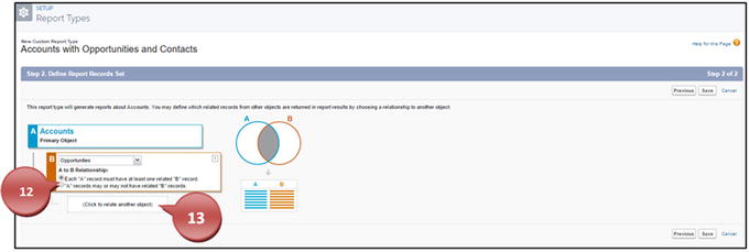 Figure 5-9Choose the type of relationship the two objects have for this report type.
 - 13.Click “Click to relate another object” to select your next object.
- 14.Click the Select Object drop-down to choose your next related object for this report type.
- 15.Choose between the two radio buttons under A to B Relationships.
- 16.Repeat steps 13 through 15 to relate more objects for this report if necessary.
- 17.Click Save, as shown in Figure 5-10.
 Figure 5-10Relating another object to your custom report type
Note
If you add new fields to your objects after creating a custom report type, you’ll have to add the new fields to the report type. You can do this by going to Setup, clicking your report type name, and clicking Edit Layout under “Fields Available for reports.” This is shown in Figure 5-11.

Figure 5-11
Adding new custom fields
to your existing customer report types
Report Formats
Salesforce in Lightning Experience offers three report formats
. Each format allows you to customize your report differently. Whether you are using Tabular format to generate a call list, Summary format to show data grouped horizontally, or Matrix format to summarize your data by both rows and columns, Salesforce has the proper format for you. You also have an additional report format, Joined reports, that you can use; however, you need to switch to Salesforce Classic to build and view these types of reports. Each report format has its strengths; let’s look into these a little further. Figure 5-12 shows where you can make this adjustment between report formats.
Figure 5-12
Switching report formats
Tabular Report Formats
The Tabular format reports are easily comparable to a flat file like a spreadsheet. This report format contains columns as the different data points and rows with your actual records. These reports are best used for creating a list of records like a call list or to list records with one grand total. This report format can’t be grouped, and you can’t display the information in a chart or use it in a dashboard component unless you use a row limit filter (see Figure 5-33). Most clients will use a Tabular report format to see a grand total of their sales with specific criteria set. For instance, if you want to run a quick report on all the sales your team generated for a quarter, you could use a tabular report. Figure 5-13 shows what a call list tabular report would look like.
Figure 5-13
Tabular report example
Summary Report Format
The Summary report format is the most widely used report format in Salesforce. This type of report format allows you to group and summarize your data for up to three levels. Within these groups, you can summarize on the column and obtain the subtotal for that particular grouping and at the end of your report the grand total. You can use formulas in this report to further define your report. You can use this type of report format to show how your sales users are stacked against each other by grouping on opportunity owner. You can also use this report to determine who in your company holds the highest record count by also grouping on users of that record. Or you can build a report to group the different type of contacts you have by title. This format can also be used and represented on a dashboard and in charts. When you leave your report ungrouped, it will display in a Tabular format. Figure 5-14 shows a report that clients would use to see how much new business is coming in versus how much business is coming from current clients. You can also see that it is grouped by the user to show how each user is stacking up against the other.
Figure 5-14
Summary report example
Matrix Report Format
The Matrix report format allows you to group your data by both columns and rows. This allows for a cross examination of your data. Just like the Summary report format, on the groups you create in the Matrix format you can see subtotals, record counts, and grand totals as well as see them by row or column, as shown in Figure 5-15. Use this type of report to show how well products perform over date ranges by grouping your columns by date and your rows by opportunity products. Or use this report to determine how well your users are performing over time. Use this report to compare your incoming case origin against your case reasons. This type of report can also be used in dashboard components as well as charts. Additionally, you can use formulas to further calculate your data. If your groupings or criteria display no results, this format report will be downgraded to Summary format.
Figure 5-15
Matrix report example
Report Filters
While in the report builder it will be necessary to understand the use of report filters that Salesforce has to offer. You can utilize up to five filter features to help customize your reports further. Filters allow you to get a closer look at your data and make it more specific for your reporting needs.
Standard Filters
Standard filters
in the report builder of Salesforce will differ for some objects. Since the data you are collecting across accounts and contacts is different from that of opportunities or cases, you’ll see these standard report filters change based on the report type. Let’s take a look at each report type and their standard filters.
Accounts, Contacts, and Leads
Accounts, contacts, and leads
all share similar standard report filters. Like most things to learn in Salesforce, if you understand the components of one object, those sometimes will translate into other objects. For the accounts, contacts, and leads, you’ll find they share similar attributes.
- All accounts: This report filter allows you to choose if you see all accounts regardless of the owner, only contacts you own, only the accounts you own, or your team’s accounts, as shown in Figure 5-16. If you have security set in place with role hierarchies or sharing rules, your users will only be able to see the accounts, contacts, and leads they are set up to see.
 Figure 5-16Account filter for ownership of records
 - All leads : This report filter for leads is similar; you have the option to see the leads you own, your team’s leads, and user-owned leads (compared to queue owned), queue-owned leads, and all leads, as shown in Figure 5-17.
 Figure 5-17Lead filter for the ownership of records
 - For the accounts, contacts, and leads, you can choose from any date field within that report type to filter from as well as use Salesforce smart dates. Smart dates allow you to choose dates that will update to the relative time every time you run your report. For instance, you can choose from the drop-down This Week or Current Calendar Year or use your own custom date range in the From and To fields, as shown in Figure 5-18.Note If these smart dates don’t work for your report, see “Field Filters” for more ideas.
 Figure 5-18Smart date filters
Opportunities’ Standard Filter Fields
Opportunities’
standard filter fields are unique to their report type, so let’s look at them.
- Similar to accounts, contacts, and leads, opportunities have a standard report filter that allows you to choose all opportunities regardless of who owns them, your team’s opportunities, and your opportunities, as shown in Figure 5-19. If you have security set in place with role hierarchies or sharing rules, your users will only be able to see the opportunities they are set up to see.
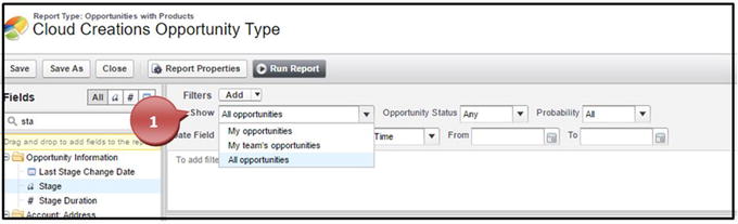 Figure 5-19Opportunity ownership filter
 - The Opportunity Status filter allows you to see any opportunity whether it is closed, open or won, and all opportunities with any status, as shown in Figure 5-20.
 Figure 5-20Opportunity status filter
 - Opportunity Probability allows you to filter based on the Probability field (which is associated with this stage). You can choose options such as greater than 90 percent to get a better picture of what is in your pipeline that will most likely close, as shown in Figure 5-21.
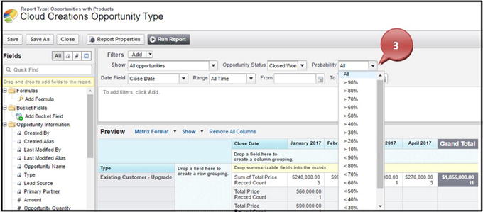 Figure 5-21Opportunity Probability filter
 - The opportunity Date Field filter works just like the one for accounts, contacts, and leads. You can choose from any date field within that report type to filter from as well as use Salesforce smart dates. Smart dates allow you to choose dates that will update to the relative time every time you run your report. For instance, you can choose from the drop-down This Week or Current Calendar Year or use your own custom date range in the From and To fields, as shown in Figure 5-22.
 Figure 5-22Opportunity smart date filters
Case Filters
Case filters have some similarities to other objects standard filters and some that are unique to this report type.
- The Show filter on cases allows you to see all your cases, all cases regardless of who owns them, user-owned cases (opposed to queue owned), queue-owned cases, your case team’s cases, or role-based team’s cases, as shown in Figure 5-23. If you have security set in place with role hierarchies or sharing rules, your users will only be able to see the cases they are set up to see.
 Figure 5-23Case ownership filter
 - The Units filter allows you to display the age of how long your case has been open in minutes, hours, or days, as shown in Figure 5-24.
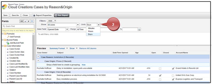 Figure 5-24Case units filter
 - The case Date Field filter works just like the one for accounts, contacts, leads, and opportunities. You can choose from any date field within that report type to filter from as well use Salesforce smart dates, as shown in Figure 5-25. Smart dates allow you to choose dates that will update to the relative time every time you run your report. For instance, you can choose from the drop-down This Week or Current Calendar Year or use your own custom date range in the From and To fields.
 Figure 5-25Case smart date filter
Campaigns
Campaigns have only one option for standard filtering.
- The Show filter allows you to filter by a specific campaign and provides a lookup field to find it, as shown in Figure 5-26. It also allows you to see all of your active campaigns, campaigns you own, all active campaigns regardless of who owns them, and all campaigns.
 Figure 5-26Campaigns’ ownership filter
Field Filters
Field filters in the report builder allow you to drag and drop any field found within that report type and filter your data using operators and values. This field filtering will be important for you to understand because you’ll see this same feature used widely throughout Salesforce. You can find this in list views, workflow rules, process builders, and the Apex language. Some of the operators you’ll want to familiarize yourself with are as follows: equals, not equal to, less than, greater than, less or equal, greater or equal, contains, does not contain, and starts with. Here is also where you can customize smart dates further if the standard smart date filters don’t work for you. Drag and drop the date field of your choice into the filter field section, set the operator to “equals,” and use a phrase like Next N Days (replace “N” with your desired number) or Last N Months.
- 1.Take your field from the left-side Fields section and drag it to the filters section, as shown in Figure 5-27.
 Figure 5-27Dragging and dropping a field onto the field filter section
 - 2.Choose the operator appropriate for your filter, as shown in Figure 5-28.
 Figure 5-28Selecting an operator for your field filter
 - 3.If the field filter chosen is a picklist field, you can click the lookup icon. If the field is another data type, you can enter the value necessary.
- 4.For picklist fields only, you’ll check the values that your filter should include.
- 5.For picklist fields only, click Insert Selected to add these values to your filter, as shown in Figure 5-29.
 Figure 5-29Selecting the field value of a picklist field
 - 6.Click OK to finalize your field filter, as shown in Figure 5-30.
 Figure 5-30Completing your field filter
Note

Figure 5-31
Locked field filters
Filter Logic
After you have set up at least one field filter, filter logic will allow you to apply “and,” “or,” or “not” statements on how the fields are evaluated. You can create a complex statement of as many field filters that are necessary for your report. If you use filter logic, you do have to include all your field filters in the statement. You can use parentheses to group logic together to further define your report. The default filter logic places AND into the logic, meaning “1 AND 2 AND 3,” and so on. This tells the report to only include records that meet all three of the criteria that you’ve set up (or however many you’ve set up) into the report.
- 1.Click the Add button next to Filters and choose Filter Logic.
- 2.Create your statement. You’ll use the number next to the field filter to define what field filter needs to be placed with an “and” or “or” statement. The statements that you’ll use will look like “(1 OR 2) AND 3 AND 4.” Another example would be “1 AND 2 AND 3 AND 4 AND (5 OR 6 OR 7).”
- 3.Click OK to complete your filter logic, as shown in Figure 5-32.Note Every time you add a new field filter, you’ll want to adjust your filter logic and ensure it is correct.
 Figure 5-32Changing the filter logic
Cross Filter
Cross filters
in Salesforce allow you to apply conditions on objects related to the current object you are reporting from. You can use cross filters by applying “with” or “without” conditions on the related objects. After you use your cross filter, further define your field filter via that related cross filter. An example of this would be filtering all opportunities without follow-up activities. Or use the cross filter to set up filtering on opportunities without products to determine what opportunities still need to be completed. Another example of using cross filters would be to determine whether an account or contact has had any interaction with your sales team. You can set this up by creating an account or contact report and adding the cross filter logic of “without” activities. This will give you a list of all the accounts or contacts that need to be reached out to or checked in on. To set this up, create at least one field filter and follow these steps:
- 1.Click the Add button next to Filters and choose Cross Filter.
- 2.Select the primary object that you want to use to relate other objects to.
- 3.Define whether you want to see these related objects with the word “with” or choose “without.”
- 4.Select the related object you would like to see or not see.
- 5.Click the Add Related Object filter, select the operator along with the value, and click OK, as shown in Figure 5-33.
 Figure 5-33Setting up a cross filter
Row Limit
Row limit
filters are used with Tabular reports and allow you to display your report in a table or chart on a dashboard if you limit the number of rows it returns and sort by a field. To create this, follow these steps:
- 1.Click the Add button and choose Row Limit, as shown in Figure 5-34.
- 2.Define the row limit.
- 3.Choose to sort by a particular field and whether it is ascending or descending and click OK.
 Figure 5-34Setting up the row limit
Using the Report Builder
Creating reports in Salesforce allows you to analyze the data you and your user are collecting. Perhaps the best thing about being a newcomer to the reports in Salesforce is that you can’t break or ruin your data. All you are doing with reports is displaying the data you currently have in a more readable format, instead of in individual records. Don’t be afraid to jump right in and start clicking away!
Creating a Leads Report
You can use lead reports
to see some or all key information about your leads. You can see how many leads you have, what lead source is working from your marketing team, the number of leads that are being handled by a user versus the ones that are in a queue, and so much more! One of the many business problems that can be resolved with generating lead reports is considering which lead source is working compared to ones that are not. You can build a report on converted leads and group the report by the lead source
, as shown in Figure 5-35.
Figure 5-35
Leads report example
To create a lead report, follow these steps
:
- 1.Navigate to the Reports tab and click Reports, as shown in Figure 5-36.
 Figure 5-36Navigating to the Reports tab
 - 2.Click New Report, as shown in Figure 5-37.
 Figure 5-37Click the New Report button to start a new report
 - 3.In the Quick Find, type Leads or click Leads and click Create, as shown in Figure 5-38.
 Figure 5-38Finding the report type to use
 - 4.Click and hold the name of the field you would like to move into your reports and drag it to the column where you would like it to be placed. Continue to drag and drop as many fields as necessary for the report. Once finished, click Save, as shown in Figure 5-39.
 Figure 5-39Dragging and dropping a new field into your report
 - 5.Name your report and press your Tab key for Salesforce to automatically enter a value in the Report Unique Name field.
- 6.Enter a description that will be displayed to users.
- 7.Select the report folder where your report should be stored.
- 8.Click Save, as shown in Figure 5-40.
 Figure 5-40Saving your report
 - 9.Click Run Report to see the results of your data, as shown in Figure 5-41.
 Figure 5-41Running your report to see your results
Creating Contacts and Accounts Report
You can create a contacts and accounts report
to display all your contact details. Use this report for a call list, mail merges, viewing newly created contacts and accounts, or any other business needs. Business-to-business (B2B) organizations can benefit from the use of account reports if they want to determine the types of industries they work with. You can generate a report that shows you how many businesses you are engaging with in each industry. This would help you to determine where you should focus your marketing efforts. You can see what this report would look like in Figure 5-42.
Figure 5-42
Accounts and contacts report example
To create a contacts and accounts report:
- 1.Navigate to the Reports tab and click Reports; once you see your report folders, click New Reports in the right corner.
- 2.In the Quick Find area, type Contact. Or, click Accounts, click Contacts & Accounts, and click Create, as shown in Figure 5-43.
 Figure 5-43Selecting the report type for your report
 - 3.Click and hold the name of the field you want to move into your reports and drag it to the column where you would like it to be placed. Continue to drag and drop as many fields as necessary for the report. Once finished, click Save, as shown in Figure 5-44.
 Figure 5-44Dragging and dropping a field into your report
 - 4.Name your report and click your Tab key for Salesforce to automatically enter a value in the Report Unique Name field.
- 5.Enter a description that will be displayed to users.
- 6.Select the report folder where your report should be stored.
- 7.Click Save, as shown in Figure 5-45.
 Figure 5-45Saving your report
 - 8.Click Run Report to see the results of your data, as shown in Figure 5-46.
 Figure 5-46Running your report to see the results
Creating an Opportunity Report
You can create an opportunity report
and opportunity with products report to display the sales your company has generated. Use these report types to display what is in the pipeline, what has dropped out of the pipeline, and all sales that your team has successfully won. Most businesses will generate opportunity reports to help project what efforts may be needed in the future. For instance, project management companies need to project how many projects they have now and how many projects may be closing or starting in the future. Being able to project this is necessary to the operations of the business. Project management companies need to be able to project how many project managers or internal support are going to be needed in the upcoming months. To project this, a project management company will look at all sales with a 90 percent or higher opportunity probability. Figure 5-47 shows what this report would look like.
Figure 5-47
Opportunity report example
To create an opportunity report, follow these steps:
- 1.Navigate to the Reports tab and click Reports; once you see your report folders, click New Reports in the right corner.
- 2.In the Quick Find area, type Opportunity. Or, click Opportunity and click Create, as shown in Figure 5-48.
 Figure 5-48Selecting the report type for your report
 - 3.Click Show and select Details, as shown in Figure 5-49.
 Figure 5-49Showing the details on a report
 - 4.Select the proper filters for your report to show the data desired, as shown in Figure 5-50.
 Figure 5-50Setting up the report field filters for your report
 - 5.Click and hold the name of the field you would like to move into your reports and drag it to the column where you would like it to be placed. Continue to drag and drop as many fields as necessary for the report. Once finished, click Save, as shown in Figure 5-51.
 Figure 5-51Dragging and dropping a field into your report
 - 6.Name your report and press your Tab key for Salesforce to automatically enter a value in the Report Unique Name field.
- 7.Enter a description that will be displayed to users.
- 8.Select the report folder where your report should be stored.
- 9.Click Save, as shown in Figure 5-52.
 Figure 5-52Saving your report
 - 10.Click Run Report to see the results of your data.
Creating Tabular, Summary, and Matrix Reports
Tabular reports are the default report selected when creating a new report. Once you have chosen your report type and are in the report builder, you can switch between all three report formats. If switching from the Summary or Matrix report format to Tabular, you’ll want to take the fields you grouped and move them to a column; otherwise, you’ll lose them and have to bring them back to the report once in Tabular format. When switching from a Matrix report to a Summary report, be aware that you may lose groupings here as well if you have set up four groupings on the Matrix report; Summary reports can handle only up to three groupings. Let’s look at creating Tabular, Summary, and Matrix reports.
- 1.Navigate to the Reports tab and click Reports; once you see your report folders, click New Reports in the right corner.
- 2.Choose the report type of your choice and click Create, as shown in Figure 5-53.
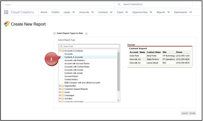 Figure 5-53Selecting the report type for your report
 - 3.In the Preview pane of the report builder, choose the drop-down that displays Tabular Format and switch to the report format of your choice, as shown in Figure 5-54.
 Figure 5-54Changing report formats
Building a Tabular Report
Follow these steps:
- 1.To build a Tabular report, there is no need to change the format drop-down. Just begin dragging and dropping your fields as needed for your report. Once finished, click Save, name your report, and click Run to see your results, as shown in Figure 5-55.
 Figure 5-55Dragging and dropping fields into your report
 - 2.You can also choose what field your Tabular report should sort by, by clicking that field. Notice that when you click the field, an arrow is added to that field facing up or down. This tells you if it is sorting this field in ascending or descending order, as shown in Figure 5-56.Note You can sort any report type like this.
 Figure 5-56Sorting by a field in your reports
Building a Summary Report
Follow these steps:
- 1.Once you are in the report builder, change the format to the Summary format, as shown in Figure 5-57.
 Figure 5-57Changing your report format to the Summary report format
 - 2.Add groupings to your report by dragging and dropping a field into the area “Drop a field here to create a grouping,” as shown in Figure 5-58.Note You can add up to three groupings here, and this feature is also available in the Matrix report format.
 Figure 5-58Dragging and dropping fields into the grouping section of the report
 - 3.Once you have grouped your report with fields, you can further define how these fields are grouped for date data type fields. For instance, if you grouped by the Close Date field, you can change the grouping to group by Calendar Month, as shown in Figure 5-59.
 Figure 5-59Defining how your report is grouped
 - 4.Continue building your report by dragging and dropping fields into places of your choice. Save and name the report and run!
Building a Matrix Format Report
Follow these steps:
- 1.Once you are in the report builder, change the Tabular Format drop-down to Matrix, as shown in Figure 5-60.
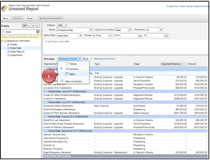 Figure 5-60Switching your report format to a Matrix report format
 - 2.Notice for this report type you have two areas for grouping: at the columns level and at the row level. Drag and drop the field of your choice onto either of these grouping areas. You can add two groups on the column grouping level and on the row grouping level, as shown in Figure 5-61.
 Figure 5-61Dragging and dropping the field into the grouping sections of the report
 - 3.Continue building your report by dragging and dropping fields where you’d like. Save and name the report and run!
Summarizing Your Data
You can use the summarize feature on the number, currency, or percent field data types in the report builder. The summarize feature allows you to sum the data in a row, find the average of data in a row, find the minimum of the data in a row, or find the maximum of the data in a row. Use this feature in an opportunity report to find the average age of an opportunity or case. Or use this feature to simply give you the sum of your amount fields on opportunities. When you use this feature in a summary or matrix report, it will summarize on all grouping levels and give you the grand total.
- 1.Once in your report builder, click the down-facing arrow next to the field you want to summarize, as shown in Figure 5-62.
 Figure 5-62Summarizing a field
 - 2.Choose to sum, find the average, find the max, or find the min and click Apply, as shown in Figure 5-63.
 Figure 5-63Choosing how you want to summarize a field
 - 3.Don’t forget to save and run your report.
Adding Formulas to Reports
You can add formulas to your reports to calculate the currency, number, or percent fields from an object. The formula feature allows you to leverage your field formats, summarize field data, use basic operators, use complex functions, and use logic statements.
The operators for formulas include addition, subtraction, multiplication, division, and exponentiation. The functions available include logical statements, mathematical statements, or summary statements.
- 1.In the left pane, drag Add Formula into the report and place it in a column position of your choice, as shown in Figure 5-64.
 Figure 5-64Adding a formula field to your report
 - 2.Name your formula.
- 3.Add a description.
- 4.Adjust the format or decimal place if necessary.
- 5.Choose what level to run this formula on.
- 6.Create your formula using the operators or functions necessary.Note Formulas are for the advanced user. We will not be covering the various aspects of what formulas to use in this book. However, Salesforce offers free support, and there are great forums that can offer help as well.
- 7.Click Check Syntax for complex formulas to ensure there are no errors.
- 8.Click OK to add the formula, as shown in Figure 5-65.
 Figure 5-65Creating a formula field on your report
 - 9.The formula field appears as a column on the report, as shown in Figure 5-66.
 Figure 5-66The formula field appears as a column in your report
Exporting Reports
You can export the data from any report you create in Salesforce to a spreadsheet. This allows you to take it into Excel for further analysis. Salesforce offers two types of exportable formats: the Excel format .xls and the comma-delimited .csv. XLS is compatible with Excel and most spreadsheet software. CSV is compatible with a wider range of software programs and comes with limited formatting.
- 1.Open your desired report; in the right corner click the down-facing arrow next to the word Edit and select Export, as shown in Figure 5-67.
 Figure 5-67Exporting a report
 - 2.Choose the format that supports your company software and select Export, as shown in Figure 5-68.
 Figure 5-68Selecting the export format and exporting the data
Creating Report Charts
You can create report charts for your reports in Salesforce. Report charts allow you to see your data in a graphical format for easy and quick review of your data. Reports and report charts have a one-to-one ratio: only one chart can be used in one report. Should you want to see several variations of your report, you can clone your report or, better yet, put them in a dashboard (shown in Figure 5-79). Report charts can be used only in Summary or Matrix format reports. You can create horizontal and vertical bar charts, stacked horizontal and vertical bar charts, line charts, donut charts, funnel chart, and scatter charts.
- 1.Go to your Reports tab and select the report of your choice, as shown in Figure 5-69.
 Figure 5-69Retrieving a report
 - 2.Click the chart symbol next to the filter symbol, as shown in Figure 5-70.
 Figure 5-70Clicking the chart icon
 - 3.Based on your report and how your data is put together, Salesforce will display a recommended report. You can change this if needed; click the settings cog icon, as shown in Figure 5-71.
 Figure 5-71Selecting the Setup icon for the chart
 - 4.Change the Display As section to reflect the type of report chart you would like to see, as shown in Figure 5-72.
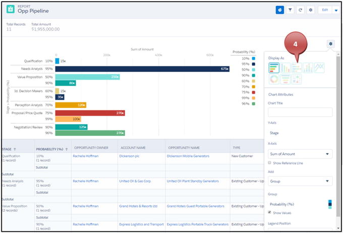 Figure 5-72Choosing the type of chart
 - 5.Adjust the chart attributes within the chart editor; add a chart title, change the x-axis to another field, add items like a dimension or second axis, choose to show the values on the report chart or not, and choose if a legend should appear on the right or bottom of the chart, as shown in Figure 5-73.Note Some features are available only on specific report charts.
 Figure 5-73Customizing your report chart attributes
After you have configured your report chart, don’t forget to save your work and see your results, as in Figure 5-74.
Figure 5-74
Finishing result of a report chart
Understanding Dashboards
Dashboards
are visual representations of the reports you have already created. Dashboards can represent multiple dashboard components (individual charts and graphs). You can display one report in multiple dashboard components; you can’t display multiple reports into one dashboard component. For example, if you have one report that represents your sales by each user, you can display this one report in two dashboard components, such as a pie chart and bar chart. You can create horizontal and vertical bar charts, stacked horizontal and vertical bar charts, line charts, donut charts, funnel charts, metric charts, gauge charts, table charts, and scatter charts.
Creating a Dashboard, Adding Dashboard Components, and Modifying Your Dashboard
Follow these steps:
- 1.Click your Dashboards tab and click New Dashboard, as shown in Figure 5-75.
 Figure 5-75Creating a new dashboard
 - 2.Name your dashboard.
- 3.Add a description.
- 4.Choose whether your dashboard is a public or private dashboard.
- 5.Click Create, as shown in Figure 5-76.
 Figure 5-76Naming and creating your dashboard
 - 6.Click Component in the upper-right corner to add a report you’ve already created to the dashboard, as shown in Figure 5-77.
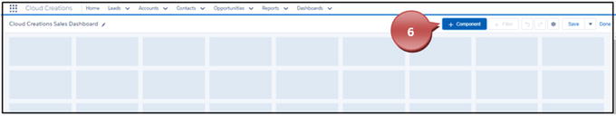 Figure 5-77Adding a new report and chart component to your dashboard
 - 7.Search the report you want to add to the dashboard, as shown in Figure 5-78.
 Figure 5-78Finding the report for your dashboard component
 - 8.Choose the chart you want to display your data in and modify any attributes to better display your data. Once finished, click Add, as shown in Figure 5-79.Note As you make changes to these attributes, watch the preview of the report to see how these changes affect the display.
 Figure 5-79Creating the chart to go with your report on your dashboard
 - 9.Click the dashboard report and drag the corners out to make your report bigger, or click the dashboard and move the report to another location on the dashboard, as shown in Figure 5-80.
 Figure 5-80Modifying the size of your report and chart
 - 10.Continue steps 6 to 9 until you are satisfied with your dashboard.
- 11.Click Save when you complete or to save your work, as shown in Figure 5-81.
 Figure 5-81Saving your dashboard
Using Dynamic Dashboards
Dynamic dashboards
allow each user to see the data that they have access to based on their security and sharing settings. This allows you to create one dashboard that every user can have access to. After you have created your dashboard, you can access the properties and make this modification or use the other two accesses for users. You can set a dashboard to be viewed as Me, which allows dashboard readers to see data in the dashboard according to your access to the data. You can select the option “A specified user,” which allows users to see data based on the selected user’s access. Lastly, you can use the “The logged in user,” which allows users to see data based on their access. Additionally, you can prevent users from changing how the dashboard is viewed by deselecting “Allow Dashboard views to change this (dynamic dashboard).” Businesses choose a dynamic dashboard over a nondynamic one when they are trying to prevent users from seeing data that they shouldn’t. For instance, a business may have many sales users. With these sales users, there are many territories. If you don’t want the salesperson responsible for California to see the sales data for New York, you could use the option “The logged in user.” (Granted, you must have set up your security to prevent this from happening, which is covered in Chapter 9.) If having the user’s data restricted is not an issue for your company, you can leave the settings as is. Let’s take a look at how you can modify this:
- 1.Click the settings cog icon in the right corner of the dashboard, as shown in Figure 5-82.
 Figure 5-82Creating a dynamic dashboard
 - 2.Select what view you would like to set the dashboard as.
- 3.Select or deselect if the user should be able to change this.
- 4.Click Save, as shown in Figure 5-83.
 Figure 5-83Selecting the view of the dashboard
Summary
One of the greatest benefits of having Salesforce as your client relationship management tool is the reports that can be generated from the data collected. Being able to calculate your return on investment (ROI) or how your sales team is doing will help you in the months and years of your business to come. The best thing about reports and dashboards is that you can’t mess your data up using them. Don’t be afraid to click around and play with them. You are only translating data; you can’t mess it up!