© The Author(s), under exclusive license to APress Media, LLC, part of Springer Nature 2021
D. B. Duldulao, R. J. L. CabagnotPractical Enterprise Reacthttps://doi.org/10.1007/978-1-4842-6975-6_15

15. Creating the Notifications, Security, and Subscription Pages

Devlin Basilan Duldulao1   and Ruby Jane Leyva Cabagnot1
(1)
Oslo, Norway
 

This last part of the series will make the Notifications, Security, and Subscription pages using Redux, Formik, and the Yup validation schema.

Overall, the aim here is to complete the UI of our React application with basic real-world functionalities and consolidate our learnings of how Redux works and how to use Formik and the Yup validation schema in our application.

Creating the Notifications Page

We will first do the Notifications page. This page is just for the design or overall UI look of the application.

Under the AccountView, we will need to create a file called Notifications.tsx:
account ➤ AccountView ➤ Notifications.tsx
Here are the named import components, as shown in Listing 15-1.
import React from 'react';
import clsx from 'clsx';
import {
  Box,
  Button,
  Card,
  CardContent,
  CardHeader,
  Checkbox,
  Divider,
  FormControlLabel,
  Grid,
  Typography,
  makeStyles,
} from '@material-ui/core';
Listing 15-1

Adding the Named Components of the Notifications.tsx

And the shape of the Notifications component, as shown in Listing 15-2.

type Props = {
  className?: string;
};
const Notifications = ({ className, ...rest }: Props) => {
  const classes = useStyles();
Listing 15-2

Adding the Notifications Function Component

And the return statement that returns elements, as shown in Listing 15-3.
return (
    <form>
      <Card className={clsx(classes.root, className)} {...rest}>
        <CardHeader title="Notifications" />
        <Divider />
        <CardContent>
          <Grid container spacing={6} wrap="wrap">
            <Grid item md={4} sm={6} xs={12}>
<Typography gutterBottom variant="h6" color="textPrimary">
                System
              </Typography>
              <Typography gutterBottom variant="body2" color="textSecondary">
                You will receive emails in your business email address
              </Typography>
              <div>
                <FormControlLabel
                  control={<Checkbox defaultChecked />}
                  label="Email alerts"
                />
              </div>
              <div>
                <FormControlLabel
                  control={<Checkbox />}
                  label="Push Notifications"
                />
              </div>
              <div>
                <FormControlLabel
                  control={<Checkbox defaultChecked />}
                  label="Text message"
                />
              </div>
              <div>
                <FormControlLabel
                  control={<Checkbox defaultChecked />}
                  label={
                     <>
                      <Typography variant="body1" color="textPrimary">
                        Phone calls
                      </Typography>
                      <Typography variant="caption">
                        Short voice phone updating you
                      </Typography>
                    </>
                  }
                />
              </div>
            </Grid>
            <Grid item md={4} sm={6} xs={12}>
              <Typography gutterBottom variant="h6" color="textPrimary">
                Chat App
              </Typography>
              <Typography gutterBottom variant="body2" color="textSecondary">
  You will receive emails in your business email address
              </Typography>
              <div>
                <FormControlLabel
                  control={<Checkbox defaultChecked />}
                  label="Email"
                />
              </div>
              <div>
                <FormControlLabel
                  control={<Checkbox defaultChecked />}
                  label="Push notifications"
                />
              </div>
            </Grid>
          </Grid>
        </CardContent>
        <Divider />
        <Box p={2} display="flex" justifyContent="flex-end">
 <Button color="secondary" type="submit" variant="contained">
            Save Settings
          </Button>
        </Box>
      </Card>
    </form>
  );
};
const useStyles = makeStyles(() => ({
  root: {},
}));
export default Notifications;
Listing 15-3

Creating the Return Elements of the Notifications

Our Notifications component here is just for aesthetics. At this point, we are not going to use any additional functionality here. The General Settings should do for our purpose of understanding the implementation flow of Redux.

However, you can update it on your own just to practice and solidify your learnings.

Creating the Security Page

Another React component we need to add is Security. Also, under AccountView, create a new file and name it Security.tsx.

We will be using here simple HTTP requests without Redux Toolkit. We are creating this to remind you that we DON’T need to use Redux in every HTTP request, similar to what we did in Chapter 6.

../images/506956_1_En_15_Chapter/506956_1_En_15_Figa_HTML.jpg
Okay, now let’s add the named components for the Security, as shown in Listing 15-4.
import React, { useState } from 'react';
import clsx from 'clsx';
import * as Yup from 'yup';
import { Formik } from 'formik';
import { useSnackbar } from 'notistack';
import { useSelector } from 'react-redux';
import {
  Box,
  Button,
  Card,
  CardContent,
  CardHeader,
  Divider,
  FormHelperText,
  Grid,
  TextField,
  makeStyles,
} from '@material-ui/core';
import { changePasswordAxios, ChangePasswordModel } from 'services/authService';
import { RootState } from 'store/reducers';
Listing 15-4

Importing the Named Components in Security

We are using Yup and Formik and the usual bunch of other components we need. We also imported the changePasswordAxios and ChangePasswordModel from authService and the RootState from reducers. As you can see, no action will send a request or update anything to the Store.

Next, we add the type of the object and use some React Hooks, as shown in Listing 15-5.
type Props = {
  className?: string;
};
type PasswordType = {
  password: string;
  passwordConfirm: string;
};
const Security = ({ className, ...rest }: Props) => {
  const { claims } = useSelector((state: RootState) => state.auth);
  const classes = useStyles();
  const [error, setError] = useState('');
  const { enqueueSnackbar } = useSnackbar();
Listing 15-5

Creating the Security Function Component

claims: We are getting the claims from the auth reducer through the useSelector.

And the return elements for the Security component, as shown in Listing 15-6.
return (
    <Formik
      initialValues={
        {
          password: '',
          passwordConfirm: '',
        } as PasswordType
      }
       {/*validation schema for the password */}
      validationSchema={Yup.object().shape({
        password: Yup.string()
          .min(7, 'Must be at least 7 characters')
          .max(255)
          .required('Required'),
        passwordConfirm: Yup.string()
          .oneOf([Yup.ref('password'), null], 'Passwords must match')
          .required('Required'),
      })}
      onSubmit={async (values, formikHelpers) => {
        try {
           {/*Checking if the password matches or not */}
          if (values.password !== values.passwordConfirm) {
            alert('Must match');
            return;
          }
          {/* If it matches, return this object with the
            following args to change password */}
          const args: ChangePasswordModel = {
            id: claims.sub,
            email: claims.email,
            password: values.password,
          };
          await changePasswordAxios(args);
          formikHelpers.resetForm();
          formikHelpers.setStatus({ success: true });
          formikHelpers.setSubmitting(false);
          enqueueSnackbar('Password updated', {
            variant: 'success',
          });
        } catch (err) {
          console.error(err);
          formikHelpers.setStatus({ success: false });
          formikHelpers.setSubmitting(false);
        }
      }}
    >
      {formikProps => (
        <form onSubmit={formikProps.handleSubmit}>
          <Card className={clsx(classes.root, className)} {...rest}>
            <CardHeader title="Change Password" />
            <Divider />
            <CardContent>
              <Grid container spacing={3}>
                <Grid item md={4} sm={6} xs={12}>
                  <TextField
                    error={Boolean(
                      formikProps.touched.password &&
                        formikProps.errors.password,
                    )}
                    fullWidth
                    helperText={
                      formikProps.touched.password &&
                      formikProps.errors.password
                    }
                    label="Password"
                    name="password"
                    onBlur={formikProps.handleBlur}
                    onChange={formikProps.handleChange}
                    type="password"
                    value={formikProps.values.password}
                    variant="outlined"
                  />
                </Grid>
                <Grid item md={4} sm={6} xs={12}>
                  <TextField
                    error={Boolean(
                      formikProps.touched.passwordConfirm &&
                        formikProps.errors.passwordConfirm,
                    )}
                    fullWidth
                    helperText={
                      formikProps.touched.passwordConfirm &&
                      formikProps.errors.passwordConfirm
                    }
                    label="Password Confirmation"
                    name="passwordConfirm"
                    onBlur={formikProps.handleBlur}
                    onChange={formikProps.handleChange}
                    type="password"
                    value={formikProps.values.passwordConfirm}
                    variant="outlined"
                  />
                </Grid>
              </Grid>
              {error && (
                <Box mt={3}>
                  <FormHelperText error>{error}</FormHelperText>
                </Box>
              )}
            </CardContent>
            <Divider />
            <Box p={2} display="flex" justifyContent="flex-end">
              <Button
                color="secondary"
                disabled={formikProps.isSubmitting}
                type="submit"
                variant="contained"
              >
                Change Password
              </Button>
            </Box>
          </Card>
        </form>
      )}
    </Formik>
  );
};
const useStyles = makeStyles(() => ({
  root: {},
}));
export default Security;
Listing 15-6

Returning the Elements for the Security React Component

Creating the Subscription Page

The last component we will build in this chapter is the Subscription.tsx, which is still under the AccountView folder.

Let’s add first the named components, as shown in Listing 15-7.
import { Link as RouterLink } from 'react-router-dom';
import clsx from 'clsx';
import { useSelector } from 'react-redux';
import {
  Box,
  Button,
  Card,
  CardContent,
  CardHeader,
  Divider,
  Link,
  Paper,
  Typography,
  makeStyles,
} from '@material-ui/core';
import { RootState } from 'store/reducers';
Listing 15-7

Adding the Named Components in the Subscription

Next, let’s do the type or shape of the object, as shown in Listing 15-8.
type Props = {
  className?: string;
};
const Subscription = ({ className, ...rest }: Props) => {
  const classes = useStyles();
  const {
    profile: { subscription },
  } = useSelector((state: RootState) => state.profile);
Listing 15-8

Adding the Props and Using Hooks for Subscription.tsx

In Listing 15-8, we access the profile and then render the Manage your subscription in the UI in Listing 15-9.

For example, we can access the subscription.currency, subscription.price, and subscription.name – because the subscription is a deconstructed object of the profile. The nested destructuring is a valid syntax here.

Listing 15-9 is the return statement of the Subscription component.
return (
    <Card className={clsx(classes.root, className)} {...rest}>
      <CardHeader title="Manage your subscription" />
      <Divider />
      <CardContent>
        <Paper variant="outlined">
          <Box className={classes.overview}>
            <div>
              <Typography display="inline" variant="h4" color="textPrimary">
                {subscription.currency}
                {subscription.price}
              </Typography>
              <Typography display="inline" variant="subtitle1">
                /mo
              </Typography>
            </div>
            <Box display="flex" alignItems="center">
              <img
                alt="Product"
                className={classes.productImage}
                src="/images/products/product_premium.svg"
              />
              <Typography variant="overline" color="textSecondary">
                {subscription.name}
              </Typography>
            </Box>
          </Box>
          <Divider />
          <Box className={classes.details}>
            <div>
              <Typography variant="body2" color="textPrimary">
                {`${subscription.proposalsLeft} proposals left`}
              </Typography>
              <Typography variant="body2" color="textPrimary">
                {`${subscription.templatesLeft} templates`}
              </Typography>
            </div>
            <div>
              <Typography variant="body2" color="textPrimary">
                {`${subscription.invitesLeft} invites left`}
              </Typography>
              <Typography variant="body2" color="textPrimary">
                {`${subscription.adsLeft} ads left`}
              </Typography>
            </div>
            <div>
              {subscription.hasAnalytics && (
                <Typography variant="body2" color="textPrimary">
                  Analytics dashboard
                </Typography>
              )}
              {subscription.hasEmailAlerts && (
                <Typography variant="body2" color="textPrimary">
                  Email alerts
                </Typography>
              )}
            </div>
          </Box>
        </Paper>
        <Box mt={2} display="flex" justifyContent="flex-end">
          <Button size="small" color="secondary" variant="contained">
            Upgrade plan
          </Button>
        </Box>
        <Box mt={2}>
          <Typography variant="body2" color="textSecondary">
            The refunds don&apos;t work once you have the subscription, but you
            can always{' '}
            <Link color="secondary" component={RouterLink} to="#">
              Cancel your subscription
            </Link>
            .
          </Typography>
        </Box>
      </CardContent>
    </Card>
  );
};
Listing 15-9

Adding the Return Statement of the Subscription Component

And lastly, the styling for this component, as shown in Listing 15-10.
const useStyles = makeStyles(theme => ({
  root: {},
  overview: {
    padding: theme.spacing(3),
    display: 'flex',
    alignItems: 'center',
    flexWrap: 'wrap',
    justifyContent: 'space-between',
    [theme.breakpoints.down('md')]: {
      flexDirection: 'column-reverse',
      alignItems: 'flex-start',
    },
  },
  productImage: {
    marginRight: theme.spacing(1),
    height: 48,
    width: 48,
  },
  details: {
    padding: theme.spacing(3),
    display: 'flex',
    alignItems: 'center',
    flexWrap: 'wrap',
    justifyContent: 'space-between',
    [theme.breakpoints.down('md')]: {
      flexDirection: 'column',
      alignItems: 'flex-start',
    },
  },
}));
export default Subscription;
Listing 15-10

Styling Components for the Subscription.tsx

Updating the AccountView

Before we wrap up this chapter, we need to update the AccountView one more time.

First, let’s update the import named components, as shown in Listing 15-11.
import React, { useState, ChangeEvent } from 'react';
import {
  Box,
  Container,
  Divider,
  Tab,
  Tabs,
  makeStyles,
} from '@material-ui/core';
import Header from './Header';
import General from './General';
import Subscription from './Subscription';
import Notifications from './Notifications';
import Security from './Security';
import Page from 'app/components/page';
Listing 15-11

Import Named Components of AccountView

What’s new here? Tabs is from Material-UI; specifically, we will be using Simple Tabs.

Tabs: Allows us to organize and navigate between groups of related content at the same hierarchy level.

Next, let’s build the AccountView React function component, as shown in Listing 15-12.
const AccountView = () => {
  const classes = useStyles();
  /*initialize the useState to 'general' - we will use that */
  const [currentTab, setCurrentTab] = useState('general');
 /*handleTabsChange -for setting or updating the value of the current tab */
  const handleTabsChange = (event: ChangeEvent<{}>, value: string): void => {
    setCurrentTab(value);
  };
  return (
    <Page className={classes.root} title="Settings">
      <Container maxWidth="lg">
        <Header />
        <Box mt={3}>
          <Tabs
            {/*handleTabsChange - for the clicking and selection of tabs */}
            onChange={handleTabsChange}
            scrollButtons="auto"
            value={currentTab}
            variant="scrollable"
            textColor="secondary"
          >
           {/*we're going to iterate or loop on the tabs here */}
            {tabs.map(tab => (
              <Tab key={tab.value} label={tab.label} value={tab.value} />
            ))}
          </Tabs>
        </Box>
        <Divider />
        <Box mt={3}>
          {/*current tab by default is the General component.
           The rest is not displayed until clicked or selected */}
          {currentTab === 'general' && <General />}
          {currentTab === 'subscription' && <Subscription />}
          {currentTab === 'notifications' && <Notifications />}
          {currentTab === 'security' && <Security />}
        </Box>
      </Container>
    </Page>
  );
};
const useStyles = makeStyles(theme => ({
  root: {
    minHeight: '100%',
    paddingTop: theme.spacing(3),
    paddingBottom: theme.spacing(3),
  },
}));
/* an array of objects with value. to be used in the
tabs for navigating between components*/
const tabs = [
  { value: 'general', label: 'General' },
  { value: 'subscription', label: 'Subscription' },
  { value: 'notifications', label: 'Notifications' },
  { value: 'security', label: 'Security' },
];
export default AccountView;
Listing 15-12

Updating the index.tsx of the AccountView

Refresh

Now time to refresh the browser.

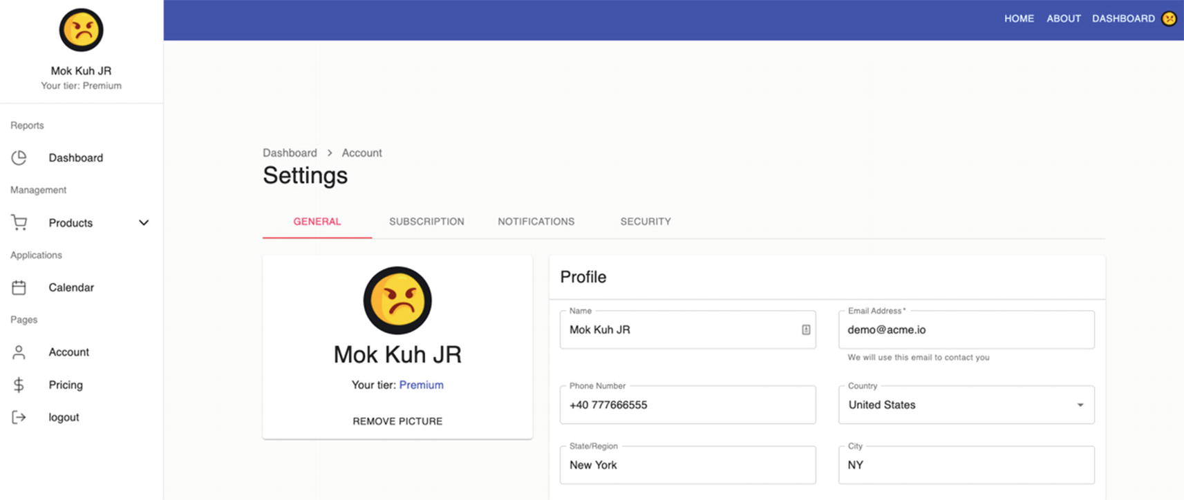
In the sidebar navigation, click Account, and you’ll see the default Settings page is the General page.

Click the other tabs such as the Subscription, Notifications, and Security.

To appreciate the power of using Redux in our app and how easily we can access or share a state of one component to another component, try to edit something in Settings ➤ General.

For example, edit the name and change it to Mok Kuh JR and save it. Once it’s saved, you’ll see the immediate update in the sidebar navigation also.
../images/506956_1_En_15_Chapter/506956_1_En_15_Fig1_HTML.jpg
Figure 15-1

Screenshot of the updated Settings

So that’s the power of Redux – making the whole application reactive to any changes.

Summary

That’s it for this three-part series. In this last chapter, we finished the UI of our application, and hopefully we get into a complete understanding of how Redux works and how to use it in our applications whenever necessary. Hopefully, you have also deepened your knowledge and understanding of Formik and the Yup validation schema to build forms in applications.

Also, just keep in mind that Redux is good, but you DON’T need to use it everywhere in your application because it still adds complexity. For simple CRUD apps or if you don’t need to reuse the state in other components, you don’t need to use Redux.

But if you anticipate building an extensive application or an enterprise-level app, I would suggest setting up Redux in your application right from the get-go.

The setup would probably just take you an hour or two, and what’s good about this is that it is just there waiting to be used whenever you need it. You can then access the state in the reducer from any component.

In the next chapter, we will see how to make our React app mobile-friendly.

..................Content has been hidden....................

You can't read the all page of ebook, please click here login for view all page.
Reset
3.141.0.61