© The Author(s), under exclusive license to APress Media, LLC, part of Springer Nature 2021
D. B. Duldulao, R. J. L. CabagnotPractical Enterprise Reacthttps://doi.org/10.1007/978-1-4842-6975-6_7

7. Writing Data Tables, Formik Forms, and Yup Validations

Devlin Basilan Duldulao1   and Ruby Jane Leyva Cabagnot1
(1)
Oslo, Norway
 

In the previous chapter, we learned how to write local states and send HTTP requests. We also installed ApexCharts to create our visual charts.

We will now move on to building our application, add new components to lay the groundwork for our data tables, and start writing forms using Formik and input validations using Yup. This chapter is the first part of a two-part series since it is a reasonably long topic. The first part would be creating data tables and other style components, which would be the foundation for the second part, the next chapter – focusing on writing forms and input validations.

The finished repository of this chapter is here:

../images/506956_1_En_7_Chapter/506956_1_En_7_Figa_HTML.jpg

Source: https://github.com/webmasterdevlin/practical-enterprise-react/tree/master/chapter-7

Component Overview

Before we proceed with our project app, let’s review some of the libraries or components we will use in this chapter.

Form Handling

Forms allow app users to directly input and submit data through our components from a profile page or login screen to a shopping checkout page and others. It is also the main reason why it is a critical part of any web application.

Based on my own experience and that of many other React developers, creating forms in a React application can be quite tedious. More importantly, forms we create from scratch may be prone to errors because of all the reactivities we need to handle ourselves.

That’s why I choose to build forms using Formik. You can use many other excellent form libraries, including Redux Form, Formsy, and React Forms.

Formik

This gives us the Form, Field, and ErrorMessage components to create our forms, add form fields, and display error messages. Formik gives us three props:
  • initialValue: For the initial values of the form fields.

  • validate: For validation rules in the form fields.

  • onSubmit: This takes a function when we click Submit.

More on this when we start to build forms. I think it’s better to show it in code.

Yup

Yup is an object schema validator in JavaScript (Listing 7-1). With Yup, we can

  • Define the object schema and its validation.

  • Create a validator object with the required schema and validation.

  • Verify if objects are valid (satisfy schemas and validations) using a Yup utility function. If it doesn’t meet the validations, an error message is returned.

//define the object schema and its validation
const book = {
        published: 1951,
  author: "JD Salinger",
  title: "The Catcher in the Rye",
  pages: 234
};
//create a validator object with the required schema and validation
const yup = require("yup");
const yupObject = yup.object().shape({
  published: yup.number.required(),
  author: yup.string.required(),
  title: yup.string.required(),
  pages: yup.number()
});
Listing 7-1

An Example of Creating the Validations with Yup

To demonstrate how we can use all of this together, we will build a Product dashboard that will list all the products and add new products to our app.

First, we will use a data table component from Material-UI to display sets of data.

Data Tables

Product Create View

Go to views ➤ dashboard, create a new folder, and name it product. Under the product folder, create another folder and name it ProductCreateView.

And inside the ProductCreateView folder, create a new file and name it Header.tsx.

Here’s the file path:
views ➤ dashboard ➤ product ➤ ProductCreateView ➤ Header.tsx

Open the Header.tsx, and after typing the snippet “rafce” for VS Code or “rsc” for WebStorm, add the header <h1>Header - CreativeView Works!</h1> for the time being.

See Listing 7-2 on creating the Header component of the ProductCreateView.
import React from 'react'.
const Header = () => {
  return (
    <div>
      <h1>Header - CreativeView Works!</h1>
    </div>
  )
}
export default Header;
Listing 7-2

Creating the Header Component of ProductCreateView

Still within the ProductCreateView folder, we’ll add another file and name it ProductCreateForm.tsx.

Product Create Form

Here’s the file path:
views ➤ dashboard ➤ product ➤ ProductCreateView ➤ ProductCreateForm.tsx
Add an <h1> tag to the ProductCreateForm.tsx. See Listing 7-3 on creating the ProductCreateForm.tsx.
import React from 'react'
const ProductCreateForm = () => {
  return (
    <div>
      <h1>ProductCreateForm Works! h1>
    </div>
  )
}
export default ProductCreateForm;
Listing 7-3

Creating the ProductCreateForm.tsx

Next, under the ProductCreateView directory, add an index.tsx file that will import the two components that we’ve just created: Header.tsx and ProductCreateForm.tsx.

Listing 7-4 creates the index.tsx of ProductCreateView.
import React from 'react';
import { Container, makeStyles } from '@material-ui/core';
import Header from './Header';
import ProductCreateForm from './ProductCreateForm';
const ProductCreateView = () => {
  const classes = useStyles();
  return (
      <Container>
        <Header />
        <ProductCreateForm />
      </Container>
  );
};
const useStyles = makeStyles(theme => ({}));
export default ProductCreateView;
Listing 7-4

Creating the index.tsx of ProductCreateView

So we’re done with that for now. We’ll go back to those components later. The next thing we shall do is to create the product list view.

Product List View

We’ll create another folder inside the product and name it ProductListView and, under that, add two new files and call them Header.tsx and Results.tsx, respectively:
views ➤ dashboard ➤ product ➤ ProductListView ➤ Header.tsx
Views ➤ dashboard ➤ product ➤ ProductListView ➤ Results.tsx
Open the Header.tsx and copy the code as follows.
import React from 'react';
import { makeStyles } from '@material-ui/core';
const Header = () => {
  const classes = useStyles();
  return (
    <div>
      <h1>Header - ListView - Works!</h1>
    </div>
  );
};
const useStyles = makeStyles(theme => ({
        root: {},
        action: {
          marginBottom: theme.spacing(1),
          '& + &': {
             marginLeft: theme.spacing(1),
           },
        },
     }));
export default Header;
Listing 7-5

Creating the Header.tsx of ProductListView

You can do the same thing on your own on the Results.tsx. However, change the <h1> header to "Results - Works!"

After doing the Results.tsx, we’ll add the index.tsx for the ProductListView.
import React from 'react';
import {Container, makeStyles} from '@material-ui/core';
import Header from './Header';
import Results from './Results';
const ProductListView = () => {
  const classes = useStyles();
  return (
    <Container>
      <Header/>
      <Results/>
    </Container>
  );
};
const useStyles = makeStyles(theme =>
  createStyles({
    backdrop: {
      zIndex: theme.zIndex.drawer + 1,
      color: '#fff',
    },
    root: {
      minHeight: '100%',
      paddingTop: theme.spacing(3),
      paddingBottom: 100,
    },
  }),
);
export default ProductListView;
Listing 7-6

Creating the index.tsx of ProductListView

We will come back to all those components later when we need to make some changes.

Updating the Routes

For now, we need to update our routes – one Route path for each newly created component: ProductCreateView and ProductListView.

We’ll register the two indexes in the routes. Open the file
src/app/routes.tsx
Within the routes.tsx file, locate the Dashboard and settings and privacy. We will add the new Route paths between them, as shown in Listing 7-7.
export const Routes = () => {
  return (
    <Suspense fallback={<LinearProgress style={{ margin: '10rem' }} />}>
      <Switch>
        {/*eager loading*/}
        <Route path={'/'} component={HomePage} exact />
        {/*lazy loadings*/}
        <Route
          path={'/about'}
     component={lazy(() => import('./views/pages/AboutPage'))}
          exact
        />
        <Route
          path={'/dashboard'}
          render={({ match: { path } }) => (
            <Dashboard>
              <Switch>
                <Route
                  path={path + '/'}
                  component={lazy(
                    () => import('./views/dashboard/dashboard-default-content'),
                  )}
                  exact
                />
                <Route
                  path={path + '/list-products'}
                  component={lazy(
                    () =>       import('./views/dashboard/product/ProductListView'),
                  )}
                  exact
                />
                 <Route
                  path={path + '/create-product'}
                  component={lazy(
                    () => import('./views/dashboard/product/ProductCreateView'),
                  )}
                  exact
                />
              </Switch>
            </Dashboard>
Listing 7-7

Registering the Route Paths of ProductCreateView and ProductListView

After registering the routes, we’ll update the sidebar dashboard.

Updating the Sidebar Dashboard

We will create two new menus in the sidebar dashboard, namely, List Products and Create Product.

Go to the dashboard-sidebar-navigation.tsx:
app ➤ layouts ➤ dashboard-layout ➤ dashboard-sidebar-navigation.tsx
We’ll import some icons from Feather in the said file.
import {PieChart as PieChartIcon,
        ShoppingCart as ShoppingCartIcon,
        ChevronUp as ChevronUpIcon,
        ChevronDown as ChevronDownIcon,
        List as ListIcon,
        FilePlus as FilePlusIcon,
        LogOut as LogOutIcon,} from 'react-feather';
Listing 7-8

Updating the Named Imports for the dashboard-sidebar-navigation

Note that we’ve renamed the icons that we imported so they’re more readable or other developers in the team can easily understand at a glance what they are for.

Next, we’ll add a local state (useState) and create an event handler handleClick to update the local state. But first, don’t forget to import the useState component from React.
import React, { useEffect, useState } from 'react';
...
const [open, setOpen] = useState(false)
  useEffect(() => {}, []);
  const handleClick =() => {
    setOpen(!open)
  };
Listing 7-9

Adding useState and an Event Handler to dashboard-sidebar-navigation

After that, we’ll render a collapsible menu in the browser.

Creating a Collapsible Sidebar Menu

Let’s add a collapsible menu in between the Dashboard and settings-and-privacy.

First, let’s import the component Collapse from Material-UI Core:
import { Collapse, Divider, ListSubheader } from '@material-ui/core';
Then let’s add the following code to our collapsible menu. We will use the local state open and the event handler handleClick and Material-UI Core’s styling icon components.
<List>
              <ListSubheader>Reports</ListSubheader>
              <Link className={classes.link} to={`${url}`}>
                <ListItem button>
                  <ListItemIcon>
                    <PieChartIcon />
                  </ListItemIcon>
                  <ListItemText primary={'Dashboard'} />
                </ListItem>
              </Link>
              <ListSubheader>Management</ListSubheader>
              <ListItem button onClick={handleClick}>
                <ListItemIcon>
                  <ShoppingCartIcon />
                </ListItemIcon>
                <ListItemText primary="Products" />
                {open ? <ChevronUpIcon /> : <ChevronDownIcon />}
              </ListItem>
              <Collapse in={open} timeout="auto" unmountOnExit>
                <List component="div" disablePadding>
        <Link className={classes.link} to={`${url}/list-products`}>
         <ListItem button className={classes.nested}>
                      <ListItemIcon>
                        <ListIcon />
                      </ListItemIcon>
                      <ListItemText primary="List Products" />
                    </ListItem>
                  </Link>
        <Link className={classes.link} to={`${url}/create-product`}>
                    <ListItem button className={classes.nested}>
                      <ListItemIcon>
                        <FilePlusIcon />
                      </ListItemIcon>
                      <ListItemText primary="Create Product" />
                    </ListItem>
                  </Link>
                </List>
              </Collapse>
              <a className={classes.link} href={'/'}>
                <ListItem button>
                  <ListItemIcon>
                    <LogOutIcon />
                  </ListItemIcon>
                  <ListItemText primary={'logout'} />
                </ListItem>
              </a>
            </List>
          </div>
        </Drawer>
      </div>
Listing 7-10

Creating a Collapsible Menu (Material-UI) for dashboard-sidebar-navigation

So what's going on with our collapsible menu? We added the Management as a list subheader, and under that, we’re using the <ShoppingCartIcon /> for the collapsible Products menu to show the menus List Products and Create Product.

The <ChevronUpIcon /> and <ChevronDownIcon /> will open up and collapse the menu when the user clicks it.

In your editor, you may or may not notice a red squiggly line on {classes.nested}.

In any case, we need to do something more here. This is because we need to add it to our useStyle component. Just add it at the bottom.
nested: {
      paddingLeft: theme.spacing(4),
    },
Listing 7-11

Updating the useStyle Component of dashboard-sidebar-navigation

Now run the application to check if everything is still working. You should see the updated sidebar navigation like the following.
../images/506956_1_En_7_Chapter/506956_1_En_7_Fig1_HTML.jpg
Figure 7-1

Updated UI of dashboard-sidebar-navigation

Click List Products and Create Product to check if you can successfully navigate between pages. You should be able to see the h1 header we’ve written:
(Shown when clicking the List Products tab)
Header - ListView Works!
Results - Works!
(Showing when clicking the Create Product tab)
Header - CreativeView Works!
ProductCreateForm Works!

So now that we’re done with that proof of concept that we can navigate to the new pages, I think it’s time to do some cleanup and remove the settings and privacy tab. We don’t need it anymore; we’ll add some more menus later on.

Cleaning Up a Bit…

Delete the settings-and-privacy from the routes.tsx.

Delete the file settings-and-privacy.tsx.

Next, go the dashboard-sidebar-navigation.tsx.

We will make two edits here:

1. Remove the settings and privacy.

2. Then replace the default <ExitToAppIcon /> with our own <LogoutIcon />.
           <a className={classes.link} href={'/'}>
                <ListItem button>
                  <ListItemIcon>
<LogOutIcon/>
                  </ListItemIcon>
                  <ListItemText primary={'logout'} />
                </ListItem>
              </a>
Listing 7-12

Logout Icon in dashboard-sidebar-navigation

I might have forgotten to use the <Divider /> from Material-UI, so we’ll put it now. Put it right after the </Toolbar>.
<<Toolbar
            style={{ width: '6rem', height: 'auto' }}
            className={classes.toolbar}
          >
            <Link to={`${url}`} className={classes.logoWithLink}>
              Logo
            </Link>
          </Toolbar>
          <Divider />
Listing 7-13

Adding the Divider Component in dashboard-sidebar-navigation

Now run or refresh the browser if the settings and privacy has been removed, and see if everything is still working.

Defining Type Alias of ProductType

After this, we’ll proceed with implementing the products in a data table. Since we’re using TypeScript, we’ll start building first our model types or interfaces. In this case, I prefer to use types.

In the models directory, create a new file and name it product-type.ts. The shape of our ProductType object is shown in the following.

/* this is like an enum string. The pipe | here is basically a union that allows us o choose either of the three options. */
export type InventoryType = 'in_stock' | 'limited' | 'out_of_stock';
export type ProductType = {
  id: string;
  attributes: string[];
  category: string;
  //union means can be string or number
  createdAt: string | number;
  currency: string;
  // the ? means nullable
  image?: string;
  inventoryType: InventoryType;
  isAvailable: boolean;
  isShippable: boolean;
  name: string;
  price: number;
  quantity: number;
  updatedAt: string | number;
  variants: number;
  description: string;
  images: string[];
  includesTaxes: boolean;
  isTaxable: boolean;
  productCode: string;
  productSku: string;
  salePrice: string;
};
Listing 7-14

Creating the Shape of the ProductType Object

The shape or type is pretty much self-explanatory here. We need to make this extra effort now for code maintainability and for us to get IntelliSense in our editor. Doing this now saves us a lot of pain in the long run.

Creating the Products Endpoint

Before we go to the services, let’s update the endpoints in the axios configuration. Open the axios.ts and add the products endpoint.
export const EndPoints = {
  sales: 'sales',
  products: 'products'
};
Listing 7-15

Adding the Products Endpoint in axios.ts

Now that we have set up the endpoints for our sales and products, it’s time to set up their HTTP services.

Creating the Products Service

We’ll use that endpoint in a new file called productService.ts , which we will create under the services directory:
services ➤ productService.ts
Open the new file and add the functions to create the products service, as shown in Listing 7-16.
import api, {EndPoints} from '../api/axios';
import {ProductType} from '../models/product-type';
export async function getProductAxios() {
  return await api.get<ProductType[]>(EndPoints.products);
}
export async function postProductAxios(product: ProductType) {
  return await api.post<ProductType>(EndPoints.products, product);
}
Listing 7-16

Creating productService.ts

In Listing 7-16, we created two functions:

getProductAxios and postProductAxios

Both use Axios to send a request to the JSON server, and the return type is an array of ProductType: <ProductType[ ]> and <ProductType>, respectively.

Both functions are async-await types.

After this, let’s update our db.json with a sample of products or an array of four objects.

Updating the db.json Data

Head off to your db.json file and add the following data, as shown in Listing 7-17.
"products": [
    {
      "id": "5ece2c077e39da27658aa8a9",
      "attributes": ["Cotton"],
      "category": "dress",
      "currency": "$",
      "createdAt": "2021-01-01T12:00:27.87+00:20",
      "image": null,
      "inventoryType": "in_stock",
      "isAvailable": true,
      "isShippable": false,
      "name": "Charlie Tulip Dress",
      "price": 23.99,
      "quantity": 85,
      "updatedAt": "2021-01-01T12:00:27.87+00:20",
      "variants": 2
    },
    {
      "id": "5ece2c0d16f70bff2cf86cd8",
      "attributes": ["Cotton"],
      "category": "dress",
      "currency": "$",
      "createdAt": "2021-01-01T12:00:27.87+00:20",
      "image": null,
      "inventoryType": "out_of_stock",
      "isAvailable": false,
      "isShippable": true,
      "name": "Kate Leopard Dress",
      "price": 95,
      "quantity": 0,
      "updatedAt": "2021-01-01T12:00:27.87+00:20",
      "variants": 1
    },
    {
      "id": "5ece2c123fad30cbbff8d060",
      "attributes": ["Variety of styles"],
      "category": "jewelry",
      "currency": "$",
      "createdAt": 345354345,
      "image": null,
      "inventoryType": "in_stock",
      "isAvailable": true,
      "isShippable": false,
      "name": "Layering Bracelets Collection",
      "price": 155,
      "quantity": 48,
      "updatedAt": "2021-01-01T12:00:27.87+00:20",
      "variants": 5
    },
    {
      "id": "5ece2c1be7996d1549d94e34",
      "attributes": ["Polyester and Spandex"],
      "category": "blouse",
      "currency": "$",
      "createdAt": "2021-01-01T12:00:27.87+00:20",
      "image": null,
      "inventoryType": "limited",
      "isAvailable": false,
      "isShippable": true,
      "name": "Flared Sleeve Floral Blouse",
      "price": 17.99,
      "quantity": 5,
      "updatedAt": "2021-01-01T12:00:27.87+00:20",
      "variants": 1
    }
  ]
Listing 7-17

Adding the db.json Data with Product Objects

You’ll notice that we’ve created four product objects. And just for simplicity here, the names of the objects are as follows:
"name": "Charlie Tulip Dress",
 "name": "Kate Leopard Dress",
 "name": "Layering Bracelets Collection",
 "name": "Flared Sleeve Floral Blouse",

Now that we’ve added the productService in our axios and updated our db.json, let’s test it out by sending an HTTP request.

Sending an HTTP Request

Head off to the index.tsx file of the ProductListView.

We’ll need the useEffect from React. Inside the useEffect, we’ll call the getProductAxios, which is imported from services/productService .
...
import { getProductsAxios } from 'services/productService';
const ProductListView = () => {
  const classes = useStyles();
  useEffect(() => {
    getProductAxios();
  }, []);
Listing 7-18

Using the getProductAxios in ProductListView.tsx

Go to the Chrome DevTools and click the Network tab and choose the XHR. Make sure that your JSON server is running at localhost:5000/products.

Click List Products in the browser, and in the headers, you should see Status Code: 200 OK to indicate a successful get response from the JSON server.

Next, click the Response tab to check the JSON objects. You should be able to see the array of products that we’ve added in our db.json.

Refactoring the ProductListView

Okay, now that we know that it is working, we will do some code refactoring in the ProductListView to reflect the best practices.

Go to the index.tsx of ProductListView and do the following:
  • Create a local state (useState) for updating the array of products’ data.

  • Add an async-await function to be named fetchProducts where we can call the getProductAxios().

  • Put the fetchProducts() inside a try-catch block as best practice.

  • Add a backdrop component from Material-UI that works much like a loader spinner.

/* local state uses Generics Type of type array, so we’ll know at a glance its shape. Hover your mouse over the <ProductType[]>, and you’ll see its model types. If you take out the Generics here, you’ll lose the ability to see the object’s model shape during hover. You’ll get the type ‘any’ */
  const [products, setProducts] = useState<ProductType[]>([])

/* No need to declare the type boolean here because we can already see its type.

Usually primitives - no need to explicitly declare the types. TS can infer it. */
  const [open, setOpen] = useState(false);
  useEffect(() => {
  fetchProduct()
  }, []);
  const fetchProduct = async () => {
    handleToggle();
    try {
      const { data } = await getProductAxios();
      setProducts(data);
    } catch (e) {
      alert('Something is wrong.');
    }
    handleClose();
  };
  const handleClose = () => {
    setOpen(false);
  };
  const handleToggle = () => {
    setOpen(!open);
  }
Listing 7-19

Updating the index.tsx of ProductListView.tsx

We’ll use the local state [open] for the backdrop. We will use that in a bit, but we need to create first some additional UI styling.

Creating Additional UI Styling

First, let’s render the table in the UI, and to do that, we’ll be creating a new file under the components folder and name it label.tsx.

Listing 7-20 creates the label.tsx for the aesthetic design or styling of the table.

import React, { ReactNode } from 'react';
import clsx from 'clsx';
import { fade, makeStyles } from '@material-ui/core';
//defining the shape or type of our label model
type Props = {
  className?: string;
  color?: 'primary' | 'secondary' | 'error' | 'warning' | 'success';
  children?: ReactNode;
  style?: {};
};
const Label = ({
                 className = '',
                 color = 'secondary',
                 children,
                 style,
                 ...rest
               }: Props) => {
  const classes = useStyles();
  return (
    <span
      className={clsx(
        classes.root,
        {
          [classes[color]]: color,
        },
        className,
      )}
      {...rest}
    >
      {children}
    </span>
  );
};
const useStyles = makeStyles(theme => ({
  root: {
    fontFamily: theme.typography.fontFamily,
    alignItems: 'center',
    borderRadius: 2,
    display: 'inline-flex',
    flexGrow: 0,
    whiteSpace: 'nowrap',
    cursor: 'default',
    flexShrink: 0,
    fontSize: theme.typography.pxToRem(12),
    fontWeight: theme.typography.fontWeightMedium,
    height: 20,
    justifyContent: 'center',
    letterSpacing: 0.5,
    minWidth: 20,
    padding: theme.spacing(0.5, 1),
    textTransform: 'uppercase',
  },
  primary: {
    color: theme.palette.primary.main,
    backgroundColor: fade(theme.palette.primary.main, 0.08),
  },
  secondary: {
    color: theme.palette.secondary.main,
    backgroundColor: fade(theme.palette.secondary.main, 0.08),
  },
  error: {
    color: theme.palette.error.main,
    backgroundColor: fade(theme.palette.error.main, 0.08),
  },
  success: {
    color: theme.palette.success.main,
    backgroundColor: fade(theme.palette.success.main, 0.08),
  },
  warning: {
    color: theme.palette.warning.main,
    backgroundColor: fade(theme.palette.warning.main, 0.08),
  },
}));
export default Label;
Listing 7-20

Creating the label.tsx

Next, we need another component that will help us render the data table. Go to the folder ProductListView and create a new file and name it TableResultsHelpers.tsx .

Let’s import the named component and define the type alias of the object, as shown in Listing 7-21.
import React from 'react';
import { InventoryType, ProductType } from 'models/product-type';
import Label from 'app/components/label';
export type TableResultsHelpers = {
  availability?: 'available' | 'unavailable';
  category?: string;
  inStock?: boolean;
  isShippable?: boolean;
};
Listing 7-21

Importing the component and adding the type alias for TableResultsHelpers

Next, let’s apply the filter conditions for rendering the products to the user; see Listing 7-22.
export const applyFilters = (
  products: ProductType[],
  query: string,
  filters: TableResultsHelpers,
): ProductType[] => {
  return products.filter(product => {
    let matches = true;
    /* the product here comes from the parent component.  */
if (query && !product.name.toLowerCase().includes(query.toLowerCase())) {
      matches = false;
    }
if (filters.category && product.category !== filters.category) {
      matches = false;
    }
if (filters.availability) {
      if (filters.availability === 'available' && !product.isAvailable) {
        matches = false;
      }
      if (filters.availability === 'unavailable' && product.isAvailable) {
        matches = false;
      }}
    if (
      filters.inStock &&
      !['in_stock', 'limited'].includes(product.inventoryType)
    ) {
      matches = false;
    }
    if (filters.isShippable && !product.isShippable) {
      matches = false;
    }
    return matches;
  });
};
/* to limit the products or the number of search results shown*/
export const applyPagination = (
  products: ProductType[],
  page: number,
  limit: number,
): ProductType[] => {
  return products.slice(page * limit, page * limit + limit);
};
export const getInventoryLabel = (
  inventoryType: InventoryType,
): JSX.Element => {
  const map = {
    in_stock: {
      text: 'In Stock',
      color: 'success',
    },
    limited: {
      text: 'Limited',
      color: 'warning',
    },
    out_of_stock: {
      text: 'Out of Stock',
      color: 'error',
    },
  };
  const { text, color }: any = map[inventoryType];
  return <Label color={color}>{text}</Label>;
};
Listing 7-22

Creating the TableResultsHelpers

The TableResultsHelpers is using the label component that we just created.

We’re also importing InventoryType and ProductType from models/product-type.

The table helpers are for the UI, so we can query or type in the filter box and see the list of results.

After that, create a new folder under src and name it helpers. Under the helpers folder, add a new file and name it inputProductOptions.ts. This file is just for labeling the table, and it’s better to put it in a separate file rather than bunching it together with the component itself.
export const categoryOptions = [
  {
    id: 'all',
    name: 'All',
  },
  {
    id: 'dress',
    name: 'Dress',
  },
  {
    id: 'jewelry',
    name: 'Jewelry',
  },
  {
    id: 'blouse',
    name: 'Blouse',
  },
  {
    id: 'beauty',
    name: 'Beauty',
  },
];
export const availabilityOptions = [
  {
    id: 'all',
    name: 'All',
  },
  {
    id: 'available',
    name: 'Available',
  },
  {
    id: 'unavailable',
    name: 'Unavailable',
  },
];
export const sortOptions = [
  {
    value: 'updatedAt|desc',
    label: 'Last update (newest first)',
  },
  {
    value: 'updatedAt|asc',
    label: 'Last update (oldest first)',
  },
  {
    value: 'createdAt|desc',
    label: 'Creation date (newest first)',
  },
  {
    value: 'createdAt|asc',
    label: 'Creation date (oldest first)',
  },
];
Listing 7-23

Creating the Helpers for inputProductOptions

That’s done for now. Now, we’ll install three NPM libraries:
$ npm i numeral
$ npm i @types/numeral
$ npm i react-perfect-scrollbar
  1. 1.

    numeral.js: A JavaScript library for formatting and manipulating numbers.

     
  2. 2.

    @types/numeral: numeral.js is built using JavaScript, so we need to add typings for this library.

     
  3. 3.

    react-perfect-scrollbar: This allows us to make a scrollbar easily for our data table.


After successfully installing the libraries, open the file results.tsx to make some edits. I’ve mentioned earlier that we will go back to this file to build it up.

Let’s add the following named import components as shown in Listing 7-24. Aside from the several styling components from Material-UI Core that we will install, we’re importing components from inputProductOptions, TableResultsHelpers, and the product-type from the models folder.
import React, { useState, ChangeEvent } from 'react';
import clsx from 'clsx';
import numeral from 'numeral';
import PerfectScrollbar from 'react-perfect-scrollbar';
import {
  Image as ImageIcon,
  Edit as EditIcon,
  ArrowRight as ArrowRightIcon,
  Search as SearchIcon,
} from 'react-feather';
import {
  Box,
  Button,
  Card,
  Checkbox,
  InputAdornment,
  FormControlLabel,
  IconButton,
  SvgIcon,
  Table,
  TableBody,
  TableCell,
  TableHead,
  TablePagination,
  TableRow,
  TextField,
  makeStyles,
} from '@material-ui/core';
import {
  availabilityOptions,
  categoryOptions,
  sortOptions,
} from 'helpers/inputProductOptions';
import {
  applyFilters,
  applyPagination,
  TableResultsHelpers,
  getInventoryLabel,
} from './tableResultsHelpers';
import { ProductType } from 'models/product-type';
Listing 7-24

Adding the Named Import Components to results.tsx

Next, we’ll define the type or shape of the object in Listing 7-25.
type Props = {
  className?: string;
  products?: ProductType[];
};
Listing 7-25

Creating the Shape or Type of the Object in results.tsx

Following the definition of the type, we’ll create some local states, as shown in Listing 7-26.
const Results = ({ className, products, ...rest }: Props) => {
  const classes = useStyles();
  //Explicitly stating that selectedProducts is an array of type string
const [selectedProducts, setSelectedProducts] = useState<string[]>([]);
  const [page, setPage] = useState(0);
  const [limit, setLimit] = useState(10);
  const [query, setQuery] = useState('');
  /* Explicitly stating that sort is an array of type string so we'll know on mouser hover that value is of type string. */
  const [sort, setSort] = useState<string>(sortOptions[0].value);
  const [filters, setFilters] = useState<TableResultsHelpers | any>({
    category: null,
    availability: null,
    inStock: null,
    isShippable: null,
  });
Listing 7-26

Creating the results.tsx Component

Next, we’ll create the following event handlers, as shown in Listing 7-27.
/*Updates the query every time the user types on the keyboard  */
const handleQueryChange = (event: ChangeEvent<HTMLInputElement>): void => {
    event.persist();
    setQuery(event.target.value);
  };
  const handleCategoryChange = (event: ChangeEvent<HTMLInputElement>): void => {
    event.persist();
    let value: any = null;
    if (event.target.value !== 'all') {
      value = event.target.value;
    }
    setFilters(prevFilters => ({
      ...prevFilters,
      category: value,
    }));
  };
  const handleAvailabilityChange = (
    event: ChangeEvent<HTMLInputElement>,
  ): void => {
    event.persist();
    let value: any = null;
    if (event.target.value !== 'all') {
      value = event.target.value;
    }
    setFilters(prevFilters => ({
      ...prevFilters,
      availability: value,
    }));
  };
  const handleStockChange = (event: ChangeEvent<HTMLInputElement>): void => {
    event.persist();
    let value: any = null;
    if (event.target.checked) {
      value = true;
    }
    setFilters(prevFilters => ({
      ...prevFilters,
      inStock: value,
    }));
  };
  const handleShippableChange = (
    event: ChangeEvent<HTMLInputElement>,
  ): void => {
    event.persist();
    let value: any = null;
    if (event.target.checked) {
      value = true;
    }
    setFilters(prevFilters => ({
      ...prevFilters,
      isShippable: value,
    }));
  };
  const handleSortChange = (event: ChangeEvent<HTMLInputElement>): void => {
    event.persist();
    setSort(event.target.value);
  };
 /*Updating all selected products */
  const handleSelectAllProducts = (
    event: ChangeEvent<HTMLInputElement>,
  ): void => {
    setSelectedProducts(
      event.target.checked ? products.map(product => product.id) : [],
    );
  };
 /*Updating one selected product */
  const handleSelectOneProduct = (
    event: ChangeEvent<HTMLInputElement>,
    productId: string,
  ): void => {
    if (!selectedProducts.includes(productId)) {
      setSelectedProducts(prevSelected => [...prevSelected, productId]);
    } else {
      setSelectedProducts(prevSelected =>
        prevSelected.filter(id => id !== productId),
      );
    }
  };
 /*This is for the pagination*/
  const handlePageChange = (event: any, newPage: number): void => {
    setPage(newPage);
  };
  const handleLimitChange = (event: ChangeEvent<HTMLInputElement>): void => {
    setLimit(parseInt(event.target.value));
  };
  /* Usually query is done on the backend with indexing solutions, but we're doing it  here just to simulate it */
  const filteredProducts = applyFilters(products, query, filters);
  const paginatedProducts = applyPagination(filteredProducts, page, limit);
  const enableBulkOperations = selectedProducts.length > 0;
  const selectedSomeProducts =
    selectedProducts.length > 0 && selectedProducts.length < products.length;
  const selectedAllProducts = selectedProducts.length === products.length;
Listing 7-27

Creating Event Handlers in results.tsx

Continuing to the HTML, we’re wrapping everything in Card from Material-UI Core. We’re also adding Box, TextField, Checkbox, and various Table styles, as shown in Listing 7-28.

Keep in mind that all these stylings are something that you need not create from scratch. You can just go to the Material-UI website and, let’s say, search for “table,” and you can use anything there according to your app’s requirements. All the APIs we’re using here are available in Material-UI.

I’m just showing you again the possibilities of using a well-written and supported library to make your coding development a bit easier. Of course, as I’ve mentioned before, there are many UI component libraries that you can use, and Material-UI is just one of them.

If you are coding along, copy-paste the Card component from Material UI, as shown in Listing 7-28. We will refactor or make some changes when necessary.
return (
    <Card className={clsx(classes.root, className)} {...rest}>
      <Box p={2}>
        <Box display="flex" alignItems="center">
          <TextField
            className={classes.queryField}
            InputProps={{
              startAdornment: (
                <InputAdornment position="start">
                  <SvgIcon fontSize="small" color="action">
                    <SearchIcon />
                  </SvgIcon>
                </InputAdornment>
              ),
            }}
            onChange={handleQueryChange}
            placeholder="Search products"
            value={query}
            variant="outlined"
          />
          <Box flexGrow={1} />
          <TextField
            label="Sort By"
            name="sort"
            onChange={handleSortChange}
            select
            SelectProps={{ native: true }}
            value={sort}
            variant="outlined"
          >
            {sortOptions.map(option => (
              <option key={option.value} value={option.value}>
                {option.label}
              </option>
            ))}
          </TextField>
        </Box>
        <Box mt={3} display="flex" alignItems="center">
          <TextField
            className={classes.categoryField}
            label="Category"
            name="category"
            onChange={handleCategoryChange}
            select
            SelectProps={{ native: true }}
            value={filters.category || 'all'}
            variant="outlined"
          >
            {categoryOptions.map(categoryOption => (
              <option key={categoryOption.id} value={categoryOption.id}>
                {categoryOption.name}
              </option>
            ))}
          </TextField>
          <TextField
            className={classes.availabilityField}
            label="Availability"
            name="availability"
            onChange={handleAvailabilityChange}
            select
            SelectProps={{ native: true }}
            value={filters.availability || 'all'}
            variant="outlined"
          >
            {availabilityOptions.map(avalabilityOption => (
              <option key={avalabilityOption.id} value={avalabilityOption.id}>
                {avalabilityOption.name}
              </option>
            ))}
          </TextField>
          <FormControlLabel
            className={classes.stockField}
            control={
              <Checkbox
                checked={!!filters.inStock}
                onChange={handleStockChange}
                name="inStock"
              />
            }
            label="In Stock"
          />
          <FormControlLabel
            className={classes.shippableField}
            control={
              <Checkbox
                checked={!!filters.isShippable}
                onChange={handleShippableChange}
                name="Shippable"
              />
            }
            label="Shippable"
          />
        </Box>
      </Box>
      {enableBulkOperations && (
        <div className={classes.bulkOperations}>
          <div className={classes.bulkActions}>
            <Checkbox
              checked={selectedAllProducts}
              indeterminate={selectedSomeProducts}
              onChange={handleSelectAllProducts}
            />
            <Button variant="outlined" className={classes.bulkAction}>
              Delete
            </Button>
            <Button variant="outlined" className={classes.bulkAction}>
              Edit
            </Button>
          </div>
        </div>
      )}
      <PerfectScrollbar>
        <Box minWidth={1200}>
          <Table>
            <TableHead>
              <TableRow>
                <TableCell padding="checkbox">
                  <Checkbox
                    checked={selectedAllProducts}
                    indeterminate={selectedSomeProducts}
                    onChange={handleSelectAllProducts}
                  />
                </TableCell>
                <TableCell />
                <TableCell>Name</TableCell>
                <TableCell>Inventory</TableCell>
                <TableCell>Details</TableCell>
                <TableCell>Attributes</TableCell>
                <TableCell>Price</TableCell>
                <TableCell align="right">Actions</TableCell>
              </TableRow>
            </TableHead>
            <TableBody>
              {paginatedProducts.map(product => {
                const isProductSelected = selectedProducts.includes(product.id);
                return (
                  <TableRow hover key={product.id} selected={isProductSelected}>
                    <TableCell padding="checkbox">
                      <Checkbox
                        checked={isProductSelected}
                        onChange={event =>
                          handleSelectOneProduct(event, product.id)
                        }
                        value={isProductSelected}
                      />
                    </TableCell>
                    <TableCell className={classes.imageCell}>
                      {product.image ? (
                        <img
                          alt="Product"
                          src={product.image}
                          className={classes.image}
                        />
                      ) : (
                        <Box p={2} bgcolor="background.dark">
                          <SvgIcon>
                            <ImageIcon />
                          </SvgIcon>
                        </Box>
                      )}
                    </TableCell>
                    <TableCell>{product.name}</TableCell>
                    <TableCell>
                      {getInventoryLabel(product.inventoryType)}
                    </TableCell>
                    <TableCell>
                      {product.quantity} in stock
                      {product.variants > 1 &&
                      ` in ${product.variants} variants`}
                    </TableCell>
                    <TableCell>
                      {product.attributes.map(attr => attr)}
                    </TableCell>
                    <TableCell>
                      {numeral(product.price).format(
                        `${product.currency}0,0.00`,
                      )}
                    </TableCell>
                    <TableCell align="right">
                      <IconButton>
                        <SvgIcon fontSize="small">
                          <EditIcon />
                        </SvgIcon>
                      </IconButton>
                      <IconButton>
                        <SvgIcon fontSize="small">
                          <ArrowRightIcon />
                        </SvgIcon>
                      </IconButton>
                    </TableCell>
                  </TableRow>
                );
              })}
            </TableBody>
          </Table>
          <TablePagination
            component="div"
            count={filteredProducts.length}
            onChangePage={handlePageChange}
            onChangeRowsPerPage={handleLimitChange}
            page={page}
            rowsPerPage={limit}
            rowsPerPageOptions={[5, 10, 25]}
          />
        </Box>
      </PerfectScrollbar>
    </Card>
  );
};
Listing 7-28

Creating Event Handlers in results.tsx

After that, we’ll just need to put the useStyles from makeStyles to the results.tsx.
const useStyles = makeStyles(theme => ({
  availabilityField: {
    marginLeft: theme.spacing(2),
    flexBasis: 200,
  },
  bulkOperations: {
    position: 'relative',
  },
  bulkActions: {
    paddingLeft: 4,
    paddingRight: 4,
    marginTop: 6,
    position: 'absolute',
    width: '100%',
    zIndex: 2,
    backgroundColor: theme.palette.background.default,
  },
  bulkAction: {
    marginLeft: theme.spacing(2),
  },
  categoryField: {
    flexBasis: 200,
  },
  imageCell: {
    fontSize: 0,
    width: 68,
    flexBasis: 68,
    flexGrow: 0,
    flexShrink: 0,
  },
  image: {
    height: 68,
    width: 68,
  },
  root: {},
  queryField: {
    width: 500,
  },
  stockField: {
    marginLeft: theme.spacing(2),
  },
  shippableField: {
    marginLeft: theme.spacing(2),
  },
}));
export default Results;
Listing 7-29

Adding the useStyles to results.tsx

We are done for now with the results.tsx. Let’s make some updates to the index.tsx of the ProductListView.

We’ll import a few components from Material-UI Core, including the Page template component, as shown in Listing 7-30.
import {
  Backdrop,
  Box,
  CircularProgress,
  Container,
  makeStyles,
} from '@material-ui/core';
import Page from 'app/components/page';
Listing 7-30

Adding Named Components to the index.tsx of ProductListView

And then let’s add the useStyles from the makeStyles component, as shown in Listing 7-31.
import { createStyles } from '@material-ui/core/styles';
...
const useStyles = makeStyles(theme =>
  createStyles({
    backdrop: {
      zIndex: theme.zIndex.drawer + 1,
      color: '#fff',
    },
    root: {
      minHeight: '100%',
      paddingTop: theme.spacing(3),
      paddingBottom: 100,
    },
  }),
);
Listing 7-31

Adding useStyles to the index.tsx of ProductListView

Okay, now that we’ve got those laid down on the ProductListView, we will use the Page template, Container , and Backdrop in the JSX, as shown in Listing 7-32.
return (
    <Page className={classes.root} title="Product List">
      <Container maxWidth={false}>
        <Header />
        {products && (
          <Box mt={3}>
            <Results products={products} />
          </Box>
        )}
        <Backdrop
          className={classes.backdrop}
          open={open}
          onClick={handleClose}
        >
          <CircularProgress color="inherit" />
        </Backdrop>
      </Container>
    </Page>
  );
};
Listing 7-32

Adding Material-UI Components to the index.tsx of ProductListView

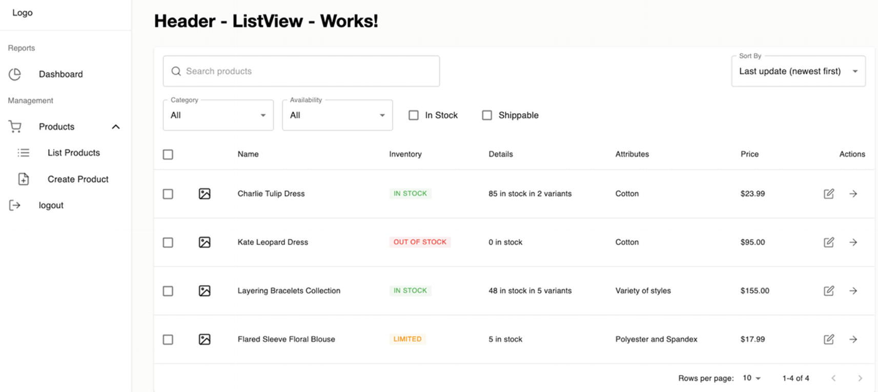
Ensure that your JSON server runs at localhost:5000/products and then refresh your UI by clicking List Products in the sidebar dashboard.
../images/506956_1_En_7_Chapter/506956_1_En_7_Fig2_HTML.jpg
Figure 7-2

Rendering the UI for List Products

Play around with the search box (Search products), Category, and Availability to check if you can successfully search and get the correct results based on your typed keywords. Click the refresh button also to check if the backdrop with the spinner is working.

Summary

We saw that the Products menu is working so far, at least half of it – the List Products – but we have still a long way to go to complete the Products sidebar menu. You can say that we have just laid down the skeletal foundation before we can get to the nitty-gritty of things.

In the second part, the next chapter, we will put a few finishing touches on the ProductListView and then jump straight away to using Formik and Yup validation forms.

..................Content has been hidden....................

You can't read the all page of ebook, please click here login for view all page.
Reset
18.216.186.164