Chapter 2. Building Interactive Apps: Apps That Do Something

Most apps need to respond to the user in some way.
And in this chapter, you’ll see how you can make your apps more interactive. You’ll discover how to add an OnClickListener to your activity code so that your app can listen to what the user’s doing, and make an appropriate response. You’ll find out more about how to design layouts, and you’ll learn how each UI component is derived from a common View ancestor. Along the way, you’ll discover why String resources are so important for flexible, well-designed apps.
Let’s build a Beer Adviser app
When you create an Android app, you’re usually going to want the app to do something.
In this chapter, we’re going to show you how to create an app that the user can interact with. We’ll create a Beer Adviser app where users can select the color of beer they enjoy, click a button, and get back a list of tasty beers to try out.

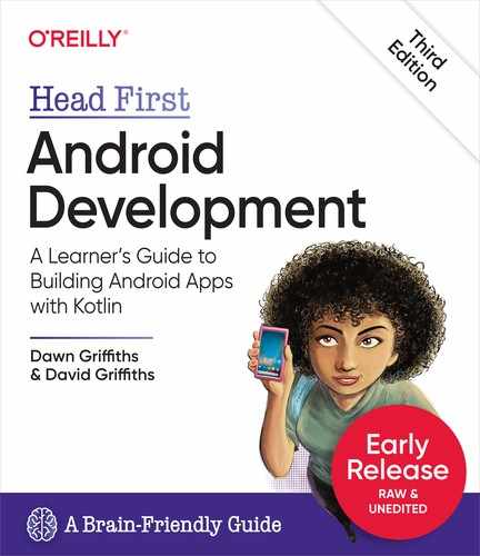
Here’s how the app will be structured:
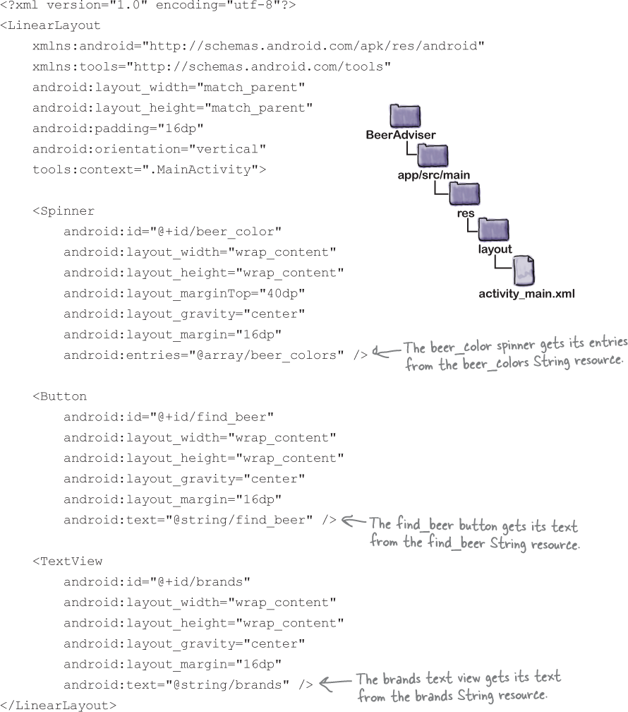
The layout activity_main.xml specifies what the app will look like.
It includes three UI components:
A drop-down list of values called a spinner, which allows the user to choose which color of beer they want.
A button that when clicked will return a selection of beers.
A text view that displays the beers.
The file strings.xml includes any String resources needed by the layout—for example, the label of the button specified in the layout and the beer colors.
The activity MainActivity specifies how the app should interact with the user.
It takes the beer color the user chooses, and uses this to display a list of beers the user might be interested in.
Here’s what we’re going to do
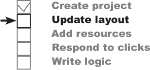
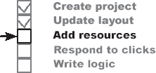
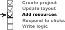
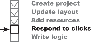
So let’s get to work. There are a few steps you need to go through to build the Beer Adviser app (we’ll tackle these throughout the rest of the chapter):
Let’s start by creating the project.
Create a project.
You’re creating a brand-new app, so you’ll need to create a new project with an empty activity and a layout.
Update the layout.
Once you have the app set up, you need to amend the layout so that it includes all the UI components your app needs.

Add String resources.
We’ll replace any hardcoded text with
Stringresources so that all the text that’s used by the app is held in a single file.
Make the button respond to clicks.
The layout only creates the visuals. To make the button do something when it’s clicked, you need to write some activity code.

Write the application logic.
You’ll add a new function to the activity, and use it to make sure users get the right beer based on their selection.
Let’s start by creating the project.
Create the project

The steps for creating the new project are nearly identical to the ones we used in the previous chapter:
Open Android Studio and choose “Start a new Android Studio project” from the welcome screen. This starts the wizard you saw in Chapter 1.
Make sure that the Phone and Tablet option is selected, and choose the Empty Activity option.
Enter a name of “Beer Adviser”, a package name of “com.hfad.beeradviser” and accept the default save location. Make sure that the language is set to Kotlin, and that the minimum API level is API 19 so that it will run on most Android devices. Then click on the Finish button.

We’ve created a default activity and layout

When you click on the Finish button, Android Studio creates a new project containing an activity named MainActivity.kt and a layout named activity_main.xml, just as it did for the project we created in Chapter 1. We need to modify these files in order to make the app look and behave the way we want.
We’ll start by updating the layout file activity_main.xml to modify the app’s appearance. We’ll build up the layout over the next few pages, but for now, switch to the Project view of Android Studio’s explorer, go to the app/src/main/res/layout folder, and open the file activity_main.xml. Then switch to the code editor, and replace the entire code in activity_main.xml with the following (we’ve bolded all the new code):


The above code features a linear layout (denoted by the <LinearLayout> element) and a text view (denoted by the <TextView> element). You’ll find out more about these elements later in the chapter, but for now, all you need to know is that the linear layout is used to arrange UI components in a vertical column, and the text view displays the text “Beer types”.
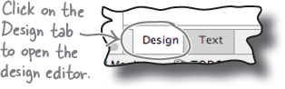
Any changes you make to a layout’s XML are reflected in the design editor. Switch to this now by clicking on the Design tab at the bottom of the editor pane.
A closer look at the design editor
As you learned in Chapter 1, the design editor presents you with a more visual way of editing your layout code than editing XML. It features two different views of the layouts design. One shows you how the layout will look on an actual device, and the other shows you a blueprint of its structure:

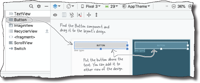
To the left of the design editor is a palette that contains components you can drag to your layout. You’ll use this to add a button to your layout, which later in the chapter, will be used to update the text that’s displayed in the app.

Add a button using the design editor

To add a button to the layout, find the Button component in the palette, click on it, and then drag it into the design editor so that it’s positioned above the text view. The button appears in the layout’s design:
Changes in the design editor are reflected in the XML
Dragging UI components to the layout like this is a convenient way of updating the layout. If you switch to the code editor, you’ll see that adding the button via the design editor has added some more code to the underlying XML:
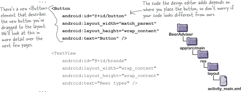
activity_main.xml has a new button

The design editor added a new <Button> element to activity_main.xml:
 <Button

     android:id="@+id/button"

     android:layout_width="match_parent"

     android:layout_height="wrap_content"

     android:text="Button" />
A button in Androidville is a component that the user can click to trigger an action. The <Button> element includes properties controlling its size and appearance. These properties aren’t unique to buttons—other UI components including text views have them too.
Buttons and text views are subclasses of the same Android View class
There’s a very good reason why buttons and text views have properties in common—they both inherit from the same Android View class. You’ll find out more about this in the next chapter, but for now, here are some of the most common properties:
android:id
This gives the component an identifying name so that your activity code can access its properties and control its behavior:
android:id="@+id/button"
android:layout_width, android:layout_height
These properties specify the width and height of the component. "wrap_content" means it should be just big enough for the content, and "match_parent" means it should be as wide as the layout containing it:
 android:layout_width="match_parent"

 android:layout_height="wrap_content"
android:text
This tells Android what text the component should display. In the case of <Button>, it’s the text that appears on the button:
android:text="Button"

A closer look at the layout code

Let’s take a closer look at the layout code, and break it down so that you can see what it’s actually doing (don’t worry if your code looks a little different, just follow along):

The <LinearLayout> element
The first element in the layout code is the <LinearLayout>. This element tells Android that the different UI components in the layout should be displayed one after another in a single row or column.
Note
There are other ways of laying out your UI components too. You’ll find out more about these in the next chapter.
You specify the orientation using the android:orientation attribute. In this example we’re using:
android:orientation="vertical"
so the UI components are displayed in a single vertical column.
The <LinearLayout> contains two elements: a <Button> and a <TextView>.
The Button element
The first element is the <Button>:
 ...
     <Button

         android:id="@+id/button"

         android:layout_width="match_parent"

         android:layout_height="wrap_content"

         android:text="Button" />

     ...
Using a linear layout means that UI components are displayed in a single row or column.
As this is the first element inside the <LinearLayout>, it appears first in the layout at the top of the screen. It has a layout_width of "match_parent", which makes it as wide as its parent element, the <LinearLayout>. Its layout_height has been set to "wrap_content“, which means it should be just tall enough to display its text.
The TextView element
The final element inside the <LinearLayout> is the <TextView>:
      ...

           <TextView

               android:id="@+id/brands"

               android:layout_width="wrap_content"

               android:layout_height="wrap_content"

               android:text="Beer types" />

      ...
As this is the second element and we’ve set the <LinearLayout> element’s orientation to "vertical", it’s displayed underneath the button (the first element). Its layout_width and layout_height properties are both set to "wrap_content" so that it takes up just enough space to contain its text.

You’ve seen how adding components to the design editor adds them to the layout XML. The opposite applies too—any changes you make to the layout XML are applied to the design. Let’s see this in action.
Let’s update the layout XML

We’ll update our layout by adding a new spinner component, and tweaking the button and text view components that are already there. A spinner is the Android term for a drop-down list of values. When you click it, it expands to show you the list so that you can pick a single value.
Update your activity_main.xml code with the following changes (highlighted in bold):
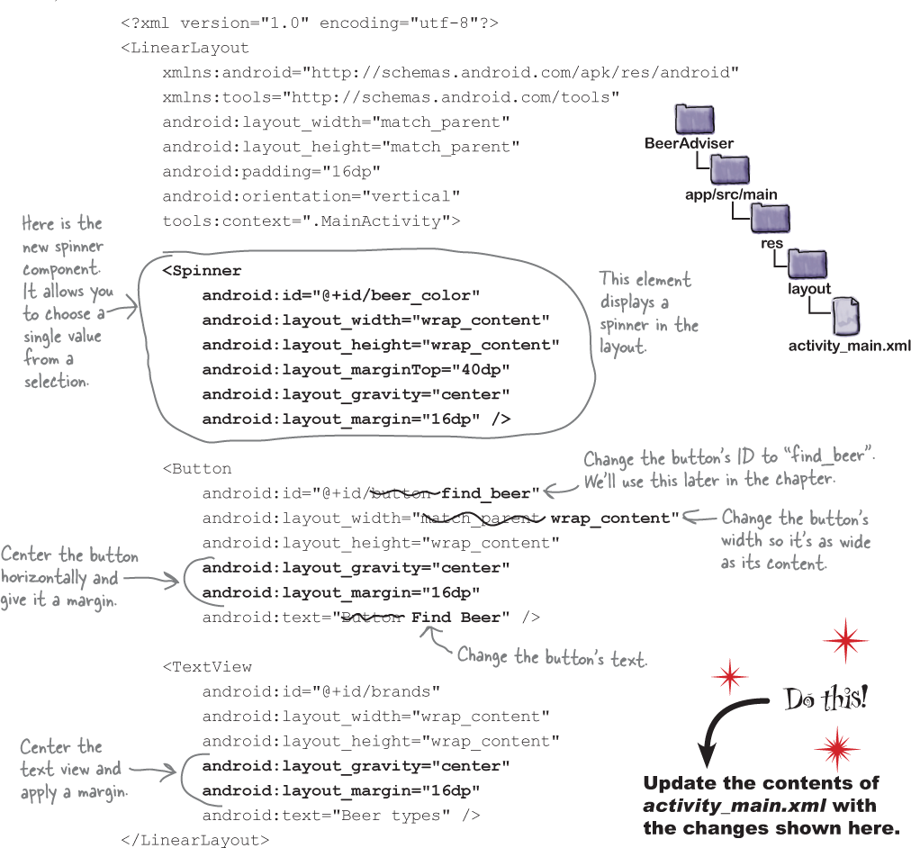
The XML changes are reflected in the design editor

Once you’ve changed the layout XML, switch to the design editor. Instead of displaying a layout containing a button with a text view underneath it, the design editor now shows a spinner, button and text view centered horizontally in a single column.

We’ve now added all the components to activity_main.xml that we need for our Beer Adviser app’s layout. We still have more work to do, but let’s take the app for a test drive so that we can see how it looks on a device.
A spinner provides a drop-down list of values. It allows you to choose a single value from a set of values.
UI components such as buttons, spinners, and text views have very similar attributes, as they are all types of View. Behind the scenes, they all inherit from the same Android View class.
Test drive


Run the app by choosing the “Run ‘app’” command from the Run menu, and wait patiently for the app to load.
When the app appears on your device, notice that it displays an empty spinner, button and text view in a single column.

There are warnings in the layout...

When you develop layouts in Android Studio, the IDE automatically checks your code for errors, and alerts you to potential improvements. An easy way of viewing any warnings or suggestions is to switch to the design editor view of your layout, and check out the component tree panel. This panel is usually located beneath the palette, and it displays a hierarchical tree of the components in your layout.
If Android Studio has any suggestions for how to improve your code, you’ll see an icon to the right of the relevant component. In our example, there are warning icons next to the find_beer and brands components. If we hover our mouse cursor over each one, we can see messages warning us about hardcoded text:


...because there’s hardcoded text
When we defined our layout, we hardcoded the text that needs to be displayed in the text view and button components using code like this:

While this approach is fine when you’re just learning, hardcoding the text in your layout isn’t the best approach.
Suppose you’ve created an app that’s a big hit on your local Google Play Store. You don’t want to limit yourself to just one country or language—you want to make it available internationally and for different languages. But if you’ve hardcoded all of the text in your layout files, sending your app global will be difficult.
It also makes it much harder to make app-wide changes to the text. Imagine your boss asks you to change the wording in the app because the company’s changed its name. If you’ve hardcoded all of the text, this means that you might need to edit a whole host of files in order to change the text.
So what’s the alternative?
Put text in a String resource file

A better approach is to put your text values into a String resource file. This makes it much easier to make app-wide changes to the text used in your application. Instead of having to change hardcoded text values in a whole host of different activity and layout files, you only need to edit the text in the resource file.
This approach also makes it much easier to localize your app. Instead of hardcoding your text in one language, you can provide separate String resource files for each language you want to support. This enables the app to switch the language that’s used in the app so that it matches the device locale.
Android Studio helps you extract String resources
If you have a layout which contains hardcoded text, Android Studio provides you with an easy way of extracting the text and adding it to a String resource file. Simply click on each icon warning you about the hardcoded text, then click on the Fix button to fix the problem.
Let’s try this with one of the components in our layout. Make sure that you’re using the design view of activity_main.xml, and click on the warning icon next to the find_beer component. You’ll be presented with an explanation about why hardcoded text is a problem. Scroll to the end of this explanation, then click on the Fix button:

Extract the String resource

When you click on the Fix button, the Extract Resource window appears. This allows you to specify the name of the String resource, its value and the name of the String resource file. Make sure that the resource name is “find_beer” and the file name is “strings.xml”. Then click on the OK button.
When you click on the OK button, Android Studio adds the find_beer component’s hardcoded text to a String resource file named strings.xml, and changes the layout’s XML so that it uses the String resource. We’ll look at both of these changes, starting with the String resource file.

A String resource has been added to strings.xml
strings.xml is the app’s default String resource file, and Android Studio automatically creates this file for you when you create a new project. Open strings.xml now by opening it in Android Studio’s explorer: you’ll find strings.xml in the app/src/main/res/values folder.
The file contents should look something like this:
     <resources>

          <string name="app_name">Beer Adviser</string>

          <string name="find_beer">Find Beer</string>

     </resources>

The above code describes two String resources, where each resource is a name/value pair. The first resource is named app_name and has a value of “Beer Adviser”, while the second is named find_beer and has a value of “Find beer”. The second resource was added when we extracted the hardcoded text for the find_beer component.

We’ll look at String resources in more detail a few pages ahead, but for now, let’s look at the change that was made to activity_main.xml.
activity_main.xml uses the String resource

When we told Android Studio to extract the hardcoded text, Android Studio automatically updated the find_beer component in activity_main.xml so that it uses the extracted String resource.
Here’s the updated code for the component:

As you can see, the find_beer button’s text property has been changed to "@string/find_beer". So what does this mean?
Let’s start with the first part, @string. This is just a way of telling Android to look up a text value from a String resource file. In our case, this is the file strings.xml that you saw earlier.

The second part, find_beer, tells Android to look up the value of a resource with the name find_beer. So "@string/find_beer" means “look up the String resource with the name find_beer, and use the associated text value.”

You also can extract String resources manually
You’ve now learned what changes Android Studio makes to your code when you ask it to extract hardcoded text into a String resource. You can also make these changes yourself by directly updating the code in strings.xml and activity_main.xml.
Let’s see how by changing the hardcoded “Beer types” text that’s used by the brands component’s text property so that it uses a String resource.
Note
In your own projects, it’s likely that you’ll just use the wizard. We’re showing you how to manually edit the XML because we need to make sure that the code you create in this book matches ours, and updating the XML is the best way of doing this.
Add and use a new String resource

We’ll atart by creating a new String resource named brands. Open strings.xml (located in the app/src/main/res/values folder), and add a new line for the String resource. Here’s what the code looks like: update your version of the code so that it matches ours:

Once you’ve added the String resource, open activity_main.xml and update the code for the brands text view so that it uses the new resource. Update your code so that it matches ours below (we’ve bolded our changes):

There’s a summary about using String resources on the next page, and after that, we’ll take the app for a test drive.
Test drive


Now that we’ve updated the layout to use String resources instead of hardcoded text values, let’s run the app to see how it’s looking. Run the app as before by choosing the “Run ‘app’” command from the Run menu.
When we run the app, the text that’s displayed on the button and in the text view has been updated so that it uses the the String values we added to strings.xml:

Add values to the spinner

Our current layout includes a spinner, but when we click on it, it’s empty. This is because we haven’t yet told the spinner what values it should display. Each time you use a spinner in your layout code, you must specify an associated list of values.
You specify a list of values for a spinner in a similar way to how you specify the text that’s displayed on a button or in a text view: by adding a resource to strings.xml and referring to the resource in the layout. Instead of specifying a single value in a String resource, however, we’ll add multiple Strings to an array resource, and use this array for the spinner’s list of values.
Resources are noncode assets, such as images or Strings, used by your app.
Adding an array resource is similar to adding a String
As you already know, you add a String resource to strings.xml using:
<string name="string_name">string_value</string>
where string_name is the name of the String, and string_value is the value that’s displayed in the app.
To add an array of Strings to a String resource file, you use the following syntax:
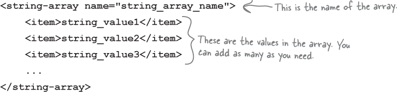
where string_array_name is the name of the array, and string_value1, string_value2, string_value3 are the individual String values that make up the array.
In our example, we want to add a String array resource to our app where each item in the array is a beer color. We’ll then attach this array to the spinner so that when the user clicks on the spinner, the beer colors will be displayed.
Let’s add the new String array.
Add the string-array to strings.xml
To add the String array, open up strings.xml, and add the code below (in bold). This adds a string-array resource named beer_colors which we’ll attach to our spinner:

Get the spinner to display the array’s values
A layout can reference a String array resource using similar syntax to how it would retrieve the value of a String resource. Rather than use:
you use the syntax:

"@array/array_name"
where array_name is the name of the array.
Let’s use this in the layout. Go to the layout file activity_main.xml and add an entries attribute to the spinner like this:

We’ll show you the full code for activity_main.xml on the next page.
The full code for activity_main.xml

Below is the entire code for activity_main.xml. Make sure your version of the file matches ours. We’ll then take the app for a test drive.
Test drive

Let’s see what impact our changes have had on the app. Run the app, and you should get something like this:

So far, we’ve created a layout (activity_main.xml) that includes a spinner, a button and a text view. These UI components use a String resource file (strings.xml) for their String and array values.
The next thing we need to do is get the app to update the brands text view each time the user clicks the button.
We need to make the app interactive

The beer adviser app has the correct appearance and features all the UI components that we need, but it doesn’t yet provide any beer recommendations. To make the app interactive, we need to make the app do something when the user clicks the find_beer button. We want the app to behave something like this:
The user chooses a beer color from the spinner and clicks the button.
Code in MainActivity responds to the button being clicked.
MainActivity passes the selected beer color to a function we’ll create named getBeers.
The
getBeersfunction finds matching brands for the beer color.MainActivity updates the brands text view so that it displays the list of recommended beers on the device.

In order to make the app respond to the user in this way, we need to update the code in MainActivity.kt, as this is the code that’s responsible for how the app behaves. Android Studio created this file for us when we created the project, so let’s take a look at the current code.
What our MainActivity code looks like
Android Studio created MainActivity.kt for us when we created our project. Open this file now (if it’s not already open) by going to the app/src/main/java folder and double-clicking on it.
Here is the code for MainActivity.kt that Android Studio created for us:

The above code is all you need to create a basic activity. As you can see, it’s a class that extends the AppCompatActivity class, and overrides its onCreate() method.
All activities (not just this one) have to extend an activity class such as AppCompatActivity. You’ll find out more about this later in the book, but for now, all you need to know is that when a class extends AppCompatActivity, it transforms your plain old Kotlin class into a full-fledged, card-carrying Android activity.

All activities must also implement the onCreate() method. This method gets called when the activity object gets created, and it’s used to perform basic setup such as what layout the activity is associated with. This is done via a call to setContentView(). In the example above, the code:
setContentView(R.layout.activity_main)
tells Android that this activity uses activity_main.xml as its layout.
You now know what the current MainActivity code does. So how do we get it to respond when the user clicks the find_beer button?
A button can listen for on-click events...

Each time the user does something in your app it’s called an event. There are many different types of event in Androidville, such as clicking a button, swiping the screen or pressing a hardware key on the device.
In our example, we want to know when the user clicks the find_beer button so that we can get the app to do something in response. We can get the app to listen for the button’s on-click event so that each time it occurs, we can update the text in the brands text view.
You can make a button respond to on-click events by adding an OnClickListener to the button.
...using an OnClickListener
You can make your app listen for a button’s on-click events by adding an OnClickListener to the button. Each time the button is clicked, the OnClickListener “hears” the click, and responds to it.

You specify what action the OnClickListener should take by passing it a block of code—a lambda—which specifies what should happen when the button is clicked.
Note
If your Kotlin lambda knowledge feels a little rusty, we suggest that you refer back to Head First Kotlin.
In our example, we want to update the brands text view each time the find_beer button is clicked. This means that we need to add an OnClickListener to the find_beer button, and pass it a lambda which tells it how to update the text view.
Let’s find out how to do this.
Get a reference to the button...

To add an OnClickListener to the find_beer button, you first need to get a reference to the button in your activity code. You do this using a method named findViewById.
The findViewById method lets you get a reference to any UI component in your layout which has an ID. Simply specify the component’s type and ID, and the method “finds” it and returns a reference to it.
In our example, we want to get a reference to the button with an ID of “find_beer”, so we use the code:

...and call its setOnClickListener method
Once you have a reference to the button, you can add an OnClickListener to it by calling its setOnClickListener method using code like this:
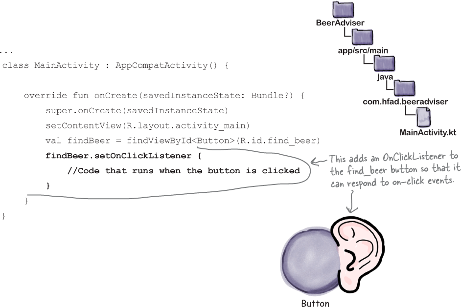
Notice that we’re adding the OnClickListener code to MainActivity’s onCreate method. onCreate runs when the activity gets created, so adding the call to setOnClickListener here means that the find_beer button will be able to start responding to clicks at the earliest opportunity.
Now that we’ve added an onClickListener to the button, let’s make it do something when the button is clicked.
Pass a lambda to the setOnClickListener method

You make the button do something when it’s clicked by passing a lambda to its setOnClickListener method. The lambda specifies what you want to happen each time the button is clicked.

So if you want your button to update some text or perform some other action, you put the code to do this in the lambda that you’re passing to the setOnClickListener method.

We ultimately want our activity to display a list of beer recommendations, but for now, let’s make the button update the brands text view with the value that’s selected in the beer_color spinner. This will let us test that the button’s OnClickListener works before we focus on getting some real beer advice.
In order to do this, there are two more things we need to know: how to edit the text in a text view, and how to get the value that’s selected in the spinner.
How to edit a text view’s text

As you’ve already learned, you change the text that’s displayed in a text view by updating its text property in the layout XML. To update the text using activity code, we therefore need to get a reference to the text view and update its text property.
If you wanted to edit the text that’s displayed in the brands text view to say “Gottle of geer”, for example,you can do so using the following code:

In our case, we want to update the brands text view’s text property to the value that the user has selected in the beer_color spinner. Let’s find out how to get this value.
How to get the spinner’s selected value
You can get the currently selected value in a spinner by accessing its selectedItem property. To get the current value from the beer_color spinner, for example, you would use the code:

The selectedItem property can hold any type of value, not just Strings, so its type is Any!. Any! is like Any, except that its nullability can’t be determined at runtime. You treat a type of Any! in the same way that you treat a type of Any, but it’s possible that you may encounter errors at runtime.
As the selectedItem property has a type of Any!, you need to convert its value to a more appropriate type before you can use it. In our example, we know that the beer_color spinner holds an array of String values, so the item the user selects is a String. We can therefore convert the value of the selectedItem property to a String using the toString function (as above), or by adding it to a String template.
You now know enough to make the find_beer button respond to clicks by getting the item the user selects from the beer_color spinner, and displaying its String value in the brands text view. Before we show you the full code, see if you can piece it together yourself by having a go at the following exercise.
Any! is a platform type of Any whose nullability can’t be determined at runtime. You treat it in the same way as Any in your code, but you may encounter runtime errors.
Pool Puzzle

Your job is to take code snippets from the pool and place them into the blank lines in MainActivity’s onCreate method. You may not use the same code snippet more than once, and you won’t need to use all the snippets. Your goal is to make the find_beer button respond to clicks by getting it to update the brands text view with the value selected in the beer_color spinner.

Note
each thing from the pool can only be used once!

Pool Puzzle Solution

Your job is to take code snippets from the pool and place them into the blank lines in MainActivity’s onCreate method. You may not use the same code snippet more than once, and you won’t need to use all the snippets. Your goal is to make the find_beer button respond to clicks by getting it to update the brands text view with the value selected in the beer_color spinner.

The updated code for MainActivity.kt
We want to update MainActivity so that the find_beer button responds to clicks. Each time the button is clicked, we want to update the text that’s displayed in the brands text view so that it includes the beer color the user selects in the spinner.
Below is the updated MainActivity.kt code featuring the code you pieced together in the previous exercise. Make sure that your code matches ours by adding all the changes (in bold) to your version of MainActivity.kt:

Before we take the code for a test drive, let’s go through what the code does when it runs.
What happens when you run the code

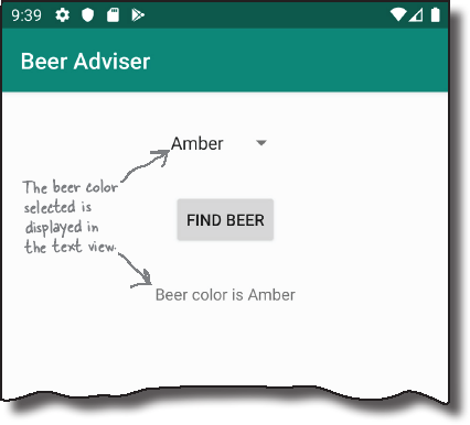
When we run the app, choose a beer color and click on the Find Beer button, the following things happen:
The user chooses a beer color from the spinner and clicks on the Find Beer button.

The button’s
OnClickListenerhears that it’s been clicked.
The OnClickListener code in MainActivity retrieves the currently selected value of the spinner (in this case Amber).

It then updates the text property of the text view to reflect that the user has chosen Amber in the spinner.

Test drive


Make sure you’ve updated MainActivity.kt, and then run your app. When we choose a beer color from the spinner and click on the Find Beer button, the value we selected is displayed in the text view.
Add the findBeers function

Now that we know that our find_beer button can respond to clicks, let’s change its behavior so that each time the user clicks the button, it provides some real beer advice based on the value that’s selected in the spinner. We’ll do this by adding a new getBeers function to MainActivity.kt, which we can then call in the button’s OnClickListener code.
The getBeers function is pure Kotlin code. It has one String parameter for the beer color, and returns a List<String> of beer suggestions. Add the getBeers function (shown below in bold) to your version of MainActivity.kt:

Next, we need to update the lambda that’s passed to the find_beer button’s setOnClickListener method so that it passes the selected beer color to the getBeers function, and updates the brands text view with the results. See if you can piece together the code to do this by having a go at the following exercise.
Activity Magnets

Somebody used fridge magnets to complete the code for MainActivity, but a freak kitchen whirlwind has dislodged some of the magnets. Can you piece the code back together again?
The code needs to call the getBeers function, and display each item it returns in the brands text view. Each item should be displayed on a new line.

Activity Magnets Solution

Somebody used fridge magnets to complete the code for MainActivity, but a freak kitchen whirlwind has dislodged some of the magnets. Can you piece the code back together again?
The code needs to call the getBeers function, and display each item it returns in the brands text view. Each item should be displayed on a new line.

The full code for MainActivity.kt
Below is the full code for MainActivity.kt. Apply the changes shown in bold to your version of the file.

Before we take the code for a final test drive, let’s go through what the code does when it runs.
What happens when you run the code

The following things happen when the app runs:
When the user clicks on the Find Beer button, the button’s OnClickListener hears the click.
The OnClickListener code in MainActivity calls the getBeers() function, passing in the beer color selected in the spinner.
The
getBeers()function returns a list of beers, whichMainActivitysaves in a separate variable.
MainActivity formats the list of beers and uses it to set the text property in the text view.

Let’s take the app for a test drive.
Test drive


Once you’ve made the changes to your app, go ahead and run it. Try selecting different types of beer and clicking on the Find Beer button.

When you choose different types of beer and click on the Find Beer button, the app uses the getBeers function to provide you with a selection of suitable beers. You’ve finished writing your first interactive Android app.
Your Android Toolbox
You’ve got Chapter 2 under your belt and now you’ve added building interactive Android apps to your toolbox.
