Chapter 3. Views and View Groups: Enjoy the View
You’ve already seen how to arrange UI components using a linear layout, but we’ve only scratched the surface. In this chapter we’ll look a little deeper and show you how linear layouts really work. We’ll introduce you to the frame layout, the scroll view, and we’ll also take a tour of the main UI components and how you use them. By the end of the chapter, you’ll see that even though they all look a little different, all layouts and UI components have more in common than you might think.
It all starts with a layout
As you already know, you define what your app looks like using one or more layouts. You usually define a layout using XML.
Each time you define a layout, you go through the following steps:
Specify the type of layout.
At the root of each layout file, you tell Android how you want any UI components to be arranged by specifying a type of layout. A linear layout, for example, arranges UI components in a linear column or row, one after another.
<LinearLayout ...>


</LinearLayout>
Specify the UI components.
Each layout usually contains one or more UI components (such as buttons and text views) which your app uses to display information or interact with the user.
<Button
    android:layout_width="wrap_content"
    android:layout_height="wrap_content"
    android:text="Click me" />
Tell an activity to use the layout.
You tell Android which activity uses the layout you’ve just defined by adding Kotlin code to the activity.
setContentView(R.layout.activity_main)

All UI components are a type of view...
As you learned in Chapter 2, every UI component is a type of view—behind the scenes, they are all subclasses of the android.view.View class.
A View object occupies rectangular space on the screen. It includes the functionality all views need in order to lead a happy, helpful life in Androidville. Here are some of the qualities shared by all views:
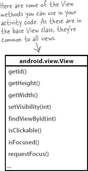
Properties and methods
Each view has properties which you can access in your activity code. You can retrieve the value selected in a spinner, for example, or change the text displayed in a text view. The exact properties and methods you have access to depend on the type of view.
Size and position
You specify the width and height of views so that Android knows how big each one needs to be.
Focus handling
Android handles which view has the focus depending on what the user does. This includes responding to any views that are hidden, removed, or made visible.
Event handling and listeners
Views can listen for events and respond to them so that your app can react to the user. All views can react to getting or losing the focus, for example, and a button can react to being clicked.
...and all layouts are a type of view group
It’s not just the UI components that are a type of view. Under the hood, all layouts (including linear layouts) are a special type of view called a view group—a view that can hold other views. Each type of layout is a subclass of the android.view.ViewGroup class, and ViewGroup is a subclass of View.
Every layout—or view group—has its own policy about how the views it holds are arranged. One layout will always lay views out in a linear row or column, while another will lay them out according to a bunch of defined constraints. And if you want to design effective layouts, you need to understand each layout’s policy, and how to use it to get the results that you want.

What we’re going to do
In this chapter, we’re going to dig deeper into how views and view groups work. Here’s what we’re going to do:
Create a linear layout.
You used a linear layout in the previous chapter, but there’s so much more that you can do with them. You’ll find out more in this step.

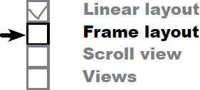
Create a frame layout.
A frame layout is a simple layout that stacks its views. We’ll use one here to display some text on top of an image.
Add a scroll view.
Scrollbars aren’t automatically added to your layout; you need to insert them manually. Here, you’ll discover how to add one to a linear layout.
Explore what other views are available.
We’ll introduce you to more UI components that you can use to display information or interact with the user.

We’ll start by creating a linear layout. Let’s create a new project for it.
Create a new project
Create a new Android Studio project using the same steps you used in the previous chapters. Choose the Empty Activity option, enter a name of “Linear Layout Example”, a package name of “com.hfad.linearlayoutexample” and accept the default save location. Make sure that the language is set to Kotlin, and that the minimum API level is API 19 so that it will run on most Android devices.

Let’s build a linear layout
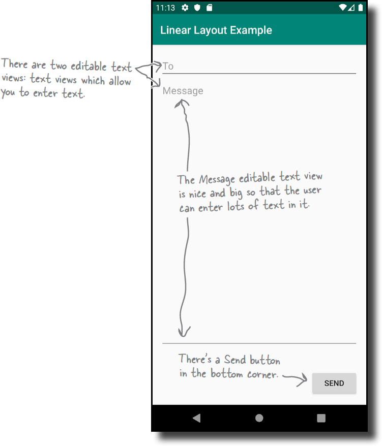
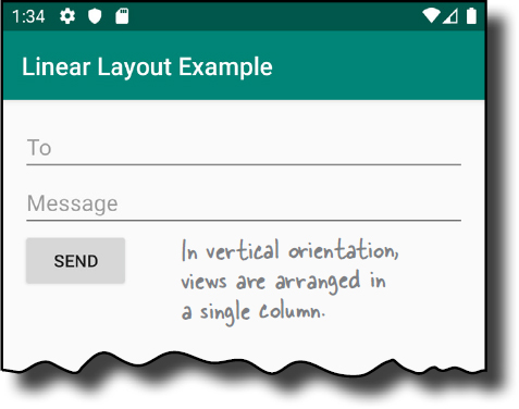
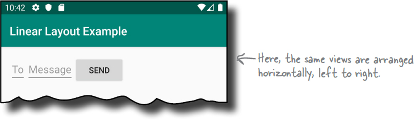
We’re going to use a linear layout to build the layout shown below. A linear layout is a good choice in this situation because the UI components are arranged in a single column. As you already know, a linear layout arranges views one after views next to each other in a vertical column or a horizontal row.
The layout is composed of two editable text views (text views which allow you to enter text) and a button. Here’s what we want the layout to look like:
We’ll start by telling Android that we want to use a linear layout.
How to define a linear layout
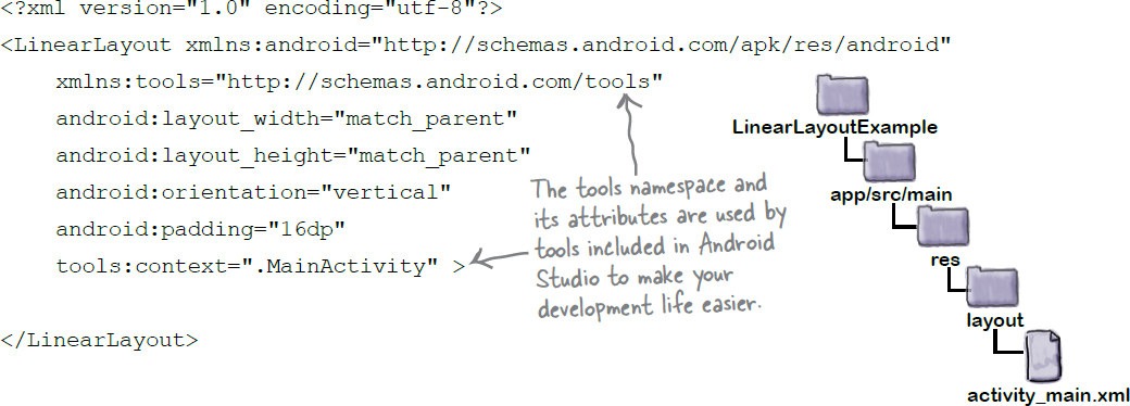
As you already know, ou define a linear layout using a <LinearLayout> element. The code looks like this:
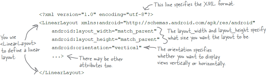
The <LinearLayout> element contains various different attributes which it needs to specify its appearance and behavior.
The first attribute is xmlns:android. This defines a namespace named android, and which needs to be set to "http://schemas.android.com/apk/res/android" as above. Defining this namespace gives your layout access to the elements and attributes that your layout needs, and you need to define it in every layout file you create.
The next two attributes are android:layout_width and android:layout_height, and these specify how wide and high you want the layout to be. These attributes are mandatory for all types of layout and view.

You can set android:layout_width and android:layout_height to "wrap_content", "match_parent" or a specific size such as 8dp—that’s 8 density-independent pixels. "wrap_content" means that you want the layout to be just big enough to hold all of the views inside it, and "match_parent" means that you want the layout to be as big as its parent—in this case, as big as the device screen minus any padding (there’s more about padding a couple of pages ahead). You will usually set the layout width and height to "match_parent".
The next attribute sets the linear layout’s orientation. We’ll look at this next.
Orientation can be vertical or horizontal
You specify the direction in which you wish to arrange views using the android:orientation attribute.
You arrange views vertically in a single column using:
android:orientation="vertical"and you arrange views horizontally in a single row with:
android:orientation="horizontal"If the orientation is horizontal, the order in which the views are arranged depends on the device language settings.
If the device language is set to one that is read from left to right, such as English, the views are displayed in a horizontal row from left to right like this:
If the language on the device is set to one that’s read from right to left, you can choose to display the views from right to left, so the first view appears against the right-most edge of the layout. You enable this feature by including a property named supportsRtl in a file named AndroidManifest.xml file, and setting it to "true" using code like this:
Note
supportsRtl means “supports right-to-left”.

Before we look at what other attributes you can use with linear layouts, let’s take a quick detour to find out more about AndroidManifest.xml.
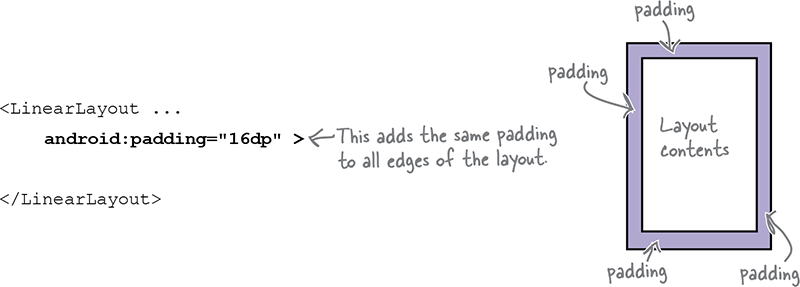
Padding adds space to the layout’s edges
Once you’ve specified the type of layout you want to use, you can optionally use one or more padding attributes to add some extra space to each of the layout’s sides. The following code, for example, uses the android:padding attribute to add 16dp to all sides of the layout:
If you want to add different amounts of padding to different edges, you can specify the edges individually. Here’s how you would add padding of 32dp to the top of the layout, and 16dp to the other edges:
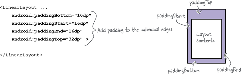
The android:PaddingStart attribute adds padding to the start edge of the layout. If the device language has been set to one that’s read from left to right (such as English), the start edge is on the left; while if the device language is set to one that’s read from right to left, and the app supports right-to-left languages, the start edge is on the right.
Note
paddingStart and paddingEnd are available in API level 17 and above. For earlier versions of Android, you need to use paddingLeft and paddingRight instead. These attributes add padding to the left and right edges of the layout respectively.
The android:PaddingEnd attribute adds padding to the end edge of the layout. This is on the right for languages that are read from left to right, and on the left for languages that are read from right to left (where the app supports right-to-left languages).
For apps using API level 26 or above, you can also use android:paddingHorizontal and android:paddingVertical. These attributes add padding to the horizontal and vertical edges of the layout respectively.
In the above example, we’ve hardcoded the amount of padding that’s used by the linear layout. If you’re likely to use the same amount of padding in multiple places in your app, there’s an alternative approach we can use.
Add a dimension resource file for consistent padding across layouts
In the example on the previous page, we hardcoded the padding and set it to 16dp. An alternative approach is to specify the padding in a dimension resource file instead. Doing so makes it easier to maintain any padding dimensions that are used in multiple places in your app.
To use a dimension resource file, you first need to add one to your project if there’s not one there already. To add the file, first select the app/src/main/res/values folder in Android Studio, then go to File menu and choose New→Values resource file. When prompted, enter a name of “dimens” and click on the OK button. This creates a new resource file called dimens.xml.
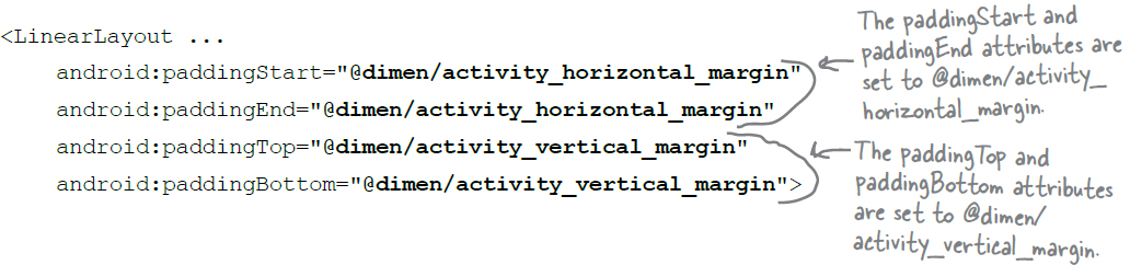
Once you’ve created the dimension resource file, you add dimensions to it using the <dimen> element. As an example, here’s how you would add dimensions for the horizontal and vertical margins to dimens.xml:

You use the dimensions you create by setting the padding attributes in your layout file to the name of a dimension resource like this:
With that kind of setup, at runtime, Android looks up the values of the attributes in the dimension resource file and applies the values it finds there, in this case 16dp.
Now that you’ve learned how to add padding to a linear layout, let’s add some to the layout we’re building.
Our layout code so far
We want to define a linear layout with a vertical orientation. We’ll include padding of 16dp so that there’s a bit of space around the edge of the layout. As we’re just applying padding to a single file, we’ll hardcode the amount of padding we’re using instead of creating a separate dimension resource file.
Here’s our code: update your version of activity_main.xml so that it matches ours:
We’ve now defined an empty linear layout. Next, let’s update it to include the UI components.
Add UI components to the linear layout
Our linear layout needs to hold two editable text views and a button. An editable text view (defined using <EditText>) is like a text view except that it’s used to enter text.
The editable text views contain hint text values of “To” and “Message”. Hint text is text that’s displayed when the edit text is empty, and it’s used to give users a hint as to what sort of text they should enter. You define hint text by adding an android:hint attribute to each <EditText>.
Here’s the linear layout, including the three UI components:


Let’s look at this in more detail.
A linear layout displays views in the order they appear in the layout XML
When you define a linear layout, you list views in the layout in the order in which you want them to displayed. So, if you want an edit text to appear above a button in a linear layout, you must put it above the button in your XML:

You specify the width and height of any views using android:layout_width and android:layout_height, just as you do for a layout. The code:
android:layout_width="wrap_content"
means that you want the view to be just wide enough for its content to fit inside it—for example, the text displayed on a button or in a text view. The code:
android:layout_width="match_parent"
means that you want the view to be as wide as the parent layout.
If you need to refer to a view in your Kotlin code to access its properties or make it do something, you need to give it an ID. As an example, the following code assigns an ID of “button” to a button:
<Button
     android:id="@+id/button"
     ... />
Note
android:layout_width and android:layout_height are mandatory attributes for all views, including view groups.
Note
They can take the values wrap_content, match_parent, or a specific dimension value such as 16dp.
As you saw in the previous chapter, giving a button an ID in this way means that you can assign a listener to it in your activity code so that the button can respond to clicks.
Now that we’ve added views to our layout, let’s see how we need to update them.
Make a view streeeeetch by adding weight
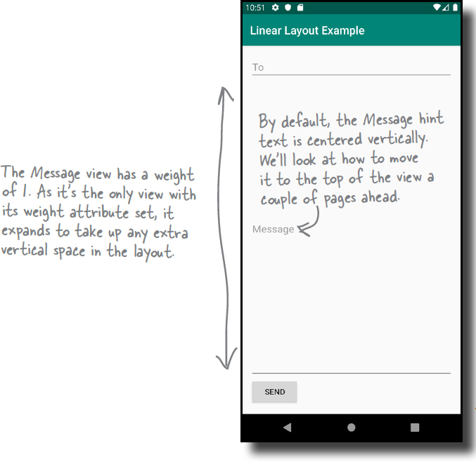
All of the views in our current layout take up just as much vertical space as they need for their content. But what we actually want is to make the Message edit text stretch to take up any vertical space in the layout that’s not being used by the other views.

In order to do this, we need to allocate some weight to the Message area. Allocating weight to a view is a way of telling it to stretch to take up extra space in the layout.
You assign weight to a view using:
android:layout_weight="number"
where number is some number greater than 0.
When you allocate weight to a view, the layout first makes sure that each view has enough space for its content: each button has space for its text, each edit text has space for its hint, and so on. Once it’s done that, the layout takes any extra space, and divides it proportionally between the views with a weight of 1 or greater.
Let’s see how to apply this to our layout.
How to add weight to one view
We need the Message edit text to take up any extra space in the layout that’s not used by either of the other two views. To do this, we’ll set its android:layout_weight attribute to 1. As this is the only view in the layout with a weight value, this will make the text field stretch vertically to fill the remainder of the screen. Here’s the code:

Giving the Message edit text a weight of 1 means that it takes up all of the extra space that’s not used by the other views in the layout. This is because neither of the other two views has been allocated any weight in the layout XML.
In this example, we only need to assign a weight attribute to a single view. Before we update our layout further, let’s see what happens when we need to assign weight to multiple views.
How to add weight to multiple views
When you assign weight to multiple views, the linear layout uses the weight you assign to each view to work out what proportion of the remaining space each view should take up.
As an example, suppose we give the To edit text a weight of 1, and the Message edit text a weight of 2, like this:
<LinearLayout ... >
    <EditText
        android:layout_width="match_parent"
        android:layout_height="0dp"
        android:layout_weight="1"
        android:hint="To" />

    <EditText
        android:layout_width="match_parent"
        android:layout_height="0dp"
        android:layout_weight="2"
        android:hint="Message" />

       <Button
        android:layout_width="wrap_content"
        android:layout_height="wrap_content"
        android:text="Send" />
</LinearLayout>
The linear layout spots that the To and Message editable text views have weights, and it uses these to work out how much space each view should take up.
It starts by adding together the android:layout_weight attributes for each view. In this example, the To and Message views have weights of 1 and 2 respectively, giving a total of 3.
The proportion of extra space taken up by each view is the view’s weight divided by the total weight. The To view has a weight of 1, so this means it will take up 1/3 of the remaining space in the layout. The Message view has a weight of 2, so it will take up 2/3 of the remaining space.
Now that you’ve learned how to use weight, let’s continue to update our layout.

The gravity attribute controls the position of a view’s contents
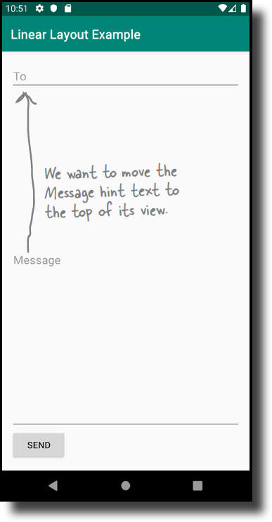
The next thing we’ll do is move the hint text that’s displayed inside the Message edit text. At the moment, it’s centered vertically inside the view. We want to change it so that the text appears at the top of the edit text field, and we can achieve this using the android:gravity attribute.
The android:gravity attribute lets you specify how you want to position the contents of a view inside the view—for example, how you want to position text inside a text view. If you want a view’s contents to appear at the top of the view, as we do here, we can set its android:gravity attribute to "top" like this:
android:gravity="top"We’ll add an android:gravity attribute to the Message edit text so that the hint text moves to the top of the view. Here’s the code:

You’ll find a list of the other values you can use with the android:gravity attribute on the next page.
Values you can use with the android:gravity attribute
Here are some more of the values you can use with the android:gravity attribute. Add the attribute to your view, and set its value to one of the values below:
android:gravity="value"

You can also apply multiple gravities to a view by separating each value with a “|”. To sink a view’s contents to the bottom-end corner, for example, use:
android:gravity="bottom|end"
Now that you know how to position a view’s contents using gravity, let’s see what other changes we need to make to our linear layout.
Note
android:gravity lets you say where you want the view’s contents to appear inside the view.
Layout Magnets

Somebody used fridge magnets to create a linear layout that, when run, produces the output below. Unfortunately, a passing sharknado has dislodged some of the magnets. Can you piece the code back together again?
Note
Hint: You won’t need to use all of the magnets.
Layout Magnets Solution
Somebody used fridge magnets to create a linear layout that, when run, produces the output below. Unfortunately, a passing sharknado has dislodged some of the magnets. Can you piece the code back together again?

The story so far
So far, we’e added three views to our linear layout, and adjusted their position by adding layout_weight and gravity attributes to the Message edit text. These attributes mean that the edit text uses up any extra space that’s not being used by either of the other views, and its hint text is displayed at the top of the view:

Our linear layout is nearly complete, but there are just two more changes we’re going to make.
Let’s see how to do this, starting with moving the button to the end.
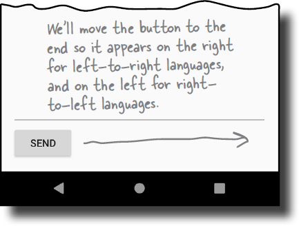
Move the Send button to the end edge.
For left-to-right languages, this will move the button over to the right.
Add more space between the Message edit text and the top of the button.
Let’s see how to do this, starting with moving the button to the end.
layout-gravity controls the position of a view within a layout
To move the button to the end edge of the layout, we’ll add an android:layout_gravity attribute to the button.
The android:layout_gravity attribute lets you specify where you want a view in a linear layout to appear in its enclosing space. You can use it to push a view to the right, for instance, or center the view horizontally. To move our button to the end edge of the layout, we’ll set the android:layout_gravity attribute to "end" using code like this:
<Button
    android:layout_width="wrap_content"
    android:layout_height="wrap_content"
    android:layout_gravity="end"
    android:text="Send" />
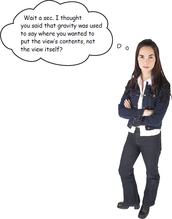
Linear layouts have two attributes that sound similar to one another, gravity and layout_gravity.
Previously, we used the android:gravity attribute to position the Message hint text inside an edit text. This is because the android:gravity attribute lets you say where you want a view’s contents to appear.
android:layout_gravity deals with the placement of the view itself, and lets you control where views appear in their available space. In our case, we want the view to move to the end of its available space, so we’re using:
android:layout_gravity="end"
There’s a list of some of the other values you can use with the android:layout_gravity attribute on the next page.
More values you can use with the android:layout-gravity attribute
Here are some of the values you can use with the android:layout_gravity attribute. Add the attribute to your view, and set its value to one of the values below:
android:layout_gravity="value"

You can assign multiple values to a view’s android:layout_gravity attribute by separating each value with a “|”. To move a view to the bottom-end corner of its available space, for example, you’d use the code:
android:layout_gravity="bottom|end"
Now that you know how change a view’s position using the android:layout_gravity attribute, let’s find out how to give a view more space.
Note
android:layout_gravity lets you say where you want views to appear in their available space.
Note
android:layout_gravity deals with the placement of the view itself, whereas android:gravity controls the view’s contents.
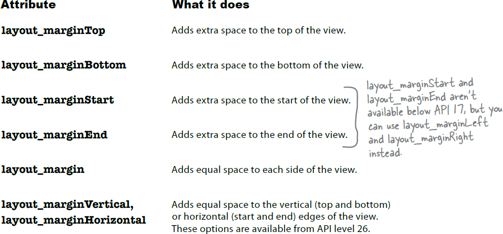
Use margins to add space between views
When you position views using a linear layout, the layout doesn’t leave much space between them. You can increase the amount of space around a view by adding one or more margins to it.
Suppose you have two views in a linear layout, an edit text that’s positioned above a button. If you wanted to increase the space between the two views, you could add a margin of 40dp to the top of the button using the android:layout_marginTop attribute like this:

Here’s a list of the margins you can use to give your views extra space. Add the attribute to the view, and set its value to the size of margin you want:
android:attribute="8dp"
The full linear layout code
Now that you know a view’s layout_gravity and margin attributes, let’s use them in our linear layout code to reposition the button and add some space to its top edge. Here’s the full code for the linear layout: update your version of the code so that it matches ours (our changes are in bold):

We’ve now finished writing our linear layout code, so let’s take it for a test drive.

Test drive

Once you’ve made the changes to your app, go ahead and run it.
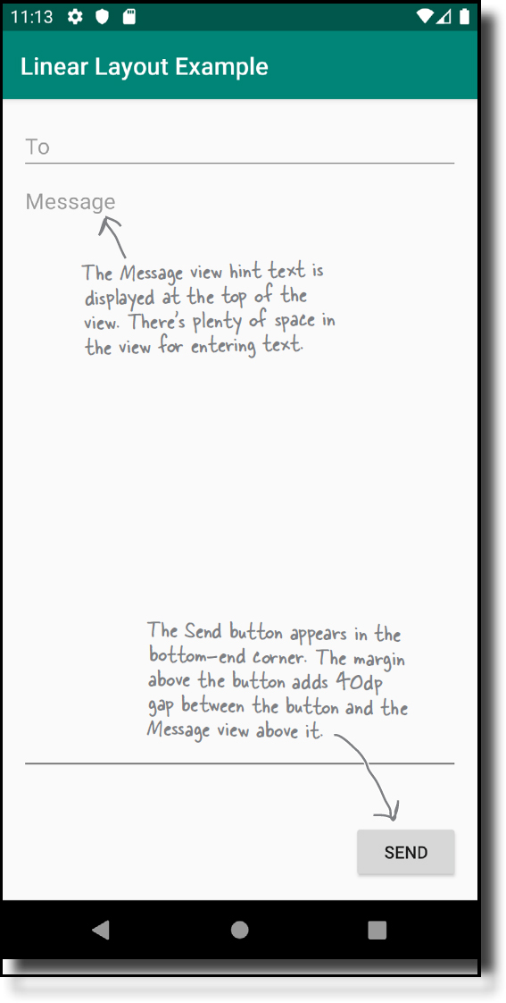
The app displays a linear layout featuring three views: two editable text views and a button. The views are displayed in a vertical column. The To view appears at the top, the Send button is displayed in the bottom end corner, and the Message view takes up any extra space, allowing for a margin of 40dp at the top edge of the button.
You now know how to create a linear layout, and control how its views are displayed. After you’ve had a go at the following exercise we’ll look at how to use a different sort of layout.
BE the Layout
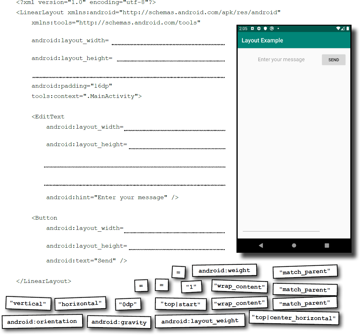
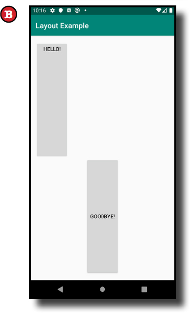
The code below describes a complete linear layout. Your job is to play like you’re the layout, and say which screen the layout will produce when run.

<?xml version="1.0" encoding="utf-8"?>
<LinearLayout
    xmlns:android="http://schemas.android.com/apk/res/android"
    xmlns:tools="http://schemas.android.com/tools"
    android:layout_width="match_parent"
    android:layout_height="match_parent"
    android:orientation="vertical"
    android:padding="16dp"
    tools:context=".MainActivity">

    <Button
        android:layout_width="wrap_content"
        android:layout_height="0dp"
        android:layout_weight="1"
        android:layout_gravity="center_horizontal"
        android:text="Hello!" />

    <Button
        android:layout_width="wrap_content"
        android:layout_height="0dp"
        android:layout_weight="1"
        android:gravity="center_horizontal"
        android:text="Goodbye!" />

</LinearLayout>

BE the Layout Solution
The code below describes a complete linear layout. Your job is to play like you’re the layout, and say which screen the layout will produce when run.

<?xml version="1.0" encoding="utf-8"?>
<LinearLayout
    xmlns:android="http://schemas.android.com/apk/res/android"
    xmlns:tools="http://schemas.android.com/tools"
    android:layout_width="match_parent"
    android:layout_height="match_parent"
    android:orientation="vertical"
    android:padding="16dp"
    tools:context=".MainActivity">

    <Button
        android:layout_width="wrap_content"
        android:layout_height="0dp"
        android:layout_weight="1"
        android:layout_gravity="center_horizontal"
        android:text="Hello!" />

    <Button
        android:layout_width="wrap_content"
        android:layout_height="0dp"
        android:layout_weight="1"
        android:gravity="center_horizontal"
        android:text="Goodbye!" />

</LinearLayout>

A frame layout stacks its views
As you already know, a linear layout arranges its views in a single row or column. Each view is allocated its own space on the screen, and they don’t overlap one another.

Sometimes, however, you want your views to overlap. As an example, suppose you want to display an image with some text overlaid on top of it. You wouldn’t be able to achieve this just using a linear layout.
If you want a layout whose views can overlap, a simple option is to use a frame layout. Instead of displaying its views in a single row or column, it stacks them, one on top of another. It’s often used to hold a single view.
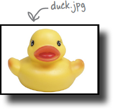
We’ll examine how frame layouts work by using one to display some text on top of a duck image. We’ll start by creating a new project.
Create a new project
Create a new Android Studio project using the same steps you used earlier. Choose the Empty Activity option, enter a name of “Frame Layout Example”, a package name of “com.hfad.framelayoutexample” and accept the default save location. Make sure that the language is set to Kotlin, and that the minimum API level is API 19 so that it will run on most Android devices.
Now that we’ve created the project, let’s define a frame layout.
How to define a frame layout
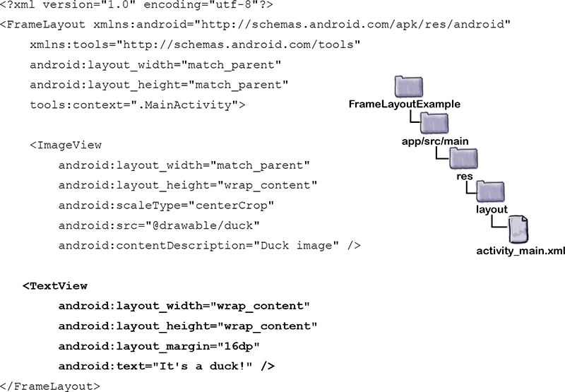
You define a frame layout using the <FrameLayout> element like this:

Just like a linear layout and any other type of view or view group, the android:layout_width and android:layout_height attributes are mandatory and specify the layout’s width and height. You can optionally add padding attributes too, although we’ve not done so here.
The above code creates an empty frame layout. Next, let’s add an image to it to it.
Add an image to your project
We’re going to display an image called duck.jpg in our layout, but before we can use it, we need to add the file to our project.
To do this, you first need to create a drawable resource folder (if Android Studio hasn’t already created it for you). This is the default folder for storing image resources in your app. Switch to the Project view of Android Studio’s explorer, select the app/src/main/res folder, go to the File menu, choose the New... option, then click on the option to create a new Android resource directory. When prompted, choose a resource type of “drawable”, name the folder “drawable”, and click on OK.
Next, download the file duck.jpg from https://git.io/v9oet, then add it to the app/src/main/res/drawable folder.
We’re going to display duck.jpg in an image view (a view that displays an image) which we’ll add to a frame layout. An image view is defined using the <ImageView> element. Here’s the code:

The <ImageView> element includes three new attributes.
The android:src attribute specifies what image should be displayed in the image view. We’ve set this to "@drawable/duck" so that it uses duck.jpg in the drawable folder.
The android:contentDescription attribute provides a text description of the image for accessibility purposes.
Finally, the android:scaleType attribute describes how you want to scale the image. We’ve used "centerCrop", which crops the edges of the image.
A frame layout stacks views in the order they appear in the layout XML
When you define a frame layout, you list views in the order in which you want them to be stacked. The first view is displayed first, the second is stacked on top of it, and so on.
In our example, we’re going to display a text view on top of the image view, so we’ll add it under the image view in the XML like this:
Test drive
Update your activity_main.xml code so that it matches ours above, then run the app. An image of a duck appears on the device with the text “It’s a duck!” in the top corner.
Now that you’ve seen how frame layouts work, let’s look at a special type of frame layout called a scroll view

A scroll view inserts a vertical scrollbar

A scroll view is a subclass of frame layout that includes a vertical scrollbar. It’s useful for layouts that are too big for the device display, as it means that you can use it to scroll to any views that don’t fit on the screen.
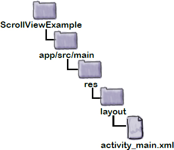
We’re going to create an app that uses a scroll view. Create a new project named “Scroll View Example”, choosing the Empty Activity option. Make sure that the language is set to Kotlin, and that the minimum API level is API 19 so that it will run on most Android devices. Then replace the code in activity_main.xml with the code below:
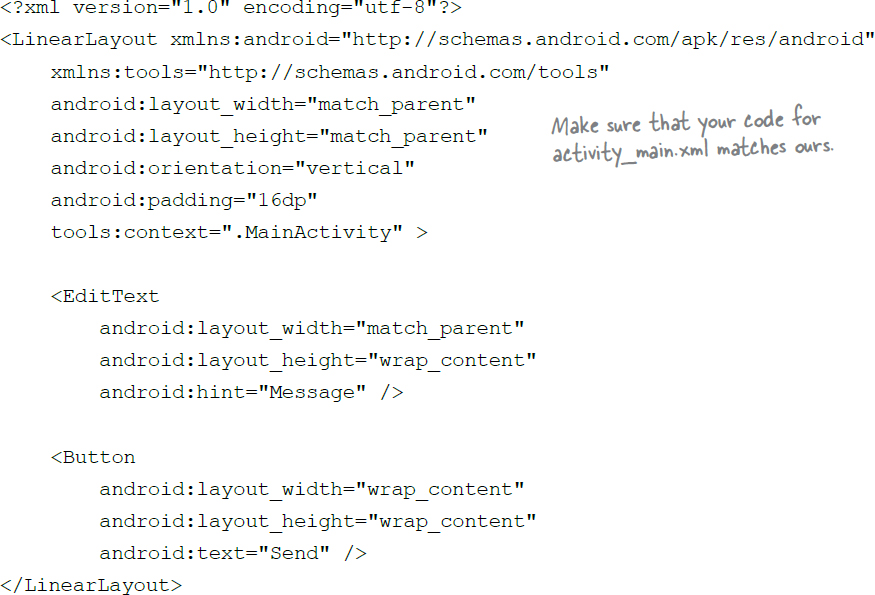
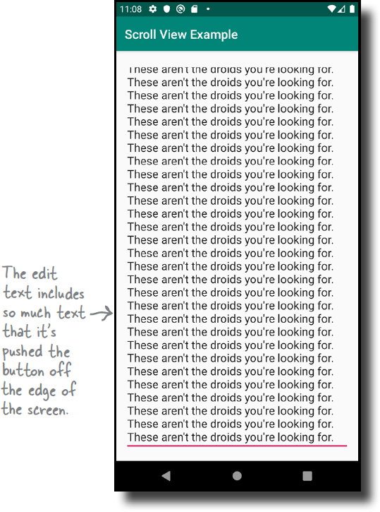
The above layout consists of a simple linear layout that contains a Message edit text and a Send button. Try running the app, and type lots of text into the edit text. The view expands to fit the content, and it eventually pushes the Send button off the edge of the screen. As there’s no scrollbar, you can no longer access the button.
We’ll add a scrollbar to the layout by including a scroll view. This will mean that we can always access the Send button, even when it’s been pushed off the edge of the screen.
How to add a scroll view
You can add a scroll view to your layout by nesting it inside a <ScrollView> element. The <ScrollView> element is used in the same way as <FrameLayout> except that it includes an extra property, fillViewport, which is used to specify whether the scroll view should fill the device screen.
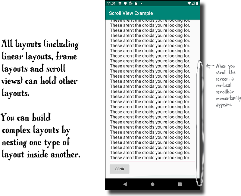
In the code below, we’ve added a scroll view to our layout so that it encloses our original linear layout. Update your code to include our changes (in bold):
Note
Yes! Layouts (including scroll views) can hold other layouts.

Let’s take the new code for a test drive.
Test drive
Go ahead and run the app. When you enter lots of text into the Message edit text, the Send button gets pushed off the edge of the screen as before. This time, however, we can scroll the device screen to reach the button.
Layouts are a type of View called a ViewGroup

As we said earlier in the chapter, each layout is a type of view called a view group—a view which can hold other views. All layouts are subclasses of the android.view.ViewGroup class, and ViewGroup is a subclass of android.view.View.
Here’s the class hierarchy for the types of layout you’ve used so far:
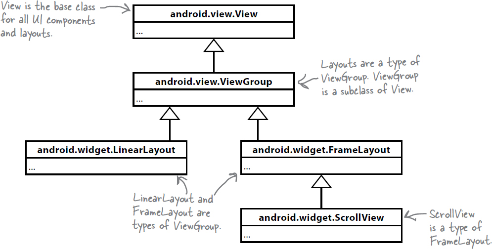
This class hierarchy means that all views and view groups share common attributes and behavior. They can all be displayed on the screen, for instance, and you get to say how tall or wide they should be. It’s why, for example, you need to specify values for each view and layout’s android:layout_height and android:layout_width attributes. These attributes are mandatory for all views, and a layout is a type of view.
It’s also why you can nest a linear layout inside a scroll view, as we did in the previous example. A scroll view is a type of view group, which means that it can hold other views. As every view group is a subclass of View, every view group can hold other view groups in order to build more complex user interfaces.
Note
Every UI component is a type of View, an object that takes up space on the screen.
Note
Every layout is a type of ViewGroup: a type of View that can contain other Views.
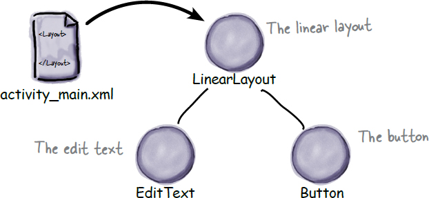
Android inflates views into objects
When you run your app, Android starts an activity and instantiates its layout by converting the views in the layout XML into objects. This is called layout inflation because it inflates each view into an object.
Layout inflation is important because it’s what allows your activity code to manipulate the views in your layout. Behind the scenes, each view is rendered to an object, which you can access in your activity code.
To see how layout inflation works, consider the code below: a linear layout containing a button and an edit text:


When the layout is instantiated the <LinearLayout> element is inflated to a LinearLayout object, the <EditText> is inflated to an EditText object, and the <Button> is inflated to a Button:
Note
When you run your app, Android instantiates the layout XML by converting each of the layout’s items into an object. This is known as layout inflation.
Let’s visit the View Zoo
As you can probably imagine, there are many different kinds of UI component in Androidville. Here’s the class hierarchy for some of the most common ones:
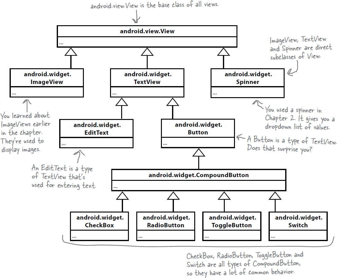
You’ve already encountered text views, spinners, buttons, edit texts and image views. Let’s take a quick tour of the ones you haven’t seen yet, and look in more detail at some of the ones you’ve already used.
An edit text lets you enter text
You saw how to use an edit text earlier in this chapter. It’s a type of text view which lets you input text, and you add it to your layout XML using code like this:
<EditText
    android:id="@+id/edit_text"
    android:layout_width="match_parent"
    android:layout_height="wrap_content"
    android:hint="To" />
There’s also an android:inputType attribute which you can use to specify what type of data you’re expecting the user to enter so that Android can provide the correct keyboard type. The following code, for example, tells Android that you’re expecting the user to enter numbers, so it provides a numeric keypad:
android:inputType="number"
Here are some more of our favorite input types:

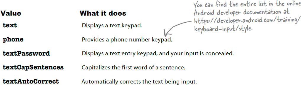
You can specify multiple input types using the | character. As an example, to capitalize the first word of a sentence and automatically correct any misspellings, you’d use:
android:inputType="textCapSentences|textAutoCorrect"
Note
Edit texts can also use the autofill framework, which is available in API level 26 and higher. The autofill framework lets you, say, autofill someone’s address or password. We’re not covering the autofill framework in this book, but you can find more information here: https://developer.android.com/guide/topics/text/autofill
How to use an edit text in your activity code
You can retrieve the text entered in an edit text by accessing its text property using code like this:
val editText = findViewById<EditText>(R.id.edit_text)
val text: String = editText.text.toString()
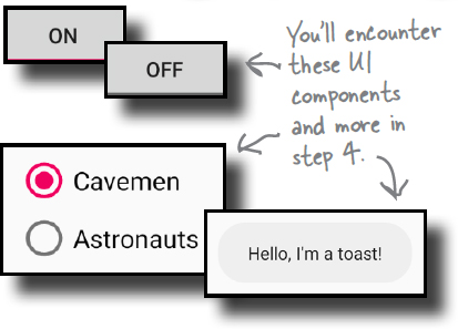
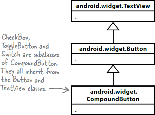
Toggle buttons, switches and checkboxes are buttons that have two states
Toggle buttons, switches and checkboxes are all types of compound button. A compound button is a type of button that has two states: checked and unchecked.
You add a compound button to your layout by specifying which type you want to use. The following code, for example, defines a toggle button (using the <ToggleButton> element) and a switch (using <Switch>):

In the above code, the toggle button displays the text “On” or “Off” depending on its status. The text that’s displayed is controlled via the android:textOn and android:textOff attributes. These attributes can also be used with switches, but an additional line, android:showText="true", is required in order to display the text.
The code to add a checkbox is similar except that you use a text attribute to dispaly the text that appears alongside the component instead of separate textOn and textOff attributes. The following code, for example adds a checkbox to a layout alongside the text “Milk”:

How to use a compound button in your activity code
Once you’ve added a compound button to your layout, you can get its state via its isChecked method, which returns a Boolean.
To see how this works, suppose you add a checkbox to your layout using the following code:

You can then perform different actions depending on the checkbox’s state by adding code like this to the activity:

If you want the checkbox to immediately respond to clicks, you can add an onClickListener to it, in the same way that you add one to a normal button:
Note
Remember, a compound button is a type of button so it inherits a button’s methods and proerties.
val milk = findViewById<ToggleButton>(R.id.checkbox_milk)
milk.setOnClickListener {
    //Code that responds to the checkbox being clicked
}
The activity code to respond to a switch or toggle button is identical to the code you write to respond to a checkbox.
Now that you’ve seen how to use toggle buttons, switches and checkbox, let’s look at another type of compound button: a radio button.
Radio buttons let you select a single option
Just like toggle buttons, switches and checkboxes, a radio button is a type of compound button. The difference, however, is that radio buttons are usually used in a group to display multiple options from which the user can select a single option.
You first define a radio group to hold the radio buttons. A radio group is a type of linear layout that’s designed to hold radio buttons, and it’s defined using the <RadioGroup> element. Each radio button is then added to the radio group using the <RadioButton> element.

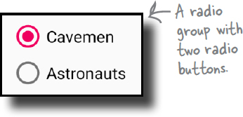
Here’s an example of some layout code that defines a radio group and two radio buttons:
<RadioGroup android:id="@+id/radio_group"
    android:layout_width="match_parent"
    android:layout_height="wrap_content"
    android:orientation="vertical">

    <RadioButton android:id="@+id/radio_cavemen"
        android:layout_width="wrap_content"
        android:layout_height="wrap_content"
        android:text="@string/cavemen" />

    <RadioButton android:id="@+id/radio_astronauts"
        android:layout_width="wrap_content"
        android:layout_height="wrap_content"
        android:text="@string/astronauts" />
</RadioGroup>
You can find out which radio button has been selected in your activity code using the radio group’s checkedRadioButtonId property. This property returns -1 if no radio button is selected, or the ID of the selected radio button. You can then use Android’s findViewById method to get a reference to the radio button:
val radioGroup = findViewById<RadioGroup>(R.id.radio_group)
val id = radioGroup.checkedRadioButtonId
if (id == -1) {
    //no item selected
} else {
    val radio = findViewById<RadioButton>(id)
    //Do something using the radio button
}
Note
RadioGroup is a subclass of LinearLayout, so you can use the same attributes with a radio group as you can with a linear layout.
An image view displays an image
You learned earlier in the chapter that you use an image view to display an image.


Adding an image to your project
You add an image to your project by putting the image in your app’s app/src/main/res/drawable folder. You can create this folder yourself if it’s not already there by selecting the app/src/main/res folder, going to the File menu, and choosing the New... option.
You can use different versions of the image depending on the screen density of the device. This allows you to display higher-resolution images on higher-density screens, and lower-resolution images on lower-density screens. To do this, you create different drawable* folders in app/src/main/res for the different screen densities. The name of the folder relates to the screen density of the device:
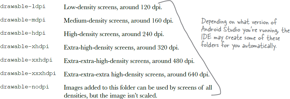
You then put different resolution images in each of the drawable* folders, making sure that each of the image files has the same name. Android decides which image to use at runtime, depending on the screen density of the device it’s running on. As an example, if the device has an extra-high-density screen, it will use the image located in the drawable-xhdpi folder.
If an image is added to just one of the folders, Android will use the same image file for all devices. If you want your app to use the same image regardless of screen density, you’d normally put it in the drawable folder.
Image view: the layout XML
As you learned earlier, you define an image view in XML using the <ImageView> element. You use the android:src attribute to specify what image you want to display, and the android:contentDescription attribute to add a String description of the image so that your app is more accessible:
<ImageView
    android:id="@+id/image"
    android:layout_width="200dp"
    android:layout_height="100dp"
    android:src="@drawable/duck"
    android:contentDescription="Duck image" />

The android:src attribute takes a value of the form "@drawable/image_name", where image_name is the name of the image (without its extension). Image resources are prefixed with @drawable, which tells Android that it’s an image resource located in one or more of the drawable* folders.
Using image views in your activity code
You can also set the image source and description in your activity code, as in this example:

This code looks for the image resource named “duck” in the drawable* folders, and sets it as the source of an image view with an ID of image.
Toasts
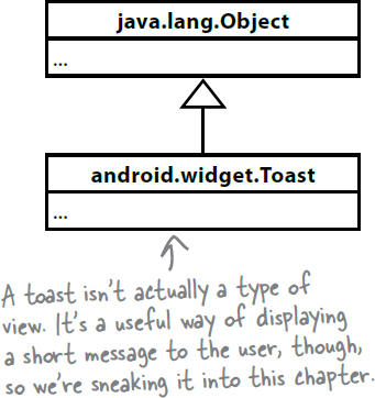
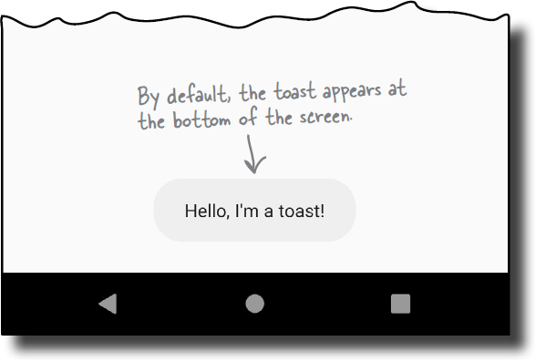
There’s one final widget we want to show you in this chapter: a toast. A toast is a simple pop-up message you can display on the screen.
Toasts are purely informative, as the user can’t interact with them. While a toast is displayed, the activity stays visible and interactive. The toast automatically disappears when it times out.
Using it in your activity code
You create a toast using activity code only. You can’t define one in your layout.
To create a toast, you call the Toast.makeText() method, and pass it three parameters: a Context (usually this for the current activity), a CharSequence that’s the message you want to display, and a duration. Once you’ve created the toast, you call its show() method to display it.
Here’s the code you would use to create a toast that appears on screen for a short duration:
val text : CharSequence = "Hello, I'm a toast!"
val duration = Toast.LENGTH_SHORT

val toast = Toast.makeText(this, text, duration)
toast.show()
Note
A toast is a message that pops up like toast in a toaster.
Your Android Toolbox

You’ve got Chapter 3 under your belt and now you’ve added views and view groups to your toolbox.