Chapter 8. Principal Component Analysis and Clustering: Player Attributes
In this era of big data, some people have a strong urge to simply “throw the kitchen sink” at data in an attempt to find patterns and draw value from them. In football analytics, this urge is strong as well. This approach should generally be taken with caution, because of the dynamic and small-sampled nature of the game. But if handled with care, the process of unsupervised learning (in contrast to supervised learning, both of which are defined in a couple of paragraphs) can yield insights that are useful to us as football analysts.
In this chapter, you will use NFL Scouting Combine data from 2000 to 2023 that you will obtain through Pro Football Reference. As mentioned in Chapter 7, the NFL Scouting Combine is a yearly event, usually held in Indianapolis, Indiana, where NFL players go through a battery of physical (and other) tests in preparation for the NFL Draft. The entire football industry gets together for what is essentially its yearly conference, and with many of the top players no longer testing while they are there (opting to test at friendlier Pro Days held at their college campuses), the importance of the on-field events in the eyes of many have waned. Furthermore, the addition of tracking data into our lives as analysts has given rise to more accurate (and timely) estimates of player athleticism, which is a fast-rising set of problems in and of its own.
Several recent articles provide discussion on the NFL Scouting Combine. “Using Tracking and Charting Data to Better Evaluate NFL Players: A Review” by Eric and others from the Sloan Sports Analytics Conference discusses other ways to measure player data. “Beyond the 40-Yard Dash: How Player Tracking Could Modernize the NFL Combine” by Sam Fortier of the Washington Post describes how player tracking data might be used. “Inside the Rams’ Major Changes to their Draft Process, and Why They Won’t Go Back to ‘Normal’” by Jourdan Rodrigue of the Athletic provides coverage of the Rams’ drafting process.
The eventual obsolete nature of (at least the on-field testing portion of) the NFL Scouting Combine notwithstanding, the data provides a good vehicle to study both principal component analysis and clustering. Principal component analysis (PCA) is the process of taking a set of features that possess collinearity of some form (collinearity in this context means the predictors conceptually contain duplicative information and are numerically correlated) and “mushing” them into smaller subsets of features that are each (linearly) independent of one another.
Athleticism data is chock-full of these sorts of things. For example, how fast a player runs the 40-yard dash depends very much on how much they weigh (although not perfectly), whereas how high they jump is correlated with how far they can jump. Being able to take a set of features that are all-important in their own right, but not completely independent of one another, and creating a smaller set of data column-wise, is a process that is often referred to as dimensionality reduction in data science and related fields.
Clustering is the process of dividing data points into similar groups (clusters) based on a set of features. We can cluster data in many ways, but if the groups are not known a priori, this process falls into the category of unsupervised learning. Supervised learning algorithms require a predefined response variable to be trained on. In contrast, unsupervised learning essentially allows the data to create the response variable—which in the case of clustering is the cluster—out of thin air.
Clustering is a really effective approach in team and individual sports because players are often grouped, either formally or informally, into position groups in team sports. Sometimes the nature of these position groups changes over time, and data can help us detect that change in an effort to help teams adjust their process of building rosters with players that fit into their ideas of positions.
Additionally, in both team and individual sports, players have styles that can be uncovered in the data. While a set of features depicting a player’s style—often displayed through some sort of plot—can be helpful to the mathematically inclined, traditionalists often want to have player types described by groups; hence the value of clustering here as well.
You can imagine that the process of running a PCA in the data before clustering is essential. If how fast a player runs the 40-yard dash carries much of the same signal as how high they jump when tested for the vertical jump, treating them both as one variable (while not “double counting” in the traditional sense) will be overcounting some traits in favor of others. Thus, you’ll start with the process of running a PCA on data, which is adapted from Eric’s DataCamp course.
Tip
We present basic, introductory methods for multivariate statistics in this chapter. Advanced methods emerge on a regular basis. For example, uniform manifold approximation and projection is emerging as one popular new distance-based tool at the time of this writing, and topological data analysis (which uses geometric properties rather than distance) is another. If you understand the basic methods that we present, learning these new tools will be easier, and you will have a benchmark by which to compare these new methods.
Web Scraping and Visualizing NFL Scouting Combine Data
To obtain the data, you’ll use similar web-scraping tools as in Chapter 7. Note the change from draft to combine in the code for the URL. Also, the data requires some cleaning. Sometimes the data contains extra headings. To remove these, remove rows whose value equals the heading (such as Ht != "Ht"). In both languages, height (Ht) needs to be converted from foot-inch to inches.
With Python, use this code to download and save the data:
## Pythonimportpandasaspdimportseabornassnsimportmatplotlib.pyplotaspltcombine_py=pd.DataFrame()foriinrange(2000,2023+1):url=("https://www.pro-football-reference.com/draft/"+str(i)+"-combine.htm")web_data=pd.read_html(url)[0]web_data["Season"]=iweb_data=web_data.query('Ht != "Ht"')combine_py=pd.concat([combine_py,web_data])combine_py.reset_index(drop=True,inplace=True)combine_py.to_csv("combine_data_py.csv",index=False)combine_py[["Ht-ft","Ht-in"]]=combine_py["Ht"].str.split("-",expand=True)combine_py=combine_py.astype({"Wt":float,"40yd":float,"Vertical":float,"Bench":float,"Broad Jump":float,"3Cone":float,"Shuttle":float,"Ht-ft":float,"Ht-in":float})combine_py["Ht"]=(combine_py["Ht-ft"]*12.0+combine_py["Ht-in"])combine_py.drop(["Ht-ft","Ht-in"],axis=1,inplace=True)combine_py.describe()
                Ht           Wt  ...      Shuttle       Season
count  7970.000000  7975.000000  ...  4993.000000  7999.000000
mean     73.801255   242.550094  ...     4.400925  2011.698087
std       2.646040    45.296794  ...     0.266781     6.950760
min      64.000000   144.000000  ...     3.730000  2000.000000
25%      72.000000   205.000000  ...     4.200000  2006.000000
50%      74.000000   232.000000  ...     4.360000  2012.000000
75%      76.000000   279.500000  ...     4.560000  2018.000000
max      82.000000   384.000000  ...     5.560000  2023.000000

[8 rows x 9 columns]
With R, use this code (in R, you will save the data and read the data back into to R because this is a quick way to help R recognize the column types):
## Rlibrary(tidyverse)library(rvest)library(htmlTable)library(multiUS)library(ggthemes)combine_r<-tibble()for(iinseq(from=2000,to=2023)){url<-paste0("https://www.pro-football-reference.com/draft/",i,"-combine.htm")web_data<-read_html(url)|>html_table()web_data_clean<-web_data[[1]]|>mutate(Season=i)|>filter(Ht!="Ht")combine_r<-bind_rows(combine_r,web_data_clean)}write_csv(combine_r,"combine_data_r.csv")combine_r<-read_csv("combine_data_r.csv")combine_r<-combine_r|>mutate(ht_ft=as.numeric(str_sub(Ht,1,1)),ht_in=str_sub(Ht,2,4),ht_in=as.numeric(str_remove(ht_in,"-")),Ht=ht_ft*12+ht_in)|>select(-Ht_ft,-Ht_in)summary(combine_r)
    Player              Pos               School            College
 Length:7999        Length:7999        Length:7999        Length:7999
 Class :character   Class :character   Class :character   Class :character
 Mode  :character   Mode  :character   Mode  :character   Mode  :character


       Ht             Wt             40yd          Vertical         Bench
 Min.   :64.0   Min.   :144.0   Min.   :4.220   Min.   :17.50   Min.   : 2.00
 1st Qu.:72.0   1st Qu.:205.0   1st Qu.:4.530   1st Qu.:30.00   1st Qu.:16.00
 Median :74.0   Median :232.0   Median :4.690   Median :33.00   Median :21.00
 Mean   :73.8   Mean   :242.6   Mean   :4.774   Mean   :32.93   Mean   :20.74
 3rd Qu.:76.0   3rd Qu.:279.5   3rd Qu.:4.970   3rd Qu.:36.00   3rd Qu.:25.00
 Max.   :82.0   Max.   :384.0   Max.   :6.050   Max.   :46.50   Max.   :49.00
 NA's   :29     NA's   :24      NA's   :583     NA's   :1837    NA's   :2802
   Broad Jump        3Cone          Shuttle      Drafted (tm/rnd/yr)
 Min.   : 74.0   Min.   :6.280   Min.   :3.730   Length:7999
 1st Qu.:109.0   1st Qu.:6.980   1st Qu.:4.200   Class :character
 Median :116.0   Median :7.190   Median :4.360   Mode  :character
 Mean   :114.8   Mean   :7.285   Mean   :4.401
 3rd Qu.:121.0   3rd Qu.:7.530   3rd Qu.:4.560
 Max.   :147.0   Max.   :9.120   Max.   :5.560
 NA's   :1913    NA's   :3126    NA's   :3006
     Season
 Min.   :2000
 1st Qu.:2006
 Median :2012
 Mean   :2012
 3rd Qu.:2018
 Max.   :2023
Notice here that many, many players don’t have a full set of data, as evidenced by the NA’s in the R table. A lot of players just give their heights and weights at the combine, which is why the number of NAs there are few. You will resolve this issue in a bit, but let’s look at the reason you need PCA in the first place: the pair-wise correlations between events.
First, look at height versus weight. In Python, create Figure 8-1:
# Pythonsns.set_theme(style="whitegrid",palette="colorblind")sns.regplot(data=combine_py,x="Ht",y="Wt");plt.show();
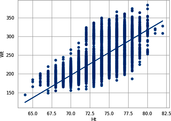
Figure 8-1. Scatterplot with trendline for player height plotted against player weight, plotted with seaborn
Or in R, create Figure 8-2:
# Rggplot(combine_r,aes(x=Ht,y=Wt))+geom_point()+theme_bw()+xlab("Player Height (inches)")+ylab("Player Weight (pounds)")+geom_smooth(method="lm",formula=y~x)

Figure 8-2. Scatterplot with trendline for player height plotted against player weight, plotted with ggplot2
This makes sense: the taller you are, the more you weigh. Hence, there really aren’t two independent pieces of information here. Let’s look at weight versus 40-yard dash. In Python, create Figure 8-3:
# Pythonsns.regplot(data=combine_py,x="Wt",y="40yd",line_kws={"color":"red"});plt.show();

Figure 8-3. Scatterplot with trendline for player weight plotted against 40-yard dash time (seaborn)
Or in R, create a similar figure (Figure 8-4):
# Rggplot(combine_r,aes(x=Wt,y=`40yd`))+geom_point()+theme_bw()+xlab("Player Weight (pounds)")+ylab("Player 40-yard dash (seconds)")+geom_smooth(method="lm",formula=y~x)

Figure 8-4. Scatterplot with trendline for player weight plotted against 40-yard dash time (ggplot2)
Warning
In most computer languages, starting object names with numbers, like
40yd, is bad. The computer does not know what to do because the
computer thinks something like arithmetic is about to happen but then
the computer gets some letters instead. R lets you use improper names by
placing backticks (`) around them, as you did to create
Figure 8-3.
Here, again, you have a positive correlation. Notice here that two clusters are emerging already in the data, though: a lot of really heavy players (above 300 lbs) and a lot of really light players (near 225 lbs). These two groups serve as an example of a bimodal distribution: rather than having a single center like a normal distribution, two groups exist. Now, let’s look at 40-yard dash and vertical jump. In Python, create Figure 8-5:
# Pythonsns.regplot(data=combine_py,x="40yd",y="Vertical",line_kws={"color":"red"});plt.show();

Figure 8-5. Scatterplot with trendline for player 40-yard dash time plotted against vertical jump (seaborn)
Or in R, create Figure 8-6:
# Rggplot(combine_r,aes(x=`40yd`,y=Vertical))+geom_point()+theme_bw()+xlab("Player 40-yard dash (seconds)")+ylab("Player vertical jump (inches)")+geom_smooth(method="lm",formula=y~x)
Resulting in:
geom_smooth: na.rm = FALSE, orientation = NA, se = TRUE
stat_smooth: na.rm = FALSE, orientation = NA, se = TRUE, method = lm,
formula = y ~ x position_identity

Figure 8-6. Scatterplot with trendline for player 40-yard dash time plotted against vertical jump (ggplot2)
Here, you have a negative relationship; the faster the player (lower the 40-yard dash, in seconds), the higher the vertical jump (in inches). Does agility (as measured by the three-cone drill, see Figure 8-7) also track with the 40-yard dash?

Figure 8-7. In the three-cone drill, players run around the cones, following the path, and their time is recorded
In Python, create Figure 8-8:
# Pythonsns.regplot(data=combine_py,x="40yd",y="3Cone",line_kws={"color":"red"});plt.show();
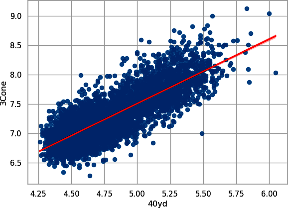
Figure 8-8. Scatterplot with trendline for player 40-yard dash time plotted against their three-cone drill (seaborn)
Or in R, create Figure 8-9:
# Rggplot(combine_r,aes(x=`40yd`,y=`3Cone`))+geom_point()+theme_bw()+xlab("Player 40-yard dash (seconds)")+ylab("Player 3 cone drill (inches)")+geom_smooth(method="lm",formula=y~x)

Figure 8-9. Scatterplot with trend line for player 40-yard dash time plotted against three-cone drill time (ggplot2)
We have another positive relationship. Hence, it’s clear that athleticism is measured in many ways, and it’s reasonable to assume that none of them are independent of the others.
To commence the process of PCA, we first have to “fill in” the missing data. We use k-nearest neighbors, which is beyond the scope of this book. As you learn more about your data structure, you may want to do your own research to find other methods for replacing missing values. For now, just run the code.
Note
We included the web-scraping step (again) and imputation step so that the book would be self-contained and you can recreate all our data yourself.
With this method, only players with a recorded height and weight at the combine had their data imputed (that is, missing values were estimated using a statistical method). We have included an if-else statement so this code will run only if the file has not been downloaded and saved to the current directory.
In Python, run the following:
## Pythonimportnumpyasnpimportosfromsklearn.imputeimportKNNImputercombine_knn_py_file="combine_knn_py.csv"col_impute=["Ht","Wt","40yd","Vertical","Bench","Broad Jump","3Cone","Shuttle"]ifnotos.path.isfile(combine_knn_py_file):combine_knn_py=combine_py.drop(col_impute,axis=1)imputer=KNNImputer(n_neighbors=10)knn_out_py=imputer.fit_transform(combine_py[col_impute])knn_out_py=pd.DataFrame(knn_out_py)knn_out_py.columns=col_imputecombine_knn_py=pd.concat([combine_knn_py,knn_out_py],axis=1)combine_knn_py.to_csv(combine_knn_py_file)else:combine_knn_py=pd.read_csv(combine_knn_py_file)combine_knn_py.describe()
Resulting in:
        Unnamed: 0       Season  ...        3Cone      Shuttle
count  7999.000000  7999.000000  ...  7999.000000  7999.000000
mean   3999.000000  2011.698087  ...     7.239512     4.373727
std    2309.256735     6.950760  ...     0.374693     0.240294
min       0.000000  2000.000000  ...     6.280000     3.730000
25%    1999.500000  2006.000000  ...     6.978000     4.210000
50%    3999.000000  2012.000000  ...     7.122000     4.310000
75%    5998.500000  2018.000000  ...     7.450000     4.510000
max    7998.000000  2023.000000  ...     9.120000     5.560000

[8 rows x 10 columns]
In R, run this:
## Rcombine_knn_r_file<-"combine_knn_r.csv"if(!file.exists(combine_knn_r_file)){imput_input<-combine_r|>select(Ht:Shuttle)|>as.data.frame()knn_out_r<-KNNimp(imput_input,k=10,scale=TRUE,meth="median")|>as_tibble()combine_knn_r<-combine_r|>select(Player:College,Season)|>bind_cols(knn_out_r)write_csv(x=combine_knn_r,file=combine_knn_r_file)}else{combine_knn_r<-read_csv(combine_knn_r_file)}
combine_knn_r|>summary()
Resulting in:
    Player              Pos               School            College
 Length:7999        Length:7999        Length:7999        Length:7999
 Class :character   Class :character   Class :character   Class :character
 Mode  :character   Mode  :character   Mode  :character   Mode  :character


     Season           Ht             Wt             40yd         Vertical
 Min.   :2000   Min.   :64.0   Min.   :144.0   Min.   :4.22   Min.   :17.50
 1st Qu.:2006   1st Qu.:72.0   1st Qu.:205.0   1st Qu.:4.53   1st Qu.:30.50
 Median :2012   Median :74.0   Median :232.0   Median :4.68   Median :33.50
 Mean   :2012   Mean   :73.8   Mean   :242.5   Mean   :4.77   Mean   :32.93
 3rd Qu.:2018   3rd Qu.:76.0   3rd Qu.:279.0   3rd Qu.:4.97   3rd Qu.:35.50
 Max.   :2023   Max.   :82.0   Max.   :384.0   Max.   :6.05   Max.   :46.50
     Bench         Broad Jump        3Cone          Shuttle
 Min.   : 2.00   Min.   : 74.0   Min.   :6.280   Min.   :3.730
 1st Qu.:16.00   1st Qu.:109.0   1st Qu.:6.975   1st Qu.:4.210
 Median :19.50   Median :116.0   Median :7.140   Median :4.330
 Mean   :20.04   Mean   :114.7   Mean   :7.252   Mean   :4.383
 3rd Qu.:24.00   3rd Qu.:121.0   3rd Qu.:7.470   3rd Qu.:4.525
 Max.   :49.00   Max.   :147.0   Max.   :9.120   Max.   :5.560
Notice, no more missing data. But, for reasons that are beyond this book and similar to reasons explained in this Stack Overflow post, the two methods produce similar, but slightly different, results because they use slightly different assumptions and methods.
Introduction to PCA
Before you fit the PCA used for later analysis, let’s take a short break to look at how a PCA works. Conceptually, a PCA reduces the number of dimensions of data to use the fewest possible. Graphically, dimensions refers to the number of axes needed to describe the data. Tabularly, dimensions refers to the number of columns needed to describe the data. Algebraically, dimensions refers to the number of independent variables needed to describe the data.
Look back at the length-weight relation shown in Figures 8-1 and
8-2. Do we need an x-axis and a y-axis to describe this data? Probably not. Let’s fit a PCA, and then you can look at the outputs. You will use the raw data after removing missing values. In Python, use the PCA() function from the scikit-learn package:
## Pythonfromsklearn.decompositionimportPCApca_wt_ht=PCA(svd_solver="full")wt_ht_py=combine_py[["Wt","Ht"]].query("Wt.notnull() & Ht.notnull()").copy()pca_fit_wt_ht_py=pca_wt_ht.fit_transform(wt_ht_py)
Or with R, use the prcomp() function from the stats package that is part of the core set of R packages:
## rwt_ht_r<-combine_r|>select(Wt,Ht)|>filter(!is.na(Wt)&!is.na(Ht))pca_fit_wt_ht_r<-prcomp(wt_ht_r)
Now, let’s look at the model details. In Python, use this code to look at the variance explained by each of the new principal components (PCs), or new axes of data:
## Python(pca_wt_ht.explained_variance_ratio_)
Resulting in:
[0.99829949 0.00170051]
In R, look at the summary() of the fit model:
## Rsummary(pca_fit_wt_ht_r)
Resulting in:
Importance of components:
                           PC1    PC2
Standard deviation     45.3195 1.8704
Proportion of Variance  0.9983 0.0017
Cumulative Proportion   0.9983 1.0000
Both of the outputs show that PC1 (or the axis of data) contains 99.8% of the variability within the data. This tells you that only the first PC is important for the data.
To see the new representation of the data, plot the new data. In Python, use matplotlib’s plot() to create a simple scatterplot of the outputs to create Figure 8-10:
## Pythonplt.plot(pca_fit_wt_ht_py[:,0],pca_fit_wt_ht_py[:,1],"o");plt.show();

Figure 8-10. Scatterplot of the PCA rotation for weight and height with plot() from matplotlot
In R, use ggplot to create Figure 8-11:
## Pythonpca_fit_wt_ht_r$x|>as_tibble()|>ggplot(aes(x=PC1,y=PC2))+geom_point()+theme_bw()
A lot is going on in these figures. First, compare Figure 8-1 to Figure 8-10 or compare Figure 8-2 to Figure 8-11. If you are good at spatial pattern recognition, you might see that the figures have the same data, just rotated (try looking at the outliers that fall away from the main crowd, and you might be able to see how these data points moved). That’s because PCA rotates data to create fewer dimensions of it. Because this example has only two dimensions, the pattern is visible in the data.

Figure 8-11. Scatterplot of the PCA rotation for weight and height with ggplot2
You can get these rotation values by looking at components_ in Python or by printing the fitted PCA in R. Although you will not use these values more in this book, they have uses in machine learning, when people need to convert data in and out of the PCA space. In Python, use this code to extract the rotation values:
## Pythonpca_wt_ht.components_
Resulting in:
array([[ 0.9991454 ,  0.04133366],
       [-0.04133366,  0.9991454 ]])
In R, use this code to extract the rotation values:
## R(pca_fit_wt_ht_r)
Resulting in:
Standard deviations (1, .., p=2):
[1] 45.319497  1.870442

Rotation (n x k) = (2 x 2):
           PC1         PC2
Wt -0.99914540 -0.04133366
Ht -0.04133366  0.99914540
Your values may be different signs than our values (for example, we may have –0.999, and you may have 0.999), but that’s OK and varies randomly. For example, Python’s PCA has three positive numbers with the book’s numbers, whereas R’s PCA has the same numbers, but negative. These numbers say that you take a player’s weight and multiply it by 0.999 and add 0.041 times the player’s height to create the first PC.
Why are these values so different? Look back again at Figures 8-10 and 8-11. Notice that the x-axis and y-axis have vastly different scales. This can also cause different input features to have different levels of influence. Also, unequal numbers sometimes cause computational problems.
In the next section, you will put all features on the same unit level by scaling the inputs. Scaling refers to transforming a feature, usually to have a mean of 0 and standard deviation of 1. Thus, the different units and magnitudes of the features no longer are important after scaling.
PCA on All Data
Now, apply R and Python’s built-in algorithms to perform the PCA analysis on all data. This will help you to create new, and fewer, predictor variables that are independent of one another. First, scale that data and then run the PCA. In Python:
## Pythonfromsklearn.decompositionimportPCAscaled_combine_knn_py=(combine_knn_py[col_impute]-combine_knn_py[col_impute].mean())/combine_knn_py[col_impute].std()pca=PCA(svd_solver="full")pca_fit_py=pca.fit_transform(scaled_combine_knn_py)
Or in R:
## Rscaled_combine_knn_r<-scale(combine_knn_r|>select(Ht:Shuttle))pca_fit_r<-prcomp(scaled_combine_knn_r)
The object pca_fit is more of a model object than it is a data object. It has some interesting nuggets. For one, you can look at the weights for each of the PCs. In Python:
## Pythonrotation=pd.DataFrame(pca.components_,index=col_impute)(rotation)
Resulting in:
                   0         1         2  ...         5         6         7
Ht          0.280591  0.393341  0.390341  ... -0.367237  0.381342  0.377843
Wt          0.506953  0.273279 -0.063500  ...  0.359464 -0.110215 -0.130109
40yd       -0.709435 -0.001356 -0.082813  ... -0.096306  0.068683 -0.019891
Vertical   -0.203781  0.033044  0.012393  ...  0.296674  0.523851  0.509379
Bench      -0.142324  0.161150  0.593645  ... -0.369323 -0.035026 -0.428910
Broad Jump  0.206559 -0.080594 -0.613440  ... -0.641948  0.277464 -0.094715
3Cone      -0.005106 -0.044482  0.027751  ... -0.298070 -0.677284  0.620678
Shuttle    -0.237684  0.857359 -0.327257  ...  0.035926 -0.162377 -0.047622

[8 rows x 8 columns]
Or in R:
## R(pca_fit_r$rotation)
Resulting in:
                  PC1        PC2          PC3         PC4         PC5
Ht         -0.2797884  0.4656585  0.747620897  0.21562254 -0.06128240
Wt         -0.3906321  0.2803488  0.002635803 -0.04180851  0.14466721
40yd       -0.3937993 -0.0994878  0.045495814 -0.01403113  0.48636319
Vertical    0.3456004  0.4186011  0.002756780 -0.53609337  0.54959455
Bench      -0.2668254  0.6109690 -0.642865102  0.18678232 -0.16950424
Broad Jump  0.3674448  0.3388903  0.139855673 -0.31774247 -0.43822503
3Cone      -0.3823998 -0.1115644 -0.060381468 -0.51566448  0.04602633
Shuttle    -0.3770497 -0.1373520  0.049975069 -0.51225797 -0.46240812
                  PC6          PC7         PC8
Ht          0.1394355 -0.164300591 -0.22194154
Wt         -0.1553924  0.089682873  0.84494838
40yd       -0.4083595  0.543622221 -0.36595878
Vertical    0.3348374  0.043881290 -0.04282478
Bench       0.0604662 -0.009981142 -0.27362455
Broad Jump -0.6246519  0.216613922 -0.02156424
3Cone      -0.2978993 -0.675688165 -0.15604839
Shuttle     0.4415283  0.404889985 -0.03684955
Warning
PCA components are based on a mathematical property of matrices called
eigenvalues and eigenvectors. These are scalar, and your PCs might have opposite signs compared to our examples (for example, if our Ht for
PC1 is negative, yours might be positive). Not to worry. Just note that
is why the signs are different. Also, this appears to have occurred with
R and Python when we were writing this book.
Notice that the first PC weighs 40-yard dash and weight about the same (with a factor weight of –0.39). Notice that most of the nonsize metrics that are better when smaller have a negative weight (40-yard dash, the agility drills), while those that are better when bigger (vertical and broad jump) are positive.
Note
Our Python and R examples start to diverge slightly because of differences in the imputation methods and PCA across the two languages. However, the qualitative results are the same.
This is a good sign that you’re onto something. You can look at how much of the proportion of variance is explained by each PC. In Python:
## Python(pca.explained_variance_)
Resulting in:
[5.60561713 0.83096684 0.62448842 0.37527929 0.21709371 0.13913206
 0.12108346 0.08633909]
Or in R, look at the standard deviation squared:
## R(pca_fit_r$sdev^2)
Which results in:
[1] 5.67454385 0.84556662 0.61894619 0.35175168 0.19651463 0.11815058 0.11166060
[8] 0.08286586
Notice here that, as expected, the first PC handles a significant amount of the variability in the data, but subsequent PCs have some influence over it as well. If you take these standard deviations in R, convert them to variances by squaring them (such as PCA12) and then dividing by the sum of all variances, you can see the percent variance explained by each axis. Python’s PCA includes this without extra math.
In Python:
## Pythonpca_percent_py=pca.explained_variance_ratio_.round(4)*100(pca_percent_py)
Resulting in:
[70.07 10.39 7.81 4.69 2.71 1.74 1.51 1.08]
Or in R:
## Rpca_var_r<-pca_fit_r$sdev^2pca_percent_r<-round(pca_var_r/sum(pca_var_r)*100,2)(pca_percent_r)
Resulting in:
[1] 70.93 10.57 7.74 4.40 2.46 1.48 1.40 1.04
Now, to access the actual PCs, deploy the following code to get something you can more readily use. In Python:
## Pythonpca_fit_py=pd.DataFrame(pca_fit_py)pca_fit_py.columns=["PC"+str(x+1)forxinrange(len(pca_fit_py.columns))]combine_knn_py=pd.concat([combine_knn_py,pca_fit_py],axis=1)
Or in R:
## Rcombine_knn_r<-combine_knn_r|>bind_cols(pca_fit_r$x)
The first thing to do from here is graph the first few PCs to see if you have any natural clusters emerging. In Python, create Figure 8-12:
## Pythonsns.scatterplot(data=combine_knn_py,x="PC1",y="PC2");plt.show();

Figure 8-12. Plot of first two PCA components (seaborn)
In R, create Figure 8-13:
## Rggplot(combine_knn_r,aes(x=PC1,y=PC2))+geom_point()+theme_bw()+xlab(paste0("PC1 = ",pca_percent_r[1],"%"))+ylab(paste0("PC2 = ",pca_percent_r[2],"%"))

Figure 8-13. Plot of first two PCA components (ggplot2)
Note
Because PCs are based on eigenvalues, your figures might be flipped from each of our examples. For example, our R and Python figures are mirror images of each other.
You can already see two clusters! What if you use more of the data to reveal other possibilities? Shade each of the points by the value of the third PC. In Python, create Figure 8-14:
## Pythonsns.scatterplot(data=combine_knn_py,x="PC1",y="PC2",hue="PC3");plt.show();

Figure 8-14. Plot of the first two PCA components, with the third PCA component as the point color (seaborn)
In R, create Figure 8-15:
## Rggplot(combine_knn_r,aes(x=PC1,y=PC2,color=PC3))+geom_point()+theme_bw()+xlab(paste0("PC1 = ",pca_percent_r[1],"%"))+ylab(paste0("PC2 = ",pca_percent_r[2],"%"))+scale_color_continuous(paste0("PC3 = ",pca_percent_r[3],"%"),low="skyblue",high="navyblue")

Figure 8-15. Plot of the first two PCA components, with the third PCA component as the point color (ggplot2)
Interesting. Looks like players on the edges of the plot have lower values of PC3, corresponding to darker shades. What if you shade by position?
In Python, create Figure 8-16:
## Pythonsns.scatterplot(data=combine_knn_py,x="PC1",y="PC2",hue="Pos");plt.show();

Figure 8-16. Plot of the first two PCA components, with the point player position as the color (seaborn)
In R, use a colorblind-friendly palette to create Figure 8-17:
## Rlibrary(RColorBrewer)color_count<-length(unique(combine_knn_r$Pos))get_palette<-colorRampPalette(brewer.pal(9,"Set1"))ggplot(combine_knn_r,aes(x=PC1,y=PC2,color=Pos))+geom_point(alpha=0.75)+theme_bw()+xlab(paste0("PC1 = ",pca_percent_r[1],"%"))+ylab(paste0("PC2 = ",pca_percent_r[2],"%"))+scale_color_manual("Player position",values=get_palette(color_count))

Figure 8-17. Plot of the first two PCA components, with the point player position as the color (ggplot2)
OK, this is fun. It does look like the positions create clear groupings in the data. Upon first blush, it looks like you can split this data into about five to seven clusters.
Tip
About 8% of men and 0.5% of women in the US have color vision deficiency (more commonly known as colorblindness). This ranges from seeing only black-and-white to, more commonly, not being able to tell all colors apart. For example, Richard has trouble with reds and greens, which also makes purple hard for him to see. Hence, try to pick colors more people can use. Tools such as Color Oracle and Sim Daltonism let you test your figures and see them like a person with colorblindness.
Clustering Combine Data
The clustering algorithm you’re going to use here is k-means clustering, which aims to partition a dataset into k clusters in which each observation belongs to the cluster with the nearest mean (cluster centers, or cluster centroid), serving as a prototype of the cluster.
We break this section into two units because the numerical methods diverge. This does not mean either method is “wrong” or “better” than the other. Instead, this helps you see that methods can simply be different. Also, understanding and interpreting multivariate statistical methods (especially unsupervised methods) can be subjective. One of Richard’s professors at Texas Tech, Stephen Cox, would describe this process as similar to reading tea leaves because you can often find whatever pattern you are looking for if you are not careful.
Warning
Despite our comparison of multivariate statistics being similar to reading tea leaves, the approaches are commonly used (and rightly so) because the methods are powerful and useful. You, as a user and modeler, however, need to understand this limitation if you are going to use the methods.
Clustering Combine Data in Python
Warning
If you are coding along (and hopefully you are!), your results will likely be different from ours for the clustering. You will need to look at the results to see which cluster number corresponds to the groups on your computer.
To start with Python, use kmeans from the scipy package and fit for six centers (we set seed to be 1234 so that we would get the same results each time we ran the code for the book):
## Pythonfromscipy.cluster.vqimportvq,kmeansk_means_fit_py=kmeans(combine_knn_py[["PC1","PC2"]],6,seed=1234)
Next, attach these clusters to the dataset:
## Pythoncombine_knn_py["cluster"]=vq(combine_knn_py[["PC1","PC2"]],k_means_fit_py[0])[0]combine_knn_py.head()
Resulting in:
   Unnamed: 0            Player  Pos  ...       PC7       PC8 cluster
0           0      John Abraham  OLB  ... -0.146522  0.292073       3
1           1   Shaun Alexander   RB  ... -0.073008  0.060237       1
2           2    Darnell Alford   OT  ... -0.491523 -0.068370       0
3           3      Kyle Allamon   TE  ...  0.328718 -0.059768       2
4           4  Rashard Anderson   CB  ... -0.674786 -0.276374       1

[5 rows x 24 columns]
Not much can be gleaned from the head of the data here. However, one thing you can do is see if the clusters bring like positions and player types together. Look at cluster 1:
(combine_knn_py.query("cluster == 1").groupby("Pos").agg({"Ht":["count","mean"],"Wt":["count","mean"]}))
Resulting in:
        Ht               Wt
     count       mean count        mean
Pos
CB     219  72.442922   219  197.506849
DB      27  72.074074    27  201.074074
DE      13  75.384615    13  250.307692
EDGE     5  74.800000     5  247.400000
FB       8  72.500000     8  235.000000
ILB     20  73.700000    20  237.700000
K        9  73.777778     9  207.666667
LB      45  73.673333    45  234.486667
OLB     78  73.987179    78  236.397436
P       24  74.416667    24  206.041667
QB      40  74.450000    40  217.000000
RB     163  71.225767   163  216.932515
S      221  72.800905   221  209.330317
TE      20  75.450000    20  244.100000
WR     409  73.795844   409  207.871638
You have little bit of everything here, but it’s mostly players away from the ball: cornerbacks, safeties, and wide receivers, with some running backs mixed in. Among those position groups, these players are heavier players.
Depending on the random-number generator in your computer, different clusters will have different numbers, so be wary of comparing across clustering regimes. Now, let’s look at the summary for all clusters by using a plot. In Python, create Figure 8-18:
## Pythoncombine_knn_py_cluster=combine_knn_py.groupby(["cluster","Pos"]).agg({"Ht":["count","mean"],"Wt":["mean"]})combine_knn_py_cluster.columns=list(map("_".join,combine_knn_py_cluster.columns))combine_knn_py_cluster.reset_index(inplace=True)combine_knn_py_cluster.rename(columns={"Ht_count":"n","Ht_mean":"Ht","Wt_mean":"Wt"},inplace=True)combine_knn_py_cluster.cluster=combine_knn_py_cluster.cluster.astype(str)sns.catplot(combine_knn_py_cluster,x="n",y="Pos",col="cluster",col_wrap=3,kind="bar");plt.show();

Figure 8-18. Plot of positions by cluster (seaborn)
Here, cluster 0 is largely bigger players, like offensive linemen and interior defensive linemen. Cluster 2 includes similar positions as cluster 0, while adding defensive ends and tight ends, which are also represented in great measure in cluster 3, along with outside linebackers. We talked about cluster 1 previously. Cluster 4 has a lot of the same positions as cluster 1, but more defensive backs and wide receivers (we’ll take a look at size next). Cluster 5 includes a lot of quarterbacks, as well as a decent number of other skill positions (skill positions in football are those that typically hold the ball and are responsible for scoring).
Let’s look at the summary by cluster to compare weight and height:
## Pythoncombine_knn_py_cluster.groupby("cluster").agg({"Ht":["mean"],"Wt":["mean"]})
Resulting in:
                Ht          Wt
              mean        mean
cluster
0        75.866972  293.708339
1        73.631939  223.254368
2        74.966517  272.490225
3        75.230958  250.847219
4        71.099940  205.290840
5        73.098379  229.605847
As we hypothesized, cluster 1 and cluster 4, while having largely the same positions represented, are such that cluster 1 includes much bigger players in terms of height and weight. Clusters 0 and 2 show similar results.
Clustering Combine Data in R
To start with R, use the kmeans() function that comes in the stats package with R’s core packages. Here, iter.max is the maximum number of iterations allowed to find the clusters and centers in the number of clusters. This is needed because the algorithm requires multiple attempts, or iterations, to fit the model. This is accomplished using the following script (you’ll set R’s random seed with set.seed(123) so that you get consistent results):
## Rset.seed(123)k_means_fit_r<-kmeans(combine_knn_r|>select(PC1,PC2),centers=6,iter.max=10)
Next, attach these clusters to the dataset:
## Rcombine_knn_r<-combine_knn_r|>mutate(cluster=k_means_fit_r$cluster)combine_knn_r|>select(Pos,Ht:Shuttle,cluster)|>head()
Resulting in:
# A tibble: 6 × 10
  Pos      Ht    Wt `40yd` Vertical Bench `Broad Jump` `3Cone` Shuttle cluster
  <chr> <dbl> <dbl>  <dbl>    <dbl> <dbl>        <dbl>   <dbl>   <dbl>   <int>
1 OLB      76   252   4.55     38.5  23.5         124     6.94    4.22       6
2 RB       72   218   4.58     35.5  19           120     7.07    4.24       4
3 OT       76   334   5.56     25    23            94     8.48    4.98       3
4 TE       74   253   4.97     29    21           104     7.29    4.49       1
5 CB       74   206   4.55     34    15           123     7.18    4.15       4
6 K        70   202   4.55     36    16           120.    6.94    4.17       4
As with the Python example, not much can be gleaned from the head of the data here, other than the fact that in R the index begins at 1, rather than 0. Look at the first cluster:
## Rcombine_knn_r|>filter(cluster==1)|>group_by(Pos)|>summarize(n=n(),Ht=mean(Ht),Wt=mean(Wt))|>arrange(-n)|>(n=Inf)
Resulting in:
# A tibble: 21 × 4
   Pos       n    Ht    Wt
   <chr> <int> <dbl> <dbl>
 1 QB      236  74.8  223.
 2 TE      200  76.2  255.
 3 DE      193  75.3  266.
 4 ILB     127  73.0  242.
 5 OLB     116  73.5  242.
 6 FB       65  72.3  247.
 7 P        60  74.8  221.
 8 RB       49  71.1  226.
 9 LB       43  72.9  235.
10 DT       38  73.9  288.
11 WR       29  74.9  219.
12 LS       28  73.9  241.
13 EDGE     27  75.3  255.
14 K        23  73.2  213.
15 DL       22  75.5  267.
16 S        11  72.6  220.
17 C         3  74.7  283
18 OG        2  75.5  300
19 CB        1  73    214
20 DB        1  72    197
21 OL        1  72    238
This cluster has its biggest representation among quarterbacks, tight ends, and defensive ends. This makes some sense football-wise, as many tight ends are converted quarterbacks, like former Vikings tight end (and head coach) Mike Tice, who was a quarterback at the University of Maryland before becoming a professional tight end.
Depending on the random-number generator in your computer, different clusters will have different numbers: In R, create Figure 8-19:
## Rcombine_knn_r_cluster<-combine_knn_r|>group_by(cluster,Pos)|>summarize(n=n(),Ht=mean(Ht),Wt=mean(Wt),.groups="drop")combine_knn_r_cluster|>ggplot(aes(x=n,y=Pos))+geom_col(position='dodge')+theme_bw()+facet_wrap(vars(cluster))+theme(strip.background=element_blank())+ylab("Position")+xlab("Count")

Figure 8-19. Plot of positions by cluster (ggplot2)
Here you get a similar result as previously with Python, with offensive and defensive linemen grouped together in some clusters, while skill-position players find other clusters more frequently. Let’s look at the summary by cluster to compare weight and height. In R, use the following:
## Rcombine_knn_r_cluster|>group_by(cluster)|>summarize(ave_ht=mean(Ht),ave_wt=mean(Wt))
Resulting in:
# A tibble: 6 × 3
  cluster ave_ht ave_wt
    <int>  <dbl>  <dbl>
1       1   73.8   242.
2       2   72.4   214.
3       3   75.6   291.
4       4   71.7   211.
5       5   75.7   281.
6       6   75.0   246.
Clusters 2 and 4 include players farther away from the ball and hence smaller, while clusters 3 and 5 are bigger players playing along the line of scrimmage. Clusters 1 (described previously) and 6 have more “tweener” athletes who play positions like quarterback, tight end, outside linebacker, and in some cases, defensive end (tweener players are those who can play multiple positions well but may or may not excel and be the best at any position).
Closing Thoughts on Clustering
Even this initial analysis shows the power of this approach, as after some minor adjustments to the data, you’re able to produce reasonable groupings of the players without having to define the clusters beforehand. For players without a ton of initial data, this can get the conversation started vis-à-vis comparables, fits, and other things. It can also weed out players who do not fit a particular coach’s scheme.
You can drill down even further once the initial groupings are made. Among just wide receivers, is this wide receiver a taller/slower type who wins on contested catches? Is he a shorter/shiftier player who wins with separation? Is he a unicorn of the mold of Randy Moss or Calvin Johnson? Does he make players who are already on the roster redundant—older players whose salaries the team might want to get rid of—or does he supplement the other players as a replacement for a player who has left through free agency or a trade? Arif Hasan of The Athletic discusses these traits for a specific coach as an example in “Vikings Combine Trends: What Might They Look For in Their Offensive Draftees?”.
Clustering has been used on more advanced problems to group things like a receiver’s pass routes. In this problem, you’re using model-based curve clustering on the actual (x,y) trajectories of the players to do with math what companies like PFF have been doing with their eyes for some time: chart each play for analysis. As we’ve mentioned, most old-school coaches and front-office members are in favor of groupings, so methods like these will always have appeal in American football for that reason. Dani Chu and collaborators describe approaches such as route identification in “Route Identification in the National Football League”, which also exists as an open-access preprint.
Some of the drawbacks of k-means clustering specifically are that it’s very sensitive to initial conditions and to the number of clusters chosen. You can take steps—including random-number seeding (as done in the previous example)—to help reduce these issues, but a wise analyst or statistician understands the key assumptions of their methods. As with everything, vigilance is required as new data comes in, so that outputs are not too drastically altered with each passing year. Some years, because of evolution in the game, you might have to add or delete a cluster, but this decision should be made after thorough and careful analysis of the downstream effects of doing so.
Data Science Tools Used in This Chapter
This chapter covered the following topics:
-
Adapting web-scraping tools from Chapter 7 for a slightly different web page
-
Using PCA to reduce the number of dimensions
-
Using cluster analysis to examine data for groups
Exercises
-
What happens when you do PCA on the original data, with all of the
NAsincluded? How does this affect your future football analytics workflow? -
Perform the k-means clustering in this chapter with the first three PCs. Do you see any differences? The first four?
-
Perform the k-means clustering in this chapter with five and seven clusters. How does this change the results?
-
What other problem in this book would be enhanced with a clustering approach?
Suggested Readings
Many basic statistics books cover the methods presented in this chapter. Here are two:
-
Essential Math for Data Science by Thomas Nield (O’Reilly, 2022) provides a gentle introduction to statistics as well as mathematics for applied data scientists.
-
R for Data Science, 2nd edition, by Hadley Wickham et al. (O’Reilly Media, 2023) provides an introduction to many tools and methods for applied data scientists.