3 PROCESS: PROTOTYPES AND TESTING
A thoughtful and considered approach to information design can make all the difference in the success of a project. The following sections explore best practices in the field today and give practical tips and advice on creating planning documents and testing your design.
→ Structural Overviews
→ Creating the Blueprints
→ Research and Testing
Structural Overviews
“Design, after all, has the unique capacity to shape information by emphasizing or understating, comparing or ordering, grouping or sorting, selecting or omitting, opting for immediate or delayed recognition, and presenting it in an entertaining fashion.” —Paul Mijksenaar
GUIDES TO UNDERSTANDING THE BIG PICTURE
Because information design projects often have a deeper level of complexity and volume of information than other design projects, you will probably need to create one or more supporting documents to aid you in the process before you begin visual design.
Supporting structural-overview documents such as sitemaps and page maps (both of which are, in essence, flowcharts) can help you gather and organize information elements and help you figure out information flow. It’s true that flowcharts and other overview charts can seem dry, boring, or even confusing to the untrained eye. However, in cases where an information design project contains many parts or levels of information, a flowchart or other diagram that visually outlines the structure of the project can often be a huge help in creating order out of apparent chaos.
WHAT IS A SITEMAP?
With projects that include very deep layers of information (such as websites, exhibitions, complex publications, or other information-dense projects), you’ll be doing your visual design team a huge disservice if there is no overall map of the project from a structural point of view. Working on a complex project without a big-picture overview is enough to make even the most patient designers run screaming.
A sitemap or similar flowchart outlining all project components is one of the first documents you may need, and it should be created long before visual design begins.
Basically, the sitemap (or a similar overview map if you’re working on something other than a website) should give a visual outline of all the components and informational elements of the project. It’s a high-level, organized laundry list of everything that should be included in the project. Sitemaps are foundational tools of information architecture, related to the master planning documents that architects have traditionally used when designing extremely complex building projects such as hospitals or university campuses.
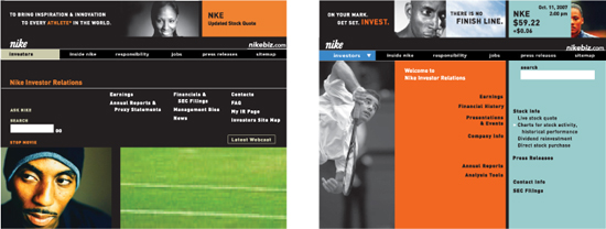
![]() The use of a main navigation bar in the Nike investor relations microsite was determined by the overall sitemap, but this did not preclude designers from experimenting with several different designs for the home page. KBDA
The use of a main navigation bar in the Nike investor relations microsite was determined by the overall sitemap, but this did not preclude designers from experimenting with several different designs for the home page. KBDA
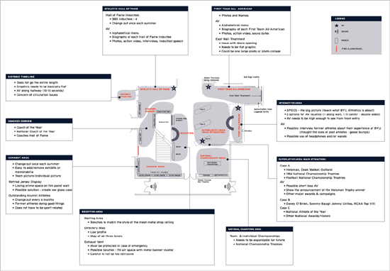
![]() This sitemap documents the content and site requirements for the first level of Brigham Young University’s Student Athlete Center. The 10,000-square-foot (929 sq. m), three-level athletic hall of fame encapsulates 100 years of BYU sports. The plan helped the design team determine the best allocation of space for the exhibits. Infinite Scale Design Group
This sitemap documents the content and site requirements for the first level of Brigham Young University’s Student Athlete Center. The 10,000-square-foot (929 sq. m), three-level athletic hall of fame encapsulates 100 years of BYU sports. The plan helped the design team determine the best allocation of space for the exhibits. Infinite Scale Design Group
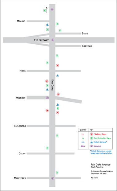
![]() A streetscape enhancement project for the City of South Pasadena was designed to reinforce a sense of place and encourage pedestrian traffic. This map helped the community evaluate the proposed placement of sign types—destination wayfinding, historic documentation, and storytelling. (See page 73 for wireframe diagrams that show signage details.) KBDA
A streetscape enhancement project for the City of South Pasadena was designed to reinforce a sense of place and encourage pedestrian traffic. This map helped the community evaluate the proposed placement of sign types—destination wayfinding, historic documentation, and storytelling. (See page 73 for wireframe diagrams that show signage details.) KBDA
![]() Similar to sitemaps, page maps are usually generated for complex print projects such as books and magazines. Page maps help the design and client teams understand the flow of a multipage piece and help the team come to an agreement about the ordering and hierarchy of information and the allocation of space for the entire piece at a macro level. This working page map captured, at a high level, the storytelling arc of the piece. KBDA
Similar to sitemaps, page maps are usually generated for complex print projects such as books and magazines. Page maps help the design and client teams understand the flow of a multipage piece and help the team come to an agreement about the ordering and hierarchy of information and the allocation of space for the entire piece at a macro level. This working page map captured, at a high level, the storytelling arc of the piece. KBDA
HOW IS A SITEMAP USED?
Coherent Diagrams: Elegant Solutions. Sitemaps are most commonly found in the world of Web and interactive design. In this context, a sitemap is an invaluable tool in helping the project team figure out the overall site structure, navigation flow, and navigation nomenclature. A well-organized sitemap gives you an at-a-glance view of the entire site, with all its main sections, pages, and sublevel pages.
Organizing the data is the first step. Once the initial diagram is in place, components can be shuffled and reordered, and categories changed, all with the goal of meeting overall project objectives.
Sitemap-style documents aren’t only useful for websites, although in terms of information design projects, they’re most often used for deliverables that have an interactive, screen-based component. However, there are many other types of projects that might make use of a sitemap or similar flowchart. Interactive games, DVD menu sequences, museum exhibits, and even banking kiosk projects might be served by having a sitemap.
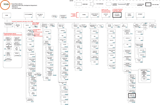
![]() This is a standard sitemap for a Web project. Note how the map includes a key explaining the different diagrammatic elements on the map, such as which shape constitutes a Web page, which pages are actually PDF downloads, and which links lead someplace off the main site. KBDA
This is a standard sitemap for a Web project. Note how the map includes a key explaining the different diagrammatic elements on the map, such as which shape constitutes a Web page, which pages are actually PDF downloads, and which links lead someplace off the main site. KBDA
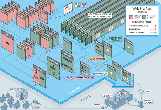
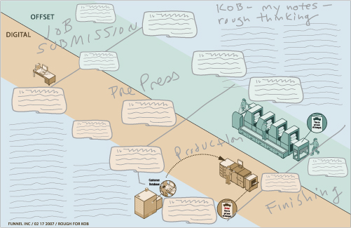
![]() This sitemap created by Funnel Incorporated started out as a typical black-and-white flowchart with boxes and lines. To better communicate with the client’s internal nontechnical audience, Funnel designed a 3-D diagram of the site from both the functional perspective and the perspective of three main customer profiles. This alternative sitemap is designed to be very user-friendly, with color coding and dimensionality. This more accessible and richly detailed approach enabled the client’s internal team to understand, approve, and fund the solution for their site. Funnel Incorporated
This sitemap created by Funnel Incorporated started out as a typical black-and-white flowchart with boxes and lines. To better communicate with the client’s internal nontechnical audience, Funnel designed a 3-D diagram of the site from both the functional perspective and the perspective of three main customer profiles. This alternative sitemap is designed to be very user-friendly, with color coding and dimensionality. This more accessible and richly detailed approach enabled the client’s internal team to understand, approve, and fund the solution for their site. Funnel Incorporated
If you have a project with several layers of information, you could probably use a sitemap-style framework, especially if the project has multiple information flows or sequences that need to be mapped out. An innovative and thoughtful approach to an information design project in big-box retail, for example, could illuminate new approaches to customers’ experiences of the aisles, shopping categories, and wayfinding in a store.
Sitemaps and Team Consensus. A sitemap helps ensure that a sound plan is approved and in place before the team proceeds to subsequent project phases of design, programming, content development, and build-out. With design projects that include many layers of information, you definitely don’t want to jump into the design phase without a solid framework. Designing a complex, information-intensive project without a plan tends to lead to haphazard solutions.
It’s often said that the only constant is change, and this is especially true of information design projects. Having an organized map of the project allows you and the client to capture details about the project’s evolution so you can plan for revisions and future versions of the design.
Discussion and Signoff. The sitemap, or another similar map/planning document, is often the first document the client will see after the creative brief. Clients may not understand the sitemap immediately and will probably need some handholding from you. That’s okay. The point here is to catalog everything at a high level for the purpose of discussion with the client and team. At this point in the project, a lot could change in terms of the informational structure and content. Trust us, it’s much better to change an elemental flowchart document than page after page of actual screen design.
“Designers can learn from library science. In trying to deliver information, what are the cognitive frameworks or resistances to absorbing information? We’re always trying to make information delivery as painless and seamless as possible. Even to the point that the person has no conscious perception of how the information is being delivered.” —Micki Breitenstein
Don’t be surprised, however, if your sitemap goes through several iterations. Once the client and design team have a plan in front of them, they will have new ideas, discover opportunities, and debate options. The sitemap allows this discussion to take place in an organized fashion. Sitemaps can be revised and revised again. Several versions are often necessary and healthy for the project. Try not to start the next phase of the project before the sitemap is approved, though, or you could find yourself wasting precious hours revising more time-intensive design documents.
WHAT SHOULD A SITEMAP LOOK LIKE?
Sitemaps and similar flowchart overview documents can come in all shapes and sizes. There are probably infinite ways to create a sitemap or other map-type diagram. You can draw it using an illustration program or a flowchart program. You can create a simple index/listing in a word processing program. You can create a sitemap out of index cards displayed on a board. You can sketch one on a napkin. Sitemaps can be simple black-and-white diagrams. They can be animated or interactive if necessary. They can be 3-D models if you think that’s useful. Hey, you can even make a sitemap out of modeling clay if that works for your project. Your project content and goals should guide you.
Whatever you need to communicate about the informational components of your project can be reflected in the sitemap. Like many maps and diagrams, a good sitemap might have a key to explain the meaning of certain map elements. Are there pieces of information that are different from the others? Let the sitemap show that. This chapter provides samples of some typical and not-so-typical sitemaps to give you an idea of how you might apply this type of document to your project.
CURSE OF THE WINCHESTER HOUSE
Sarah Winchester, famous rifle heiress, built her notorious Winchester House without any real plan. She built the house based on the advice of a medium, who had told her that as long as she kept up construction of the house, the evil spirits of those killed by Winchester rifles would be appeased. Construction went on for 36 years, 24 hours a day. With no master plan, Sarah would review her hand-sketched ideas with building foremen each morning. Rooms were added to other rooms, which then became entire new wings. Now, multiple staircases lead to nowhere. Doors open to sudden drops to the lawn below. The long-since completed house has a current estimate of 160 rooms, but the house’s floorplan is so confusing that initial room counts yielded different totals each time.
Don’t let your project turn into a Winchester House! Create and document a plan using something like a sitemap or page map. Make sure the client approves the plan before you move forward with the project’s next steps. As part of the natural process, you may need to update the plan while the project is under way. However, with your documented plan in place, you’ll be able to avoid creating the information design equivalent of a door that leads to a two-story drop to the lawn below.
Creating the Blueprints
“Psychologists and experts in the field of human perception tell us that human beings take in data through the senses and turn it into something that is memorable and has meaning. This can then become permanent knowledge. Designers have to find ways to make the information meaningful.” —Krzysztof Lenk
WIREFRAMES FLESH OUT A PROJECT
Big-picture overviews are extremely helpful and often necessary, but they may not allow for the level of detail that your team will need to determine the right approach for the visual design of the project. If the sitemap or structural overview is a kind of skeleton, wireframes add a bit more flesh and muscle. Like sitemaps, wireframes (sometimes also referred to as schematics) are often found in the worlds of environmental and interactive design, and are also used for complex print projects. Like sitemaps, wireframes are planning documents and, thus, are not concerned with design details such as typography, shape, and color. At this point, you’re still in the planning stages and using broad strokes.
Like a blueprint for a house, the wireframe acts as a detailed guideline for layout and functionality within the information design piece. With the sitemap, you generally figure out the hierarchy of information and determine the master plan for the piece. In essence, you decide which rooms will be included in the house, and the flow of traffic between them.
The wireframes begin to give shape to the structure and provide detail for all the rooms and features within the structure.
![]() Funnel Incorporated’s process includes preliminary whiteboard sketches done in work sessions with their clients to get a sense of the information flow and layout of a project. The sketching process happens before visual design begins and helps everyone “get the story right” in advance. Funnel Incorporated
Funnel Incorporated’s process includes preliminary whiteboard sketches done in work sessions with their clients to get a sense of the information flow and layout of a project. The sketching process happens before visual design begins and helps everyone “get the story right” in advance. Funnel Incorporated
You begin by asking questions: Are all the rooms the same size or different? Does each room have the same function? How much wall space will there be? How much furniture do we need to accommodate in each room? How many doors and windows are there, and how do those doors and windows function? Are they standard doors, sliding doors, or French windows?
Wireframes map out which elements in the design are most and least important to determine the focal points for the design of the house. Which rooms are the central showcase areas for the house? Which part of a room is its focal point (fireplace, sofa, great work of art)? (Since this is a precursor to visual design, you won’t have chosen the fireplace style, the sofa, or the art; you’re just making the space for it. Wireframes allow you to plan without making specific choices about shape, color, or other visual components.)
DON’T BUILD WITHOUT A BLUEPRINT
While the sitemap or structural overview provides a bird’s-eye view, wireframes flesh out the finer details of a complex information design project. They help answer questions: How much content will we need to consider as we create the design? What kinds of specific information do we need to design around? Do we need headers and subheaders for the content? How much main text is there? Are there pieces of related content that live alongside the main content but in a separate area of the layout? What other types of information does the design need to accommodate and how should we display that information? Will we need lists? Diagrams? Charts? Illustrations? Few, if any, of these issues can be planned properly on a structural overview diagram like a sitemap. There’s simply not enough detail in that kind of overview document. Wireframe sketches allow you to carefully envision all of these details.
![]() From the whiteboard sketch, designers then execute a rough sketch that introduces layout and look and feel without dealing specifically with all of the content that will be used in the final piece. Funnel Incorporated
From the whiteboard sketch, designers then execute a rough sketch that introduces layout and look and feel without dealing specifically with all of the content that will be used in the final piece. Funnel Incorporated
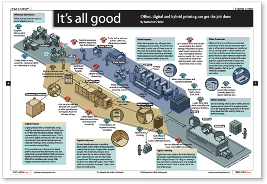
![]() This final version of the Funnel design shows how preliminary elements of the sketch evolved into the end deliverable. Planning in advance helped to organize the complex information in terms of flow, hierarchy, layout, and storytelling. Funnel Incorporated
This final version of the Funnel design shows how preliminary elements of the sketch evolved into the end deliverable. Planning in advance helped to organize the complex information in terms of flow, hierarchy, layout, and storytelling. Funnel Incorporated
“Information is the beginning of meaning. Information is data put into context, with thought given to its organization and presentation.” —Nathan Shedroff
A wireframe is, in a sense, a sketch that allows the design team and client to see a detailed view of how the content will be organized on just a few given pages or sections of your project. For websites, you might choose a series of representative site pages (often called page types) for your set of wireframe sketches. For instance, for a website, you might start with the home page and a few drill-down pages. Book or magazine content sketches might show rough templates for how the typical feature or department content will be organized into headers, introduction text, body text, and sidebars.
Without wireframes, you can spend a lot of time and budget creating highly detailed design deliverables only to find that not all of the project parameters have been thought through. If you’re designing a web-site home page based on three spotlight areas for content and suddenly the client wants five spotlights, it’s much easier to revise and update a simple wireframe sketch than to rework a fully realized layout.
Wireframes help ensure your design planning is thorough and deliberate. By the time your team is ready to begin visual design, you’ll have thought of most, if not all, of the issues related to the organization and display of the information you need to include in your project.
WHAT SHOULD A WIREFRAME LOOK LIKE?
Wireframe documents tend to look like their moniker: plain, wirelike drawings with basic text labels. Nothing too fancy. Nevertheless, there are no hard-and-fast rules for creating wireframes. You can draw them using a variety of tools and methods, depending on project content and goals. The main goal is to catalog all the information in layout form but without spending time and thought applying any specific visual design elements.
Wireframes don’t have to be ugly (Why should anything you create be ugly?), but it doesn’t make sense to spend an inordinate amount of time making them beautiful. For one thing, people might wrongly assume your gorgeously nuanced wireframes are reflective of the final look and feel for the piece. Wireframes should be sketches that are clear, thorough, and free from extraneous graphic elements and details.
Some information designers use color in their wireframes sketches. If you use color, limit your palette to one or two colors that you use to emphasize certain information.
By primarily sticking to black and white or grayscale, you won’t run the risk of confusing your clients into thinking they’re looking at visual design deliverables. And you won’t be inadvertently starting or pre-empting the visual design process before that phase has begun.
THE BEAUTY OF INTERPRETATION
Most of the time, wireframes will look absolutely nothing like the final design. And, ideally, during the next phase of the project when you present the visual design options, you will have diverse visual solutions that look radically different from each other, all based on the same set of wireframes.
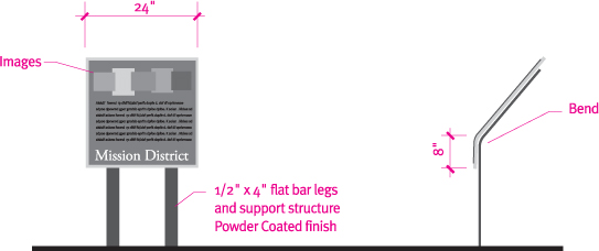
![]() These content sketches were created in generic sign templates as part of the planning phase of the City of South Pasadena’s streetscape enhancement project. The goal was to get the community to approve the content requirements for two proposed sign types before actual design commenced. (See the sitemap on page 66 for the structural overview of the Pasadena signage project.) KBDA
These content sketches were created in generic sign templates as part of the planning phase of the City of South Pasadena’s streetscape enhancement project. The goal was to get the community to approve the content requirements for two proposed sign types before actual design commenced. (See the sitemap on page 66 for the structural overview of the Pasadena signage project.) KBDA
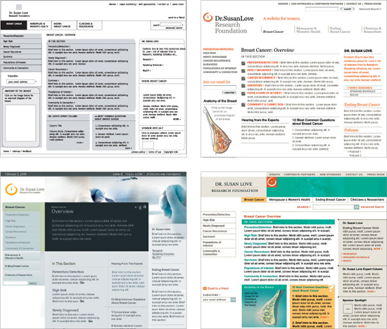
![]() A wireframe (top left) was given to three different designers for the Dr. Susan Love Research Foundation website redesign project. The designers (David Handschuh, Keith Knueven, and Liz Burrill) each interpreted the wireframe quite differently, giving the client several options to choose from. Jill Vacarra Design
A wireframe (top left) was given to three different designers for the Dr. Susan Love Research Foundation website redesign project. The designers (David Handschuh, Keith Knueven, and Liz Burrill) each interpreted the wireframe quite differently, giving the client several options to choose from. Jill Vacarra Design
Make It Just Real Enough. Wireframes should look enough like the final piece so a layperson can understand, with a little explanation, what they’re looking at. As we’ve discussed, you don’t have to come close to a final design at this stage. But, for example, if you’re creating a website wireframe, you’ll want to make the document look enough like a website so that the person gets the gist. You probably want to use the same dimensions as a typical Web screen and use some detailing to clarify navigational elements. If you’re creating wireframes for signage, it helps to give the diagram a few recognizable visual cues, like a signpost or sign frame, to help viewers instantly understand that the sketch represents a sign.
ACHIEVING CLIENT CONSENSUS
Wireframes give you a way to map out the piece in advance and to reach team consensus regarding the form and content of your final design. The wireframe stage of a complex information design project can go through many, many iterations. Once you have team and client approval, the design team will then use the wireframe sketches as a detailed reference guide as they begin to address the visual design.
Continued Research with Wireframes. It’s a really good idea to test key elements of your information design at the wire-frame sketch stage with target audience members. Even before you’ve spent time and effort on the detailed visual aspects of the design, you can test your thinking.
The client and design team may be making assumptions that you can avoid if you ask end users for their feedback at this stage in the process.
By showing the wireframe sketches, you can ask users if they understand how the information in your project is categorized, organized, and named. You can find out if you’ve inadvertently made choices that cause confusion for users. Wireframes can allow you to find out quite a bit about how audiences will react to the information design piece even before you and your team have spent the time and budget on look and feel.
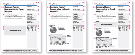
![]() Carbone Smolan Agency worked to develop a comprehensive way for Morgan Stanley to publish their global equity research reports. After thorough research, CSA created wireframes to illustrate possible options for organizing the content. (See case study on page 124.) Carbone Smolan Agency
Carbone Smolan Agency worked to develop a comprehensive way for Morgan Stanley to publish their global equity research reports. After thorough research, CSA created wireframes to illustrate possible options for organizing the content. (See case study on page 124.) Carbone Smolan Agency
Research and Testing
“If you’re going to inflict something, it’s polite to see if it’s useful. It’s an act of a civil society to involve people to ensure that the outcome is useful.” —David Sless
You’ve done your audience research. You know your users and have a good overall sense of what they will need when interacting with your design. You know your client’s mission and goals for the project. Based on all of this initial research, you have chosen a direction for the project and have started the design process and made some headway. You may even have some innovative design solutions on the table. But how can you be sure that you’re not designing just for yourself or in a vacuum? How can you confirm that important information is being effectively communicated?
DON’T GUESS, TEST!
Also referred to as usability testing, user testing is a bit of a misnomer because it implies that your users are being tested themselves when really it’s the design that’s being tested. Testing is really just another form of research. With the initial research, you set the direction, gather requirements, and lay the foundation for the project. Testing throughout the design development cycle ensures that the design becomes more and more focused toward getting it right. Testing is like having guard-rails along the interstate. The guardrails aren’t the actual road, but they make sure you don’t drive off the cliff.
But testing shouldn’t be a separate, isolated, and annoying step, an afterthought that no one wants to do or pay for. With user-centered design, you build the user feedback loop into your design process, right from the start.
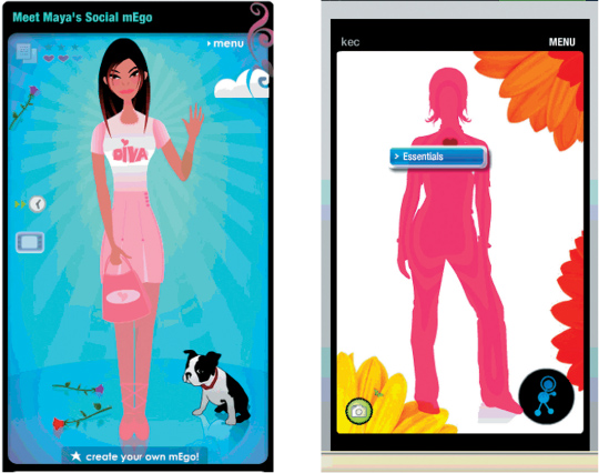
![]() mEgo is a profiling tool for representing users across multiple social networks. Testers felt the first avatar graphic approach was too “young and cartoon-like.” Testing also revealed that users did not understand that mEgo was interactive and that further content was available on rollover. mEgo created an alternate “silhouette avatar” that appealed to a wider range of ages. Tool tips were animated over the image to invite user interaction with the profile’s content areas. What’s Next Interactive Inc.
mEgo is a profiling tool for representing users across multiple social networks. Testers felt the first avatar graphic approach was too “young and cartoon-like.” Testing also revealed that users did not understand that mEgo was interactive and that further content was available on rollover. mEgo created an alternate “silhouette avatar” that appealed to a wider range of ages. Tool tips were animated over the image to invite user interaction with the profile’s content areas. What’s Next Interactive Inc.
RESIST THE URGE NOT TO TEST
Isn’t testing expensive and time-consuming? These are two assumptions clients—and designers themselves—often make when deciding not to test. Sometimes a design team falls into the trap of thinking they’ll convince the client to test after the project is well underway (or at the very end of the project, when many design decisions have already been made). At that point, however, introducing a testing phase will probably be seen as an unnecessary expense. The client has invested a lot of time and money in you as a design expert. So why not just rely on your expertise? Everyone on the team has invested a great deal of time and energy in the current design solution. Testing for the very first time so late in the game seems like a chore. Worse yet, what if all that creativity and energy have been focused in the wrong direction? If there are problems, sometimes we just don’t want to know.
Testing—especially informal testing— needn’t have a huge impact on your overall timeframe for the project, if you build iterative testing into your process. You can (and should) also conduct more formal user testing at the end of the project, but by that time you’ll be testing a design that has already been through a process of refinement based on real user feedback.
Testing Saves Money. The value proposition of testing is that if you do it from the beginning, the project may cost a bit more, but it will end up saving money in the long run. The likelihood of “getting it right” in version 1.0 of your project will go up exponentially the more research testing you do.
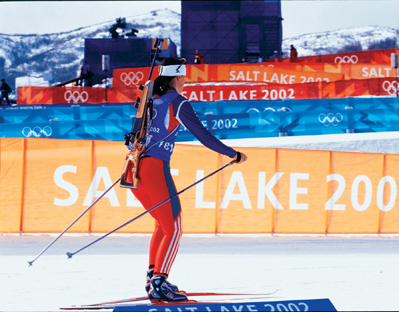
![]() With environmental projects, it’s imperative to test design decisions in context before final fabrication begins. In a signage project for the Salt Lake City Winter Olympic Games, for example, the design firm consistently reviewed full-scale mockups and materials on-site to make sure the scale and contrast levels of the graphic elements were effective. Infinite Scale Design Group
With environmental projects, it’s imperative to test design decisions in context before final fabrication begins. In a signage project for the Salt Lake City Winter Olympic Games, for example, the design firm consistently reviewed full-scale mockups and materials on-site to make sure the scale and contrast levels of the graphic elements were effective. Infinite Scale Design Group
Best Practices, Radical Simplification, and User-centered Design
Kathryn Campbell, principal of What’s Next Interactive, provides strategic consulting, testing services, and user-centered design training. Campbell and her team use proven methodologies grounded in user research and business analytics while encouraging experimentation, creativity, and user-centric design for interactive projects.
How does radical simplification apply to the user-centric design process?
KC: We need to recognize the built-in tendency during concept development toward excessive sophistication. There is the inclination to look at what everyone else has done and say, “We want to include all that, plus everything we’ve ever tried, plus more.”
Complexity often creates cognitive noise, preventing the user from focusing on the essential information you want to communicate. What are the must-have features? What can be cut? Create more division between the must-haves and the nice-to-haves.
What do you think of the notion of best practices in terms of usability?
KC: I have a lot of respect for Jakob Nielsen and other usability traditionalists. I respect that they base their thinking on research rather than so-called best practices in the marketplace. Often people define best practices as “other people do it.” That’s bull#@*! Show me the best practices that led to iPod!
How can we push the design envelope in the face of so-called best practices?
KC: One of the biggest disservices that usability traditionalists have done is they’ve bludgeoned people into thinking that if they design something different, it will be unusable. If you’re recommending something significantly different than a typical approach, test it to see if it works. I’ve tested some incredibly nonstandard, progressive information design, but at the end of the interviews, users thought it was better and easier! If you’re smart, you can make designs innovative and useful.
Are there any tried-and-true best practices?
KC: Some conventions hold true. The eye-tracking data that says the upper right is a bad place to put something important is absolutely true. People have become trained to search for left navigation on websites. If you put something in the upper right of a Web screen, you better be sure you use a technique, a color, something to call attention. We have many tools: visual design, movement, sound. In any design process, know the rules so that you know when you can break them and how to break them effectively.
The people who originally put flat roofs on buildings as part of the modern movement ignored the fact that some slant to a roof had a useful function: shedding water. A lot of those buildings leaked badly. If they’d only asked themselves, “How do I avoid using a slanted roof, but still shed water?” Anticipate the problems when you’re designing. That’s the design challenge.
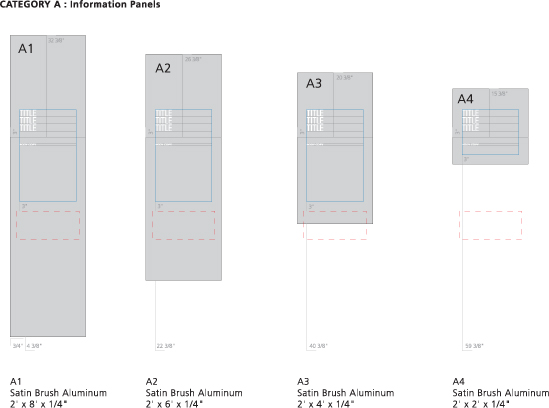
![]() As part of the planning for the Athletic Hall of Fame at Brigham Young University, this diagram by Infinite Scale Design Group maps out how information would be applied to the different sizes and locations of the exhibit signage. This included testing for the best sight lines. Infinite Scale Design Group
As part of the planning for the Athletic Hall of Fame at Brigham Young University, this diagram by Infinite Scale Design Group maps out how information would be applied to the different sizes and locations of the exhibit signage. This included testing for the best sight lines. Infinite Scale Design Group
Testing Isn’t Make-work. The best approach is to stop thinking of testing as an extra option, and present it as a necessary, integrated part of the process, one that will help you and the client ensure that the project is successful for the client’s audience.
Testing and Politics. “Testing takes some of the politics out of the decision-making process during projects,” explains Kathryn Campbell of What’s Next Interactive. Is there a sacred cow? Something that you think isn’t a good idea, that perhaps the client insists on integrating into the project despite your protests? Don’t argue, test! Is there an innovative solution you’d like to try, something that you think will be helpful for users that perhaps goes against what has come to be considered standard practice? Don’t guess and don’t think you have to design based on the strictest rules; you can test your ideas. The results may surprise you.
“Make everything as simple as possible, but not simpler.” —Albert Einstein
![]() Qualitative data gained from testing prototypes can be particularly useful in validating concepts. These typical users evaluated possible approaches to simplifying the design of parking signage in New York City. Research has shown that ten participants reviewing prototypes can uncover 80 percent of the problems with a design approach. (See case study on page 132.) Addison
Qualitative data gained from testing prototypes can be particularly useful in validating concepts. These typical users evaluated possible approaches to simplifying the design of parking signage in New York City. Research has shown that ten participants reviewing prototypes can uncover 80 percent of the problems with a design approach. (See case study on page 132.) Addison
“The world in which we live has become a cultural smorgasbord, and we all live permanently on the verge of indigestion. We have to have some help in sifting through the endless choices.” —Joe Jackson, Musician
THE TESTING PRACTICE
Make It Standard Practice. The best approach is to build testing into your project plan from the very beginning. Clients are likely to be more receptive if you explain that testing is simply part of your regular production process.
Test Iteratively. Test early and often. Iterative testing means you don’t wait to test until you’ve spent weeks or months on the project. At project inception, find a selection of representative users and set up a regular testing schedule. Set aside a couple of hours each week for a simple informal test. Don’t try to test everything at once. With dense information, there are often too many elements that you’re still in the process of trying to figure out. Test individual segments of your design. Test whatever is ready at the time. If you’re working on a website, test just the navigation titles one week. The next week test a set of icons. The next week you could test just the on/off states of the buttons, and so on.
PROTOTYPES AND TESTING TOOLS
Simple Paper Prototypes. Testing tools don’t have to be fancy. Especially during the early stages in the project, test with paper prototypes. You don’t need to videotape the test (although if you have the resources, you can). The most important thing is to get user feedback during the design process. Take good notes and/or perhaps record audio to catalog their responses. Have the design team spend time discussing the feedback. Then make some decisions on how the feedback will impact the next iteration of the design.
Advanced Prototypes. Once you’ve mapped out a good portion of the user experience of the information design, you can conduct more elaborate testing. If you’re testing a website, you might test an entire path leading from the home page to subpages and a particular interactive tool. Even during advanced testing with interactive “clickable” prototypes, it’s best to keep things relatively simple for each user-testing scenario by testing one path or one piece of functionality at a time.
How Finished Should Your Prototypes Be? Testing a prototype that is still in a very abstract stage of design (for instance, website wireframes without any design elements) can be a real challenge for end users. “Those of us who have ended up in design careers,” says Campbell, “tend to vastly overestimate how conceptual most people are. Most people are, cognitively, fairly literal. It doesn’t mean they’re unintelligent. Think about how hard it is to convey to the client that a wireframe isn’t really design. You have to make things look like the real thing or people get confused.”
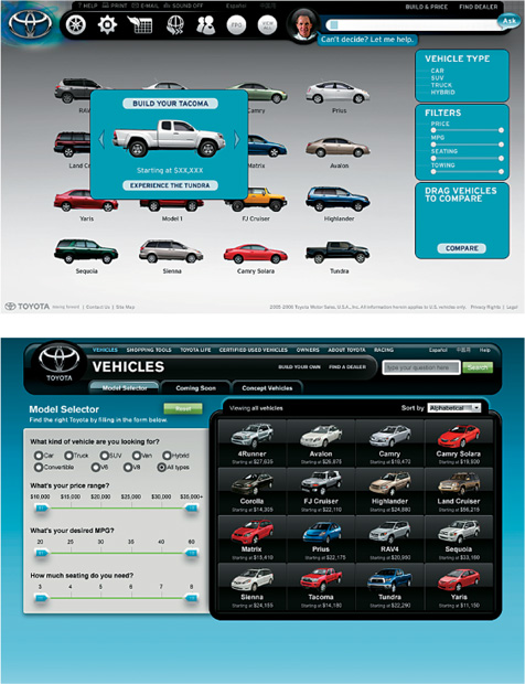
![]() Several clickable prototypes of Toyota.com’s car model selection tool were tested. In an early prototype, users didn’t understand that the filters were slider bars and attempted to click on the circular end points as if they were buttons. Most users were overwhelmed by the filters, sort tools, and comparison tools that were grouped into one area. Several users bypassed the tools entirely without trying to figure out how to use them. In a later version, introductory copy and a change in design made the filter’s slider bars more intuitive. Users also found the tool easier to explore and understand once the different functions were more clearly differentiated from each other. What’s Next Interactive Inc.
Several clickable prototypes of Toyota.com’s car model selection tool were tested. In an early prototype, users didn’t understand that the filters were slider bars and attempted to click on the circular end points as if they were buttons. Most users were overwhelmed by the filters, sort tools, and comparison tools that were grouped into one area. Several users bypassed the tools entirely without trying to figure out how to use them. In a later version, introductory copy and a change in design made the filter’s slider bars more intuitive. Users also found the tool easier to explore and understand once the different functions were more clearly differentiated from each other. What’s Next Interactive Inc.
However, if you’re in the early stages of a project at a point where most design issues have not been resolved and you decide to create a prototype that looks very “finished,” you run the risk of testers, clients, and even designers confusing your testing materials with actual methodical, strategic visual design. People can get attached to the look that was quickly thrown together for the sake of a test. Plus, when something looks like it could be the final design, you run the risk of having clients and users focus and give feedback on the visual elements you’re not even testing, instead of on the information design issues for which you need feedback.
Bottom line: Make your testing prototypes look enough like the final product so it’s clear to users that it’s a website or even a subway map. Just don’t spend so much time on making the testing prototype look so complete as an artifact that users mistake it for a design that is further along in the process than it actually is.
Campbell says, “I like to have the very last prototype that I test look darn final. But that’s the very last test.”
HOW TO FIND TESTERS
First, you’ll need to know your main audience types. (See “Wrangling Audience and Content” in Chapter 2 for more information about determining audience types.)
Typically, your client should be able to provide you with a list of customers or appropriate users from their database. You can also get help gathering your test subjects by hiring a recruiting agency. These agencies contact potential testers, offer incentives, and even set up the test in a testing lab.
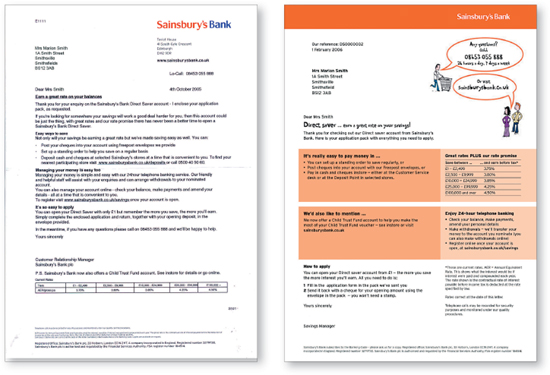
![]() A London-based information design firm regularly conducts customer and stakeholder research to determine best practices for simplifying invoices, bills, and forms. The goal is to increase customer satisfaction. This before-and-after example shows improvements made on a document for Sainsbury’s Bank. Boag Associates Ltd.
A London-based information design firm regularly conducts customer and stakeholder research to determine best practices for simplifying invoices, bills, and forms. The goal is to increase customer satisfaction. This before-and-after example shows improvements made on a document for Sainsbury’s Bank. Boag Associates Ltd.
![]() In order to test the best direction for the look and feel for online and print applications, KBDA will often create mood boards to help the client visualize their options. To get input from geographically dispersed constituents, KBDA will often test an online presentation linked to a simple and inexpensive online survey application that can capture both quantitative and qualitative responses. KBDA
In order to test the best direction for the look and feel for online and print applications, KBDA will often create mood boards to help the client visualize their options. To get input from geographically dispersed constituents, KBDA will often test an online presentation linked to a simple and inexpensive online survey application that can capture both quantitative and qualitative responses. KBDA
How Many Testers Do You Need? For the Allergan pharmaceuticals site, What’s Next Interactive tested a site on three specific user types identified as the most important in terms of site traffic: doctors, patients, and Job seekers. How many users participated in the testing? Approximately six people from each user group. “Because of my background in traditional market research, I wasn’t poised to believe this,” says Campbell. “But you really only need to test your design on a few people. After about six interviews with a particular set of users, you find out about all the big issues for that user type.”
SURVEYS VS. LIVE USER TESTING
When you want to test your design but don’t have access to live testers or want a broader range of opinions, a survey may be an effective course. There are some basic tools that help you create and distribute surveys online. Or you can keep it really simple and email PDF or jpeg images of alternative designs to a wide sampling of users, asking for their preference.
On the other hand, if you want to know something specific, such as which button users will most likely push, which information they see as most important, or whether they understand a set of icons, it’s probably best to test one-on-one with a smaller sampling of representative users.
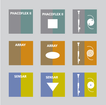
![]() When Allergan asked KBDA to create new packaging for its line of intraocular lenses, research showed effective information design could help differentiate their products. The surgical nursing staff was hard-pressed to identify correct lens types in their high-stress, low-lit operating room environment. The stakes were high because the appropriate choice of lenses was crucial to the patient’s recovery. Approaches were carefully tested with users. It was determined that using a combination of color-coding and graphic icons produced the most reliable results. KBDA
When Allergan asked KBDA to create new packaging for its line of intraocular lenses, research showed effective information design could help differentiate their products. The surgical nursing staff was hard-pressed to identify correct lens types in their high-stress, low-lit operating room environment. The stakes were high because the appropriate choice of lenses was crucial to the patient’s recovery. Approaches were carefully tested with users. It was determined that using a combination of color-coding and graphic icons produced the most reliable results. KBDA
“You can only understand something new relative to something you already understand, whether visually, verbally, or numerically.” —Richard Saul Wurman
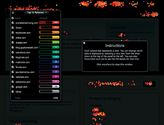
![]() Crazy Egg creates data visualization software that helps people visually understand and analyze visitor traffic on their websites. This Confetti visualization shows a Flash visualization of all site clicks. The visualization lets you isolate the data you want to compare and hide the rest. Crazy Egg, Inc.
Crazy Egg creates data visualization software that helps people visually understand and analyze visitor traffic on their websites. This Confetti visualization shows a Flash visualization of all site clicks. The visualization lets you isolate the data you want to compare and hide the rest. Crazy Egg, Inc.
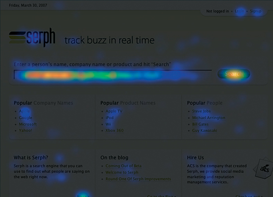
![]() Crazy Egg’s popular heatmap visualization provides a simple way for website owners to view the frequency of user clicks on particular parts of a site page. This allows for simple and fast analysis and decision-making regarding success of features and content on a site. Crazy Egg, Inc.
Crazy Egg’s popular heatmap visualization provides a simple way for website owners to view the frequency of user clicks on particular parts of a site page. This allows for simple and fast analysis and decision-making regarding success of features and content on a site. Crazy Egg, Inc.
Types of User Research and Testing
Different types of testing can occur during all project phases. At times, you’ll want to employ all testing types in a project. Sometimes you’ll need one or two types of testing, depending on project needs. Jeff Harris, founding partner and executive experience director at Atlanta-based Matter, outlines the various tests. Harris has a deep background in human-centered design and a range of experience in researching and testing design projects.
“There are some people who come into graphic design and find it a bit ephemeral and vacuous. People who like to do useful things are attracted to information design. There is something quite useful about designing traffic signs so people don’t get lost or medicine bottles that people can understand. It’s a way of making a difference. It’s public service.” —David Sless
CONCEPT TESTS
Concept tests occur early in the project. Prototypes are simple and may not even have physical form. You present and get feedback on an idea. Instead of polling fellow designers with a concept test, you ask potential users about your design. You literally talk to someone about your idea.
You could be considering creating an online shopping site. With a concept test, you ask whether or not someone would be interested in buying your products online. The conversation is a “low-fidelity” sort of testing prototype.
You can do concept tests for any kind of design. For a museum experience, you might ask potential visitors what a museum visit should be like just using adjectives. Is the museum quiet or moody, fun or energetic?
PARTICIPATORY DESIGN
With participatory design, people use design exercises to sort through ideas. The participants will often do something during the test that will surprise you. This method works best when you interact one-on-one with the participant. You could use a card-sorting method to test how participants organize information. You might put content headers on cards or even Post-it notes and have the participants sort and group them by subject matter. Next, ask them to group the headers into categories. Essentially, your participants can create a website information architecture.
Use the card-sorting exercise for anything where you need to organize heaps of information: chapters in a book, a series of posters, or a museum layout.
DESIGN TESTING
Design testing occurs when you’ve finished concept exploration and you’ve decided on one concept for design development.
Just to rewind: Initial research allows you to become a proxy for your end users. If your client didn’t pay for research, you’re guessing what users want, making the best decisions you can. The purpose of design testing is to help you make decisions you don’t feel comfortable making alone.
Working with testers individually is best. Show each participant how the poster, museum exhibit, or website might look and function and ask for feedback.
With design testing, there are different levels of prototype fidelity. For Web or software interfaces, you can show people mock-up wireframes in a PDF file or basic HTML. In packaging development, you build a model of the package. When you show your prototype to users, have them run through scenarios, or just ask them what they think. For print or packaging design, you may ask: “Can you read this? Is the type too small?” For interactive design testing, you look for feedback on interface behaviors and functionality. No question is too big or small. You can test a specific piece or the whole design.
FOCUS GROUPS
Traditional focus groups collect people from the same demographic to evaluate a fully developed product. Movie preview screenings are a common example of a focus group. Often, focus groups are conducted in an artificial environment—a lab or a room with a big mirror and people behind it.
The challenge with focus groups is “group-think.” Sometimes people hesitate to agree, or dominant personalities lead the conversation. You’re usually putting strangers together, asking them to deal with social dynamics. People are afraid of saying something different from the crowd.
It’s hard to get a group to engage with specific aspects of your design. Do you hand something out to everyone or pass something around and ask them to respond? Talk to the same people individually and you’ll likely get their true opinion.
Focus groups work when groupthink is important. For quick consensus, a focus group can be useful. Focus groups also work when people aren’t strangers: for example, groups who have the exact same job. When groups have common experience, social dynamics are reduced.
USABILITY TESTING
Usability testing reveals whether everything in the design is working. Is it intuitive? How steep is the learning curve? If I release it into the wild, will people figure it out?
We all take for granted certain social systems. Say an alien lands on Earth in a densely populated area. He enters what he thinks is a domicile and is confronted with somebody who directs him to a place to sit and hands him a manuscript, then disappears. Another person comes by and offers him a liquid, then waits for him to do something. That’s a restaurant. Socially, we all know how that system works: the maitre d’, the table, the menu, and the waiter with a glass of water. To an alien, it’s unknown and confusing.
A usability test ensures you haven’t made so many assumptions with the design that people won’t figure it out. Conduct tests all along the way and you may short-circuit many problems. Usability testing ensures that the work functions as designed—be it the readability of a poster, the navigation of a shopping center, or the effectiveness of hospital signage.
Time spent on a task is a key point in a usability test. You, as a project expert, can figure it out in five seconds, while a novice might take three minutes. Usability testing fine-tunes the solution before you go live.
BETA TESTING AND PERFORMANCE TESTING
Beta testers with interactive projects are looking for bugs in the code and doing performance testing for software. You can apply that same thinking to a museum experience. What if 50,000 people show up on opening day? How would the exhibit design handle that load?
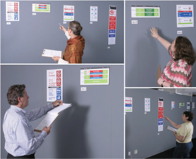
![]() Once you’ve settled on a concept, design testing with paper prototypes can ensure that you incorporate user feedback into your process. Matter
Once you’ve settled on a concept, design testing with paper prototypes can ensure that you incorporate user feedback into your process. Matter
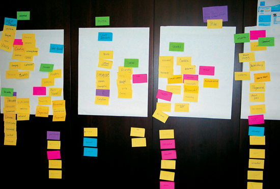
![]() You can have users participate in the initial design planning process by having them help you organize your project content. Using simple Post-it notes, testers can sort content into the categories that make the most sense to them. Matter
You can have users participate in the initial design planning process by having them help you organize your project content. Using simple Post-it notes, testers can sort content into the categories that make the most sense to them. Matter
“If you ever find yourself designing something a certain way because you think it would be better that way, then you’re probably performing art and not design. Art is about self-expression. Design is selfless.” —Jeff Harris, Matter