
5 Applied Color
As color spreads across an identity program into environments, packaging, websites, and more, consistency and meaning reign supreme.
Strong identity programs use color in a fiercely consistent fashion. Choosing the right color is important—if you end up owning the wrong one, you can drag down a brand—but the importance of consistency in application can’t be overstated. Anything less adds confusion to the emotional spectrum that inspired the color choice in the first place.
As you think about how a base color and its accents tie a program together, remember this: Color communicates at the speed of light. The brain responds to color the same way it responds to pleasure or pain. It’s immediate, primal. Know the cultural connotations of colors before assigning meaning to them within your identity program. Green means “go,” but it can also mean environmentally friendly, or the Brazilian national football team.
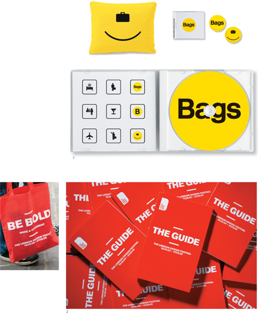
1. Bags Push Chris Robb, Mark Unger, Gordon Weller, Forest Young, Randall Morris, Renda Morton, Pedro Gomez, Steven Marshall
2. London Design Festival 2009
Pentagram
Domenic Lippa
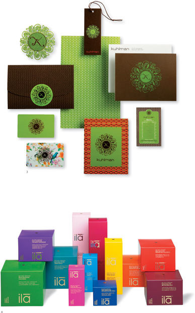
3. Kuhlman
Imagehaus
Jay Miller, Mahsa Safavi-Hansen, April Mueller
4. Ila
Pentagram
John Rushworth
Some program designers pick one color and stick to it.
Some designers pick a palette within which to work and make color selections based on the application.