SHAPE
13 Logo Shapes
An assemblage of different shapes often comprises a graphic identity. At the same time, graphic identities form a single shape once assembled. A logo’s internal shapes largely define it, since other aspects such as color may change over time or in different contexts. Which shapes are selected and how their interplay unfolds can become memorable components of a graphic identity: Are they contained or freeform? Complex or simple? Thick or thin? Symmetrical or asymmetrical? Singular or multiple?
Many logos strive for a sense of balance or simplicity by employing a circle or square as its primary external shape. Like word marks that are recognized before they are read, the overall shape of a logo becomes a recognizable identifier for a brand.
1. Mexipor
Xose Teiga
2. Evenson Design Group (EDG)
Evenson Design Group
Stan Evenson, Mark Sojka, Dallas Duncan, Tim Moraitis
3. Bus Stop
gdloft PHL
Allan Espiritu, Matthew Bednarik
4. Corporation Engtransstroy
fallindesign
Svetlana Faldina, Anastasia Faldina, Alexandra Faldina
5. PopTech!
C2
Erik Cox, John Bielenberg
6. Rooster
TOKY Branding + Design
Eric Thoelke, Jamie Banks-George
7. Campbell Mithun
Cue, Inc.
Nate Hinz, Alan Colvin, Paul Sieka
8. Sandy Leong
The O Group
Jason B. Cohen, J. Kenneth Rothermich
9. Charlie Palmer at the Joule
Mirko Ili![]() Corp
Corp
Mirko Ili![]() , Jee-eun Lee
, Jee-eun Lee
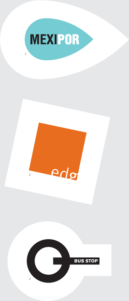
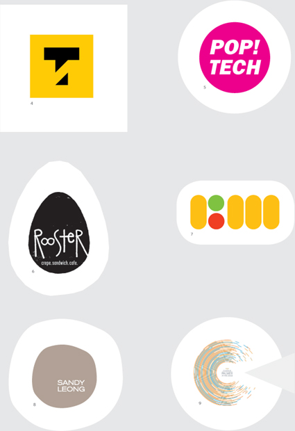
What type of company is a circle? A square? A triangle? An egg shape? Shape, like color, makes an immediate impact. What shape will people remember about your graphic identity?