COMPETITION
70 Dueling Logos
Fifty years ago, when discussions about graphic design found their way into corporate boardrooms, the idea of creating a unique, graphic representation of a company and what it stands for was new. Today’s consumers face a tidal wave of brands, with thousands of logos washing over us every day.
The competition for good logos is steep. Not all logos are good. In fact, many of them aren’t. But the sheer number of them makes it harder than ever to stand out. Thankfully, far less competition exists within any one industry or segment. A quick survey of all the logos in an industry might reveal that the majority of logos are blue and blocky. If you’re looking to upgrade a graphic identity for a company in this industry, do something different and better that will be uniquely appealing to your audience. It sounds obvious, but too often firms follow the competition, rather than their customers.
Sometimes a graphic identity can stand out on quality alone. A clear, easily readable typeface will often endure beyond a fad font. A good mark can become the foundation for communicating your competitive position.
1. Rocamojo
Evenson Design Group
Stan Evenson, Kera Scott
2. Joe Coffee
Square One Design
Mike Gorman, Karin Lannon
3. Te Aro
Akendi
Ian Chalmers, Athena Herrmann, Rosie Pech
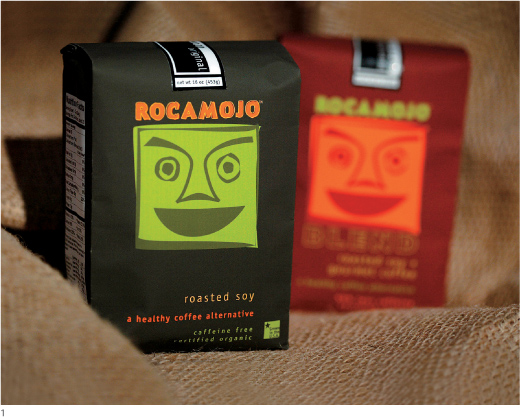
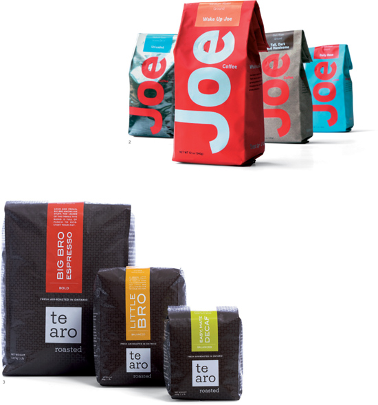
When different brands turn to the same aesthetic elements as the competition did for their graphic identity, being different is a way to stand out. Which coffee brand do you want to buy?