
ORIGINALITY
73 Timelessness
During the first decades of the twentieth century, graphic identity was a novel idea. As the appetite for logos has increased, the marketplace has grown more crowded. Today, with more marks than ever vying for attention, freshness can be one way to slice through the noise. But freshness is different than originality.
When high-profile companies rebrand themselves with a new logo and a new attitude, sometimes the decisions are wise. Often, they are not. Facelifts don’t create an original face; they just make the same old one look a little fresher.
When AT&T hired Saul Bass to design the mark that would become their famous Bell System logo in 1969, the company remained committed to the mark until its break-up in 1983. The freshness may have worn off, but over its fourteen-year run, Bass’s Bell Telephone logo enjoyed a 93 percent recognition rate in the U.S.
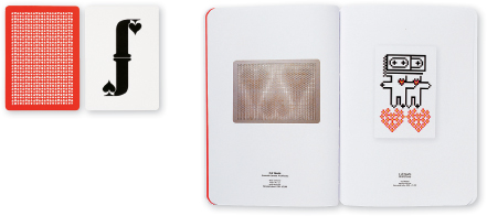
House of Cards
Pentagram
Domenic Lippa
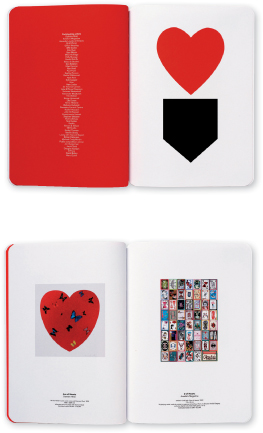
Black and red are timeless colors for graphic identities—and very appropriate for House of Cards. The bold, confident palette helps visualize the name graphically even apart from the mark itself.
Cuisipro
Hahn Smith Design
Nigel Smith, Alison Hahn
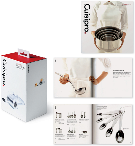
Some of the most effective graphic identities rely more on a sense of enduring quality than on originality per se. Cuisipro employs a classic modern style that looks like it could have been designed in 1960—and we mean that as a compliment.