74 Taking Chances
In the crazy picture-in-a-box world we live in, the chance of doing something graphically that has never been done before has slimmed. The real opportunity for originality opens up when designers take a chance and try something different with a logo in application. Two companies might have pretty similar logos, but express a wildly different aesthetic sensibility when they’re applied.
Companies often miss the opportunities presented by identity programs. That’s because doing something truly original with an identity program takes guts. Part of the reason the Nike logo succeeded was that it was an original shape, but the company also had the guts to do something different with it. They downplayed or completely removed the company name. That idea isn’t going to make it past too many clients, but not only did Nike have the guts to pursue it, they created a cultural icon by doing so.
Motorola
BIG/Ogilvy
Brian Collins, Maja Blazejewska, Stella Bugbee, Edward Chiquitucto, Alan Dye, Jason Ring, Thomas Vasquez, Michael Kaye
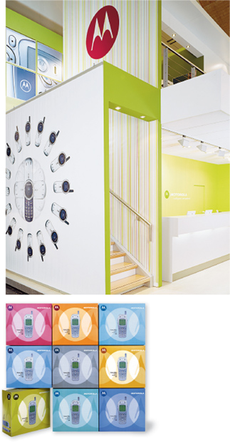
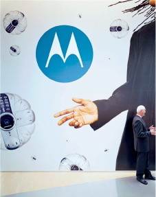


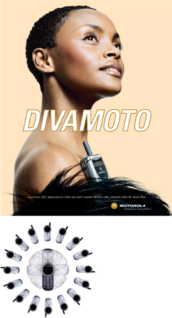
This Motorola program strikes a balance between the familiar and the new.