
 5
5
Measures of Bivariate Association
Overview
This chapter discusses procedures to test the significance of the relationship between two variables. Recommendations are made for choosing the correct statistic based on the level of measurement (data type and modeling type) of the variables. This chapter shows how to use the JMP Fit Y by X platform to prepare bivariate scatterplots and perform the chi-square test of independence, and how to use the JMP Multivariate platform to compute Pearson correlations and Spearman correlations.
Significance Tests versus Measures of Association
Choosing the Correct Statistic
Levels of Measurement and JMP Modeling Types
A Table of Appropriate Statistics
The Spearman Correlation Coefficient
The Pearson Correlation Coefficient
How to Interpret the Pearson Correlation Coefficient
Linear versus Nonlinear Relationships
Producing Scatterplots with the Fit Y by X Platform
Computing Pearson Correlations
Other Options Used with the Multivariate Platform
Computing Spearman Correlations
The Chi-Square Test of Independence
The Two-Way Classification Table
Computing Chi-Square from Tabular Data
Computing Chi-Square from Raw Data
Fisher’s Exact Test for 2 X 2 Tables
Appendix: Assumptions Underlying the Tests
Assumptions: Pearson Correlation Coefficient
Assumptions: The Spearman Correlation Coefficient
Assumptions: Chi-Square Test of Independence
Significance Tests versus Measures of Association
This section defines several fundamental statistical terms. There are a large number of statistical procedures that you can use to investigate bivariate relationships. These procedures can provide a test of statistical significance, a measure of association, or both.
- A bivariate relationship involves the relationship between just two variables. For example, if you conduct an investigation in which you study the relationship between SAT verbal test scores and college grade point average (GPA), you are studying a bivariate relationship.
- A test of statistical significance allows you to test hypotheses about the relationship between the variables in the population. For example, the Pearson correlation coefficient tests the null hypothesis that the correlation between two continuous numeric variables is zero in the population. For example, suppose you draw a sample of 200 subjects and determine that the Pearson correlation between the SAT verbal test and GPA is 0.35 for this sample. You can then use this finding to test the null hypothesis that the correlation between SAT verbal and GPA is zero in the population. If the resulting test is significant at p < 0.001, this p-value suggests that there is less than 1 chance in 1,000 of obtaining a sample correlation of 0.35 or larger if the null hypothesis is true. You therefore reject the null hypothesis, and conclude that the correlation is probably not equal to zero in the population.
- A Pearson correlation can also serve as a measure of association. A measure of association reflects the strength of the relationship between variables (regardless of the statistical significance of the relationship). For example, the absolute value of a Pearson correlation coefficient reveals the strength of the linear relationship between two variables. A Pearson correlation ranges from –1.00 through 0.00 to +1.00, with larger absolute values indicative of stronger linear relationships. For example, a correlation of 0.00 indicates no linear relationship between the variables, a correlation of 0.20 (or –0.20) indicates a weak linear relationship, and a correlation of 0.90 (or –0.90) indicates a strong linear relationship. A later section in this chapter provides more detailed guidelines for interpreting Pearson correlations.
Choosing the Correct Statistic
Levels of Measurement and JMP Modeling Types
When investigating the relationship between two variables, there is an appropriate bivariate statistic, given the nature of the variables studied. In all analysis situations, JMP platforms use the modeling types of the variables you select for analysis and automatically compute the correct statistics. To anticipate and understand these statistics, you need to understand the level of measurement or JMP modeling type of the two variables.
Chapter 1 briefly described the four levels of measurement used with variables in social science research: nominal, ordinal, interval, and ratio. These levels of measurement are equivalent to the modeling types assigned to all JMP variables.
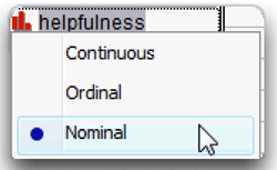
- A variable measured on a nominal scale has a nominal modeling type in JMP and is a classification variable. Its values indicate the group to which a subject belongs. For example, race is a nominal variable if a subject could be classified as African-American, Asian-American, Caucasian, and so forth.
- A variable measured on an ordinal scale has an ordinal modeling type in JMP and is a ranking variable. An ordinal variable indicates which subjects have more of the construct being assessed and which subjects have less. For example, if all students in a classroom are ranked with respect to verbal ability so that the best student is assigned the value 1, the next-best student is assigned the value 2, and so forth, this verbal ability ranking is an ordinal variable. However, ordinal scales have the characteristic that equal differences in scale value do not necessarily have equal quantitative meaning. In other words, the difference in verbal ability between student 1 and student 2 is not necessarily the same as the difference in ability between student 2 and student 3.
- An interval scale of measurement has a continuous modeling type in JMP. With an interval scale, equal differences in scale values do have equal quantitative meaning. For example, imagine that you develop a test of verbal ability. Scores on this test can range from 0 through 100, with higher scores reflecting greater ability. If the scores on this test are truly on an interval scale, then the difference between a score of 60 and 70 is equal to the difference between a score of 70 and 80. In other words, the unit of measurement is the same across the full range of the scale. Nonetheless, an interval-level scale does not have a true zero-point. Among other things, this means that a score of zero on the test does not necessarily indicate a complete absence of verbal ability.
- A ratio scale also has a continuous modeling type in JMP. It has all of the properties of an interval scale and also has a true zero point. This makes it possible to make meaningful statements about the ratios between scale values. For example, body weight is assessed on a ratio scale: a score of 0 pounds indicates no body weight at all. With this variable, it is possible to state that a person who weighs 200 pounds is twice as heavy as a person who weighs 100 pounds. Other examples of ratio-level variables are age, height, and income.
Important: Remember that in JMP each column has a modeling type corresponding to a level of measurement. The modeling types are nominal, ordinal, and continuous, where continuous includes both the interval and ratio scales of measurement. In further discussion, levels of measurement are referred to as modeling types. The modeling types are given to the variable when it is created. You can change a variable’s modeling type at any time using the Column Info dialog. Or, click on the modeling type icon next to the variable name in the Columns panel and choose a modeling type from the menu that appears. Changing a variable’s modeling type can change the type of analysis generated by JMP.
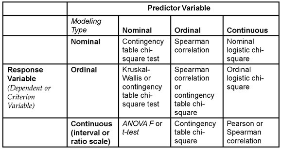
A Table of Appropriate Statistics
If you know the modeling type of the variables, you can anticipate the correct statistic that JMP generates for analyzing their relationship. However, the actual situation is a bit more complex than Table 5.1 suggests because for some sets of variables, there can be more than one appropriate statistic that investigates their relationship. This chapter presents only a few of the most commonly used statistics. To learn about additional procedures and the special conditions under which they might be appropriate, consult a more comprehensive statistics textbook such as Hays (1988).
Table 5.1 identifies some of the analyses and statistics appropriate for pairs of variables with given modeling types (levels of measurement). The vertical columns of the table indicate the modeling type of the predictor (independent) variable of the pair. The horizontal rows are the modeling type of the response (predicted or criterion) variable. The appropriate test statistic for a given pair of variables is identified where a given row and column intersect, and JMP picks the correct statistic to use based on modeling types.
Note: Keep in mind that for some contingency table situations and for correlations, both variables are considered as responses. Neither is a predictor.
Table 5.1: Statistics for Pairs of Variables
The Chi-Square Test
When you have a nominal predictor variable and a nominal response variable, Table 5.1 indicates that a chi-square test is an appropriate statistic. To illustrate this situation, imagine that you are conducting research that investigates the relationship between geographic region of voters in the United States and political party affiliation. Assume that you have hypothesized that people who live in the Midwest are more likely to belong to the Republican Party, relative to those who live in the East or those who live in the West. To test this hypothesis, you gather data on two variables for each of 1,000 subjects. The first variable is U.S geographic region, and each subject is coded as living either in the East, Midwest. Geographic region is therefore a nominal variable that can assume one of those three values. The second variable is party membership, and each subject is coded as either being a Republican, a Democrat, or Other. Party membership is also a nominal variable that assumes one of three values.
A chi-square test and with a significantly large chi-square value indicates a relationship between geographic region of voters and party affiliation. Close inspection of the two-way classification table that is produced in this analysis then indicates whether those in the Midwest are more likely to be Republicans.
The Spearman Correlation Coefficient
Table 5.1 recommends the Spearman correlation coefficient when the predictor and response variables are ordinal. An ordinal variable usually has numeric values or can be created as a numeric variable and analyzed using a continuous modeling type. As an illustration, imagine that an author has written a book that ranks the 100 largest universities in the U.S. from best to worst so that the best school ranks first (1), the second best ranks second (2), and so forth. In addition to providing an overall ranking for the institutions, the author also ranks them from best to worst with respect to a number of specific criteria such as intellectual environment, prestige, quality of athletic programs, and so forth. Assume the hypothesis that the universities’ overall rankings demonstrate a strong positive correlation with the rankings of the quality of their library facilities.
To test this hypothesis, you could compute the correlation between two variables (their overall ranks and the ranks of their library facilities). Both variables are ordinal because both tell you about the numeric ordinal rankings of the universities. For example, the library facilities variable could tell you that one university has a more extensive collection of books than another university, but it does not tell you how much better. Because both variables are on a numeric ordinal scale it is appropriate to create them as numeric variables, assign them continuous modeling types, and analyze the relationship between them with the Spearman correlation coefficient.
The Pearson Correlation Coefficient
Table 5.1 shows that when both the predictor and response are continuous variables (either the interval-level or ratio-level of measurement), the Pearson correlation coefficient could be appropriate. For example, assume that you want to test the hypothesis that income is positively correlated with age. That is, you predict that older people tend to have more income than younger people. To test this hypothesis, suppose you obtain data from 200 subjects on both variables. The first variable is age, which is the subject’s age in years. The second variable is income, which is the subject’s annual income in dollars. Income can assume values such as $0, $10,000, $1,200,000, and so forth.
Both variables in this study are continuous numeric variables. In fact, they are assessed on a ratio scale because equal intervals have equal quantitative meaning and each has a true zero point—zero years of age and zero dollars of income indicate complete absence of age and income. A Pearson correlation is often the correct way to examine the relationship between these kinds of variables. The Pearson correlation is also based on other assumptions that are discussed in a later section and are also summarized in an appendix at the end of this chapter.
Other Statistics
The statistics identified on the diagonal of Table 5.1 are used when both predictor and response variable have the same modeling type. For example, you should use the chi-square test when both variables are nominal or ordinal variables. The situation becomes more complex when the variables have different modeling types. For example, when the response variable is continuous and the predictor variable is nominal, the appropriate procedure is ANOVA (ANalysis Of VAriance). This chapter only discusses the Pearson correlation coefficient, the Spearman correlation coefficient, and the chi-square test. Analysis of variance (ANOVA) is covered in later chapters of this book. The Kruskal-Wallis test is not covered, but is described in other JMP documentation (see Basic Analysis and Graphing (2012)).
Remember that Table 5.1 presents only some of the appropriate statistics for a given combination of variables. There are many exceptions to these general guidelines. For example, Table 5.1 assumes that all nominal variables have only a relatively small number of values (perhaps two–six), all continuous variables can take on a large number of values, and that ordinal variables might have either a small number of categorical values or a larger number of numeric values. When these conditions do not hold, the correct statistic can differ from those indicated by the table. For example, the F test produced in an ANOVA (instead of a correlation analysis) might be the appropriate statistic when both response and predictor variables are continuous. This is the case when there is an experiment in which the response variable is number of errors on a memory task and the predictor is amount of caffeine administered: 0 mg versus 100 mg versus 200 mg. The predictor variable (amount of caffeine administered) is theoretically continuous, but the correct statistic is ANOVA because this predictor has only three values. In this situation, the modeling type for caffeine administered should be assigned as nominal or ordinal for the analysis. As you read about the examples of research throughout this text, you will develop a better sense of what JMP platforms to use and how to interpret the statistics generated by JMP for a given study.
Section Summary
The purpose of this section was to provide a simple strategy for understanding measures of bivariate association under conditions often encountered in scientific research. The following section reviews information about the Pearson correlation coefficient, and shows how to use the JMP Fit Y by X platform to see scatterplots that verify that the relationship between two variables is linear. Subsequent sections provide a more detailed discussion of the three statistics that are emphasized in this chapter: the Pearson correlation, the Spearman correlation, and the chi-square test. For each of these statistics, there is an example study that shows how to do the correct JMP analysis and explains how to interpret the results.
Pearson Correlations
When to Use
You can use the Pearson product-moment correlation coefficient (symbolized as r) to examine the nature of the relationship between two variables when both variables are continuous. It is also assumed that both variables have a large number of values.
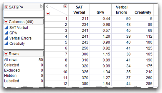
For example, it is appropriate to compute a Pearson correlation coefficient to investigate the nature of the relationship between SAT verbal test scores and grade point average (GPA). SAT verbal is a continuous variable that can assume a wide variety of values (possible scores range from 200 through 800). Grade point average is also a continuous variable, and can also assume a wide variety of values ranging from 0.00 through 4.00. Figure 5.1 shows a partial listing of hypothetical data, SATGPA.jmp, which is used in the following examples.
The Pearson correlation assumes the variables are numeric with a continuous modeling type and that the observations have been drawn from normally distributed populations. When one or both variables display a non-normal distribution (for example, when one or both variables are markedly skewed), it might be more appropriate to analyze the data with the Spearman correlation coefficient. A later section of this chapter discusses the Spearman coefficient. A summary of the assumptions of both the Pearson and Spearman correlations appear in an appendix at the end of this chapter.
Figure 5.1: Partial Listing of the SATGPA.jmp Data Table
How to Interpret the Pearson Correlation Coefficient
To better understand the nature of the relationship between the two variables in this example, it is necessary to interpret two characteristics of a Pearson correlation coefficient.
First, the sign of the coefficient tells you whether there is a positive linear relationship or a negative linear relationship between the two variables.
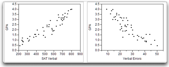
- A positive correlation indicates that as values for one variable increase, values for the second variable also increase. The positive correlation illustrated on the left in Figure 5.2 shows the relationship between SAT verbal test scores and GPA in a fictitious sample of data. You can see that subjects who received low scores on the predictor variable (SAT Verbal) also received low scores on the response variable (GPA). At the same time, subjects who received high scores on SAT Verbal also received high scores on GPA. Therefore, these variables are positively correlated.
- With a negative correlation, as values for one variable increase, values on the second variable decrease. For example, you might expect to see a negative correlation between SAT verbal test scores and the number of errors that subjects make on a vocabulary test. The students with high SAT verbal scores tend to make few mistakes, and the students with low SAT scores tend to make many mistakes. This negative relationship is illustrated on the right in Figure 5.2.
Figure 5.2: Positive Correlation (left) and Negative Correlation (right)
The second characteristic of a correlation coefficient is its size. Larger absolute values of a correlation coefficient indicate a stronger relationship between the two variables. Pearson correlation coefficients range in size from –1.00 through 0.00 to +1.00. Coefficients of 0.00 indicate no relationship between two variables. For example, if there is zero correlation between SAT scores and GPA, then knowing a person’s SAT score tells you nothing about that person’s GPA. In contrast, correlations of –1.00 or +1.00 indicate perfect relationships. If the correlation between SAT scores and GPA is 1.00, then knowing someone’s SAT score allows you to predict that person’s GPA with perfect accuracy. In the real world, SAT scores are not strongly related to GPA. The correlation between them is less than 1.00.
The following is an approximate guide for interpreting the strength of the linear relationship between two variables based on the absolute value of the coefficient:
- ± 1.00 = perfect correlation
- ± 0.50 = moderate correlation
- ± 0.80 = strong correlation
- ± 0.20 = weak correlation
- ± 0 = no correlation
We recommend that you consider the magnitude of correlation coefficients as opposed to whether or not coefficients are statistically significant. This is because significance estimates are strongly influenced by sample sizes. For instance, an r of 0.15 (weak correlation) would be statistically significant with samples in excess of 700, whereas an r of 0.50 (moderate correlation) would not be statistically significant with a sample of only 15 participants.
Remember that you consider the absolute value of the coefficient when interpreting its size. This means that a correlation of –0.50 is just as strong as a correlation of +0.50, a correlation of –0.75 is just as strong as a correlation of +0.75, and so forth.
Linear versus Nonlinear Relationships
The Pearson correlation is appropriate only if there is a linear relationship between the two variables. There is a linear relationship between two variables when their scatterplot follows the form of a straight line. For example, a straight line through the points in the scatterplot on the left in Figure 5.3 fits the pattern of the data. This means that there is a linear relationship between SAT verbal test scores and GPA.
In contrast, there is a nonlinear relationship between two variables if their scatterplot does not follow a straight line. For example, imagine that you have a test of creativity and have administered it to a large sample of college students. With this test, higher scores reflect higher levels of creativity. Imagine further that you obtain the SAT verbal test scores for these students, plot their SAT scores against their creativity scores, and obtain the scatterplot on the right in Figure 5.3. This scatterplot shows a nonlinear relationship between SAT scores and creativity:
- Students with low SAT scores tend to have low creativity scores.
- Students with moderate SAT scores tend to have high creativity scores.
- Students with high SAT scores tend to have low creativity scores.
It is not possible to draw a straight line through the data points in the scatterplot of SAT scores and creativity shown on the right in Figure 5.3 because there is a nonlinear (or curvilinear) relationship between these variables.
Figure 5.3: A Linear Relationship (left) and a Nonlinear Relationship right)
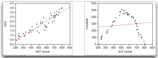
The Pearson correlation should not be used to examine the relationship between two variables involved in a nonlinear relationship because the correlation coefficient that results usually underestimates the actual strength of the relationship between the variables. For example, the Pearson correlation between the SAT scores and creativity scores presented on the right in Figure 5.3 indicates a very weak relationship between the two variables (the fitted straight line is nearly horizontal). However, the scatterplot shows a strong linear relationship between SAT scores and creativity, which means that for a given SAT score, you can accurately predict the creativity score.
You should verify that there is a linear relationship between two variables before computing a Pearson correlation for those variables. An easy way to verify that the relationship is linear is to prepare a scatterplot similar to those presented in Figure 5.3. This is easily done using the Fit Y by X platform in JMP, which is described in the next section.
Producing Scatterplots with the Fit Y by X Platform
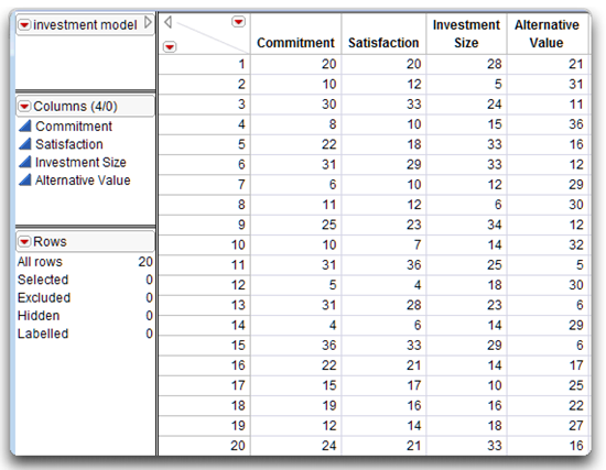
To illustrate a bivariate analysis (an analysis between two continuous variables), imagine that you conduct a study dealing with an investment model that is a theory of commitment in romantic associations. The investment model identifies a number of variables that are believed to influence a person’s commitment to a romantic association. Commitment refers to the subject’s intention to remain in the relationship. In the following example, the variable called Commitment is the response variable.
These are some of the variables that are thought to influence subject commitment (predictor variables):
Satisfaction—the subject’s affective response to the relationship.
Investment size—the amount of time and personal resources that the subject has put into the relationship.
Alternative value—the attractiveness of the subject’s alternatives to the relationship (e.g., the attractiveness of alternative romantic partners).
Use scatterplots of the response variable plotted on the vertical axis and the predictor variables plotted on the horizontal axis to explore correlations.
Assume you have a 16-item questionnaire to measure these four variables. Twenty participants who are currently involved in a romantic relationship complete the questionnaire while thinking about their relationship. When they complete the questionnaire, their responses are used to compute four scores for each participant:
- First, each participant receives a score on the commitment scale; higher values on the commitment scale reflect greater commitment to the relationship.
- Each participant also receives a score on the satisfaction scale; higher values on the satisfaction scale reflect greater satisfaction with the relationship.
- Each person also receives a score on the investment scale; higher values on the investment scale meanthat the participant believes that he or she has invested a great deal of time and effort in the relationship.
- Finally, each person receives a score on the alternative value scale; higher values on the alternative value scale mean that it would be attractive to the respondent to find a different romantic partner.
Figure 5.4 lists the (fictitious) results in a JMP data table called investment model.jmp.
Figure 5.4: JMP Data Table of the Commitment Data
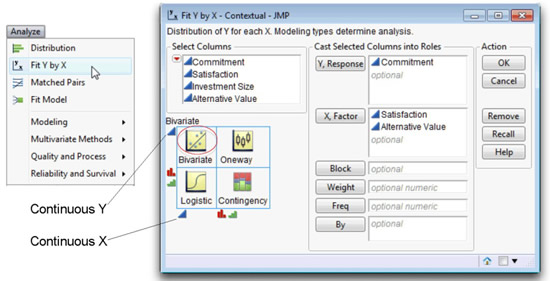
You can use the Fit Y by X command on the Analyze menu to prepare scatterplots for various combinations of variables. For a hands-on example, open the investment model.jmp table and follow the mouse steps.
![]() To begin, choose Analyze > Fit Y by X, which launches the dialog in Figure 5.5.
To begin, choose Analyze > Fit Y by X, which launches the dialog in Figure 5.5.
![]() Select Commitment, and click the Y, Response button (or, drag the Commitment variable from the variable list on the left of the dialog to the Y, Response box).
Select Commitment, and click the Y, Response button (or, drag the Commitment variable from the variable list on the left of the dialog to the Y, Response box).
![]() Likewise, select two of the predictor variables, Satisfaction and Alternative Value, and click the X, Factor button.
Likewise, select two of the predictor variables, Satisfaction and Alternative Value, and click the X, Factor button.
![]() Click OK to see the bivariate scatterplots of Commitment by each of the X variables.
Click OK to see the bivariate scatterplots of Commitment by each of the X variables.
Note: There is always help available. The Help button on the launch dialog tells how to complete the dialog. After the results appear, choose the Help tool (question mark) from the Tools menu or Tools palette, and click anywhere on the results.
Figure 5.5: Launch Dialog for the JMP Fit Y by X Platform
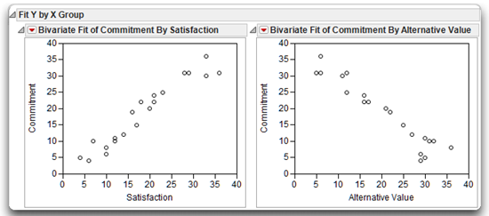
The scatterplot on the left in Figure 5.6 shows the initial results for Commitment by Satisfaction. Notice that the response variable (Commitment) is on the vertical axis and the predictor variable (Satisfaction) is on the horizontal axis. The shape of the scatterplot shows a linear relationship between Satisfaction and Commitment because it is possible to draw a good-fitting straight line through the center of the points.
The general shape of the scatterplot also suggests a fairly strong relationship between the two variables. Knowing where a subject stands on the Satisfaction variable allows you to predict, with some accuracy, where that subject stands on the Commitment variable.
Figure 5.6 also shows that the relationship between Satisfaction and Commitment is positive. Large Satisfaction values are associated with large Commitment values, and small Satisfaction values are associated with small Commitment values. This makes intuitive sense—you expect subjects who are highly satisfied with their relationships to be highly committed to those relationships.
To illustrate a negative relationship, look at the plot of Commitment by Alternative Value, which is shown on the right in Figure 5.6. Notice that the relationship between these two variables is negative. As you might expect, subjects who indicate that the alternatives to their current romantic partner are attractive are not terribly committed to their current partner.
Figure 5.6: Scatterplots of Commitment Scores with Satisfaction and Alternative Value
Computing Pearson Correlations
The relationships between Commitment by both Alternative Value and Satisfaction appear to be linear, so it is appropriate to assess the strength of these relationships with the Pearson correlation coefficient.
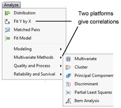
Two commands on the Analyze menu, Fit Y by X and Multivariate Methods > Multivariate, compute the Pearson Correlation coefficient.
- The Fit Y by X platform computes a single correlation coefficient.
- The Multivariate platform offers options to compute different types of correlation coefficients.
Computing a Single Correlation Coefficient
In some instances, you might want to compute the correlation between just two variables. A simple way to do this uses the Fit Y by X platform and the Density Ellipse option available on the red triangle menu on the bivariate scatterplot title bar. Figure 5.7 shows the scatterplot of Commitment and Satisfaction with a 95% density ellipse overlaid on the plot. The density ellipse is computed from the sample statistics to contain an estimated 95% of the points. In addition, this option appends the Correlation table to the plot.
The names of the variables are listed first table, and the statistics for the variables appear to the right of the variable names. These descriptive statistics show the means and standard deviations of each variable, the Pearson correlation coefficient between them, and the number of values used to compute the descriptive statistics and correlation.
Figure 5.7: Computing the Pearson Correlation between Commitment and Satisfaction

The Correlation table shows the mean for Commitment as 18.6 and the standard deviation as 10.05. The mean for Satisfaction is 18.5 and its standard deviation is 9.51. There are no missing values for either variable so all 20 observations are used to compute the statistics. Observations with a missing value for either variable are not used in the analysis.
The Pearson correlation coefficient between Commitment and Satisfaction is 0.96252 (you can round this to 0.96). The p value associated with the correlation, labeled Signif. Prob, is next to the correlation. This is the p value obtained from a test of the null hypothesis that the correlation between Commitment and Satisfaction is zero in the population. Recall that a correlation value of zero means there is no relationship, or no predictive value, between two variables. More technically, the p value gives the probability of obtaining a sample correlation this large (or larger) if the correlation between Commitment and Satisfaction were really zero in the population.
For the correlation of 0.96, the corresponding p value is less than 0.0001, written < 0.0001*. This means that, given the sample size of 20, there is less than 1 chance in 10,000 of obtaining a correlation of 0.96 or larger if the population correlation was really zero. You can therefore reject the null hypothesis, and tentatively conclude that Commitment is related to Satisfaction in the population.
The alternative hypothesis for this statistical test is that the correlation is not zero in the population. This alternative hypothesis is two-sided, which means that it does not indicate that the population correlation is positive or negative, only that it is not equal to zero.
Computing All Possible Correlations for a Set of Variables
Use the Multivariate platform when you have multiple variables and want to know the correlations between each pair.
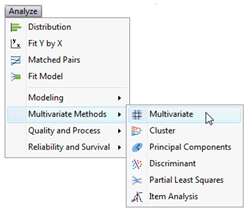
![]() Choose Analyze > Multivariate > Multivariate Methods, as shown here.
Choose Analyze > Multivariate > Multivariate Methods, as shown here.
When you choose this command, a launch dialog asks you to select the variables to analyze. This platform does not distinguish between response and predictor variables. It looks only at the relationship between pairs of variables.
Figure 5.8 shows the initial result for the four variables: Commitment, Satisfaction, Alternative Value, and Investment Size, beginning with the Pearson correlation coefficients for each pair. The scatterplot matrix is a visual representation of correlations. Each scatterplot has a 95% density ellipse imposed. Like the ellipse seen in the Fit Y by X platform, it is computed from the sample statistics to contain an estimated 95% of the points. The thinner, more diagonal ellipse indicates greater correlation. The red triangle menu on the Scatterplot Matrix title bar lets you change the ellipse percent (that is, 99%, 90%, or other), fill the ellipse, change its color, and other options.
Figure 5.8: Computing All Possible Pearson Correlations
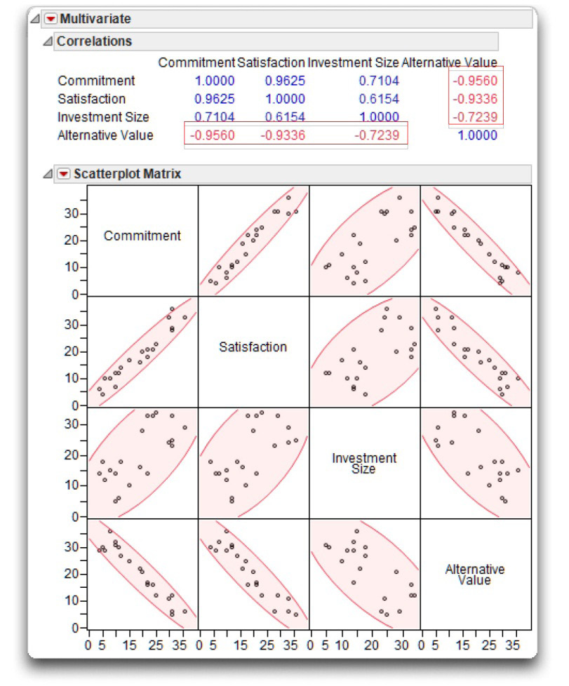
The scatterplot matrix is interactive. Highlight points with the pointer, brush tool, or lasso tool, in any plot and see them highlighted in all other plots and in the data table. The scatterplot matrix can be resized by dragging on any boundary. You can rearrange the order of the variables in the matrix by dragging any cell on the diagonal to a different position on the diagonal.
The correlations display above the matrix with the significant correlations displayed in red.
Note: The Correlations table shows correlations computed only for the set of observations that have values for all variables.
![]() Next, select the Pairwise Correlations option on the Multivariate title bar menu.
Next, select the Pairwise Correlations option on the Multivariate title bar menu.
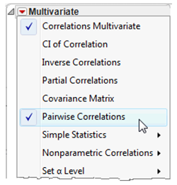
This option appends a new set of correlations at the bottom of the scatterplot matrix. The values in the Pairwise Correlations table are computed using all available values for each pair of variables. The count values among the pairs differ if any pair has a missing value for either variable. These are the same correlations given by the Density Ellipse option on the Fit Y by X platform. Figure 5.9 shows the Pairwise Correlations table for this example. If there had been missing values in the data, these correlations would differ from those in Figure 5.8, which use only the set of observations that have values for all variables.
Figure 5.9: Pairwise Pearson Correlations with Significance Probabilities and Bar Chart
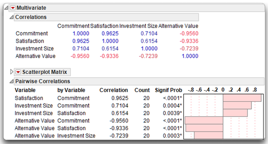
You can interpret the correlations and p-values in this output in exactly the same way as the Fit Y by X results. For example, the Pearson correlation between Investment Value and Commitment is 0.7104, with the count of 20 used for the computation. However, remember that when requesting correlations between several different pairs of variables, some correlations might be based on more subjects than others (due to missing data). In that case, the sample sizes printed for each individual correlation coefficient will be different. Finally, the p-value of 0.0004 for these variables means that there are only 4 chances in 10,000 of observing a sample correlation this large if the population correlation is really zero. By convention, the observed correlation is said to be statistically significant if the p-value is less than 0.05.
Notice that the bar chart to the right of the values shows the pattern of correlations, which supports some of the predictions of the investment model: Commitment is positively related to Satisfaction and Investment Size, and is negatively related to Alternative Value. With respect to strength, the correlations (for these fictitious data) range from being moderately strong to very strong.
Other Options Used with the Multivariate Platform
The following list summarizes the items used in the previous example, and a few of the other Multivariate platform options that you might find useful when conducting research.
Note: Any table generated by a JMP platform can be saved as a JMP data table or as a matrix. Right-click anywhere on the body of a table to see a menu of options for that table.
Correlations Multivariate gives a matrix of Pearson (product-moment) correlation coefficients using only the observations having nonmissing values for all variables in the analysis. These correlations (and the Pairwise correlations) are a measure of association that summarizes how closely a variable is a linear function of the other variables in the multivariate analysis.
CI of Correlations lists the correlations in tabular form with their confidence intervals.
Inverse Correlations provides a matrix whose diagonal elements are a function of how closely a variable is a linear function of the other variables. These diagonal elements are also called the variance inflation factor (VIF).
Partial Correlations shows the partial correlation of each pair of variables after adjusting for all other variables.
Covariance Matrix shows the covariance matrix used to compute correlations.
Pairwise Correlations gives a matrix of Pearson (product-moment) correlation coefficients, using all available values. The count (N) values differ if any pair has a missing value for either variable. These are the same correlations given by the Density Ellipse option on the Fit Y by X platform.
Nonparametric Correlations include the following:
Spearman’s Rho is a product-moment correlation coefficient computed on the ranks of the data values instead of the data values themselves. Spearman’s correlation is covered in the next section.
Kendall’s Tau is based on the number of matching and nonmatching (concordant and discordant) pairs of observations, correcting for tied pairs.
Hoeffding’s D measure of dependence (association or correlation) is a statistical scale with a range from –0.5 to 1, where greater positive values indicate association.
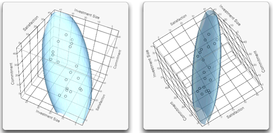
You can examine and try out other interesting options that might be useful for specific sets of data. For example, the commitment data has three variables that are highly correlated and show up well with the Ellipsoid 3D Plot option. Figure 5.10 shows two views of the Commitment, Investment Size, and Satisfaction variables.
Figure 5.10: Ellipsoid 3D Plots of Correlated Commitment Variables
See Basic Analysis and Graphing (2012) found on the JMP Help menu for more details about all the options available for the Multivariate platform.
Spearman Correlations
When to Use
Spearman’s rank-order correlation coefficient (symbolized as rs) is appropriate in a variety of circumstances. First, you can use Spearman correlations when both variables are numeric and have an ordinal modeling type (level of measurement). It is also correct when one variable is a numeric ordinal variable, and the other is a continuous variable.
However, it can also be appropriate to use the Spearman correlation when both variables are continuous. The Spearman coefficient is a distribution-free test. A distribution-free test makes no assumption about the shape of the distribution from which the sample data are drawn. For this reason, researchers sometimes compute Spearman correlations when one or both of the variables are continuous but are markedly non-normal (such as the skewed data shown previously), which makes a Pearson correlation inappropriate. The Spearman correlation is less useful than a Pearson correlation when both variables are normal, but it is more useful when one or both variables are non-normal.
JMP computes a Spearman correlation by converting both variables to ranks and computing the correlation between the ranks. The resulting correlation coefficient can range from –1.00 to +1.00, and is interpreted in the same way as the Pearson correlation.
Computing Spearman Correlations
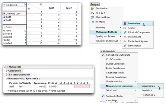
To illustrate this statistic, assume a teacher has administered a test of creativity to 10 students. After reviewing the results, the students are ranked from 1 to 10, with “10” representing the most creative student, and “1” representing the least creative student. Two months later, the teacher repeats the process, arriving at a slightly different set of rankings. The question now is to determine the correlation between rankings made by the two tests, which were given at different times. The data (rankings) are clearly on an ordinal level of measurement, so the correct statistic is the Spearman rank-order correlation coefficient.
See Figure 5.11 to follow along with this example.
![]() Enter the data as shown in the data table in Figure 5.11 and name the variables test 1 and test 2.
Enter the data as shown in the data table in Figure 5.11 and name the variables test 1 and test 2.
![]() Choose Analyze > Multivariate Methods > Multivariate.
Choose Analyze > Multivariate Methods > Multivariate.
![]() In the Multivariate launch dialog, select test 1 and test 2 as analysis variables.
In the Multivariate launch dialog, select test 1 and test 2 as analysis variables.
![]() Click OK to see the initial Multivariate results (not shown in Figure 5.11).
Click OK to see the initial Multivariate results (not shown in Figure 5.11).
![]() Either close the outline nodes for the Correlations table and the Scatterplot Matrix, or use the menu on the Multivariate title bar to suppress (uncheck) them.
Either close the outline nodes for the Correlations table and the Scatterplot Matrix, or use the menu on the Multivariate title bar to suppress (uncheck) them.
![]() On the Multivariate menu, select Nonparametric Correlations > Spearman’s
On the Multivariate menu, select Nonparametric Correlations > Spearman’s ![]()
These steps produce the Nonparametric: Spearman’s Rho results seen at the bottom in Figure 5.11. The correlation coefficient between the tests is 0.9152 and the significance probability (p-value) is 0.0002. The correlation and p-value are interpreted as described previously for the Pearson statistics.
Figure 5.11: Computing Spearman’s Rho Correlation between Variables test1 and test2
The Chi-Square Test of Independence
When to Use
The chi-square test is appropriate when both variables are classification or categorical variables, with a character data type and nominal or ordinal modeling type. Either variable can have any number of categories, but in practice the number of categories is usually small.
The Two-Way Classification Table
The nature of the relationship between two nominal-level variables is easiest to understand using a two-way classification table, also called a contingency table. A two-way classification table has rows that represent the categories (values) of one variable and the columns represent the categories of a second variable. You can review the number of observations in the various cells of a two-way table to look for a pattern that indicates some relationship between the two variables, and perform a chi-square test to determine if there is any statistical evidence that the variables are related in the population.
For example, suppose you want to prepare a table that shows one variable with two categories and a second variable with three categories. The general form for such a table appears in Table 5.2.
Table 5.2: General Form for a Two-Way Classification Table
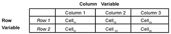
The point at which a row and column intersects is called a cell, and each cell is given a unique subscript. The first number in this subscript indicates the row to which the cell belongs, and the second number indicates the column to which the cell belongs. So the general form for the cell subscripts is cellrc where r = row and c = column. This means cell21 is the intersection of row 2 and column 1, cell13 is the intersection of row 1 and column 3, and so forth. Classification tables often show row totals and column totals, called marginal totals. The sum of all the cells is the grand total.
The chi-square test is appropriate for looking at contingency tables constructed two different ways:
- When one sample of subjects falls into cell categories and there are no predetermined marginal totals, the chi-square test of independence tests whether there is any association or relationship between the contingency table variables.
- When a sample is taken from each category of either the row or column variable, then the marginal totals for that category in the contingency table are fixed. The chi-square test of homogeneity tests whether the distributions of these samples are the same for the levels of the second variable.
This section is only concerned with the chi-square test of independence.
Note: The chi-square test is computed the same way whether it is testing independence or homogeneity, but the hypothesis and conclusion of a significant chi-square differs depending on the circumstances of its use.
One of the first steps in performing a chi-square test is to determine exactly how many subjects fall into each of the cells of the classification table. The pattern shown by the table cells helps you understand whether the classification variables are related.
Computing a Chi-Square
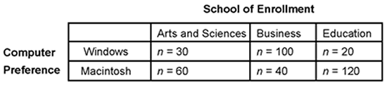
To make this more concrete, assume that you are a university administrator preparing to purchase a large number of new personal computers for three of the schools in your university: the School of Arts and Science, the School of Education, and the School of Business. For a given school, you can purchase either Windows computers or Macintosh computers, and you need to know which type of computer the students within each school prefer.
In general terms, your research question is, “Is there a relationship between (a) school of enrollment, and (b) computer preference?”
The chi-square test will help answer this question. If this test shows that there is a relationship between the two variables, you can review the two-way classification table to see which type of computer most students in each of the three schools prefer.
To answer this question, you draw a representative sample of 370 students from the 8,000 students that constitute the three schools. Each student is given a short questionnaire that asks just two questions:
1. In which school are you enrolled? (Circle one):
a. School of Arts and Sciences
b. School of Business
c. School of Education
2. Which type of computer do you prefer that we purchase for your school? (Circle one):
a. Windows
b. Macintosh
These two questions constitute the two nominal-level variables for your study.
- Question 1 defines a school of enrollment variable that can take on one of three values (Arts and Science, Business, or Education).
- Question 2 defines a computer preference variable that can take on one of two values (Windows or Macintosh).
These are nominal variables because they only indicate group membership and provide no quantitative information.
You can now prepare the two-way classification table shown in Table 5.3. Computer preference is the row variable—row 1 represents students who preferred Windows computers, and row 2 represents students who preferred Macintosh computers. School of enrollment is the column variable.
Table 5.3 shows the number of students that appear in each cell of the classification table. For example, the first row of the table shows that, among those students who preferred Windows computers, 30 were Arts and Science students, 100 were Business students, and 20 were Education majors.
Table 5.3: Two-Way Table of Computer Preference by School of Enrollment
Remember that the purpose of the study is to determine whether there is any relationship between the two variables, that is, to determine whether school of enrollment is related to computer preference. This is just another way of saying, “If you know what school a student is enrolled, does that help you predict what type of computer that student is likely to prefer?” When you ask this kind of question about a set of nominal variables, the statistic to address the question is the chi-square test of independence. You want to know if computer preference is dependent (or not) on school of enrollment.
In this case, the answer to the question is easiest to find if you review the table one column at a time. For example, review just the Arts and Sciences column of the table. Notice that most of the students (n = 60) preferred Macintosh computers, while fewer (n = 30) preferred Windows computers. The column for the Business students shows the opposite trend—most business students (n = 100) preferred Windows computers. Finally, the pattern for the Education students was similar to that of the Arts and Sciences student in that the majority (n = 120) preferred Macintosh computers.
In short, there appears to be a relationship between school of enrollment and computer preference. Business students appear to prefer Windows computers, and Arts and Sciences and Education students appear to prefer Macintosh computers. But this is just a trend that you observed in the sample. Is this trend strong enough to allow you to conclude that the variables are probably related in the population of 8,000 students? To determine this you must conduct a chi-square test of independence.
Tabular versus Raw Data
You can use JMP to compute the chi-square test of independence regardless of whether you are dealing with tabular data or raw data. When you are working with raw data, you are working with data that have not been summarized or tabulated in any way. For example, imagine that you administer your questionnaire to 370 students, and have not yet tabulated their responses—you merely have 370 completed questionnaires. In this situation, you are working with raw data.
On the other hand, tabular data are data that have been summarized in a table. For example, imagine that it was actually another researcher who administered this questionnaire, and then summarized subject responses in a two-way classification table similar to Table 5.3. In this case you are dealing with tabular data.
In computing the chi-square statistic, there is no advantage to using one form of data or the other. The following section shows how to request the chi-square statistic in JMP for tabular data. A subsequent section shows how to analyze raw data.
Computing Chi-Square from Tabular Data
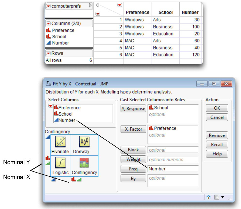
Often, the data to be analyzed with a chi-square test of independence have already been summarized and entered into the JMP data table as shown in Figure 5.12.
This JMP data table, computerprefs.jmp, contains three variables for each line of data. The first variable is a character variable named Preference that codes student computer preferences. The second is a character variable named School that gives students’ school enrollment. The third variable is a numeric variable called Number that indicates how many students are in a given preference by school cell.
By now, you might wonder why there is so much emphasis on preparing a two-way classification table when you want to perform a chi-square test of independence. This is necessary because computing a chi-square statistic involves comparing the observed frequencies in each cell of the classification table (the number of observations that actually appear in each cell), and the expected frequencies in each cell of the table (the number of observations that you would expect to appear in each cell if the row variable and the column variable were completely unrelated).
However, the JMP analysis finds these expected frequencies needed for the chi-square computation regardless of whether the data are in raw form or tabular form.
Figure 5.12: Data and Launch Dialog to Generate a Contingency Table
Now that your two-way classification data are in a JMP data table, you can request the chi-square statistic as follows:
![]() With the computerprefs.jmp table active, choose Analyze > Fit Y by X and complete the launch dialog as shown in Figure 5.12.
With the computerprefs.jmp table active, choose Analyze > Fit Y by X and complete the launch dialog as shown in Figure 5.12.
![]() Note that the Number variable must be assigned as the Freq role because the data are already in tabular form in the data table. The Number value tells how many observations are in each Preference by School cell of the two-way contingency table, as illustrated previously in Table 5.3.
Note that the Number variable must be assigned as the Freq role because the data are already in tabular form in the data table. The Number value tells how many observations are in each Preference by School cell of the two-way contingency table, as illustrated previously in Table 5.3.
![]() Click OK to see the initial analysis results shown in Figure 5.13.
Click OK to see the initial analysis results shown in Figure 5.13.
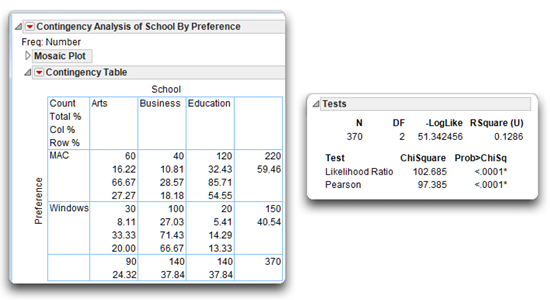
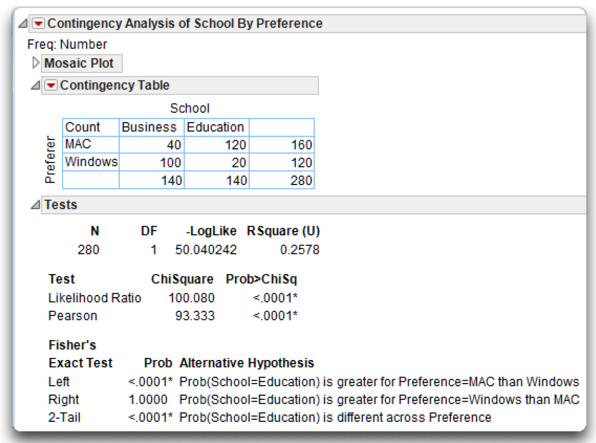
The Contingency Table
In the 2 X 3 classification table, called the Contingency Table in the analysis results, the name of the row variable (Preference) is on the far left of the table. The label for each row taken from the data table appears on the left side of the appropriate row. The first row (labeled MAC) represents the students who preferred Macintosh computers, and the second row (labeled Windows) represents students who preferred Windows computers.
The name of the column variable (School) appears above the three columns. Each column is headed with its label—“Arts” represents the Arts and Sciences students, “Business” students are tabulated in the second column, and “Education” is the third column.
Figure 5.13: Contingency Table and Tests for the Computer Preferences Data
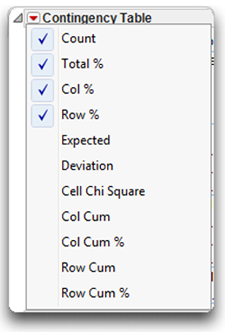
Where a given row and column intersect, you see information about the subjects in that cell. The upper left cell in the table is a legend that lists the quantities in the cells. The red triangle menu on the Contingency Analysis title bar (shown to the right) gives you options to show or hide these quantities in the contingency table cells by checking or unchecking them.
Here are definitions for some of these quantities.
Count is the count or the raw number of subjects in the cell. Total % is the total percent or the percent of subjects in that cell relative to the total number of subjects (the number of subjects in the cell divided by the total number of subjects).
Col % is the column percent or the percent of subjects in that cell, relative to the number of subjects in that column. For example, there are 30 subjects in the Windows Arts cell, and 90 subjects in the Arts column. Therefore, the column percent for this cell is 30/90 = 33.33%.
Row % is the row percent or the percent of subjects in that cell, relative to the number of subjects in that row. For example, there are 30 subjects in the Windows Arts cell, and 150 subjects in the Windows row. Therefore, the row percent for this cell is 30/150 = 20%.
Expected shows the expected cell frequencies (E), which are the cell frequencies that would be expected if the two variables were in fact independent (unrelated). This is a very useful option for determining the nature of the relationship between the two variables. It is computed as the product of the corresponding row total and column total, divided by the grand total.
Deviation is the observed (actual) cell frequency (O) minus the expected cell frequency (E).
Cell Chi Square is the chi-square value for the individual cell, computed as (O–E)2 / E.
In the present study, it is particularly revealing to review the classification table one column at a time, and to pay particular attention to the column percent. First, consider the Arts column. The column percent entries show that only 33.33% of the Arts and Sciences students preferred the Windows operating system, while 66.67% preferred Macintoshes. Next, consider the Business column, which shows the reverse trend: 71.43% of the Business students preferred Windows, while only 28.57 percent preferred Macintoshes. The trend of the Education students is similar to that for the Arts and Sciences students: only 14.29% preferred Windows, while 85.71% preferred Macintoshes.
These percentages reinforce the suspicion that there is a relationship between school of enrollment and computer preference. To find out if the relationship is statistically significant, you must consult the chi-square test of independence shown below and in Figure 5.13.
The Tests Report
The upper part of the Tests report shows a statistic similar to an Analysis of Variance table for continuous data. This table assumes there is a linear model where one variable is the fixed predictor (X) and the other is the response (Y).
The negative log-likelihood (–Loglike) plays the same role for categorical data as the sums of squares does for continuous data. It measures the fit and uncertainty of the model. Likewise, the total number of observations is shown, with total degrees of freedom. The Rsquare (U) is the proportion of uncertainty (–LogLike) explained by the model.
The lower part of the Tests report shows two chi-square tests of independence, the Likelihood Ratio test (computed as twice the negative log-likelihood for Model in the Tests table) and the familiar Pearson chi-square test. These statistics test the null hypothesis that in the population the two variables (Preference and School) are independent, or unrelated. When the null hypothesis is true, expect the value of chi-square to be relatively small—the stronger the relationship between the two variables in the sample, the larger chi-square will be.
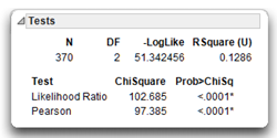
The Tests report shows that the obtained value of the Pearson chi-square is 97.385 with 2 degrees of freedom. The Model DF at the top of the Tests report shows the degrees of freedom. The degrees of freedom for the chi-square test are calculated as

For the current analysis, the row variable (Preference) has two categories, and the column variable (School) has three categories, so the degrees of freedom are calculated as
df = (2-1)(3-1) = (1)(2) = 2
The obtained (computed) value of chi-square, 97.385, is quite large for the given the degrees of freedom. The probability value, or p-value, for this chi-square statistic is printed below the heading Prob > ChiSq in the Tests report. This p-value is less than 0.0001, which means that there is less than one chance in 10,000 of obtaining a chi-square value of this size (or larger) if the variables were independent in the population. You can therefore reject the null hypothesis, and tentatively conclude that school of enrollment is related to computer preferences.
Computing Chi-Square from Raw Data
In many cases the data are not pre-summarized and don’t have a Number column, as in the previous example (see Figure 5.12). Instead, there is one row for each respondent. If the data in the example above had not been tabulated, the data table would have had 30 rows with School value listed as “Arts” and Preference value listed as “Windows,” 100 rows for a School value of “Business” and Preference value of “Windows,” and so forth. The data table would have had 370 rows and only two variables. To analyze data in this raw form, choose Analyze > Fit Y by X and proceed as described in Figure 5.12 but without a Freq variable. The results are identical to those described for tabular data.
Fisher’s Exact Test for 2 X 2 Tables
A 2 X 2 table contains just two rows and two columns. Said another way, a two-way classification table for a chi-square study is a 2 X 2 table when there are two values for the row variable and two values for the column variable. For example, imagine that you modified the preceding computer preference study so that there were only two values for the school of enrollment variable (“Arts and Sciences” and “Business”). The resulting table is called a 2 X 2 table because it has only two rows (“Windows” and “Macintosh”) and two columns (“Arts and Sciences” and “Business”).
When analyzing a 2 X 2 classification table, it is best to use Fisher’s exact test instead of the standard chi-square test. This test is automatically appended to the Fit Y by X contingency table analysis whenever the classification table is a 2 X 2 table (see Figure 5.14). In the JMP analysis results, consult the p-values listed in the Tests report as Prob Alternative Hypothesis, for the Left, Right, and 2-Tail hypotheses. These estimate the probability of observing a table that gives at least as much evidence of a relationship as the one actually observed, given that the null hypothesis is true. In other words, when the p value for Fisher’s exact test is less than 0.05, you can reject the null hypothesis that the two nominal-scale variables are independent in the population, and conclude that they are related.
Note: If you are using JMP Pro, there is an additional command on the Contingency Analysis menu to request exact tests for tables larger than 2 X 2.
Figure 5.14: Contingency Table Analysis with Fisher’s Exact Test for 2 X 2 Table
A note of caution is that the chi-square test might not be valid if the observed frequency in any of the cells is 0, or if the expected frequency in any of the cells is less than 5 (use the Expected option on the Contingency Table menu to see expected cell frequencies). JMP displays a warning when this situation occurs. When these minimums are not met, consider gathering additional data or combining similar categories of subjects in order to increase cell frequencies.
Summary
Bivariate associations are the simplest types of associations studied, and the statistics presented here (the Pearson correlation, the Spearman correlation, and the chi-square test of independence) are appropriate for investigating most types of bivariate relationships found in the social sciences and many other areas of research. With these relatively simple procedures behind you, you are now ready to proceed to the t-test, the one-way analysis of variance, and other tests of group differences.
Appendix: Assumptions Underlying the Tests
Assumptions: Pearson Correlation Coefficient
Continuous Variables
Both the predictor and response variables have a continuous modeling type, with continuous values measures on an interval or ratio scale.
Random Sampling
Each subject in the sample contributes one score on the predictor variable and one score on the response variable. These pairs of scores represent a random sample drawn from the population of interest.
Linearity
The relationship between the response variable and the predictor variable should be linear. This means that, in the population, the mean response scores at each value of the predictor variable fall on a straight line. The Pearson correlation coefficient is not appropriate for assessing the strength of the relationship between two variables involved in a curvilinear relationship.
Bivariate Normal Distribution
The pairs of scores should follow a bivariate normal distribution. That is, scores on the response variable should form a normal distribution at each value of the predictor variable. Similarly, scores of the predictor variable should form a normal distribution at each value of the response variable. When scores represent a bivariate normal distribution, they form an elliptical scatterplot when plotted (their scatterplot is shaped like a football—fat in the middle and tapered on the ends). However, the Pearson correlation coefficient is robust (works well) with respect to the normality assumption when the sample size is greater than 25.
Assumptions: The Spearman Correlation Coefficient
Ordinal Modeling Type
Both the predictor and response variables should have numeric values and an ordinal modeling type. However, continuous numeric variables are sometimes analyzed with the Spearman correlation coefficient when one or both variables are markedly skewed.
Assumptions: Chi-Square Test of Independence
Nominal or Ordinal Modeling Type
Both variables must have either a nominal or ordinal modeling type. The Fit Y by X platform treats both nominal and ordinal variables as classification variables and analyzes them the same way.
Random Sampling
Subjects contributing data should represent a random sample drawn from the population of interest.
Independent Cell Entries
Each subject must appear in only one cell. The fact that a given subject appears in one cell should not affect the probability of another subject appearing in any other cell.
Expected Frequencies of at Least 5
For tables with expected cell frequencies less than 5, the chi-square test might not be reliable. A standard rule of thumb (Cochran, 1954) is to avoid using the chi-square test for tables with expected cell frequencies less than 1, or when more than 20% of the table cells have expected cell frequencies less than 5. For 2 X 2 tables, use Fisher’s exact test whenever possible.
References
Cochran, W. G. 1954.“Some Methods of Strengthening the Common Chi-Square Tests.” Biometrics,” 10: 417-451.
Friendly, M. 1991. “Mosaic Displays for Multiway Contingency Tables.” New York University Department of Psychology Reports: 195.
Hartigan, J. A., and Kleiner, B. 1981. “Mosaics for Contingency Tables,” Proceedings of the 13th Symposium on the Interface between Computer Science and Statistics. Ed. Eddy, W. F., New York: Springer-Verlag, 268–273.
SAS Institute Inc. 2012. JMP Basic Analysis and Graphing. Cary, NC: SAS Institute Inc.
SAS Institute Inc. 2009. JMP 8 Statistics and Graphics Guide, Second Edition. Cary, NC: SAS Institute Inc.