
 12
12
Factorial ANOVA with Repeated-Measures Factors and Between-Subjects Factors
Overview
This chapter shows how to use the JMP Fit Model platform to analyze a two-way ANOVA with repeated measures, and includes guidelines for the hierarchical interpretation of the analysis. This chapter shows how to
- interpret main effects in the absence of interaction
- interpret a significant interaction between the repeated measures factor and the between-subjects factor
- look at post-hoc multiple-comparison tests
- compare the univariate approach to multivariate analysis with the multivariate model approach.
Introduction: The Basics of Mixed-Design ANOVA
Extension of the Single-Group Design
Advantages of the Two-Group Repeated-Measures Design
Studies with More Than Two Groups
Possible Results from a Two-Way Mixed-Design ANOVA
Nonsignificant Interaction, Nonsignificant Main Effects
Problems with the Mixed-Design ANOVA
Example with a Nonsignificant Interaction
Using the JMP Distribution Platform
Testing for Significant Effects with the Fit Model Platform
Notes on the Response Specification Dialog
Results of the Repeated Measures MANOVA Analysis
Summarize the Analysis Results
Formal Description of Results for a Paper
Example with a Significant Interaction
Formal Description of Results for a Paper
Appendix A: An Alternative Approach to a Univariate Repeated-Measures Analysis
Specifying the Fit Model Dialog for Repeated Measures
Using the REML Method Instead of EMS Method for Computations
Appendix B: Assumptions for Factorial ANOVA with Repeated-Measures and Between-Subjects Factors
Assumptions for the Multivariate Test
Assumptions for the Univariate Test
Introduction: The Basics of Mixed-Design ANOVA
This chapter discusses analysis of variance procedures appropriate for studies that have both repeated-measures factors and between-subjects factors. These research designs are sometimes called mixed-model designs.
A mixed-model ANOVA is similar to the factorial ANOVA discussed in Chapter 9, “Factorial ANOVA with Two Between-Subjects Factors.” The procedure discussed in Chapter 9 assumes there is a continuous numeric response variable and categorical (nominal or ordinal) predictor variables. However, the predictor variables in a repeated-measures ANOVA differ from those in a factorial ANOVA. Specifically, a mixed-designed ANOVA assumes that the analysis includes
- at least one nominal-scale predictor variable that is a between-subjects factor, as in Chapter 8, “One-Way ANOVA with One Between-Subjects Factor”
- at least one nominal-scale predictor variable that is a repeated-measures factor, as in Chapter 11, “One-Way ANOVA with One Repeated-Measures Factor”
These designs are called mixed designs because they include a mix of between-subjects fixed effects, repeated-measures factors, and subjects. The repeatedly sampled subjects in a repeated measures design are a random sample from the population of all possible subjects. This type of variable (subject) is called a random effect because it represents a random sample of all possible subjects.
Extension of the Single-Group Design
It is useful to think of a factorial mixed design as an extension of the single-group repeated-measures design presented in Chapter 11. A one-factor repeated-measures design takes repeated measurements on the response variable from only one group of participants. The occasions at which measurements are taken are often called times (or trials) and there is typically some type of experimental manipulation that occurs between two or more of these occasions. It is assumed that, if there is a change in scores on the response from one time to another, it is due to experimental manipulation. However, this assumption can often be challenged, given the many possible confounds associated with this single-group design.
Chapter 11 shows how to use a one-factor repeated-measures research design to test the effectiveness of a marriage encounter program to increase participants’ perceptions of how much they have invested in their romantic relationships. The concept of investment size was drawn from Rusbult’s investment model (Rusbult, 1980). Investment size refers to the amount of time and personal resources that an individual has put into the relationship with a romantic partner. In the preceding chapter, it was hypothesized that the participants’ perceived investment in their relationships would increase immediately following the marriage encounter weekend.
Figure 12.1 illustrates the one-factor repeated-measures design used to test this hypothesis in Chapter 11. The circles represent the occasions when the dependent variable (response or criterion variable) is measured. The response variable in the study is Investment Size. You can see that the survey measures the response variable at three points in time:
- a baseline survey (Time 1) was administered immediately before the marriage encounter weekend
- a post-treatment survey (Time 2) was administered immediately after the marriage encounter weekend
- a follow-up survey (Time 3) was administered three weeks after the marriage encounter weekend
The predictor variable in this study, Time, has three levels called Pre (Time 1), Post (Time 2), and Followup (Time 3). Each subject in the study provides data for each of these three levels of the predictor variable, which means that Time is a repeated-measures factor.
Figure 12.1: Single-Group Experimental Design with Repeated Measures
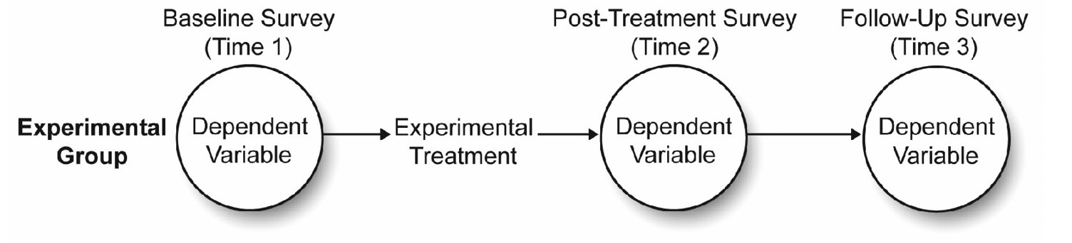
Figure 12.1 shows an experimental treatment (the marriage encounter program) positioned between Times 1 and 2. You therefore hypothesize that the investment scores observed immediately after this treatment (Post) will be significantly higher than scores observed just before this treatment (Pre or baseline).
However, Chapter 11 points out a weakness in this single-group repeated-measures design, if used inappropriately. The fictitious single-group study that assessed the effectiveness of the marriage encounter program is an example of a weak design. The statistical evidence that supported the hypothesis that Post (Time 2) scores are significantly higher than Pre (Time 1) scores was weak because there could be many alternative explanations for your findings that have nothing to do with the effectiveness of the marriage encounter program.
For example, if perceived investment increased from Time 1 to Time 2, you could argue that this change was due to the passage of time, rather than to the marriage encounter program. This argument asserts that the perception of investments naturally increases over time in all couples, regardless of whether they participate in a marriage encounter program. Because your study includes only one group, you have no evidence to show that this alternative explanation is wrong.
As the preceding discussion suggests, data obtained from a single-group experimental design with repeated measures generally provides weak evidence of cause and effect. To minimize the weaknesses associated with this design, it is often necessary to expand it into a two-group experimental design with repeated measures (a mixed design).
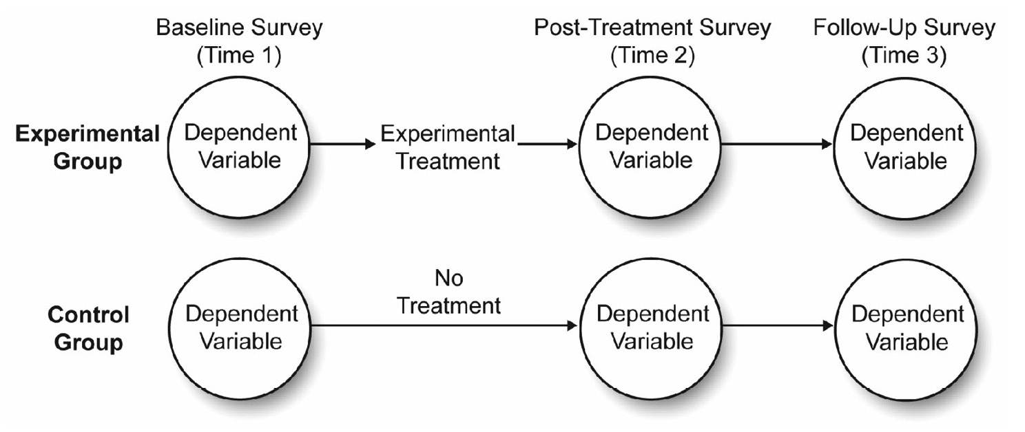
Figure 12.2 illustrates how to expand the current investment model study into a two-group design with repeated measures. This study begins with a single group of participants and randomly assigns each to one of the two experimental conditions. The experimental group goes through the marriage encounter program, and the control group does not go through the marriage encounter program. You administer the measure of perceived investment to both groups at three points in time:
- a baseline survey at Time 1 (Pre), immediately before the experimental group went through the marriage encounter program
- a post-treatment survey at Time 2 (Post), immediately after the experimental group went through the program
- a follow-up survey at Time 3 (Followup), three weeks after the experimental group went through the marriage intervention program
Figure 12.2: Two-Group Experimental Design with Repeated Measures
Advantages of the Two-Group Repeated-Measures Design
Including the control group makes this a more rigorous study compared to the single-group design presented earlier. The control group lets you test the plausibility of alternative explanations that can account for the study results.
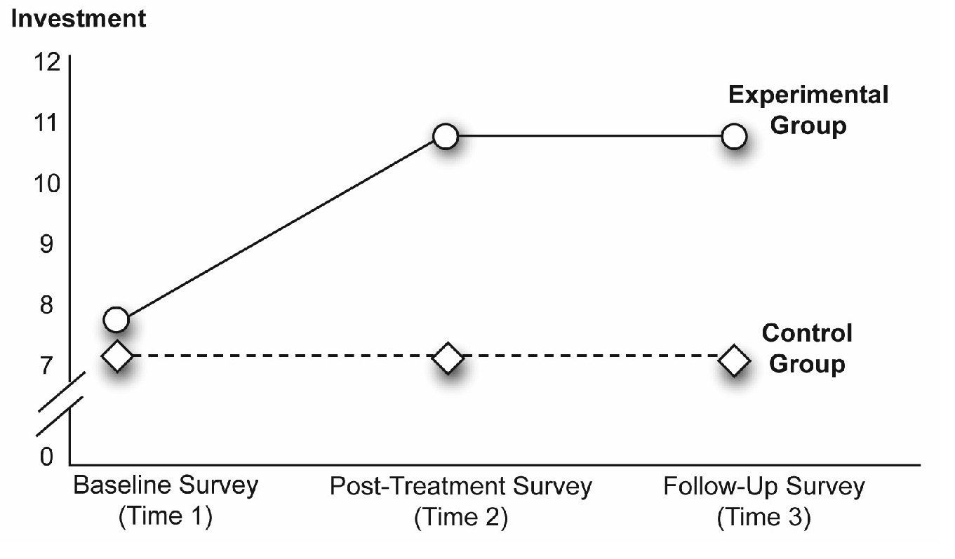
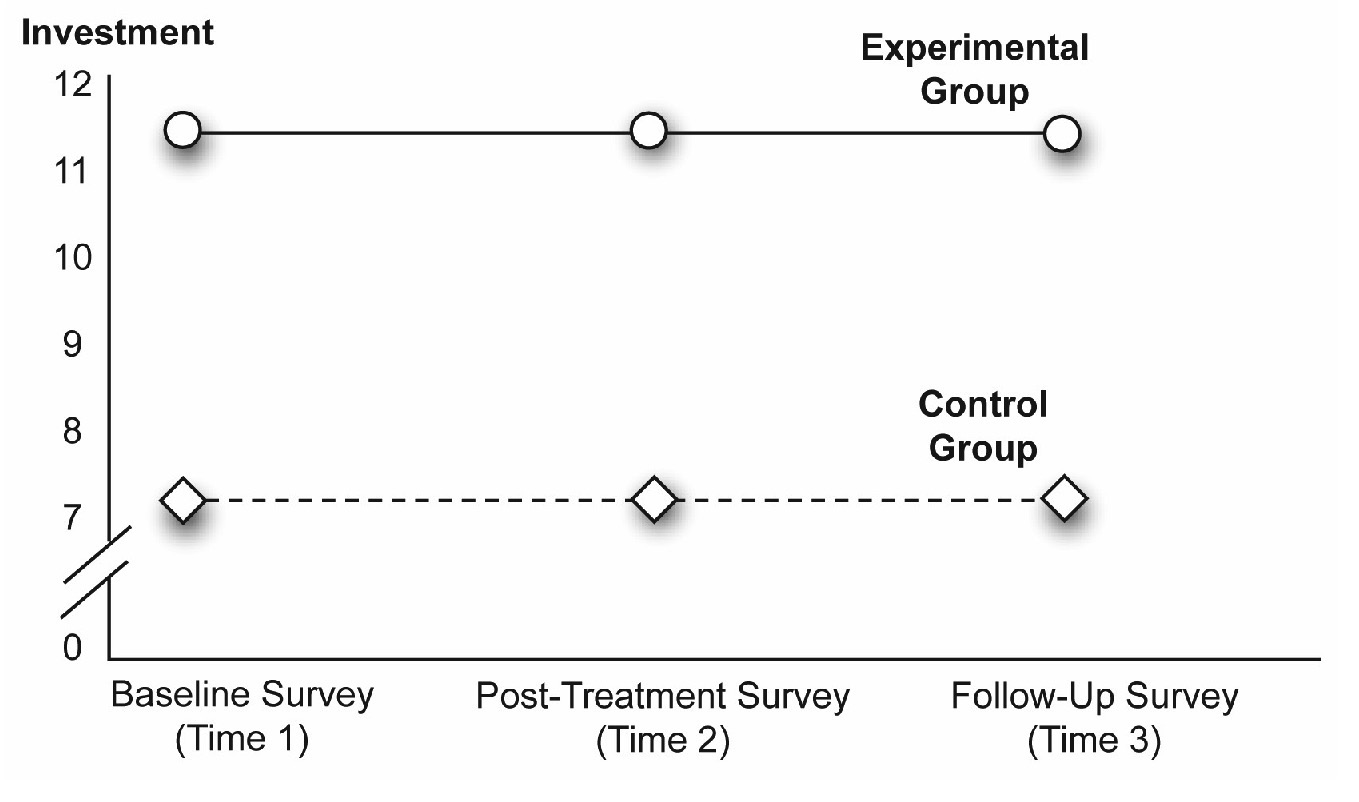
For example, consider a best-case scenario, in which you obtain the results that appear in Figure 12.3. These fictitious results show the mean investment scores displayed by the two groups at three points in time. The scores for the experimental group (the group that experienced the marriage encounter program) displayed a relatively low level of perceived investment at Time 1—the mean investment score is approximately 7 on a 12-point scale. The score for this group visibly increased following the marriage encounter program at Times 2 and 3—mean investment scores are approximately 11.5. These findings support your hypothesis that the marriage encounter program positively affects perceptions of investment.
In contrast, consider the line in Figure 12.3 that represents the mean scores for the control group (the group that did not participate in the marriage encounter program). Notice that the mean investment scores for this group begin relatively low at Time 1—about 6.9 on the 12-point scale, and do not appear to increase at Times 2 or 3 (the line remains relatively flat). This finding is also consistent with your hypothesis. Because the control group did not participate in the marriage encounter program, you did not expect them to demonstrate large improvements in perceived investments over time.
The results in Figure 12.3 are consistent with the hypothesis about the effects of the program, and the presence of the control group lets you discount many alternative explanations for the results. For example, it is no longer tenable for someone to argue that the increases in perceived investment are due simply to the passage of time (sometimes referred to as maturation effects). If that were the case you would expect to see similar increases in perceived investments in the control group, yet these increases are not evident. Similarly, it is not tenable to say the post-treatment scores for the experimental group are significantly higher than the post-treatment scores for the control group because of some type of bias in assigning participants to conditions. Figure 12.3 shows that the two groups demonstrated similar levels of perceived investment at the baseline survey of Time 1 (before the experimental treatment). Because this two-group design protects you from these alternative explanations (as well as some others), it is often preferable to the single-group procedure discussed in Chapter 11.
Figure 12.3: A Significant Interaction between Time and Group
Random Assignment to Groups
It is useful at this point to review the important role played by randomization in a mixed-design study. In the experiment just described, it is essential that volunteer couples be randomly assigned to either the treatment or control groups. In other words, the couples must be assigned to conditions by you (the researcher) and these assignments must be made in a completely random (unsystematic) manner, such as by using a coin toss or a table of random numbers.
The importance of random assignment becomes clear when you consider what might happen if participants are not randomly assigned to conditions. For example, imagine that the experimental group in this study consisted only of people who voluntarily chose to participate in the marriage encounter program, and that the control group consisted only of couples who had chosen not to participate in the program. Under these conditions, it would be reasonable to argue that a selection bias could affect the outcome of the study. Selection biases can occur any time participants are assigned to groups in a nonrandom fashion. When this happens, the results of the experiment might reflect pre-existing differences instead of treatment effects. In the study just described, couples that volunteered to participate in a marriage encounter weekend are probably different in some way from couples that do not volunteer. The volunteering couples could have different concerns about their relationships, different goals, or different views about themselves that influence their scores on the measure of investment. Such pre-existing differences could render any results from the study meaningless.
One way to rectify this problem in the present study is to ensure that you recruit all couples from a list of couples that volunteer to participate in the marriage encounter weekend. Then, randomly assign the couples to treatment conditions to ensure that the couples in both groups are as similar as possible at the start of the study.
Studies with More Than Two Groups
To keep things simple, this chapter focuses only on two-group repeated-measures designs. However, it is possible for these studies to include more than two groups under the between-subjects factors. For example, the preceding study included only two groups—a control group and an experimental group. A similar study could include three groups of participants such as
- the control group
- experimental group 1, which experiences the marriage encounter program
- experimental group 2, which experiences traditional marriage counseling
The addition of the third group lets you to test additional hypotheses. The procedures for analyzing the data from such a design are a logical extension of the two-group procedures described in this chapter.
Possible Results from a Two-Way Mixed-Design ANOVA
Before analyzing data from a mixed design, it is instructive to review some of the results possible with this design. This will help illustrate the power of this design, and lay a foundation for concepts to follow.
A Significant Interaction
In Chapter 9, “Factorial ANOVA with Two Between-Subjects Factors,” you learned that a significant interaction means that the relationship between one predictor variable and the response is different at different levels of the second predictor variable. In experimental research, the corresponding definition is
“The effect of one independent variable on the response variable is different at different levels of the second independent variable.”
To better understand this definition, refer back to Figure 12.3, which illustrates the interaction between Time and Group.
In this study, Time is the variable that coded the repeated-measures factor—Pre (Time 1) scores, Post (Time 2) scores, and Followup (Time 3) scores. Group is the variable that codes the between-subjects factor (experimental group or control group). When there is a significant interaction between a repeated-measures factor and a between-subjects factor, it means that the relationship between the repeated-measures factor and the response is different for the different groups coded under the between-subjects factor.
The two lines in Figure 12.3 illustrate this interaction. To understand this interaction, focus first on the line in the figure that illustrates the relationship between Time and investment scores for the experimental group. Notice that the mean for the experimental group is relatively low at Time 1 but significantly higher at Times 2 and 3. This shows that there is a significant relationship between Time and perceived investment for the experimental group.
Next, focus on the line that illustrates the relationship between Time and perceived investment for just the control group. Notice that this line is flat—there is little change from Time 1 to Time 2 to Time 3, which shows there is no relationship between Time and investment size for the control group.
Combined, these results illustrate the definition for an interaction. The relationship between one predictor variable (Time) and the response variable (investment size) is different at levels of the second predictor variable—the relationship between Time and investment size is significant for the experimental group, but non-significant for the control group.
To determine whether an interaction is significant, consult the appropriate reports in the JMP analysis results. However, it is also sometimes possible to identify a likely interaction by reviewing a figure that illustrates group means. For example, consider each line that goes from Time 1 to Time 2 in Figure 12.3. Notice that the line for the experimental group is not parallel to the line for the control group. The line for the experimental group has a steeper angle. Nonparallel lines are the hallmark of an interaction. Whenever a figure shows that a line segment for one group is not parallel to the corresponding line segment for a different group, it can mean that there is an interaction between the repeated-measures factor and the between-subjects factor.
Note: In some (but not all) studies that employ a mixed design, the central hypothesis can require that there be a significant interaction between the repeated-measures variable and the between-subjects variable. For example, in the present study that assessed the effectiveness of the marriage encounter program, a significant interaction shows that the experimental group displays a greater increase in investment size compared to the control group.
Significant Main Effects
If a given predictor variable is not involved in any significant interactions, you then determine whether that variable displays a significant main effect. When a predictor variable displays a significant main effect, there is a difference between at least two levels of that predictor variable with respect to scores on the response variable.
The number of possible main effects is equal to the number of predictor variables. The present investment model study has two predictor variables giving main effects—the repeated-measures factor (Time) and the between-subjects factor (Group).
A Significant Main Effect for Time
For example, Figure 12.4 shows a possible main effect for the Time variable that is an increasing linear trend. Notice that the investment scores at Time 2 are somewhat higher than the scores at Time 1, and that the scores at Time 3 are somewhat higher than the scores at Time 2. Whenever the values of a predictor variable are plotted on the horizontal axis of a figure, a significant main effect for that variable is indicated when the line segments display a relatively steep slope.
Figure 12.4: A Significant Effect for Time Only
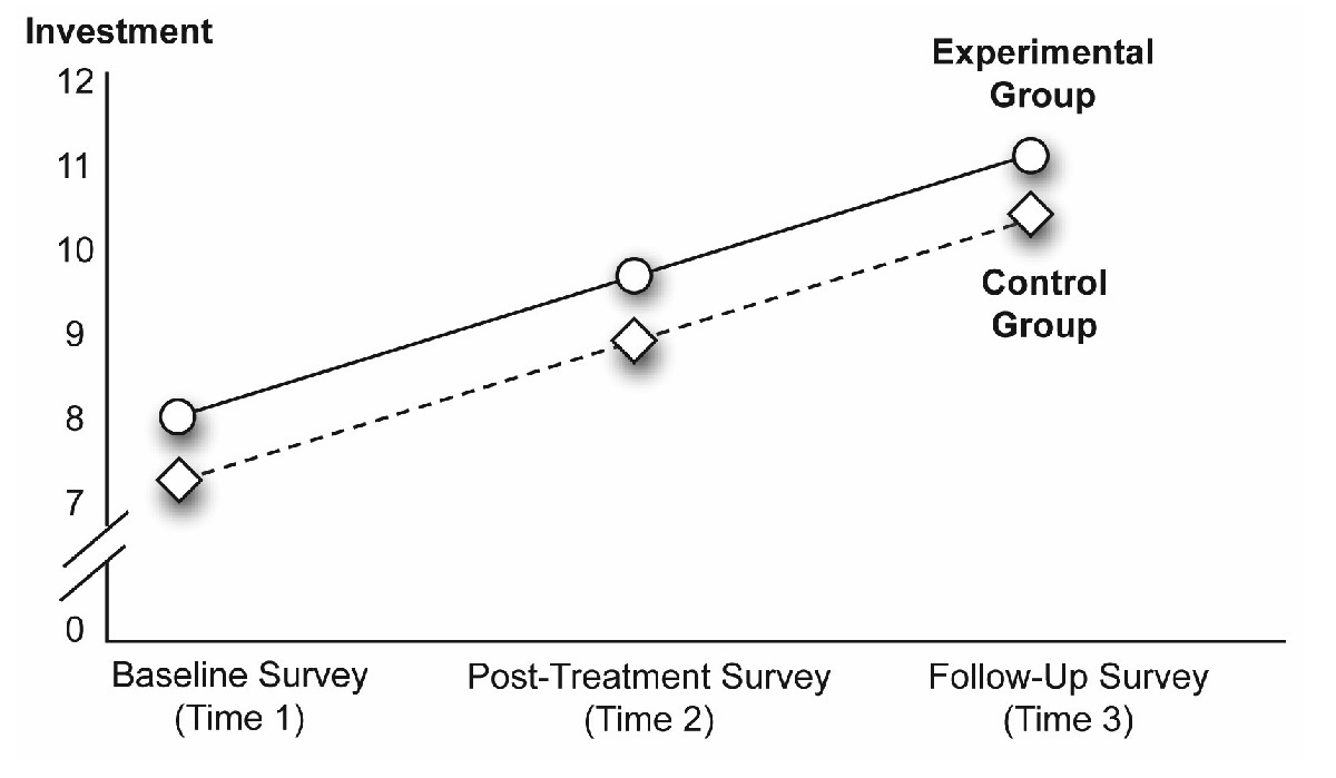
Here, the horizontal axis identifies the values of Time as “Baseline Survey (Time 1),” “Post-Treatment Survey (Time 2),” and “Follow-Up Survey (Time 3).” There is a relatively steep slope in the line that goes from Time 1 to Time 2, and from Time 2 to Time 3. These results typically indicate a significant main effect. However, always check the appropriate F test for the main effect in the JMP results to verify that it is significant.
The statistical analysis averages the main effect for Time over the groups in the study. In Figure 12.4, there is an overall main effect for Time after collapsing across the experimental group and control group.
A Significant Main Effect for Group
The previous figure illustrates a significant Time effect. If the Group effect is significant but Time is not, you expect to see a different pattern. The values of the predictor variable, Time, show as three separate points on the horizontal axis of the figure. In contrast, the values of the predictor variable, Group, are coded by drawing separate lines for the two groups under this variable. The line for the experimental group shows circles at each point and the line for the control group shows diamonds.
When a predictor variable, such as Group, is represented in a figure by plotting separate lines for its various levels, a significant main effect for that variable is evident when at least two of the lines are separate from each other, as in Figure 12.5.
Figure 12.5: A Significant Main Effect for Group Only
To interpret Figure 12.5, first determine which effects are probably not significant. You can see that all line segments for the experimental group are parallel to their corresponding segments for the control group. This tells you that there is probably not a significant interaction between Time and Group. Next, you can see that none of the line segments display a relatively steep angle, which this tells you that there is probably not a significant main effect for Time.
However, the line that represents the experimental group appears to be separated from the line that represents the control group. Now look at the individual data points. At Time 1, the experimental group displays a mean investment score that appears to be much higher than the one displayed by the control group. This same pattern of differences appears at Times 2 and 3. Combined, these are the results that you expect to see if there is a significant main effect for Group. Figure 12.5 suggests that the experimental group consistently demonstrated higher investment scores than the control group.
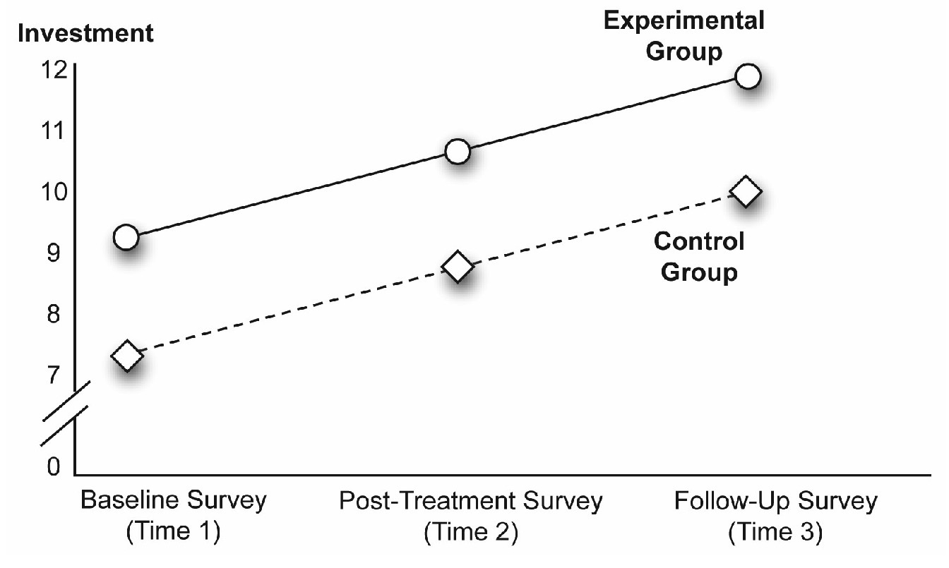
A Significant Main Effect for Both Predictor Variables
It is possible to obtain significant main effects for both predictor variables. Such an outcome appears in Figure 12.6. Note that the line segments display a relatively steep slope (indicative of a main effect for Time), and the lines for the two groups are also relatively separated (indicative of a main effect for Group).
Figure 12.6: Significant Main Effect for Both Time and Group
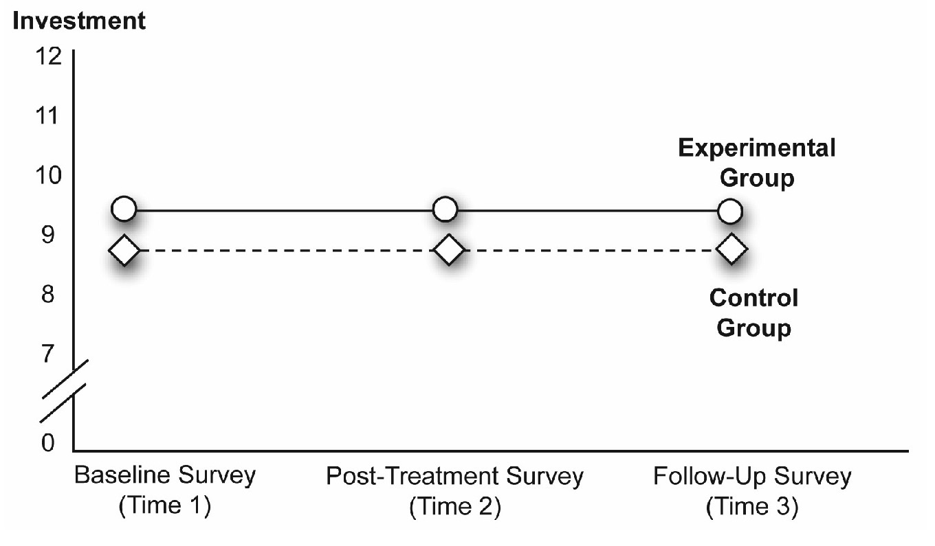
Nonsignificant Interaction, Nonsignificant Main Effects
Of course, there is no law that says that any of your effects have to be significant (as every researcher knows all too well!). This is evident in Figure 12.7. In this figure the lines for the two groups are parallel, which suggests a probable nonsignificant interaction. The lines have a slope of zero, which indicates that the main effect for Time is not significant. Finally, the line for the experimental group is not separated from the line for the control group, which suggests that the main effect for Group is also not significant.
Figure 12.7: A Nonsignificant Interaction, and Nonsignificant Main Effects
Problems with the Mixed-Design ANOVA
The proper use of a control group in a mixed-design investigation can help remedy some of the weaknesses associated with the single-group repeated-measures design. However, there are other problems that can affect a repeated-measures design even when it includes a control group.
For example, Chapter 11, “One-Way ANOVA with One Repeated-Measures Factor,” described a number of sequence effects that can confound a study with a repeated-measures factor. Specifically, repeated-measures investigations often suffer from
- order effects (effects that occur when the ordinal position of the treatments introduces response biases)
- carryover effects (effects that occur when the effect from one treatment changes, or carries over, to the participants’ responses in the following treatment conditions)
You should always be sensitive to the possibility of sequence effects with any type of repeated-measures design. In some cases, it is possible to successfully deal with these problems through the proper use of counterbalancing, spacing of trials, additional control groups, or other strategies. Some of these approaches were discussed previously in Chapter 11 in the “Sequence Effects” section.
Example with a Nonsignificant Interaction
The fictitious example presented here is a follow-up to the pilot study described in Chapter 11. The results of that pilot study suggest that scores on a measure of perceived investment significantly increase following a marriage encounter weekend. However, you can argue that those investment scores increased as a function of time and not because of the experimental manipulation. In other words, the investment scores could have increased simply because the couples spent time together and that this would have occurred with any activity, not just a marriage encounter experience.
To address concerns about this possible confound (as well as some others inherent in the one-group design), replicate the study as a two-group design. An experimental group again takes part in the marriage encounter program and a control group does not. You obtain repeated measures on perceived investment from both groups, as illustrated earlier in Figure 12.2.
Remember that this two-group design is generally considered to be superior to the design described in Chapter 11. You should use it in place of an uncontrolled design whenever possible.
The primary hypothesis is that the experimental group will show a greater increase in investment scores at post-treatment and follow-up than the control group. To confirm this hypothesis, you want to see a significant Group by Time interaction in the ANOVA. You also hypothesize (based on the results obtained from the pilot project described in Chapter 11) that the increased investment scores in the treatment group will still be found at follow-up. To determine whether the results are consistent with these hypotheses, it is necessary to check group means, review the results from the test of the interaction, and consult a number of post-hoc tests, which will be described later.
Using the JMP Distribution Platform
The response variable in this study is perceived Investment Size: the amount of time and effort that participants believe they have invested in their relationships (their marriages). Perceived investment is assessed with a survey constructed such that higher scores indicate greater levels of investment. Assume that these scores are assessed on a continuous numeric scale and that responses to the scale have been shown to demonstrate acceptable psychometric properties (validity and reliability).
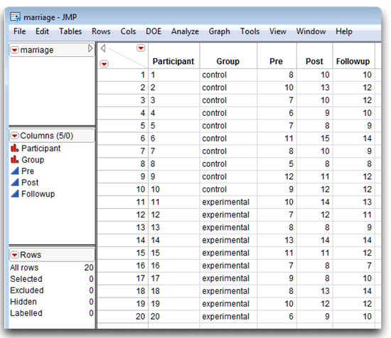
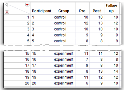
The JMP data table has a column for each of the three points in time. The data table, named mixed nointeraction.jmp (see Figure 12.8), has these variables:
- Pre lists investment scores obtained at Time 1 (the baseline survey).
- Post has investment scores obtained at Time 2 (the post-treatment survey).
- Followup contains investment scores obtained at Time 3 (the follow-up survey).
- Participant denotes each participant’s identification number (values range from 1 through n, where n = the number of participants).
- Group designates membership in either the “experimental” or “control” group.
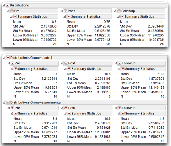
Begin by looking at descriptive statistics for the data. Use the Distribution platform to obtain descriptive statistics for all variables. Simple statistics for each variable provides an opportunity to check for obvious data entry errors.
Using the Distribution platform is important when analyzing data from a mixed-design study because the output of the Fit Model platform does not include a table of simple statistics for within-participants variables in a mixed-design ANOVA.
You want to look at means and other descriptive statistics for the investment score variables—Pre, Post, and Followup. You need to have the overall means (based on the complete sample) as well as the means by Group. That is, you need means on the three variables for the control group and the experimental group. The Distribution platform gives this information.
Figure 12.8: Data Table with Repeated Measures—No Significant Effects
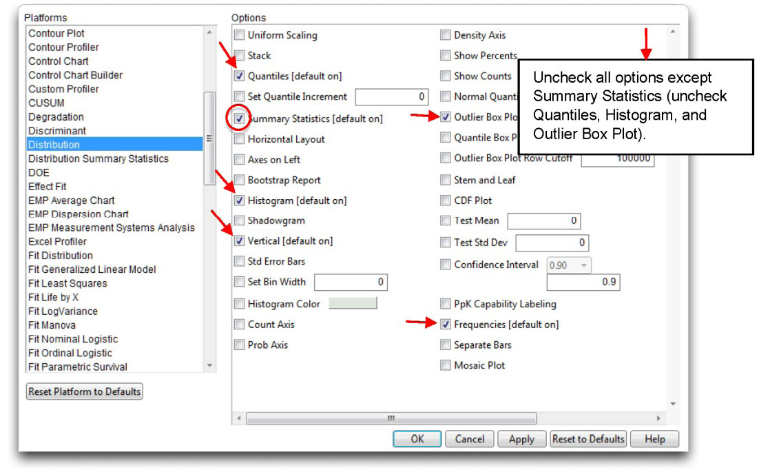
The next section shows you how JMP Preferences can be used to specify only the portions of analysis results you want to see. The Distribution analysis that follows uses these preferences.
Using Preferences (Optional)
The Distribution platform in JMP automatically (by default) shows histograms with an outlier box plot, a Quantiles table, and a Summary Statistics table for all numeric variables specified in its launch dialog.
In this example you only want to see Means and other simple statistics. One way to simplify or tailor the results from any JMP platform is with platform preferences. To change preferences for the Distribution platform, do the following:
![]() Choose the Preferences command from the File menu (Edit menu on the Macintosh).
Choose the Preferences command from the File menu (Edit menu on the Macintosh).
![]() When the initial Preferences panel appears, click on the Platforms tab.
When the initial Preferences panel appears, click on the Platforms tab.
![]() Select Distribution from the list of JMP platforms.
Select Distribution from the list of JMP platforms.
![]() Uncheck all the default results except for the Summary Statistics table, as shown in Figure 12.9.
Uncheck all the default results except for the Summary Statistics table, as shown in Figure 12.9.
With these preferences in effect, only the Summary Statistics table appears when you request results from the Distribution platform.
Note: The next time you do a distribution analysis, don’t forget to reset the Distribution platform preferences to the ones you want (usually the defaults noted in the list of platform features).
Figure 12.9: Use Platform Preferences to Tailor JMP Results
Distribution Platform Results
You want to see summary statistics for the three commitment measures over the whole sample and for each group separately. To do this, you need to launch the Distribution platform twice.
![]() First, launch the Distribution platform and specify the three response measures in the launch dialog.
First, launch the Distribution platform and specify the three response measures in the launch dialog.
![]() Click OK to see the overall statistics.
Click OK to see the overall statistics.
![]() Next, again launch the Distribution platform dialog. Specify the three responses, and also select Group as the By variable. Click OK to see results for each group.
Next, again launch the Distribution platform dialog. Specify the three responses, and also select Group as the By variable. Click OK to see results for each group.
These two Distribution analyses produce the tables in Figure 12.10. By using preferences, only the Summary Statistics tables appear. If you want to see more, the menu on the title bars of each table accesses all plots and tables given by the Distribution platform.
The results for the combined sample appear at the top of Figure 12.10. Review these overall means to get a sense for any general trends in the data. Remember that the variables Pre, Post, and Followup are investment scores obtained at Times 1, 2, and 3. The Pre variable displays a mean score of 8.60—the average investment score was 8.60 just before the marriage encounter weekend. The mean score on Post shows that the average investment score increased to 10.75 immediately after the marriage encounter weekend, and the mean investment score on Followup is 11.00 three weeks following the program. These means seem to display a fairly large increase in investment scores from Time 1 to Time 2, which suggests a significant effect for Time when you review ANOVA results.
Figure 12.10: Summary Statistics for the Marriage Data
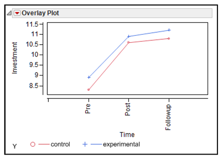
It is important to remember that, in order for the hypotheses to be supported, it is not adequate to merely observe a significant effect for Time. Instead, it is necessary to obtain a significant Time by Group interaction. Specifically, the increase in investment scores over time must be greater among participants in the experimental group than it is among those in the control group. To see whether such an interaction has occurred, you can first look at a figure that plots data for the two groups separately and then consult the F test for the interaction in the statistical analyses. Figure 12.11 shows a plot of the means from the Distribution results in Figure 12.10.
This JMP overlay plot requires that the data be restructured. The next section shows how to manipulate the raw data and produce the overlay plot shown here. A similar plot is automatically produced by the Fit Model platform when you analyze the data later.
Figure 12.11: Profile Plot of Mean Investment Scores
A Data Manipulation Adventure in JMP (Optional)
The overlay plot in Figure 12.11 is sometimes called a profile plot. A profile plot shows the response of one factor under different settings of another factor, and is automatically produced by the Fit Model platform when you analyze the data. To produce this plot from the raw data table requires the use of Tables menu commands. The data must be summarized and manipulated to arrange results suitable for the Overlay Plot command. These kinds of table manipulations are often necessary but not always explained in statistical texts. To produce the overlay plot above using the mixed nointeraction.jmp data table, do the following:
- Use Tables > Summary to produce a table of mean investment scores for each group at each time.
- Use Tables > Transpose to rearrange (transpose) the summarized table.
- Change the name of the first column in the transposed table from Label to Time.
Use the Column Info dialog for Time to assign it a List Check property, and change the default alphabetical order of the values so they are chronological: “Pre,” “Post,” and then “Followup.” By default, most platforms arrange values in alphabetic order. See Chapter 9, “Factorial ANOVA with Two Between-Subjects Factors, “the “Ordering Values in Analysis Results” section, for details about using the List Check property.
The remainder of this section shows the steps for these actions and includes more detailed explanation.
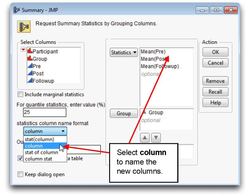
![]() With the mixed nointeraction.jmp table active, choose Summary from the Tables menu.
With the mixed nointeraction.jmp table active, choose Summary from the Tables menu.
![]() When the Summary dialog appears, select Pre, Post, and Followup in the variable list on the left in the dialog, and Mean from the Statistics menu in the Summary dialog.
When the Summary dialog appears, select Pre, Post, and Followup in the variable list on the left in the dialog, and Mean from the Statistics menu in the Summary dialog.
![]() Select Group from the variable list, and click Group in the Summary dialog.
Select Group from the variable list, and click Group in the Summary dialog.
![]() Select Column from the Statistics Column Name Format menu in the Summary dialog to assign the original column names to columns in the new table.
Select Column from the Statistics Column Name Format menu in the Summary dialog to assign the original column names to columns in the new table.
![]() Click OK to see the Summary table, which is shown with the completed Summary dialog in Figure 12.2.
Click OK to see the Summary table, which is shown with the completed Summary dialog in Figure 12.2.
Figure 12.12: Completed Summary Dialog and Resulting JMP Table
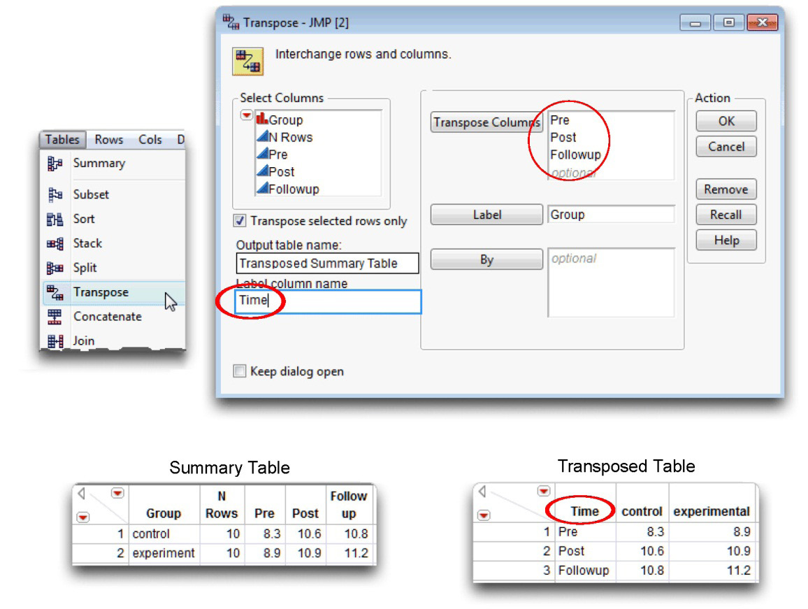
However, this summarized table is not in the form needed to produce an overlay plot of mean investment scores for the groups shown previously in Figure 2.11. To plot the investment means at each time period for each group requires that the time periods be rows in the table, and the groups be columns. The Transpose feature in JMP can rearrange the table:
![]() With the new Summary table active, choose the Transpose command from the Tables menu.
With the new Summary table active, choose the Transpose command from the Tables menu.
![]() When the Transpose dialog first appears, all columns show in the Columns to be transposed list. Highlight the N rows variable, and click the Remove button in the dialog.
When the Transpose dialog first appears, all columns show in the Columns to be transposed list. Highlight the N rows variable, and click the Remove button in the dialog.
![]() Select Pre, Post, and Followup in the Columns list on the left of the dialog, and click the Add button.
Select Pre, Post, and Followup in the Columns list on the left of the dialog, and click the Add button.
![]() Select Group in the Columns list, and click the Label button in the Transpose dialog. The completed dialog should look like the one shown in Figure 12.13.
Select Group in the Columns list, and click the Label button in the Transpose dialog. The completed dialog should look like the one shown in Figure 12.13.
![]() Click OK in the dialog to see the transposed table. Note that the values of “Group, “control,” and “experimental” are column names in the new table.
Click OK in the dialog to see the transposed table. Note that the values of “Group, “control,” and “experimental” are column names in the new table.
![]() In the new transposed table, change the name of the column called “Label” to “Time” to make the overlay plot more easily readable.
In the new transposed table, change the name of the column called “Label” to “Time” to make the overlay plot more easily readable.
Figure 12.13: Transpose Dialog and Transposed Table—Columns to Rows
The transposed table of summarized data now lends itself to the Overlay Plot platform.
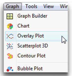
![]() With the transposed table active, choose Overlay Plot from the Graph menu, as shown here.
With the transposed table active, choose Overlay Plot from the Graph menu, as shown here.
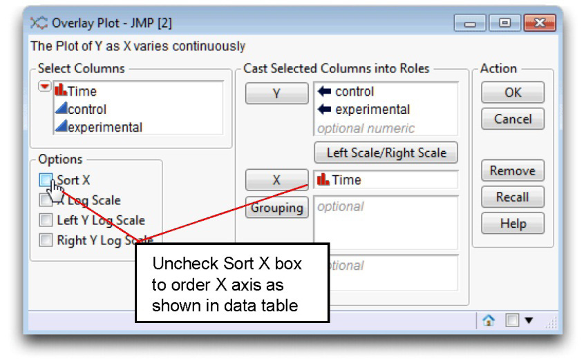
![]() Complete the dialog as shown in Figure 12.14. Be sure to uncheck the Sort X box so that the X axis is arranged as found in the data table.
Complete the dialog as shown in Figure 12.14. Be sure to uncheck the Sort X box so that the X axis is arranged as found in the data table.
![]() Click OK to see the overlay profile plot shown in Figure 12.11, and again here.
Click OK to see the overlay profile plot shown in Figure 12.11, and again here.
![]() On the overlay plot, double-click on the Y axis name to edit it. Change the name from “Y” to “Investment.”
On the overlay plot, double-click on the Y axis name to edit it. Change the name from “Y” to “Investment.”
![]() If the points are not connected, use the Y Options > Connect Points command found in the red triangle menu on the Overlay Plot title bar.
If the points are not connected, use the Y Options > Connect Points command found in the red triangle menu on the Overlay Plot title bar.
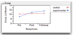
On the plot, the line with the x markers illustrates mean scores for the control group. These mean scores are the Pre, Post, and Followup means that appear in the summary statistics shown in Figure 12.10 and in the summary table. The line with the square markers illustrates mean scores for the experimental group.
The general pattern of means does not suggest an interaction between Time (Pre, Post and Followup) and Group. When two variables are involved in an interaction, the lines that represent the various groups tend not to be parallel. So far, the lines for the control group and experimental group do appear to be parallel. This might mean that the interaction is nonsignificant. However, the only way to be sure is to analyze the data and compute the appropriate statistical test. The next section shows how to do this.
Figure 12.14: Completed Overlay Plot Dialog and Results
You should now see the overlay plot shown previously in Figure 12.11.
Testing for Significant Effects with the Fit Model Platform
The Fit Model platform can test for interaction between Time and Group in the mixed nointeraction.jmp data table.
![]() First, click the nointeraction.jmp data table so that it is the active table.
First, click the nointeraction.jmp data table so that it is the active table.
![]() Next, choose Fit Model from the Analyze menu.
Next, choose Fit Model from the Analyze menu.
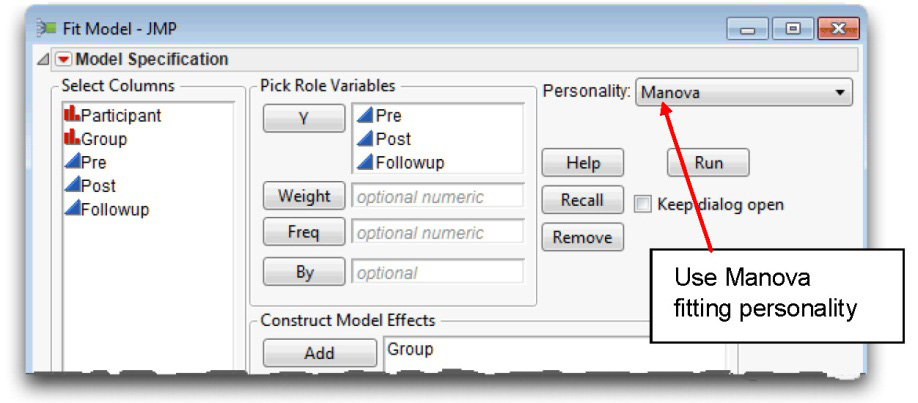
![]() Complete the dialog as shown in Figure 12.15. The three time variables, Pre, Post, and Followup, record the investment scores over time and are the response (Y) variables. Group is the model effect, which is the between-subjects factor.
Complete the dialog as shown in Figure 12.15. The three time variables, Pre, Post, and Followup, record the investment scores over time and are the response (Y) variables. Group is the model effect, which is the between-subjects factor.
![]() Be sure to choose Manova from the Personality menu.
Be sure to choose Manova from the Personality menu.
Figure 12.15: Fit Model Dialog for Repeated Measures Analysis
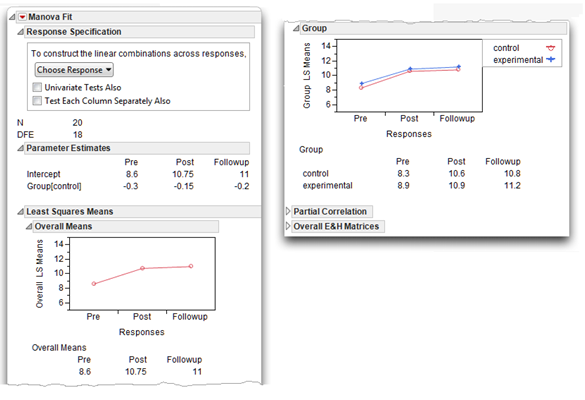
![]() Click Run in the Fit Model dialog to see the initial Manova Fit panel shown in Figure 12.16.
Click Run in the Fit Model dialog to see the initial Manova Fit panel shown in Figure 12.16.
Figure 12.16: Initial MANOVA Results for the No Interaction Data
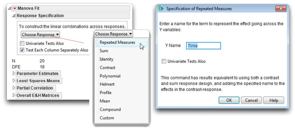
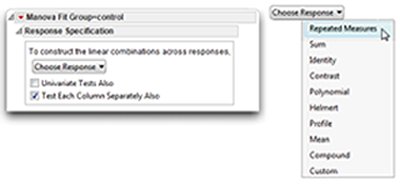
Notes on the Response Specification Dialog
The Response Specification dialog, which is shown at the top of the MANOVA Fit platform, lets you interact with the MANOVA analysis. Each time you select a response design (other than Repeated Measures) from the Choose Response menu, the structure of the analysis shows in the Response Specification dialog. When you click Run, JMP performs that analysis and appends it to the bottom of the report, following any previous analysis you requested.
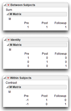
Note: The structure of the Repeated Measures design is a combination of the Contrast and the Sum response designs. The Repeated Measures design uses the Sum design to compute the between-subjects statistics, and uses the Contrast design to compute the within-subjects statistics.
Computations for the MANOVA are a function of a linear combination of responses. The response design selection from the Choose Response menu defines this linear combination. The response structure is called the M matrix and is included with each requested multivariate analysis. You can see this structure in the Response Specification dialog when you select a response model, or open the M matrix in the analysis report. The columns of the M matrix define the set of transformation variables for the multivariate analysis.
Looking at the M matrix tells you which kind of multivariate analysis has been done.
The following list describes three commonly used response designs with associated M matrices (shown here).
- The Sum design is the sum of the responses, giving a single response value.
- The Identity design uses each separate response, as shown by the identity matrix.
- The Contrast design compares each response to the first response. You can see in the Contrast M Matrix that this kind of analysis compares the pre-weekend response to both the post-weekend response and the follow-up response.
Test Each Column Separately
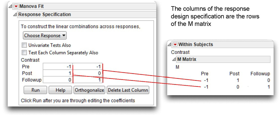
When you select the Test Each Column Separately Also check box in the initial MANOVA dialog, the analysis results include a univariate ANOVA for each column in the design specification. Note that each column of the design specification appears as a row of the M matrix (the M matrix is a transpose of the design specification).
The example in Figure 12.17 shows a Contrast design and its M matrix. This example requests an ANOVA for each column in the design, which produces a contrast of Pre and Post responses, and a second contrast of Pre and Followup responses.
Figure 12.17: Response Design and M Matrix
The Repeated Measures Response Design
There are initial parameter estimates, least squares means with plots (shown earlier in Figure 12.16), correlations among the response columns, and E and H matrices. The E and H matrices are the error and hypothesis cross-product matrices. For more details about these results, see Modeling and Multivariate Methods(2012), which can be found on the Help menu.
To continue with the analysis,
![]() Choose Repeated Measures from the Response dialog, as shown in Figure 12.18. This is called selecting a response model.
Choose Repeated Measures from the Response dialog, as shown in Figure 12.18. This is called selecting a response model.
When you choose the Repeated Measure response, the Specification of Repeated Measures dialog shown in Figure 12.18 appears, prompting you for a name that identifies the Y (repeated) variables. By default this name is Time, which is often the nature of the repeated measures and is appropriate for this example.
Recall that the repeated measures selection does not display a single design, as shown previously, because the repeated measures analysis uses the Sum response design to compute between-subjects statistics and a Contrast response design for the within-subjects analysis.
![]() Select the Test Each Column Separately Also check box to see a comparison of the post-weekend and follow-up responses to the pre-weekend baseline response.
Select the Test Each Column Separately Also check box to see a comparison of the post-weekend and follow-up responses to the pre-weekend baseline response.
Figure 12.18: Initial Results from MANOVA Analysis
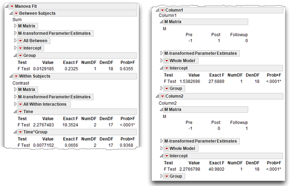
Results of the Repeated Measures MANOVA Analysis
![]() Click OK in the Specification of Repeated Measures dialog to see the repeated measures analysis appended to the initial analysis (see Figure 12.19).
Click OK in the Specification of Repeated Measures dialog to see the repeated measures analysis appended to the initial analysis (see Figure 12.19).
Note: The MANOVA reports contain more information than is needed in this example so unneeded outline nodes are closed. Figure 12.19 shows everything you need for this example.
You see both between-subjects results and within-subjects results. In a repeated-measures design, selecting Test Each Column Separately Also shows contrasts between time periods. These contrasts are appended to the report, as shown on the right in Figure 12.19. The “Steps to Review the Results” section includes an explanation of these results.
Figure 12.19: MANOVA Analysis for Investment Study
Steps to Review the Results
Step 1: Make sure that everything looks reasonable. As always, before interpreting the results it is best to review the results for possible signs of problems. Most of these steps with a mixed-design MANOVA are similar to those used with between-subjects designs. That is, check the number of observations listed in the initial MANOVA results, labeled N, to make certain the analysis includes all the observations. The initial MANOVA results show that N is 20 (see Figure 12.18). Also note that the degrees of freedom for error (DFE) is 18, which tells you there are two group levels (N – DFE = number of group levels, “control” and “experimental”).
Step 2: Determine whether the interaction term is statistically significant. First check the interaction effect. If the interaction effect is not statistically significant, then you can proceed with interpretation of main effects. This chapter follows the same general procedure recommended in Chapter 10, “Multivariate Analysis of Variance (MANOVA) with One Between-Subjects Factor,” in which you first check for interactions and then proceed to test for main effects and examine post-hoc analyses.
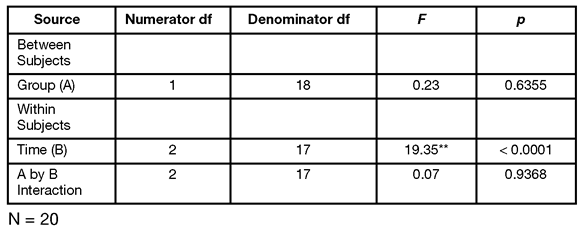
The results of the within-subjects multivariate significance test for the Time by Group interaction shows an F-value of 0.0656 with an associated probability value of 0.9368. You conclude that there is no interaction between Time and Group. The control and experimental groups respond the same over time.
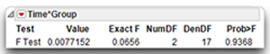
The primary hypothesis for this study required a significant interaction but you now know that the data do not support such an interaction. If you actually conducted this research project, your analyses might terminate at this point. However, in order to illustrate additional steps in the analysis of data from a mixed-design, this section looks at the tests for main effects.
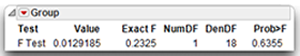
Step 3: Determine if the Group Effect is statistically significant. In this chapter, the term group effect is used to refer to the effect of the between-subjects factor. In the present study, the variable named Group represented this effect.
The group effect is of no real interest in the present investment-model investigation because support for the study’s central hypothesis required a significant interaction. Nonetheless, it is still useful to plot group means and review the statistic for the group effect in order to validate the methodology used to assign participants to groups. For example, if the effect for Group proved to be significant and if the scores for one of the treatment groups were consistently higher than the corresponding scores for the other treatment group (particularly at Time 1), it could indicate that the two groups were not equivalent at the beginning of the study. This might suggest that there was some type of bias in the selection and assignment process. Such a finding could invalidate other results from the study.
The test for the Group effect shows that the obtained F-value for the Group effect is only 0.2325 with 1 and 18 degrees of freedom and is not significant. The p-value for this F is 0.6355, much greater than 0.05, which indicates that there is not an overall difference between experimental and control groups with respect to their mean investment scores. Figure 12.11 previously illustrated this finding, which shows that there is very little separation between the line for the experimental group and the line for the control group.
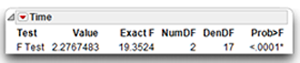
Step 4: Determine if the time effect is statistically significant. In this chapter, the term time effect refers to the effect of the repeated-measures factor. Remember that the word Time was designated in the initial platform dialog to code the repeated-measures factor, which consists of the variables Pre, Post, and Followup. A main effect for Time suggests that there is a significant difference between investment scores obtained at one time and the investment scores obtained at least one other time during the study.
The multivariate test for the Time effect appears just above the Time by Group interaction effect. You can see that the multivariate F for the Time effect is 19.3524. This computed F-value with 2 and 17 degrees of freedom, is significant at p < 0.0001. That is, the overall within-subjects effect across the three time variables is a highly significant effect. Time is a significant effect for both groups, but there appears to be no difference between groups.
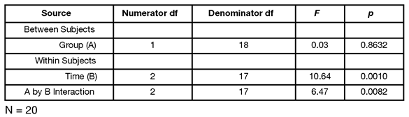
Step 5: Prepare you own version of the ANOVA summary table. Table 12.1 summarizes the preceding analysis of variance.
Table 12.1: MANOVA Summary Table for Study Investigating Changes in Investments Following an Experimental Manipulation (Nonsignificant Interaction)
Step 6: Review the results of the contrasts. The specification of the analysis included multivariate the Test Each Column Separately Also option, checked in the initial multivariate results (see Figure 12.18). For a repeated-measures analysis, this option performs the contrast described by the M matrix of the Within Subjects analysis, which is shown here. The first row of the M matrix compares the Pre scores to the Post scores. The second row compares the Pre scores to the Followup scores.
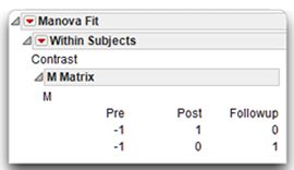
The contrast analyses show at the bottom of the Within Subjects analysis, labeled Column 1 and Column 2 in the report. The Column 1 report compares the Time 1 (Pre) investment scores with Time 2 (Post) scores. Column 2 compares Time 1 (Pre) with the Time 3 (Followup) scores.
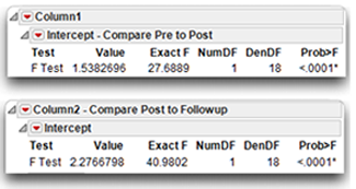
- The comparison of Time 1 to Time 2 has an F ratio of 27.6889, which is significant at p < 0.0001. You can reject the null hypothesis that there is no difference between Time 1 (Pre) investment scores and Time 2 (Post) investment scores in the population.
- The analysis that compares Time 2 to Time 3 has an F ratio of 40.9802 with an associated p < 0.0001. You can also reject the null hypothesis that there is no difference between Time 1 (Pre) investment scores and Time 3 (Followup) investment scores in the population.
Recall that the plot of means also suggested Time 2 scores were significantly higher than Time 1 scores for both experimental and control groups. This same plot (see Figure 12.20) is the overlay plot of the Least Squares Means shown at the beginning of the multivariate analysis. Since the design is balanced, the LSMeans are the same as each of the group means, which are shown in the table beneath the plot.
Figure 12.20: Least Squares Means Plot in Multivariate Analysis Report
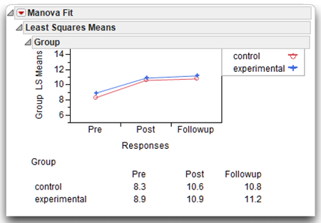
Visualizing the experimental results with the overlay plot and looking at the table of means leads you to believe that the pre-treatment scores are lower than either the post-treatment or follow-up scores. The MANOVA gives significant statistical support to the belief that there is an overall difference in group means for the control and experimental groups. Also, the mean investment score at Time 1 (Pre) is significantly different than means scores at both Time 2 (Post) and Time 3 (Followup).
Summarize the Analysis Results
The results of this mixed-design analysis can be summarized using the standard statistical interpretation format presented earlier in this book:
A. Statement of the problem
B. Nature of the variables
C. Statistical test
D. Null hypothesis (H0)
E. Alternative hypothesis (H1)
F. Obtained statistic
G. Obtained probability p-value
H. Conclusion regarding the null hypothesis
I. MANOVA summary table
J. Figure representing the results
This summary could be performed three times: once for the null hypothesis of no interaction in the population; once for the null hypothesis of no main effect for Group; and once for the null hypothesis of no main effect for Time. As this format has been already described, it does not appear again here.
Formal Description of Results for a Paper
Following is one way that you could summarize the present results for a published paper.
Results were analyzed using a multivariate analysis of variance (MANOVA) with repeated measures on time represented by pre-, post-, and follow-up treatment investment scores. The Group by Time interaction was not significant, F(2,17) = 0.07, p = 0.9368, nor was the main effect of Group, F(1,18) = 0.23, p = 0.63. However, this analysis did reveal a significant effect for Time, F(2,17) = 19.75, p < 0.0001. Post-hoc contrasts found that investment scores at the post-treatment and follow-up times were significantly higher than the scores observed at baseline (Time 1) with p < 0.0001.
Example with a Significant Interaction
The initial hypothesis stated that the investment scores would increase more for the experimental group than for the control group. Support for this hypothesis requires a significant Time by Group interaction. This section analyzes a different set of fictitious data, where participant responses provide the desired interaction. You will see that it is necessary to perform a number of different follow-up analyses when there is a significant interaction in a mixed-design MANOVA. Figure 12.21 shows the JMP data table, mixed interaction.jmp.
Figure 12.21: Investment Data with Interaction
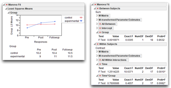
Use the Fit Model platform to run the same analysis as described previously in the “Testing for Significant Effects with the Fit Model Platform” section (see Figure 12.15). The results for the data with a significant interaction are shown in Figure 12.22. Before you select the Repeated Measures response design, note that the interaction shows clearly in the Group profile pot, which is part of the initial analysis. The profile plot on the left in Figure 12.22 shows that the means of each group (experimental and control) over time are not parallel—in fact they are crossed, denoting interaction between Time and Group.
Figure 12.22: Repeated Measures Analysis with Significant Interaction
Steps to Review the Output
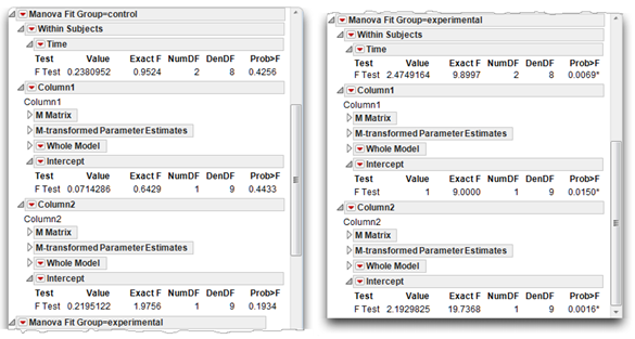
Step 1: Determine whether the interaction term is statistically significant. Once you scan the results in the usual manner to verify that there are no obvious errors in the program or data, check the appropriate statistics to see whether the interaction between the between-subjects factor and the repeated-measures factor is significant. The interaction results are part of the Within Subjects analysis, and appear as the Time*Group report. The exact F-value for this interaction term is 6.4657. With 2 and 17 degrees of freedom, the p-value for this F is 0.0082, which indicates a significant interaction. This finding is consistent with the hypothesis that the relationship between the Time variable and investment scores is different for the two experimental groups.
Step 2: Examine the Interaction. The interaction plot shown here and in Figure 12.22 clearly shows the interaction. Notice that the line for the experimental group is not parallel to the line for the control group, which is what you expect with a significant Time by Group interaction. You can see that the line for the control group is relatively flat. There does not appear to be an increase in perceived investment from Pre to Post to Followup times. In contrast, notice the angle displayed by the line for the experimental group. There is an apparent increase in investment size from Pre to Post, and another slight increase from Post to Followup.
These findings are consistent with the hypothesis that there is a larger increase in investment scores in the experimental group than in the control group. However, to have more confidence in this conclusion, you want to test for simple effects.
Step 3: Test Simple Effects. Testing simple effects (called testing slices in JMP) determines whether there is a significant relationship between one predictor variable and the response for participants at one level of the second predictor variable. The concept of testing slices to look at simple effects is covered in Chapter 9, “Factorial ANOVA with Two Between-Subjects Factors.”
In the present study you might want to determine whether there is a significant relationship between Time and the investment variable among those participants in the experimental group. If there is, you can state that there is a simple effect for Time at the experimental level of Group.
To better understand the meaning of this, consider the line in the interaction plot that represents the experimental group. This line plots investment scores for the experimental group at three points in time. If there is a simple effect for Time in the experimental group, it means that investment scores obtained at one point in time are significantly different than investment scores obtained at one other point in time. If the marriage encounter program is effective, you expect to see a simple effect for Time in the experimental group—investment scores should improve over time in this group. You do not expect to see a simple effect for Time in the control group because they did not experience the program.
To test for the simple effects of the repeated-measures factor (Time, in this case), it is necessary to consider participants separately based on their classification under the group variable, Group. This is easily done by assigning the Group variable as a By variable in the Fit Model dialog.
To do this,
![]() Click the mixed interaction.jmp table so that it is active.
Click the mixed interaction.jmp table so that it is active.
![]() Choose Analyze > Fit Model.
Choose Analyze > Fit Model.
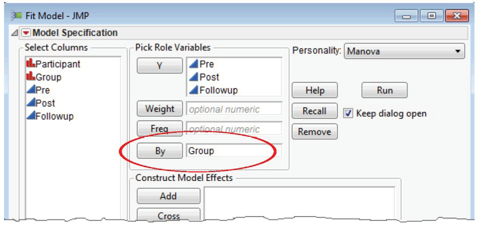
![]() Do not assign Group as a Model Effect. Instead assign Group as a By variable as shown in Figure 12.23.
Do not assign Group as a Model Effect. Instead assign Group as a By variable as shown in Figure 12.23.
Figure 12.23: Exclude/Include Command to Exclude Rows from Analysis
![]() Click Run to see the initial analysis of Time for each level of the Group variable.
Click Run to see the initial analysis of Time for each level of the Group variable.
![]() On the initial result for each level of Group, first select the Test Each Column Separately Also check box.
On the initial result for each level of Group, first select the Test Each Column Separately Also check box.
![]() For each level of Group, select Repeated Measures from the Choose Response menu.
For each level of Group, select Repeated Measures from the Choose Response menu.
The results of the simple effects analysis for each level of the Group variable are shown in Figure 12.24.
The simple effect test of Time at the “control” level of Group appears on the left in Figure 12.24. The F-value of 0.9524 with 2 and 8 degrees of freedom gives a nonsignificant simple effect for Time in the control group (p = 0.4256).
- The simple effect test of Time at the “experimental” level of Group appears on the right in Figure 12.24. The F-value of 9.8997 with 2 and 8 degrees of freedom gives a significant simple effect for Time in the experimental group (p = 0.0069).
The simple effect for the “control” group is not significant so you don’t need to look at contrasts for that group.
The simple effect for Time is significant in the “experimental” group so you can interpret the planned contrasts that appear beneath the test for Time. These contrasts show that in the experimental group,
- There is a significant difference between mean scores obtained at Time 1 (Pre) versus those obtained at Time 2 (Post), labeled Column1 in the results. The F-value with 1 and 9 degrees of freedom is 9.00, with p = 0.0150.
- There is also a significant difference between mean scores obtained at Time 1 (Pre) versus Time 3 (Followup) with F(1, 9) = 19.7368 and p = 0.0016.
Figure 12.24: Results of Simple Effects Analysis of Time in Control Group (left) and Experimental Group (right)
Although these results seem straightforward, there are two complications in the interpretation.
You performed multiple tests (one test for each level under the Group factor), which means that the significance level initially chosen needs to be adjusted to control for the experiment-wise probability of making a Type I error (rejection of a true null hypothesis or finding a significant difference when there is no difference in the population). Looney and Stanley (1989) recommend dividing the initial alpha (0.05 in the present study) by the number of tests conducted, and using the result as the required significance level for each test. This adjustment is also referred to as a Bonferroni correction. For example, assume the alpha is initially set at 0.05 (per convention) in this investigation. You perform two tests for simple effects, so divide the initial alpha by 2, giving an actual alpha of 0.025. When you conduct tests for simple effects, you conclude that an effect is significant only if the p-value that appears in the output is less than 0.025. This approach to adjusting alpha is viewed as a rigorous adjustment. There are other approaches to protect the experiment-wise error rate, but they are not included in this book.
The second complication involves the error term used in the analyses. With the preceding approach, the error term used in computing the F ratio for a simple effect is the mean square error from the one-way ANOVA based on data from one group. An alternative approach is to use the mean square error from the test that includes the between-subjects factor, the repeated-measures factor, and the interaction term, found in the original analysis (the “omnibus” model) shown in Figure 12.22. This second approach has the advantage of using the same yardstick (the same mean square error) in the computation of both simple effects. Some authors recommend this procedure when the mean squares for the various groups are homogeneous. On the other hand, the first approach in which different error terms are used in the different tests has the advantage (or disadvantage, depending upon your perspective) of providing a slightly more conservative F test because it involves fewer degrees of freedom for the denominator. For a discussion of the alternative approaches for testing simple effects, see Keppel (1982, pp. 428–431), and Winer (1971, pp. 527–528).
This section discussed simple effects only for the Time factor. It is also possible to perform tests for three simple effects for the Group factor. Specifically, you can determine whether there is a significant difference between the experimental group and the control group with respect to
- investment scores obtained at Time 1 (pre-weekend)
- investment scores obtained at Time 2 (post-weekend)
- investment scores obtained at Time 3 (follow-up)
Because there are only two levels of Group, you can use the Fit Y by X platform as described in Chapter 8, “One-Way ANOVA with One Between-Subjects Factor” to test simple effects for Group. Analyzing these simple effects is left as an exercise for the reader as these analyses do not yield any significant results.
When you look at the big picture of the Group by Time interaction discovered in this analysis, it becomes clear that the interaction is due to a simple effect for Time at the “experimental” group level of Group. On the other hand, there is no evidence of a simple effect for Group at any level of Time.
Step 4: Prepare your own version of the MANOVA summary table. Table 12.2 presents the MANOVA summary table from the analysis (see Figure 12.21).
Table 12.2: MANOVA Summary Table for Study Investigating Changes in Investments Following an Experimental Manipulation (Significant Interaction)
Formal Description of Results for a Paper
Results were analyzed using a two-way ANOVA with repeated measures on one factor. The Group by Time interaction was significant, F(2,17) = 6.466, p = 0.0082. Tests for simple effects showed that the mean investment scores for the control group displayed no significant differences across time, F(2,8) = 0.9524, p = 0.4256. However, the experimental group did display significant increases in perceived investment across time, F(2,8) = 9.8997, p < 0.0096. Post-hoc contrasts showed that the experimental group has significantly higher scores at post-test [F(1,9) = 9.00, p < 0.05] and follow-up [F(1,9) = 19.74, p < 0.01] compared to baseline.
Summary
In summary, the two-way mixed design ANOVA is appropriate for a type of experimental design frequently used in social science research. The most common form of this design divides participants groups and provides repeated measures on the response variable at various time intervals. The MANOVA analysis automatically selects the correct error terms for the analysis. However, the disadvantage is that multiple comparisons across group levels are not available.
Appendix A: An Alternative Approach to a Univariate Repeated-Measures Analysis
The examples in this chapter used the Fit Model platform to perform a multivariate repeated-measures analysis. The examples in Chapter 11, “One-Way ANOVA with One Repeated-Measures Factor,” also used the Fit Model multivariate platform, but included univariate F tests, which are an option on the multivariate control panel (see Figure 12.16). Univariate F tests are appropriate if conditions of sphericity are met.
Sphericity is a characteristic of a difference-variable covariance matrix obtained when performing a repeated-measures ANOVA. The concept of sphericity was discussed in greater detail in Chapter 11.
If sphericity is not a concern and you want to do a univariate analysis of repeated-measures data, there is an alternate way to specify the model in the Fit Model dialog. This appendix shows that method and compares the results to those given by the multivariate model.
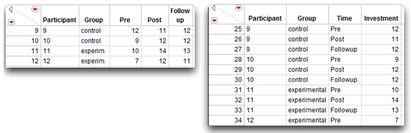
First, to perform a univariate repeated-measures analysis, the data need to be restructured. Figure 12.25 shows partial listings of the data table called mixed nointeraction.jmp, and the restructure of that data, called stacked nointeraction.jmp. You can find an example that shows how to use the Stack command to restructure data in Chapter 7, “t-Tests: Independent Samples and Paired Samples.”
In the stacked table, the repeated measures are stacked into a single column and identified by the variable called Time with values “Pre,” “Post,” and “Followup,” Notice that Participant, Group, and Time are character (nominal) variables.
Figure 12.25: Repeated Measures Data (left) and Stacked Data (right)
Specifying the Fit Model Dialog for Repeated Measures
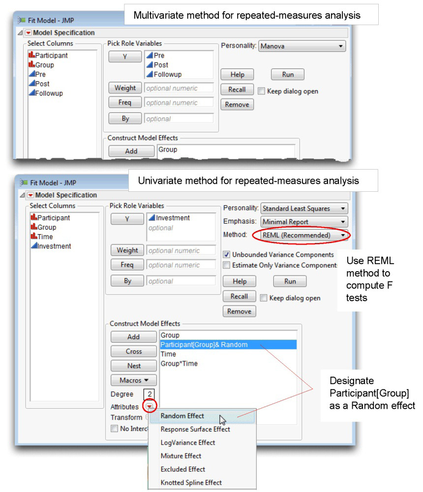
Use this stacked table to perform the univariate repeated measures analysis. Follow these steps to specify the model in the Fit Model dialog:
![]() With the stacked nointeraction.jmp active, choose Fit Model from the Analyze menu.
With the stacked nointeraction.jmp active, choose Fit Model from the Analyze menu.
![]() Select Investment in the Select Columns list, and click Y in the dialog.
Select Investment in the Select Columns list, and click Y in the dialog.
![]() Select Group in the Select Columns list, and click Add in the dialog.
Select Group in the Select Columns list, and click Add in the dialog.
![]() Select Participant in the Select Columns list, and click Add.
Select Participant in the Select Columns list, and click Add.
![]() Now select Participant in the Construct Model Effects list, and select Group in the Select Columns list. Then click Nest in the dialog. This action gives the Participant[Group] nested effect in the Construct Model Effects list.
Now select Participant in the Construct Model Effects list, and select Group in the Select Columns list. Then click Nest in the dialog. This action gives the Participant[Group] nested effect in the Construct Model Effects list.
Select the Participant[Group] effect in the Construct Model Effect list, and choose Random Effect from the Attributes menu in the dialog, as shown at the bottom in Figure 12.26.
![]() Finally, enter the interaction term. Select both Group and Time in the Select Columns list, and click Cross in the dialog.
Finally, enter the interaction term. Select both Group and Time in the Select Columns list, and click Cross in the dialog.
![]() Choose Minimal Report from the Emphasis menu.
Choose Minimal Report from the Emphasis menu.
![]() Choose REML in the Method menu. This is discussed in the next section.
Choose REML in the Method menu. This is discussed in the next section.
Figure 12.26 shows the Fit Model dialog for multivariate repeated-measures analysis at the top, and it shows the univariate repeated-measures analysis at the bottom.
The nested effect Participant[Group] is designated as a Random effect so that it will be used as the error term for F tests of all effects showing above it in the Construct Model Effects list. In this repeated-measures analysis, it is the appropriate error term for the Group effect. The F tests for effects below the random effect use the model error (residual) as the denominator.
Figure 12.26: Comparison of Model Specifications
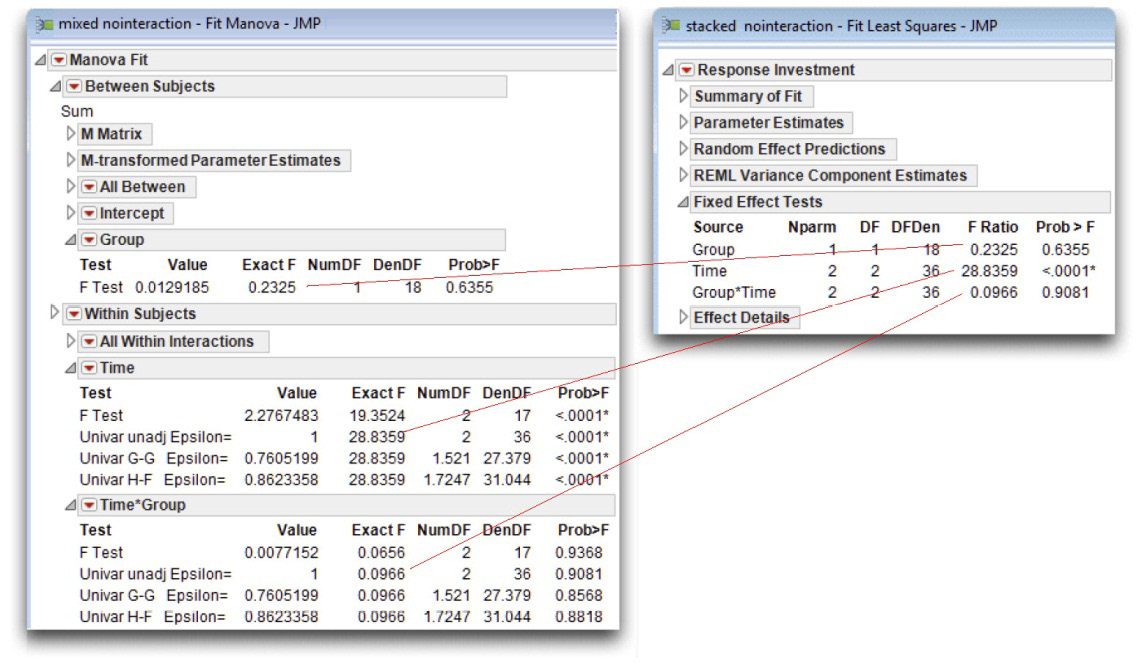
Click Run to see the univariate repeated-measures analysis. Figure 12.27 shows a comparison of the results for the two types of analyses.
Figure 12.27: Univariate F Tests for Repeated Measures Analysis
Using the REML Method Instead of EMS Method for Computations
Notice that the Method menu shows REML instead of EMS as the method for computing the expected mean squares for the F tests in a mixed model. With the development of powerful computers the REML (Restricted Maximum Likelihood) method has become the state-of-the-art method for fitting mixed models. In the past, researchers used the Method of Moments to calculate the Expected Mean Squares (EMS) in terms of variance components, and subsequently synthesized expressions for test statistics that had the correct expected values under the null hypothesis.
If your model satisfies certain conditions (that is, it has random effects that contain the terms of the fixed effects for which they provide the random structure), then you can use the EMS choice to produce these traditional analyses. However, since the newer REML method produces identical results, but is considerably more general, the EMS method is not recommended. The REML method doesn’t depend on balanced data or shortcut approximations; it computes correct test statistics, including contrasts across interactions.
The REML approach was pioneered by Patterson and Thompson in 1974. See also Wolfinger, Tobias, and Sall (1994); and Searle, Casella, and McCulloch (1992).
Appendix B: Assumptions for Factorial ANOVA with Repeated-Measures and Between-Subjects Factors
All of the statistical assumptions associated with a one-way ANOVA, repeated-measures design are also required for a factorial ANOVA with repeated-measures factors and between-subjects factors. In addition, the latter design also requires a homogeneity of covariances assumption for the multivariate. This section reviews the assumptions for the one-way repeated measures ANOVA and introduces the new assumptions for the factorial ANOVA, mixed design.
Assumptions for the Multivariate Test
Level of measurement
The response variable is a continuous numeric measurement. The predictor variables should be nominal variables (categorical variables). One predictor codes the within-subjects variable and the second predictor codes the between-subjects variable.
Independent observations
A given participant’s score in any one condition should not be affected by any other participant’s score in any of the study’s conditions. However, it is acceptable for a given participant’s score to be dependent upon his or her own score under different conditions (under the within-subjects predictor variable).
Random sampling
Scores on the response variable should represent a random sample drawn from the populations of interest.
Multivariate normality
The measurements obtained from participants should follow a multivariate normal distribution. Under conditions normally encountered in social science research, violations of this assumption have only a very small effect on the Type I error rate (the probability of incorrectly rejecting a true null hypothesis).
Homogeneity of covariance matrices
In the population, the response-variable covariance matrix for a given group (under the between-subject’s predictor variable) should be equal to the covariance matrix for each of the remaining groups. This assumption was discussed in greater detail in Chapter 10, “Multivariate Analysis of Variance (MANOVA) with One Between-Subjects Factor.”
Assumptions for the Univariate Test
The univariate test requires all of the preceding assumptions as well as the following assumptions of sphericity and symmetry:
Sphericity
Sphericity is a characteristic of a difference-variable covariance matrix obtained when performing a repeated-measures ANOVA. The concept of sphericity was discussed in greater detail in Chapter 11, “One-Way ANOVA with One Repeated-Measures Factor.” Briefly, two conditions must be satisfied for the covariance matrix to demonstrate sphericity. First, each variance on the diagonal of the matrix should be equal to every other variance on the diagonal. Second, each covariance off of the diagonal should equal zero. This is analogous to saying that the correlations between the difference variables should be zero. Remember that, in a study with a between-subjects factor, there will be a separate difference-variable covariance matrix for each group under the between-subjects variable.
Symmetry condition
The first symmetry condition is the sphericity condition just described. The second condition is that the difference-variable covariance matrices obtained for the various groups (under the between-subjects factor) should be equal to one another.
For example, assume that a researcher has conducted a study that includes a repeated-measures factor with three conditions and a between-subjects factor with two conditions. Participants assigned to condition 1 under the between-subjects factor are designated as “group 1,” and those assigned to condition 2 are designated as “group 2.” With this research design, one difference-variable covariance matrix will be obtained for group 1 and a second difference-variable covariance matrix will be obtained for group 2. The nature of these difference-variable covariance matrices was discussed in Chapter 11. The symmetry conditions are met if both matrices demonstrate sphericity and each element in the matrix for group 1 is equal to its corresponding element in the matrix for group 2.
References
Keppel, G. 1982. Design and Analysis: A Researcher’s Handbook, Second Edition. Englewood Cliffs, NJ: Prentice Hall.
Looney, S., and Stanley, W. 1989. “Exploratory Repeated Measures Analysis for Two or More Groups.” The American Statistician, 43, 220–225.
Patterson, H. D., and Thompson, R. 1974. “Maximum Likelihood Estimation of Components of Variance.” Proceedings of the Eighth International Biochemistry Conference, 197–209.
Rusbult, C. E. 1980. “Commitment and Satisfaction in Romantic Associations: A Test of the Investment Model.” Journal of Experimental Social Psychology, 16, 172–186.
SAS Institute Inc. 2012. Modeling and Multivariate Methods. Cary, NC: SAS Institute Inc.
Searle, S. R., Casella, G., and McCulloch, C. E. 1992. Variance Components. New York: John Wiley & Sons.
Winer, B. J. 1971. Statistical Principles in Experimental Design, Second Edition. New York: McGraw-Hill.
Wolfinger, R., Tobias, R., and Sall, J. 1994. “Computing Gaussian Likelihoods and Their Derivatives for General Linear Mixed Models.” SIAM Journal of Scientific Computing, 15, 6 (Nov. 1994), 1294–1310.